The world is a big place. To break it down for this blog, when in came to celebrating all the magical newspaper entries from the Society for News Designs Best of News Design competition I have broken it down into Canada (because I live and work here), the U.S. and the rest of the world. And that is not to diminish the rest of the world. The work coming out from newspapers around the world is astounding, which in itself is astounding given the times we’re in. Which brings me to where I want to start. The World’s Best Designed Newspaper, SND’s highest honour.
This year I had the great honour of being a facilitator for this competition. I got to watch them whittle down the entries to four finalists, and from there to choose one paper. The discussion was riveting. It came down to the New York Times, de Volkskrant, Het Parool and Die Zeit. Anyone who follows me knows I love de Volkskrant. Seeing it make the final was very satisfying.
After days of review and debate/discussion, Die Zeit came out on top. While all these newspapers have huge strengths, Die Zeit is worthy of this lofty title.
What makes a world’s best-designed newspaper? So, so many things. One word that was heard again and again was “considered.” Everything is so considered. All the little details. Nothing was overlooked. Things like drop caps, the spacing of words that wrap around images, kerning, and so on. But also the big things. Photo choices, how and when illustrations are used, how the text worked with art and the design. The funny thing was it was so well designed, it was remarked that the design falls to the background. Except when it doesn’t. The design is so remarkably clean, but sometimes they go big. And their use of photos and graphics? Considered. Everything is so artistic, they said. The judges could tell there was collaboration between editors and designers, which is imperative if you want to go from a nice paper to a top paper. Even more needs to happen to elevate a paper to world’s best designed. Congrats to Die Zeit for doing all of this and more. It shows.
While Die Zeit may not have many of those big “wow” pages, it still has some amazing, striking pages that take their clean and refined design to another level, and that clean design is already at another level. It really is a paper that rises above. I’ll start by showing some pages from Die Zeit, followed by a selection of some of the best pages from the rest of the world, Canada and U.S. excluded. You can see those here (Canada) and here (U.S).
“Great print design paints a coherent experience for the reader where every carefully chosen element contributes to convey more than the sum of its parts.”
Judges’ statement
Die Zeit
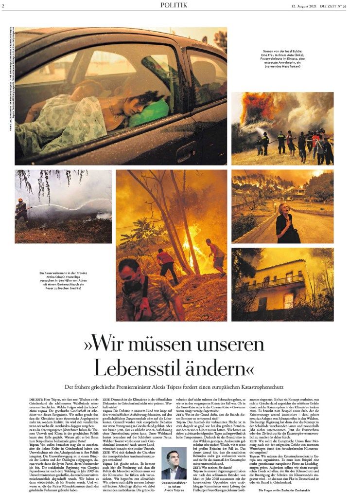
Die Zeit is a weekly paper out of Germany. So that is one main difference from the papers it was up against. First, I will show a selection of some consecutive pages. Just to lull you into thinking it’s just a nice clean design. But this is what readers would see every day as they start flipping through their newspaper. After those pages, I’ve included some with sizzle. Text as design, illustrations and graphics, colour.
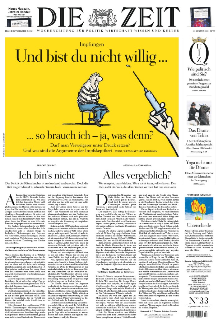
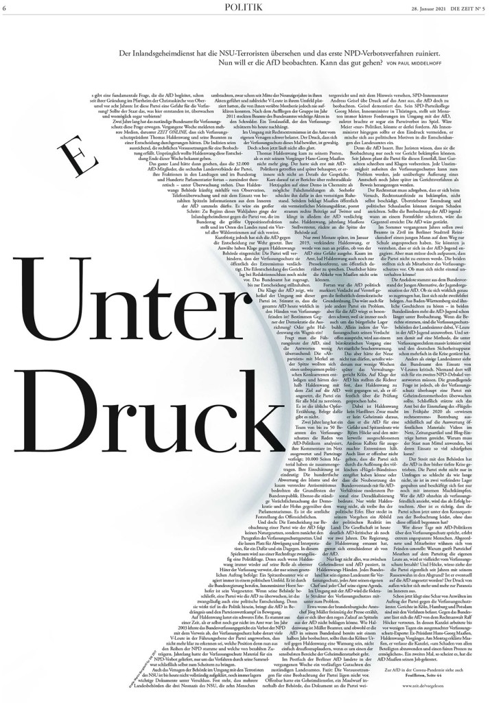
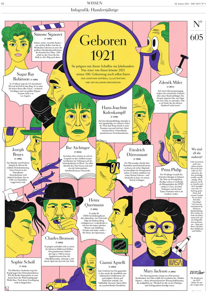
This one is one of my faves from Die Zeit. Every year one paper does a funky text design that grabs onto me and won’t let go. This was this year’s. I love the bend, that the text is still so well spaced and readable. The E. And they did more incredible text designs. They made a chicken out of text. A chicken! Wait for it. It’s coming.
Die Zeit, Jan. 28, 2021
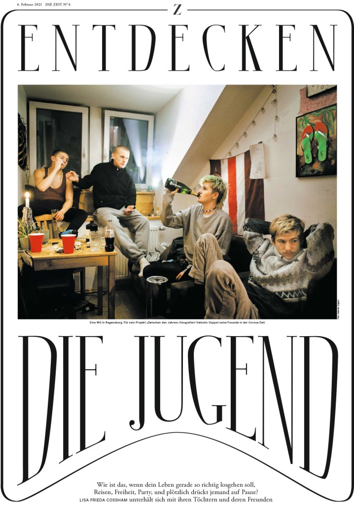
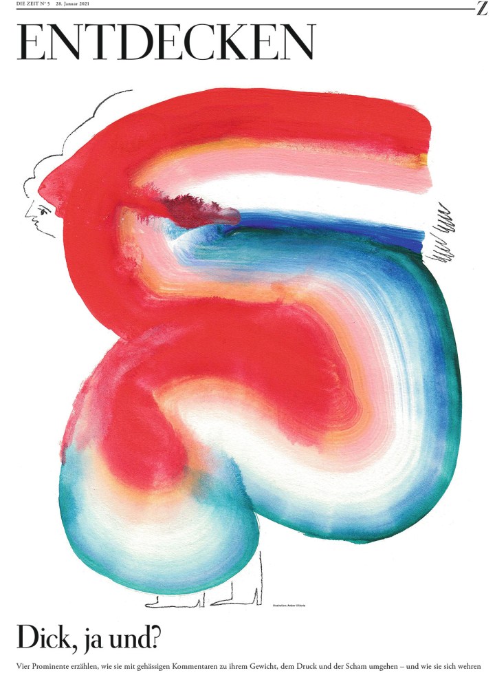
This page is just funky. That’s all. I love the text treatment. The border. The pic. It actually reminds me of a design I once did, just better. So good.
Die Zeit, Feb. 4, 2021
A chicken! Out of text! Over a two-page spread!
Die Zeit, March 31, 2021
I’ve included a few more separately. They were too good to be missed.
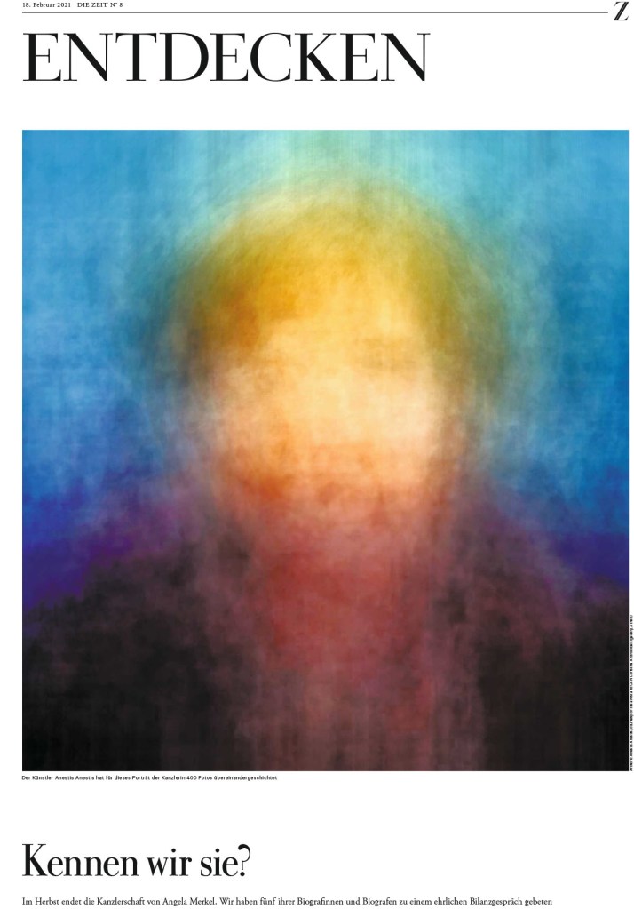
Die Zeit, Feb. 18, 2021
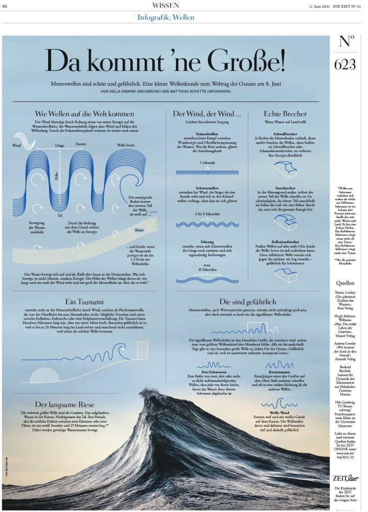
Die Zeit, Jan. 21, 2021
Die Zeit, June 2, 2021
And so so many more stunning, smartly designed pages. This slide show has a number of them, but it’s still a small sampling of the work that comes out of this paper every week. Just such amazing attention to detail on every page.
The rest …
There were more than 3,500 entries in this year’s competition, up from the previous year, which is encouraging. Of those, there were more than 800 winners. If that sounds like a lot, keep in mind the 3,500 entries consist of what designers from around the world considered their best work, work worthy of award consideration. I look at 500+ front pages every day. That’s just covers. I can’t even begin to fathom how many pages are produced each year. How many great pages weren’t entered.
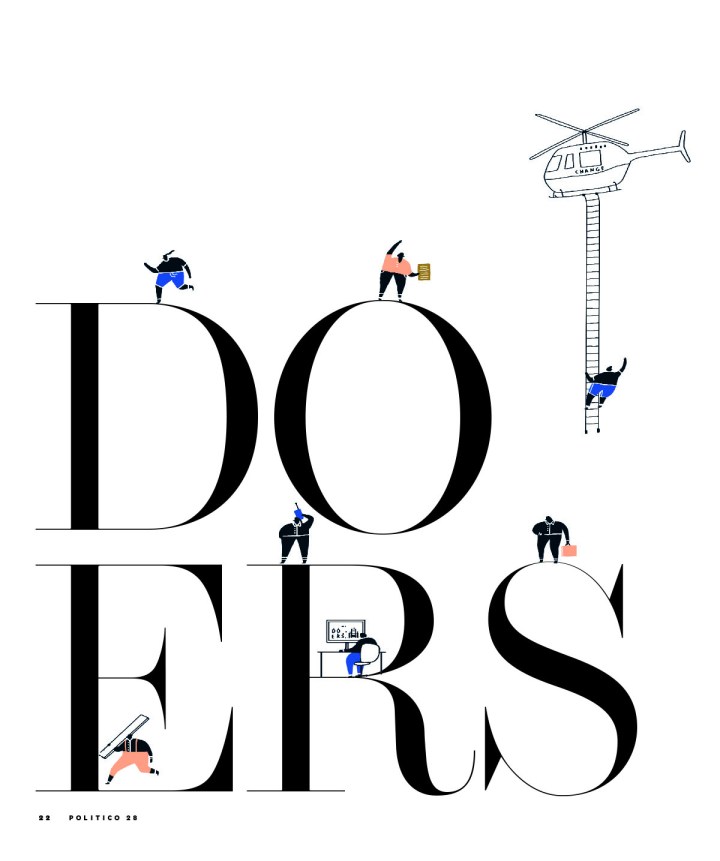
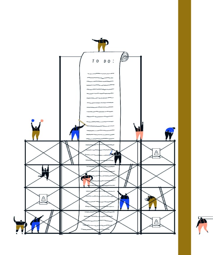
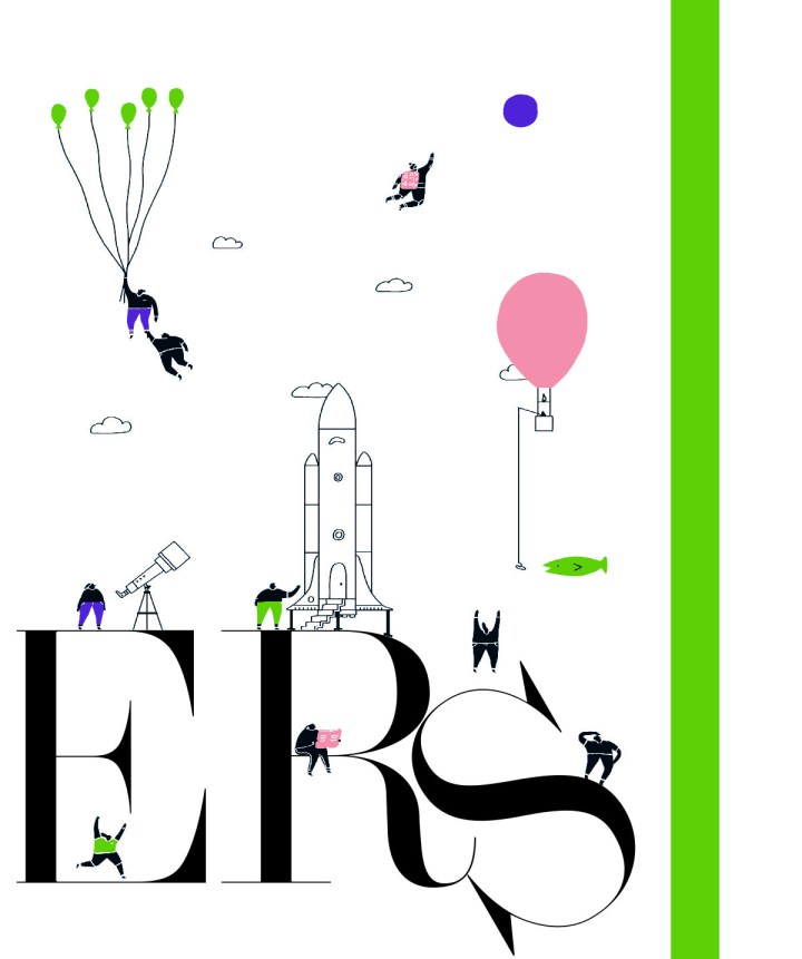
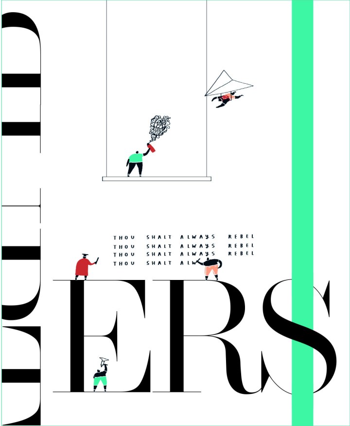
Alas, you’ve seen Canada. You’ve seen the U.S. Here is a very slimmed down selection of pages from the rest of the world. One of the things I love about newspapers from other countries is that they often look so different than the typical North American newspaper. They take a different approach, have different design philosophies. But one thing is clear with all them: they want to wow their readers. This will mark my last post from SND 43, but it may not be the last you see of some of the pages in this post as I try to gently coerce the incredible designers behind some of these pages to talk to me about their work. First up, Politico Europe and Politiken!
Politico Europe
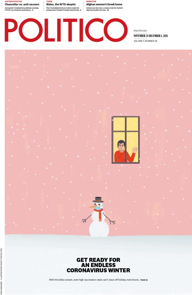
There is such a range of pages from Politico Europe. A lot are illustration-driven. And the illustrations are beautiful or haunting or striking. I will start with the snowman. Every time I saw this little guy, and the person in the window, I felt something. I want to feel happy. But then …
Politico Europe, Nov. 25-Dec. 1, 2021
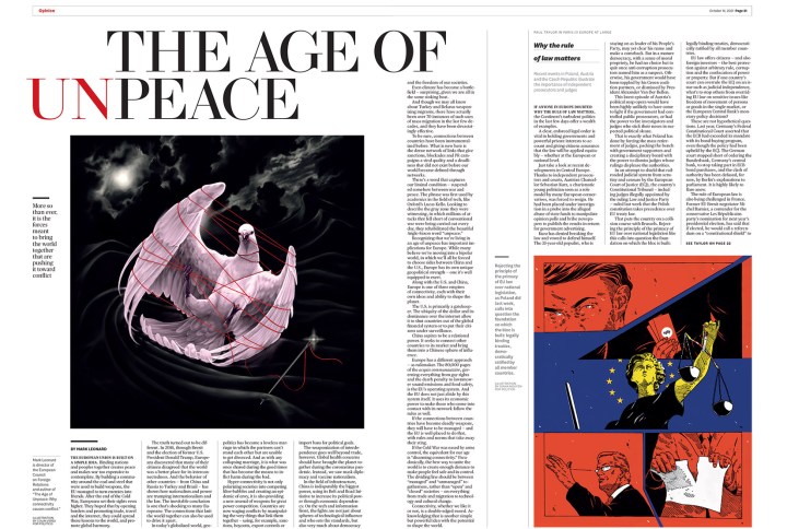
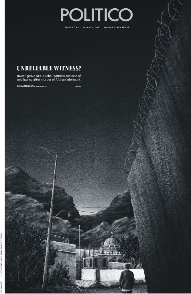
This spread is so well done. The art is striking, the headline is strong, both words and design. It’s clean, but with some surprises. The headline is almost jarring as set up, but I feel it’s supposed to be. It’s not the age of peace, after all.
Politico Europe, Oct. 14, 2021
In this slide show, again, there is a great variety, starting with this dark image, and ending with a section about doers and dreamers that makes me smile. Every page makes me smile.
Politiken
I’ve long been a fan of Politiken. I feature pages from this publication on my Instagram frequently. This was a page I featured here. I put it in with my Christmas collection even though I wasn’t sure if it was meant to be a Christmas page. But the entry was called wrapping paper! So it is.
Politiken, Dec. 24, 2021
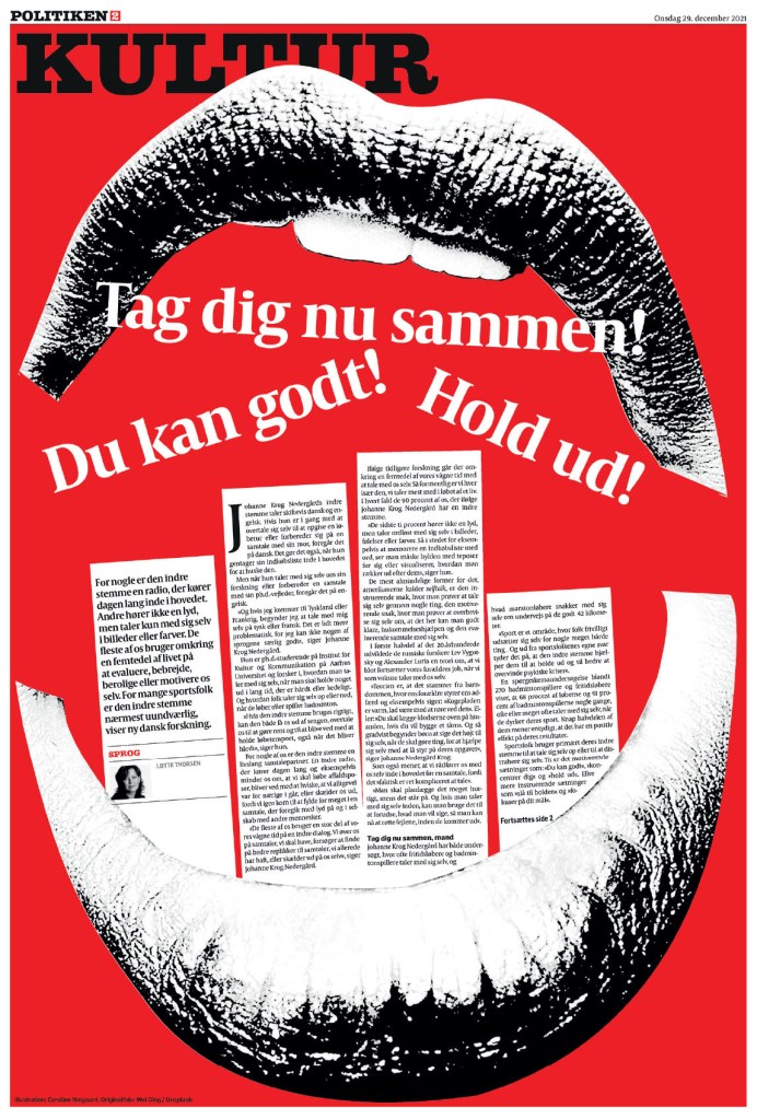
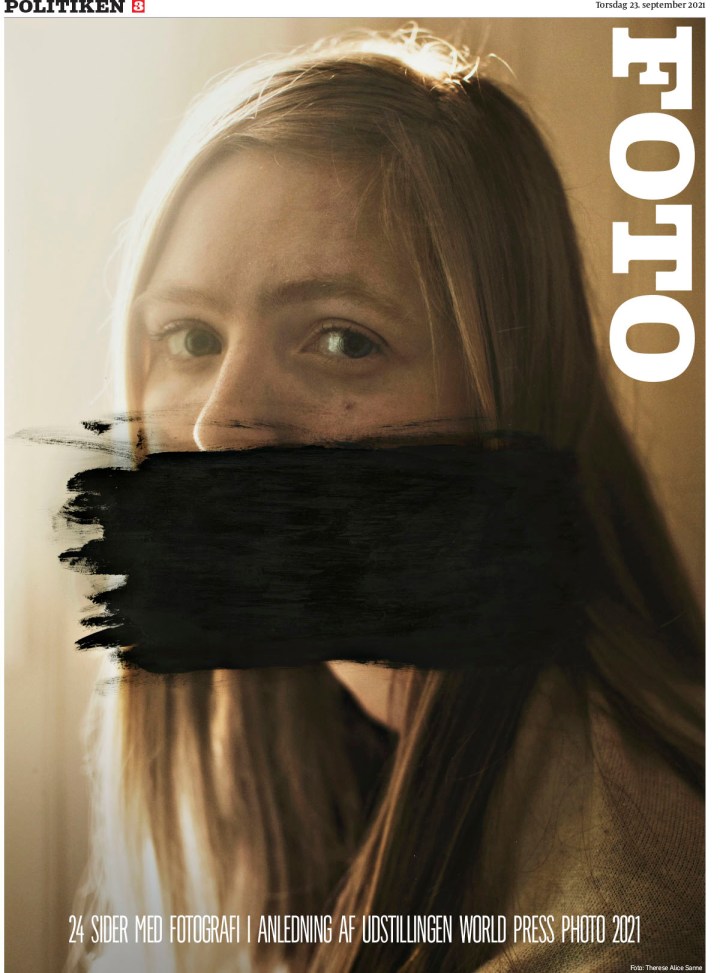
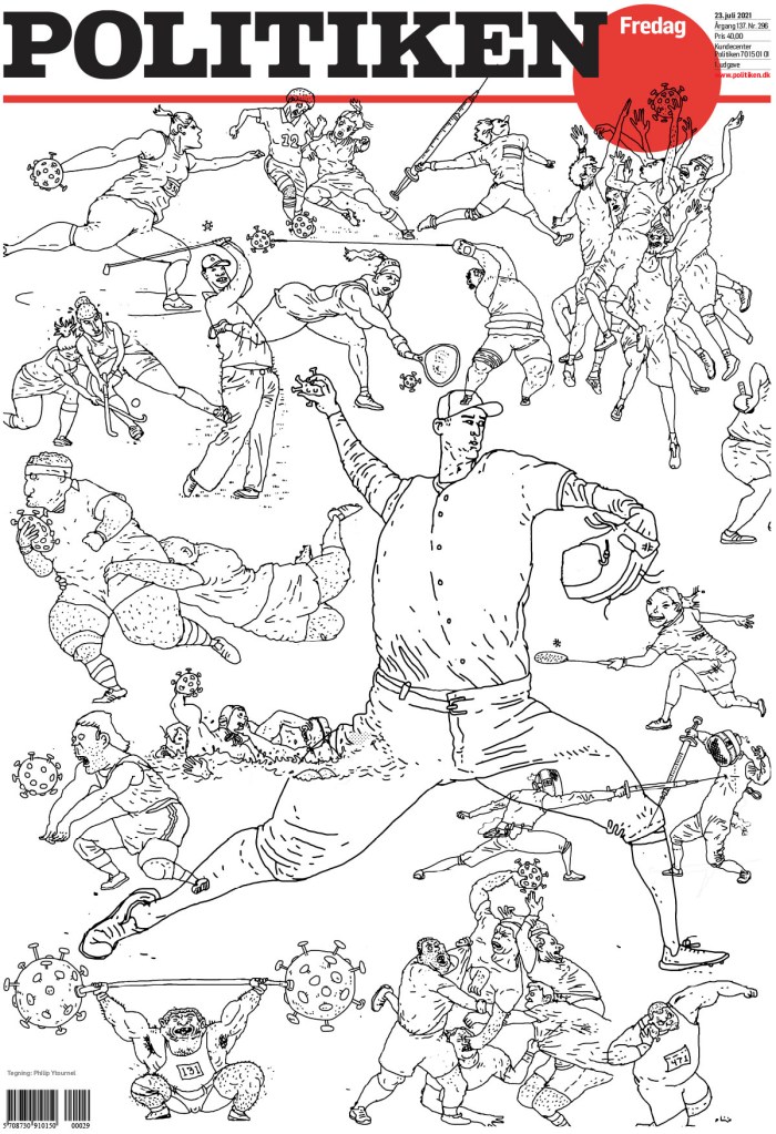
And now for something completely different. The next two pages are from the same award-winning portfolio by designer Caroline Niegaard. What strikes me about these is that they are chaotically bold. They are full of energy.
Politiken, Dec. 29, 2021Politiken, Feb. 27, 2021
And many more. I love that this paper takes risks. And that its work is so varied. The last three I’ve chosen to show are completely different, but still within character.
Below are some others I have pulled out to highlight. Just some of my faves, but there were so many more incredible entries from other papers. First from de Volkstrant, a page that was featured on my Instagram, and then two from Dagens Nyheter, which I think does an incredible job on covers regularly.
de Volkstrant, Oct. 1, 2021
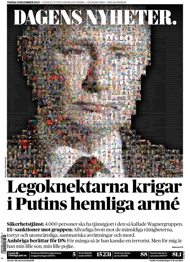
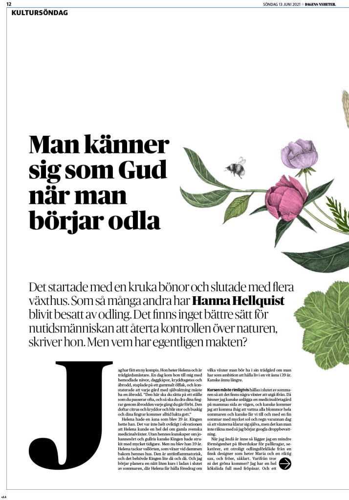
Dagens Nyheter, Dec. 21, 2021
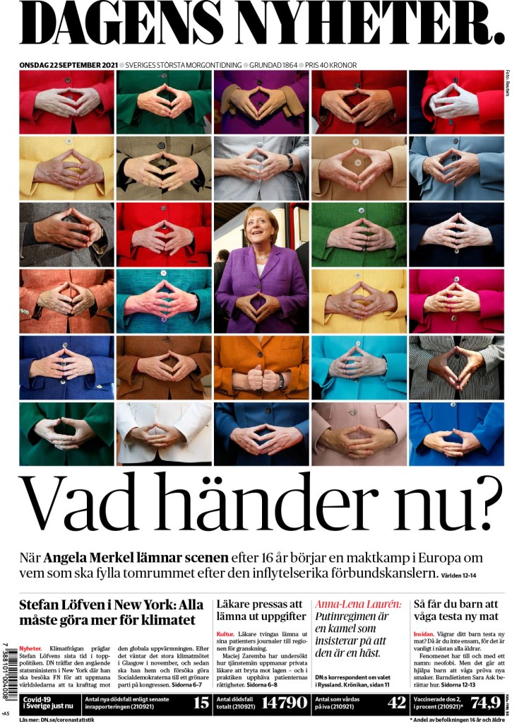
Dagens Nyheter, Sept. 22, 2021
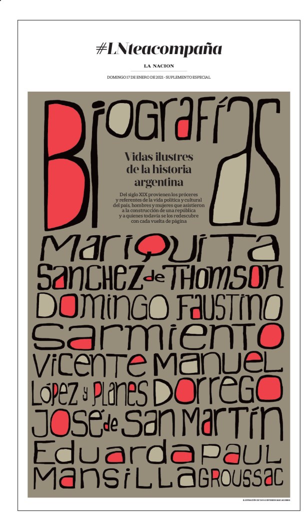
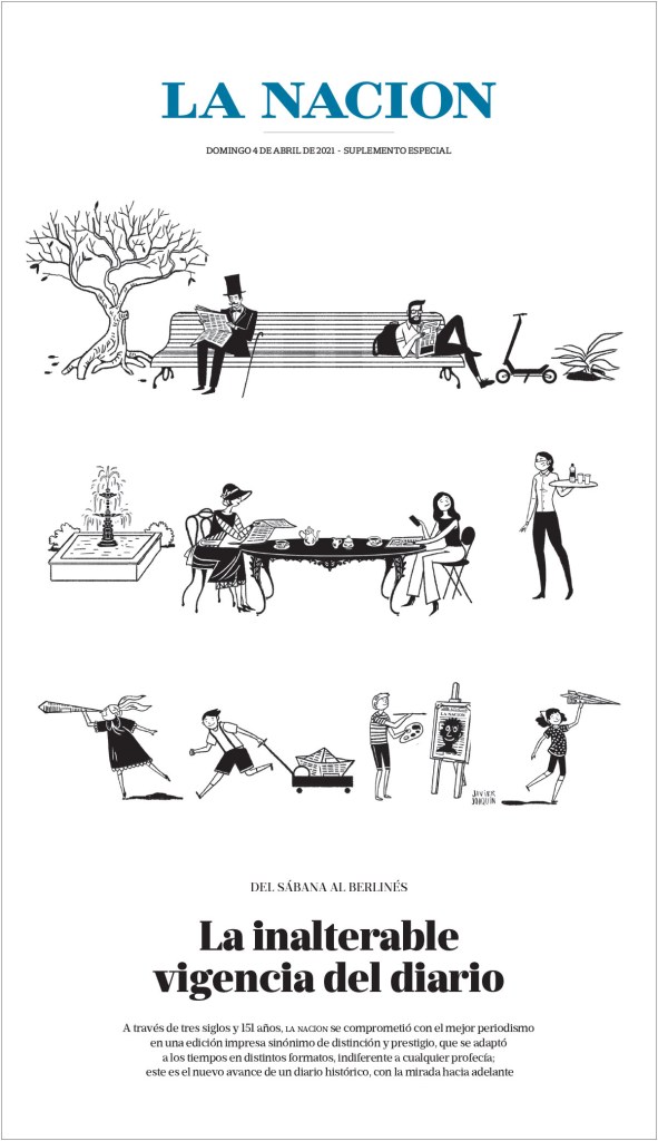
This page from La Nacion is just so lovely. There is another from them in the slideshow.
La Nacion, Dec. 17, 2021
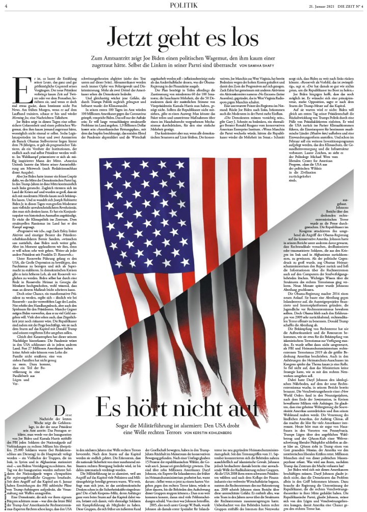
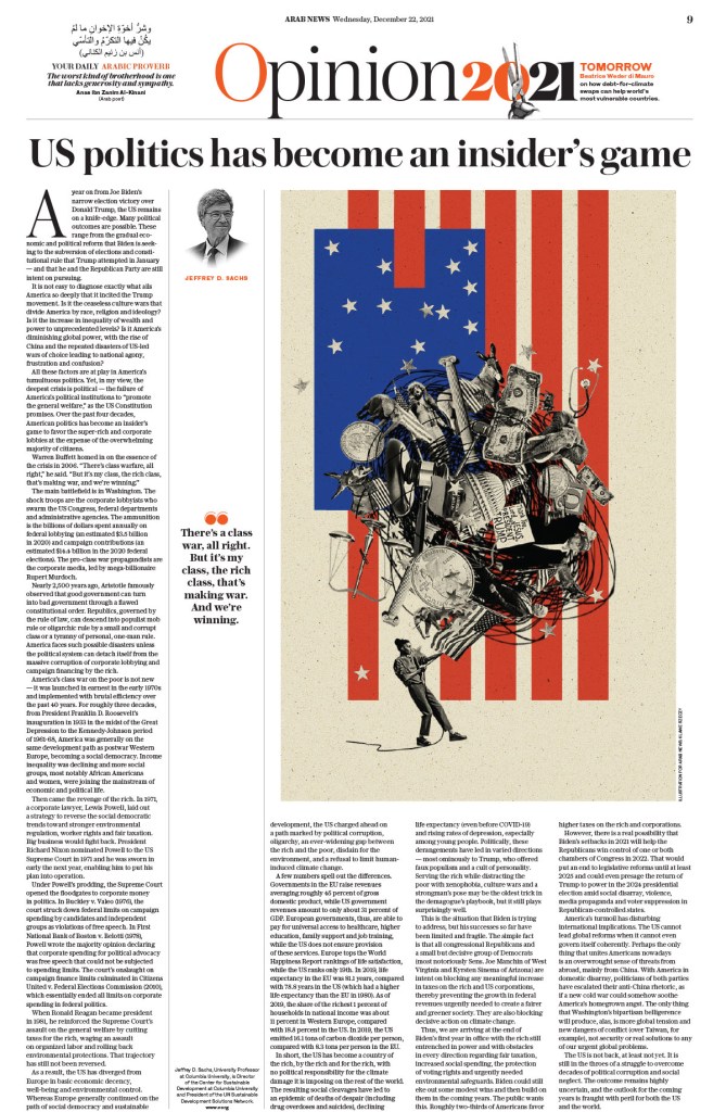
Arab News has many great pages, but this opinion page really jumped out at me. I love the illustration, and the page itself is just clean and crisp. The American flag features prominently in pages, particularly opinion pages, around the world. It’s used in so many different ways to convey so many different ideas.
Arab News, Dec. 22, 2021
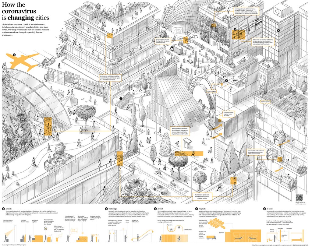
There are a few more South China Morning Post pages in the slideshow. While this is one really works because of the illustration, it was just such a compelling illustration. For the most part I didn’t include pages that won just for illustration. But they also used the small bit of display text so well. I am positive the space in the top left was left for display copy.
South China Morning Post
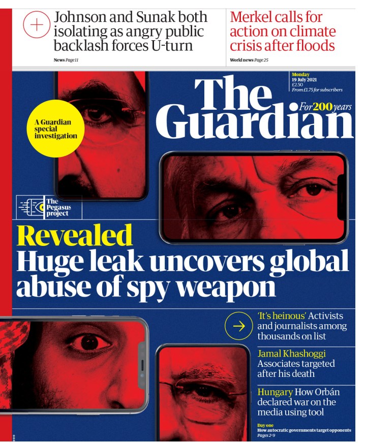
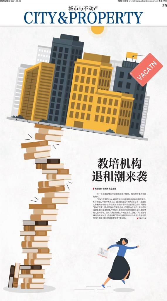
And the final slideshow from SND 43. There is a wide cross section of pages from multiple publications, such as The Age, The Guardian, The Day, Economic Observer out of China and more.
Canvas_Version:3.0.23
And that’s it. Another year, another awe-inspiring competition. Inspiring is the right word, as it would be impossible for any newspaper designer seeing the incredible work submitted to walk away without some new ideas, some extra enthusiasm or desire to push just a little harder.
More than 3,500 entries. That’s more than 3,500 newspaper pages (way more, as multiple page entries like sections are one entry) that designers and newspapers around the world decided were their best, and submitted to the Society for News Design‘s annual design competition. Nearly 800 winners (798 Awards of Excellence, 68 Silver Medals and 18 Gold Medals). So how does one winnow that down into a blog post? One doesn’t! I tried. Not a chance. So I started by breaking out Canada due to my obvious Canadian bias! But there are still more than 700 left to choose from. So after that, I attempted to cram the rest of the world into one post, but nope. So American papers get their own post, followed by the rest of the world. Even still it’s challenging. Despite newspapers falling on tough times, designers are killing it. So this is an act of curation based on my tastes. And leaving out dozens upon dozens of entries that I dearly loved so that this doesn’t go on forever.
I had the good fortune of being a volunteer facilitator for the second year in a row, for the organization that truly changed the arc of my journalism career. Beside my desk sit five tattered SND books, which they release annually capturing the winners of these competitions. I am beyond humbled to be in three of them, one for a portfolio of work. I had six books, but one got stolen or borrowed and not returned. Do I begrudge that person? No, because my path started by … borrowing two from my first newspaper job when I left. One of those is missing. That’s just the circle of design life.
For SND 43, I was part of the World’s Best-Designed Newspaper competition. Results will come soon. But here, I present the individual entries. If you’ve not been following along, a quick summary of awards. AoE is an outstanding page, one that is deeply considered, uses typography and/or white space and/or art, etc. incredibly well. It’s not design for design’s sake. It is designed with purpose. A silver rises above even further, is exceptional among the outstanding. It could be considered state of the art. And gold. Well, on a gold page, it needs to rise to near perfection, above the outstandingly exceptional. It should be hard for a judge to find a flaw. That is why there are so few. Kerning between two letters, a crop that seems just off, too much or too little white space. All sorts of tiny details prevent a page from being elevated to this level. Because of that, finding the best way to present this (by paper, by theme, by region) is so challenging. I will start with the only gold medal for a portfolio of design (there was another for illustrations).
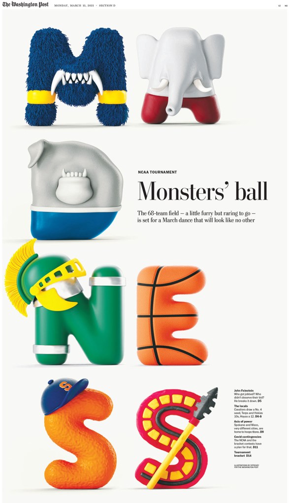
Brandon Ferrill, Washington Post, Gold Medal for portfolio
The first page in this slideshow was really the talk of the weekend. Universally loved. And fun. There were some hard pages, some big subjects in 2021. COVID-19 was still raging, the Capitol riot, the Taliban in Afghanistan. And so on. And then we have this happy-making page. The entire portfolio is striking. That judges moved an entire portfolio to gold says so much about the quality of this work. And trust me, you will see a lot more from the Washington Post here. When they go big, they win. We win.
Facilitator’s special recognition
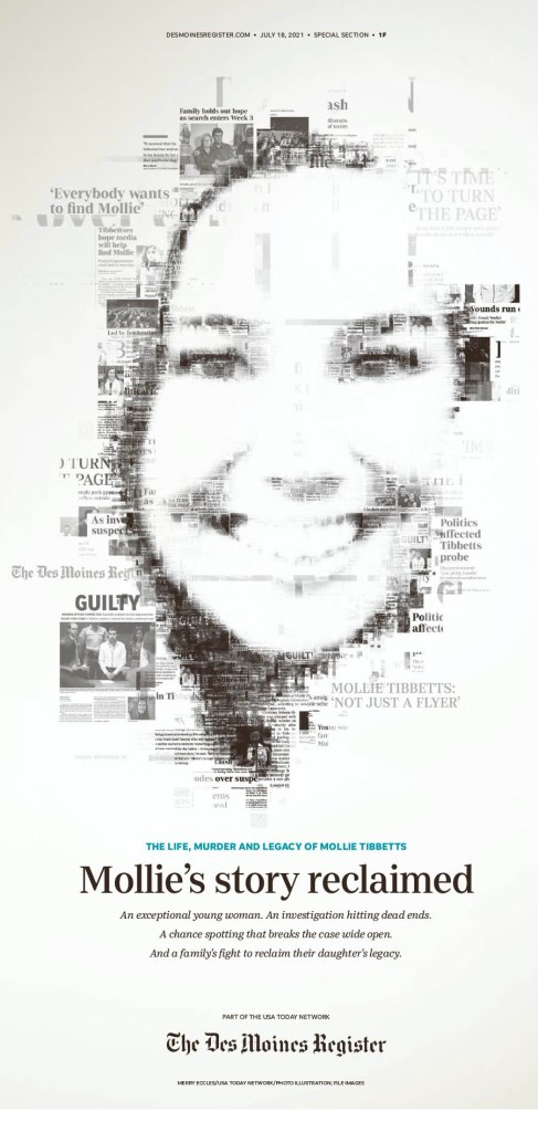
At last year’s competition (my first), two pages immediately took my breath away. And it kept piling on. I waited for that experience this year. Nothing will compare to that first experience at SND. Not because the pages aren’t just as exceptional, but you start thinking differently, more critically. You know what can be done. What’s out there. But this year there was a page that really struck me (so many did). But I kept going back to this one. And it wasn’t the Washington Post, the New York Times, the Los Angeles Times or the Star Tribune. It was the Des Moines Register. Maybe it is because I am a champion of the underdog. Maybe it’s because it uses newspaper clippings, which doesn’t often work but really does here. It’s so smartly done. Maybe the lack of colour. Seemingly simple, but quite complex. And the judges must have mostly agreed. It won a silver medal.
Des Moines Register, July 18, 2021
U.S.: The Big 4 conference
When it came to papers in the U.S., the four I mentioned above really stand out: New York Times, Washington Post, Los Angeles Times and Star Tribune (Minneapolis, and employer of my most recent featured designer, Stacie Kammerling). I will give each paper a slideshow and little blurb. I will exclude the portfolio above from the Washington Post below.
Washington Post
I tried to choose a favourite. I really did. But the first three here are so close, for very different reasons. Some pages are driven by illustrations, some by text alone. I’ve said this before: A good illustration is good on its own, enhanced by a good design. But then there is just good design, and designing with text is skill. Also, when it comes to opinion pages, the Washington Post is among the best in the world, if not the best, largely based on smart illustrations. And I had to narrow this down. I cut some amazing pages out.
The New York Times
What can I say about the New York Times. It’s funny that it’s known as the Gray (Grey) Lady. Because once you get past that iconic grey cover (much less grey than it once was), and past the news section, it’s a marvel. Design beyond most designers’ wildest imaginations. The kids section alone is a masterpiece. Truly brilliant.
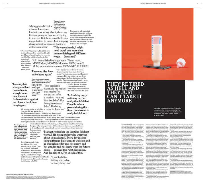
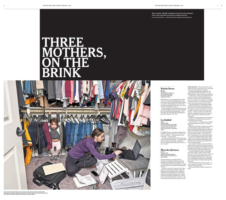
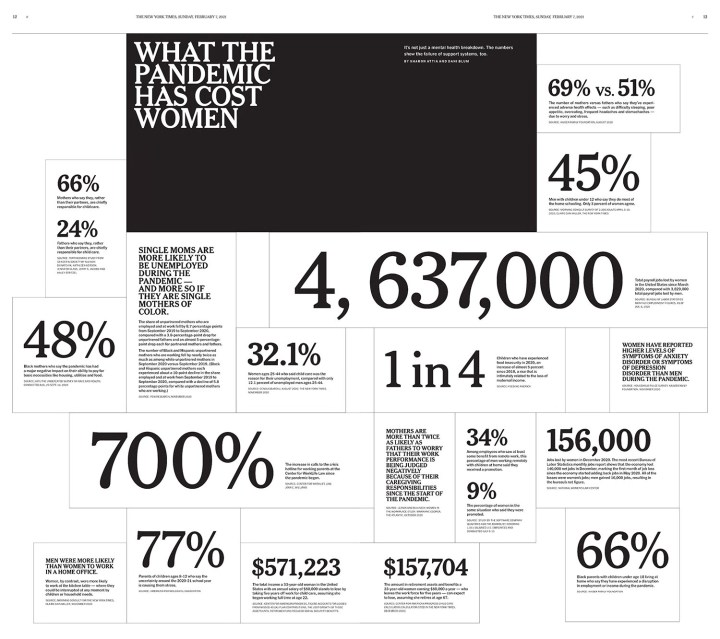
There were so many jaw-dropping pages from NYT, so this is truly just a snapshot of the work they produce. There were some I couldn’t do justice to as it would require seeing the entire section. I have included four pages from a section about the struggle of mothers because of the subject matter, and because of the judges’ comments. The section, they believe, is designed in a way intended to make you uncomfortable. It’s far from a standard design. It is jarring. I am so envious. If they are ever looking to hire a designer with a Canadian perspective, feel free to reach out. I accept. In a twist, the one A1/front page I included is so strong because it’s grey. I wrote an entire post about it when it came out in early 2021. The first two pages in the slideshow is two of my faves from the competition. I love little pictures. And the god page is boldly and smartly done.
Star Tribune
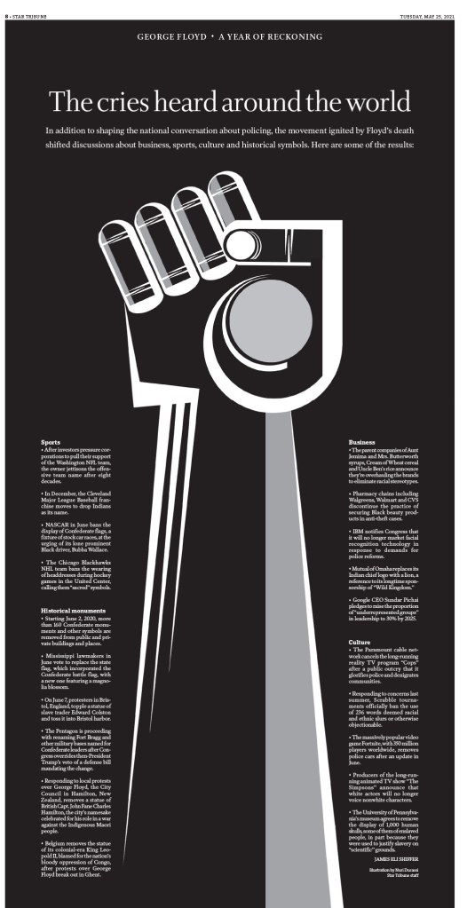
Funny thing about all of these four is that if you look at the front page each day, while they are well designed (particularly the Star Tribune, which is just a nice, clean, newsy front most days), they don’t look flashy. But then you get inside. Or then you have those big days. And wow. What is absolutely paying off for the Star Tribune is the state fair. There are always beautiful pages that come from there. To see more Star Tribune pages, other than what I’ve included here, see my recent post on designer Stacie Kammerling. A much more serious story this newspaper has handled so powerfully and with such grace is the George Floyd story. Just incredible, sensitive, yet provocative, boundary-pushing work. I will start there. Then to some fun and fair stuff (the contrast of last year’s fair and this year’s fair in cartoon figures is magical), and I have even included one of those hard-working front pages. And yes, I cut a lot again.
Los Angeles Times
And finally, the Los Angeles Times. Perhaps my favourite paper from last year’s competition. I still absolutely loved it this year. I have started with pages that just use design. Brilliant and bold typography, strong photos, creative white space. Then I get into breathtaking illustrations, followed by a few pages from a special section, which is a clear strength of the Times. They had some outstanding complete special sections, but again, I had to make some choices.
And more
Having these papers down here is not meant to dismiss any of them. They did some incredible work. I had to pare it down somehow. You can see them all here. Below are a few outstanding pages separately, and then another slideshow with more.
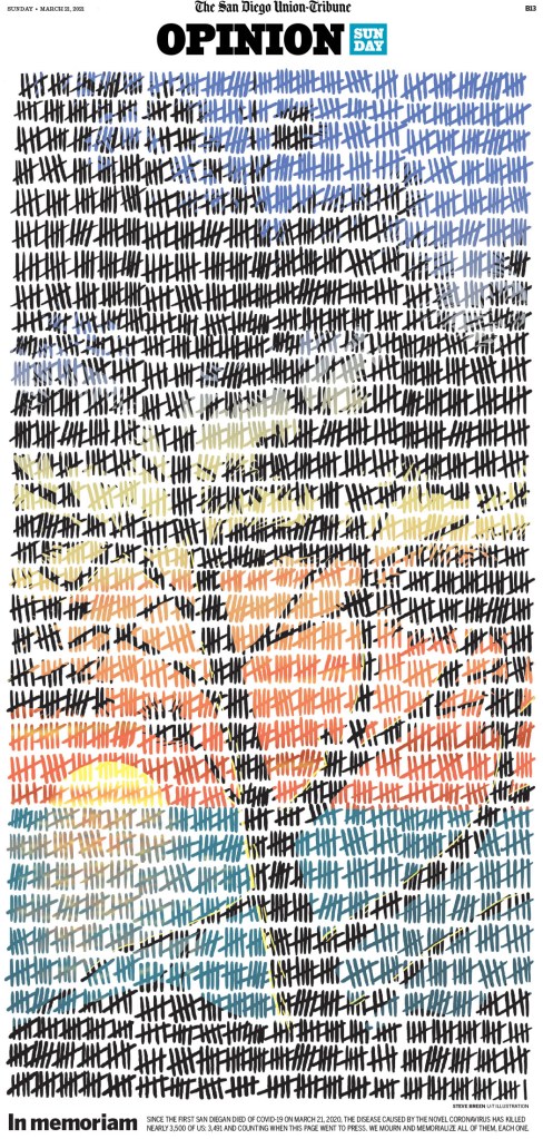
The San Diego Union-Tribune, March 21, 2021
This page from the San Diego Union-Tribune was one of my top pages from the competition. It’s a new take on using tallies. It is so well executed.
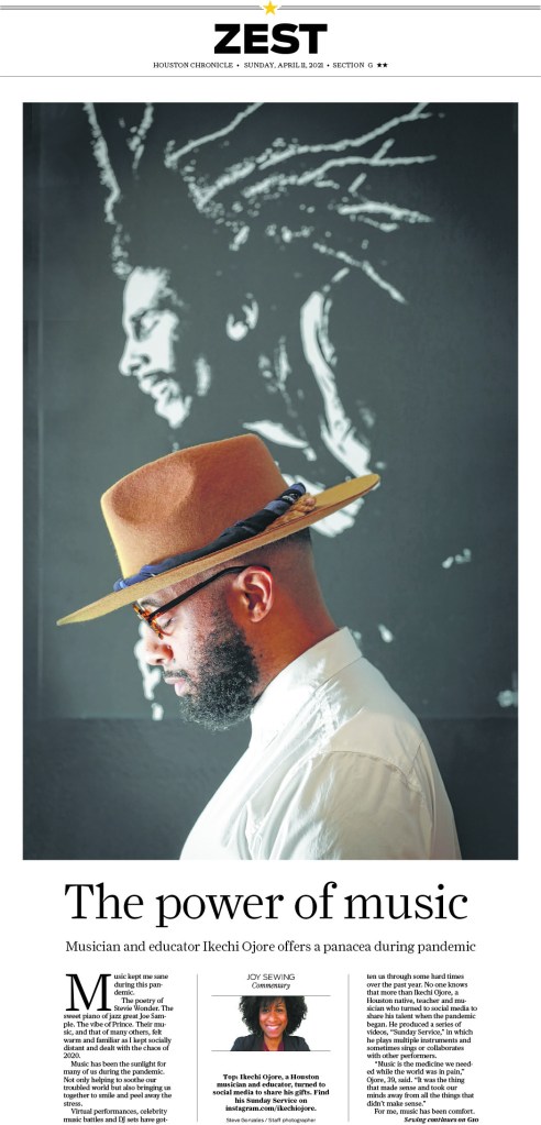
Houston Chronicle, April 11, 2021
I put this Houston Chronicle page in for its simplicity. Proof that you don’t need to do big and wild designs to look good. I love it.
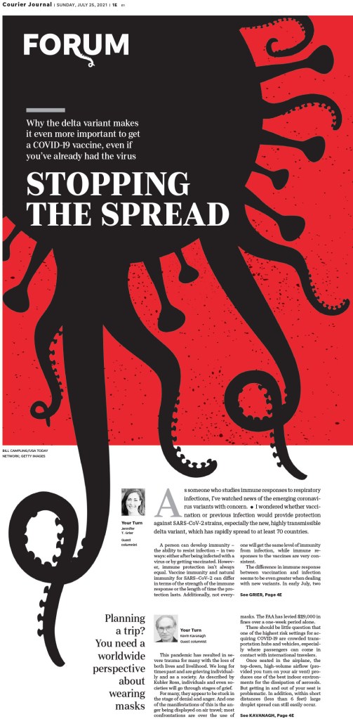
Louisville Courier Journal, July 25, 2021
This Courier Journal (Louisville) page is so compelling and is a creative play on the COVID imagery we have seen again and again. This is new. Very clever.
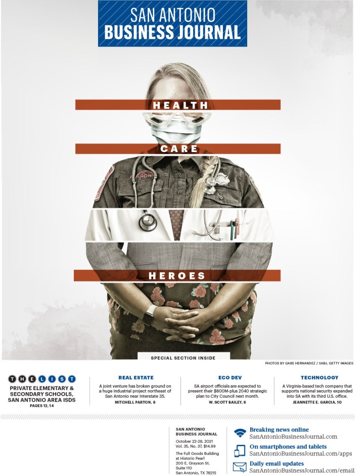
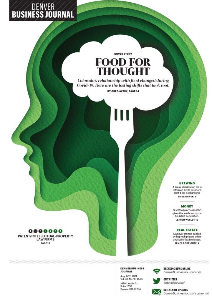
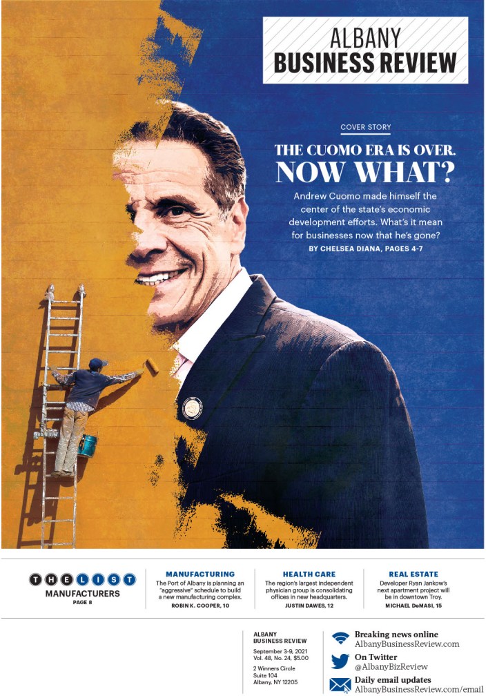
Here is a selection of pages from The Business Journals. They had a number of winners. They are doing such smart things with illustrations and text. The text on the first page is both understated and bold at the same time! Small, but reverse white on red with a touch of transparency.
And last but definitely not least, a selection from some other publications. I am positive I will look through the pages again and curse when I see a dozen that I forgot about. That’s how much there was to look through. It is a tribute to the incredibly hard-working and talented staff at all the newspapers or news hubs. Thank you for all your work. And your readers do too, even if they don’t know it. It’s hard to know what goes into not only the execution, but also the conception. Amazing.
So there you go. Print is alive. I just proved it.
Another year, another Society for News Design Best of Newspaper Design competition! For the second year in a row, I was honoured to be a facilitator, this year in the category of World’s Best-Designed Newspaper. What a thrill. Results of that will come out on March 28.
I feel like the competition could give me fodder for months and months of content. But I will restrain myself to three posts. The first will be on the outstanding work done by Canadian papers. Next will be the rest of the world (so will be much longer!). Then finally World’s Best.
I know I am a broken record, but SND means so much to me. As a print design lover, it first and foremost offers a community of like-minded people. But it also still celebrates print design in a time when that is becoming less frequent. Looking at you Canadian media awards competitions. So many of those involved in print design are behind the scenes. Sure illustrators and photographers get credits. But art directors don’t. Page designers don’t. Headline writers don’t. But without these people, the information you get would be dull.
Canada produced some incredible work this year. However, because I have been following print design much closer over the past year, both here and on my Instagram, not much here will be new to anyone who follows me! It was a different experience this year at SND 43, as there weren’t many surprises, at least from Canada. But that doesn’t mean it wasn’t exceptional, and doesn’t mean I won’t highlight it again.
There were only four newspapers to submit for awards this year, which is such a tragedy, as I know there is other amazing stuff going on in Canada, particularly with my soon-to-be former employer Postmedia, particularly the National Post. They are still producing some of the finest pages in the business, particularly in Canada. And much of that is a credit to one of my former featured designers, Raina Toomey, who moved on to the National Post in late 2021. Postmedia stopped submitting, I believe, after Gayle Grin left. She recently wrapped up some consulting at the Toronto Star, and her touch is obvious there. There were more than 300 entries overall from Canada, more than 3,500 in the competition.
The Globe and Mail won 25 awards, including 24 Awards of Excellence and one Silver Medal. To explain, an AoE is for outstanding work. Work that stands out, goes above and beyond. A silver medal rises above that, just on another level or through a higher degree of difficulty. There are also gold medals, though no Canadian publication earned one this year. For a gold, judges should have a hard time finding any flaw, down to kerning between two letters (a topic that was discussed this year, with a comment: “You could almost fit an i in there.” It should be state of the art, challenging the industry norms. The Toronto Star won eight AoEs, Le Devoir won 5 and 24 Heures 2. I won’t show all the all work here, but a selection from each.
Globe and Mail
I won’t talk too much about each page for the Globe as I have talked about the paper a lot. Things I love about the Globe are the use of illustrations — and the quality and sophistication of the illustrations — as well as its bold and smart use of white space.
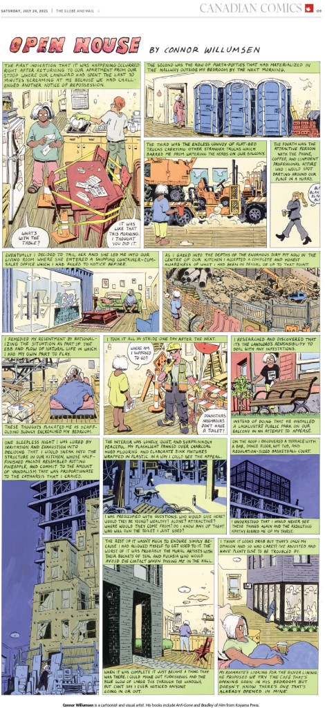
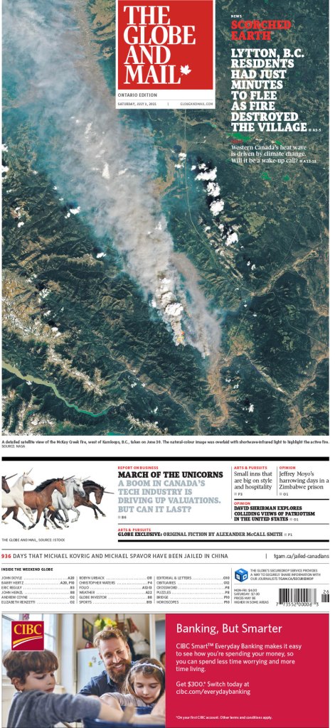
Globe and Mail, July 24, 2021
This was Canada’s only medal, for illustration by Connor Willumsen.
Globe and Mail, April 17, 2021
This was one of my faves from the Globe this year. There is so much going on. A lovely illustration by Kathleen Fu. Newspapers, she’s incredible. Take note.
Here are a few illustration-driven pages. There is some really lovely stuff here. I love what Canadian papers do with their Remembrance Day covers. This one by the Globe was so well done. Elegant. Illustration by Kayla Whitney.
And a few more. The Globe does so much with their design, particularly on Saturdays and features sections. I loved the bear cover. It works for the Globe, going so dark on dark, because their cover is on glossy paper. That design might be lost on most papers. Congrats to the Globe for a solid year. Being March already, I can tell you they are off to a good start in 2022 as well!
Toronto Star
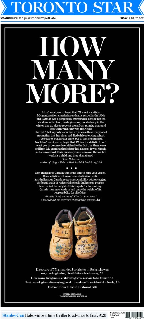
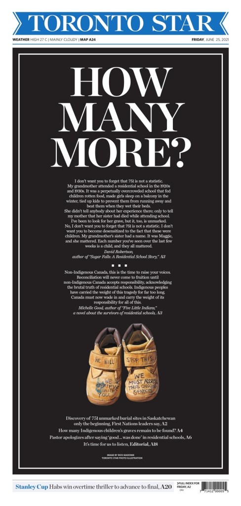
Of course I have a soft spot for the Toronto Star. I worked there, and worked directly or indirectly with the Star or Torstar for more than half of my career. Anyone who follows me will know how much I loved the page that came out after the discovery of unmarked Indigenous graves in Saskatchewan. It was so powerful. Here it is, and a few more.
Toronto Star, June 25, 2021
I just loved the imagery here. It was so powerful at a time that needed something powerful. Something to keep the focus on this issue. It’s striking.
And here are a few more. The Star decided to invest in its print product in 2021, which was such welcome news, adding four entirely new positions, including an art director, Becky Guthrie, formerly of the National Post. You can see her influence. I hope that we continue to see such strong work.
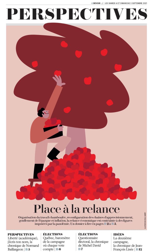
Le Devoir
I don’t see Le Devoir as often as the previous two. But I love the design. It is smart and refined. It looks European. Nice clean lines, often simple. Here are a few top-notch pages from them. I will show four of these off individually as none have appeared here or my Instagram, starting with my fave of their submissions.
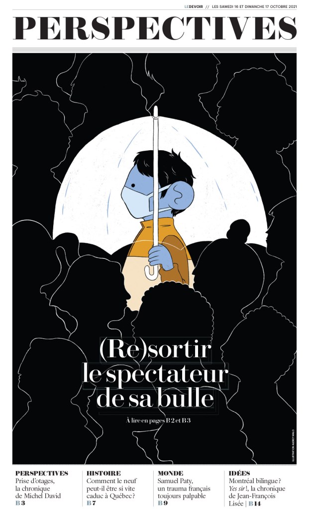
Le Devoir, Oct. 17, 2021
I love the contrast. The love the lines. The beautiful illustration by Audrey Malo. It is so clear where your eye is supposed to start, and clear that it’s not supposed to stop there. So well done.
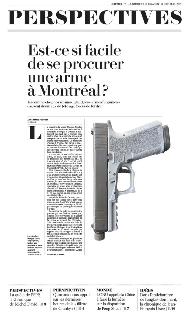
Le Devoir, Nov. 21, 2021
The one above and below are both driven by the design, not an illustration. A great illustration is great on its own. I can be enhanced if used well. But these are just nice designs, with a basic image, images that couldn’t be more different. And below, the little condiment spills take this page to a new level. Love it. Smartly filling in some white space, but also using what is left wisely.
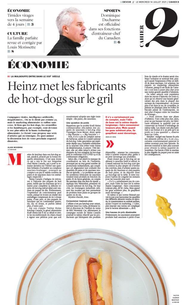
Le Devoir, July 14, 2021
Le Devoir, Sept. 5, 2021
And then an illustration-driven page. It’s a nice, simple illustration (for a talented illustrator! Who just happens to be Cécile Gariépy). And it’s used so well. The text doesn’t take away from the fantastic art. Nicely done, Le Devoir.
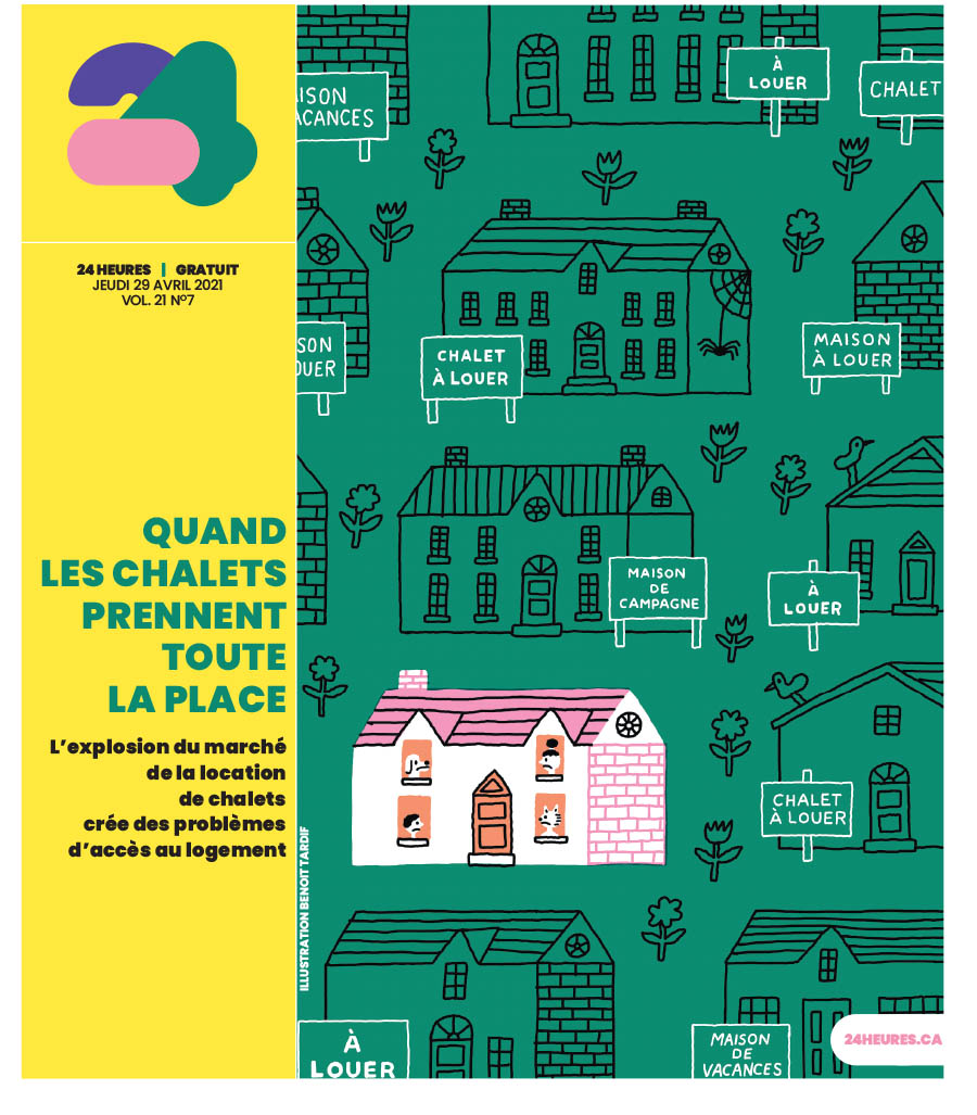
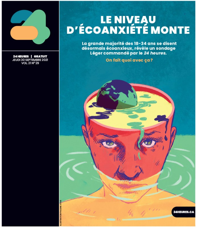
24 Heures
And finally a couple from 24 Heures. Both illustration driven. Smart art, well played, yet completely different illustration styles. Even the supporting material is played differently, with the head down the side on one, and on the art on the other. But it doesn’t take away from the art. It uses the space well. First by Benoit Tardif, next by Pauline Stive.
Just some incredible stuff. And this is just from Canada’s entries.
So that’s that. I am so happy to see there is still some amazing work going on in Canada, and around the world. Up next will be about some the best newspaper pages from around the world.
The Star Tribune has long been a great newspaper. One of the best, not only in terms of newspaper design, but as a news source for its audience. I feel like a bit of an authority because I was inspired by the Star Tribune when I was tasked with doing a full redesign of the Guelph Mercury way back in 2008. Two papers disproportionately were reflected in the final product: the Virginian-Pilot (once the best designed newspaper in the world IMHO) and the Star Tribune.
A funny thing about newspaper design though. For the most part, other than once a year at design competitions, which are becoming less and less common (thank you to the Society for News Design for keeping them alive), those who design newspaper pages are anonymous. Faceless and nameless, they are the part of team that executes, and often conceptualizes, the designs we see on newspaper front pages every day. Unlike reporters with bylines, or magazine designers, who often get named on the inside cover, we don’t know who did that design. You know, that design that took your breath away when you pulled the newspaper out of the bag that you picked up from your doorstep. Come on, it can’t be just me. That is why I do these designer spotlights. To get them the attention they deserve. So when, on a whim, I reached out to Stacie Kammerling, a designer from a newspaper I have the utmost respect for, I was hopeful, but you just never know. I hadn’t seen her work before reaching out. I have high design standards, and my own design biases as to what works, what’s cliché and what didn’t work.
Well … Mind. Blown. Stacie is a phenomenal talent. So for this post, I gambled and won. But if you’re reading this, you win, too. Stacie was kind enough to answer a pile of questions I sent her and to send me very thoughtful responses. I am grateful for that. And a funny thing happened on the way to this profile. I do this to get others the attention they deserve, those like Stacie. And what did she do? She thrust others into the spotlight I provided her. She is a true collaborator, and clearly someone who absorbs what others are saying. And now I turn it over to Stacie.
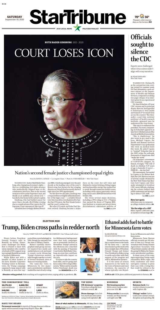
Star Tribune, Sept. 19, 2020
A Q & A with Stacie Kammerling, Star Tribune
Q: How did you get into newspaper design?
A: In a roundabout way, I actually fell into news design. As a teen I loved how art felt accessible to me through editorial illustration, so I applied to art school with dreams of working at a magazine. There were no illustration programs in Indiana that I knew of, so I chose a degree in art with a concentration in visual communication at Ball State University. As a first generation student, I liked the idea of a multidisciplinary program studying both fine art and graphic design. But a year into art school, I felt a bit disillusioned. Artists I knew hadn’t landed jobs post-graduation. I felt like the program wasn’t fully preparing students to build a path for a career. I was terrified of my future student loans and providing for myself to live on my own.
Design as a practice can be a lot of ego, and it’s very important to listen to what readers want beyond what you’ve always provided them.
Meanwhile, the independent school newspaper, the Ball State Daily News, was looking for staff. I really wanted more experience with editorial design, so I volunteered to work a few night shifts a week. I met so many creative, kind, and determined people. It opened my world to discovering journalism and expanded my idea of what information design could be. I really liked how collaborative the Unified Media Lab felt. Designers, reporters, graphic artists and photographers all shared techniques and ideas. I surprised myself by continuing, I often hated most pages I did. The quick deadlines were a huge stress. I was very hard on myself, though the process made me much more resilient as a designer and person.
I was very influenced by the 2016 U.S. election during my senior year as I was deciding on a path after college. I wanted to feel like I could contribute to truth-telling, fighting misinformation and even just the documentation of history that newspapers provide. Ryan Sparrow, who led the journalism graphics program and now works for USA today, was a huge influence in showing me future paths I could take via journalism. So I moved to the Villages, Florida for my first job as a production editor at the retirement community’s newspaper. I learned so much about not just newspaper design, but celebrating community, how to edit down information and headlines to get at the core of a topic, and how important it is to be part of and understand your readership. Design as a practice can be a lot of ego, and it’s very important to listen to what readers want beyond what you’ve always provided them.
What do you like about newspaper design? What makes it different from other design?
I really like that newspaper design is first and foremost focused on the reader. It’s a service for disseminating information and giving readers not only access to information, but curating it so they can clearly see what matters and why they should care.
There is still a big push for innovation, surprise and alternative storytelling within newspaper design, despite dwindling print opportunities for designers. Choosing a career in print news design in this decade is scary. But the bar has never been higher for how we can take care of presenting information for the people who prefer it, cherish it and truly look forward to their paper. I like knowing the audience truly deeply cares about every page we make, even if the form is often temporary. When it’s not temporary, as in for historic and special occasions, the paper is even more special to me as a document of history.
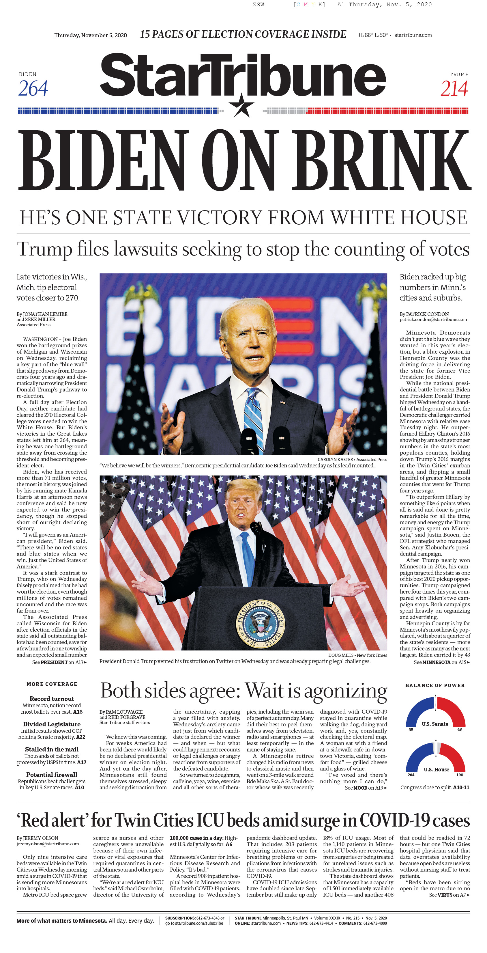
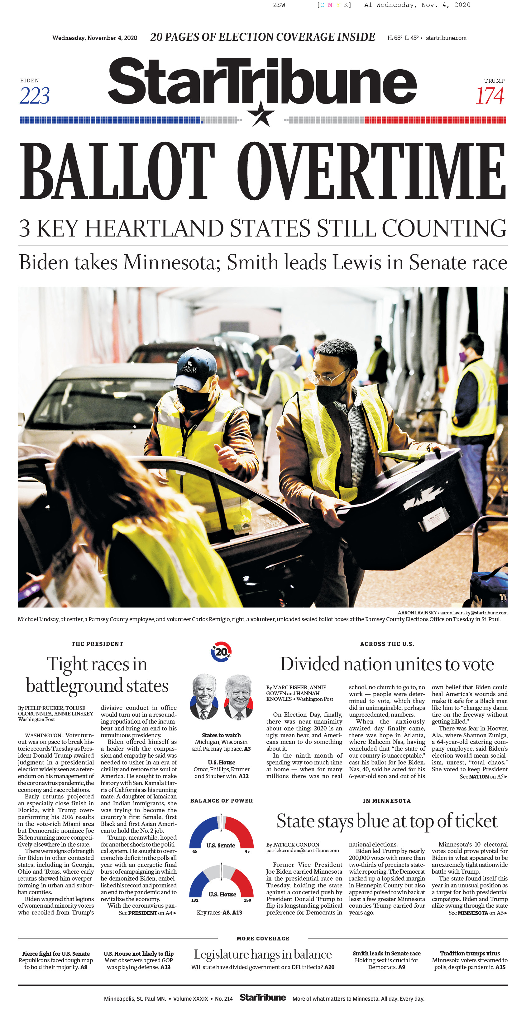
Star Tribune, Nov. 4 and 5, 2020
To me news design differs from most other forms of design in that it is very utilitarian. There is a (mostly) clear ethical pact that separates visual journalists from other designers. Knowing there are distinct standards to publication and storytelling make it a more trustworthy institution as both a designer and reader. And an inspiring one as journalists analyze the way we’ve always done things and how we can change century-old institutions to make our processes more equitable, accessible and useful as the world becomes rightfully more so.
Another thing I’ve found comforting and inspiring is how many nontraditional paths lead to the same place. A majority of my colleagues at the Star Tribune didn’t study newspaper design or reporting specifically, we bring our wide and varied backgrounds to a job where we learn and grow as we go. A great majority of what I have learned has been on the job. I didn’t have a news or editorial internship before graduating college, so being taken under the wing of many has been extremely formative and I am forever grateful to them. The culture of protecting and helping one another in such a cutthroat industry is invaluable.
What was the most fun you have had with a design?
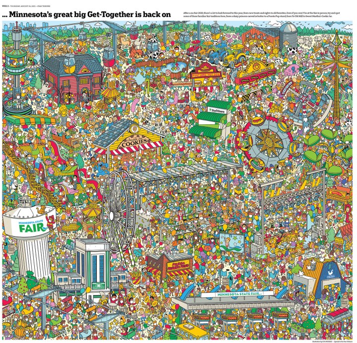
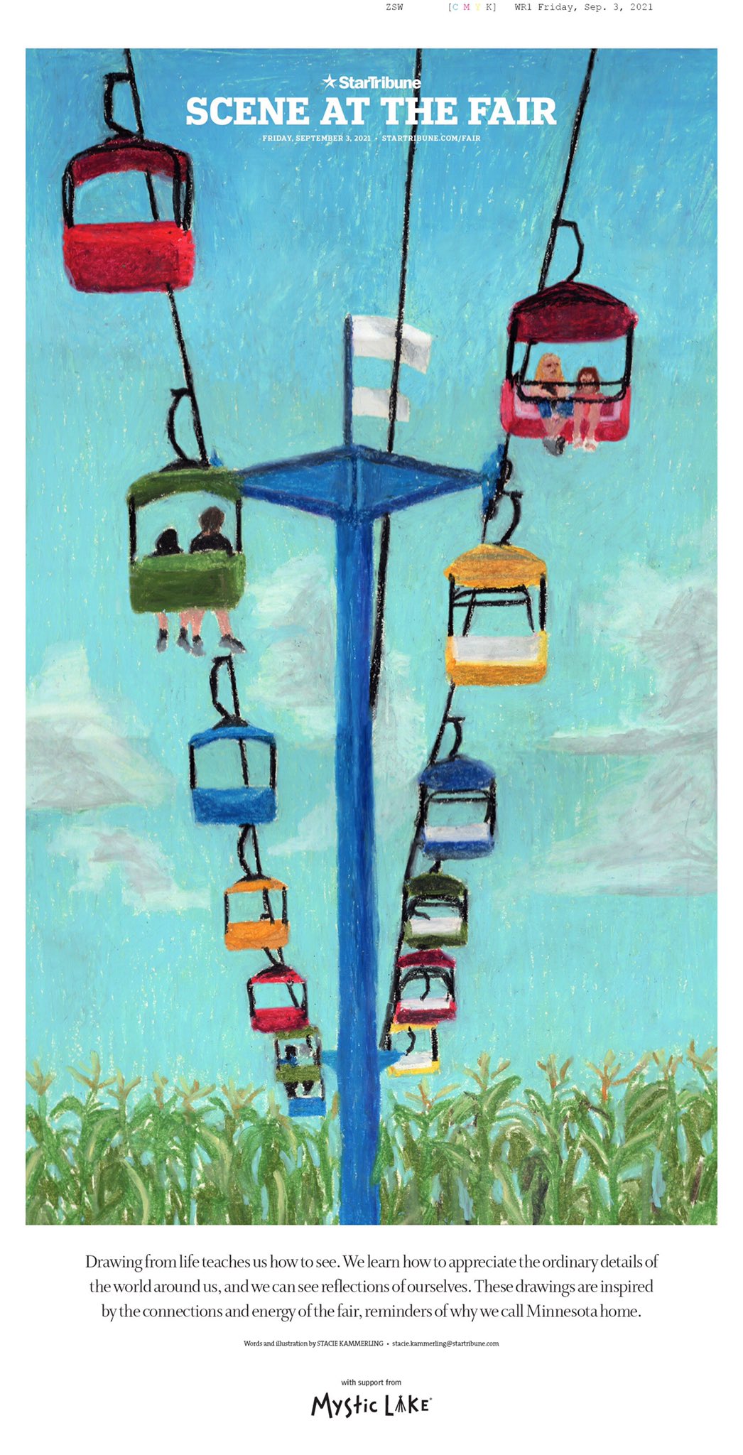
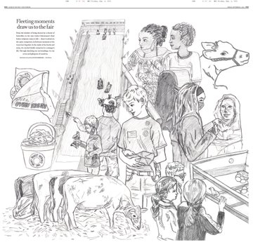
In August 2021 I got to conceptualize and design a special section for the Minnesota State Fair. The 10-day fair is a huge deal in Minnesota and the upper Midwest. I wanted to illustrate live scenes from the fair, so I spent a couple days drawing all around the fairgrounds. It was a bit stressful and overwhelming at first, but the quick nature of life drawing soon felt like the quick and precise process I do designing a new front page every day.
After sketching I scanned drawings onto a big inside spread and arranged them. For the cover, I did a much longer drawing using oil pastels. I wrote a bit about my experience and what it means to truly stop and see the world around us. It was an honour to be able to share something vulnerable like that with readers, especially at an event many deeply care about.
Star Tribune, Sept. 3, 2021
Do you rely on one design principle more than others (white space, text as design, colour, cutouts, etc.)?
I most often work on “hard” news and the front page, so my daily job involves honing in on the cleanest, easiest to digest designs as possible. As well as communication across departments so that we can all get a bit of what we need. I would say the one design principle I rely on most often is “the grid.” Especially building modular grids that can easily adjust as stories and news changes. The style at the Star Tribune is very clean and compact, while also giving room for large photography and informational breakouts. So finding ways to best tell stories that feel manageable for the reader is my biggest challenge day to day.
Tell me about a design idea you loved that was rejected or just wasn’t working so you had to abandon it.
It’s really hard for me to think of one! My editors have always been supportive of my creativity and ideas, often pushing them to make them stronger. I’m super grateful for the trust and guidance I’ve been given, especially as a young designer still learning more every day. For the front page, which I’m most often found designing, tweaks to my drafts are much more common. It can be frustrating at times. I find ways to compromise a lot — not the sense of giving in — but finding ways to align all of our interests in the newsroom.
The Star Tribune was one of the papers that inspired me while redesigning the Guelph Mercury. Do you have newspapers that inspire you from a design standpoint?
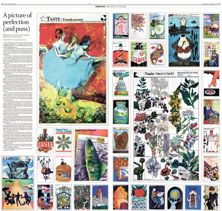
The Star Tribune has such a rich history and has been an inspiration for me too! I’ve especially loved exploring old covers and special projects, such as the huge artful poster covers from our Taste cover archive during its 50th anniversary in 2019.
Star Tribune, Oct. 3, 2019
I was very inspired by the unique voice and ethos of the Villages Daily Sun before working there from 2017-2018. In college I was very inspired by the intersection of art and journalism in Matt Haney’s work at the Omaha World Herald and Martin Gee’s work at Time magazine. I loved seeing how designers could be a vital part to telling a story, not just putting words and pictures on a page. The ability to bring their expertise in art and typography to the table really elevated and showcased journalism in a fun and surprising way. Print publications that give the space for visuals to shine create a more dynamic and interesting story, in my opinion.
Time Magazine, Martin Gee
On that, can you think of any designs that blew you away, at your paper or elsewhere? Anything that stands out?
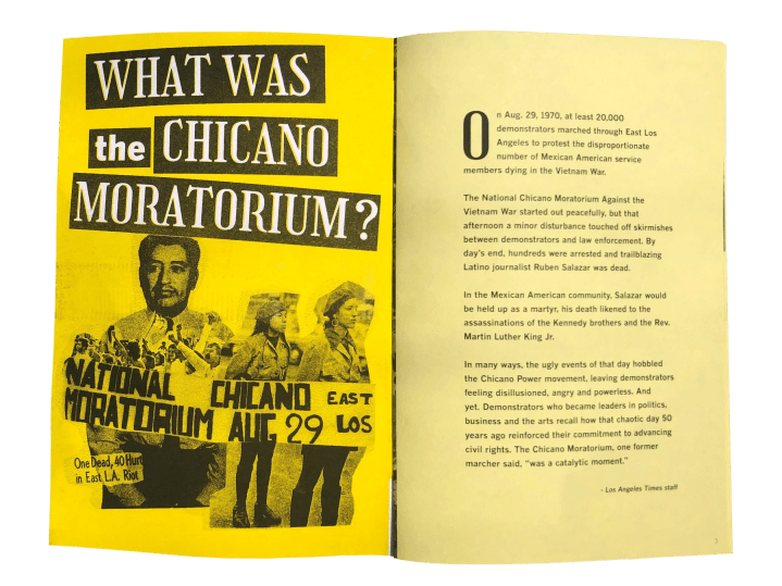
I think the things that blow me away the most aren’t necessarily page designs, but unexpected interactive work that extends into the local community, both telling their stories and inviting them to participate. I loved Martina Ibáñez-Baldor’s work on the Chicano Moratorium project (especially the zine) for the L.A. Times.
Los Angeles Times, August 2020
The most inspiring things for me involve physicality, bringing handmade touches to the print product. I’m still learning what draws me to it. I think seeing the influence and texture of hand-crafted art transports me into a story more than digital art can at times. I believe allowing the design to be as clean and simple as possible to let art and photography shine can make a huge impact. And highlight what the reader really needs to make meaning of a story.
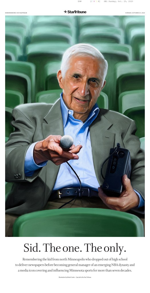
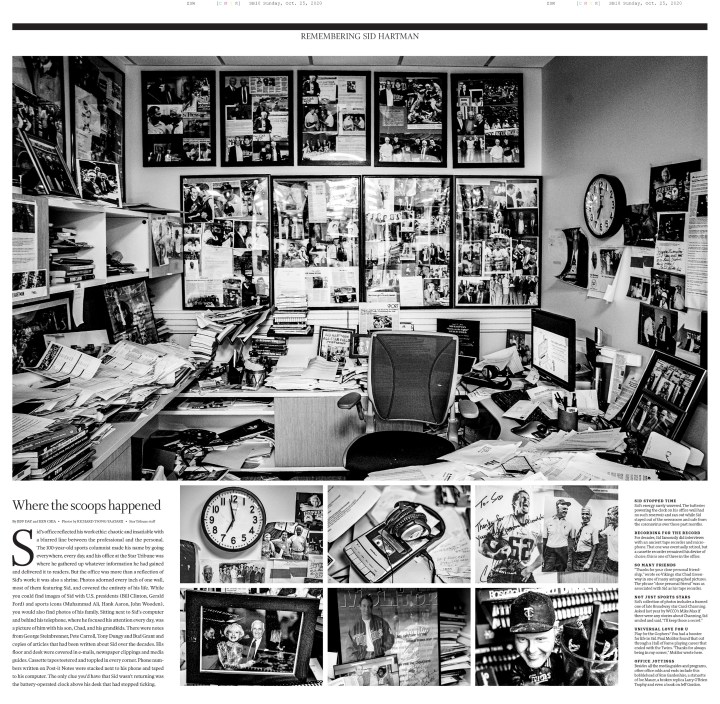
After the death of Sid Hartman, the Star Tribune’s sports writer and columnist of 75 years, design director Greg Mees designed a beautiful special section to honor him and share his story, office and memories from friends and family. It was so touching and the oil painting commissioned for the cover really blew me away. (EDS note: I saw this page at last year’s Society for News Design awards, and it absolutely blew me away as well. Greg Mees, on top of being a super kind dude, is also a world-class designer. And btw, the next instalment of the awards are coming soon and I couldn’t be more excited!)
Q: Why do you think newspaper design still matters?
I think newspaper design still matters because of the distinct need for informational direction and credible service-based and solutions journalism. There’s so much news happening and a daily snapshot of the state of the world is important for breaking information down into something digestible. What do we need to know about what’s happening in our communities right now? How can we help support a cause, business or person? Beyond following the processes newspapers have always held, I believe conversations about what the future looks like is vital. How are we reaching people where they are, asking what matters to readers and including them in not only the product but the process?
While this is often a nameless, faceless job, it’s a huge part of the newsmaking process, as anyone reading this blog knows. It’s not just throwing things on a page, but allowing space for stories that need it, being flexible, even encouraging edit after edit to ensure a journalist’s work is displayed in the best light possible. The way we design something can shape the way readers see and understand important stories.
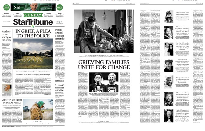
Star Tribune, Oct. 25, 2020
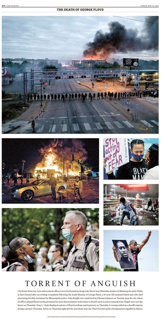
Star Tribune, May 31, 2020
Q: How often do you get to conceptualize big ideas? I know bigger papers often have a team. What’s the process like for you there?
While much of my work is started and finished in a matter of hours for the next day’s paper, I also work on larger projects every other month or so. Collaboration is still an important part of the process, which I really enjoy.
After reading a brief about the story, or sometimes the story itself, I talk to the photo team to see what they have in mind, or more frequently for larger projects, work on creating art myself. Talking to the graphics team and editor of the section are also important steps in the process of gathering all the pieces. Booking out the stories and art is another early step that can take quite some time to visualize the best way to present a longer narrative. Here is one of the larger projects I worked on about how businesses were still waiting for aid and struggling to stay open one year after the 2020 unrest in Minneapolis.
Q: It might be like picking favourite family members, but if you had to pick a few favourite pages, what would they be and why?
My bread and butter has really been designing front pages for breaking news. I am most often drafting ideas in minutes. It can feel hard to feel ownership over these things, it’s entirely collaborative and often happens so quickly it’s hard to take a step back. And since coming into the newspaper world in 2017, many many nights have looked like that. While I am proud of and live in those high-speed moments, I am most proud of pages where I can put a little more time into, including ones that I can show a bit of myself and the art I love to make.
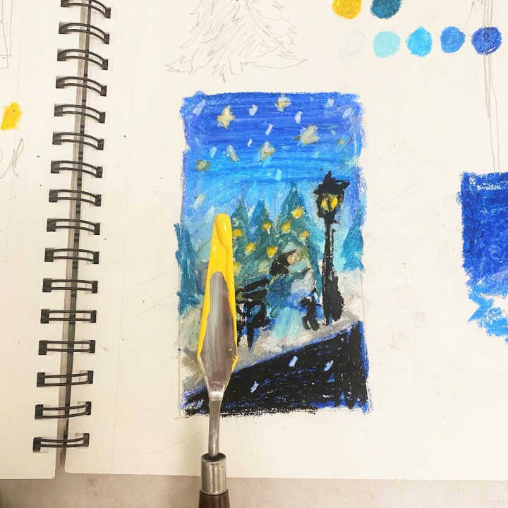
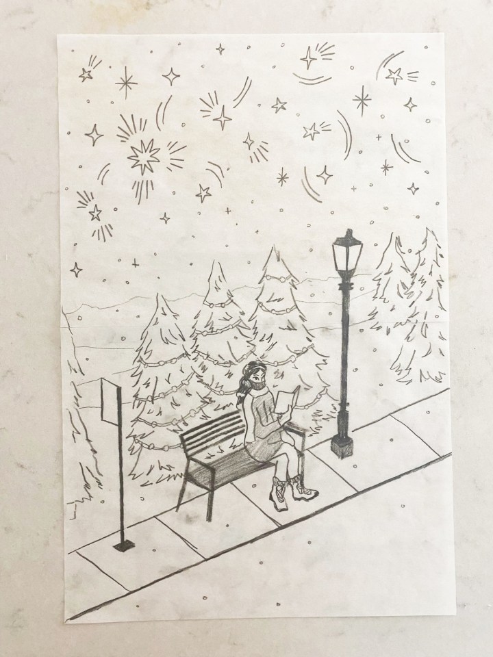
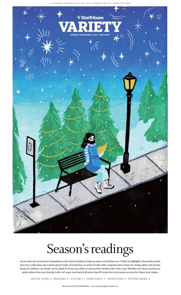
HOLIDAY BOOKS
In December I created a seven-layer linocut print for the annual Holiday Books gift guide. This was a huge undertaking as the biggest print I have created as a printmaker, as well as pretty complex with many colors. In my art practice, I carve each linoleum or rubber block by hand, layer by layer. So every colour is a different layer. I often work on one-coloor prints, but wanted to really play with colour to capture the mood I had in mind.
Our holiday books guide always features a winter scene. I was inspired by snowy downtown Minneapolis, a place I walk often. I liked the idea of a person reading at a bus stop, finding beauty in the liminal space between where they came from and where they’re going.
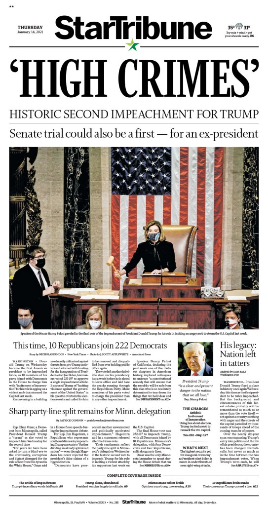
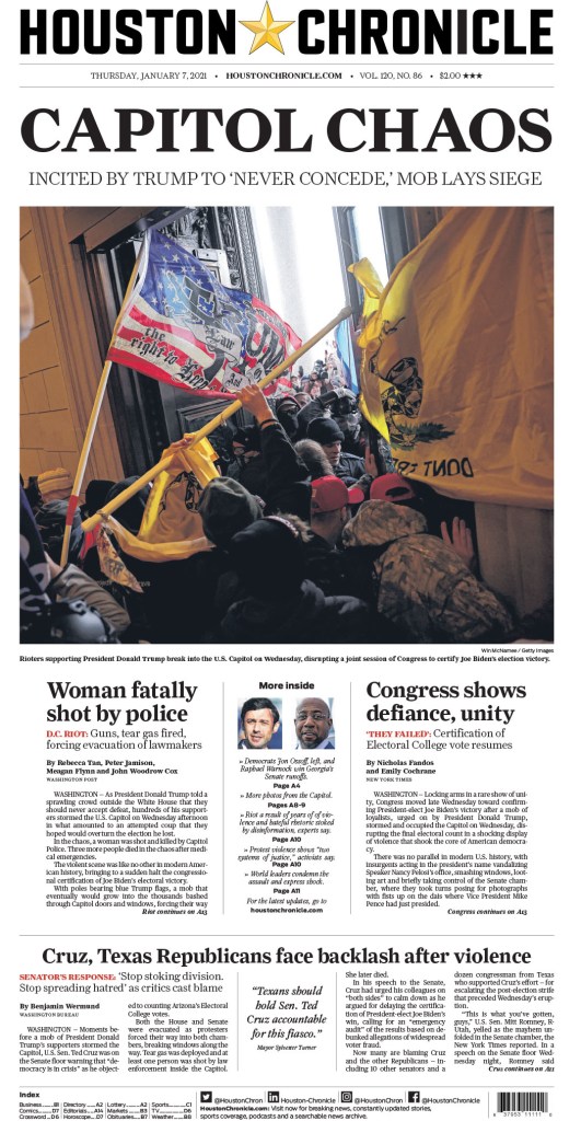
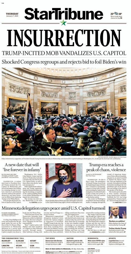
INSURRECTION
Last January I drafted our front page for the Capitol Insurrection around 4 p.m. and followed that through the night as more photography and reactions came through. It was astonishing to witness and I’m proud of where we landed with striking imagery and language on a tight deadline. The challenge of this night was developing our voice on the situation as it was happening. How do we make sure we’re being accurate in describing what happened? Fair and objective on a fraught political topic? Being in a large newsroom we have a 1A planning editor and several other editors that really dig into this, which is immensely helpful for me as I work with them and make the rest of the paper.
Star Tribune, Jan. 7, 2021
TURKEY COLOURING
For our Thanksgiving paper I was asked to create the turkey for our annual kids colouring contest. This was the first block print I’ve made for work, which felt like a special moment to me personally. It can feel intimidating to fully throw myself into an art that isn’t often featured in print anymore, especially with the pressure to work digitally. It’s slow, arduous and easy to mess up. But I think the nature of the material creates unexpected marks and surprises that bring something special I couldn’t create otherwise.
Star Tribune, Nov. 25, 2021
Thank you, Stacie!
Putting this post together was a joy. It’s great to see so much passion and thought put into print designs. And it’s inspiring to see how much credit she shares around. The Star Tribune sounds like an amazing place to work. An incredible cast, a real team.
Another thing that struck me is that Stacie handles both hard news pages and also produces art for feature sections. That is multitalented. Her art is stunning, and solid news pages often don’t get the love they deserve. But Stacie’s are very well done. Solid and clean and strong.
Thank you, Stacie, for participating. If any other print designers want their work featured, reach out to me here or at bradneedham@gmail.com.
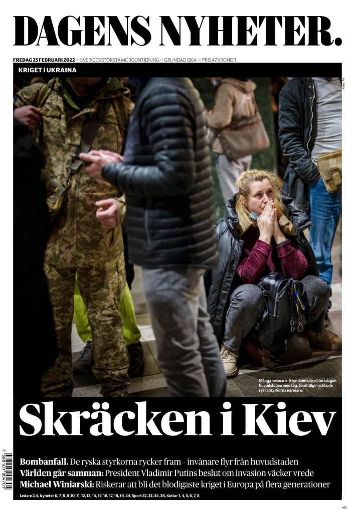
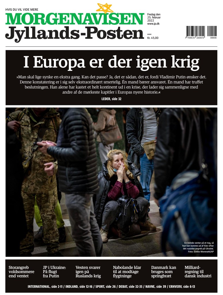
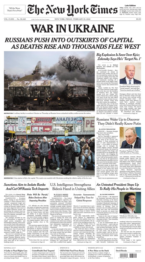
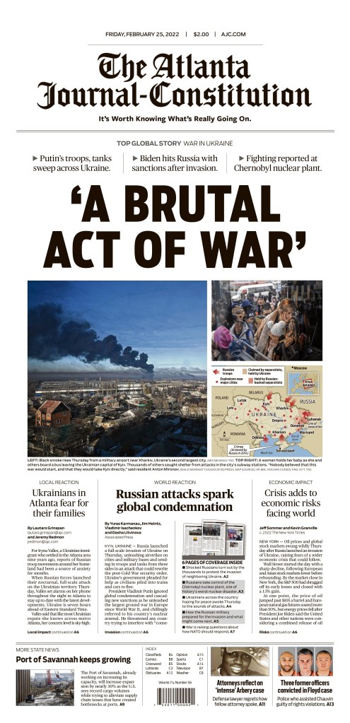
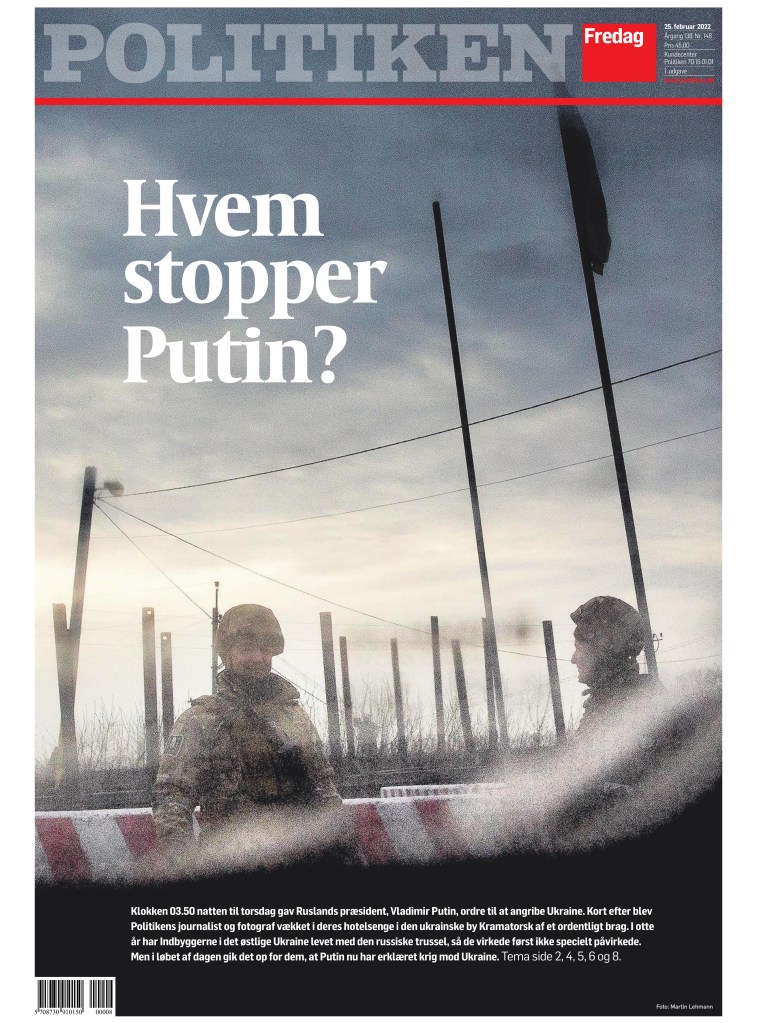
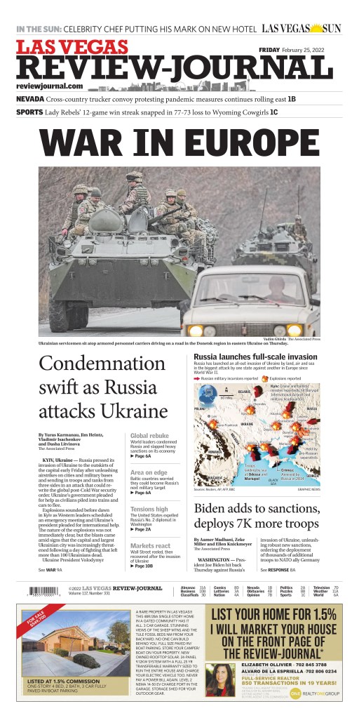
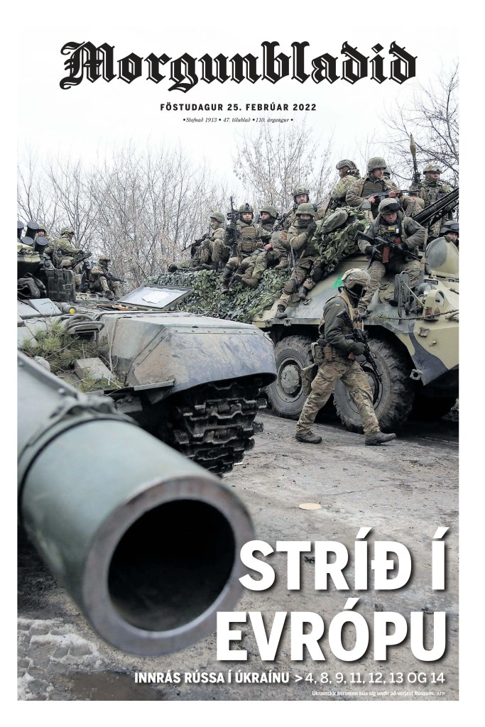
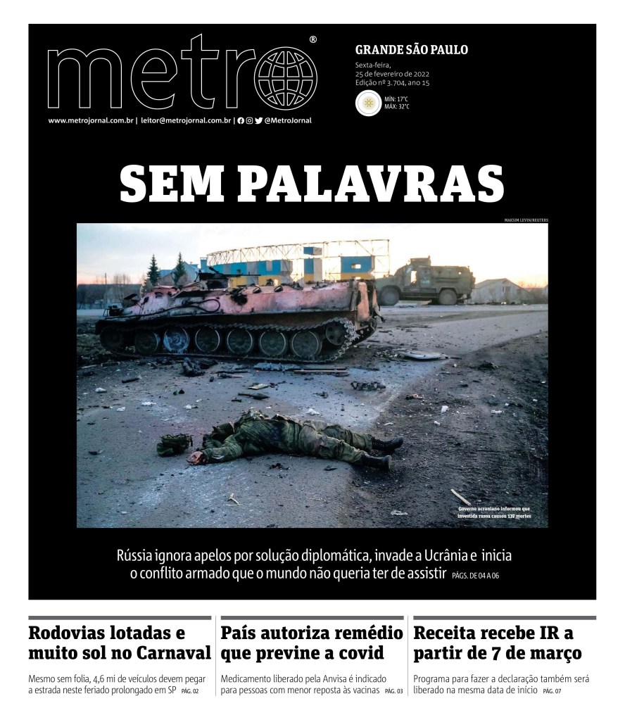
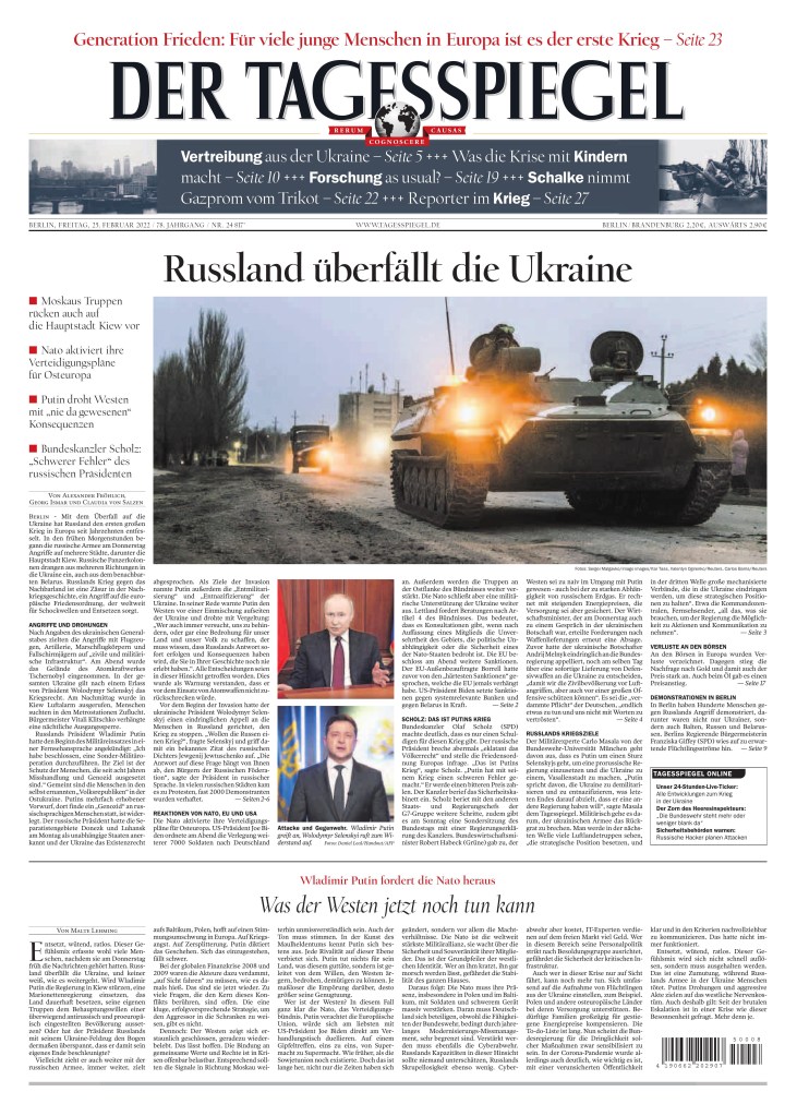
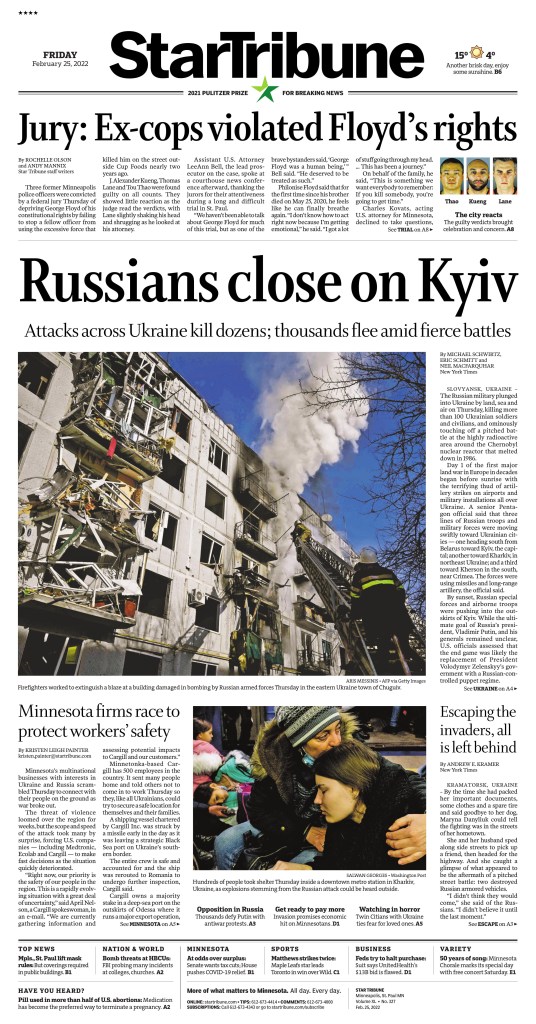
As Russia’s brutal invasion of Ukraine entered its first full day, we got to see how newspapers around the world displayed to their readers what was happening. Big, powerful photos (three stood out as the most commonly used) big, bold, powerful headlines. When events like this happen (though there hasn’t been an equivalent to this in a long time) we see a lot of similar ideas. We also see the power of newspapers.
Below is a selection of powerful newspaper front pages. I have chosen the ones that almost made me gasp. The power of print will never be lost on me, especially in times of crisis.
Newspapers in Canada
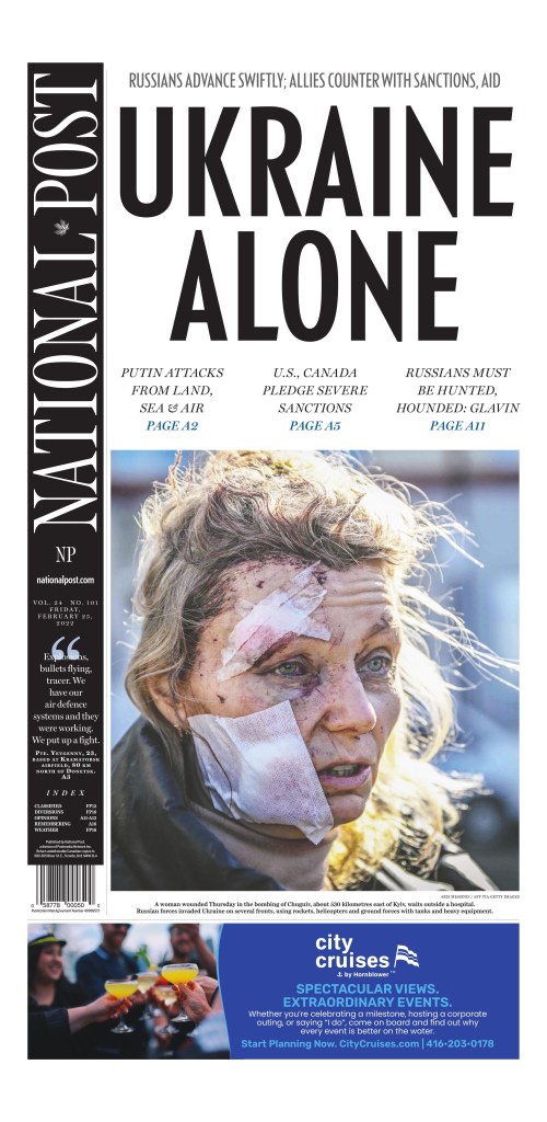
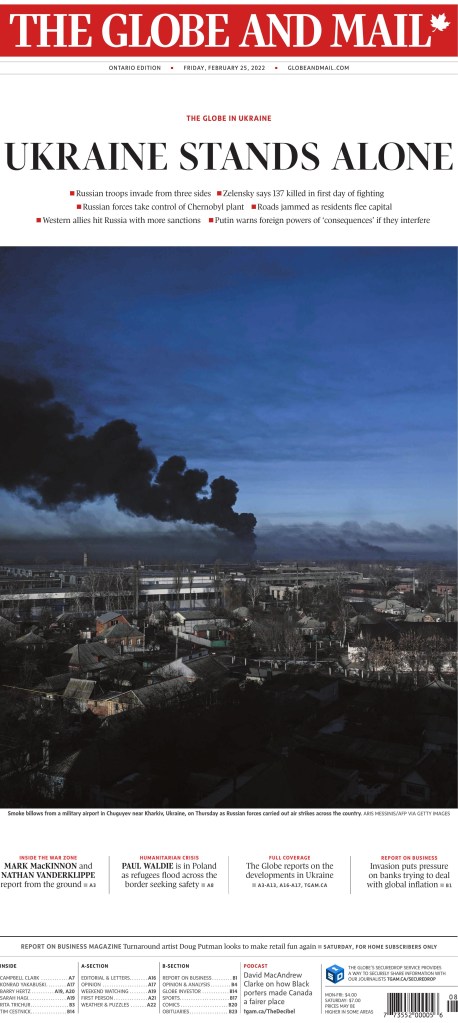
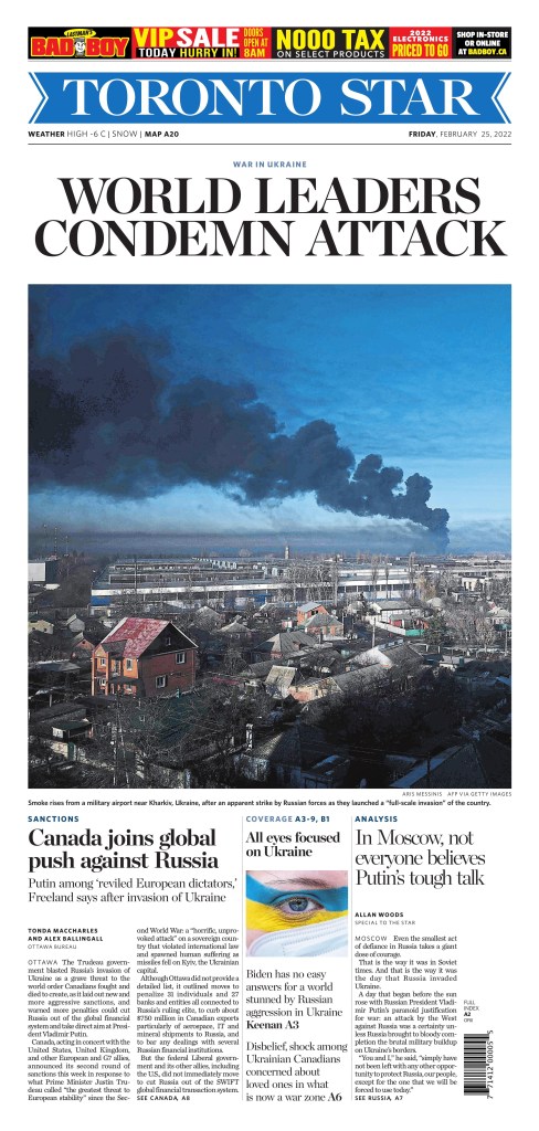
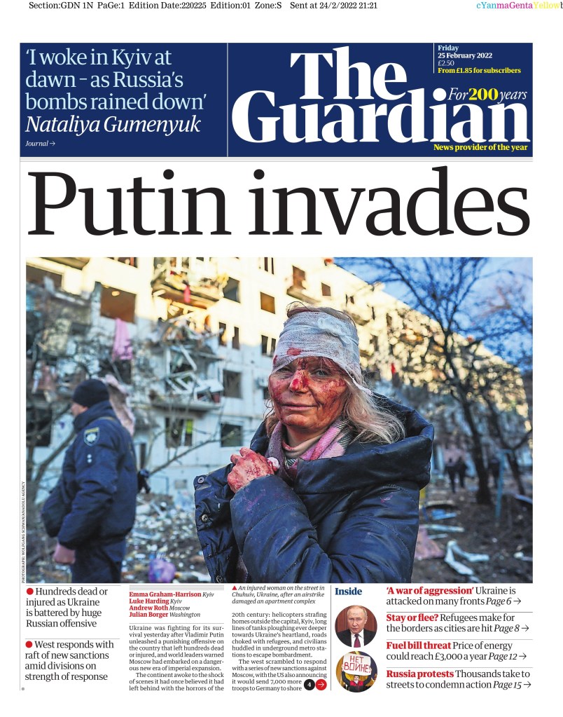
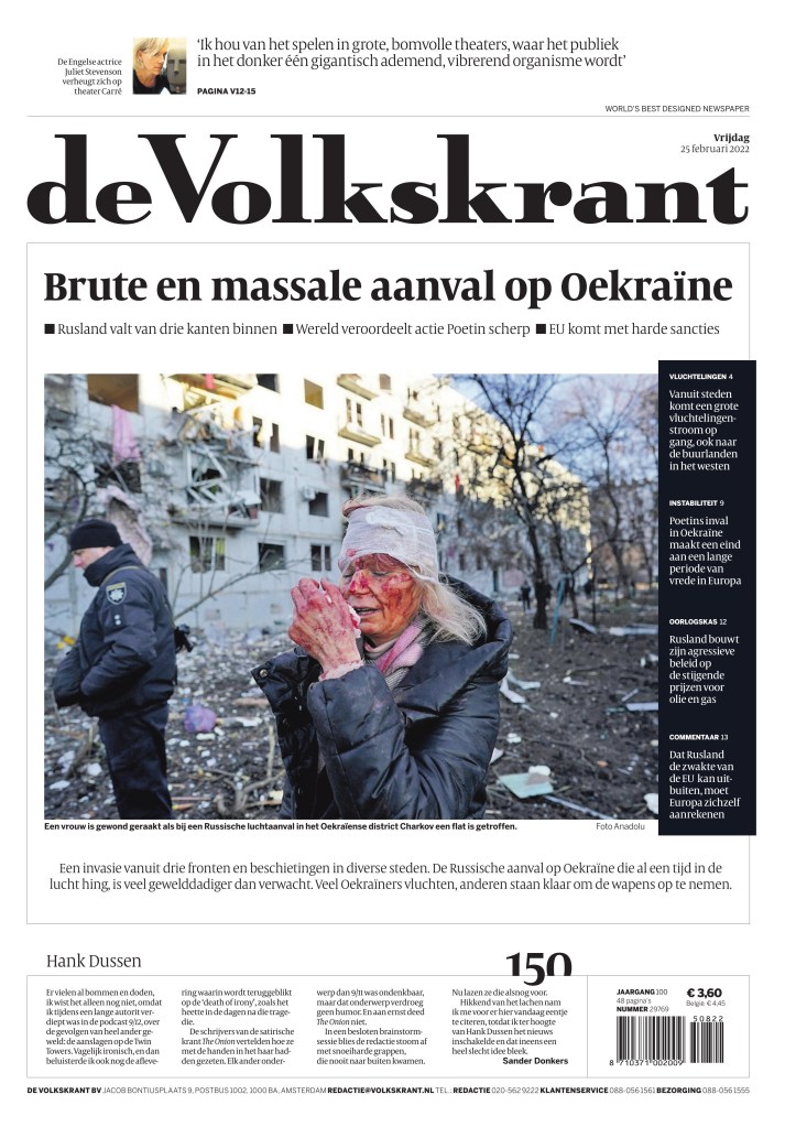
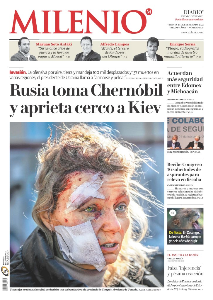
The photo used by National Post was seen on papers throughout the world and there are more that use it below. The Toronto Star and Globe and Mail used the same photo and the Globe and National Post used nearly the same headline, about Ukraine standing alone.
National Post, Feb. 25, 2022
Globe and Mail, Feb. 25, 2022
Toronto Star, Feb. 25, 2022
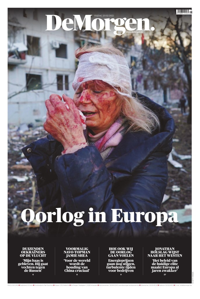
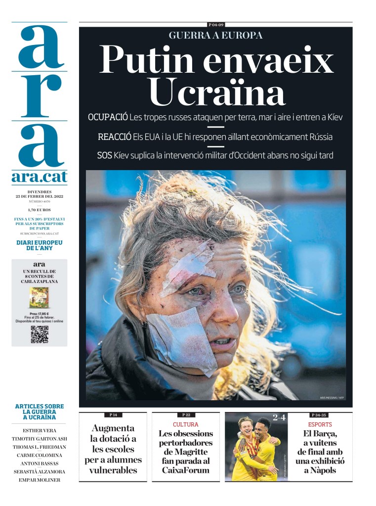
The faces of war
When war strikes, we see the casualties on front pages. The injured. The common person. Sometimes the dead. This woman was on papers all over the world, either this pic or a similar one, as seen on the National Post cover, and below. As the woman further down was also common on a lot of pages. This is what war looks like.
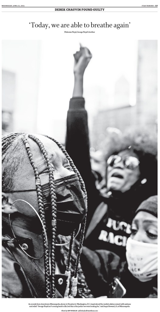
It was a big news day in Minneapolis as news also came out about the George Floyd case, another story that has caught the world’s attention over the past nearly two years. The editors had to balance a huge local story with the biggest international story.
Star Tribune, Feb. 25, 2022 (Minneapolis, Minn.)
Sadly I am sure there will be many more pages like this over the coming days and weeks. War is brutal. War is ugly. Hopefully newspapers around the world can help hold Russia to account. To show the world, to capture for history, the brutality of this unnecessary war.
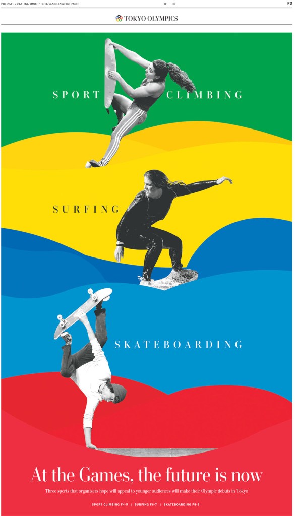
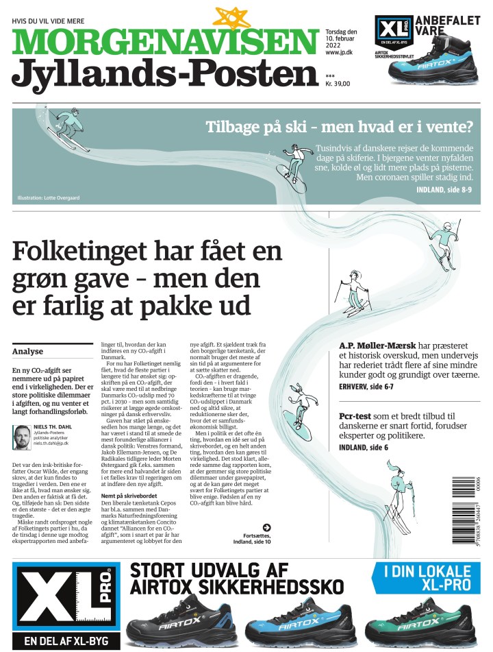
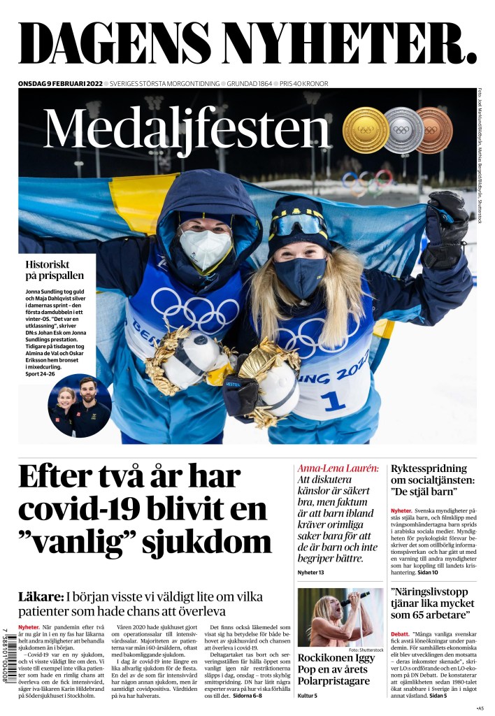
During the Summer Olympics in Tokyo, I was so excited to check the front page designs of newspapers around the world to see what they had done. They didn’t disappoint. There were so many great front pages every day, despite Japan being a world away in terms of time zones for many newspapers. But even newspapers in North America had big splashes frequently. And thanks to COVID, we got to do it again months rather than years later with Beijing.
And this time I was asked to be part of the Olympic team at Postmedia (for a brief period after Ben Johnson won the 100-metre gold I was determined to make the Olympics, and for the record I’m pretty damn fast). I was in charge of co-ordinating the print coverage for Postmedia’s many newspapers, primarily the Ottawa Citizen, Montreal Gazette, Calgary Herald, Edmonton Journal, Vancouver Sun, Windsor Star, Regina Leader Post and the Sasktatoon Star Phoenix. Not for front pages, but the sports sections.
As I started watching front pages this year, I was disappointed. A friend asked if it seemed like coverage was lacking for this Olympics. I thought it was a matter of time. But it never came to be. Likely for several reasons — the time zone, the busier news season, particularly in Canada with the occupation of Ottawa, and the news around the always looming invasion of Ukraine, and likely politics. With the Games in China I wouldn’t be at all surprised if media organizations around the world made the decision to give less play to these Games. They lived online and in sports sections around the world. Front page real estate was as hot as the Brampton housing market.
There were a few front page splashes, but not many. So I will indulge myself. I will show a few of the nice front pages from the Games from around the world, but also show some of the pages I did that I was proud of. I am going to let the pages mostly speak for themselves.
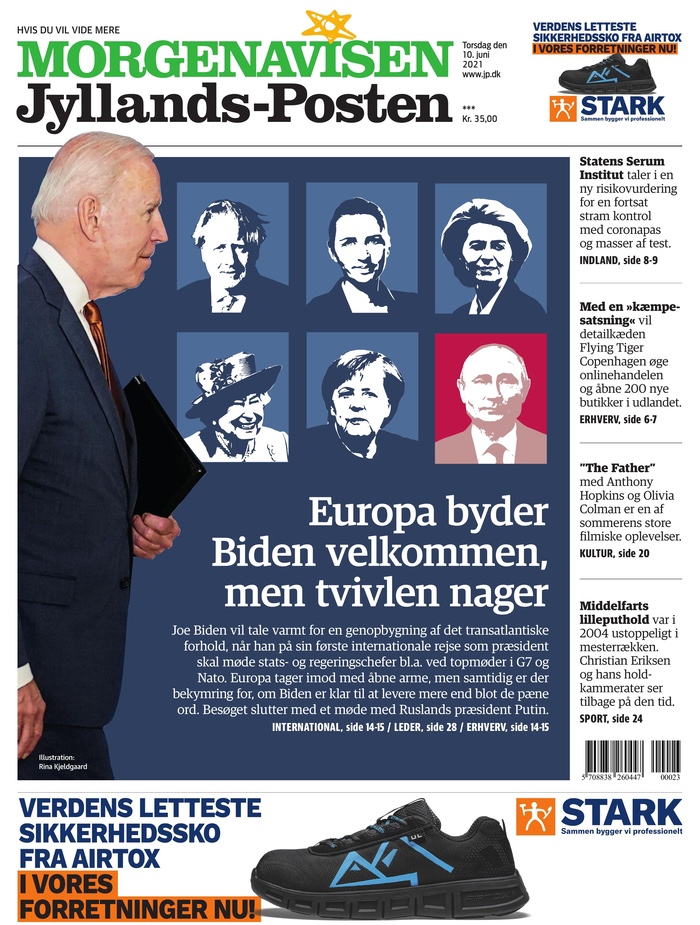
Jyllands Posten, Feb. 10, 2022
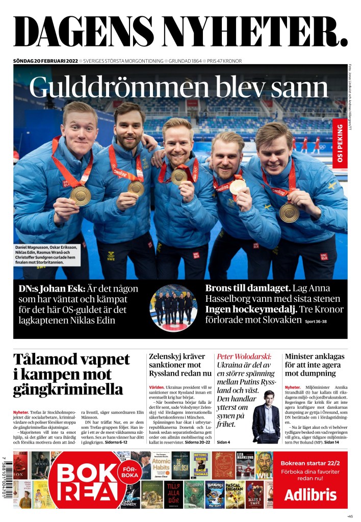
Dagens Nyheter, Feb. 9, 2022
Dagens Nyheter, Feb. 20, 2022
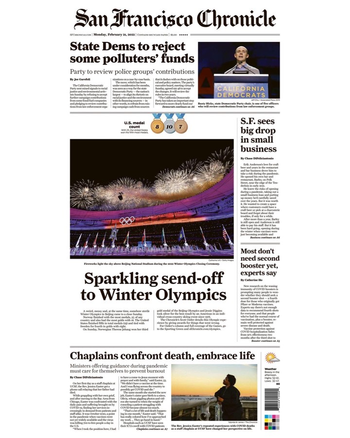
San Francisco Chronicle, Feb. 21, 2022
And me!
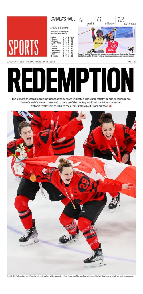
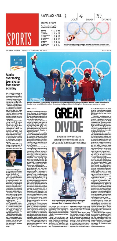
There is nothing overly fancy about any of these pages. I just wanted to be simple and clean, but fun. I am happy with how they turned out. With each, I had to design in such a way that if there is a banner ad, the page can be easily adjusted and still work. The exception being the first below, celebrating the Canadian women’s hockey gold medal win, for which I did two totally separate designs.
Vancouver Sun, Feb. 18, 2022
Calgary Herald, Feb. 15, 2022
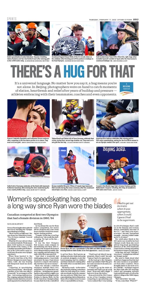
While I was looking through the photos, I started to see a lot of people hugging, some happy, some sad. I thought, who doesn’t love hugs? And with all the reasons to not like the Olympics this time around, primarily due to their location, in a country known for human rights abuses, there were these athletes. They were overjoyed, and they were crushed. But there were hugs. Lots of hugs. This is a very small selection of the amazing photos, captured by professional photographers from around the world.
Ottawa Citizen, Feb. 17, 2022
Edmonton Journal, Feb. 5, 2022
Hopefully the next Olympics will offer more, like the previous one did. So unlike the Summer Games, I won’t award medals for the top papers. Though I will say Dagens Nyheter was one of the most consistent. Until next time.
Another week, another batch of nice newspaper front page designs. Showing my Canadian bias I will start with Canada! As always the best pages tend to fall in Saturdays and last week was no exception. The nicest page of the week goes to the Toronto Star this time.
Toronto Star
Toronto Star, Jan. 29
I am a sucker for white space it’s well done. This almost beefed on too much but not quite. On top of that it point to an important piece of journalism.
The News Journal Wilmington, Delaware
The News Journal, Jan. 28
I love this page. Well-played stock art and creatively conceptualized. Again well used white space. Nice headline that works with the photo.
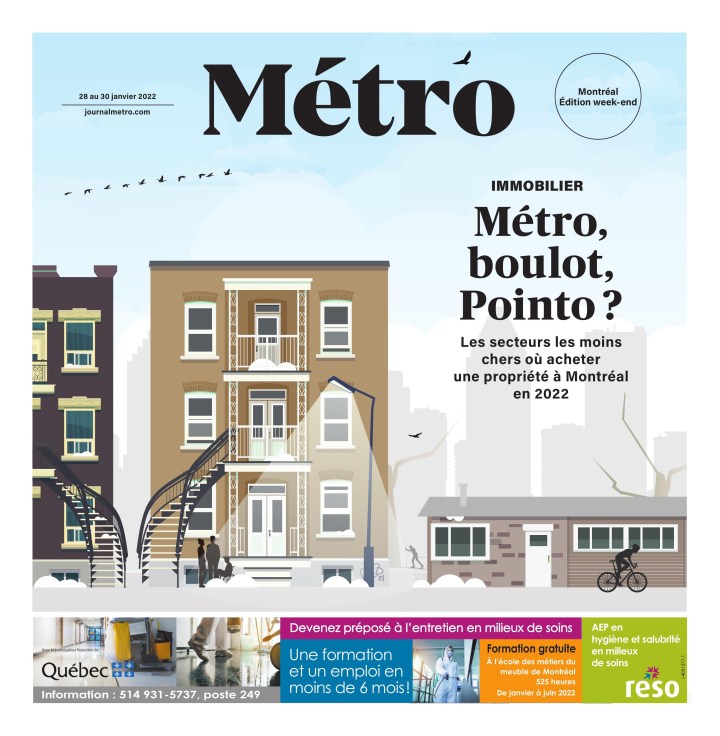
Metro Montreal
Metro often has beautiful pages like this one. It’s just a pretty and smart illustration. They use the small space well.
Metro, Jan. 28-30
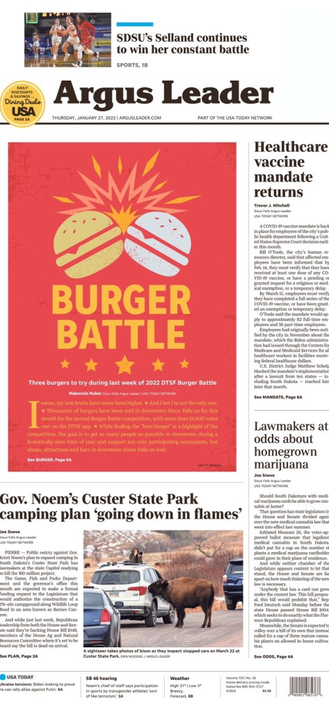
Argus Leader Sioux Falls, South Dakota
Argus Leader, Jan. 27
Burgers! A nice break from war, anti-vaccine protests, Donald Trump (had to know he’d be back). This centrepiece is just fun. Not just. It’s also well executed. Nice colours (just enough to be contrasty enough), the clashing, the stars. I
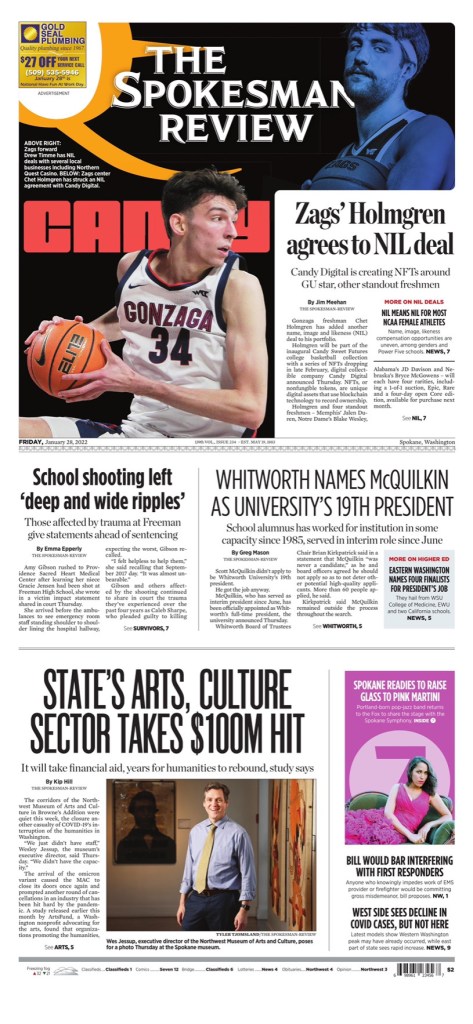
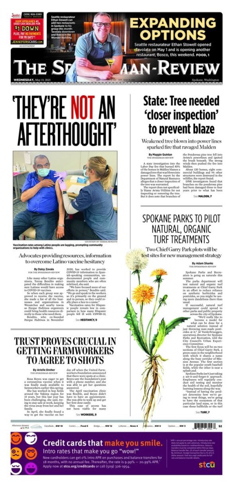
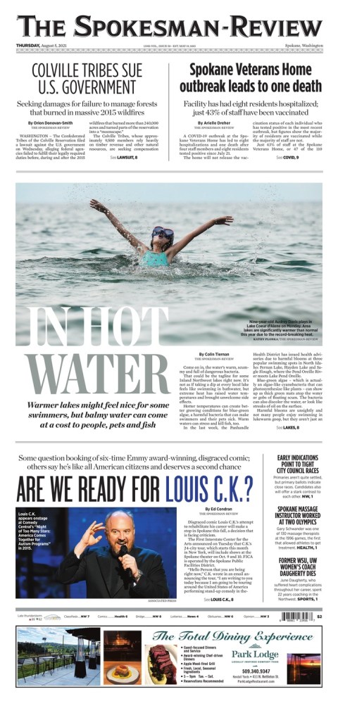
The Spokesman Review, Spokane, Wash.
There were a couple from the Spokesman Review I liked last week. No surprise. You’ll probably find at least one every week. Their pages just speak to me. It’s my kind of design. But I will highlight the flag on this one, as that is what makes this page stand out.
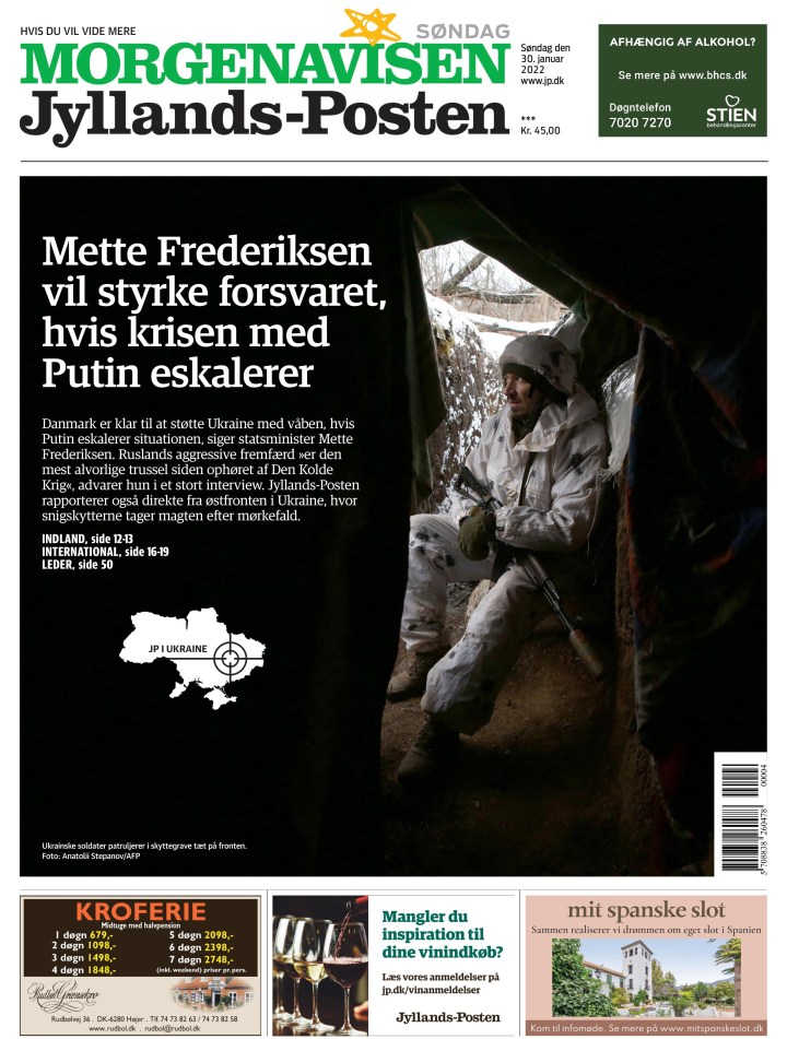
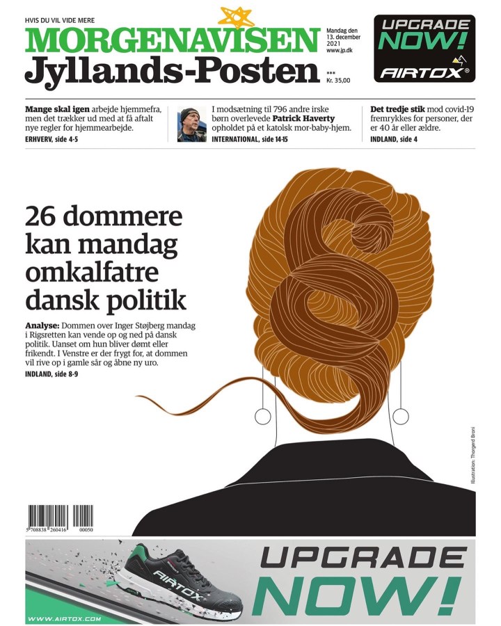
Jyllands-Posten Denmark
Jyllands-Posten, Jan. 30.
I like the black, the contrast. It’s a simple page with limited content. Nicely played where the words on the picture don’t take away from it, but complement it.
That’s all! Watch for more great pages next week. Want to submit a page? Reach out.
Old news? Booooooring! Old newspaper designs? Exciting! If you disagree, you’re in the wrong place. Beside my desk, on a special table dedicated to newspaper design, sits a handful of Society for News Design Best of Newspaper Design books (as well as some awards and the National Geographic from June 1985, featuring the young Afghan girl with the piercing eyes). I still look through the SND books, and am amazed by how the newspaper design has held up years later. So when I thought about posting newspaper pages from the previous week, I though certainly those would hold up!
Most days there is a newspaper front page or two that stands out. Maybe it will never be award winning (recognition for newspaper design is becoming an endangered species), but there are pages worthy of attention for the effort and creativity put in. I look through more than 500 pages every day. Some days nothing catches my eye. But that’s why it’s worthy of attention when something does.
So, life permitting, I’m hoping to post a few of my fave newspaper designs from the week prior. I post daily on my Instagram. I will generally choose from the pages I posted there, though there are occasionally pages I don’t get around to posting.
These short posts will be driven by the pages not my words, unlike the babbling above! But I had to set it up somehow. Don’t judge me.
Here are a few from last week.
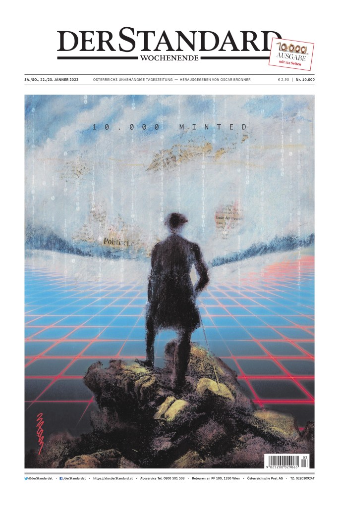
Der Standard Austria
Der Standard, Jan. 23, 2022
I made no secret in twitter and my instagram that I loved this page. It is not lost in me that it is completely driven by the art, which I find stunning and so smart. Print and digital together. Newspapers barely visible through the sky. and it is to celebrate the 10,000th print edition. How many more will there be? Is that what this hints at? The demise of print or how print and digital will work together for a common goal?
The art is being auctioned off as an NFT (non-fungible token).
Die Titelseite der 10.000sten Ausgabe des STANDARD ziert das Bild "Meta Citizen" des Künstlerduos 3893. Es kann als NFT bei @ArtcareAt ersteigert werden. Der Erlös kommt Studierenden der Akademie der bildenden Künste in Notsituationen zugute. Mehr hier: https://t.co/QxS2EloJDNpic.twitter.com/e3JIEPw7e1
A nice Saturday page by the Toronto Star. It’s likely every weekly roundup will feature at least one page from a Saturday publication of Canada’s big three
Monopoly houses are nothing new in design. I’ve done it. And I almost did that t another time before creating one of my favourite pages, pivoted below, before taking another approach. But in this page the for sale signs make add that extra touch.
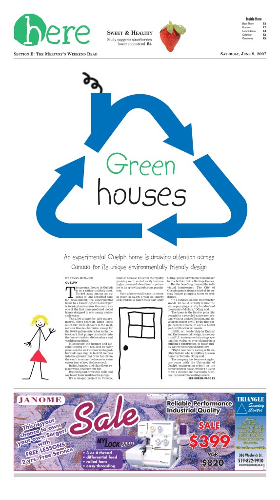
Guelph Mercury, June 9, 2007
This was mine. I thought the design was begging for a green monopoly house, given the headline. But I took a different path. If you can believe it I did the art myself.
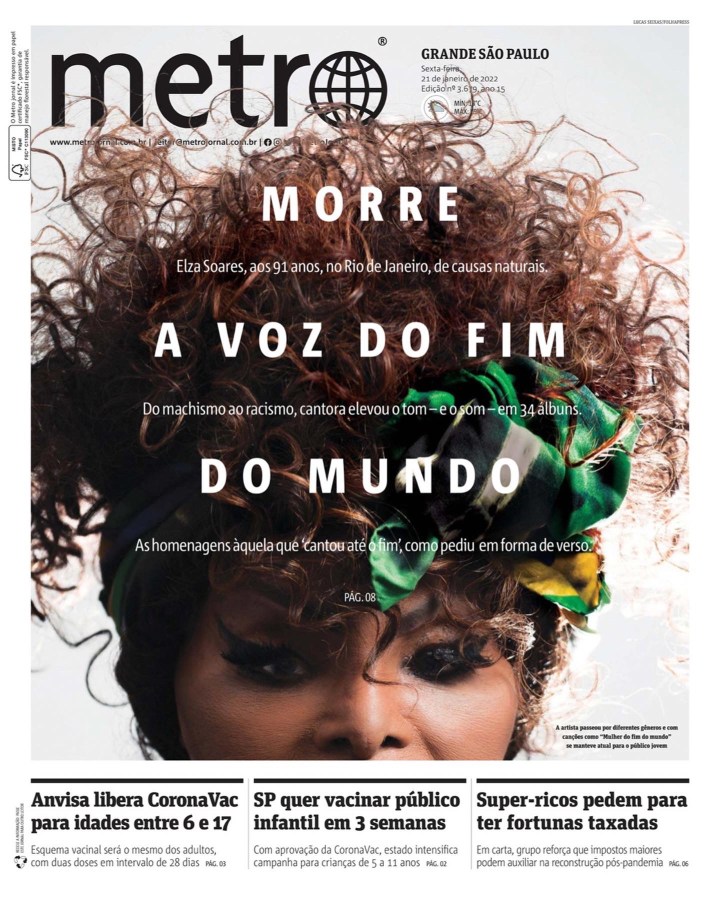
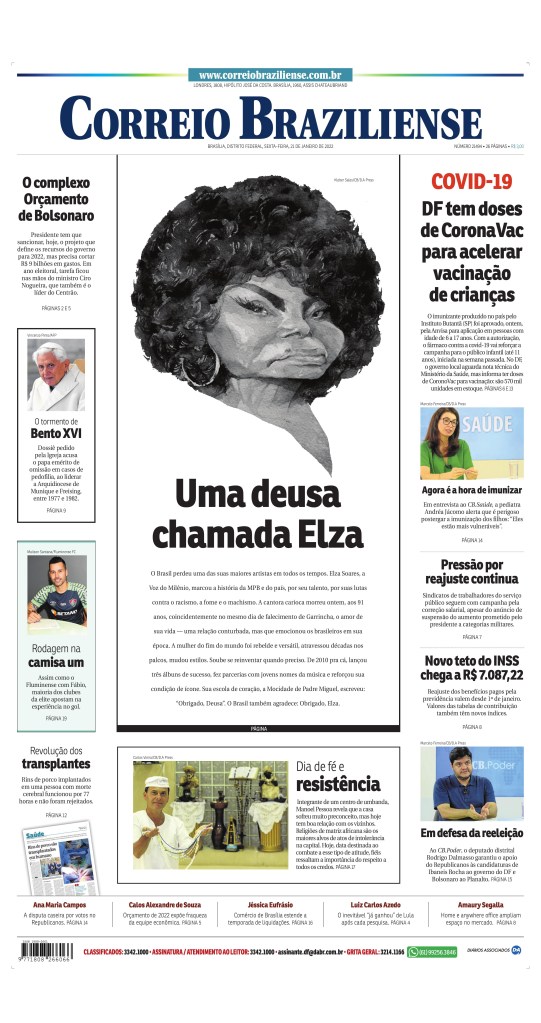
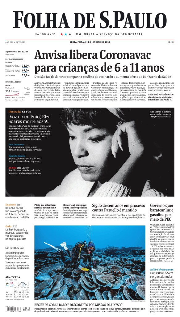
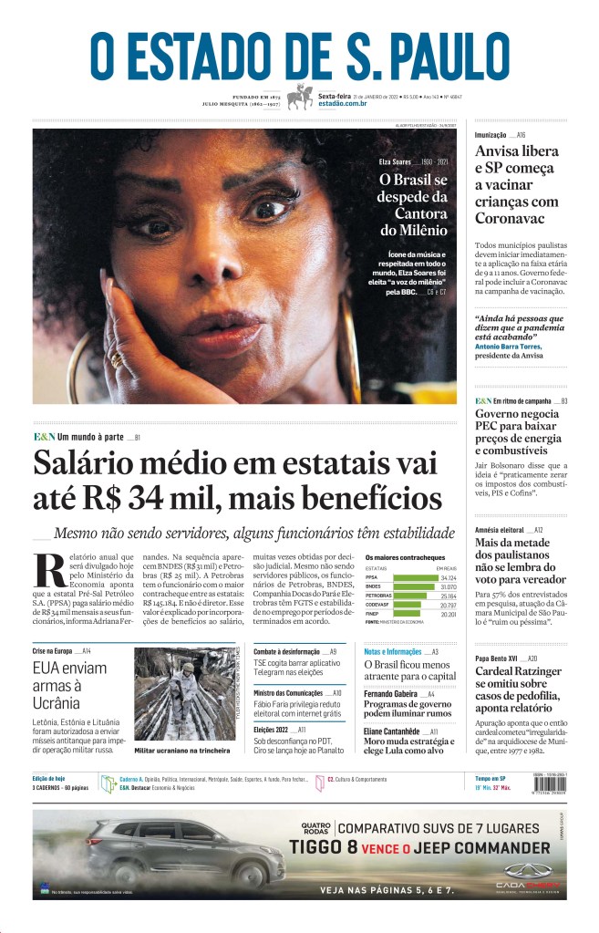
Tributes to Elza Soares
Here are some tribute pages to great Brazilian singer, Elza Soares, the samba queen as someone remarked on Twitter. The Metro page is amazing but the others, Correio Braziliense, O Estado de S. Paulo and Folha de S.Paulo, are great as well. Nice tributes.
There were some other great pages. You can see all of the ones I like on my Instagram.
The world has a lot of newspapers. With the help of Freedom Forum’s Today’s Front Pages website, the pool I generally look at as been narrowed down greatly. I will look at the best front pages I’ve seen from newspapers around the world. And this is A1 only. Papers like the L.A. Times and New York Times, and so many others, do amazing things with features sections. One day I will look at those. Today, A1s. And like the post from Canada’s best, I am highlighting the papers that go above and beyond regularly.
Anyone who follows my Instagram will see the same papers again and again. That is not because I am ignoring other papers. It’s because these papers are consistently producing great pages, while other papers don’t. Many do once in a while. The papers below do it regularly.
I will pull out a few of the top pages from each, and then put the rest in a slideshow. There was some outstanding work in 2021.
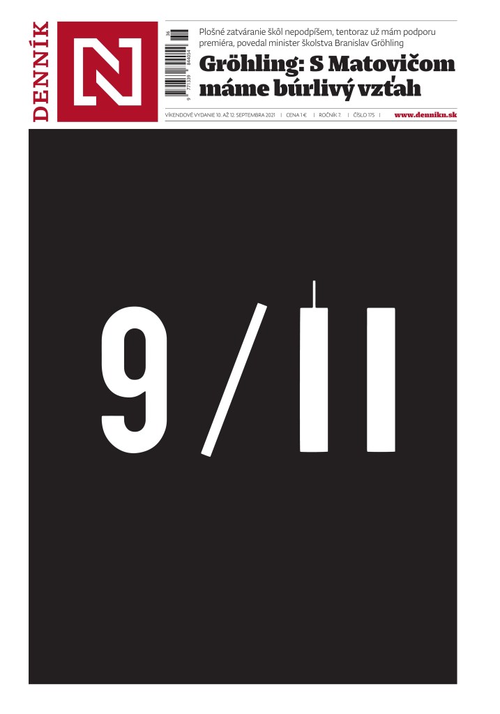
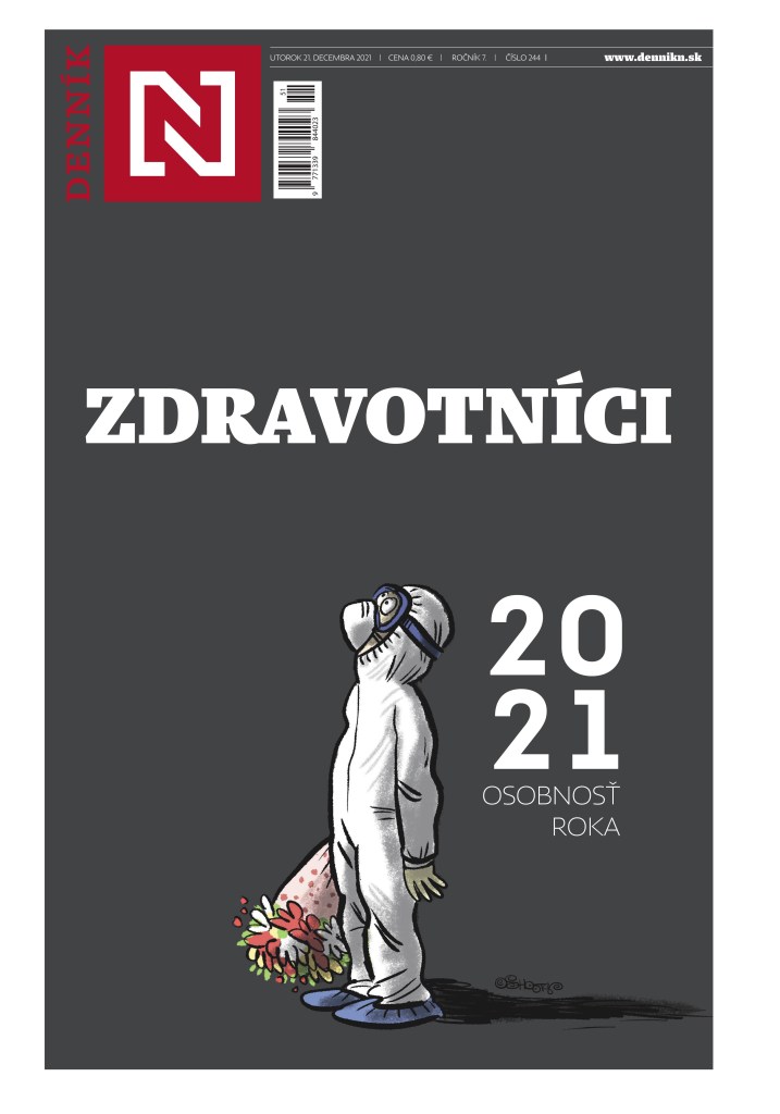
Dennik N Slovakia
What can I say about this tab. I have been in awe of Dennik N since I first started really paying attention to pages from around the world. I look at 500+ every day, and every day I could highlight the front page from this publication. They definitely have their own style. The cover often has cartoons, and the characters come back again and again, like the health-care worker (shout out to them, as it’s been a trying two years to say the least). On average, I enjoy more covers from this paper than any other in the world, though Reporte Indigo has some breathtaking stuff as well. All illustrator-driven.
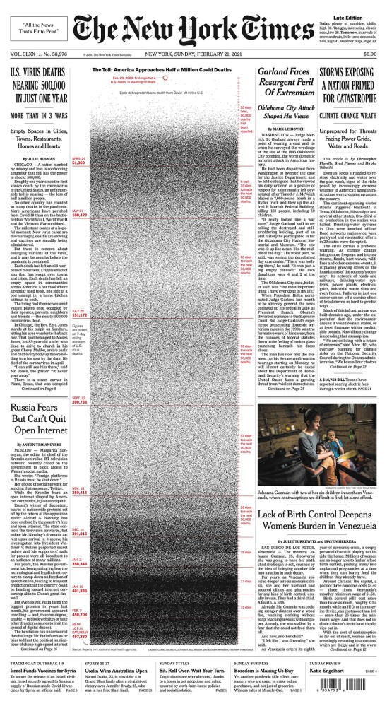
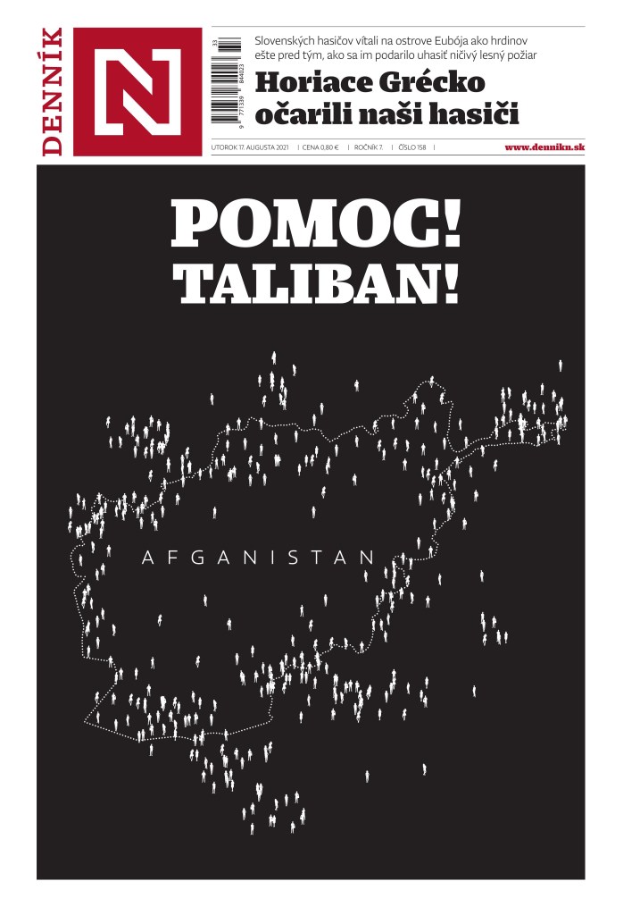
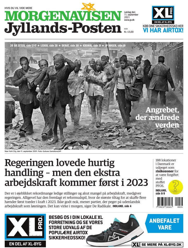
This 9/11 page was one of the most powerful, and simplest, to mark the 20th anniversary. It was so close to another cover, not featured here. Just the idea of adding a thin line to the top of a thick line. It was just 1. Now it’s a 1 and a tower. Simple. Powerful.
This little dude made a few appearances. Health-care workers were in the spotlight as COVID ravaged our lives. My life is more difficult. I can’t imagine working in health care right now. This little guy was always just right.
I don’t think much needs to be said about this one. It’s just simplistically beautiful.
I could go on forever with the paper. They do amazing stuff. Maybe one day I can talk to one of the designers. Here are some more from this amazing paper.
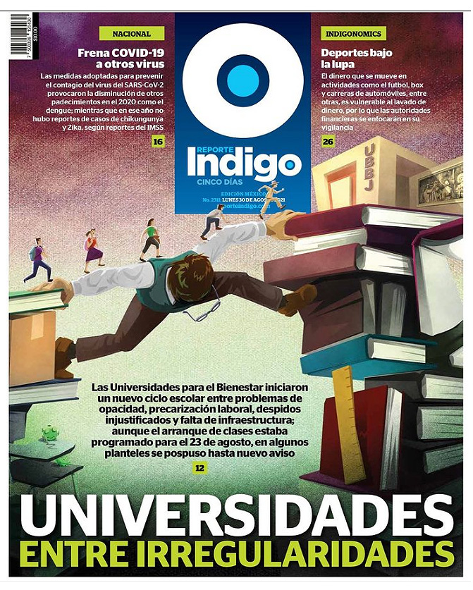
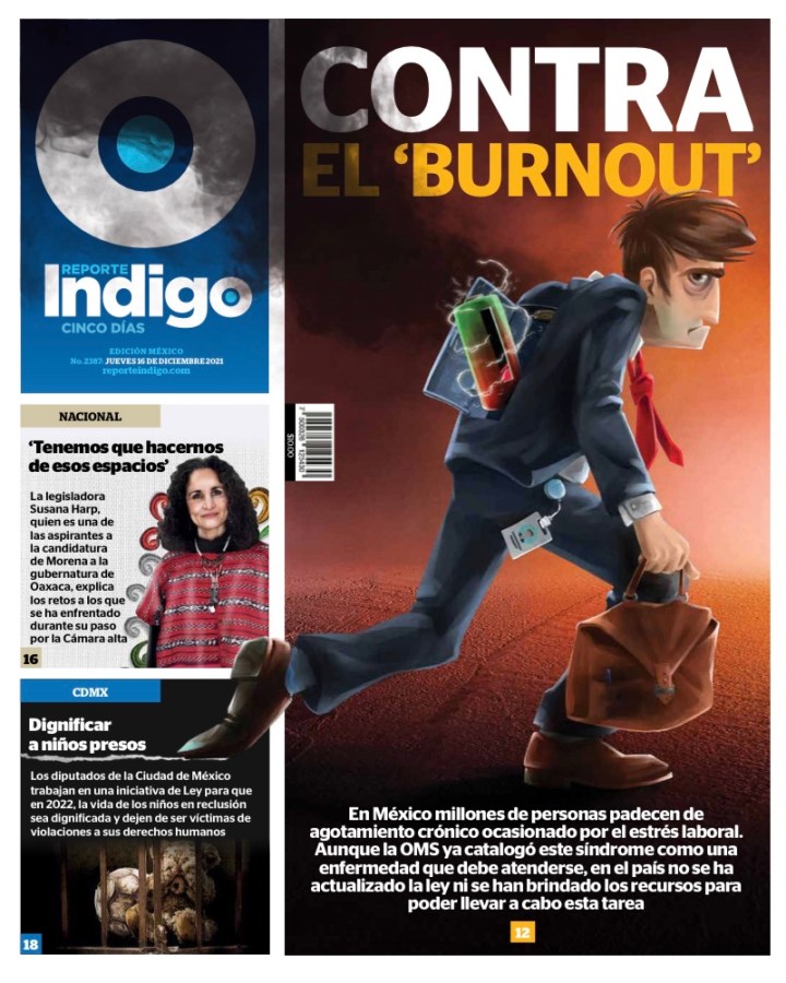
ReporteIndigo Mexico
Like Dennik N, but to the extreme, Reporte Indigo is driven by illustrations. Unlike Dennik N, which often has basic and simple illustrations, Reporte Indigo has elaborate pieces. The work is always stunning. Always worthy of recognition. I don’t have as many from them as they aren’t on the Freedom Forum site. I only found where to get them partway through the year (the entire paper can be downloaded from their website, and you can see it on PressReader). The art goes on throughout, every page pretty much. I can’t imagine how much time and effort this takes, so kudos to them. It’s gorgeous. This first one is truly mind blowing.
I just loved this visual when I first saw it. And I love the little dudes walking past the flag. That is some attention to detail.
And here are a few more. You get the idea, but damn, they look so labour intensive. A for effort, and unreal execution as well. But loving how hard they work.
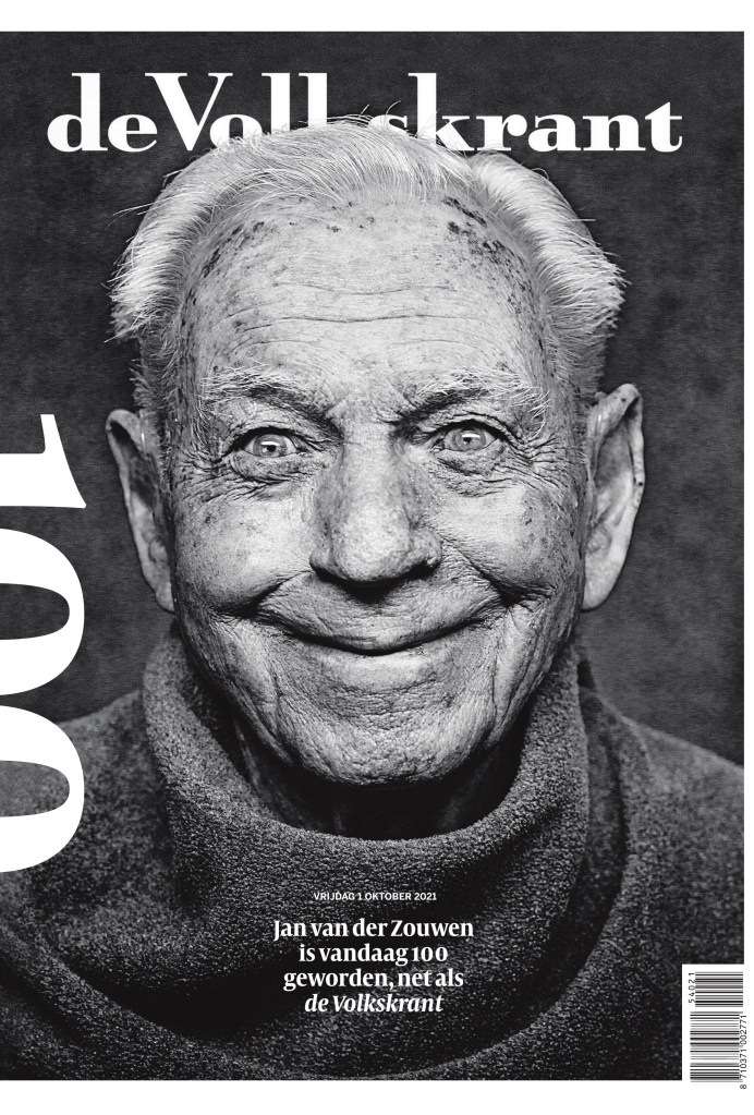
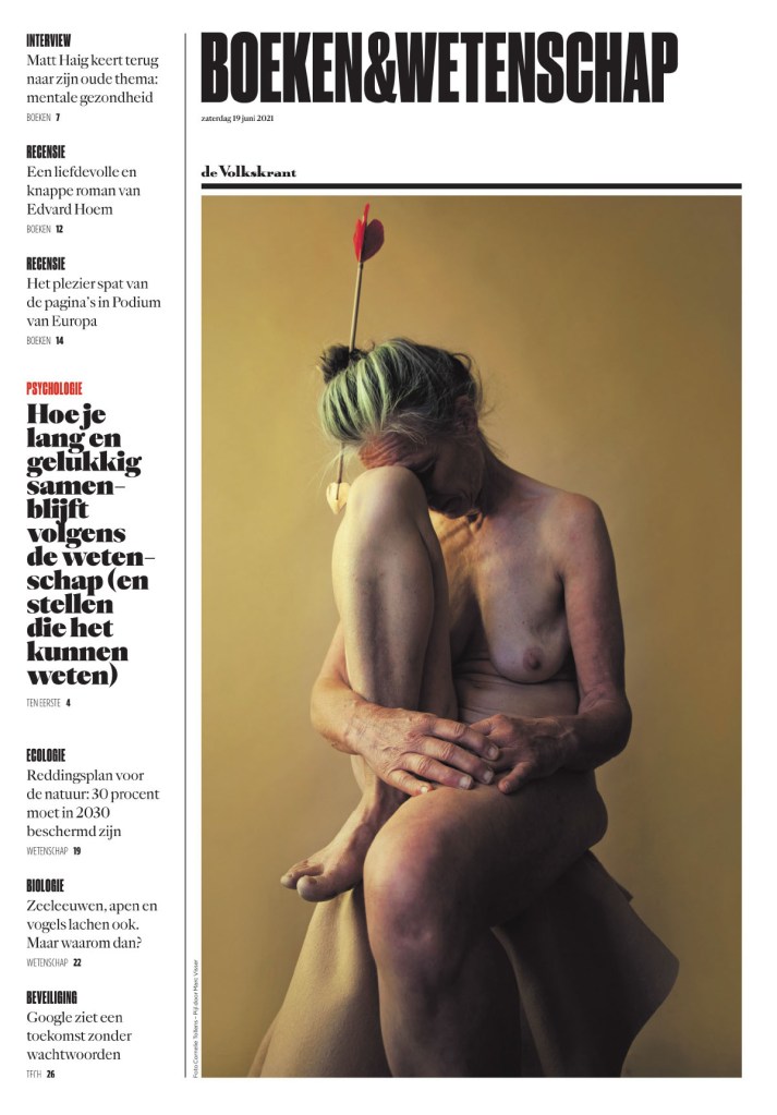
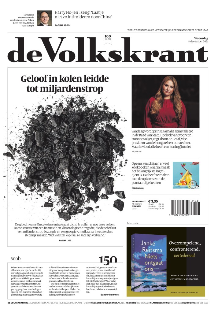
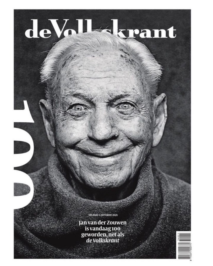
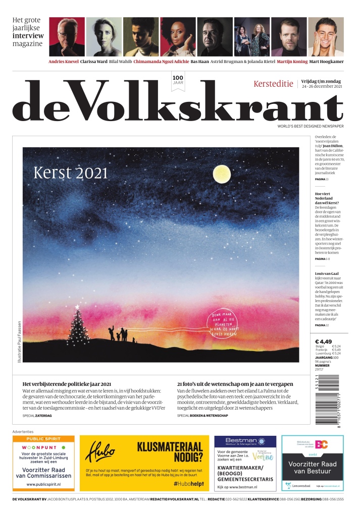
de Volkstrant Netherlands
The tiny little words on top of the flag say it all: World’s best designed newspaper | European newspaper of the year. De Volkstrant is not at all like the ones above. It doesn’t rely on illustrations. It is elegant and clean. It is a paper that has mastered the use of white space. Did I mention it’s elegant. The fonts are so smartly chosen. I chose a similar looking font when I redesigned the Guelph Mercury because I am a fan of elegance in newspapers. And the little numbers they do are great.
Did I mention de Volkstrant turned 100 last year? I hope it has 100 more years in print with pages like this. Again, it’s not elaborate. It’s just beautiful. What a photo.
Just after I say they don’t rely on illustrations … a beautiful illustration by Paul Fasssen. But even still it fits their personality. It’s pretty, as is the text around it.
And just a few more to admire.
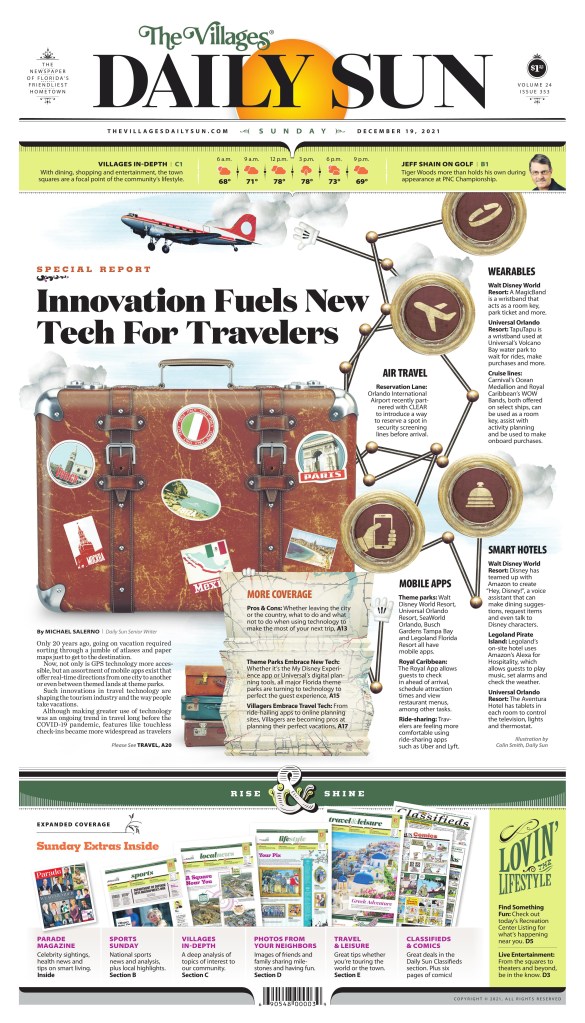
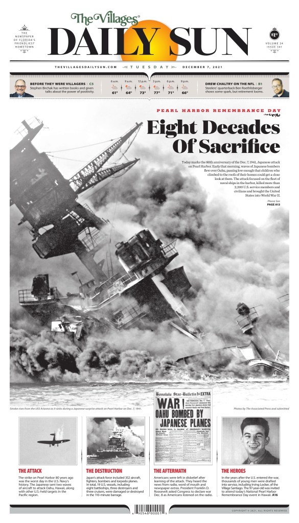
The Villages Daily Sun Florida
I have made it no secret that I love The Villages Daily Sun, a paper with a print-first mentality. Print FIRST!! Like Reporte Indigo, the designers here put a lot of effort it all the time. As I mentioned in my post on Adam Rogers and Colin Smith, they also worked hard to match the design to the community. That’s incredible. Unlike a lot of papers, there is never any doubt when you’re looking at a Daily Sun page. Branding, baby.
But back to effort. All I need to say is just look at this page. Mind. Blown.
Not a lot of papers went big with the 80th anniversary of Pearl Harbor, but the Daily Sun did. And it’s striking. Newspapers need to look forward, but they also need to look back.
And a few more.
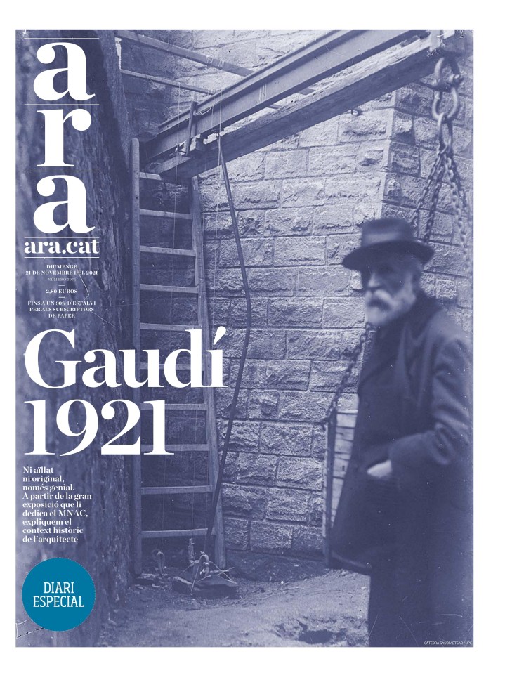
Diari Ara Spain
Diari Ara grew on me slowly. But I kept seeing pages that clearly had a lot of thought put into them. And then I saw one I loved. And then another. This one struck me and I’m still not precisely sure why yet, but I just loved it. It speaks to me. I do love a good sepia tone. And the blurry person. It adds mystery.
This was one of my favourite 9/11 pages, marking the 20th anniversary of the tragedy.
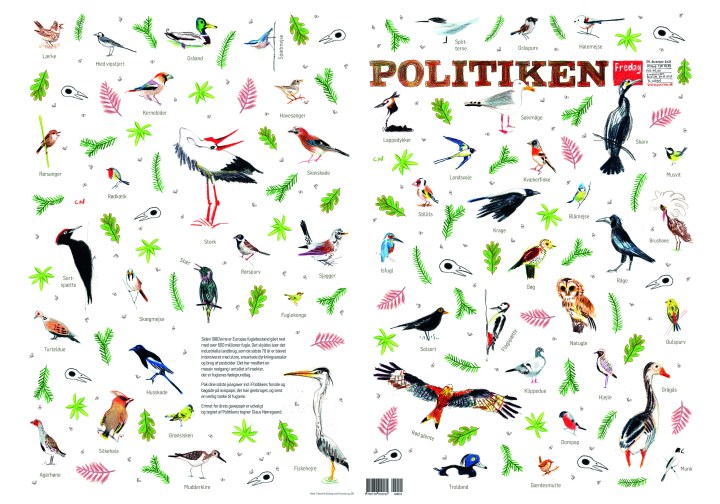
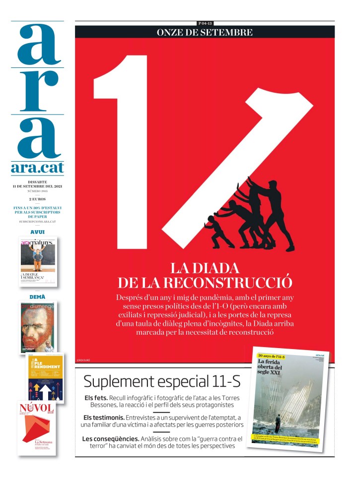
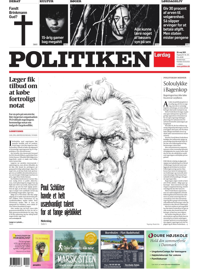
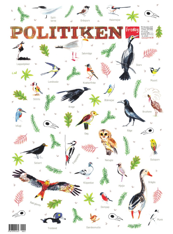
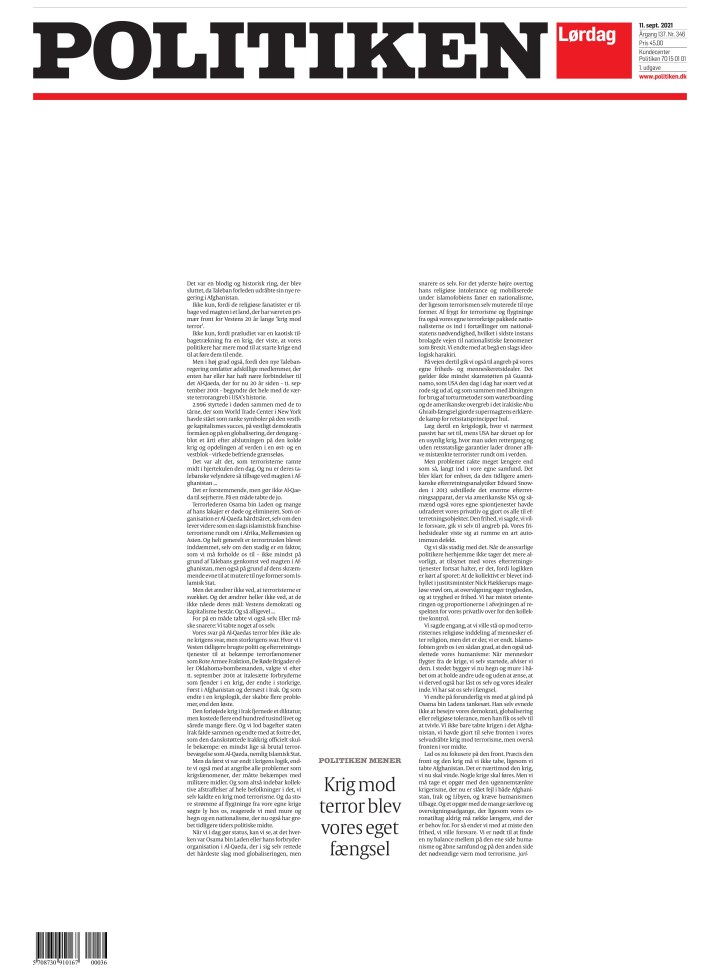
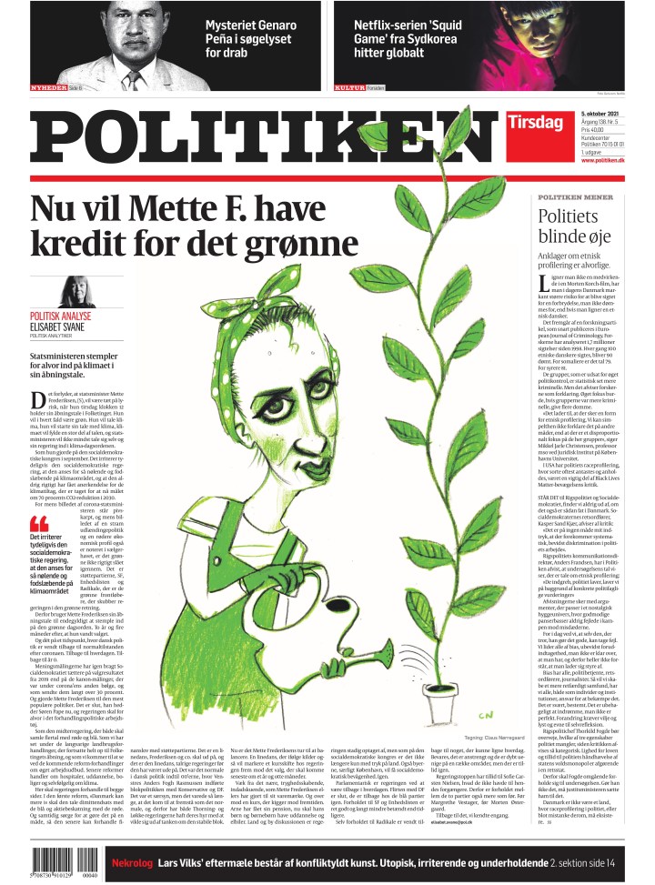
Politiken Denmark
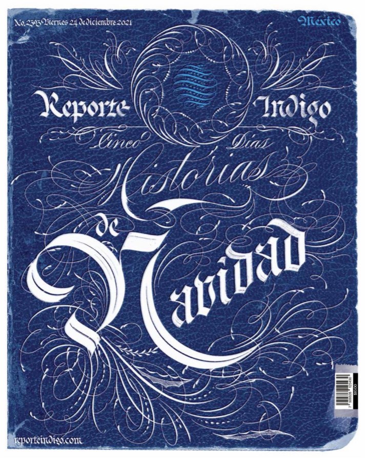
Politiken has a harder news feel than some of the others. It uses sketches, less colour, often plays on the the white, red and black in its design, leaving other colours to wish they were invited to Politiken A1 party.
So … when they use colour … boom! The paper often has such a hard feel to it. Then Christmas Eve, and here is this beautiful page. I have no idea why or what, but I love it.
And just a few more from very little colour to a lot of colour.
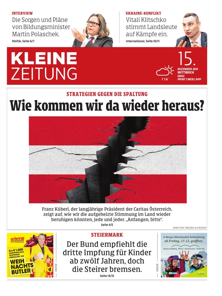
Kleine Zeitung Austria
Another tab, and more great work. There aren’t a lot of papers like Kleine Zeitung in North America. There are tabs of course, but I don’t see things like this. It’s a lovely paper, doing lovely things all the time. This depressing page might have been my fave of the year, right under the wire.
I should always translate the text, and I worry about this one. But it is striking. It’s just such a clean page, with a nice illustration as the centrepiece.
They have had so many good ones, and here are just a few more.
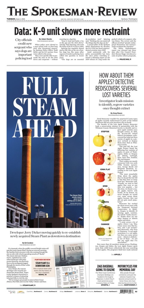
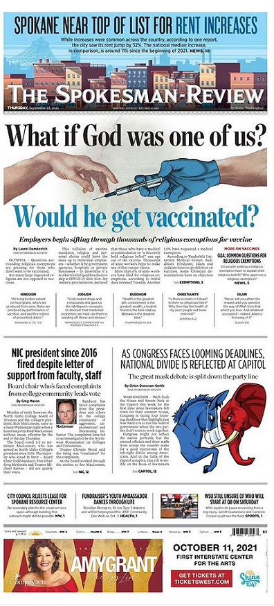
The Spokesman-Review Spokane, Wa.
I have had a years’ long love affair with The Spokesman-Review (don’t tell my paper). Anyone who follows this blog will know this as I was lucky enough to talk to Caitlin MIller, an emerging designer for a recent post. Until becoming a volunteer with the Society for News Design for last year’s Best of Newspaper Design competition, I would have said it was the best designed newspaper in the world, after the Virginian-Pilot stopped performing it’s magic. I say that with all due respect to my former employees at Pagemasters North America. They did some incredible things for the Pilot after it moved production to PMNA. But it used to be the best cover in the world most days. I digress. The Spokesman-Review has a similar feel. It lets stories breathe, it goes big, it uses its flag in design. And it continues on other section fronts. I admit I have cheated here as I lost some from page files in a phone swap, so I am including some section covers. Sorry! As a side note, some other amazing things they do: they have today’s and recent front pages on their site, inside pages from today’s pub, historical pages and they list the designer. I wish more papers did this.
I love a few things on this page. I love the big reverse text head. I love that it is played in the background. The apples, and just the air.
The thing about the Spokesman-Review is that it has character, a consistency. I can say the same thing about each front page, yet it never gets boring. They try new things while somehow keeping the same flavour and feel day after day. A credit to Chris Soprych, I’m sure. Again, great typography. A playful bit with the dandelion. Air. And the flag. They play with their flag all the time. When that’s your brand, that’s bold.
And here are a few more, with some inside pages.
Jyllands-Posten Denmark
I love this tab. Just smart design, often simple and clean. It’s great. This page was my fave because of the smart and creative use of playful typography.
I love when newspapers do portrait-type art like this. There is no face, it’s simple, but readers will know who that is instantly. This is so nicely done.
And a couple more.
There were more from other papers. But these were my faves from papers who frequently went above and beyond. I am excited to see what 2022 brings, but I hope for more like these.
Some newspapers have clearly given up on print design. It’s about content and digital. Obviously both of those are key to the future of media organizations everywhere. But I still believe print design is important. And that’s why I celebrate it here and on my Instagram account, both of which have been around for about a year now. While my Instagram shows great pages from day to day, this blog tends to focus on designers or bigger topics.
While I want to celebrate all newspapers making an effort (and I do on Instagram), the next two posts are going to show a few papers that consistently deliver striking and thoughtful designs. This post will focus on Canada’s big three: The Globe and Mail, Toronto Star and National Post. Perhaps next year I will add more, though I don’t see many papers upping their effort. Next post, the rest of the world.
Each of these top papers tends to have a solidly defined style. I will look at my top three pages from each publication (at least that I highlighted this year on my Instagram), then a slideshow of some other pages. To be clear, I know there is some amazing work happening inside these papers and on other section fronts, but this is about A1, and only includes papers making an effort — and a splash — frequently. I won’t look at one-offs, or rare successes in this post. I will feature them in order of my connections with each, so Toronto Star, Globe and Mail (only as managing editor of Pagemasters North America, which handles most of the page production for the Globe and Mail, though the pages featured here were likely done in house) and the National Post (I recently started working at Postmedia).
Toronto Star
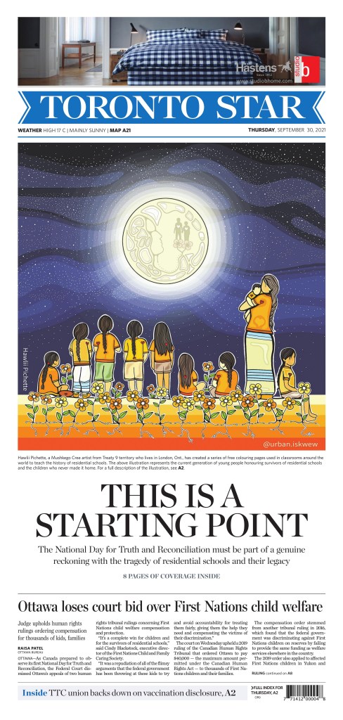
This was probably the page of the year in Canadian media for me (the top Globe page rivals it), though not necessarily from a design perspective. There were some stronger pages visually, more complex. But this is a powerful page, which gave a lot of real estate to a key issue at a key time. The reverse text, the big headline asking a big question, the little moccasins with a big message. It came out a day late (only because the day-after coverage in many Canadian papers was lacking), two days after the discovery of hundreds of unmarked graves of Indigenous children, but it struck a chord.
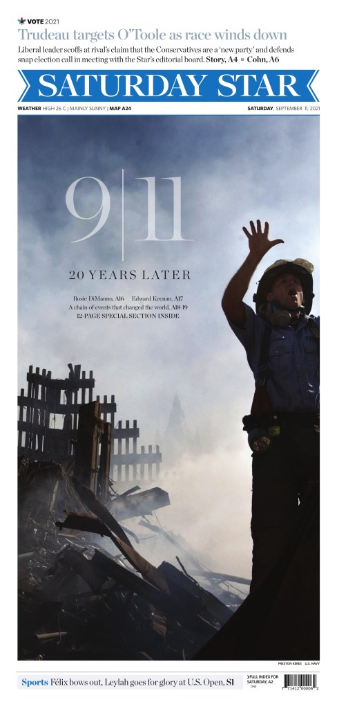
The Star will less frequently blow out its front page for an international issue than the national papers, but it did here. It was the strongest Canadian 9/11 anniversary page, with a strong image and beautifully handled typography.
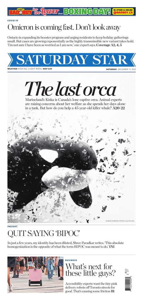
In the summer of 2021, the Star decided to focus more on print design (I’m not making this up), hiring an art director as well as three others to focus on design, graphics, illustrations, etc. This is an example of this, with a striking, contrasty photo illustration from Ramon Ferreira.
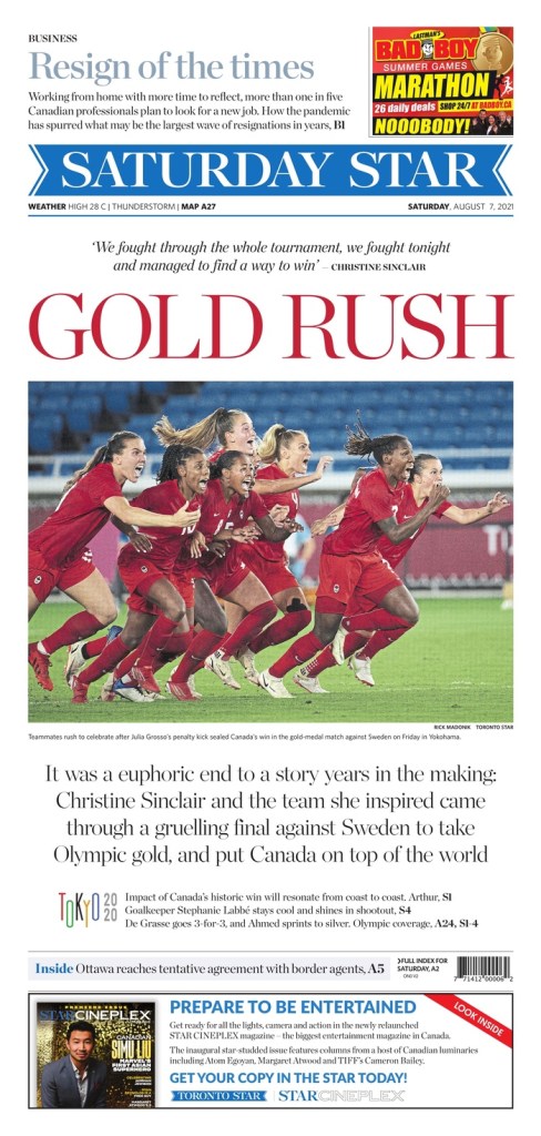
Here is a small sampling of some other great Toronto Star pages. All great in their own way, all very Star. The beautiful illustration by Hawlii Pichette, the strong art and colours on the Afghanistan page and the excitement of an epic gold medal win on the Olympics page.
Globe and Mail
The Globe and Mail is always swinging for the fences and often knocks pages out of the park, well beyond A1. The Globe tends to have elegant or pleasantly elaborate illustrations, big art and sometimes subtle headlines. Its weekend A1s can run with the best in the world.
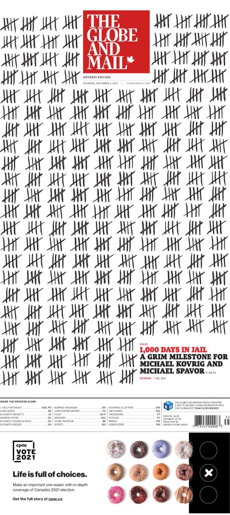
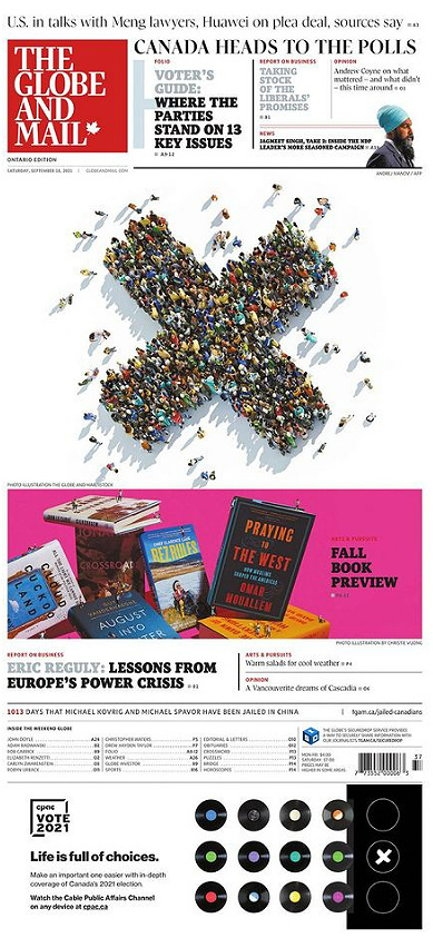
This page might have been the best purely from a design standpoint. It’s simple, but smart. Likely planned for ages. It is powerful as well, about the “Two Michaels,” who were wrongly imprisoned in China for more than 1,000 days. This was Day 1,000, a grim milestone. Some will argue this, but the Globe owned this story, especially in Canada. Every day the Globe kept track of days the Michaels were detained on the front page. I don’t know how early it started, but it was there for hundreds of days. This was the culmination of that. The tallies, how they work around the flag. No art. The contrast. It’s a stunning and powerful page.
The Globe had one of the best Election Day and and best election results page. But I love this visual. And fantastic use of white space.
I love this illustration by Klawe Rzeczy. It’s busy, it’s chaotic, but it is absolutely eye catching. And despite the Globe getting illustrations from various illustrators, it always seems to feel like the Globe. Refined.
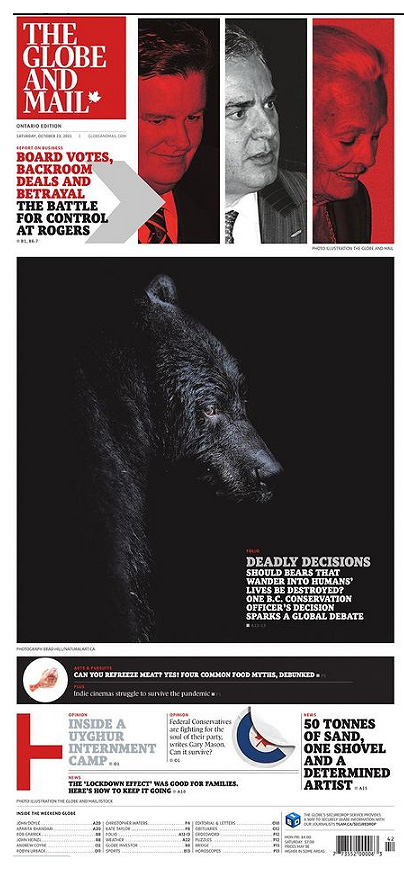
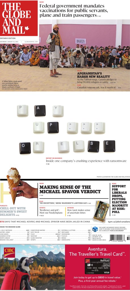
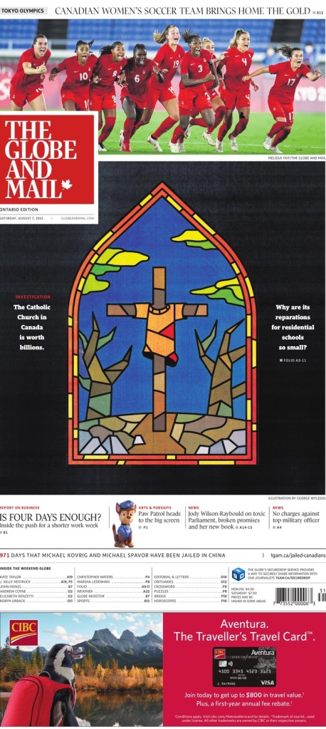
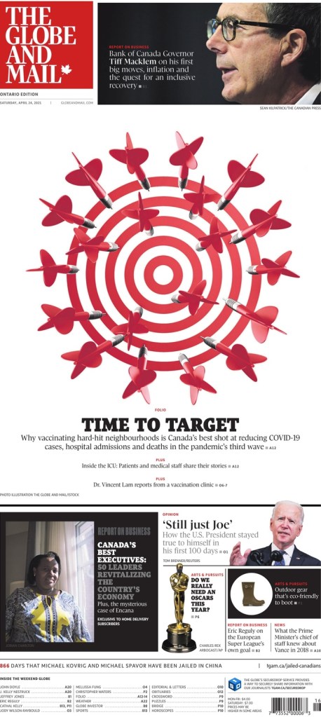
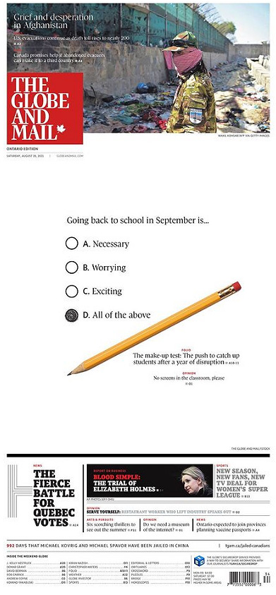
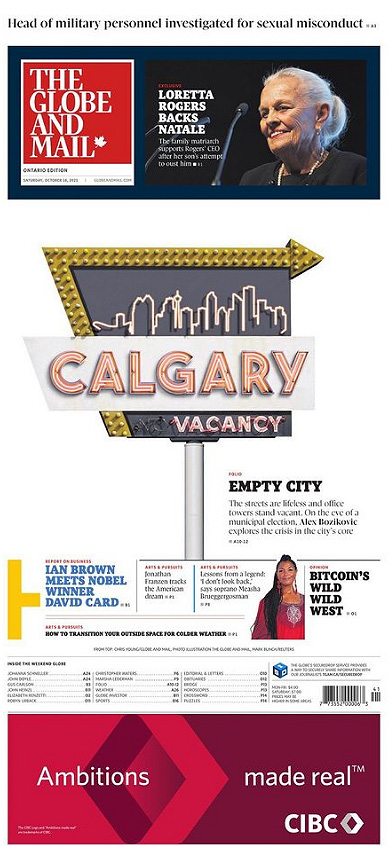
Here are a few more. I love the keys from the keyboard. And, again, in Globe style, the white space. They do not fear white space because they know how to use it. They also did a stained glass look (see National Post below). It’s too bad it cost the Canadian women’s soccer team some play, but it’s a nice page. The dart board. White space. Red. Contrast. And the pencil. I did a page like this, so of course I like it! Again, bold white space. And Calgary. I love it for design, but also I’m from Calgary! Finally, the bear. So dark, and boldly dark, but the Globe can get away with it as it prints on glossy paper. I should have said that earlier as that is key to some of its success in print.
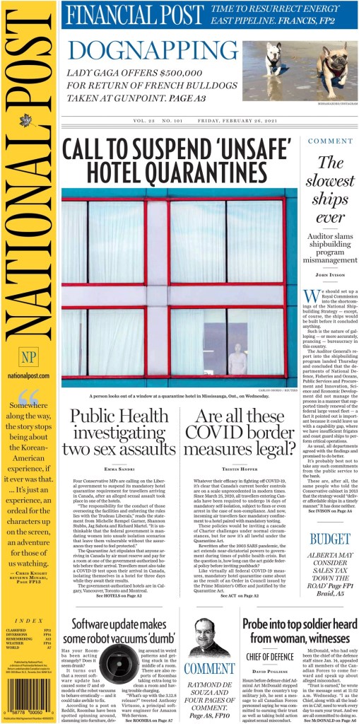
National Post
The National Post has been known for its design since its inception in 1998. For a long time it stood above the rest. It’s still exceptional, especially once you get past the very often great front page. The inside design doesn’t try too hard. It is elegant and clean. So much so that others have tried to imitate it, without success. The vertical flag is something I often talk about. It adds so much. Funny that these three papers all have very different flag styles, with only the Star having the classic text across the top. Sorry, tangent. The National Post is still giving it its all, particularly on Saturdays.
I debated my fave, but in the end this vibrant illustration won out. It’s played well with the other content on the page, but it, in itself, is just so striking. To tie things together, it’s done by Becky Guthrie, now the art director at the Toronto Star. The Canadian media scene is a small world.
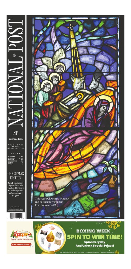
But then there is the Christmas page. This has been a tradition for the National Post since it started, conceptualized as a way to compete with the Globe’s art-driven Christmas page. They took the boldly overtly religious approach to set themselves apart from the Globe. The reverse flag. The colours.
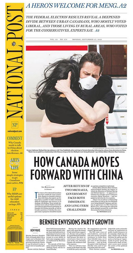
This page is a basic, clean design. There are other extraordinarily designed Post pages, but I wanted to give props to a big news page. Like headlines, designs are often more celebrated for feature-type stories as they are easier to illustrate. This was a big news day in Canada. The Two Michaels home at least. It was the best page for this event.
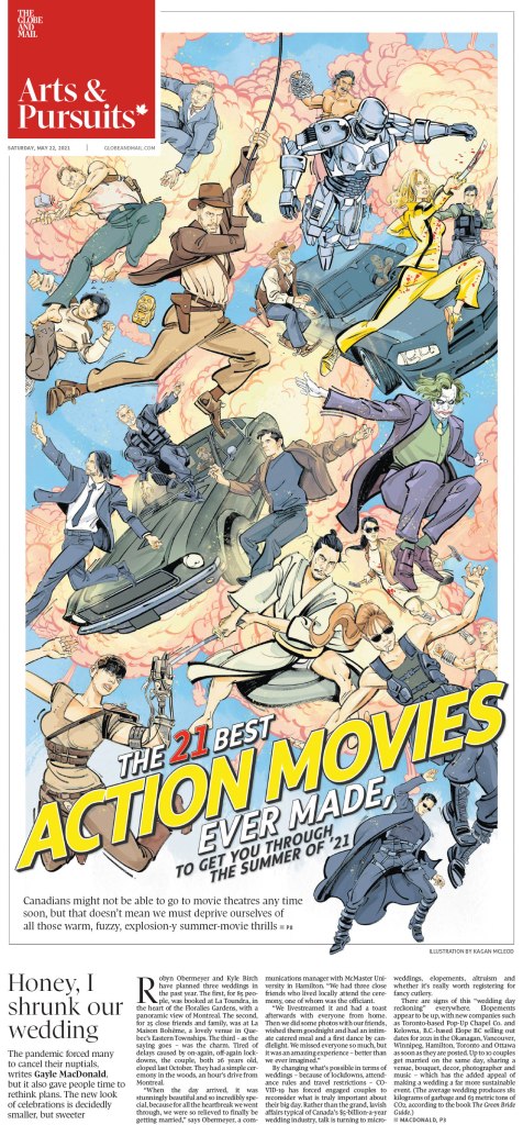
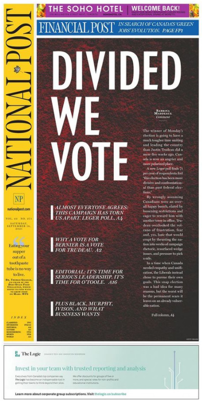
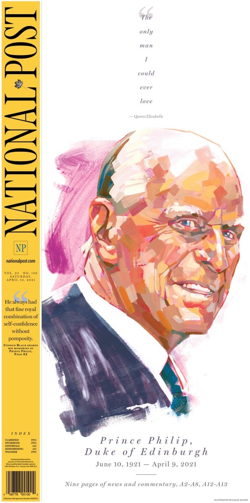
The National Post’s Election Day page was great. Still maybe my favourite. It’s very different from the Globe’s white space. A big monster headline. Contrast-y text on a dark background. I just love the symmetry on the next page. I almost chose the Prince Philip page as one of my top 3. It was close. What a piece of art by my good friend* Kagan McLeod. The next is an Olympics page. As I wrote then, the Post won the Canadian newspaper Olympics with outstanding design day in and day out. And a classic Post cartoon cover. *I don’t actually know Kagan other than over Twitter and through seeing his illustrations in each of the top three papers here, but I’ve been a Kagan stan for a while.
So while 2021 proved to be just as maddening and depressing as 2020, just with vaccines, it still provided plenty of brilliant newspaper front pages. I am thankful to the editors and designers at all the papers here, who keep pushing boundaries and working with passion. And to those at the papers who still do the once-in-a-while great pages. Every little bit counts.
Next up, a look at papers from around the world, featuring publications such as Dennik N of Slovakia, Denmark’s Politiken, The Villages Daily Sun from Florida (you must have known that was coming) and more!
If you want to keep seeing posts like this, subscribe!