By Brad Needham
Old news? Booooooring! Old newspaper designs? Exciting! If you disagree, you’re in the wrong place. Beside my desk, on a special table dedicated to newspaper design, sits a handful of Society for News Design Best of Newspaper Design books (as well as some awards and the National Geographic from June 1985, featuring the young Afghan girl with the piercing eyes). I still look through the SND books, and am amazed by how the newspaper design has held up years later. So when I thought about posting newspaper pages from the previous week, I though certainly those would hold up!
Most days there is a newspaper front page or two that stands out. Maybe it will never be award winning (recognition for newspaper design is becoming an endangered species), but there are pages worthy of attention for the effort and creativity put in. I look through more than 500 pages every day. Some days nothing catches my eye. But that’s why it’s worthy of attention when something does.
So, life permitting, I’m hoping to post a few of my fave newspaper designs from the week prior. I post daily on my Instagram. I will generally choose from the pages I posted there, though there are occasionally pages I don’t get around to posting.
These short posts will be driven by the pages not my words, unlike the babbling above! But I had to set it up somehow. Don’t judge me.
Here are a few from last week.
Der Standard Austria
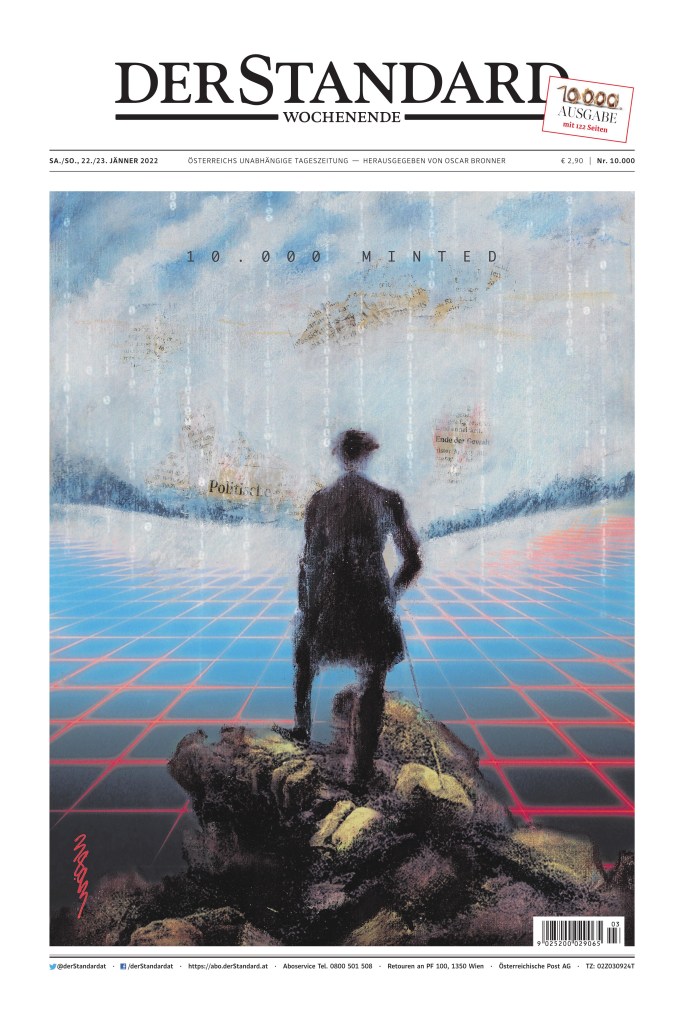
I made no secret in twitter and my instagram that I loved this page. It is not lost in me that it is completely driven by the art, which I find stunning and so smart. Print and digital together. Newspapers barely visible through the sky. and it is to celebrate the 10,000th print edition. How many more will there be? Is that what this hints at? The demise of print or how print and digital will work together for a common goal?
The art is being auctioned off as an NFT (non-fungible token).
Toronto Star
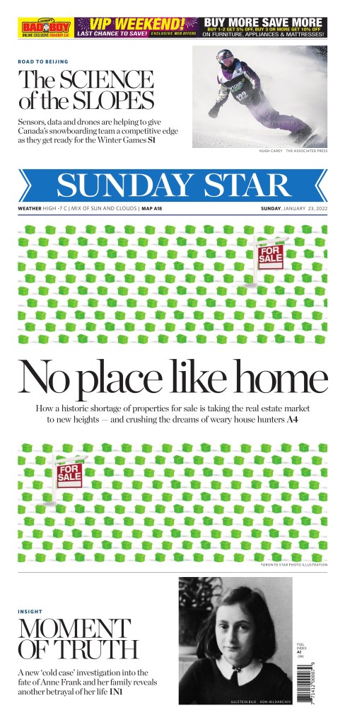
A nice Saturday page by the Toronto Star. It’s likely every weekly roundup will feature at least one page from a Saturday publication of Canada’s big three
Monopoly houses are nothing new in design. I’ve done it. And I almost did that t another time before creating one of my favourite pages, pivoted below, before taking another approach. But in this page the for sale signs make add that extra touch.
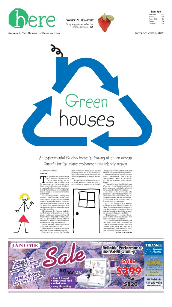
This was mine. I thought the design was begging for a green monopoly house, given the headline. But I took a different path. If you can believe it I did the art myself.
Tributes to Elza Soares
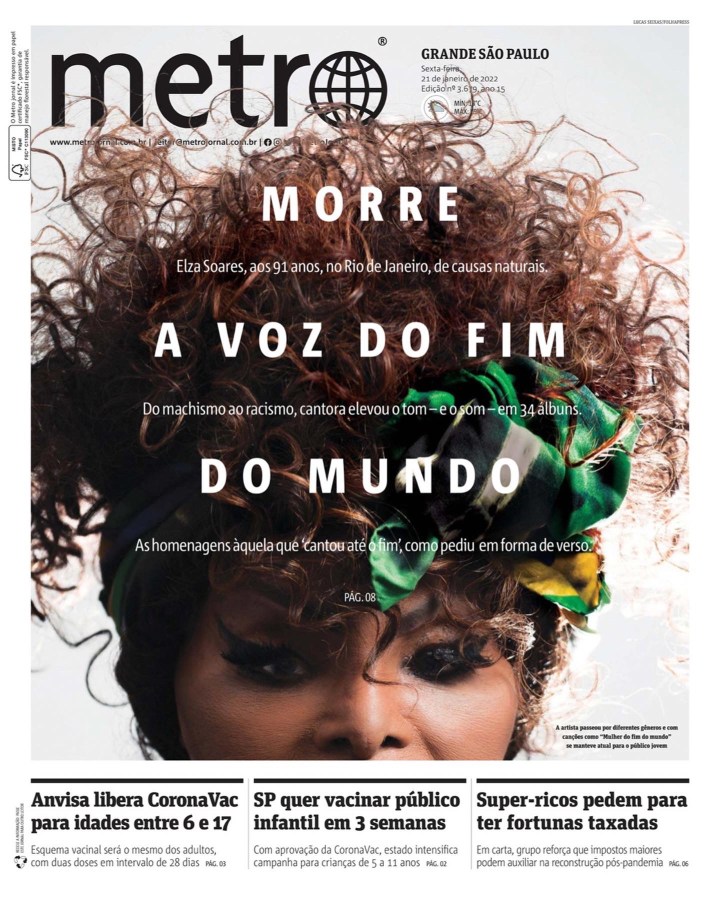
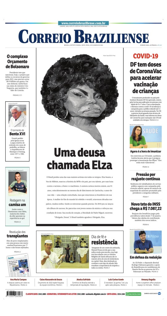
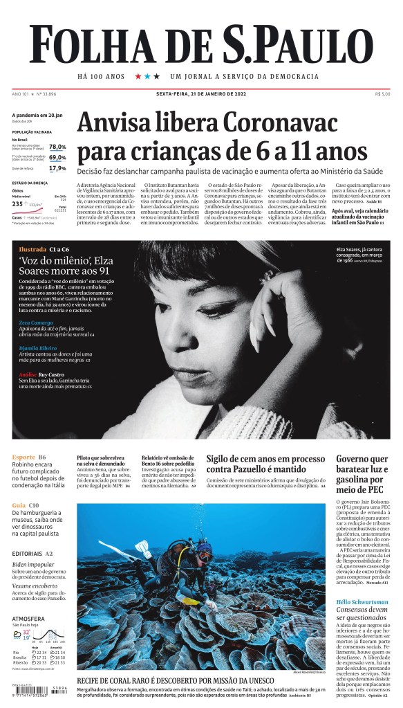
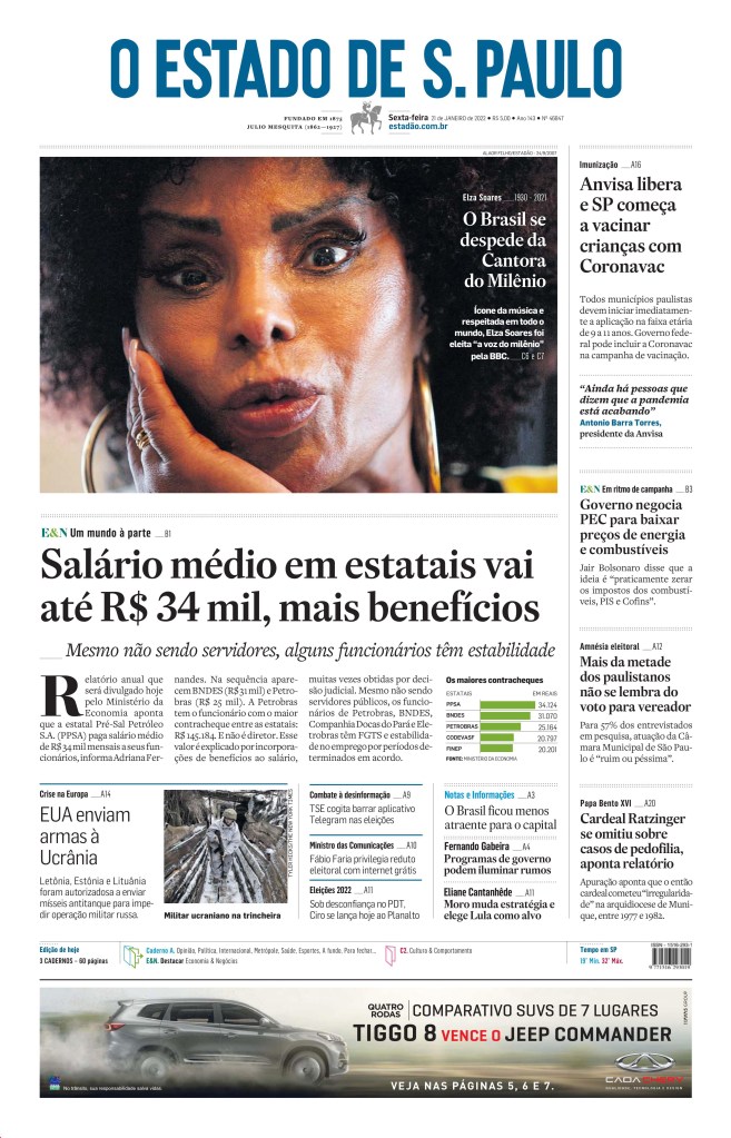
Here are some tribute pages to great Brazilian singer, Elza Soares, the samba queen as someone remarked on Twitter. The Metro page is amazing but the others, Correio Braziliense, O Estado de S. Paulo and Folha de S.Paulo, are great as well. Nice tributes.
There were some other great pages. You can see all of the ones I like on my Instagram.
