By Brad Needham
When it comes to the best newspaper designs in the world, the United States is always a leader. And at the Society for News Design’s 45th creative competition, that held true again. The U.S. has some incredibly strong contenders, usually led by The New York Times. Funny thing about the Times. If you have only ever seen the front page, it might surprise you to know they have mind-blowing, colourful, art-driven designs throughout. The often-not-so-grey lady led the competition again this year, with well over 150 awards, including nine gold medals (!!), which tied its gold total from last year.
Some of the other big players in terms of awards were the Star Tribune (Minneapolis), which finished second overall this year (!), The Washington Post and The Wall Street Journal. There are always solid entries from the Los Angeles Times and American City Business Journals as well.
Which leads me to my annual tradition before I get into the pages from the big winners. At SND’s competition, there are awards of excellence (three of five judges must agree an entry is truly excellent), silver medals (four of five judges must agree the work rises above excellence and stands above other AoEs), gold medals (all five judges must agree it stands out among silver winners and that it is nearly impossible to find a flaw), Best in Show (all golds can compete for this honour, and 75 per cent of judges agree it’s worthy), World’s Best Designed Newspaper (more on this in my next post) and finally Judge’s Special Recognition. This is for work that is outstanding in a particular respect not necessarily singled out in other areas of the competition.
This year I was again honoured to be a facilitator on the World’s Best team. As facilitator, I have no sway on the awards, nor can I participate in discussions. And let me tell you, it’s not easy as I have opinions! Which is why I created the Covers in a Dangerous Time Facilitator’s Special Recognition award!
Facilitator’s Special Recognition
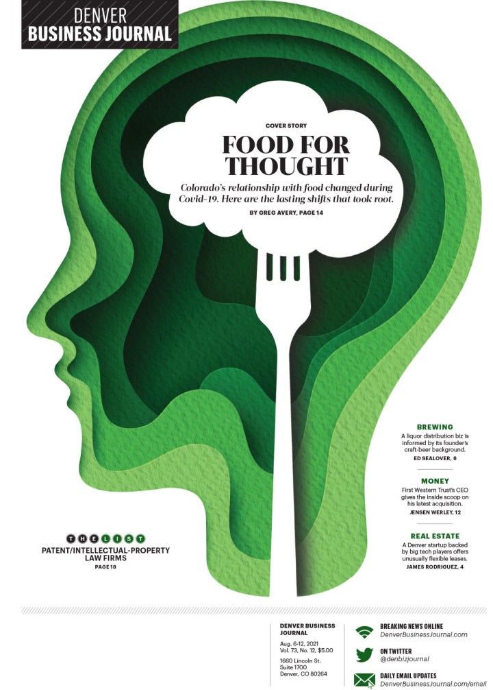
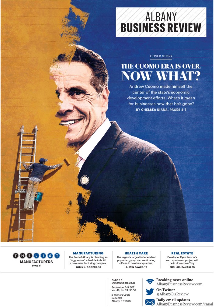
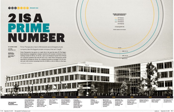
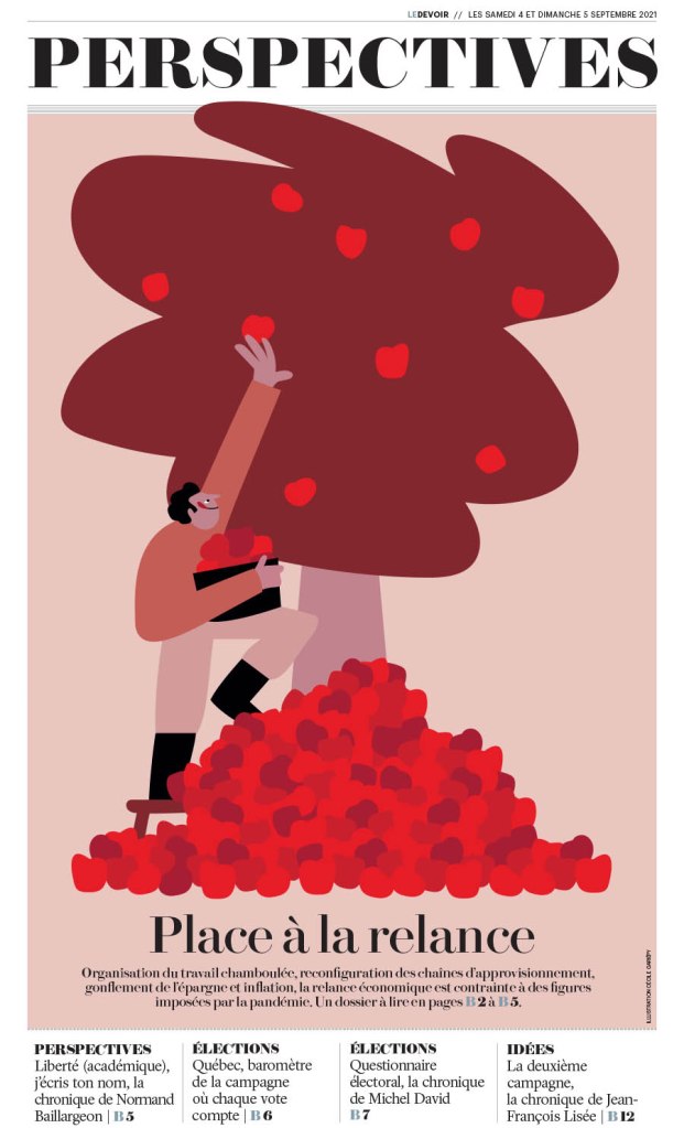
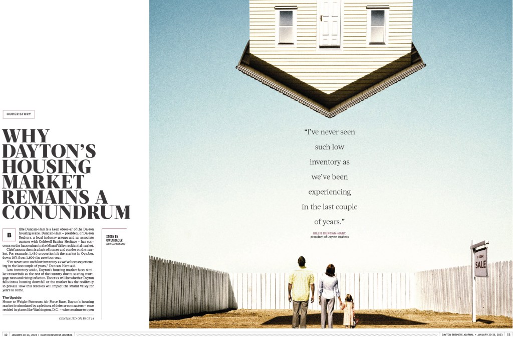
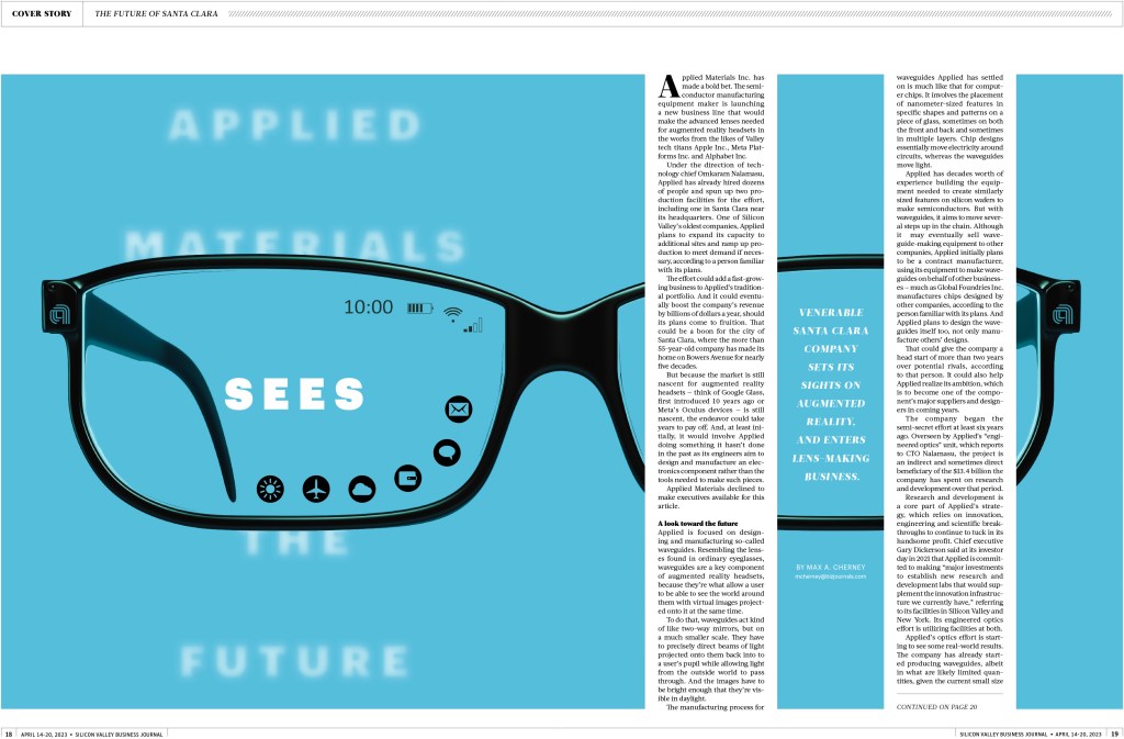
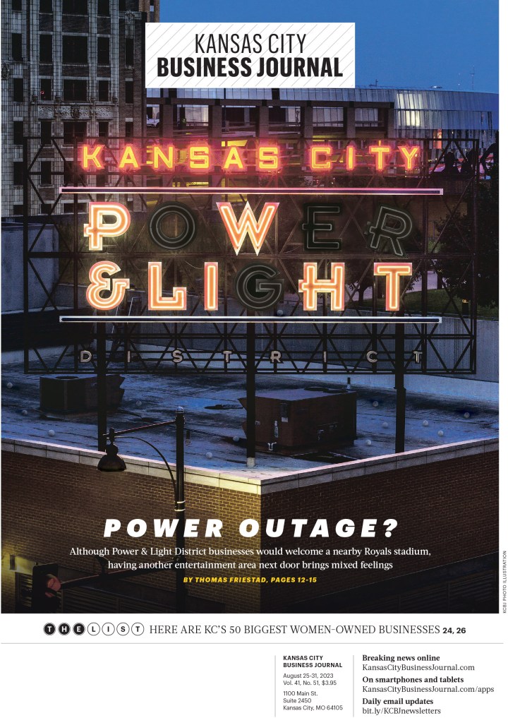
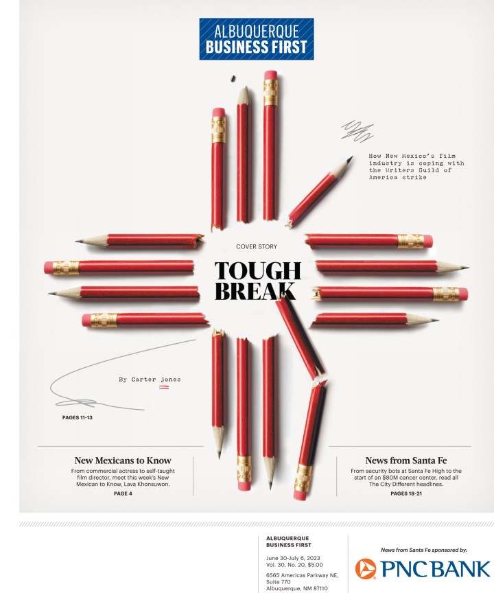
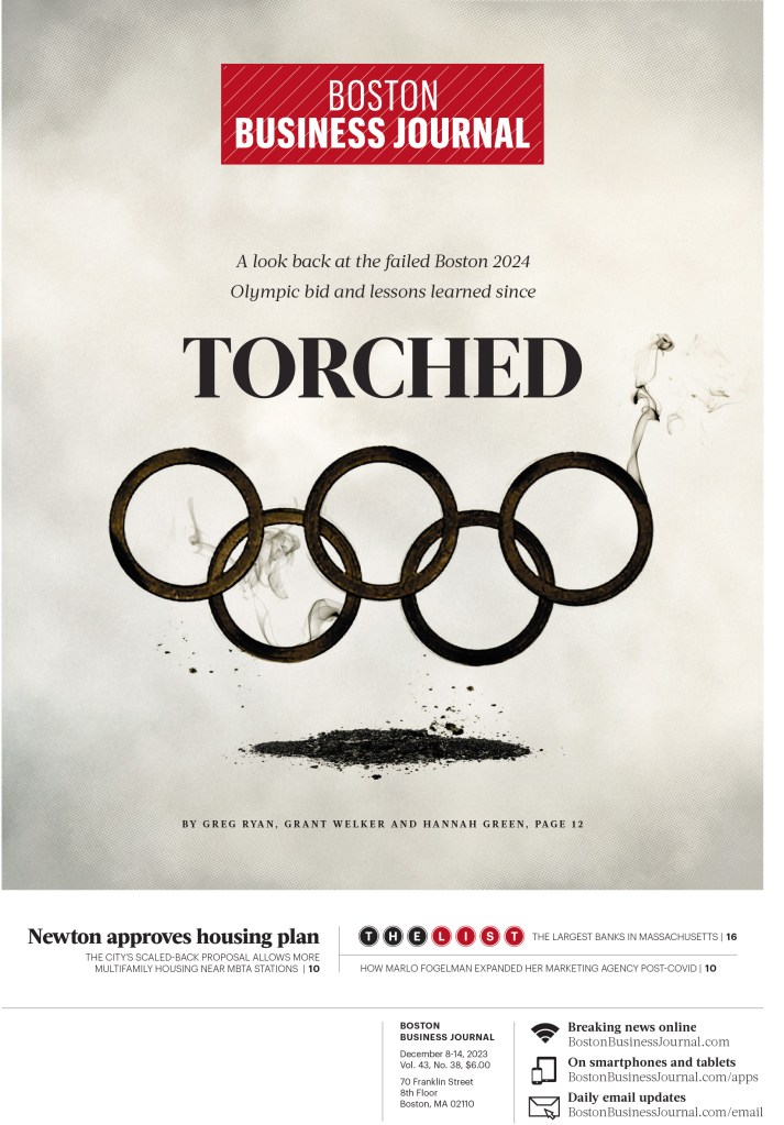
This year there is a tie! As the title of the this site implies, I tend to focus on covers (front pages). However, there were two non-related cover entries that stood out for me this year. The first is American City Business Journal inside spreads. They are stunning. Such a strong use of brilliant art/illustrations and beautiful page design. Here are a few.
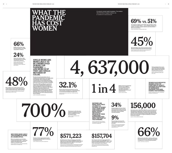
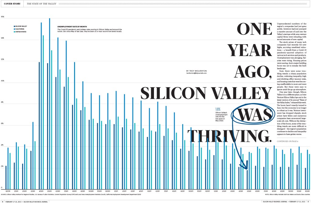
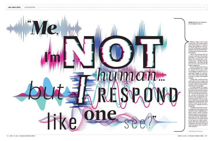
A bar chart winning awards? Yes! Thanks to a great design overall.
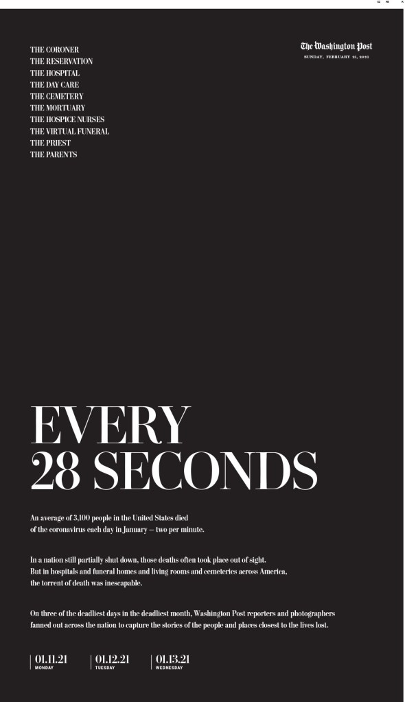
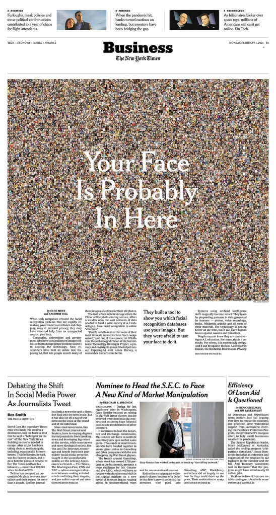
And then there is this Washington Post headline. It just to happens to be on a wonderfully designed and conceptualized page, but the headline. I feel like the page was decided on after someone came up with this headline. As someone who has always been on both the design and editing sides of things, something that mixes both is going to catch my attention.
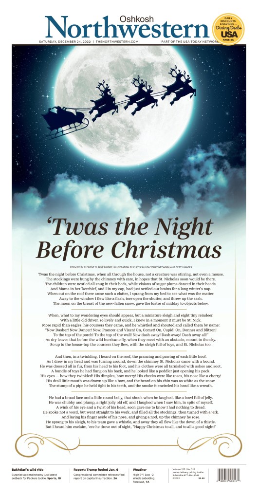
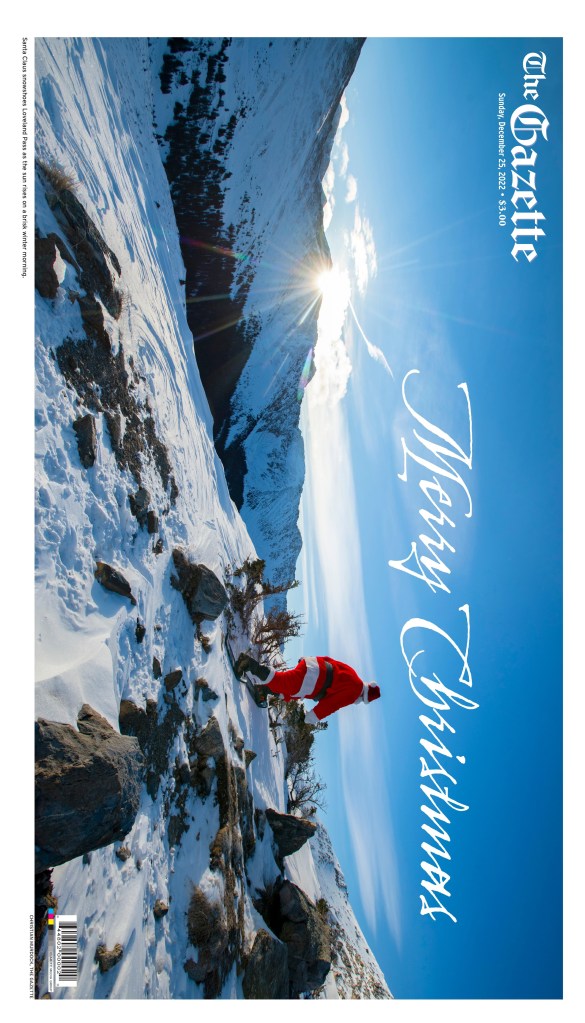
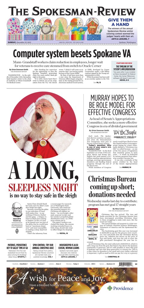
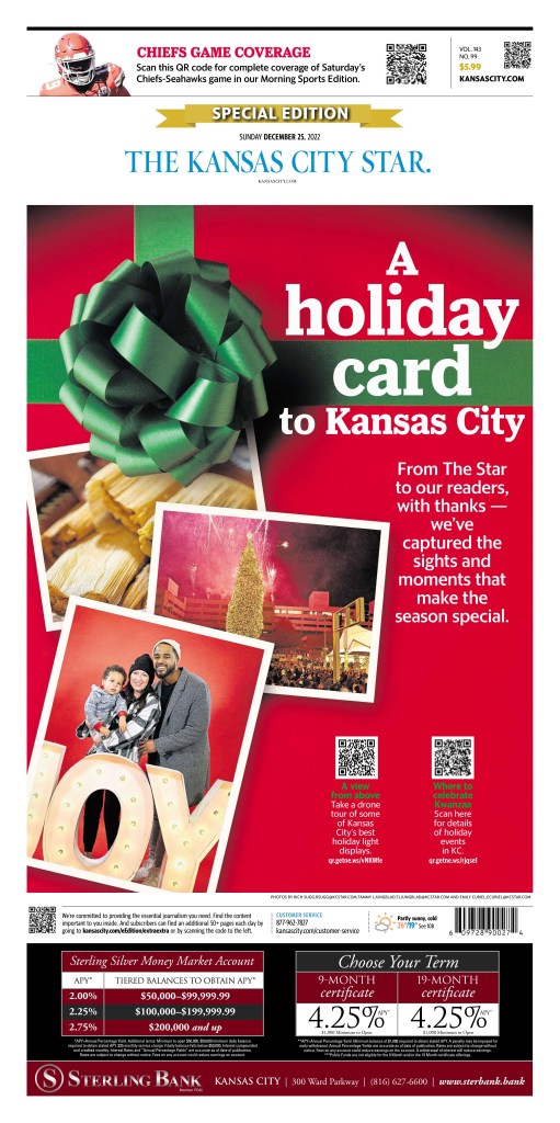
And now for some more pages, starting with the big winners, but please keep reading/viewing, or even just scroll down to look at some of the pages from those that didn’t finish the top 10 or so, but still produced some brilliant work. First, the always mighty New York Times.
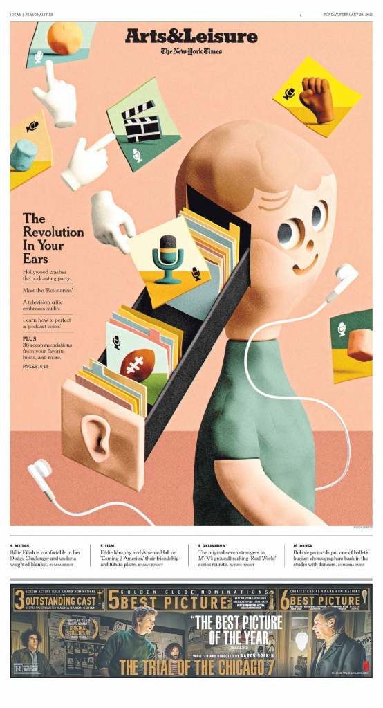
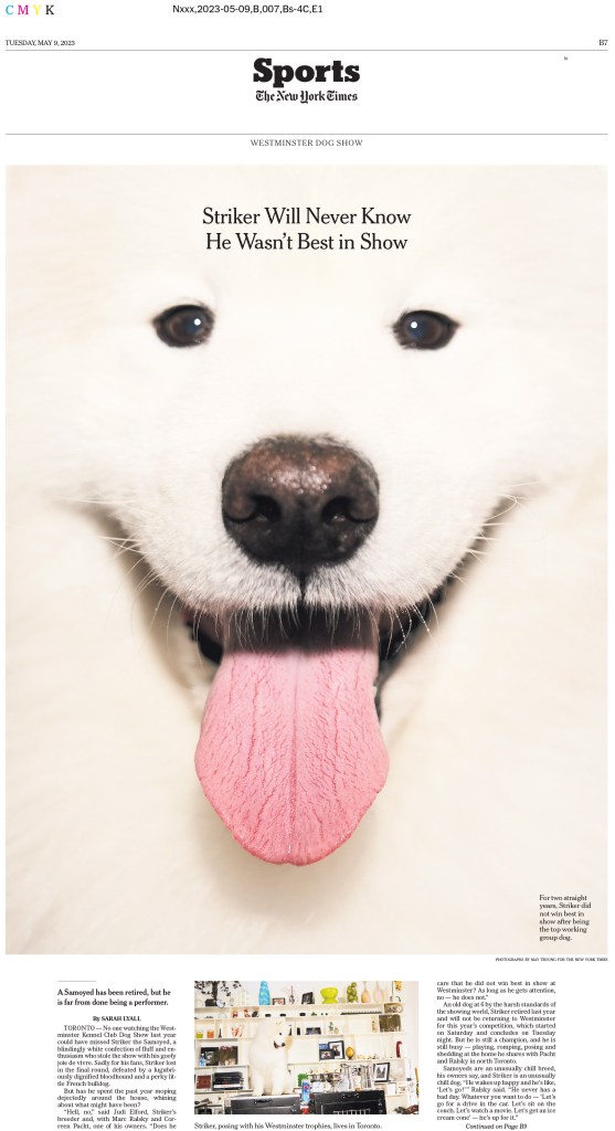
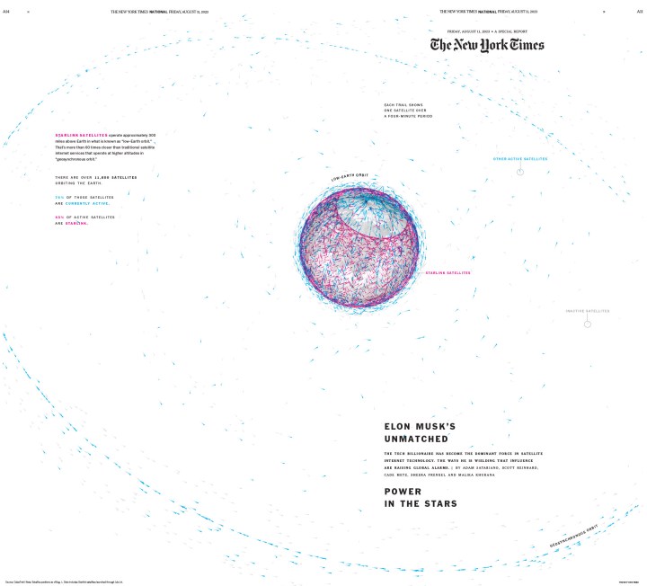
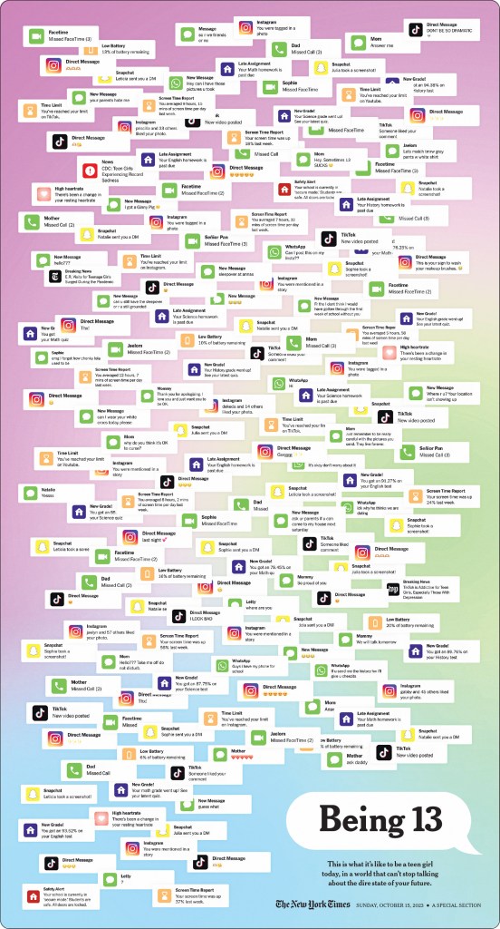
The New York Times
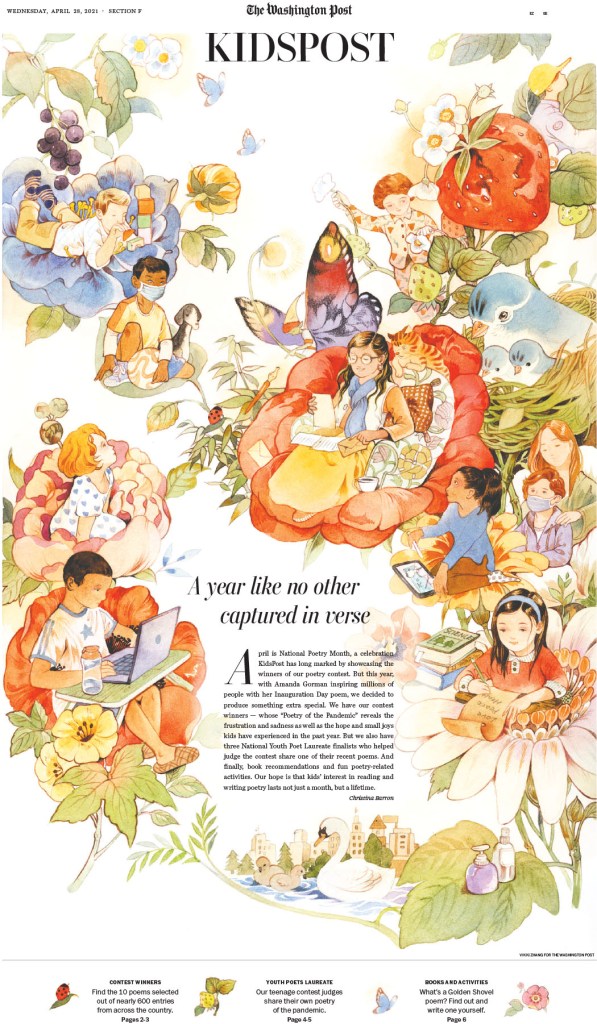
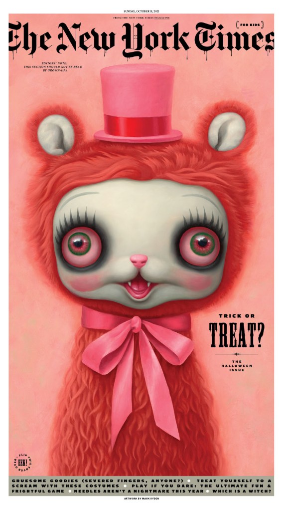
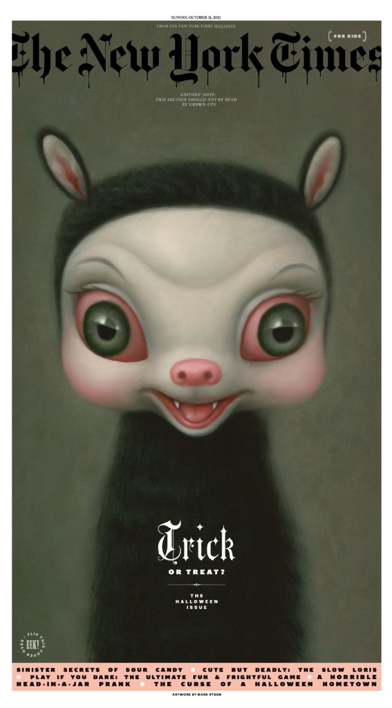
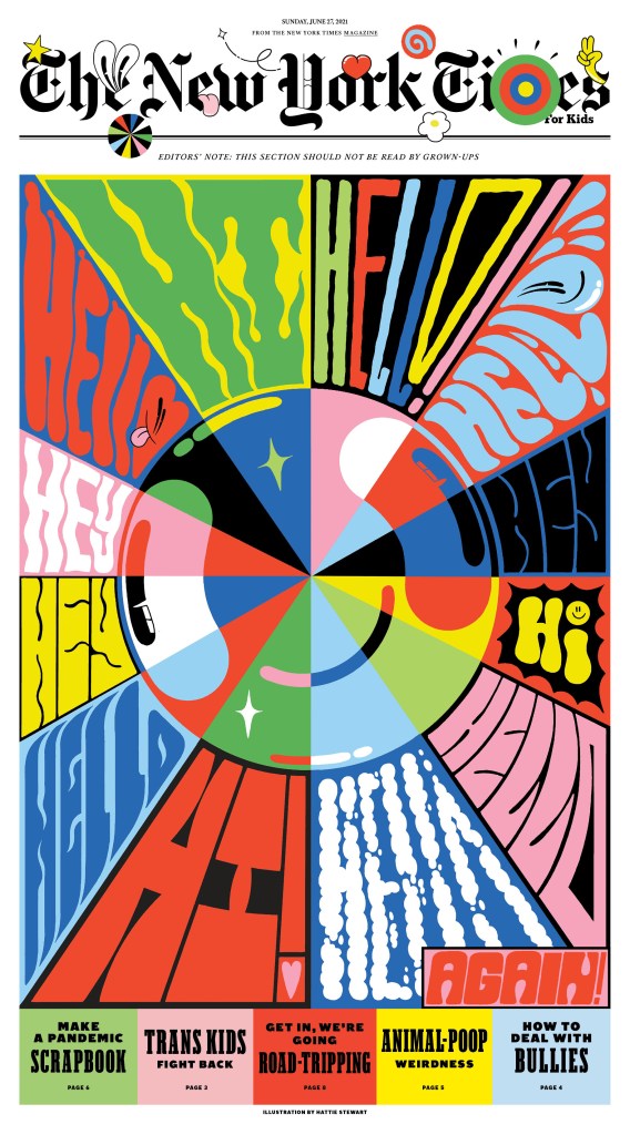
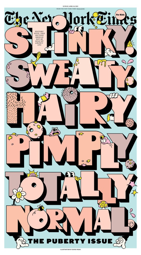
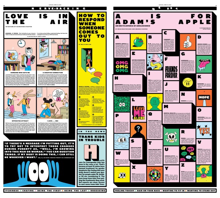
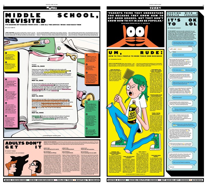
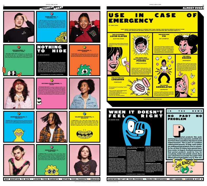
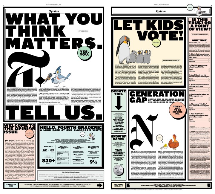
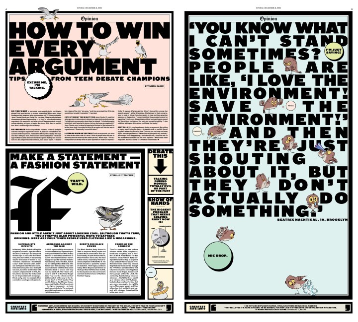
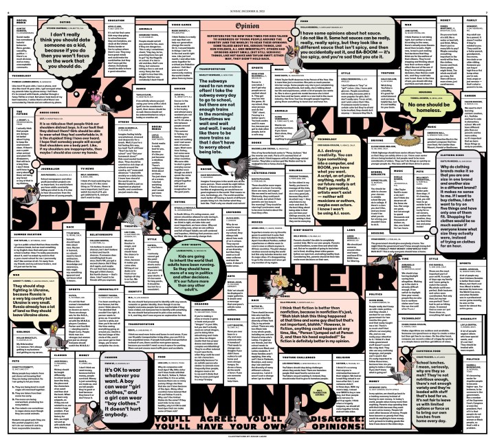
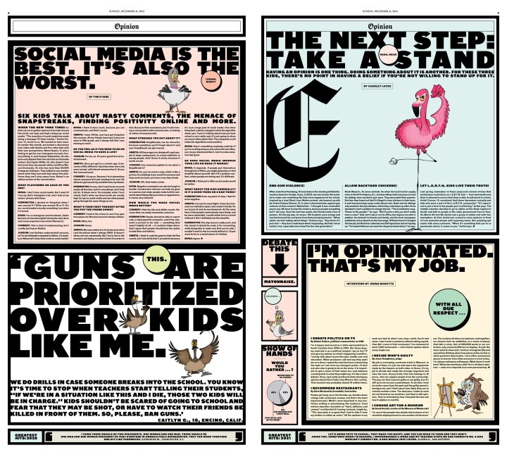
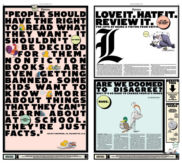
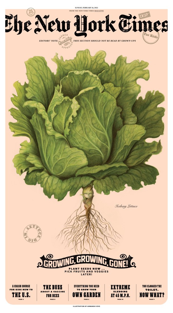
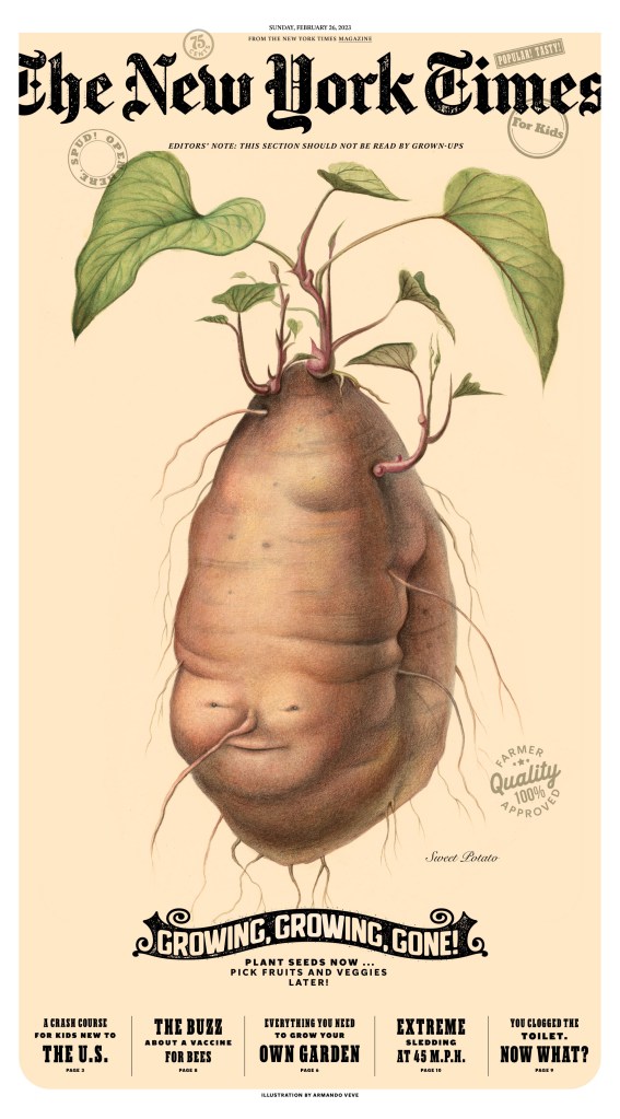
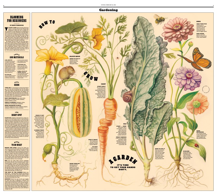
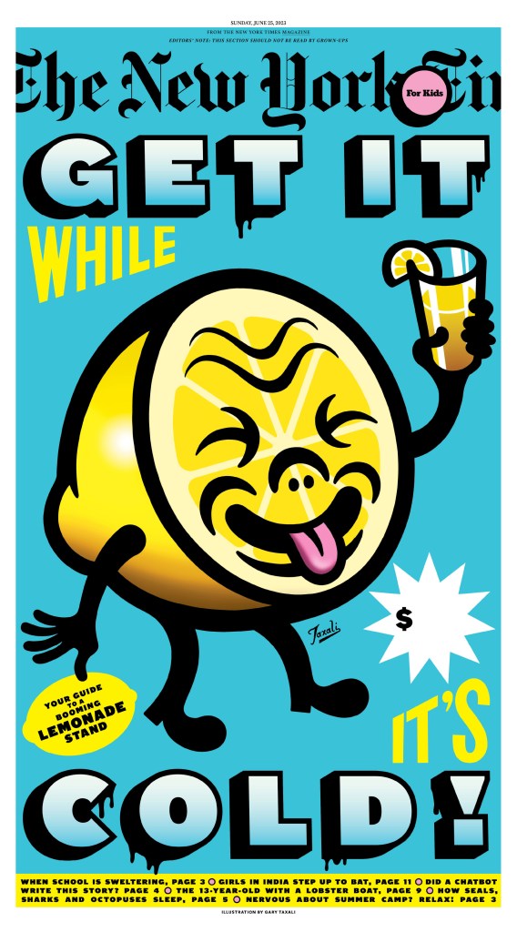
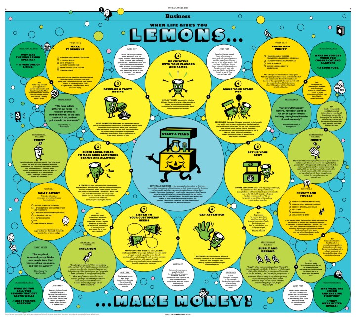
I might as well jump straight to the kids’ section as it always garners a lot of discussion and always wins plenty of awards. It’s big, bold, busy and playful. Always. I have included slideshows showing full sections or a single story’s design.
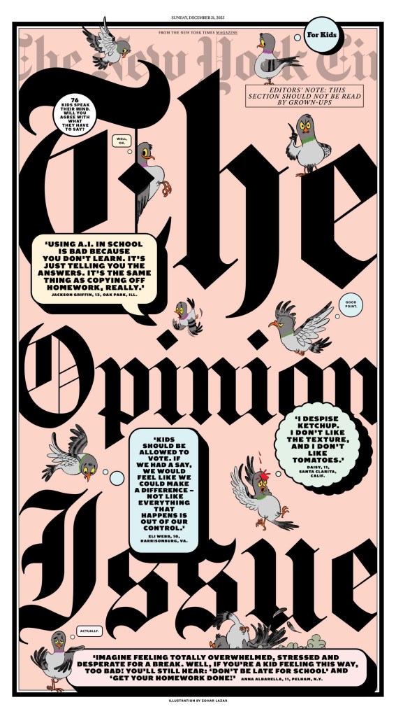

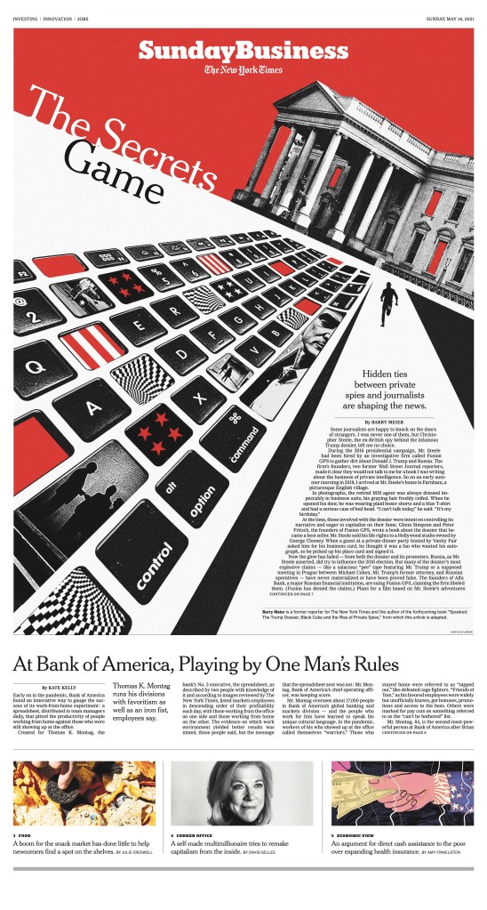
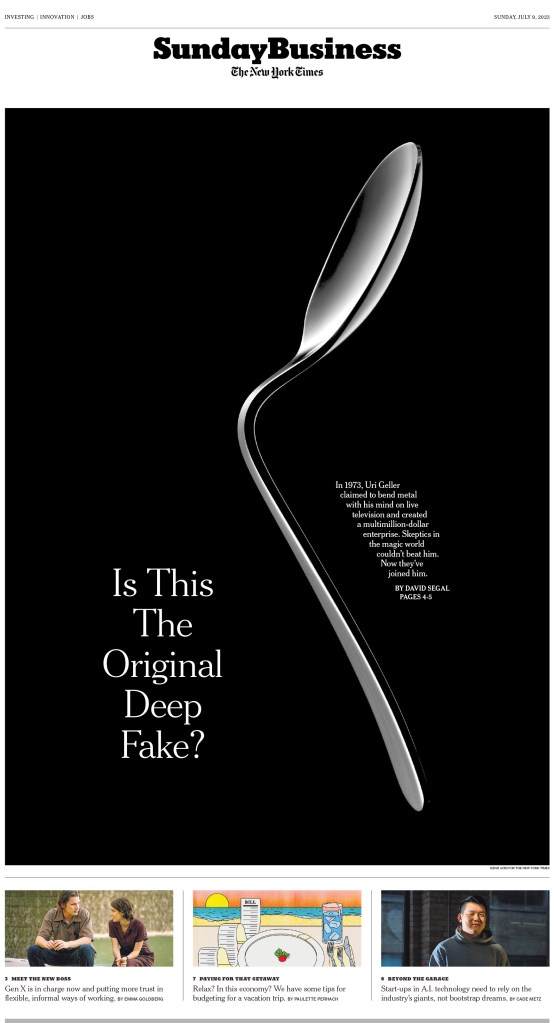
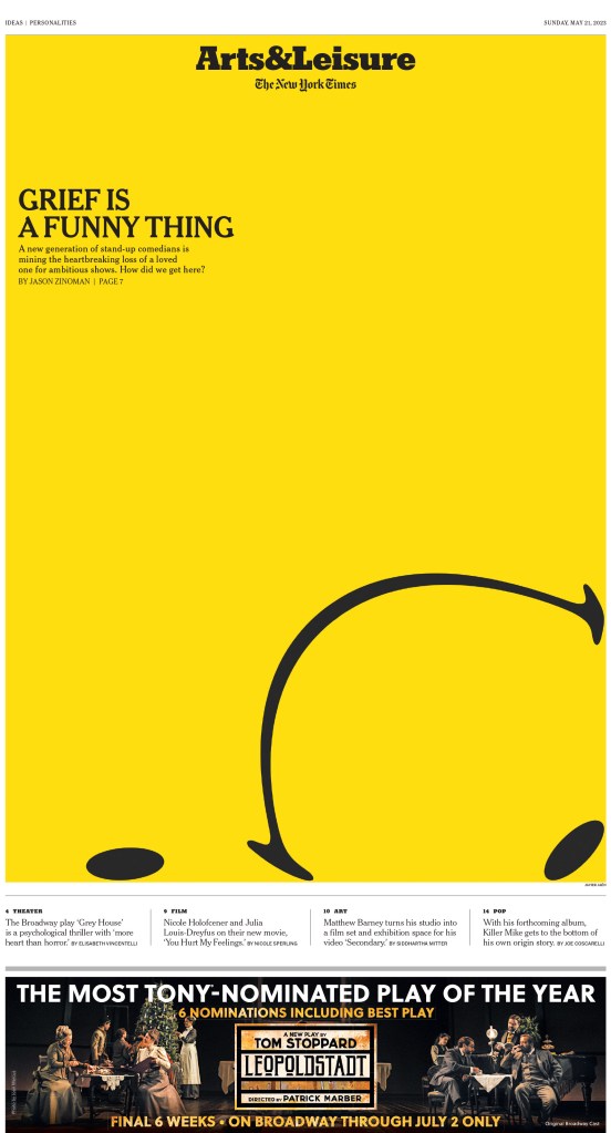
Have you recovered? If so, let’s move on to something completely different. Here are some of the non-kids pages that I loved from The Times this year.
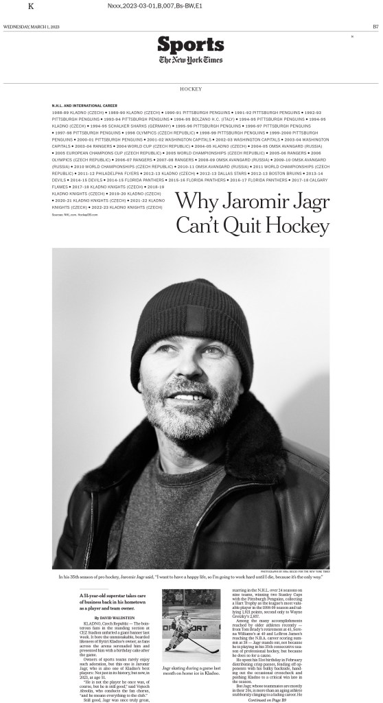
I could go on and on. But I will just add these to wrap up NYT.
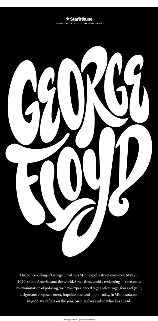
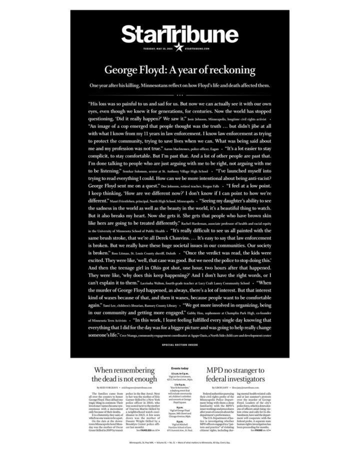
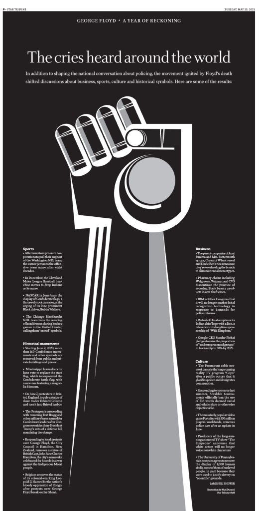
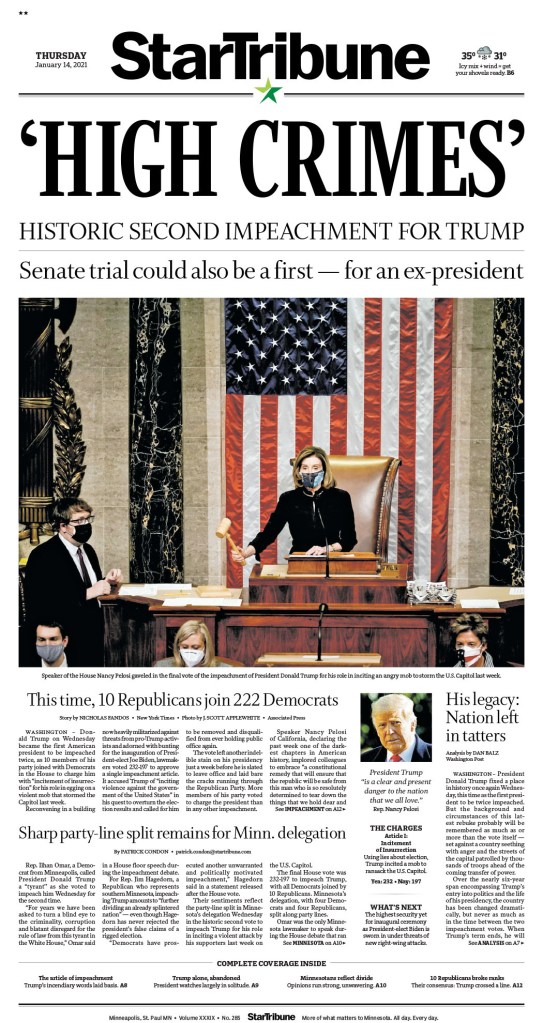
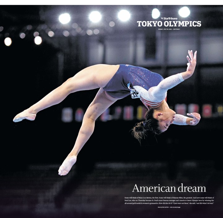
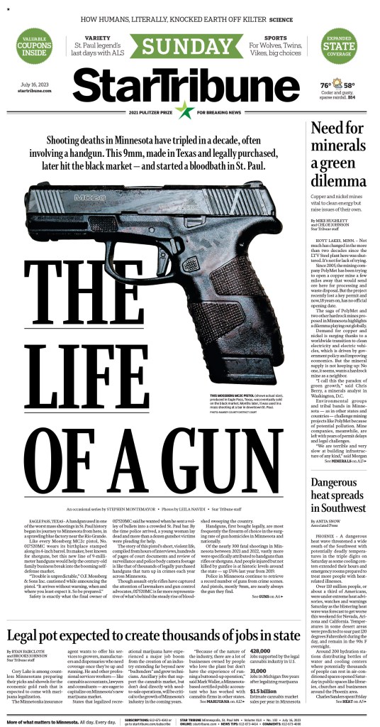
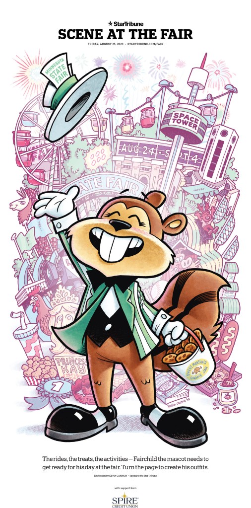
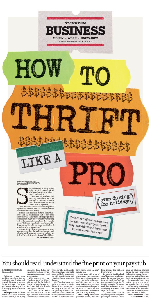
Star Tribune (Minneapolis)
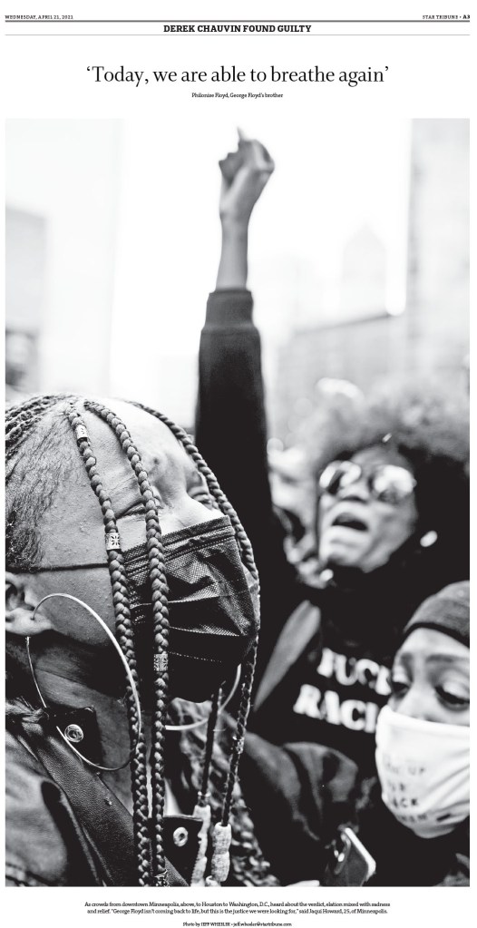
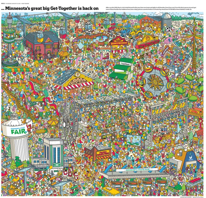
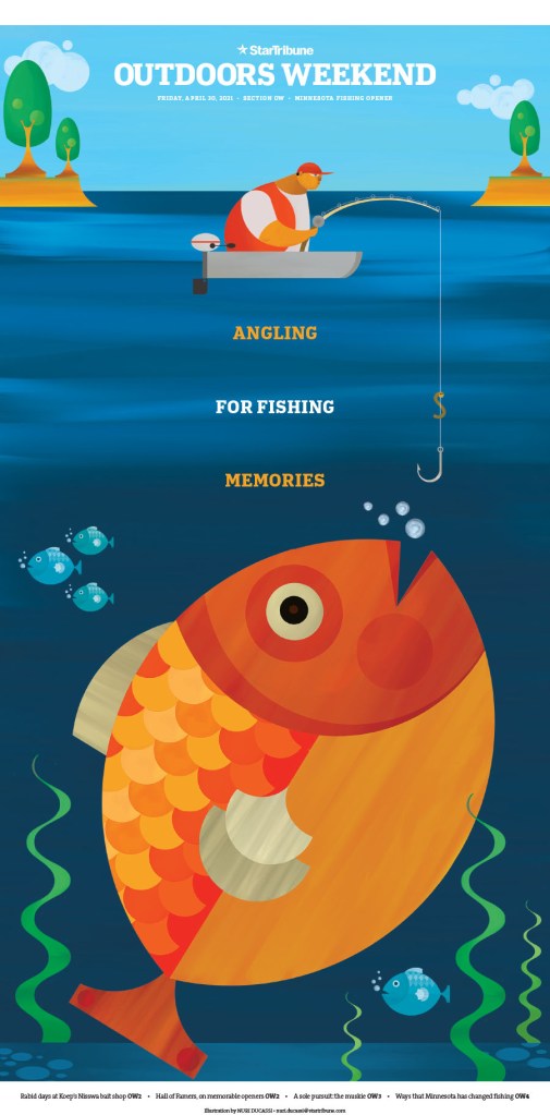
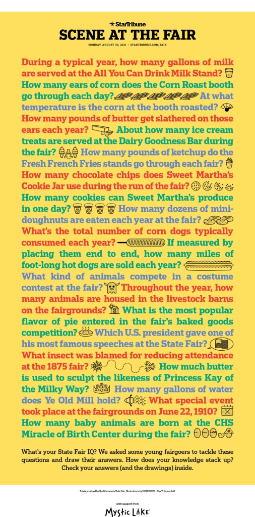
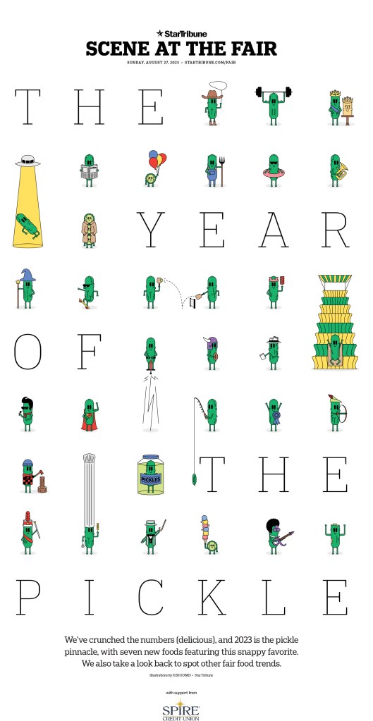
This paper has long been one of the finest designed in the world, thanks a commitment made from the top and some incredible talent to pull it off. They produce outstanding work on the regular, and especially with their very playful features sections. The state fair gives their creative minds design fodder every year. So first a few from there, starting with pickles, of course. Mmmmm, pickles.
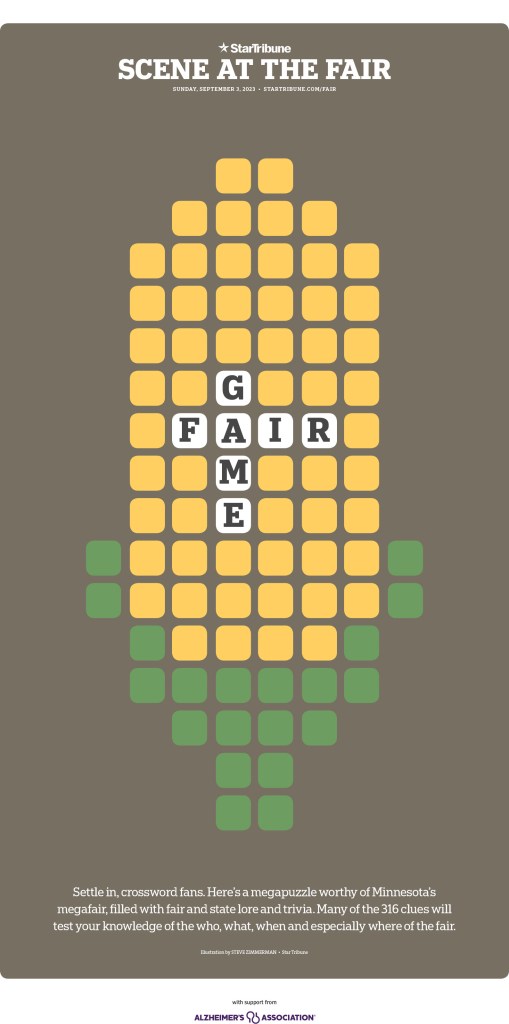
And then … corn!
And while I could keep showing brilliant and fun fair pages, I am going to move to some other incredible designs, including some full story designs over multiple pages.

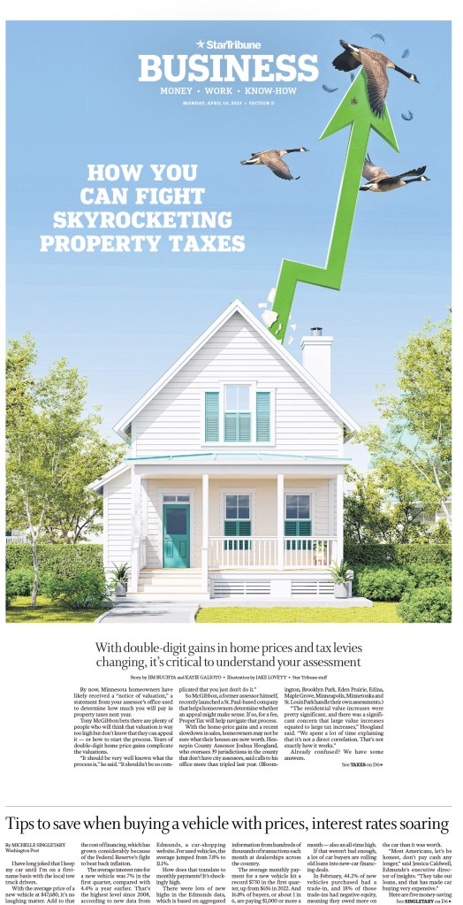
Animals are a common theme on Star Tribune pages, and the one nearly impaled goose on this page pushes it over the top (or very near the top in the goose’s case)!
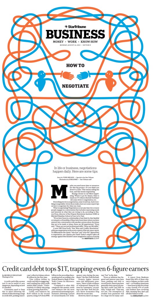
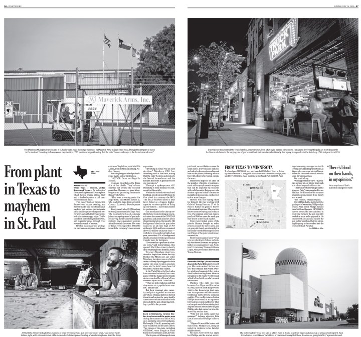
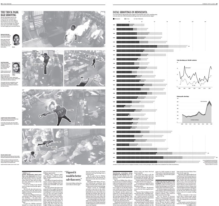
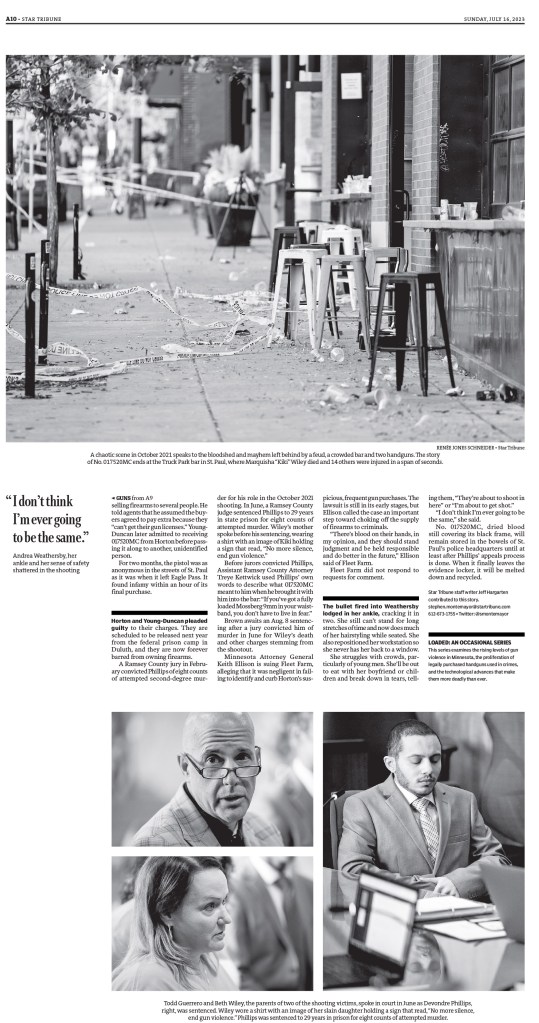
The next two slideshows show brilliant covers and what happens when you get inside the paper, which is always telling. Does a paper just focus on the front, or does the design carry on. With the Star Tribune, I can assure you, the design keeps going. It’s a mix of beautiful, simple design, charts, illustrations. They really do it all here.
And a few more to wrap it up. You can’t have 2023 and now show something about Taylor Swift. And yes, I did sneak another fair page in here.

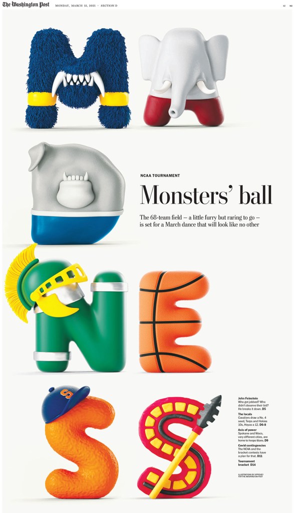
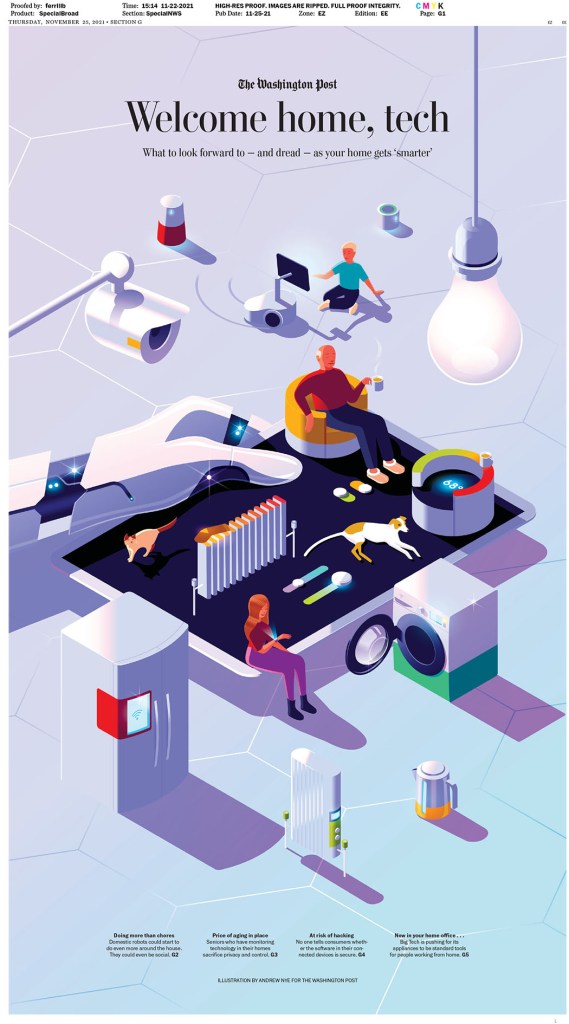
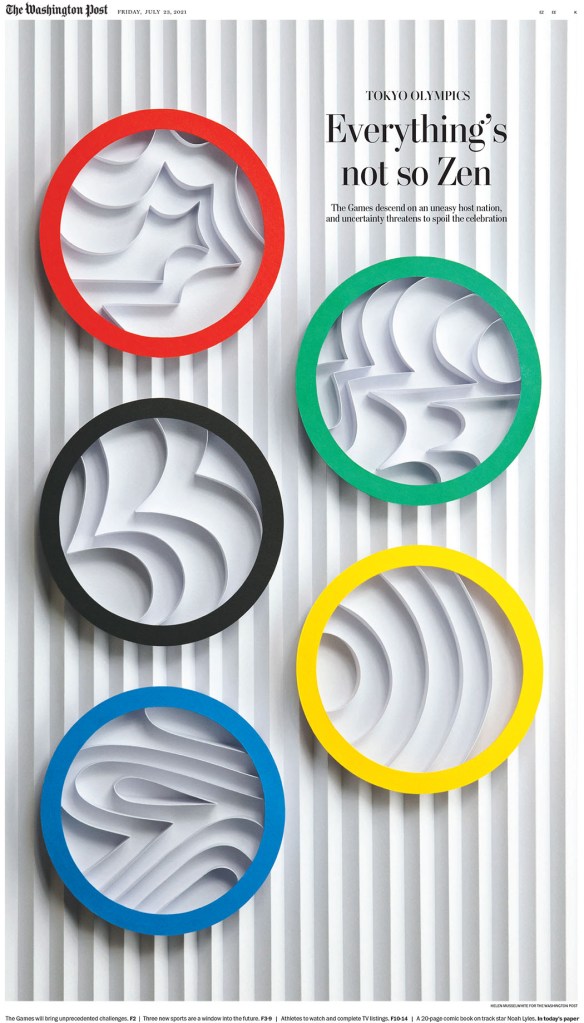
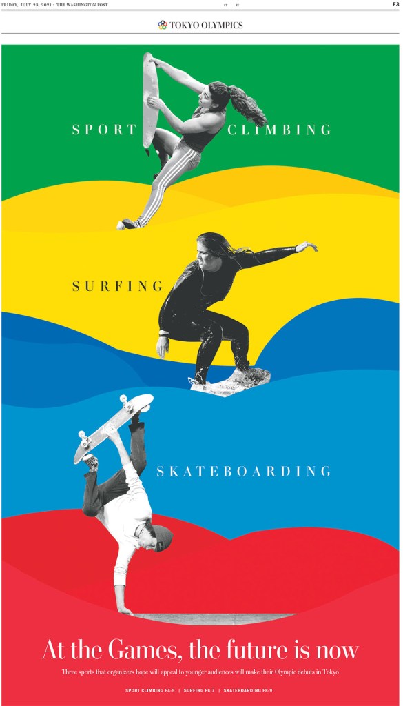
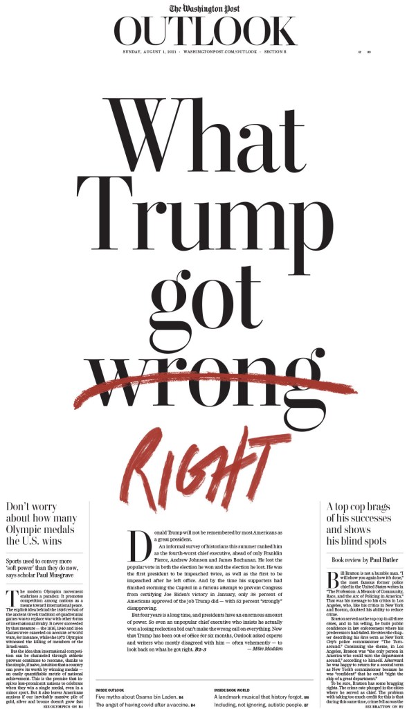
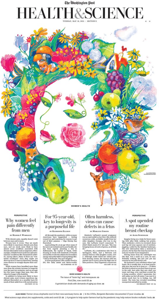
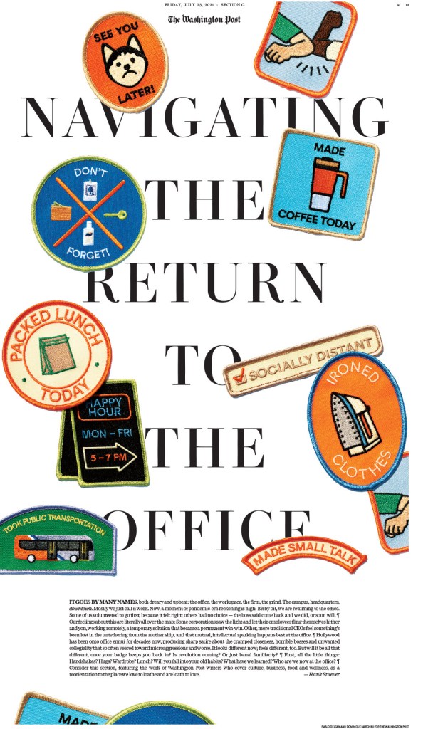
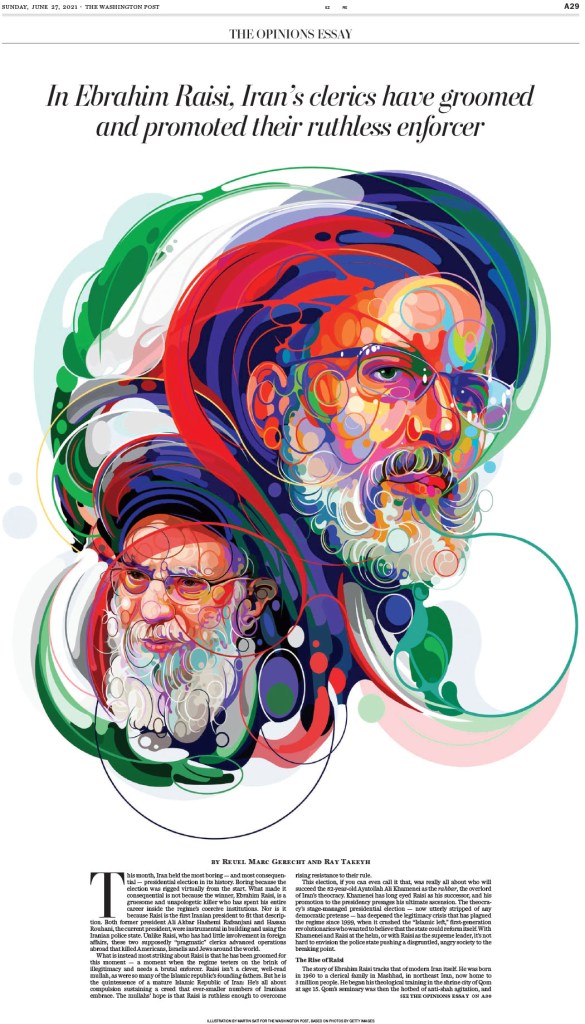
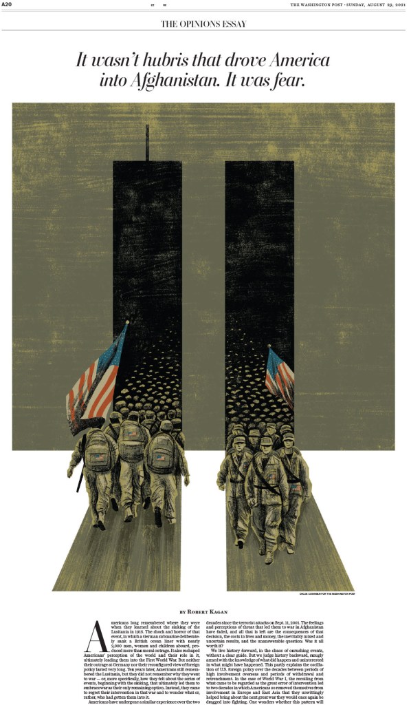
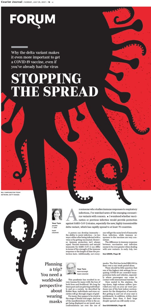
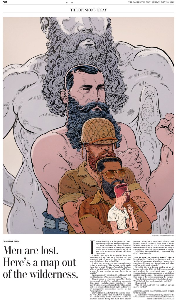
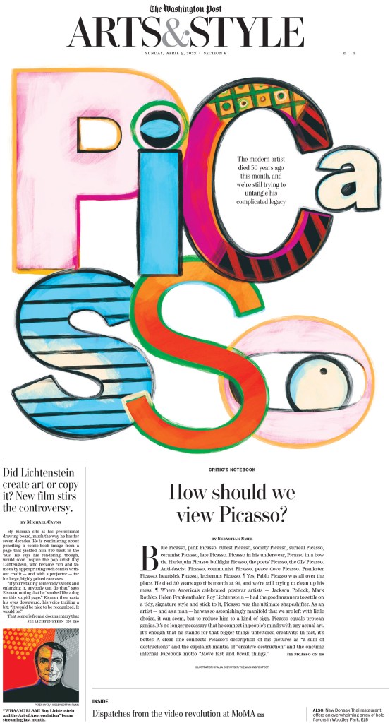
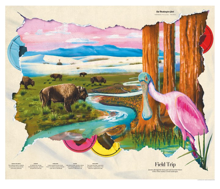
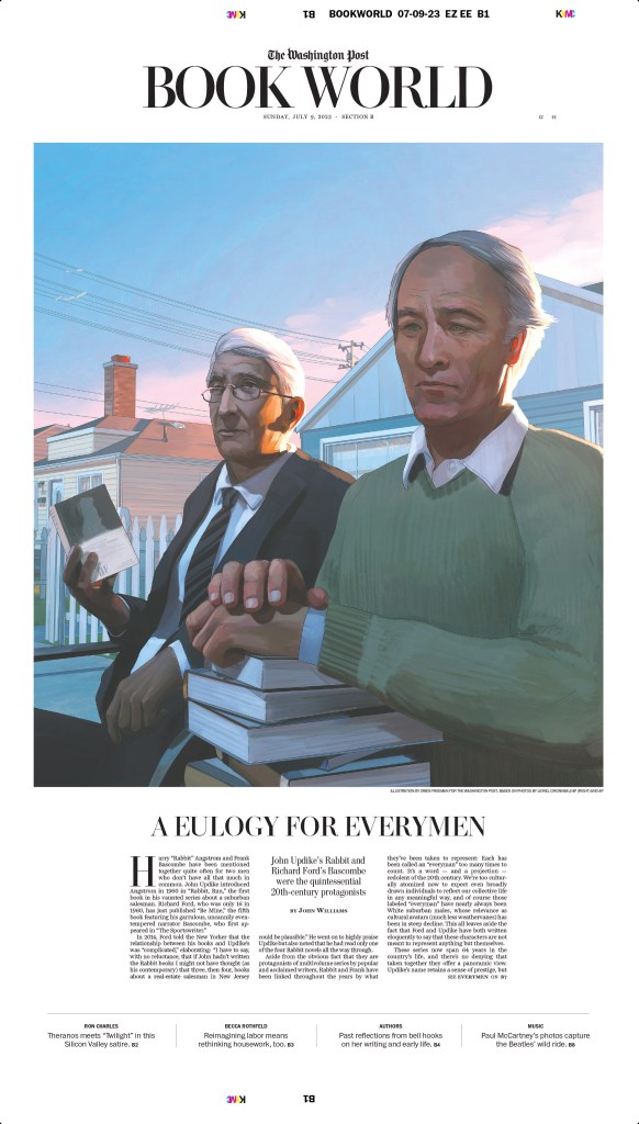
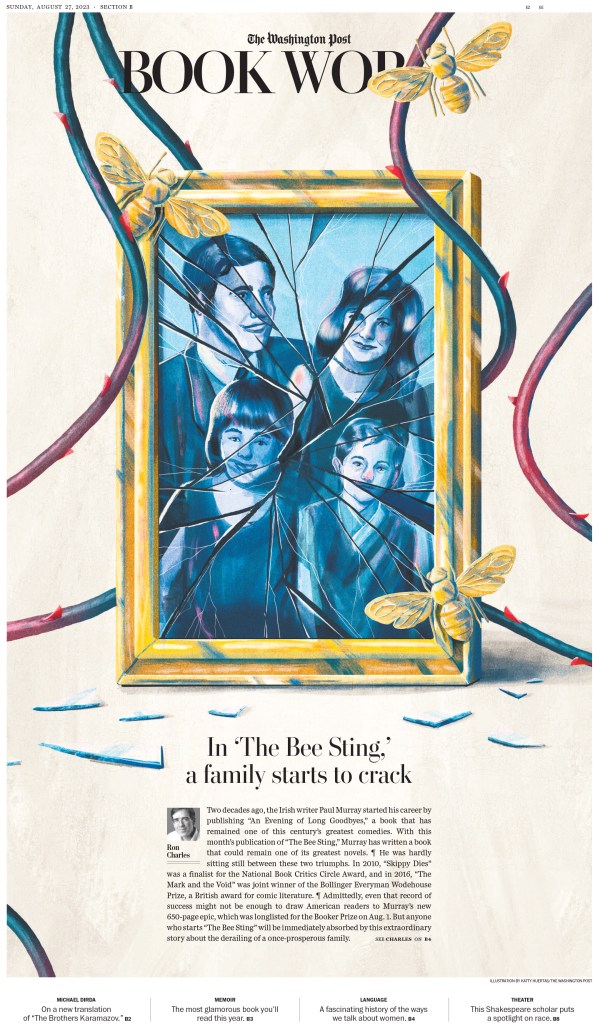
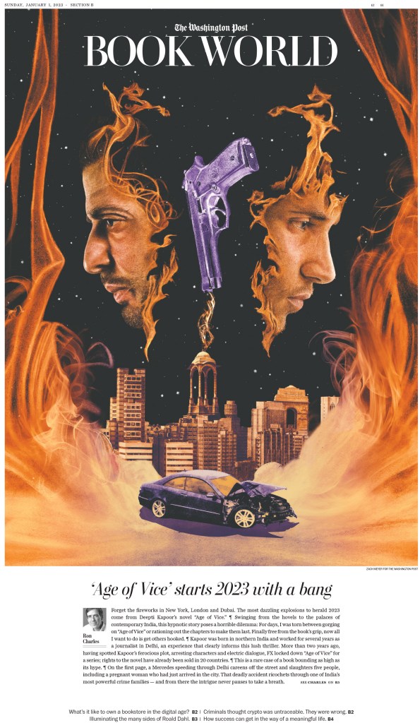
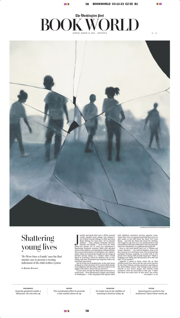
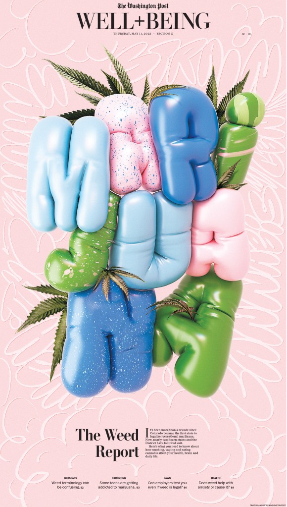
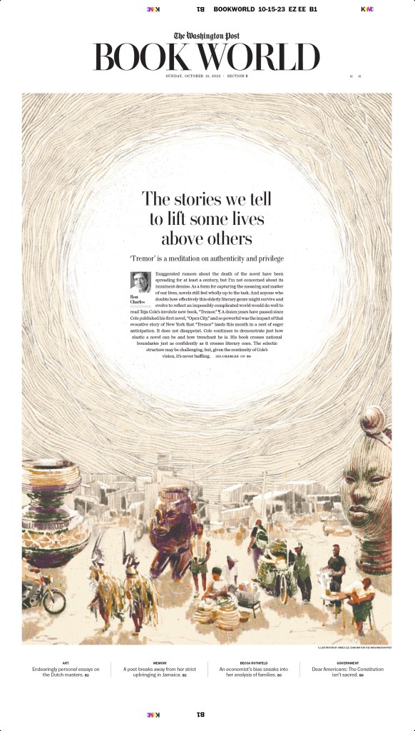
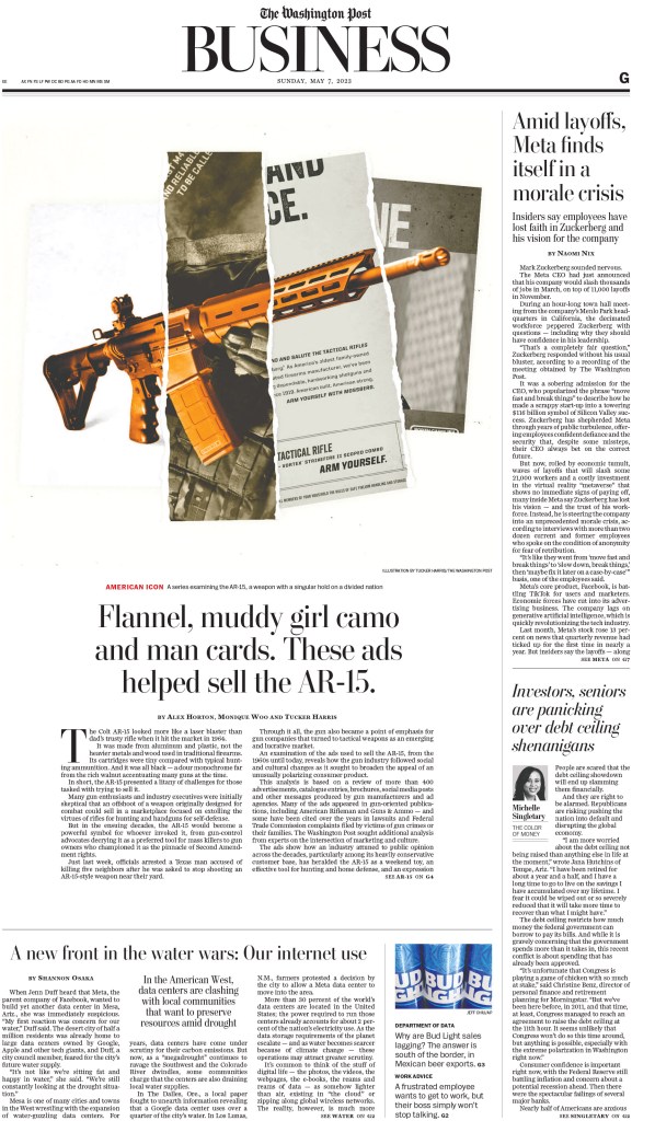
The Washington Post
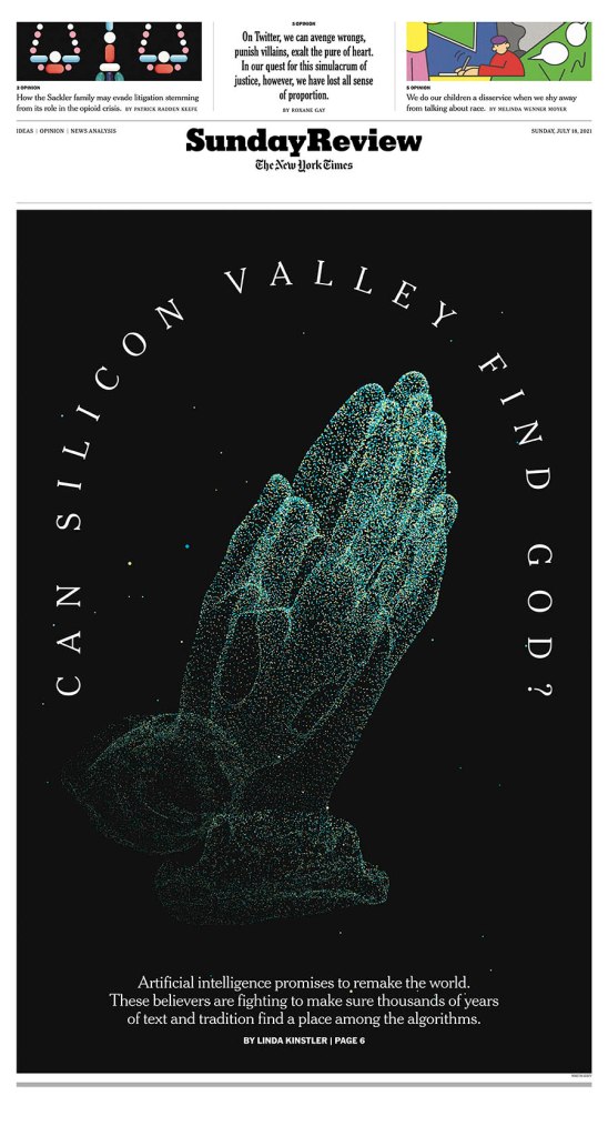
I have already shown much from the Best in Show-winning entry on AR-15s in a previous post, so I will leave those out. But it was an incredibly powerful package, both print and online and is absolutely worth a look. So I will start here, with this gold-medal-winning illustration, followed by a few more illustration-driven pages.
These books pages come from a gold-medal-winning portfolio, the last gold awarded at this year’s competition!
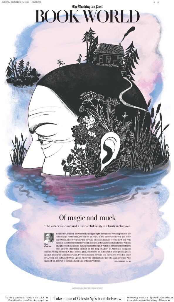
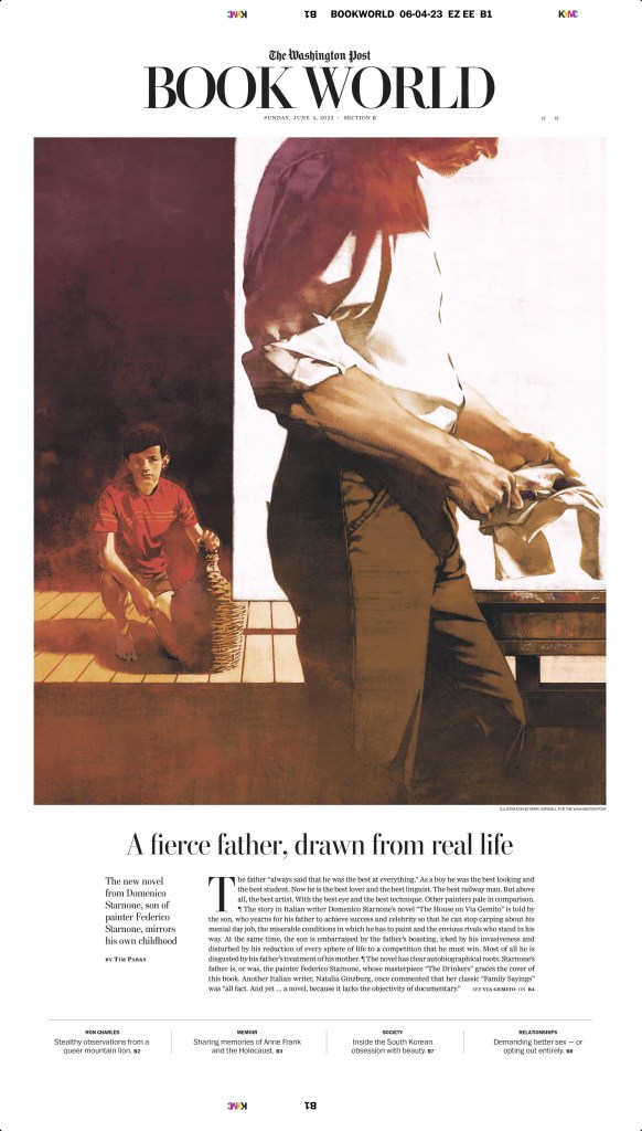
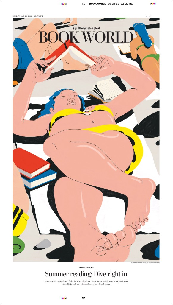
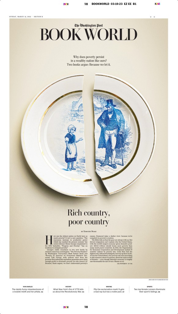
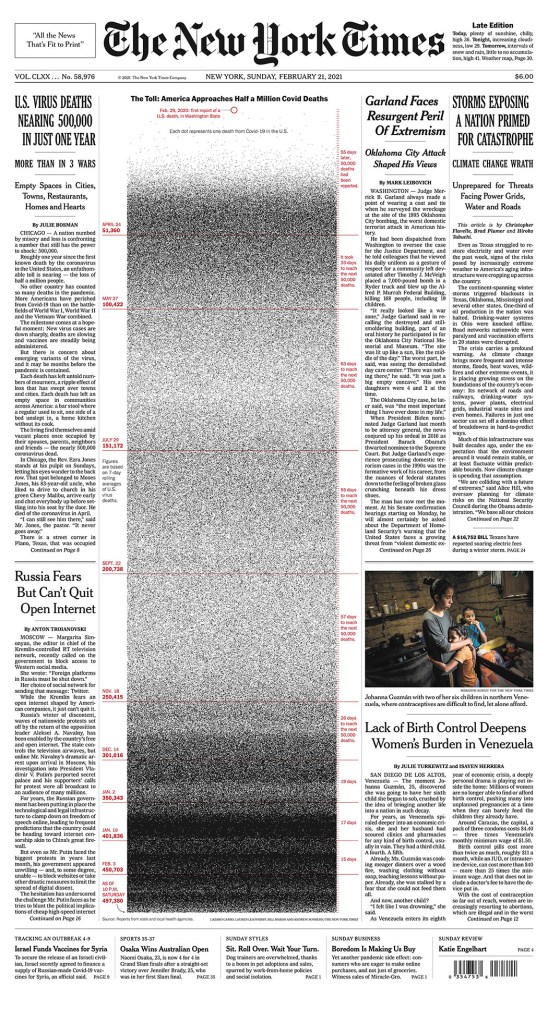
And a few more to close off The Washington Post.
The rest
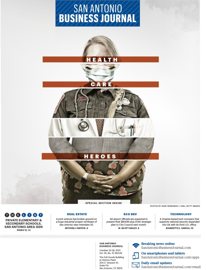
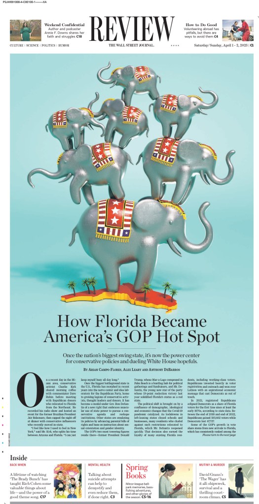
And now for the rest. Full competition results can be found here (you can filter for specific newspapers or categories). The Wall Street Journal also finished in the top 10, but more than half of the awards were for (strikingly beautiful and incredible) illustrations. I will show a couple, as well as many big and bold illustration-driven pages from other publications. I will also show some full stories that relied more on page design.
This illustration for the Wall Street Journal page won a silver medal.
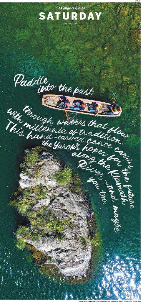
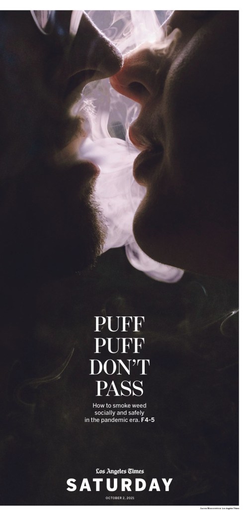
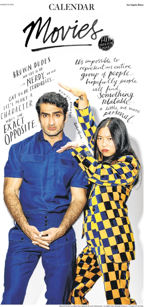
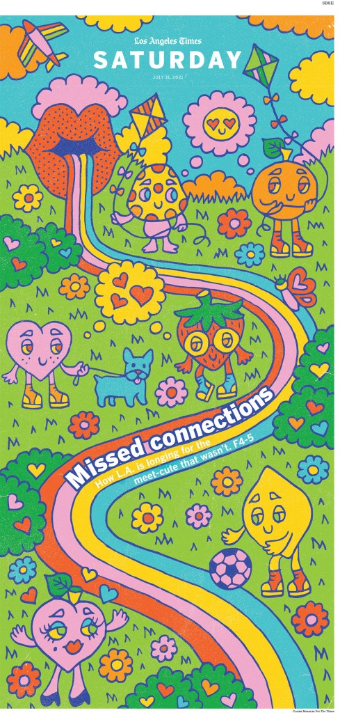
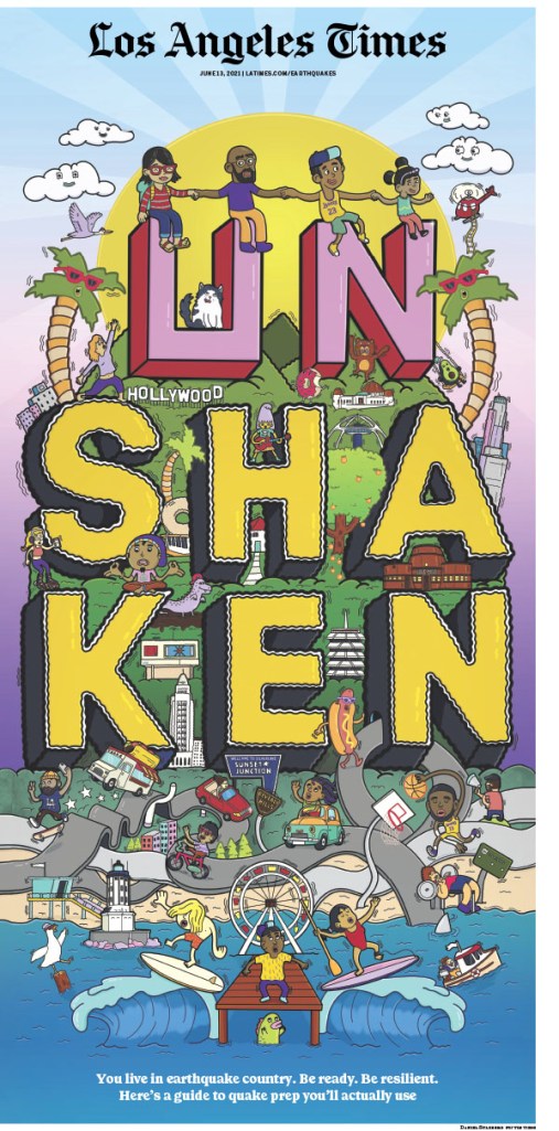
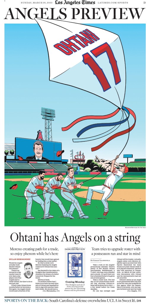
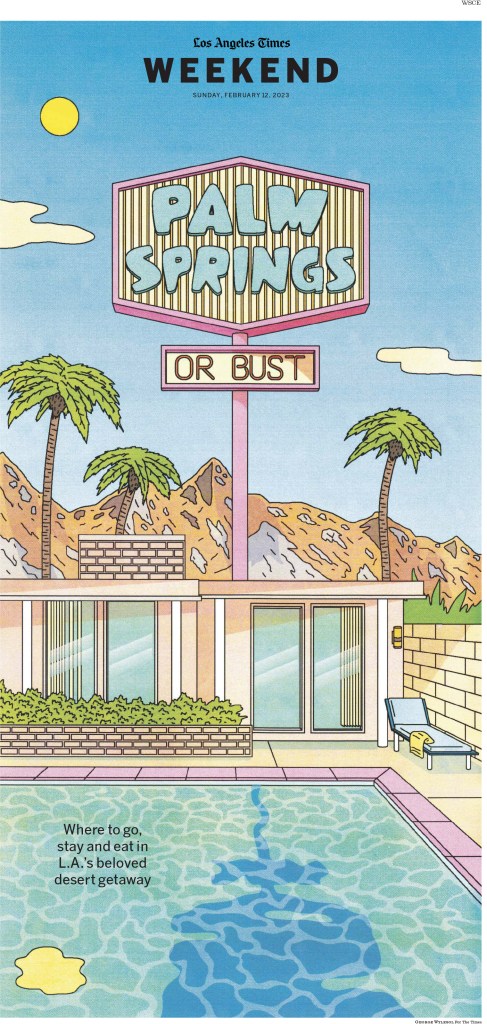
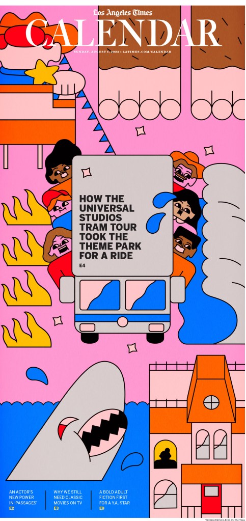
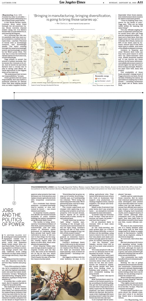
The Los Angeles Times didn’t finish in the top 10 this year, but I’ve long been an LA Times stan, after they gave me the feels while I was volunteering with SND for the first time, for a Covid-inspired page, which you can see in this post (Will we ever kiss again?). Here is a selection, starting with some driven by the kinds of illustrations I have come to expect from the LA Times.
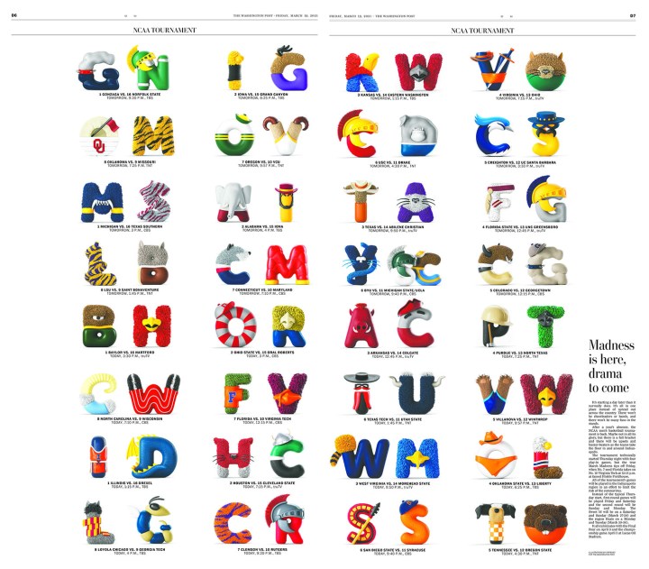
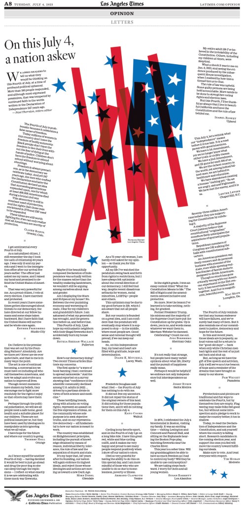
I almost gave this page a facilitator’s special recognition award. A letters page winning for design? Amazing. Creative. Also credit to illustrator Patrick Hruby, as I used a portion of the illustration as my feature image for this post.
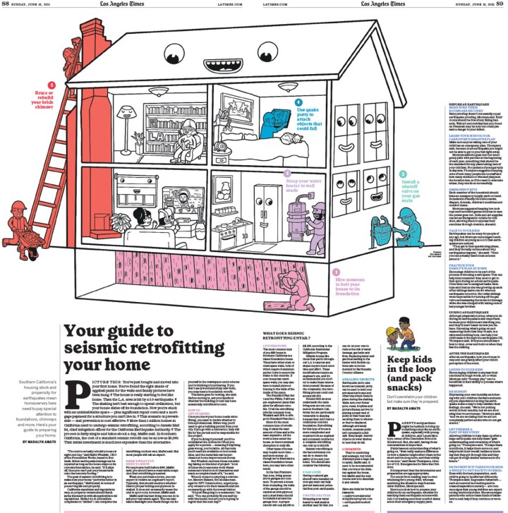
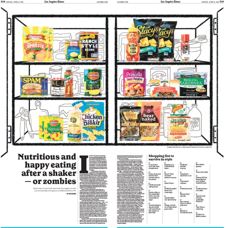
And this is just some solid story design. A look inside, which you don’t see as much here. I appreciate the use of the rules between stories throughout. It’s a small but nice touch.
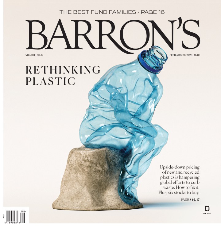
Barron’s had some very strong entries this year, led by this gold-medal-winning page. What a smart concept, and brilliant execution as well.
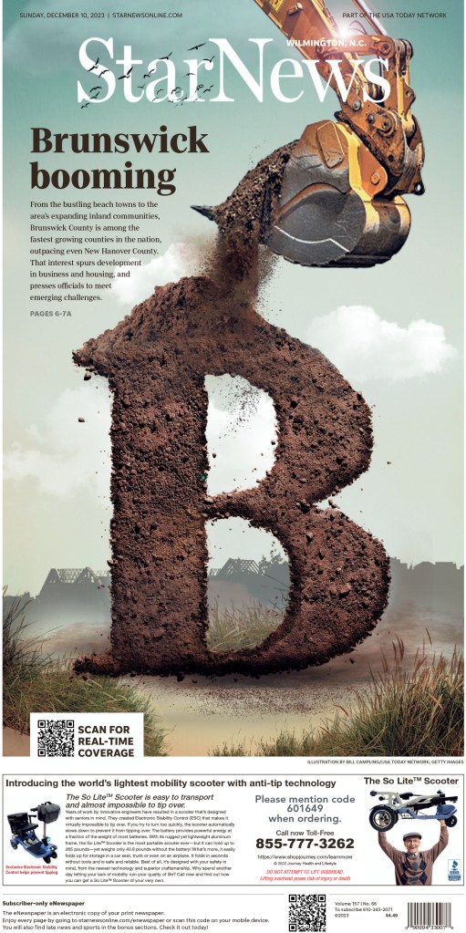
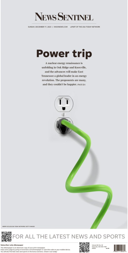
Gannett also had some amazing pages from different publications. The next two were my favourites, from the Star News (Wilmington, N.C.) and News Sentinel (Knoxville, Tenn.).
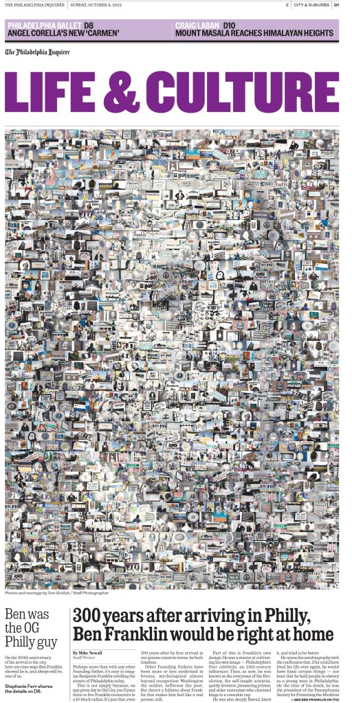
This concept, when executed well, makes for pages that give you so much to explore. You see the main image, but what are all the smaller ones? The Philadelphia Inquirer nails it here.
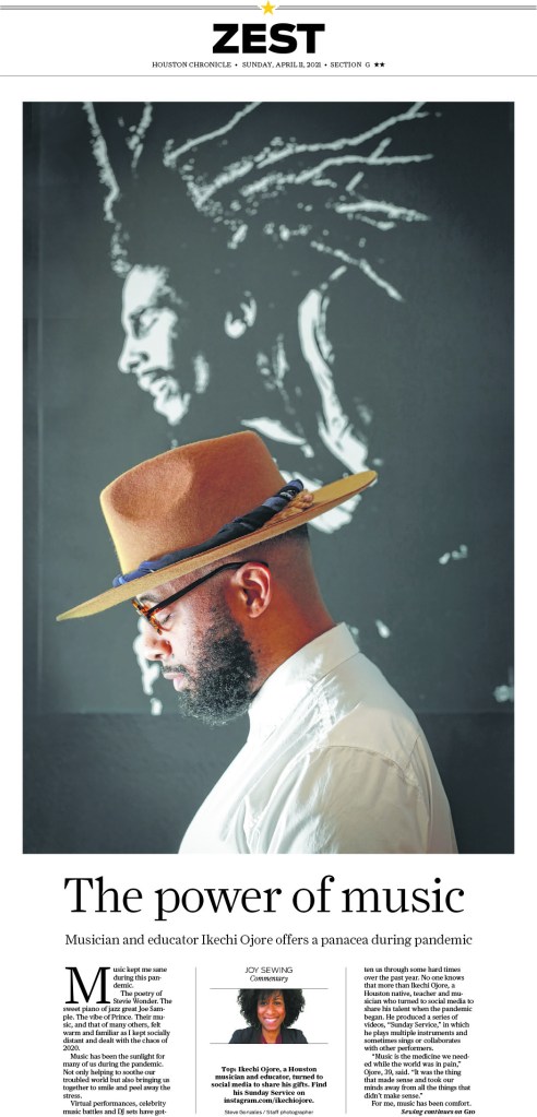
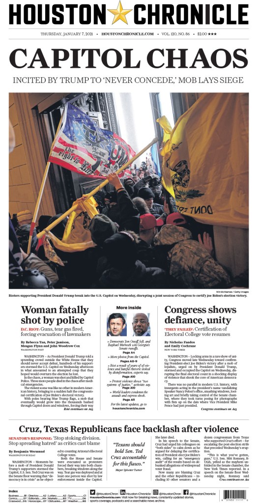
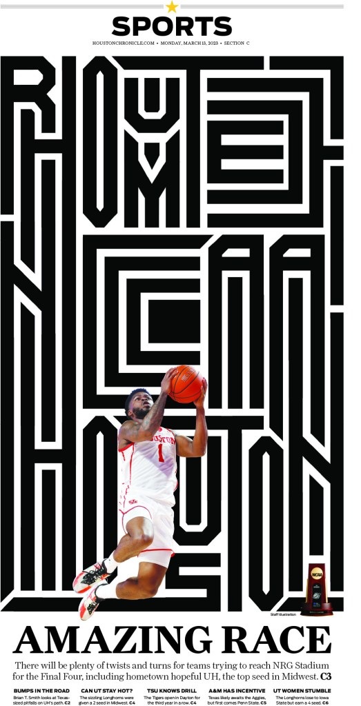
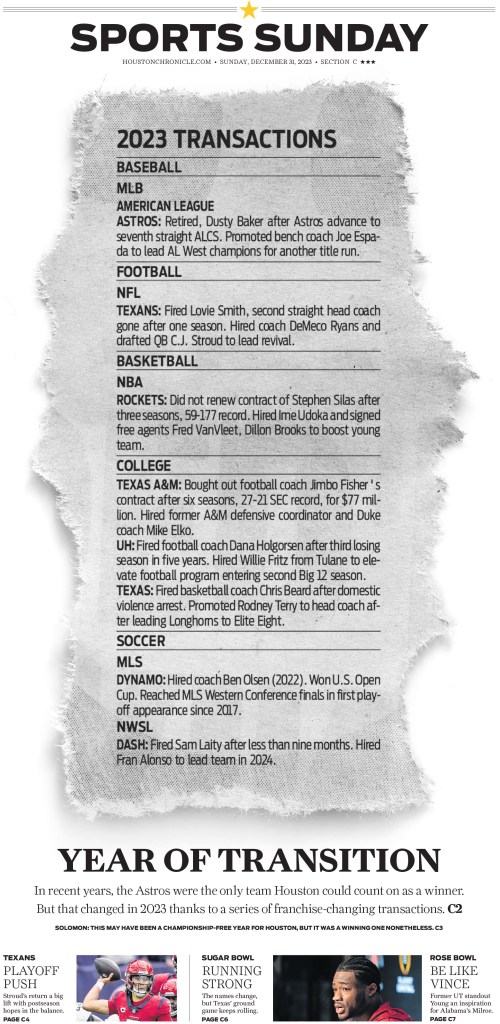
Hearst won a handful of entries for pages from the Houston Chronicle, including the two in the slideshow below (the first won a silver medal!). Hearst is a client of Pagemasters North America, the company I work for, though we don’t handle pages for Houston. But we do love working on their pages!
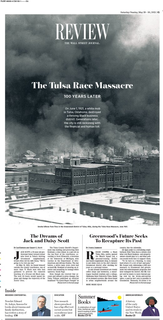
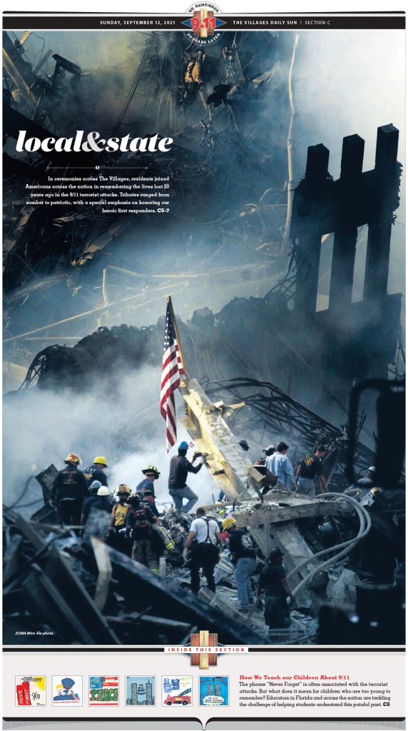
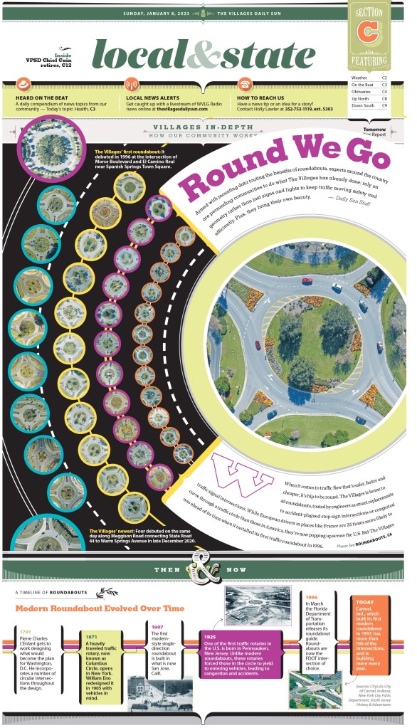
Anyone who has followed me for a while knows what I feel about the Villages Daily Sun. I did a feature on two of their designers, one of whom was the team lead on the World’s Best team this year, so I had the privilege of working with him again.
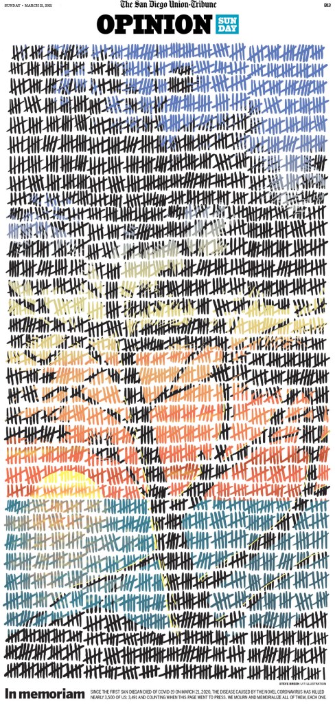
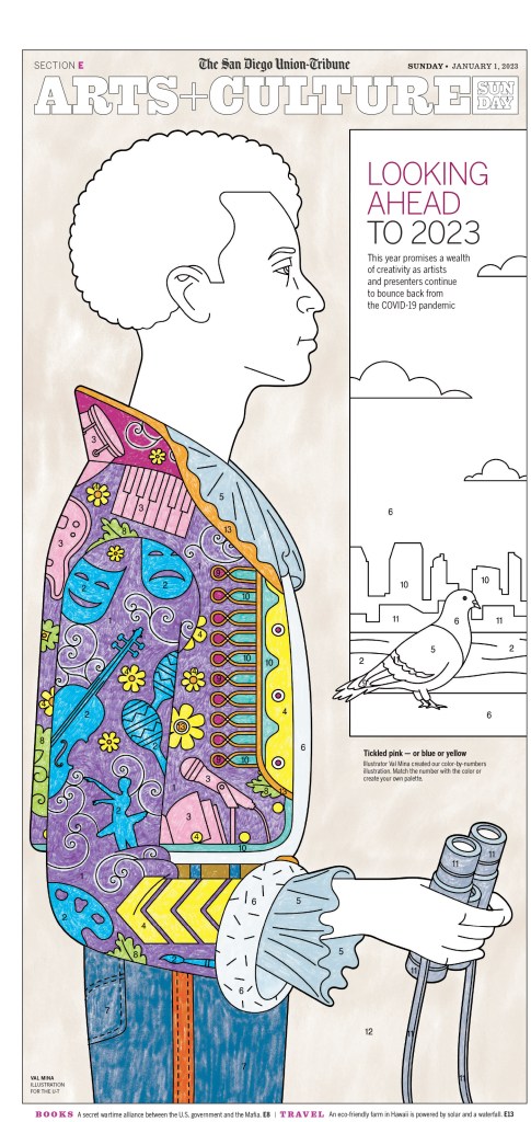
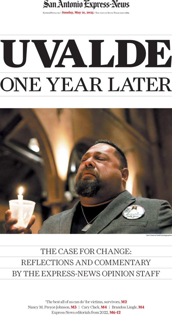
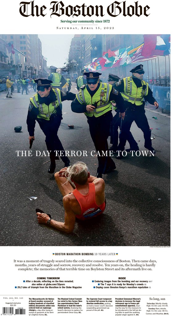
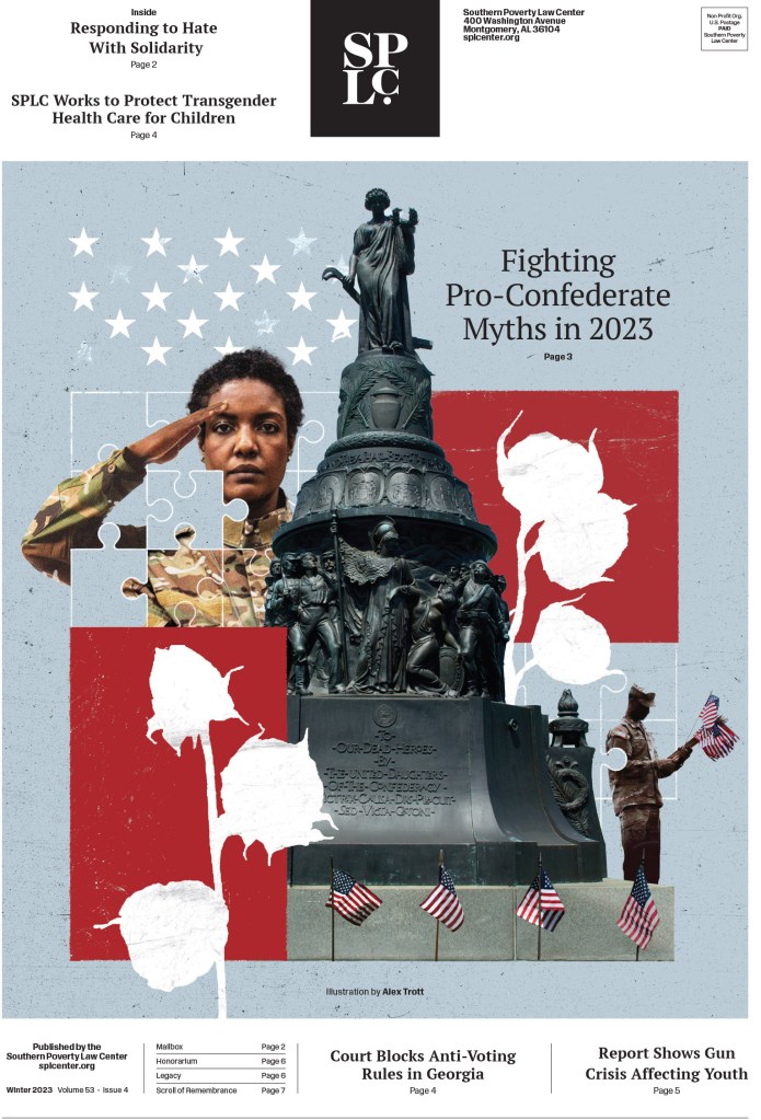
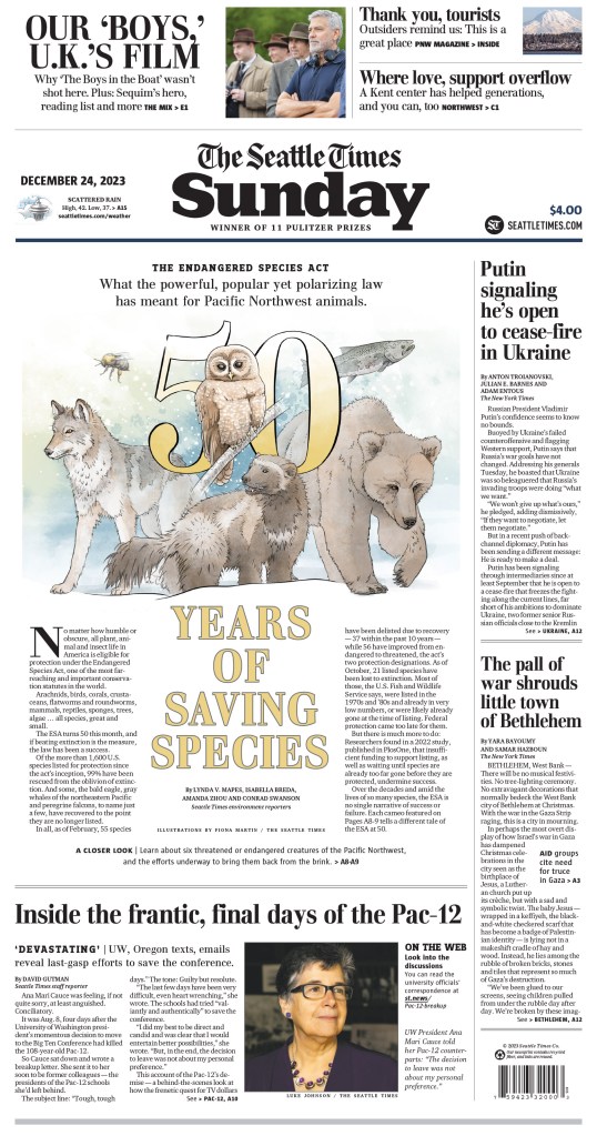
And last but not least, two more slideshows. I have to say, paring down the thousands of entries is not easy. And it’s painful. I hate to cut anything or any publication. In the first slideshow there are excellent pages from the San Diego Union-Tribune, San Antonio Express-News, The Boston Globe (a digital client of Pagemasters), Southern Poverty Law Center and the Seattle Times.
And just a little more from some of American City Business Journal titles, including one more inside spread. I couldn’t resist.
So there it is. Another very strong year by American newspapers. Even as newspapers find themselves in tumultuous times, there are so many still going all out. Thanks to all the designers, illustrators, headline writers, art directors and even executives are willing to allow their papers to do this. We are better for it.
More from SND45:
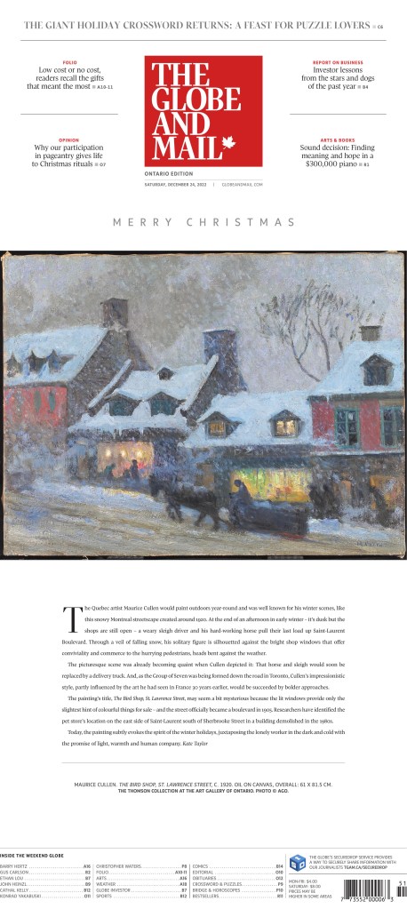
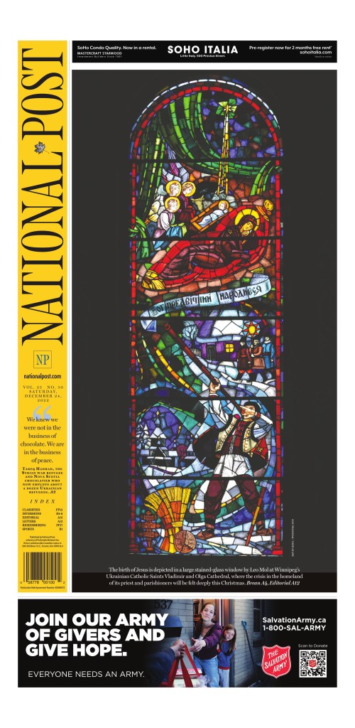
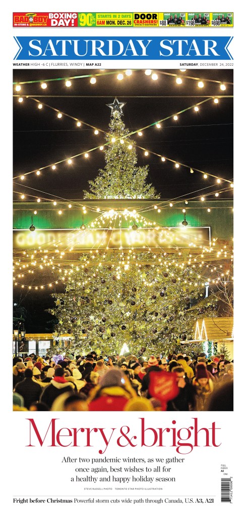
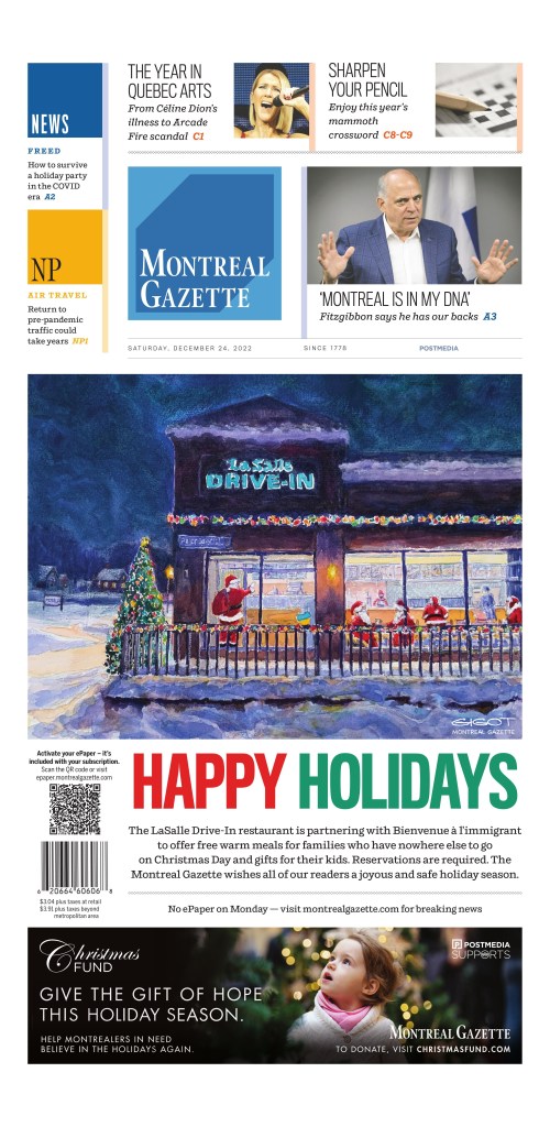
The best from Canada
The best of the rest of the world