By Brad Needham
World’s best designed newspaper. One could argue as the newspaper world contracts, the title of world’s best designed newspaper means less. I will argue the contrary. As print revenue is in decline, anyone in the newspaper world has heard about cuts or newspaper closures. There are fewer resources available. Yet some newspapers refuse to take their foot off the gas pedal. Some newspapers are still prioritizing the print reader experience. And in this post, I salute them.
For the third year in a row I have been fortunate enough to be a facilitator on the World’s Best Designed Newspaper team at the Society for News Design’s annual creative competition. This year’s was its 45th. My role is to help the judges with anything they need. I always feel so privileged to hear some of the world’s best designers debate what newspaper (or newspapers) should be declared World’s Best.
After much back and forth, and some fascinating discussions, the judges pared the entry pool down to four finalists. This year, none of the finalists were from North America. They were: Die Zeit, La Nacion, Politiken and Weekendavisen.
Before I get to the winner (I will talk about and show pages from all finalists), I want to touch on the judging panel at SND45. The panel included Vanessa Wyse (Sudio Wyse), Wayne Kamdoi (The New York Times), Raju Narisetti (McKinsey & Company) and Kris Viesselman (consultant). Below is a little more about them, some taken from their SND bios. There is more to say about all of them as they have had and continue to have impressive careers.
- Vanessa Wyse is the founder and creative director of Studio Wyse in Toronto. She has over 20 years’ experience working with some of the worlds’ largest media brands and institutions including Pinterest, The Globe and Mail, Fairfax Media, The University of Toronto and Air Canada. The Grid, a smaller but mighty now shuttered Canadian weekly publication, where she was the founding creative director, was the first publication to win three consecutive World’s Best Designed Newspaper awards.
- Wayne Kamidoi is an art director for The New York Times, focusing on enterprise in its print hub. He was an art director in Sports for more than 20 years after joining The Times from the Detroit Free Press. He is also one of the few newspaper designers I’ve seen people come up to and talk about feeling lucky to be in their presence. He was a rock star at SND45.
- Raju Narisetti is leader of global publishing at McKinsey & Company. Over a 35-year career, he has created, reimagined and managed major media organizations in the U.S., Europe and Asia. Raju spent 14 years at The Wall Street Journal where he went from a reporting intern to editor of WSJ Europe, and later managing editor, digital, of the global WSJ. Also, Raju has a Wikipedia entry, so that’s fun!
- Kris Viesselman is a creative director, editor, designer and ring leader. She has been a top editor and top creative at a number of media companies and has worked as a consultant with a wide range of clients. Kris is a past president of SND and has consulted and presented in five continents.
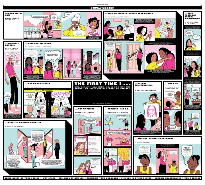
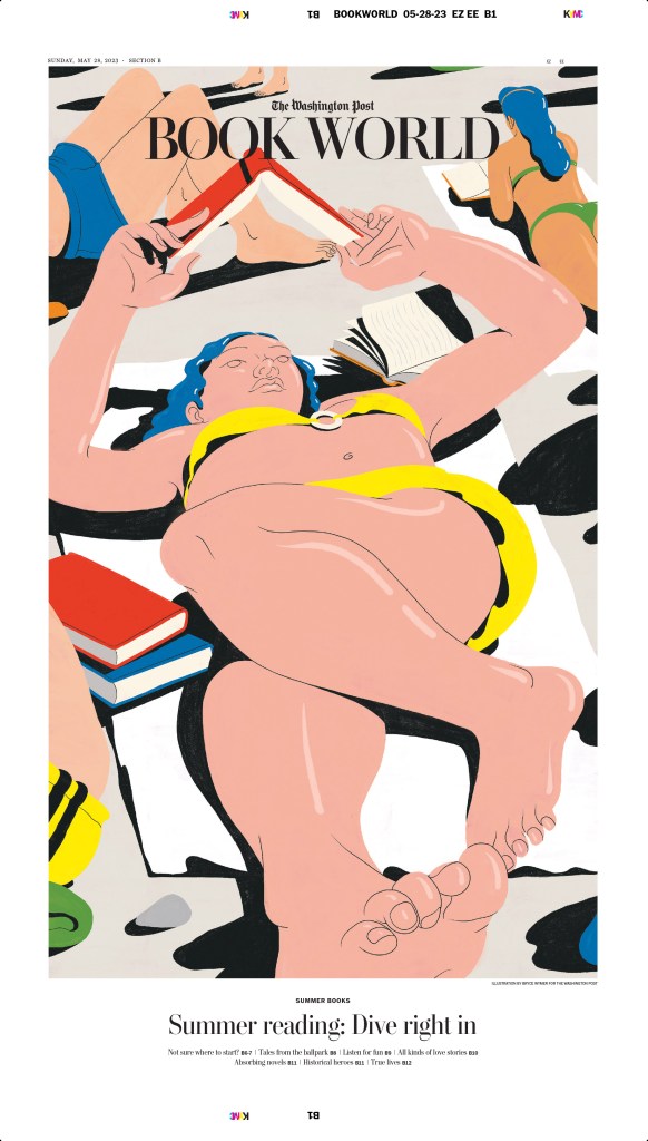
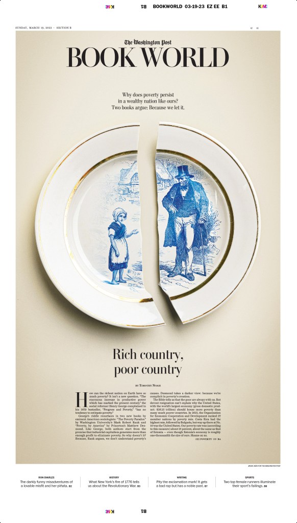
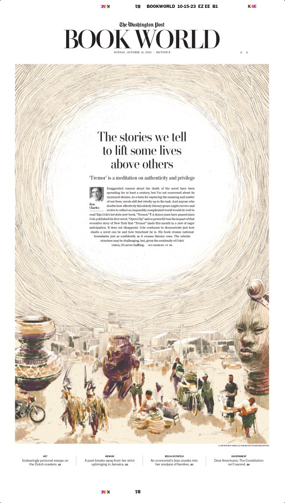
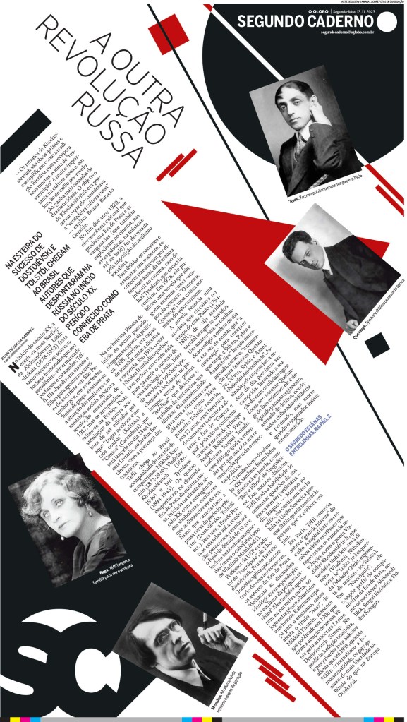
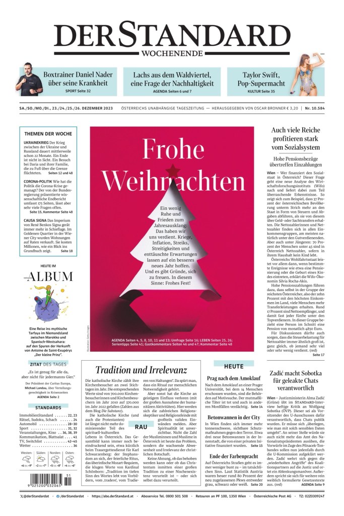
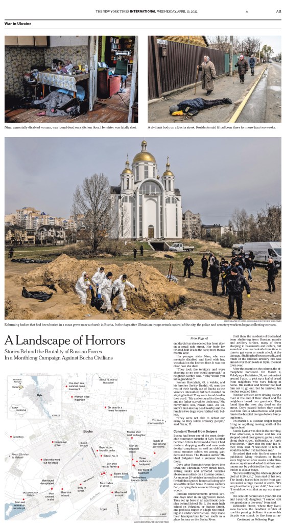
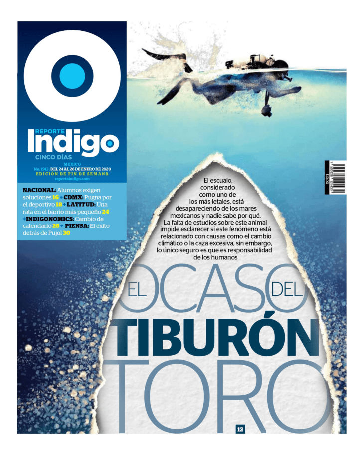
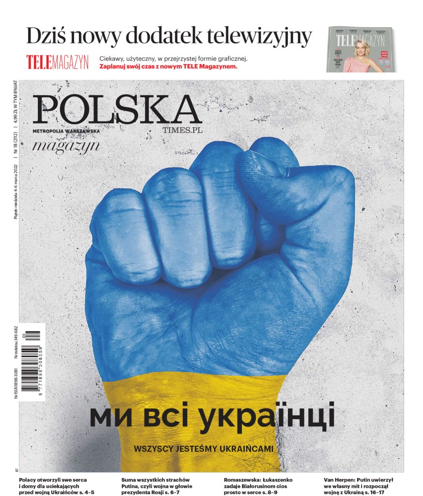
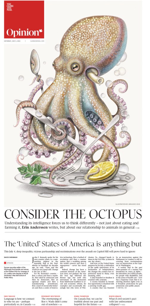
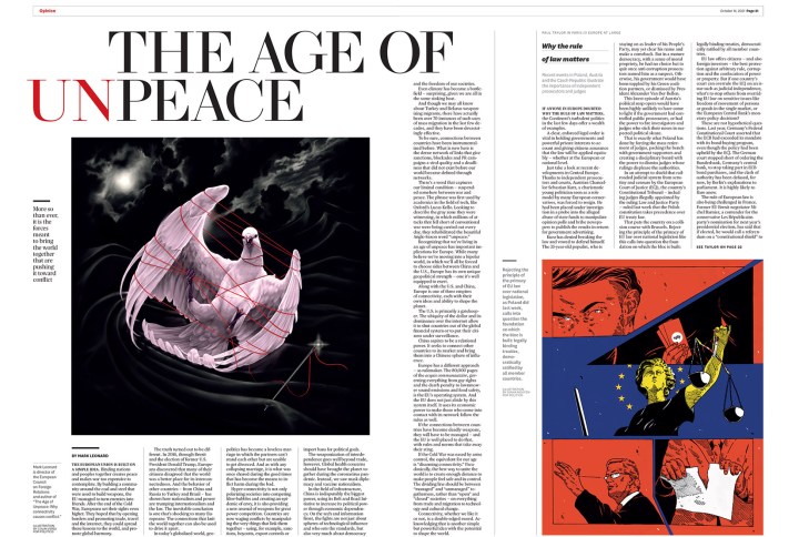
Before I get to what judges were looking for a World’s Best Designed Newspaper, I feel like we need to see some pages! I will start with the runners up, which means I need to announce the winners. This year the judges selected two newspapers as World’s Best Designed. They are … Die Zeit (for the third year in a row!) and Weekendavisen (the second win in four years!). Which leaves us with La Nacion and Politiken. I will start with La Nacion, and the judges’ statement.
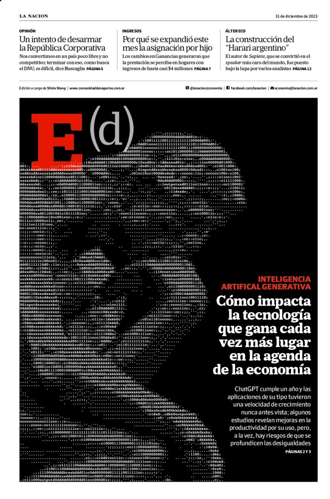
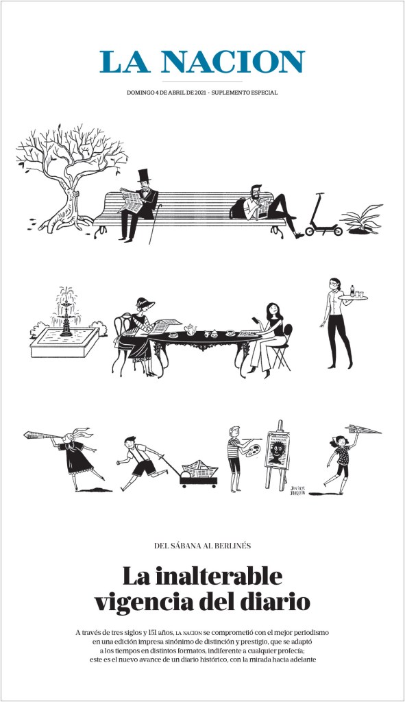
La Nacion
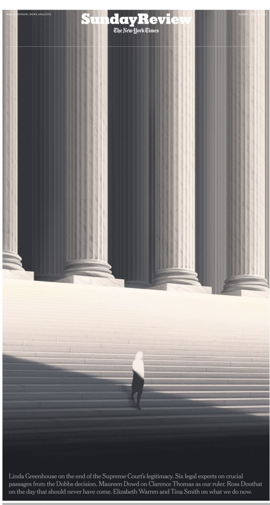
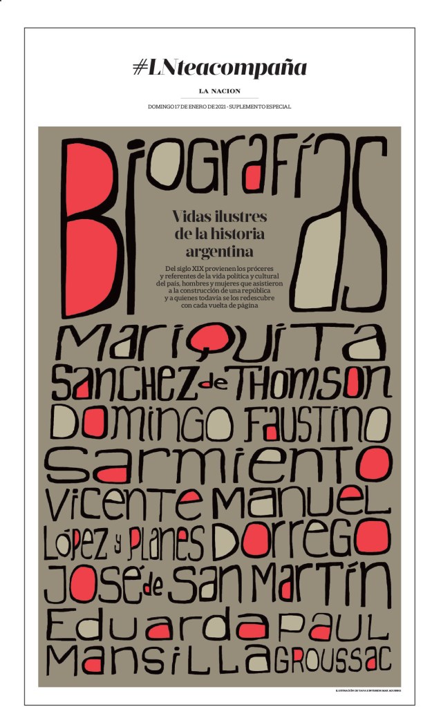
“La Nacion is a terrific example of how to build a 50- to 80-page daily newspaper, one that offers a cohesive reading experience with gravitas and dynamism, even on some of the biggest breaking news days. Its elegant information graphics, powerful blend of illustrations and robust news photography, coupled with consistently smart selection of typefaces poured into organic shapes, is sophisticated yet highly accessible, and makes for a very satisfying, complete offering.”
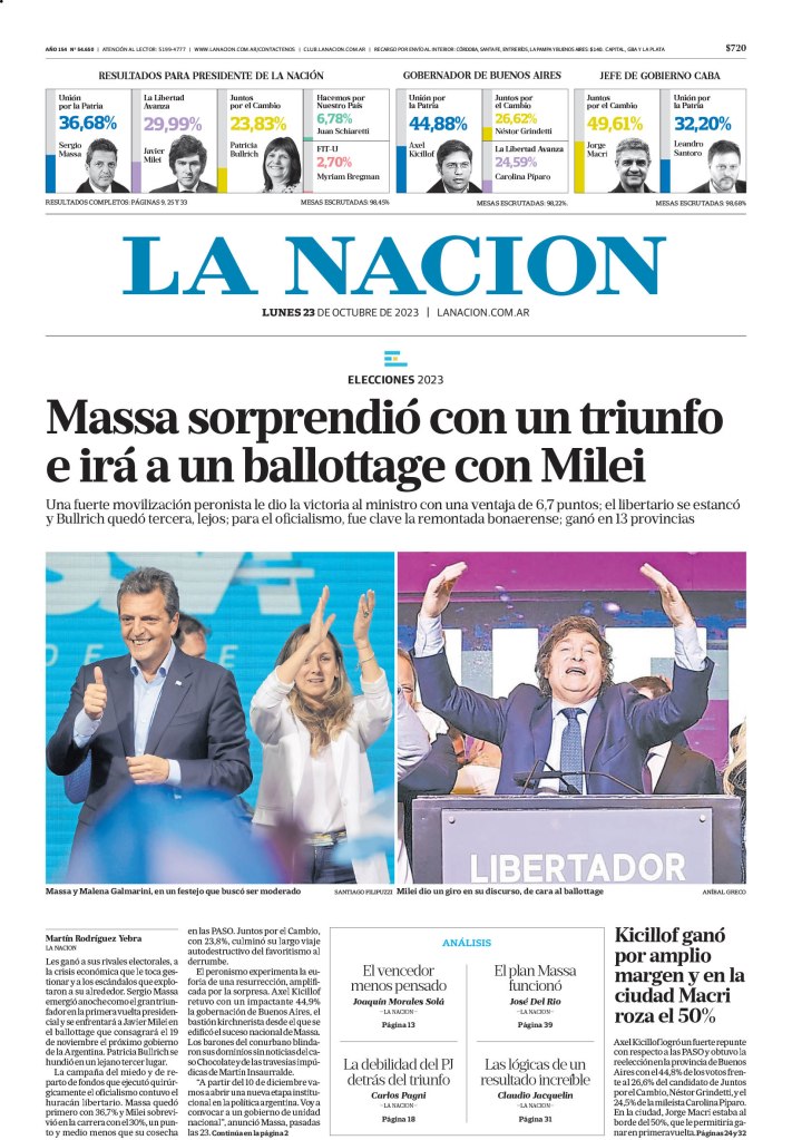
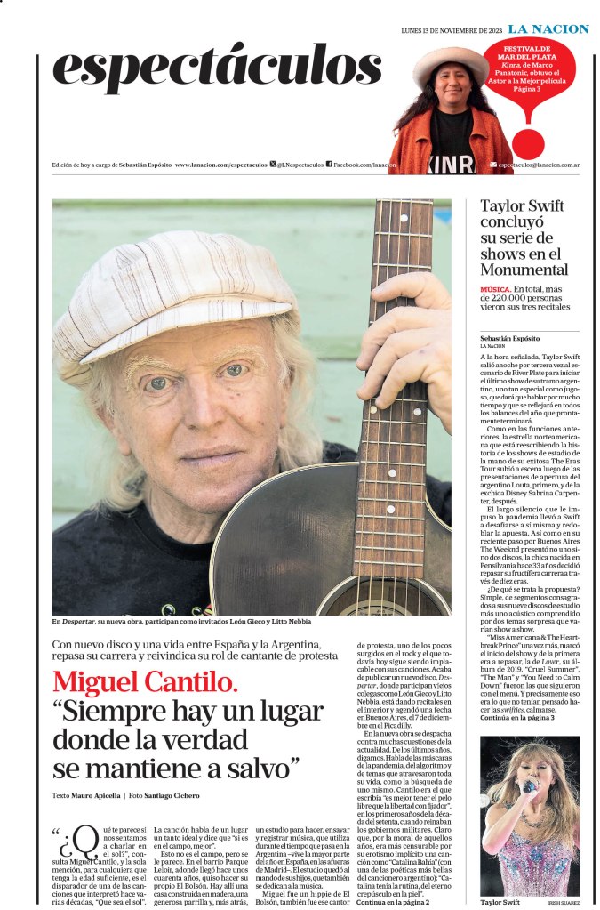
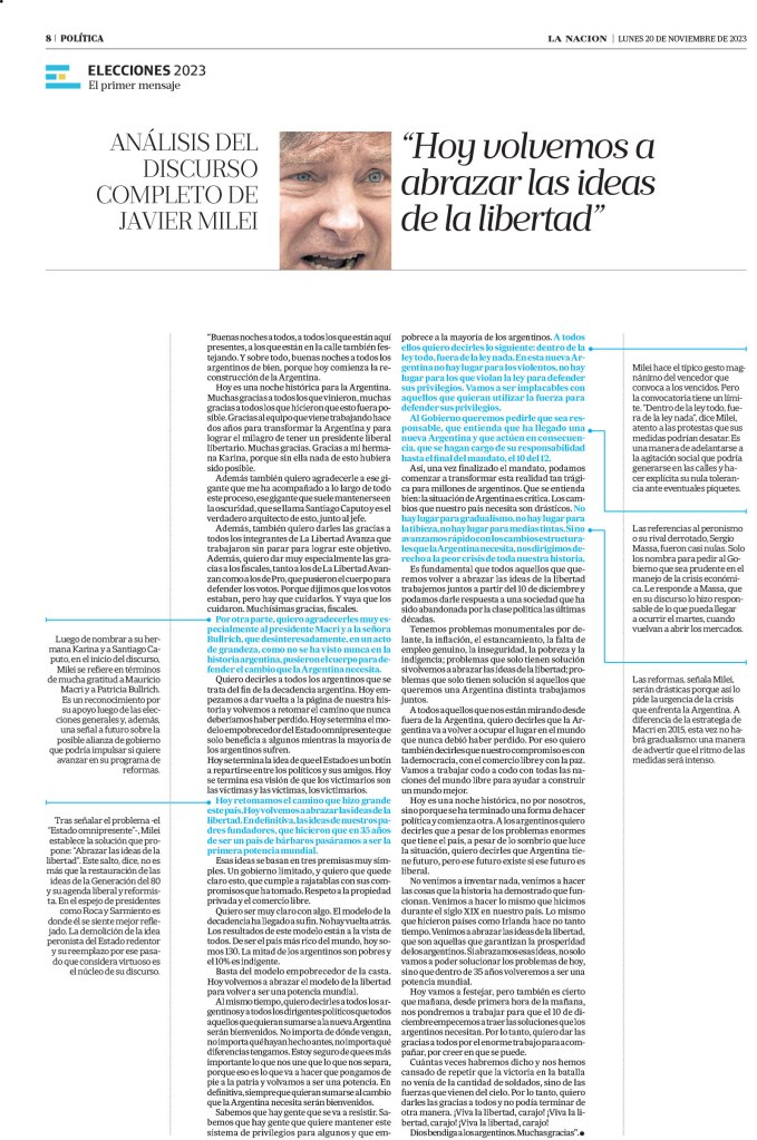
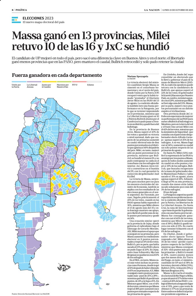
One of the things I loved about La Nacion was its inside spreads.
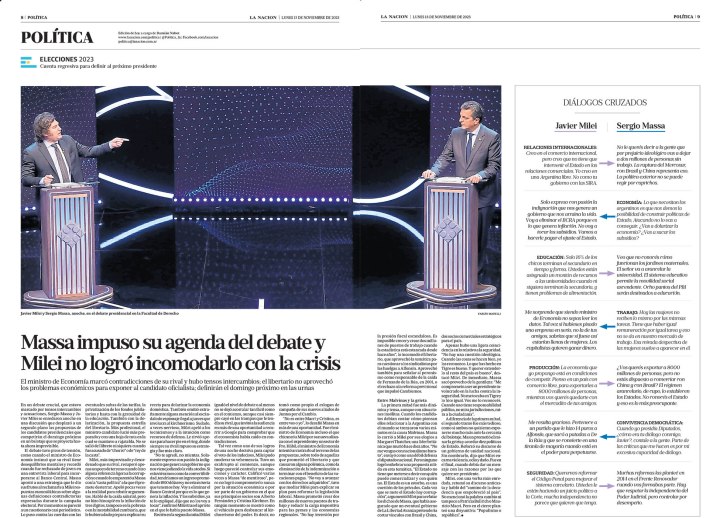
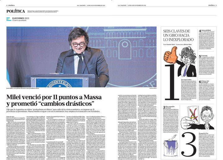
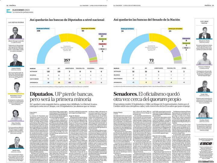
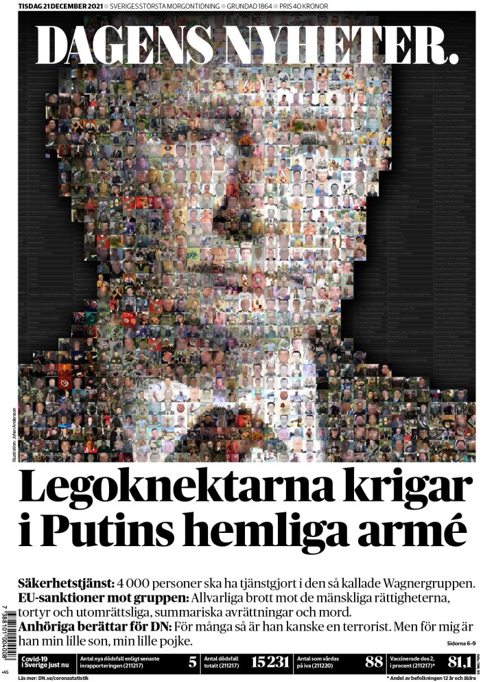
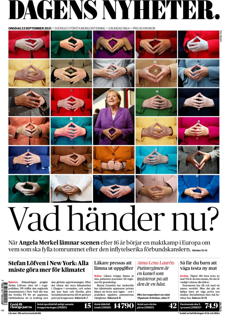
And a couple more, where they use nice graphics or photos to drive the pages.
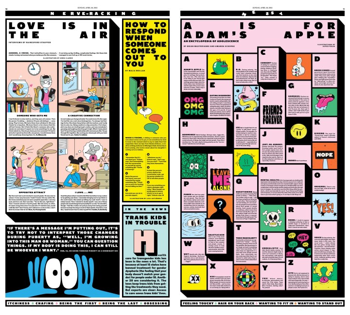
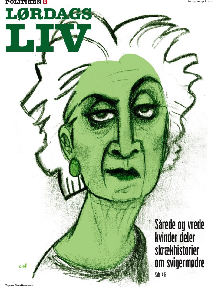
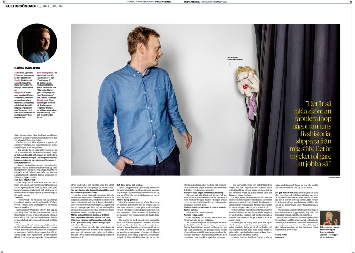
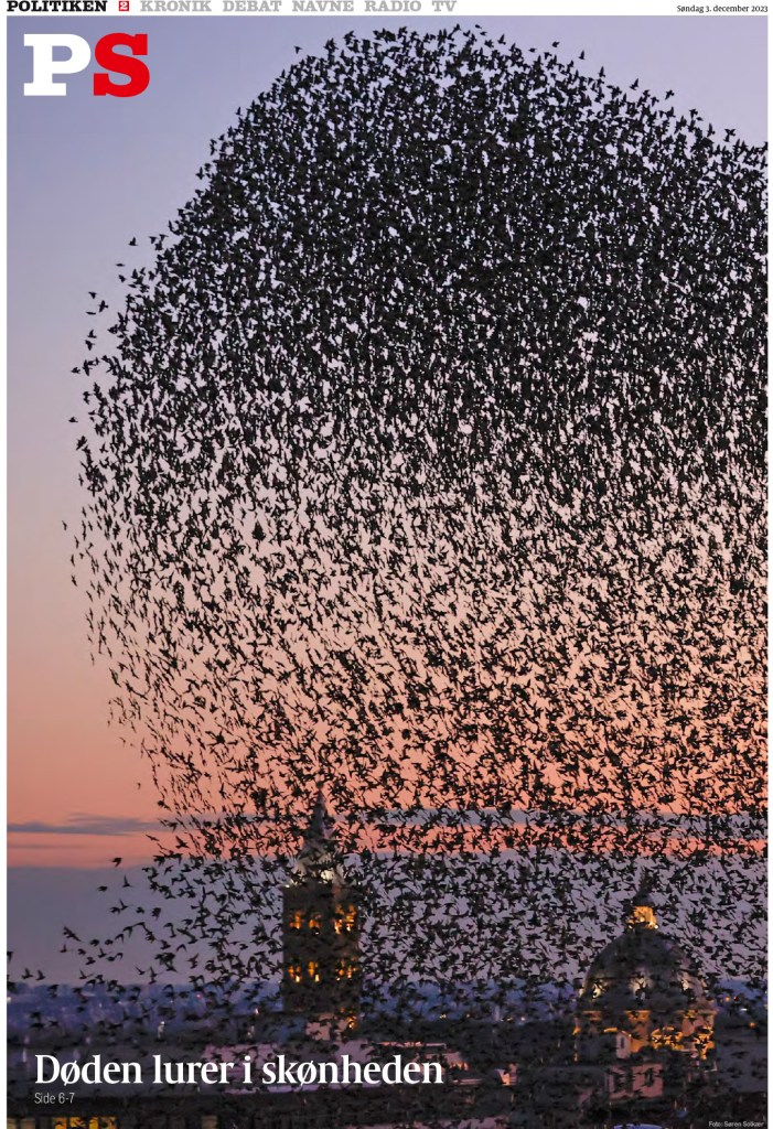
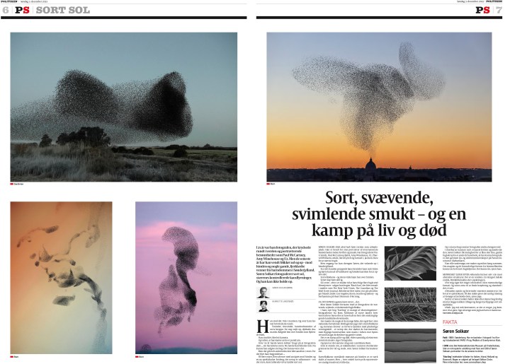
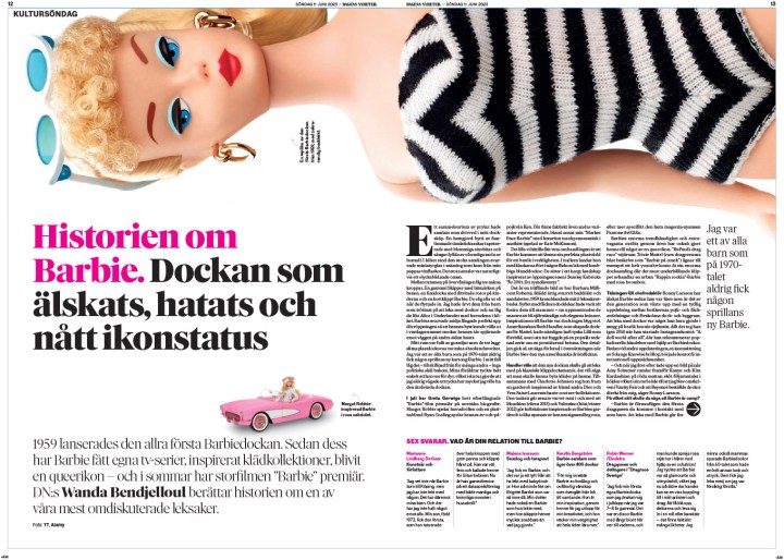
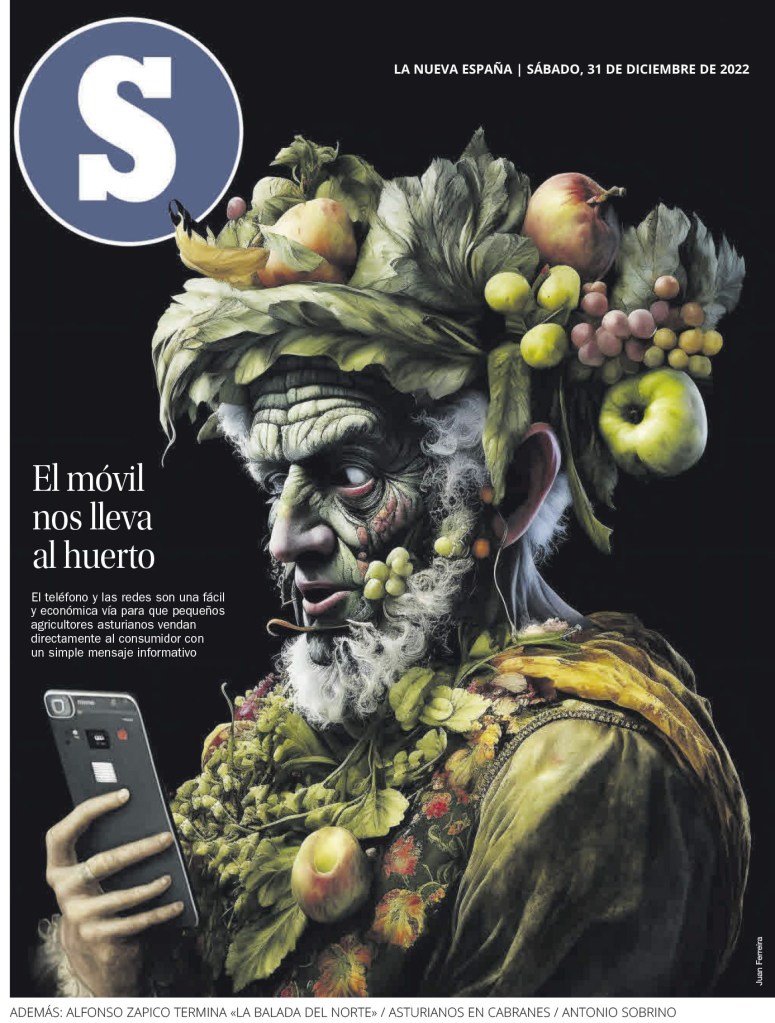
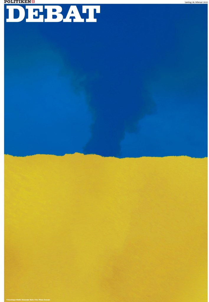
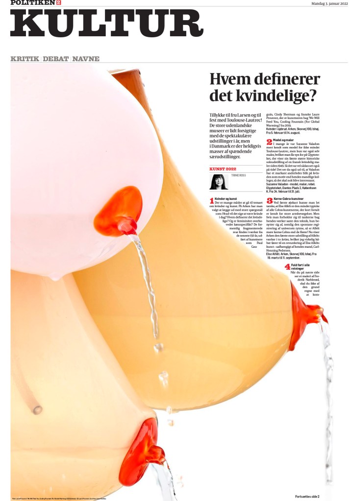
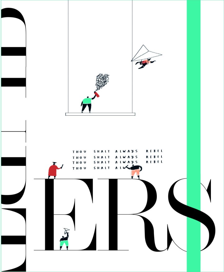
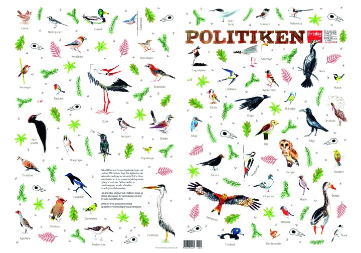
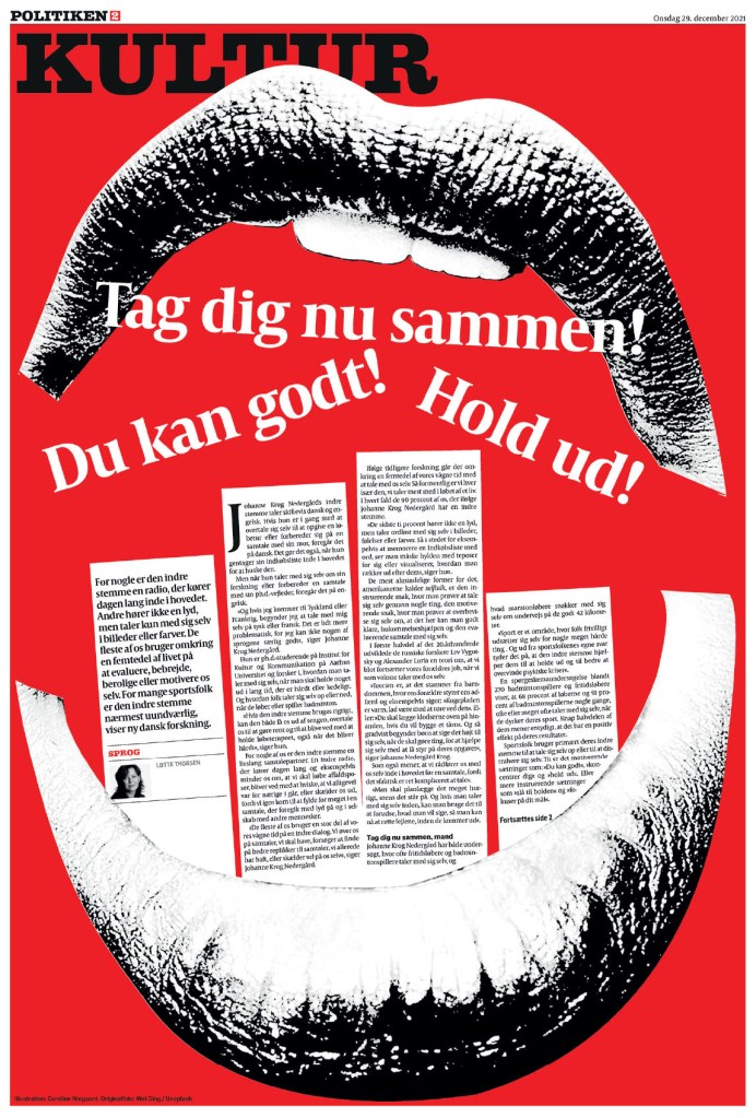
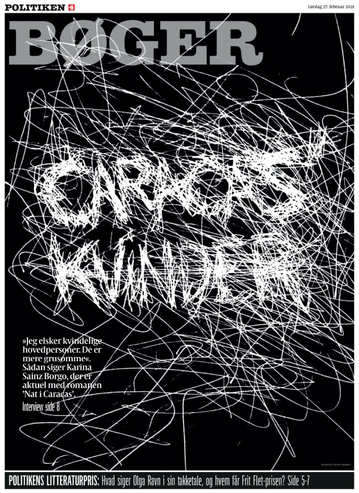
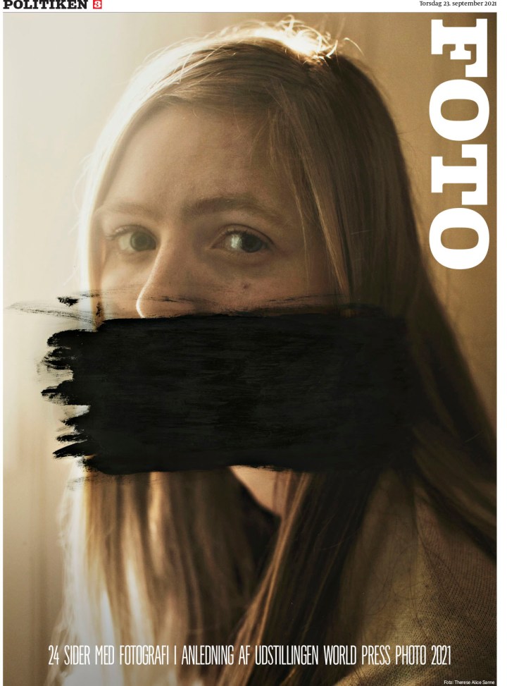
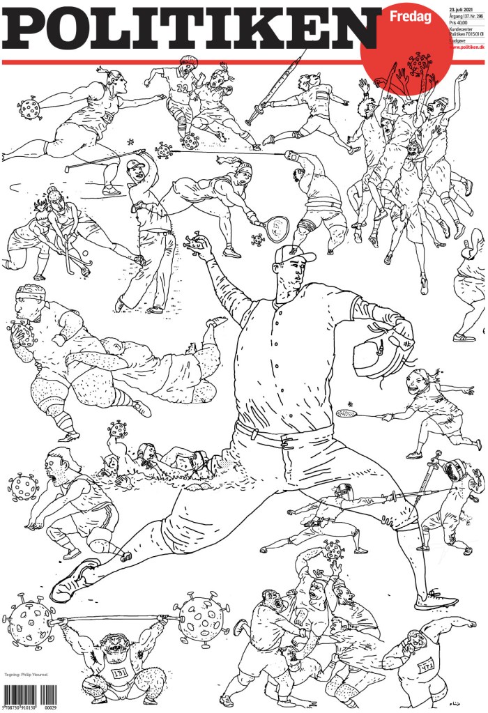
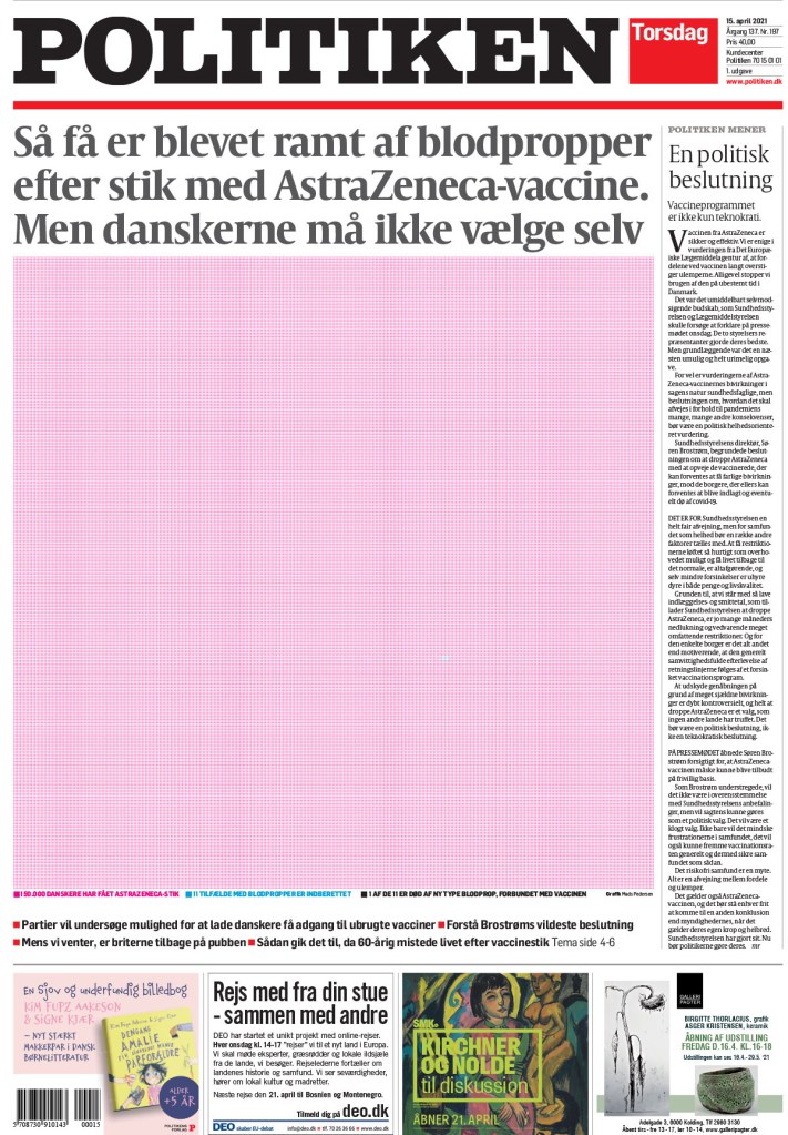
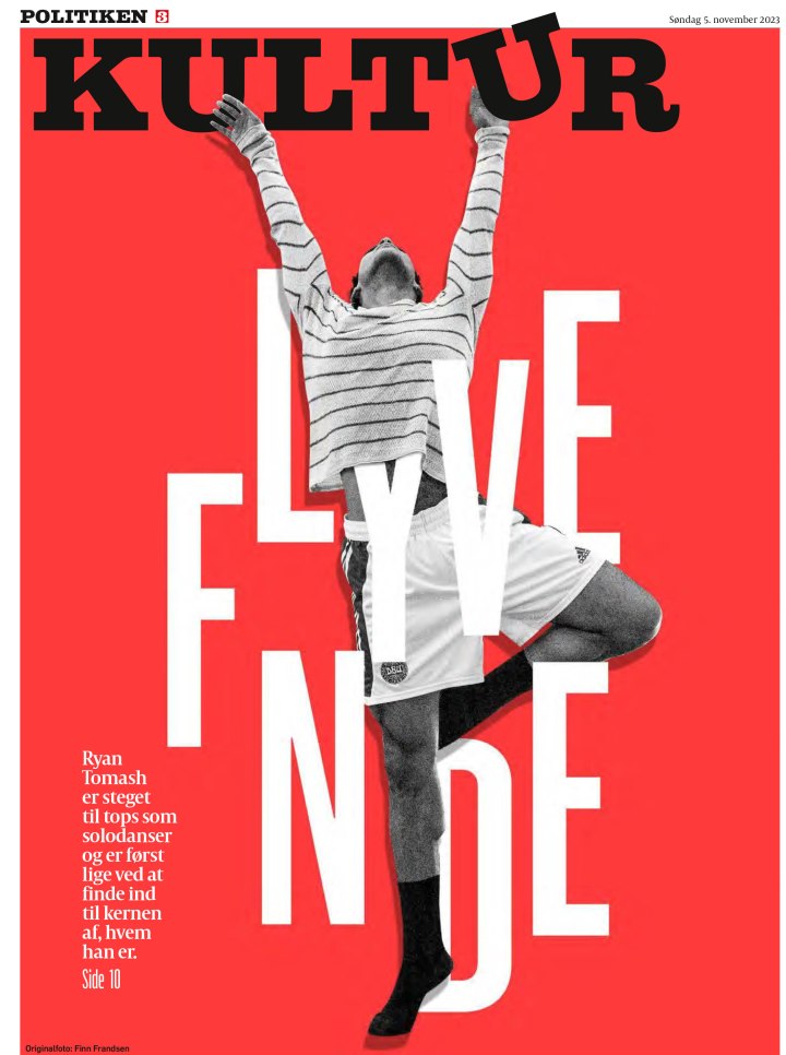
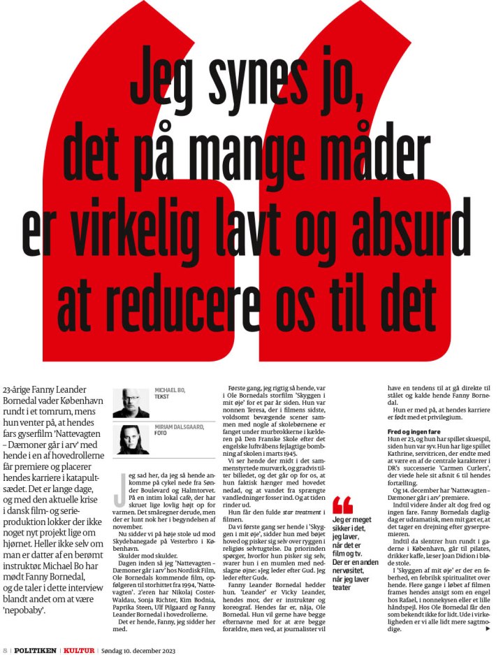
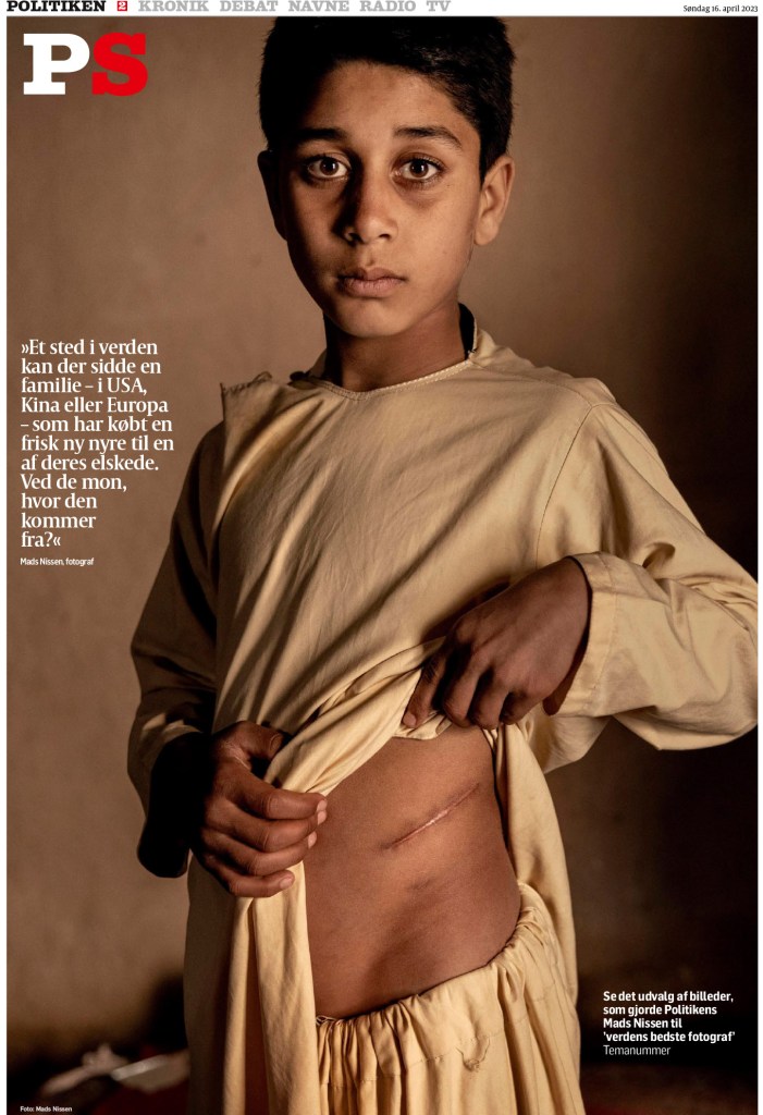
Politiken
“Politiken’s dynamic design conveys a sense of urgency, while maintaining its overall elegance. Distinctive visual content is the foundation for storytelling that runs the spectrum from sober to edgy to delightful. Despite this range of tones, a cohesive report emerges, propelled by carefully selected — and deployed — typefaces and navigational devices. The result is a curated publication that is iconically Politiken — at once powerful, important and beautiful.”
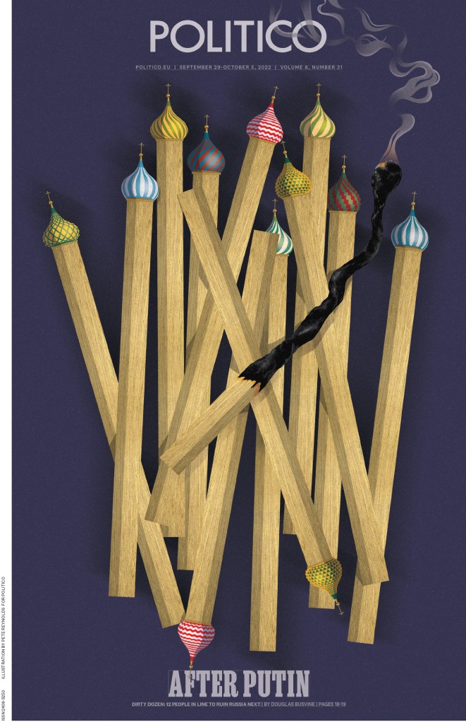
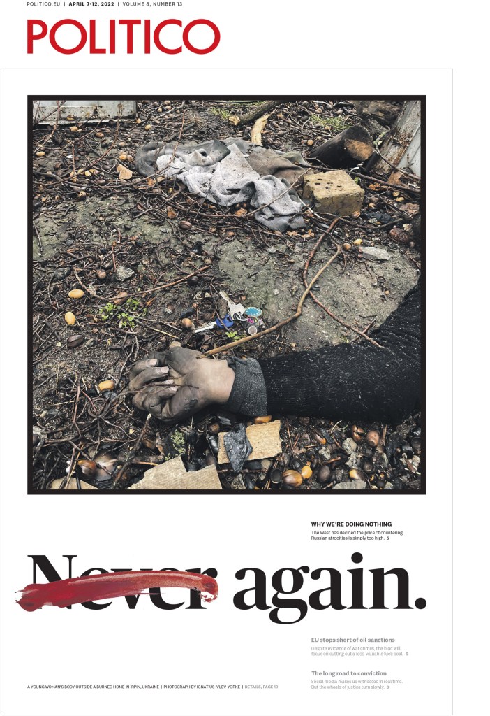
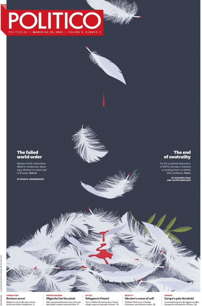
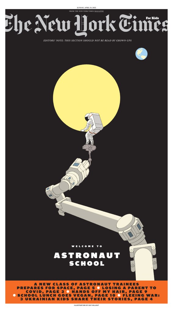
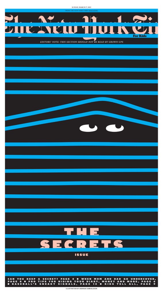
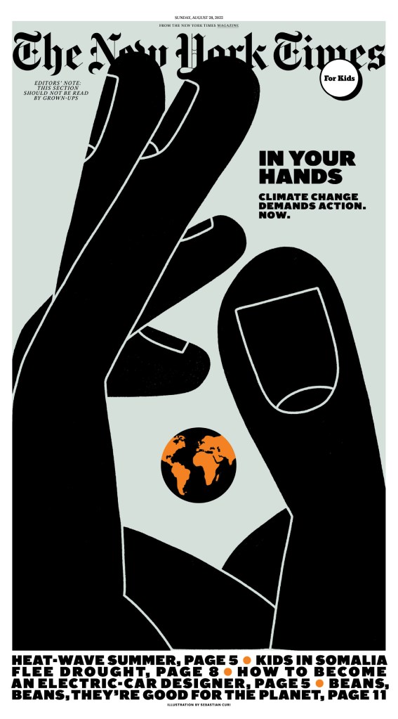
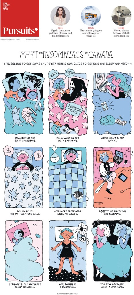
I will start with a variety of pages, all done differently: big photo, nice illustration, typography. They use such a variety of design techniques, but still remain clearly Politiken. Anyone who follows my Instagram will know I am a fan of Politiken.
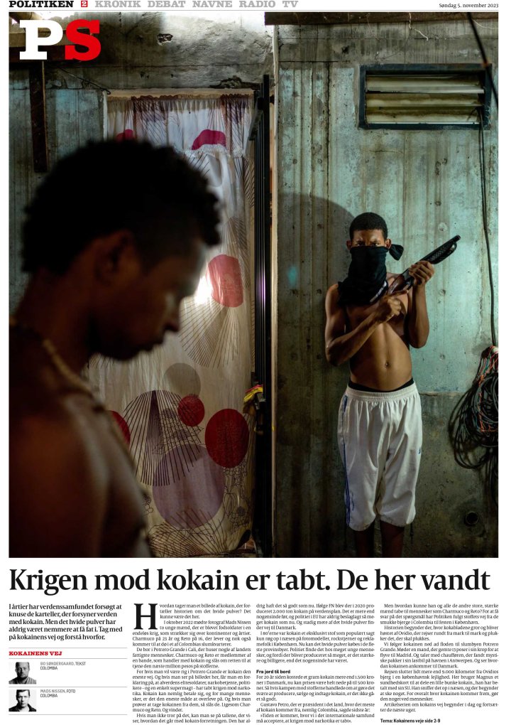
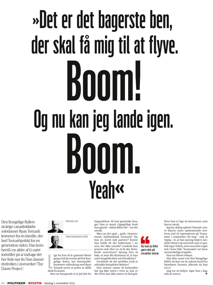
And a few more. I have shared more from both these publications in previous posts.
And now for the winners. Here is what the judges said they were looking for.
“We were seeking smart, lively publications that were cohesively designed. The ones that stood out had a clear vision and brand identity that was reflected in their typography and signature visuals. They had a strong sense of place and a clear focus on their target audiences. While we valued consistency, we were delighted to see surprises — places where extra planning, collaboration and innovative ideation was apparent. Maximizing the strengths of print presentation helped some rise above the rest. In our increasingly digital-first world, we applauded print’s ability to offer readers thoughtfully curated content that is both unique and rewarding.”
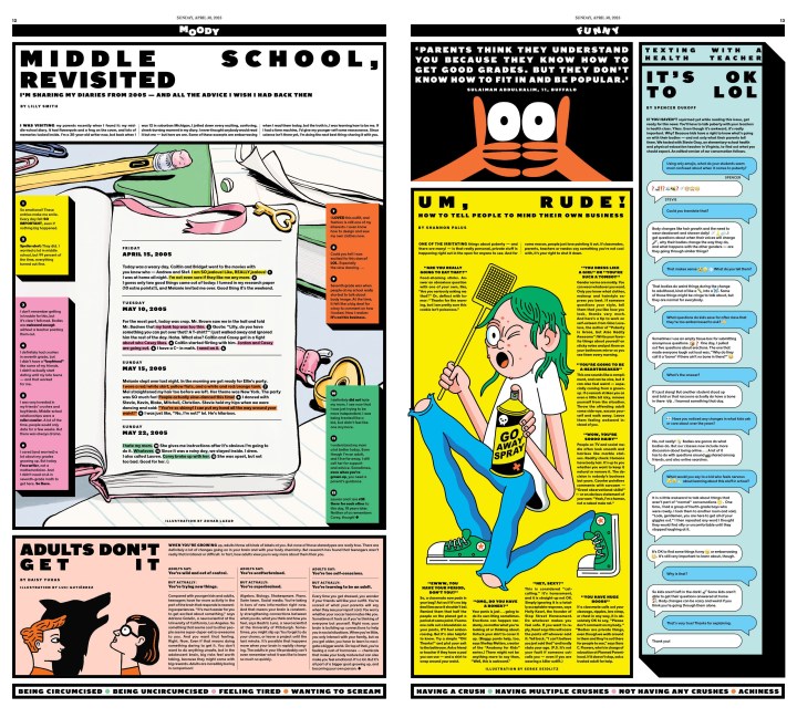
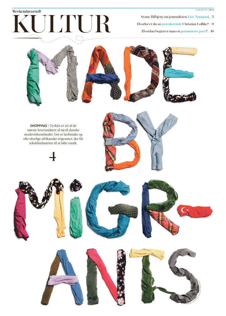
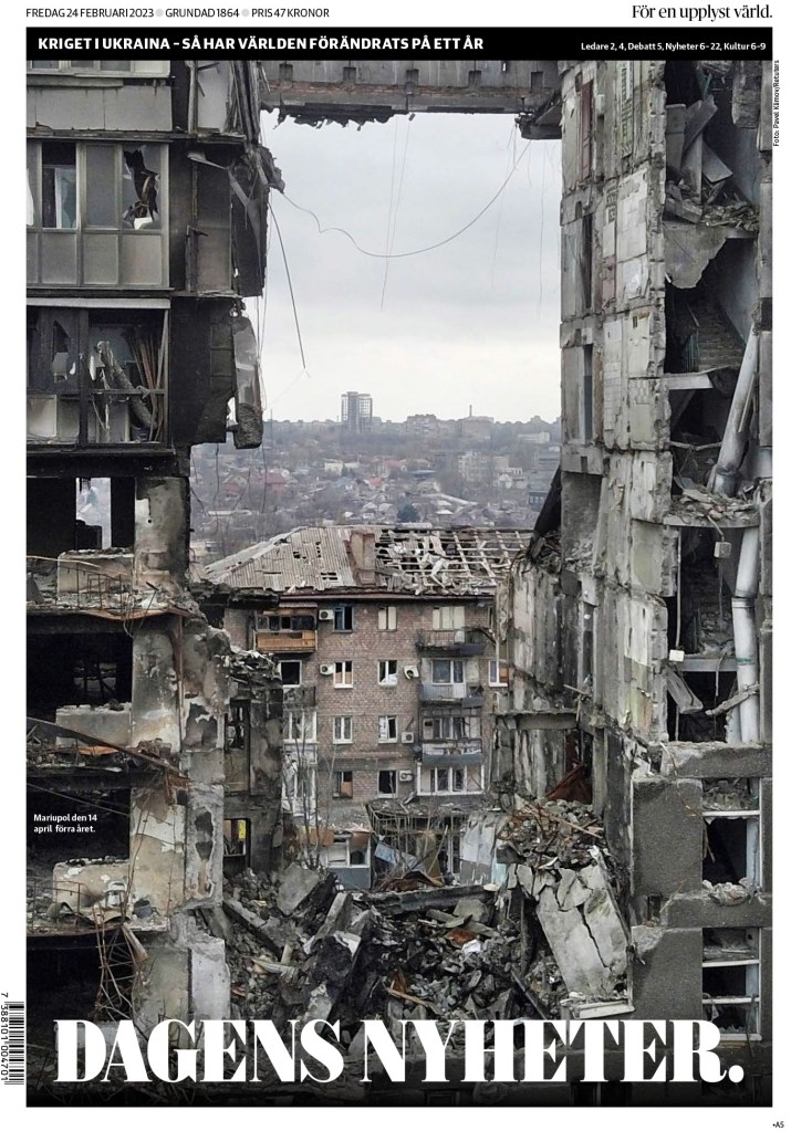
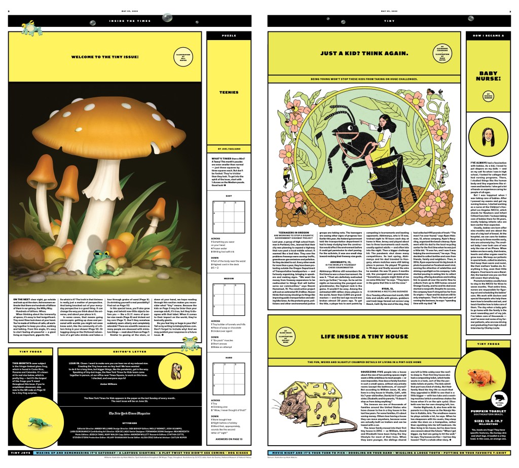
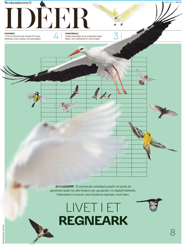
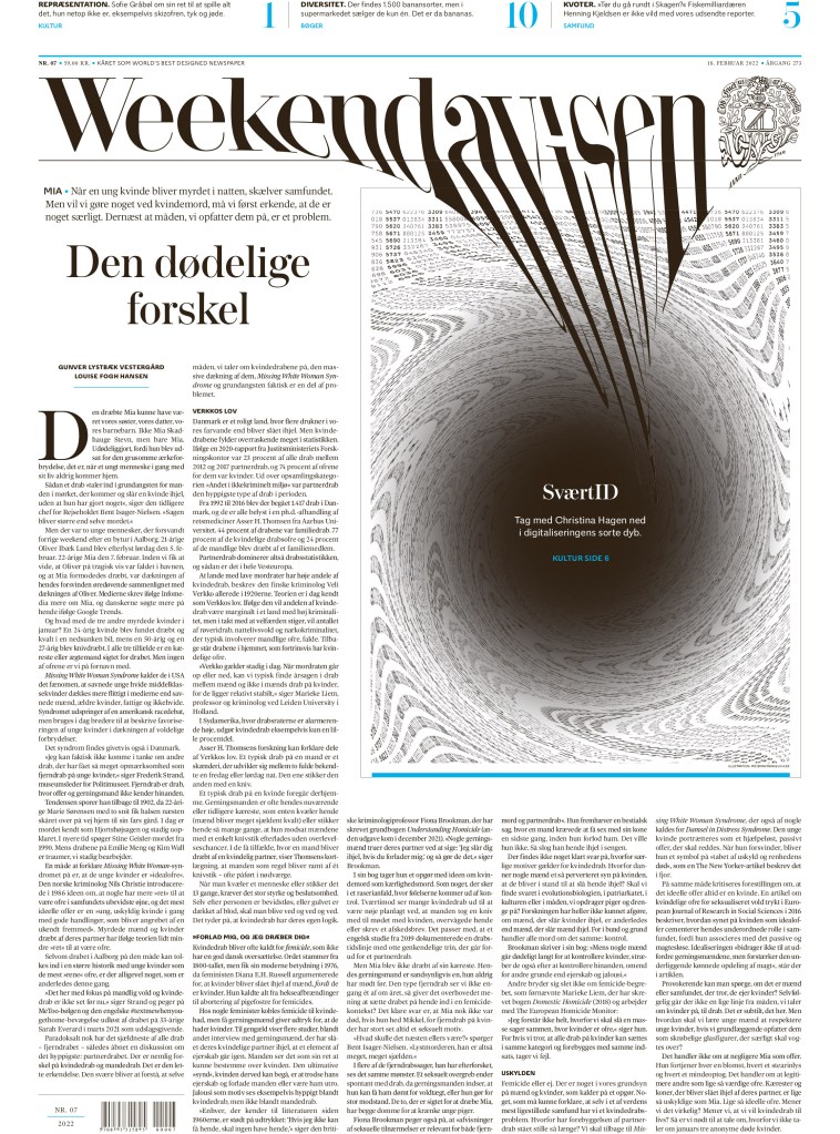
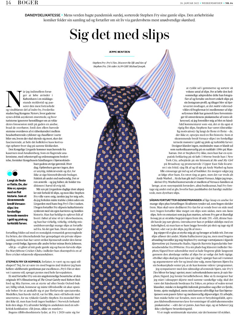
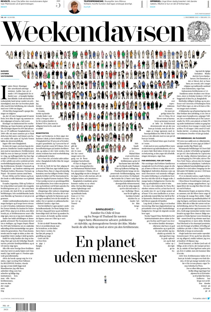
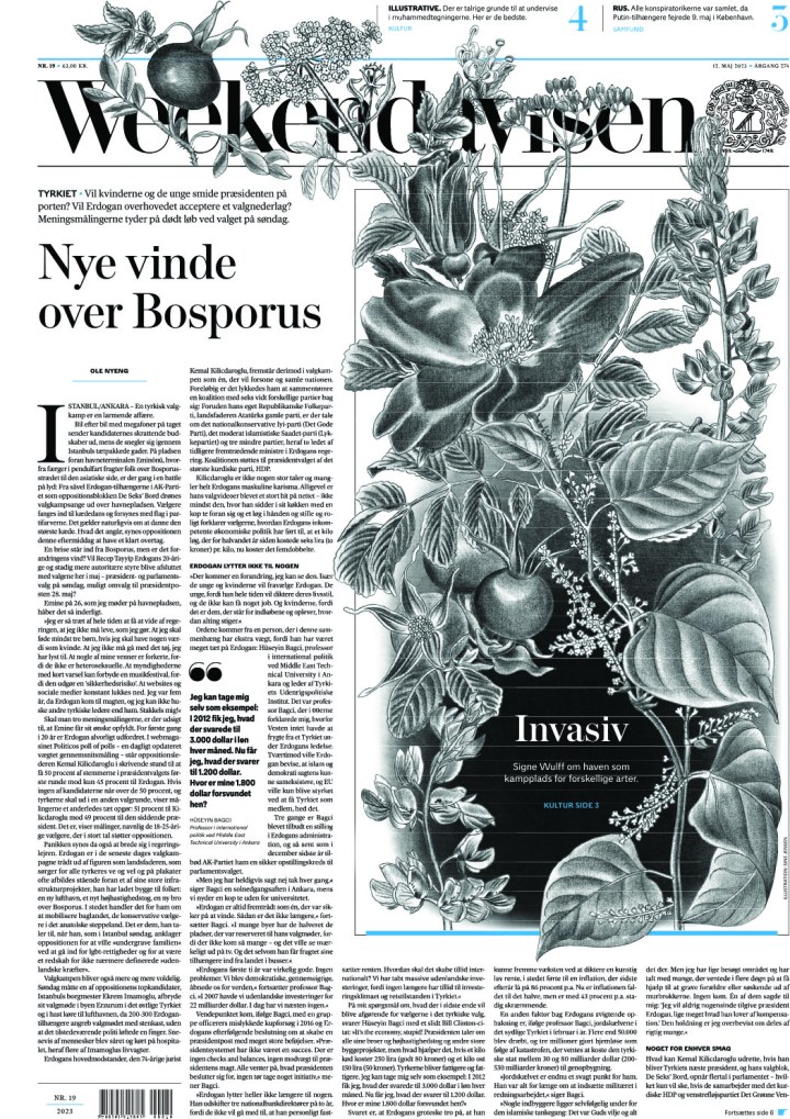
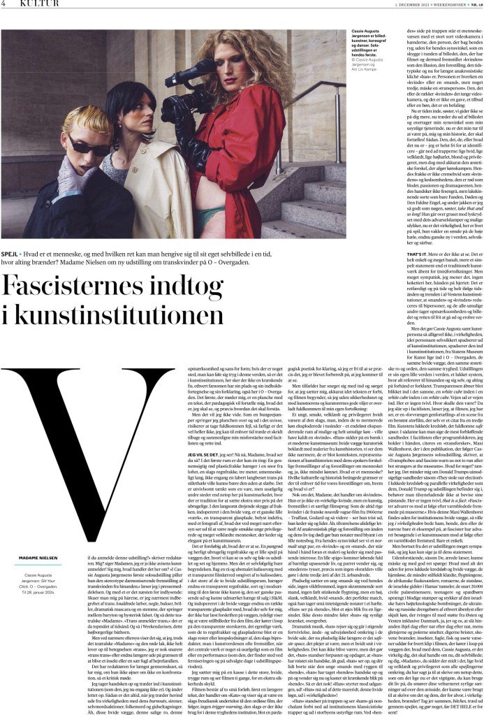
Weekendavisen
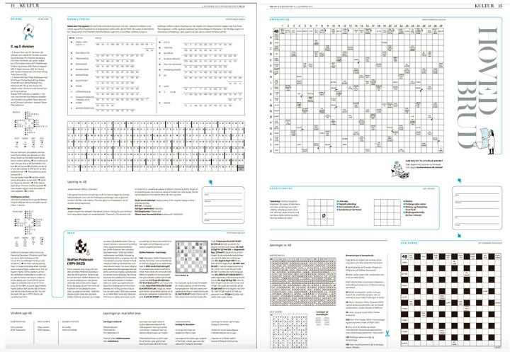
“Weekendavisen is a joy to read, with visual impact in all of the right places. The offspring of one of the oldest newspapers in the world, Berlinske Tidende, Weekendavisen offers its readers a contemporary feel, while adhering to its traditional roots. From front to back, Weekendavisen is a cohesive experience that is serious, evocative, innovative and playful. Its designers are not afraid to take risks. Restraint is the key to its success — nothing seems forced, always executed with purpose. Its many strengths include elegant typography, a carefully curated and restrained color palette, on-point illustrations and a sense of whimsy. The icing on the cake: Solve the puzzles on a smartly packaged spread.”
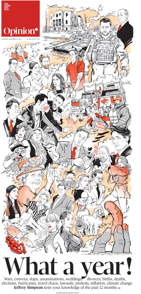
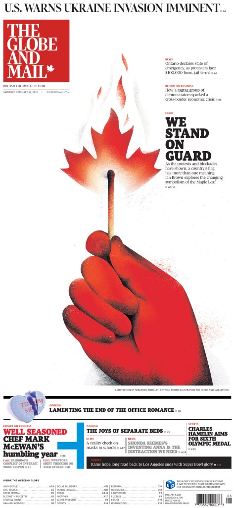
One of the similarities between the two winners is that they aren’t afraid to take chances. They make some very bold design choices, but one has to ask, are they taking chances if they succeed so often? Or do they just know it’s going to be great? These first to covers. Mind blown.
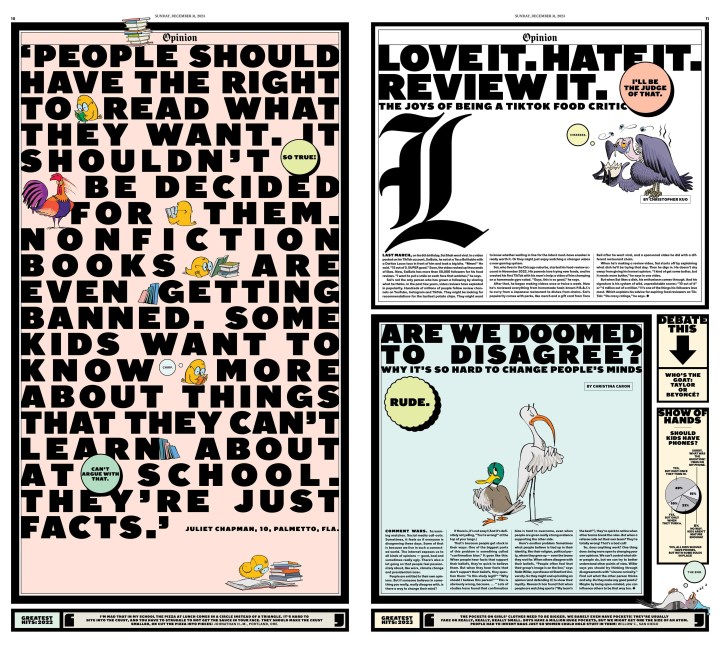
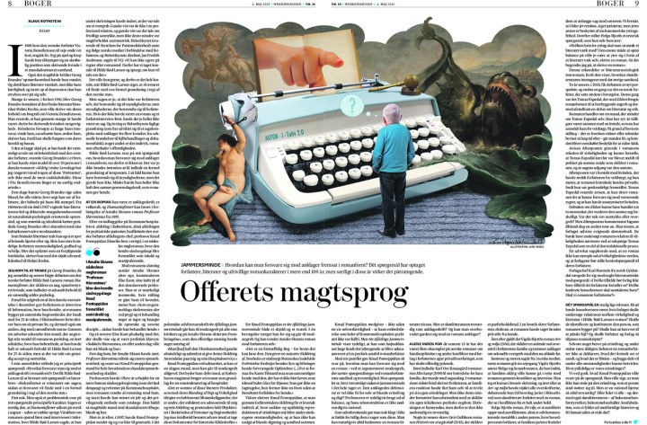
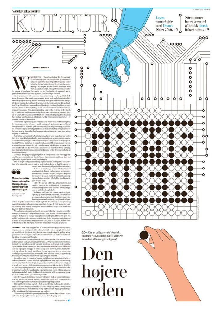
Both also use typography so well, in ways other papers might be afraid to try. You see a lot of that with Die Zeit, but here are a couple from Weekendavisen.
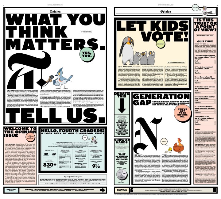
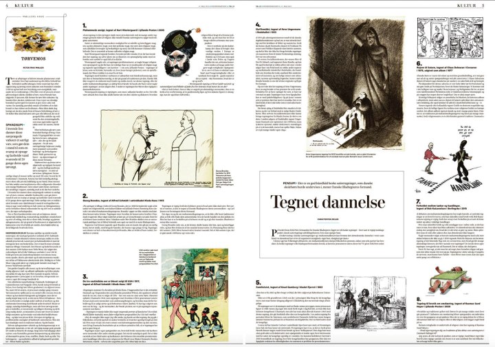
Here is an example of how to make a lot of text beautiful. I love this spread.
And of course the puzzles the judges loved so much! Image a puzzles pages being cited as a reason for a paper being chosen world’s best designed.
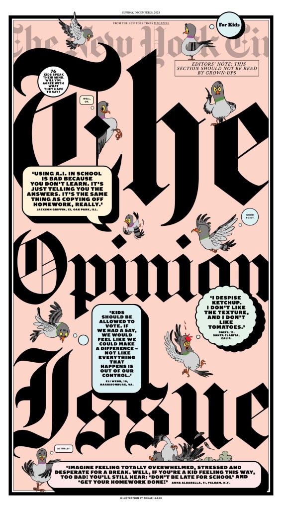
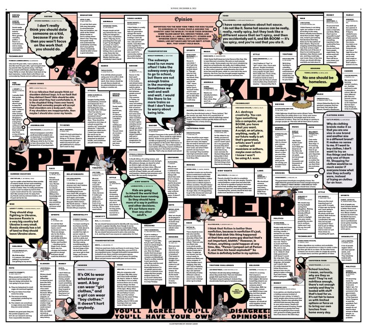
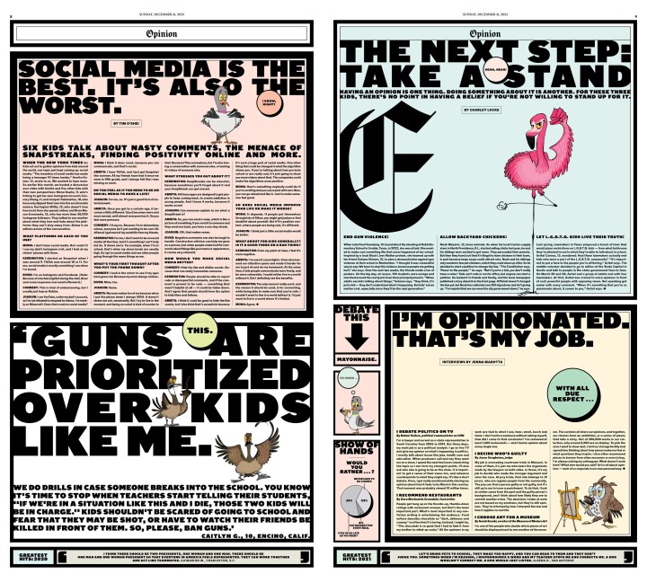
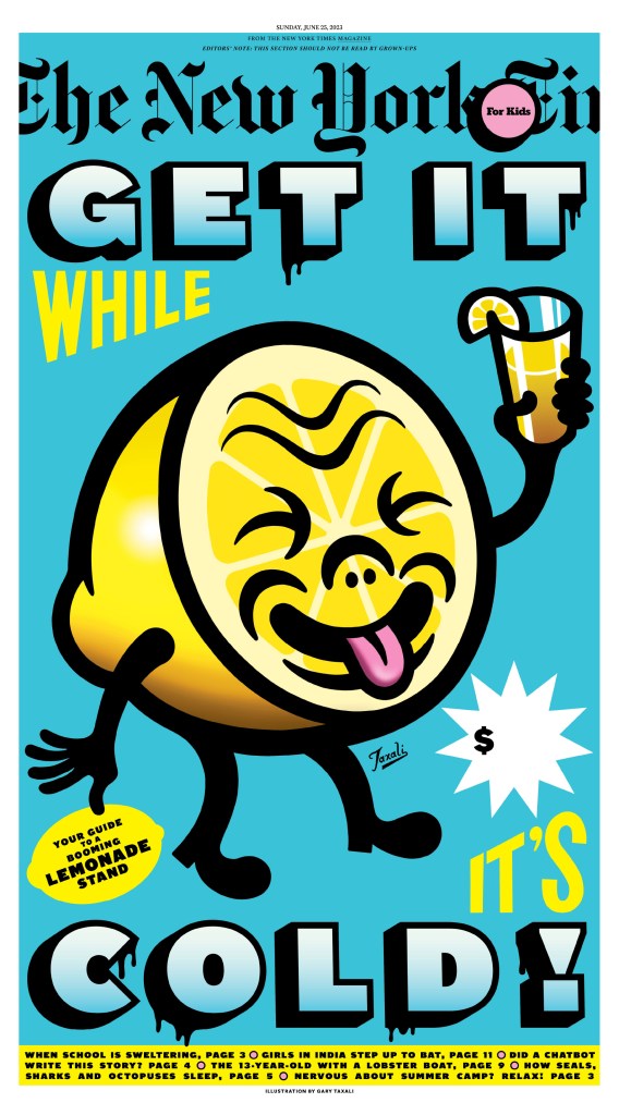
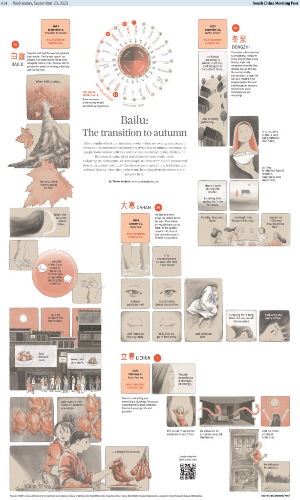
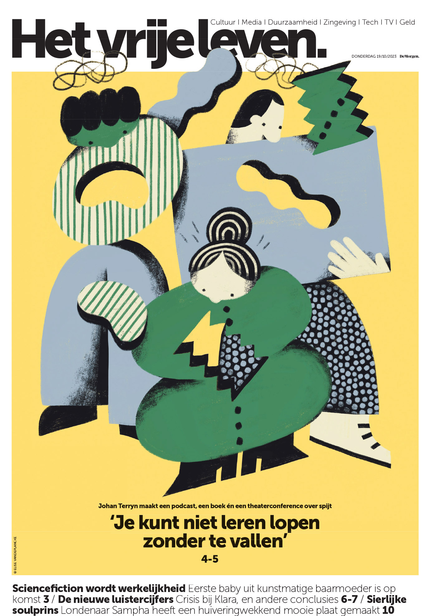
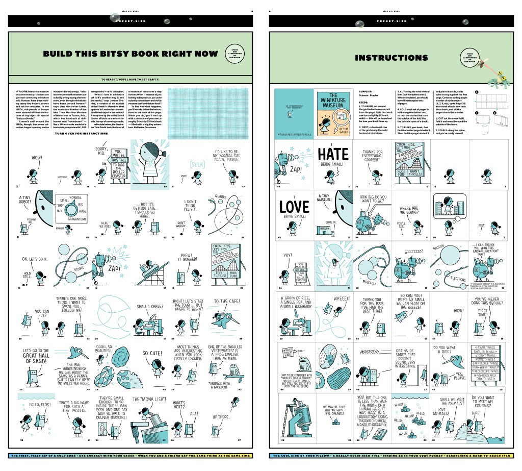
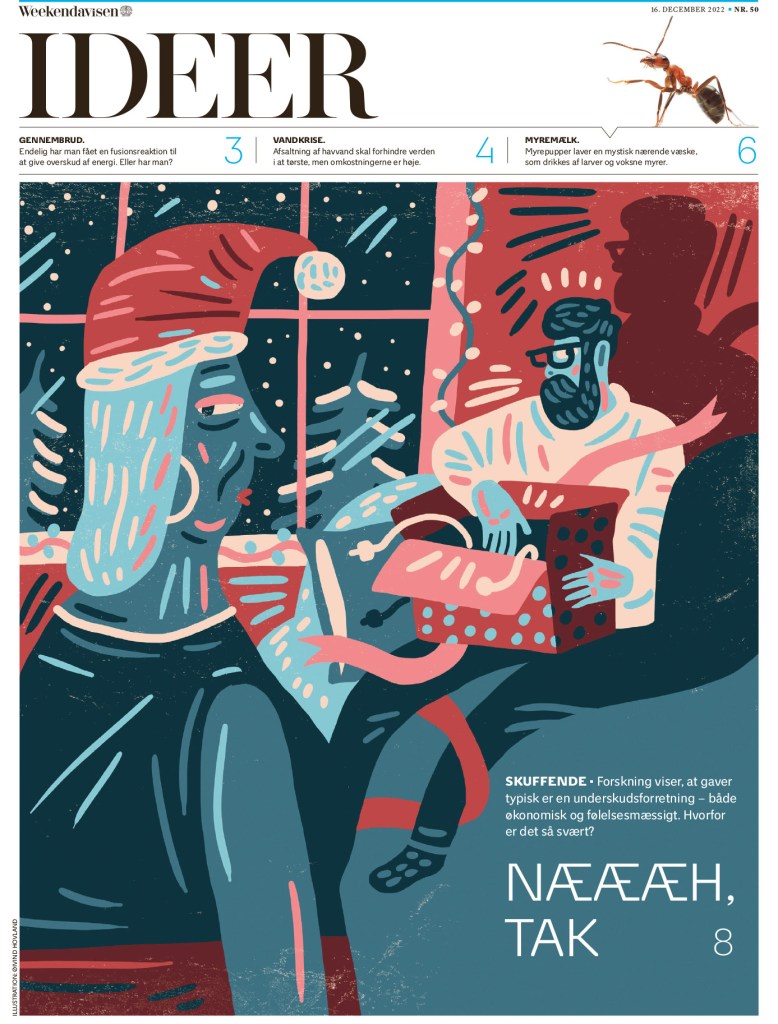
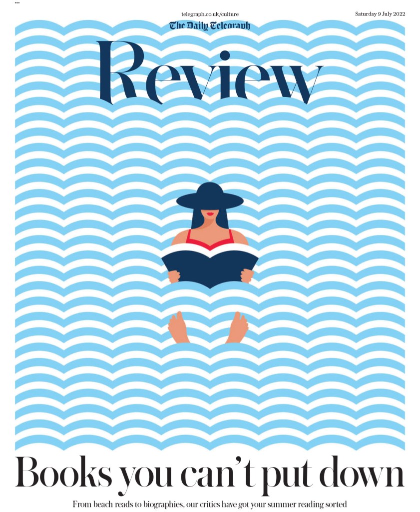
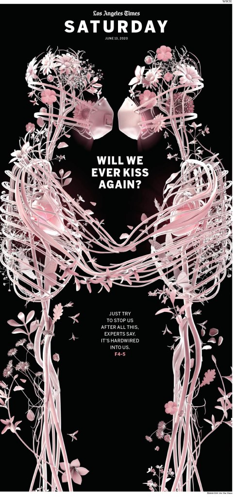
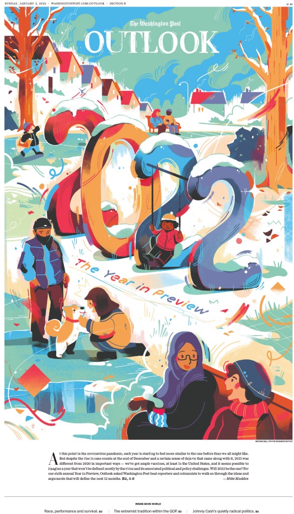
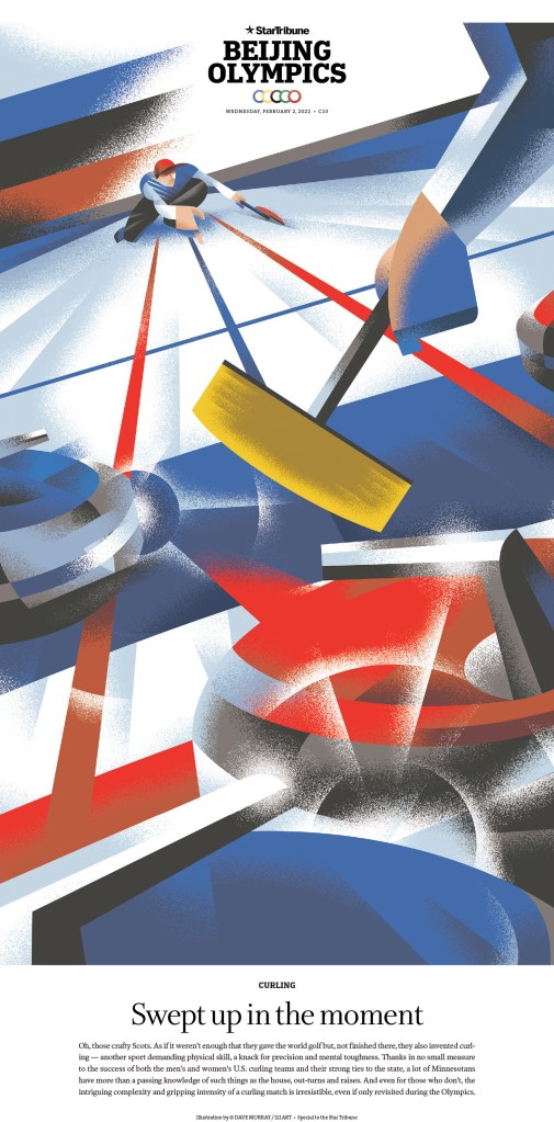
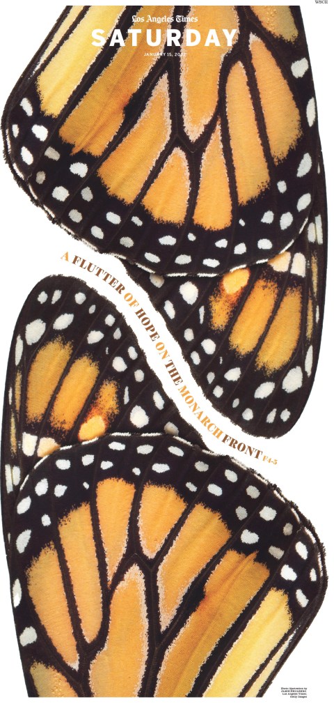
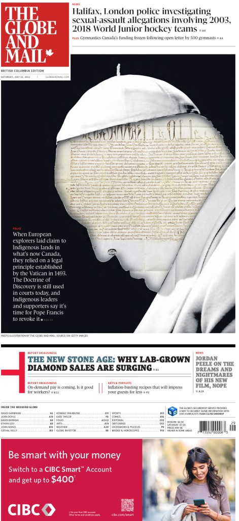
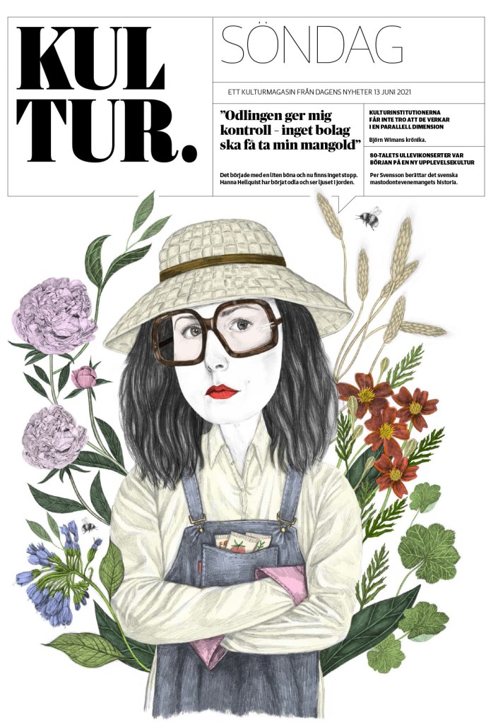
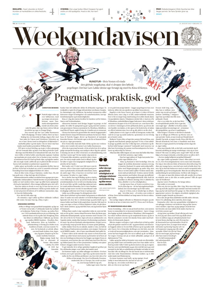
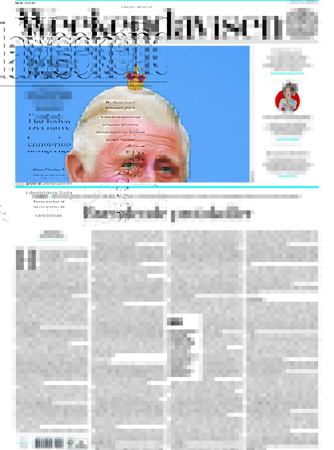
This is very much driven by the illustration, but this page caught my eye and I kept coming back to it. It’s one of my faves from Weekendavisen. A special shout out the illustrator, as I have used a portion of this as my feature image for this post.
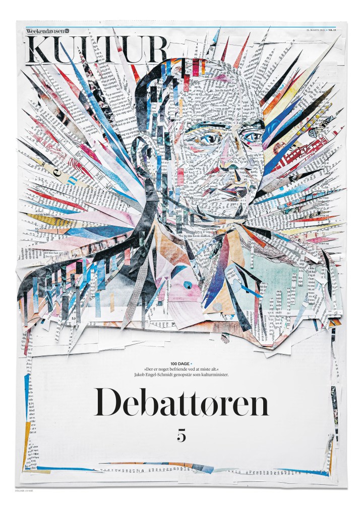
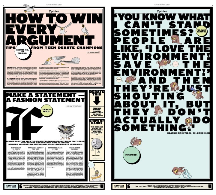
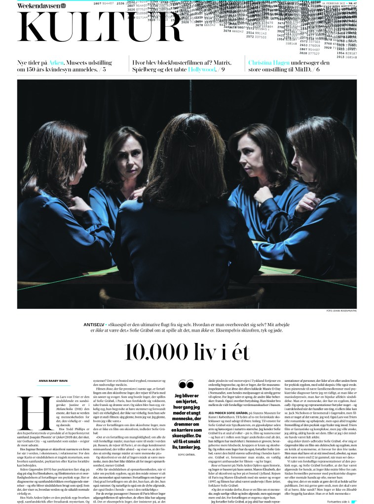
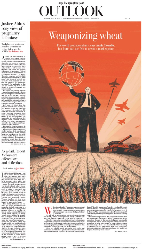
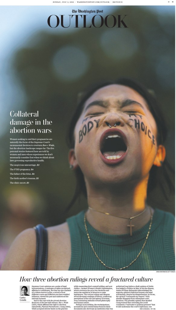
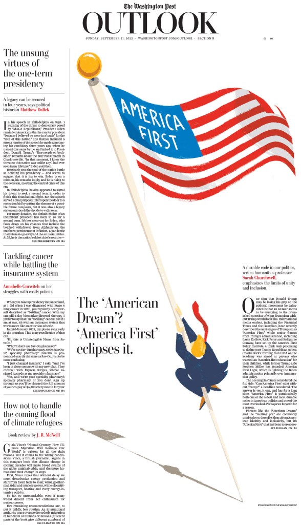
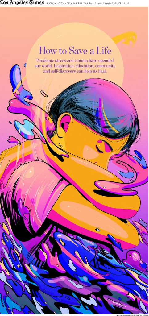
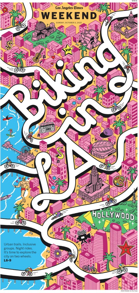
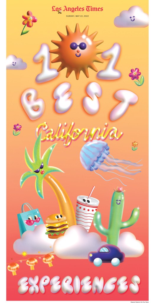
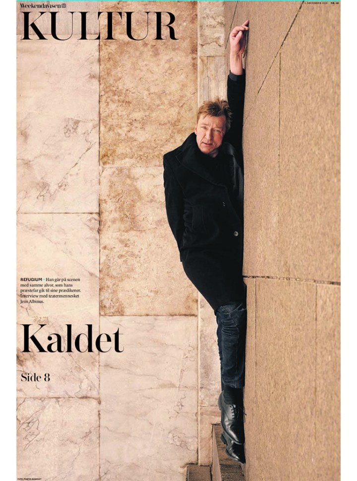
And here are a few more. You can see such variety in the pages, but still a strong design voice shining through.

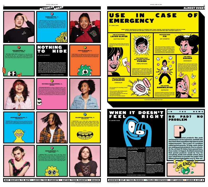
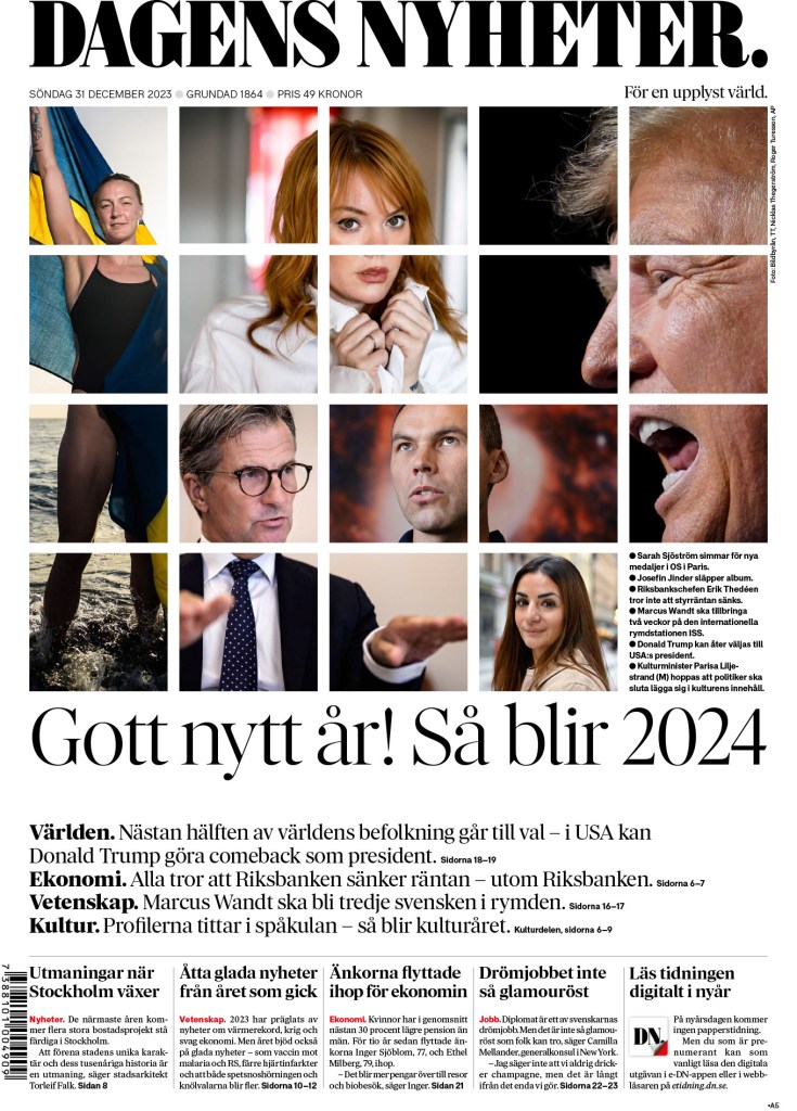
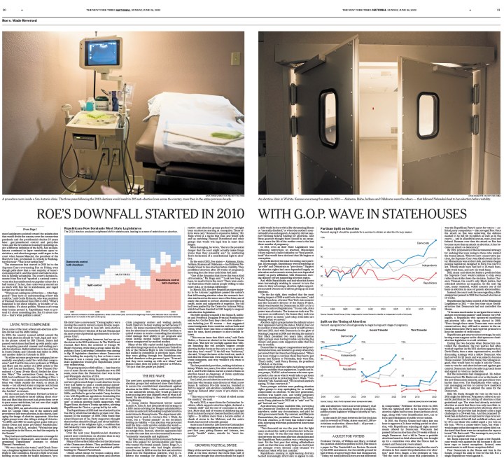
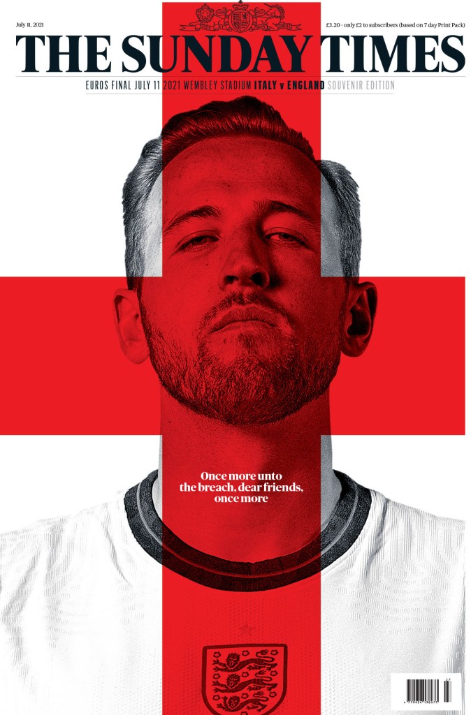
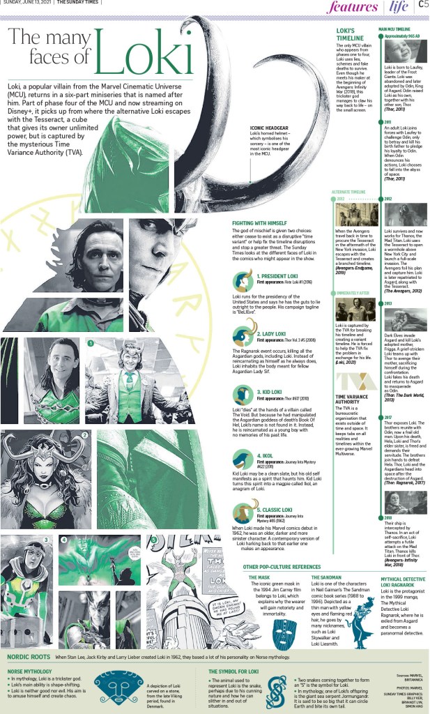
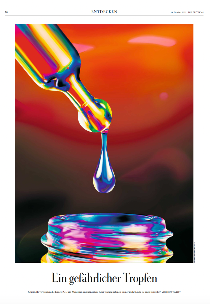
Die Zeit
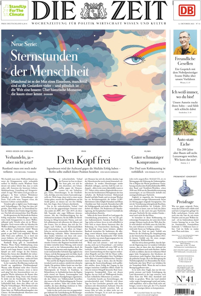
Here is what the judges said about three-peat champion Die Zeit.
“This is print storytelling at its very best. Every move made by the team at Die Zeit is rooted in intentional decision-making, restraint and surprise. Die Zeit continues to captivate by balancing long-form journalism with exceptionally smart illustrations, impeccable photo editing and beautifully placed typographic touches. Each page reveals subtle, layered details, as Die Zeit’s talented team surfaces delightfully subtle design nuances that engage a busy reader. The real superstar of the newspaper is what isn’t immediately apparent — the strategic use of white space to amplify the content.”
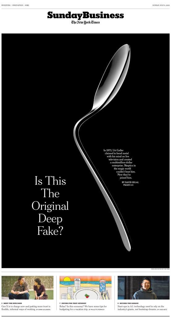
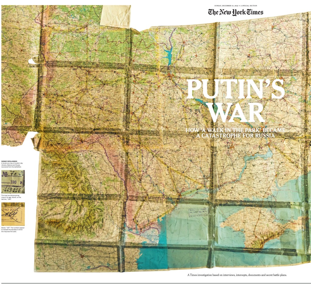
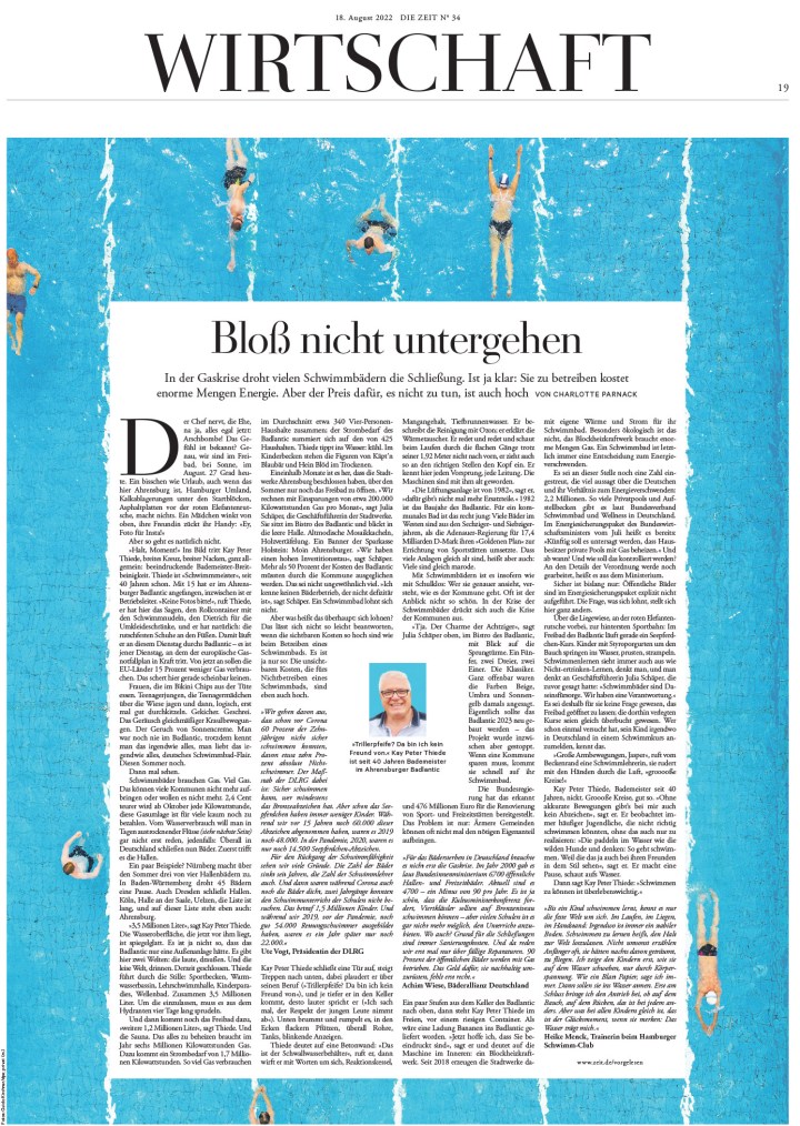
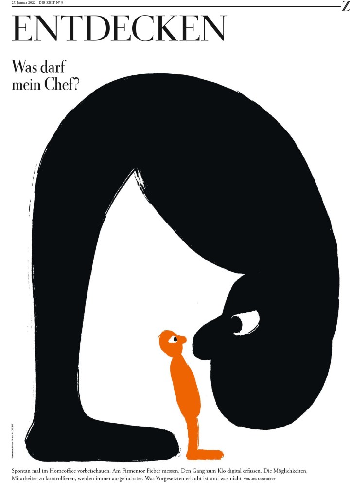
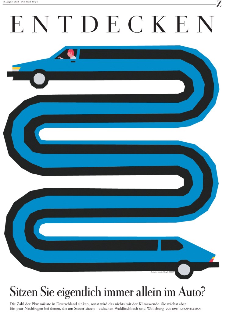
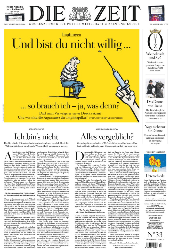
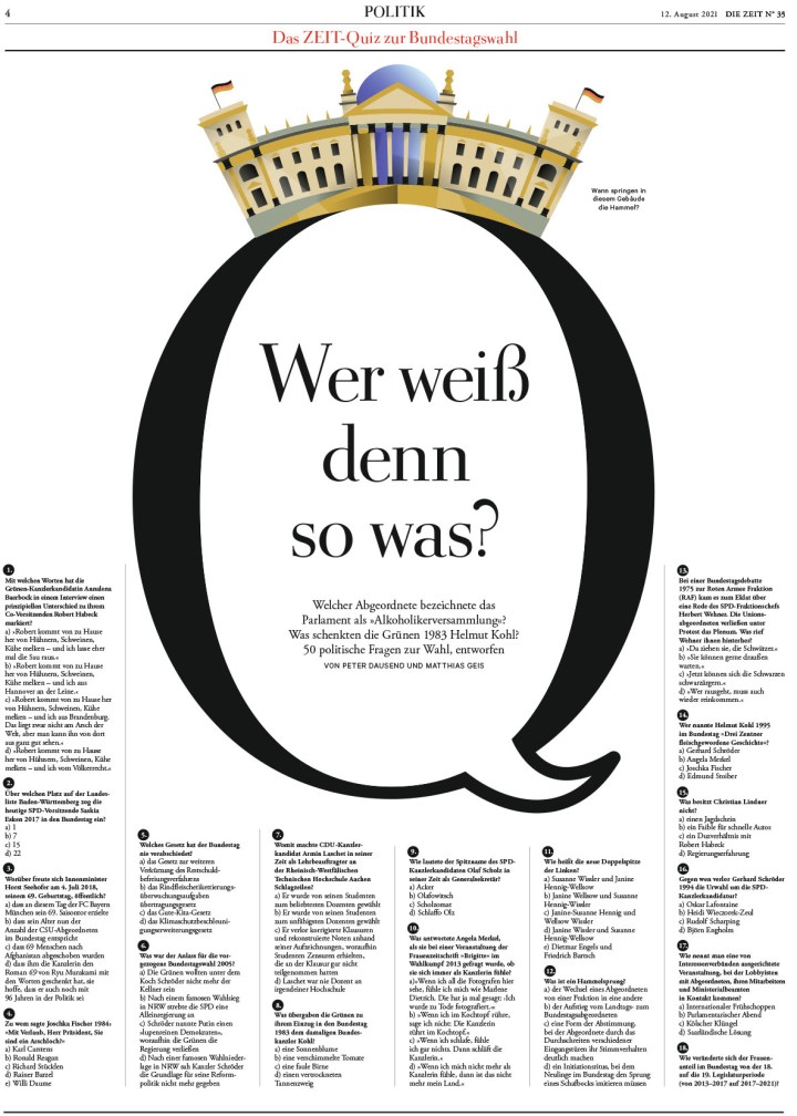
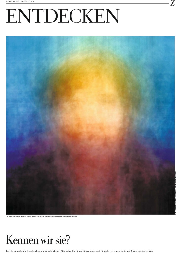
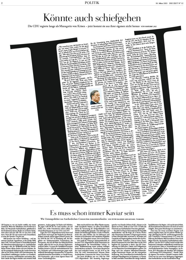
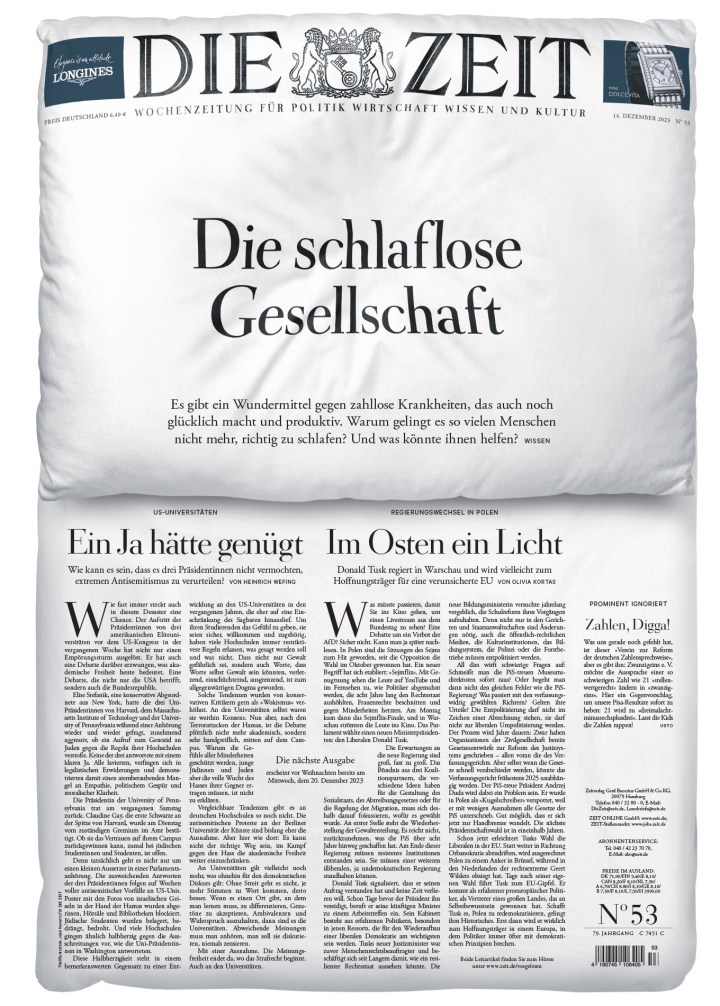
This is a front page. So cool, what else can I say? It’s so smart. Great concept and well executed.
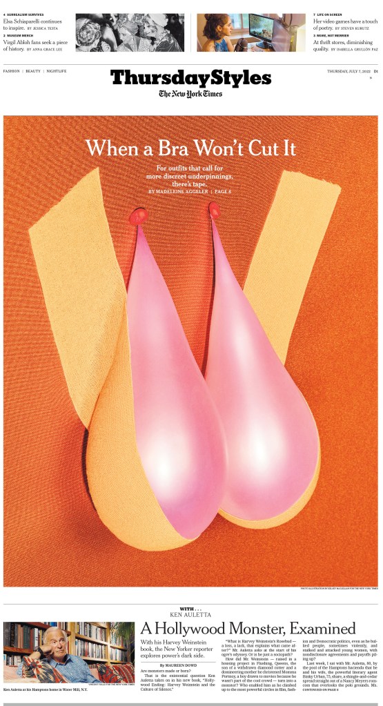
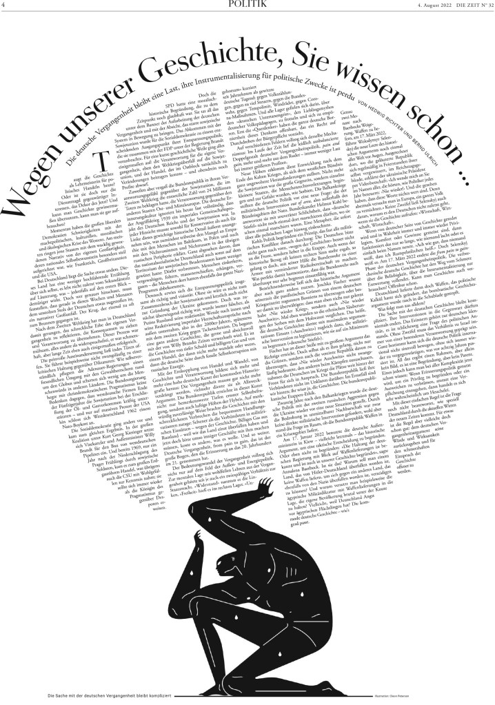
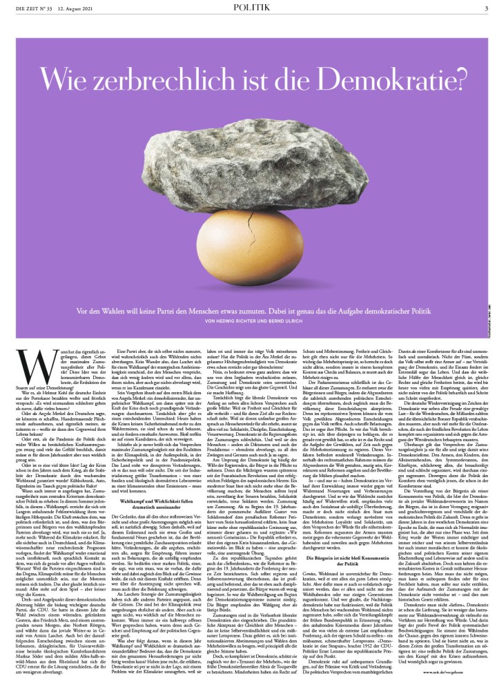
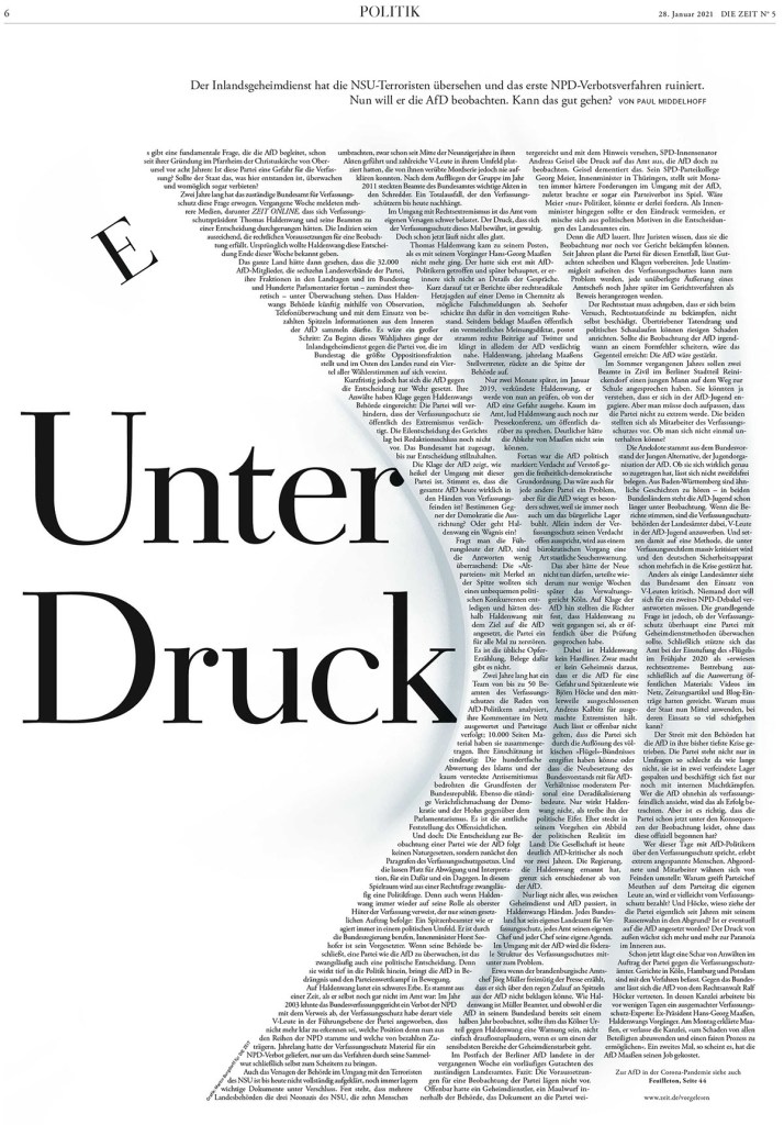
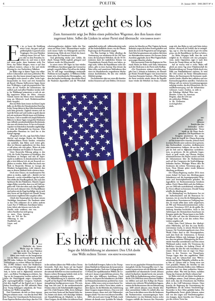
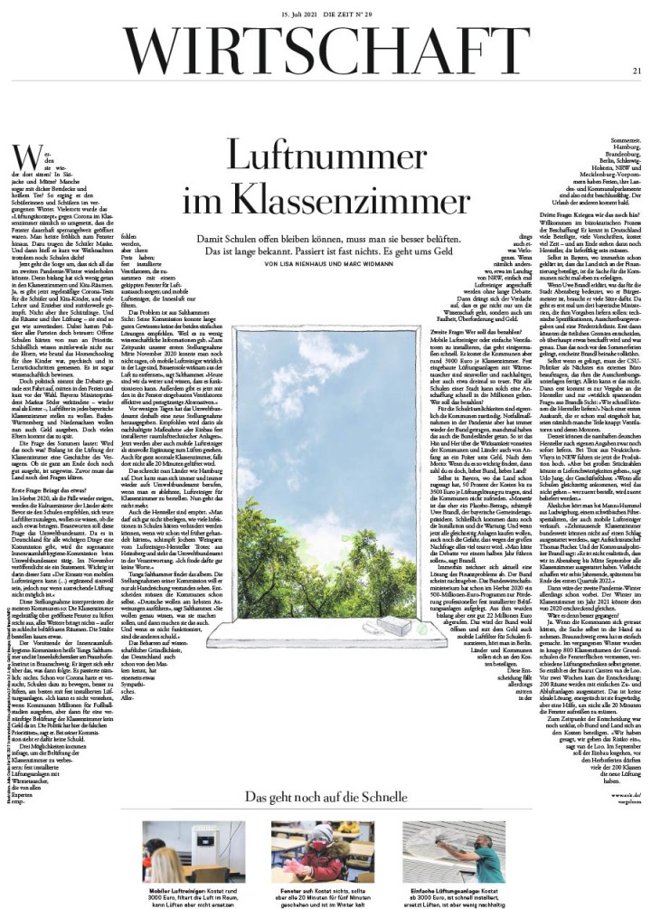
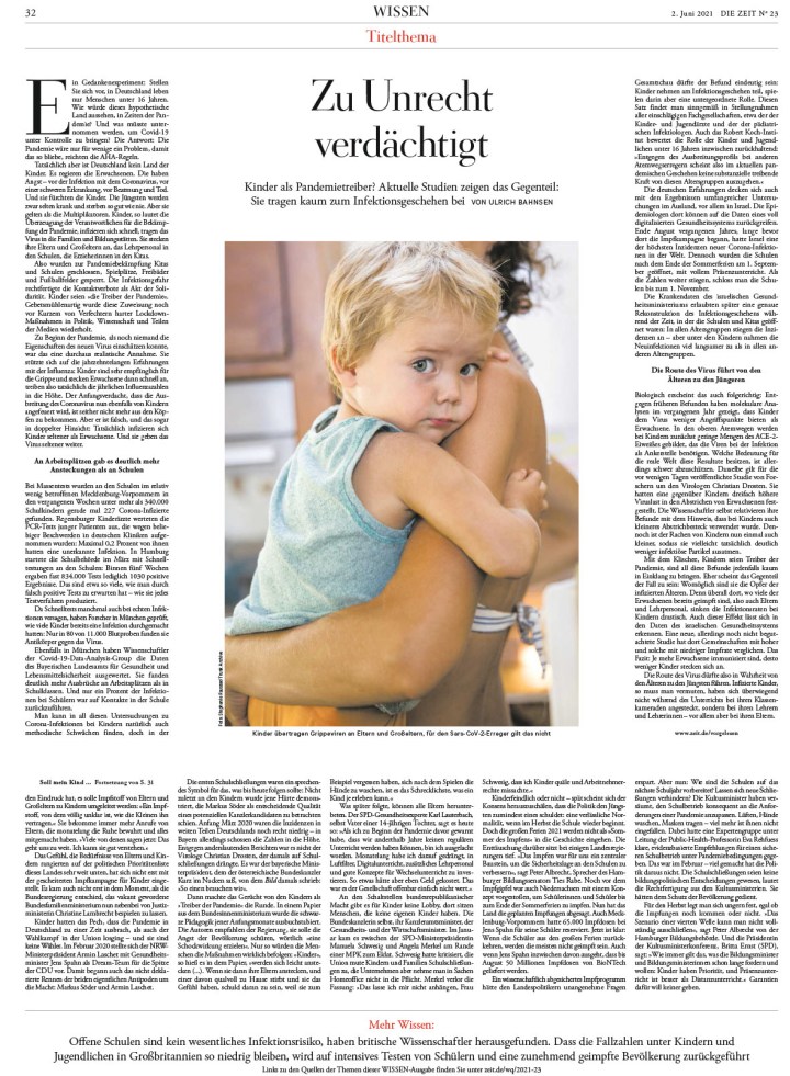
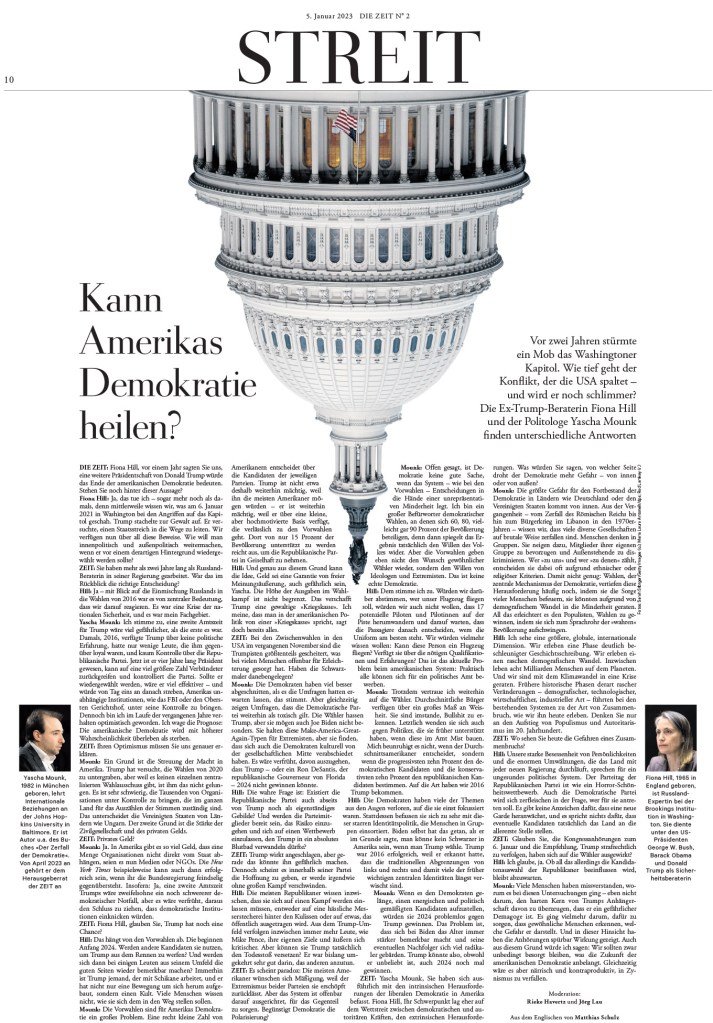
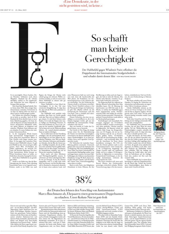
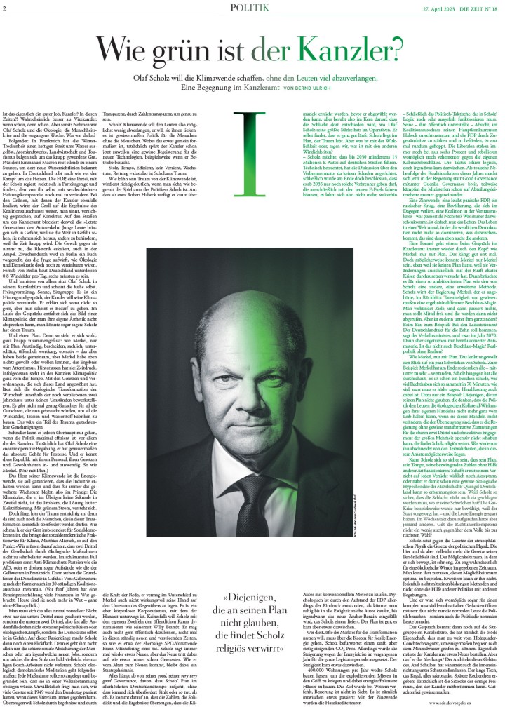
A smart use of the image and the play of the typography in the body copy make this page hard to look away from. It has a ton of copy. But it’s striking.
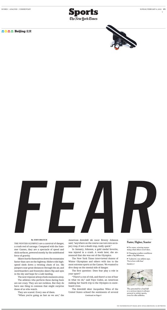
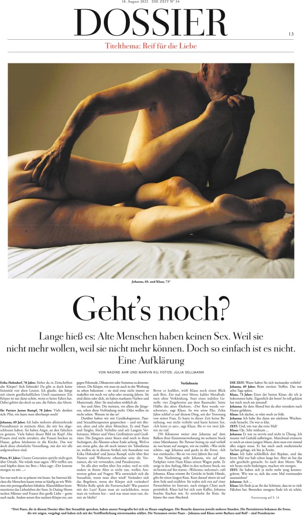
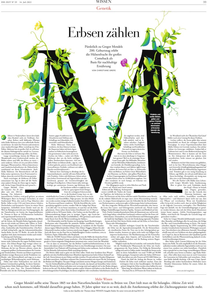
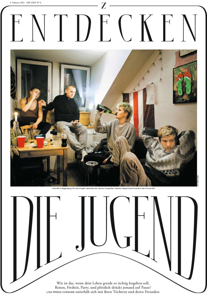
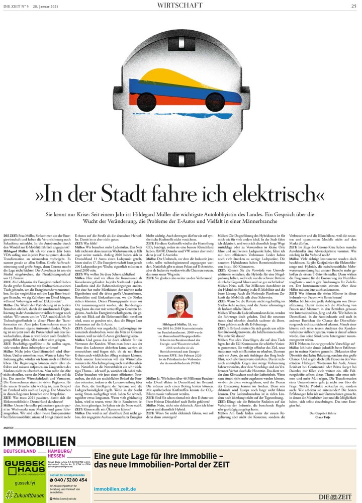
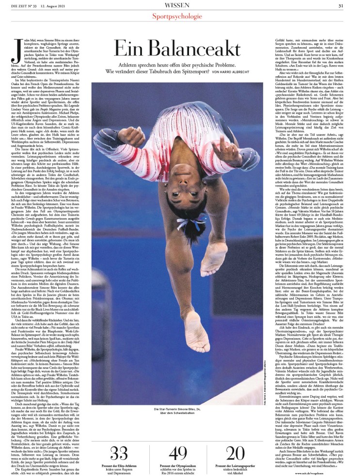
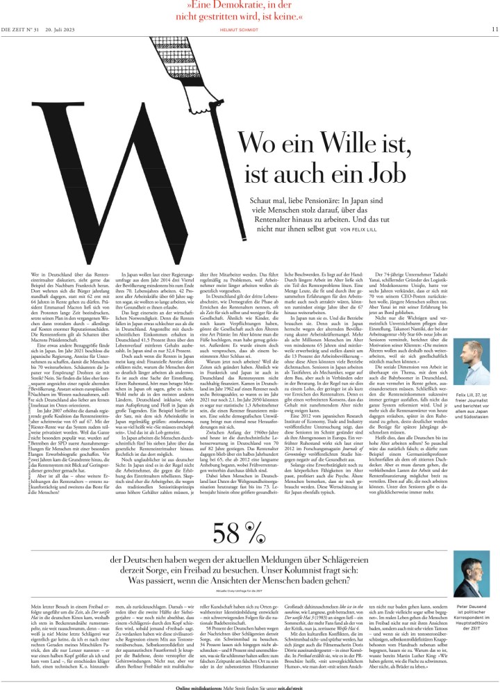
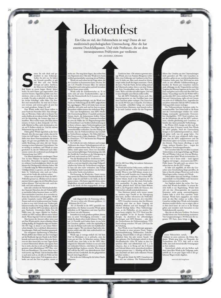
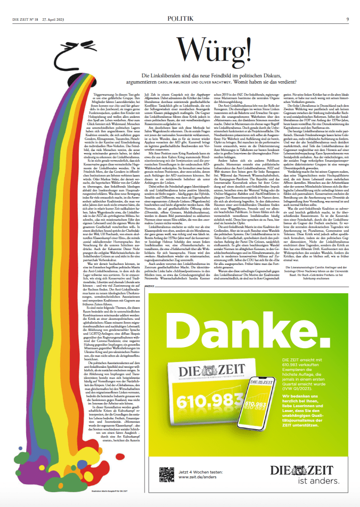
Nobody does bold and smart typography better than Die Zeit, in my opinion, and here are several examples of it.
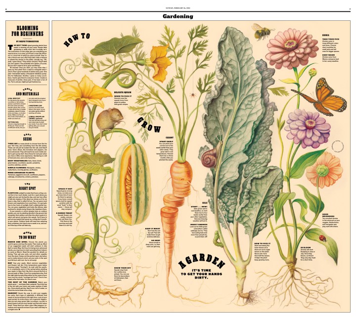
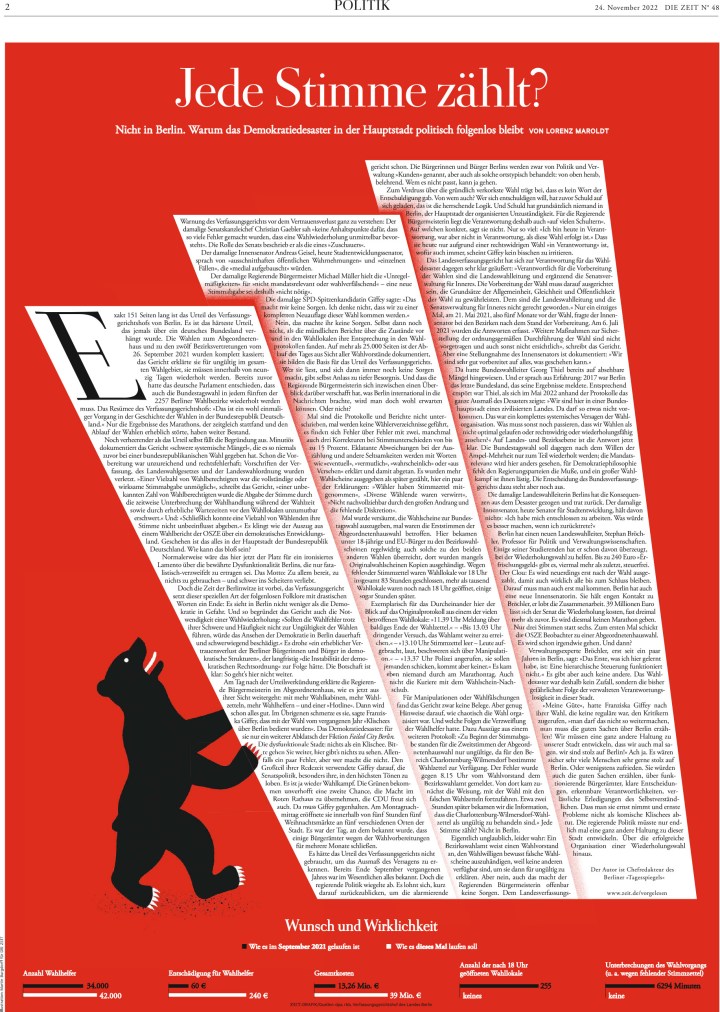
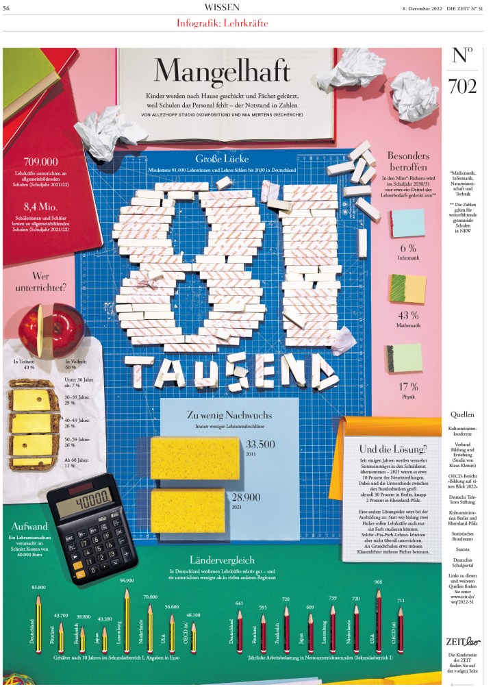
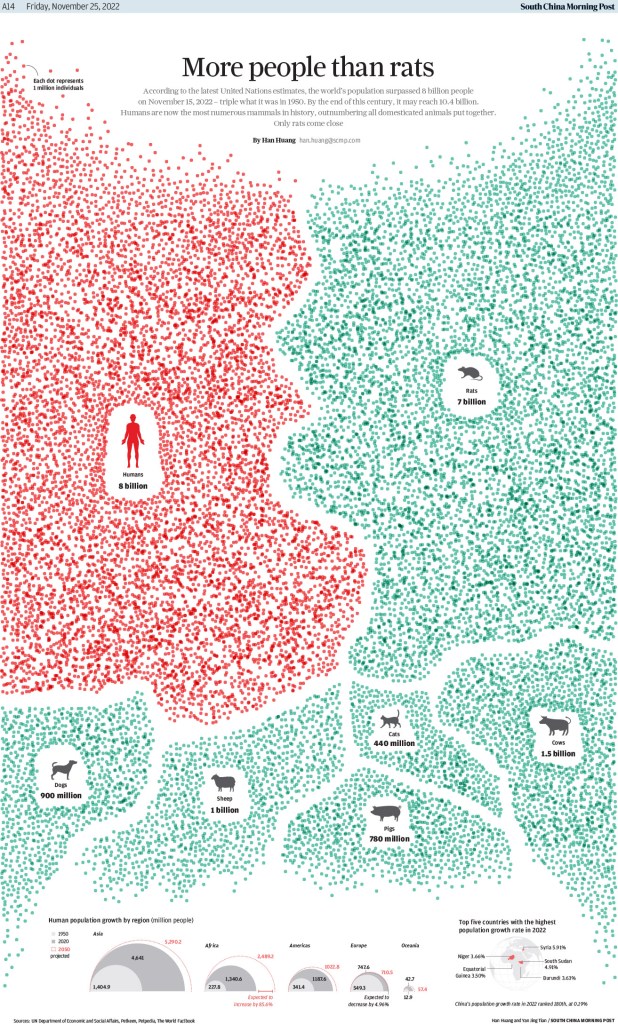
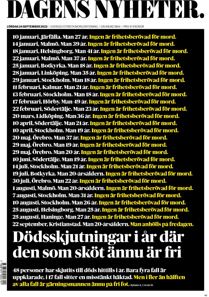
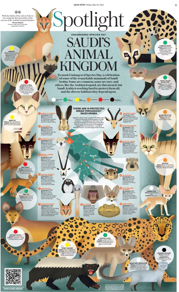
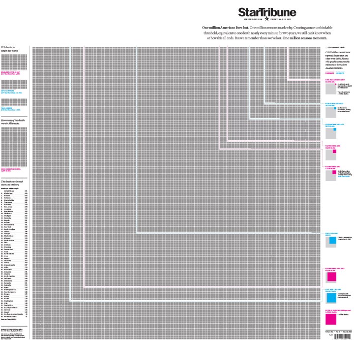
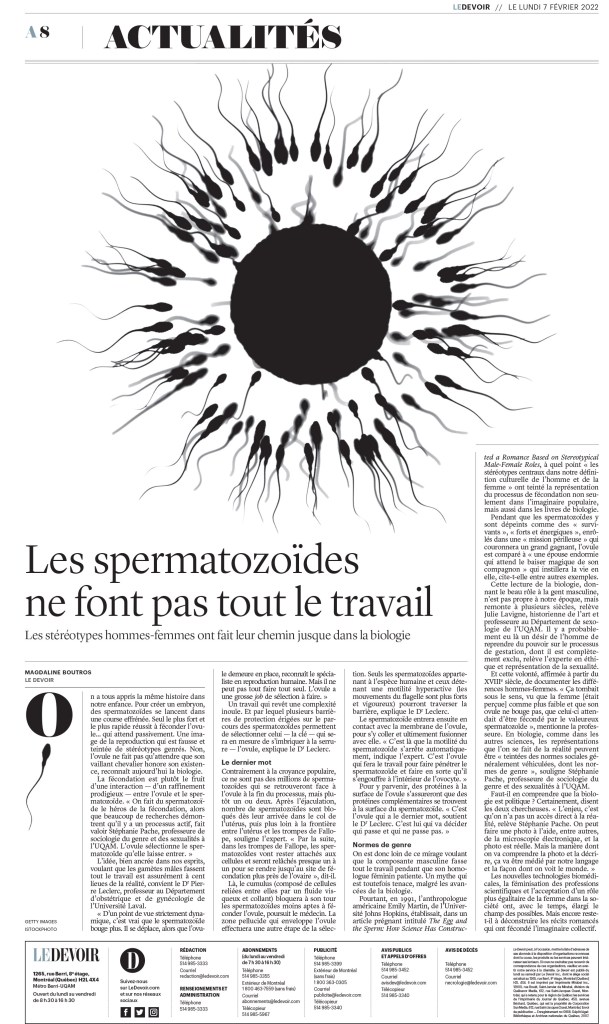
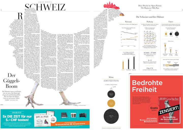
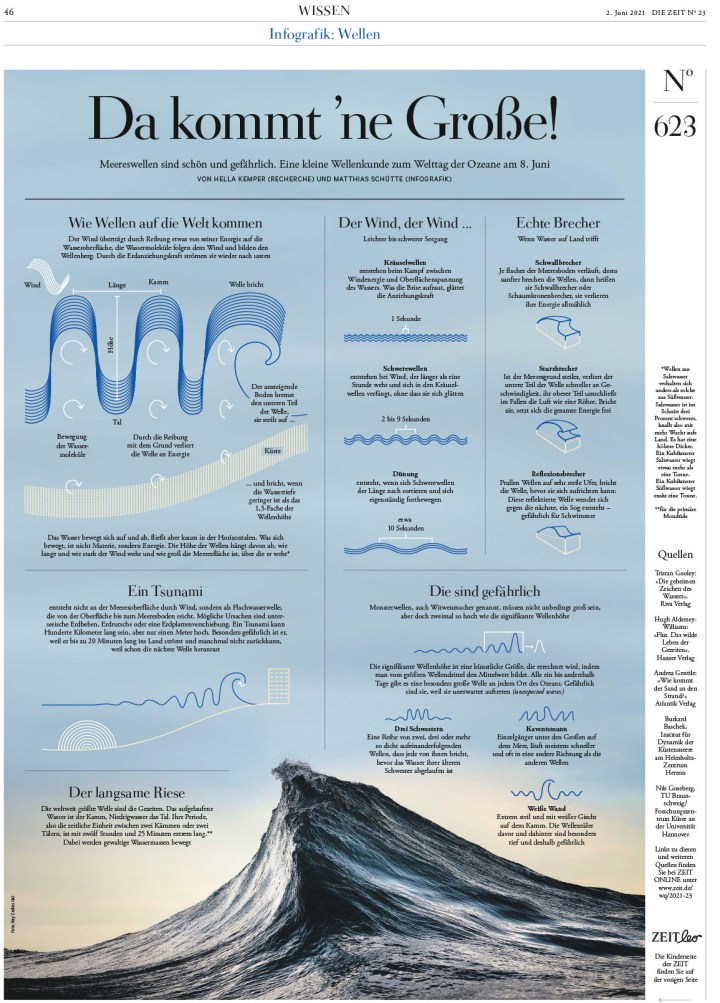
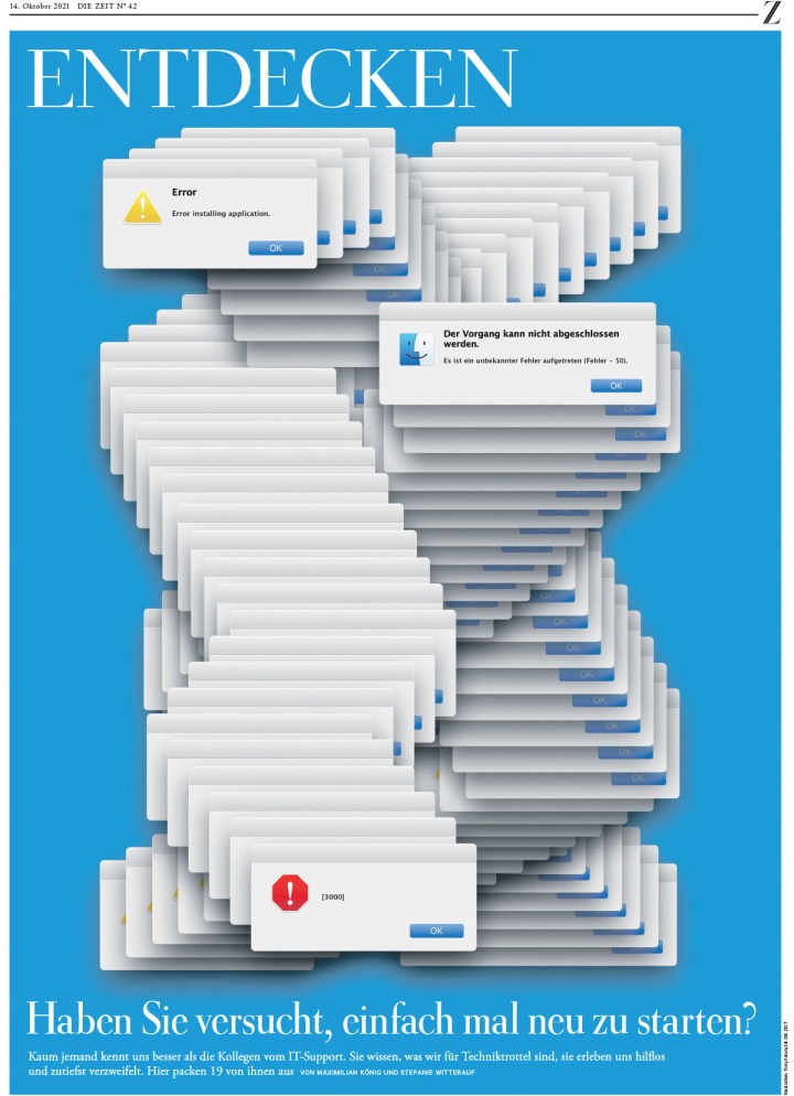
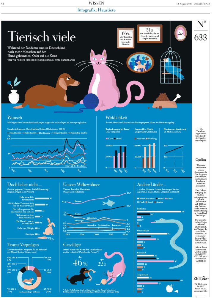
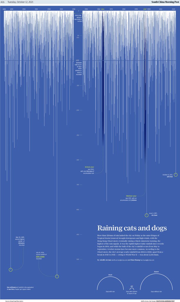
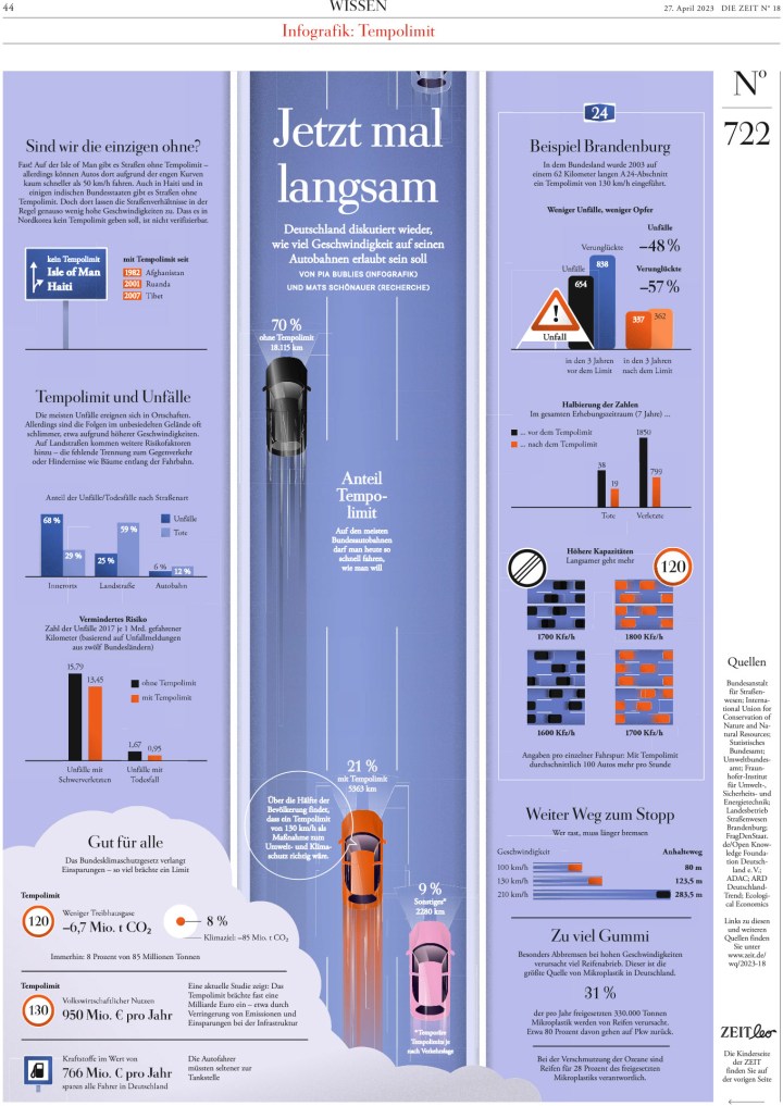
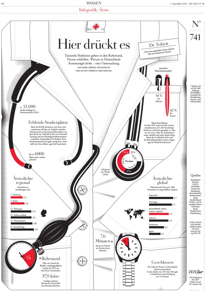
This is such a strong infographic page.
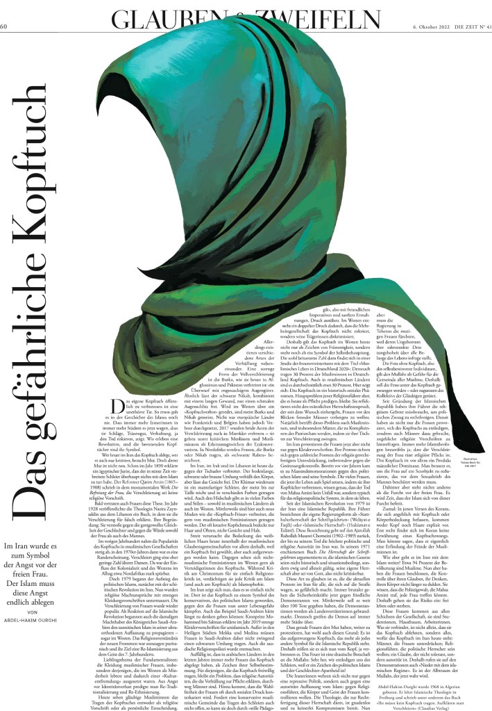
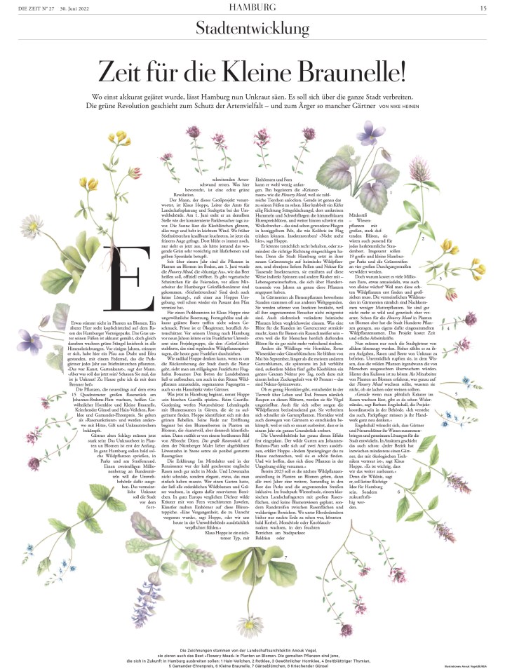
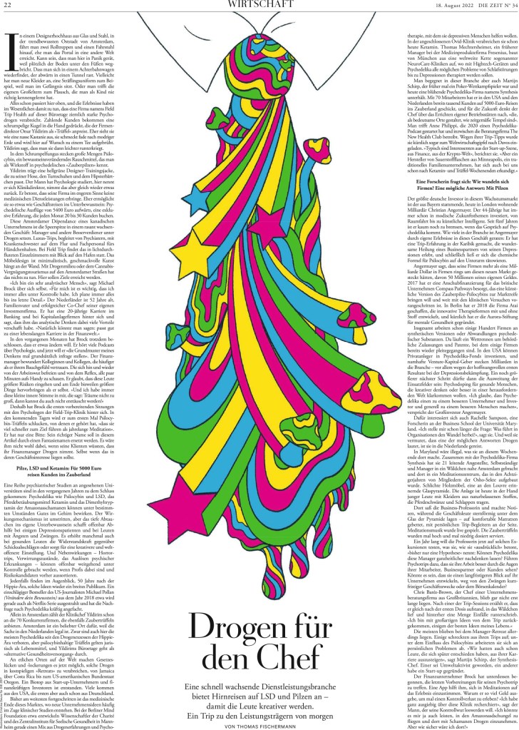
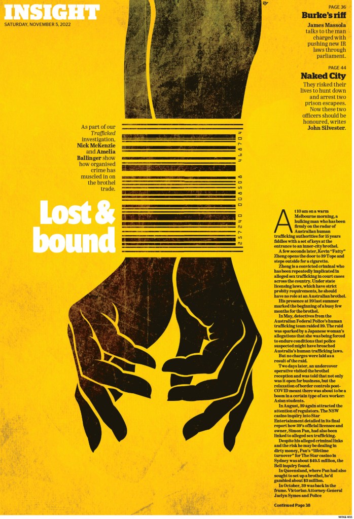
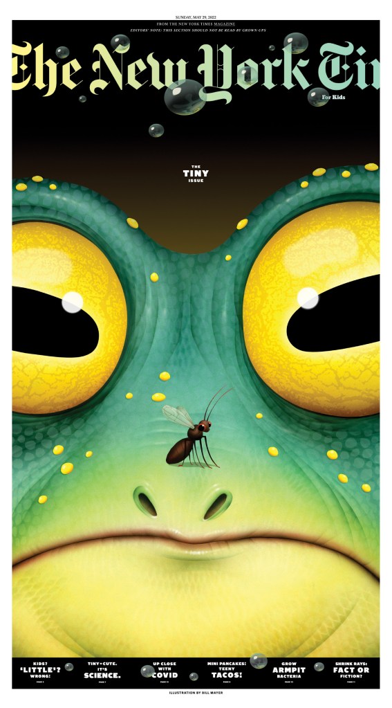
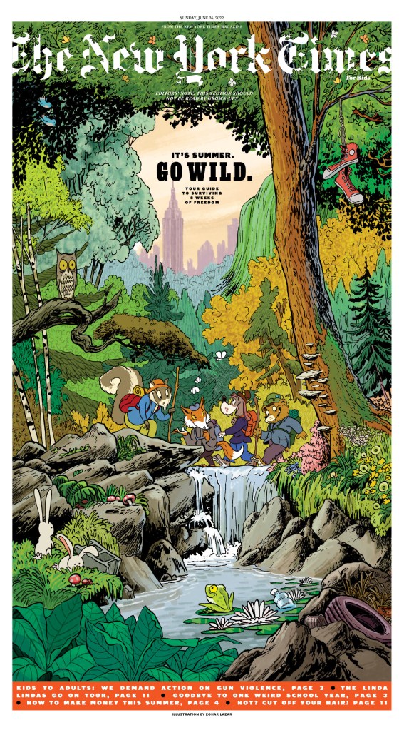
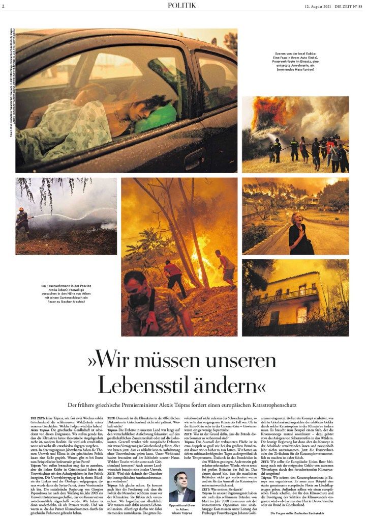
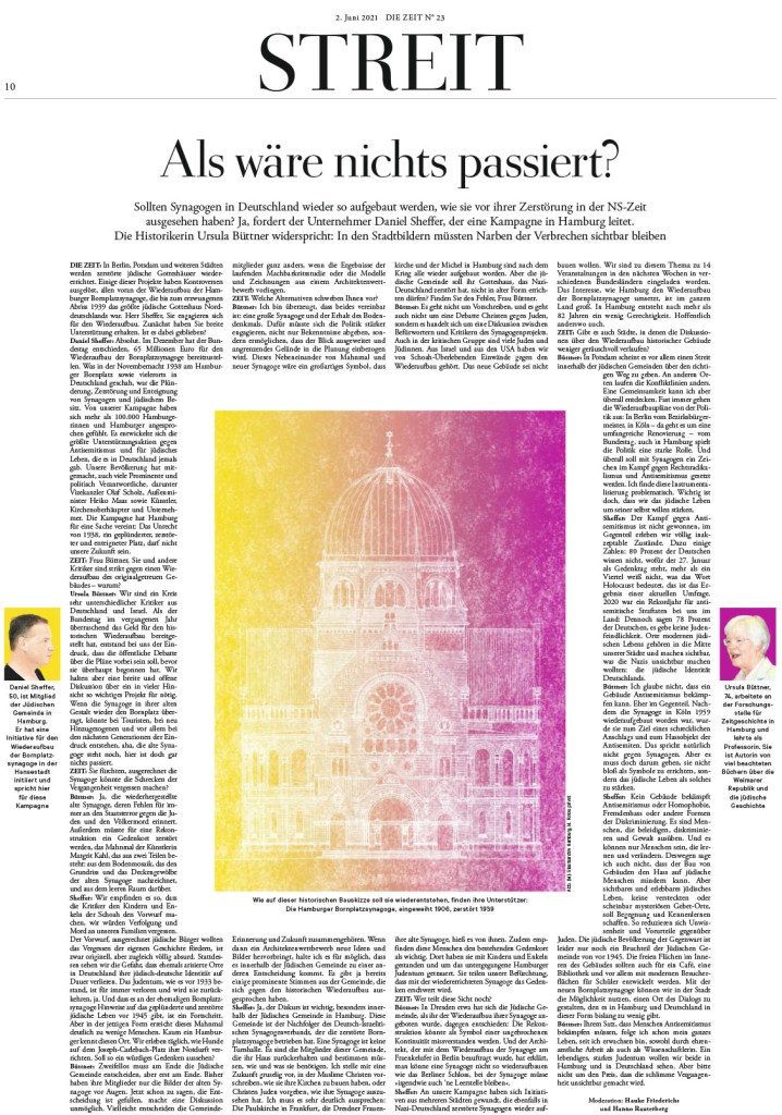
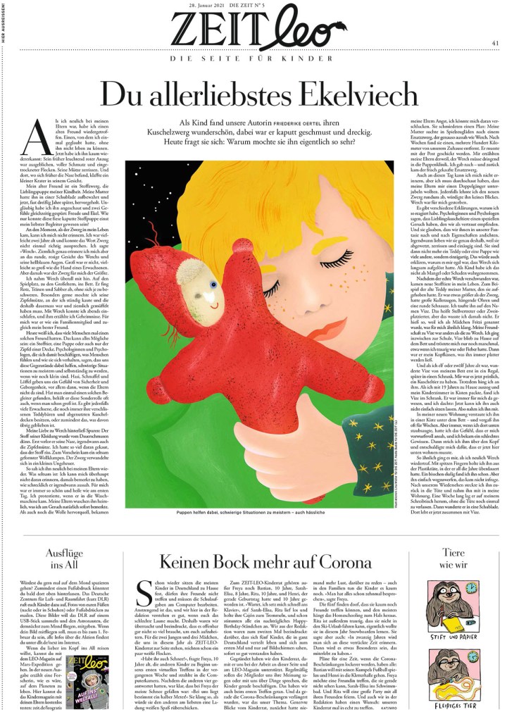
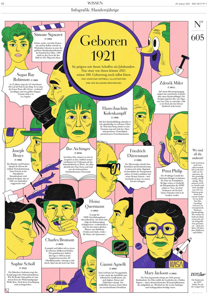
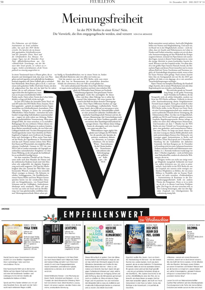
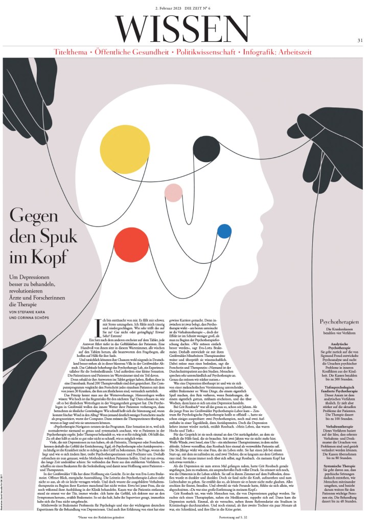
This page does so much well. Not only does it have a strong illustration, it doesn’t rely solely on that to create a compelling package, as we often see. There is a lot of page design going on to complement the illustration. Brilliant.
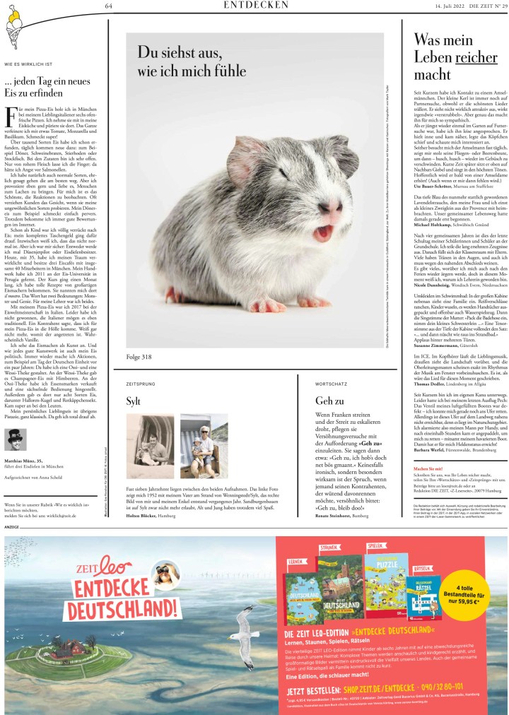
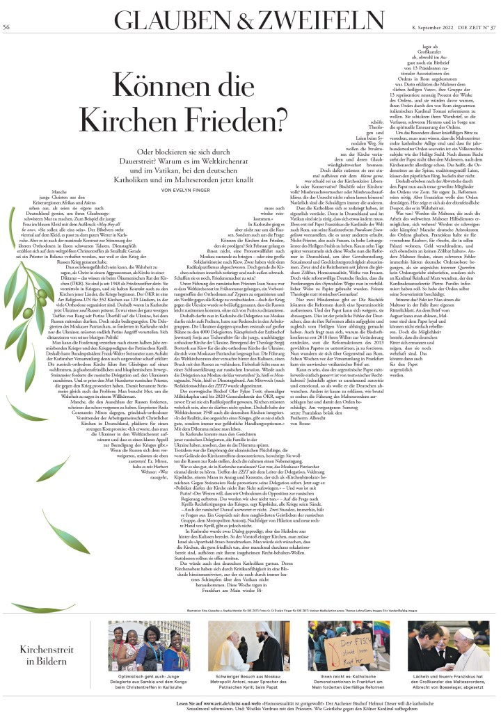
And a few more!
You can see all the winning pages here.
And that’s another year of SND in the books. Again, it was a great privilege to be a part of it. I always find it so inspiring, both looking at all the incredible submissions, including all those that didn’t win, but also listening to the judges.
More from SND45
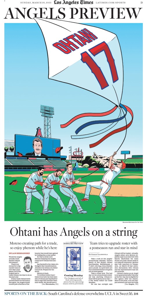
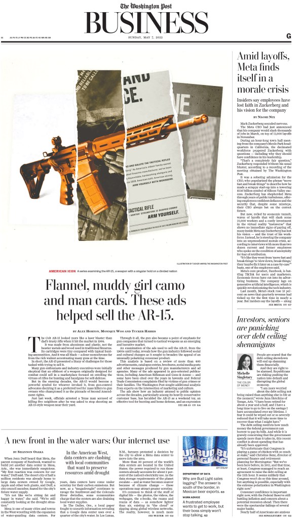
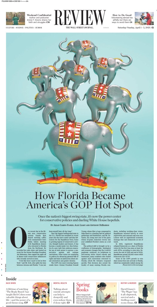
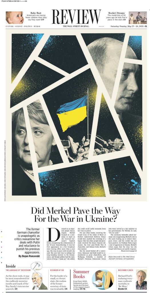
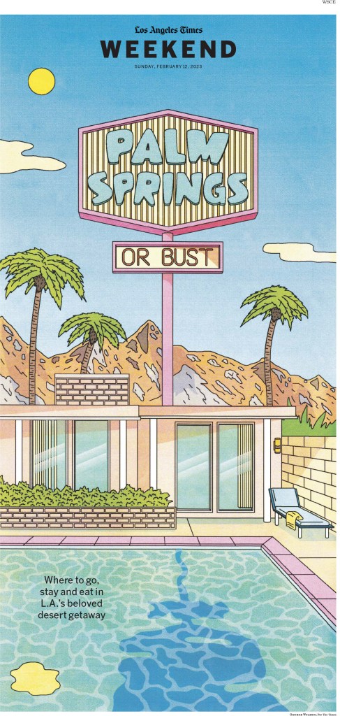
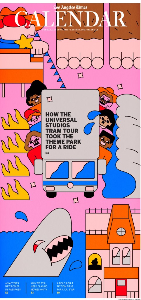
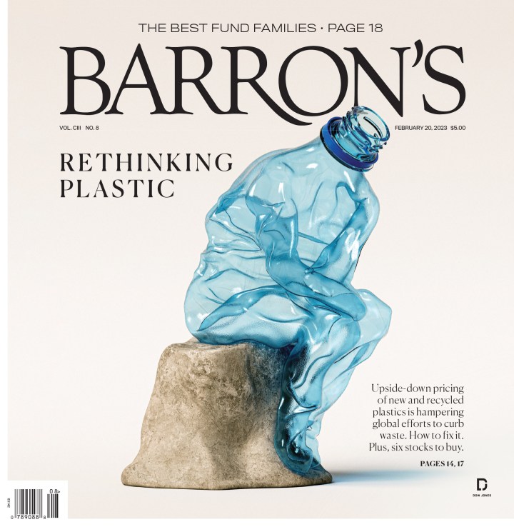
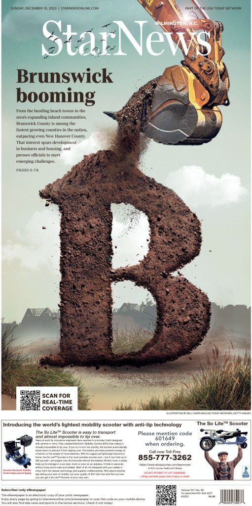
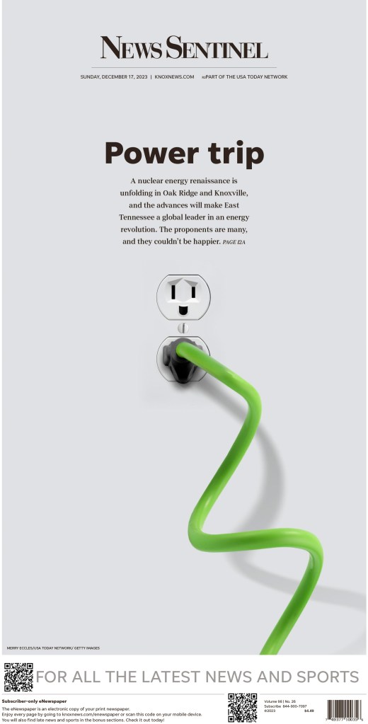
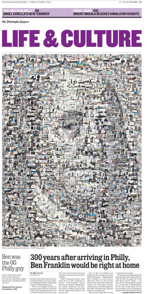
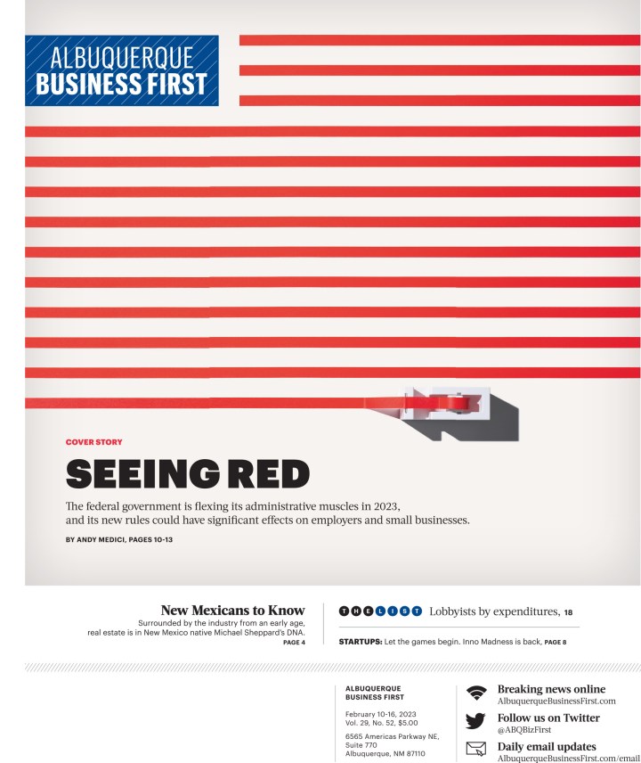
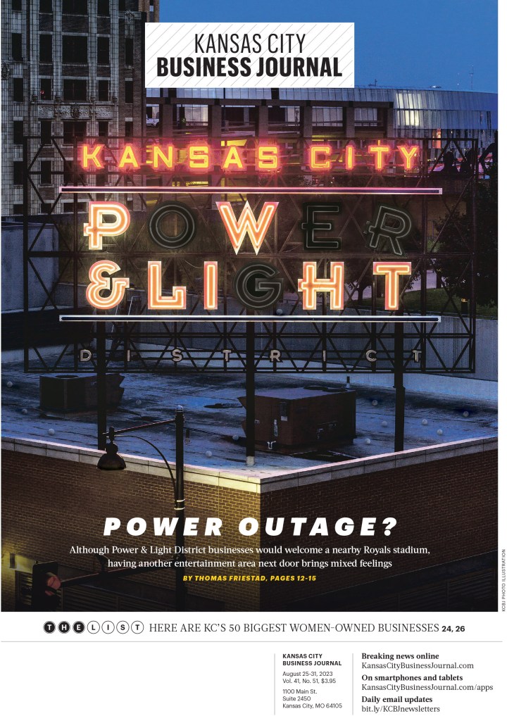
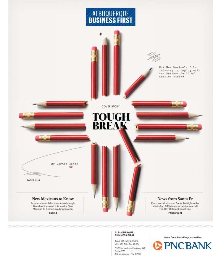
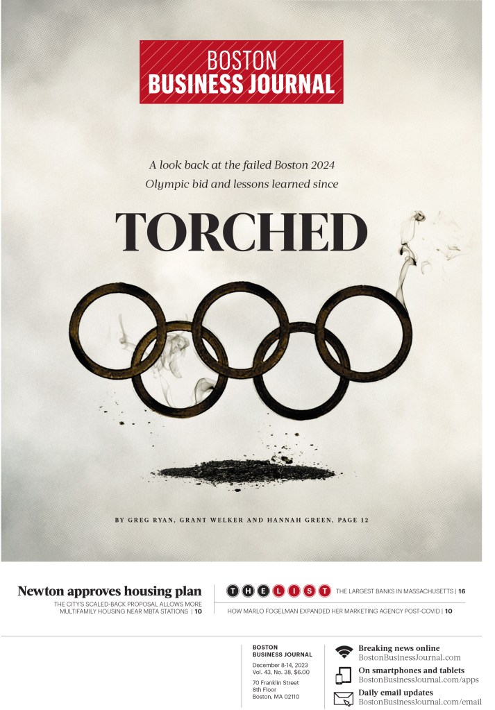
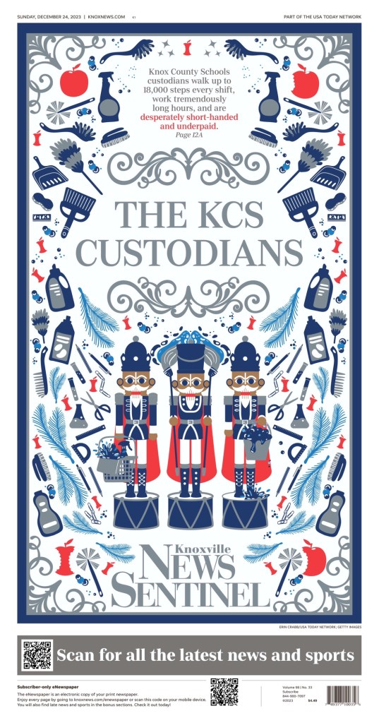
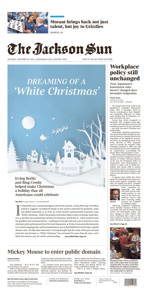
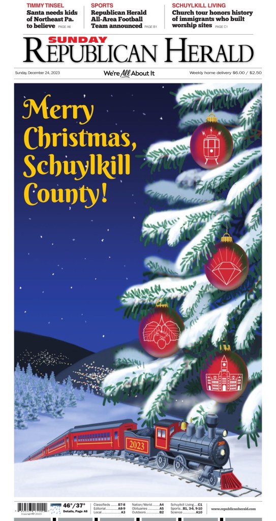
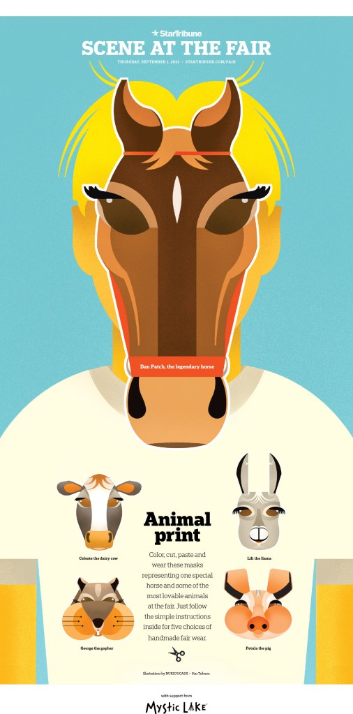
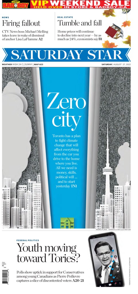
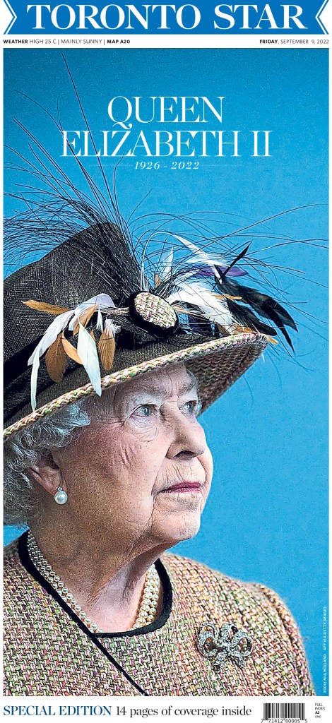
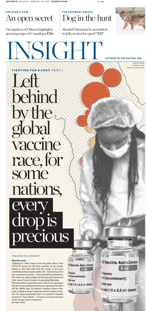
The best from Canadian newspapers
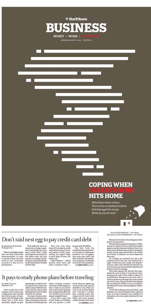
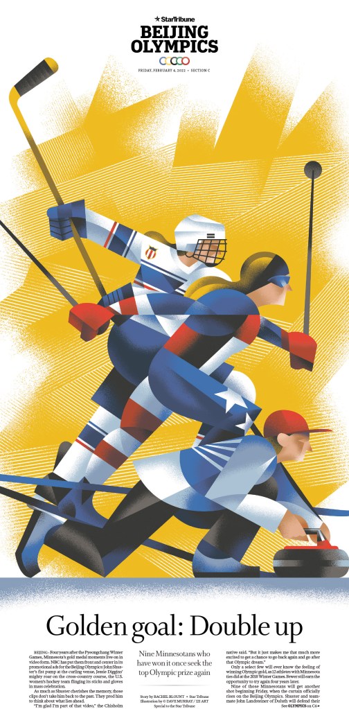
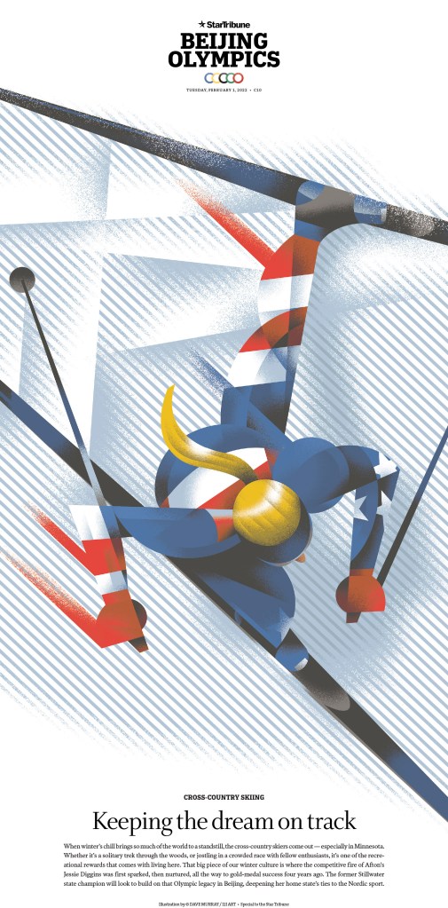
The best from American newspapers
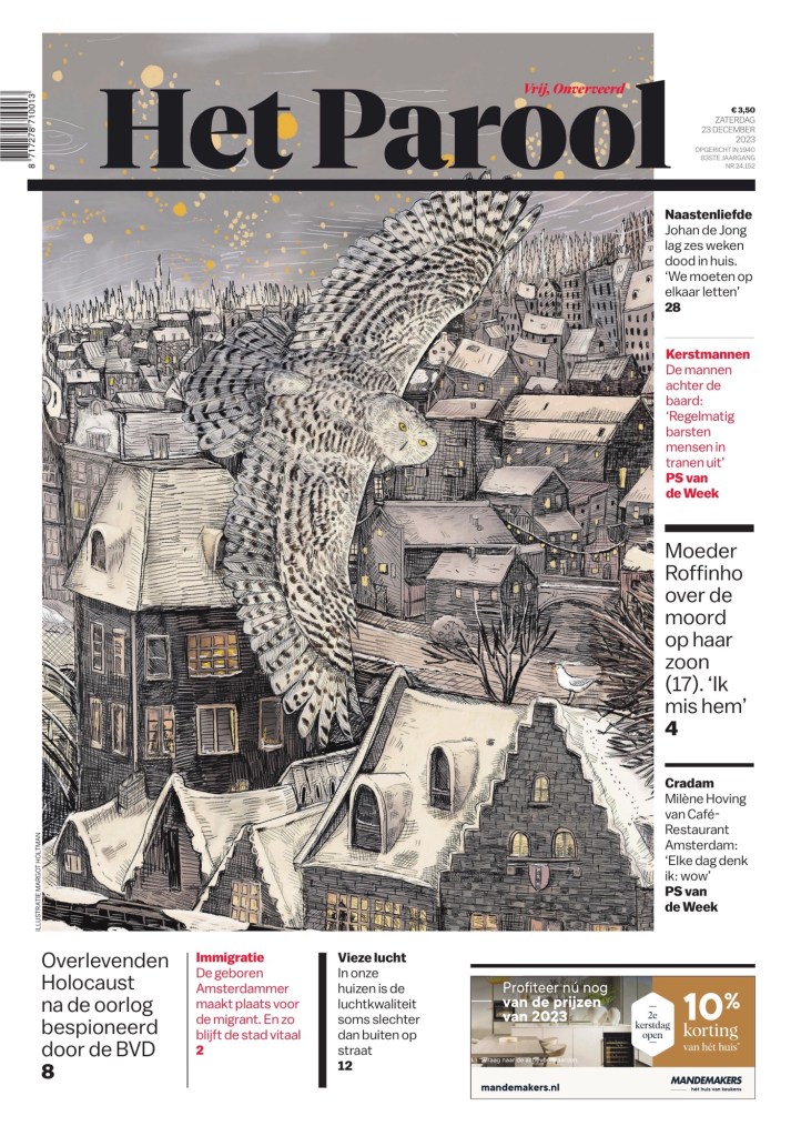
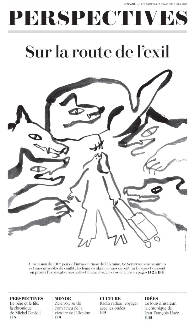
The best from the rest of the world
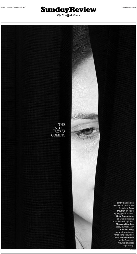
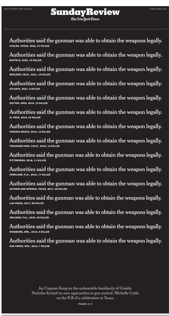
Use of black and white
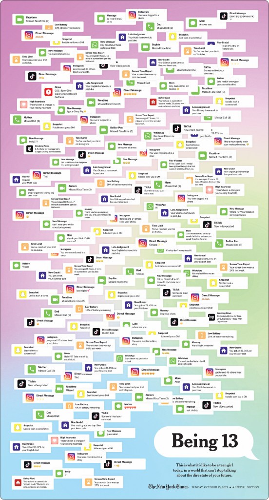
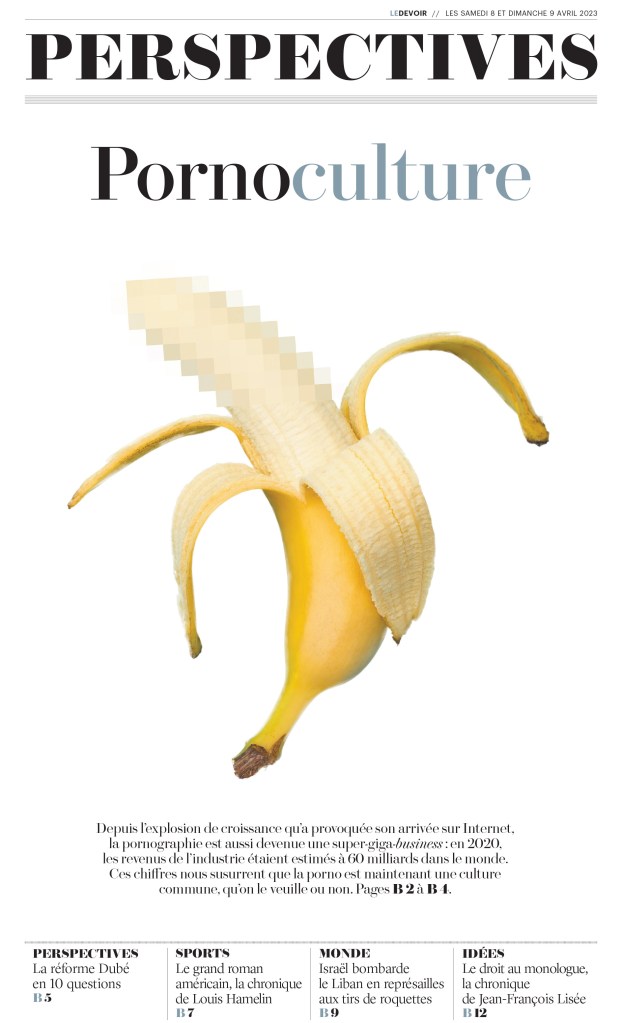
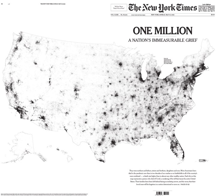
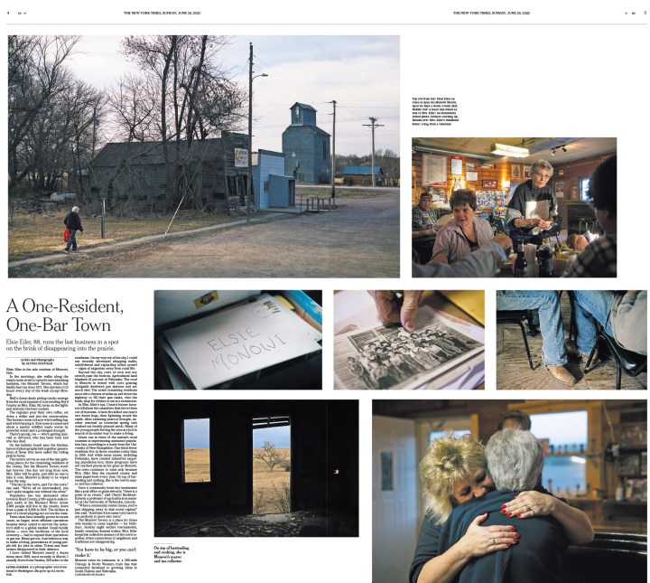
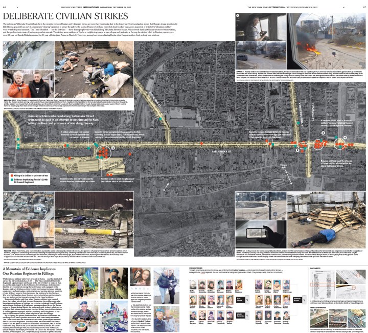
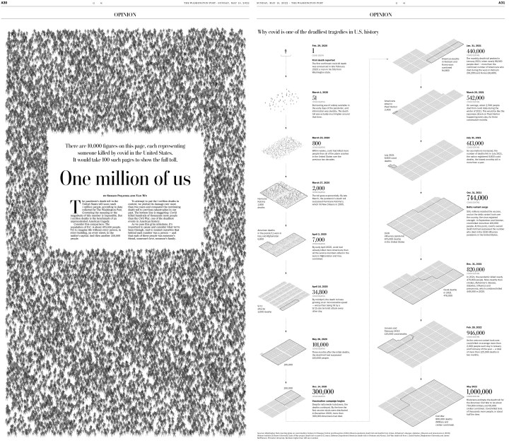
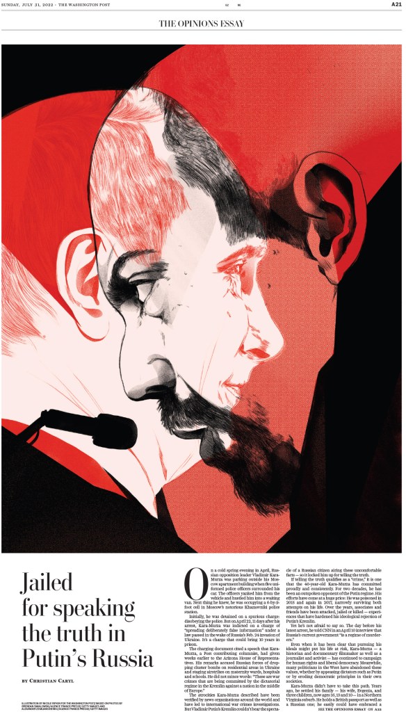
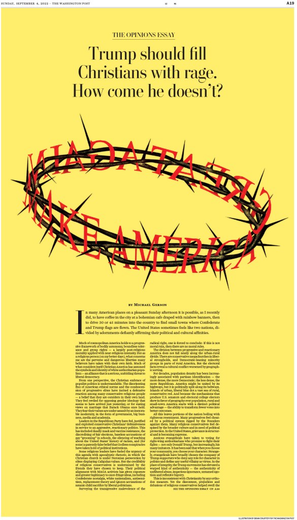
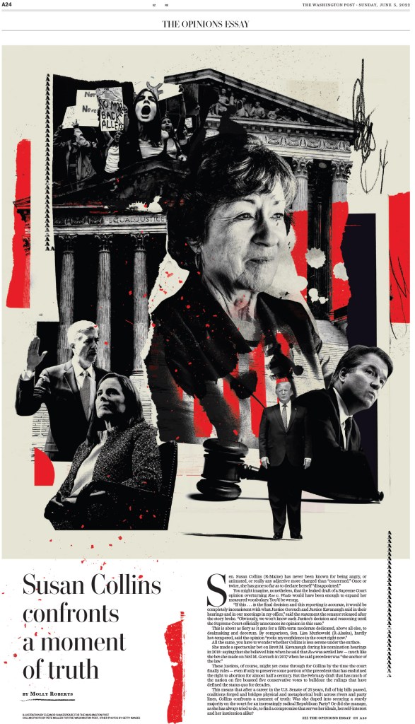
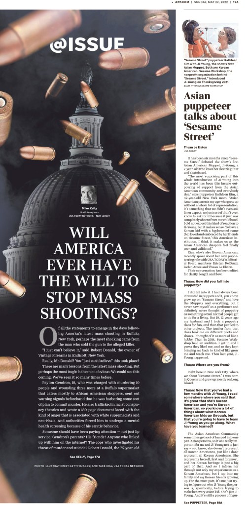
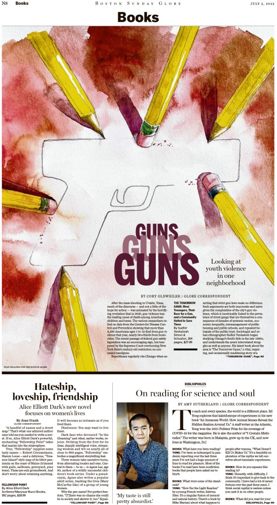
Dealing with tough topics