By Brad Needham
While some people have started taking screenshots of websites on big days, nobody is going to remember what the home page of the New York Times or Globe and Mail looked like on the night/day Donald Trump was elected. More so, most don’t care. But the front page of the newspaper? Many will remember. Many will seek it out later to see how it was played. Same for other major events. People in Hartford will remember the Harford Courant cover on September 12, 2001. People around the U.S. will remember the covers of their papers when Barack Obama won a historic victory.
There is something about a newspaper front page. They are a reference point for history. So much so that the Freedom Forum Institute is collaborating with more than 2,000 newspapers around the world on its front page gallery. Every day they post front pages of the day, and only for the day. However, going back as far as Sept. 11, 2001, 9/11, they have compiled key front pages from monumental days: 9/11, Donald Trump and Barack Obama’s presidential victories, the Charlie Hebdo attack, Osama bin Laden’s death, and so on. The pages are from events “that are considered of historical significance and fit its educational mission.”

Acquitted. Again.
Most recently, and the news hook if you will, was Trump’s latest acquittal. It was both a more and less historic day than his first acquittal on impeachment charges. It happened on a Saturday. Thankfully for American readers Sundays are still big publishing days. In Canada, most of the front pages from big Saturday news would come on Monday. In the examples above, two of the headlines are similar (USA Today and the Philadelphia Inquirer), both big and both use acquitted. Another not included said “Acquitted. Again”. Big bold words. The other, from the Telegraph in the U.K., shows how a non-U.S. paper played it. It didn’t get nearly the play it did in the American or even North American, media. Just another front page story.
I am always amazed at how these pages come together. While the conceptualizing for some, like elections, can start well in advance, for other events, it’s a mad dash to the finish, like the covers for September 12, 2001, (or for some papers, September 11 as they rushed to put out special editions or put out their afternoon or evening editions. The Guelph Mercury (RIP) tore up its cover to replace it with a 9/11 cover. As the story goes, it was so rushed that the turns from the stories that were on the cover originally still ran). I feel fortunate that I have been able to work behind the scenes on a lot of big days. I’ve worked too many elections to remember, but I do remember some. Obama was memorable. Trump was even more so, only because it was so tight and surprising. While papers always have contingency plans for election covers, I would wager most papers, like the Toronto Star, had a “Hillary Clinton wins” design firmly planted on the page for much of the night, with a Trump victory on the pasteboard.
There are a few things I find notable about big day newspaper front pages. Here are a few things I love.
Headlines: Big and short
Big events can be a headline writer’s dream … or nightmare. Often a big front page headline is 72 points. Smaller for most non-tabloid papers. But on big days the font size isn’t just bumped up a few points, it often explodes. 100 points. 200 points. And the bigger the font the smaller the headline in terms of words. Now instead of seven or eight words, you get two or three. The bigger the event, the fewer words you get to capture it for posterity. While some of these are tragic stories, I want to note the work by creative headline writers and designers who can create these packages and that capture the moment. The team that puts these pages together recognize the importance of what they’re doing. Some examples, and they may seem simple, but the words have to be just right:
OH-BAMA!
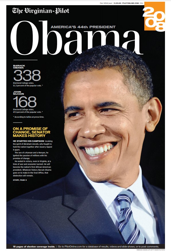
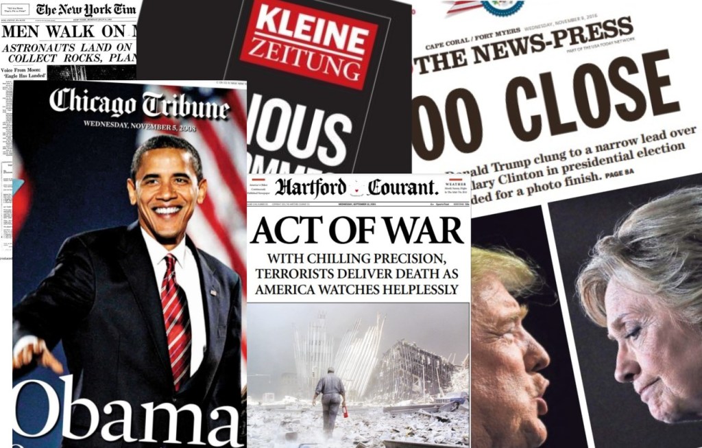
It was a historic day. Americans elected their first Black president. Here are some of the headlines: Virginian-Pilot, Obama; Critica, Historica; The Commercial Appeal, YES HE DID; Philadelphia Daily News, New York Times and The Honolulu Advertiser (and more for sure), OBAMA; Kansas City Star, HISTORY. And, OH-BAMA!, Orange County Register. Lots of Obama, lots of history, lots of yes he can or did … And all beautifully played with strong, emotive art, and other key elements.
9/11
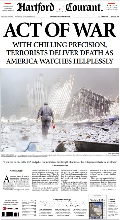
Some papers came out that day, some the next. The common theme was shock, anger, sadness. Here are some headlines: The Arizona Republic, TERROR; The Oakland Tribune, Terrifying; The San Diego Union-Tribune, NATION IN ANGUISH; Hartford Courant, ACT OF WAR; Chicago Tribune, ‘Our nation saw evil’; The New York Times, U.S. ATTACKED. There were some outliers, such as the Washington Post: Terrorists Hijack 4 Airliners, Destroy Word Trade Center, Hit Pentagon; Hundreds Dead.
Capitol riot
What started as a fiery protest turned into a riot at the U.S. Capitol, when an angry mobbed stormed the building. Here are some of the headlines: Arizona Republic, PRO-TRUMP MOB INVADES CAPITOL; Anchorage Daily News, Pro-Trump mob storms Capitol; Tampa Bay Times, UNDER SIEGE.
I love that despite being hundreds or thousands of kiliometres apart there is often such similar language from paper to paper. Repetition of big, powerful, emotive words. Terror. Victory. Siege. History. On their own the words wouldn’t mean much. That is where the rest of the design comes in. One, two or three words. A poweful photo. A deck. All of the sudden a quick glance can tell the story. I think it’s magical.
The art of design: the photo
Iconic front pages are often made iconic by iconic photos. (Don’t tell the former editor from the Toronto Star that I said iconic three times in one sentence. I will be blackballed from the industry.) Those who choose the pictures deserve some props as well. It’s not an easy task most days, but on days of historical significance it is an even greater responsibility. Even on days when the art essentially chooses itself, it can be a painstaking process. Do we show the planes crashing into the building? Do we show show the Turkish police officer carrying little Alan Kurdi’s body? It’s an excruciatingly hard decision some days. And in print, once the paper hits the press, the decision is irrevocable.
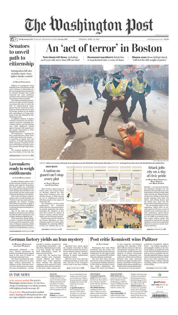
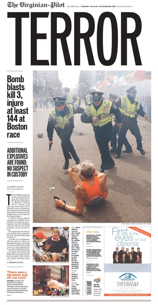
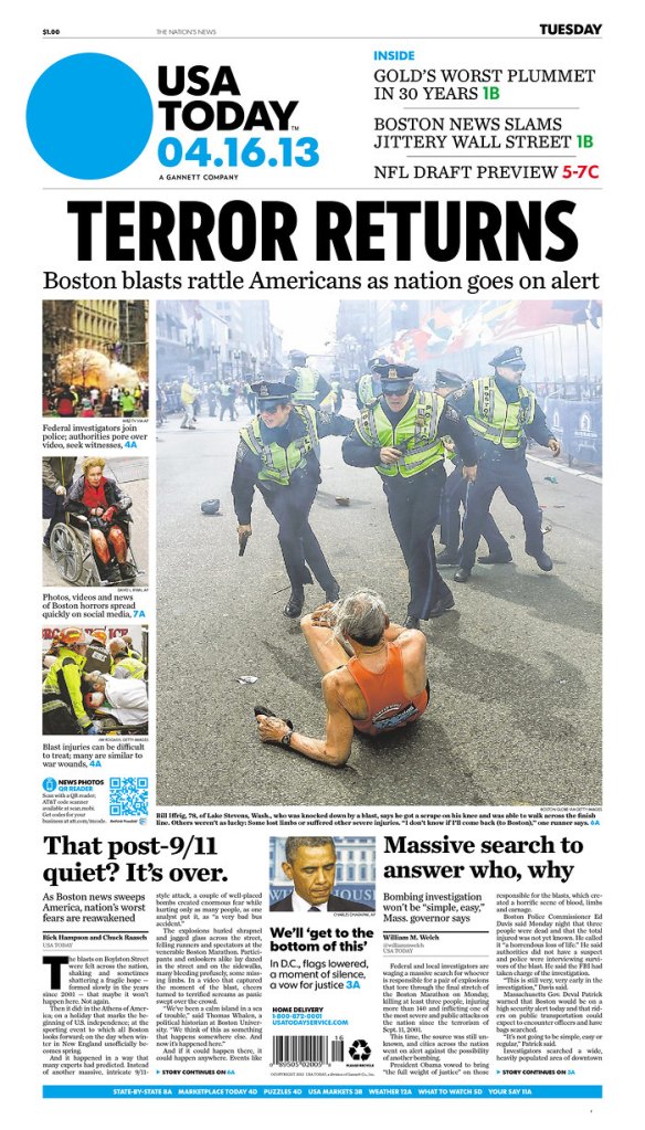
The Boston Marathon bombing was a good example of a major story and of art choosing itself. When it happened, newsrooms started buzzing (I was in one and I remember it well). Images were flowing in. There were lots. The main image was replaced and replaced. Until the image came in. Rather than one caught by a witness cellphone, it was by Boston Globe photographer John Tlumacki. Not all papers chose to run it, but many, maybe even most, did. It captured the panic. The moment. A runner on the ground. Police with guns drawn. Smoke. The kind of photo rarely captured by an amateur photographer. One captured by a newspaper professional.
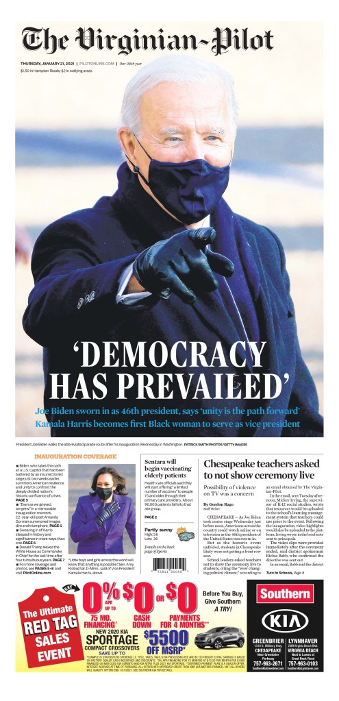
Two of the three papers above took a similar approach. The big headline. Terror. Big photo. Less information. The Virginian-Pilot has a long and storied history, and is one of the most recognized papers in the world for its incredible design. I love that it’s not afraid to reduce the size of its flag to give more pop to the content. It’s bold. The Washington Post played it straight. More information, less about the design. As newspapers get smaller being able to blow out your cover on one story still happens, but it’s a much bigger investment than it once was. We might see more covers like the Post’s, but some papers are still going big. And I will celebrate them as I see them (I will write more about this in a future post). Being able to turn around a front page that captures a key moment in history at a glance, while under pressing deadlines, is an incredible feat, pulled of by teams of passionate editors and designers, and it happens all over the world.
Here are a few of the amazing pages from big events. I don’t think I need to say anything more. The designs say it all. Credit to the papers in flags, and to the Freedom Forum Institute, which has kept these pages easily accessible for the public to see.