‘Tis the season of Christmas front pages. As many papers don’t publish on Christmas Day, I usually start this post on Christmas Eve and update.
Here is a selection from this year, starting with my two faves, though Politken is my runaway No. 1 this year. Het Parool is No. 2, before we get into Canada, we’re two papers continue their long traditions.
Both the Globe and Mail and National Post carry on their Christmas front page traditions.
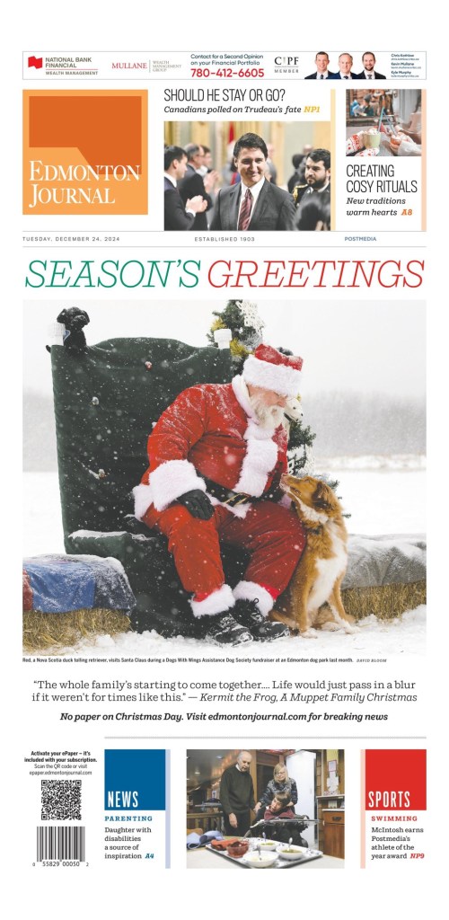
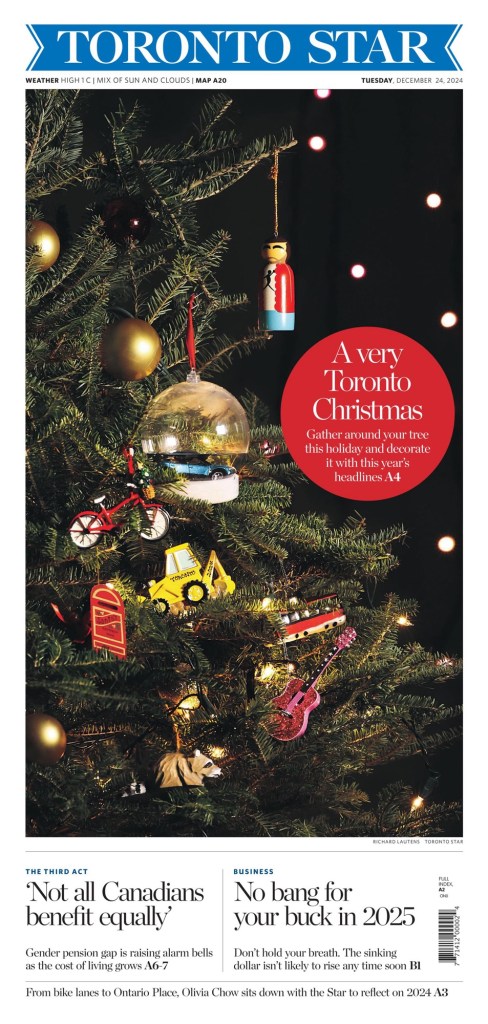
And here are a couple more from Canada, the Edmonton Journal and Toronto Star.
If not for Canadian papers, this Christmas kitty would have been higher up. My daughter wanted it in the No. 2 slot.
And here are a few more from around the world. As per usual this is one of my favourite times of year on newspaper front pages.
The Star Tribune has long been a great newspaper. One of the best, not only in terms of newspaper design, but as a news source for its audience. I feel like a bit of an authority because I was inspired by the Star Tribune when I was tasked with doing a full redesign of the Guelph Mercury way back in 2008. Two papers disproportionately were reflected in the final product: the Virginian-Pilot (once the best designed newspaper in the world IMHO) and the Star Tribune.
A funny thing about newspaper design though. For the most part, other than once a year at design competitions, which are becoming less and less common (thank you to the Society for News Design for keeping them alive), those who design newspaper pages are anonymous. Faceless and nameless, they are the part of team that executes, and often conceptualizes, the designs we see on newspaper front pages every day. Unlike reporters with bylines, or magazine designers, who often get named on the inside cover, we don’t know who did that design. You know, that design that took your breath away when you pulled the newspaper out of the bag that you picked up from your doorstep. Come on, it can’t be just me. That is why I do these designer spotlights. To get them the attention they deserve. So when, on a whim, I reached out to Stacie Kammerling, a designer from a newspaper I have the utmost respect for, I was hopeful, but you just never know. I hadn’t seen her work before reaching out. I have high design standards, and my own design biases as to what works, what’s cliché and what didn’t work.
Well … Mind. Blown. Stacie is a phenomenal talent. So for this post, I gambled and won. But if you’re reading this, you win, too. Stacie was kind enough to answer a pile of questions I sent her and to send me very thoughtful responses. I am grateful for that. And a funny thing happened on the way to this profile. I do this to get others the attention they deserve, those like Stacie. And what did she do? She thrust others into the spotlight I provided her. She is a true collaborator, and clearly someone who absorbs what others are saying. And now I turn it over to Stacie.
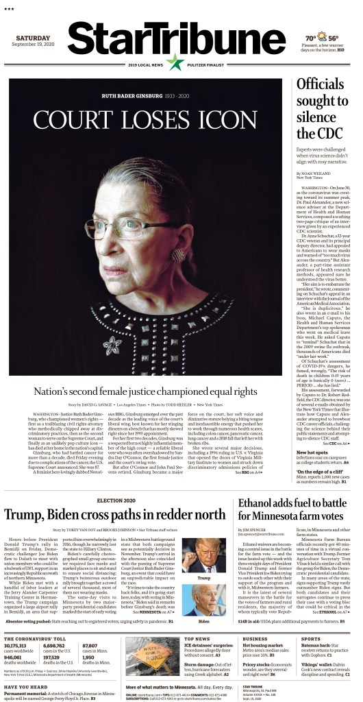
Star Tribune, Sept. 19, 2020
A Q & A with Stacie Kammerling, Star Tribune
Q: How did you get into newspaper design?
A: In a roundabout way, I actually fell into news design. As a teen I loved how art felt accessible to me through editorial illustration, so I applied to art school with dreams of working at a magazine. There were no illustration programs in Indiana that I knew of, so I chose a degree in art with a concentration in visual communication at Ball State University. As a first generation student, I liked the idea of a multidisciplinary program studying both fine art and graphic design. But a year into art school, I felt a bit disillusioned. Artists I knew hadn’t landed jobs post-graduation. I felt like the program wasn’t fully preparing students to build a path for a career. I was terrified of my future student loans and providing for myself to live on my own.
Design as a practice can be a lot of ego, and it’s very important to listen to what readers want beyond what you’ve always provided them.
Meanwhile, the independent school newspaper, the Ball State Daily News, was looking for staff. I really wanted more experience with editorial design, so I volunteered to work a few night shifts a week. I met so many creative, kind, and determined people. It opened my world to discovering journalism and expanded my idea of what information design could be. I really liked how collaborative the Unified Media Lab felt. Designers, reporters, graphic artists and photographers all shared techniques and ideas. I surprised myself by continuing, I often hated most pages I did. The quick deadlines were a huge stress. I was very hard on myself, though the process made me much more resilient as a designer and person.
I was very influenced by the 2016 U.S. election during my senior year as I was deciding on a path after college. I wanted to feel like I could contribute to truth-telling, fighting misinformation and even just the documentation of history that newspapers provide. Ryan Sparrow, who led the journalism graphics program and now works for USA today, was a huge influence in showing me future paths I could take via journalism. So I moved to the Villages, Florida for my first job as a production editor at the retirement community’s newspaper. I learned so much about not just newspaper design, but celebrating community, how to edit down information and headlines to get at the core of a topic, and how important it is to be part of and understand your readership. Design as a practice can be a lot of ego, and it’s very important to listen to what readers want beyond what you’ve always provided them.
What do you like about newspaper design? What makes it different from other design?
I really like that newspaper design is first and foremost focused on the reader. It’s a service for disseminating information and giving readers not only access to information, but curating it so they can clearly see what matters and why they should care.
There is still a big push for innovation, surprise and alternative storytelling within newspaper design, despite dwindling print opportunities for designers. Choosing a career in print news design in this decade is scary. But the bar has never been higher for how we can take care of presenting information for the people who prefer it, cherish it and truly look forward to their paper. I like knowing the audience truly deeply cares about every page we make, even if the form is often temporary. When it’s not temporary, as in for historic and special occasions, the paper is even more special to me as a document of history.
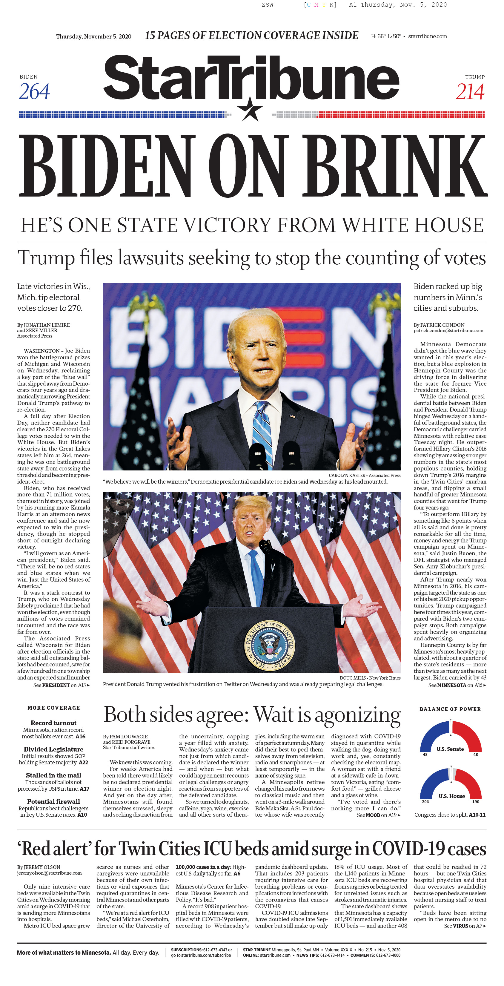
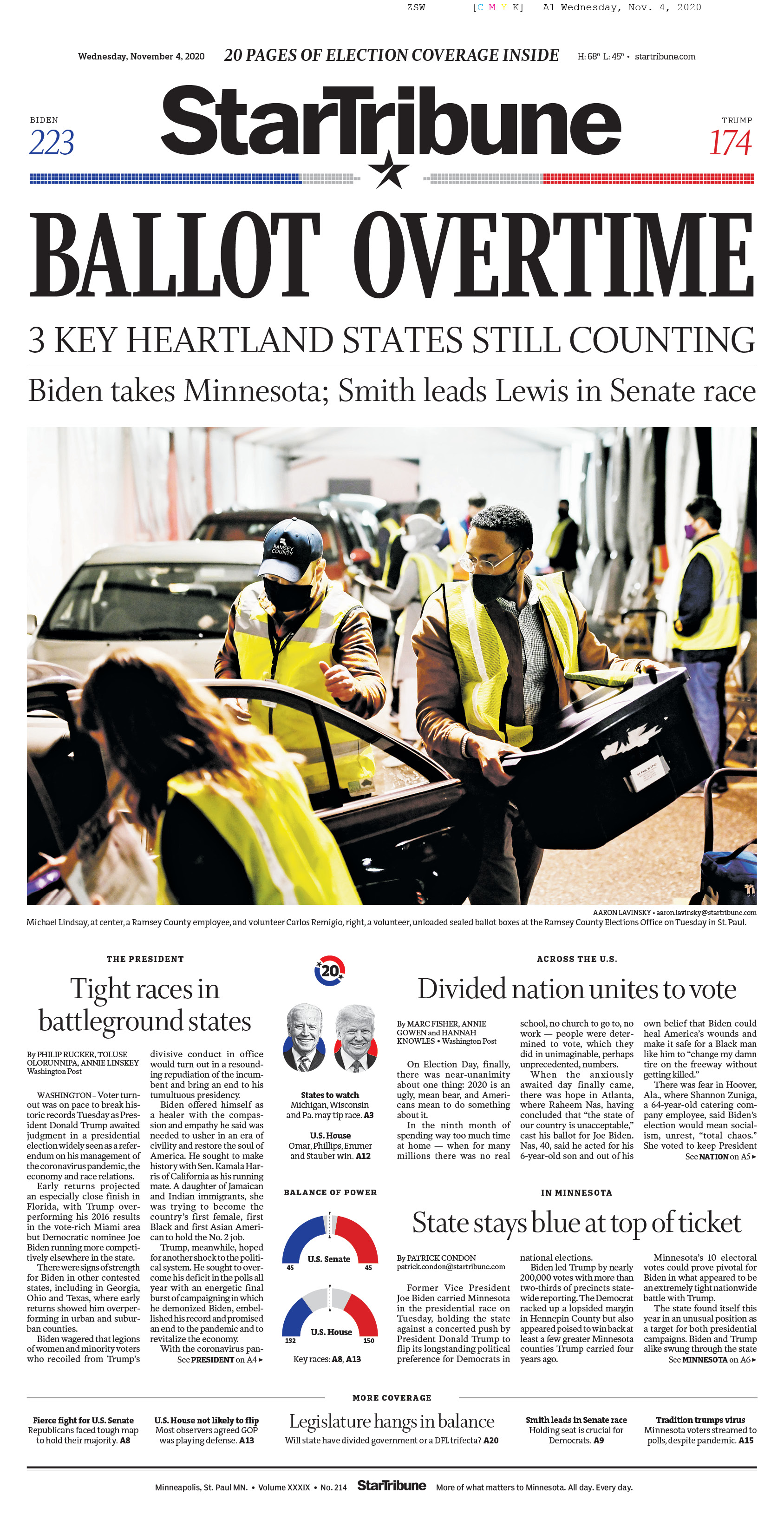
Star Tribune, Nov. 4 and 5, 2020
To me news design differs from most other forms of design in that it is very utilitarian. There is a (mostly) clear ethical pact that separates visual journalists from other designers. Knowing there are distinct standards to publication and storytelling make it a more trustworthy institution as both a designer and reader. And an inspiring one as journalists analyze the way we’ve always done things and how we can change century-old institutions to make our processes more equitable, accessible and useful as the world becomes rightfully more so.
Another thing I’ve found comforting and inspiring is how many nontraditional paths lead to the same place. A majority of my colleagues at the Star Tribune didn’t study newspaper design or reporting specifically, we bring our wide and varied backgrounds to a job where we learn and grow as we go. A great majority of what I have learned has been on the job. I didn’t have a news or editorial internship before graduating college, so being taken under the wing of many has been extremely formative and I am forever grateful to them. The culture of protecting and helping one another in such a cutthroat industry is invaluable.
What was the most fun you have had with a design?
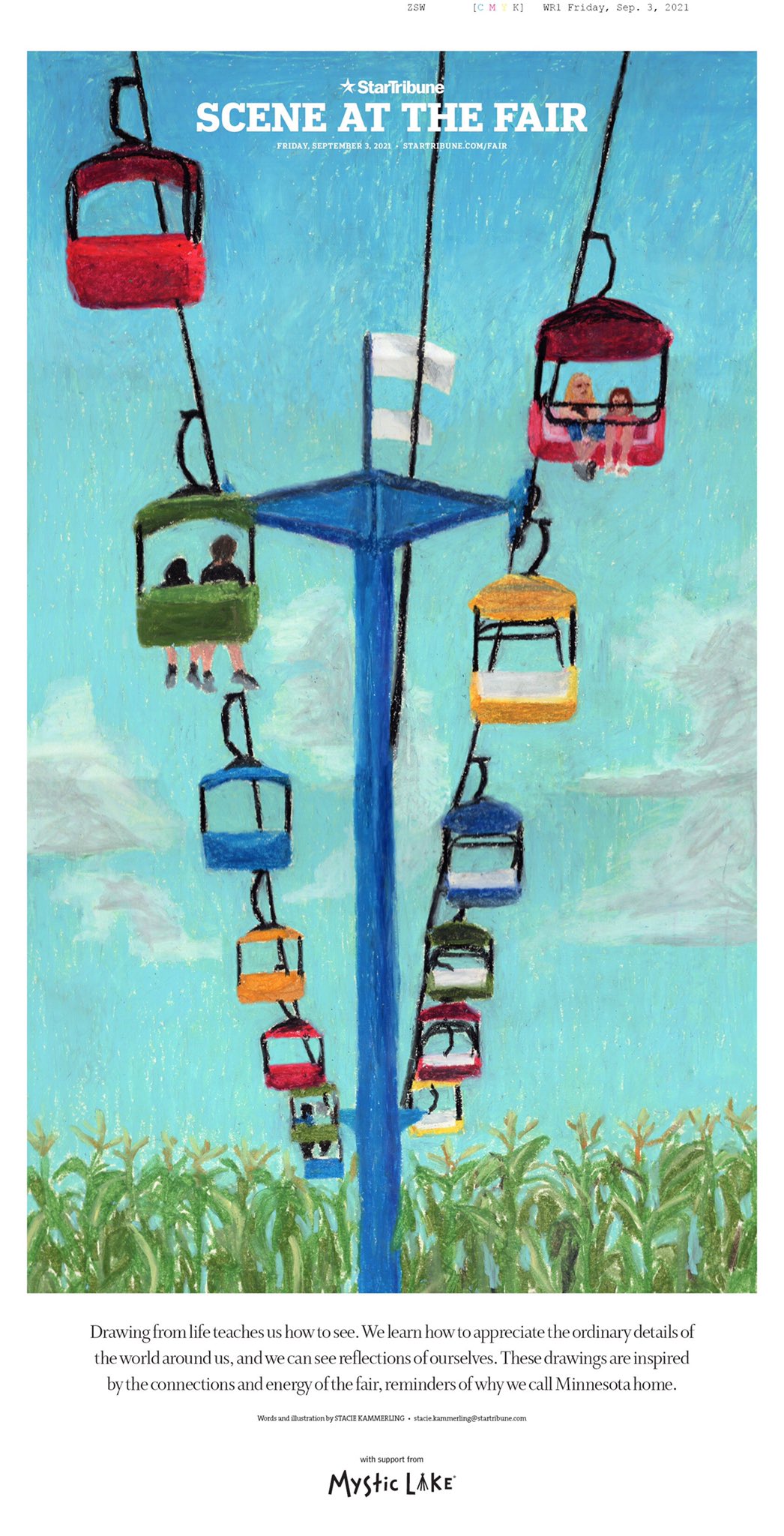
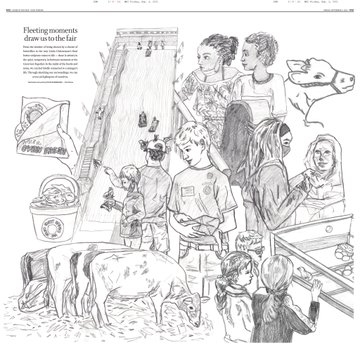
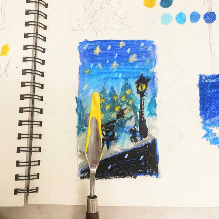
In August 2021 I got to conceptualize and design a special section for the Minnesota State Fair. The 10-day fair is a huge deal in Minnesota and the upper Midwest. I wanted to illustrate live scenes from the fair, so I spent a couple days drawing all around the fairgrounds. It was a bit stressful and overwhelming at first, but the quick nature of life drawing soon felt like the quick and precise process I do designing a new front page every day.
After sketching I scanned drawings onto a big inside spread and arranged them. For the cover, I did a much longer drawing using oil pastels. I wrote a bit about my experience and what it means to truly stop and see the world around us. It was an honour to be able to share something vulnerable like that with readers, especially at an event many deeply care about.
Star Tribune, Sept. 3, 2021
Do you rely on one design principle more than others (white space, text as design, colour, cutouts, etc.)?
I most often work on “hard” news and the front page, so my daily job involves honing in on the cleanest, easiest to digest designs as possible. As well as communication across departments so that we can all get a bit of what we need. I would say the one design principle I rely on most often is “the grid.” Especially building modular grids that can easily adjust as stories and news changes. The style at the Star Tribune is very clean and compact, while also giving room for large photography and informational breakouts. So finding ways to best tell stories that feel manageable for the reader is my biggest challenge day to day.
Tell me about a design idea you loved that was rejected or just wasn’t working so you had to abandon it.
It’s really hard for me to think of one! My editors have always been supportive of my creativity and ideas, often pushing them to make them stronger. I’m super grateful for the trust and guidance I’ve been given, especially as a young designer still learning more every day. For the front page, which I’m most often found designing, tweaks to my drafts are much more common. It can be frustrating at times. I find ways to compromise a lot — not the sense of giving in — but finding ways to align all of our interests in the newsroom.
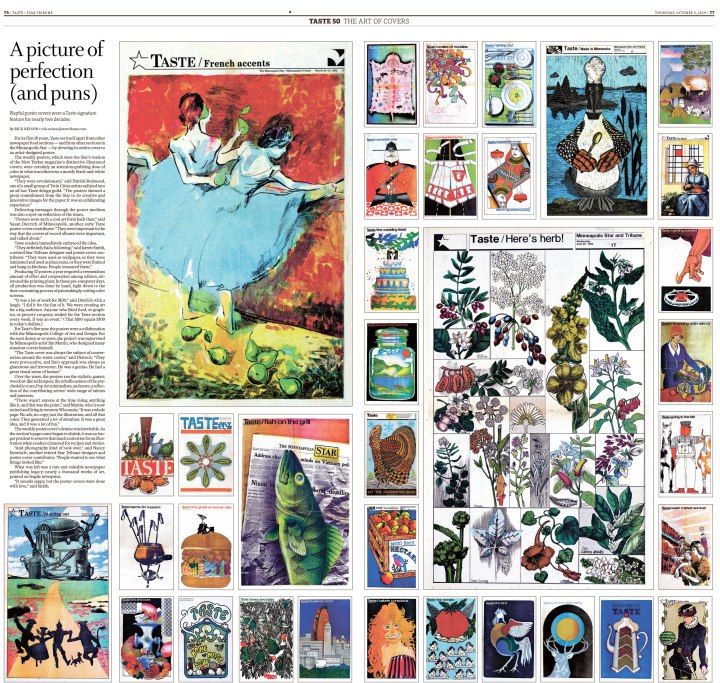
The Star Tribune was one of the papers that inspired me while redesigning the Guelph Mercury. Do you have newspapers that inspire you from a design standpoint?
The Star Tribune has such a rich history and has been an inspiration for me too! I’ve especially loved exploring old covers and special projects, such as the huge artful poster covers from our Taste cover archive during its 50th anniversary in 2019.
Star Tribune, Oct. 3, 2019
I was very inspired by the unique voice and ethos of the Villages Daily Sun before working there from 2017-2018. In college I was very inspired by the intersection of art and journalism in Matt Haney’s work at the Omaha World Herald and Martin Gee’s work at Time magazine. I loved seeing how designers could be a vital part to telling a story, not just putting words and pictures on a page. The ability to bring their expertise in art and typography to the table really elevated and showcased journalism in a fun and surprising way. Print publications that give the space for visuals to shine create a more dynamic and interesting story, in my opinion.
Time Magazine, Martin Gee
On that, can you think of any designs that blew you away, at your paper or elsewhere? Anything that stands out?
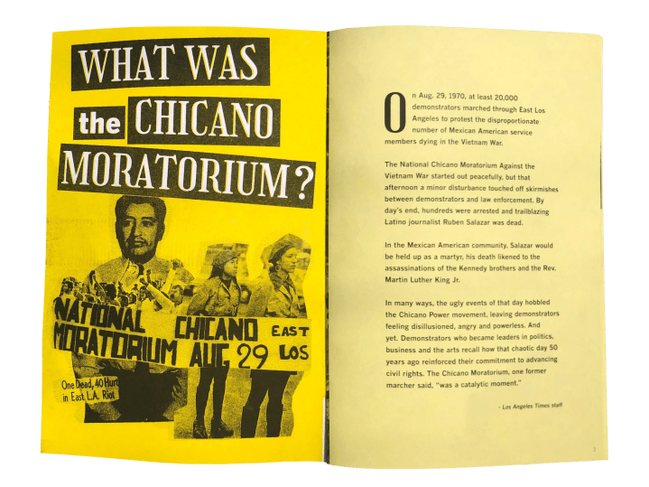
I think the things that blow me away the most aren’t necessarily page designs, but unexpected interactive work that extends into the local community, both telling their stories and inviting them to participate. I loved Martina Ibáñez-Baldor’s work on the Chicano Moratorium project (especially the zine) for the L.A. Times.
Los Angeles Times, August 2020
The most inspiring things for me involve physicality, bringing handmade touches to the print product. I’m still learning what draws me to it. I think seeing the influence and texture of hand-crafted art transports me into a story more than digital art can at times. I believe allowing the design to be as clean and simple as possible to let art and photography shine can make a huge impact. And highlight what the reader really needs to make meaning of a story.
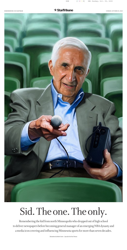
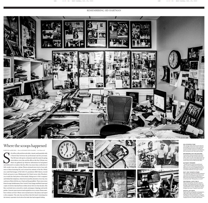
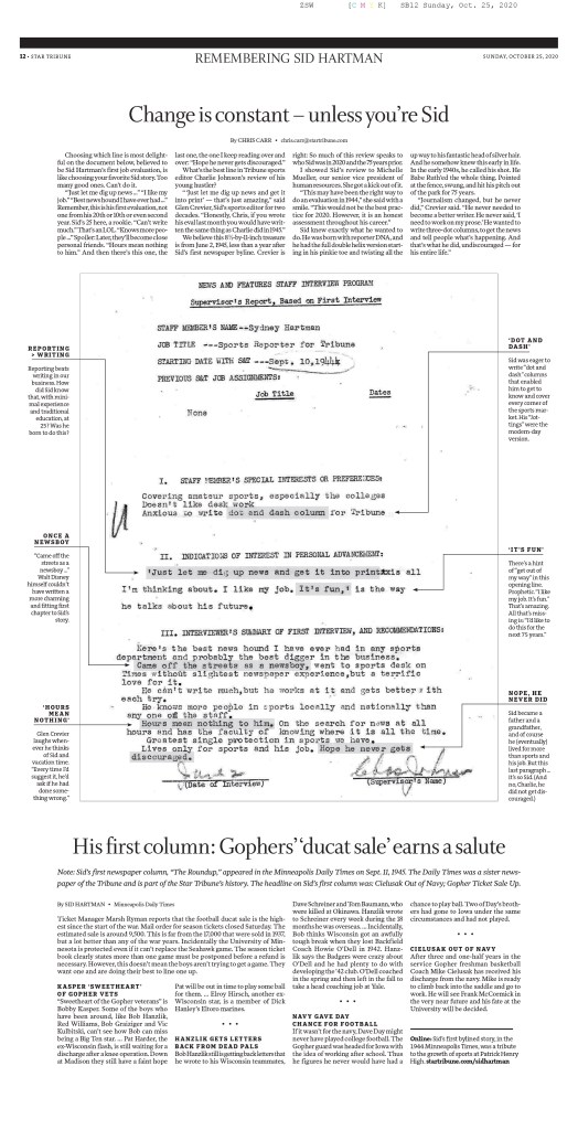
After the death of Sid Hartman, the Star Tribune’s sports writer and columnist of 75 years, design director Greg Mees designed a beautiful special section to honor him and share his story, office and memories from friends and family. It was so touching and the oil painting commissioned for the cover really blew me away. (EDS note: I saw this page at last year’s Society for News Design awards, and it absolutely blew me away as well. Greg Mees, on top of being a super kind dude, is also a world-class designer. And btw, the next instalment of the awards are coming soon and I couldn’t be more excited!)
Q: Why do you think newspaper design still matters?
I think newspaper design still matters because of the distinct need for informational direction and credible service-based and solutions journalism. There’s so much news happening and a daily snapshot of the state of the world is important for breaking information down into something digestible. What do we need to know about what’s happening in our communities right now? How can we help support a cause, business or person? Beyond following the processes newspapers have always held, I believe conversations about what the future looks like is vital. How are we reaching people where they are, asking what matters to readers and including them in not only the product but the process?
While this is often a nameless, faceless job, it’s a huge part of the newsmaking process, as anyone reading this blog knows. It’s not just throwing things on a page, but allowing space for stories that need it, being flexible, even encouraging edit after edit to ensure a journalist’s work is displayed in the best light possible. The way we design something can shape the way readers see and understand important stories.
Star Tribune, Oct. 25, 2020
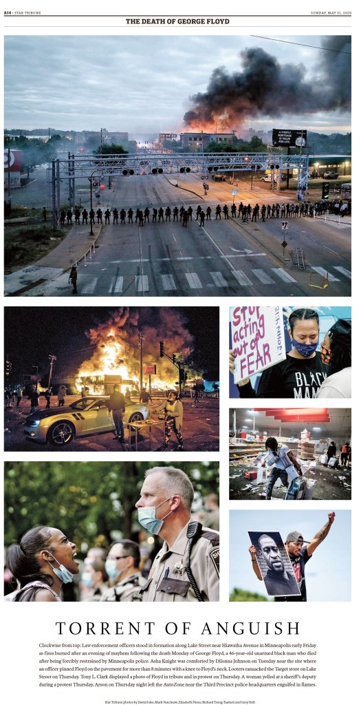
Star Tribune, May 31, 2020
Q: How often do you get to conceptualize big ideas? I know bigger papers often have a team. What’s the process like for you there?
While much of my work is started and finished in a matter of hours for the next day’s paper, I also work on larger projects every other month or so. Collaboration is still an important part of the process, which I really enjoy.
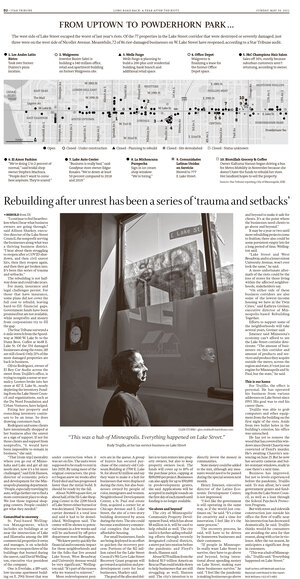
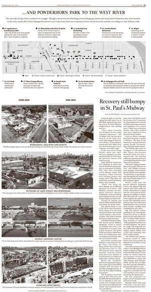
After reading a brief about the story, or sometimes the story itself, I talk to the photo team to see what they have in mind, or more frequently for larger projects, work on creating art myself. Talking to the graphics team and editor of the section are also important steps in the process of gathering all the pieces. Booking out the stories and art is another early step that can take quite some time to visualize the best way to present a longer narrative. Here is one of the larger projects I worked on about how businesses were still waiting for aid and struggling to stay open one year after the 2020 unrest in Minneapolis.
Q: It might be like picking favourite family members, but if you had to pick a few favourite pages, what would they be and why?
My bread and butter has really been designing front pages for breaking news. I am most often drafting ideas in minutes. It can feel hard to feel ownership over these things, it’s entirely collaborative and often happens so quickly it’s hard to take a step back. And since coming into the newspaper world in 2017, many many nights have looked like that. While I am proud of and live in those high-speed moments, I am most proud of pages where I can put a little more time into, including ones that I can show a bit of myself and the art I love to make.
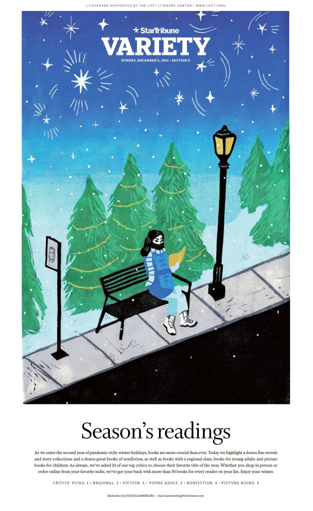
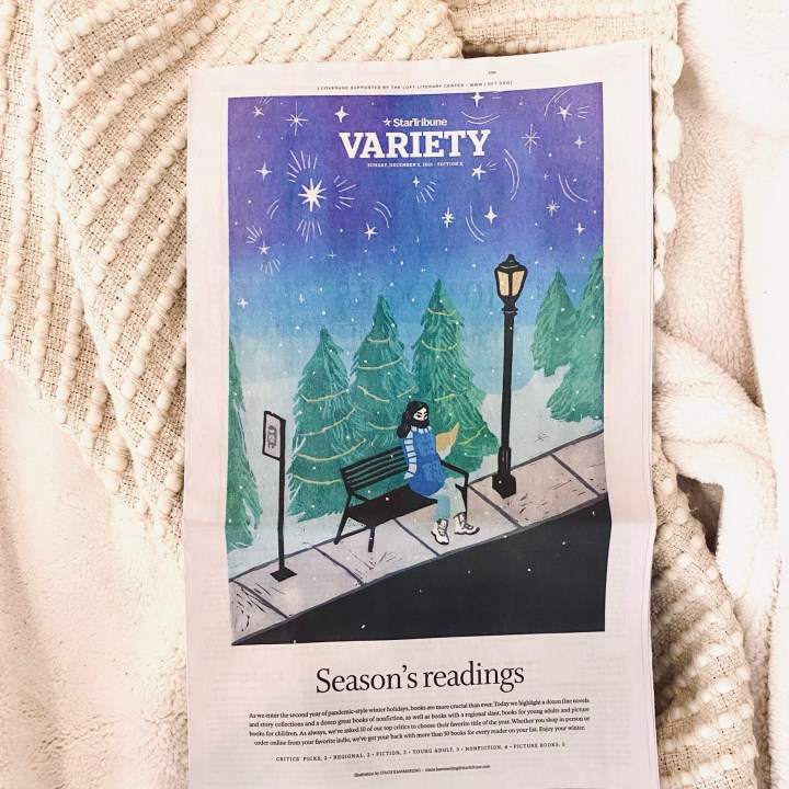
HOLIDAY BOOKS
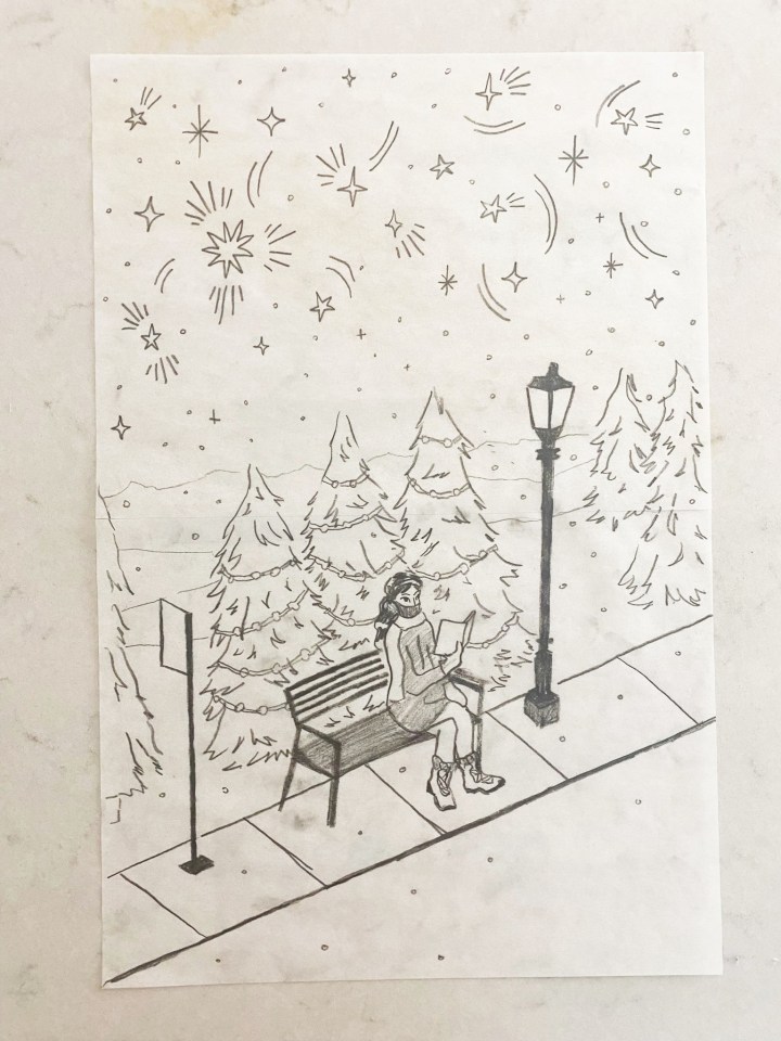
In December I created a seven-layer linocut print for the annual Holiday Books gift guide. This was a huge undertaking as the biggest print I have created as a printmaker, as well as pretty complex with many colors. In my art practice, I carve each linoleum or rubber block by hand, layer by layer. So every colour is a different layer. I often work on one-coloor prints, but wanted to really play with colour to capture the mood I had in mind.
Our holiday books guide always features a winter scene. I was inspired by snowy downtown Minneapolis, a place I walk often. I liked the idea of a person reading at a bus stop, finding beauty in the liminal space between where they came from and where they’re going.
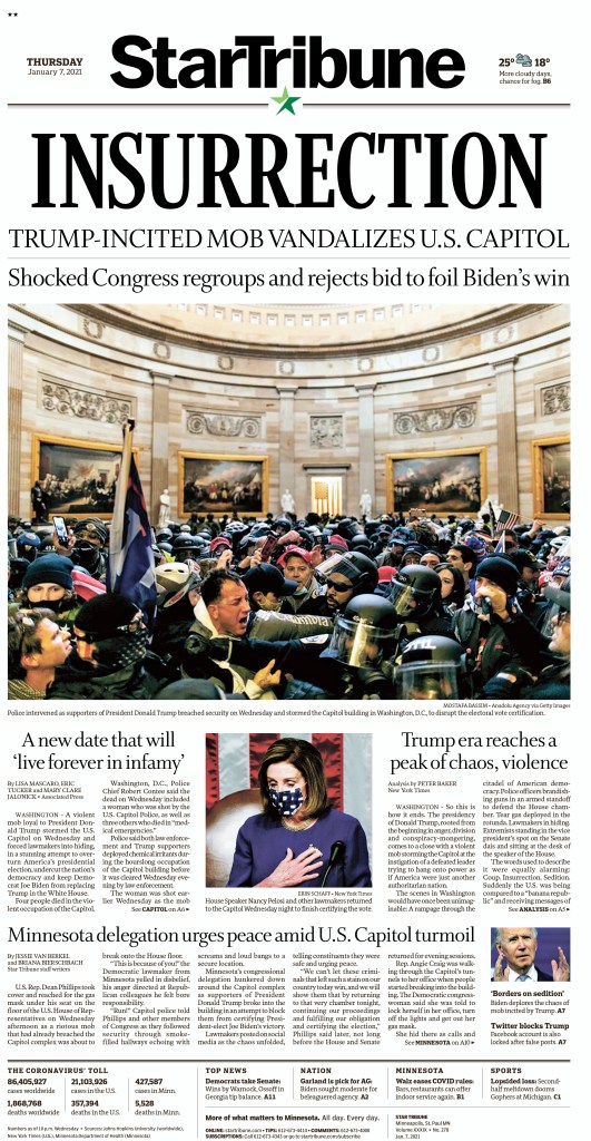
INSURRECTION
Last January I drafted our front page for the Capitol Insurrection around 4 p.m. and followed that through the night as more photography and reactions came through. It was astonishing to witness and I’m proud of where we landed with striking imagery and language on a tight deadline. The challenge of this night was developing our voice on the situation as it was happening. How do we make sure we’re being accurate in describing what happened? Fair and objective on a fraught political topic? Being in a large newsroom we have a 1A planning editor and several other editors that really dig into this, which is immensely helpful for me as I work with them and make the rest of the paper.
Star Tribune, Jan. 7, 2021
TURKEY COLOURING
For our Thanksgiving paper I was asked to create the turkey for our annual kids colouring contest. This was the first block print I’ve made for work, which felt like a special moment to me personally. It can feel intimidating to fully throw myself into an art that isn’t often featured in print anymore, especially with the pressure to work digitally. It’s slow, arduous and easy to mess up. But I think the nature of the material creates unexpected marks and surprises that bring something special I couldn’t create otherwise.
Star Tribune, Nov. 25, 2021
Thank you, Stacie!
Putting this post together was a joy. It’s great to see so much passion and thought put into print designs. And it’s inspiring to see how much credit she shares around. The Star Tribune sounds like an amazing place to work. An incredible cast, a real team.
Another thing that struck me is that Stacie handles both hard news pages and also produces art for feature sections. That is multitalented. Her art is stunning, and solid news pages often don’t get the love they deserve. But Stacie’s are very well done. Solid and clean and strong.
Thank you, Stacie, for participating. If any other print designers want their work featured, reach out to me here or at bradneedham@gmail.com.
Some newspapers have clearly given up on print design. It’s about content and digital. Obviously both of those are key to the future of media organizations everywhere. But I still believe print design is important. And that’s why I celebrate it here and on my Instagram account, both of which have been around for about a year now. While my Instagram shows great pages from day to day, this blog tends to focus on designers or bigger topics.
While I want to celebrate all newspapers making an effort (and I do on Instagram), the next two posts are going to show a few papers that consistently deliver striking and thoughtful designs. This post will focus on Canada’s big three: The Globe and Mail, Toronto Star and National Post. Perhaps next year I will add more, though I don’t see many papers upping their effort. Next post, the rest of the world.
Each of these top papers tends to have a solidly defined style. I will look at my top three pages from each publication (at least that I highlighted this year on my Instagram), then a slideshow of some other pages. To be clear, I know there is some amazing work happening inside these papers and on other section fronts, but this is about A1, and only includes papers making an effort — and a splash — frequently. I won’t look at one-offs, or rare successes in this post. I will feature them in order of my connections with each, so Toronto Star, Globe and Mail (only as managing editor of Pagemasters North America, which handles most of the page production for the Globe and Mail, though the pages featured here were likely done in house) and the National Post (I recently started working at Postmedia).
Toronto Star
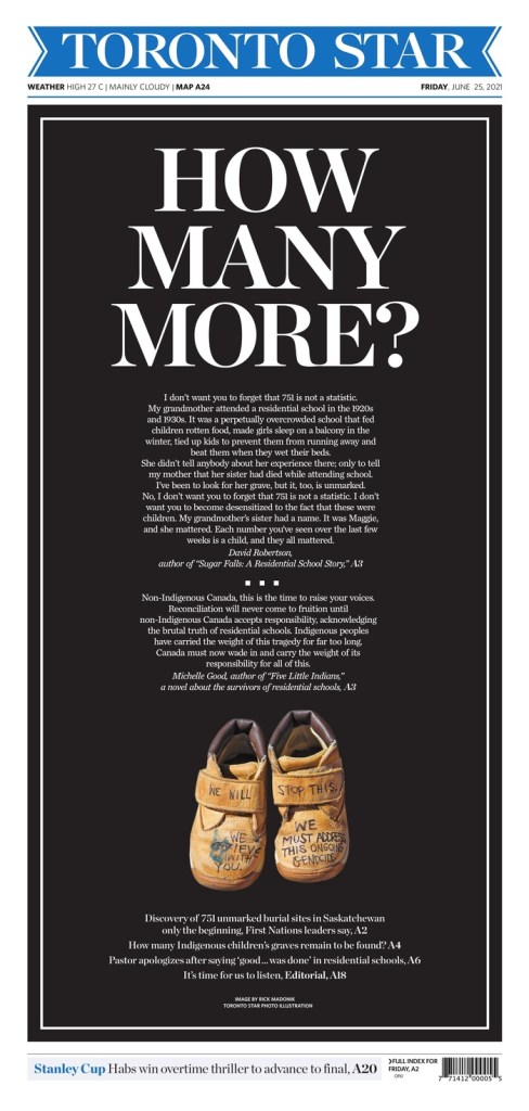
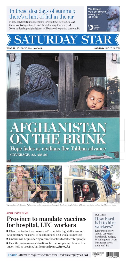
This was probably the page of the year in Canadian media for me (the top Globe page rivals it), though not necessarily from a design perspective. There were some stronger pages visually, more complex. But this is a powerful page, which gave a lot of real estate to a key issue at a key time. The reverse text, the big headline asking a big question, the little moccasins with a big message. It came out a day late (only because the day-after coverage in many Canadian papers was lacking), two days after the discovery of hundreds of unmarked graves of Indigenous children, but it struck a chord.
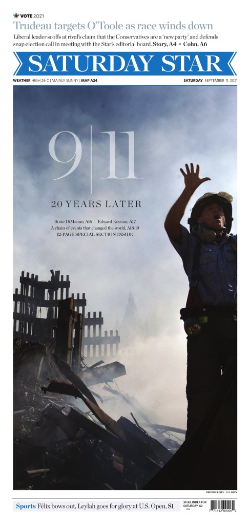
The Star will less frequently blow out its front page for an international issue than the national papers, but it did here. It was the strongest Canadian 9/11 anniversary page, with a strong image and beautifully handled typography.
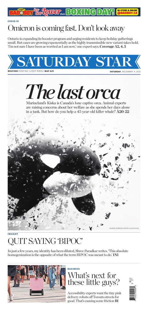
In the summer of 2021, the Star decided to focus more on print design (I’m not making this up), hiring an art director as well as three others to focus on design, graphics, illustrations, etc. This is an example of this, with a striking, contrasty photo illustration from Ramon Ferreira.
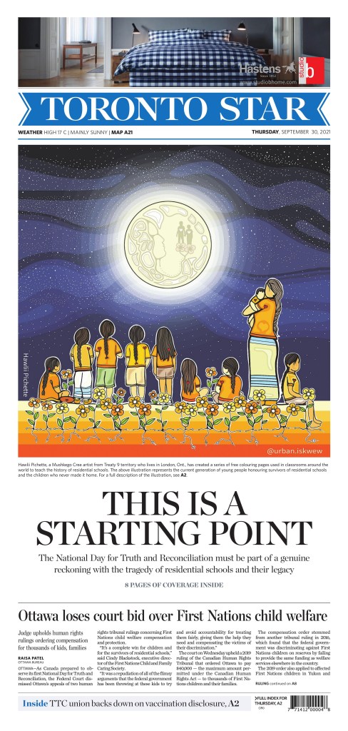
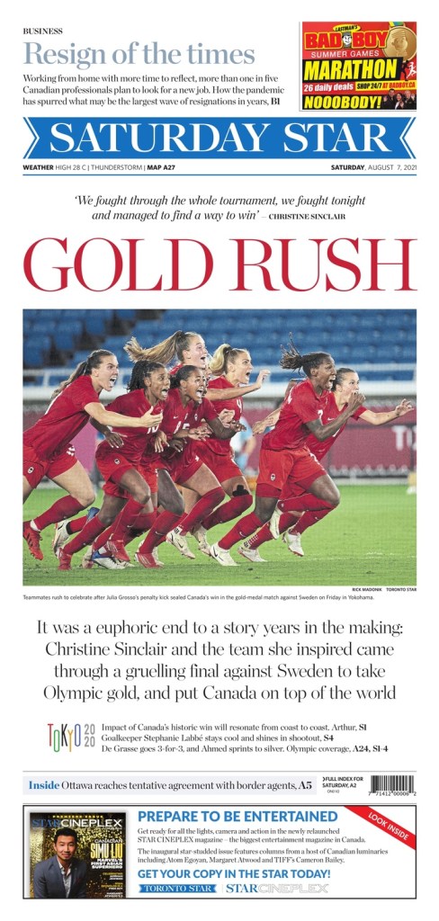
Here is a small sampling of some other great Toronto Star pages. All great in their own way, all very Star. The beautiful illustration by Hawlii Pichette, the strong art and colours on the Afghanistan page and the excitement of an epic gold medal win on the Olympics page.
Globe and Mail
The Globe and Mail is always swinging for the fences and often knocks pages out of the park, well beyond A1. The Globe tends to have elegant or pleasantly elaborate illustrations, big art and sometimes subtle headlines. Its weekend A1s can run with the best in the world.
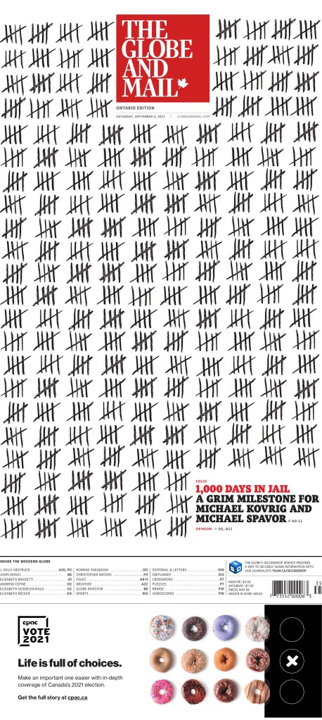
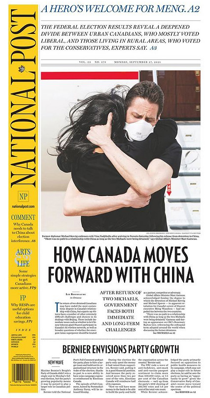
This page might have been the best purely from a design standpoint. It’s simple, but smart. Likely planned for ages. It is powerful as well, about the “Two Michaels,” who were wrongly imprisoned in China for more than 1,000 days. This was Day 1,000, a grim milestone. Some will argue this, but the Globe owned this story, especially in Canada. Every day the Globe kept track of days the Michaels were detained on the front page. I don’t know how early it started, but it was there for hundreds of days. This was the culmination of that. The tallies, how they work around the flag. No art. The contrast. It’s a stunning and powerful page.
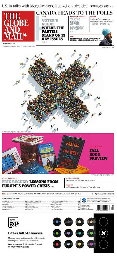
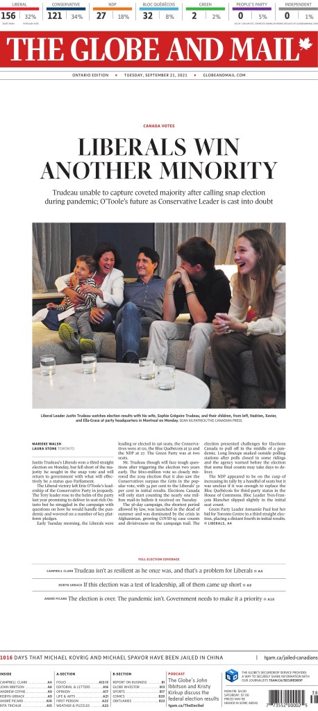
The Globe had one of the best Election Day and and best election results page. But I love this visual. And fantastic use of white space.
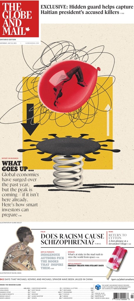
I love this illustration by Klawe Rzeczy. It’s busy, it’s chaotic, but it is absolutely eye catching. And despite the Globe getting illustrations from various illustrators, it always seems to feel like the Globe. Refined.
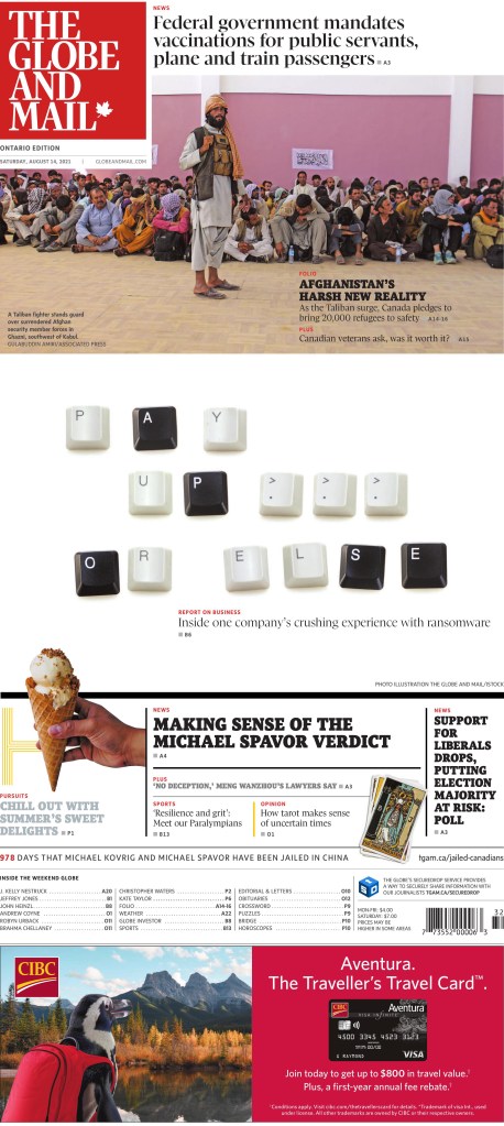
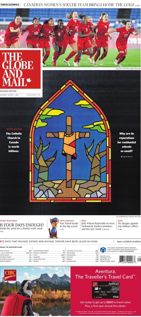
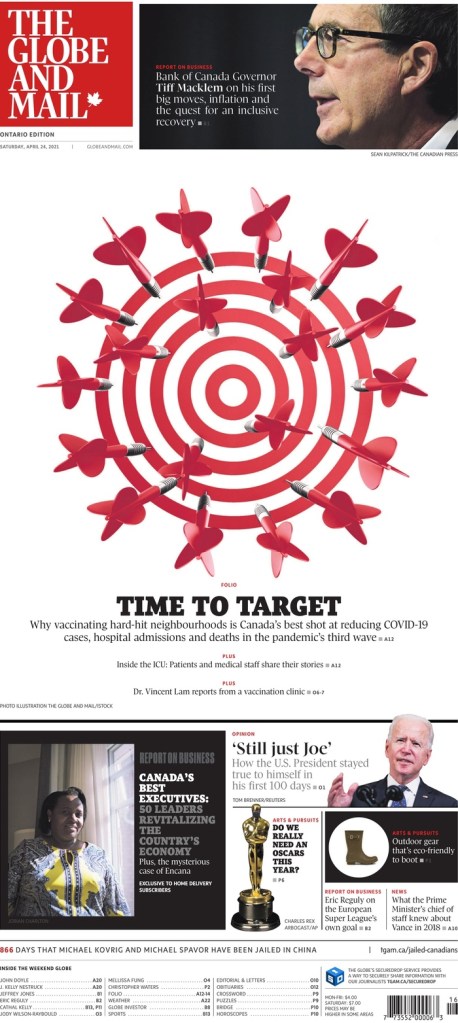
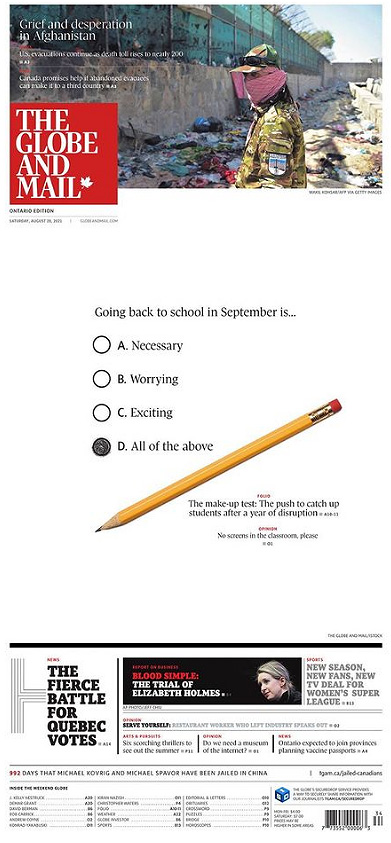
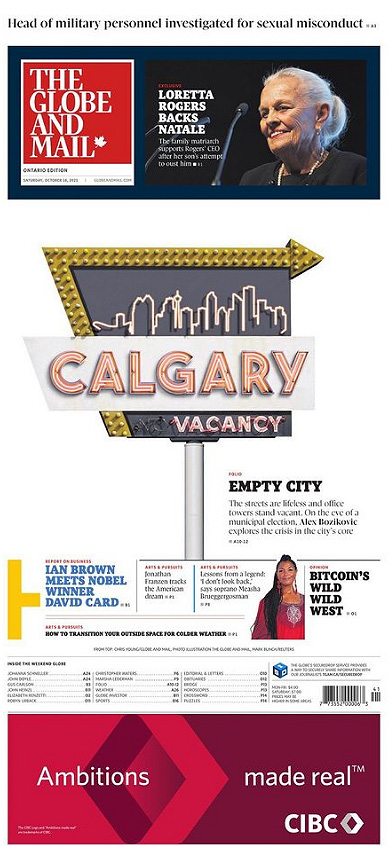
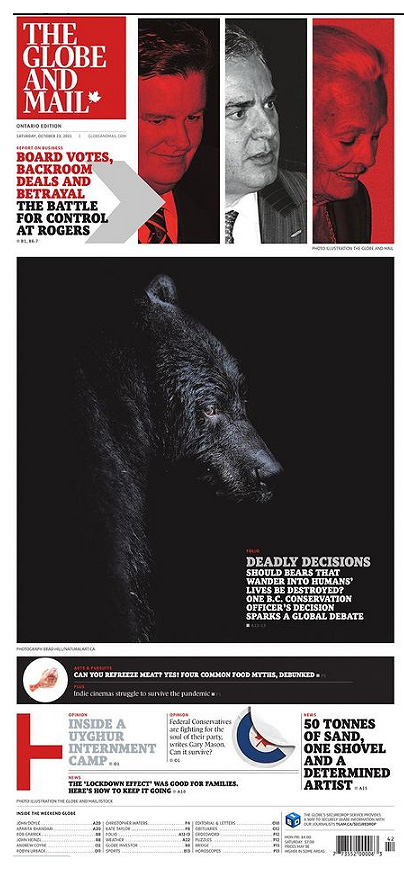
Here are a few more. I love the keys from the keyboard. And, again, in Globe style, the white space. They do not fear white space because they know how to use it. They also did a stained glass look (see National Post below). It’s too bad it cost the Canadian women’s soccer team some play, but it’s a nice page. The dart board. White space. Red. Contrast. And the pencil. I did a page like this, so of course I like it! Again, bold white space. And Calgary. I love it for design, but also I’m from Calgary! Finally, the bear. So dark, and boldly dark, but the Globe can get away with it as it prints on glossy paper. I should have said that earlier as that is key to some of its success in print.
National Post
The National Post has been known for its design since its inception in 1998. For a long time it stood above the rest. It’s still exceptional, especially once you get past the very often great front page. The inside design doesn’t try too hard. It is elegant and clean. So much so that others have tried to imitate it, without success. The vertical flag is something I often talk about. It adds so much. Funny that these three papers all have very different flag styles, with only the Star having the classic text across the top. Sorry, tangent. The National Post is still giving it its all, particularly on Saturdays.
I debated my fave, but in the end this vibrant illustration won out. It’s played well with the other content on the page, but it, in itself, is just so striking. To tie things together, it’s done by Becky Guthrie, now the art director at the Toronto Star. The Canadian media scene is a small world.
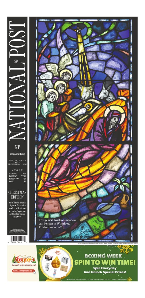
But then there is the Christmas page. This has been a tradition for the National Post since it started, conceptualized as a way to compete with the Globe’s art-driven Christmas page. They took the boldly overtly religious approach to set themselves apart from the Globe. The reverse flag. The colours.
This page is a basic, clean design. There are other extraordinarily designed Post pages, but I wanted to give props to a big news page. Like headlines, designs are often more celebrated for feature-type stories as they are easier to illustrate. This was a big news day in Canada. The Two Michaels home at least. It was the best page for this event.
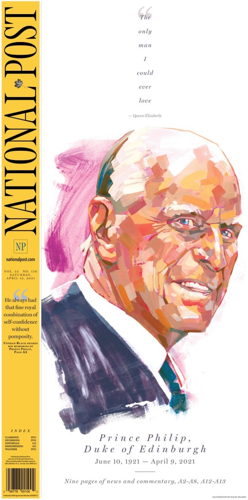
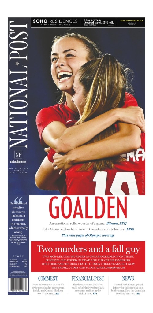
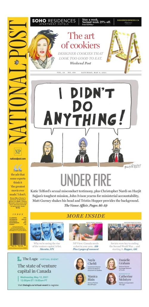
The National Post’s Election Day page was great. Still maybe my favourite. It’s very different from the Globe’s white space. A big monster headline. Contrast-y text on a dark background. I just love the symmetry on the next page. I almost chose the Prince Philip page as one of my top 3. It was close. What a piece of art by my good friend* Kagan McLeod. The next is an Olympics page. As I wrote then, the Post won the Canadian newspaper Olympics with outstanding design day in and day out. And a classic Post cartoon cover. *I don’t actually know Kagan other than over Twitter and through seeing his illustrations in each of the top three papers here, but I’ve been a Kagan stan for a while.
So while 2021 proved to be just as maddening and depressing as 2020, just with vaccines, it still provided plenty of brilliant newspaper front pages. I am thankful to the editors and designers at all the papers here, who keep pushing boundaries and working with passion. And to those at the papers who still do the once-in-a-while great pages. Every little bit counts.
Next up, a look at papers from around the world, featuring publications such as Dennik N of Slovakia, Denmark’s Politiken, The Villages Daily Sun from Florida (you must have known that was coming) and more!
If you want to keep seeing posts like this, subscribe!
Newspapers often go all out on Christmas Eve, often with stunning illustrations or photos on their front pages. This year is no different, except that it’s very different. With Omicron raging, lockdowns, limits on gatherings. It’s been a hard year or two for most, regardless of the season. No commentary on religion here. Just design and the feeling of hopefulness the season often brings. And the incredible front pages don’t hurt! After about two years with COVID-19, it’s nice to have hope so I appreciate these covers even more this year.
For whatever reason, Canadian newspapers seem to blow out their covers disproportionately compared to other places in the world. I looked through about 20 Canadian covers and at least half had very Christmas-y covers. The proportion of America papers was much, much lower, which was surprising. Many didn’t publish today.
Canadian Christmas Eve
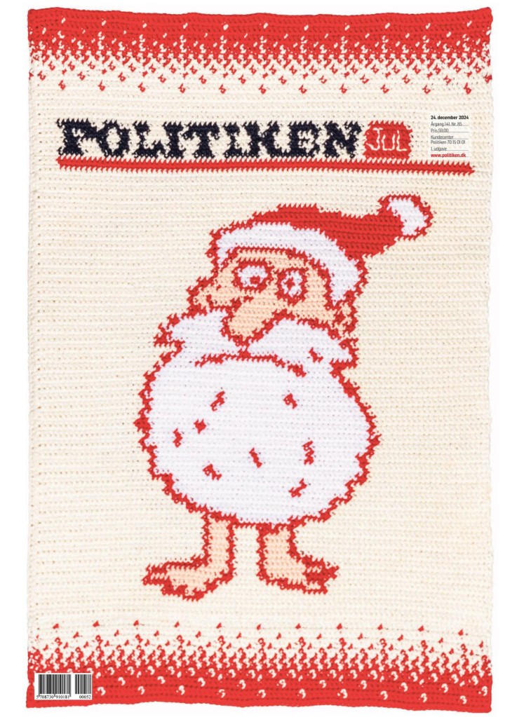
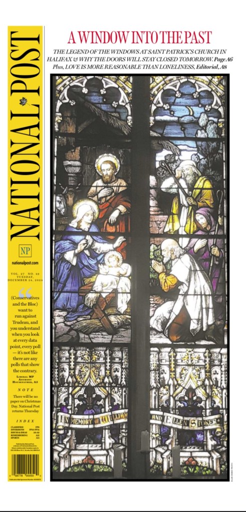
Alas, the covers. First I will start with Christmas Eve in Canada. Each of Canada‘s big three has a very different feel, in line with its target audience. First up, the National Post. The stained glass look and the black really pop. It’s such a striking visual. The National Post has been doing this since its first year, 1998, and every year I love it. It’s become a Christmas tradition. It definitely has a stronger religious feel than many others, but that is by design. Of course their vertical flag, as it often does, helps creating a more powerful visual.
Next up, the Toronto Star. The Star has recently hired a handful of staff to focus on print visuals, including an art director, formerly from the National Post. It shows. This illustration is lovey. Happy-making.
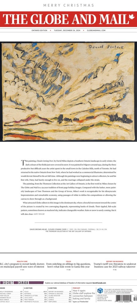
Then the Globe and Mail. Like the National Post, the Globe has been doing a similar cover for years. A beautiful oil painting, from the Art Gallery of Ontario, with a little text. In fact I have learned they have been doing it since before 1998 at least, featuring art from its parent company’s art collection. Most years it’s more of a winter theme rather than Christmas.
Then there is the Guardian from Charlottetown, P.E.I. Just a pretty, hopeful and happy painting, submitted by the very non-winter-named Summer Kelly, 11. Amazing work from a young artist.
Around the world
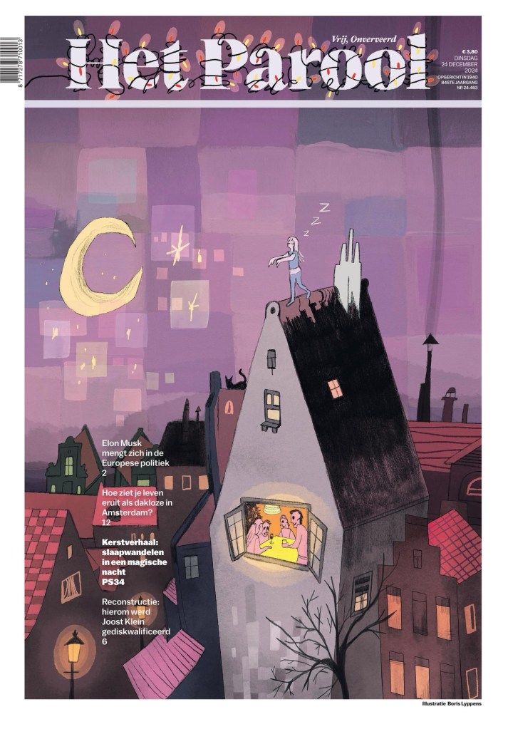
And now for covers from around the world! This Het Parool cover is one of my faves. I just find the illustration to be so magical and eye-catching/pleasing.
Reporte Indigo is known for their illustrations. And they don’t disappoint here. So classy. Stunning.
Kleine Zeitung has a beautiful illustration but they don’t gloss over COVID. It’s part of our lives.
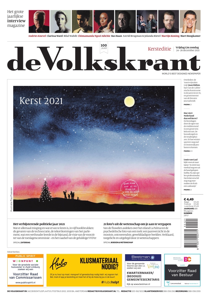
This cover from de Volkstrant is just simple and elegant. Really pretty art.
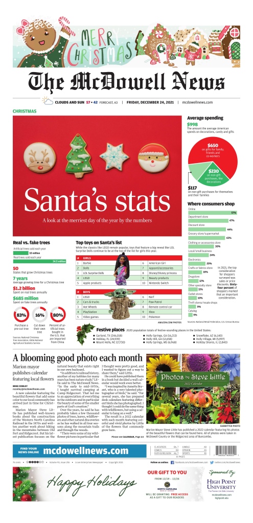
And this McDowell News front page. It’s different! Christmas stats. Very American. Nice contrast. It’s fun and informative.
There were more, but these were the tops that I saw. Thanks to all the newspaper designers out there, still doing their thing. I appreciate how much effort still goes into these pages. Happy holidays, everyone.
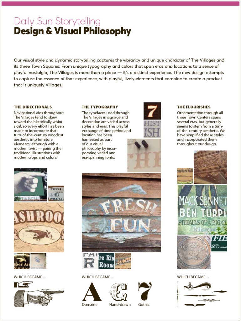
The Villages Daily Sun goes above and beyond in visual journalism, print specifically. Colin Smith and Adam Rogers tell us more.
By Brad Needham
Print might be on the way to becoming an afterthought for some newspapers, but not the Villages Daily Sun in Florida. It is proudly and heavily visually designed for print. They don’t even have an Instagram account. I know because I posted a front page on my Instagram account once and couldn’t, for the life of me, find their Instagram handle. Yet shortly after I posted it, they found me! An editor sent me a note saying they don’t have Instagram and they are a print-first publication (but they do have a Tumblr account!). As a longtime mostly print journalist and print designer, I love that. So naturally I asked them if I could talk to a designer. Not only did they oblige, they sent me two! And they each sent pages. And a visual philosophy.
I am so thankful to have heard back from both Colin Smith, the senior project designer, and Adam Rogers, managing editor of innovation. I had a lot of fun reading through their thoughtful answers, looking at their stunning pages, and feeling like I’m not alone as a print lover in a digital world.
The first thing they sent me was their design and visual philosophy document. It is fun to read. Here is how it begins.
I knew right away these were my kind of people. They have designed a newspaper to reflect their community. Not just in content, but design. Amazing. How can you not love a philosophy like this?
We’re not just filling pages, we’re a daily friend offering news, information, community moments, support and, most importantly, surprises on every page.
The answer? You can’t. You must love this, or you’re on the wrong blog. This blog is for all the print that’s fit to print.
I will turn it over to Adam and Colin. Eds. note: these responses are from early September.
How did you get into newspaper design? Adam: It was something I sort of stumbled into as a student at Youngstown State in Ohio. My degree is in TV and video production, but I was minoring in multimedia design. That led me to a page design opportunity at the student newspaper The Jambar where I ended up working for four years and decided to focus my career efforts on print design.
Colin: My academic background is urban planning and architecture. I started news design at my college paper, then it became my first job out of college. I’ve been in the industry ever since.
What do you like about newspaper design? And what makes it different from other design? Adam: I really like that you have the opportunity to start with a fresh canvas every single day. With 365 editions each year, you can experiment. See what works, what doesn’t and learn from it. And I feel like whether its design or general knowledge of the world, I learn something new every single day.
Colin: Philosophically, I like being able to tell stories to wide audiences on a daily basis. I especially love working on redesigns — the chance to weave visual worlds for our readers to explore. On a personal level, I like the frequent, immovable deadlines of daily news production — it’s perfect for a procrastinator like me.
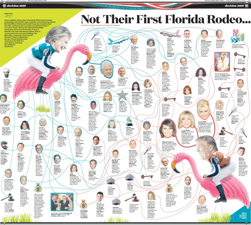
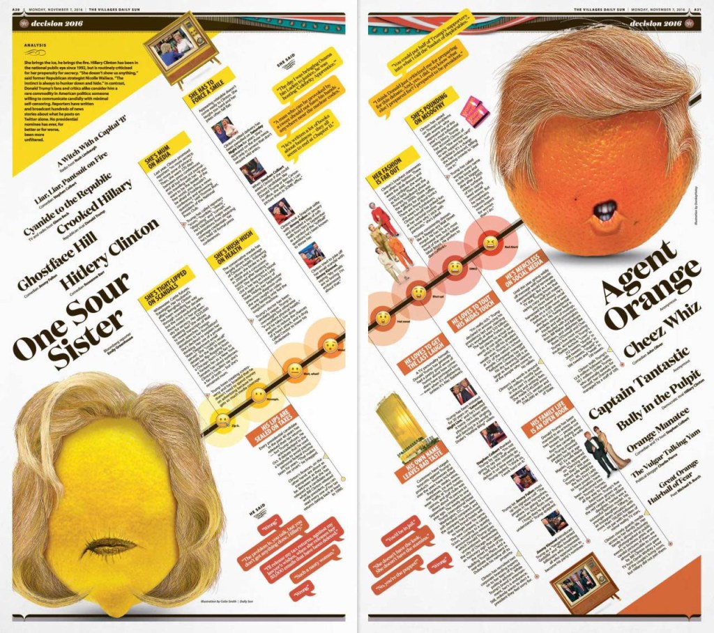
What was the most fun you have had with a design? Adam: I would have to go back to a doubletruck presentation I worked on during the 2016 election showing all of Donald Trump and Hillary Clinton’s connections to each other and to the state of Florida. It involved some colourful photo illustrations of the candidates riding flamingos. Honestly, Colin Smith and I had a lot of fun throughout that entire election cycle creating illustrations for a variety of topics along the way.
Colin: The Daily Sun has definitely been the most fun at I’ve had at a paper. I love redesigns, as I’ve mentioned, and this was at the first paper where (aside from the nameplate) nothing was off limits. It’s a paper that wants to have fun in a community built for having fun. That’s opened up so many paths visually. The editor has been a huge part of that evolution. She really has helped push me in directions I would have never thought exploring at other publications, and I think it’s really made a unique product in the process.
Do you rely on one design principle more than others (white space, text as design, colour, cutouts, etc.)? Adam: At the Daily Sun we focus a lot on just being consistent. We have built a beautiful core structure for our newspaper that highlights our colour palette and carefully selected typography. From there we make strategic decisions on when to break from the templates. And when we do, we usually go pretty big.
Colin: Great question. When in doubt, I go to the grid. Barring that, then I tend to focus on clean typography and common alignments. I don’t like to modify my type too much, so generally it’s one colour and one alignment. And you can’t go wrong with a beautiful dominant image. I tend to shy away from cutouts mostly because, after 20 years, I’m just tired of doing them (although I will if I must, but it’s not my go-to move). And I’m always a sucker for a symmetrical layout.
Tell me about a design idea you loved that was rejected or just wasn’t working so you had to abandon it. Adam: I joke a lot about having a pile of abandoned pages that I burn for warmth during that one week of winter we get in Florida. And that’s true to some extent. After a decade it’s tough to narrow it down to one that stands out. Our projects and pages grow and evolve so much during our design process that I’ve learned to not to get emotionally attached to an idea. We try to put the our readers and the storytelling above our own egos.
Wherein most newspapers follow an assembly line model, our process is more circular, with reporters, editors and designers working in concert to iterate and elevate our content in ways that surprise our readers and surpass expectations.
Colin: Too many to count, honestly. I used to revise and revise and revise before showing a page/project/redesign, but that philosophy doesn’t work at a paper where we have a very deliberate style we’re going for. So now I do a quick mock-up, get input from the editor to see if I’m going in the right direction or not, then I either refine what I’ve done or archive it and try something else. Honestly, I’ve never flat-out thrown a design away. If something doesn’t make the cut, I’ll usually file it away possibly for use later. Generally if I’m really excited about a design, I’ll find a way to get it used. Although I’ve had print/web designs implemented then discarded after I’ve left a paper, so I guess that’s stung a little more. But such is life.
I like the idea of your design direction matching your community, i.e. a heavily designed community begets a heavily designed newspaper. Tell me more! Adam: If you were to visit The Villages (which everyone really should some day) you would see that the developers put a lot of time and thought into the small details. We like to say that the community is designed to take you back in time, but you can’t always hit on exactly when. We’ve taken their fun but meticulous sense of design for the community and have made the newspaper reflect that. From the colour palette down to our use of woodcut and victorian flourishes, we have pulled inspiration from all corners of the community.
Colin: I believe the true power of newspaper design is the ability to create a visual microcosm of the community that is filled with all the surprises, delights, familiar places and new experiences that one expects from a journey in their city or town. I believe the areas of the paper should capture the personalities of a place (quiet cafés and loud clubs, bustling streets and quiet leafy suburbs). Visually, The Villages is a master planned community with several strong visual identities. On top of that, residents here have very active lives and fascinating stories to tell. There is always so much going on, and so much life to capture, that it really puts the onus on the Daily Sun to be as energetic and vibrant as our readers.
Visually the editor challenged me to come up with an overall design that was both nostalgic and thoroughly modern. That’s why you’ll see Victorian text flourishes paired with vibrant citrus colors to create something that blends a fondness for the past with an optimistic vision of the present. The goal was to create a kinetic vibration throughout the entire publication that is both familiar and yet also completely unique to our community.
I’ve been told the idea your covers are based on (lots of small bits of information) carries on on the inside. This concept and a few others seems to make this paper stand apart from others. Can you show some examples and tell me why you decided to do that? Adam: That is very true. While The Villages may be a mecca for retirees, they break every stereotype for seniors imaginable. We are blessed to have a very active and engaging community to cover. Our readers are very busy and we want to respect their time. So we implement of a lot quick hit information and alternative story formats that make the news quickly and easily digestible. We use this approach in every section in concert with traditional longform presentations.
Colin: Adam probably already went into this, but just in case he didn’t, here you go. Even though the vast majority of our readers are retired, they are still quite busy. Between social gatherings, planned events and daily excursions we owe it to our readers to get as much information into every page as possible. Since Villagers come from around the U.S. and the world, we try to get as much into each edition as possible. Our high ad stacks make it difficult to get a lot of traditional articles on a page, so instead we run a collection of briefs, photos and alternative story formats along the tops of inside pages (we call them attics) with a longer read below it.
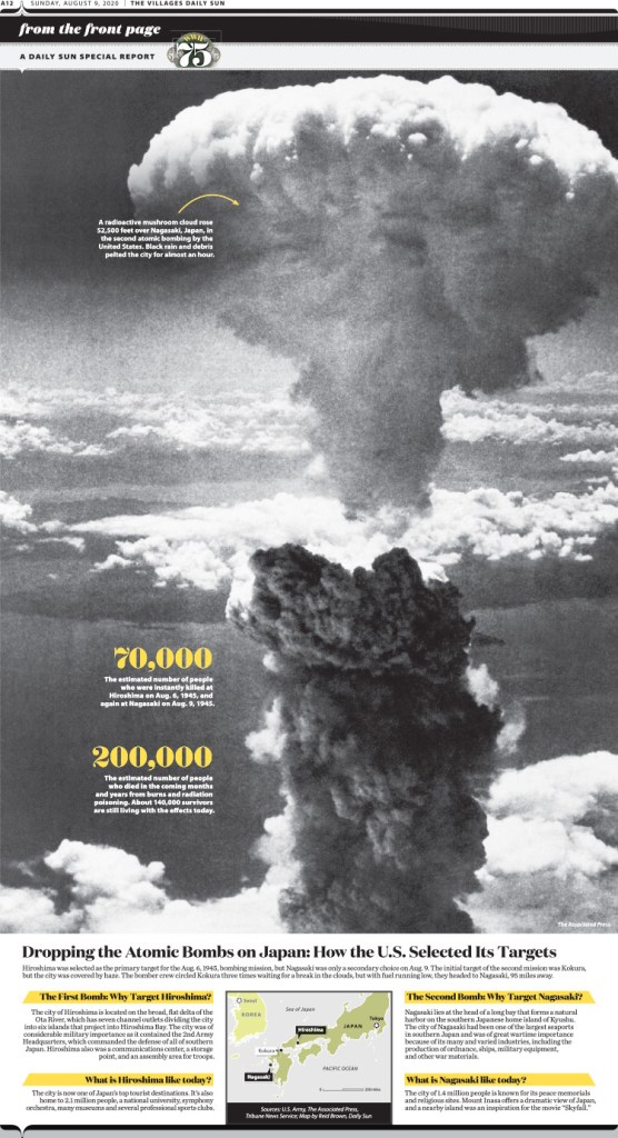
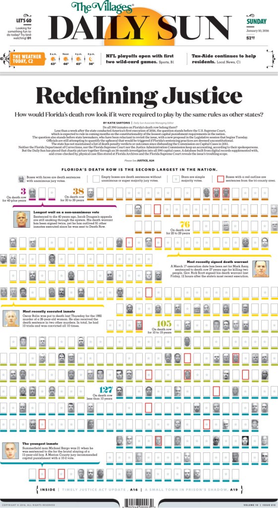
It might be like picking favourite family members, but if you had to pick a few favourite pages, what would they be and why? Adam: First I would go back to a 2013 page on the 50th anniversary of the March on Washington. I worked on this page with the help of executive editor Bonita Burton and it evolved from a traditional centrepiece that we just kept pushing bigger and bigger. Our design and typography has changed a lot since then, but this did land me my first SND Award of Excellence and I was truly humbled. Then I would say a 2016 front page information graphic that was part of our multi-year “Redefining Justice” investigation into Florida’s death row. It really pushed my organizational skills and I spent a lot of time making sure the information we were presenting on a complex topic was digestible. And then more recently an inside page on the atomic bomb that was part of a yearlong series we did on the 75th anniversary of the Second World War. I really like working with historic photography and finding ways to present it in striking ways.
Colin: Ooh, that’s a good question. I mean, I’ve been redesigning our paper for so many years it’s hard to pick just a few. But if I had to: + Redesign/Template-wise, I love our A2-A3 world map — I really had a fun time drawing the map, and the page has so much personality. We used to have a sea monster on the page, and I do miss it.
+ We have some templated local front pages that really have a lot of visual oomph that I’ve enjoyed putting together, too.
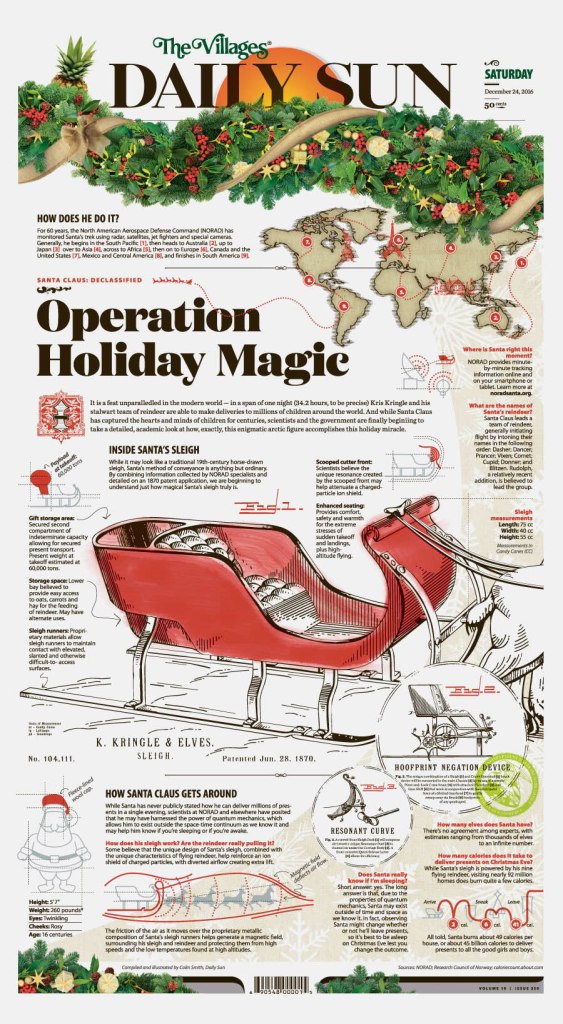
+ When I’m not redesigning the paper, some pages I’ve worked on that I really like have been a Christmas cover with a Santa sleigh based on an 1800s patent application (we’ve gotten a lot of mileage out of that one, re-running it pretty much every year).
+ An oldie but a goodie, but I also really had a ton of fun designing our 2016 election coverage and doing those illustrations.
Tell me a little about your process. How do you come up with ideas? Adam: For our bigger projects, we huddle up a lot to brainstorm. Sometimes it’s really simple to just run with your first idea, but we talk a lot here about not stopping too short. One thing Bonita says to us a lot when approaching a page is “what can we do that we’ve never done before.” And then the brainstorming kicks off. Even if it’s not a huge project, just turning to one or two other people in your pod or in the newsroom can help elevate an idea or a page. We’re sort of all in this together.
Colin: Ideas for stories is pretty simple. Generally main stories are planned weeks in advance and special projects are planned months in the future. The bigger the project, the more the lead-time for visual discussions — from data visualization to the need for photo reporting and illustration. Actual designing for special projects doesn’t begin until about two weeks in advance, with final design beginning in earnest a few days before publication.
As far as the ideas, it’s a back-and-forth process where the narrative is weighed with how we’ll tell the story visually and one, the other or both are adjusted until we’re happy with the final result.
And that’s a wrap from Colin and Adam. But what fun. It seems like the Villages Daily Sun would be any print designer’s dream job. Thanks to both for all their insight.
By Brad Needham (but mostly by newspaper designers around Canada)
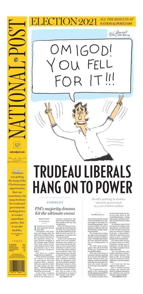
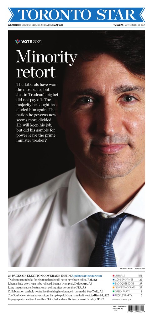
It looks as though making an election newspaper during a pandemic is just as hard as voting in a busy Toronto riding during a pandemic. That is to say not easy. Very little art, no gatherings, no big hugs or ecstatic faces. Despite the results coming in early (as I — and any experienced journalist — would have guessed!), there wasn’t a ton of fresh art used today. I admit I had delusions of grandeur, of waking up to front pages that blew my mind. I love elections, and I love election newspapers. What does blow my mind about these is that most of this work was likely done in people’s homes. That’s an incredible feat, so congrats to all the editors who made this happen. There are some nice looking pages, for sure. I hope for more tomorrow.
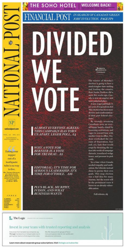
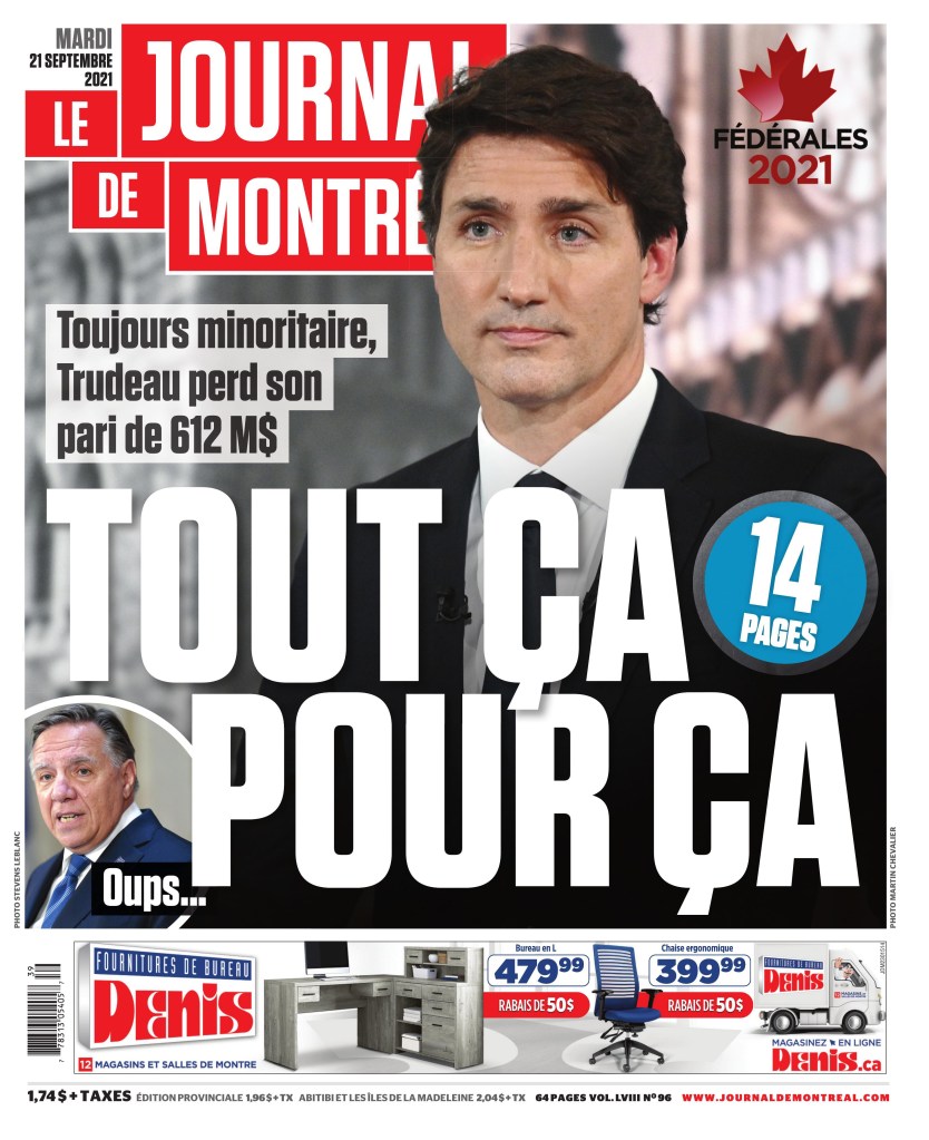
Without too much political commentary, and for those not following Canadian politics — which probably includes most of the world and a good chunk of Canadians — this was an interesting election to cover. A minority government that brought itself down and came back as a nearly identical — almost to the seat — minority government, with a Quebec nationalist party seeing the biggest increase (which was still tiny). Naturally, with $612 million spent, it has caused some opinions to be formed in Canada, including in the media. Some in support, some clearly against. That is captured in some of these pages.
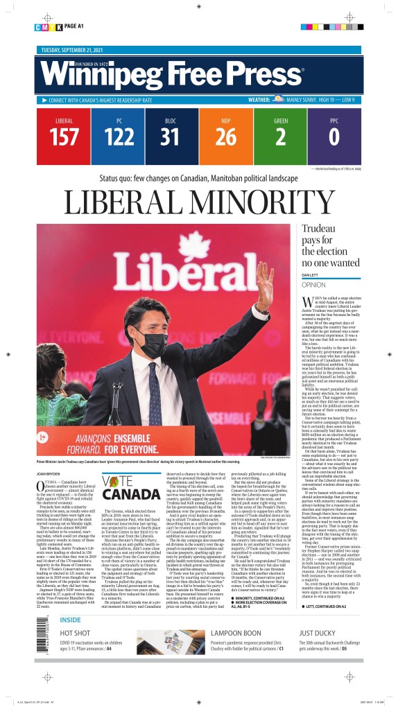
The papers that used fresh art and took a more neutral approach win my election newspaper edition of the this blog! The Globe and Mail wins a majority, with the Winnipeg Free Press filling the role of official opposition. Here is a selection of pages from this election, with little to no commentary on the content or design. Just the pages for your viewing pleasure.
Globe and Mail, Tuesday, Sept. 21
Winnipeg Free Press, Tuesday, Sept. 21
Montreal Gazette, Tuesday, Sept. 21
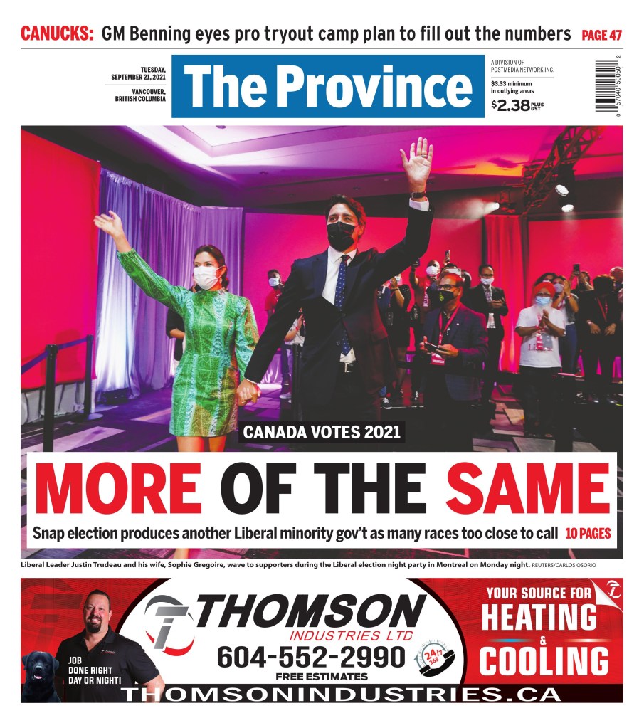
And now for some more political leaning covers
Most newspapers have a slant of some sort. These papers chose to display theirs, subtly or obviously, on their election covers today.
Up until March of 2020, newsrooms had always been buzzing, busy places. Reporters on calls. The clickety-clack of typing. Editors and designers shouting across the room. Editorial decision-makers making decisions. All in one place. How could it be done any other way? It was about collaboration and community. The community within the newsroom preparing news for the community without. And then on March 11, 2020, the WHO declared the coronavirus outbreak a pandemic. Not an epidemic. And unlike some of the other pandemics in the past 50 years, this one seemed to capture the attention of everyone. Maybe it was that the NBA postponed its season one year ago today. The NHL followed suit shortly thereafter. Two organizations driven so much by money cancelling their primary revenue streams. Money talks.
But by March 11, or very shortly thereafter, what seemed unthinkable for a newsroom, producing a daily (or weekly) newspaper from anywhere but a newsroom, became a reality. One year ago today or shortly thereafter, newsrooms started shipping computers and keyboards and monitors and mice home. And setting up VPNs. Soon setting up Zoom accounts for all staff.
It was a pandemic. One that caused mass panic. You couldn’t even find toilet paper in most places. I know because I searched high and low trying to find some for an editor who said she couldn’t find any. I found a four-pack and brought it into the office. I went to 10 stores, a little scared in every one. This was pre-masks. Or knowledge.
But was it such a big deal? One that warranted panic buying of toilet paper and canned goods? Hindsight is usually 20/20. In newsrooms one year ago today, discussions were being had about tomorrow’s front page as well. What do we do? Is this bigger than the flu pandemic of 2009? Or the SARS pandemic of 2002? Newspapers are always worried about blowing things out of proportion. So do we play this big, they would be asking? Do we downplay it? Do we talk about soup? It had to be on the front page. But how big?
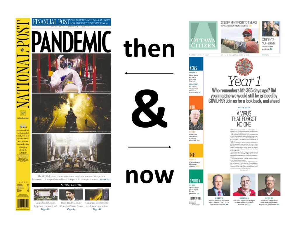
I’m going to look at some of the papers from March 12, 2020, and then at some from today, March 11, 2021. I admit I was expecting big anniversary covers. That was going to be the focus of this post. Some papers did. Most papers didn’t. It also happens to be the 10th anniversary of the 2011 Japanese earthquake and tsunami, which also caused a nuclear disaster. A devastating tragedy that left 20,000 dead. It is a tragic anniversary, so I acknowledge it here before looking at the pandemic papers of 2020 and 2021.
March 11, 2020 (March 12 in the newspaper world): WHO declares a pandemic
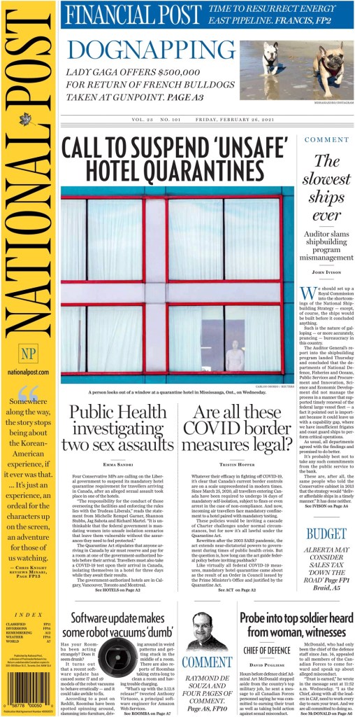
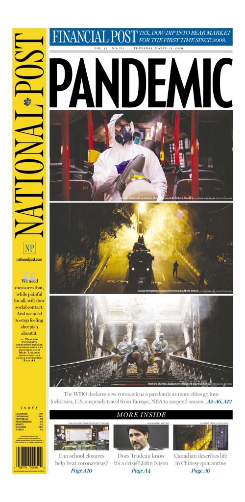
National Post, March 12, 2020
Of all the pages I looked at from March 12, 2020, the National Post cover was the one I felt most hit the mark on the type of play this should get (or should have gotten in hindsight). This was a significant day, and while it was just a declaration, the disease would have spread and wreaked havoc around the world regardless, this was a key moment. This week last year was when everything changed. This page uses a single-word headline, all caps: PANDEMIC. I’ve talked about this in previous posts. It seems so simple. But It was certainly discussed ad nauseum. And to complement that are striking, bold images. And equally important, they blew out the entire page. For a national newspaper to blow out an entire cover it needs to be a significant story. The editors at the National Post felt this was. This was a scary day, and life changed after this. But this is a beautiful page, despite the devastating and deadly outcome over the next year.
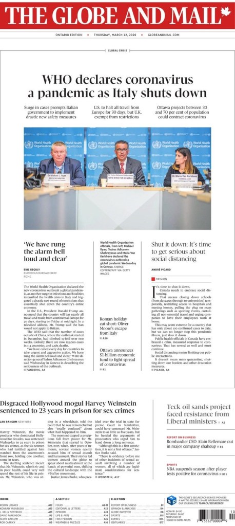
Globe and Mail, March 12, 2020
Another national newspaper in Canada also gave it big play. The Globe and Mail, while not as bold as the National Post in this instance, gave the pandemic top-of-the-fold play. And as is typical of the Globe, it uses white space to its advantage. They chose not to blow out the entire front, and while I wasn’t in the room, I can imagine the discussions. First, the Globe targets a different audience. They want information on the front. They often use their real estate to its fullest, having some pages inside without art, or very small art. On top of the pandemic, Harvey Weinstein was also sentenced to 23 years in prison for sex crimes. It was assumed the legal system would go easy on him, as it has with most powerful men charged or convicted of similar crimes. But it didn’t. On many days, this would be a black line story, across the top. It was a significant verdict. The Globe decided it must still make the front. I respect that. And the page is still well executed. It gives the pandemic centre stage, but acknowledges other key news of the day.
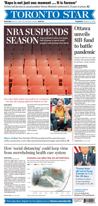
Another major Canadian newspaper, the Toronto Star, went a different route. While, other than a throw across the top (also recognizing the importance of the Weinstein verdict) the cover is all about COVID-19 (coronavirus), it’s less splashy and focuses on an intensely Toronto angle: the NBA’s suspension of its season, a.k.a. the end of the Raptors’ season. The cover design itself isn’t outstanding, but it had a clear focus on the news of the day. And looking back at it, you wouldn’t feel they missed the mark. It’s a solid cover. Strong news value.
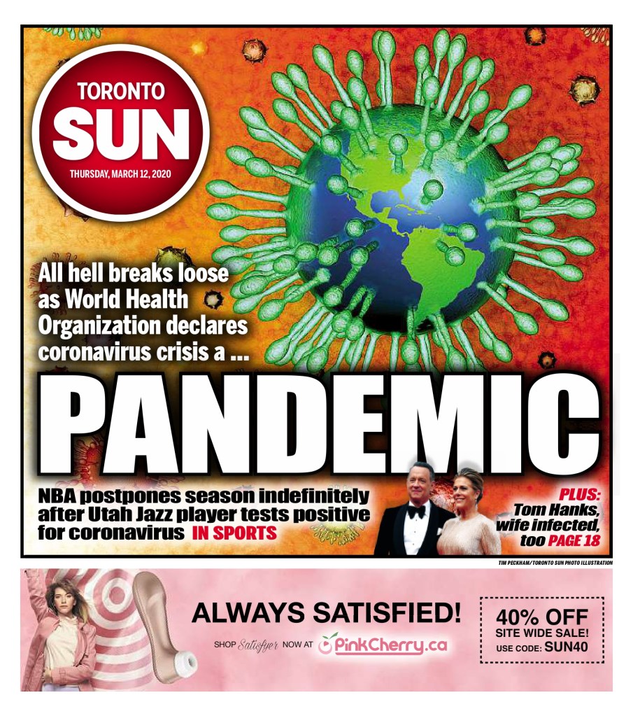
Toronto Sun, March 12, 2020
I admit I don’t often go to tabloid covers (by tabloid I don’t just mean size) for the design, even though they are often very creative. The Toronto Sun deserves credit here. It doesn’t take that big of a story for a tabloid to blow out its cover. But this has a take on that iconic COVID-19 image. The Earth as a coronavirus, with its telltale spike proteins, the claws that “act as grappling hooks that allow the virus to latch onto host cells and crack them open for infection,” as so well said on the Scripps Research website. Tabloids will often blow things out of proportion, but I’m not here to talk about that (all love, no hate, remember?). I am here to say well done to the Toronto Sun. This a bold, colourful cover. It captures the essence of the day, even if we were uncertain as to what it meant then. Believe the hype. It was worth the strong words and the design. And of course the ad. Who knew how relevant that might be for time spent in solitary confinement for the next year.
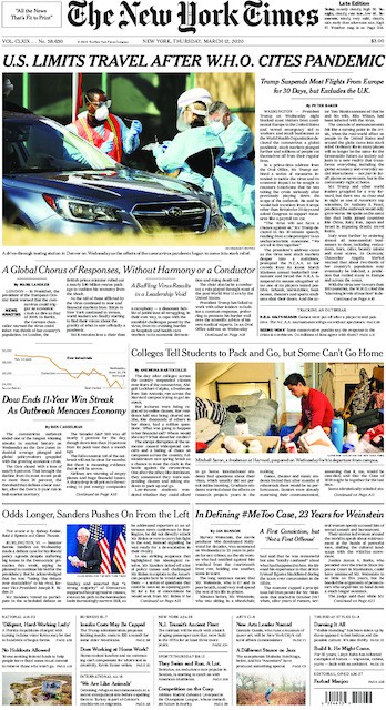
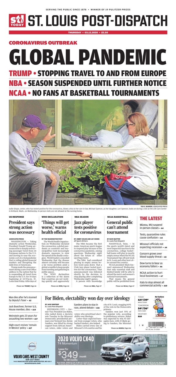
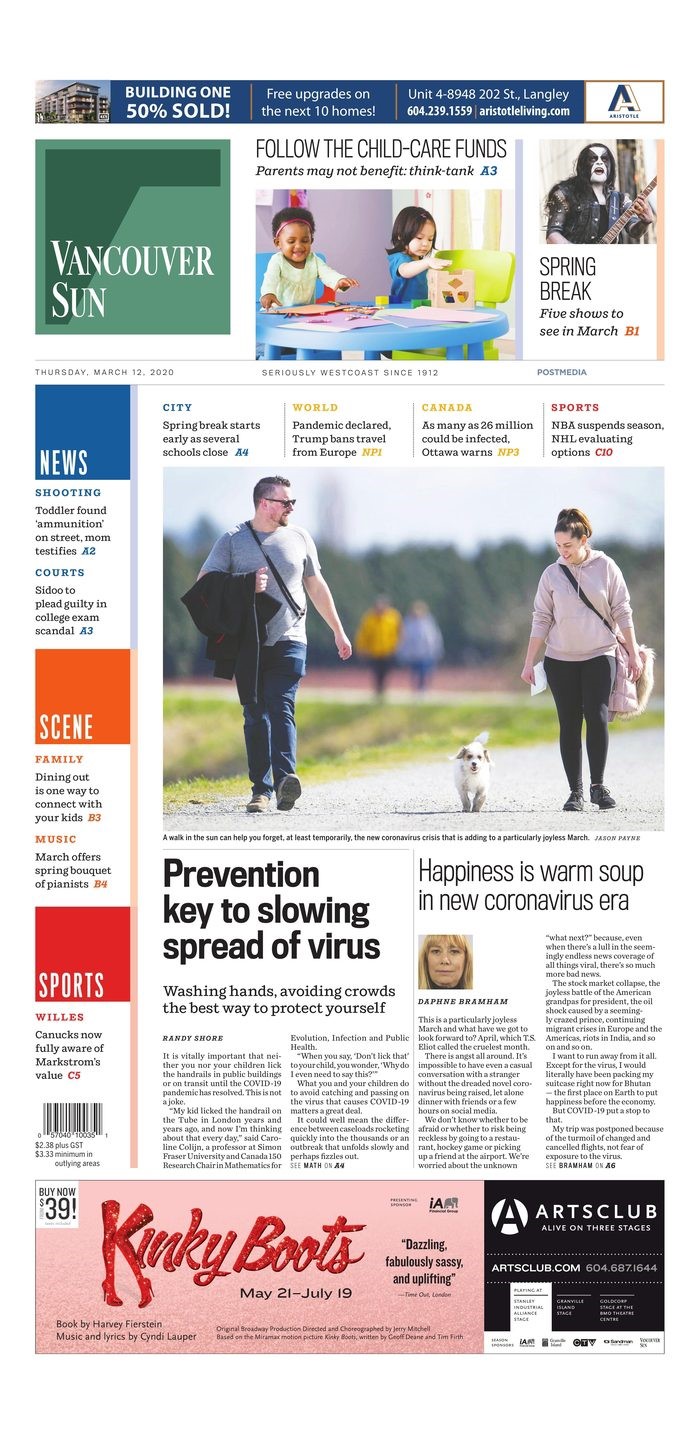
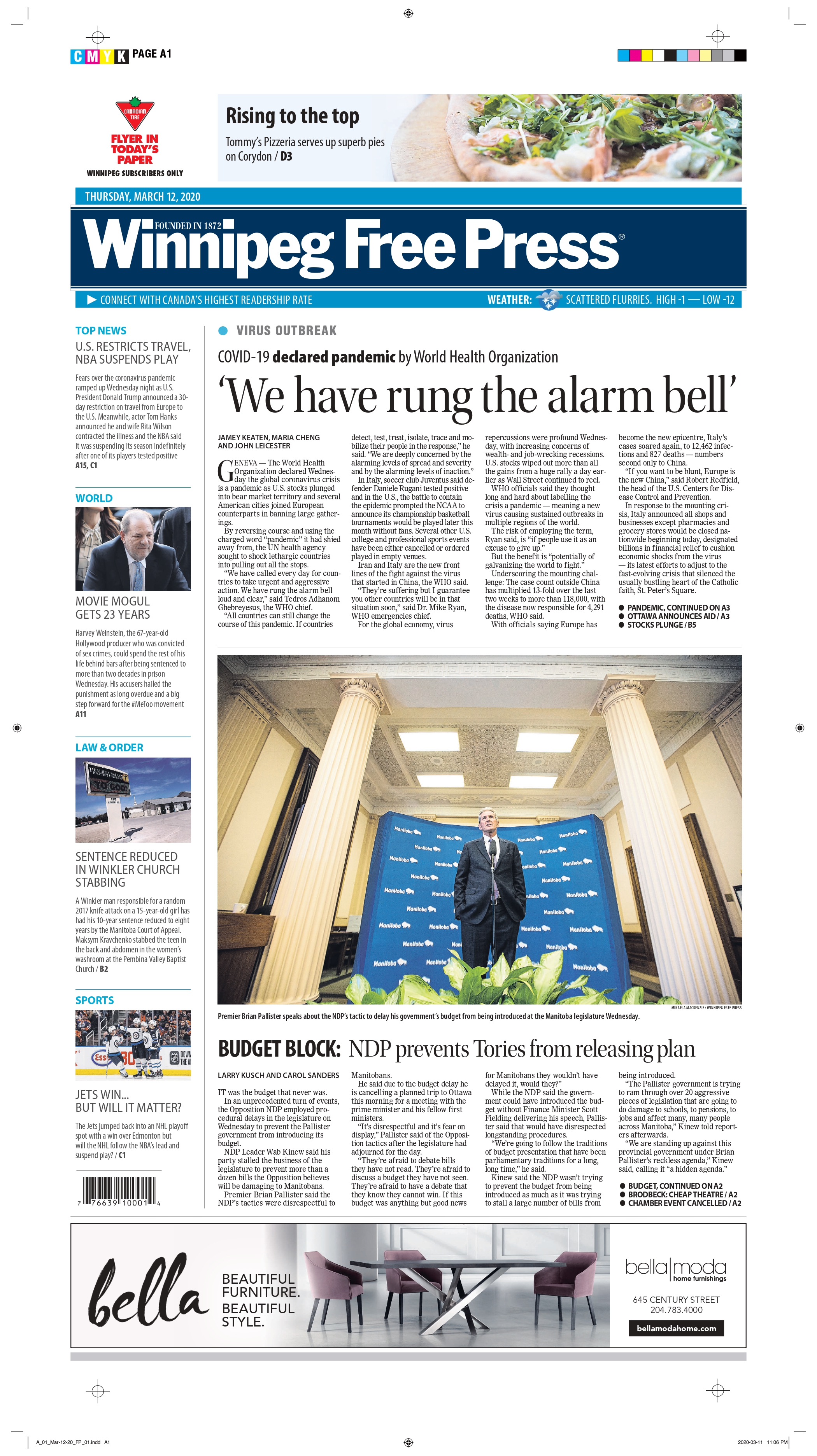
I won’t go into each of these with individual posts. My favourite from a design perspective is the St. Louis Post-Dispatch. It still looks different than other days, and is clearly taking the declaration seriously. The New York Times is the New York Times, here because of its stature in the journalism world, not for its design. I included the Vancouver Sun because it does have a heavy focus on the pandemic, but also adds a lighter touch: Happiness is warm soup in new coronavirus era (told you there was soup). It almost seems laughable a year later, but surely the editors wanted to present a mix of information. And the Winnipeg Free Press presents a standard newspaper cover. Much like most of this year’s that I have looked at.
March 11, 2021: one year later
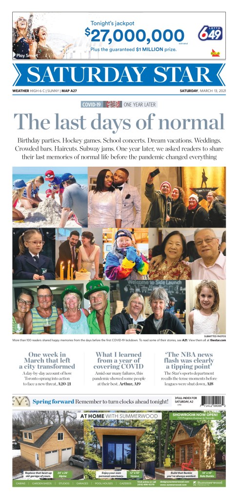
When I decided to do this post, I was prepared for covers to be blown out again. It’s been one year since the declaration that changed our lives. Alas, it mostly wasn’t to be. Of course it comes the day after the U.S. Congress passed a $1.9 trillion (TRILLION) pandemic relief package. Money talks. Especially when it’s in the trillions. So there was news to share. And maybe editors were never planning on commemorating the day at most papers. I looked at hundreds of newspaper covers today* (thank you to Freedom Forum for its daily gallery, which I look at almost every day). Two stood out, and both deserve praise. In order of how much I love them (no shame in finishing second here!). * One additional page of note landed Saturday, a big day for blowout feature pages in Canada, so I am updated to add the March 13 Toronto Star.
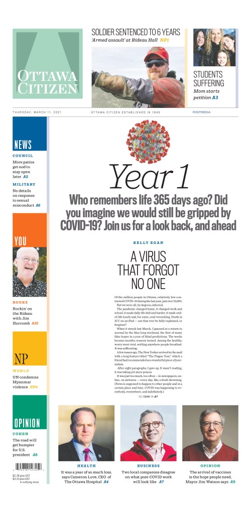
Ottawa Citizen, March 11, 2021
It’s … beautiful. This is what I was hoping to see today. This is the kind of page this blog is about. It’s simple. It’s clean. It’s not gimmicky. It uses white space wonderfully. A big headline. A little bit of the story. And it captures the moment from last year. Was this declaration a big deal? Yes. Yes it was. Huge points for the Ottawa Citizen today. To the designers, decision makers, editors and all involved (some direction provided by editors in Ottawa and then further conceptualized and executed by the talented staff in Postmedia’s production hub in Hamilton), well done. As print journalism struggles, it’s comforting to see that someone still cares.
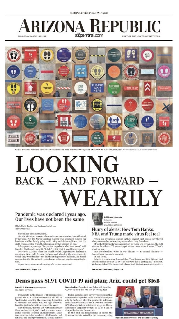
The Arizona Republic takes a bit of a different approach, but the design is still lovely, and really captures the importance of the day. It still gets the story about the $1.9 trillion (trillion!!) aid plan, but also offers a look back to one year ago today. It uses striking imagery right across the top of the page. It’s not an obvious image. You need to really look at it. Which is a great strategy. And the headline is playfully done, unlike a standard headline. Different sizes, different alignments. Strong word choices. So again to those in Arizona, bravo. It’s often a well-designed paper, and today was no different.
A few days after the anniversary, the Toronto Star ran with this cover. It focuses on the people affected by the pandemic. They blew out the front cover for the story (a tear-jerker, particularly if you are wistful about that last week, and the days before). Similar to the initial pandemic cover, the actual design is more basic. A collage of photos. But that it blows out the front page with essentially snapshots is bold. As a reader you know there is a story behind every photo. There are billions of stories over the course of this year. But here the Star shines a light on 10 photos, and more people. I tear up thinking about “The last days of normal.” So points for headline as well. It was. Nothing has been the same since, and may never be. This cover captures that emotion (as do the stories inside).