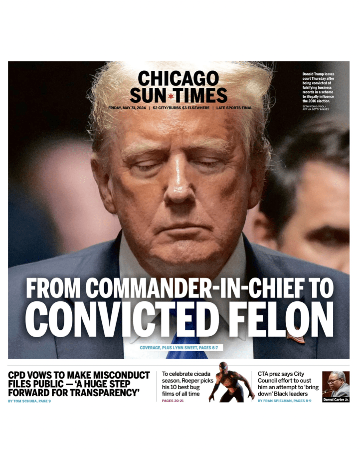
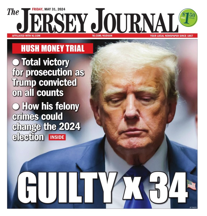
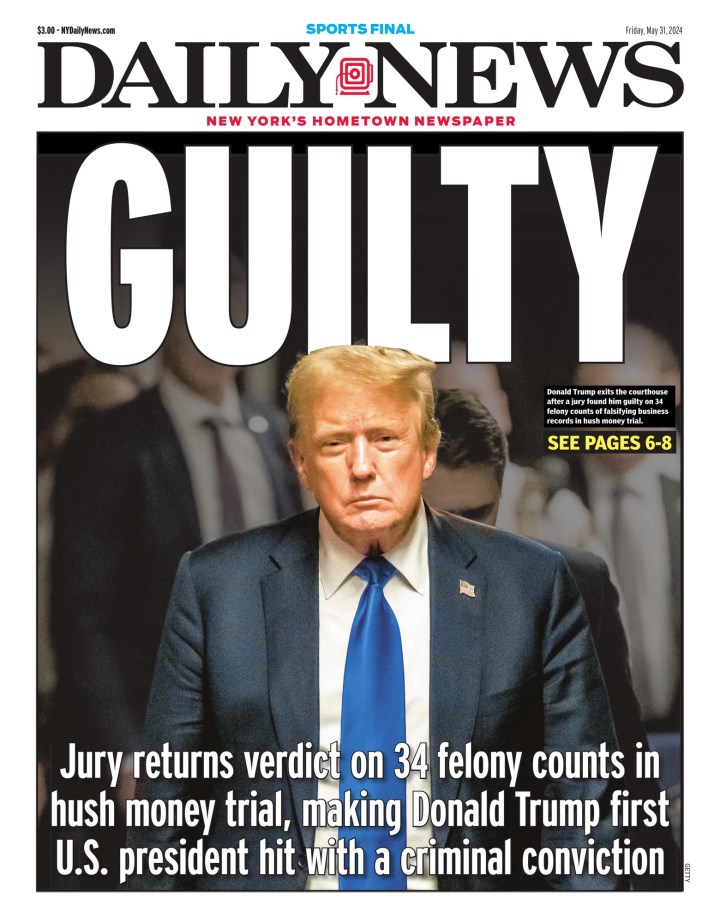
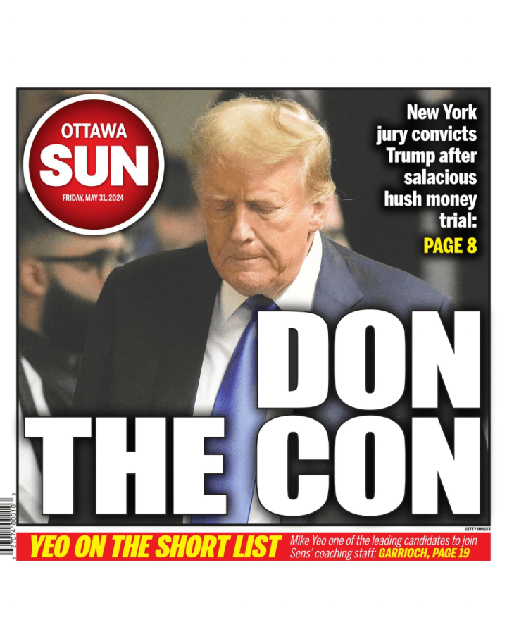
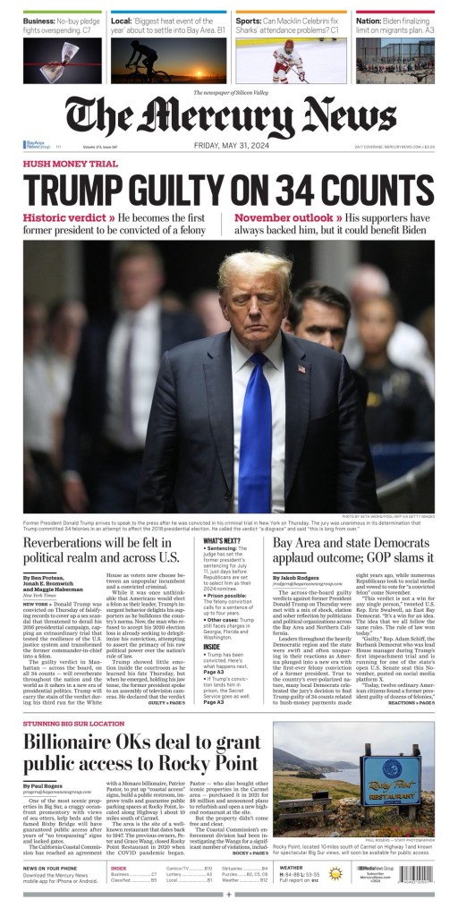
Guilty. Condenado. Coupable. No matter how you say, the guilty verdict against former U.S. president Donald Trump was splashed all over newspaper front pages around the world (depending on the time zone, as it came too late for some). With this Trump becomes the first U.S. president to be convicted of a felony crime. On days with big news, I like to look at how different newspapers treat the news from a design perspective, which includes headlines, picture play, and so on.
This the second post I’ve done on Trump’s legal issues, and it likely won’t be the last Trump post as the U.S. election nears. If I were a betting man, I’d predict there could be some Trump wins front pages come November. But I will try not to do too much on Trump, as I know that has long been a criticism of the media: too much coverage.
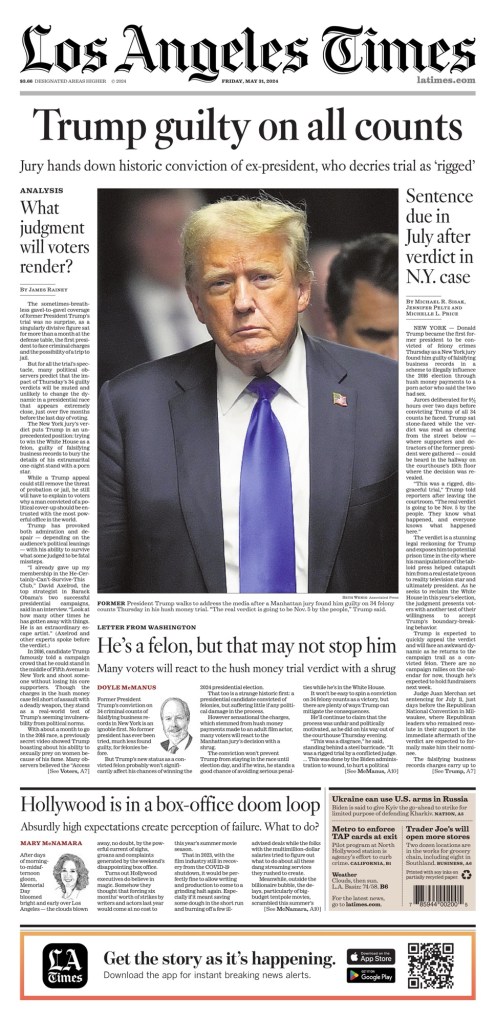
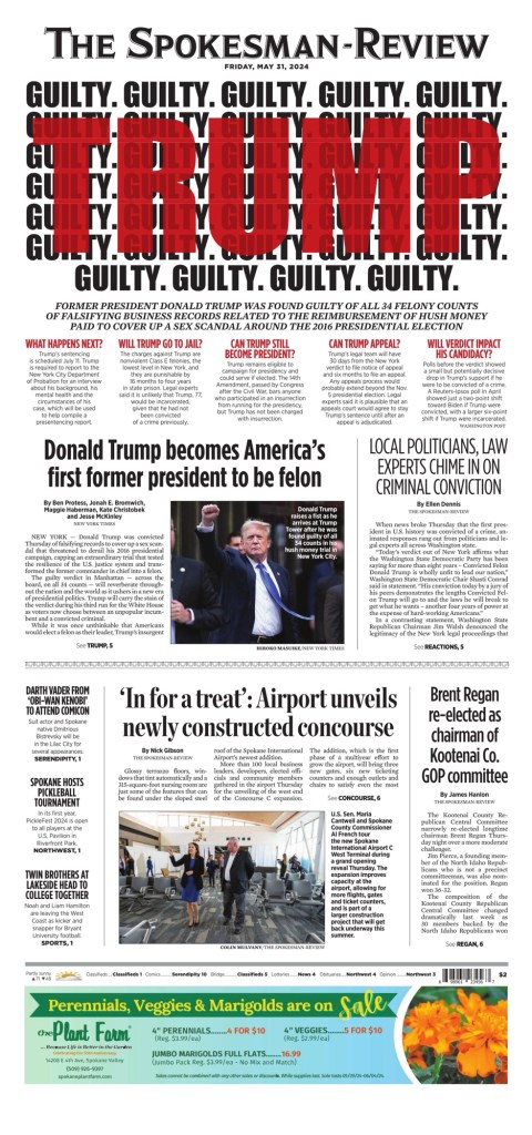
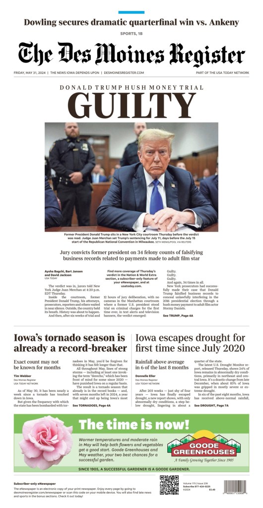
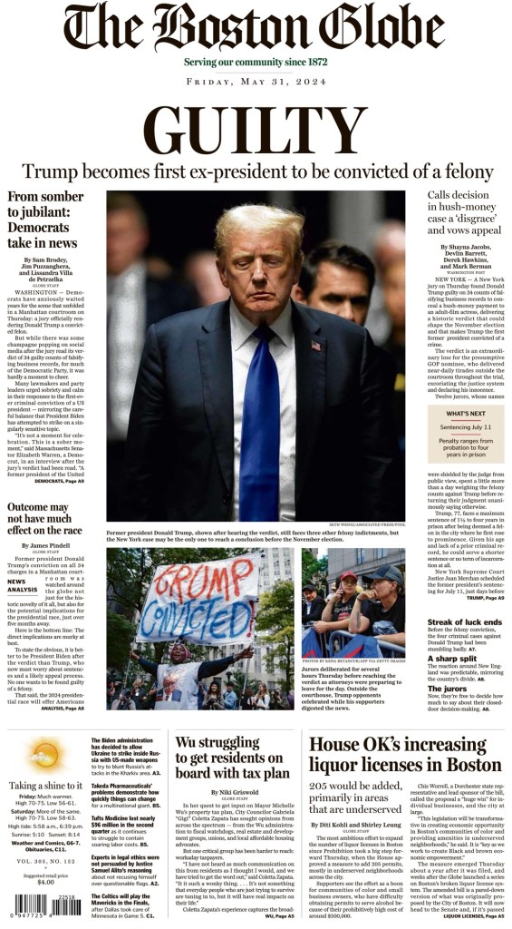
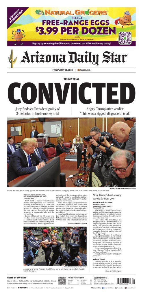
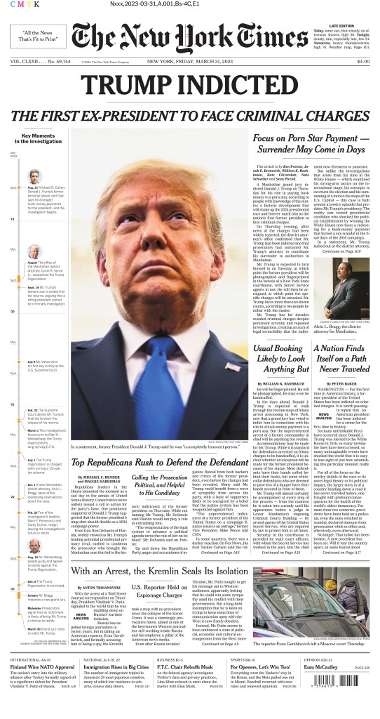
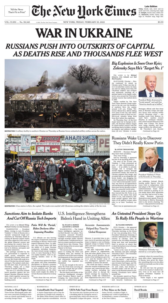
Today there were dozens of front pages that gave Trump huge play. I have selected 20, for various reasons. Some that look the same, some very different, different languages and regions. I will start with two of the bigger U.S. papers, The New York Times and Los Angeles Times.
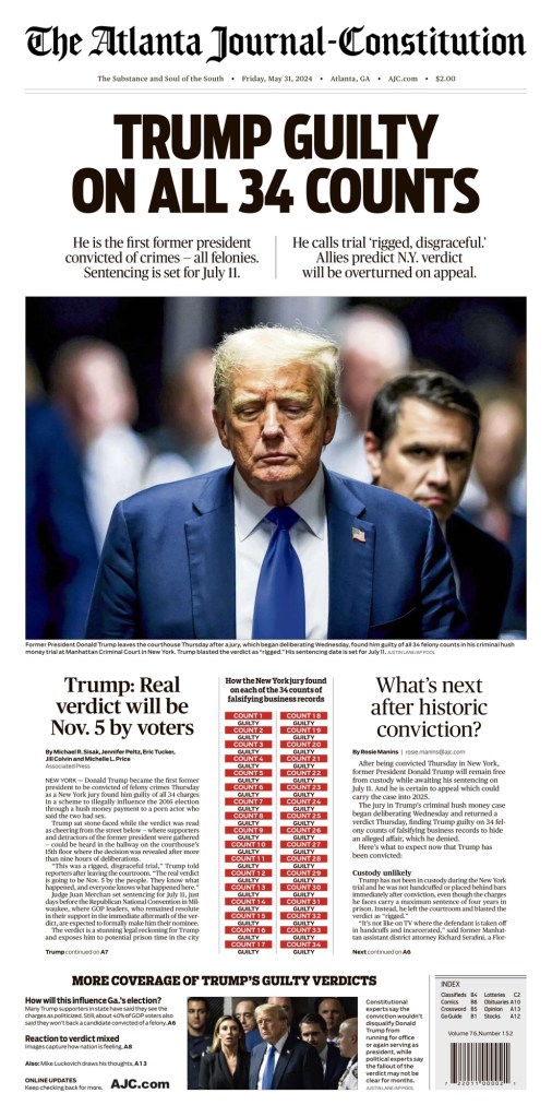
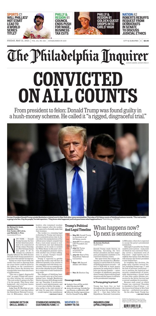
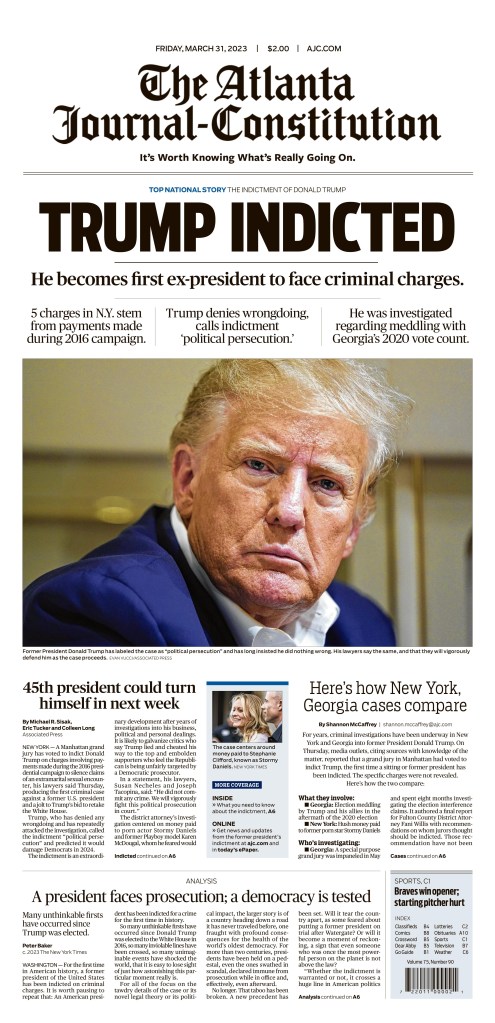
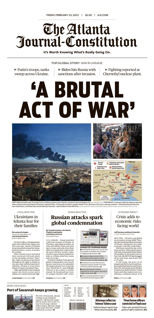
The next two are two of my favourites from a design perspective. Classic big news front pages. Big headlines and photos, some explainers. They are The Atlanta Journal-Constitution and The Philadelphia Inquirer.
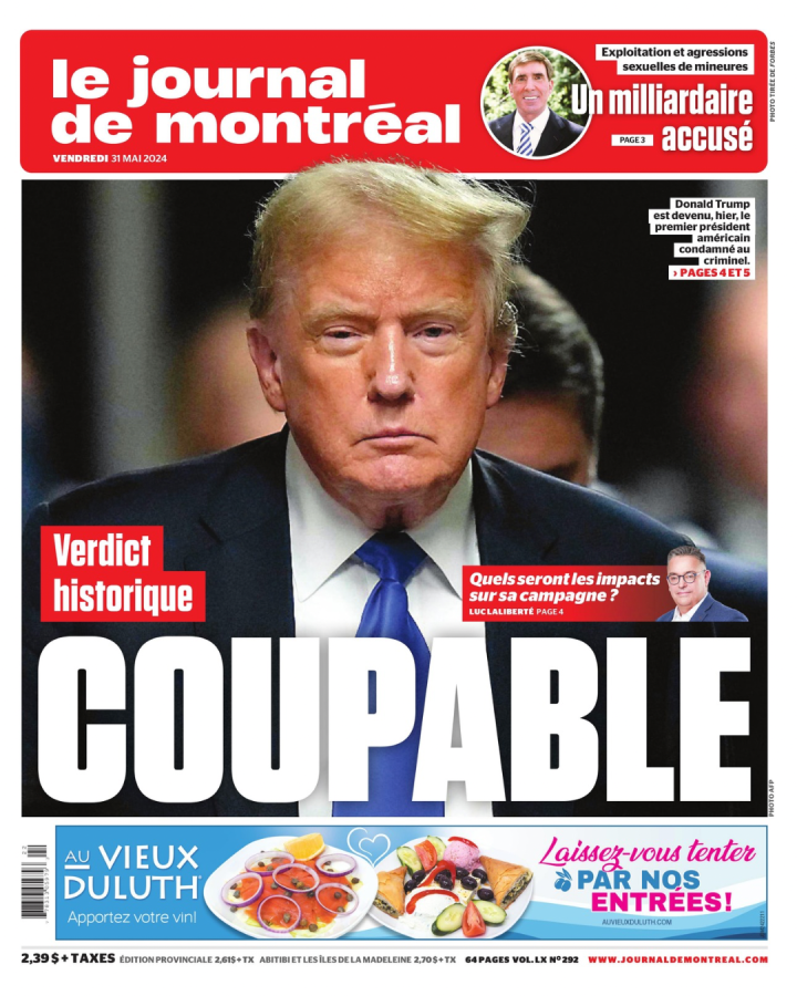
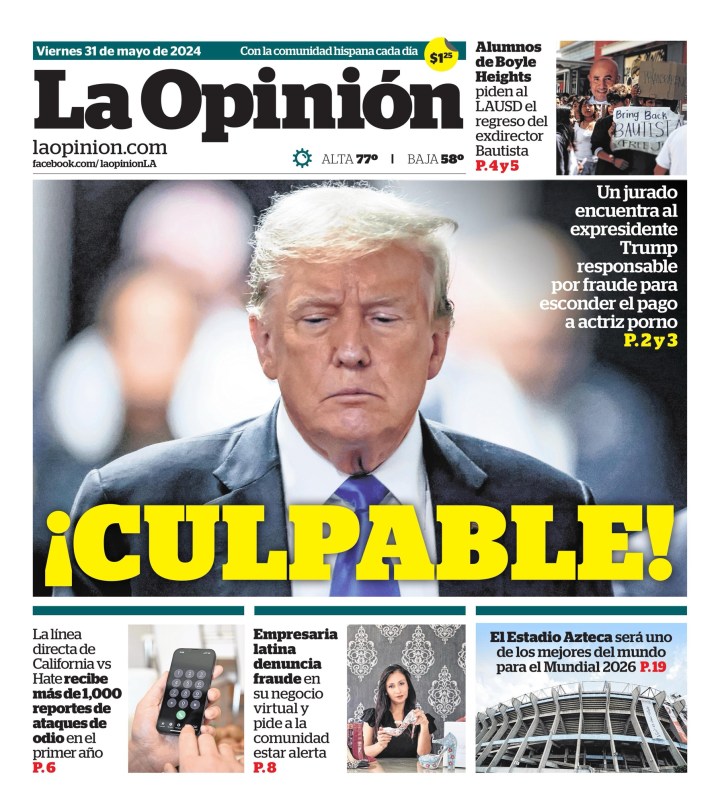
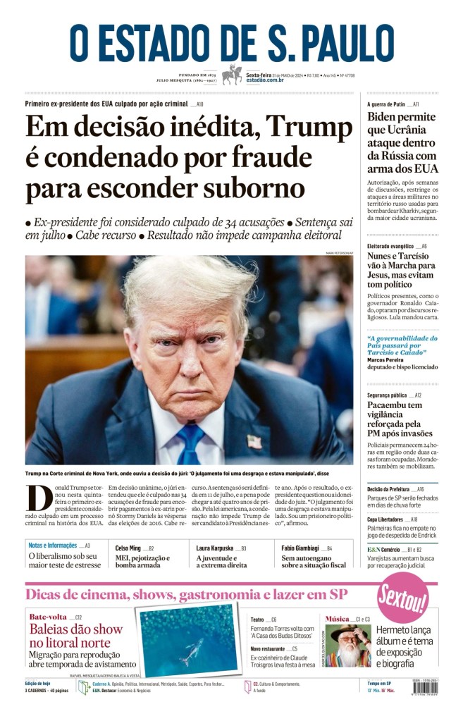
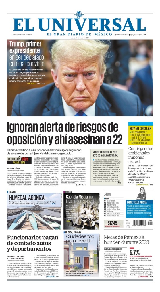
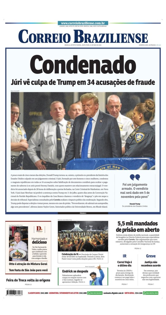
Next up, a selection of papers in other languages, from other parts of the world.
Here are a few U.S. tabloids.
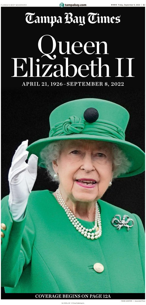
Highlighting the Tampa Bay Times for use of the largest headline on the day, at least in broadsheet.
And to wrap it up, a slideshow, starting with another Canadian paper, the Ottawa Sun, giving the story classic tabloid treatment.
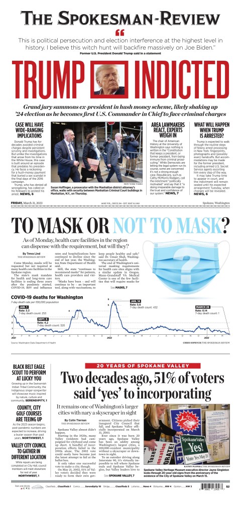
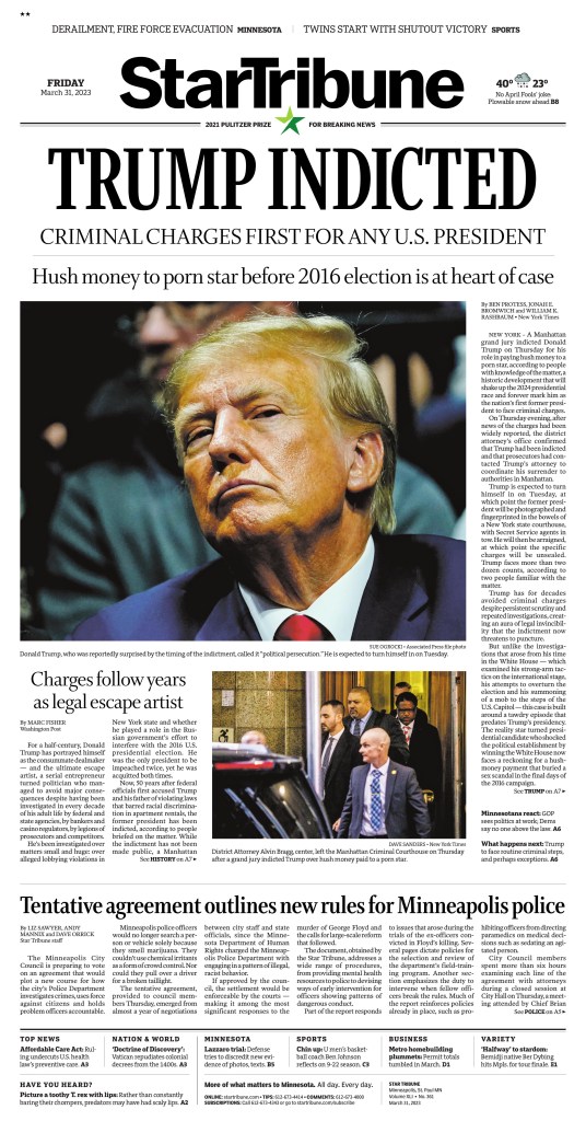
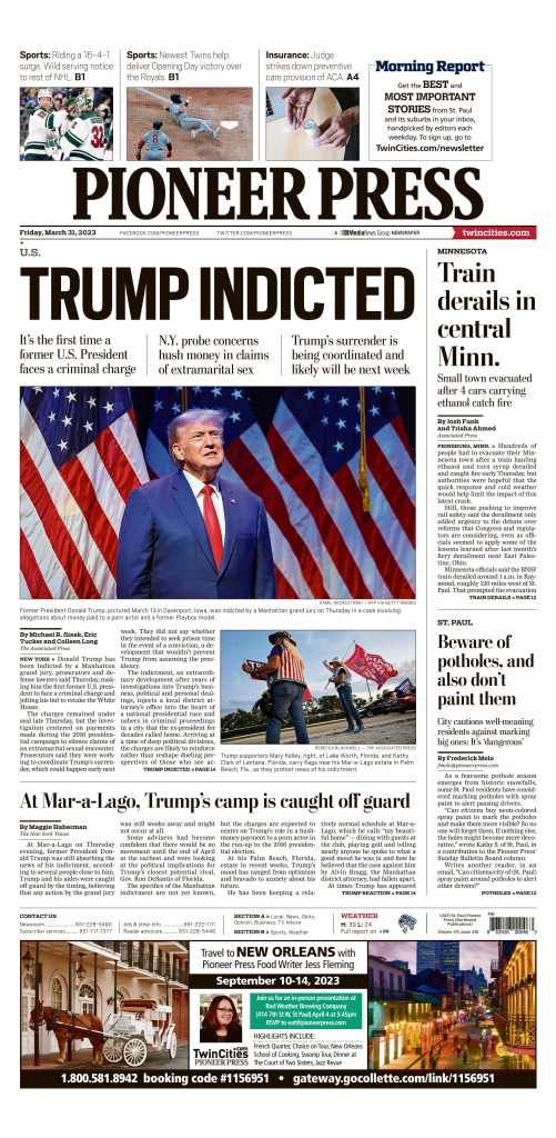
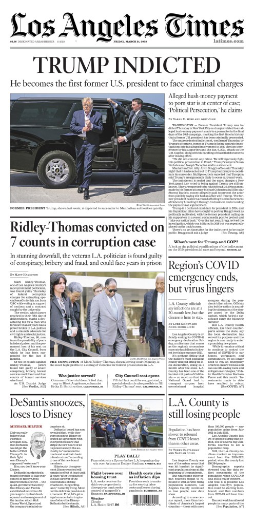
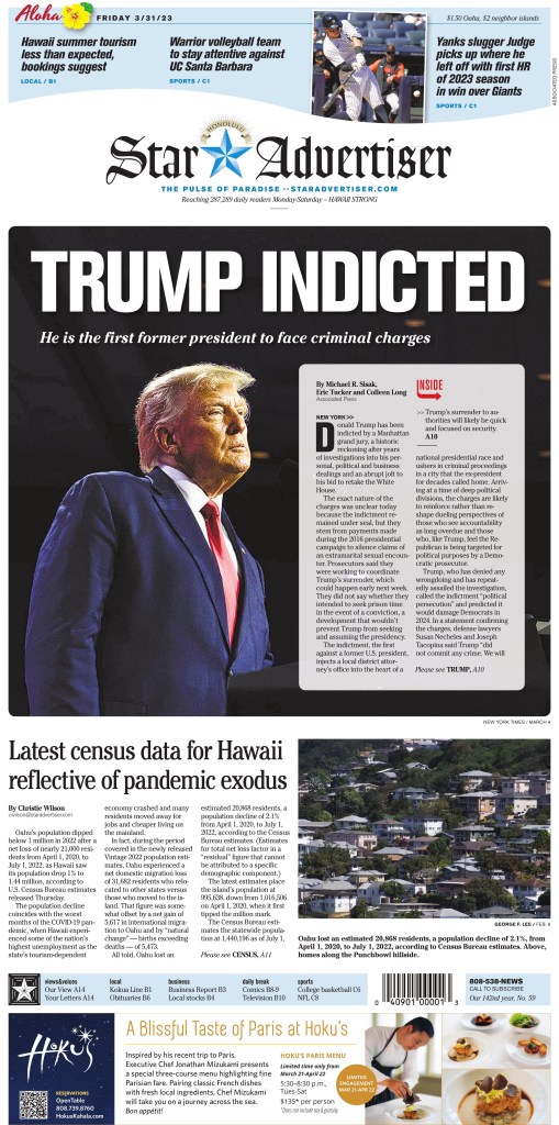
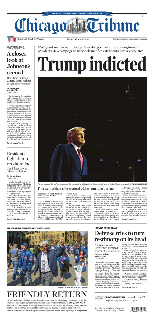
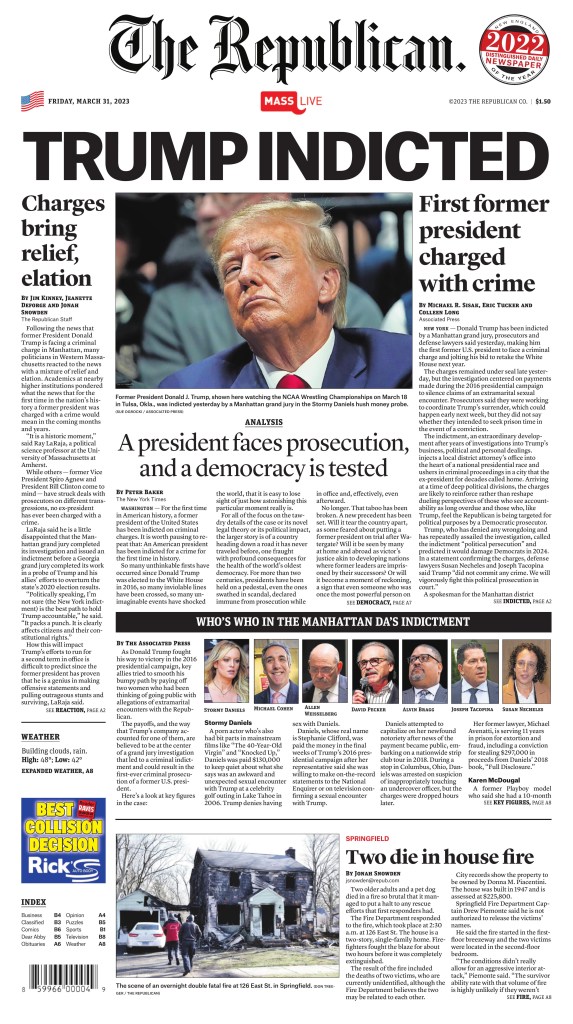
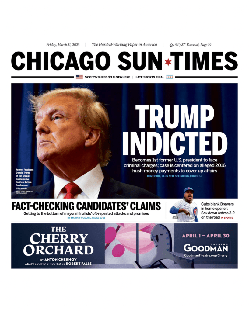
When word came out yesterday that former U.S. president Donald Trump was indicted, it was pretty obvious it was going to be the lead story on many newspaper front pages, particularly across the United States. It was the first time anyone who has held that position had been charged with a crime, though others have certainly committed some.
Nor was it surprising to see one headline splashed across more papers than anything else. While some papers carried a version of this headline, most papers went simply with: Trump indicted.
Here is a selection of 10 newspapers that used that headline. Most used the headline very similarly: big, bold and all capitals. The design that follows the head is similar in some cases, but it’s also very different in others. The Atlanta Journal-Constitution is my favourite from today. It is often a design leader on big news days. Take a look.
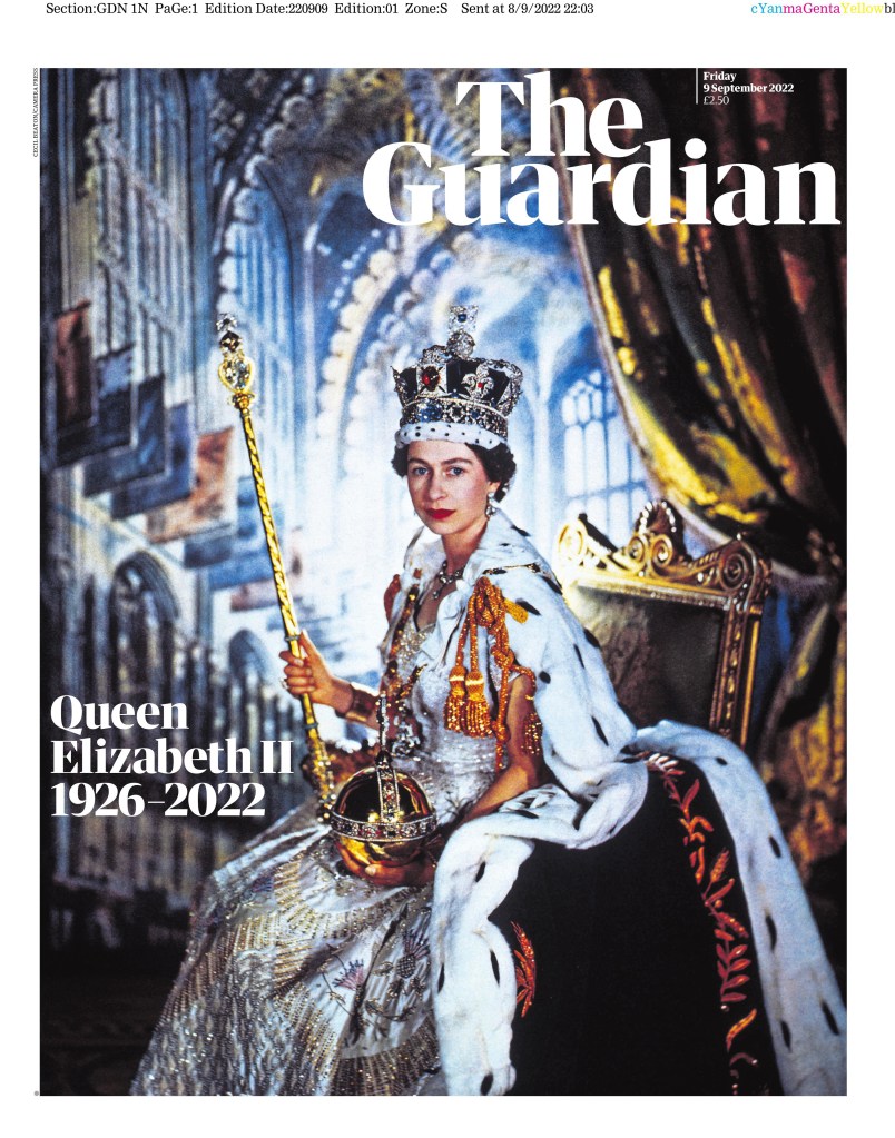
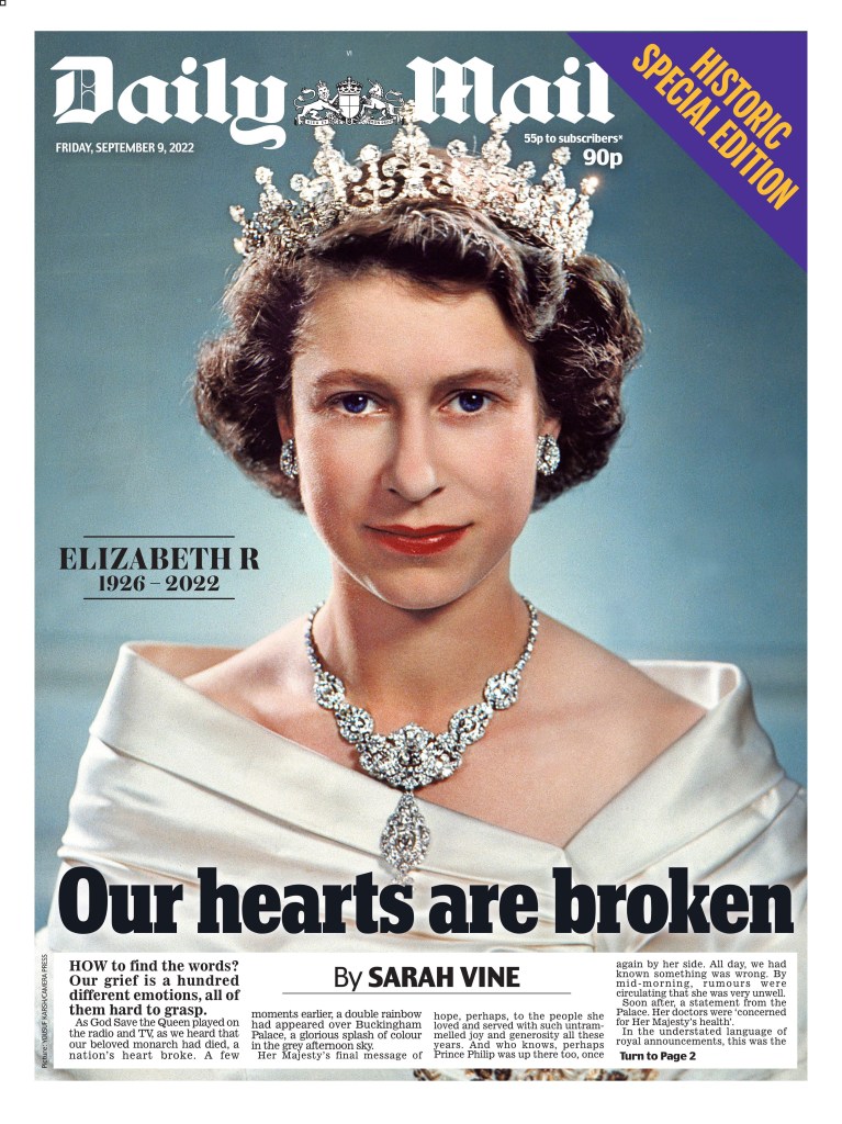
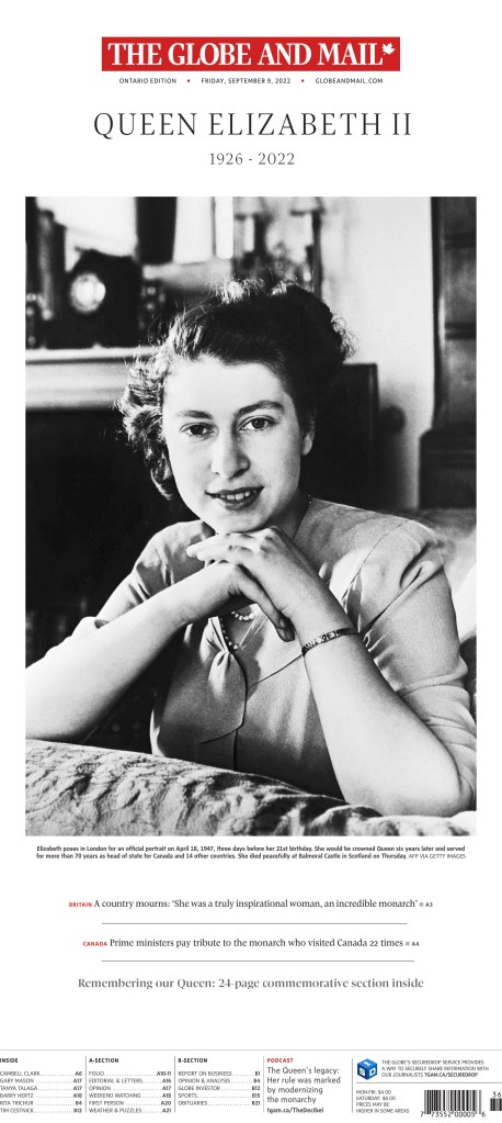
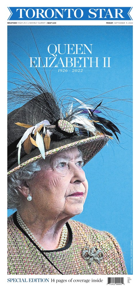
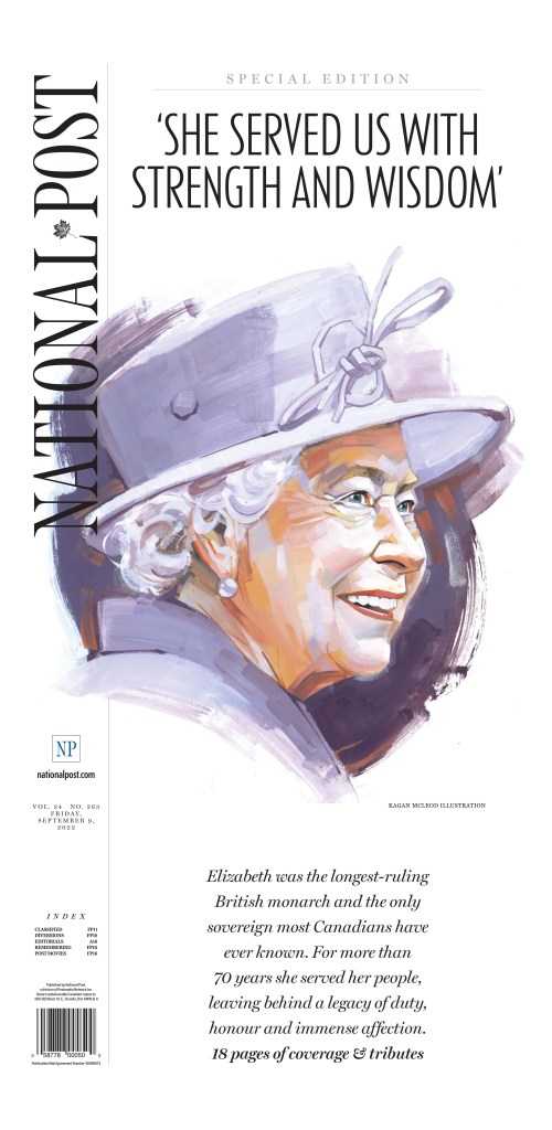
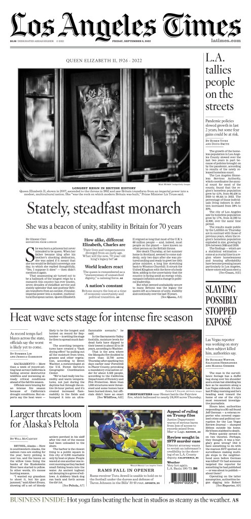
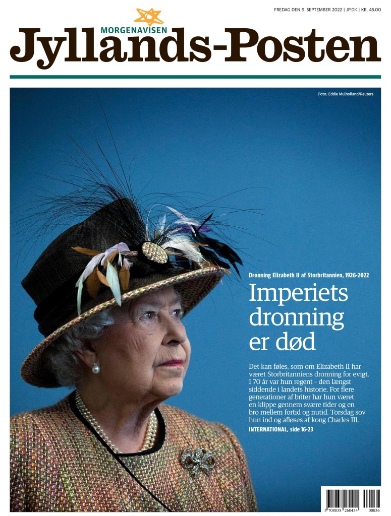
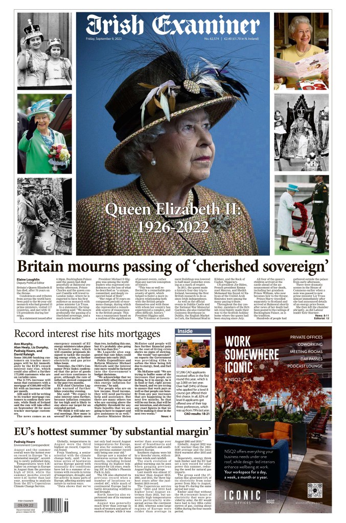
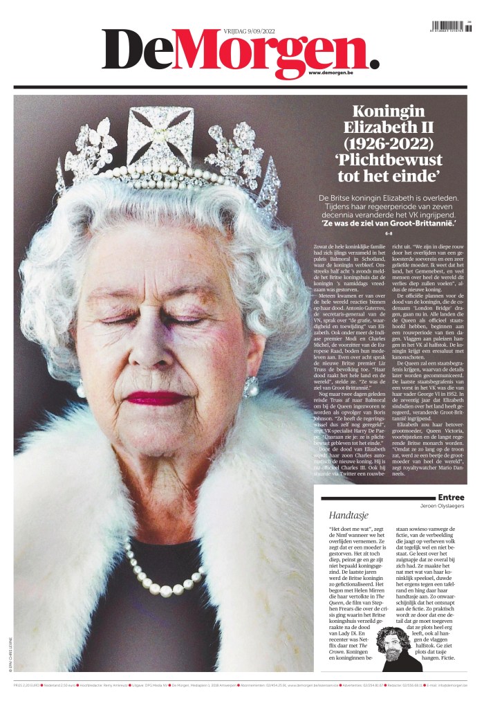
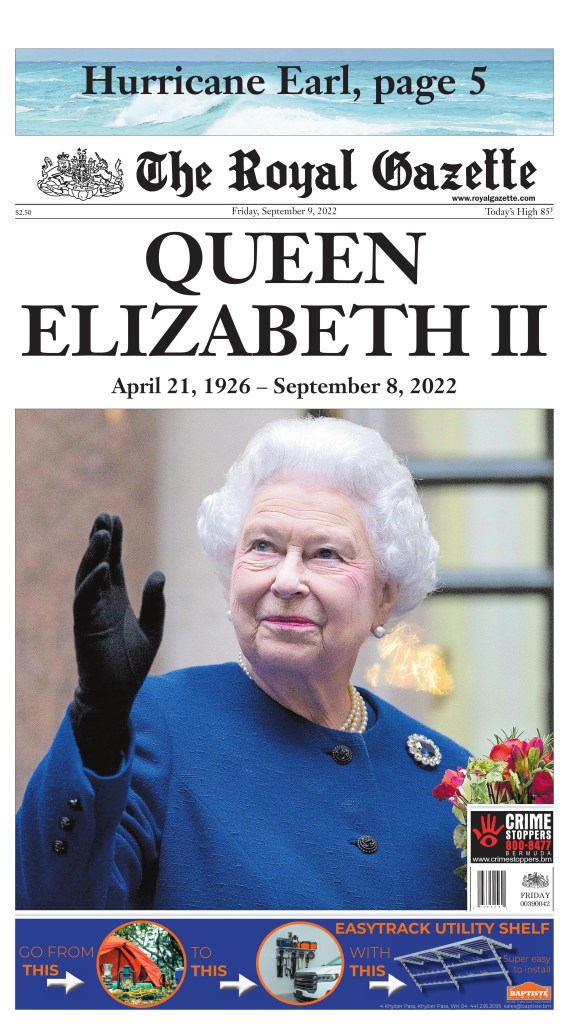
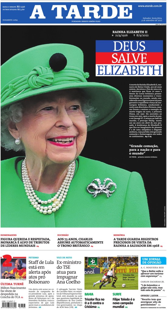
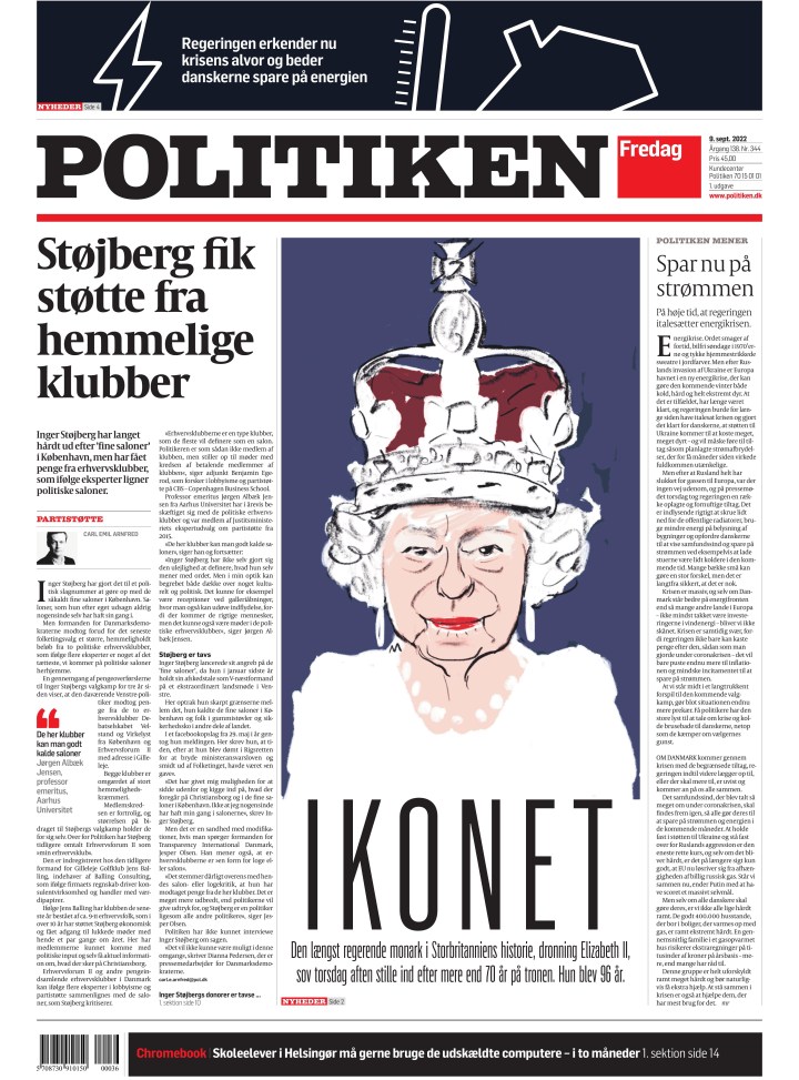
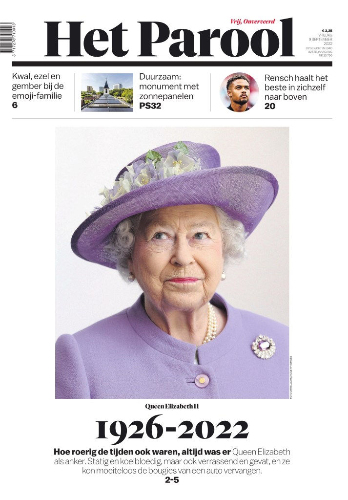
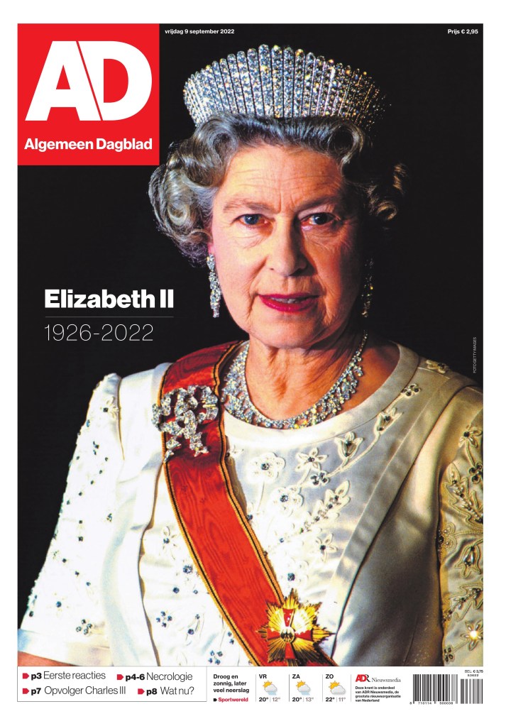
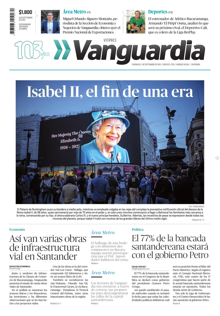
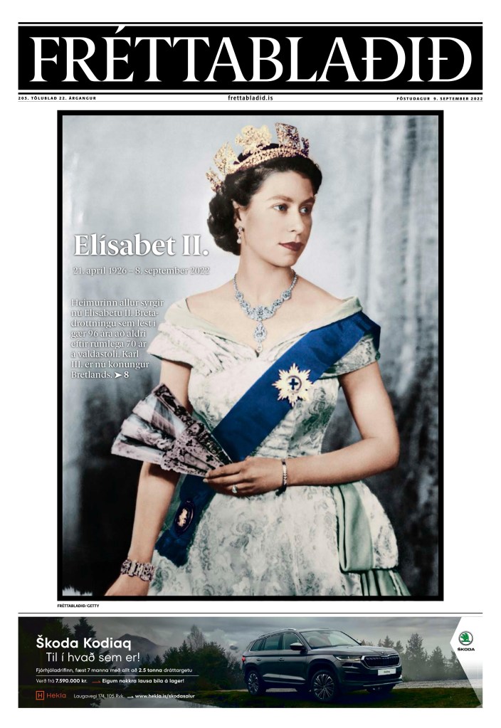
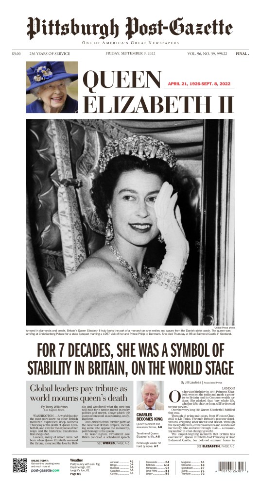
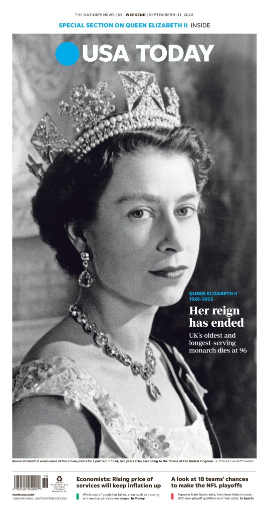
Today is one of those days in newspaper history. A story that resonates around the world: the death of Queen Elizabeth II. Newspapers have long been planning for the death of the Queen, both for their front pages as well as special sections to mark her extraordinarily long reign. When the news came Thursday afternoon It wasn’t a huge surprise.
What was striking was the varied reactions, and rightly so. The Queen ruled for more than 70 years. She’s been around for, and involved in, a lot of history. She had been queen for almost half of Canada’s existence. To many, she is beloved. Mum. To others, she is a symbol of colonialism. Oppressor. While many mourned her passing, others celebrated. Some expressed deep sadness, while others expressed anger or joy over her death. From what I could see, newspapers, at least on the front pages, only showed reverence. Her legacy will be long debated, and should be.
But today, on this blog, as always, it’s about design. And there are some striking pages marking her death, at 96 years old. Here is a selection from around the world. No more words required.
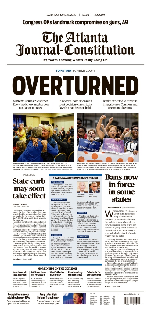
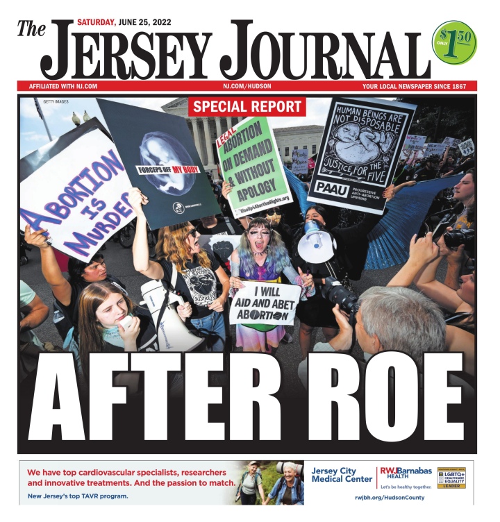
In a devastating blow to women’s rights in the country that proclaims to be the freest in the world, the U.S. Supreme Court has officially overturned Roe v. Wade. The 1973 decision ruled the Constitution protected a woman’s right to choose an abortion. Nearly 50 years later, that ruling has been overturned, handing control to individual states to decide. Some have already enacted restrictive rules, nearly outright bans. It’s a crushing and significant decision that will likely have significant repercussions for years to come.
Its significance was clear by looking at newspaper front pages today. Not often does one topic get primary play in so many newspapers. Almost every paper I saw this morning had this as its main story. It affects everyone. Every woman. Every man. Every person.
A lot of the pages within the same newspaper chain had similar designs, so I have pulled out 10 that stood out, plus The New York Times front page from the original 1973 decision and today’s.
Chicago Sun Times, June 25, 2022
The Dallas Morning News, June 25, 2022
Tampa Bay Times, June 25, 2022
The Atlanta Journal-Constitution, June 25, 2022
The Star Tribune (Minneapolis), June 25, 2022
The Des Moines Register, June 25, 2022
San Francisco Chronicle, June 25, 2022
Arizona Republic, June 25, 2022
The Jersey Journal, June 25, 2022
Knoxville News Sentinel, June 25, 2022
And here is The New York Times front page when the Supreme Court decided Roe v. Wade, followed by today’s front page. On the printed page, a clear demonstration of moving backwards in American society.
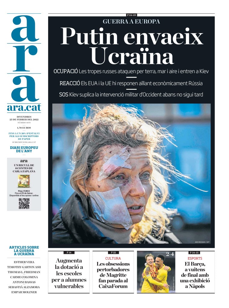
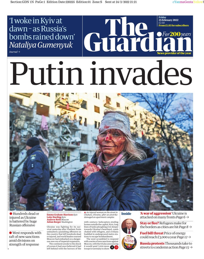
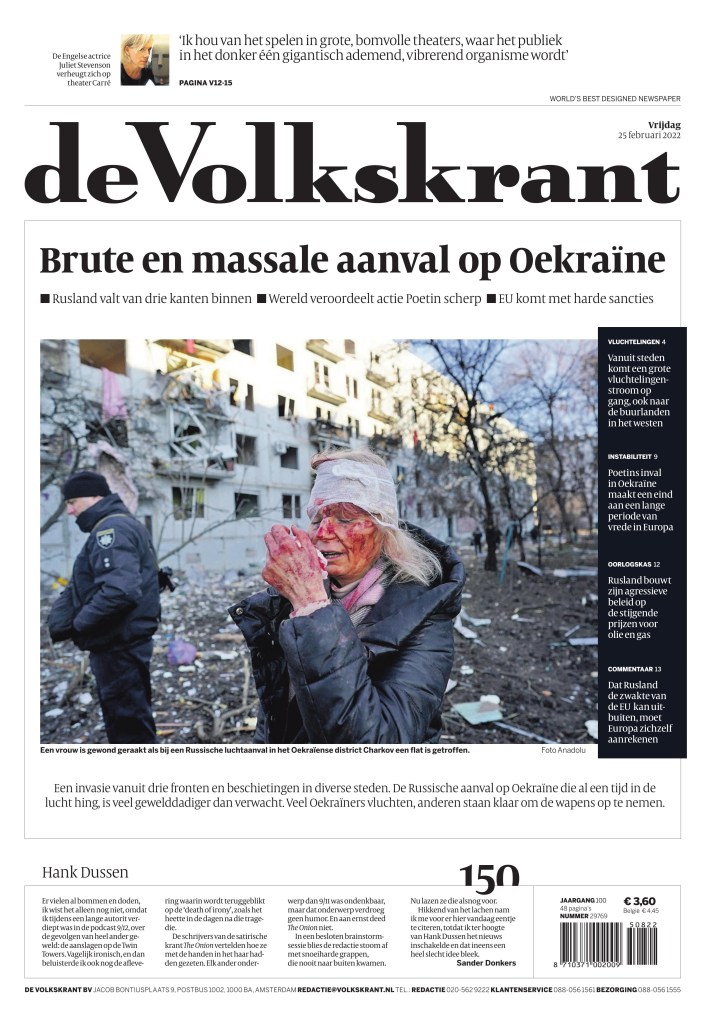
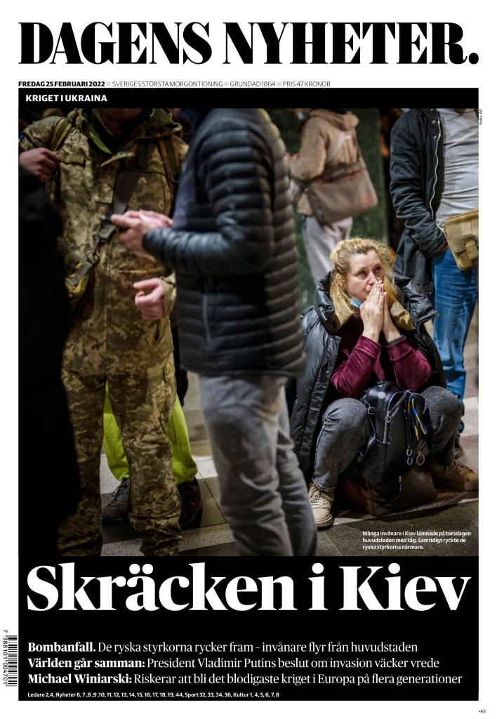
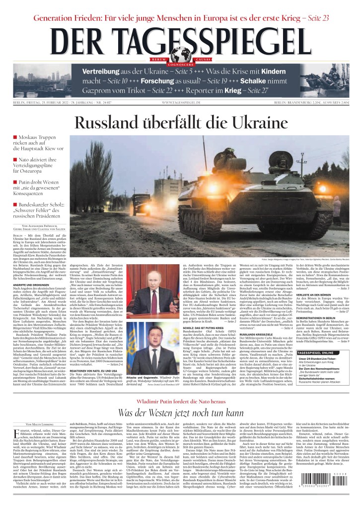
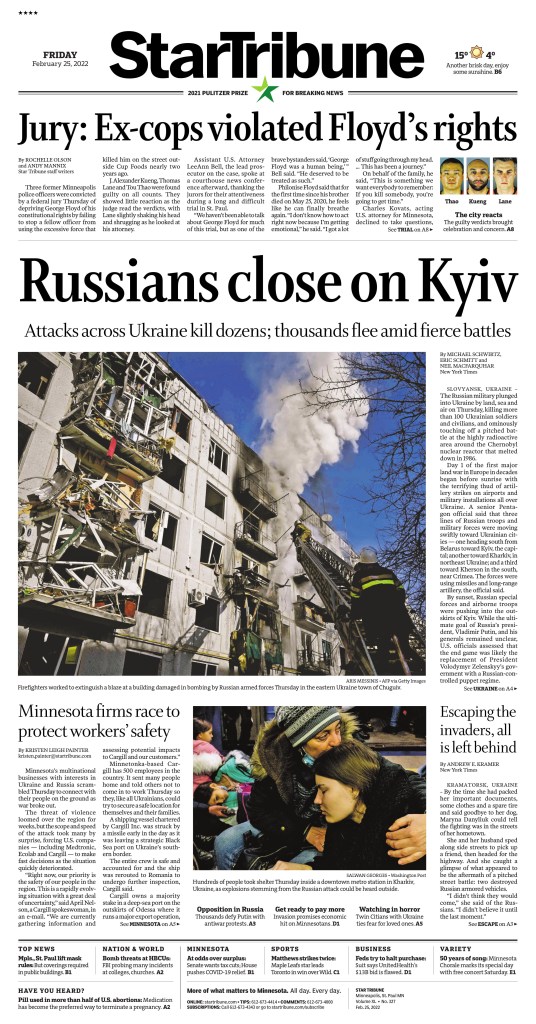
As Russia’s brutal invasion of Ukraine entered its first full day, we got to see how newspapers around the world displayed to their readers what was happening. Big, powerful photos (three stood out as the most commonly used) big, bold, powerful headlines. When events like this happen (though there hasn’t been an equivalent to this in a long time) we see a lot of similar ideas. We also see the power of newspapers.
Below is a selection of powerful newspaper front pages. I have chosen the ones that almost made me gasp. The power of print will never be lost on me, especially in times of crisis.
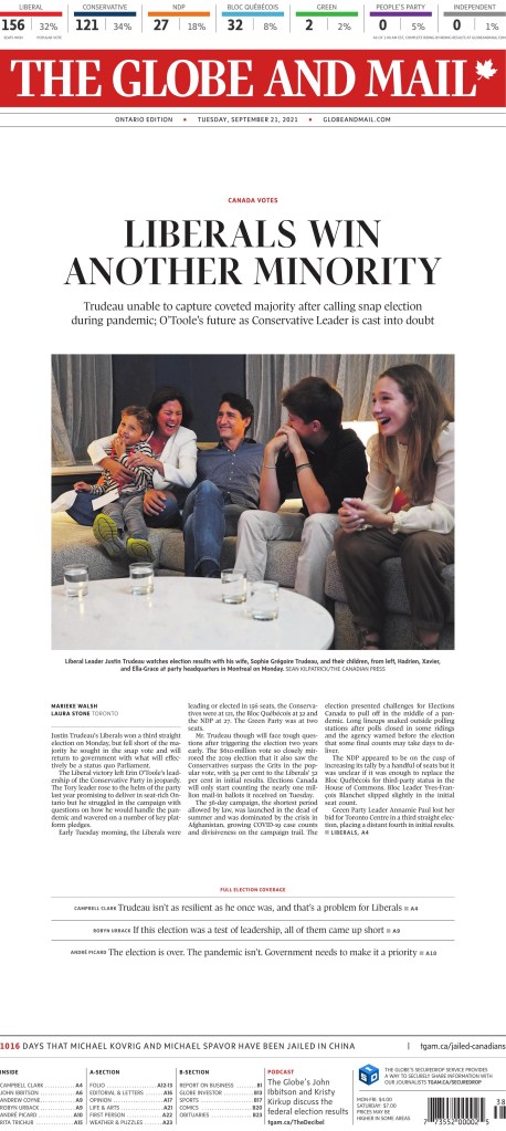
Newspapers in Canada
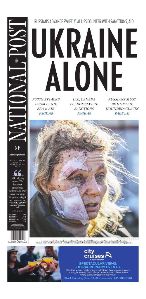
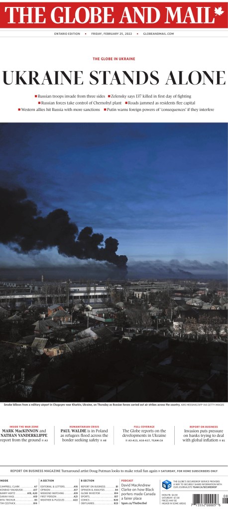
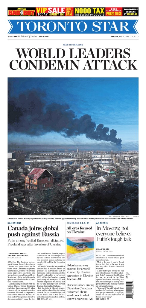
The photo used by National Post was seen on papers throughout the world and there are more that use it below. The Toronto Star and Globe and Mail used the same photo and the Globe and National Post used nearly the same headline, about Ukraine standing alone.
National Post, Feb. 25, 2022
Globe and Mail, Feb. 25, 2022
Toronto Star, Feb. 25, 2022
The faces of war
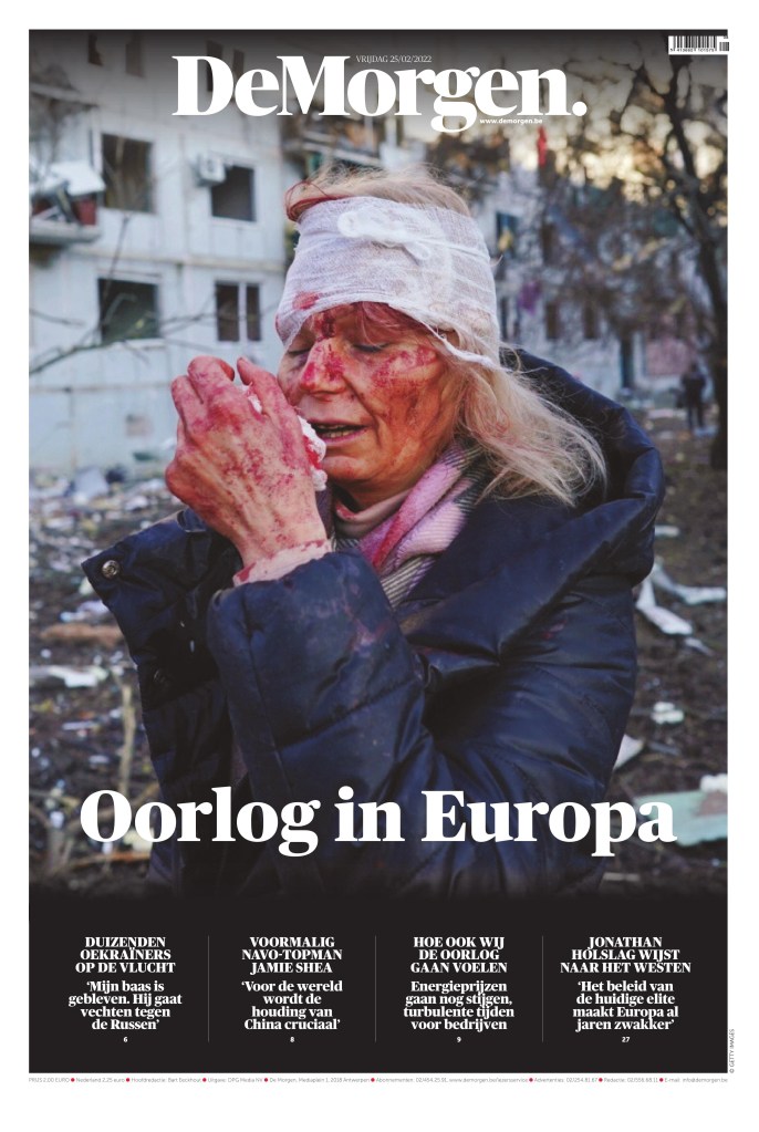
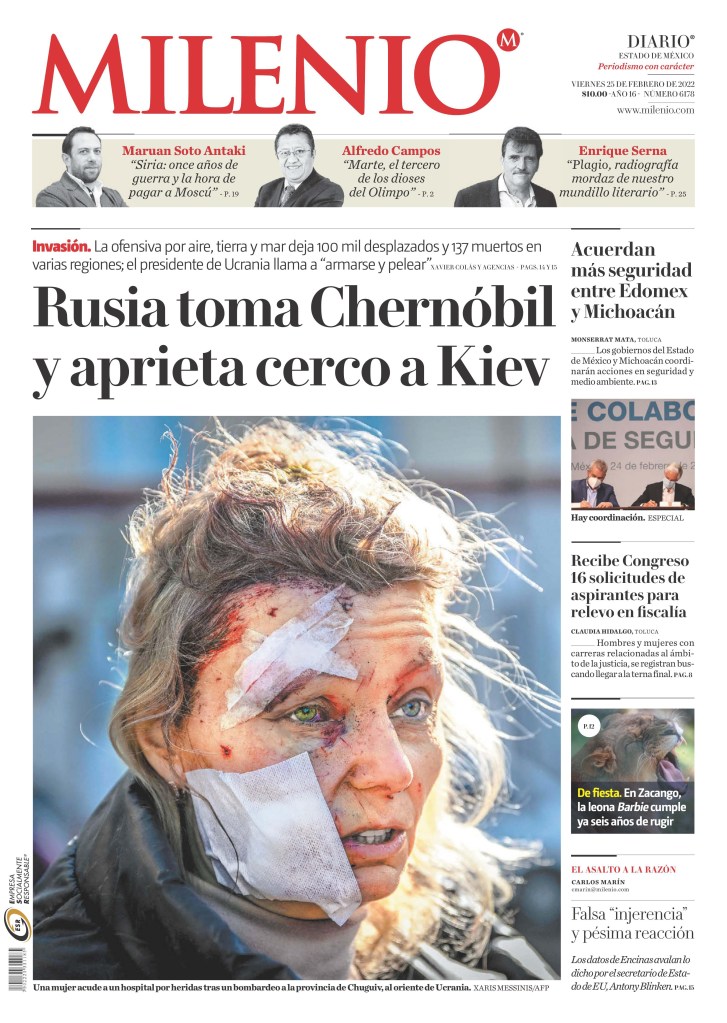
When war strikes, we see the casualties on front pages. The injured. The common person. Sometimes the dead. This woman was on papers all over the world, either this pic or a similar one, as seen on the National Post cover, and below. As the woman further down was also common on a lot of pages. This is what war looks like.
It was a big news day in Minneapolis as news also came out about the George Floyd case, another story that has caught the world’s attention over the past nearly two years. The editors had to balance a huge local story with the biggest international story.
Star Tribune, Feb. 25, 2022 (Minneapolis, Minn.)
Sadly I am sure there will be many more pages like this over the coming days and weeks. War is brutal. War is ugly. Hopefully newspapers around the world can help hold Russia to account. To show the world, to capture for history, the brutality of this unnecessary war.
By Brad Needham (but mostly by newspaper designers around Canada)
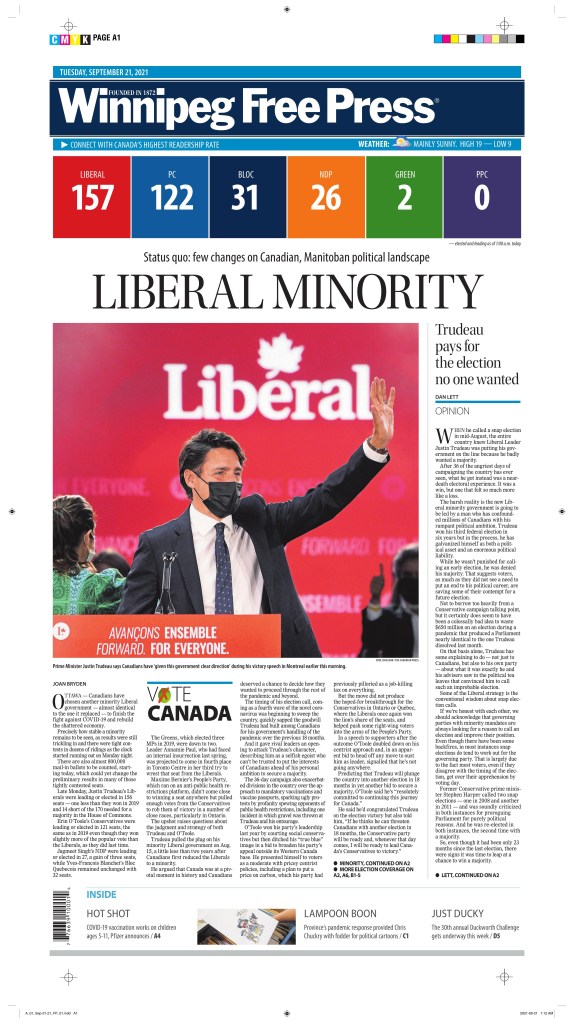
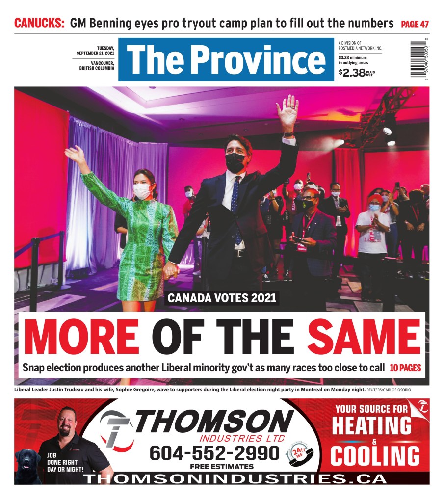
It looks as though making an election newspaper during a pandemic is just as hard as voting in a busy Toronto riding during a pandemic. That is to say not easy. Very little art, no gatherings, no big hugs or ecstatic faces. Despite the results coming in early (as I — and any experienced journalist — would have guessed!), there wasn’t a ton of fresh art used today. I admit I had delusions of grandeur, of waking up to front pages that blew my mind. I love elections, and I love election newspapers. What does blow my mind about these is that most of this work was likely done in people’s homes. That’s an incredible feat, so congrats to all the editors who made this happen. There are some nice looking pages, for sure. I hope for more tomorrow.
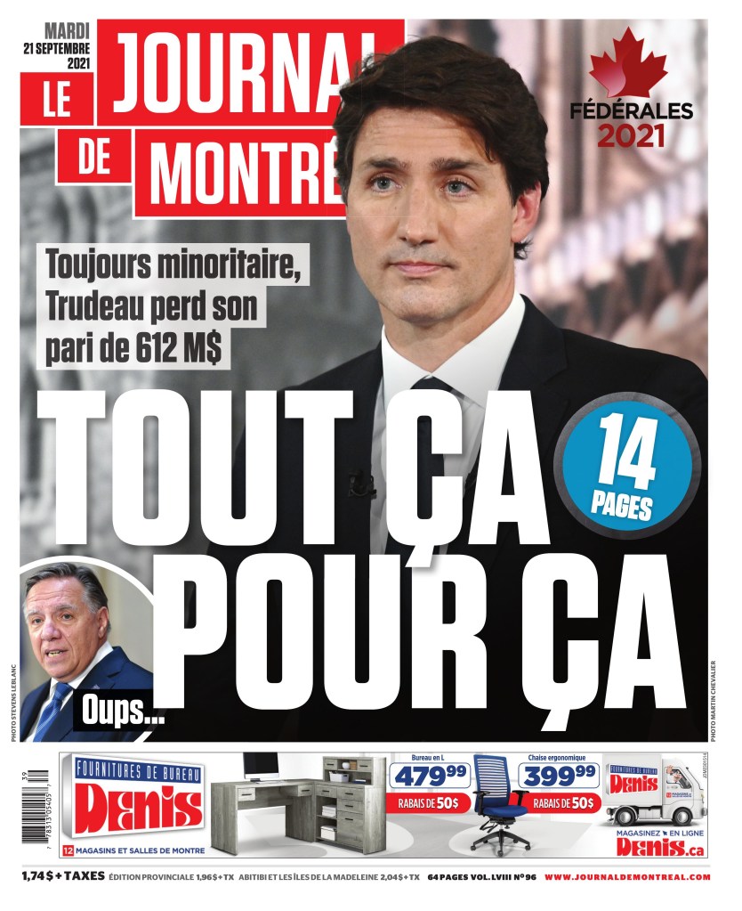
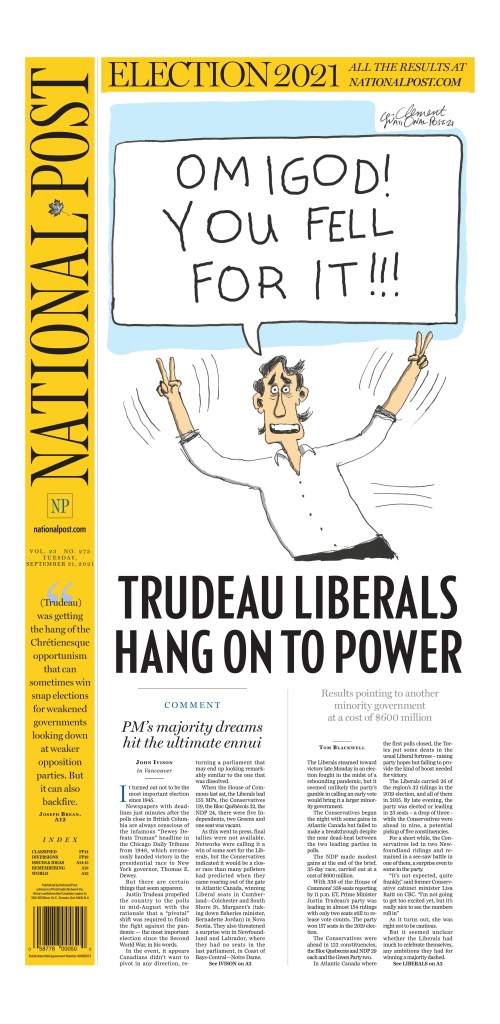
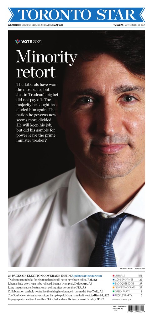
Without too much political commentary, and for those not following Canadian politics — which probably includes most of the world and a good chunk of Canadians — this was an interesting election to cover. A minority government that brought itself down and came back as a nearly identical — almost to the seat — minority government, with a Quebec nationalist party seeing the biggest increase (which was still tiny). Naturally, with $612 million spent, it has caused some opinions to be formed in Canada, including in the media. Some in support, some clearly against. That is captured in some of these pages.
The papers that used fresh art and took a more neutral approach win my election newspaper edition of the this blog! The Globe and Mail wins a majority, with the Winnipeg Free Press filling the role of official opposition. Here is a selection of pages from this election, with little to no commentary on the content or design. Just the pages for your viewing pleasure.
Globe and Mail, Tuesday, Sept. 21
Winnipeg Free Press, Tuesday, Sept. 21
Montreal Gazette, Tuesday, Sept. 21
And now for some more political leaning covers
Most newspapers have a slant of some sort. These papers chose to display theirs, subtly or obviously, on their election covers today.
September 11, 2001. 9/11. It was a day that changed the world. The attacks in New York, heard and seen around the world. Today marks 20 years since that infamous day. I remember my first indication something was up was waking up to an email from a friend who worked at the United Nations saying, don’t worry, I am safe. Shortly thereafter the world watched as a second plane flew into the World Trade Center buildings. I was in my final year of journalism school so wasn’t in a newsroom, but I have heard the stories. The chaos. Tearing papers apart. Trying to get special editions out. The Guelph Mercury apparently put out an edition with the attacks on the cover, removing all the stories that were there, but left the turns from the original stories inside.
September 11, 2021. Twenty years later, I look at some amazing newspaper covers as the world remembers and reflects on that day. Some are what you would expect. Some are not. It was a tragedy on an unimaginable scale. But this is about the creativity in newsrooms around the world. How do they tell the story visually? I will let the covers mostly speak for themselves. There were dozens (the vast majority of papers in the U.S. had a big 9/11 splash) so I have chosen a few that cover the themes I saw. Some just wildly creative and powerful, simple and elegant. Some showing current photos, some showing destruction. Some taking an artistic approach. Here they are.
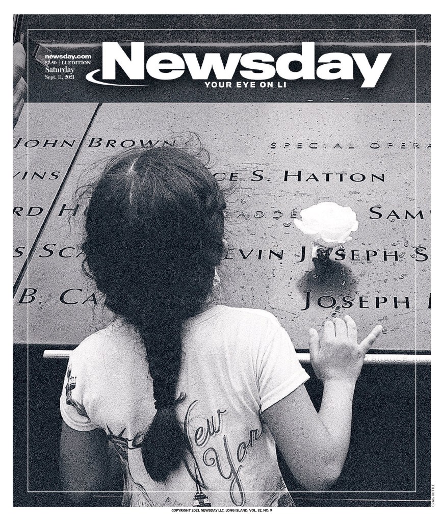
This Newsday cover does so much. It’s different than many others. No towers, no planes, no destruction. Just a little girl. A New York T-shirt. A monument remembering those who died. A single flower.
Definitely the strongest 9/11 front page in Canada. The Toronto Star uses a big, powerful image. So well processed. An image similar to this was used in many newspapers. It was just used better here. Minimal text. Stunning.
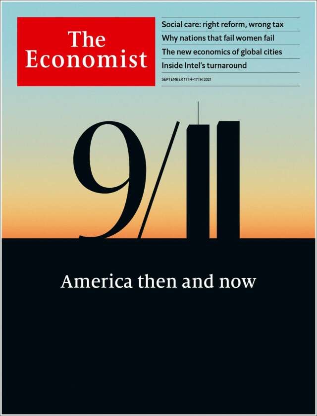
The Dennik N page from Sept. 10 and The Economist from Sept. 11 do something similar with the numbers, similar conceptually, but they look so different. These are two of my favourites. Simple. Beautiful. I love so much that one line, on the first 1, makes all the difference. It takes it from numbers to buildings. So smart.
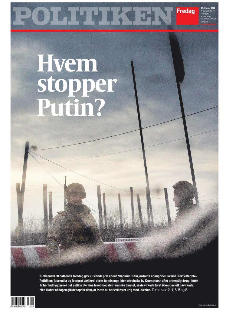
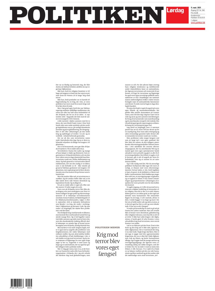
This is a creative page by Politiken. It is so simple.
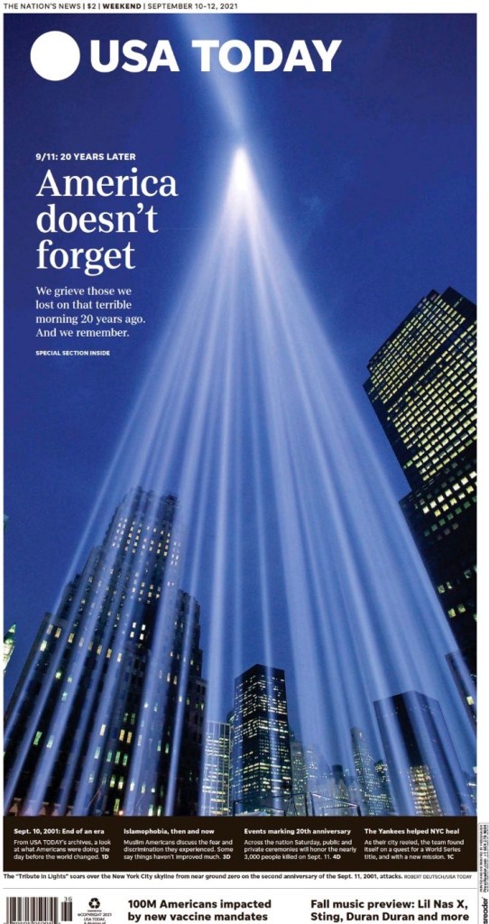
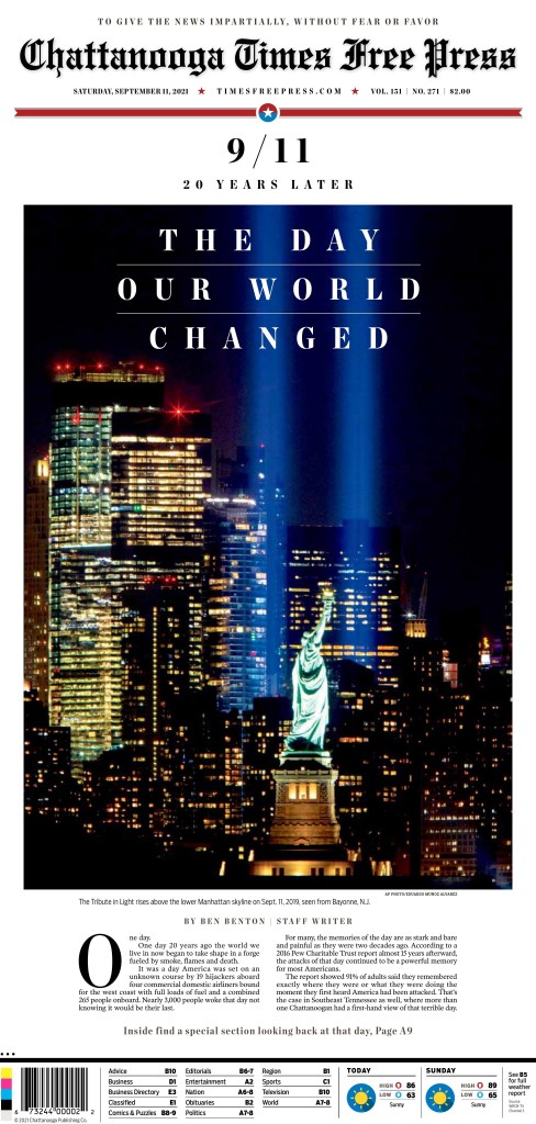
These two — above, USA Today, and below, Chattanooga Times Free Press — went with the big photo of the Tribute Lights. Many papers took this approach.
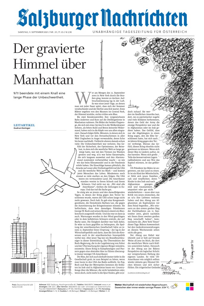
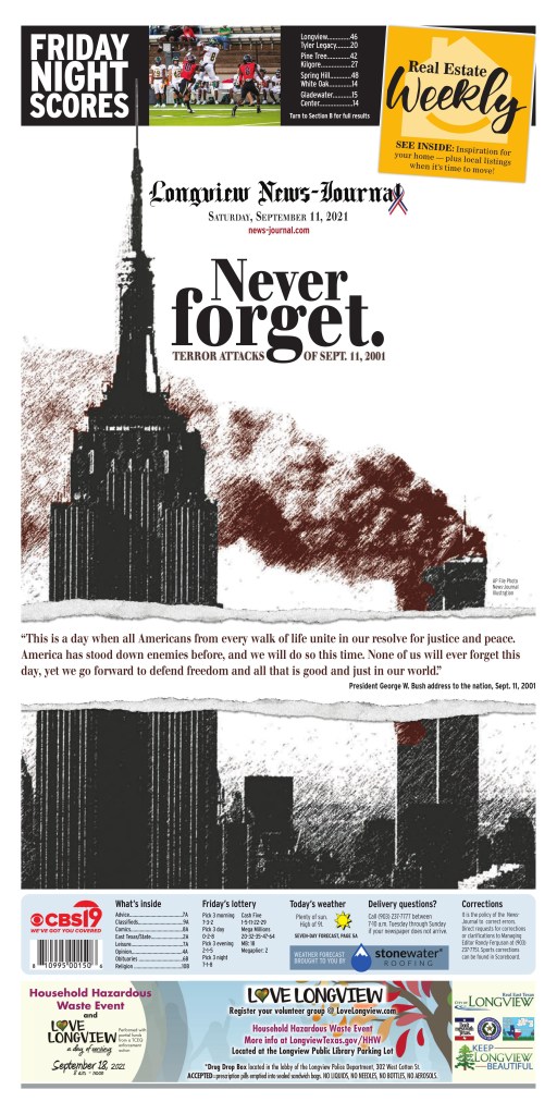
Both these pages used an art-based approach. Above, Salzburger Nachrichten is quite bold. Below is the Longview News-Journal.
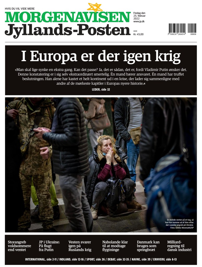
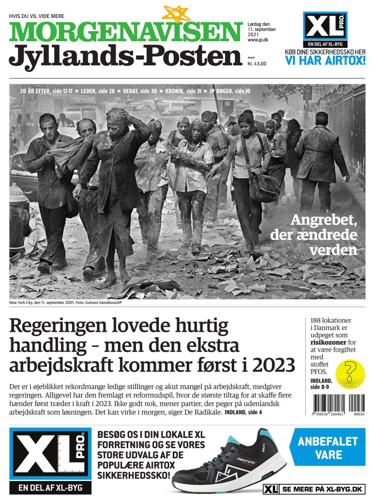
The Jyllands-Posten uses a different photo than most. No destruction visible. But the people. What a photo.
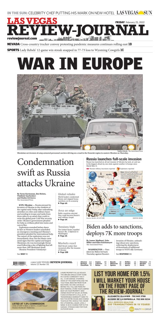
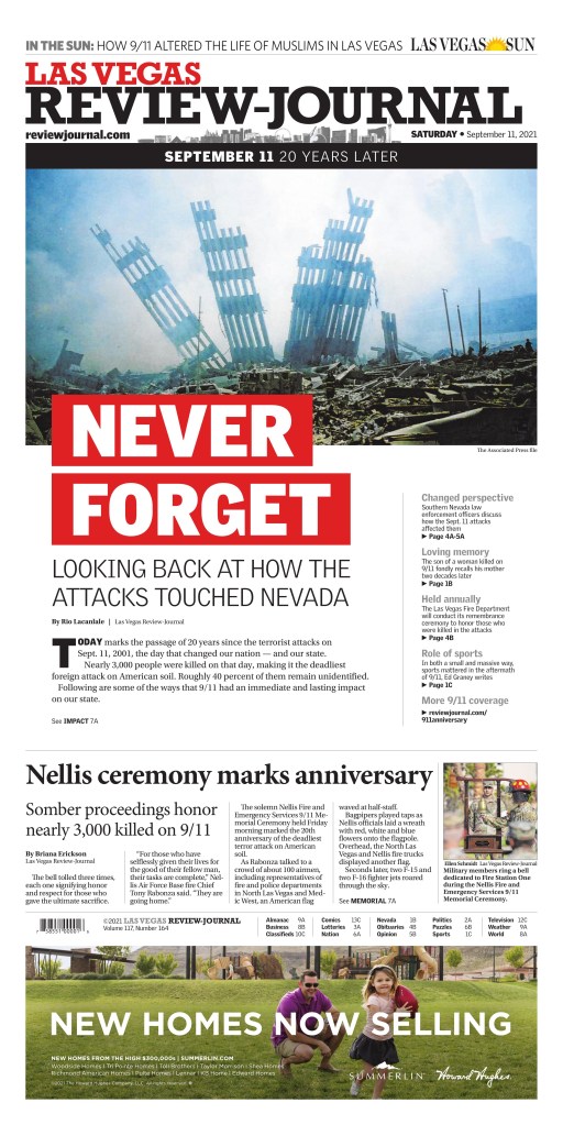
And the Las Vegas Review-Journal. It uses a similar photo to the Star, without the person. This photo was used widely today.
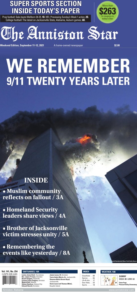
The Anniston Star went with one of the most terrifying photos from 2001. These photos will never not send me right back.
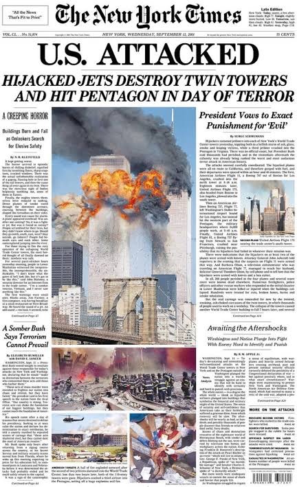
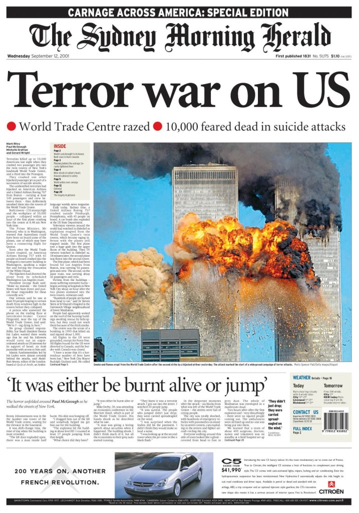
And below are two pages from 2001. I have looked at pages from this time in a previous post, so I won’t go too far into it. The New York Times and The Sydney Morning Herald, Sept. 12, 2001.
On the heels of a major and deadly earthquake in Haiti, Kabul, the capital of Afghanistan, fell to the Taliban two decades after it lost control after a U.S.-led invasion. That is a lot of big news over a couple of days. While there was very little in terms of big pages for Haiti, the same was not true for Kabul. There were several striking pages. It’s a significant story, and one that will be playing out for a long time to come. There will be dire consequences for many in the country, particularly girls and women. Newspapers were right to give it the main play today.
I find it fascinating to see the design choices, both in terms of layout and photo choices. So often there is one photo that stands out. In this case most of the pages used one of two photos. And in some cases the designs and headlines were almost identical. That is not a knock. That’s newspapering. This isn’t the time to for wild design choices or plays on words. These are serious news pages. And these newspapers, all of whom have a strong focus on the world, presented the dire situation to their readers in a way will have an impact. Hopefully the world acts.
Here is a selection of some of the amazing pages from around the world, with the pages mostly speaking for themselves.
The Guardian, Monday, Aug. 16
Globe and Mail, Monday, Aug. 16
The Globe, above, and Hartford Courant, below, are so very similar, but also so well done. They are both powerful pages, achieved with a good, big and clear headline, strong art, and nice but simple treatment of other elements.
Hartford Courant, Monday, Aug. 16
And again this photo. Wow. Used in many papers today. Both the above and deVolksrant below were just three of many who went with this powerful image.
deVolkstrant, Monday, Aug. 16
Jyllands-Posten, Monday, Aug. 16
And a helicopter photo, also used by a handful of papers, including the next three (different pictures or crops, but same idea). The comparison of Vietnam and Kabul is an interesting play in Arab news. A beautiful and powerful headline. It says so much in so few words.
Prince Philip, the Duke of Edinburgh, was a towering figure, both in physical and societal stature. The husband of the longest serving monarch in British history. Married for more than 70 years to one of the most powerful woman in the world. Himself the longest serving royal consort in British history. While he retired from his royal duties in 2017, his stature didn’t fade. Prince Philip died two months shy of his 100th birthday.
Newspapers are often ready for the death of a significant figure. While nobody likes to think about or predict someone’s death, readers have come to expect information immediately. There has been a long practice, perhaps nearly as old as journalism itself, to prepare obituaries for key figures ahead of their deaths, particularly for anyone who could be at greater risk. So media organizations will have obituaries prepared, starting with “z-copy”, a.k.a., their history, so all that needs to be added are the new details, such as when and where the person died, any recent events or interesting information, and then refining as required. That allows the story to be posted very quickly, and then it can be refined later. But that’s the story. What about the design? Readers demand the story immediately. The design comes next.
In most cases, newspapers won’t have predesigned pages, unless something is imminent. In the case of Prince Philip, he had developed heart problems in his 80s, and was recently hospitalized. It’s possible media organizations had started to compile key photos. But it’s unlikely it went much further, though that very well might not be true of papers in Britain. While the Duke of Edinburgh was a significant figure around the world, particularly in Commonwealth countries, no where would his stature be larger than at home.
While media often struggles with just want to say about key figures when they die — do they mention Prince Philip’s racist comments and other offensive remarks over the course of his life? — the same is often not true in design. The design captures the gravity of the situation — or the gravitas of the person. While the display copy — either the headline or the deck — might capture some of the negative aspects of the person, it is generally left to the story to capture the nuances. The good and the bad.
Today newspapers around the world had some amazing front pages that did just that. It captured what he meant to so many. The good and the bad, of him and the monarchy. There will be more powerful front pages after his funeral. For today, I want to put a spotlight on front pages mostly from Britain, but some from other Commonwealth countries as well. I will let the pages do most of the talking, as that is the power of a great front page. It shouldn’t need much help.
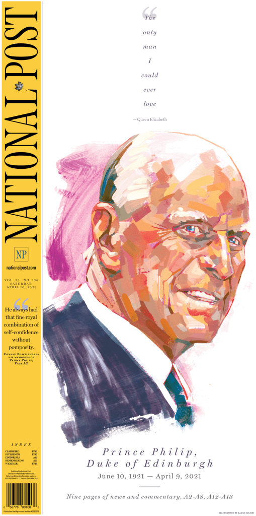
I will start at home for me, with the National Post. It was the best cover in Canada, one of the best in the world today. And on days with big events, it often is. It is known for its bold design. It used the entire front page real estate and showcases a beautiful illustration by artist Kagan McLeod. A great use of white space and an emotional quote, played small, but powerfully. It’s entirely possible the National Post had this illustration ready to go already. If not, it’s even more amazing. In Canada, the announcement came with hours to go before deadline, so papers had a chance to give design more consideration.
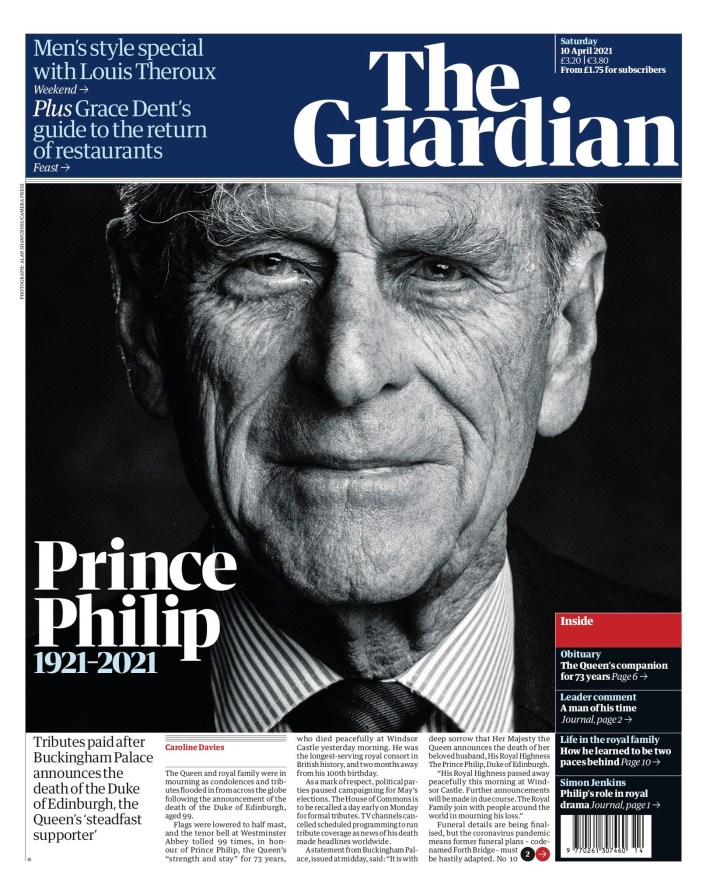
British papers on the other hand would have had less time. But they all did well, which speaks to how committed print journalists still are to their craft. No surprise that the Guardian would have a powerful cover. A stately portrait, his name, and the dates he lived. Simple and effective.
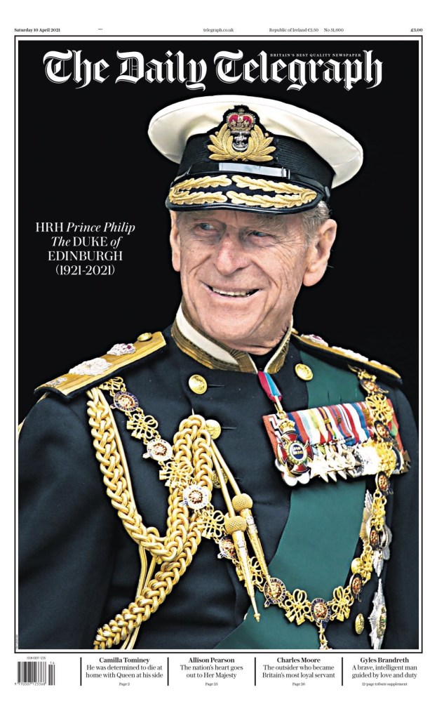
The Daily Telegraph has similar play to the Guardian. Elegant photo, name, dates. And that’s all you need.
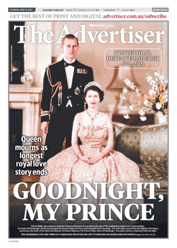
The Advertiser in Australia uses a classic photo of the prince and the Queen. The big headline, all caps, GOODNIGHT, MY PRINCE, captures the emotion. These are still human beings. They had a long marriage, many trials and tribulations. This page evokes nostalgia.
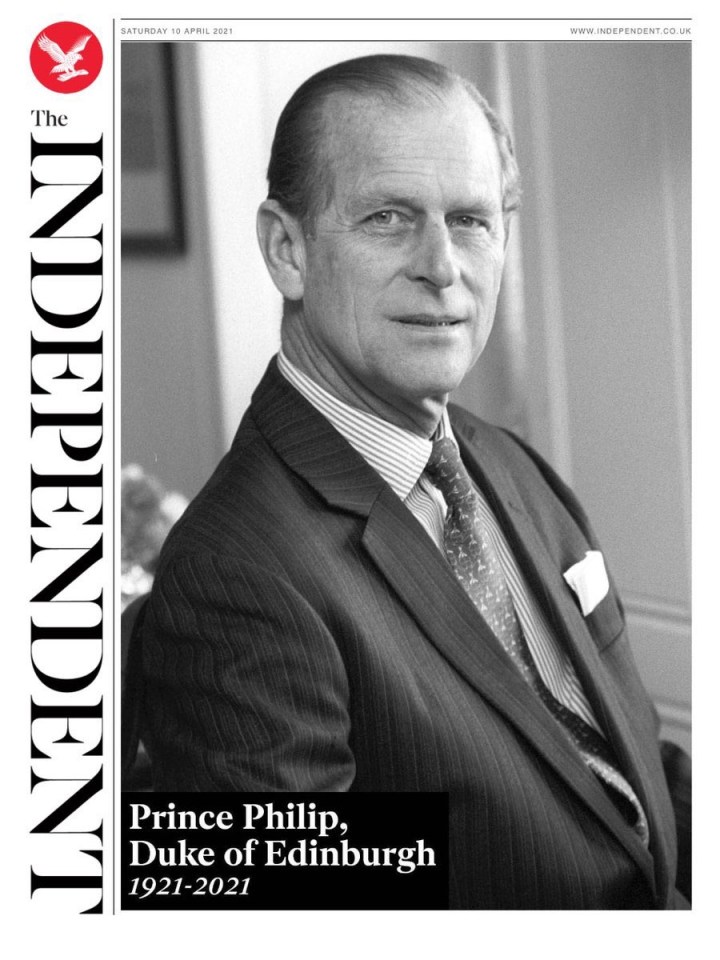
The Independent has a similar but slightly different approach. A black and white portrait, capturing a younger Prince Philip. A lovely page.
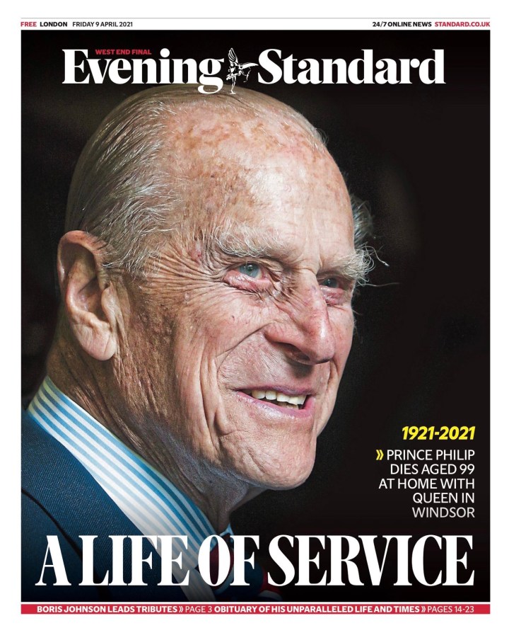
The Evening Standard went with a more recent photo. Capturing the now. It’s a beautiful portrait of man who lived a long, full life. A headline about his service. He was actively serving royal duties until 2017.
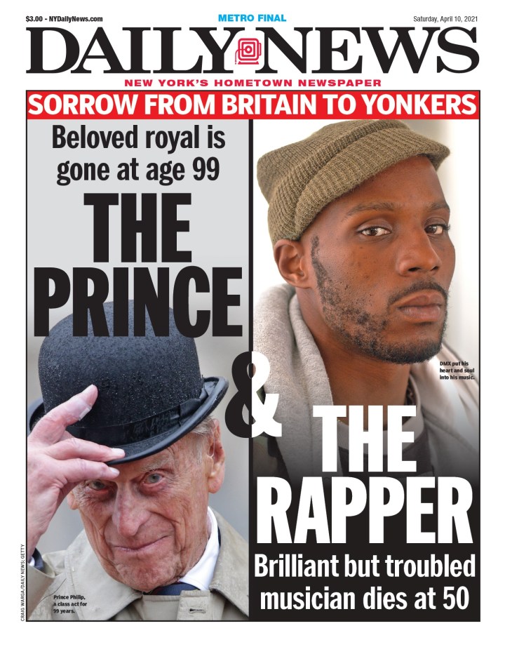
I chose this one for a different reason. The design is nice. But the Daily News also split the attention between Prince Philip and DMX, and many thought it should have been DMX getting these covers instead. The page has some issues, as it highlights the troubles of DMX, but doesn’t touch on any of the controversy around Prince Philip. But I respect that the paper, in New York, knows its audience. Readers expect DMX to get attention. And he should have. He was very influential. On any other day, he would have been the cover. And in many papers, maybe he should have been anyway.
There were plenty more worth celebrating for their creativity and power.
Expect more powerful covers after Prince Philip’s funeral. It will be a major event and the world will be watching. While many will watch it live, newspapers will do their best to capture the moment with a strong front page. Have thoughts? Share them below!