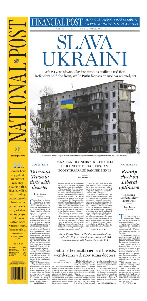
After months of threats, of world leaders warning an invasion of Ukraine was imminent, one year ago today, Feb. 24, 2022, Russia began an unprovoked war. Many thought the super power would roll over Ukraine. But one year later the war continues, with surprisingly little change, other than the tragic and large-scale loss of life on both sides and massive destruction in Ukraine. One year ago, the invasion dominated newspaper front pages. It dominated it for weeks. But, as happens with long-running stories, it started to fall off the front, and move inside newspapers, or down media home pages. Certain events would bring it back to the front. Media have tried to keep the war in the collective consciousness. Today, one year since the invasion, the sombre anniversary has brought the war back to newspaper front pages all over the world.
As I Tweeted out a few pages today, as a journalist, for a second, I debated the hashtag #RussiaInvadedUkraine, worried about showing bias. But reporting facts is not bias. Russia invaded Ukraine. And newspapers have not shied away from that.
Today, Poland delivered the first Leopard tank to Ukraine. Most of the world still stands behind Ukraine.
Here is a selection of some of the stronger front pages marking the anniversary.
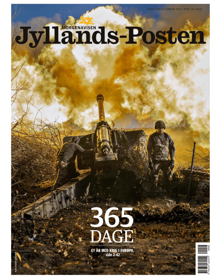
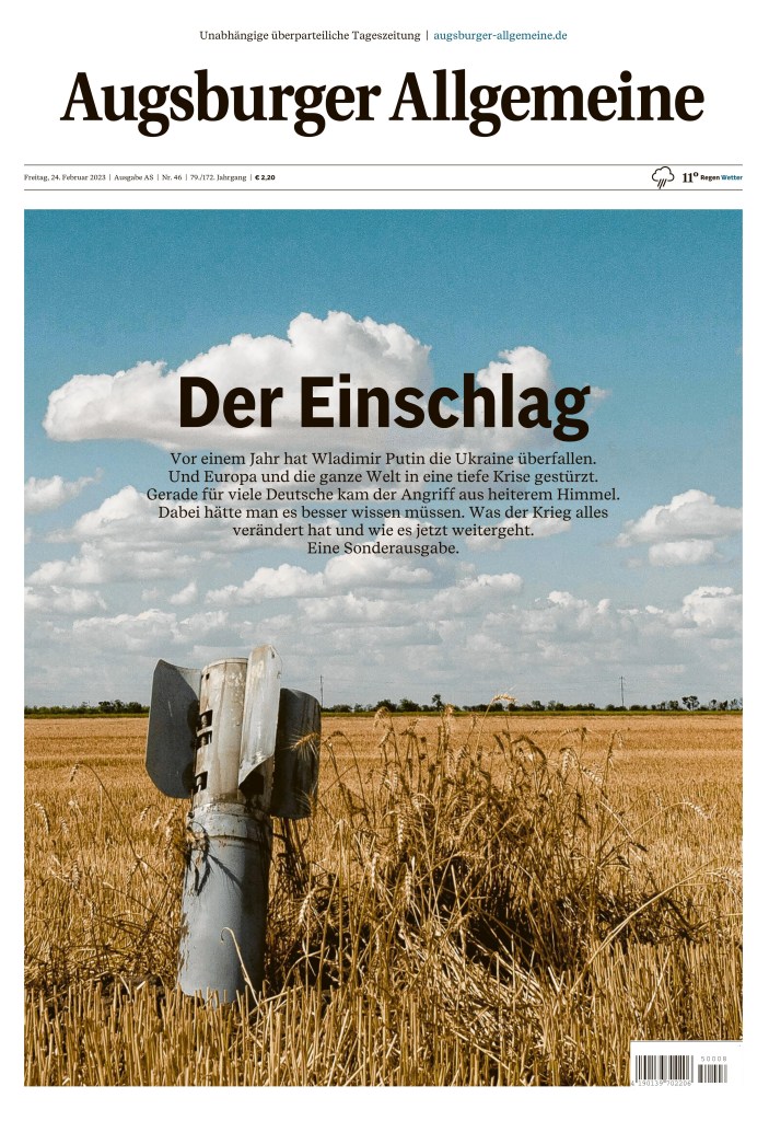
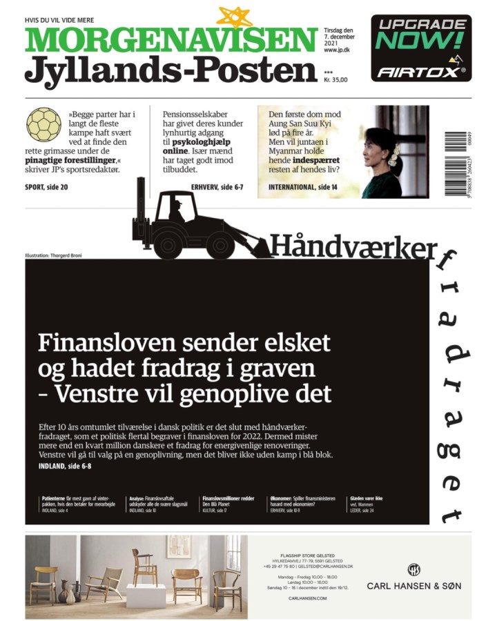
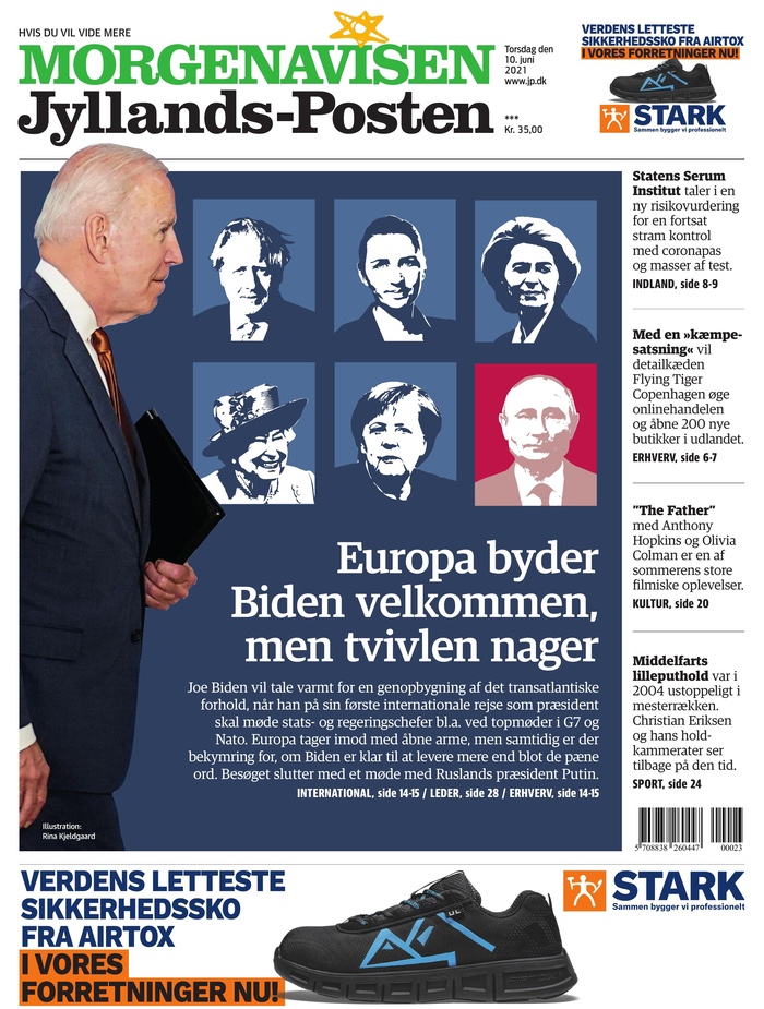
Jyllands-Posten front page, Feb. 24, 2023, Viby, Denmark
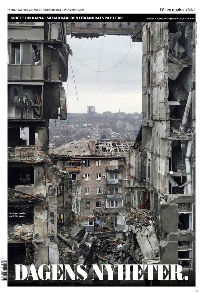
Dagens Nyheter front page, Feb. 24, 2023, Stockholm
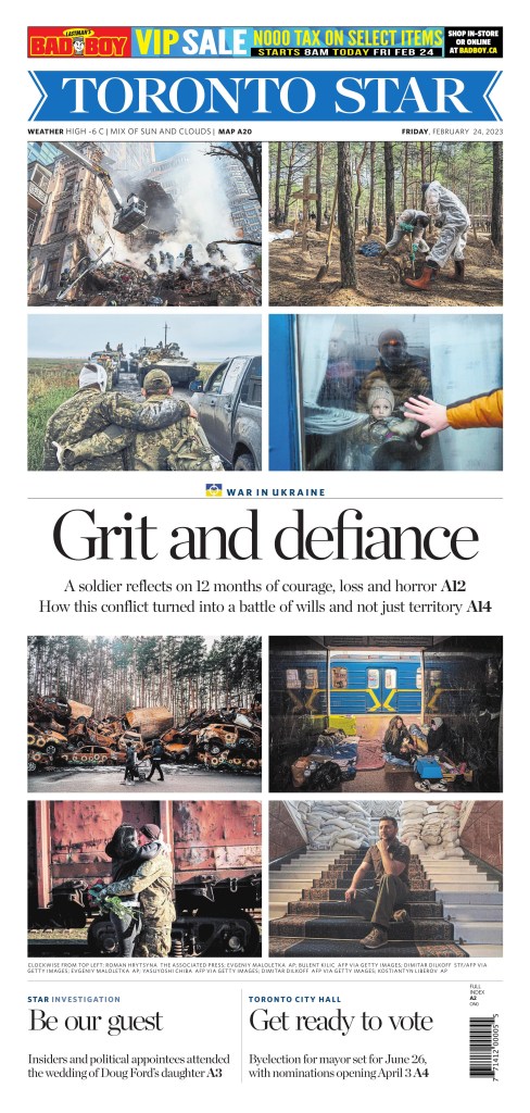
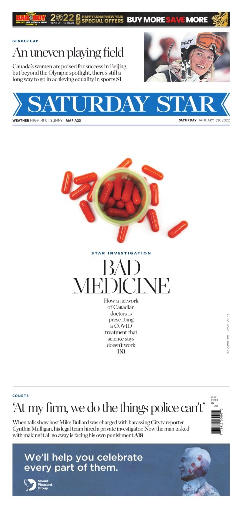
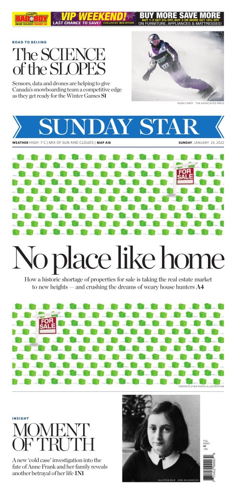
Another week, another batch of nice newspaper front page designs. Showing my Canadian bias I will start with Canada! As always the best pages tend to fall in Saturdays and last week was no exception. The nicest page of the week goes to the Toronto Star this time.
Toronto Star
Toronto Star, Jan. 29
I am a sucker for white space it’s well done. This almost beefed on too much but not quite. On top of that it point to an important piece of journalism.
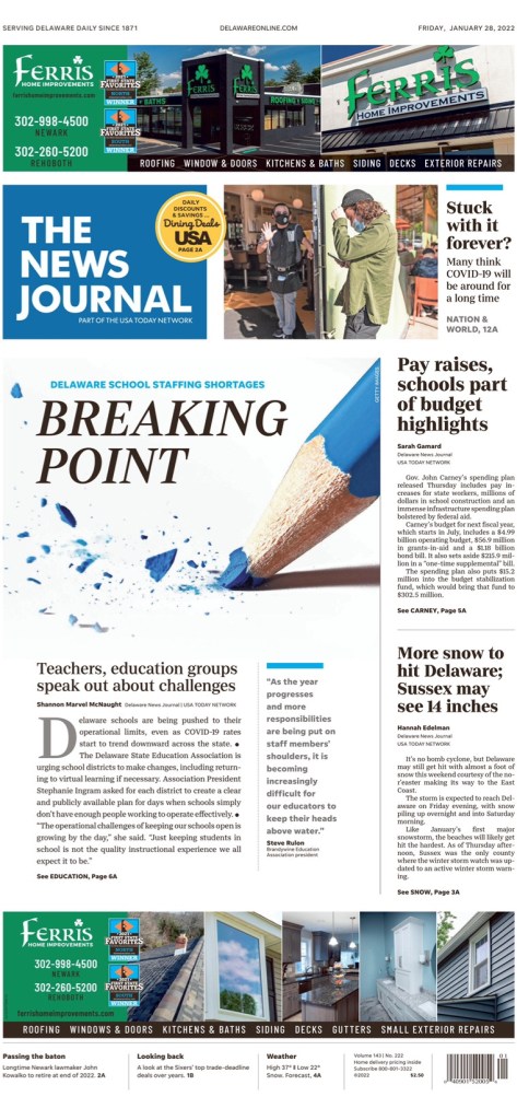
The News Journal Wilmington, Delaware
The News Journal, Jan. 28
I love this page. Well-played stock art and creatively conceptualized. Again well used white space. Nice headline that works with the photo.
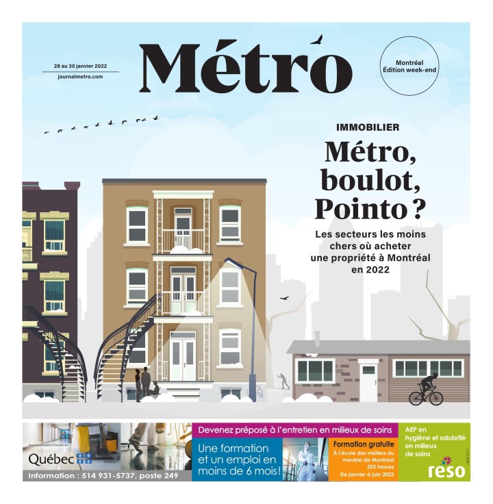
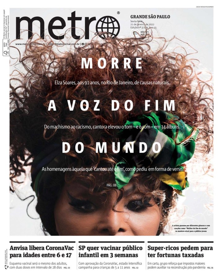
Metro Montreal
Metro often has beautiful pages like this one. It’s just a pretty and smart illustration. They use the small space well.
Metro, Jan. 28-30
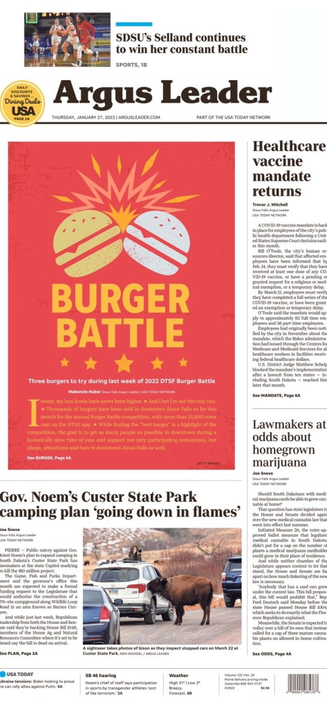
Argus Leader Sioux Falls, South Dakota
Argus Leader, Jan. 27
Burgers! A nice break from war, anti-vaccine protests, Donald Trump (had to know he’d be back). This centrepiece is just fun. Not just. It’s also well executed. Nice colours (just enough to be contrasty enough), the clashing, the stars. I
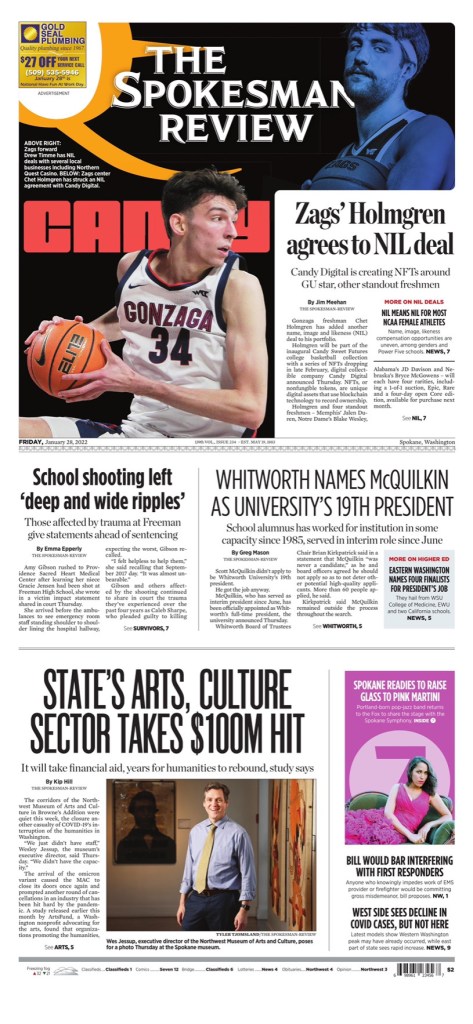
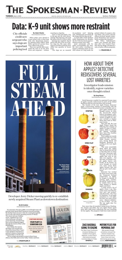
The Spokesman Review, Spokane, Wash.
There were a couple from the Spokesman Review I liked last week. No surprise. You’ll probably find at least one every week. Their pages just speak to me. It’s my kind of design. But I will highlight the flag on this one, as that is what makes this page stand out.
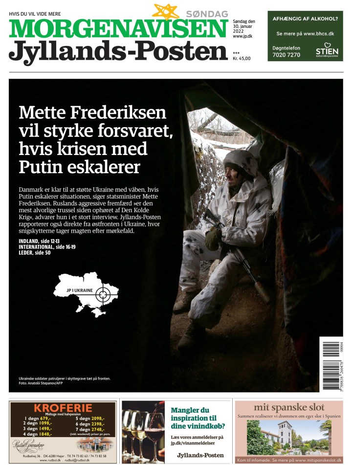
Jyllands-Posten Denmark
Jyllands-Posten, Jan. 30.
I like the black, the contrast. It’s a simple page with limited content. Nicely played where the words on the picture don’t take away from it, but complement it.
That’s all! Watch for more great pages next week. Want to submit a page? Reach out.
Old news? Booooooring! Old newspaper designs? Exciting! If you disagree, you’re in the wrong place. Beside my desk, on a special table dedicated to newspaper design, sits a handful of Society for News Design Best of Newspaper Design books (as well as some awards and the National Geographic from June 1985, featuring the young Afghan girl with the piercing eyes). I still look through the SND books, and am amazed by how the newspaper design has held up years later. So when I thought about posting newspaper pages from the previous week, I though certainly those would hold up!
Most days there is a newspaper front page or two that stands out. Maybe it will never be award winning (recognition for newspaper design is becoming an endangered species), but there are pages worthy of attention for the effort and creativity put in. I look through more than 500 pages every day. Some days nothing catches my eye. But that’s why it’s worthy of attention when something does.
So, life permitting, I’m hoping to post a few of my fave newspaper designs from the week prior. I post daily on my Instagram. I will generally choose from the pages I posted there, though there are occasionally pages I don’t get around to posting.
These short posts will be driven by the pages not my words, unlike the babbling above! But I had to set it up somehow. Don’t judge me.
Here are a few from last week.
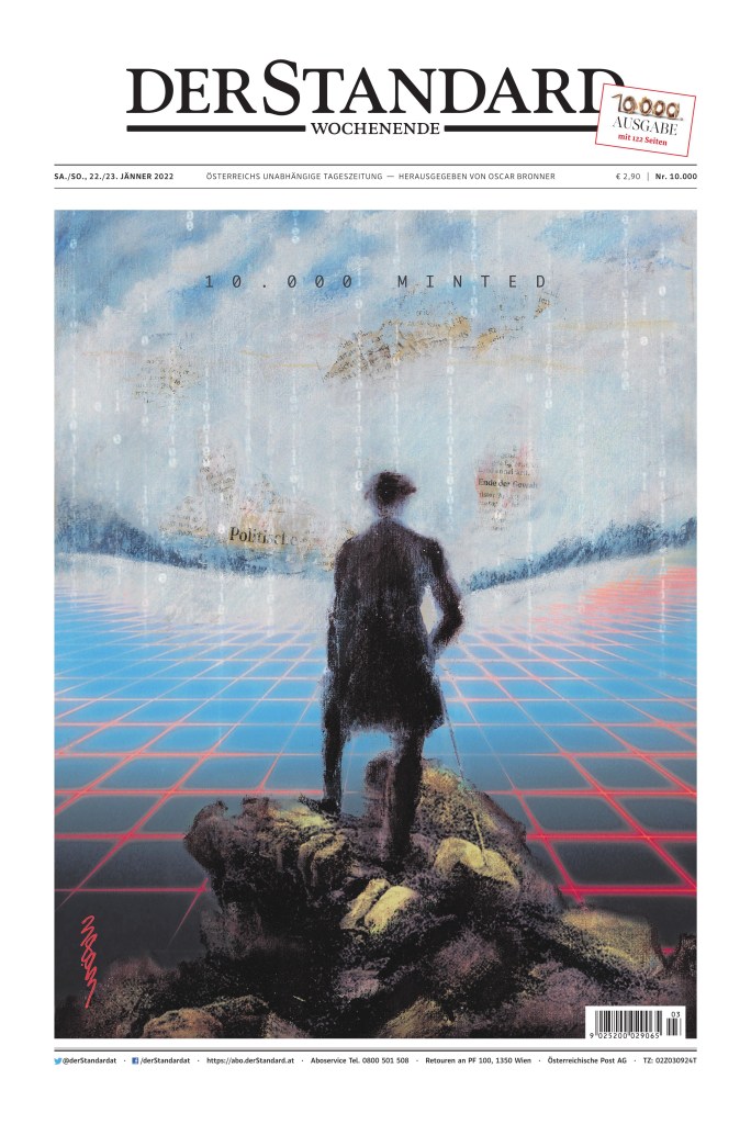
Der Standard Austria
Der Standard, Jan. 23, 2022
I made no secret in twitter and my instagram that I loved this page. It is not lost in me that it is completely driven by the art, which I find stunning and so smart. Print and digital together. Newspapers barely visible through the sky. and it is to celebrate the 10,000th print edition. How many more will there be? Is that what this hints at? The demise of print or how print and digital will work together for a common goal?
The art is being auctioned off as an NFT (non-fungible token).
Die Titelseite der 10.000sten Ausgabe des STANDARD ziert das Bild "Meta Citizen" des Künstlerduos 3893. Es kann als NFT bei @ArtcareAt ersteigert werden. Der Erlös kommt Studierenden der Akademie der bildenden Künste in Notsituationen zugute. Mehr hier: https://t.co/QxS2EloJDNpic.twitter.com/e3JIEPw7e1
A nice Saturday page by the Toronto Star. It’s likely every weekly roundup will feature at least one page from a Saturday publication of Canada’s big three
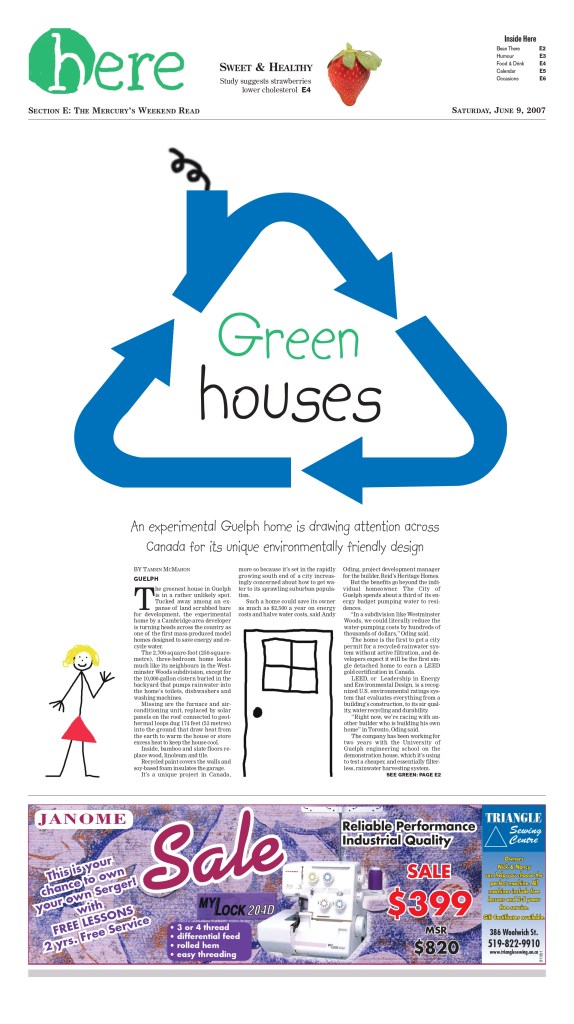
Monopoly houses are nothing new in design. I’ve done it. And I almost did that t another time before creating one of my favourite pages, pivoted below, before taking another approach. But in this page the for sale signs make add that extra touch.
Guelph Mercury, June 9, 2007
This was mine. I thought the design was begging for a green monopoly house, given the headline. But I took a different path. If you can believe it I did the art myself.
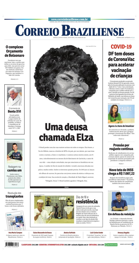
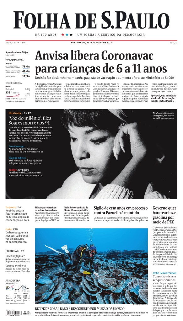
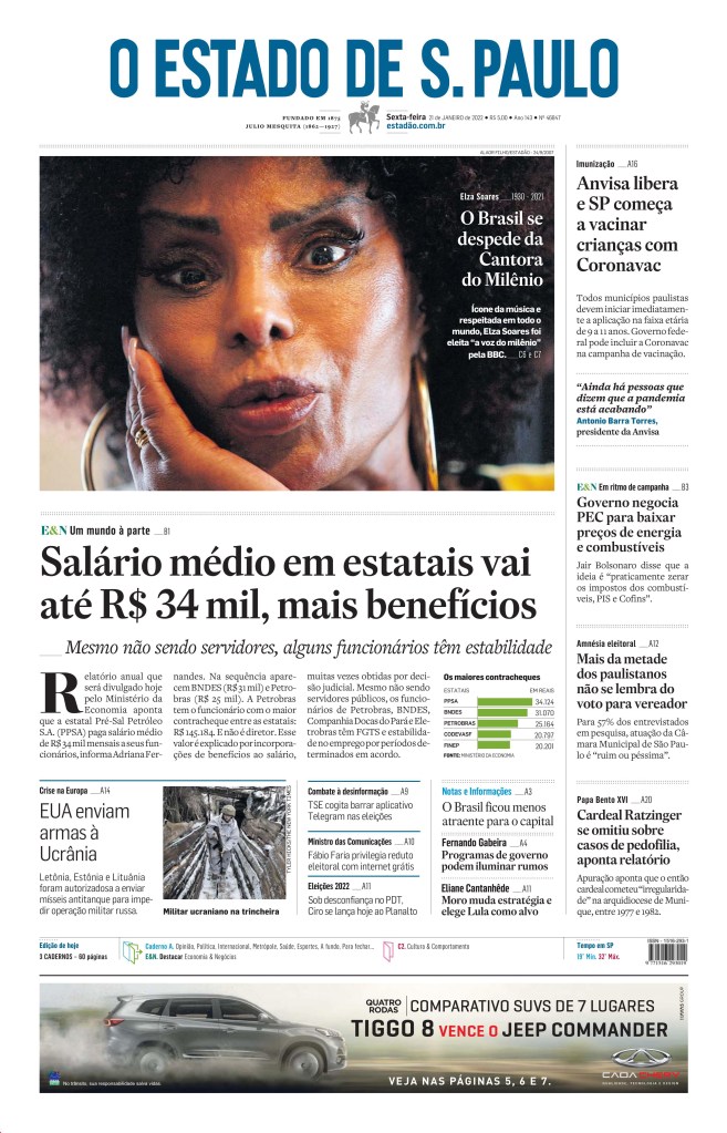
Tributes to Elza Soares
Here are some tribute pages to great Brazilian singer, Elza Soares, the samba queen as someone remarked on Twitter. The Metro page is amazing but the others, Correio Braziliense, O Estado de S. Paulo and Folha de S.Paulo, are great as well. Nice tributes.
There were some other great pages. You can see all of the ones I like on my Instagram.
The world has a lot of newspapers. With the help of Freedom Forum’s Today’s Front Pages website, the pool I generally look at as been narrowed down greatly. I will look at the best front pages I’ve seen from newspapers around the world. And this is A1 only. Papers like the L.A. Times and New York Times, and so many others, do amazing things with features sections. One day I will look at those. Today, A1s. And like the post from Canada’s best, I am highlighting the papers that go above and beyond regularly.
Anyone who follows my Instagram will see the same papers again and again. That is not because I am ignoring other papers. It’s because these papers are consistently producing great pages, while other papers don’t. Many do once in a while. The papers below do it regularly.
I will pull out a few of the top pages from each, and then put the rest in a slideshow. There was some outstanding work in 2021.
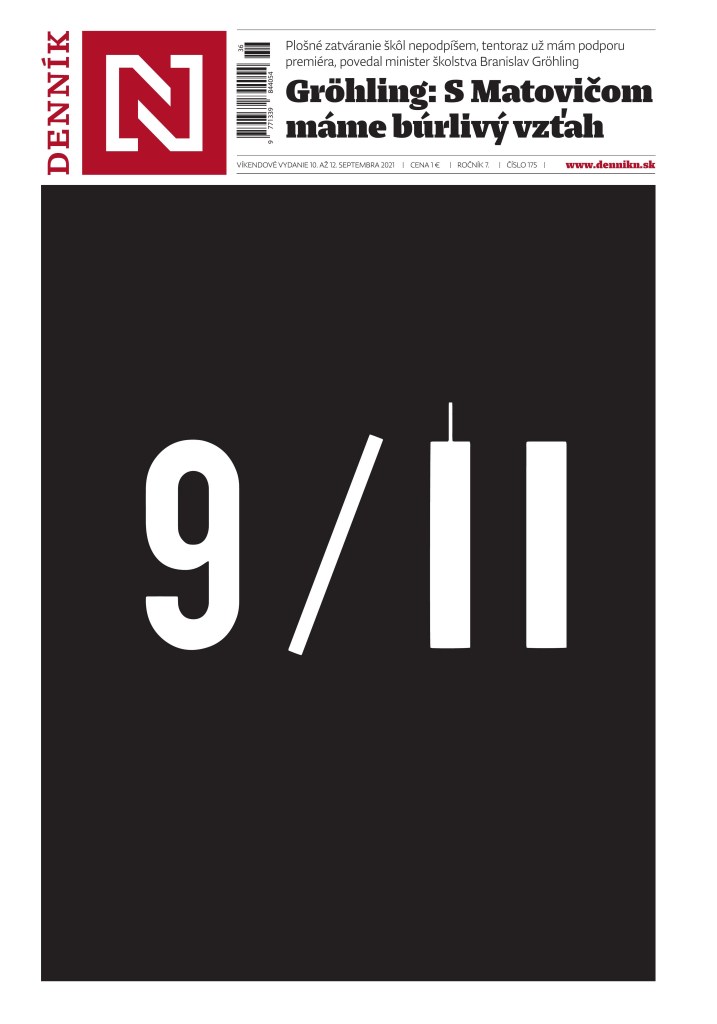
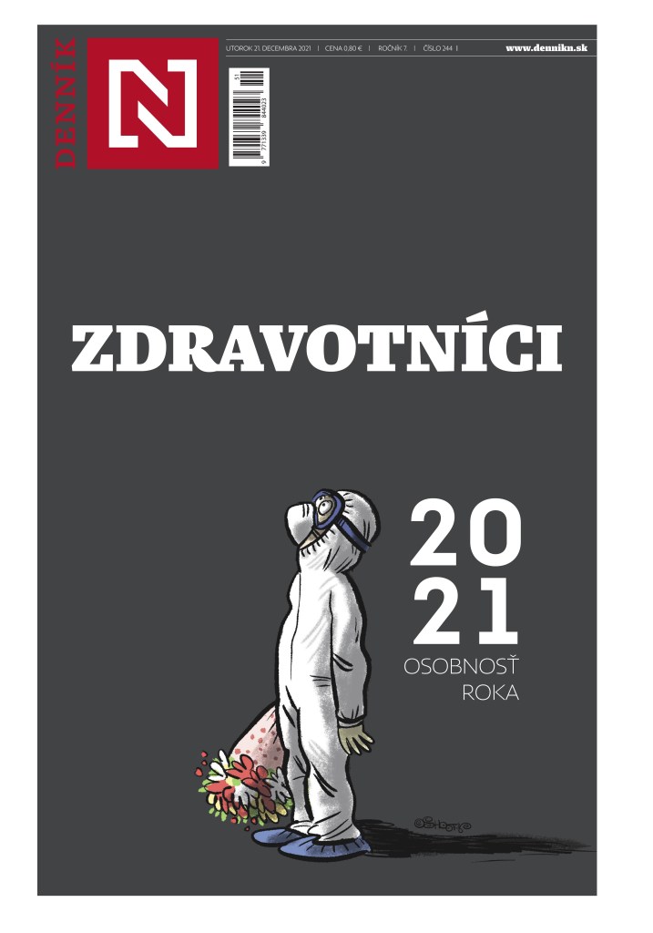
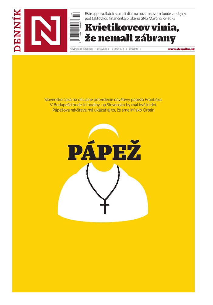
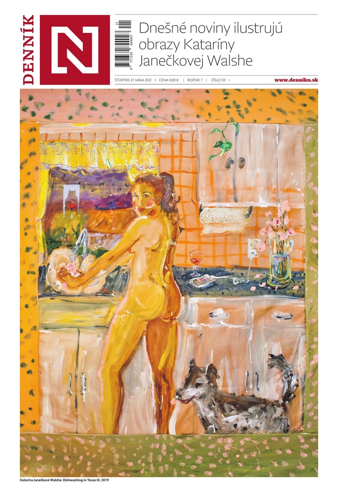
Dennik N Slovakia
What can I say about this tab. I have been in awe of Dennik N since I first started really paying attention to pages from around the world. I look at 500+ every day, and every day I could highlight the front page from this publication. They definitely have their own style. The cover often has cartoons, and the characters come back again and again, like the health-care worker (shout out to them, as it’s been a trying two years to say the least). On average, I enjoy more covers from this paper than any other in the world, though Reporte Indigo has some breathtaking stuff as well. All illustrator-driven.
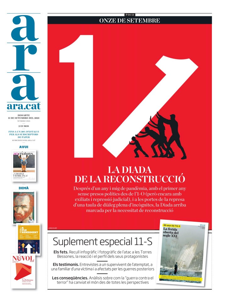
This 9/11 page was one of the most powerful, and simplest, to mark the 20th anniversary. It was so close to another cover, not featured here. Just the idea of adding a thin line to the top of a thick line. It was just 1. Now it’s a 1 and a tower. Simple. Powerful.
This little dude made a few appearances. Health-care workers were in the spotlight as COVID ravaged our lives. My life is more difficult. I can’t imagine working in health care right now. This little guy was always just right.
I don’t think much needs to be said about this one. It’s just simplistically beautiful.
I could go on forever with the paper. They do amazing stuff. Maybe one day I can talk to one of the designers. Here are some more from this amazing paper.
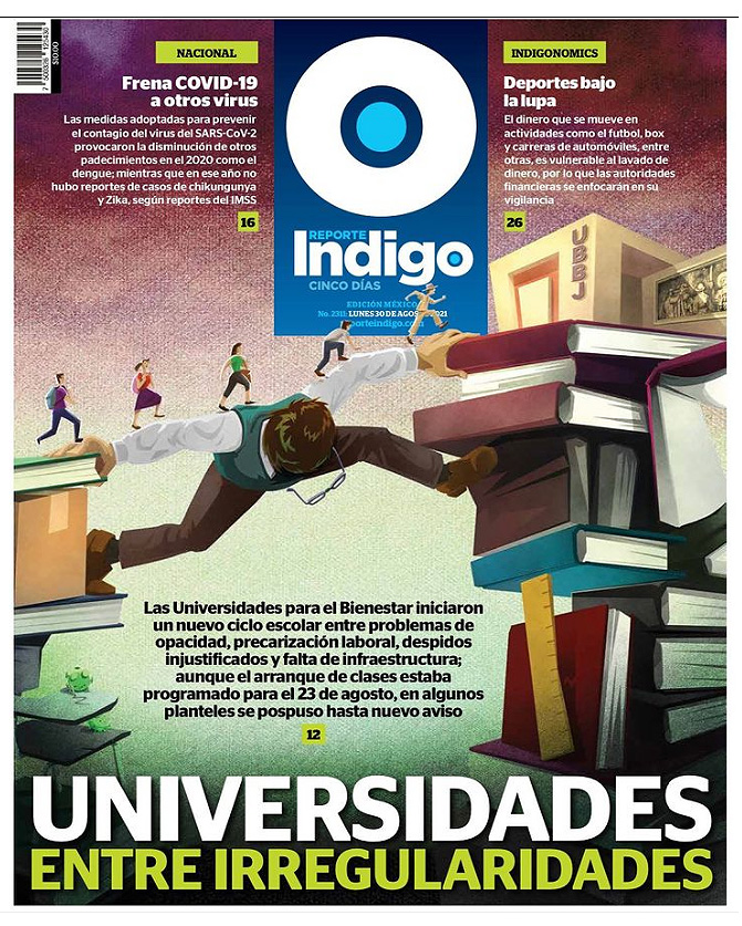
ReporteIndigo Mexico
Like Dennik N, but to the extreme, Reporte Indigo is driven by illustrations. Unlike Dennik N, which often has basic and simple illustrations, Reporte Indigo has elaborate pieces. The work is always stunning. Always worthy of recognition. I don’t have as many from them as they aren’t on the Freedom Forum site. I only found where to get them partway through the year (the entire paper can be downloaded from their website, and you can see it on PressReader). The art goes on throughout, every page pretty much. I can’t imagine how much time and effort this takes, so kudos to them. It’s gorgeous. This first one is truly mind blowing.
I just loved this visual when I first saw it. And I love the little dudes walking past the flag. That is some attention to detail.
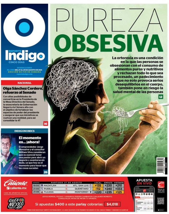
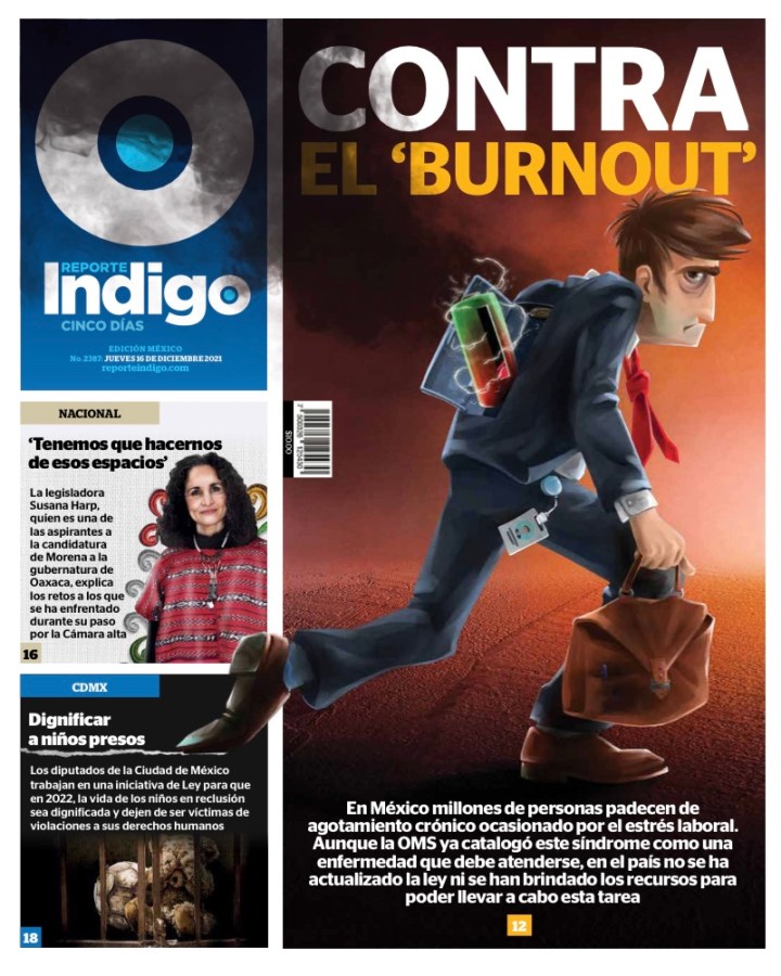
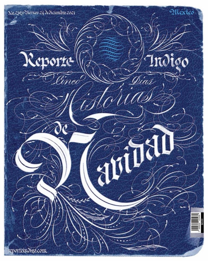
And here are a few more. You get the idea, but damn, they look so labour intensive. A for effort, and unreal execution as well. But loving how hard they work.
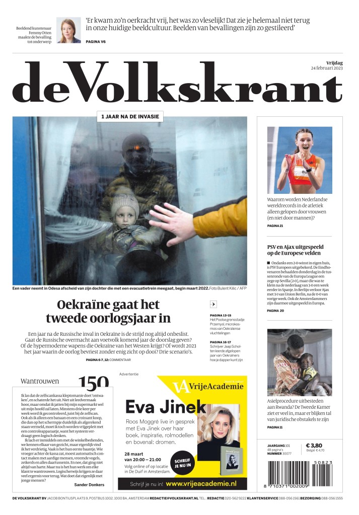
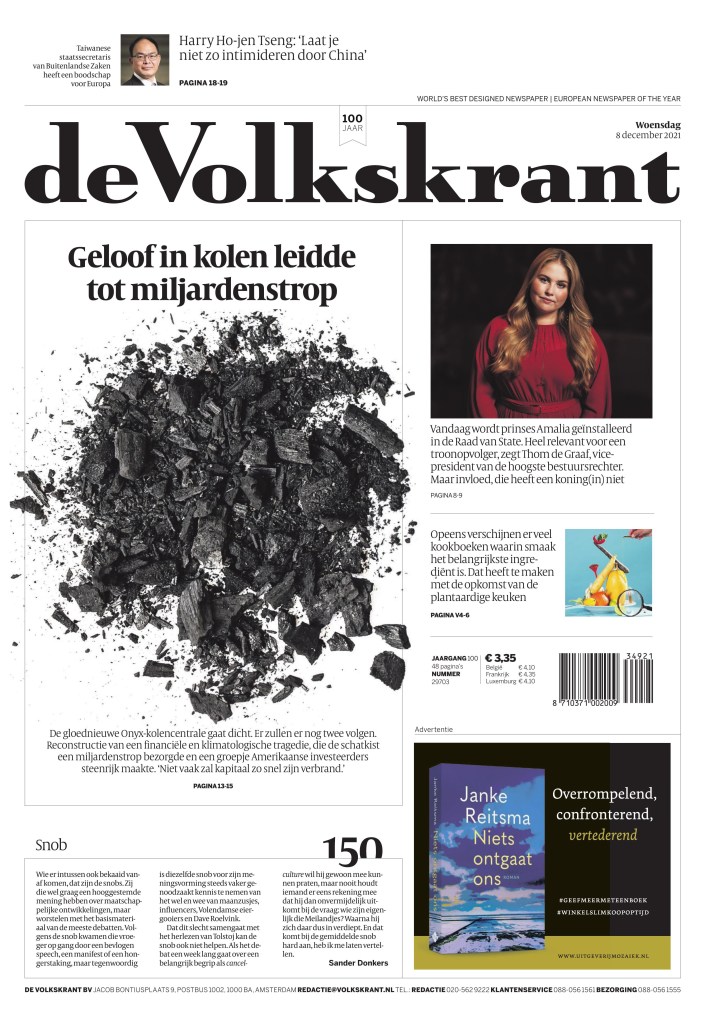
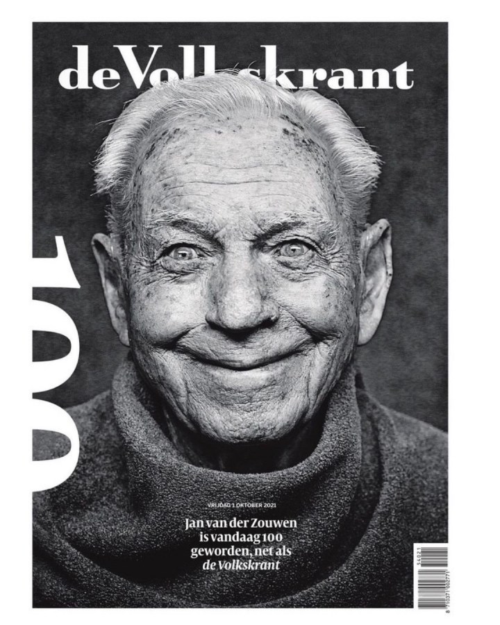
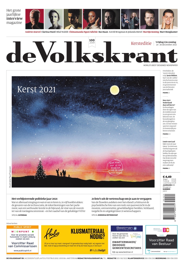
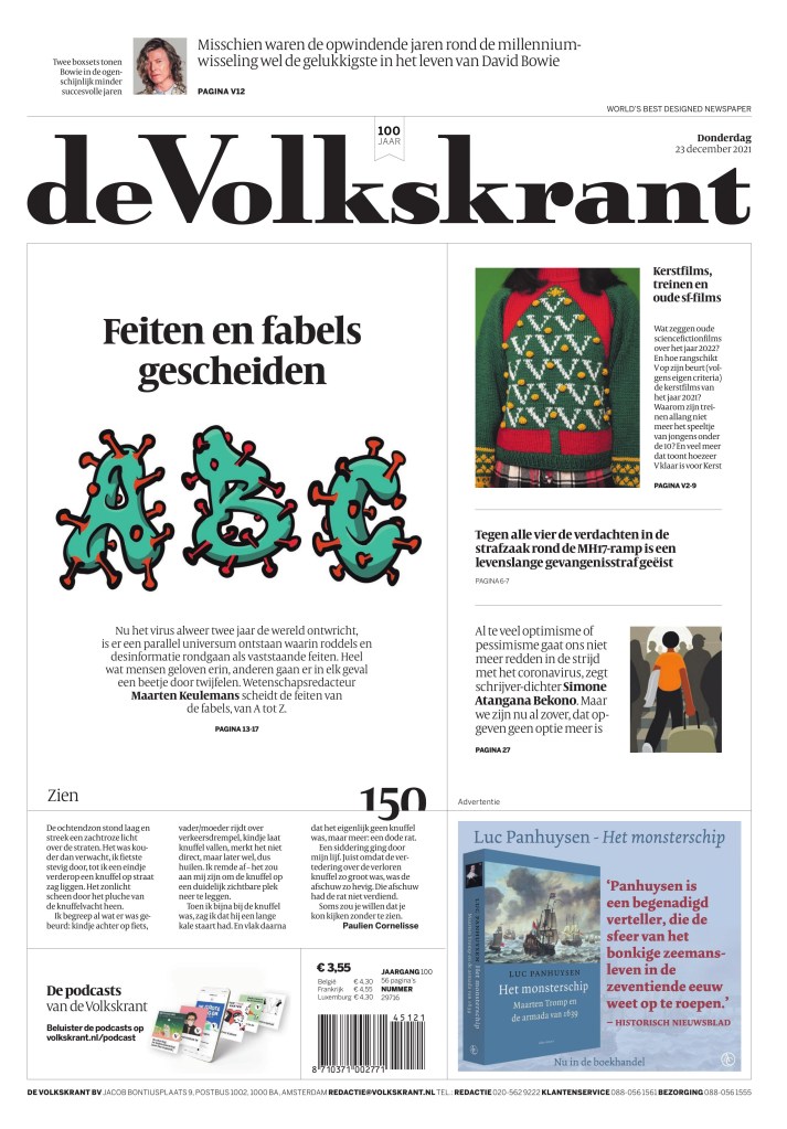
de Volkstrant Netherlands
The tiny little words on top of the flag say it all: World’s best designed newspaper | European newspaper of the year. De Volkstrant is not at all like the ones above. It doesn’t rely on illustrations. It is elegant and clean. It is a paper that has mastered the use of white space. Did I mention it’s elegant. The fonts are so smartly chosen. I chose a similar looking font when I redesigned the Guelph Mercury because I am a fan of elegance in newspapers. And the little numbers they do are great.
Did I mention de Volkstrant turned 100 last year? I hope it has 100 more years in print with pages like this. Again, it’s not elaborate. It’s just beautiful. What a photo.
Just after I say they don’t rely on illustrations … a beautiful illustration by Paul Fasssen. But even still it fits their personality. It’s pretty, as is the text around it.
And just a few more to admire.
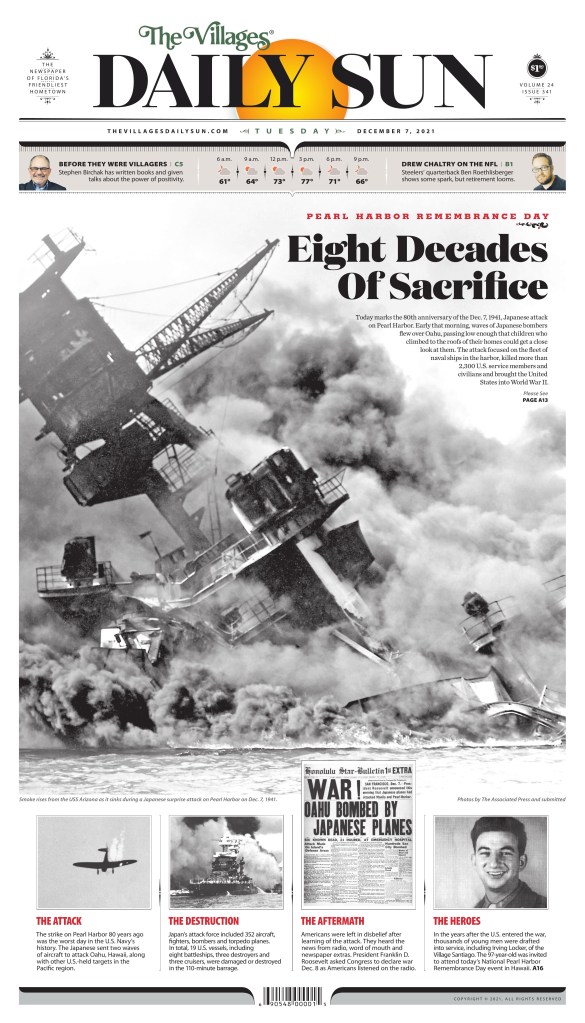
The Villages Daily Sun Florida
I have made it no secret that I love The Villages Daily Sun, a paper with a print-first mentality. Print FIRST!! Like Reporte Indigo, the designers here put a lot of effort it all the time. As I mentioned in my post on Adam Rogers and Colin Smith, they also worked hard to match the design to the community. That’s incredible. Unlike a lot of papers, there is never any doubt when you’re looking at a Daily Sun page. Branding, baby.
But back to effort. All I need to say is just look at this page. Mind. Blown.
Not a lot of papers went big with the 80th anniversary of Pearl Harbor, but the Daily Sun did. And it’s striking. Newspapers need to look forward, but they also need to look back.
And a few more.
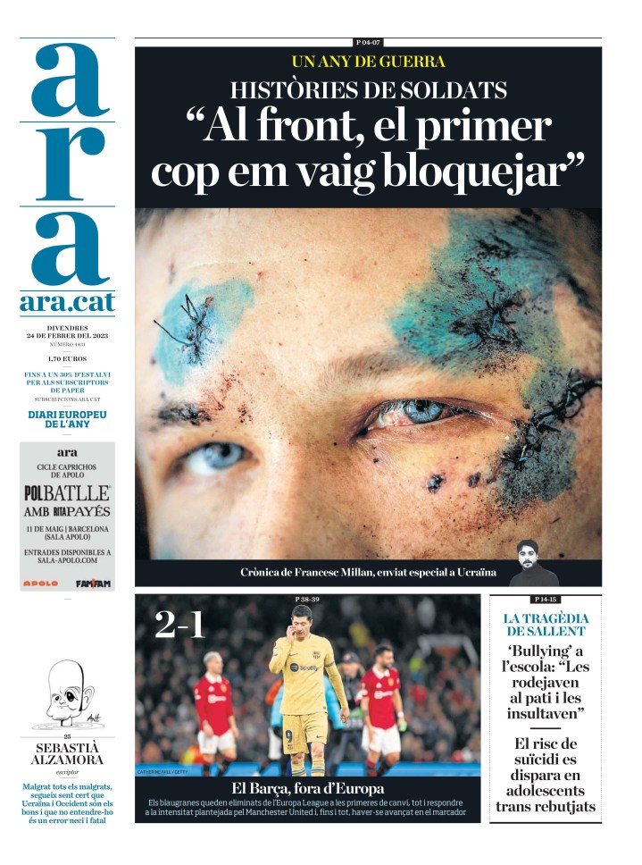
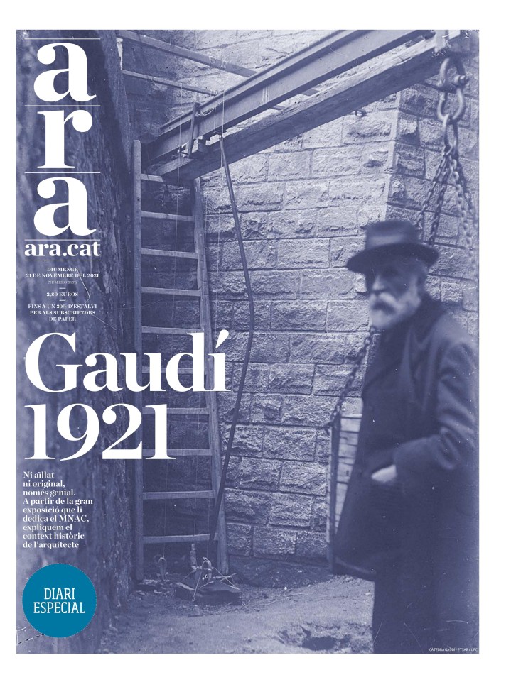
Diari Ara Spain
Diari Ara grew on me slowly. But I kept seeing pages that clearly had a lot of thought put into them. And then I saw one I loved. And then another. This one struck me and I’m still not precisely sure why yet, but I just loved it. It speaks to me. I do love a good sepia tone. And the blurry person. It adds mystery.
This was one of my favourite 9/11 pages, marking the 20th anniversary of the tragedy.
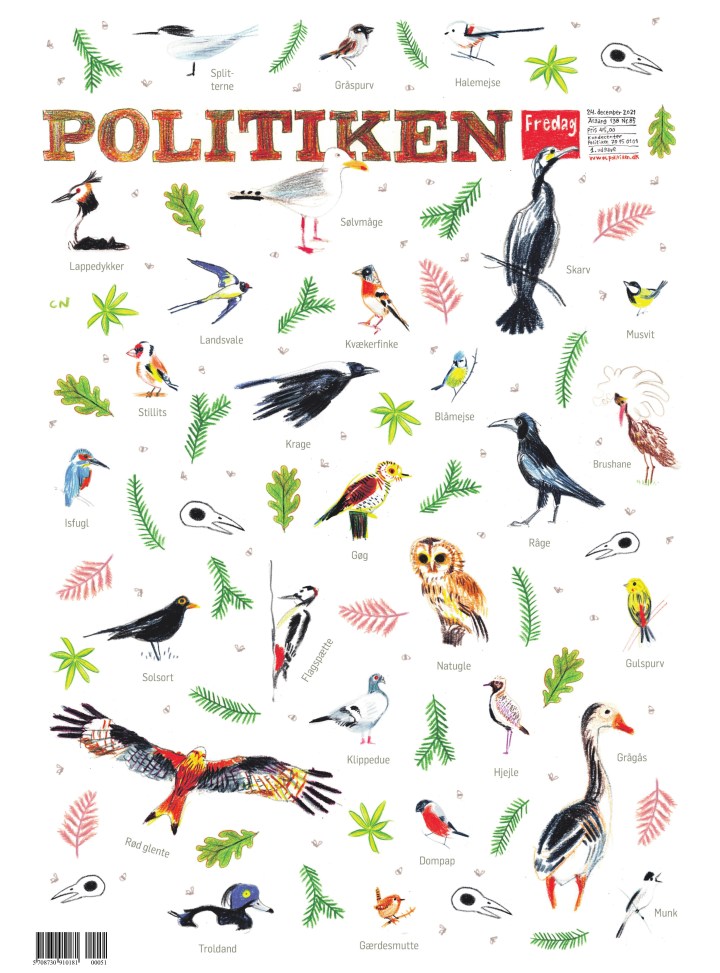
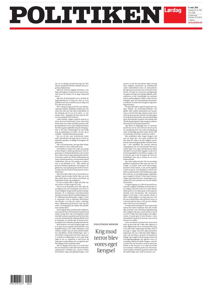
Politiken Denmark
Politiken has a harder news feel than some of the others. It uses sketches, less colour, often plays on the the white, red and black in its design, leaving other colours to wish they were invited to Politiken A1 party.
So … when they use colour … boom! The paper often has such a hard feel to it. Then Christmas Eve, and here is this beautiful page. I have no idea why or what, but I love it.
And just a few more from very little colour to a lot of colour.
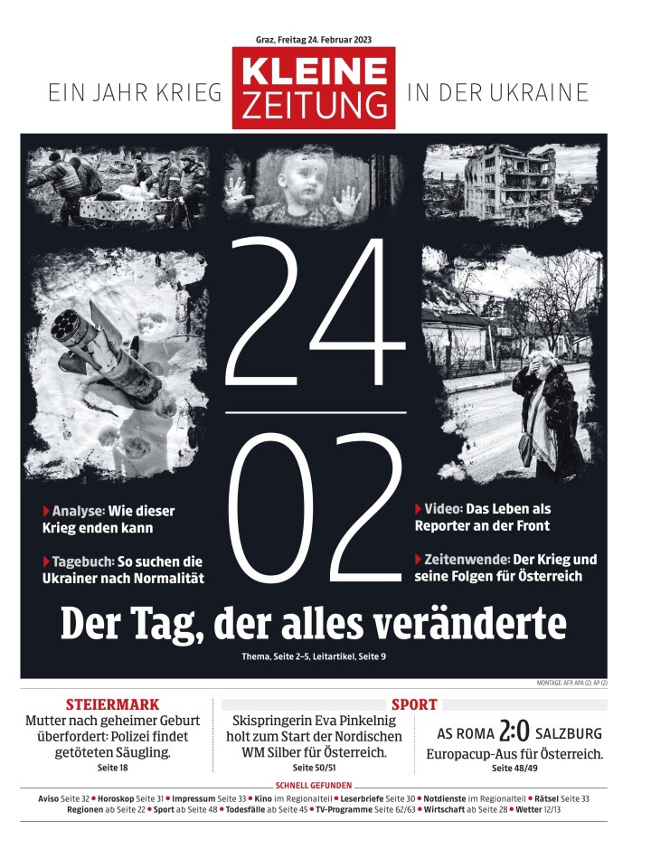
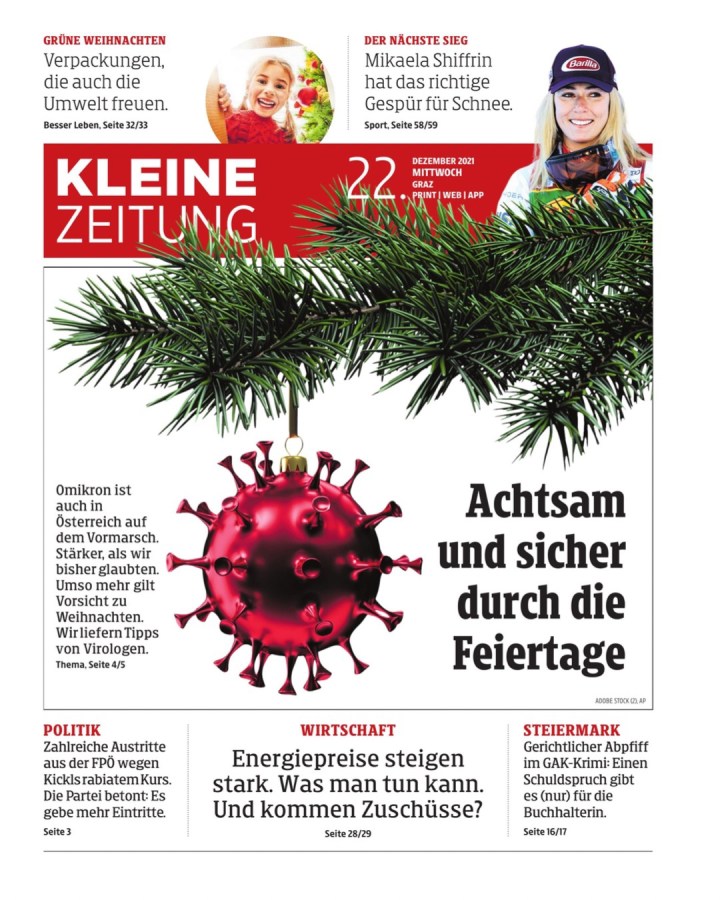
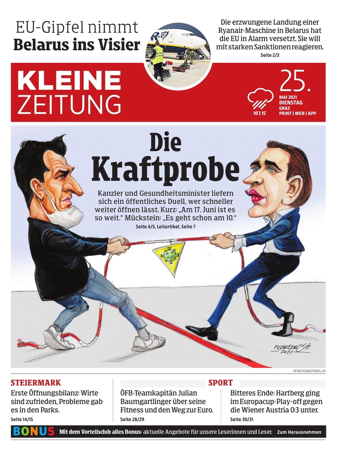
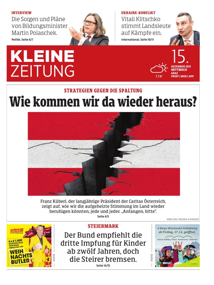
Kleine Zeitung Austria
Another tab, and more great work. There aren’t a lot of papers like Kleine Zeitung in North America. There are tabs of course, but I don’t see things like this. It’s a lovely paper, doing lovely things all the time. This depressing page might have been my fave of the year, right under the wire.
I should always translate the text, and I worry about this one. But it is striking. It’s just such a clean page, with a nice illustration as the centrepiece.
They have had so many good ones, and here are just a few more.
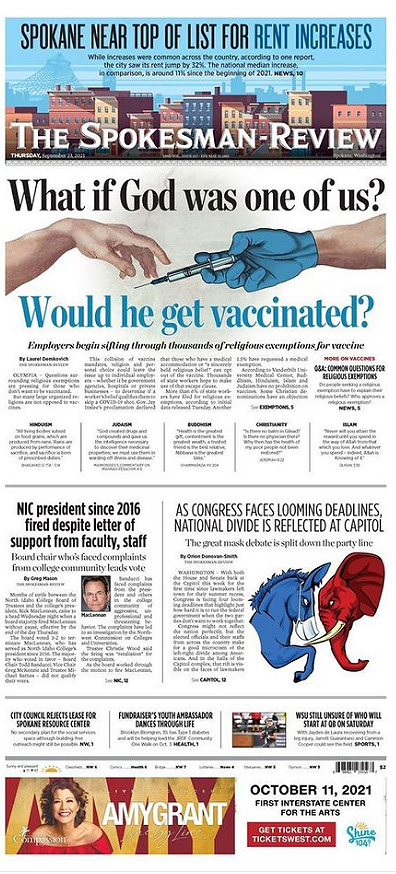
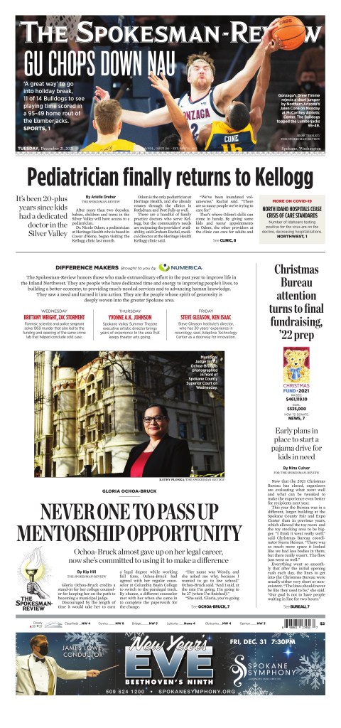
The Spokesman-Review Spokane, Wa.
I have had a years’ long love affair with The Spokesman-Review (don’t tell my paper). Anyone who follows this blog will know this as I was lucky enough to talk to Caitlin MIller, an emerging designer for a recent post. Until becoming a volunteer with the Society for News Design for last year’s Best of Newspaper Design competition, I would have said it was the best designed newspaper in the world, after the Virginian-Pilot stopped performing it’s magic. I say that with all due respect to my former employees at Pagemasters North America. They did some incredible things for the Pilot after it moved production to PMNA. But it used to be the best cover in the world most days. I digress. The Spokesman-Review has a similar feel. It lets stories breathe, it goes big, it uses its flag in design. And it continues on other section fronts. I admit I have cheated here as I lost some from page files in a phone swap, so I am including some section covers. Sorry! As a side note, some other amazing things they do: they have today’s and recent front pages on their site, inside pages from today’s pub, historical pages and they list the designer. I wish more papers did this.
I love a few things on this page. I love the big reverse text head. I love that it is played in the background. The apples, and just the air.
The thing about the Spokesman-Review is that it has character, a consistency. I can say the same thing about each front page, yet it never gets boring. They try new things while somehow keeping the same flavour and feel day after day. A credit to Chris Soprych, I’m sure. Again, great typography. A playful bit with the dandelion. Air. And the flag. They play with their flag all the time. When that’s your brand, that’s bold.
And here are a few more, with some inside pages.
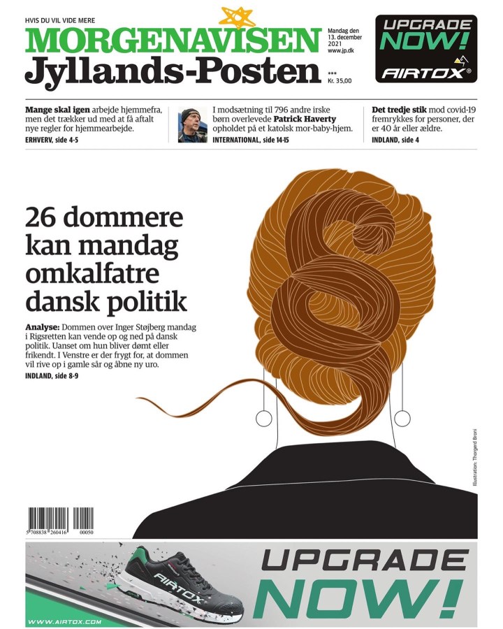
Jyllands-Posten Denmark
I love this tab. Just smart design, often simple and clean. It’s great. This page was my fave because of the smart and creative use of playful typography.
I love when newspapers do portrait-type art like this. There is no face, it’s simple, but readers will know who that is instantly. This is so nicely done.
And a couple more.
There were more from other papers. But these were my faves from papers who frequently went above and beyond. I am excited to see what 2022 brings, but I hope for more like these.
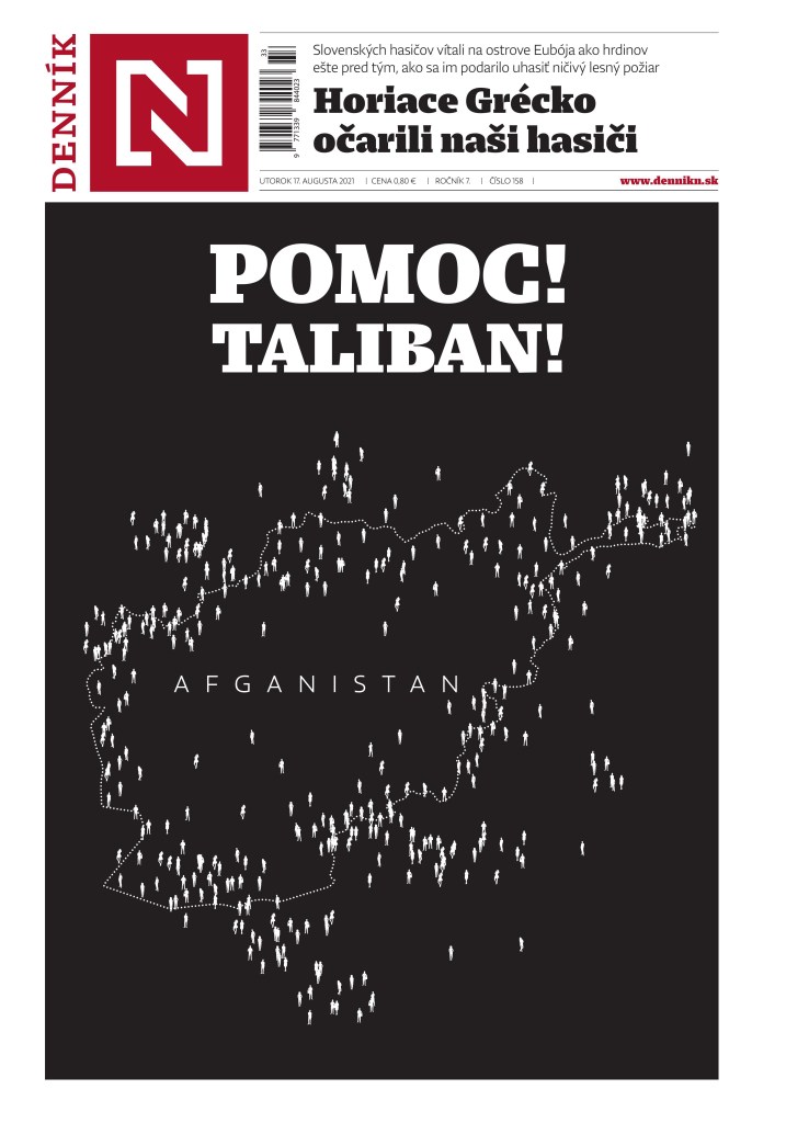
On the heels of a major and deadly earthquake in Haiti, Kabul, the capital of Afghanistan, fell to the Taliban two decades after it lost control after a U.S.-led invasion. That is a lot of big news over a couple of days. While there was very little in terms of big pages for Haiti, the same was not true for Kabul. There were several striking pages. It’s a significant story, and one that will be playing out for a long time to come. There will be dire consequences for many in the country, particularly girls and women. Newspapers were right to give it the main play today.
I find it fascinating to see the design choices, both in terms of layout and photo choices. So often there is one photo that stands out. In this case most of the pages used one of two photos. And in some cases the designs and headlines were almost identical. That is not a knock. That’s newspapering. This isn’t the time to for wild design choices or plays on words. These are serious news pages. And these newspapers, all of whom have a strong focus on the world, presented the dire situation to their readers in a way will have an impact. Hopefully the world acts.
Here is a selection of some of the amazing pages from around the world, with the pages mostly speaking for themselves.
The Guardian, Monday, Aug. 16
Globe and Mail, Monday, Aug. 16
The Globe, above, and Hartford Courant, below, are so very similar, but also so well done. They are both powerful pages, achieved with a good, big and clear headline, strong art, and nice but simple treatment of other elements.
Hartford Courant, Monday, Aug. 16
And again this photo. Wow. Used in many papers today. Both the above and deVolksrant below were just three of many who went with this powerful image.
deVolkstrant, Monday, Aug. 16
Jyllands-Posten, Monday, Aug. 16
And a helicopter photo, also used by a handful of papers, including the next three (different pictures or crops, but same idea). The comparison of Vietnam and Kabul is an interesting play in Arab news. A beautiful and powerful headline. It says so much in so few words.
Big sporting events always lead to big coverage from newspapers. And often big and beautiful design. That’s one reason I love the Olympics. Two weeks of big sporting events. Anything is possible. And being in a country like Canada, where we don’t dominate as much as our neighbours to the south, our newspapers make a big deal out of big victories. Tokyo 2020 (21?) was no exception. Using the Freedom Forum’s amazing website, which showcases hundreds of newspaper front pages from around the world every day, I looked through each day and picked out my favourites. There were more. So many. But these were my faves. Editor’s note: as this is a judged event with only one judge, a Canadian, there is a distinct Canadian advantage. That said, Canadian papers swung for the fences every day. And also, I give props to newspapers on this side of the world, who decided to make a big deal out of what could be considered old news. Often 18 or 20 hours after an event, it still dominated the front page. It gave these athletes a chance to live on forever. A moment in time captured.
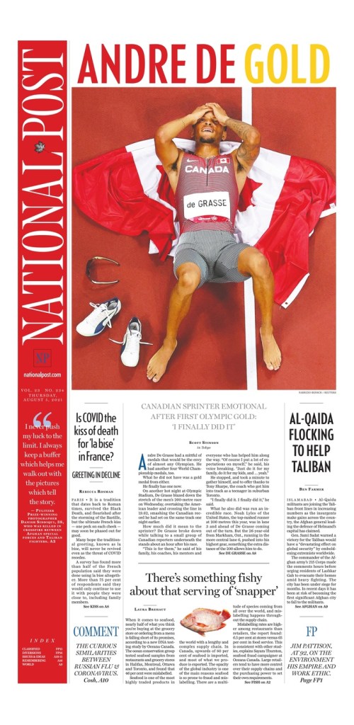
Gold: National Post (by a hair)
Had the National Post and the Toronto Star approached me like the men’s high jumpers asking for two golds after they tied and decided against a jump off, I might have done that. Alas, I didn’t give them the chance. But I would welcome a design-off if they’re interested. I will facilitate. But I digress. In the absence of that, by a hair …
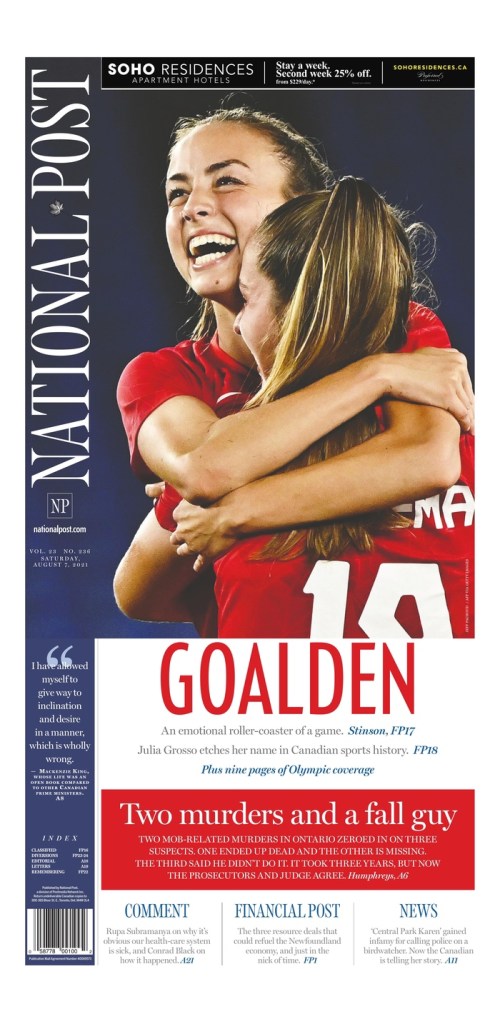
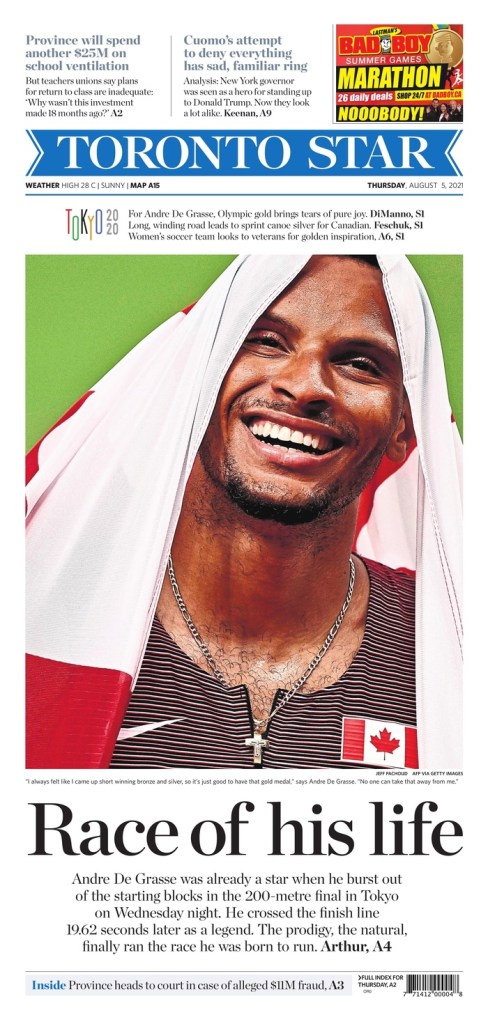
The National Post had some stunning covers, my fave being the one celebrating Andre De Grasse’s gold medal victory in the 200-metre sprint. It was just so well put together. The balance, the colours. The flag complementing the red in his name. While not novel, the gold of the word gold. But it worked, as it looks so nice with the red. The strong photo. And, while not Olympics, the little fish cutout in the middle of the bottom of the page. There is such nice symmetry and balance on this page. The headline is big and bold and colourful. Loved it. It is what helped push it up.
National Post, Thursday, Aug. 5, 2021
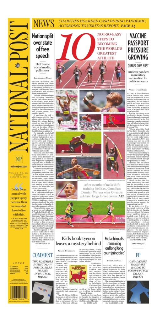
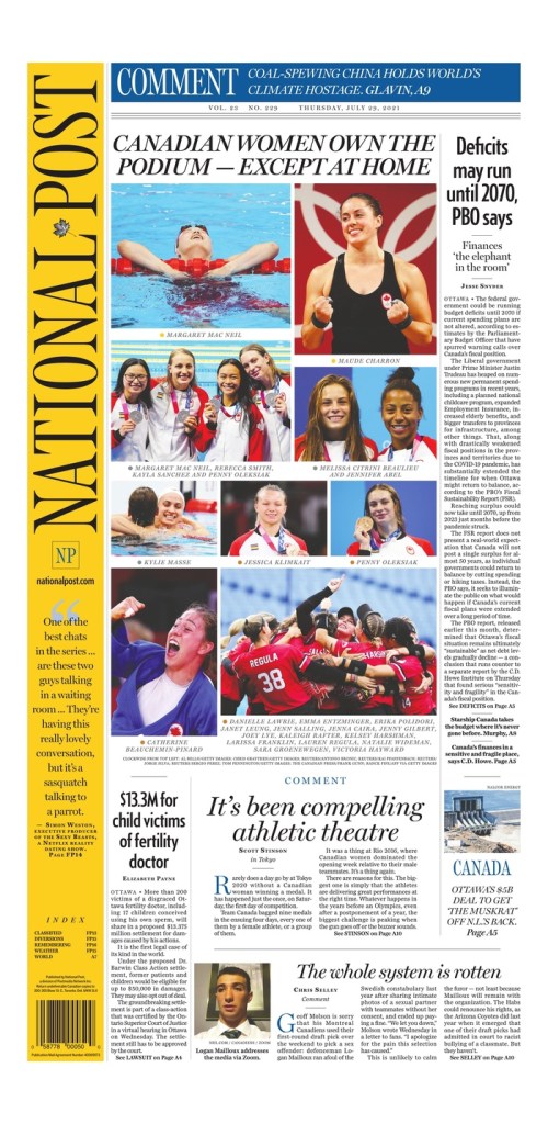
But you can’t top the podium with one strong page. There were three more from the Post that I posted on my Instagram account. The one directly below celebrating the Canadian women’s gold medal in soccer, which again has such a nice colour balance and a beautiful photo. It’s also clean. And the page capturing Damian Warner’s decathlon gold medal. A big 10 (to be expected, and was also used by the Star), a nice collage capturing his events. Just a nice tribute. And one more documenting the success of Canadian women. It was a nice collage. Well put together.
National Post, Thursday, Aug. 7, 2021
National Post, Friday, Aug. 6, 2021
National Post, July 29, 2021
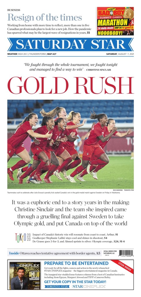
Silver+: Toronto Star
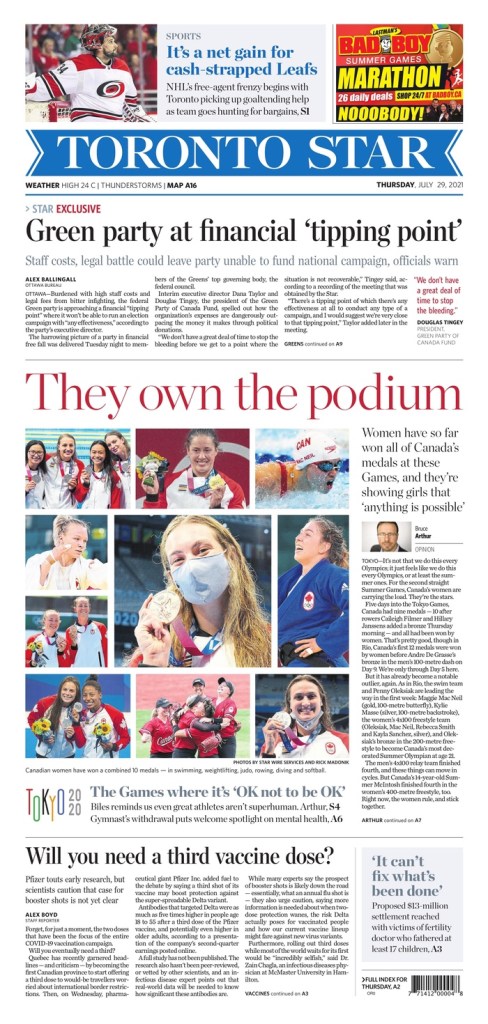
The Star had some beautiful pages. In some cases while the overall design wasn’t quite as strong as the Post, the headlines were stronger. The Star doesn’t have the benefit of working with a vertical flag, which I think so often adds to the Post’s design appeal. But the Star knows how to use the space below (and often above) the flag well. I thought the cover on the women’s soccer gold was the strongest, only because the headline and photo work so well together. Often that’s not considered. Word people come up with good words, design people come up with good designs. But “Gold rush,” with the women all charging off the page and into the paper. Rushing to celebrate the historic win together. And the front blown out for this. Lovely.
Toronto Star, Aug. 7, 2021
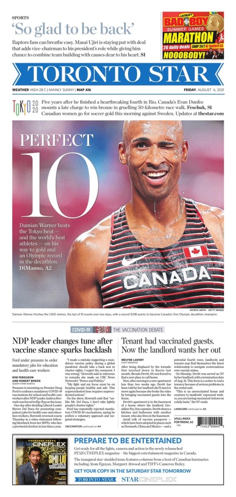
The top pages for the Star and Post came on the same days about the same things. Even about Canadian women dominance. Same day even though either could have gone earlier. The Andre De Grasse page from the Star is fantastic as well. A great emotive photo. Big headline. Nice use of white space. And again a blown out cover for one thing. And just below it was the Damian Warner decathlon page, only faulted for the headline Perfect 10 — I would grant that even if Warner won every event or finished with the best score ever. The Globe and Mail chose the same head. But no shade. A big 10 again and a truly fantastic photo. That wink. Amazing. And I love the play of the display copy on the photo. It’s done well. And the women’s collage. Very similar to the Post.
Toronto Star, Aug. 5, 2021
Toronto Star, Aug. 6, 2021
Toronto Star, July 29, 2021
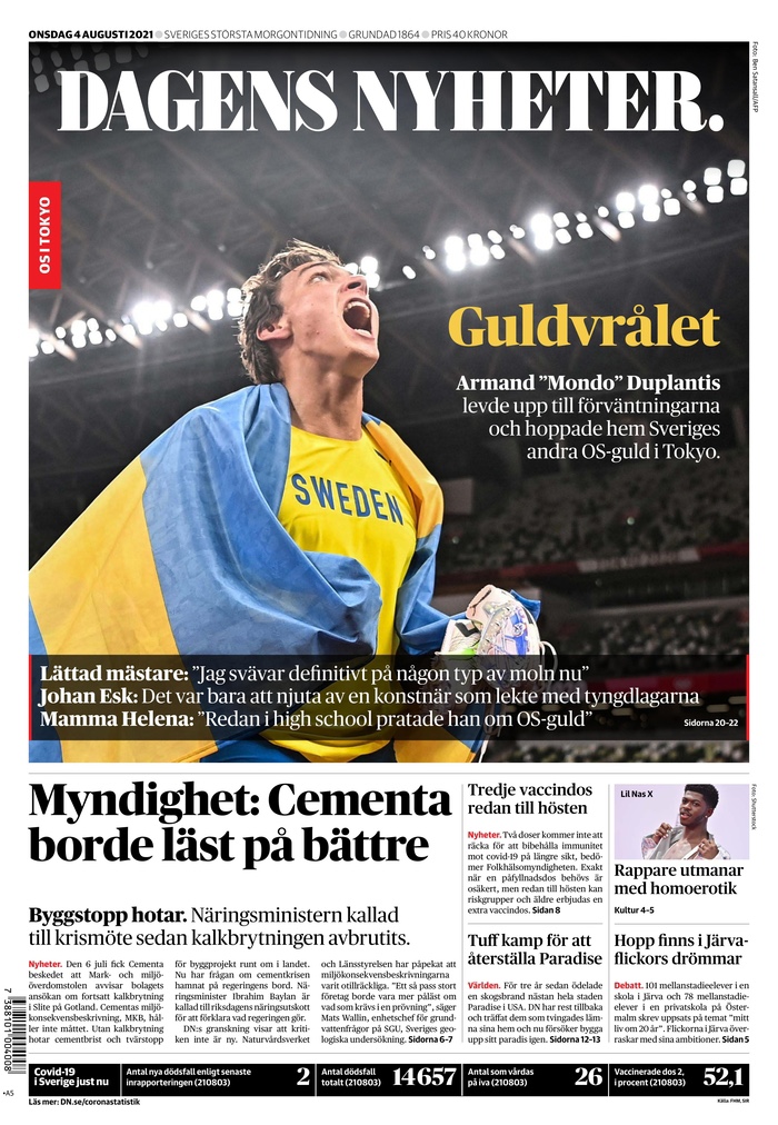
Bronze: Dagens Nyheter (Sweden)
The covers in Dagens Nyheter were just so crisp and clean. An emphasis on strong photography. I have included two, at opposite ends of the spectrum. Heartbreak for the women’s soccer team after losing to Canada in the gold medal match and elation from Armand “Mondo” Duplantis after a gold medal win in pole vault. The display on the photos is done so well. Differently in both but both so good. I love the pull quote on the soccer page and the small yellow head on the pole vault. Such a small head for a big victory but it works so well.
Dagens Nyheter, Aug. 7, 2021
Dagens Nyheter, Aug. 4, 2021
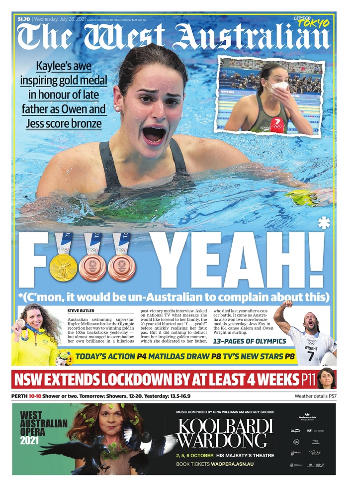
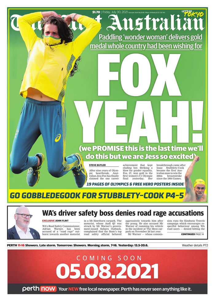
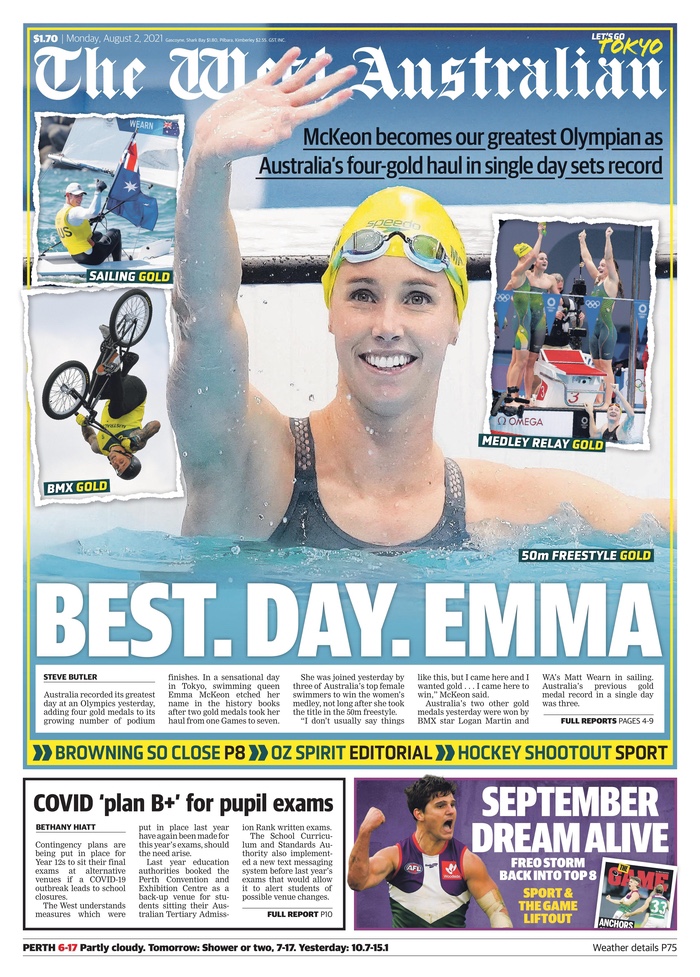
Runner up for being funny: The West Australian
Cheeky? Yes. Did they use the same profane joke twice? Yes. Was it still funny? Fox yeah. But only because they used their decks (or subheads, if you prefer) masterfully. It was a master class in tabloid display. And of course they wouldn’t be here if they didn’t have lovely designs as well. All very similar but still great. No near profanity on the Emma page but also wonderfully done in true tabloid style. Must read in an Australian accent. And a slight pause between each word. Best. Day. Emma.
The West Australian, July 28, 2021
The West Australian, July 30, 2021
The West Australian, Aug. 2, 2021
Olympic efforts
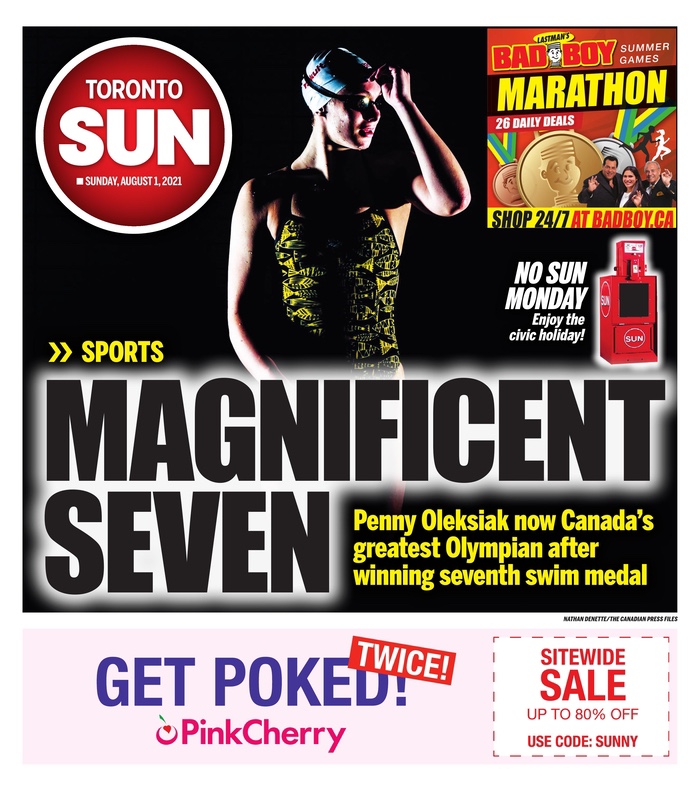
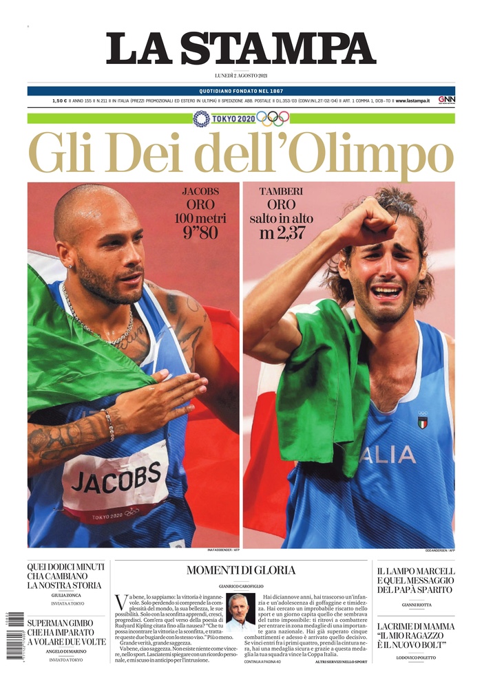
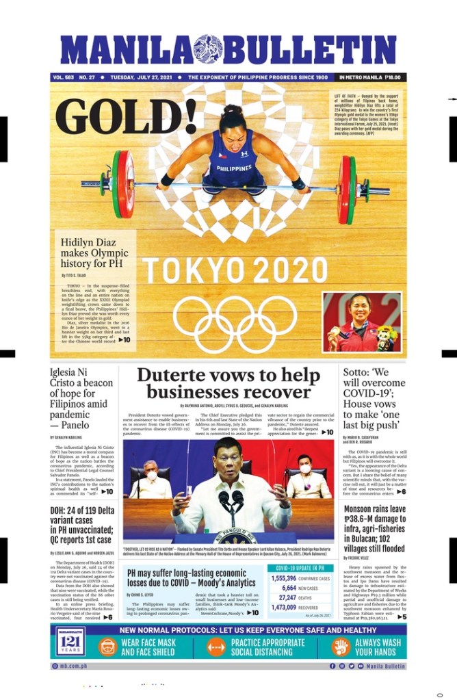
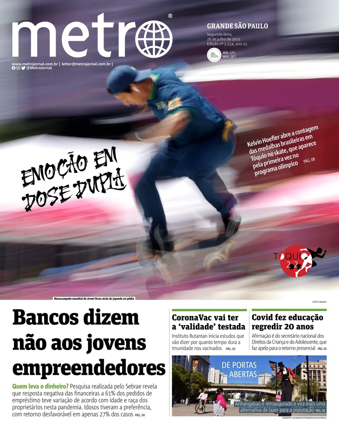
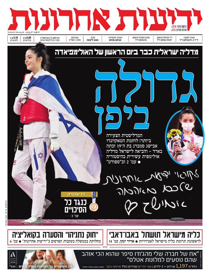
And here are a handful of other great pages I saw. One more from Canada (the Toronto Sun) and then four others from around the world. La Stampa (Italy) shows two big victories, really captures the emotion. The Manila Bulletin (Philippines) has such beautiful colours and a nice bird’s eye view photo. Metro (Brazil) is totally photo driven. A gorgeous photo. And Yedioth Ahronoth (Israel). Nice art and great contrast. And while she is walking off the page, it works. Rules are meant to be guidelines. So follow them when it works. Walk off the page when it doesn’t.
Toronto Sun, Aug. 1, 2021
La Stampa, Aug. 2, 2021
Manila Bulletin, Aug. 2, 2021
Metro, July 26, 2021
Yedioth Ahronoth, July 25, 2021
There were so many nice pages over the course of these Olympics. The Games that probably never should have happened. But tell that to the athletes. While maybe it was reckless, I am thankful for these beautiful covers. This is a dangerous time indeed. For newspapers, for the athletes, for Tokyo, for the world. The athletes gave us something to celebrate. These newspapers put it out there for their readers to see, and left it all on the newsroom floor (probably their basement or kitchen floors in a lot of cases). The power of print is alive and well. 🏅
George Floyd’s death was more than a tragedy. It was a murder. It was a catalyst for an uprising, in the U.S. and around the world. It was a wakeup call, one of many, but one that seemed to resonate with people outside of the Black community. George Floyd, who was killed after allegedly buying cigarettes with a counterfeit $20. Killed by police. For nine minutes and 29 seconds, police had him on the ground, knee on his neck. Somewhere around the eight-minute mark he lost consciousness. But the knee remained. This was May 25, 2020.
His death came to be a symbol of what’s wrong, not only in America, but around the world. The systematic racism that exists and thrives.
Newspapers covered his death in the immediate aftermath and long after. There were many necessary stories, many appearring on front pages around the world. And while newspapers won’t run out of key angles to write about (assuming the editors and decision makers are keeping this story in the collective consciousness), how do designers keep the story fresh, to help keep it dynamic? Sure, a newspaper can put a story over the fold on its front page. It will get attention. But the design can play a key role in elevating the story. You can’t have readers get complacent and gloss over the story. A designer needs to pull them in, and sometimes there aren’t a lot of choices visually.
More than a year has passed since his death. In a world of 24-hour news and social media, most stories don’t get the spotlight for long. This story, the issue it thrust in front of the comfortable and privileged, needs to be there.
One year after Floyd’s murder, there were two pages that stood out for me, each taking very different approaches to their designs. But both highlight the power newspapers have, and the responsibility they have. And the power of newspaper design. It’s not just the words.
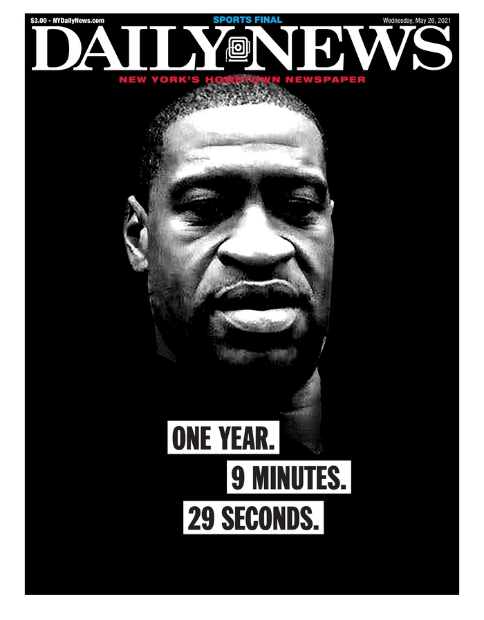
The first page that caught my eye was the New York Daily News. It was striking. A big photo of Floyd. His face instantly recognizable, brightly lit in parts and not in others. Starkly placed on a black background. The white newspaper flag adding contrast. And a great newspaper page almost always has strong words. Or strong words elevate a great page to unforgettable. This one simply says: One year. 9 minutes. 29 seconds. Black text on white on black. Those words are so significant. Anyone familiar with the story will know what it means. Anyone not will be appalled. How the words are played is significant. It was a masterful page. It captured the feeling one year later, and helped keep this story in front of readers.
New York Daily News cover, May 26, 2021
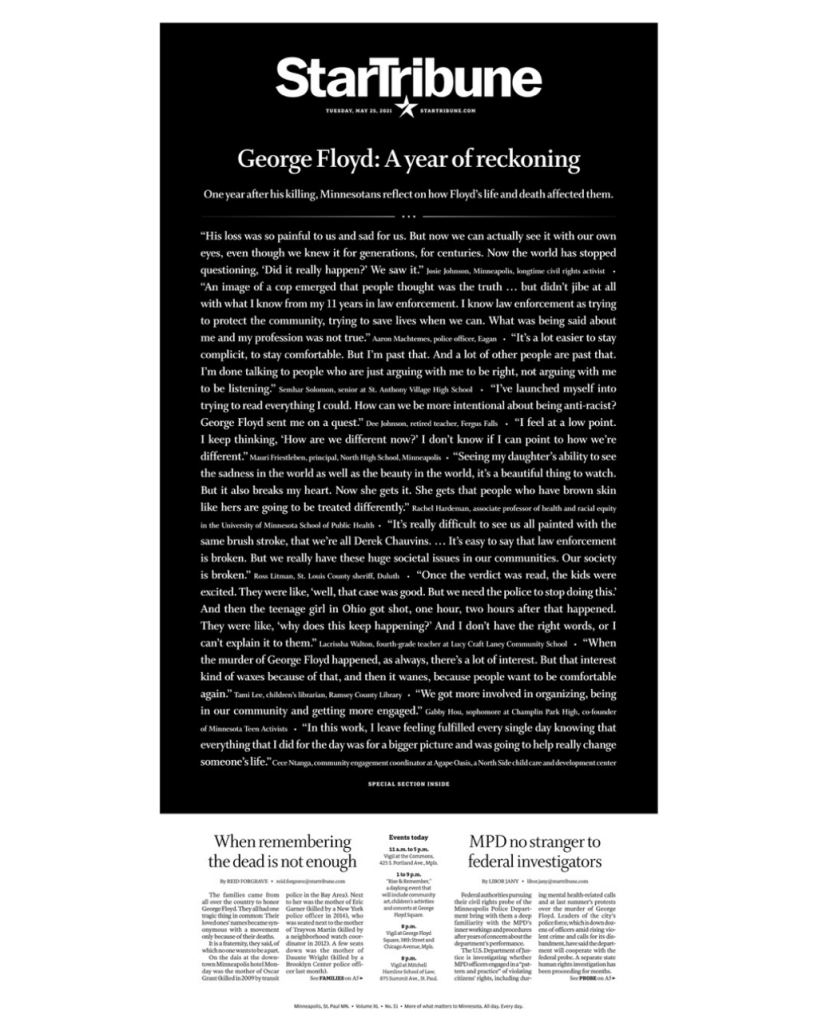
The next page took a very different approach. The similarity was that it was also on a black background. Reverse white text on a black background. But it isn’t a picture of Floyd that makes this page. It’s words. All words. It was a powerful message. When a newspaper makes a decision to run a page without art, the words have to do it all, so they have to be done well. When an issue is so consequential, sometimes words are all there is. The Star Tribune is an exceptional paper. It’s in Minneapolis, where Floyd was killed. While this became a worldwide story, this paper owes it to its community to keep this story front and centre. This page was breathtaking, yet simple. So many words, but that’s why it works. In this instance. In others, it wouldn’t. But it was the right time and the right play and the right words.
Newspapers owe it to readers and to society to run stories like this, to keep these issues, issues like this, like the unmarked graves of Indigenous children in Canada, in the collective conscience. It was in the news again when Derek Chauvin, the police officer who kept his knee on Floyd’s neck, was found guilty of murder. And again when he was sentenced to 22.5 years in prison.
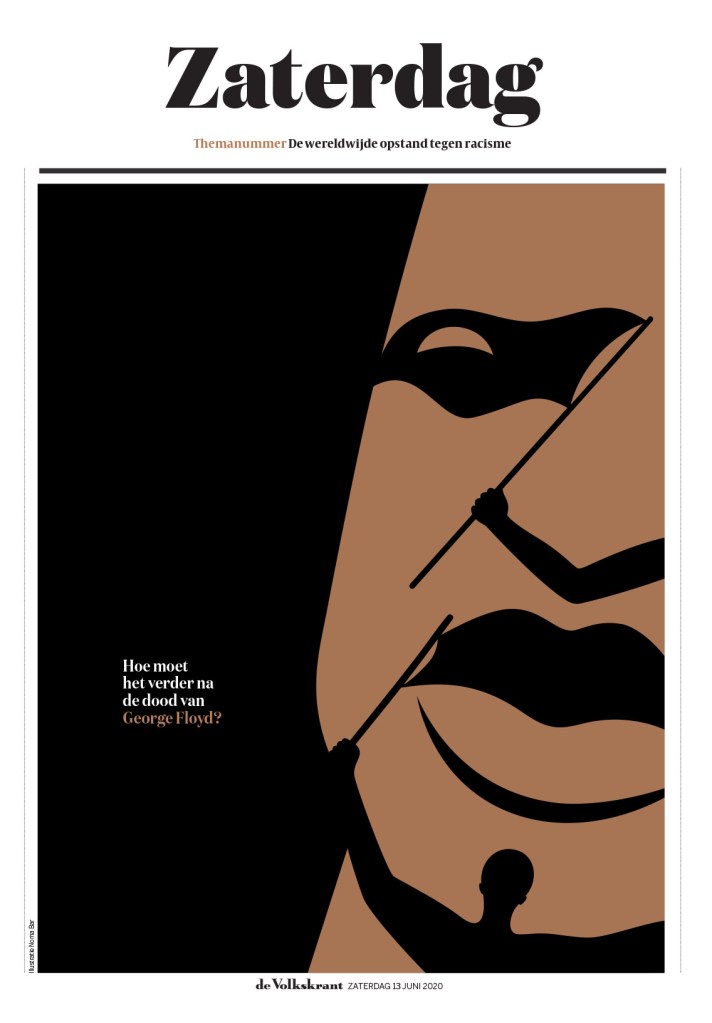
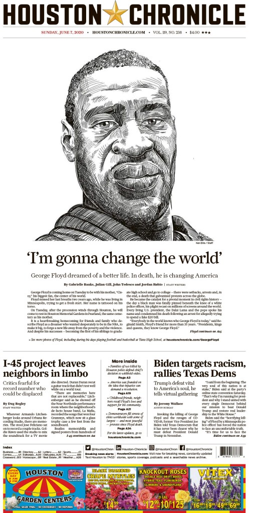
But these pages above, and the ones below (which I’ve shown in previous posts) highlight the power of print design. Three of them show, or somewhat show Floyd’s face, which has become a symbol of the movement and a way to illustrate the story. And newspapers try to present his face in novel ways. As long as newspapers are trying to raise awareness of serious issues through design, I will keep showing them.
Above: de Volkstrant’s stunning and masterful illustration of Floyd’s face, and of the movement it catapulted into the world’s consciousness, and the Houston Chronicle, with a powerful sketch of Floyd.
Up until March of 2020, newsrooms had always been buzzing, busy places. Reporters on calls. The clickety-clack of typing. Editors and designers shouting across the room. Editorial decision-makers making decisions. All in one place. How could it be done any other way? It was about collaboration and community. The community within the newsroom preparing news for the community without. And then on March 11, 2020, the WHO declared the coronavirus outbreak a pandemic. Not an epidemic. And unlike some of the other pandemics in the past 50 years, this one seemed to capture the attention of everyone. Maybe it was that the NBA postponed its season one year ago today. The NHL followed suit shortly thereafter. Two organizations driven so much by money cancelling their primary revenue streams. Money talks.
But by March 11, or very shortly thereafter, what seemed unthinkable for a newsroom, producing a daily (or weekly) newspaper from anywhere but a newsroom, became a reality. One year ago today or shortly thereafter, newsrooms started shipping computers and keyboards and monitors and mice home. And setting up VPNs. Soon setting up Zoom accounts for all staff.
It was a pandemic. One that caused mass panic. You couldn’t even find toilet paper in most places. I know because I searched high and low trying to find some for an editor who said she couldn’t find any. I found a four-pack and brought it into the office. I went to 10 stores, a little scared in every one. This was pre-masks. Or knowledge.
But was it such a big deal? One that warranted panic buying of toilet paper and canned goods? Hindsight is usually 20/20. In newsrooms one year ago today, discussions were being had about tomorrow’s front page as well. What do we do? Is this bigger than the flu pandemic of 2009? Or the SARS pandemic of 2002? Newspapers are always worried about blowing things out of proportion. So do we play this big, they would be asking? Do we downplay it? Do we talk about soup? It had to be on the front page. But how big?
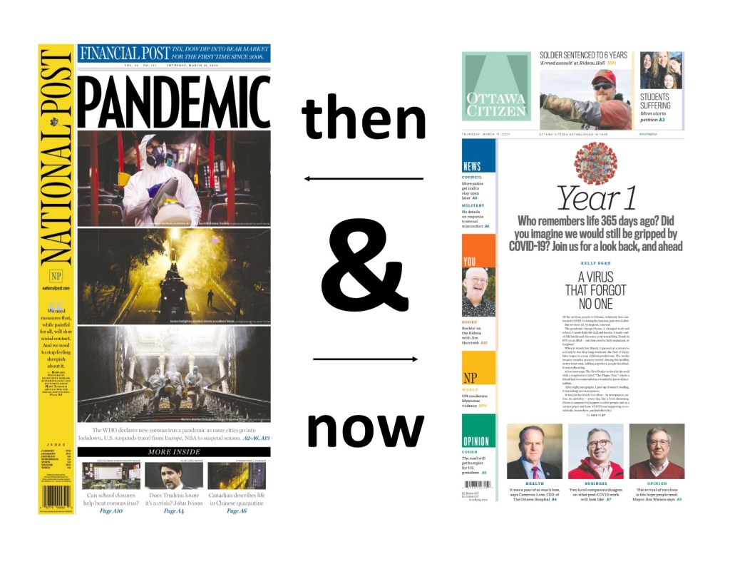
I’m going to look at some of the papers from March 12, 2020, and then at some from today, March 11, 2021. I admit I was expecting big anniversary covers. That was going to be the focus of this post. Some papers did. Most papers didn’t. It also happens to be the 10th anniversary of the 2011 Japanese earthquake and tsunami, which also caused a nuclear disaster. A devastating tragedy that left 20,000 dead. It is a tragic anniversary, so I acknowledge it here before looking at the pandemic papers of 2020 and 2021.
March 11, 2020 (March 12 in the newspaper world): WHO declares a pandemic
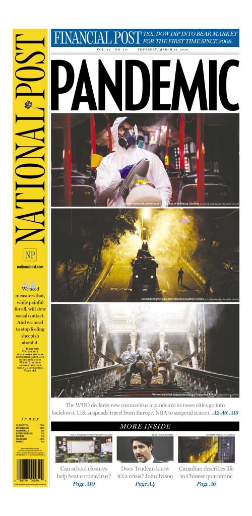
National Post, March 12, 2020
Of all the pages I looked at from March 12, 2020, the National Post cover was the one I felt most hit the mark on the type of play this should get (or should have gotten in hindsight). This was a significant day, and while it was just a declaration, the disease would have spread and wreaked havoc around the world regardless, this was a key moment. This week last year was when everything changed. This page uses a single-word headline, all caps: PANDEMIC. I’ve talked about this in previous posts. It seems so simple. But It was certainly discussed ad nauseum. And to complement that are striking, bold images. And equally important, they blew out the entire page. For a national newspaper to blow out an entire cover it needs to be a significant story. The editors at the National Post felt this was. This was a scary day, and life changed after this. But this is a beautiful page, despite the devastating and deadly outcome over the next year.
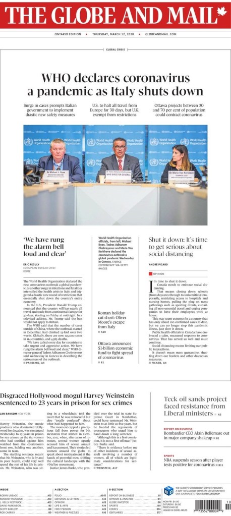
Globe and Mail, March 12, 2020
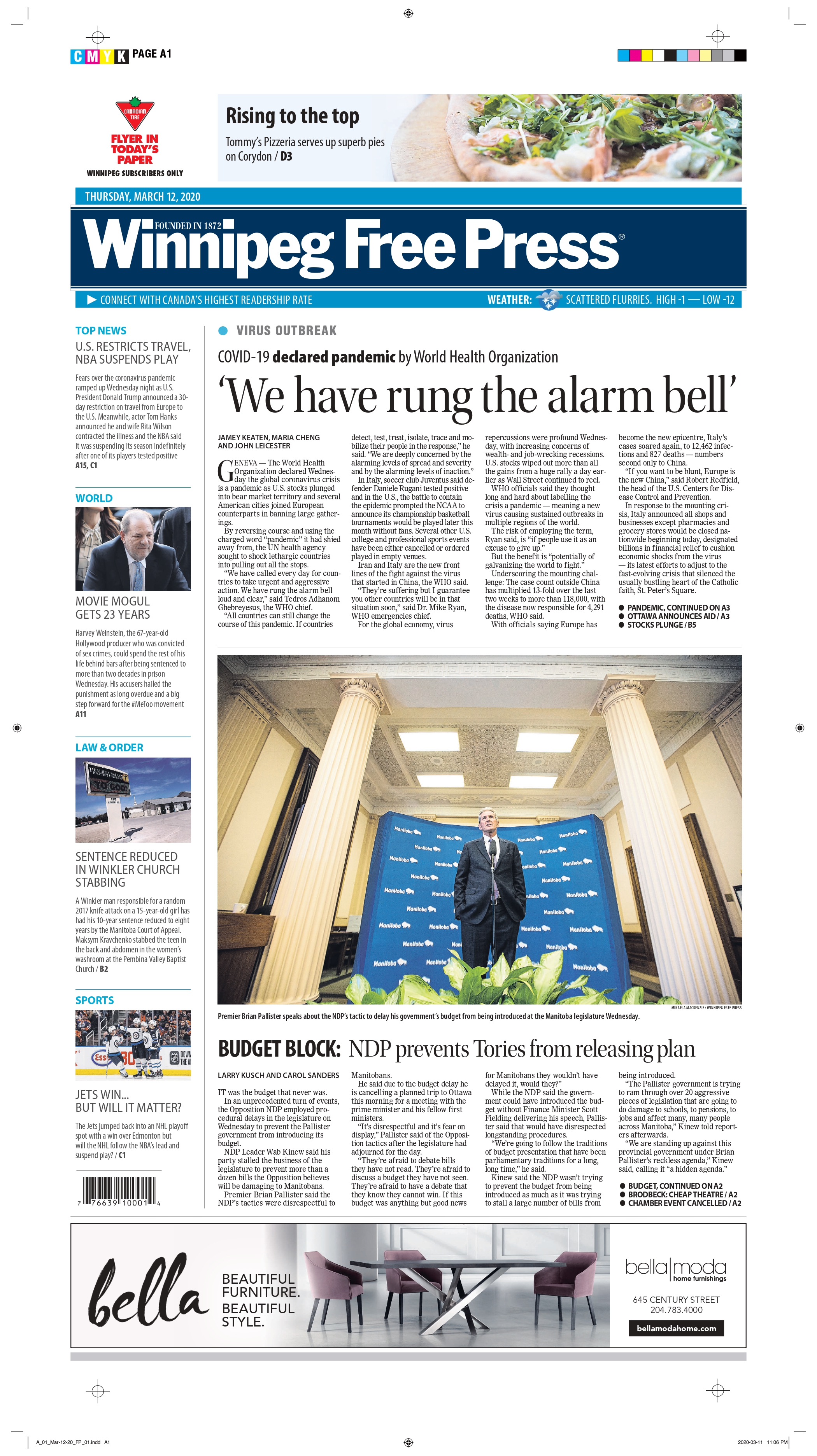
Another national newspaper in Canada also gave it big play. The Globe and Mail, while not as bold as the National Post in this instance, gave the pandemic top-of-the-fold play. And as is typical of the Globe, it uses white space to its advantage. They chose not to blow out the entire front, and while I wasn’t in the room, I can imagine the discussions. First, the Globe targets a different audience. They want information on the front. They often use their real estate to its fullest, having some pages inside without art, or very small art. On top of the pandemic, Harvey Weinstein was also sentenced to 23 years in prison for sex crimes. It was assumed the legal system would go easy on him, as it has with most powerful men charged or convicted of similar crimes. But it didn’t. On many days, this would be a black line story, across the top. It was a significant verdict. The Globe decided it must still make the front. I respect that. And the page is still well executed. It gives the pandemic centre stage, but acknowledges other key news of the day.
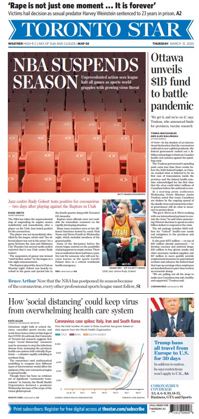
Another major Canadian newspaper, the Toronto Star, went a different route. While, other than a throw across the top (also recognizing the importance of the Weinstein verdict) the cover is all about COVID-19 (coronavirus), it’s less splashy and focuses on an intensely Toronto angle: the NBA’s suspension of its season, a.k.a. the end of the Raptors’ season. The cover design itself isn’t outstanding, but it had a clear focus on the news of the day. And looking back at it, you wouldn’t feel they missed the mark. It’s a solid cover. Strong news value.
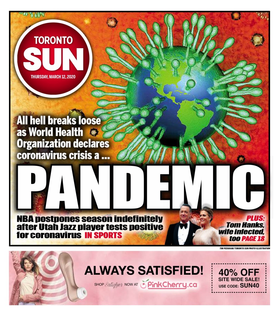
Toronto Sun, March 12, 2020
I admit I don’t often go to tabloid covers (by tabloid I don’t just mean size) for the design, even though they are often very creative. The Toronto Sun deserves credit here. It doesn’t take that big of a story for a tabloid to blow out its cover. But this has a take on that iconic COVID-19 image. The Earth as a coronavirus, with its telltale spike proteins, the claws that “act as grappling hooks that allow the virus to latch onto host cells and crack them open for infection,” as so well said on the Scripps Research website. Tabloids will often blow things out of proportion, but I’m not here to talk about that (all love, no hate, remember?). I am here to say well done to the Toronto Sun. This a bold, colourful cover. It captures the essence of the day, even if we were uncertain as to what it meant then. Believe the hype. It was worth the strong words and the design. And of course the ad. Who knew how relevant that might be for time spent in solitary confinement for the next year.
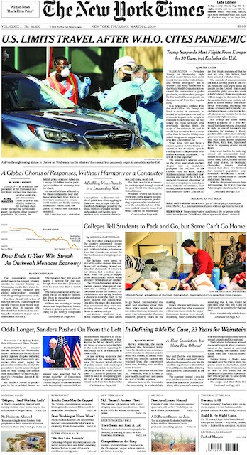
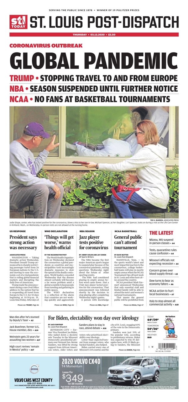
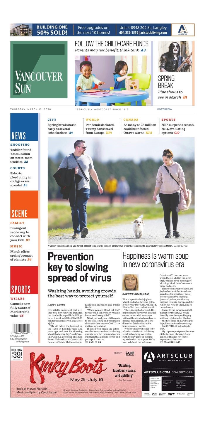
I won’t go into each of these with individual posts. My favourite from a design perspective is the St. Louis Post-Dispatch. It still looks different than other days, and is clearly taking the declaration seriously. The New York Times is the New York Times, here because of its stature in the journalism world, not for its design. I included the Vancouver Sun because it does have a heavy focus on the pandemic, but also adds a lighter touch: Happiness is warm soup in new coronavirus era (told you there was soup). It almost seems laughable a year later, but surely the editors wanted to present a mix of information. And the Winnipeg Free Press presents a standard newspaper cover. Much like most of this year’s that I have looked at.
March 11, 2021: one year later
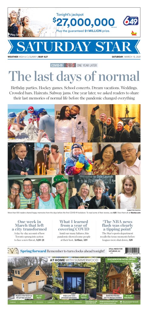
When I decided to do this post, I was prepared for covers to be blown out again. It’s been one year since the declaration that changed our lives. Alas, it mostly wasn’t to be. Of course it comes the day after the U.S. Congress passed a $1.9 trillion (TRILLION) pandemic relief package. Money talks. Especially when it’s in the trillions. So there was news to share. And maybe editors were never planning on commemorating the day at most papers. I looked at hundreds of newspaper covers today* (thank you to Freedom Forum for its daily gallery, which I look at almost every day). Two stood out, and both deserve praise. In order of how much I love them (no shame in finishing second here!). * One additional page of note landed Saturday, a big day for blowout feature pages in Canada, so I am updated to add the March 13 Toronto Star.
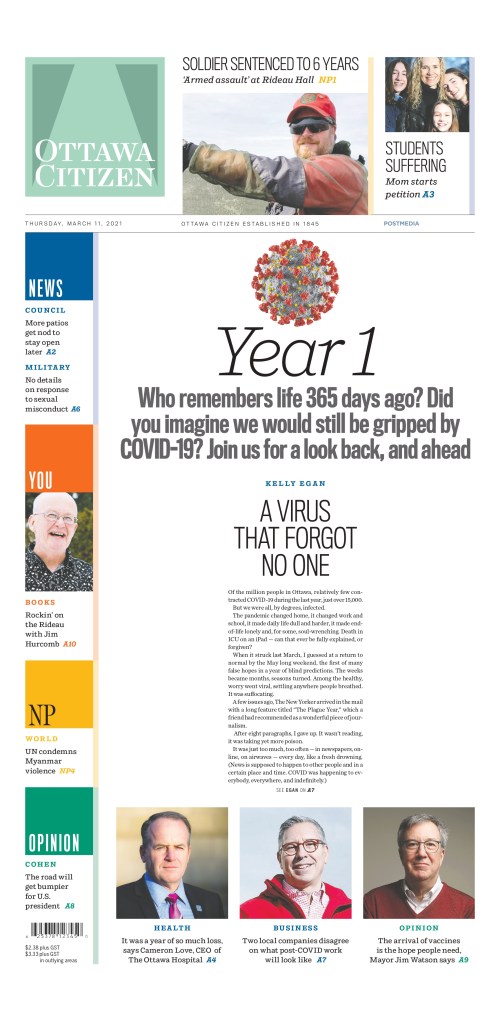
Ottawa Citizen, March 11, 2021
It’s … beautiful. This is what I was hoping to see today. This is the kind of page this blog is about. It’s simple. It’s clean. It’s not gimmicky. It uses white space wonderfully. A big headline. A little bit of the story. And it captures the moment from last year. Was this declaration a big deal? Yes. Yes it was. Huge points for the Ottawa Citizen today. To the designers, decision makers, editors and all involved (some direction provided by editors in Ottawa and then further conceptualized and executed by the talented staff in Postmedia’s production hub in Hamilton), well done. As print journalism struggles, it’s comforting to see that someone still cares.
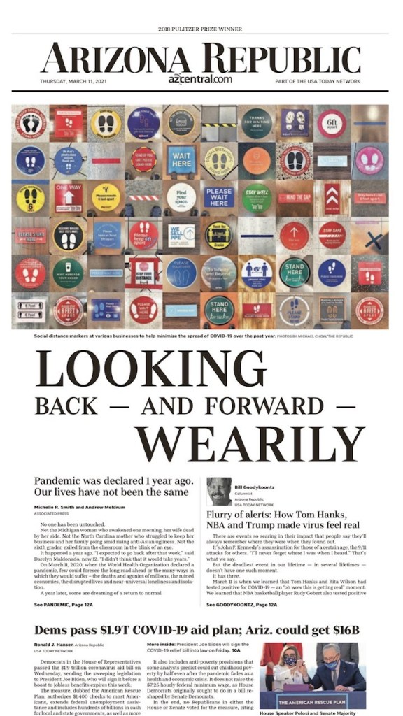
The Arizona Republic takes a bit of a different approach, but the design is still lovely, and really captures the importance of the day. It still gets the story about the $1.9 trillion (trillion!!) aid plan, but also offers a look back to one year ago today. It uses striking imagery right across the top of the page. It’s not an obvious image. You need to really look at it. Which is a great strategy. And the headline is playfully done, unlike a standard headline. Different sizes, different alignments. Strong word choices. So again to those in Arizona, bravo. It’s often a well-designed paper, and today was no different.
A few days after the anniversary, the Toronto Star ran with this cover. It focuses on the people affected by the pandemic. They blew out the front cover for the story (a tear-jerker, particularly if you are wistful about that last week, and the days before). Similar to the initial pandemic cover, the actual design is more basic. A collage of photos. But that it blows out the front page with essentially snapshots is bold. As a reader you know there is a story behind every photo. There are billions of stories over the course of this year. But here the Star shines a light on 10 photos, and more people. I tear up thinking about “The last days of normal.” So points for headline as well. It was. Nothing has been the same since, and may never be. This cover captures that emotion (as do the stories inside).