
By Brad Needham
Big sporting events always lead to big coverage from newspapers. And often big and beautiful design. That’s one reason I love the Olympics. Two weeks of big sporting events. Anything is possible. And being in a country like Canada, where we don’t dominate as much as our neighbours to the south, our newspapers make a big deal out of big victories. Tokyo 2020 (21?) was no exception. Using the Freedom Forum’s amazing website, which showcases hundreds of newspaper front pages from around the world every day, I looked through each day and picked out my favourites. There were more. So many. But these were my faves. Editor’s note: as this is a judged event with only one judge, a Canadian, there is a distinct Canadian advantage. That said, Canadian papers swung for the fences every day. And also, I give props to newspapers on this side of the world, who decided to make a big deal out of what could be considered old news. Often 18 or 20 hours after an event, it still dominated the front page. It gave these athletes a chance to live on forever. A moment in time captured.
Gold: National Post (by a hair)
Had the National Post and the Toronto Star approached me like the men’s high jumpers asking for two golds after they tied and decided against a jump off, I might have done that. Alas, I didn’t give them the chance. But I would welcome a design-off if they’re interested. I will facilitate. But I digress. In the absence of that, by a hair …
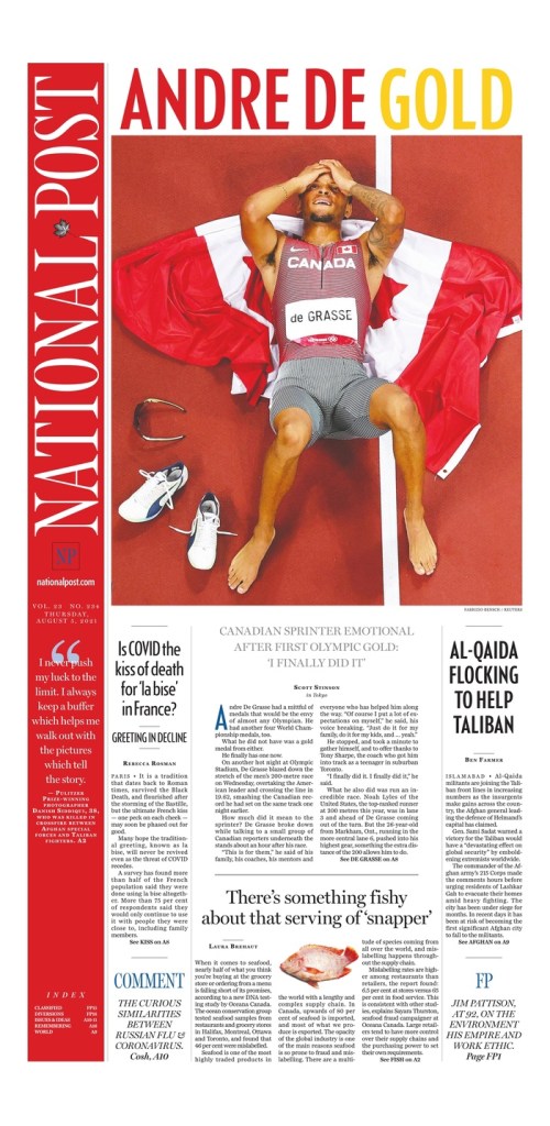
The National Post had some stunning covers, my fave being the one celebrating Andre De Grasse’s gold medal victory in the 200-metre sprint. It was just so well put together. The balance, the colours. The flag complementing the red in his name. While not novel, the gold of the word gold. But it worked, as it looks so nice with the red. The strong photo. And, while not Olympics, the little fish cutout in the middle of the bottom of the page. There is such nice symmetry and balance on this page. The headline is big and bold and colourful. Loved it. It is what helped push it up.
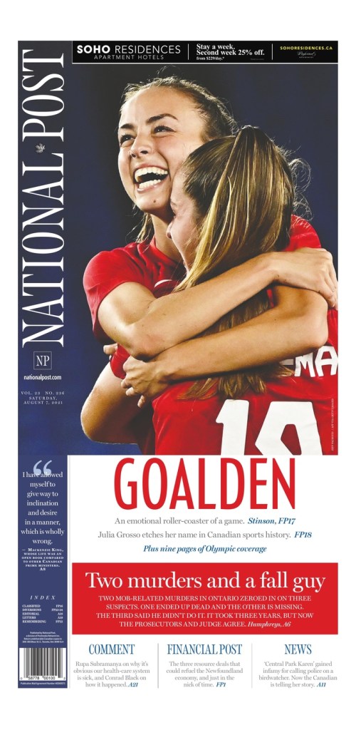
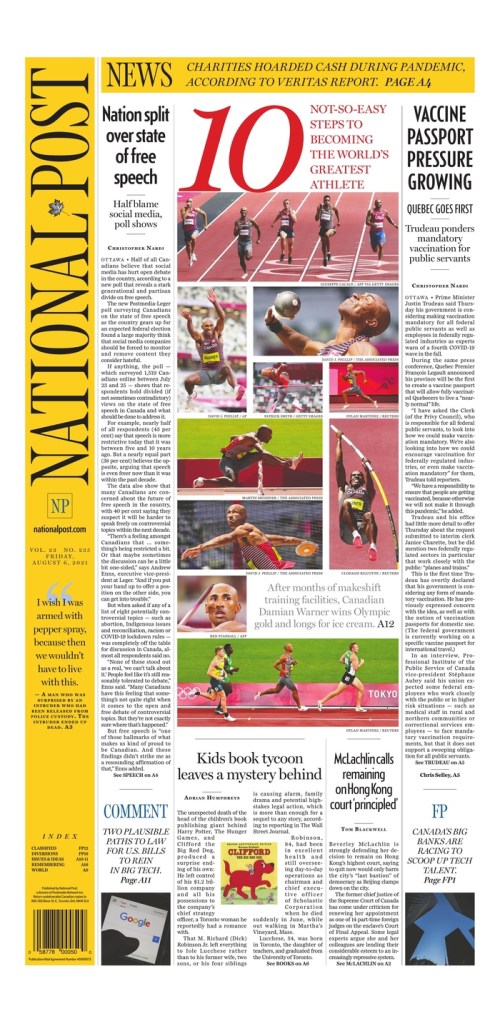
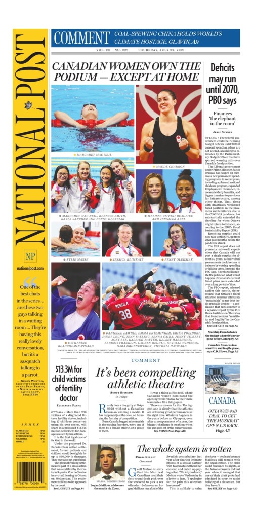
But you can’t top the podium with one strong page. There were three more from the Post that I posted on my Instagram account. The one directly below celebrating the Canadian women’s gold medal in soccer, which again has such a nice colour balance and a beautiful photo. It’s also clean. And the page capturing Damian Warner’s decathlon gold medal. A big 10 (to be expected, and was also used by the Star), a nice collage capturing his events. Just a nice tribute. And one more documenting the success of Canadian women. It was a nice collage. Well put together.
Silver+: Toronto Star
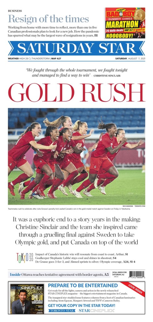
The Star had some beautiful pages. In some cases while the overall design wasn’t quite as strong as the Post, the headlines were stronger. The Star doesn’t have the benefit of working with a vertical flag, which I think so often adds to the Post’s design appeal. But the Star knows how to use the space below (and often above) the flag well. I thought the cover on the women’s soccer gold was the strongest, only because the headline and photo work so well together. Often that’s not considered. Word people come up with good words, design people come up with good designs. But “Gold rush,” with the women all charging off the page and into the paper. Rushing to celebrate the historic win together. And the front blown out for this. Lovely.
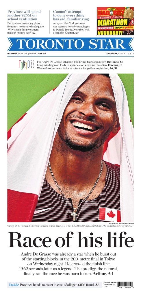
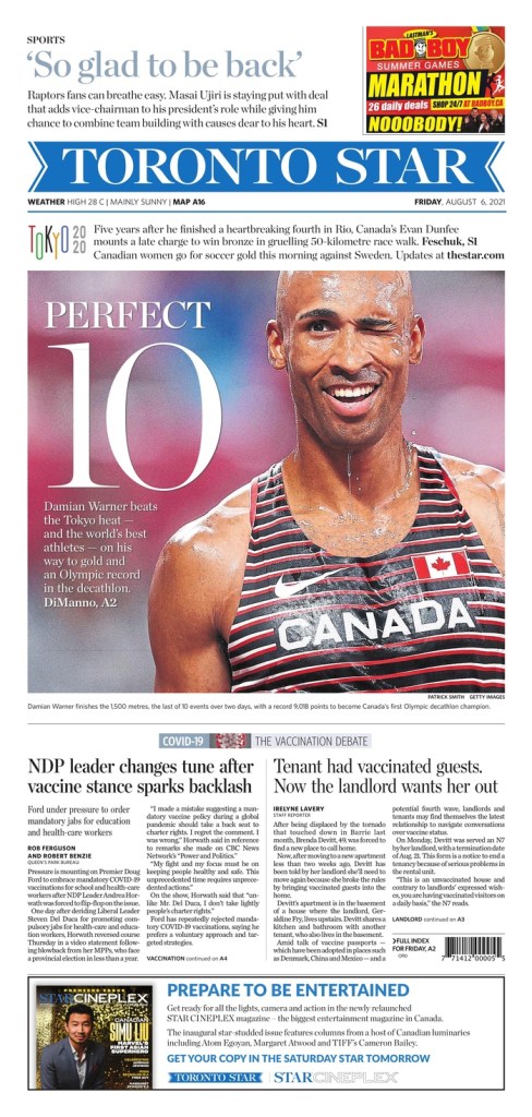
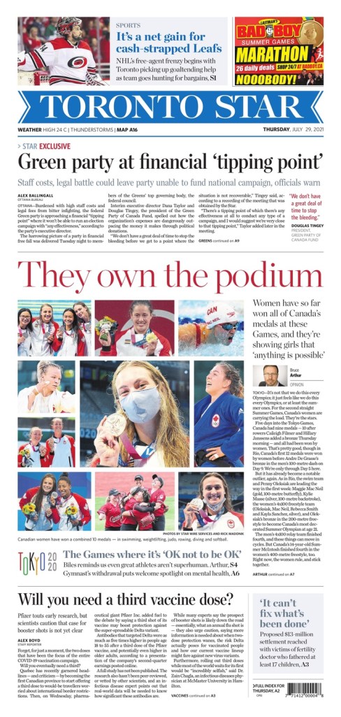
The top pages for the Star and Post came on the same days about the same things. Even about Canadian women dominance. Same day even though either could have gone earlier. The Andre De Grasse page from the Star is fantastic as well. A great emotive photo. Big headline. Nice use of white space. And again a blown out cover for one thing. And just below it was the Damian Warner decathlon page, only faulted for the headline Perfect 10 — I would grant that even if Warner won every event or finished with the best score ever. The Globe and Mail chose the same head. But no shade. A big 10 again and a truly fantastic photo. That wink. Amazing. And I love the play of the display copy on the photo. It’s done well. And the women’s collage. Very similar to the Post.
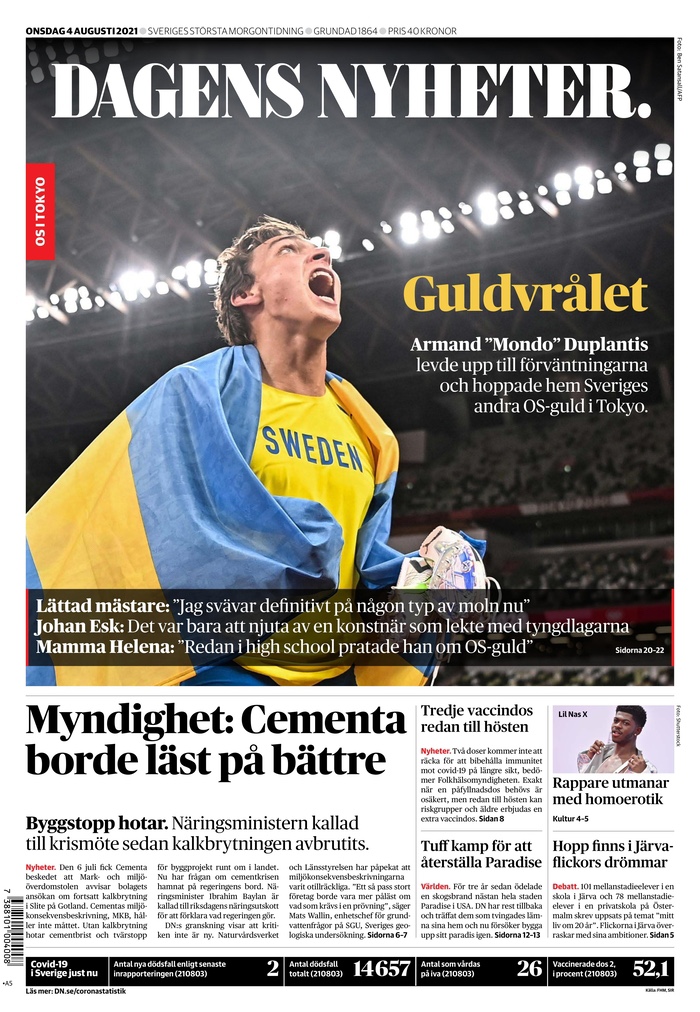
Bronze: Dagens Nyheter (Sweden)
The covers in Dagens Nyheter were just so crisp and clean. An emphasis on strong photography. I have included two, at opposite ends of the spectrum. Heartbreak for the women’s soccer team after losing to Canada in the gold medal match and elation from Armand “Mondo” Duplantis after a gold medal win in pole vault. The display on the photos is done so well. Differently in both but both so good. I love the pull quote on the soccer page and the small yellow head on the pole vault. Such a small head for a big victory but it works so well.

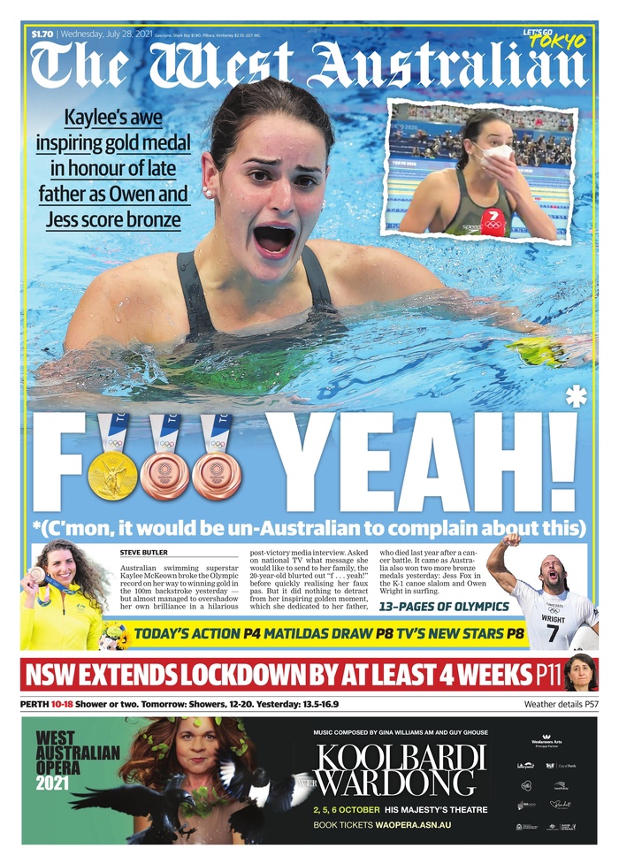
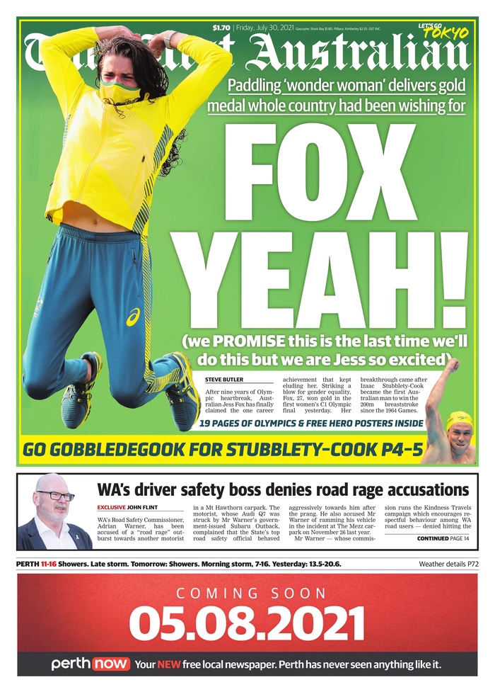
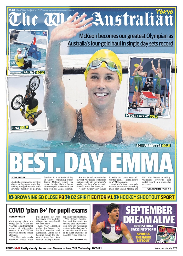
Runner up for being funny: The West Australian
Cheeky? Yes. Did they use the same profane joke twice? Yes. Was it still funny? Fox yeah. But only because they used their decks (or subheads, if you prefer) masterfully. It was a master class in tabloid display. And of course they wouldn’t be here if they didn’t have lovely designs as well. All very similar but still great. No near profanity on the Emma page but also wonderfully done in true tabloid style. Must read in an Australian accent. And a slight pause between each word. Best. Day. Emma.
Olympic efforts
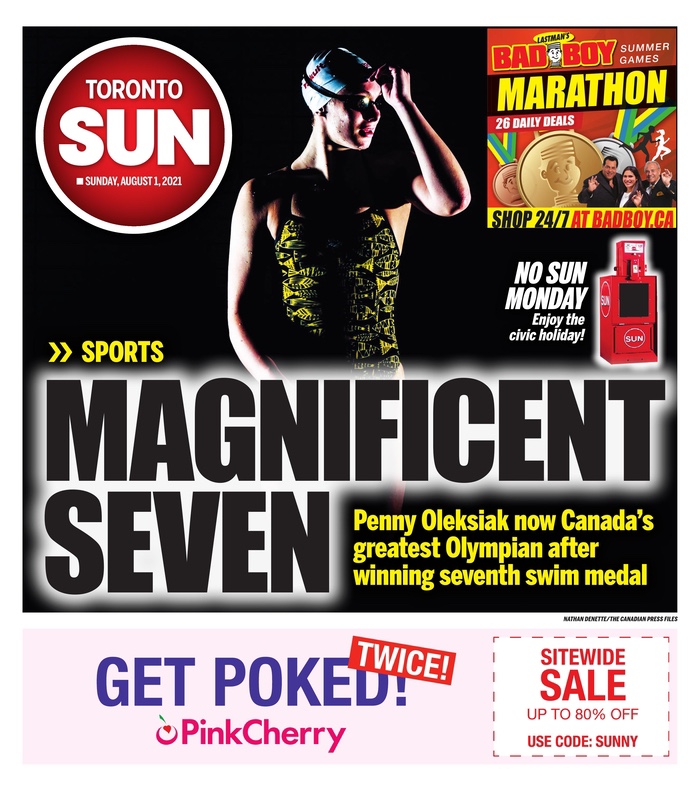
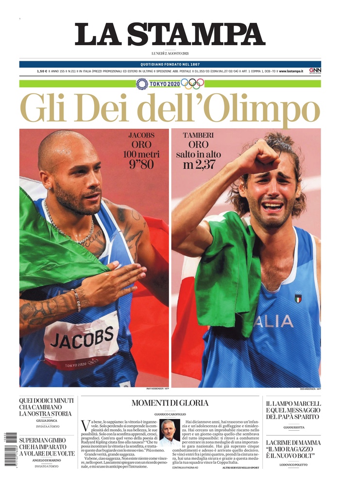
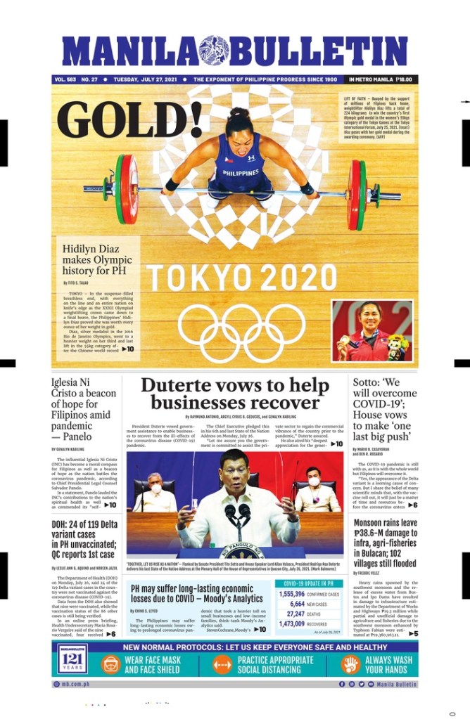
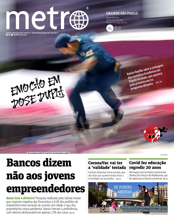
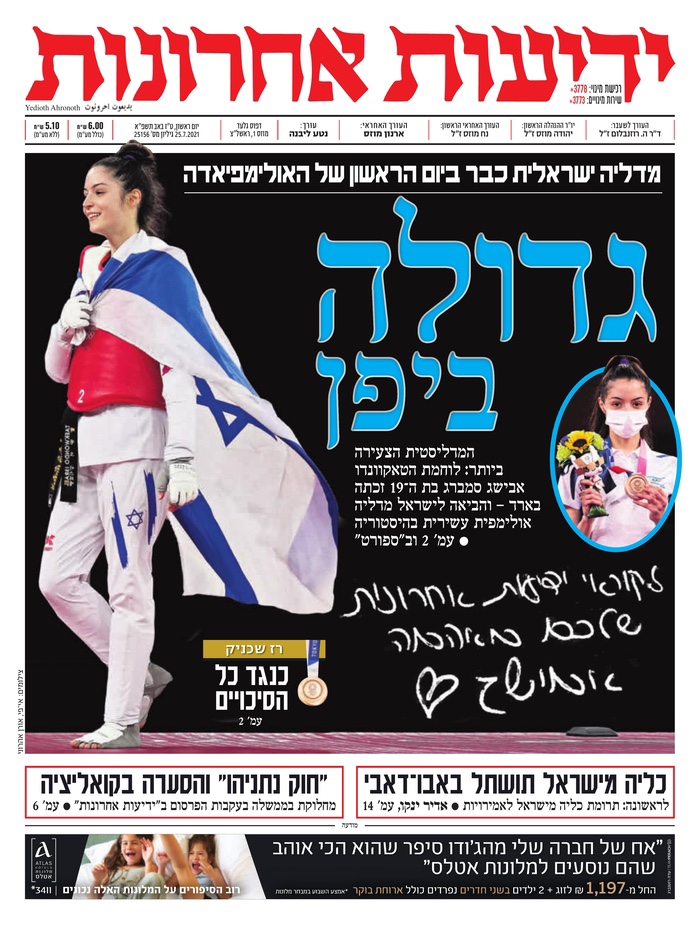
And here are a handful of other great pages I saw. One more from Canada (the Toronto Sun) and then four others from around the world. La Stampa (Italy) shows two big victories, really captures the emotion. The Manila Bulletin (Philippines) has such beautiful colours and a nice bird’s eye view photo. Metro (Brazil) is totally photo driven. A gorgeous photo. And Yedioth Ahronoth (Israel). Nice art and great contrast. And while she is walking off the page, it works. Rules are meant to be guidelines. So follow them when it works. Walk off the page when it doesn’t.
There were so many nice pages over the course of these Olympics. The Games that probably never should have happened. But tell that to the athletes. While maybe it was reckless, I am thankful for these beautiful covers. This is a dangerous time indeed. For newspapers, for the athletes, for Tokyo, for the world. The athletes gave us something to celebrate. These newspapers put it out there for their readers to see, and left it all on the newsroom floor (probably their basement or kitchen floors in a lot of cases). The power of print is alive and well. 🏅

[…] around the world to see what they had done. They didn’t disappoint. There were so many great front pages every day, despite Japan being a world away in terms of time zones for many newspapers. But even newspapers […]
LikeLike