George Floyd’s death was more than a tragedy. It was a murder. It was a catalyst for an uprising, in the U.S. and around the world. It was a wakeup call, one of many, but one that seemed to resonate with people outside of the Black community. George Floyd, who was killed after allegedly buying cigarettes with a counterfeit $20. Killed by police. For nine minutes and 29 seconds, police had him on the ground, knee on his neck. Somewhere around the eight-minute mark he lost consciousness. But the knee remained. This was May 25, 2020.

His death came to be a symbol of what’s wrong, not only in America, but around the world. The systematic racism that exists and thrives.

Newspapers covered his death in the immediate aftermath and long after. There were many necessary stories, many appearring on front pages around the world. And while newspapers won’t run out of key angles to write about (assuming the editors and decision makers are keeping this story in the collective consciousness), how do designers keep the story fresh, to help keep it dynamic? Sure, a newspaper can put a story over the fold on its front page. It will get attention. But the design can play a key role in elevating the story. You can’t have readers get complacent and gloss over the story. A designer needs to pull them in, and sometimes there aren’t a lot of choices visually.

More than a year has passed since his death. In a world of 24-hour news and social media, most stories don’t get the spotlight for long. This story, the issue it thrust in front of the comfortable and privileged, needs to be there.

One year after Floyd’s murder, there were two pages that stood out for me, each taking very different approaches to their designs. But both highlight the power newspapers have, and the responsibility they have. And the power of newspaper design. It’s not just the words.

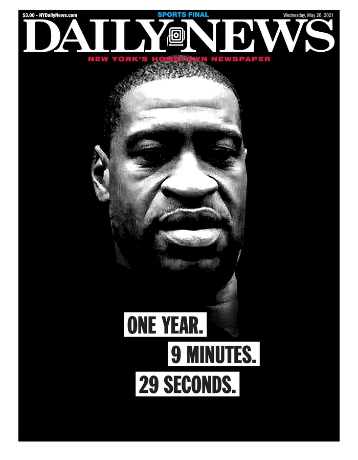
The first page that caught my eye was the New York Daily News. It was striking. A big photo of Floyd. His face instantly recognizable, brightly lit in parts and not in others. Starkly placed on a black background. The white newspaper flag adding contrast. And a great newspaper page almost always has strong words. Or strong words elevate a great page to unforgettable. This one simply says: One year. 9 minutes. 29 seconds. Black text on white on black. Those words are so significant. Anyone familiar with the story will know what it means. Anyone not will be appalled. How the words are played is significant. It was a masterful page. It captured the feeling one year later, and helped keep this story in front of readers.

New York Daily News cover, May 26, 2021

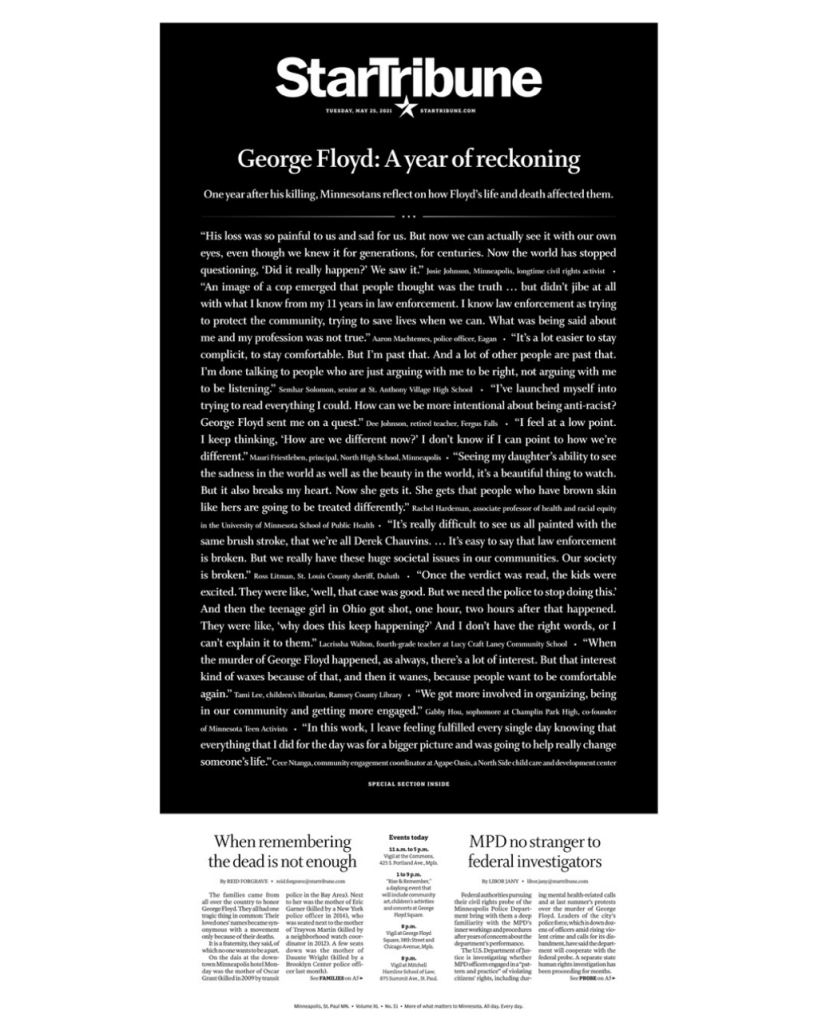
The next page took a very different approach. The similarity was that it was also on a black background. Reverse white text on a black background. But it isn’t a picture of Floyd that makes this page. It’s words. All words. It was a powerful message. When a newspaper makes a decision to run a page without art, the words have to do it all, so they have to be done well. When an issue is so consequential, sometimes words are all there is. The Star Tribune is an exceptional paper. It’s in Minneapolis, where Floyd was killed. While this became a worldwide story, this paper owes it to its community to keep this story front and centre. This page was breathtaking, yet simple. So many words, but that’s why it works. In this instance. In others, it wouldn’t. But it was the right time and the right play and the right words.

Newspapers owe it to readers and to society to run stories like this, to keep these issues, issues like this, like the unmarked graves of Indigenous children in Canada, in the collective conscience. It was in the news again when Derek Chauvin, the police officer who kept his knee on Floyd’s neck, was found guilty of murder. And again when he was sentenced to 22.5 years in prison.

But these pages above, and the ones below (which I’ve shown in previous posts) highlight the power of print design. Three of them show, or somewhat show Floyd’s face, which has become a symbol of the movement and a way to illustrate the story. And newspapers try to present his face in novel ways. As long as newspapers are trying to raise awareness of serious issues through design, I will keep showing them.

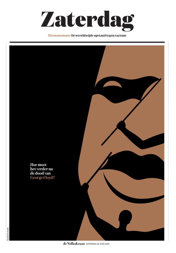
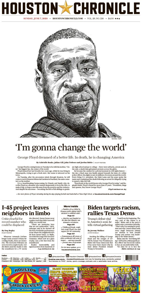
Above: de Volkstrant’s stunning and masterful illustration of Floyd’s face, and of the movement it catapulted into the world’s consciousness, and the Houston Chronicle, with a powerful sketch of Floyd.

By Brad Needham

The power of print. Newspapers. It’s the reason I started this blog. Every day I look through hundreds of front pages from newspapers all over the world. Over the course of a few days last week, I had the privilege of looking through some of the best designs in the world at the Society for News Design print competition. It was mind blowing. It actually left me stirring with emotions. To look at one of the most challenging years in our history, at least recent history, through the lens of newspapers around the world. The loneliness and emptiness of COVID-19. The coming together and rallies around George Floyd and the racial reckoning. We probably watched videos. Read countless stories online. Maybe we remember some. But newspaper pages live on. They are a time capsule. I was fortunate enough to be asked to be a facilitator at this year’s SND Best of Print competition. It was even better than I was hoping for.

Some of the judges, organizers and facilitators from SND42.

In my first real newspaper job, I stumbled upon old, tattered SND books. I looked though them, in awe of the brilliance. Wondering if I might be able to learn something. I took them everywhere, even on vacation. I had yellow sticky notes marking inspirational pages. Some books had dozens of pages marked, the sticky notes tattering like the books (two of which I stole from my first workplace — sorry and thanks). Less than 10 years later, I appeared in one of the books. Then again two years later. And again two years later. That was 10 years ago. Every time, the feeling was magical. As newspapers were contracting, I made the fateful decision to move to the Toronto Star shortly after the last award. After just over a year I was laid off, and moved to Pagemasters North America to lead … the production of the Toronto Star. But my design days were mostly left behind. Being at this competition made me wistful and left me with a strong sense of longing. How I wanted to do it again. When I heard that the competition almost didn’t happen this year, I was floored. While print media may be in a period of contraction, I can assure readers there are so many who are still giving it their all. Some of the pages were so powerful. Some brought people to tears. (I might have been one of the tearful.)

De Volkskrant’s entry, “How should things go on after the death of George Floyd?”

I will sprinkle a few of the entries through this post, but I will do another post soon reviewing what I will call my best in show, an actual category at SND that is sometimes awarded and sometimes not. To meet the highest standards, a strong majority of judges need to agree that one submission stands above the rest. In a competition with thousands of outstanding entries, with judges from diverse backgrounds, feeling different emotions, being pulled in different directions, finding one that stands out from the crowd is no easy task.

Los Angeles Times a year in review.

Being in the room listening to the judges was such a joy. And one of the most educational moments in my career in terms of design knowledge. Ten years after my last award and I feel like I know so much more. Listening to the insight different judges had, on both the strengths and failings of different pages. On Sunday while out for a walk, I listened to the Best in Show discussion on my phone. It was like a tennis match, each judge skillfully volleying their opinions, only to have another judge counter with an equally insightful opinion on the other side.

There were pages from all over the world. It was fascinating to see all sorts of representations of the COVID ball, depictions of George Floyd (see the Houston Chronicle and Die Zeit above). It was surprising to see creative concepts, seemingly unique, repeated in slightly different ways. Below, the Globe and Mail and Politico Europe use a tangled string to illustrate getting through COVID, while The Economic Observer and Politico Europe use an upward view of buildings and plane in the sky for very different stories.

This was the first year the competition was held virtually. So instead of newspaper pages spread out on tables, it was PDFs being opened on laptops. While the pages were all crisp and clear, no yellowing of print from pages pulled from the archives, some judges commented on how they felt certain entries would have hit them differently laid out in all their print glory. Instead of cups holding votes for Awards of Excellence or not it was computer tabs, with a virtual separator between those that got three votes and those that got four or more, which would then be up for medal discussion (an entry needs three of five votes to win an Award of Excellence). Instead of taking 15,000 steps over the day, those partaking were lucky to get in 1,500 sitting in their basements, in front of bookshelves, old cameras, bourbon. And instead of more than 10,000 entries, there were a little more than 3,000. If SND will have me between now and next year, I am determined to change that. After looking through pages every day, I know there are potential Awards of Excellence out there that weren’t submitted. Maybe medals.

The experience overall was worth its weight in gold medals. There were five this year. Here are a few more tweets with judges’ commentary from SND on some of the big winners.

I will use this soapbox to encourage people to support print media. I will argue here or there or anywhere, on a train or in the rain, that there is no media more powerful, with more impact, than print media. I encourage those from smaller newspapers to start thinking about next year’s competition. Put yourself out there. The vast majority of the entries were outstanding. Some rose above, and some rose even further. Even those that didn’t win still showed that the creative spirit is alive and well. So a shoutout to print designers everywhere. To illustrators (some of the illustrations this year were breath-takingly beautiful and powerful). To those who still put forth their best effort day in and day out, with fewer resources and less time. You’re all amazing. And I will bury this here. I was contemplating quitting this blog. I didn’t think there were enough people who cared about print media. I was having a hard time finding magical pages. But after seeing the emotion and passion at SND42, and the sheer volume of awe-inspiring entries, I’ve decided to keep plugging away. Sharing great designs when I see them. I can’t wait for SND43.

Looking back

These were three of the pages I submitted over two years to get recognition. Not on par with the stunning pages I saw this year, but I am proud of the work we did at the Guelph Mercury, with a circulation around 10,000 and a very small newsroom.

Coming soon: posts on my best in show and one on CanCon at SND42.

Have thoughts? Share them below. Want to see more? Subscribe!