By Brad Needham

The power of print. Newspapers. It’s the reason I started this blog. Every day I look through hundreds of front pages from newspapers all over the world. Over the course of a few days last week, I had the privilege of looking through some of the best designs in the world at the Society for News Design print competition. It was mind blowing. It actually left me stirring with emotions. To look at one of the most challenging years in our history, at least recent history, through the lens of newspapers around the world. The loneliness and emptiness of COVID-19. The coming together and rallies around George Floyd and the racial reckoning. We probably watched videos. Read countless stories online. Maybe we remember some. But newspaper pages live on. They are a time capsule. I was fortunate enough to be asked to be a facilitator at this year’s SND Best of Print competition. It was even better than I was hoping for.

Some of the judges, organizers and facilitators from SND42.

In my first real newspaper job, I stumbled upon old, tattered SND books. I looked though them, in awe of the brilliance. Wondering if I might be able to learn something. I took them everywhere, even on vacation. I had yellow sticky notes marking inspirational pages. Some books had dozens of pages marked, the sticky notes tattering like the books (two of which I stole from my first workplace — sorry and thanks). Less than 10 years later, I appeared in one of the books. Then again two years later. And again two years later. That was 10 years ago. Every time, the feeling was magical. As newspapers were contracting, I made the fateful decision to move to the Toronto Star shortly after the last award. After just over a year I was laid off, and moved to Pagemasters North America to lead … the production of the Toronto Star. But my design days were mostly left behind. Being at this competition made me wistful and left me with a strong sense of longing. How I wanted to do it again. When I heard that the competition almost didn’t happen this year, I was floored. While print media may be in a period of contraction, I can assure readers there are so many who are still giving it their all. Some of the pages were so powerful. Some brought people to tears. (I might have been one of the tearful.)

De Volkskrant’s entry, “How should things go on after the death of George Floyd?”

I will sprinkle a few of the entries through this post, but I will do another post soon reviewing what I will call my best in show, an actual category at SND that is sometimes awarded and sometimes not. To meet the highest standards, a strong majority of judges need to agree that one submission stands above the rest. In a competition with thousands of outstanding entries, with judges from diverse backgrounds, feeling different emotions, being pulled in different directions, finding one that stands out from the crowd is no easy task.

Los Angeles Times a year in review.

Being in the room listening to the judges was such a joy. And one of the most educational moments in my career in terms of design knowledge. Ten years after my last award and I feel like I know so much more. Listening to the insight different judges had, on both the strengths and failings of different pages. On Sunday while out for a walk, I listened to the Best in Show discussion on my phone. It was like a tennis match, each judge skillfully volleying their opinions, only to have another judge counter with an equally insightful opinion on the other side.

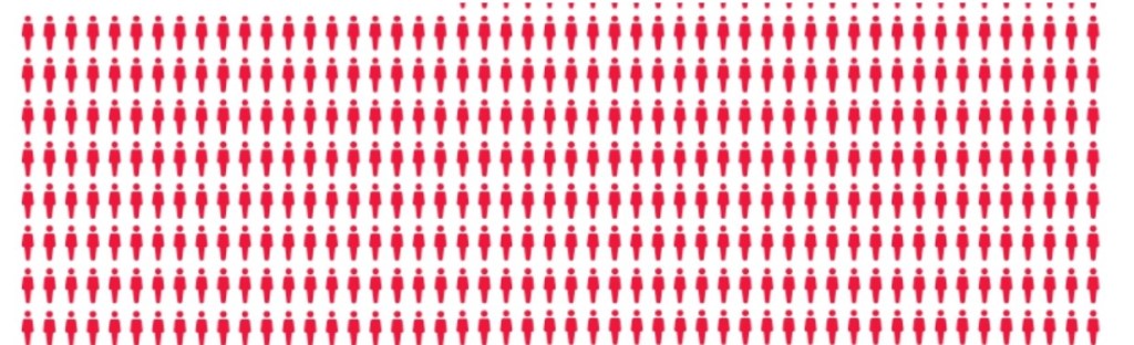
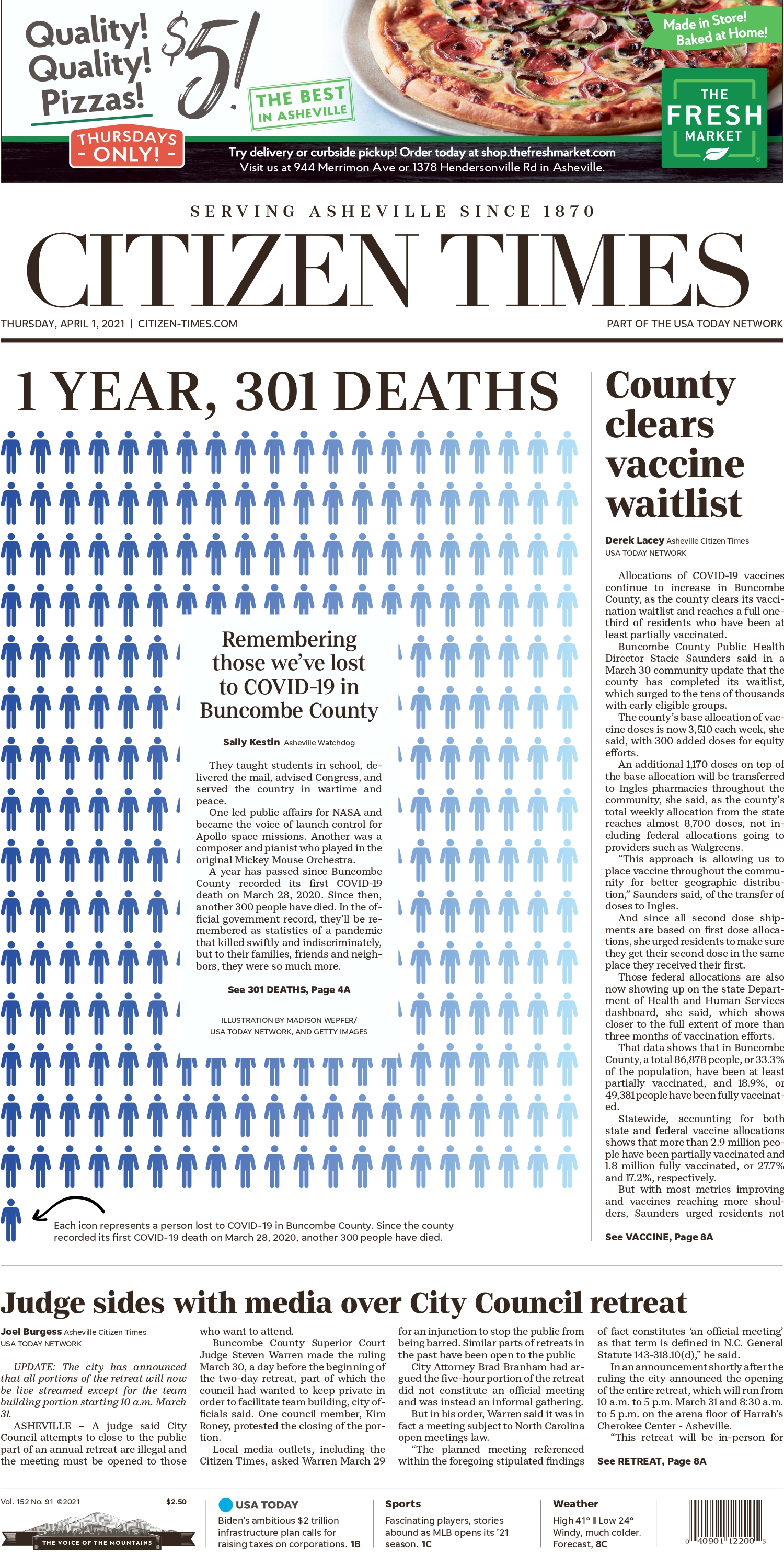
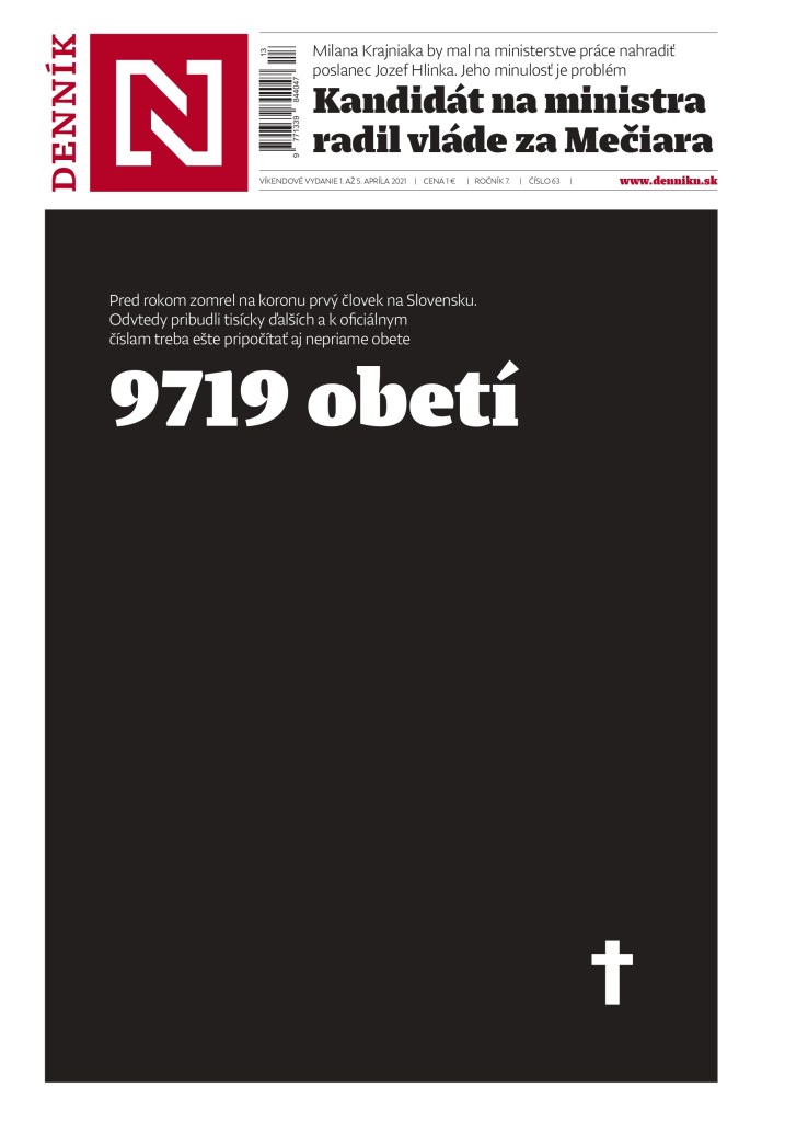
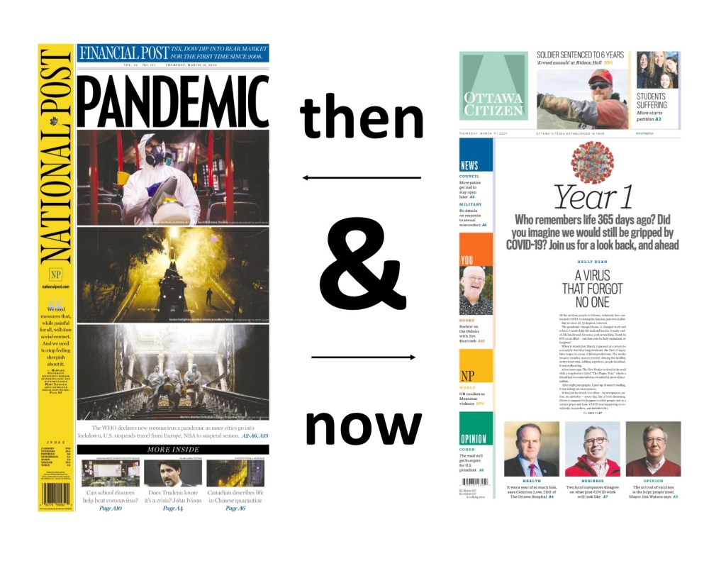
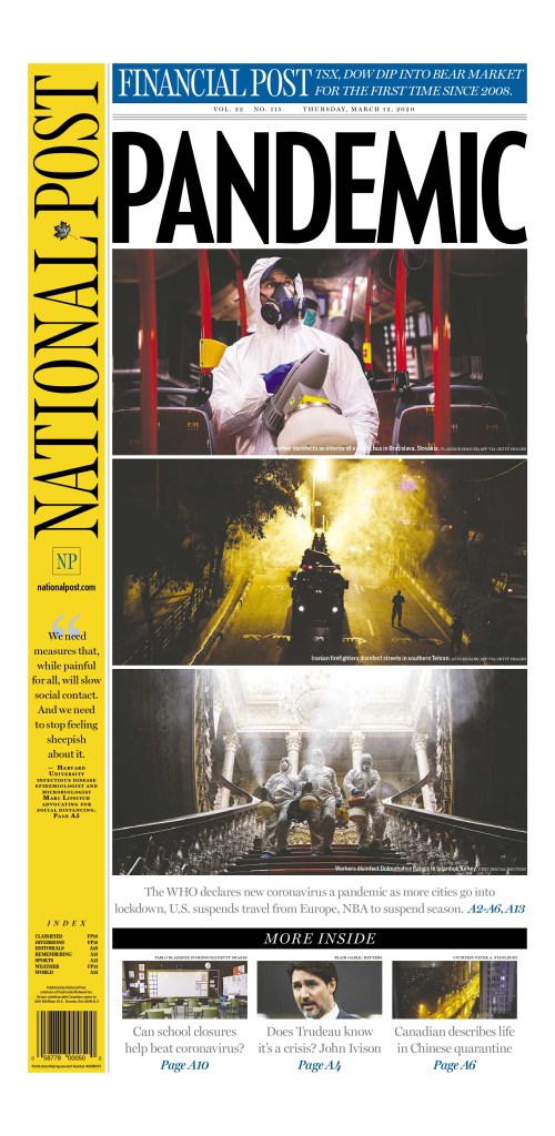
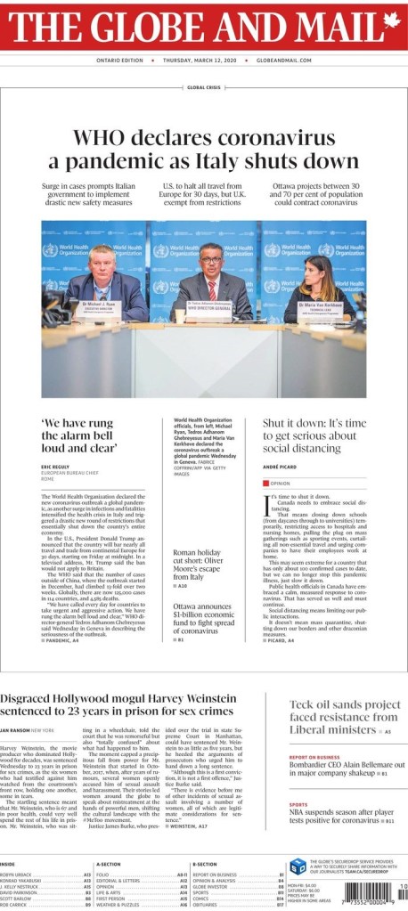
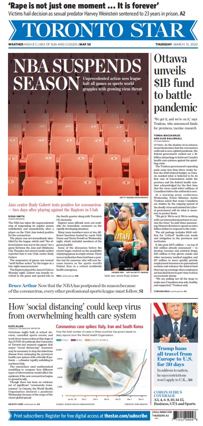
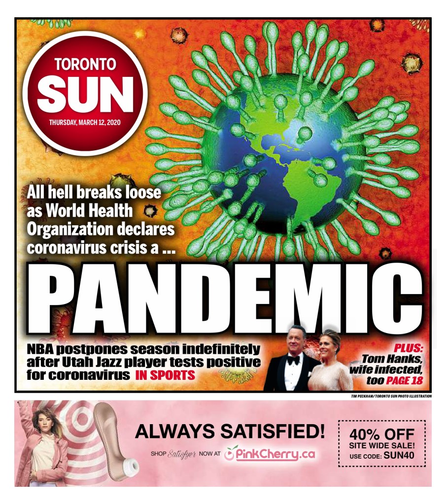
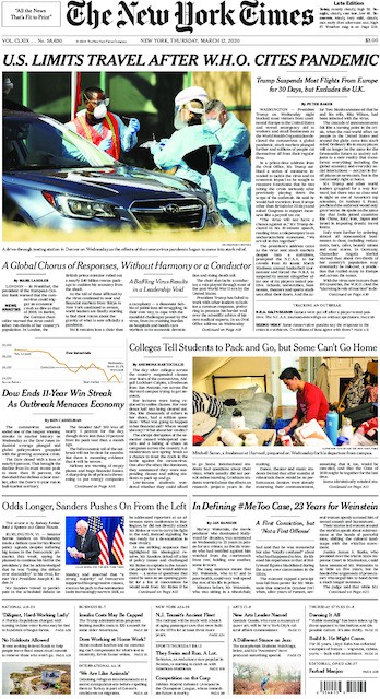
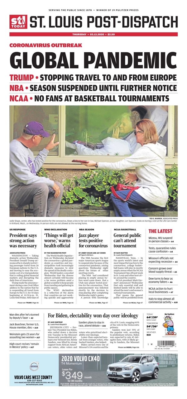
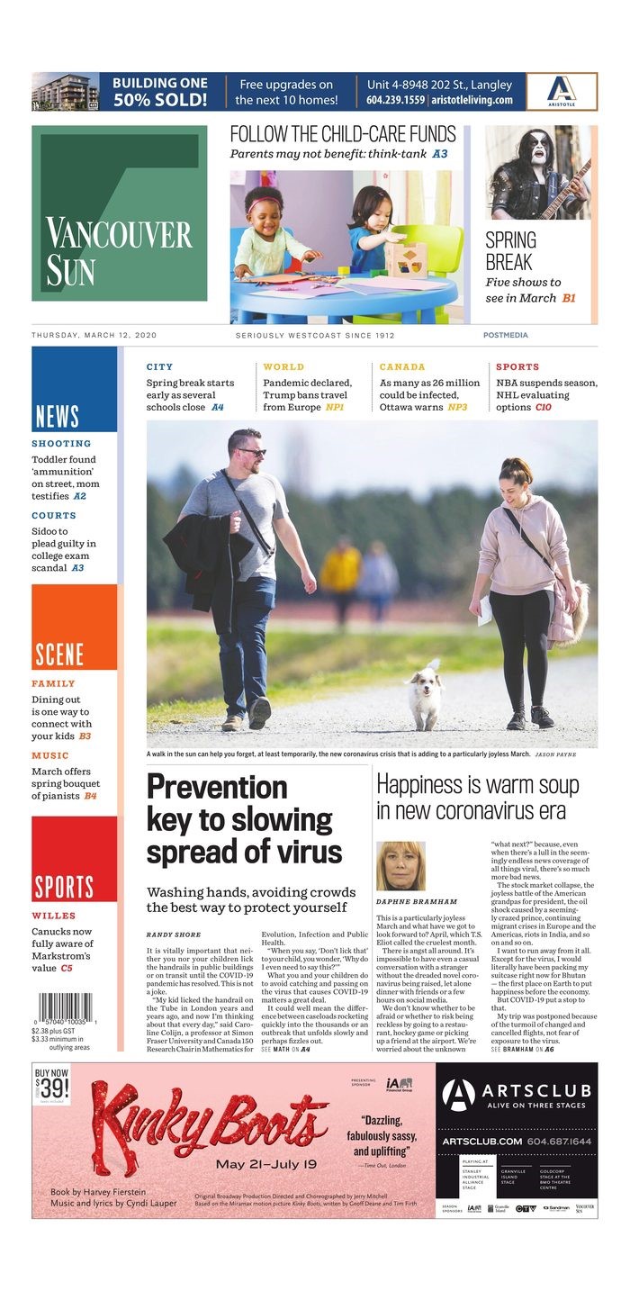
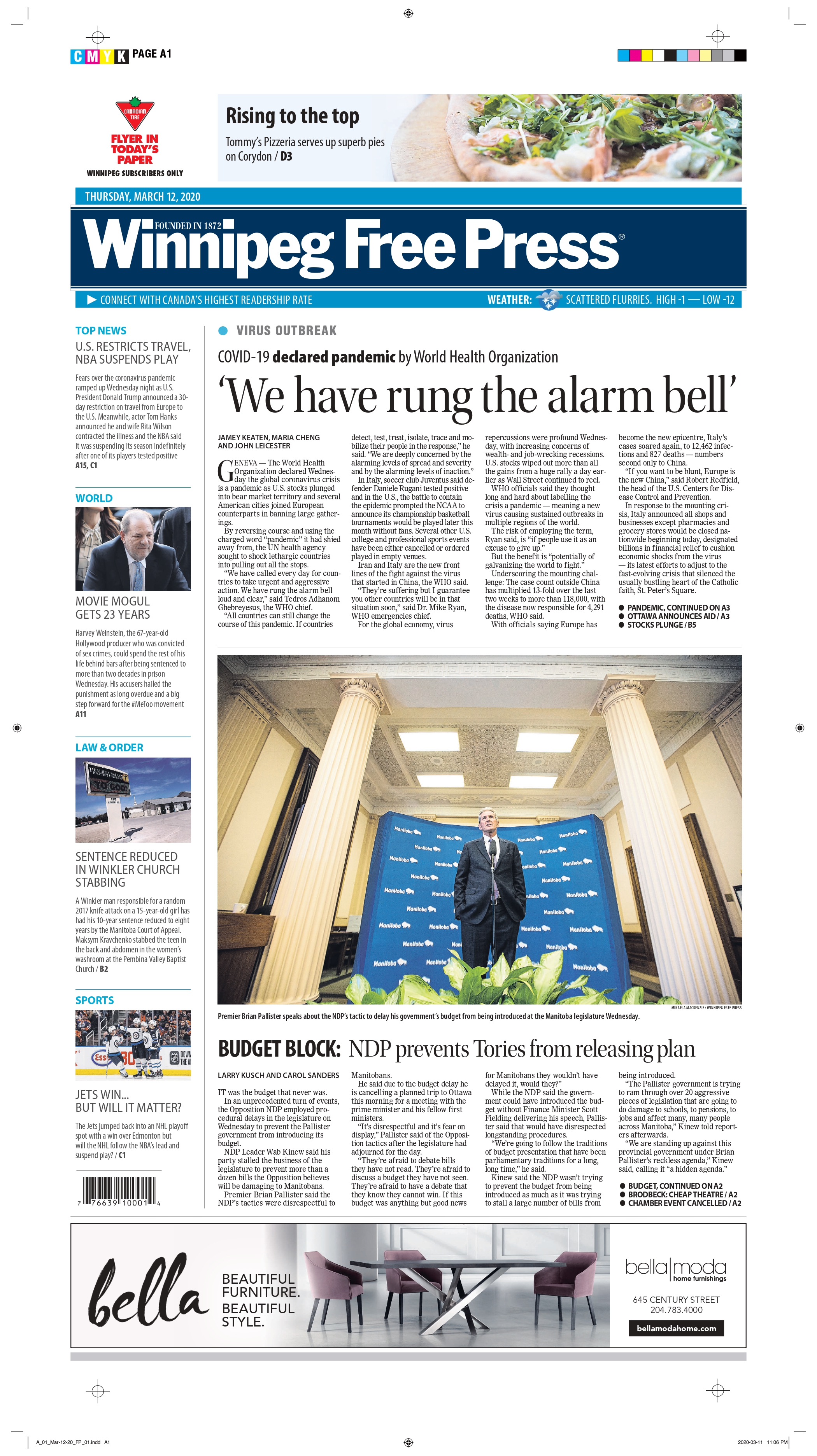
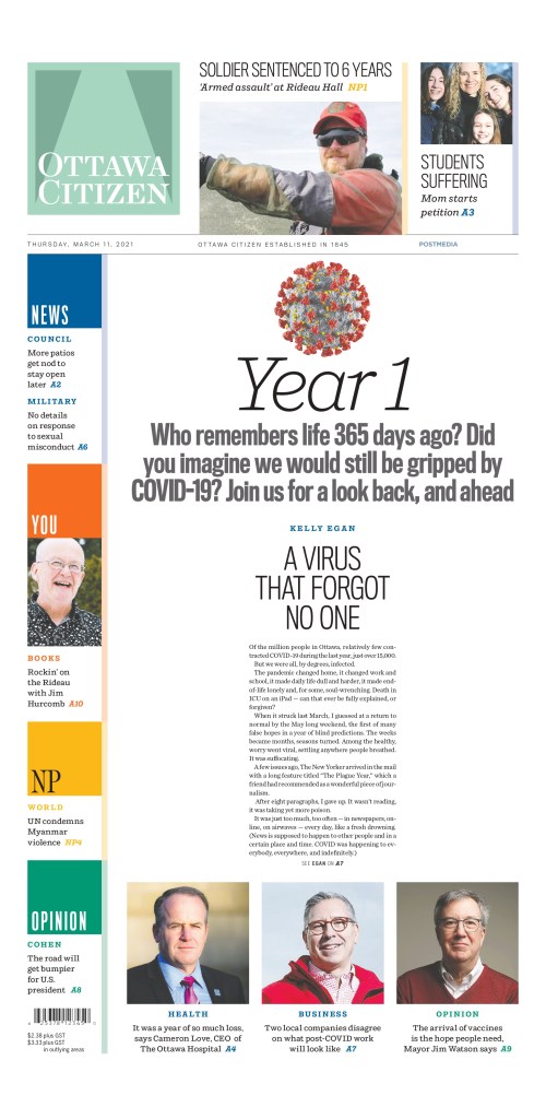
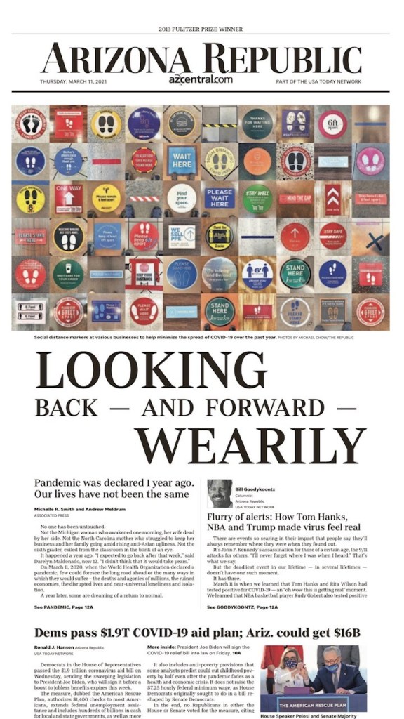
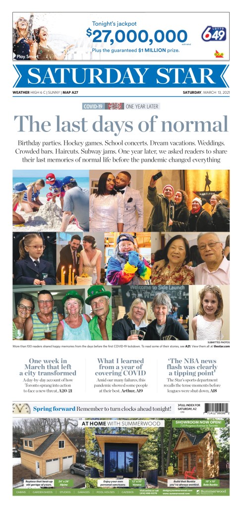
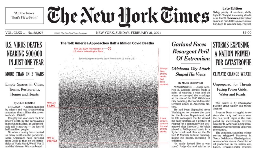
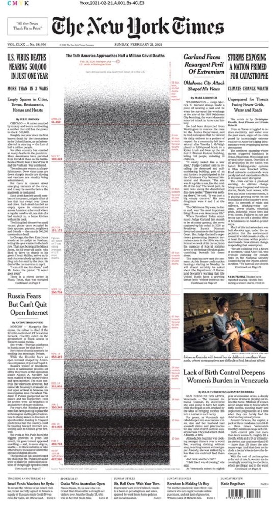
There were pages from all over the world. It was fascinating to see all sorts of representations of the COVID ball, depictions of George Floyd (see the Houston Chronicle and Die Zeit above). It was surprising to see creative concepts, seemingly unique, repeated in slightly different ways. Below, the Globe and Mail and Politico Europe use a tangled string to illustrate getting through COVID, while The Economic Observer and Politico Europe use an upward view of buildings and plane in the sky for very different stories.

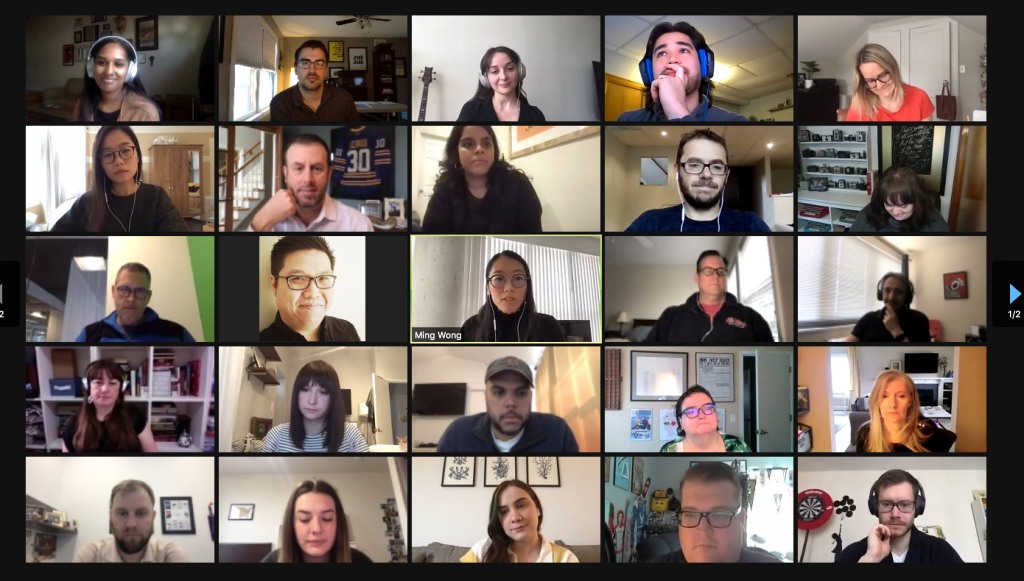
This was the first year the competition was held virtually. So instead of newspaper pages spread out on tables, it was PDFs being opened on laptops. While the pages were all crisp and clear, no yellowing of print from pages pulled from the archives, some judges commented on how they felt certain entries would have hit them differently laid out in all their print glory. Instead of cups holding votes for Awards of Excellence or not it was computer tabs, with a virtual separator between those that got three votes and those that got four or more, which would then be up for medal discussion (an entry needs three of five votes to win an Award of Excellence). Instead of taking 15,000 steps over the day, those partaking were lucky to get in 1,500 sitting in their basements, in front of bookshelves, old cameras, bourbon. And instead of more than 10,000 entries, there were a little more than 3,000. If SND will have me between now and next year, I am determined to change that. After looking through pages every day, I know there are potential Awards of Excellence out there that weren’t submitted. Maybe medals.

The experience overall was worth its weight in gold medals. There were five this year. Here are a few more tweets with judges’ commentary from SND on some of the big winners.

I will use this soapbox to encourage people to support print media. I will argue here or there or anywhere, on a train or in the rain, that there is no media more powerful, with more impact, than print media. I encourage those from smaller newspapers to start thinking about next year’s competition. Put yourself out there. The vast majority of the entries were outstanding. Some rose above, and some rose even further. Even those that didn’t win still showed that the creative spirit is alive and well. So a shoutout to print designers everywhere. To illustrators (some of the illustrations this year were breath-takingly beautiful and powerful). To those who still put forth their best effort day in and day out, with fewer resources and less time. You’re all amazing. And I will bury this here. I was contemplating quitting this blog. I didn’t think there were enough people who cared about print media. I was having a hard time finding magical pages. But after seeing the emotion and passion at SND42, and the sheer volume of awe-inspiring entries, I’ve decided to keep plugging away. Sharing great designs when I see them. I can’t wait for SND43.

Looking back

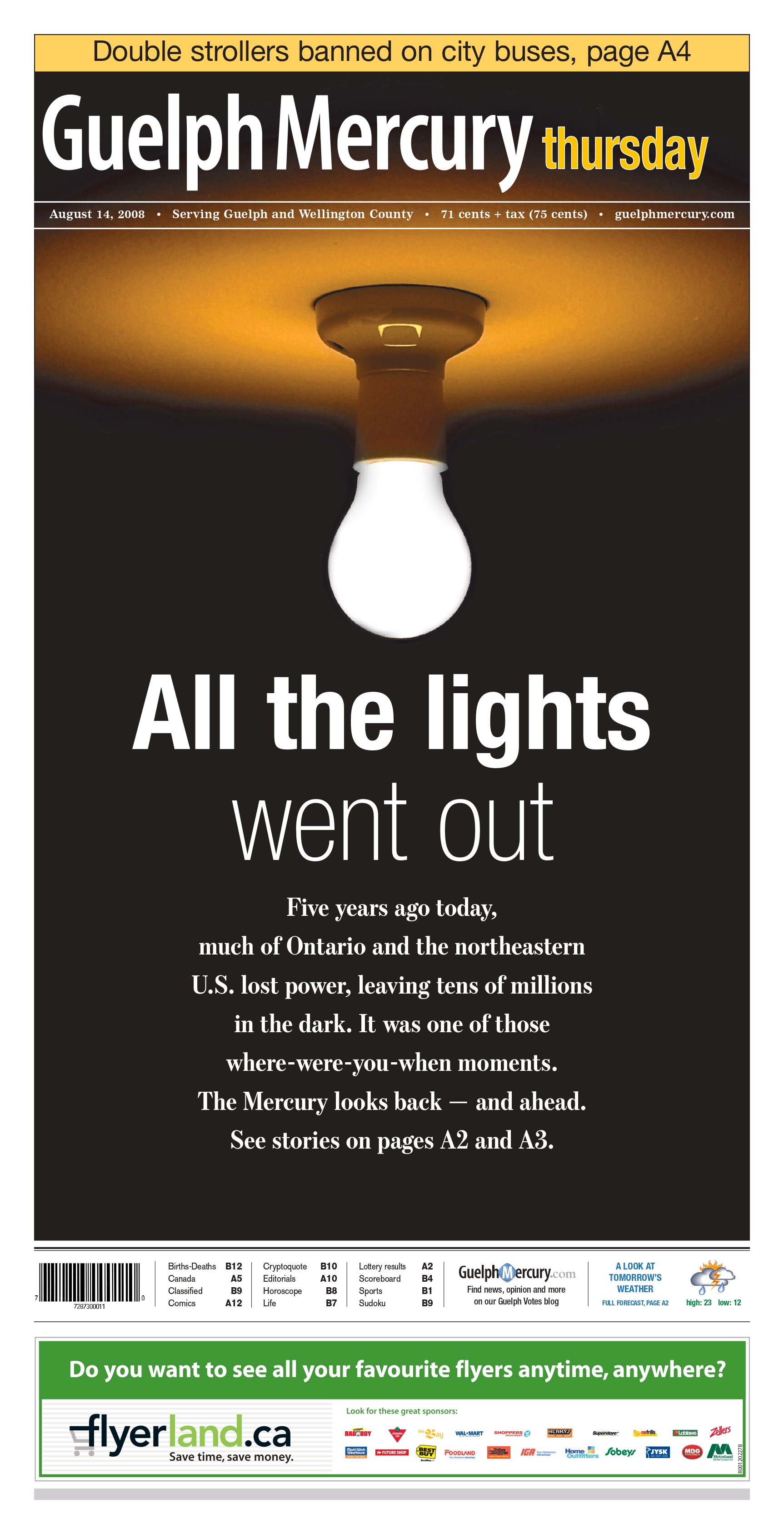
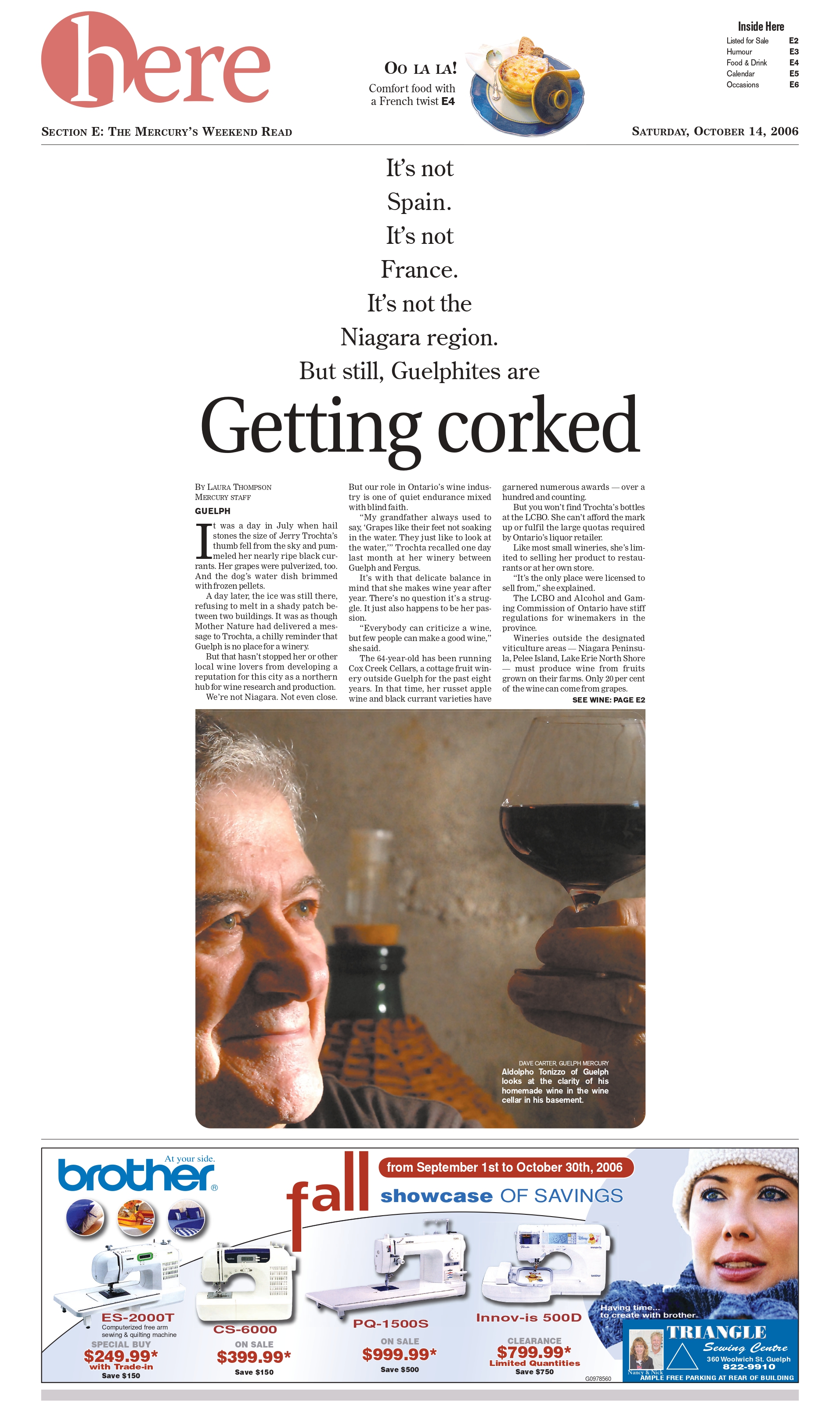
These were three of the pages I submitted over two years to get recognition. Not on par with the stunning pages I saw this year, but I am proud of the work we did at the Guelph Mercury, with a circulation around 10,000 and a very small newsroom.

Coming soon: posts on my best in show and one on CanCon at SND42.

Have thoughts? Share them below. Want to see more? Subscribe!

By Brad Needham

Most days I like to look through the daily front pages of newspapers around the world from the Freedom Forum (I will do a post about this organization soon). I am always looking for inspiration or trends or just one-off great newspaper designs. Today I found a sad theme: COVID-19. Yes, that is on the front page of most newspapers every day. But for the most part they are standard news pages, though I have written about a couple of other days with great pages, one from the New York Times and its Wall of Grief and one that looked at the anniversary of the pandemic declaration. Today there were some big designs. Interestingly two of the three I found used what is also an increasingly common design device: the generic stick figure-type shape. But one newspaper used it to mark vaccination efforts and another to mark COVID deaths. Both striking.

Both of these covers are powerful in their own rights. One, the Citizen Times uses the figures to mark a sombre story. Each figure represents one death over a year, 301 in total. Not the one on the line on its own. Even that uneven number, the imbalance, as power to what has been a sad and lonely year for many. But it’s more symbolic as it talks about the first death, and then the 300 that followed. That first death will always be symbolic. And there is a single figure, on a line of its own. The Citizen Times takes an interesting approach of putting the text of the story in the middle, over top of some of the figures. Despite some of the 301 being covered, the idea is still powerful, and I am a fan of starting a story on text when it works. It does here.

On the San Francisco Chronicle front, each figure represents 10,000 people. But it’s more hopeful. The first batch, red, represents the number of people between the ages of 50 and 64 who are eligible to receive vaccines starting today. That is 5.5 million people whose lives could change today or soon. The next, the black batch, represents those who have not been vaccinated but are eligible as of April 15. And the bottom, the blue with check marks, are those who have received at least one dose.

It’s fascinating that two papers, thousands of miles apart, decided to blow out their covers with figures representing COVID-19. Two pages. Very similar ideas. Very different representations. One sombre, one hopeful. Both powerful.

Denník N, a Slovakian paper, uses this very powerful page also to mark the same sombre milestone as the Citizen Times. Deaths over one year due to COVID-19. It uses reverse white text on a black cover, which really highlights the gravity. A small cross in the bottom corner. A large number, both physically and as a marker for the number of deaths: 9,719. And that number is higher today. The deaths continue.

I expect we will see a lot more pages like these as communities continue to mark milestones, either grim or hopeful. I highlight these pages to show the power of newspaper print design, whether the message is positive or negative.

Previous posts:

The Pandemic Papers
The Wall of Grief
Print is dead, long live print

By Brad Needham

Up until March of 2020, newsrooms had always been buzzing, busy places. Reporters on calls. The clickety-clack of typing. Editors and designers shouting across the room. Editorial decision-makers making decisions. All in one place. How could it be done any other way? It was about collaboration and community. The community within the newsroom preparing news for the community without. And then on March 11, 2020, the WHO declared the coronavirus outbreak a pandemic. Not an epidemic. And unlike some of the other pandemics in the past 50 years, this one seemed to capture the attention of everyone. Maybe it was that the NBA postponed its season one year ago today. The NHL followed suit shortly thereafter. Two organizations driven so much by money cancelling their primary revenue streams. Money talks.

But by March 11, or very shortly thereafter, what seemed unthinkable for a newsroom, producing a daily (or weekly) newspaper from anywhere but a newsroom, became a reality. One year ago today or shortly thereafter, newsrooms started shipping computers and keyboards and monitors and mice home. And setting up VPNs. Soon setting up Zoom accounts for all staff.

It was a pandemic. One that caused mass panic. You couldn’t even find toilet paper in most places. I know because I searched high and low trying to find some for an editor who said she couldn’t find any. I found a four-pack and brought it into the office. I went to 10 stores, a little scared in every one. This was pre-masks. Or knowledge.

But was it such a big deal? One that warranted panic buying of toilet paper and canned goods? Hindsight is usually 20/20. In newsrooms one year ago today, discussions were being had about tomorrow’s front page as well. What do we do? Is this bigger than the flu pandemic of 2009? Or the SARS pandemic of 2002? Newspapers are always worried about blowing things out of proportion. So do we play this big, they would be asking? Do we downplay it? Do we talk about soup? It had to be on the front page. But how big?

I’m going to look at some of the papers from March 12, 2020, and then at some from today, March 11, 2021. I admit I was expecting big anniversary covers. That was going to be the focus of this post. Some papers did. Most papers didn’t. It also happens to be the 10th anniversary of the 2011 Japanese earthquake and tsunami, which also caused a nuclear disaster. A devastating tragedy that left 20,000 dead. It is a tragic anniversary, so I acknowledge it here before looking at the pandemic papers of 2020 and 2021.

March 11, 2020 (March 12 in the newspaper world): WHO declares a pandemic

National Post, March 12, 2020

Of all the pages I looked at from March 12, 2020, the National Post cover was the one I felt most hit the mark on the type of play this should get (or should have gotten in hindsight). This was a significant day, and while it was just a declaration, the disease would have spread and wreaked havoc around the world regardless, this was a key moment. This week last year was when everything changed. This page uses a single-word headline, all caps: PANDEMIC. I’ve talked about this in previous posts. It seems so simple. But It was certainly discussed ad nauseum. And to complement that are striking, bold images. And equally important, they blew out the entire page. For a national newspaper to blow out an entire cover it needs to be a significant story. The editors at the National Post felt this was. This was a scary day, and life changed after this. But this is a beautiful page, despite the devastating and deadly outcome over the next year.

Globe and Mail, March 12, 2020

Another national newspaper in Canada also gave it big play. The Globe and Mail, while not as bold as the National Post in this instance, gave the pandemic top-of-the-fold play. And as is typical of the Globe, it uses white space to its advantage. They chose not to blow out the entire front, and while I wasn’t in the room, I can imagine the discussions. First, the Globe targets a different audience. They want information on the front. They often use their real estate to its fullest, having some pages inside without art, or very small art. On top of the pandemic, Harvey Weinstein was also sentenced to 23 years in prison for sex crimes. It was assumed the legal system would go easy on him, as it has with most powerful men charged or convicted of similar crimes. But it didn’t. On many days, this would be a black line story, across the top. It was a significant verdict. The Globe decided it must still make the front. I respect that. And the page is still well executed. It gives the pandemic centre stage, but acknowledges other key news of the day.

Another major Canadian newspaper, the Toronto Star, went a different route. While, other than a throw across the top (also recognizing the importance of the Weinstein verdict) the cover is all about COVID-19 (coronavirus), it’s less splashy and focuses on an intensely Toronto angle: the NBA’s suspension of its season, a.k.a. the end of the Raptors’ season. The cover design itself isn’t outstanding, but it had a clear focus on the news of the day. And looking back at it, you wouldn’t feel they missed the mark. It’s a solid cover. Strong news value.

Toronto Sun, March 12, 2020

I admit I don’t often go to tabloid covers (by tabloid I don’t just mean size) for the design, even though they are often very creative. The Toronto Sun deserves credit here. It doesn’t take that big of a story for a tabloid to blow out its cover. But this has a take on that iconic COVID-19 image. The Earth as a coronavirus, with its telltale spike proteins, the claws that “act as grappling hooks that allow the virus to latch onto host cells and crack them open for infection,” as so well said on the Scripps Research website. Tabloids will often blow things out of proportion, but I’m not here to talk about that (all love, no hate, remember?). I am here to say well done to the Toronto Sun. This a bold, colourful cover. It captures the essence of the day, even if we were uncertain as to what it meant then. Believe the hype. It was worth the strong words and the design. And of course the ad. Who knew how relevant that might be for time spent in solitary confinement for the next year.

I won’t go into each of these with individual posts. My favourite from a design perspective is the St. Louis Post-Dispatch. It still looks different than other days, and is clearly taking the declaration seriously. The New York Times is the New York Times, here because of its stature in the journalism world, not for its design. I included the Vancouver Sun because it does have a heavy focus on the pandemic, but also adds a lighter touch: Happiness is warm soup in new coronavirus era (told you there was soup). It almost seems laughable a year later, but surely the editors wanted to present a mix of information. And the Winnipeg Free Press presents a standard newspaper cover. Much like most of this year’s that I have looked at.

March 11, 2021: one year later

When I decided to do this post, I was prepared for covers to be blown out again. It’s been one year since the declaration that changed our lives. Alas, it mostly wasn’t to be. Of course it comes the day after the U.S. Congress passed a $1.9 trillion (TRILLION) pandemic relief package. Money talks. Especially when it’s in the trillions. So there was news to share. And maybe editors were never planning on commemorating the day at most papers. I looked at hundreds of newspaper covers today* (thank you to Freedom Forum for its daily gallery, which I look at almost every day). Two stood out, and both deserve praise. In order of how much I love them (no shame in finishing second here!).
* One additional page of note landed Saturday, a big day for blowout feature pages in Canada, so I am updated to add the March 13 Toronto Star.

Ottawa Citizen, March 11, 2021

It’s … beautiful. This is what I was hoping to see today. This is the kind of page this blog is about. It’s simple. It’s clean. It’s not gimmicky. It uses white space wonderfully. A big headline. A little bit of the story. And it captures the moment from last year. Was this declaration a big deal? Yes. Yes it was. Huge points for the Ottawa Citizen today. To the designers, decision makers, editors and all involved (some direction provided by editors in Ottawa and then further conceptualized and executed by the talented staff in Postmedia’s production hub in Hamilton), well done. As print journalism struggles, it’s comforting to see that someone still cares.

The Arizona Republic takes a bit of a different approach, but the design is still lovely, and really captures the importance of the day. It still gets the story about the $1.9 trillion (trillion!!) aid plan, but also offers a look back to one year ago today. It uses striking imagery right across the top of the page. It’s not an obvious image. You need to really look at it. Which is a great strategy. And the headline is playfully done, unlike a standard headline. Different sizes, different alignments. Strong word choices. So again to those in Arizona, bravo. It’s often a well-designed paper, and today was no different.

A few days after the anniversary, the Toronto Star ran with this cover. It focuses on the people affected by the pandemic. They blew out the front cover for the story (a tear-jerker, particularly if you are wistful about that last week, and the days before). Similar to the initial pandemic cover, the actual design is more basic. A collage of photos. But that it blows out the front page with essentially snapshots is bold. As a reader you know there is a story behind every photo. There are billions of stories over the course of this year. But here the Star shines a light on 10 photos, and more people. I tear up thinking about “The last days of normal.” So points for headline as well. It was. Nothing has been the same since, and may never be. This cover captures that emotion (as do the stories inside).

Top half o the New York Times Feb. 21 cover.

By Brad Needham

Once in a while, on a day you wouldn’t expect, a front page comes along that leaves readers awestruck. It’s a page that does something to convey a story or an idea so big. Through a design, through a graphic, through an image. Sunday’s New York Times front page was such a page.

At a quick glance, the reader wouldn’t even know what they were looking at. The Gray Lady was even greyer as the primary graphic on the page was black and white and at first indiscernible.

It doesn’t get you at first glance. But when you look deeper you see it. The graphic is made up of nearly 500,000 dots, each one representing an American who has died from COVID-19. On the front page of the New York Times, about half the page taken up by almost 500,000 tiny dots. In newsprint almost certainly blending together becoming unrecognizable as single dots as the death toll starts increasing at an alarming rate. The page goes from grey and white to almost a block of black. That is part of what makes it so powerful. How in itself it tells a story. The dots blur together.

New York Times cover, Sunday, Feb. 21.

It goes to speak to the power that still resides with newspapers and why I celebrate them. Of course it’s easy to celebrate the New York Times, though more often than not it’s for the reporting, not the design. It may not be as grey as it once was, but its front page is still usually pretty busy. Even this one has other stories. Imagine if the entire front was simply this graphic?

In a New York Times Insider article about this page, Nancy Coleman explains that a similar version of the graphic ran online in January. Despite that, I didn’t see much about it on Twitter or other social media. But when I searched for front pages on Sunday, this page was everywhere. And that’s quite a feat for a newspaper page.

“The prominent real estate in the print edition conveyed the significance of this moment in the pandemic and the totality of the devastation,” she says in the article.

Because there is still nothing like it. The power of the front page. Where real estate is finite.

It may sound like a contradiction, but the graphic is both painfully simple — dots — and thoughtfully complex. What often gets lost in newspaper design is what happens before the execution. Someone is conceptualizing. They are either given a story or idea and told to come up with something or they come up with a concept and run it by their editors.

A huge shoutout to New York Times graphic editors and the graphics co-ordinator who worked on this (Lazara Gamia, Lauren Leatherby and Bill Marsh) as well as those who made the decision to run this in print. The insider article, linked to above, is a must read for those who wonder what goes into such decisions.

… unlike the previous approaches, Sunday’s graphic depicts all of the fatalities. “I think part of this technique, which is good, is that it overwhelms you — because it should,” Mr. Gamio said.

From the NYT insider article

Here is some of the reaction from Twitter, just a sampling as there was a lot more.

Any time the front page of a newspaper makes such an impact in the digital world, and not for something stupid, it deserves to be called out. So thank you, New York Times, for such a powerful page. A devastating milestone captured not only for today’s readers, but beyond.