By Brad Needham
Most days I like to look through the daily front pages of newspapers around the world from the Freedom Forum (I will do a post about this organization soon). I am always looking for inspiration or trends or just one-off great newspaper designs. Today I found a sad theme: COVID-19. Yes, that is on the front page of most newspapers every day. But for the most part they are standard news pages, though I have written about a couple of other days with great pages, one from the New York Times and its Wall of Grief and one that looked at the anniversary of the pandemic declaration. Today there were some big designs. Interestingly two of the three I found used what is also an increasingly common design device: the generic stick figure-type shape. But one newspaper used it to mark vaccination efforts and another to mark COVID deaths. Both striking.
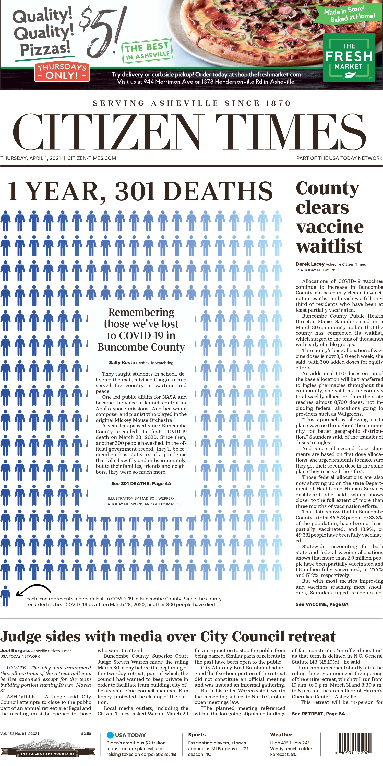

Both of these covers are powerful in their own rights. One, the Citizen Times uses the figures to mark a sombre story. Each figure represents one death over a year, 301 in total. Not the one on the line on its own. Even that uneven number, the imbalance, as power to what has been a sad and lonely year for many. But it’s more symbolic as it talks about the first death, and then the 300 that followed. That first death will always be symbolic. And there is a single figure, on a line of its own. The Citizen Times takes an interesting approach of putting the text of the story in the middle, over top of some of the figures. Despite some of the 301 being covered, the idea is still powerful, and I am a fan of starting a story on text when it works. It does here.
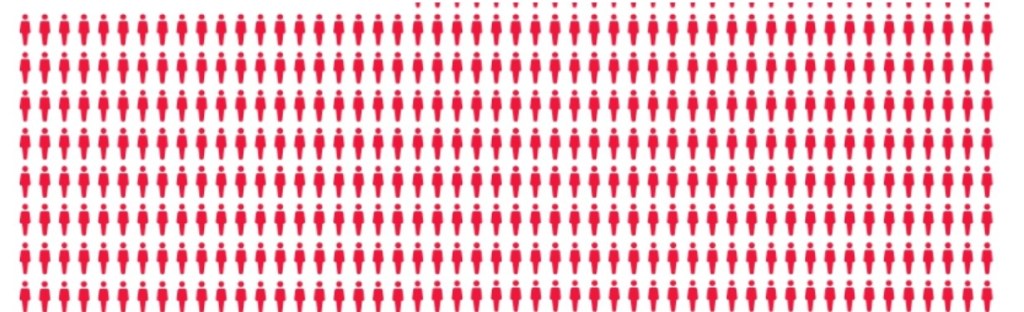
On the San Francisco Chronicle front, each figure represents 10,000 people. But it’s more hopeful. The first batch, red, represents the number of people between the ages of 50 and 64 who are eligible to receive vaccines starting today. That is 5.5 million people whose lives could change today or soon. The next, the black batch, represents those who have not been vaccinated but are eligible as of April 15. And the bottom, the blue with check marks, are those who have received at least one dose.
It’s fascinating that two papers, thousands of miles apart, decided to blow out their covers with figures representing COVID-19. Two pages. Very similar ideas. Very different representations. One sombre, one hopeful. Both powerful.
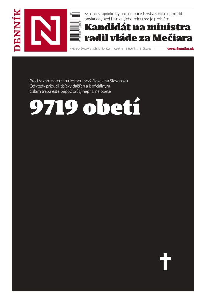
Denník N, a Slovakian paper, uses this very powerful page also to mark the same sombre milestone as the Citizen Times. Deaths over one year due to COVID-19. It uses reverse white text on a black cover, which really highlights the gravity. A small cross in the bottom corner. A large number, both physically and as a marker for the number of deaths: 9,719. And that number is higher today. The deaths continue.
I expect we will see a lot more pages like these as communities continue to mark milestones, either grim or hopeful. I highlight these pages to show the power of newspaper print design, whether the message is positive or negative.
Previous posts:
The Pandemic Papers
The Wall of Grief
Print is dead, long live print
