By Brad Needham
Covers in a dangerous time. I chose this as the name of my blog to highlight that newspapers are going through a tumultuous time, but I wanted to make sure the great work still happening was recognized. Each year at the Society for News Design’s annual creative competition, I am reminded by how much more prevalent the tumult is in Canadian media.
Again this year there were only entries from three newspapers: the Globe and Mail, Toronto Star and Le Devoir. Between them they won 33 total awards, including one silver medal (awarded for pages that are excellent, but even stand out among the excellence. This was given to the Globe and Mail for its climate coverage package) and 32 awards of excellence. For a page to receive this honour, three of five judges need to agree that this page shines. Overall, the numbers are down for Canadian outlets (The Globe had 32 on its own last year, and managed 26 this year). The Canadian total was 38 last year.
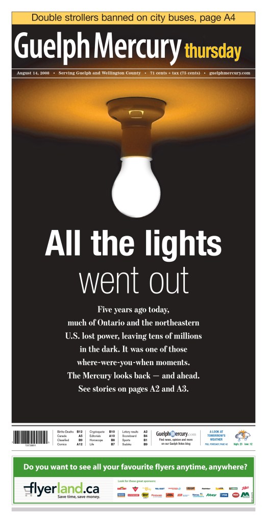
When I won, I submitted for the Guelph Mercury, a small paper that punched way above its weight. I would love to see a few more publications next year.
Alas, this site is meant to celebrate excellence in visual journalism, and despite there being fewer wins this year, Canadian media outlets produced some outstanding stuff.
Full results: SND 45 winners
As a little background, this is my fourth year assisting at SND’s Best of Newspaper Design competition. I have acted a facilitator (I am not a judge; I help the ensure the judges have everything they need, and help organize things for the SND team). I started on the news team and have been on the World’s Best team for the the past three years. It has been an honour to be involved. This year it was held in Minneapolis, Minnesota, at the Star Tribune office.

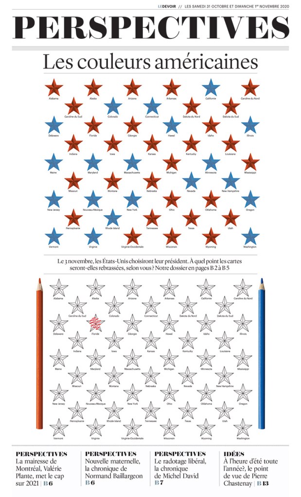
Time to show off some brilliant newspaper design, the reason anyone comes to this site. These pages may or may not have won awards. I chose them because I liked them. I will start with Le Devoir, as they had one of my favourite pages.
Le Devoir (Montreal)
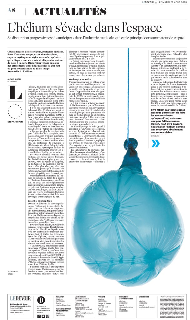
Often when doing newspaper design, designers need to find a way to illustrate things that can be tricky to illustrate. I appreciate the thought that goes into this. In this case it’s porn. Imagine being asked: we want to do a story about pornography, and it will be a section front. How will you illustrate this? Blurry bananas, naturally. Or at least one.
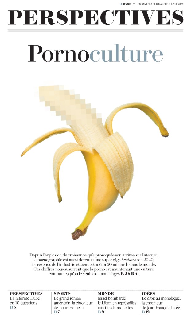
And here is another. A simple but smart photo. A good use of white space, as this paper is known for.
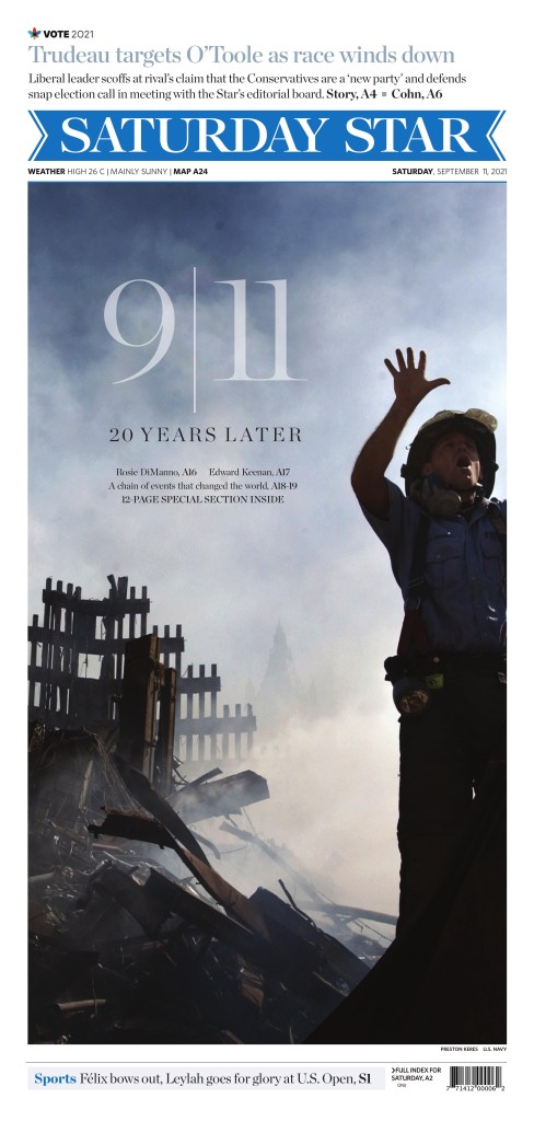
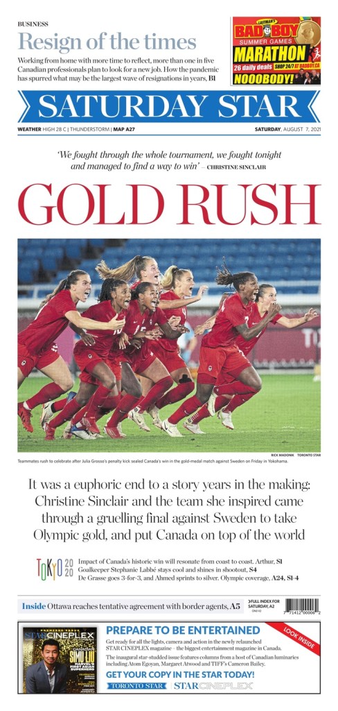
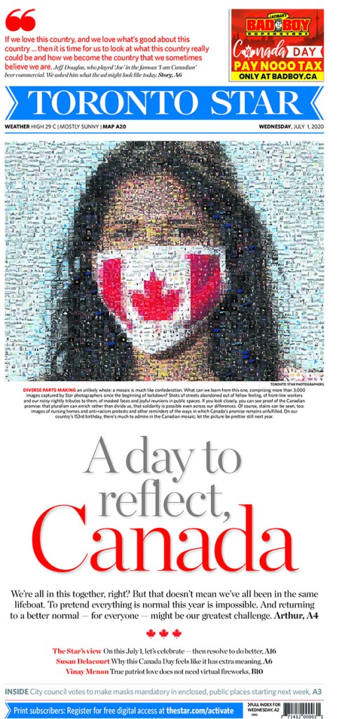
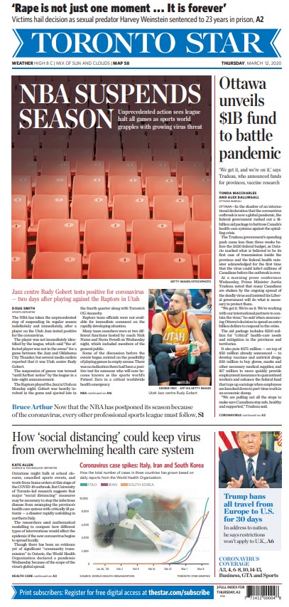
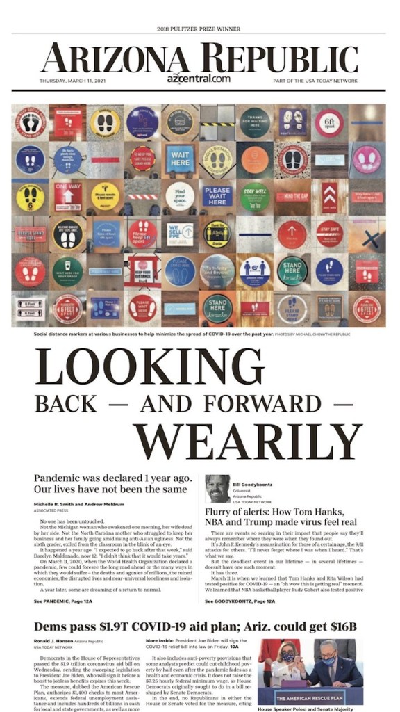
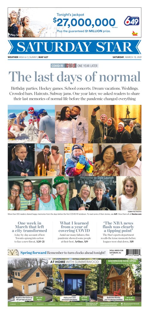
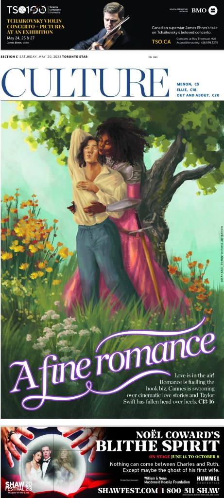
Toronto Star
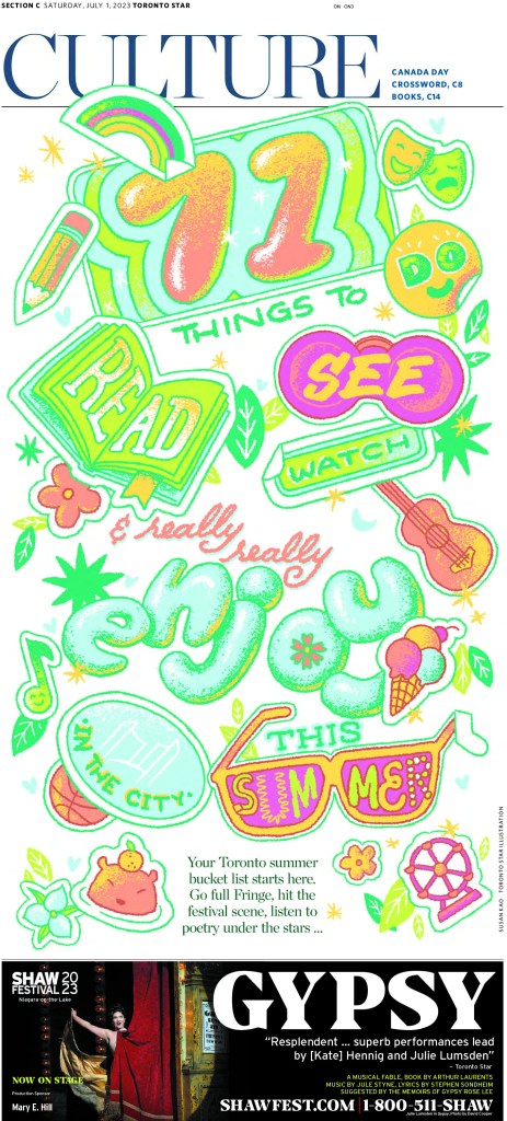
I am always excited to see the Star do great things. I am proud to say I have worked on Star pages and created some I’m proud of. Though I didn’t have the opportunity to do any of this calibre in my time there. This first page, from a staff portfolio submission, has a bit of a Los Angeles Times vibe. It’s bright and fun. Bubble letters.
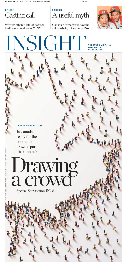
I have seen pages similar to this before. Little people making shapes. This is nicely done. Not only the image but the rest of the design.
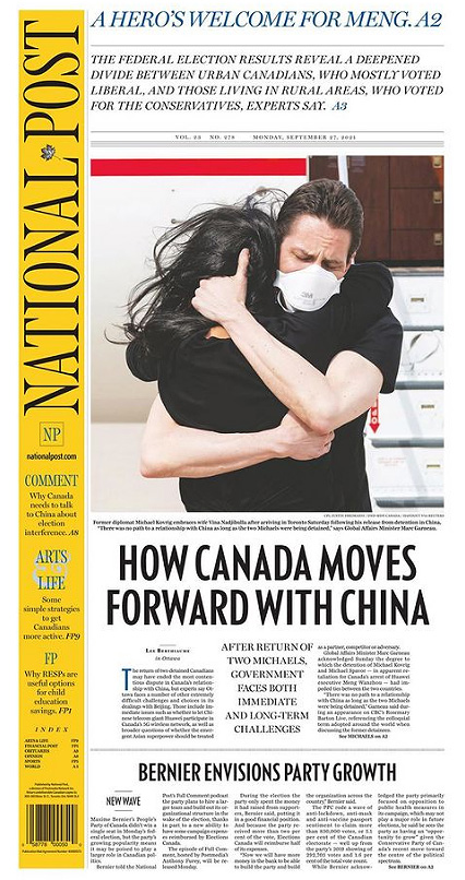
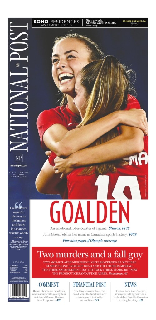
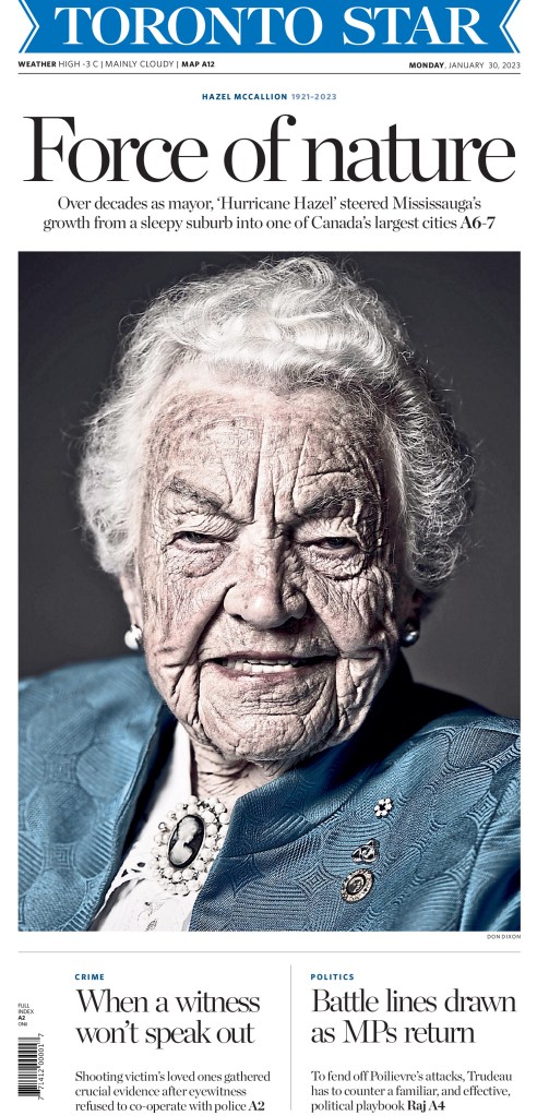
This page created some controversy when it first ran. Many thought the photo was insulting to longtime Mississauga, Ontario, mayor Hazel McCallion. Others thought it should have been identified as being enhanced (it was desaturated, which isn’t normally something a newspaper would do with a photo, but rather a photo illustration). But even when it came out, I posted it on my Instagram. It’s striking as an image, and as a page.
One more from the staff portfolio entry. It’s driven by the illustration, but there is some fun text treatment.
And here are a few more from the Star.
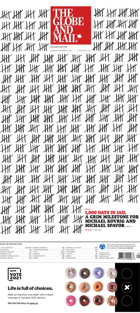
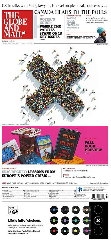
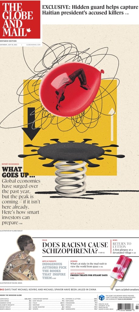
Globe and Mail
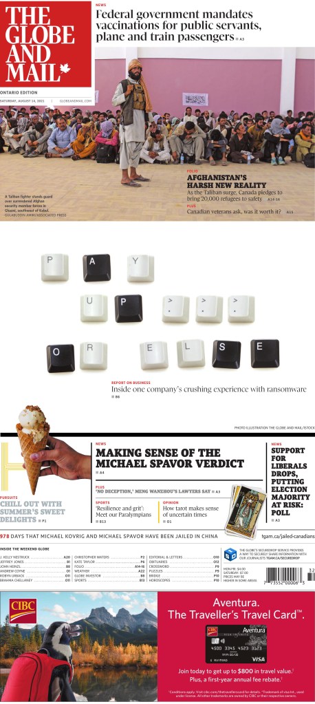
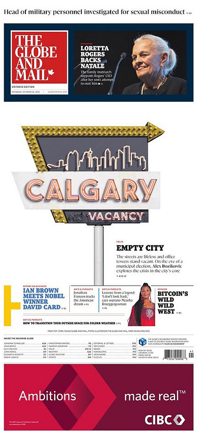
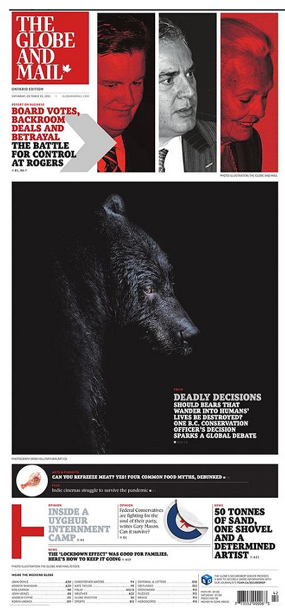
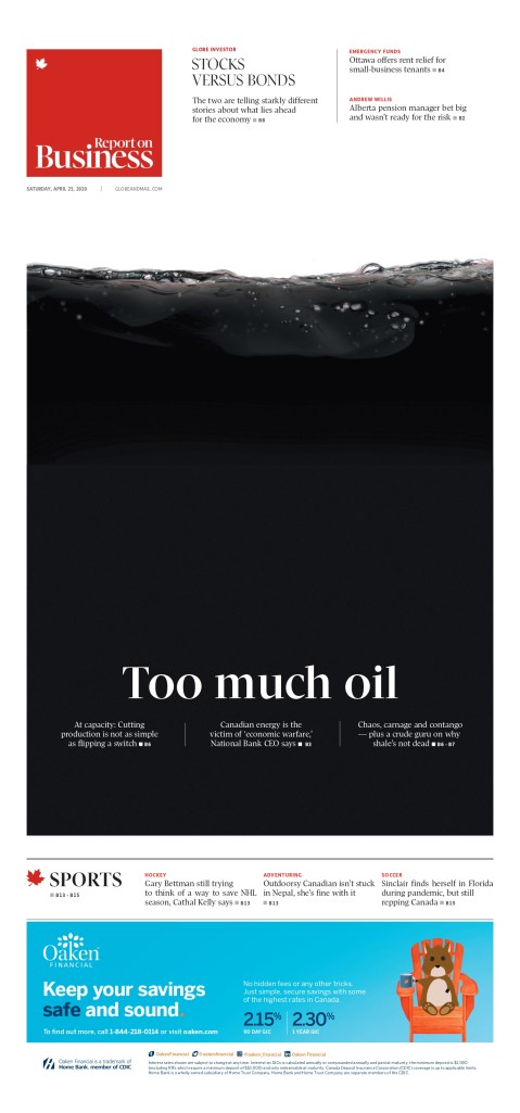
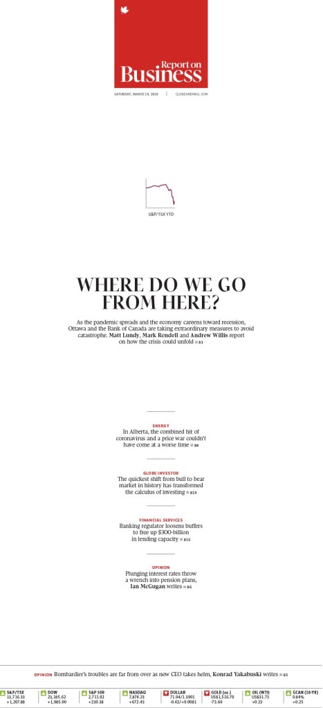
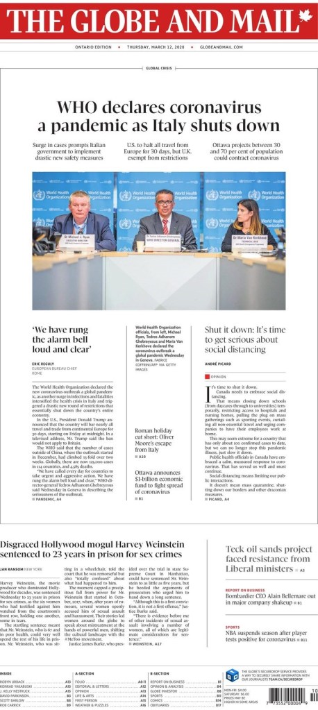
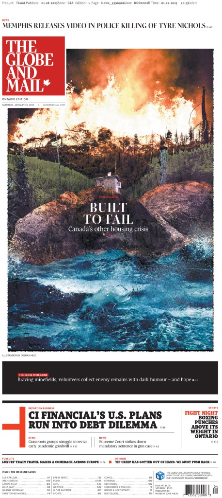
And last, but definitely not least, Canada’s big winner, the Globe and Mail. The results are still being tallied, but looks like the Globe might have squeezed into the top 10 again this year, at number 10. Much of the design the Globe was recognized for was for coverage of serious and heavy topics. Special coverage on climate change won a silver medal. I get the Globe at home (and disclosure: PMNA, where I work, does page production for the Globe) and the next two pages were pages that really stood out for me. All the pages here are handled at the Globe and/or art directed at the Globe.
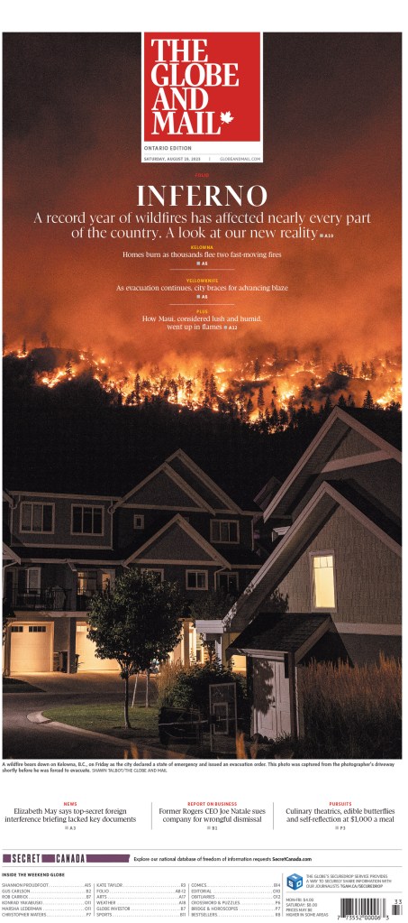
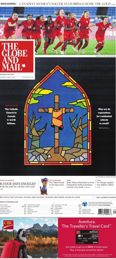
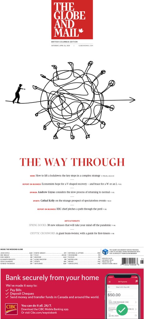
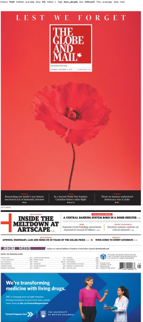
The Globe has also been a leader on coverage of the war in Gaza in Canadian media. It had some striking pages on that topic, like this cover (the Globe does a poster front on Saturdays) and the photo spread below. They do some beautiful photo spread pages.

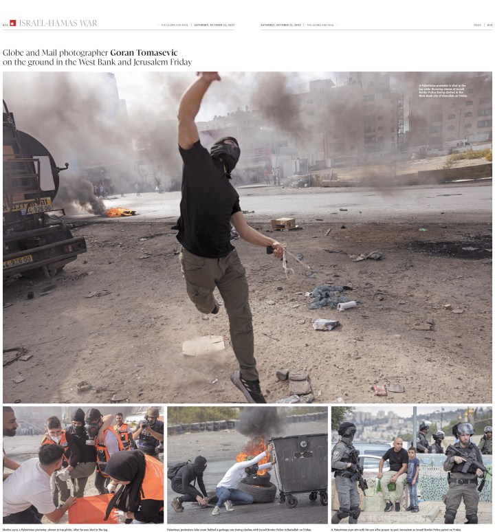
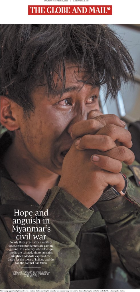
And one more, driven by this powerful, emotion-filled photo.
The next two were pages from art directors who each won individual portfolio awards. That’s a tricky category to win in, as it recognizes a body work. The first is from Brennan Higginbotham. The second is from Lauren Heintzman.
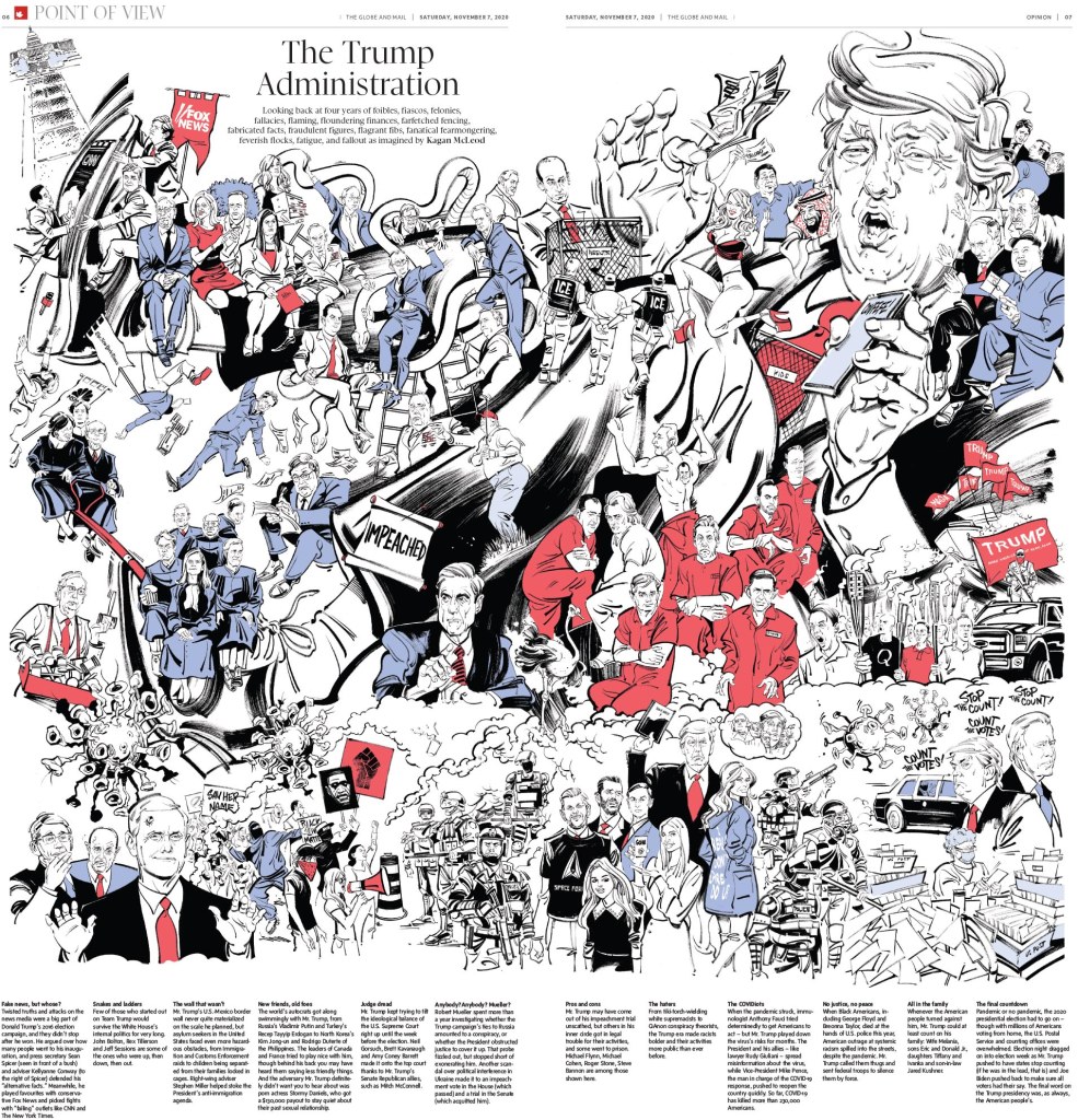
And now for some fun stuff. The Globe, and other Canadian media outlets, often turn to Kagan McLeod when they want a fun illustration. He’s a wizard (also credit to Kagan for the featured image I use with this post, as it’s a portion of one of the illustrations below). And he didn’t disappoint here.
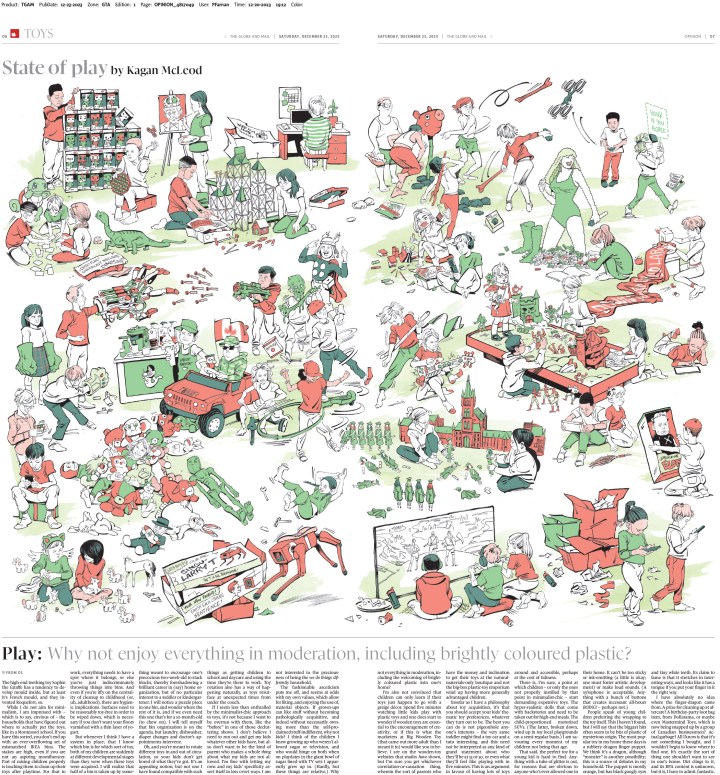
Here are the last couple I will show from this year. They are both so playful and fun. And as has become norm for the Globe, they have fantastic headlines.
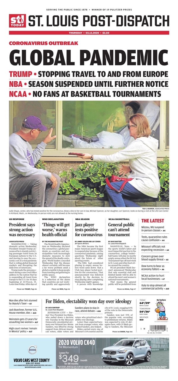
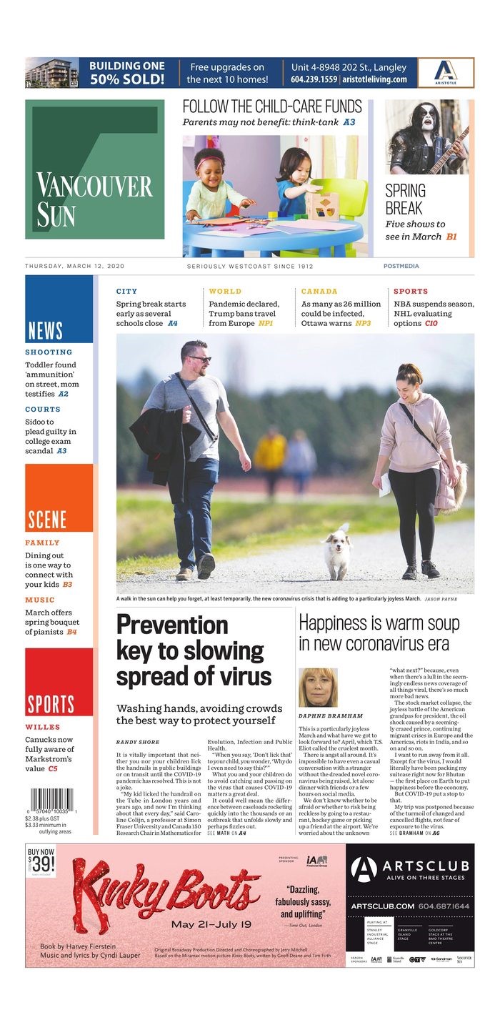
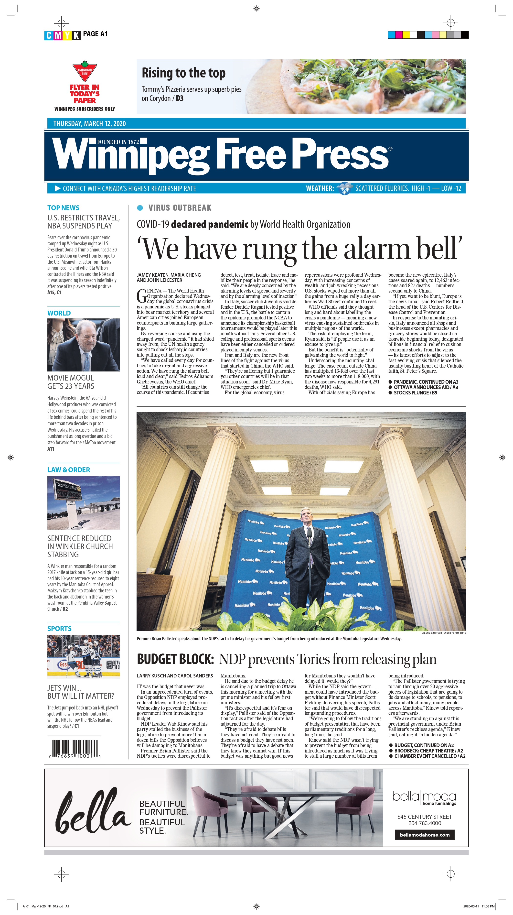
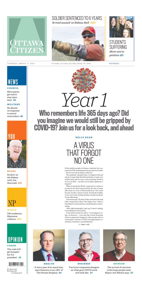
Fingers crossed we see more Canadian publications entering next year. Looking at you, Postmedia and Winnipeg Free Press, among others. Stand with print media and celebrate your great work.
Up next: Best from the United States, best from the rest of the world, and finally World’s Best Designed Newspaper. Watch for those sprinkled over the next week or so.