By Brad Needham
Behind every successfully designed newspaper page is a talented designer. And often a slew of other people. As part of this blog, I plan to feature designers. I want to find out what makes them tick. What gives them that creative spark. Newspaper pages can be like art. Sometimes designers have oodles of time to bring these designs to reality. But sometimes it’s a day. Or less. Either way, I applaud them.
I hope to run a profile every month, of either an established designer with a deep portfolio, or an emerging designer, with a few great portfolio pieces and a boatload of potential.
In the first instalment, I bring you the great Tammy Hoy, a Canadian Press and Pagemasters North America designer. Disclaimer: I am the managing editor at Pagemasters and I have worked with Tammy for eight years. That is not necessarily why I’m featuring her, but it’s why I know very well the depth of her talents. But I will be writing what I know! So early on, dear reader, you may notice people with connections to me! I hope to find designers to feature from further afield as well, but Tammy is a great choice regardless. A quick look at her website, tammyhoy.com, anyone could quickly see a whole lot of visually mastery.
In these features, I will do a Q&A, and let the designers do most of the speaking. So I will stop talking for now. Without further ado …

Designer profile: Tammy Hoy, Pagemasters North America/The Canadian Press
How did you get into newspaper design?
It was a series of unlikely but fortunate events. Back in 1994 I was studying Illustration and design at Sheridan College and my roommate mentioned a job ad that he saw for freelance newspaper design work that was posted in the wrong department at our college (That department being animation and not design). I was really excited and I hoped it might be a great opportunity to get some real-life work experience while still at college. I called the number on the ad and they asked me if I could make it to 1 Yonge St. within the hour. I told them I could be there in two.
I was so nervous. In my interview I was told that they needed a front-page illustration for a new section on technology; and they needed it by tomorrow! It was a sink or swim situation. I told them, I’ve got this.
It was a super exciting opportunity, but the worst part of it, ironically was the technology at the time. Envision this, I had to produce an illustration overnight using one of the first versions of Photoshop. I had no scanner because at the time they were a couple thousand dollars. We did not have cellphones so I couldn’t transfer any kind of image or reference material to my computer. I literally had to draw something with a mouse and make it look high tech. And on top of all this, it would take an hour to apply a filter. Layers were not even invented yet! Needless to say I did my best with what I had. And they liked it!
I can certainly see that I’ve grown but they’re not bad considering this was the ’90s, an era when rotating logos with flames were in still in fashion.
In the coming months I completed several of the front pages for this section and invested in a scanner so that I could add some imagery to some of my future art. I loved every minute of it. I continued on that year to complete my degree in Illustration and Design at Sheridan College.
That same year my mum saw a job ad in the Toronto Star looking for an artist to work in the newspaper industry. I jumped on it. I started out in the graphics department at The Canadian Press and later began creating full-page newspaper designs, motion graphics and various other artistic material for Pagemasters North America, a subsidiary of The Canadian Press.
What do you like about newspaper design?
I like that once you build a good working relationship with your editors the sky is the limit in terms of what you can create. Within the confines of the newspaper’s style there are so many unique opportunities to express yourself.
The goal being to work with the editor to create something a little unique that also goes well with the story. It’s also rewarding to meet extreme deadlines because you get to see your work published the next day or a few days from the day you put it together. There really is no time to fuss over things or overthink.
I love it because it’s also a beautiful collaboration between typography and art. The trick being to combine both, to create something really special.
What advice do you give when teaching people about design?
Think outside the margins and use white space to your advantage. While margins are there to maintain consistency, you don’t always want your page to be completely bound by a grid. Fronts and special feature pages are a great opportunity to go outside the lines a little. The best pages are ones that surprise you.
I’m in my happy place when I have lots of room for art.
Play with the space to create a flow. Your eye should travel through the page elements, typically top to bottom. Think about things like the crop of a photo. Would an extreme vertical or extreme horizontal work better? Cutting out a photo is a great way to add interest to a page. Mixed media can also be really interesting. Adding hand-painted art, collages, art with different shapes are all great ways to deviate from your standard rectangle.
Do you rely on one design principle more than others (white space, text as design, colour, cutouts, etc.)?
I really think a good page will make use of many elements, but if I had to pick only one thing, I would say I prefer designs with larger graphical elements. If you are able to push some of your text to the next page take advantage of that and make your art big. Make your headlines pop, use that white space to your advantage. Add some cutouts. I’m in my happy place when I have lots of room for art.
Tell me about a design you loved that was rejected.
I designed a front page made up entirely of different woodgrain. I loved it! It had fine grain, big grain, coloured grain, all running every which way and just this very small little headline positioned over top. I was a little disappointed when they decided not to run it but hey you move on. You win some. You lose some. That’s what it’s all about.
How do you feel now about the first handful of pages you were proud of? Still love them? Wonder what you were thinking? Wistful for times gone by?
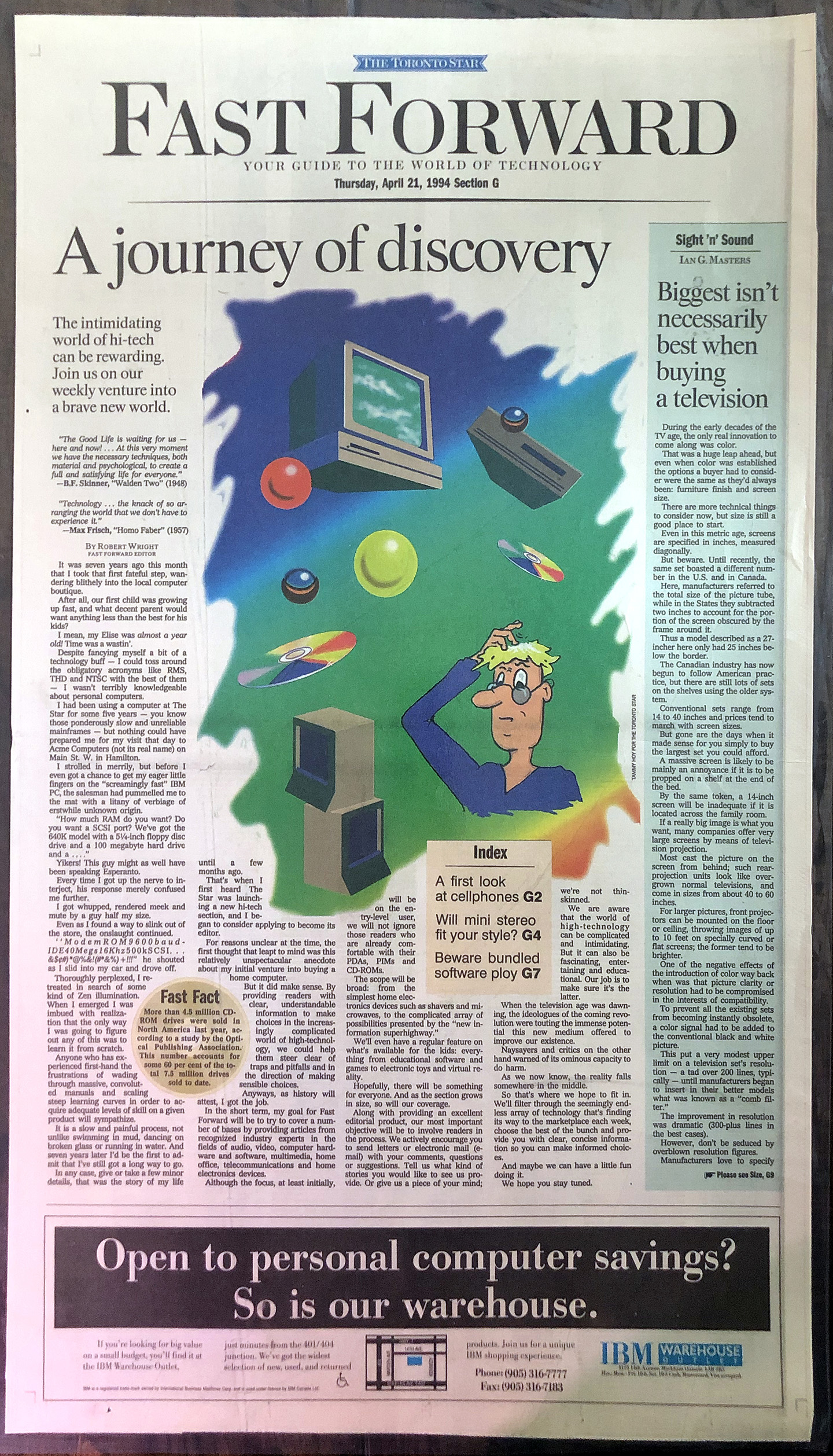
Haha, it’s really not a fair comparison when you consider the technology of today versus the technology of 1994. Just for fun I dug up some of my first illustrations and pages. I can certainly see that I’ve grown but they’re not bad considering this was the ’90s, an era when rotating logos with flames were in still in fashion. My first page entitled “A journey of discovery” is very apt. Life sure is about learning and improving as you go.
What would you say is the biggest change you’ve noticed since you started designing (new rules, time, etc.)?
I would have to say it’s the technology. When I started at The Canadian Press none of us working there even had an email address. Can you imagine? The company was super excited because they had just upgraded to colour computers and shortly after that they upgraded to 28.8 baud modems. That’s right, we were using dial-up connections to send graphics back and forth from home to work.
When it came time for the yearly federal budget we would travel to Ottawa and lug mountains of equipment to produce graphics. We had giant tube screen monitors tied to dollies and full-sized hard drives packed up in crates on wheels. We would show up at 6 a.m. to set everything up! The cleaners would be vacuuming around us as we transmitted the files back to Toronto.
Today the material is released digitally and graphics are created on the fly from home or from the office. The speed at which photos, graphics and pages are created has increased exponentially and they’re available on the web almost instantly. Pages are built in databased systems so they can be edited, proofed and sent to print at lightning speed.
How do you design when there is no obvious art?
This is a great question. Having great art with a story is awesome but having mediocre art or no art can sometimes be a lot more fun! It’s the perfect time to turn a negative situation into an opportunity.
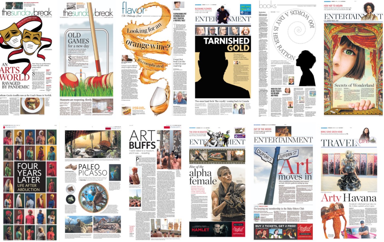
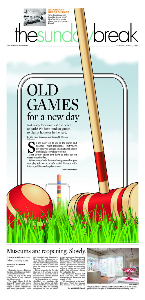
If I am short on time I will sometimes have a look at stock art. Rather than just picking something generic and slapping it on to my page, I try to create something new by combining several pieces of stock art or by playing it up with some creative typography. For a page on old games becoming popular again, I used various pieces of stock art combined with some of my own hand-drawn elements to create a scene depicting a game of croquet with the headline displayed through the wicket.
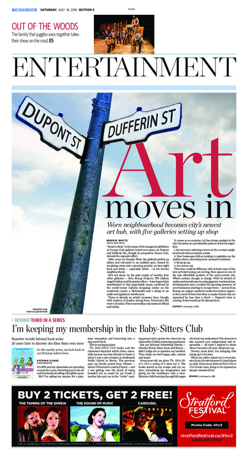
For a local story on a new intersection where all the art galleries were moving to, I decided to create something from scratch. I took my phone outside and photographed the street sign at an intersection outside. I came back to the office, cloned out the street names in Photoshop and carefully imposed the new ones in. It was something unique and went really well with what the story conveyed.
So draw something, pick up your camera, go outside and shoot something. There really are so many options and it can be a lot fun to try something new.
It might be like picking favourite family members, but if you had to pick up to three favourite pages, what would they be and why?
That is hard but here you go:
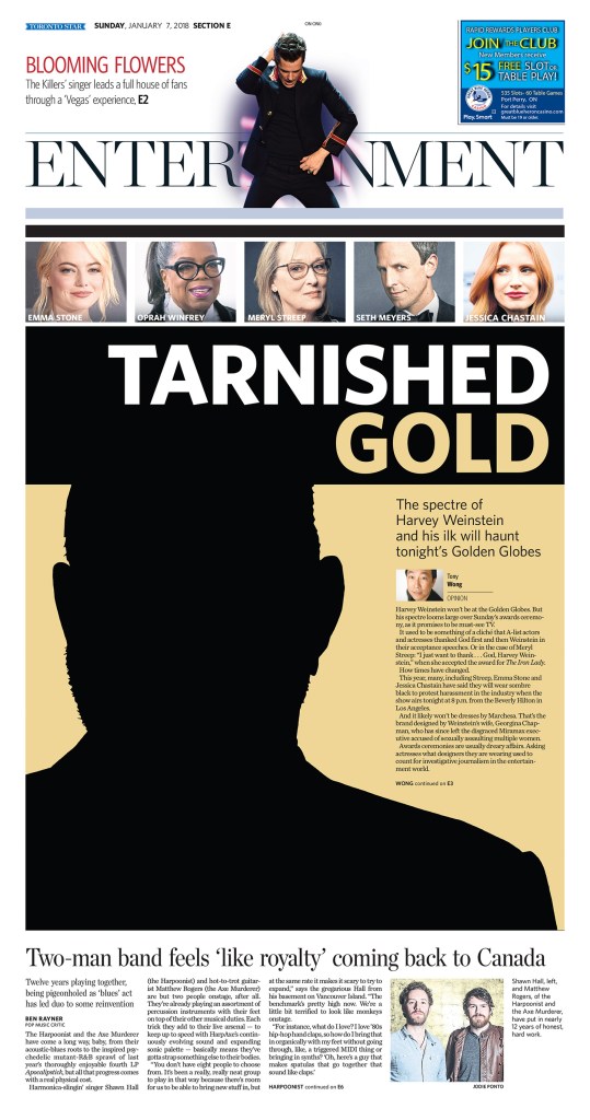
Tarnished Gold
This was a page on the spectre of Harvey Weinstein haunting the Golden Globes. Instead of running a typical photo of Weinstein I felt the page would have more impact if I drew just an outline of him and displayed it as a shadow. I used a complementary gold colour to represent the Golden Globes. The little profile pictures at the top also draw the reader in. I felt this was a good way to illustrate a sensitive topic.
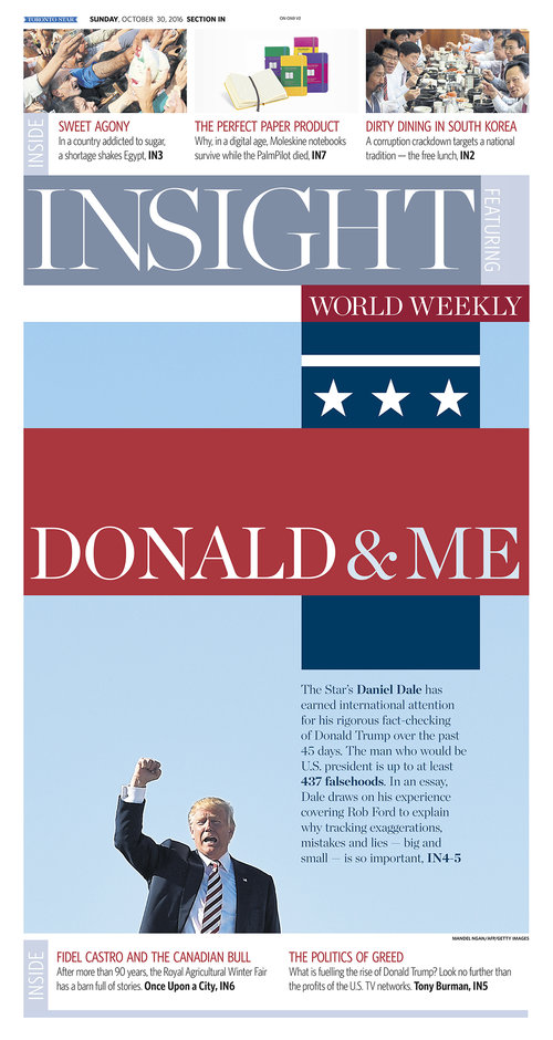
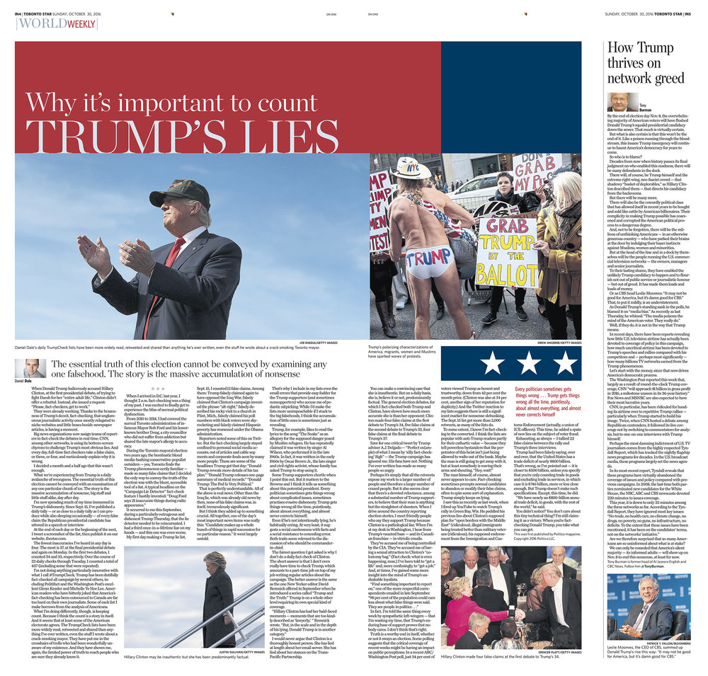
Donald & me (front and spread, Yes I’m trying to squeeze an extra page in here)
I really like this package because of the graphical elements. You really can’t miss the stars and stripes when it comes to Donald Trump, so I used them to guide your eye through the feature without (hopefully) overpowering the pages. I also made the decision on the front to make the message of the story larger than Trump himself. Part of being a designer is to remain objective.
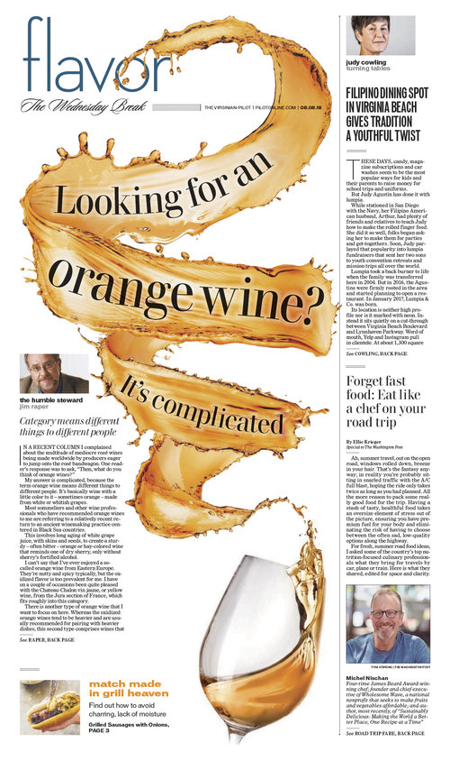
Orange wine
This is one of my favourite pages because the wine looks like it’s jumping right out of the glass and almost off the page. There is so much movement and colour. Working the display text into the splash was a challenge but I am happy with the end result.
Thanks, Tammy! And now a couple more that I love
When I was perusing Tammy’s website (did I mention Tammy has a website? And not just with newspaper designs) it brought back a lot of memories. All of these pages I’d seen come to life in my time at Pagemasters. I agree with all of her choices. The Trump package is amazing. The orange wine splashing around the page. But since I am supposed to celebrate design, I wanted to share a couple more that I loved for various reasons.


The Secrets of Wonderland page has always left me in awe. I mean, sure, the art is great. A perfect starting point. But having the text come in around those fingers, making it look three dimensional is gold. It’s also a bold use of a cover. One article, one monster piece of art.
The Where to shop next page speaks to me for a different reason. I have long been a major fan of the Virginian-Pilot. This is a page that just sticks so true to the Pilot’s design philosophy, I thought it needed to be called out. As an outsourcer, Pagemasters is occasionally and misguidedly criticized for shoddy work from those who don’t actually see what we do. All these pages prove otherwise, but this one is so close to the flavour of the Pilot, its long and storied history of design that I wanted to shout out Tammy for capturing it. You wouldn’t be able to tell it apart from a page that ran in 2011 or 2015. It just screams Pilot. So I shout Tammy’s praises from the rooftop. And to boot, a bold headline, fun art treatment, colourful. The pictures lead the eye all the way down the page.
If you are a designer or know of a designer who wants to be featured, click here to send me an email!

[…] The designer behind the designs — Covers in a dangerous time […]
LikeLike
Hi Brad – great stuff! Seeing all those pages was like a trip down memory lane … and the good kind of memories.
LikeLike
[…] incredible and award-worthy work coming out of these places. You only need to look at my profile on Tammy Hoy to see what is being done. But there is less time for most places to spend on design. And […]
LikeLike
[…] helping them grow and develop. So I still had a hand in others’ designs. Even super designer Tammy Hoy occasionally asked for my advice. Five of those years were spent overseeing the Star after they […]
LikeLike
[…] Read more, Designers Behind the Designs: Stacie Kammerling, Star TribuneAdam Rogers and Colin Smith, Villages Daily SunCaitlin Miller, Spokesman-ReviewRaina Toomey, PostmediaTammy Hoy, The Canadian Press […]
LikeLike