By Brad Needham
Another year, another Society for News Design Best of Newspaper Design competition! For the second year in a row, I was honoured to be a facilitator, this year in the category of World’s Best-Designed Newspaper. What a thrill. Results of that will come out on March 28.
I feel like the competition could give me fodder for months and months of content. But I will restrain myself to three posts. The first will be on the outstanding work done by Canadian papers. Next will be the rest of the world (so will be much longer!). Then finally World’s Best.
I know I am a broken record, but SND means so much to me. As a print design lover, it first and foremost offers a community of like-minded people. But it also still celebrates print design in a time when that is becoming less frequent. Looking at you Canadian media awards competitions. So many of those involved in print design are behind the scenes. Sure illustrators and photographers get credits. But art directors don’t. Page designers don’t. Headline writers don’t. But without these people, the information you get would be dull.
Canada produced some incredible work this year. However, because I have been following print design much closer over the past year, both here and on my Instagram, not much here will be new to anyone who follows me! It was a different experience this year at SND 43, as there weren’t many surprises, at least from Canada. But that doesn’t mean it wasn’t exceptional, and doesn’t mean I won’t highlight it again.
There were only four newspapers to submit for awards this year, which is such a tragedy, as I know there is other amazing stuff going on in Canada, particularly with my soon-to-be former employer Postmedia, particularly the National Post. They are still producing some of the finest pages in the business, particularly in Canada. And much of that is a credit to one of my former featured designers, Raina Toomey, who moved on to the National Post in late 2021. Postmedia stopped submitting, I believe, after Gayle Grin left. She recently wrapped up some consulting at the Toronto Star, and her touch is obvious there. There were more than 300 entries overall from Canada, more than 3,500 in the competition.
The Globe and Mail won 25 awards, including 24 Awards of Excellence and one Silver Medal. To explain, an AoE is for outstanding work. Work that stands out, goes above and beyond. A silver medal rises above that, just on another level or through a higher degree of difficulty. There are also gold medals, though no Canadian publication earned one this year. For a gold, judges should have a hard time finding any flaw, down to kerning between two letters (a topic that was discussed this year, with a comment: “You could almost fit an i in there.” It should be state of the art, challenging the industry norms. The Toronto Star won eight AoEs, Le Devoir won 5 and 24 Heures 2. I won’t show all the all work here, but a selection from each.
Globe and Mail
I won’t talk too much about each page for the Globe as I have talked about the paper a lot. Things I love about the Globe are the use of illustrations — and the quality and sophistication of the illustrations — as well as its bold and smart use of white space.
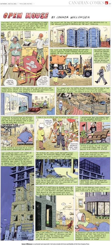
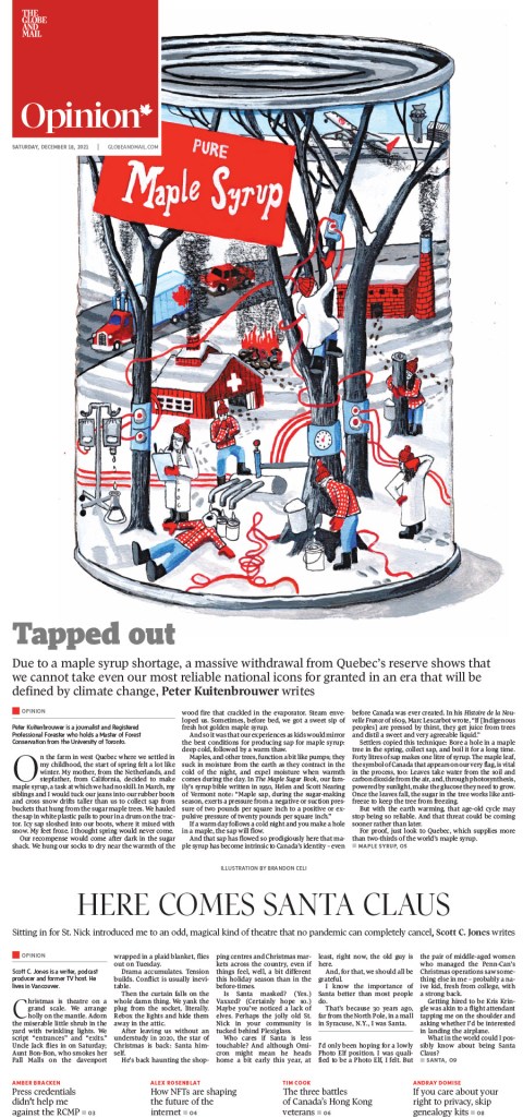
This was Canada’s only medal, for illustration by Connor Willumsen.

This was one of my faves from the Globe this year. There is so much going on. A lovely illustration by Kathleen Fu. Newspapers, she’s incredible. Take note.
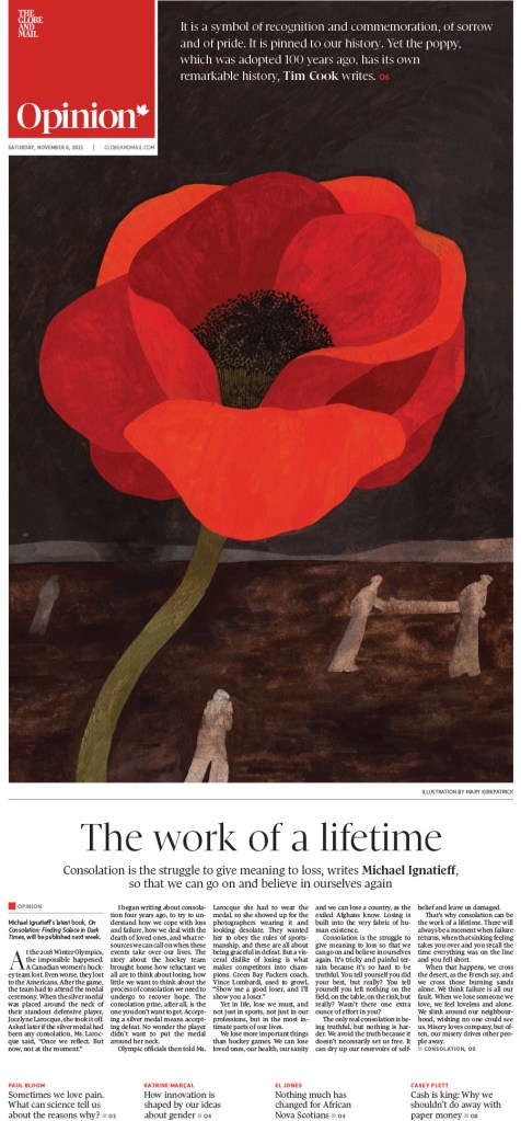

Here are a few illustration-driven pages. There is some really lovely stuff here. I love what Canadian papers do with their Remembrance Day covers. This one by the Globe was so well done. Elegant. Illustration by Kayla Whitney.
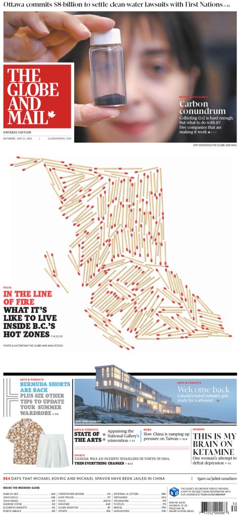
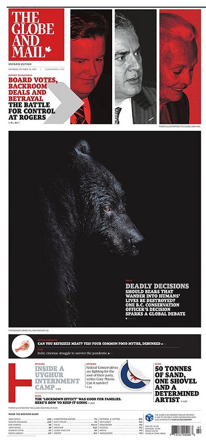
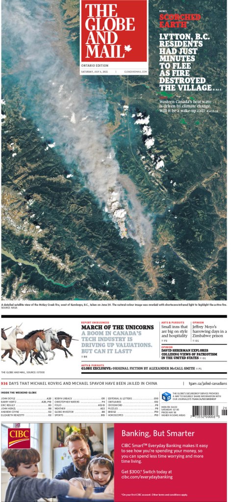

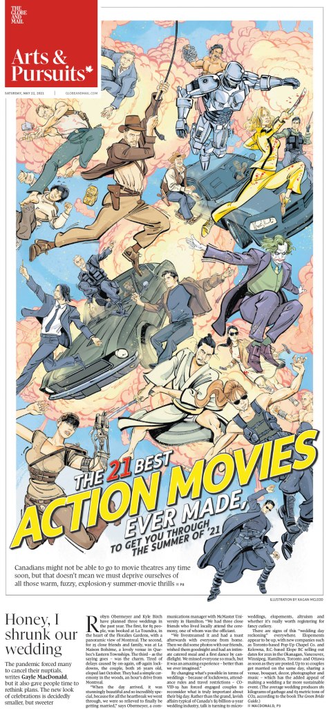
And a few more. The Globe does so much with their design, particularly on Saturdays and features sections. I loved the bear cover. It works for the Globe, going so dark on dark, because their cover is on glossy paper. That design might be lost on most papers. Congrats to the Globe for a solid year. Being March already, I can tell you they are off to a good start in 2022 as well!
Toronto Star
Of course I have a soft spot for the Toronto Star. I worked there, and worked directly or indirectly with the Star or Torstar for more than half of my career. Anyone who follows me will know how much I loved the page that came out after the discovery of unmarked Indigenous graves in Saskatchewan. It was so powerful. Here it is, and a few more.
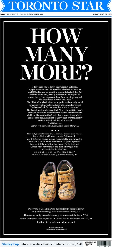
I just loved the imagery here. It was so powerful at a time that needed something powerful. Something to keep the focus on this issue. It’s striking.
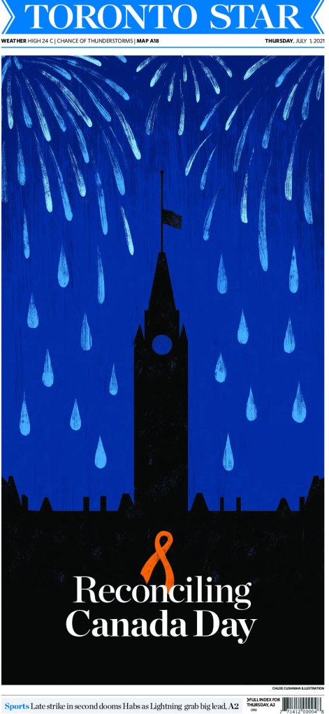
And here are a few more. The Star decided to invest in its print product in 2021, which was such welcome news, adding four entirely new positions, including an art director, Becky Guthrie, formerly of the National Post. You can see her influence. I hope that we continue to see such strong work.
Le Devoir
I don’t see Le Devoir as often as the previous two. But I love the design. It is smart and refined. It looks European. Nice clean lines, often simple. Here are a few top-notch pages from them. I will show four of these off individually as none have appeared here or my Instagram, starting with my fave of their submissions.
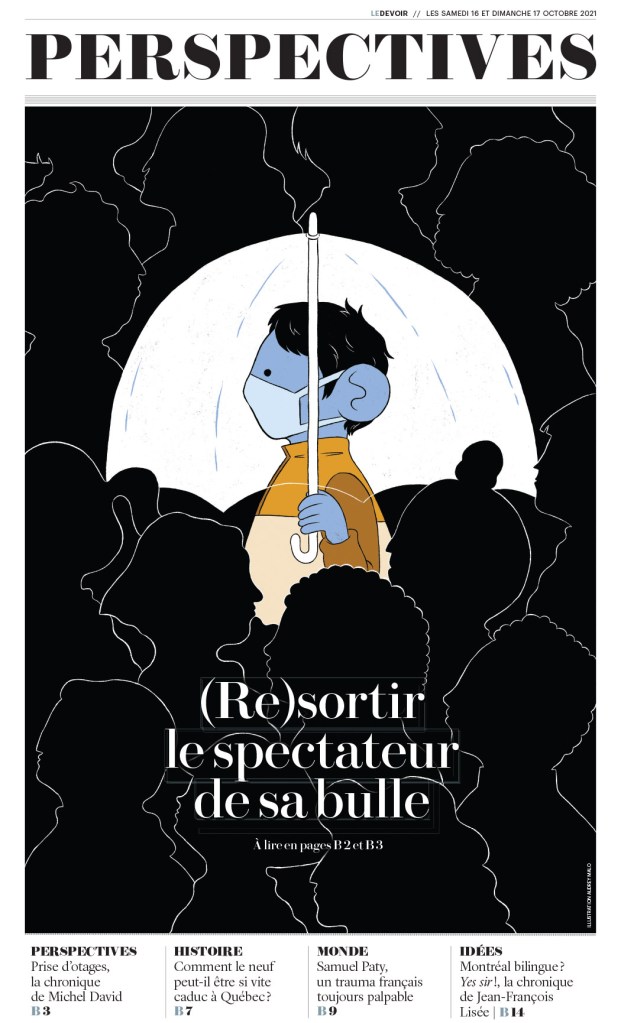
I love the contrast. The love the lines. The beautiful illustration by Audrey Malo. It is so clear where your eye is supposed to start, and clear that it’s not supposed to stop there. So well done.
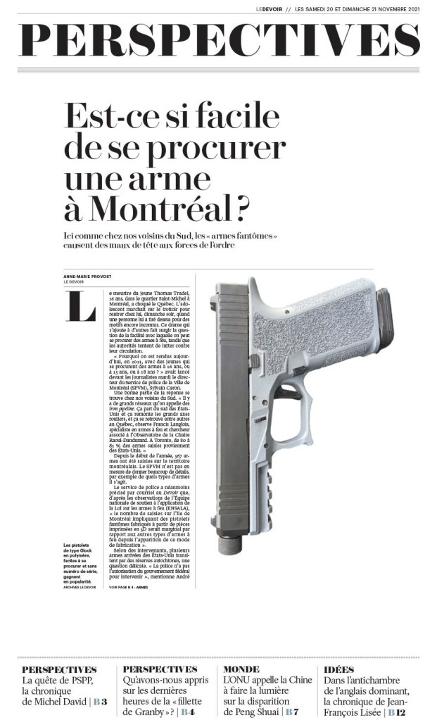
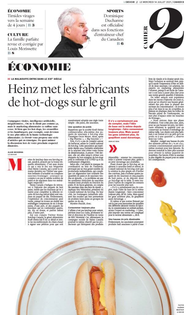
The one above and below are both driven by the design, not an illustration. A great illustration is great on its own. I can be enhanced if used well. But these are just nice designs, with a basic image, images that couldn’t be more different. And below, the little condiment spills take this page to a new level. Love it. Smartly filling in some white space, but also using what is left wisely.
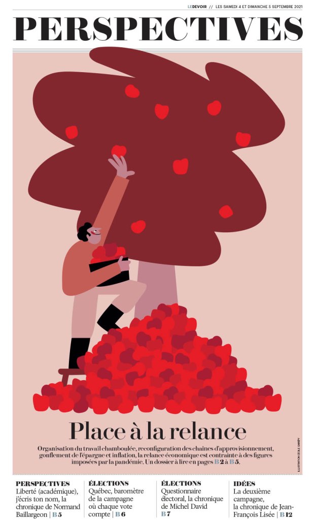
And then an illustration-driven page. It’s a nice, simple illustration (for a talented illustrator! Who just happens to be Cécile Gariépy). And it’s used so well. The text doesn’t take away from the fantastic art. Nicely done, Le Devoir.
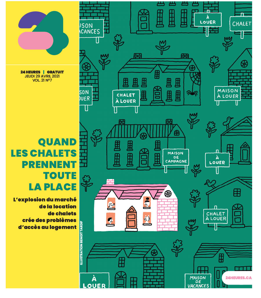
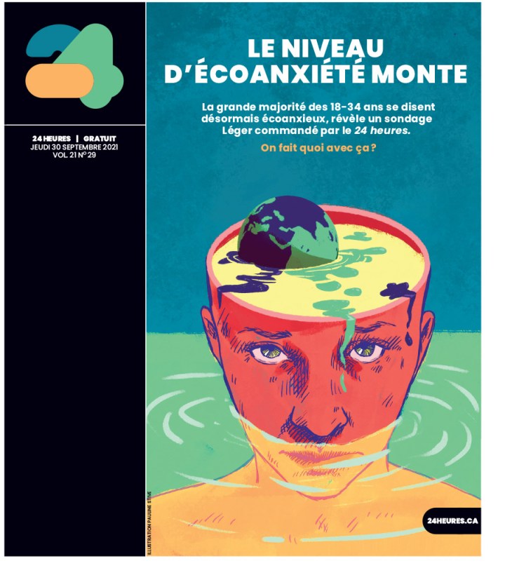
24 Heures
And finally a couple from 24 Heures. Both illustration driven. Smart art, well played, yet completely different illustration styles. Even the supporting material is played differently, with the head down the side on one, and on the art on the other. But it doesn’t take away from the art. It uses the space well. First by Benoit Tardif, next by Pauline Stive.
Just some incredible stuff. And this is just from Canada’s entries.
So that’s that. I am so happy to see there is still some amazing work going on in Canada, and around the world. Up next will be about some the best newspaper pages from around the world.
Read more, Designers Behind the Designs:
Stacie Kammerling, Star Tribune
Adam Rogers and Colin Smith, Villages Daily Sun
Caitlin Miller, Spokesman-Review
Raina Toomey, Postmedia
Tammy Hoy, The Canadian Press

[…] Previous PostBack […]
LikeLike
[…] of some of the best pages from the rest of the world, Canada and U.S. excluded. You can see those here (Canada) and here […]
LikeLike
[…] SND43: Best of Canada […]
LikeLike