By Brad Needham
This time of year is like Christmas for those who love print newspaper design. Newspapers who still take design seriously have submitted the work they consider their best to the Society of News Design. And for those of us who are lucky enough to be a part of the judging process in one way or another, as part of the planning committee, a facilitator or judge, it’s magical. We get to look through the best designs by the world’s best designers.
But to make this year even more special, after moving to a remote a competition because of COVID-19, it was back in person, and in New York. To make it even more exciting, it was in the New York Times building. I admit I got shivers as I saw the sign from a distance.
This year I had a bit of a hybrid role, part planning committee until life got in the way, part facilitator, part floater. For the second year in a row I got to be part of the team that chooses the World’s Best Newspaper (I wasn’t a judge, so not making the decision, just helping out).
This post is about the best in Canadian media. Sadly not as many papers submit. When I won, each of the three was for the Guelph Mercury, which had a circulation in the neighbourhood of 10,000. There is nothing close to that size anymore. This year in Canada, with Postmedia being out of the mix, only three media outlets submitted entries: The Globe and Mail, Toronto Star and Le Devoir, which just so happens to make up two-thirds of the ownership group of Pagemasters/The Canadian Press, my employer (Globe and Torstar).
So while there were fewer entries overall, and fewer outlets, than in years past, the quality of work these publications submits is still right up there with the best in the world. In this post, I will look at the Canadian entries. I will follow up with posts on the best American papers as well as the best from around the world, and also on the winners of the World’s Best Designed, which will be announced later this week. It will be worth the wait.
In Canada, The Globe and Mail was far and away the top winner, followed by the Toronto Star and Le Devoir. The Globe finished in the top 10 overall, which I attribute largely to incredibly smart art direction.
As a bit of a legend, awards are broken down into a few categories. First, an award of excellence must get the support of three of five judges, and those judges must think this work is beyond good. It must be excellent. Work that rises above what you might expect to see normally. Then there are silver and gold medals. As the level of award goes up, so do the expectations. By the time judges reach a gold medal discussion, the entry must be essentially flawless, down to kerning, every bit of white space and so on. It should be hard to find a flaw. This year, there were no gold medals for Canadian publications.
The Globe and Mail
This year the Globe won all awards of excellence other than in photography, which is somewhat out of scope for the blog, so I will look at the AOEs. The Globe finished in the top 10 overall, with 32 awards, three of which were silver medals for photography.
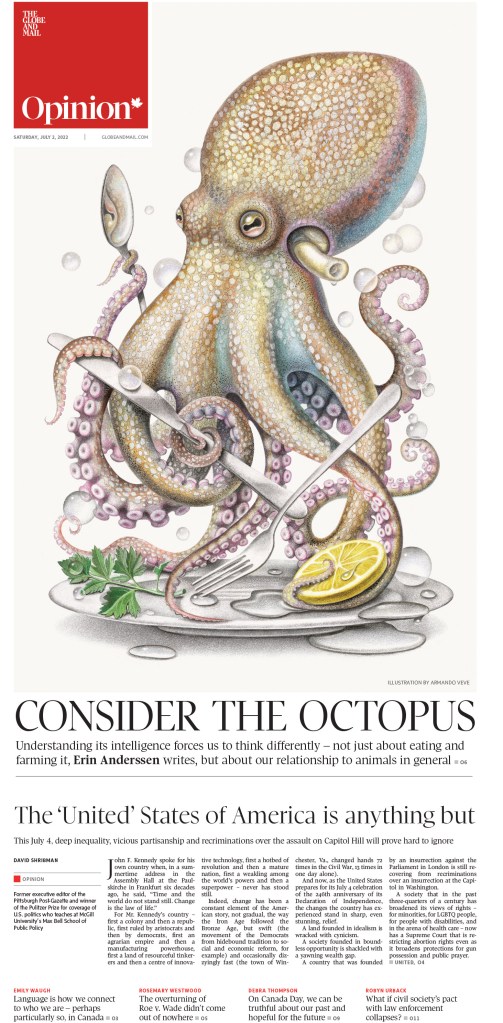
As soon as I saw this page in production, I knew it would be contender. Interestingly, pages like this were raised by judges. Is this a great page or a great illustration, or both? To be a great page it needs to use the illustration as part of a total package. To be clear, this page is absolutely driven by this stunning illustration. And this is where the art direction comment comes in. The Globe consistently uses incredible illustrations to drive pages. At some point that moves beyond just incredible illustrations and into smart art direction. Not only are the illustrations beautiful, they work with the story, and elevate the page to another level. And that is precisely what happens here and in many of the pages the Globe won for.
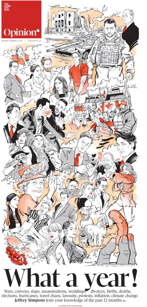
As often is the case with Kagan McLeod illustrations, the illustration drives this page. And I always know, regardless of the paper it appears in, at a glance that it is a McLeod special. He has a distinctive style. He has been helping Canadian newspapers elevate their front pages for years, from the Globe to the Star to the National Post. And I’m sure they are grateful.
This page was part of a staff portfolio award package. I often don’t like when newspapers use different fonts for headlines, but this page works. Nice symmetry, cute illustrations, and the typography is playful and works.
Not much to say about this other than it is visually magnificent. It’s a beautiful page, smartly conceptualized and executed. This and the next three pages are from the great Brennan Higginbotham, who won an award of excellence for his portfolio or work. I won three awards, one of which was for a portfolio of work. That is the award I am most proud of as it’s for a body of work. And as Higgenbotham shows here he is far from a one-page wonder. Some beautiful work.
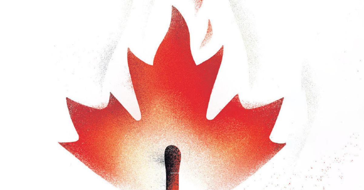
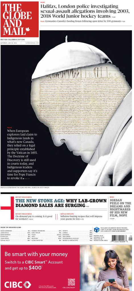
Using the maple leaf in a creative way in an illustration is not novel, but I am always impressed by how many amazing ways newspapers use it. To the world, Canada likely seems like a peaceful place, full of people saying excuse me and sorry. Especially sorry. But things are changing. As populism politics take hold in other countries, very much emboldened by Donald Trump’s presidency, Canada is following suit. The country is more divided than ever. And this illustration politely shows (so Canadian) that things are heating up. A great and smart illustration, nice use of white space and a witty main headline.
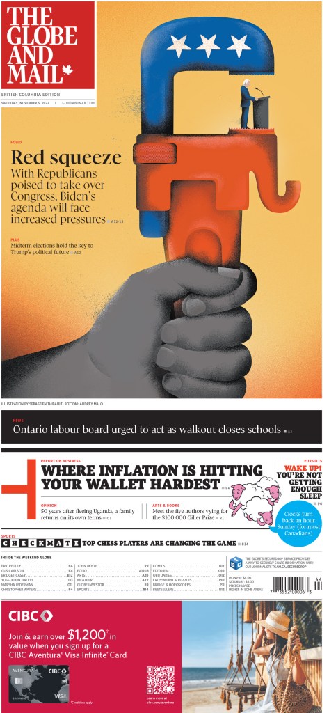
Just a lovely illustration, used well on a front page. NBD.
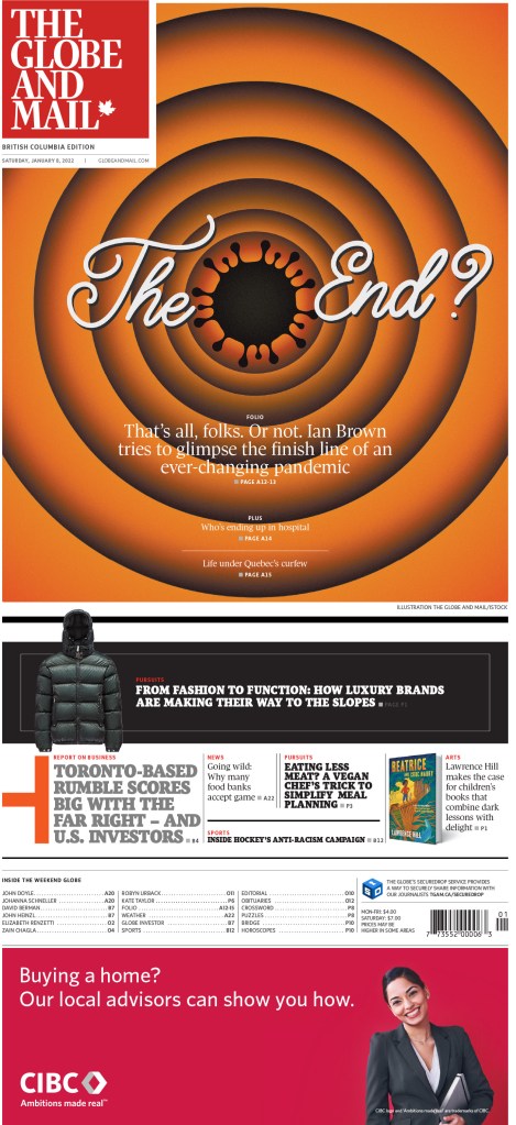
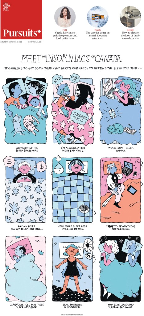
When I looked at the paper this Saturday morning I knew I’d be seeing this page in the competition. It’s one of my faves from year from the Globe. Is the song in your head yet? It makes for a very bold and colourful front page. As for the Globe entries for this post … that’s all folks.
Toronto Star
The Star submits significantly fewer entries than the Globe, and less than it used to. It’s great to see that it is still being recognized when it swings for the fences. It won four awards in total. Here are a few.
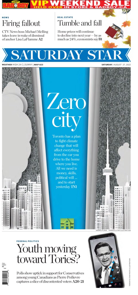
This is an example of a page with a great illustration that helps drive the story, but also a great design. The illustration needs smart typography to work, and it works.
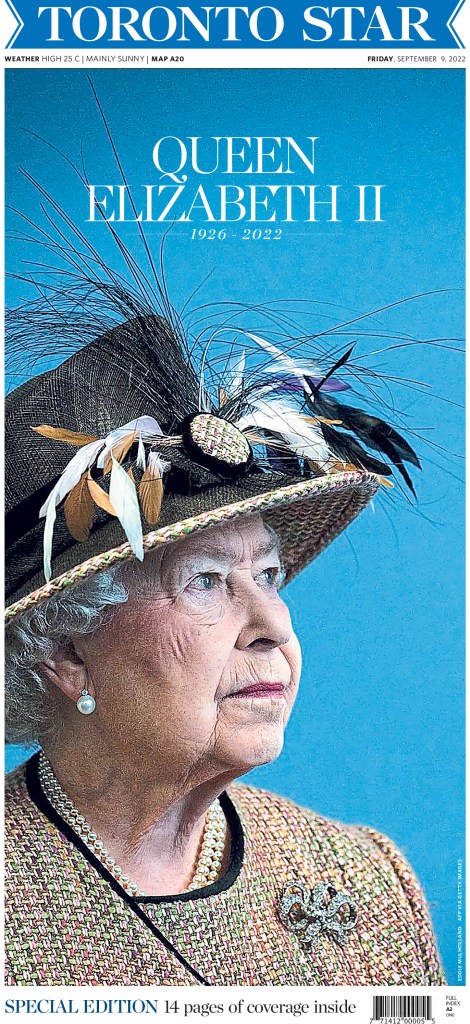
Anyone who follows me here or Instagram would have seen this page already. It was one of the sharpest pages around the Queen’s death. Great photo choice, very simple headline in terms of content and design.
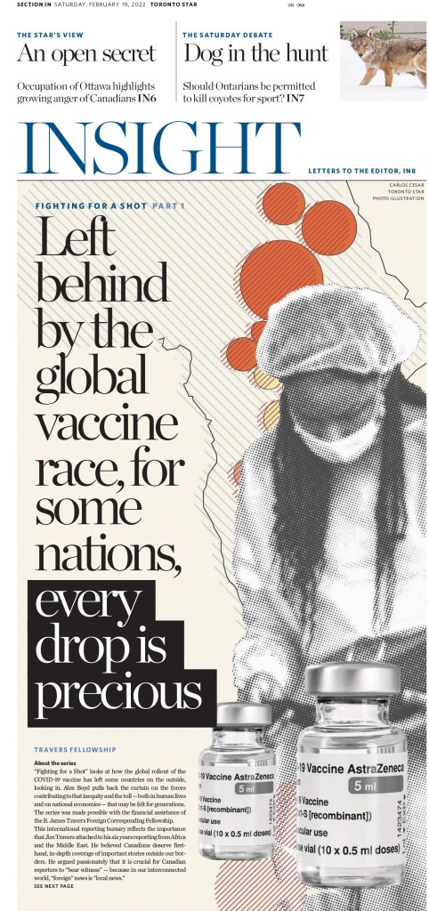
As a counter to the very simple Queen page, this is a busy page. There is a lot going on. Yet the focus of the story is clear. It does some things I might not normally like, but manages to pull it all together to make a very compelling design.
Le Devoir
Le Devoir submitted very few entries, but did a heck of job curating those entries. It won two awards in total. Here is one of the winners and one I liked that didn’t win.
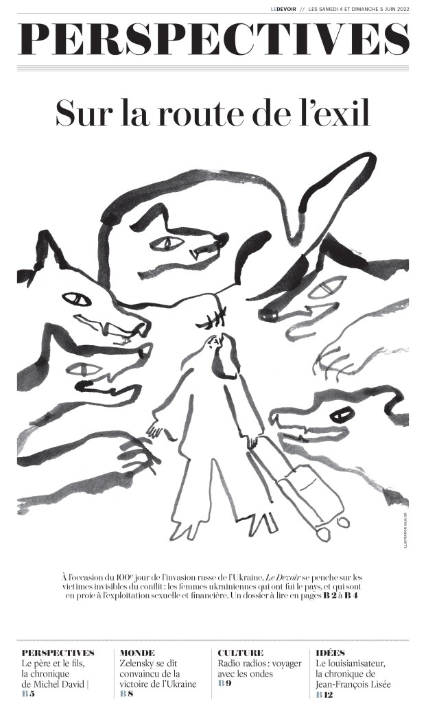
Something about this illustration speaks to me. It didn’t win an award, so this is a facilitator’s special recognition, I guess. I dig it. It really draws me in, and even without knowing French well enough to read this, I feel like I really want to know what it’s about.
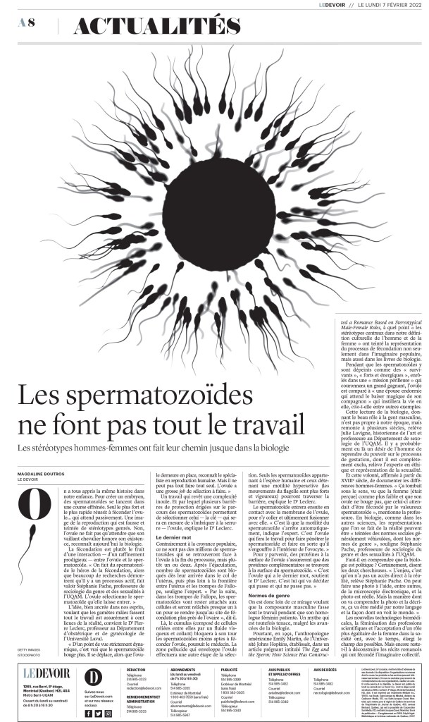
This page looks very much like many of the European newspaper design powerhouses. The rules, the simplicity and the attention to very small details, like the illustration around the drop cap. Love it.
I know there is other great design happening around the country. The Winnipeg Free Press, Postmedia and elsewhere have some strong designs, even in this new and more challenging newspaper world. Sadly for judges and Canadian media loves, they don’t submit.
A huge kudos to those who do, and those behind the designs, from an art direction standpoint. You all put your work out there into the world to be judged by some of the world’s best. You open it up for critiquing. And sometimes you win. All of these papers had more entries and winners than I have shown. This is merely a selection of the incredible work they produced in 2022. As the Globe page above said, what a year.
So bravo to the Canadian designers who won awards and submitted their work.
Related posts:

[…] Previous PostBack […]
LikeLike
[…] have already posted about Canada’s best and America’s best. This post will feature some of my favourite newspaper pages submitted to […]
LikeLike
[…] SND44 content: Best Canadian designsBest American designsBest designs from the rest of the […]
LikeLike