
By Brad Needham
More than 3,500 entries. That’s more than 3,500 newspaper pages (way more, as multiple page entries like sections are one entry) that designers and newspapers around the world decided were their best, and submitted to the Society for News Design‘s annual design competition. Nearly 800 winners (798 Awards of Excellence, 68 Silver Medals and 18 Gold Medals). So how does one winnow that down into a blog post? One doesn’t! I tried. Not a chance. So I started by breaking out Canada due to my obvious Canadian bias! But there are still more than 700 left to choose from. So after that, I attempted to cram the rest of the world into one post, but nope. So American papers get their own post, followed by the rest of the world. Even still it’s challenging. Despite newspapers falling on tough times, designers are killing it. So this is an act of curation based on my tastes. And leaving out dozens upon dozens of entries that I dearly loved so that this doesn’t go on forever.
I had the good fortune of being a volunteer facilitator for the second year in a row, for the organization that truly changed the arc of my journalism career. Beside my desk sit five tattered SND books, which they release annually capturing the winners of these competitions. I am beyond humbled to be in three of them, one for a portfolio of work. I had six books, but one got stolen or borrowed and not returned. Do I begrudge that person? No, because my path started by … borrowing two from my first newspaper job when I left. One of those is missing. That’s just the circle of design life.
For SND 43, I was part of the World’s Best-Designed Newspaper competition. Results will come soon. But here, I present the individual entries. If you’ve not been following along, a quick summary of awards. AoE is an outstanding page, one that is deeply considered, uses typography and/or white space and/or art, etc. incredibly well. It’s not design for design’s sake. It is designed with purpose. A silver rises above even further, is exceptional among the outstanding. It could be considered state of the art. And gold. Well, on a gold page, it needs to rise to near perfection, above the outstandingly exceptional. It should be hard for a judge to find a flaw. That is why there are so few. Kerning between two letters, a crop that seems just off, too much or too little white space. All sorts of tiny details prevent a page from being elevated to this level. Because of that, finding the best way to present this (by paper, by theme, by region) is so challenging. I will start with the only gold medal for a portfolio of design (there was another for illustrations).
Brandon Ferrill, Washington Post, Gold Medal for portfolio
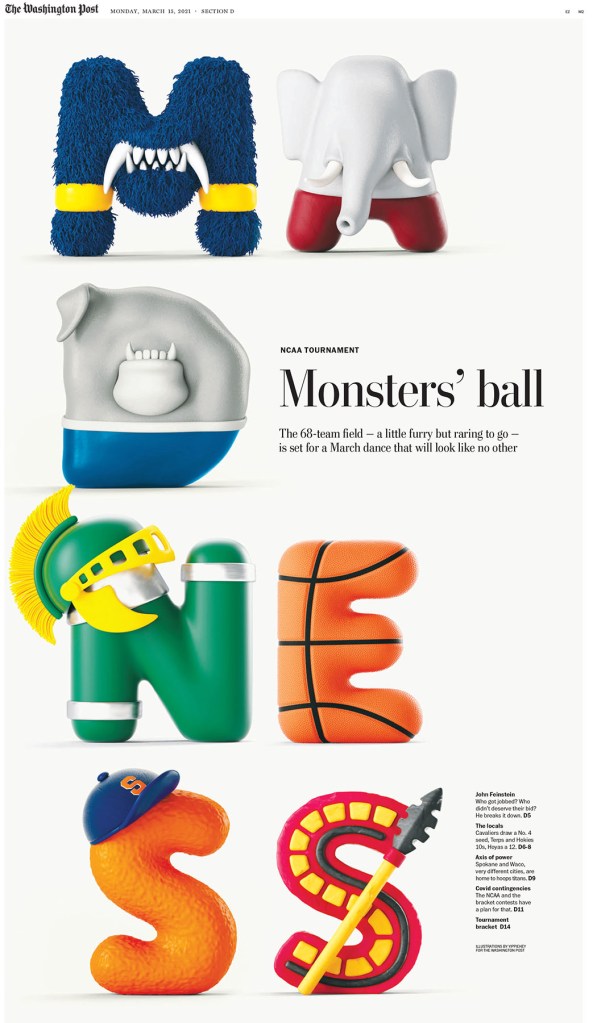
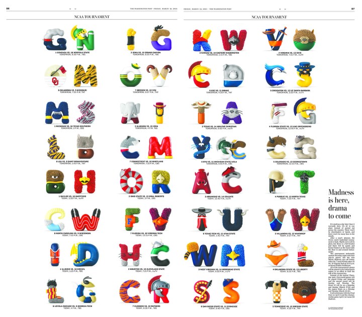
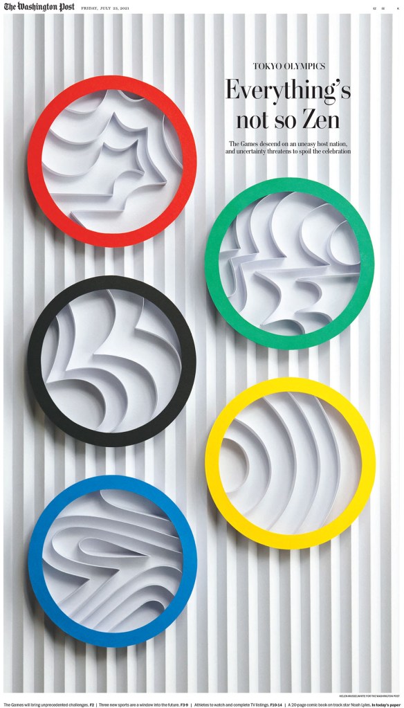
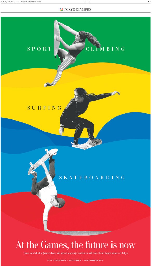
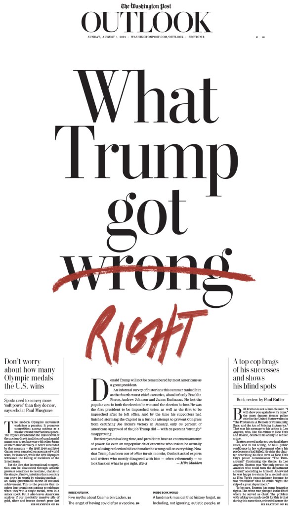
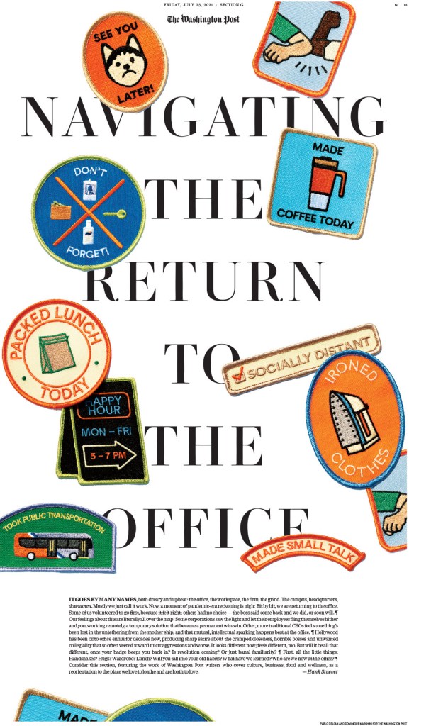
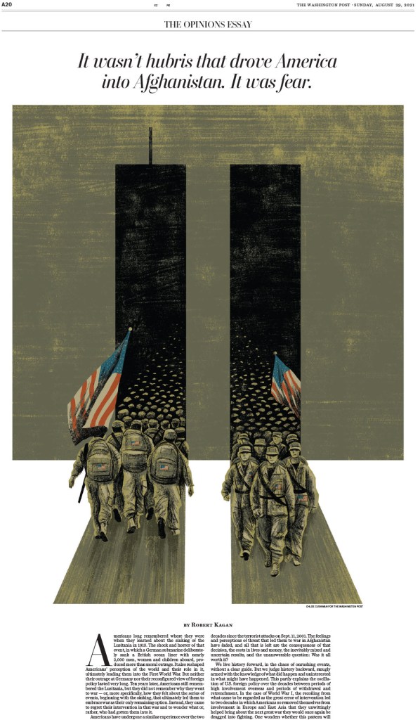
The first page in this slideshow was really the talk of the weekend. Universally loved. And fun. There were some hard pages, some big subjects in 2021. COVID-19 was still raging, the Capitol riot, the Taliban in Afghanistan. And so on. And then we have this happy-making page. The entire portfolio is striking. That judges moved an entire portfolio to gold says so much about the quality of this work. And trust me, you will see a lot more from the Washington Post here. When they go big, they win. We win.
Facilitator’s special recognition
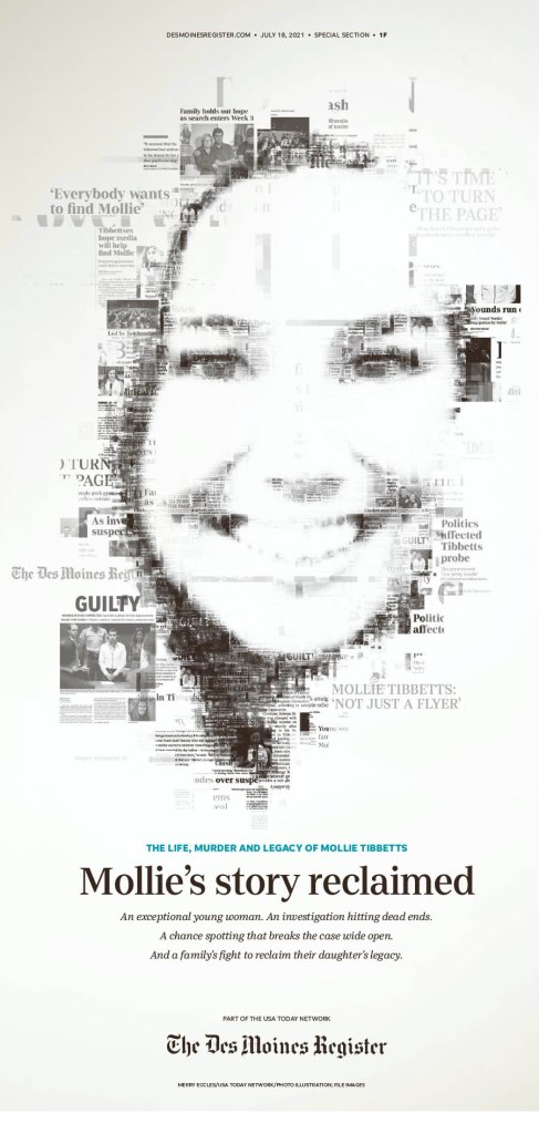
At last year’s competition (my first), two pages immediately took my breath away. And it kept piling on. I waited for that experience this year. Nothing will compare to that first experience at SND. Not because the pages aren’t just as exceptional, but you start thinking differently, more critically. You know what can be done. What’s out there. But this year there was a page that really struck me (so many did). But I kept going back to this one. And it wasn’t the Washington Post, the New York Times, the Los Angeles Times or the Star Tribune. It was the Des Moines Register. Maybe it is because I am a champion of the underdog. Maybe it’s because it uses newspaper clippings, which doesn’t often work but really does here. It’s so smartly done. Maybe the lack of colour. Seemingly simple, but quite complex. And the judges must have mostly agreed. It won a silver medal.
U.S.: The Big 4 conference
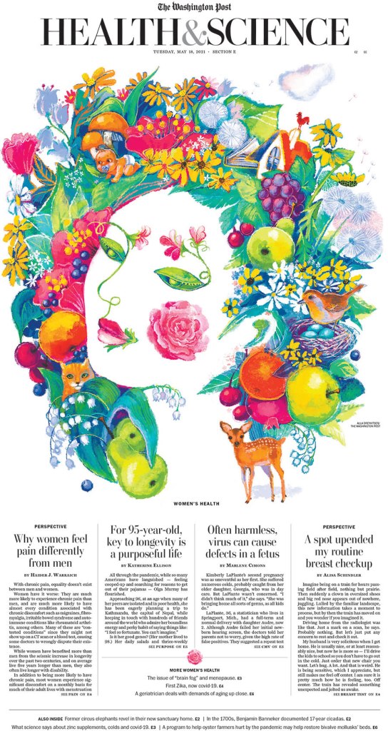
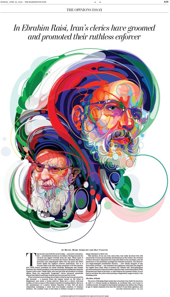
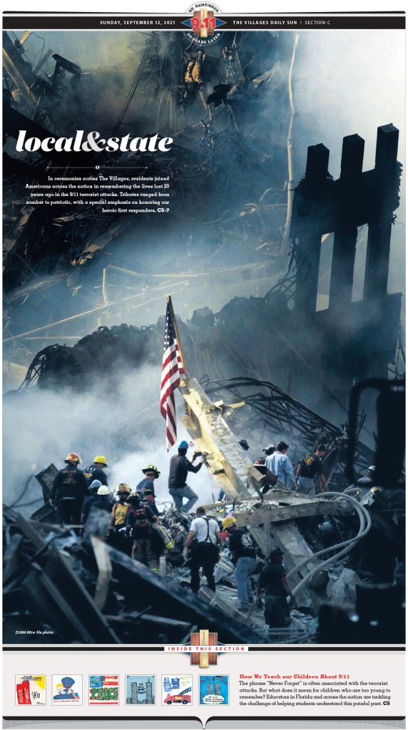
When it came to papers in the U.S., the four I mentioned above really stand out: New York Times, Washington Post, Los Angeles Times and Star Tribune (Minneapolis, and employer of my most recent featured designer, Stacie Kammerling). I will give each paper a slideshow and little blurb. I will exclude the portfolio above from the Washington Post below.
Washington Post
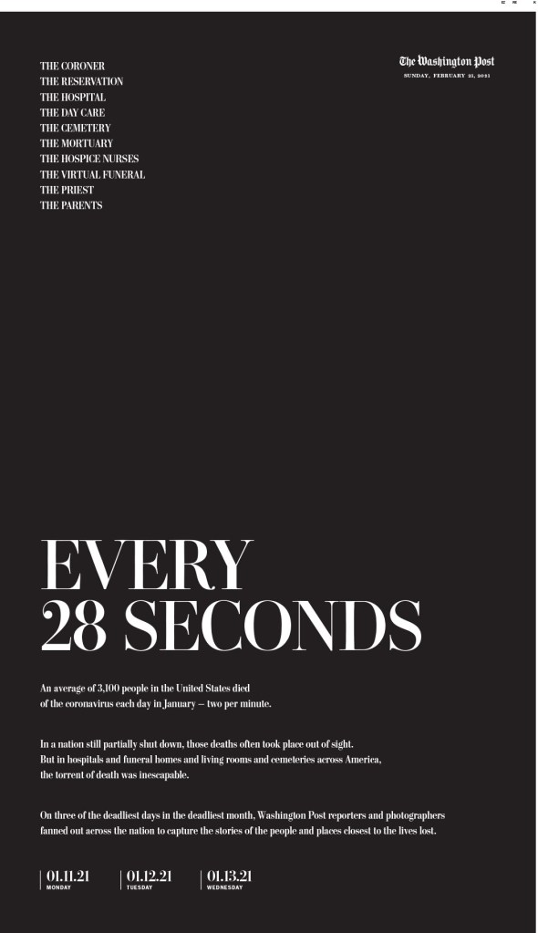
I tried to choose a favourite. I really did. But the first three here are so close, for very different reasons. Some pages are driven by illustrations, some by text alone. I’ve said this before: A good illustration is good on its own, enhanced by a good design. But then there is just good design, and designing with text is skill. Also, when it comes to opinion pages, the Washington Post is among the best in the world, if not the best, largely based on smart illustrations. And I had to narrow this down. I cut some amazing pages out.
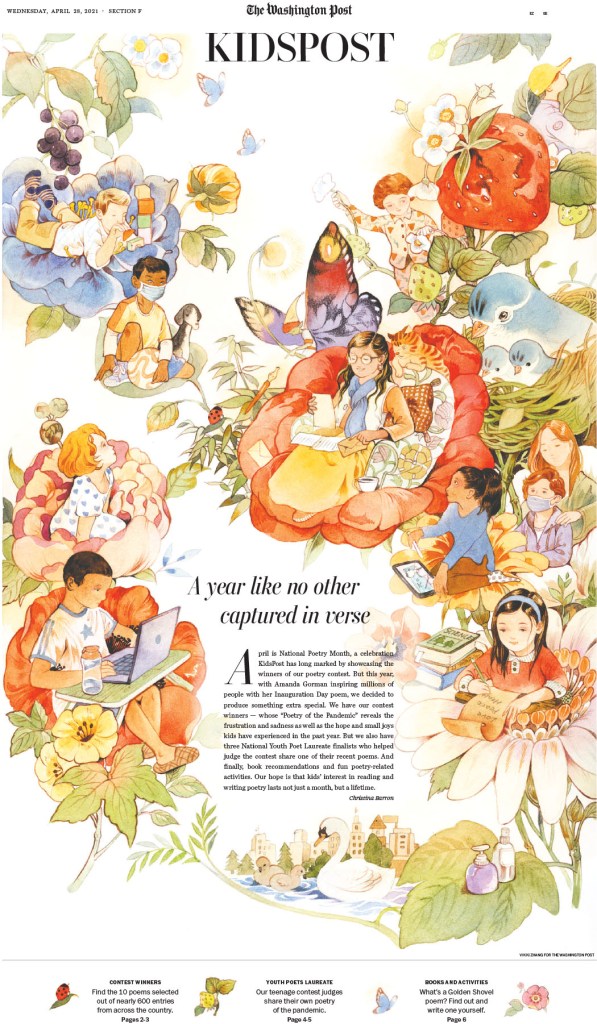
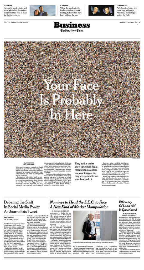
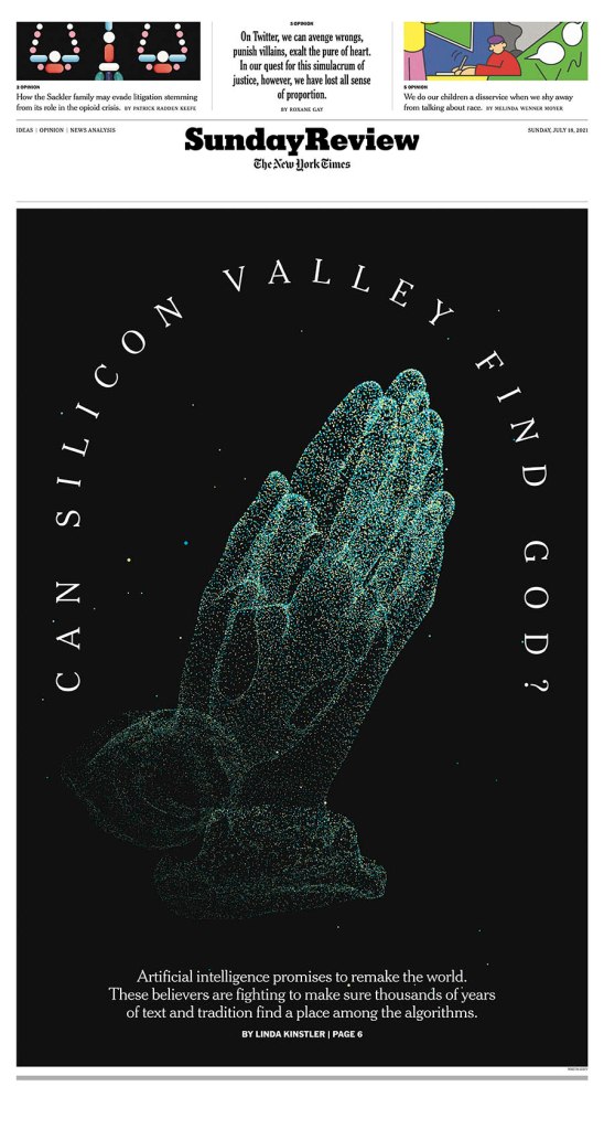
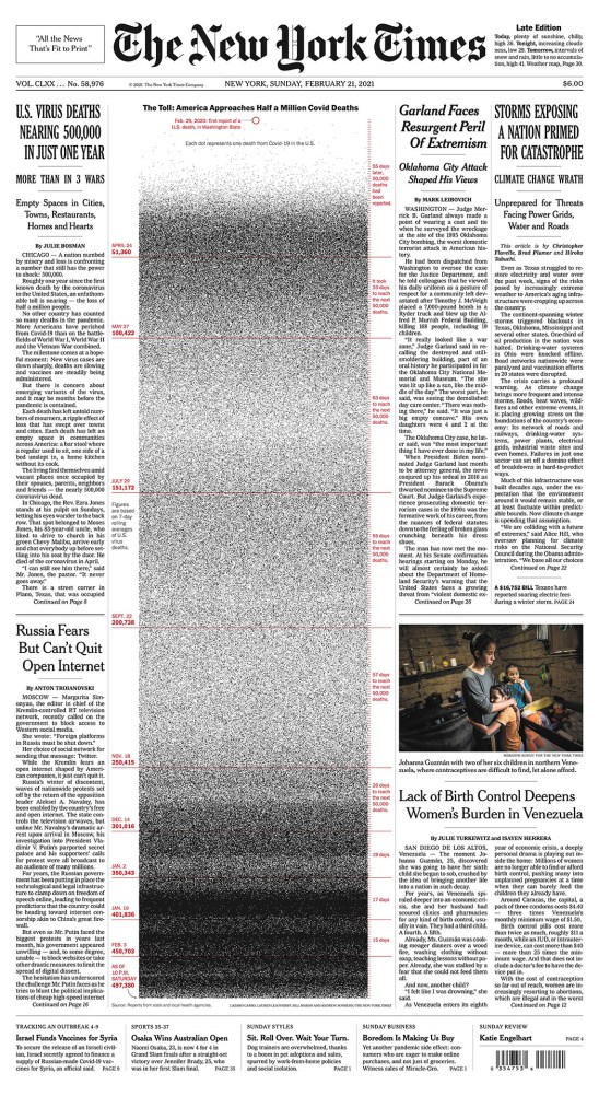
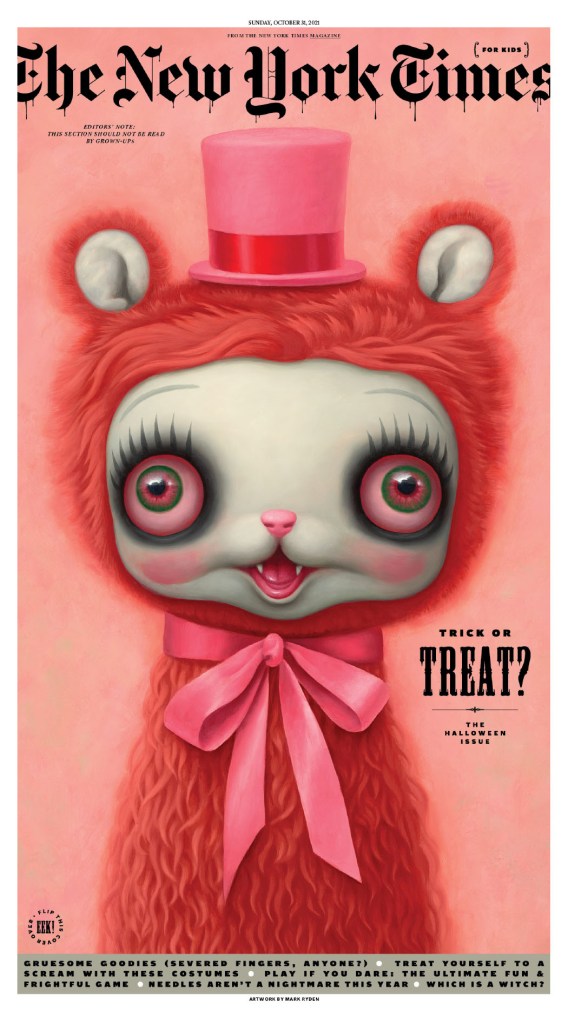
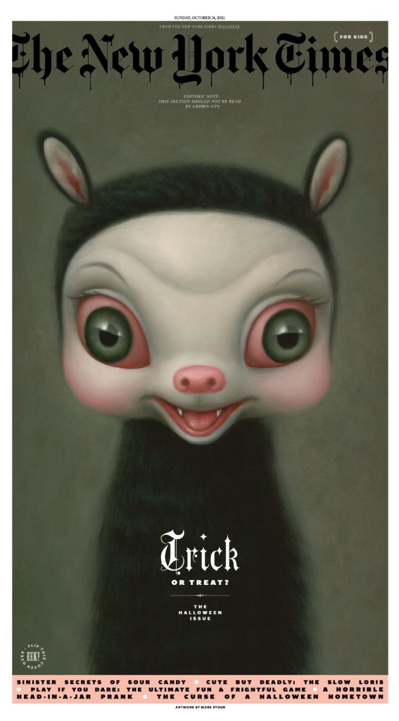
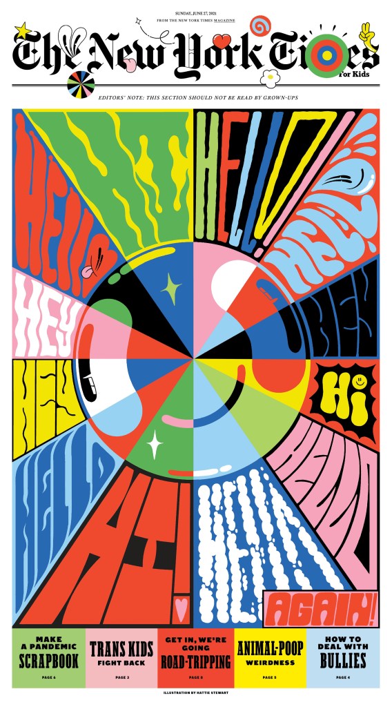
The New York Times
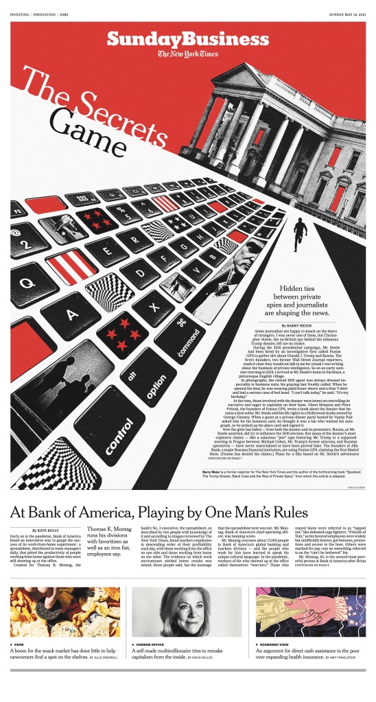
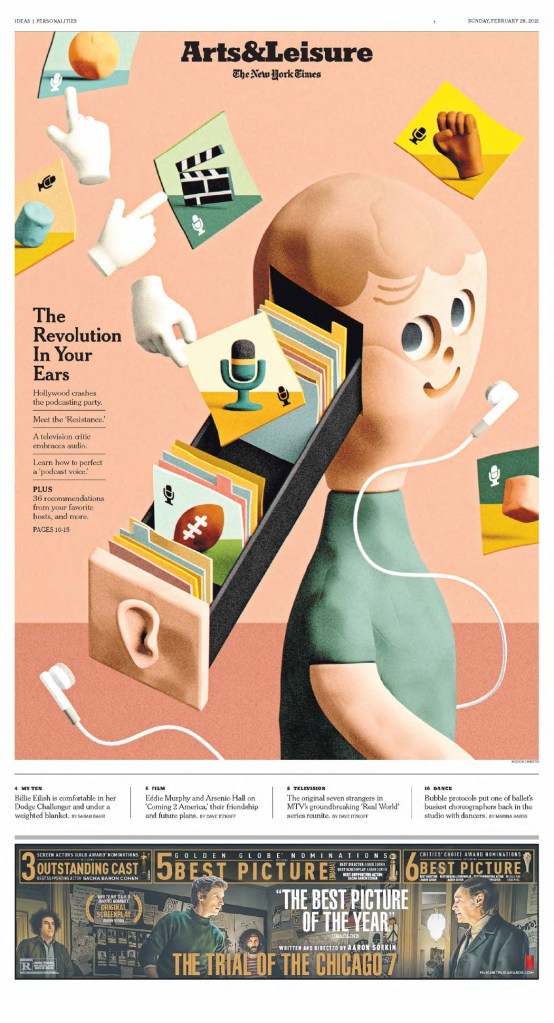
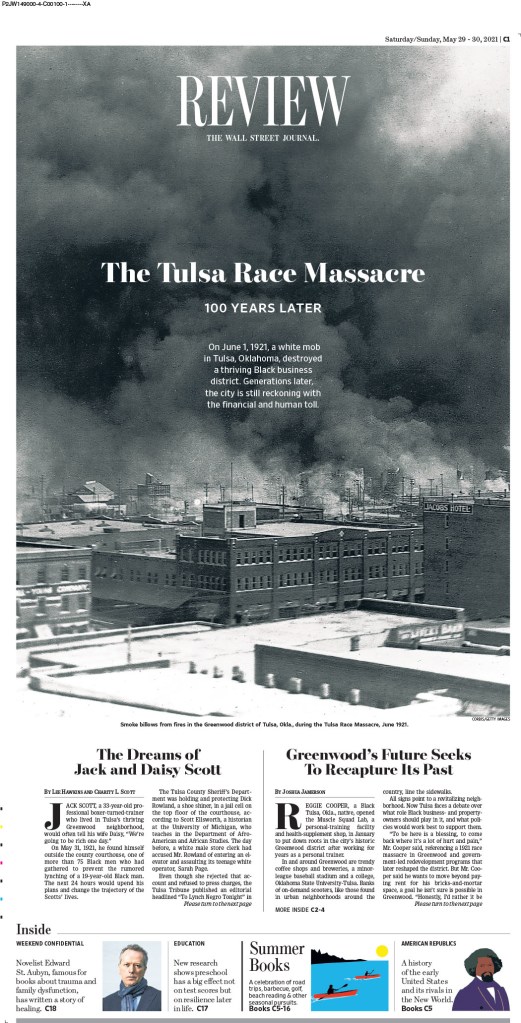
What can I say about the New York Times. It’s funny that it’s known as the Gray (Grey) Lady. Because once you get past that iconic grey cover (much less grey than it once was), and past the news section, it’s a marvel. Design beyond most designers’ wildest imaginations. The kids section alone is a masterpiece. Truly brilliant.
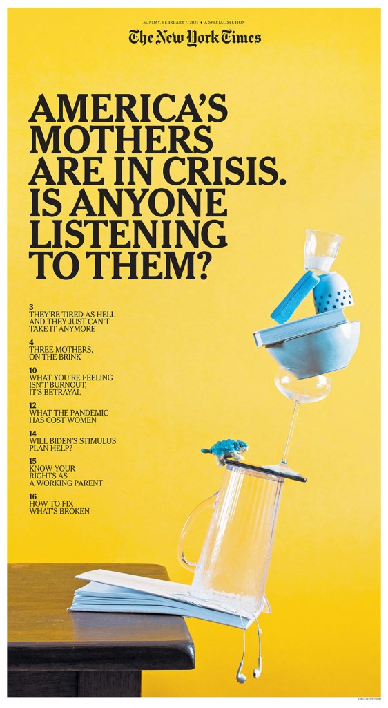
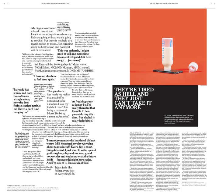
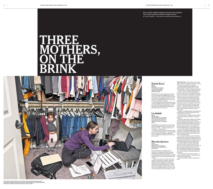
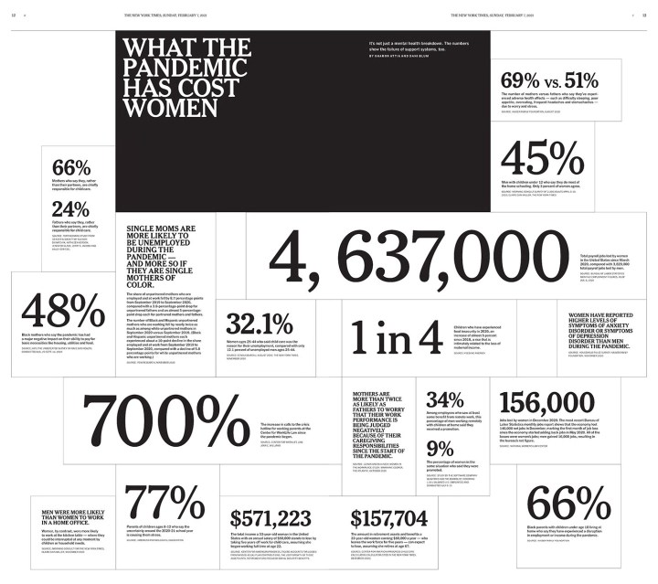
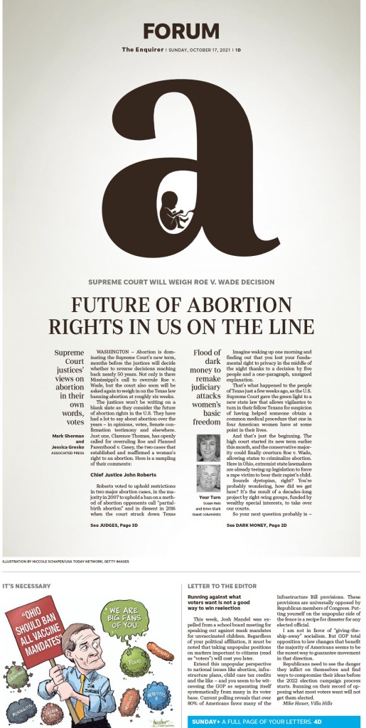
There were so many jaw-dropping pages from NYT, so this is truly just a snapshot of the work they produce. There were some I couldn’t do justice to as it would require seeing the entire section. I have included four pages from a section about the struggle of mothers because of the subject matter, and because of the judges’ comments. The section, they believe, is designed in a way intended to make you uncomfortable. It’s far from a standard design. It is jarring. I am so envious. If they are ever looking to hire a designer with a Canadian perspective, feel free to reach out. I accept. In a twist, the one A1/front page I included is so strong because it’s grey. I wrote an entire post about it when it came out in early 2021. The first two pages in the slideshow is two of my faves from the competition. I love little pictures. And the god page is boldly and smartly done.

Star Tribune
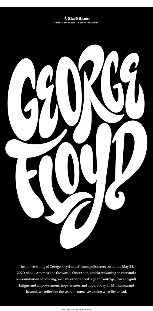
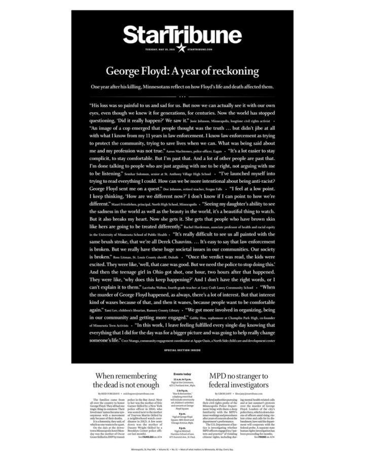
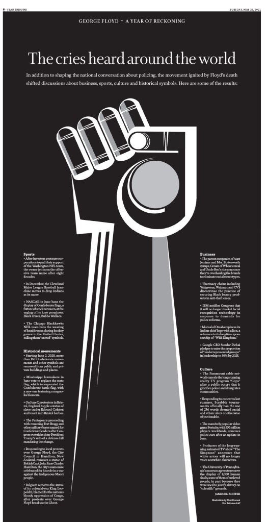
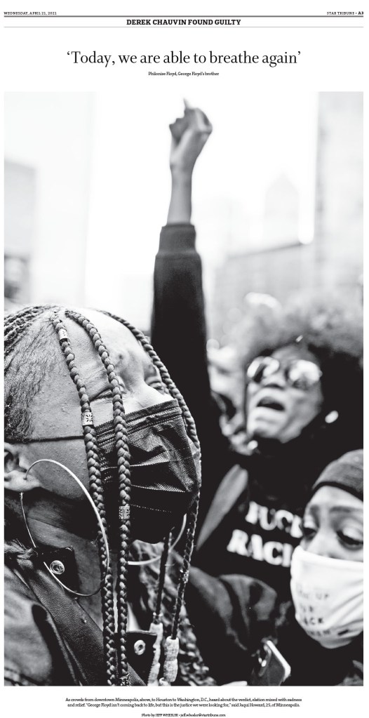
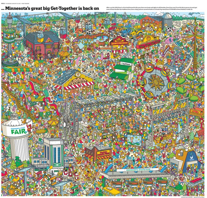
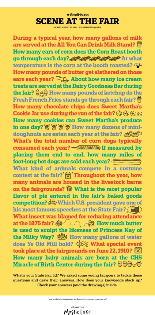
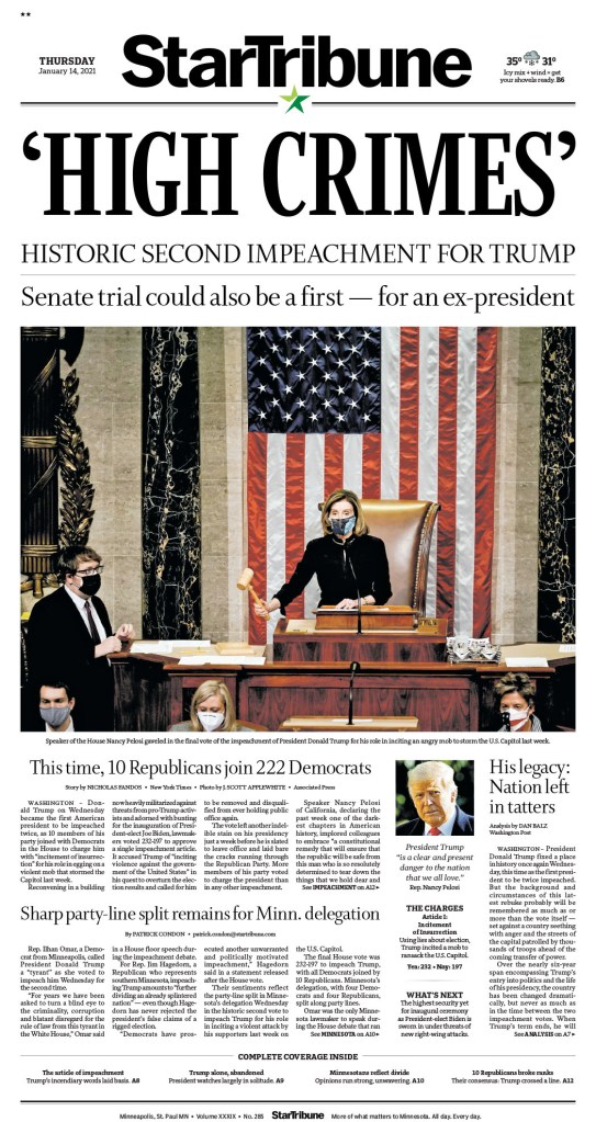
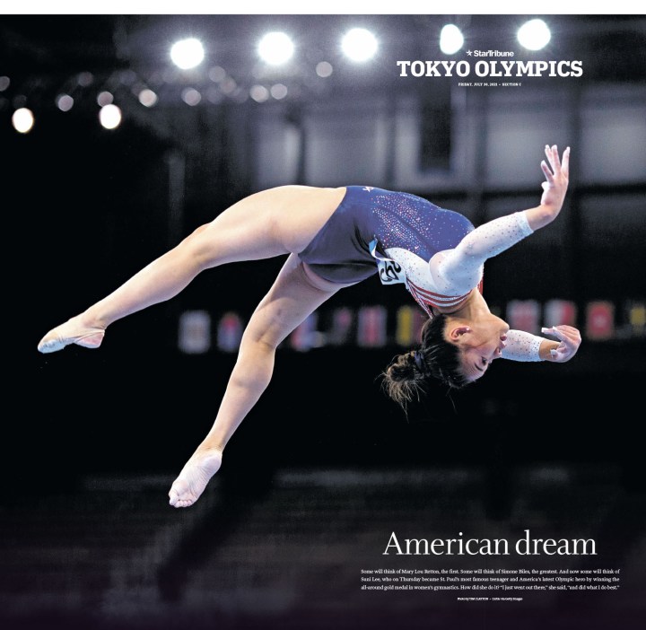
Funny thing about all of these four is that if you look at the front page each day, while they are well designed (particularly the Star Tribune, which is just a nice, clean, newsy front most days), they don’t look flashy. But then you get inside. Or then you have those big days. And wow. What is absolutely paying off for the Star Tribune is the state fair. There are always beautiful pages that come from there. To see more Star Tribune pages, other than what I’ve included here, see my recent post on designer Stacie Kammerling. A much more serious story this newspaper has handled so powerfully and with such grace is the George Floyd story. Just incredible, sensitive, yet provocative, boundary-pushing work. I will start there. Then to some fun and fair stuff (the contrast of last year’s fair and this year’s fair in cartoon figures is magical), and I have even included one of those hard-working front pages. And yes, I cut a lot again.

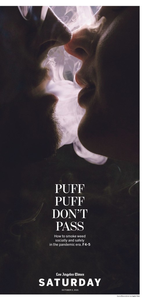
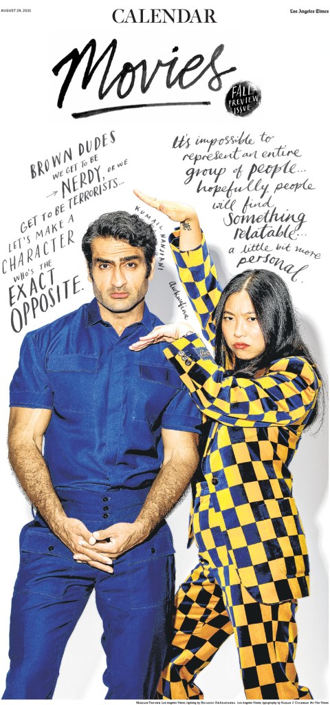
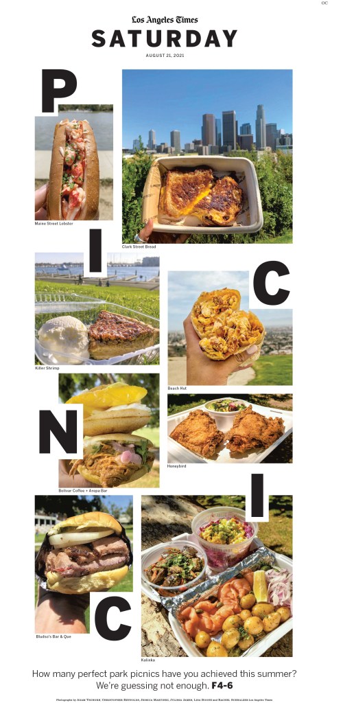
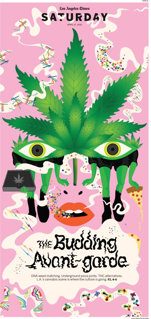
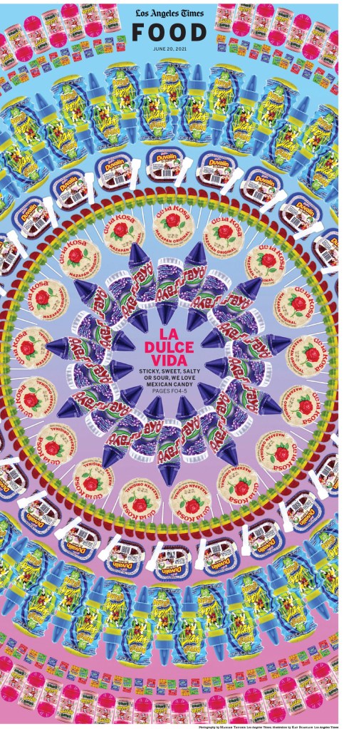
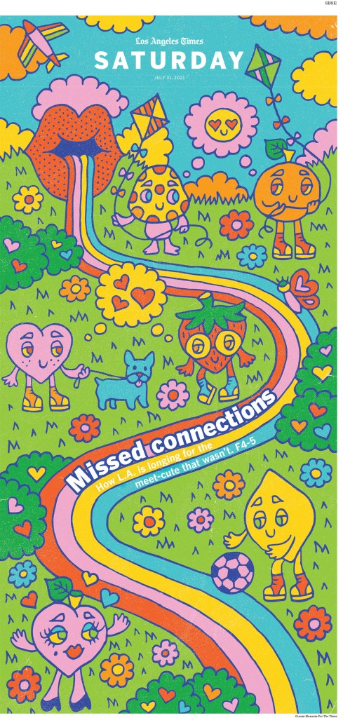
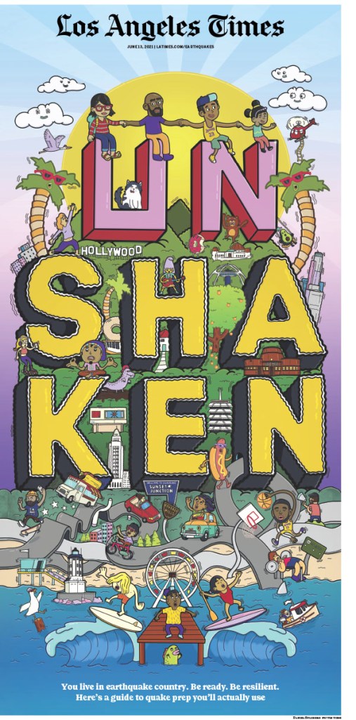
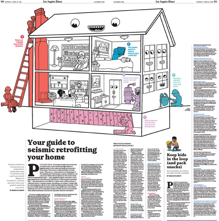
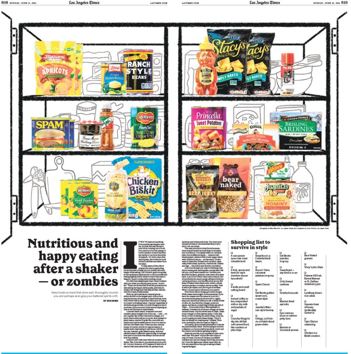
Los Angeles Times
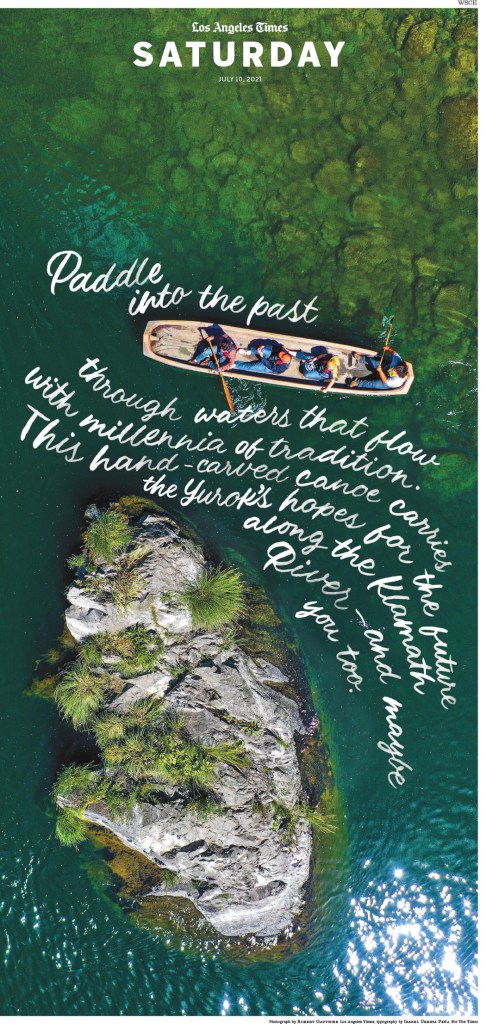
And finally, the Los Angeles Times. Perhaps my favourite paper from last year’s competition. I still absolutely loved it this year. I have started with pages that just use design. Brilliant and bold typography, strong photos, creative white space. Then I get into breathtaking illustrations, followed by a few pages from a special section, which is a clear strength of the Times. They had some outstanding complete special sections, but again, I had to make some choices.
And more
Having these papers down here is not meant to dismiss any of them. They did some incredible work. I had to pare it down somehow. You can see them all here. Below are a few outstanding pages separately, and then another slideshow with more.
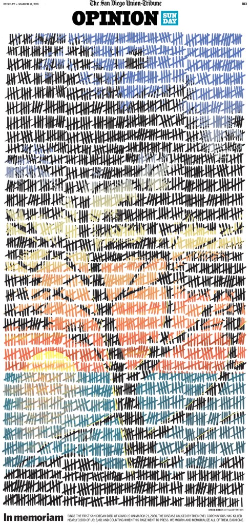
This page from the San Diego Union-Tribune was one of my top pages from the competition. It’s a new take on using tallies. It is so well executed.
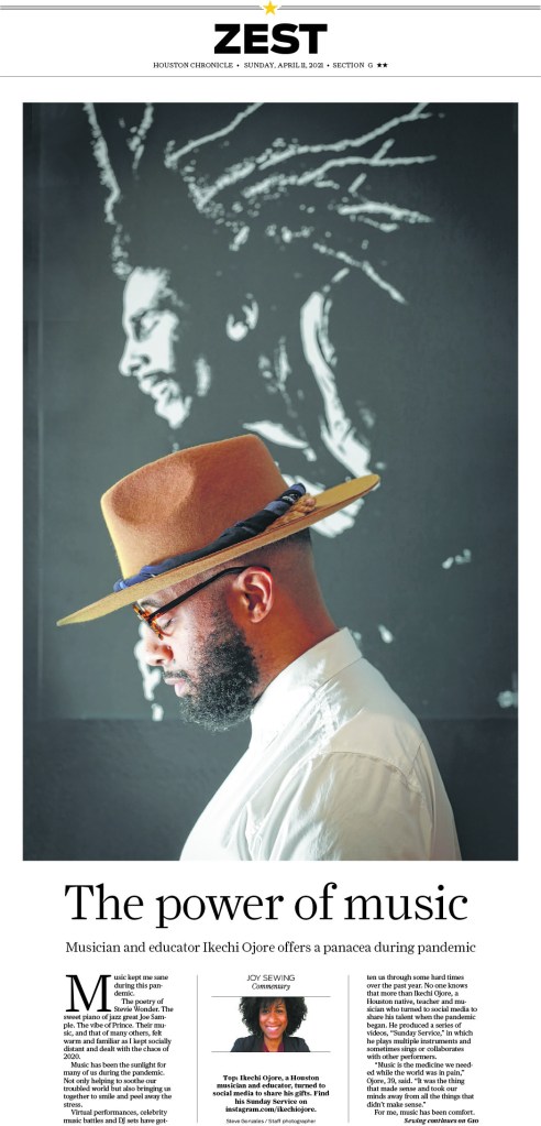
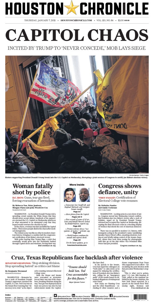
I put this Houston Chronicle page in for its simplicity. Proof that you don’t need to do big and wild designs to look good. I love it.
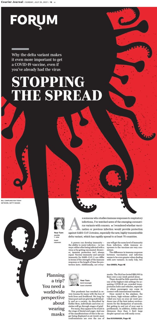
This Courier Journal (Louisville) page is so compelling and is a creative play on the COVID imagery we have seen again and again. This is new. Very clever.
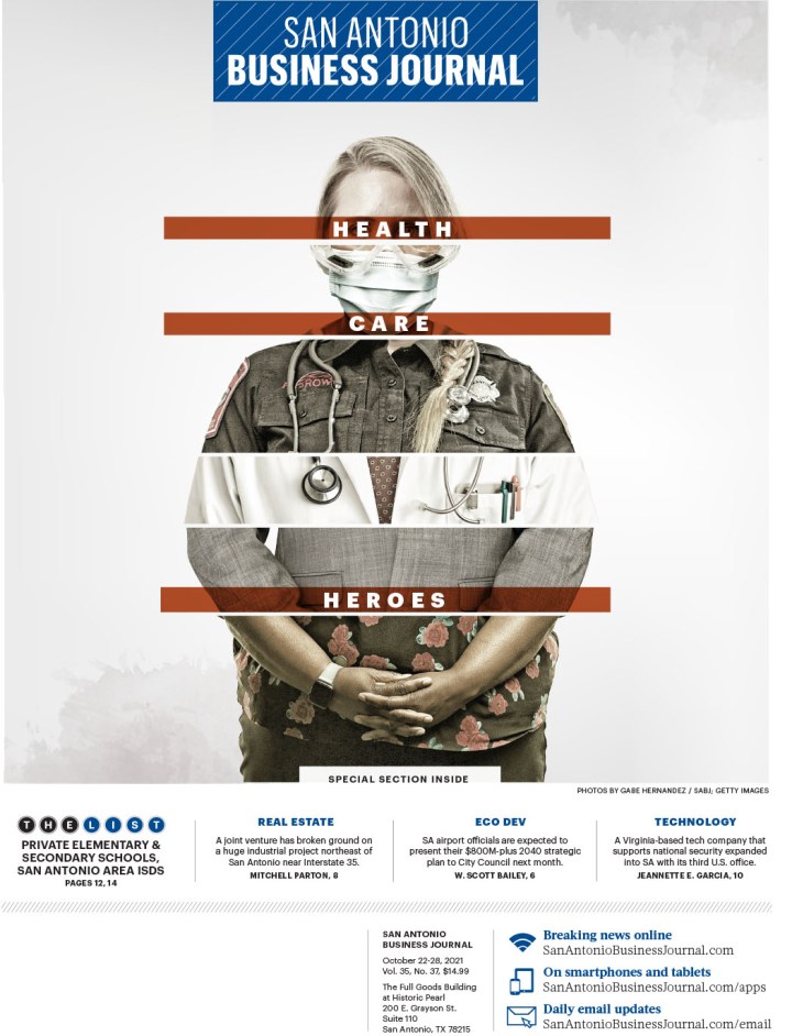
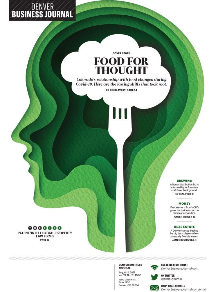
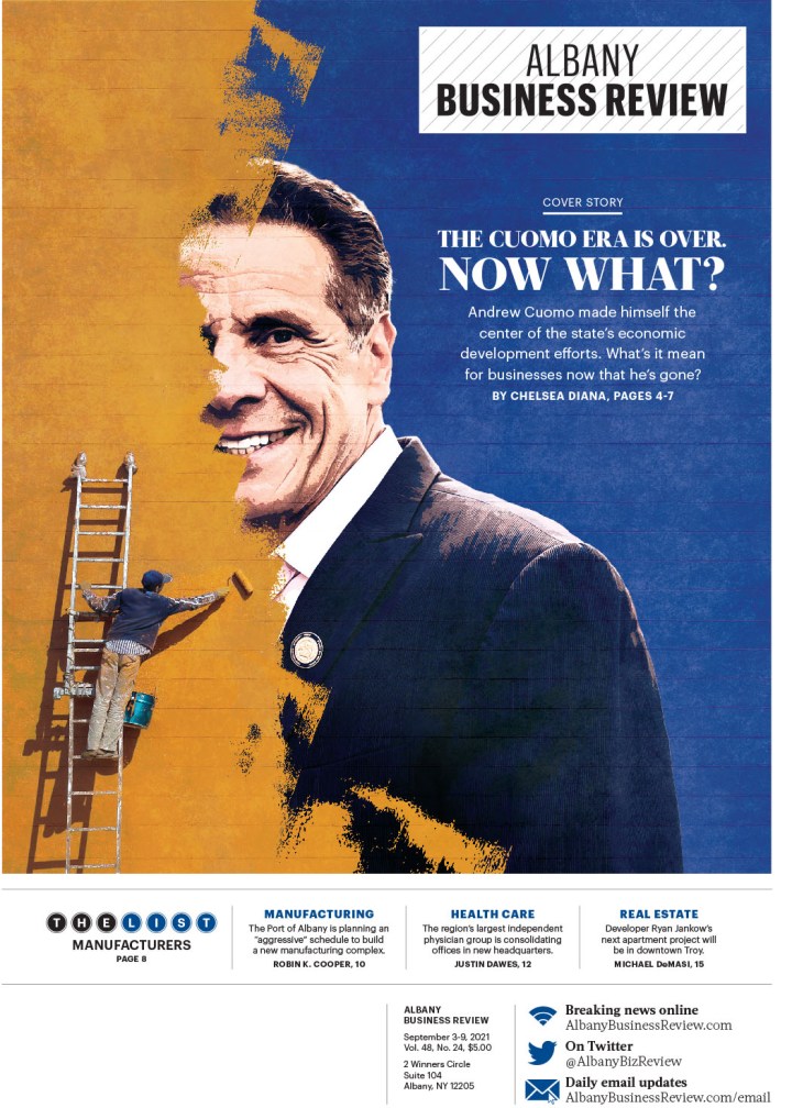
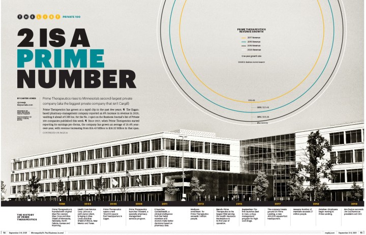
Here is a selection of pages from The Business Journals. They had a number of winners. They are doing such smart things with illustrations and text. The text on the first page is both understated and bold at the same time! Small, but reverse white on red with a touch of transparency.
And last but definitely not least, a selection from some other publications. I am positive I will look through the pages again and curse when I see a dozen that I forgot about. That’s how much there was to look through. It is a tribute to the incredibly hard-working and talented staff at all the newspapers or news hubs. Thank you for all your work. And your readers do too, even if they don’t know it. It’s hard to know what goes into not only the execution, but also the conception. Amazing.
So there you go. Print is alive. I just proved it.

[…] Previous PostBack […]
LikeLike
[…] #SND43, the best American newspaper designs from 2021 […]
LikeLike
[…] RELATED: SND43: Best of U.S. papers […]
LikeLike