
By Brad Needham
The world is a big place. To break it down for this blog, when in came to celebrating all the magical newspaper entries from the Society for News Designs Best of News Design competition I have broken it down into Canada (because I live and work here), the U.S. and the rest of the world. And that is not to diminish the rest of the world. The work coming out from newspapers around the world is astounding, which in itself is astounding given the times we’re in. Which brings me to where I want to start. The World’s Best Designed Newspaper, SND’s highest honour.
This year I had the great honour of being a facilitator for this competition. I got to watch them whittle down the entries to four finalists, and from there to choose one paper. The discussion was riveting. It came down to the New York Times, de Volkskrant, Het Parool and Die Zeit. Anyone who follows me knows I love de Volkskrant. Seeing it make the final was very satisfying.
After days of review and debate/discussion, Die Zeit came out on top. While all these newspapers have huge strengths, Die Zeit is worthy of this lofty title.
What makes a world’s best-designed newspaper? So, so many things. One word that was heard again and again was “considered.” Everything is so considered. All the little details. Nothing was overlooked. Things like drop caps, the spacing of words that wrap around images, kerning, and so on. But also the big things. Photo choices, how and when illustrations are used, how the text worked with art and the design. The funny thing was it was so well designed, it was remarked that the design falls to the background. Except when it doesn’t. The design is so remarkably clean, but sometimes they go big. And their use of photos and graphics? Considered. Everything is so artistic, they said. The judges could tell there was collaboration between editors and designers, which is imperative if you want to go from a nice paper to a top paper. Even more needs to happen to elevate a paper to world’s best designed. Congrats to Die Zeit for doing all of this and more. It shows.
While Die Zeit may not have many of those big “wow” pages, it still has some amazing, striking pages that take their clean and refined design to another level, and that clean design is already at another level. It really is a paper that rises above. I’ll start by showing some pages from Die Zeit, followed by a selection of some of the best pages from the rest of the world, Canada and U.S. excluded. You can see those here (Canada) and here (U.S).
“Great print design paints a coherent experience for the reader where every carefully chosen element contributes to convey more than the sum of its parts.”
Judges’ statement
Die Zeit
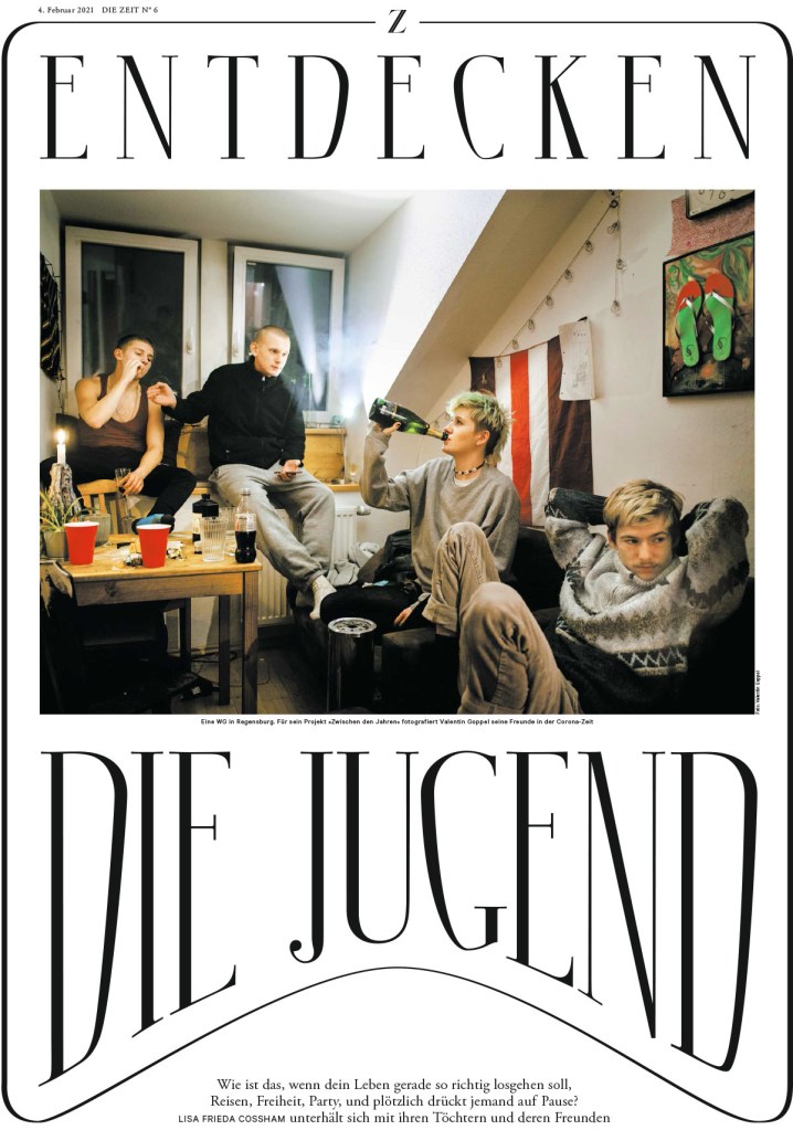
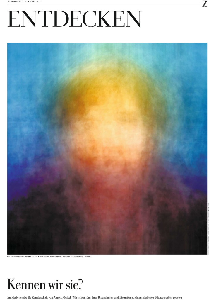
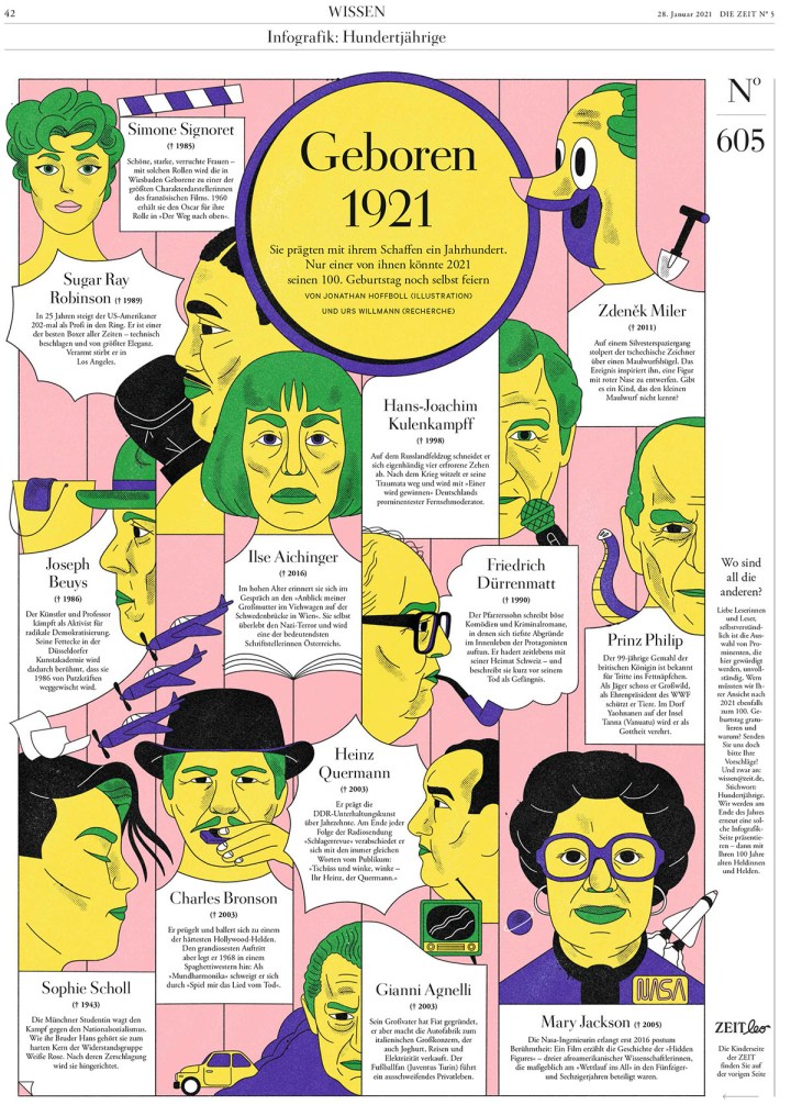
Die Zeit is a weekly paper out of Germany. So that is one main difference from the papers it was up against. First, I will show a selection of some consecutive pages. Just to lull you into thinking it’s just a nice clean design. But this is what readers would see every day as they start flipping through their newspaper. After those pages, I’ve included some with sizzle. Text as design, illustrations and graphics, colour.
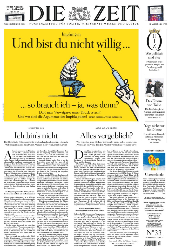
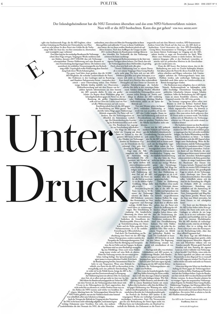
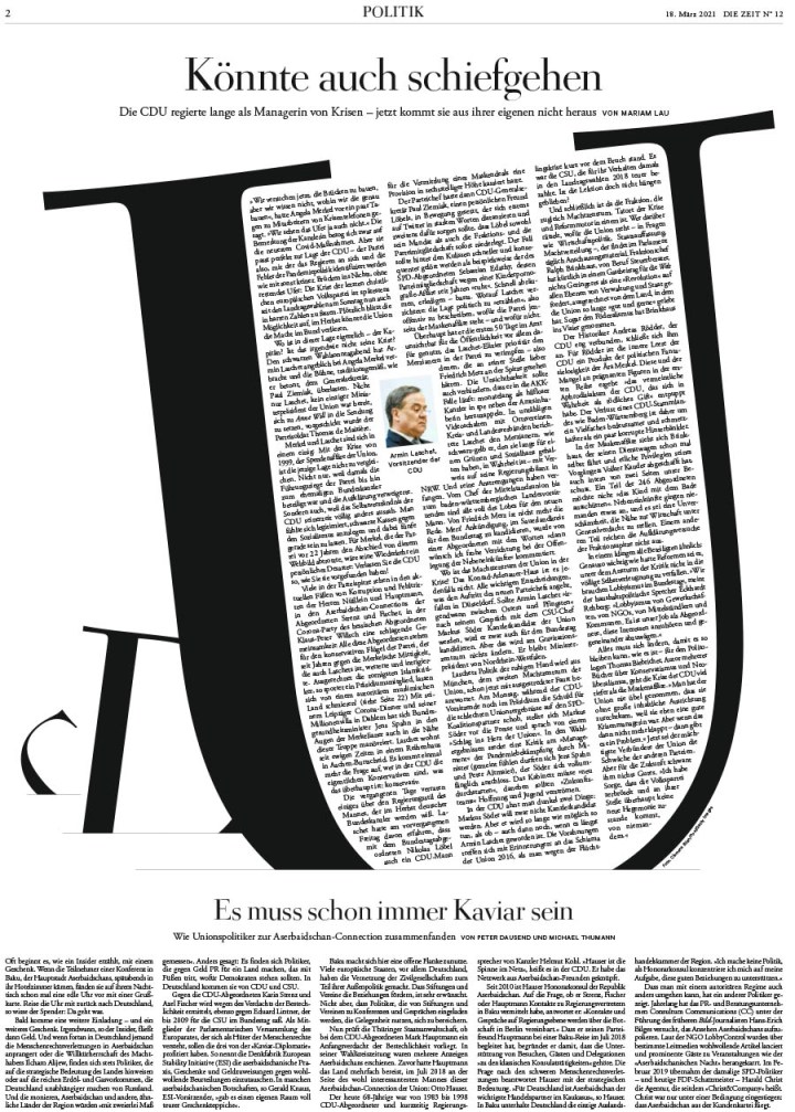
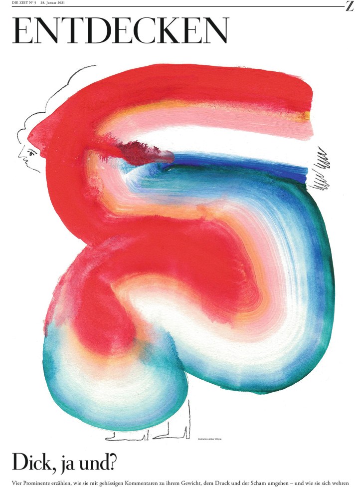
This one is one of my faves from Die Zeit. Every year one paper does a funky text design that grabs onto me and won’t let go. This was this year’s. I love the bend, that the text is still so well spaced and readable. The E. And they did more incredible text designs. They made a chicken out of text. A chicken! Wait for it. It’s coming.
This page is just funky. That’s all. I love the text treatment. The border. The pic. It actually reminds me of a design I once did, just better. So good.
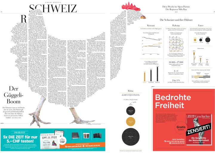
A chicken! Out of text! Over a two-page spread!
I’ve included a few more separately. They were too good to be missed.
And so so many more stunning, smartly designed pages. This slide show has a number of them, but it’s still a small sampling of the work that comes out of this paper every week. Just such amazing attention to detail on every page.

The rest …
There were more than 3,500 entries in this year’s competition, up from the previous year, which is encouraging. Of those, there were more than 800 winners. If that sounds like a lot, keep in mind the 3,500 entries consist of what designers from around the world considered their best work, work worthy of award consideration. I look at 500+ front pages every day. That’s just covers. I can’t even begin to fathom how many pages are produced each year. How many great pages weren’t entered.
Alas, you’ve seen Canada. You’ve seen the U.S. Here is a very slimmed down selection of pages from the rest of the world. One of the things I love about newspapers from other countries is that they often look so different than the typical North American newspaper. They take a different approach, have different design philosophies. But one thing is clear with all them: they want to wow their readers. This will mark my last post from SND 43, but it may not be the last you see of some of the pages in this post as I try to gently coerce the incredible designers behind some of these pages to talk to me about their work. First up, Politico Europe and Politiken!
Politico Europe
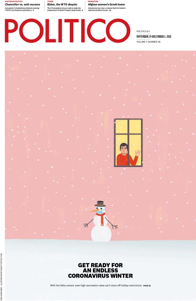
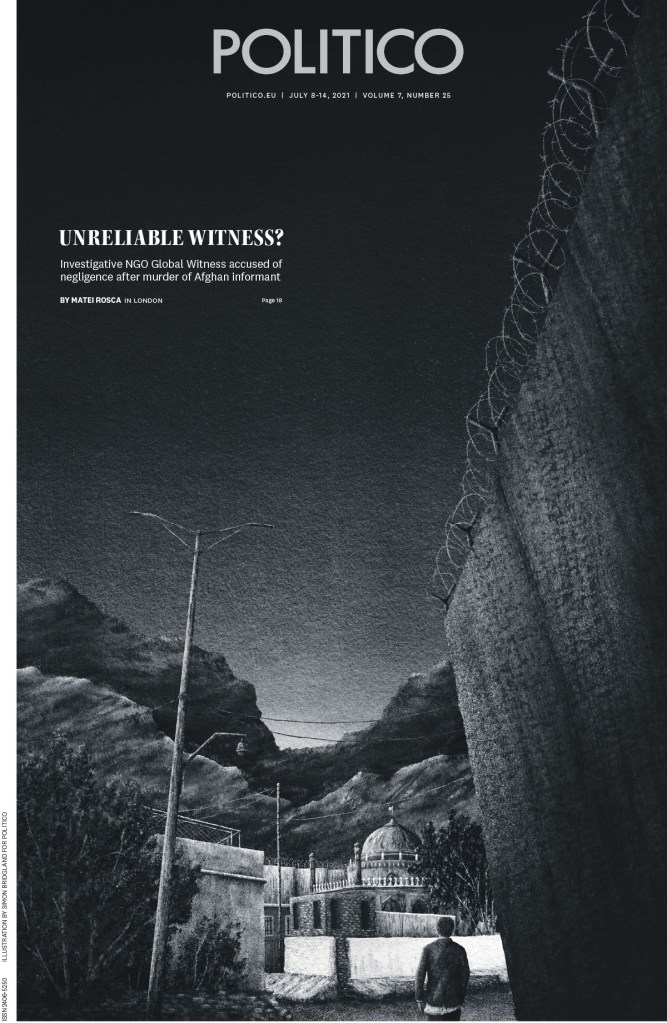
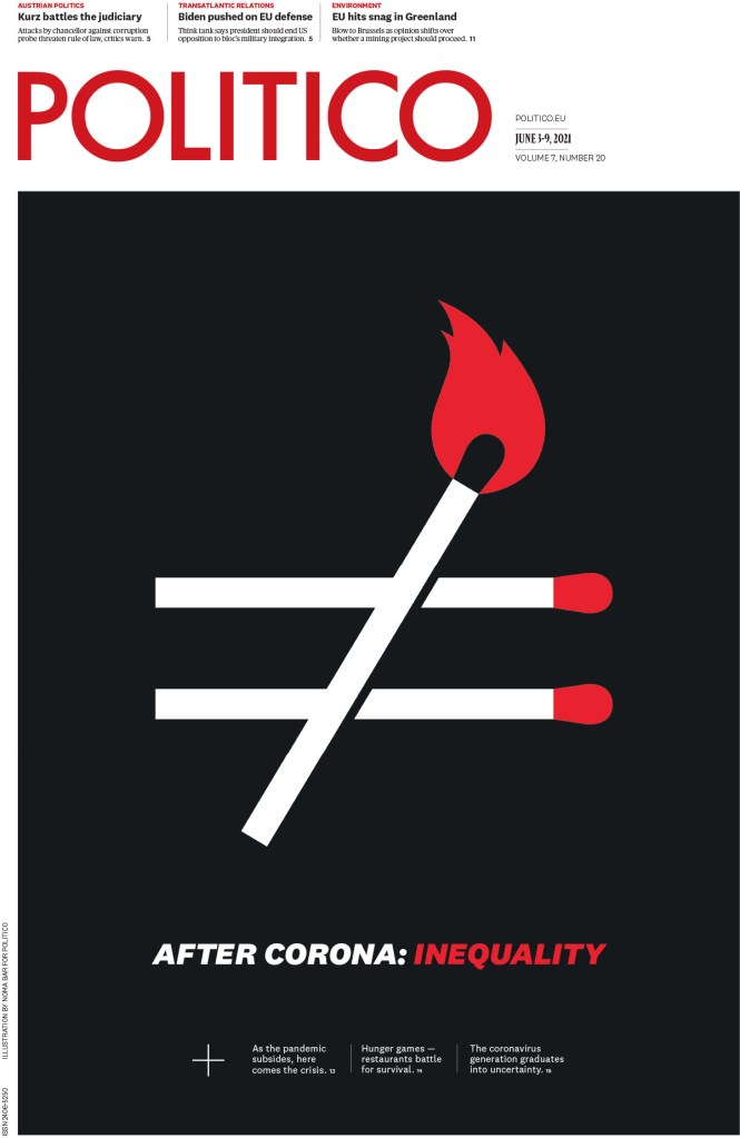
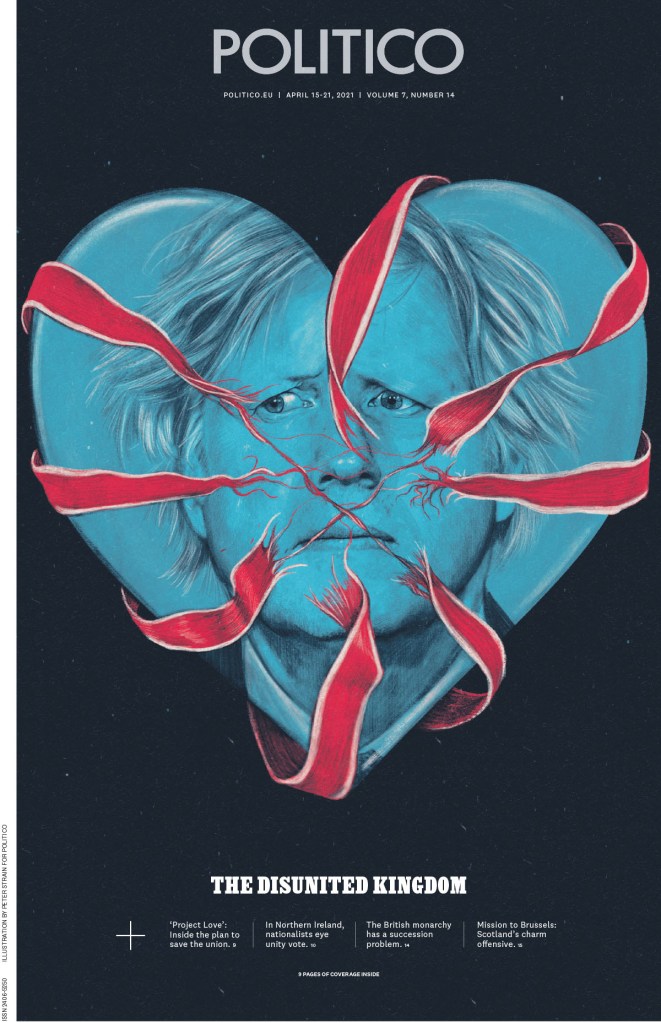
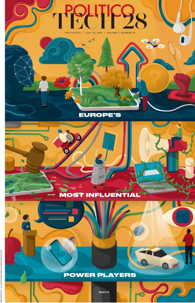
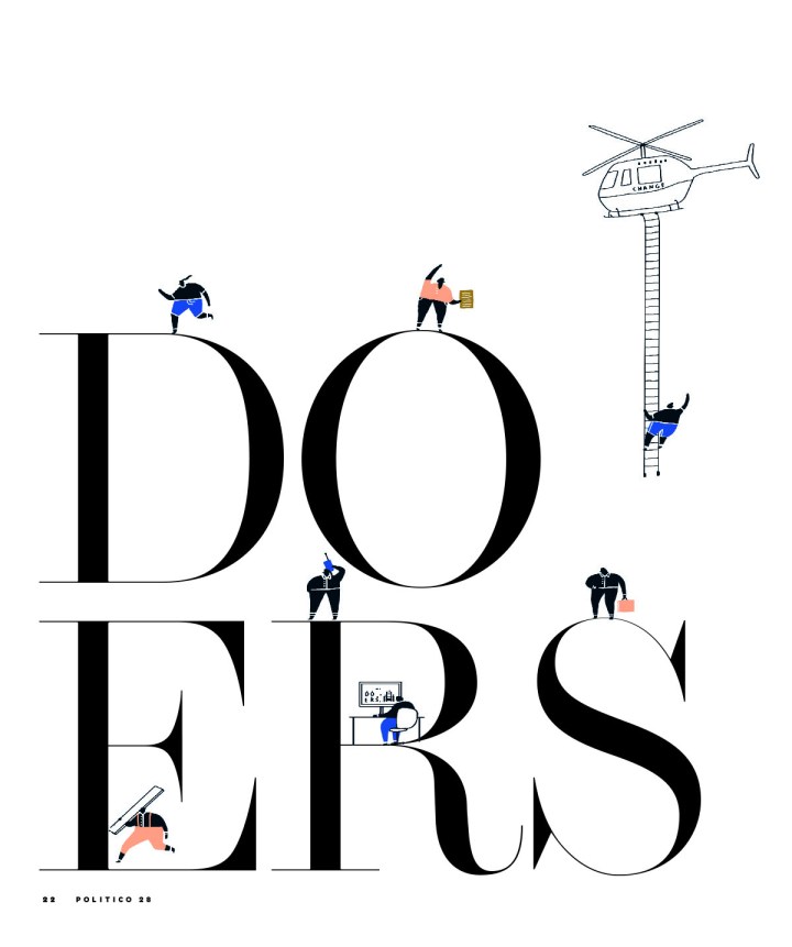
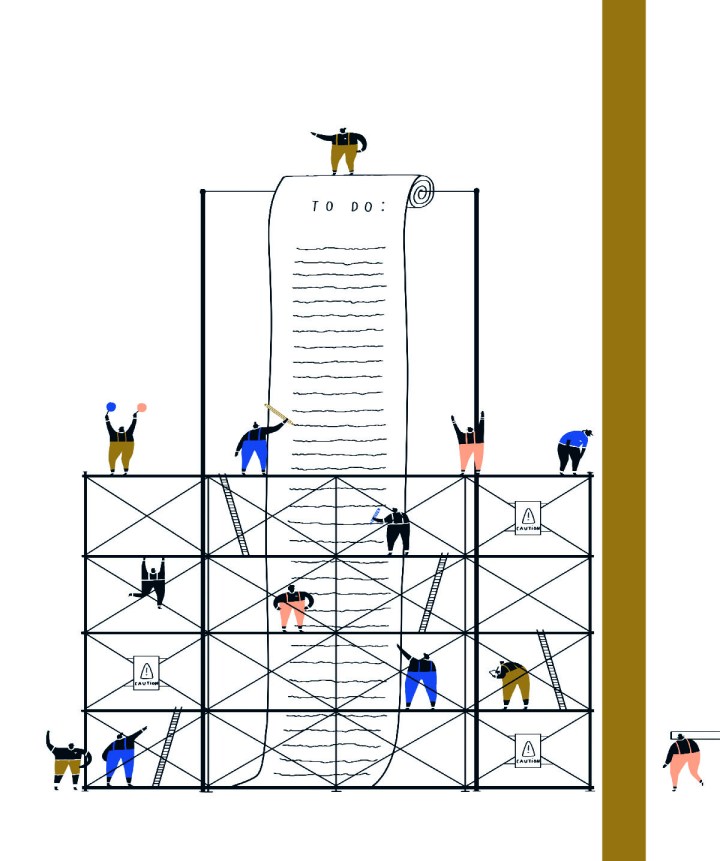
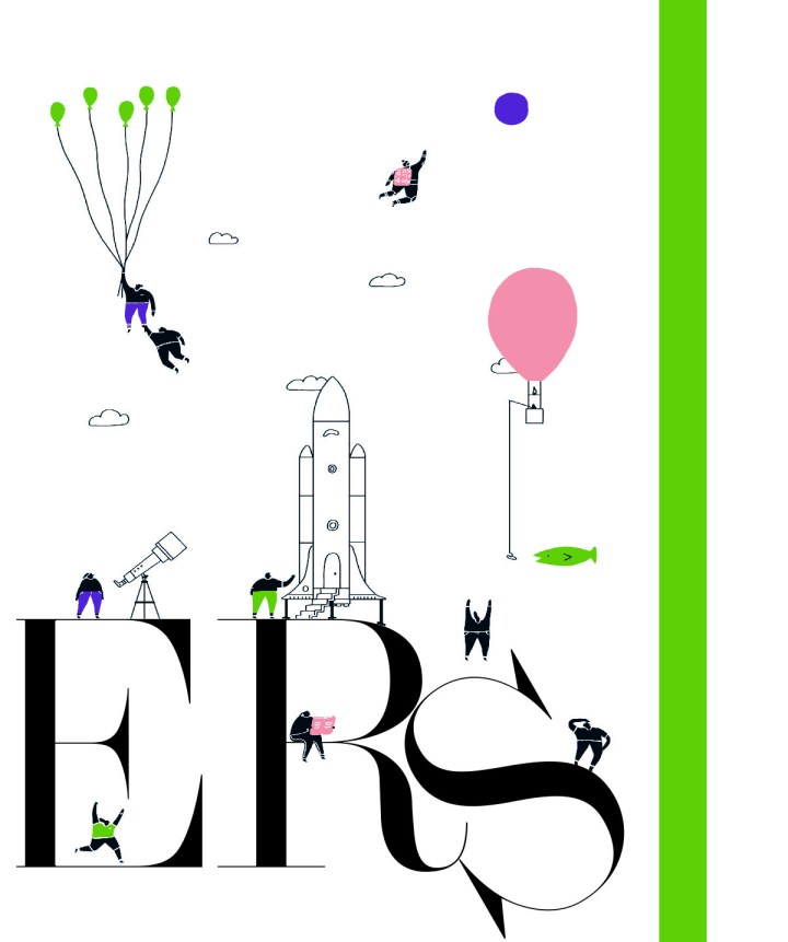
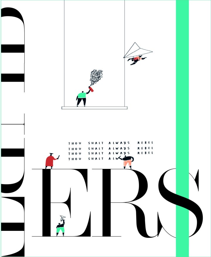
There is such a range of pages from Politico Europe. A lot are illustration-driven. And the illustrations are beautiful or haunting or striking. I will start with the snowman. Every time I saw this little guy, and the person in the window, I felt something. I want to feel happy. But then …
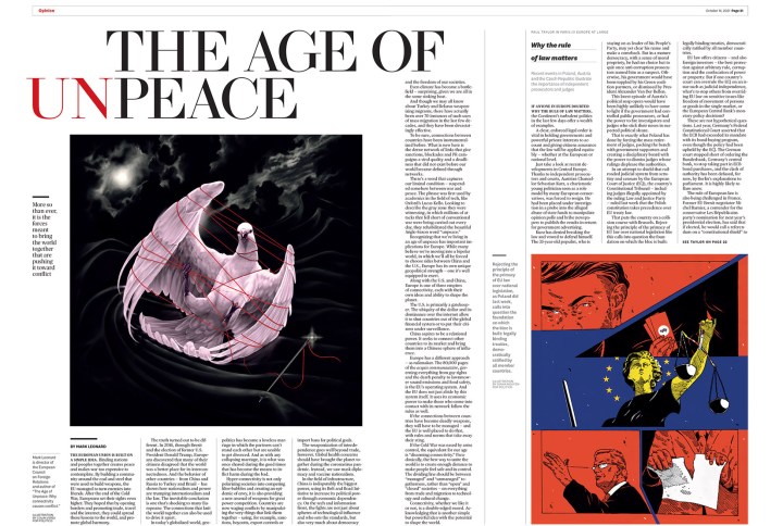
This spread is so well done. The art is striking, the headline is strong, both words and design. It’s clean, but with some surprises. The headline is almost jarring as set up, but I feel it’s supposed to be. It’s not the age of peace, after all.
In this slide show, again, there is a great variety, starting with this dark image, and ending with a section about doers and dreamers that makes me smile. Every page makes me smile.


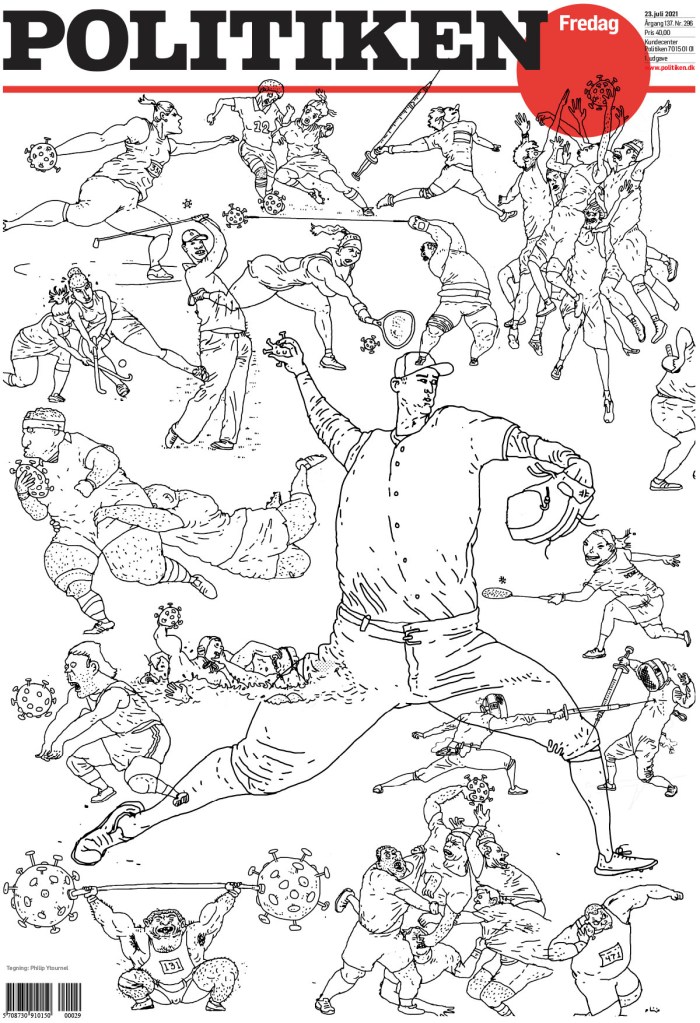
Politiken
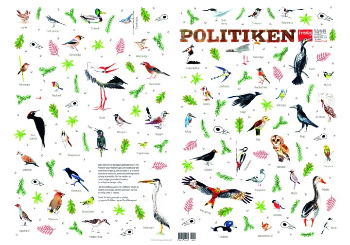
I’ve long been a fan of Politiken. I feature pages from this publication on my Instagram frequently. This was a page I featured here. I put it in with my Christmas collection even though I wasn’t sure if it was meant to be a Christmas page. But the entry was called wrapping paper! So it is.
And now for something completely different. The next two pages are from the same award-winning portfolio by designer Caroline Niegaard. What strikes me about these is that they are chaotically bold. They are full of energy.
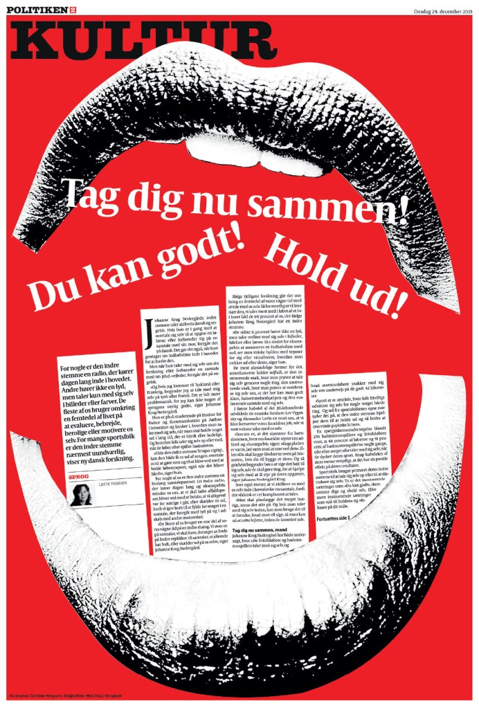
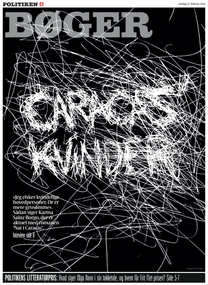
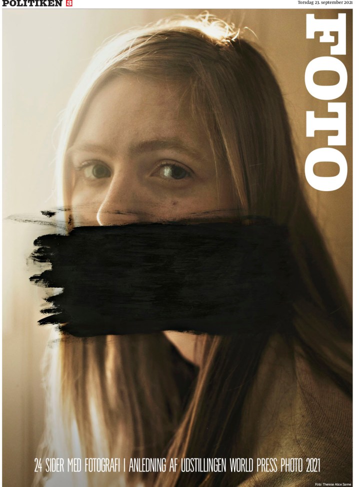
And many more. I love that this paper takes risks. And that its work is so varied. The last three I’ve chosen to show are completely different, but still within character.
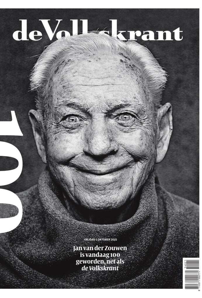
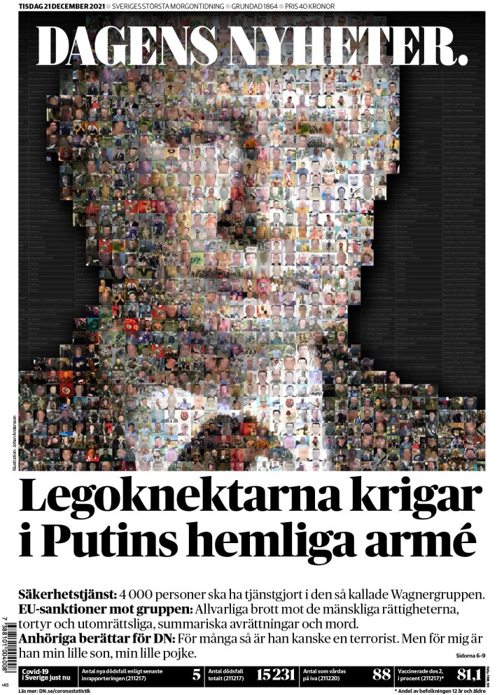
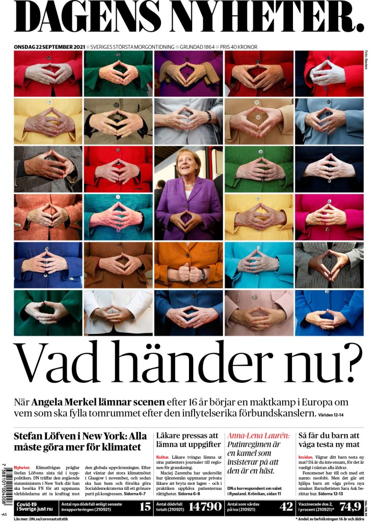
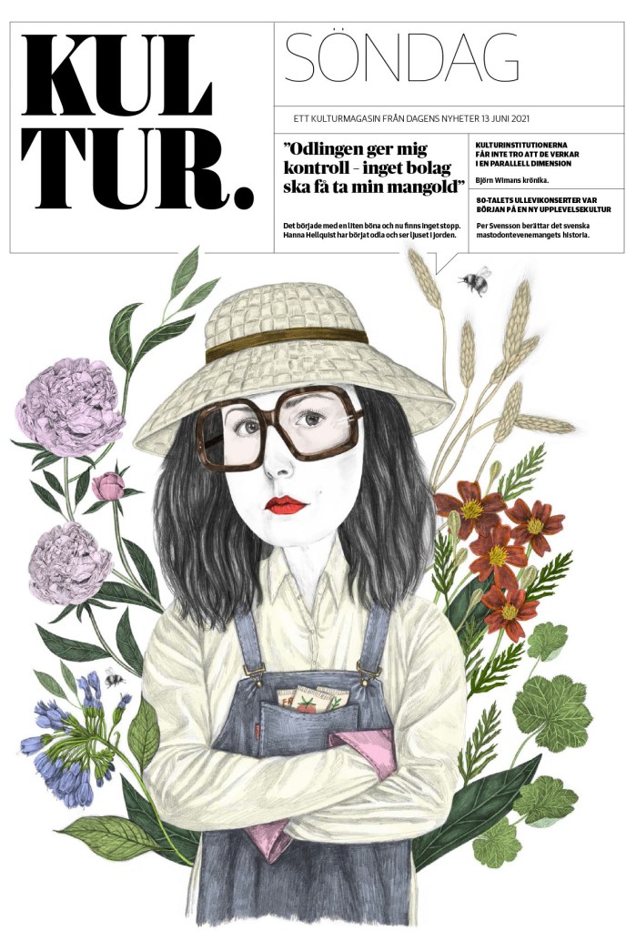
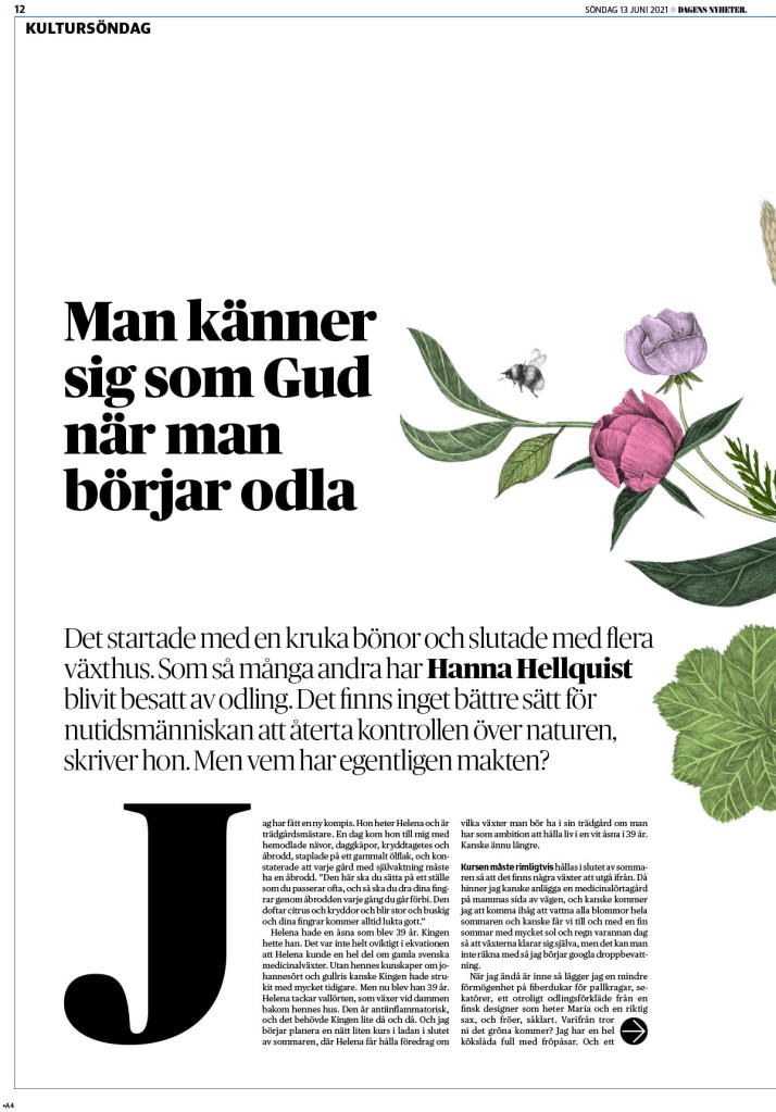
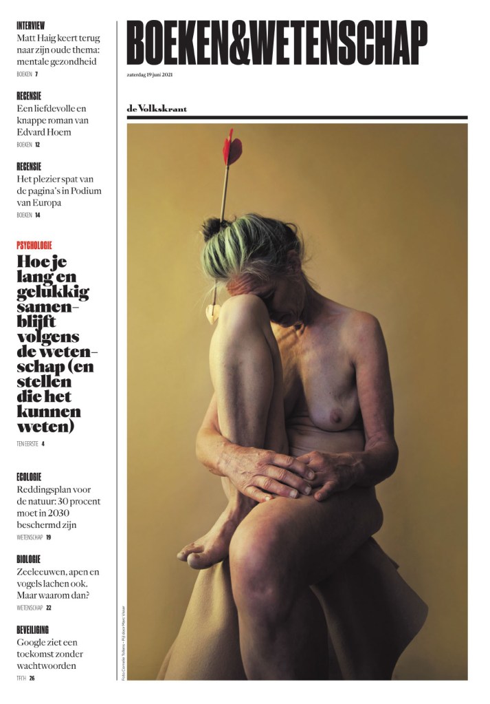
Below are some others I have pulled out to highlight. Just some of my faves, but there were so many more incredible entries from other papers. First from de Volkstrant, a page that was featured on my Instagram, and then two from Dagens Nyheter, which I think does an incredible job on covers regularly.
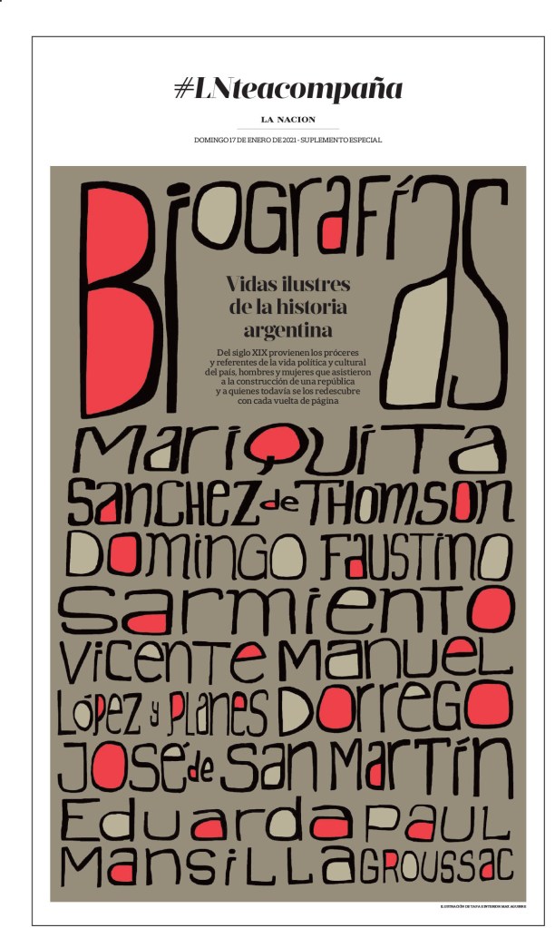
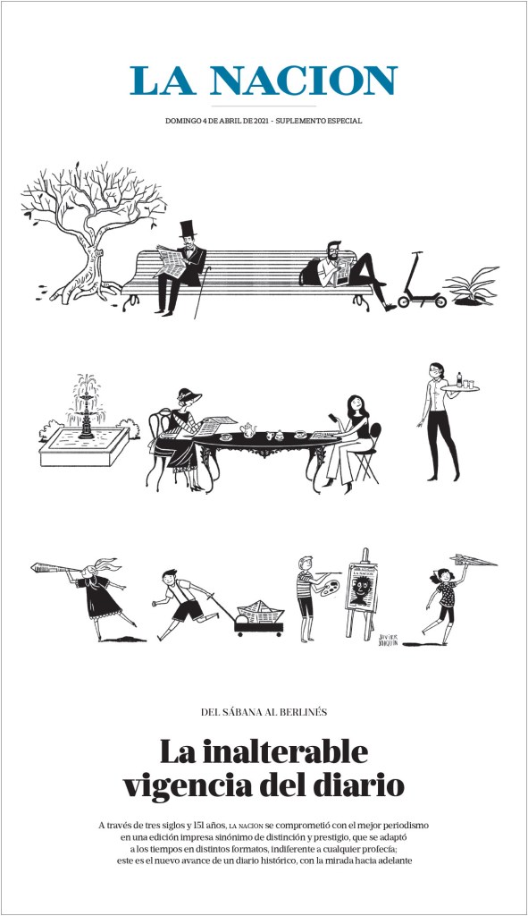
This page from La Nacion is just so lovely. There is another from them in the slideshow.
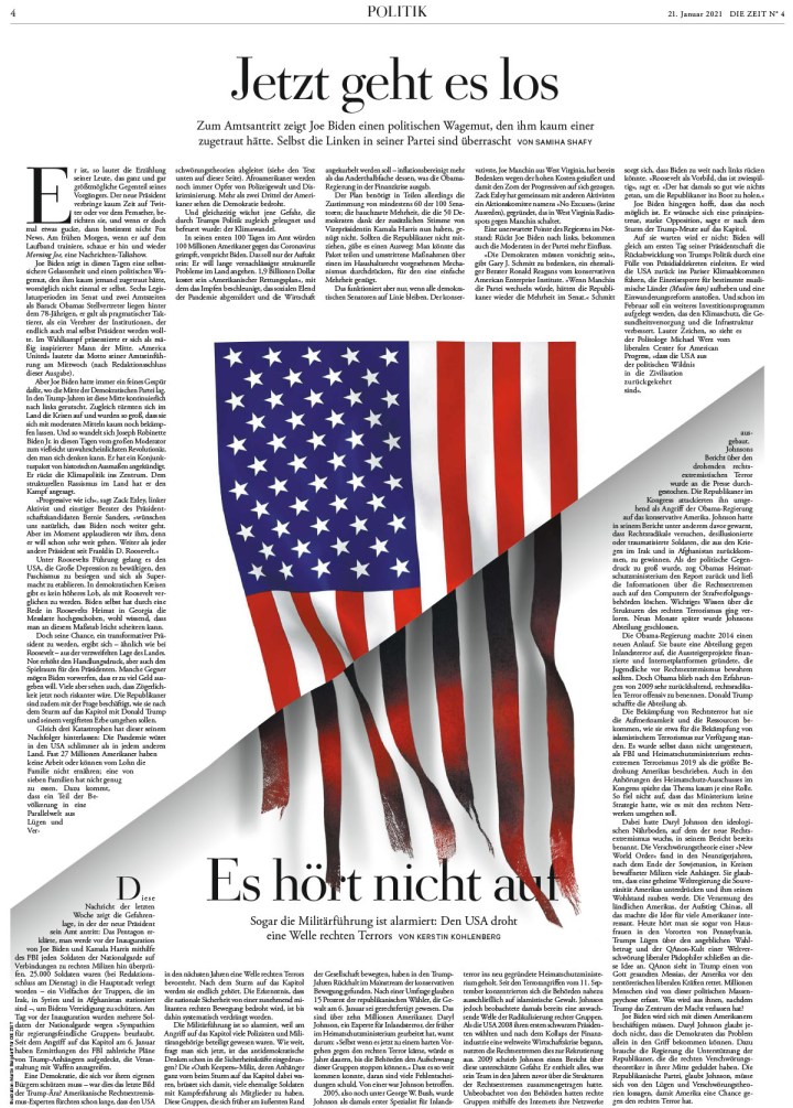
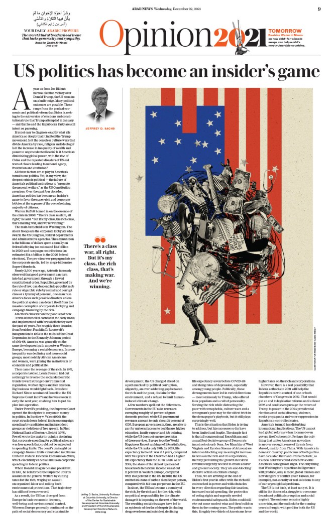
Arab News has many great pages, but this opinion page really jumped out at me. I love the illustration, and the page itself is just clean and crisp. The American flag features prominently in pages, particularly opinion pages, around the world. It’s used in so many different ways to convey so many different ideas.
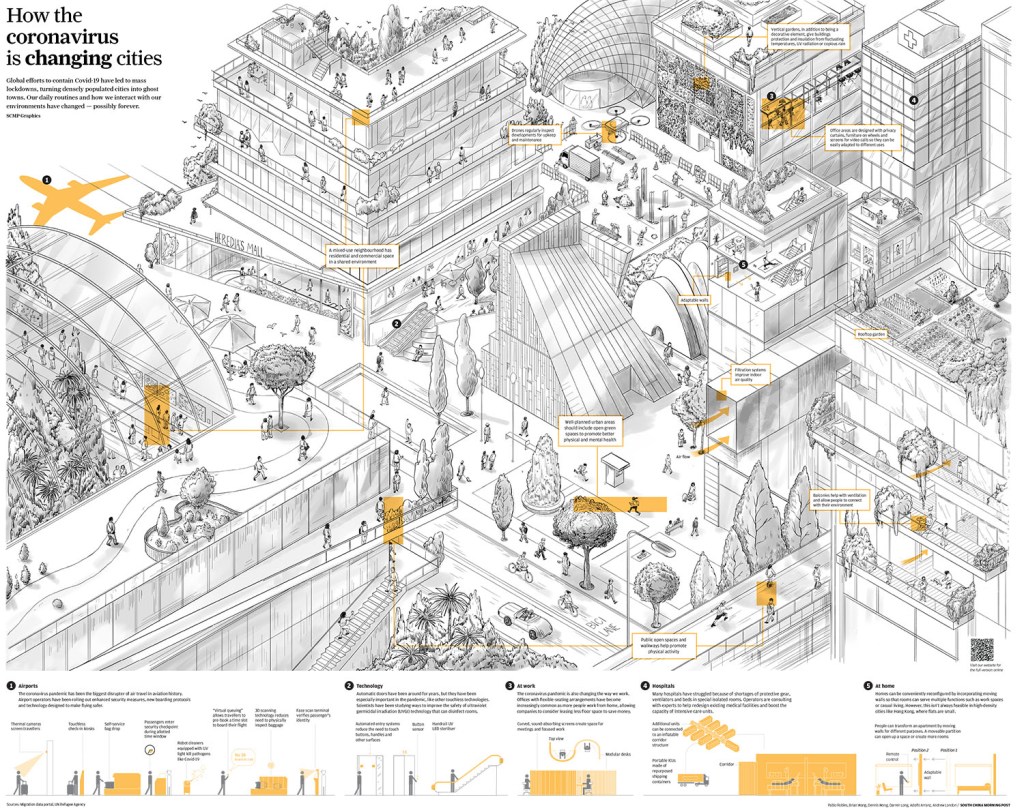
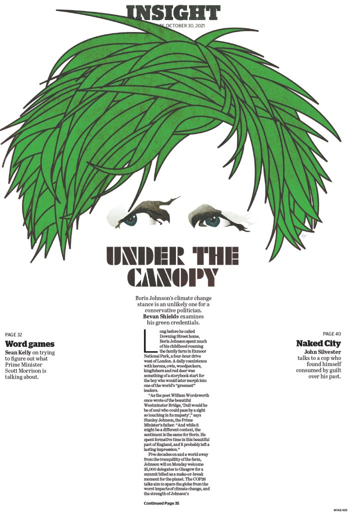
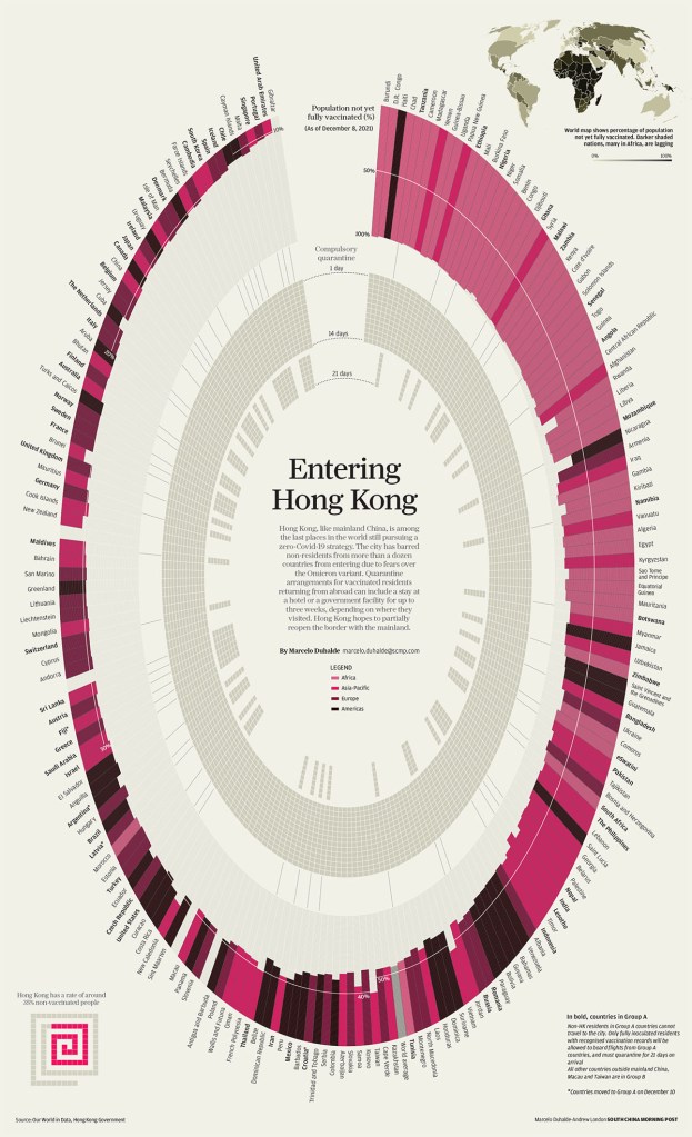
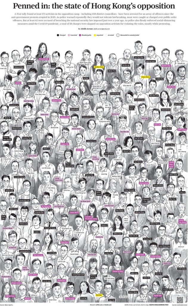
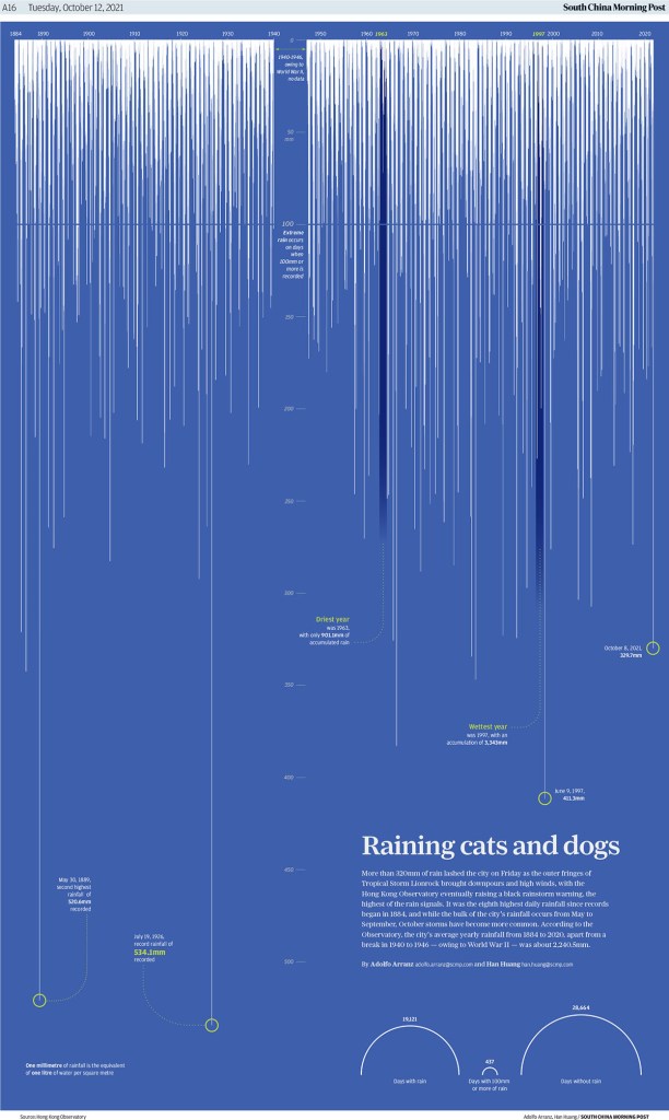
There are a few more South China Morning Post pages in the slideshow. While this is one really works because of the illustration, it was just such a compelling illustration. For the most part I didn’t include pages that won just for illustration. But they also used the small bit of display text so well. I am positive the space in the top left was left for display copy.
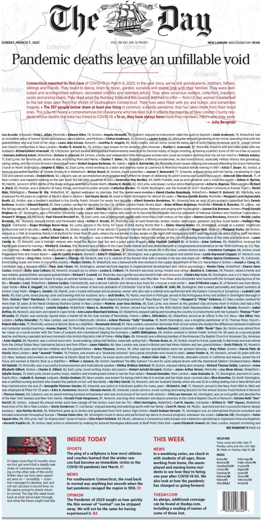
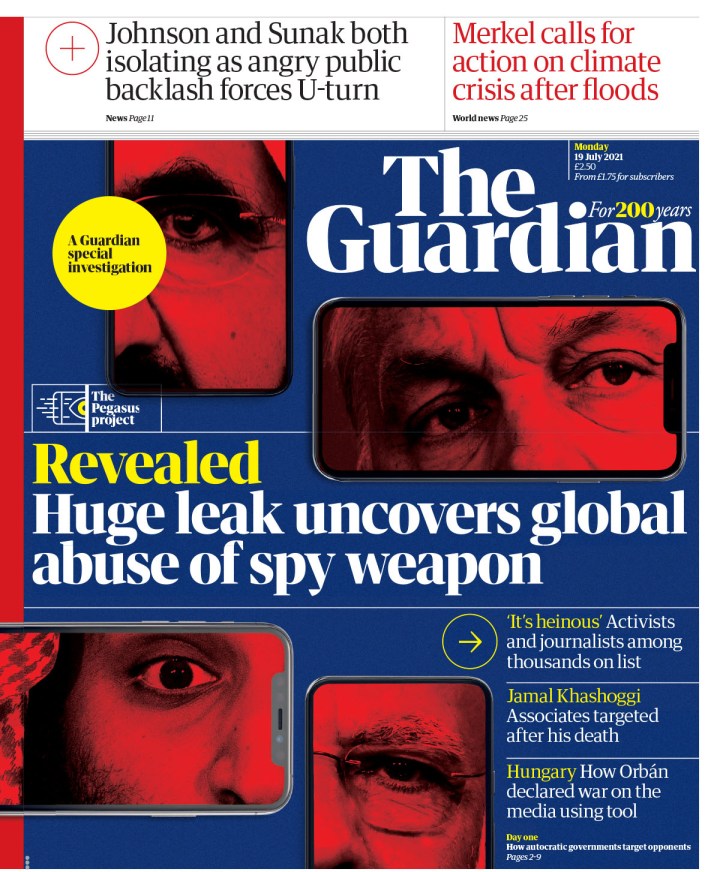
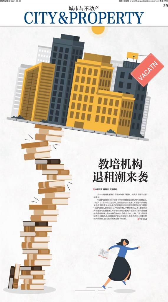
And the final slideshow from SND 43. There is a wide cross section of pages from multiple publications, such as The Age, The Guardian, The Day, Economic Observer out of China and more.
And that’s it. Another year, another awe-inspiring competition. Inspiring is the right word, as it would be impossible for any newspaper designer seeing the incredible work submitted to walk away without some new ideas, some extra enthusiasm or desire to push just a little harder.
READ MORE: A look back at SND 42
Best from Canada
And the rest

[…] #SND43: World’s Best-Designed Newspaper (and other brilliant pages) […]
LikeLike
[…] German paper, last year’s World’s Best Designed winner and in contention again this year, could be talked about with some German stereotypes. It is […]
LikeLike