There are average newspaper pages and there are good newspaper pages. And there are almost unbelievably great newspaper pages. That is what the Society for News Design is all about. If you read this blog, you likely know all about SND by now. Over the course of a few days last week I was fortunate enough to be a facilitator in the SND42 Best of Print Design competition. I got to listen to some of the greatest minds in the visual design space talk about some of the best pages in the world throughout 2020, a tumultuous year to say the least. The judges spoke. They gave their awards and their medals. And for the most part I agreed with everything. In many cases their keen observations bowled me over. While I didn’t get to look at all of the more than 3,000 entries, I did try to look at as many as I could. I wanted to share some of the pages I was secretly rooting for, yelling at my muted computer when the team captain asked if anyone else had anything to say.
Here are a selection of pages from this year’s competition that blew my mind, mostly from the news category my team was judging, but not all. I haven’t included any of Canada’s best here, as that will be separate post.
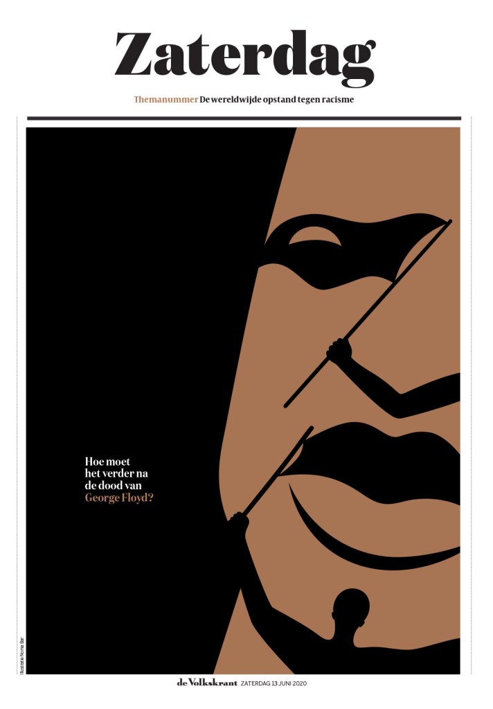
This page is timely again after the conviction of Derek Chauvin on all charges, including two murder charges, in the death of George Floyd. This page certainly didn’t get past the judges. It was much talked about. It does so much, capturing the iconic image of George Floyd, but also movement it sparked in one illustration (by Noma Bar). And that’s just the beautiful illustration. The rest of the page is strong too. The words are small, deferential. They don’t take away from the image. This captures the power of print.
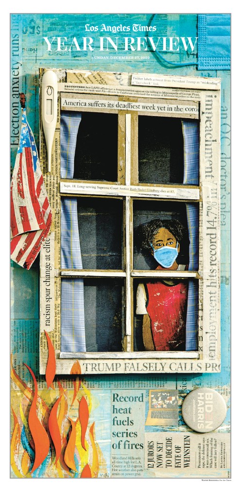
I hope to get the chance to talk more about this page with someone who was involved in it in a future post. But this was the first page that took my breath away. Not only do I find it to be such a striking image (illustration by Wayne Brezinka), it in itself is a celebration of print, with newspaper clippings pasted throughout. It looks like a crafting project, just better than any crafting project I’ve ever seen (though my daughter does some killer crafting).
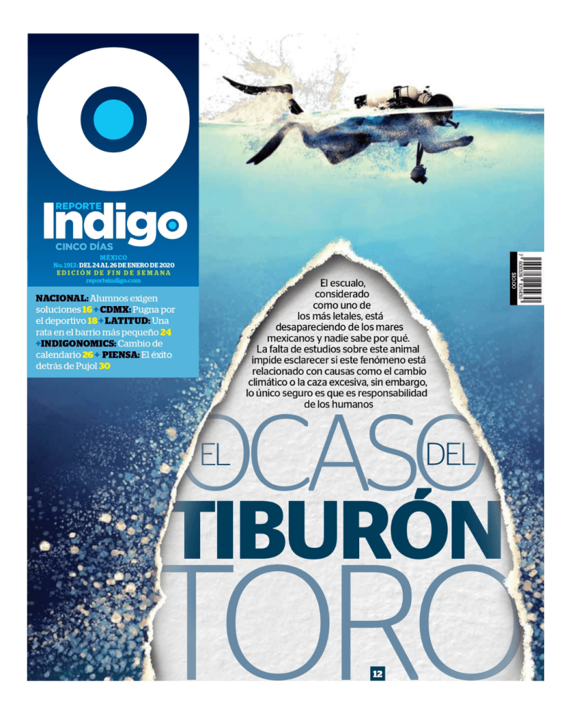
This page did so much for me. As I listened to the discussion as to whether it should be a medal contender, I found myself loudly voicing my opinions while muted (facilitators aren’t allowed to weigh in, but I did in spirit). I loved the text, the tear, the obvious shark that is not there, which was the point. It’s about disappearing sharks. The 3D effect. The colours. Despite being about a depressing topic, as many of the pages are (hence their power), the design made me happy.
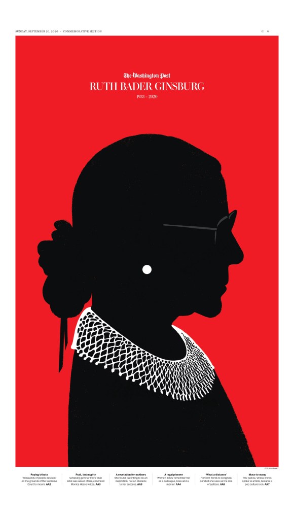
I don’t need to say much about this one. It’s stunning. It’s powerful. It’s simple. It’s respectful. The silhouetted look is the focus. The words are small, and don’t take focus away. The earring and the collar. The slight but necessary hint of glasses. This page is more about the illustration (by Edel Rodriguez), but the respectful treatment of it makes it a complete package. They could have used a photo of Ruth Bader Ginsburg. They could have used a more traditional illustration. But neither would have the power that this did. I saw this one the day it came out and it struck me then just as powerfully as it did when up against the world’s best. Read more about it here.
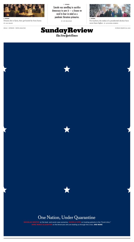
When I saw the wall of grief page from the New York Times, I thought that was the pinnacle. It was so powerful. Could there be a stronger NYT page? Enter SND42, and One Nation, Under Quarantine. This page is so strikingly simple and complex at the same time. Playing off the flag, a symbol of unity. The Stars close together, separate but united. But not here. Quarantine drove Americans, drove everyone, apart. The stars normally so close now evenly spaced, physically, socially distancing. It’s such a symbolic visual.
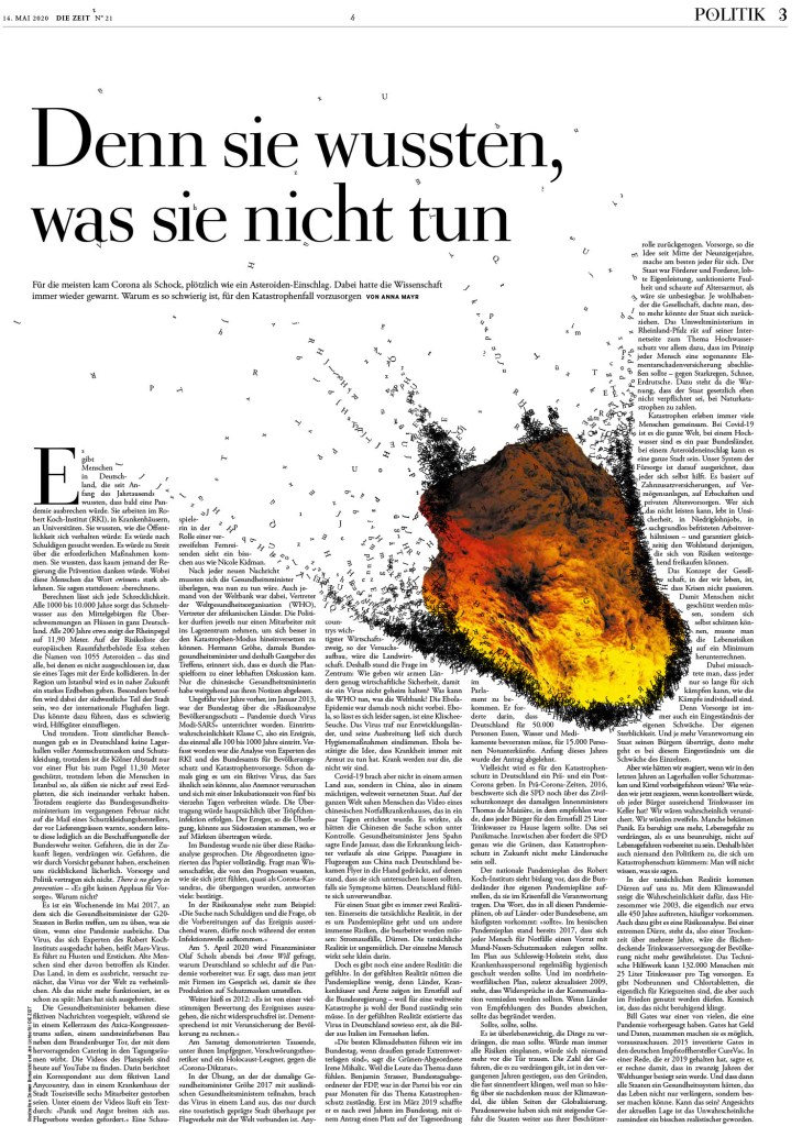
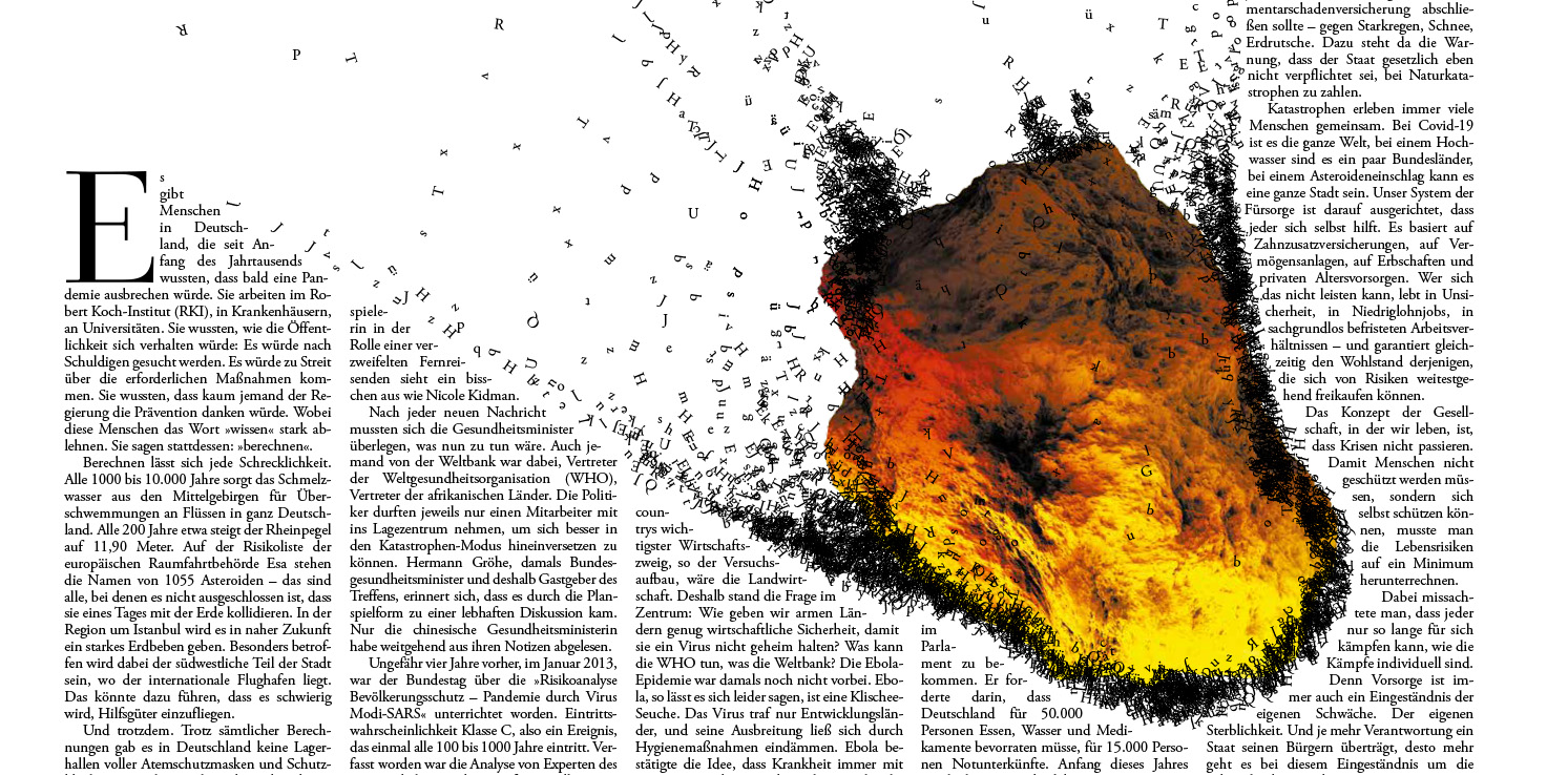
This page has a lot of text. It could almost be considered too grey. But the visual of the meteor tearing through the page changes that. Letters flying around. A disease like COVID wasn’t unexpected. It was predicted. Like we might be able to predict a meteor’s path. But we didn’t prepare. And thus the impact has been devastating, like this meteor tearing apart a piece of regular life, a newspaper. The meteor is tight to the text. With almost any other illustration it would be too tight. But that’s the point. It’s still burning through. The impact still being felt. And the text is still readable, so key to design. A page can be the most beautiful thing in the world. If the design affects readability, you’ve lost most of your readers.
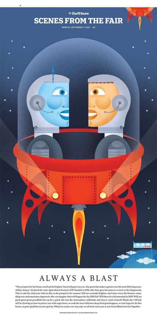
The Star Tribune had so many great pages. It’s such a hub of design and creativity. So with pages on George Floyd and COVID-19 and the U.S. election, why did I choose one about the fair? Because it makes me happy. It was a tough year. There were so many big and hard stories. But when I saw this page (there are many just like it), I smiled. It brought out the kid in me. Not only is the illustration lovely (by Nuri Ducassi, whom I had the good fortune of working with at the Toronto Star), the page itself is just wonderfully designed. Simple, effective and fun.
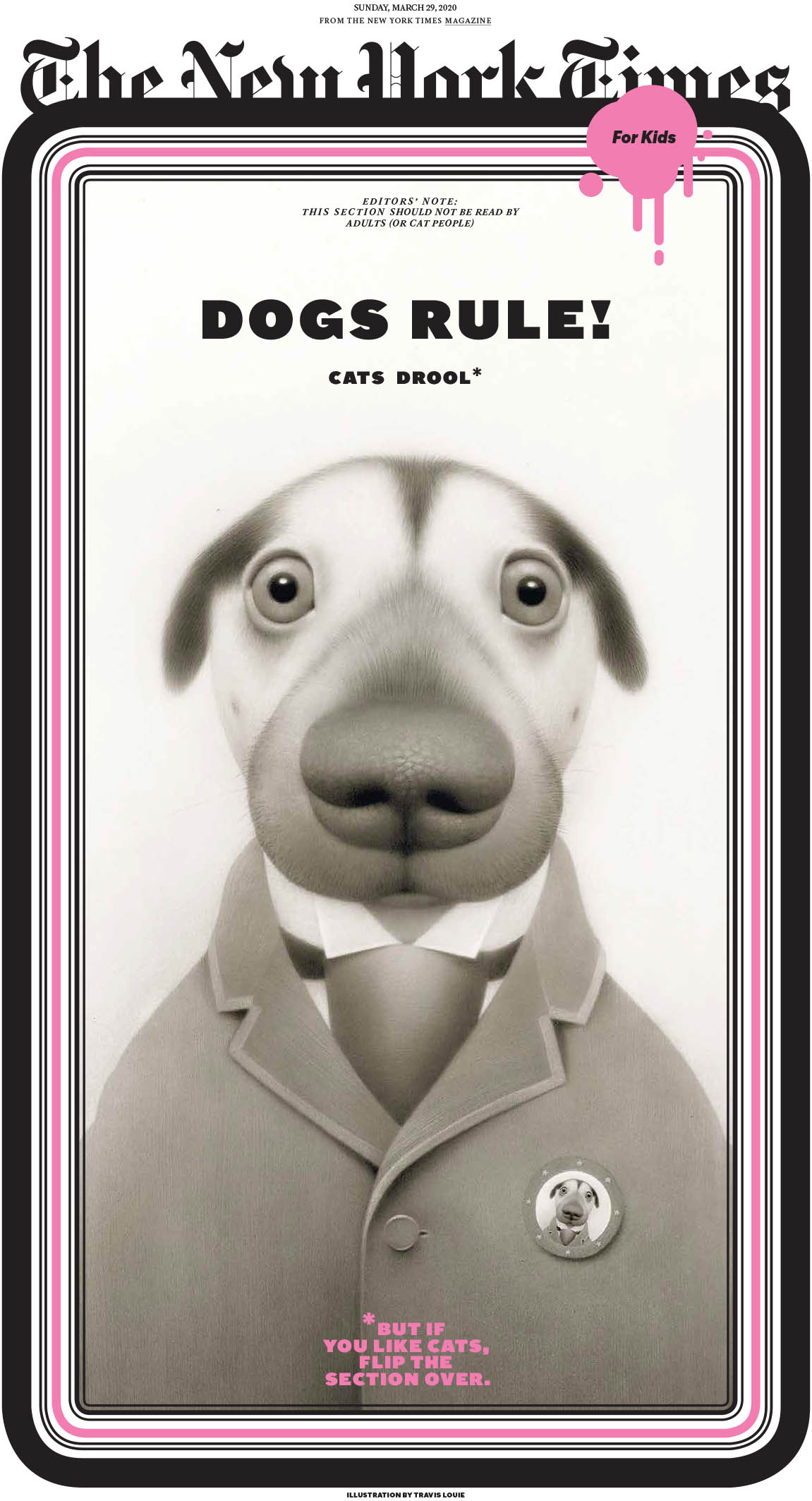
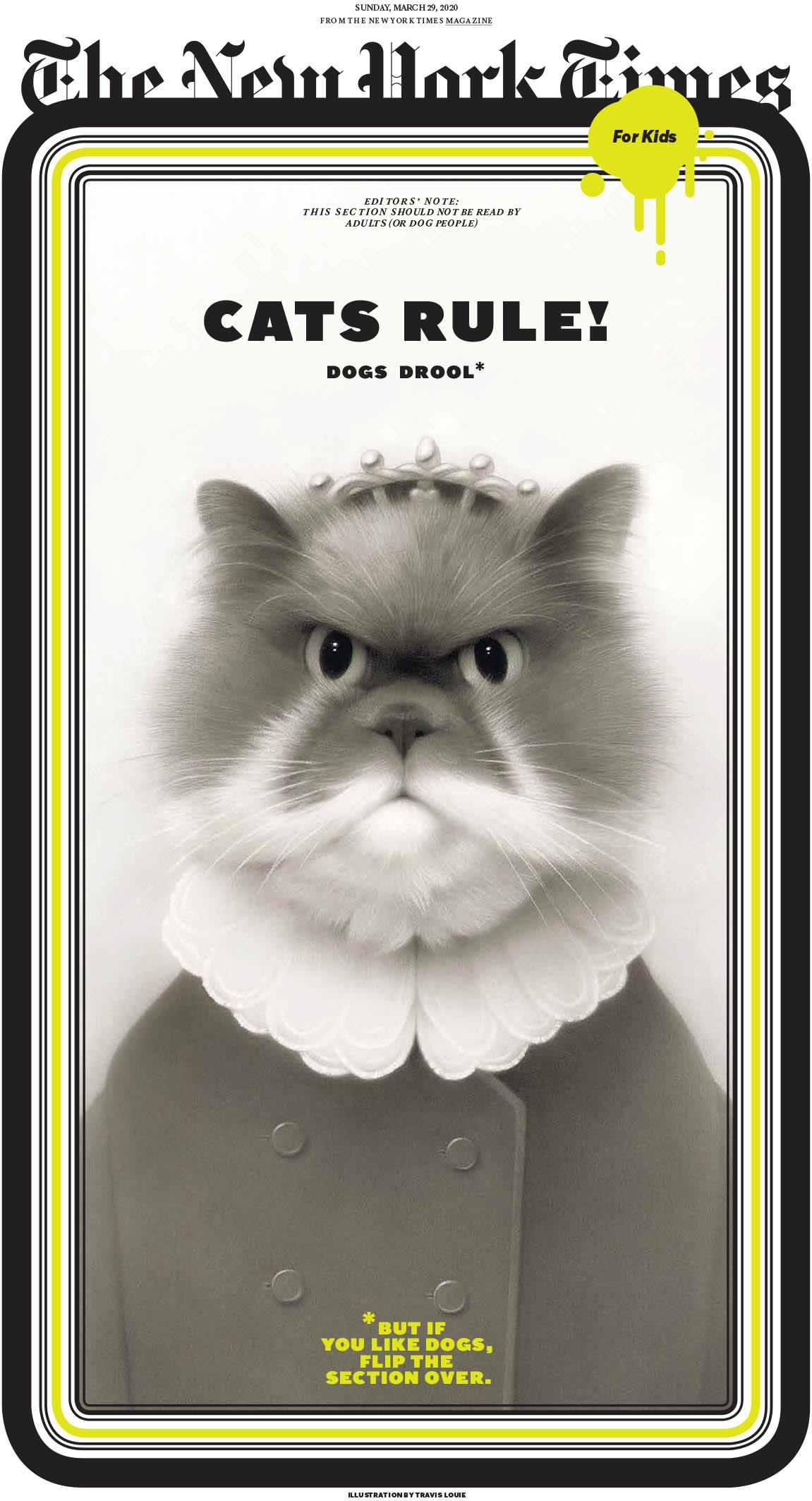
Speaking of simple fun, these New York Times pages from its kids section are just that. Fun. And who doesn’t love the age-old debate about which is better (and which drools), cats or dogs. But I think we all know the answer. Feel free to share in the comments below, but really, do we need to? We know (wink, wink). Again, pages driven by brilliant and beautiful illustrations. But a great concept. And a smile.
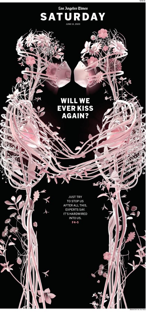
Last but certainly not least, the kiss. Another LA Times page driven by an illustration, but what an illustration it is. This haunting image by Eddie Guy is beautiful. How else to explain it? It gives me chills. And it’s even more impactful now, I’d argue, more than a year after the pandemic was first declared. Vaccinations are rolling out, there is a sense that we could return to some version of normal, but it’s been so long. and it’s been so hard. The biggest loss in all of this, after the tragic lives of so many lives, is personal, human contact.
There were so so many more incredible pages. It was astounding to see so much creativity in one place. I have some that rival these above on my scale of favourites. There was just so much talent on display. But I will seal this one with a kiss.
I hope that SND42 will be the gift that keeps on giving. I plan to talk about the amazing work that came out of Canada, and with any luck I will talk to some creative types who played a role in some of the pages that got so much love in the competition.

[…] READ MORE: A look back at SND 42Best from CanadaAnd the rest […]
LikeLike