By Brad Needham
The Star Tribune has long been a great newspaper. One of the best, not only in terms of newspaper design, but as a news source for its audience. I feel like a bit of an authority because I was inspired by the Star Tribune when I was tasked with doing a full redesign of the Guelph Mercury way back in 2008. Two papers disproportionately were reflected in the final product: the Virginian-Pilot (once the best designed newspaper in the world IMHO) and the Star Tribune.
A funny thing about newspaper design though. For the most part, other than once a year at design competitions, which are becoming less and less common (thank you to the Society for News Design for keeping them alive), those who design newspaper pages are anonymous. Faceless and nameless, they are the part of team that executes, and often conceptualizes, the designs we see on newspaper front pages every day. Unlike reporters with bylines, or magazine designers, who often get named on the inside cover, we don’t know who did that design. You know, that design that took your breath away when you pulled the newspaper out of the bag that you picked up from your doorstep. Come on, it can’t be just me. That is why I do these designer spotlights. To get them the attention they deserve. So when, on a whim, I reached out to Stacie Kammerling, a designer from a newspaper I have the utmost respect for, I was hopeful, but you just never know. I hadn’t seen her work before reaching out. I have high design standards, and my own design biases as to what works, what’s cliché and what didn’t work.
Well … Mind. Blown. Stacie is a phenomenal talent. So for this post, I gambled and won. But if you’re reading this, you win, too. Stacie was kind enough to answer a pile of questions I sent her and to send me very thoughtful responses. I am grateful for that. And a funny thing happened on the way to this profile. I do this to get others the attention they deserve, those like Stacie. And what did she do? She thrust others into the spotlight I provided her. She is a true collaborator, and clearly someone who absorbs what others are saying. And now I turn it over to Stacie.
A Q & A with Stacie Kammerling, Star Tribune
Q: How did you get into newspaper design?
A: In a roundabout way, I actually fell into news design. As a teen I loved how art felt accessible to me through editorial illustration, so I applied to art school with dreams of working at a magazine. There were no illustration programs in Indiana that I knew of, so I chose a degree in art with a concentration in visual communication at Ball State University. As a first generation student, I liked the idea of a multidisciplinary program studying both fine art and graphic design. But a year into art school, I felt a bit disillusioned. Artists I knew hadn’t landed jobs post-graduation. I felt like the program wasn’t fully preparing students to build a path for a career. I was terrified of my future student loans and providing for myself to live on my own.
Design as a practice can be a lot of ego, and it’s very important to listen to what readers want beyond what you’ve always provided them.
Meanwhile, the independent school newspaper, the Ball State Daily News, was looking for staff. I really wanted more experience with editorial design, so I volunteered to work a few night shifts a week. I met so many creative, kind, and determined people. It opened my world to discovering journalism and expanded my idea of what information design could be. I really liked how collaborative the Unified Media Lab felt. Designers, reporters, graphic artists and photographers all shared techniques and ideas. I surprised myself by continuing, I often hated most pages I did. The quick deadlines were a huge stress. I was very hard on myself, though the process made me much more resilient as a designer and person.
I was very influenced by the 2016 U.S. election during my senior year as I was deciding on a path after college. I wanted to feel like I could contribute to truth-telling, fighting misinformation and even just the documentation of history that newspapers provide. Ryan Sparrow, who led the journalism graphics program and now works for USA today, was a huge influence in showing me future paths I could take via journalism. So I moved to the Villages, Florida for my first job as a production editor at the retirement community’s newspaper. I learned so much about not just newspaper design, but celebrating community, how to edit down information and headlines to get at the core of a topic, and how important it is to be part of and understand your readership. Design as a practice can be a lot of ego, and it’s very important to listen to what readers want beyond what you’ve always provided them.
What do you like about newspaper design? What makes it different from other design?
I really like that newspaper design is first and foremost focused on the reader. It’s a service for disseminating information and giving readers not only access to information, but curating it so they can clearly see what matters and why they should care.
There is still a big push for innovation, surprise and alternative storytelling within newspaper design, despite dwindling print opportunities for designers. Choosing a career in print news design in this decade is scary. But the bar has never been higher for how we can take care of presenting information for the people who prefer it, cherish it and truly look forward to their paper. I like knowing the audience truly deeply cares about every page we make, even if the form is often temporary. When it’s not temporary, as in for historic and special occasions, the paper is even more special to me as a document of history.
To me news design differs from most other forms of design in that it is very utilitarian. There is a (mostly) clear ethical pact that separates visual journalists from other designers. Knowing there are distinct standards to publication and storytelling make it a more trustworthy institution as both a designer and reader. And an inspiring one as journalists analyze the way we’ve always done things and how we can change century-old institutions to make our processes more equitable, accessible and useful as the world becomes rightfully more so.
Another thing I’ve found comforting and inspiring is how many nontraditional paths lead to the same place. A majority of my colleagues at the Star Tribune didn’t study newspaper design or reporting specifically, we bring our wide and varied backgrounds to a job where we learn and grow as we go. A great majority of what I have learned has been on the job. I didn’t have a news or editorial internship before graduating college, so being taken under the wing of many has been extremely formative and I am forever grateful to them. The culture of protecting and helping one another in such a cutthroat industry is invaluable.
What was the most fun you have had with a design?
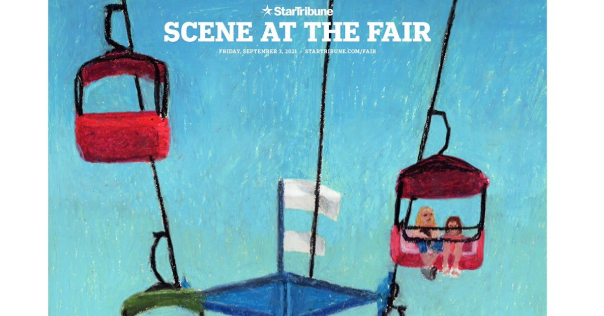
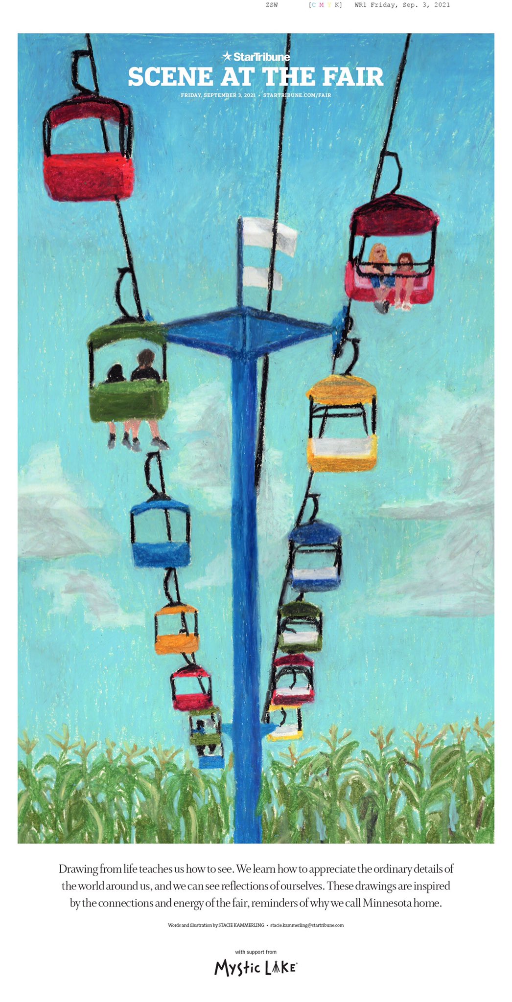
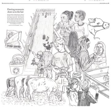
In August 2021 I got to conceptualize and design a special section for the Minnesota State Fair. The 10-day fair is a huge deal in Minnesota and the upper Midwest. I wanted to illustrate live scenes from the fair, so I spent a couple days drawing all around the fairgrounds. It was a bit stressful and overwhelming at first, but the quick nature of life drawing soon felt like the quick and precise process I do designing a new front page every day.
After sketching I scanned drawings onto a big inside spread and arranged them. For the cover, I did a much longer drawing using oil pastels. I wrote a bit about my experience and what it means to truly stop and see the world around us. It was an honour to be able to share something vulnerable like that with readers, especially at an event many deeply care about.
Do you rely on one design principle more than others (white space, text as design, colour, cutouts, etc.)?
I most often work on “hard” news and the front page, so my daily job involves honing in on the cleanest, easiest to digest designs as possible. As well as communication across departments so that we can all get a bit of what we need. I would say the one design principle I rely on most often is “the grid.” Especially building modular grids that can easily adjust as stories and news changes. The style at the Star Tribune is very clean and compact, while also giving room for large photography and informational breakouts. So finding ways to best tell stories that feel manageable for the reader is my biggest challenge day to day.
Tell me about a design idea you loved that was rejected or just wasn’t working so you had to abandon it.
It’s really hard for me to think of one! My editors have always been supportive of my creativity and ideas, often pushing them to make them stronger. I’m super grateful for the trust and guidance I’ve been given, especially as a young designer still learning more every day. For the front page, which I’m most often found designing, tweaks to my drafts are much more common. It can be frustrating at times. I find ways to compromise a lot — not the sense of giving in — but finding ways to align all of our interests in the newsroom.
The Star Tribune was one of the papers that inspired me while redesigning the Guelph Mercury. Do you have newspapers that inspire you from a design standpoint?
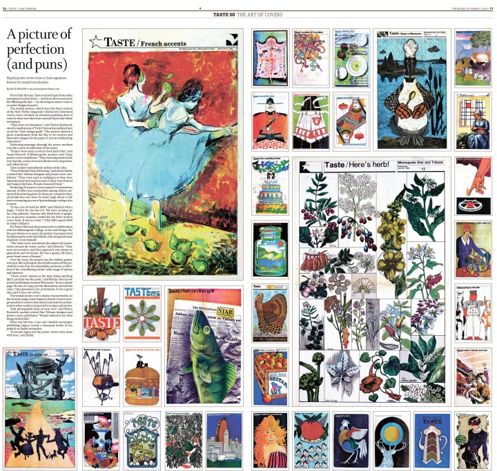
The Star Tribune has such a rich history and has been an inspiration for me too! I’ve especially loved exploring old covers and special projects, such as the huge artful poster covers from our Taste cover archive during its 50th anniversary in 2019.
I was very inspired by the unique voice and ethos of the Villages Daily Sun before working there from 2017-2018. In college I was very inspired by the intersection of art and journalism in Matt Haney’s work at the Omaha World Herald and Martin Gee’s work at Time magazine. I loved seeing how designers could be a vital part to telling a story, not just putting words and pictures on a page. The ability to bring their expertise in art and typography to the table really elevated and showcased journalism in a fun and surprising way. Print publications that give the space for visuals to shine create a more dynamic and interesting story, in my opinion.
On that, can you think of any designs that blew you away, at your paper or elsewhere? Anything that stands out?
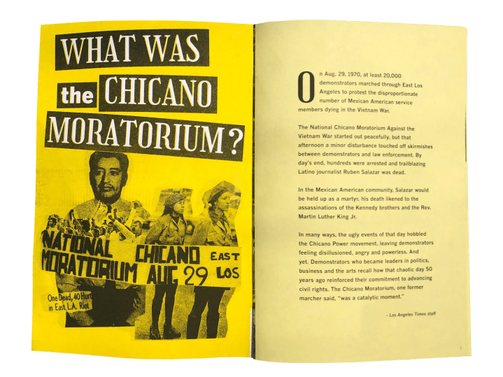
I think the things that blow me away the most aren’t necessarily page designs, but unexpected interactive work that extends into the local community, both telling their stories and inviting them to participate. I loved Martina Ibáñez-Baldor’s work on the Chicano Moratorium project (especially the zine) for the L.A. Times.
The most inspiring things for me involve physicality, bringing handmade touches to the print product. I’m still learning what draws me to it. I think seeing the influence and texture of hand-crafted art transports me into a story more than digital art can at times. I believe allowing the design to be as clean and simple as possible to let art and photography shine can make a huge impact. And highlight what the reader really needs to make meaning of a story.
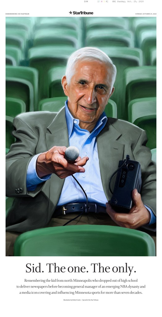
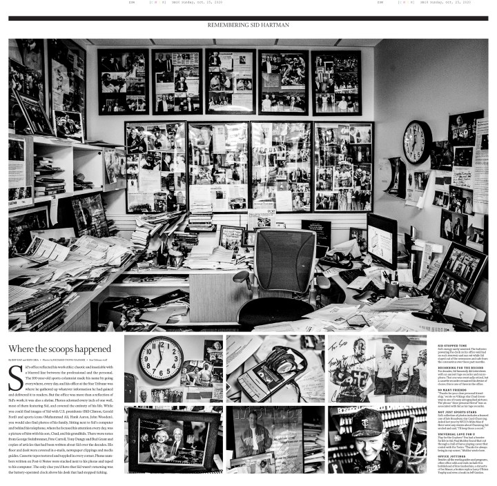
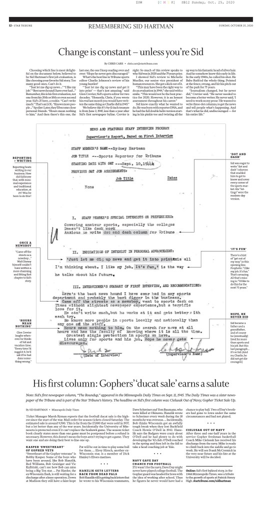
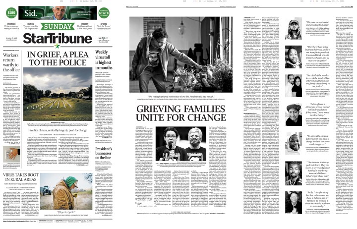
After the death of Sid Hartman, the Star Tribune’s sports writer and columnist of 75 years, design director Greg Mees designed a beautiful special section to honor him and share his story, office and memories from friends and family. It was so touching and the oil painting commissioned for the cover really blew me away. (EDS note: I saw this page at last year’s Society for News Design awards, and it absolutely blew me away as well. Greg Mees, on top of being a super kind dude, is also a world-class designer. And btw, the next instalment of the awards are coming soon and I couldn’t be more excited!)
Q: Why do you think newspaper design still matters?
I think newspaper design still matters because of the distinct need for informational direction and credible service-based and solutions journalism. There’s so much news happening and a daily snapshot of the state of the world is important for breaking information down into something digestible. What do we need to know about what’s happening in our communities right now? How can we help support a cause, business or person? Beyond following the processes newspapers have always held, I believe conversations about what the future looks like is vital. How are we reaching people where they are, asking what matters to readers and including them in not only the product but the process?
While this is often a nameless, faceless job, it’s a huge part of the newsmaking process, as anyone reading this blog knows. It’s not just throwing things on a page, but allowing space for stories that need it, being flexible, even encouraging edit after edit to ensure a journalist’s work is displayed in the best light possible. The way we design something can shape the way readers see and understand important stories.
Q: How often do you get to conceptualize big ideas? I know bigger papers often have a team. What’s the process like for you there?
While much of my work is started and finished in a matter of hours for the next day’s paper, I also work on larger projects every other month or so. Collaboration is still an important part of the process, which I really enjoy.
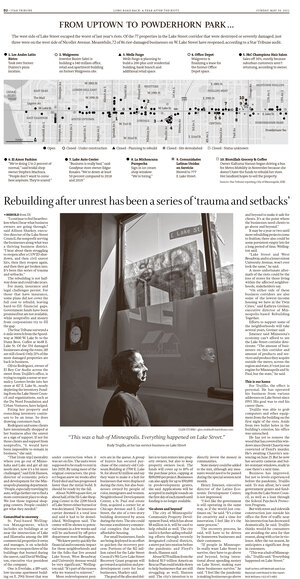
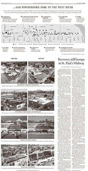
After reading a brief about the story, or sometimes the story itself, I talk to the photo team to see what they have in mind, or more frequently for larger projects, work on creating art myself. Talking to the graphics team and editor of the section are also important steps in the process of gathering all the pieces. Booking out the stories and art is another early step that can take quite some time to visualize the best way to present a longer narrative. Here is one of the larger projects I worked on about how businesses were still waiting for aid and struggling to stay open one year after the 2020 unrest in Minneapolis.

Q: It might be like picking favourite family members, but if you had to pick a few favourite pages, what would they be and why?
My bread and butter has really been designing front pages for breaking news. I am most often drafting ideas in minutes. It can feel hard to feel ownership over these things, it’s entirely collaborative and often happens so quickly it’s hard to take a step back. And since coming into the newspaper world in 2017, many many nights have looked like that. While I am proud of and live in those high-speed moments, I am most proud of pages where I can put a little more time into, including ones that I can show a bit of myself and the art I love to make.
HOLIDAY BOOKS
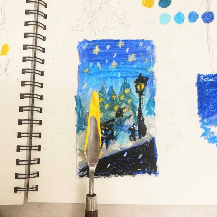
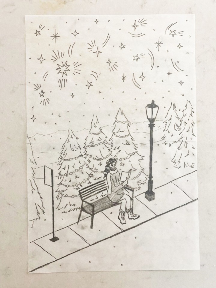
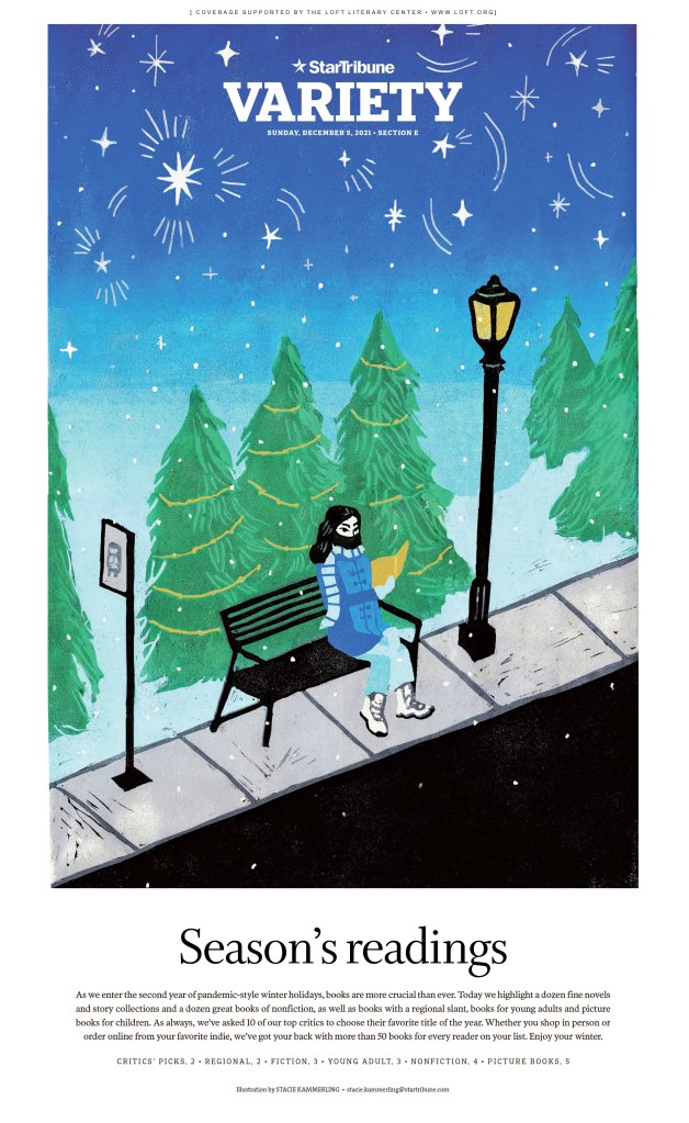
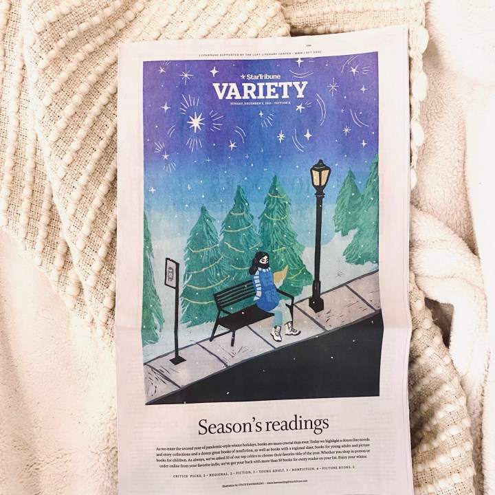
In December I created a seven-layer linocut print for the annual Holiday Books gift guide. This was a huge undertaking as the biggest print I have created as a printmaker, as well as pretty complex with many colors. In my art practice, I carve each linoleum or rubber block by hand, layer by layer. So every colour is a different layer. I often work on one-coloor prints, but wanted to really play with colour to capture the mood I had in mind.
Our holiday books guide always features a winter scene. I was inspired by snowy downtown Minneapolis, a place I walk often. I liked the idea of a person reading at a bus stop, finding beauty in the liminal space between where they came from and where they’re going.
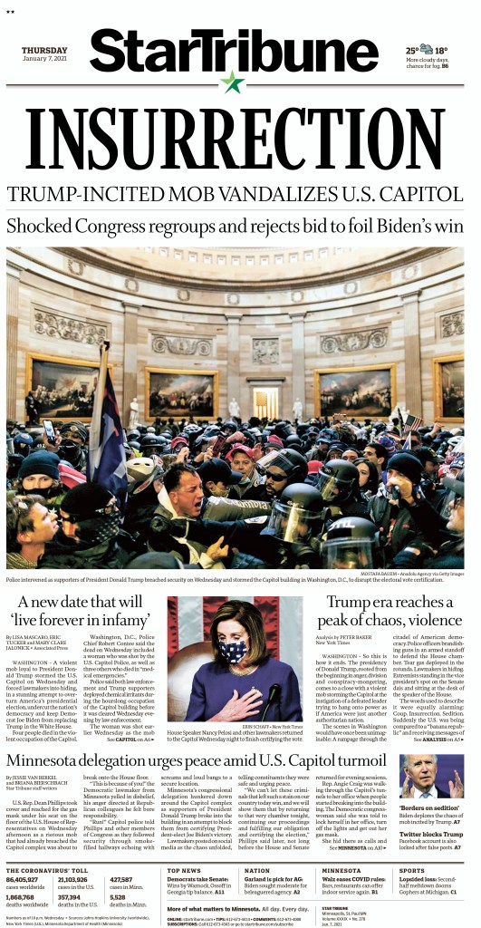
INSURRECTION
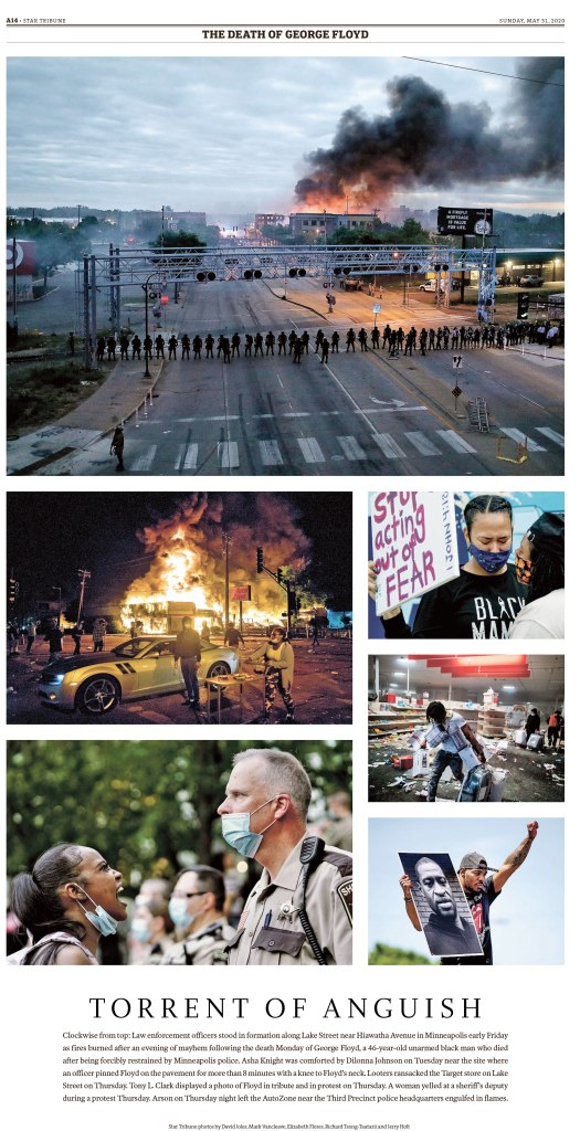
Last January I drafted our front page for the Capitol Insurrection around 4 p.m. and followed that through the night as more photography and reactions came through. It was astonishing to witness and I’m proud of where we landed with striking imagery and language on a tight deadline. The challenge of this night was developing our voice on the situation as it was happening. How do we make sure we’re being accurate in describing what happened? Fair and objective on a fraught political topic? Being in a large newsroom we have a 1A planning editor and several other editors that really dig into this, which is immensely helpful for me as I work with them and make the rest of the paper.
TURKEY COLOURING
For our Thanksgiving paper I was asked to create the turkey for our annual kids colouring contest. This was the first block print I’ve made for work, which felt like a special moment to me personally. It can feel intimidating to fully throw myself into an art that isn’t often featured in print anymore, especially with the pressure to work digitally. It’s slow, arduous and easy to mess up. But I think the nature of the material creates unexpected marks and surprises that bring something special I couldn’t create otherwise.

Thank you, Stacie!
Putting this post together was a joy. It’s great to see so much passion and thought put into print designs. And it’s inspiring to see how much credit she shares around. The Star Tribune sounds like an amazing place to work. An incredible cast, a real team.
Another thing that struck me is that Stacie handles both hard news pages and also produces art for feature sections. That is multitalented. Her art is stunning, and solid news pages often don’t get the love they deserve. But Stacie’s are very well done. Solid and clean and strong.
Thank you, Stacie, for participating. If any other print designers want their work featured, reach out to me here or at bradneedham@gmail.com.

[…] Previous PostBack […]
LikeLike
[…] Washington Post, Los Angeles Times and Star Tribune (Minneapolis, and employer of my most recent featured designer, Stacie Kammerling). I will give each paper a slideshow and little blurb. I will exclude the portfolio above from the […]
LikeLike