Covers in a dangerous time. I chose this as the name of my blog to highlight that newspapers are going through a tumultuous time, but I wanted to make sure the great work still happening was recognized. Each year at the Society for News Design’s annual creative competition, I am reminded by how much more prevalent the tumult is in Canadian media.
Again this year there were only entries from three newspapers: the Globe and Mail, Toronto Star and Le Devoir. Between them they won 33 total awards, including one silver medal (awarded for pages that are excellent, but even stand out among the excellence. This was given to the Globe and Mail for its climate coverage package) and 32 awards of excellence. For a page to receive this honour, three of five judges need to agree that this page shines. Overall, the numbers are down for Canadian outlets (The Globe had 32 on its own last year, and managed 26 this year). The Canadian total was 38 last year.
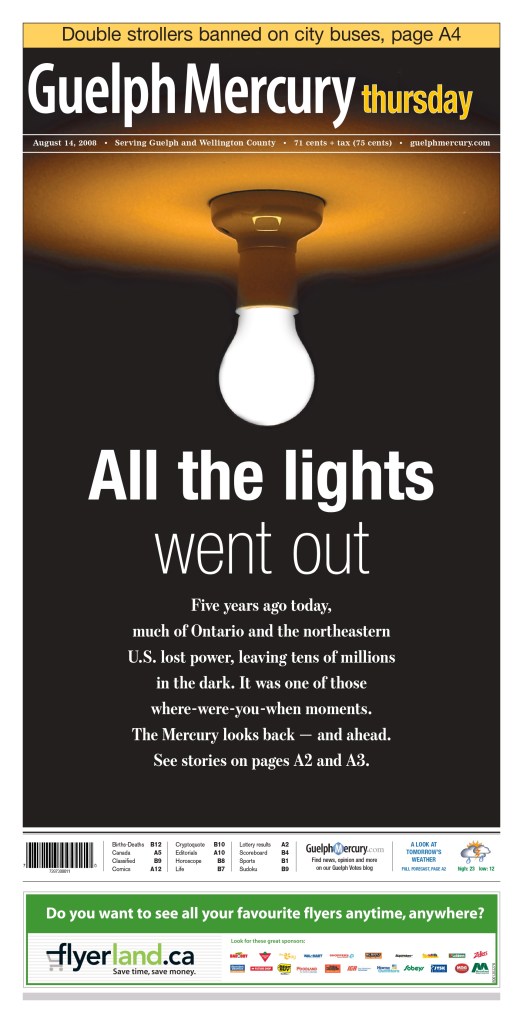
When I won, I submitted for the Guelph Mercury, a small paper that punched way above its weight. I would love to see a few more publications next year.
Alas, this site is meant to celebrate excellence in visual journalism, and despite there being fewer wins this year, Canadian media outlets produced some outstanding stuff.
As a little background, this is my fourth year assisting at SND’s Best of Newspaper Design competition. I have acted a facilitator (I am not a judge; I help the ensure the judges have everything they need, and help organize things for the SND team). I started on the news team and have been on the World’s Best team for the the past three years. It has been an honour to be involved. This year it was held in Minneapolis, Minnesota, at the Star Tribune office.
Time to show off some brilliant newspaper design, the reason anyone comes to this site. These pages may or may not have won awards. I chose them because I liked them. I will start with Le Devoir, as they had one of my favourite pages.
Le Devoir (Montreal)
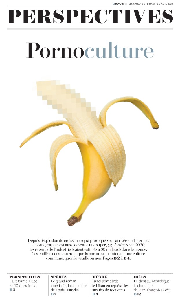
Often when doing newspaper design, designers need to find a way to illustrate things that can be tricky to illustrate. I appreciate the thought that goes into this. In this case it’s porn. Imagine being asked: we want to do a story about pornography, and it will be a section front. How will you illustrate this? Blurry bananas, naturally. Or at least one.
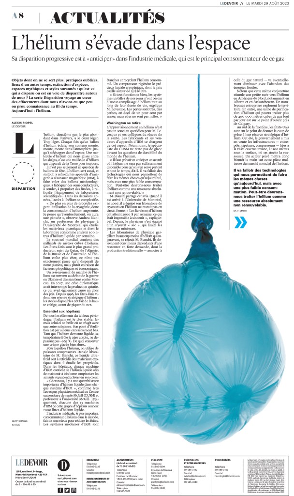
And here is another. A simple but smart photo. A good use of white space, as this paper is known for.
Toronto Star
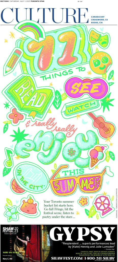
I am always excited to see the Star do great things. I am proud to say I have worked on Star pages and created some I’m proud of. Though I didn’t have the opportunity to do any of this calibre in my time there. This first page, from a staff portfolio submission, has a bit of a Los Angeles Times vibe. It’s bright and fun. Bubble letters.
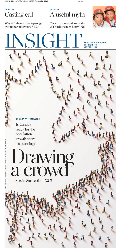
I have seen pages similar to this before. Little people making shapes. This is nicely done. Not only the image but the rest of the design.
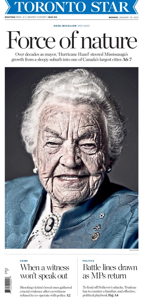
This page created some controversy when it first ran. Many thought the photo was insulting to longtime Mississauga, Ontario, mayor Hazel McCallion. Others thought it should have been identified as being enhanced (it was desaturated, which isn’t normally something a newspaper would do with a photo, but rather a photo illustration). But even when it came out, I posted it on my Instagram. It’s striking as an image, and as a page.
One more from the staff portfolio entry. It’s driven by the illustration, but there is some fun text treatment.
And here are a few more from the Star.
Globe and Mail
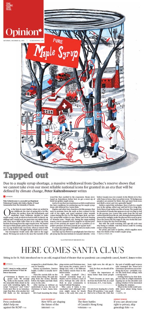
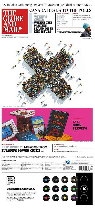
And last, but definitely not least, Canada’s big winner, the Globe and Mail. The results are still being tallied, but looks like the Globe might have squeezed into the top 10 again this year, at number 10. Much of the design the Globe was recognized for was for coverage of serious and heavy topics. Special coverage on climate change won a silver medal. I get the Globe at home (and disclosure: PMNA, where I work, does page production for the Globe) and the next two pages were pages that really stood out for me. All the pages here are handled at the Globe and/or art directed at the Globe.
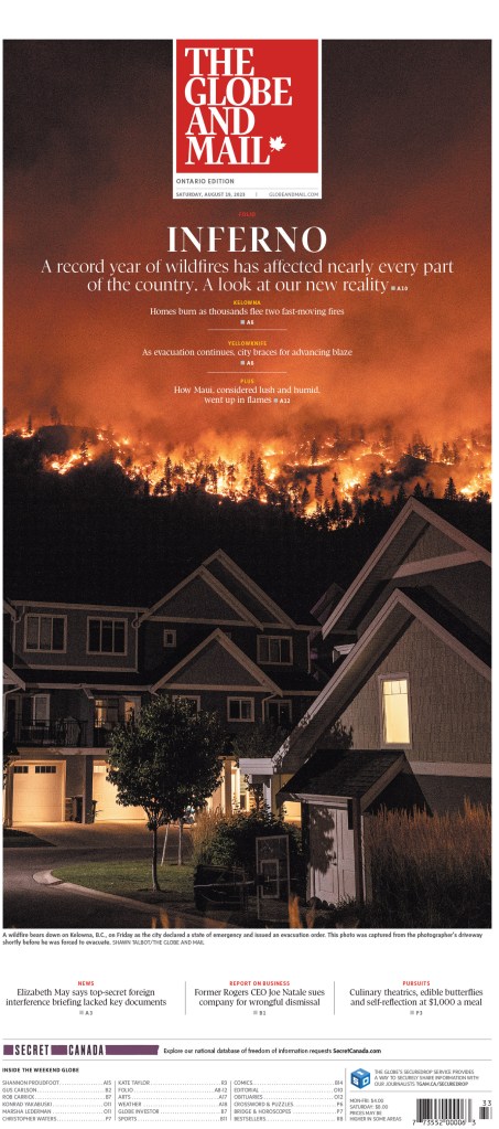
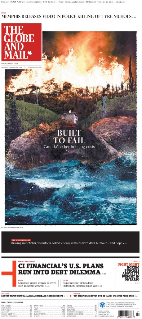
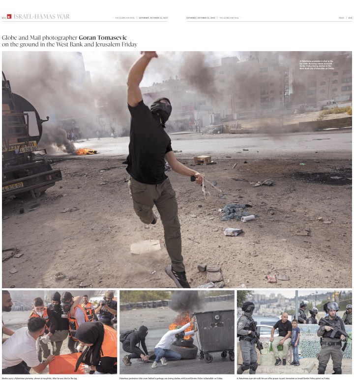
The Globe has also been a leader on coverage of the war in Gaza in Canadian media. It had some striking pages on that topic, like this cover (the Globe does a poster front on Saturdays) and the photo spread below. They do some beautiful photo spread pages.
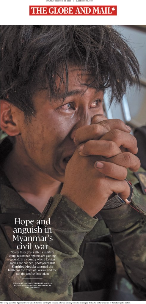
And one more, driven by this powerful, emotion-filled photo.
The next two were pages from art directors who each won individual portfolio awards. That’s a tricky category to win in, as it recognizes a body work. The first is from Brennan Higginbotham. The second is from Lauren Heintzman.
And now for some fun stuff. The Globe, and other Canadian media outlets, often turn to Kagan McLeod when they want a fun illustration. He’s a wizard (also credit to Kagan for the featured image I use with this post, as it’s a portion of one of the illustrations below). And he didn’t disappoint here.
Here are the last couple I will show from this year. They are both so playful and fun. And as has become norm for the Globe, they have fantastic headlines.
Fingers crossed we see more Canadian publications entering next year. Looking at you, Postmedia and Winnipeg Free Press, among others. Stand with print media and celebrate your great work.
Up next: Best from the United States, best from the rest of the world, and finally World’s Best Designed Newspaper. Watch for those sprinkled over the next week or so.
It’s the most wonderful newspaper time of the year. Where covers are shiny, no columnists whining, just all artists’ cheer! It’s the most wonderful newspaper time of the year! At least on the covers of some papers. And this year, I think the world needs a little cheer. It has been an exceptionally challenging year for many reasons, largely due to war. So these covers are meant to symbolize happiness and the dream of peace.
There is not much like Christmas front pages. Many newspapers go all out, with beautiful art taking up most or essentially all of the front page. There are some papers that always go big, and a few that use the same concept year after year (and they do it well).
Christmas front pages were spread over a couple of days this year as a lot of newspapers don’t publish on Sundays. Without further adieu (the most popular opening salvo in Wordle, but according the The New York Times not the best) …
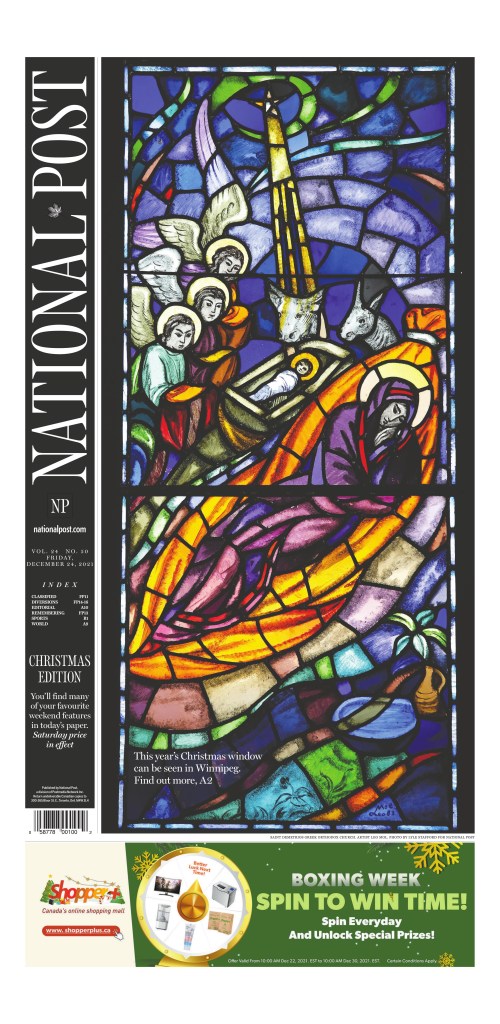
The National Post always runs a stained glass window. It has since its first Christmas cover in 1998. And it’s always lovely.
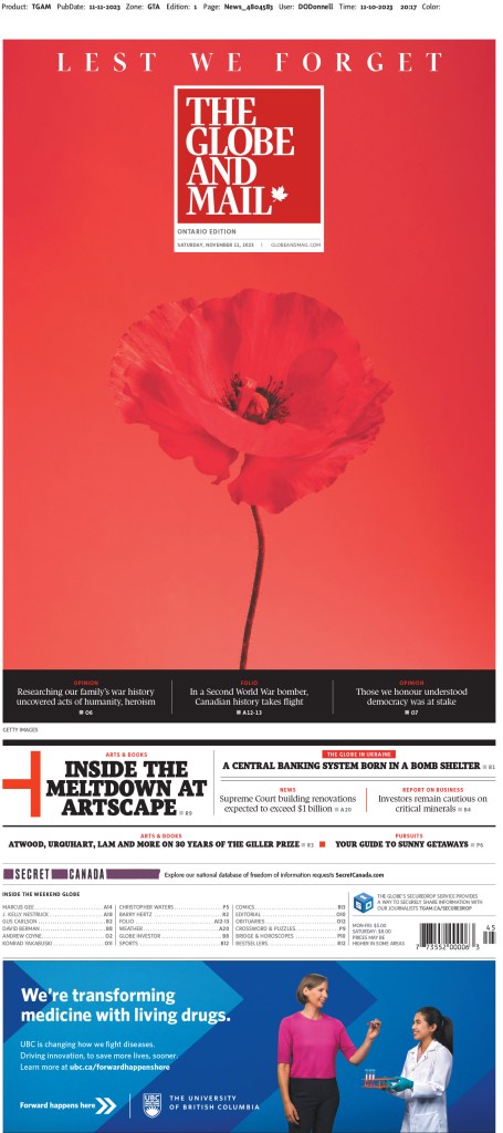
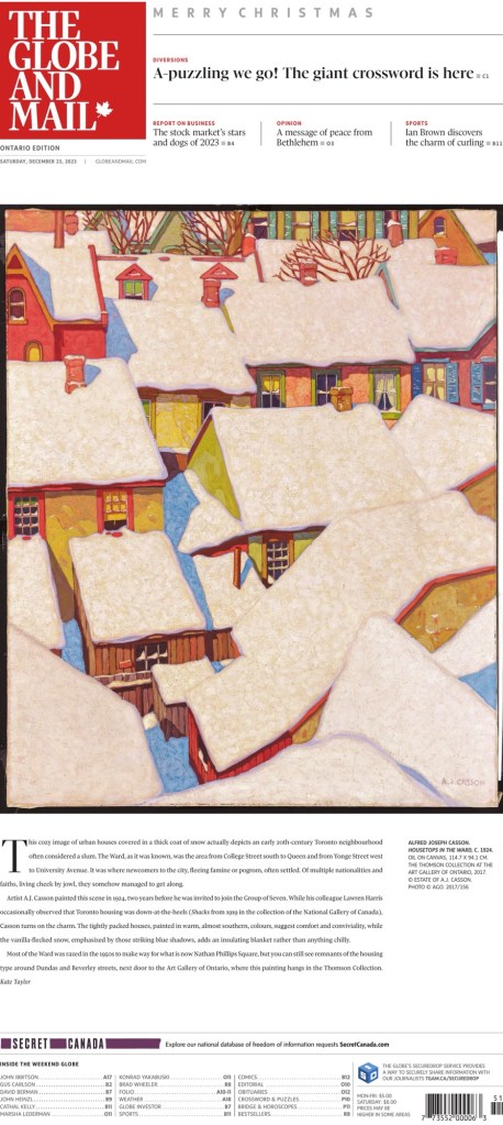
The Globe and Mail is another paper that has long run with the same idea, a piece of art from the Art Gallery of Ontario. This year it’s a piece by Alfred Joseph Casson called Housetops in the Ward. Rumour has it the Globe was inspired to start doing something like this after the launch of the National Post, and seeing what they were doing.
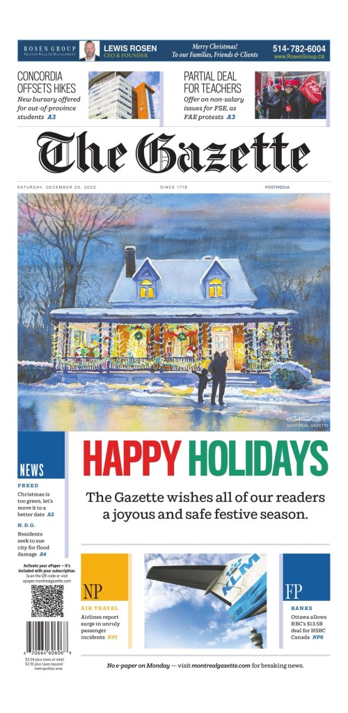
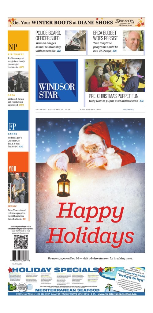
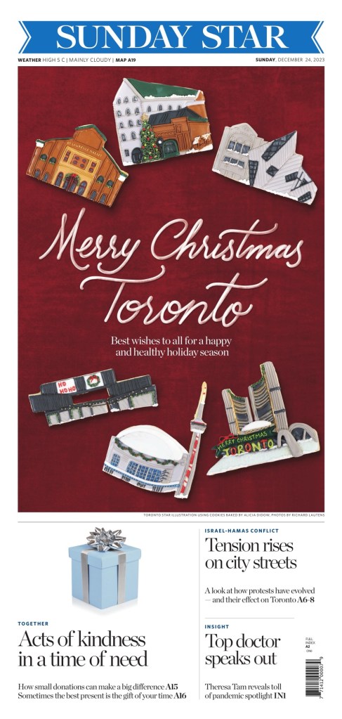
Here are a few other front pages from Canada before we see some of the best from around the world. Included are Postmedia’s Montreal Gazette and Windsor Star, followed by the Toronto Star. I feel like the Toronto star normally looks for wide appeal, but went hyper local this year. It’s fully a Toronto Christmas wish. And you know what? That’s OK because unlike the Globe and the National Post, the Star really is about Toronto.
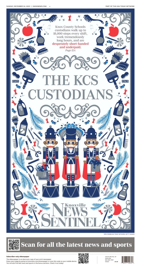
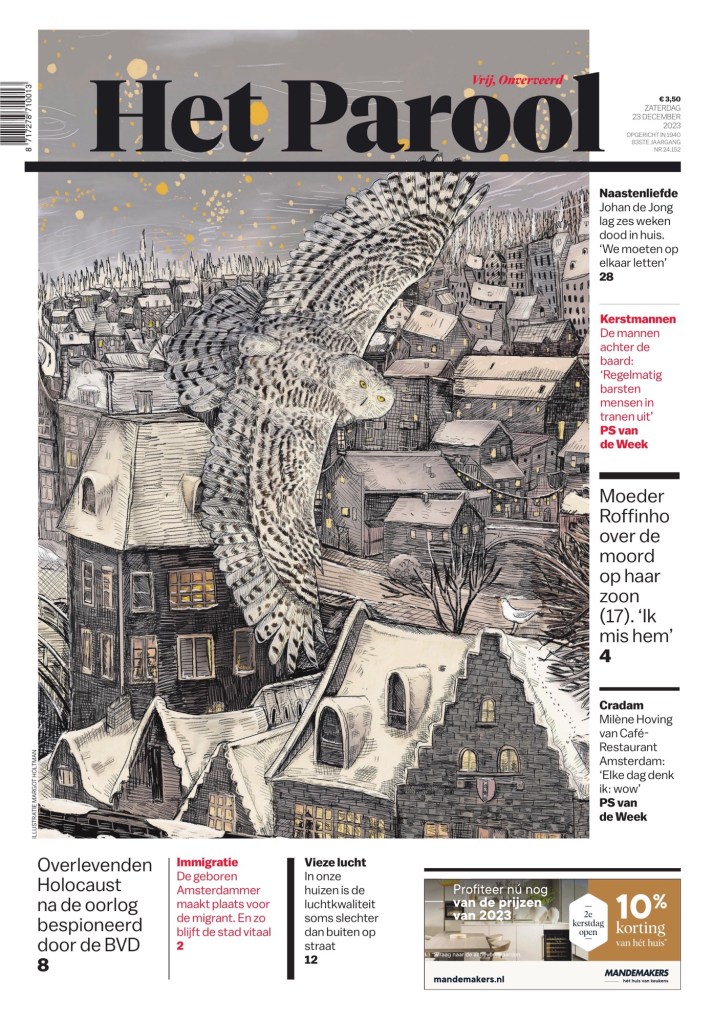
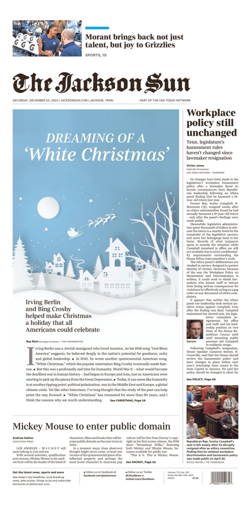
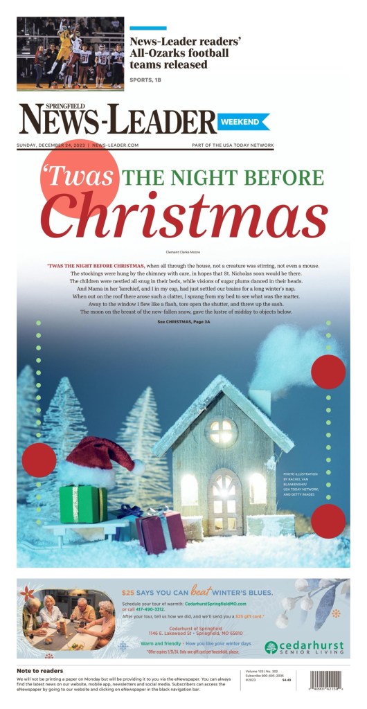
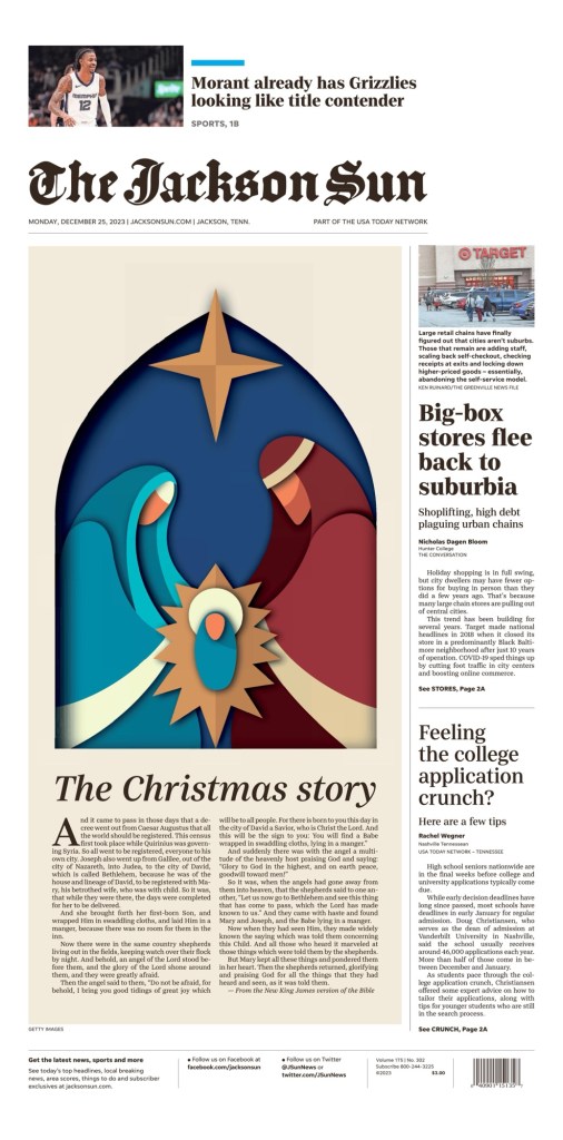
These next three are three of my favourites overall from 2023. The art is just striking and beautiful. they include the Knoxville News Sentinel, Het Parool (Amsterdam) and the Jackson Sun.
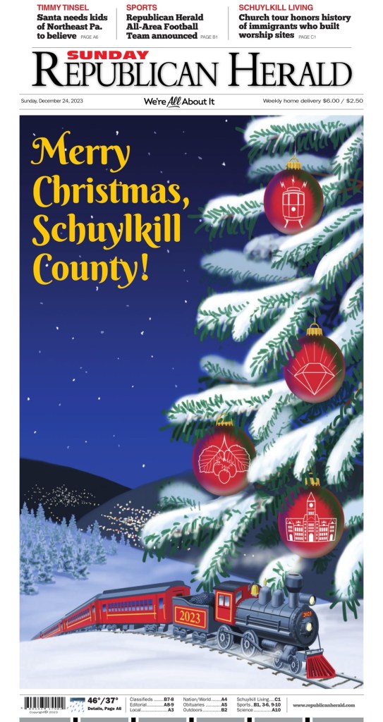
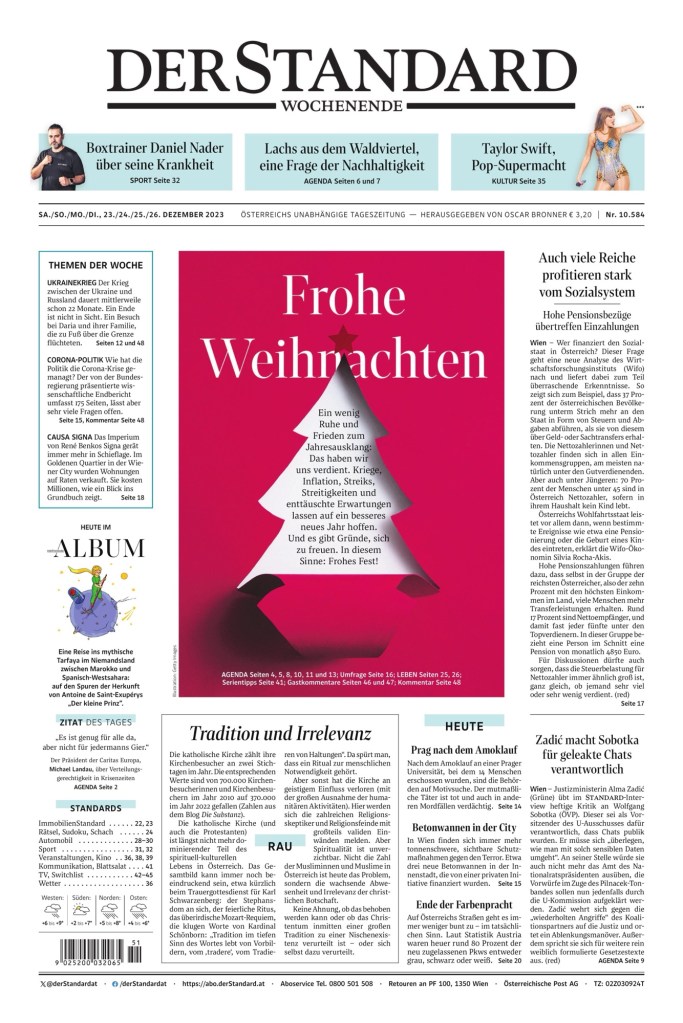
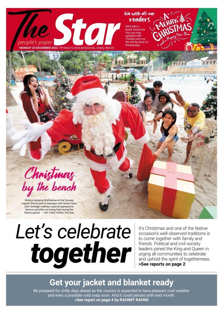
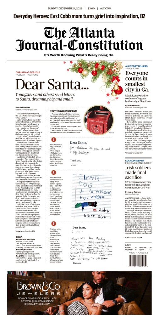
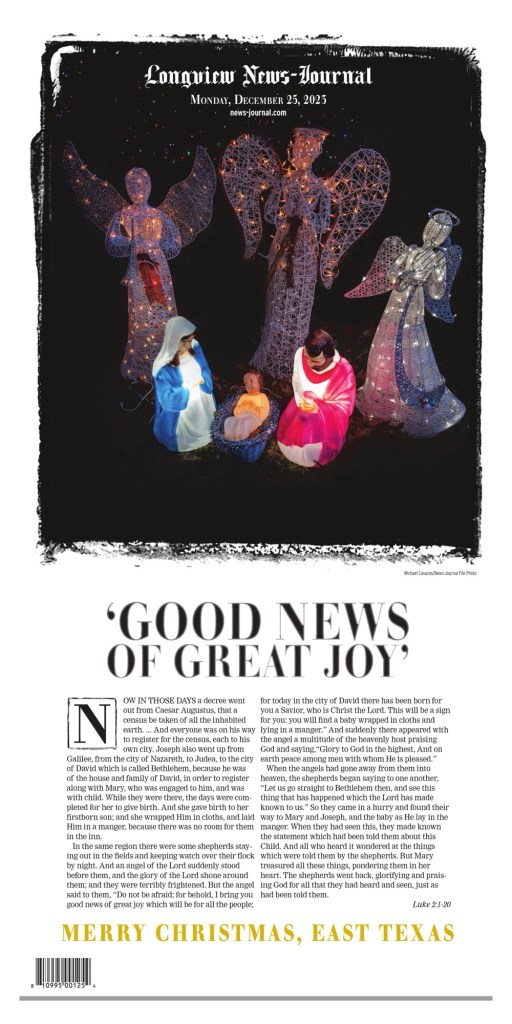
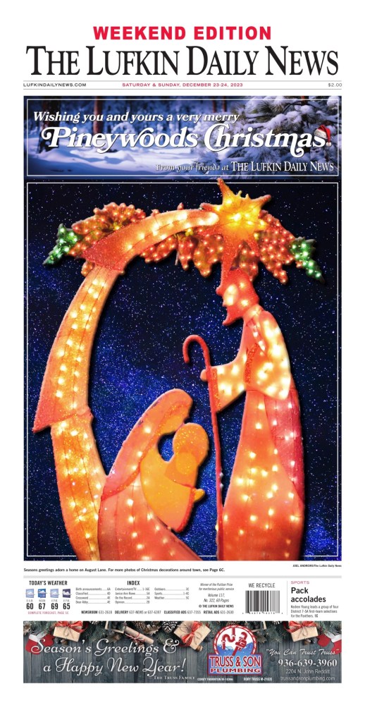
And here are a few more. Mostly from the U.S. but also one from Austria and another from Malaysia. The Jackson Sun makes a second appearance. Also there is a different take by the Atlanta Journal Constitution. Dear Santa …
Merry Christmas to those who celebrate it. And a wish for peace for everyone.
Another year, another Society for News Design Best of Newspaper Design competition! For the second year in a row, I was honoured to be a facilitator, this year in the category of World’s Best-Designed Newspaper. What a thrill. Results of that will come out on March 28.
I feel like the competition could give me fodder for months and months of content. But I will restrain myself to three posts. The first will be on the outstanding work done by Canadian papers. Next will be the rest of the world (so will be much longer!). Then finally World’s Best.
I know I am a broken record, but SND means so much to me. As a print design lover, it first and foremost offers a community of like-minded people. But it also still celebrates print design in a time when that is becoming less frequent. Looking at you Canadian media awards competitions. So many of those involved in print design are behind the scenes. Sure illustrators and photographers get credits. But art directors don’t. Page designers don’t. Headline writers don’t. But without these people, the information you get would be dull.
Canada produced some incredible work this year. However, because I have been following print design much closer over the past year, both here and on my Instagram, not much here will be new to anyone who follows me! It was a different experience this year at SND 43, as there weren’t many surprises, at least from Canada. But that doesn’t mean it wasn’t exceptional, and doesn’t mean I won’t highlight it again.
There were only four newspapers to submit for awards this year, which is such a tragedy, as I know there is other amazing stuff going on in Canada, particularly with my soon-to-be former employer Postmedia, particularly the National Post. They are still producing some of the finest pages in the business, particularly in Canada. And much of that is a credit to one of my former featured designers, Raina Toomey, who moved on to the National Post in late 2021. Postmedia stopped submitting, I believe, after Gayle Grin left. She recently wrapped up some consulting at the Toronto Star, and her touch is obvious there. There were more than 300 entries overall from Canada, more than 3,500 in the competition.
The Globe and Mail won 25 awards, including 24 Awards of Excellence and one Silver Medal. To explain, an AoE is for outstanding work. Work that stands out, goes above and beyond. A silver medal rises above that, just on another level or through a higher degree of difficulty. There are also gold medals, though no Canadian publication earned one this year. For a gold, judges should have a hard time finding any flaw, down to kerning between two letters (a topic that was discussed this year, with a comment: “You could almost fit an i in there.” It should be state of the art, challenging the industry norms. The Toronto Star won eight AoEs, Le Devoir won 5 and 24 Heures 2. I won’t show all the all work here, but a selection from each.
Globe and Mail
I won’t talk too much about each page for the Globe as I have talked about the paper a lot. Things I love about the Globe are the use of illustrations — and the quality and sophistication of the illustrations — as well as its bold and smart use of white space.
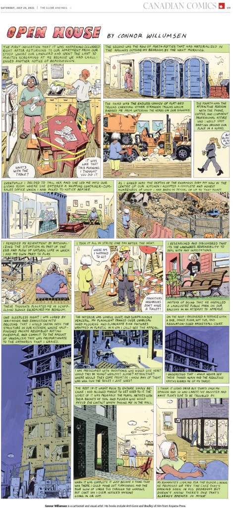
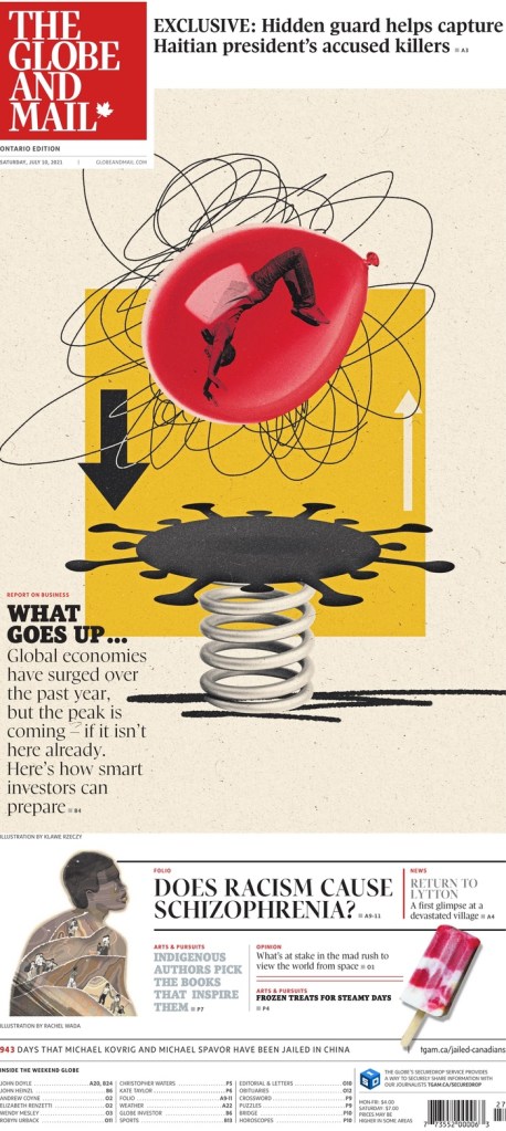
Globe and Mail, July 24, 2021
This was Canada’s only medal, for illustration by Connor Willumsen.
Globe and Mail, April 17, 2021
This was one of my faves from the Globe this year. There is so much going on. A lovely illustration by Kathleen Fu. Newspapers, she’s incredible. Take note.
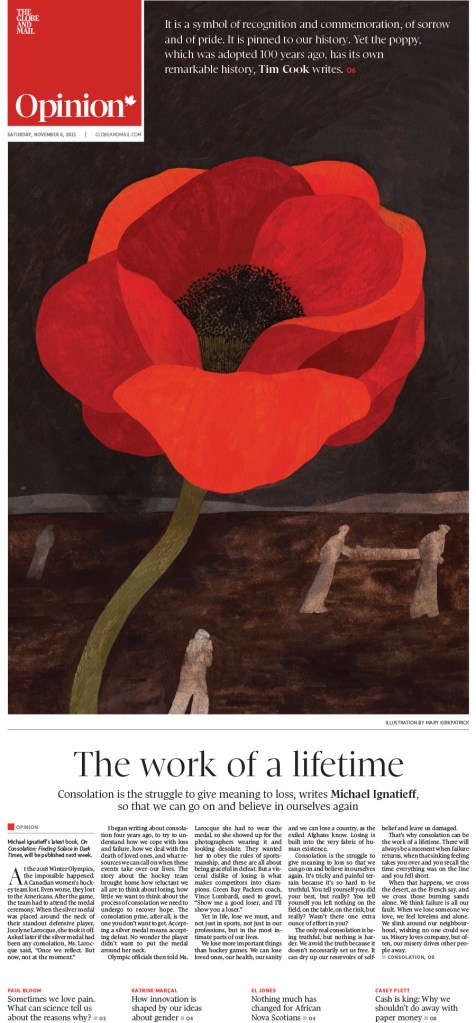
Here are a few illustration-driven pages. There is some really lovely stuff here. I love what Canadian papers do with their Remembrance Day covers. This one by the Globe was so well done. Elegant. Illustration by Kayla Whitney.
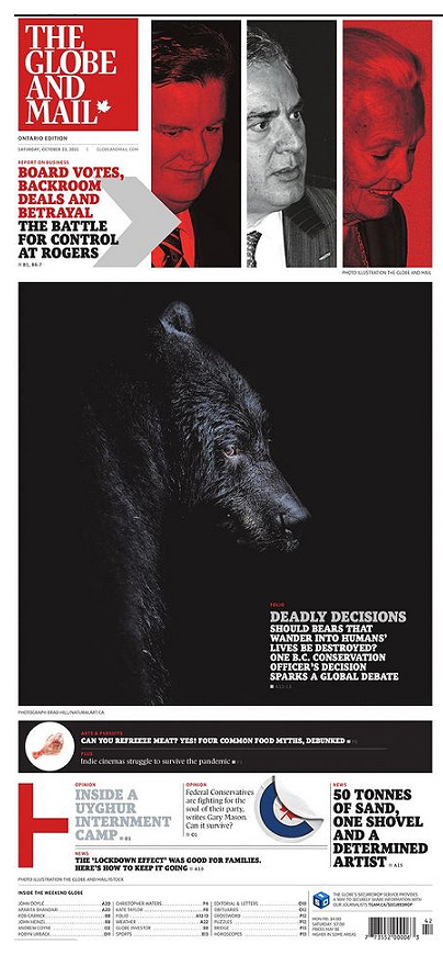
And a few more. The Globe does so much with their design, particularly on Saturdays and features sections. I loved the bear cover. It works for the Globe, going so dark on dark, because their cover is on glossy paper. That design might be lost on most papers. Congrats to the Globe for a solid year. Being March already, I can tell you they are off to a good start in 2022 as well!
Toronto Star
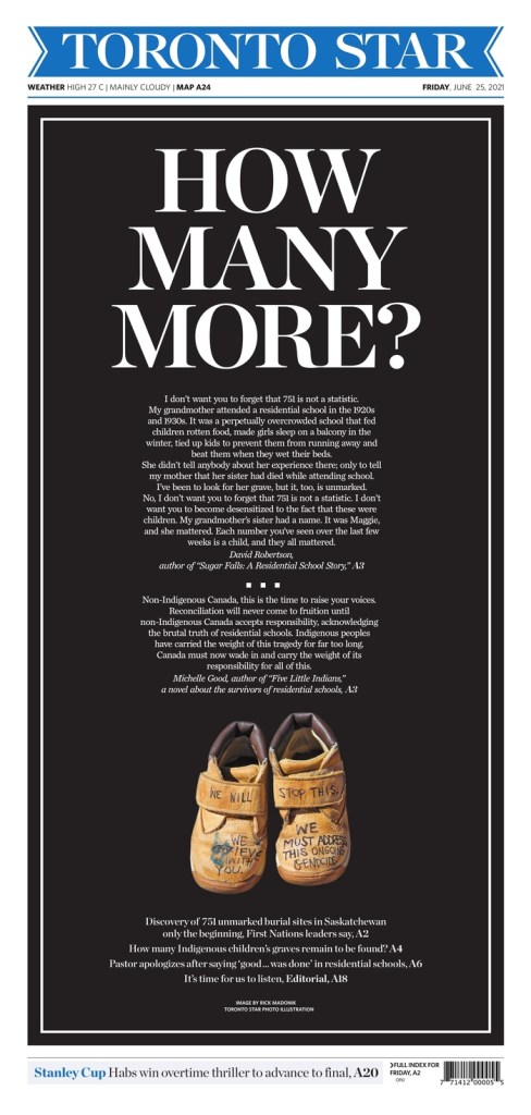
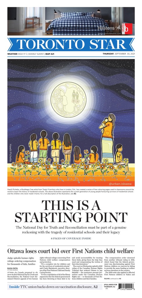
Of course I have a soft spot for the Toronto Star. I worked there, and worked directly or indirectly with the Star or Torstar for more than half of my career. Anyone who follows me will know how much I loved the page that came out after the discovery of unmarked Indigenous graves in Saskatchewan. It was so powerful. Here it is, and a few more.
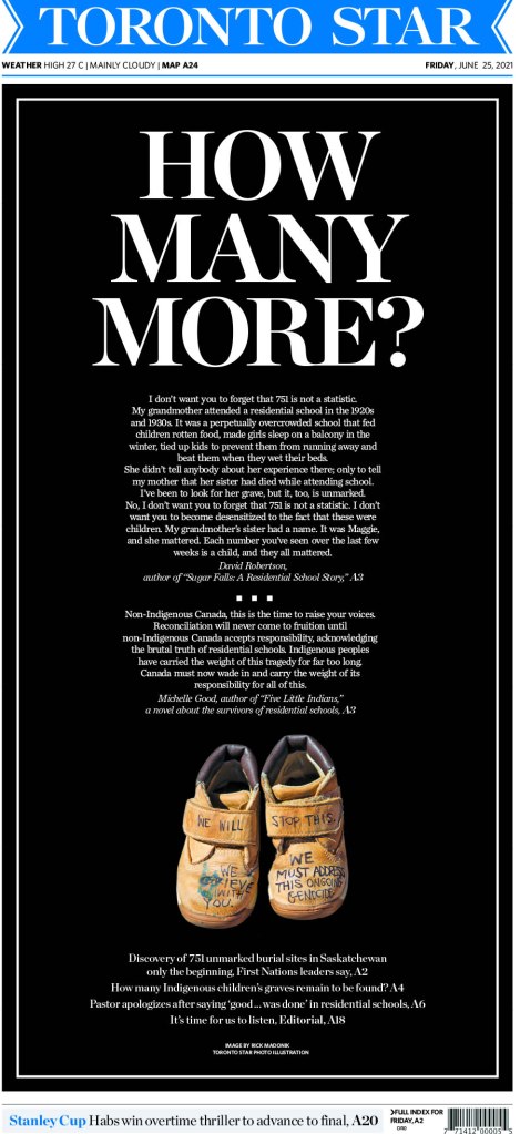
Toronto Star, June 25, 2021
I just loved the imagery here. It was so powerful at a time that needed something powerful. Something to keep the focus on this issue. It’s striking.
And here are a few more. The Star decided to invest in its print product in 2021, which was such welcome news, adding four entirely new positions, including an art director, Becky Guthrie, formerly of the National Post. You can see her influence. I hope that we continue to see such strong work.
Le Devoir
I don’t see Le Devoir as often as the previous two. But I love the design. It is smart and refined. It looks European. Nice clean lines, often simple. Here are a few top-notch pages from them. I will show four of these off individually as none have appeared here or my Instagram, starting with my fave of their submissions.
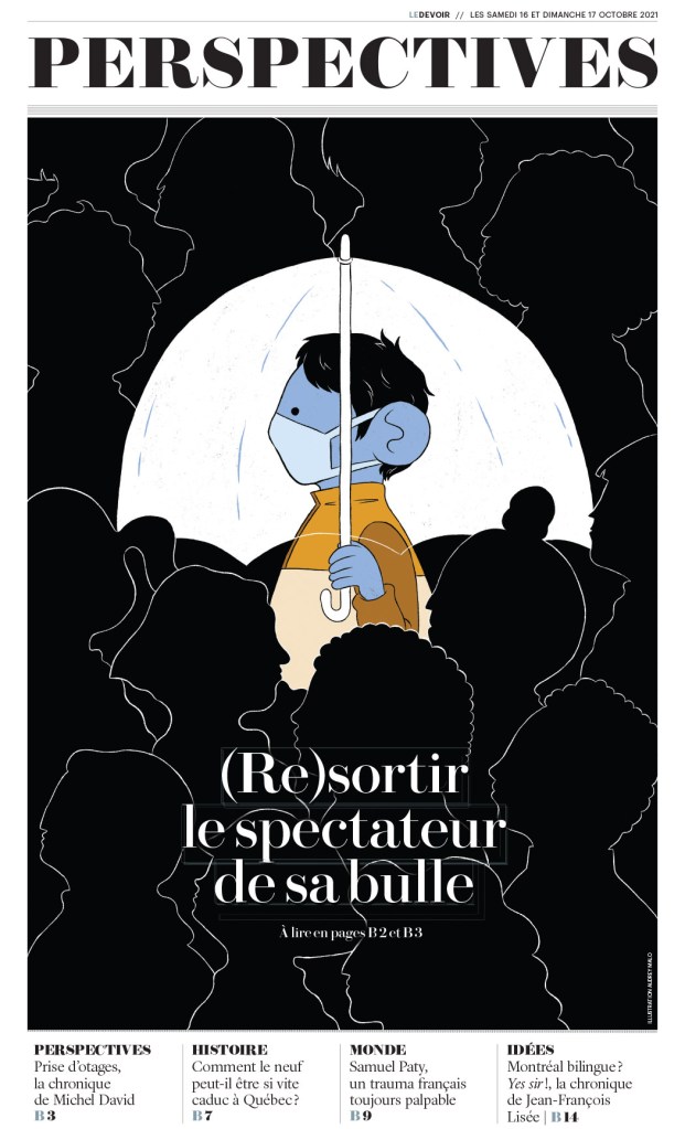
Le Devoir, Oct. 17, 2021
I love the contrast. The love the lines. The beautiful illustration by Audrey Malo. It is so clear where your eye is supposed to start, and clear that it’s not supposed to stop there. So well done.
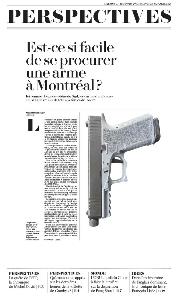
Le Devoir, Nov. 21, 2021
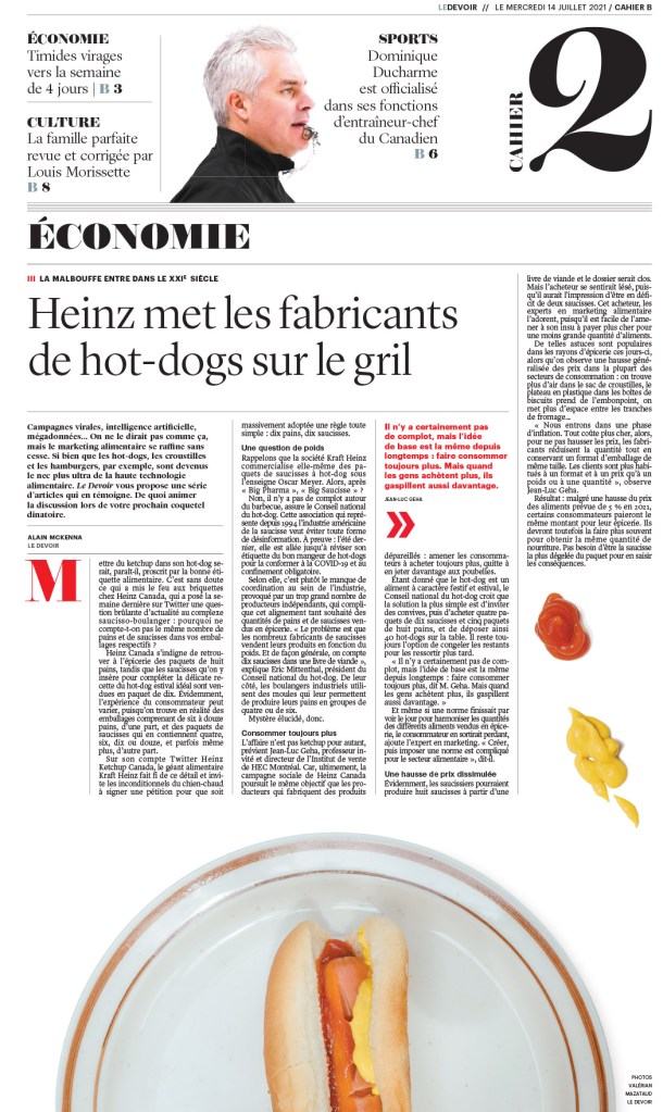
The one above and below are both driven by the design, not an illustration. A great illustration is great on its own. I can be enhanced if used well. But these are just nice designs, with a basic image, images that couldn’t be more different. And below, the little condiment spills take this page to a new level. Love it. Smartly filling in some white space, but also using what is left wisely.
Le Devoir, July 14, 2021
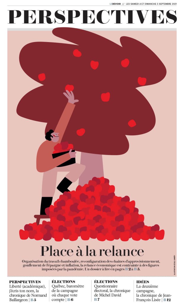
Le Devoir, Sept. 5, 2021
And then an illustration-driven page. It’s a nice, simple illustration (for a talented illustrator! Who just happens to be Cécile Gariépy). And it’s used so well. The text doesn’t take away from the fantastic art. Nicely done, Le Devoir.
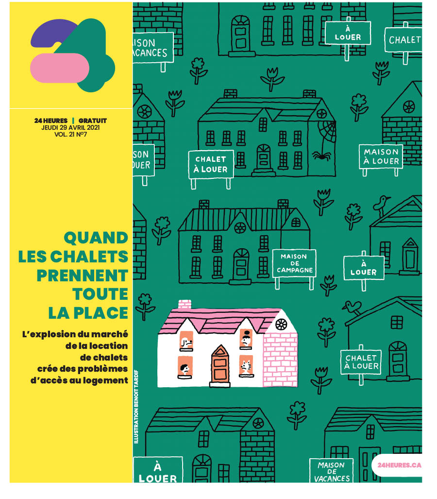
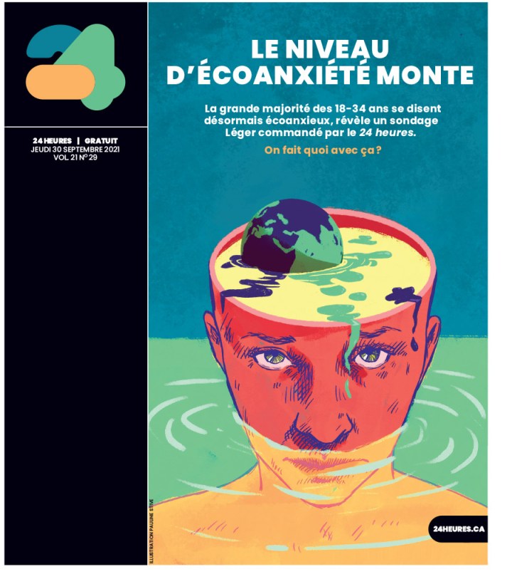
24 Heures
And finally a couple from 24 Heures. Both illustration driven. Smart art, well played, yet completely different illustration styles. Even the supporting material is played differently, with the head down the side on one, and on the art on the other. But it doesn’t take away from the art. It uses the space well. First by Benoit Tardif, next by Pauline Stive.
Just some incredible stuff. And this is just from Canada’s entries.
So that’s that. I am so happy to see there is still some amazing work going on in Canada, and around the world. Up next will be about some the best newspaper pages from around the world.
Some newspapers have clearly given up on print design. It’s about content and digital. Obviously both of those are key to the future of media organizations everywhere. But I still believe print design is important. And that’s why I celebrate it here and on my Instagram account, both of which have been around for about a year now. While my Instagram shows great pages from day to day, this blog tends to focus on designers or bigger topics.
While I want to celebrate all newspapers making an effort (and I do on Instagram), the next two posts are going to show a few papers that consistently deliver striking and thoughtful designs. This post will focus on Canada’s big three: The Globe and Mail, Toronto Star and National Post. Perhaps next year I will add more, though I don’t see many papers upping their effort. Next post, the rest of the world.
Each of these top papers tends to have a solidly defined style. I will look at my top three pages from each publication (at least that I highlighted this year on my Instagram), then a slideshow of some other pages. To be clear, I know there is some amazing work happening inside these papers and on other section fronts, but this is about A1, and only includes papers making an effort — and a splash — frequently. I won’t look at one-offs, or rare successes in this post. I will feature them in order of my connections with each, so Toronto Star, Globe and Mail (only as managing editor of Pagemasters North America, which handles most of the page production for the Globe and Mail, though the pages featured here were likely done in house) and the National Post (I recently started working at Postmedia).
Toronto Star
This was probably the page of the year in Canadian media for me (the top Globe page rivals it), though not necessarily from a design perspective. There were some stronger pages visually, more complex. But this is a powerful page, which gave a lot of real estate to a key issue at a key time. The reverse text, the big headline asking a big question, the little moccasins with a big message. It came out a day late (only because the day-after coverage in many Canadian papers was lacking), two days after the discovery of hundreds of unmarked graves of Indigenous children, but it struck a chord.
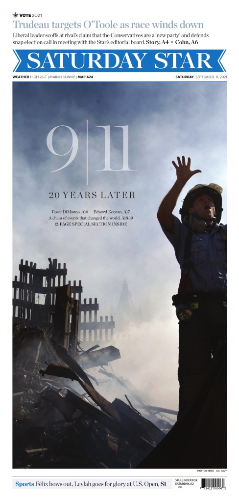
The Star will less frequently blow out its front page for an international issue than the national papers, but it did here. It was the strongest Canadian 9/11 anniversary page, with a strong image and beautifully handled typography.
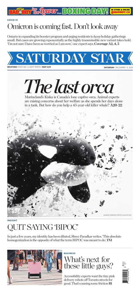
In the summer of 2021, the Star decided to focus more on print design (I’m not making this up), hiring an art director as well as three others to focus on design, graphics, illustrations, etc. This is an example of this, with a striking, contrasty photo illustration from Ramon Ferreira.
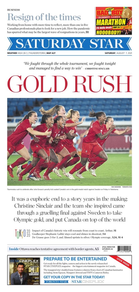
Here is a small sampling of some other great Toronto Star pages. All great in their own way, all very Star. The beautiful illustration by Hawlii Pichette, the strong art and colours on the Afghanistan page and the excitement of an epic gold medal win on the Olympics page.
Globe and Mail
The Globe and Mail is always swinging for the fences and often knocks pages out of the park, well beyond A1. The Globe tends to have elegant or pleasantly elaborate illustrations, big art and sometimes subtle headlines. Its weekend A1s can run with the best in the world.
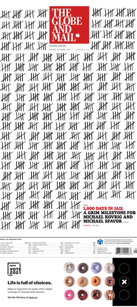
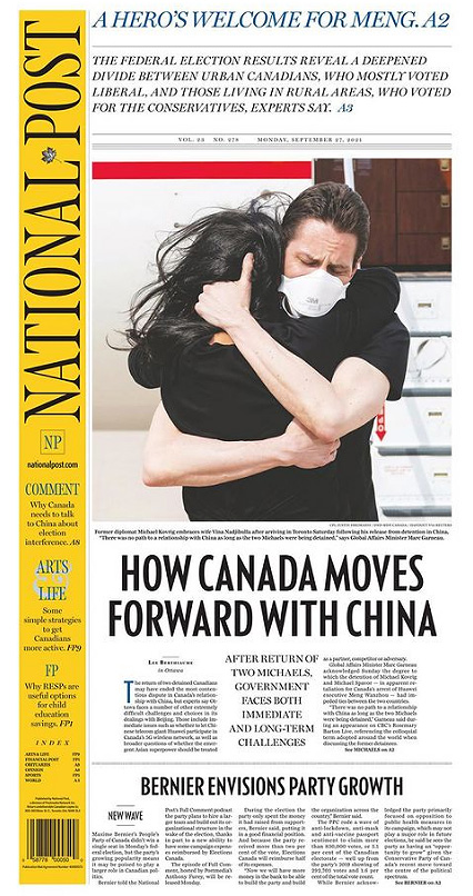
This page might have been the best purely from a design standpoint. It’s simple, but smart. Likely planned for ages. It is powerful as well, about the “Two Michaels,” who were wrongly imprisoned in China for more than 1,000 days. This was Day 1,000, a grim milestone. Some will argue this, but the Globe owned this story, especially in Canada. Every day the Globe kept track of days the Michaels were detained on the front page. I don’t know how early it started, but it was there for hundreds of days. This was the culmination of that. The tallies, how they work around the flag. No art. The contrast. It’s a stunning and powerful page.
The Globe had one of the best Election Day and and best election results page. But I love this visual. And fantastic use of white space.
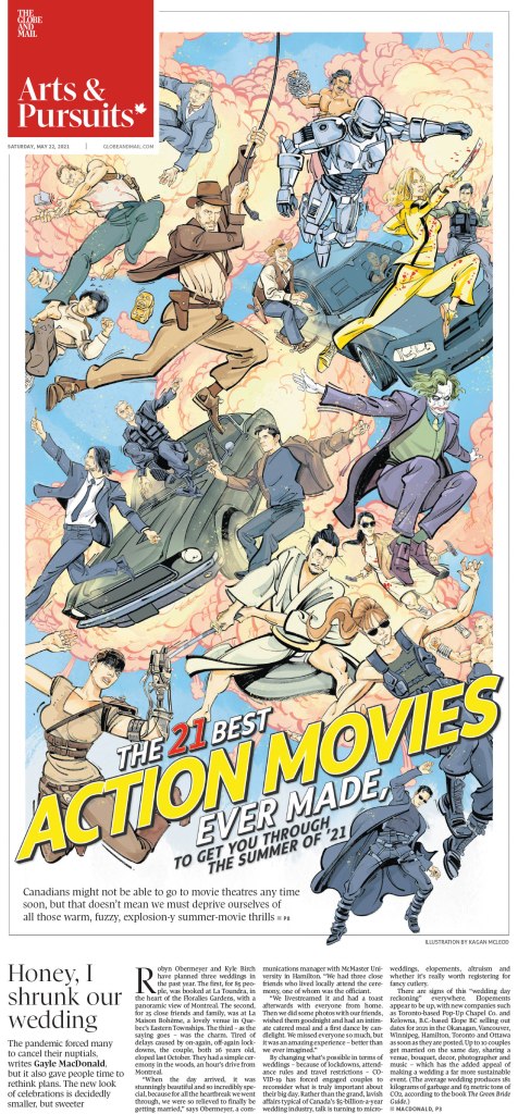
I love this illustration by Klawe Rzeczy. It’s busy, it’s chaotic, but it is absolutely eye catching. And despite the Globe getting illustrations from various illustrators, it always seems to feel like the Globe. Refined.
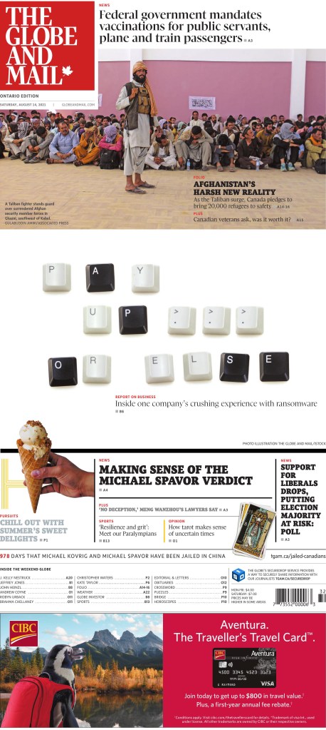
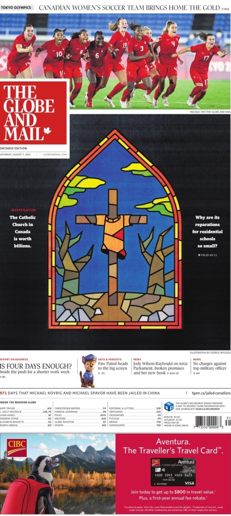
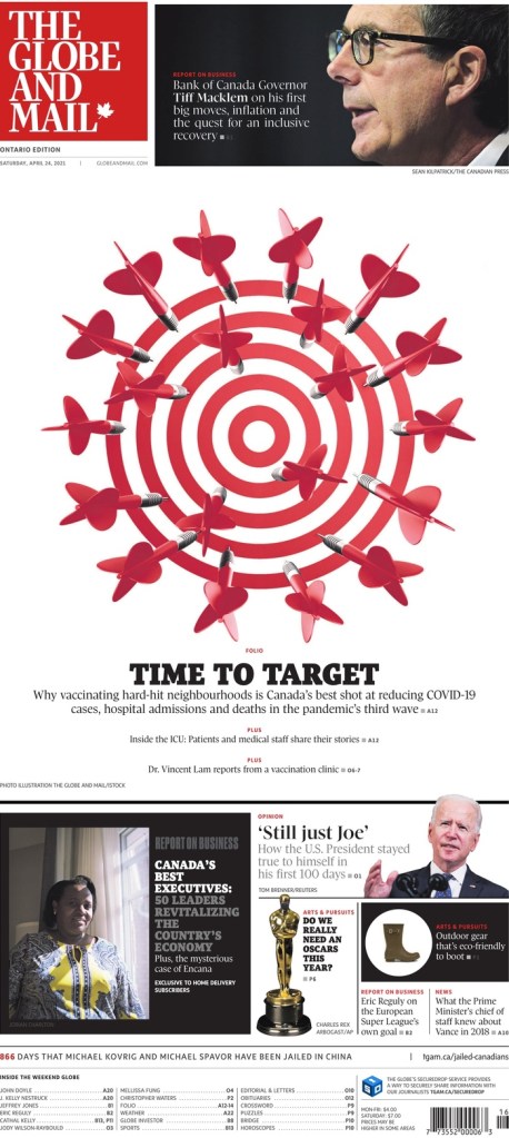
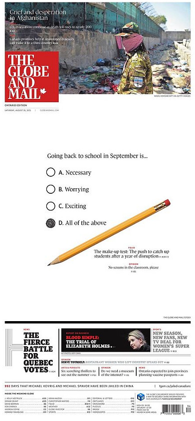
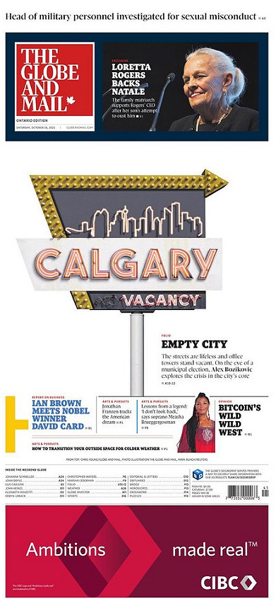
Here are a few more. I love the keys from the keyboard. And, again, in Globe style, the white space. They do not fear white space because they know how to use it. They also did a stained glass look (see National Post below). It’s too bad it cost the Canadian women’s soccer team some play, but it’s a nice page. The dart board. White space. Red. Contrast. And the pencil. I did a page like this, so of course I like it! Again, bold white space. And Calgary. I love it for design, but also I’m from Calgary! Finally, the bear. So dark, and boldly dark, but the Globe can get away with it as it prints on glossy paper. I should have said that earlier as that is key to some of its success in print.
National Post
The National Post has been known for its design since its inception in 1998. For a long time it stood above the rest. It’s still exceptional, especially once you get past the very often great front page. The inside design doesn’t try too hard. It is elegant and clean. So much so that others have tried to imitate it, without success. The vertical flag is something I often talk about. It adds so much. Funny that these three papers all have very different flag styles, with only the Star having the classic text across the top. Sorry, tangent. The National Post is still giving it its all, particularly on Saturdays.
I debated my fave, but in the end this vibrant illustration won out. It’s played well with the other content on the page, but it, in itself, is just so striking. To tie things together, it’s done by Becky Guthrie, now the art director at the Toronto Star. The Canadian media scene is a small world.
But then there is the Christmas page. This has been a tradition for the National Post since it started, conceptualized as a way to compete with the Globe’s art-driven Christmas page. They took the boldly overtly religious approach to set themselves apart from the Globe. The reverse flag. The colours.
This page is a basic, clean design. There are other extraordinarily designed Post pages, but I wanted to give props to a big news page. Like headlines, designs are often more celebrated for feature-type stories as they are easier to illustrate. This was a big news day in Canada. The Two Michaels home at least. It was the best page for this event.
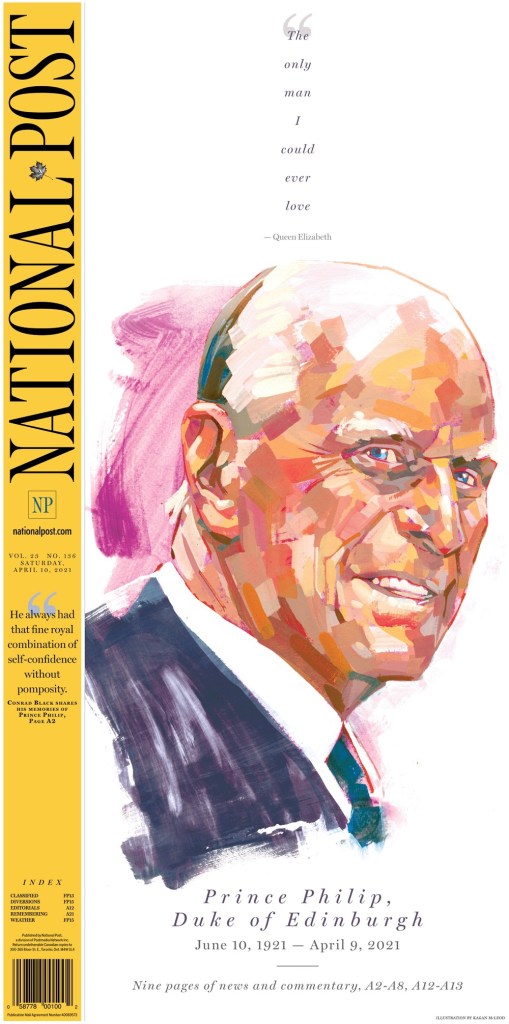
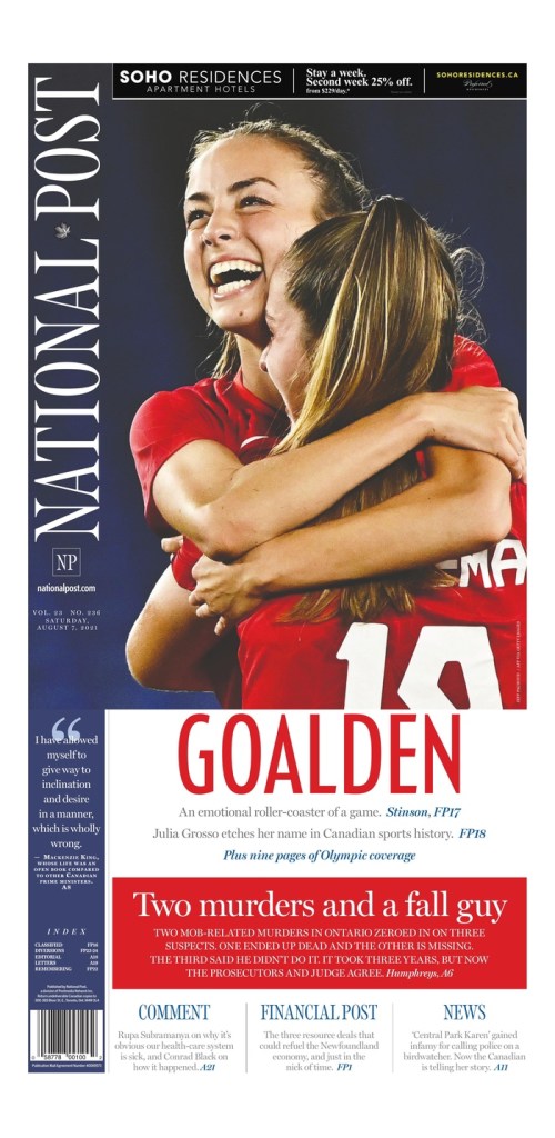
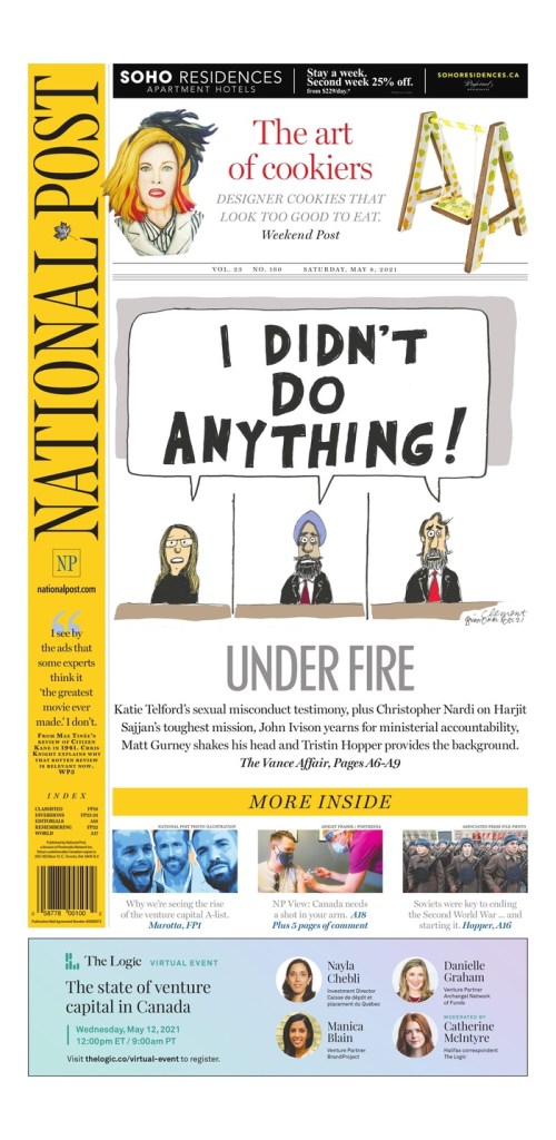
The National Post’s Election Day page was great. Still maybe my favourite. It’s very different from the Globe’s white space. A big monster headline. Contrast-y text on a dark background. I just love the symmetry on the next page. I almost chose the Prince Philip page as one of my top 3. It was close. What a piece of art by my good friend* Kagan McLeod. The next is an Olympics page. As I wrote then, the Post won the Canadian newspaper Olympics with outstanding design day in and day out. And a classic Post cartoon cover. *I don’t actually know Kagan other than over Twitter and through seeing his illustrations in each of the top three papers here, but I’ve been a Kagan stan for a while.
So while 2021 proved to be just as maddening and depressing as 2020, just with vaccines, it still provided plenty of brilliant newspaper front pages. I am thankful to the editors and designers at all the papers here, who keep pushing boundaries and working with passion. And to those at the papers who still do the once-in-a-while great pages. Every little bit counts.
Next up, a look at papers from around the world, featuring publications such as Dennik N of Slovakia, Denmark’s Politiken, The Villages Daily Sun from Florida (you must have known that was coming) and more!
If you want to keep seeing posts like this, subscribe!
Newspapers often go all out on Christmas Eve, often with stunning illustrations or photos on their front pages. This year is no different, except that it’s very different. With Omicron raging, lockdowns, limits on gatherings. It’s been a hard year or two for most, regardless of the season. No commentary on religion here. Just design and the feeling of hopefulness the season often brings. And the incredible front pages don’t hurt! After about two years with COVID-19, it’s nice to have hope so I appreciate these covers even more this year.
For whatever reason, Canadian newspapers seem to blow out their covers disproportionately compared to other places in the world. I looked through about 20 Canadian covers and at least half had very Christmas-y covers. The proportion of America papers was much, much lower, which was surprising. Many didn’t publish today.
Canadian Christmas Eve
Alas, the covers. First I will start with Christmas Eve in Canada. Each of Canada‘s big three has a very different feel, in line with its target audience. First up, the National Post. The stained glass look and the black really pop. It’s such a striking visual. The National Post has been doing this since its first year, 1998, and every year I love it. It’s become a Christmas tradition. It definitely has a stronger religious feel than many others, but that is by design. Of course their vertical flag, as it often does, helps creating a more powerful visual.
Next up, the Toronto Star. The Star has recently hired a handful of staff to focus on print visuals, including an art director, formerly from the National Post. It shows. This illustration is lovey. Happy-making.
Then the Globe and Mail. Like the National Post, the Globe has been doing a similar cover for years. A beautiful oil painting, from the Art Gallery of Ontario, with a little text. In fact I have learned they have been doing it since before 1998 at least, featuring art from its parent company’s art collection. Most years it’s more of a winter theme rather than Christmas.
Then there is the Guardian from Charlottetown, P.E.I. Just a pretty, hopeful and happy painting, submitted by the very non-winter-named Summer Kelly, 11. Amazing work from a young artist.
Around the world
And now for covers from around the world! This Het Parool cover is one of my faves. I just find the illustration to be so magical and eye-catching/pleasing.
Reporte Indigo is known for their illustrations. And they don’t disappoint here. So classy. Stunning.
Kleine Zeitung has a beautiful illustration but they don’t gloss over COVID. It’s part of our lives.
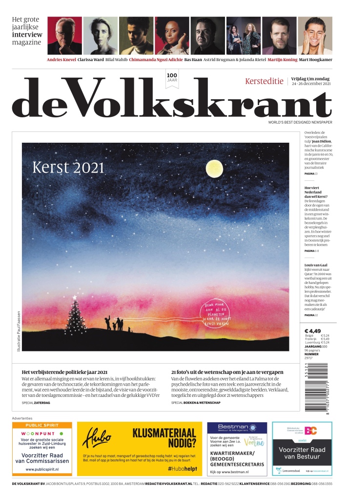
This cover from de Volkstrant is just simple and elegant. Really pretty art.
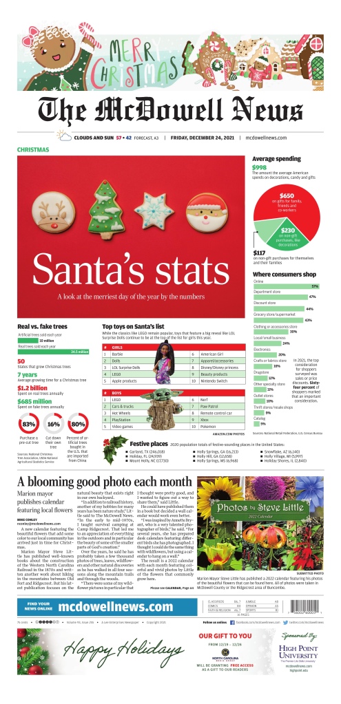
And this McDowell News front page. It’s different! Christmas stats. Very American. Nice contrast. It’s fun and informative.
There were more, but these were the tops that I saw. Thanks to all the newspaper designers out there, still doing their thing. I appreciate how much effort still goes into these pages. Happy holidays, everyone.
Newspaper design. There is not much more anonymous. Even the front page. Many magazines will list who designed the cover on or near the masthead. That is not standard practice in the newspaper world. In the past designers could compete for awards, but even those are disappearing. The Ontario Newspaper Awards dropped its design category (though I will urge them to bring it back here…). There is a presentation category that captures print and digital at the National Newspaper Awards. But other than the Society for News Design awards (still the pinnacle of print design awards), there isn’t much left. However, often those who get into design do so to be behind the scenes. So perhaps some don’t want to throw their hats into the ring of competition and have their names up in lights. Leave that to byline-hungry reporters (we thank you for your content).
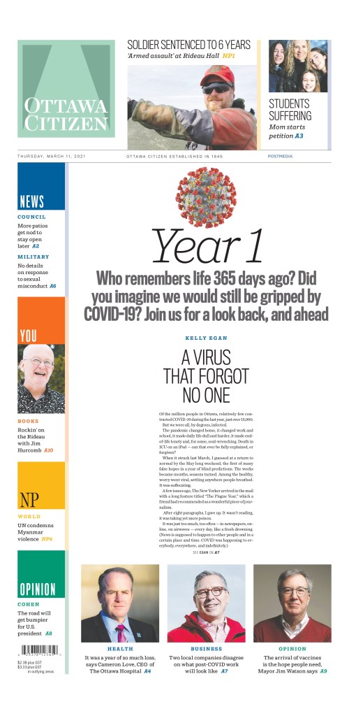
But the role of this blog is to shine a spotlight on both the publications and, when possible, people behind the designs. In this post I speak to Raina Toomey from the Postmedia Production Centre in Hamilton. It is the primary print production centre for Postmedia. I have long heard Toomey’s name. And unknowingly, I have seen her work (because it’s so anonymous). It was only luck that I stumbled upon something designed by her when I was doing a post on COVID-19 papers. She was responsible for what was probably the page of the year, in at least Canadian newspapers, on the anniversary of the declaration of the pandemic, March 11, 2021.
Ottawa Citizen, March 11, 2021
I was happy to hear that she would be interested in talking to me about more of her designs. I love to look at a body of someone’s work, rather than one piece, to see themes and differences. I asked Raina some questions about her career in design. I found that she and I had a lot of similarities. We both started in editing. We both love simplicity in design. We both work in media production centres. Without further ado …
How did you get into newspaper design? I studied print journalism in college because I loved writing and, at the very wise age of 19, decided it was journalism or teaching and I didn’t want to be a teacher. (I shake my head at myself now, of course.)
In my second semester of college, I started working part-time as a copy runner (essentially, a gofer) at the Ottawa Sun, took on freelance work for them and did my job placement there in the fourth semester as a reporter. That was when it firmed in my mind that I really hated reporting and talking to strangers at some of the worst points in their lives. I was hired as their TV editor, which involved a mix of interviewing, writing features and basic layout. That evolved into the new position of production editor for the Today section, laying out and copy editing the Sun’s arts and life pages. Being the Sun, that meant a lot of bells and whistles and splashy design.
Readers’ time is valuable. Effective newspaper design informs as much as it attracts.
Raina Toomey
From there, I moved to the Sun’s news rim as a copy editor, then to the senior slot editor, slotting and drawing the news and business pages.
After 17 years at the Ottawa Sun, I made the move to broadsheets and the Ottawa Citizen as a copy editor on the news desk. By the time I left the Citizen four years later, I was their A1 editor and had worked on a number of special projects, including design and being a builder of their content management system.
I transferred to Postmedia Editorial Services in Hamilton, where I am the production editor for the hub that produces the chain’s 10 major market publications (nine broadsheets, one tabloid). The position offers a lot of variety, and I’m somewhat of a jack-of-all-trades. My specialties involve developing efficient print workflows across the chain, newsroom technology, planning and newspaper design. I work on everything from day-to-day production – layout, editing, clearing pages, design of pages that break away from the ordinary – to the design and production of special coverage such as the Olympics and elections, to rolling out and training staff on our content management system and other technology.
What do you like about newspaper design? And what makes it different? I love the flexibility of newspaper design, in that it goes beyond pure esthetics. Newspaper design demands a special skillset that blends news sense with creativity. It needs to draw the reader in, while remaining true to the subject matter. It must be more than visually pleasing; it has to be readable. Yes, use a pullquote, but only if it draws in the reader in a contextual way. Info boxes, numbers packages, sidebars all have to be treated as part of the whole and add value. Readers’ time is valuable. Effective newspaper design informs as much as it attracts.
Ottawa Citizen, March 28, 2020: a text-driven cover.
What was the most fun you have had with a design? I think the most fun I’ve had with design is when I’ve been forced to make something out of nothing – where the art is lacking or of poor quality, but the story is important and needs to make a splash. I am not fond of using clipart unless there is no other option, so it is satisfying to devise a type attack or interesting play of lacklustre art that manages to make things pop.
Do you rely on one design principal more than others (white space, text as design, colour, cutouts, etc.)?
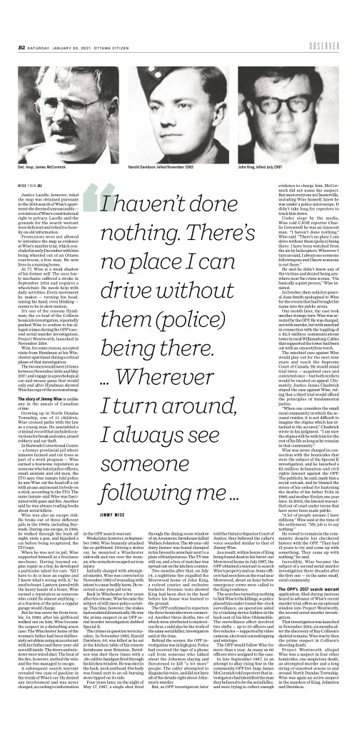
Ottawa Citizen, Jan. 30, 2021. A simple cover with just three headshots as art.
Simplicity is important to me. I like the conscious use of white space, as well as the judicious breaking of rules in limited instances. The Postmedia design has what some have called rigid rules – headline hierarchy, how and when colour should be used in text, no text on photos, no cutouts or close crops – but that is only for the day-to-day design. Sticking to the rules in the majority of situations adds more power and impact to a design when a decision is made to deviate from the rules.
Tell me about a design you loved that was rejected. One paper had a lifestyles section front about wedding dresses. The main art was fairly small, and restricted to above the fold. I sized the art way up, so the model went from the top of the page all the way to the bottom, approved a close-crop and extended the train across the bottom of the page. It was stunning. The editor insisted the photo be sized back down so the entire gown could be above the fold.
I feel I’ve grown a lot as a designer and a journalist since my early days, and expect to learn more – and improve – in the years to come. If I don’t, that would be a sad state of affairs.
RAina Toomey
Now, in my opinion, above the fold/below the fold is outdated thinking, even when it comes to A1. First, the bulk of the circulation for most papers is based on home subscribers, not single-copy sales at the corner store or gas station. Secondly, someone who is going to pick up a paper along with their gas and lottery tickets will not be choosing their purchase as they would decide which tomato to buy at the grocery store – they want to buy that newspaper. Lastly, this was an inside section; by default, the reader would have to unfold the paper to even read it, and would see the dress in its entirety.
Are there any designers or publications other than those you have worked at that you are sure to look at? I love the design of the National Post’s Weekend Post. It’s very magazine-like, and showcases the way great design can maintain a consistency in style while doing some pretty out-there design. Lovely.
How do feel now about the first handful of pages you were proud of? Still love them? Wonder what you were thinking? Wistful for times gone by? I don’t do a lot of looking back. I consider design a constantly evolving skill. What I did years ago is indicative of where I was at that point in my career, and that’s fine. I feel I’ve grown a lot as a designer and a journalist since my early days, and expect to learn more – and improve – in the years to come. If I don’t, that would be a sad state of affairs.
I do appreciate that technology has reached the point where the designer can touch all aspects of their creation – no sizing wheel, no getting camera-ready versions of images shot for paste-up, no painstaking close crop work with an X-Acto knife.
How is it different working in Hamilton vs. working directly in the newsroom? In some respects, working at a hub offers more variety, challenge and flexibility than working in a traditional newsroom. While our newsroom colleagues may feel that those at the hub are separate from them, and not as invested as they are in stories that matter to their readers, that is not the case in reverse. Many staff at the hub take pride in the work they do for “their” paper or papers and feel they are contributing in a meaningful way to the papers’ success. This past year of working from home has likely offered our colleagues a glimpse of what it is like to work outside the newsroom and still be part of the important work we do as journalists.
The logistics of working at a production hub are different, and that can largely be chalked up to technology and how economics have changed the business of presenting the news.
In past years, when every large newsroom had in-house designers, print design was as much a part of the discussion for special projects as the writing and photography. Now, that kind of start-to-finish collaboration often only occurs for digital presentation. It’s possible that some newsrooms consider print design to be outside their scope, since their paper is no longer put together in-house. It is also simply the way things are as we move more fully into the digital world.
Unlike traditional newsrooms of the past, the production hub has to balance creativity and workload. Where once a designer in a large newsroom might have a week or weeks (or longer) to create something spectacular, a designer at a hub has to work under much tighter time constraints and deal with a greater volume of pages. Some newsrooms try to involve the hub as much as possible, giving advance notice and filing early when they require something with flare. They may have suggestions or a vision, or they may just hand it over without offering guidance. Other newsrooms aren’t as aware of the time needed to make something sparkle, or face staffing constraints that don’t allow much turnaround time. Everyone everywhere has to do more with less.
It might be like picking favourite family members, but if you had to pick a few favourite pages, what would they be and why?
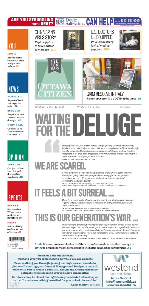
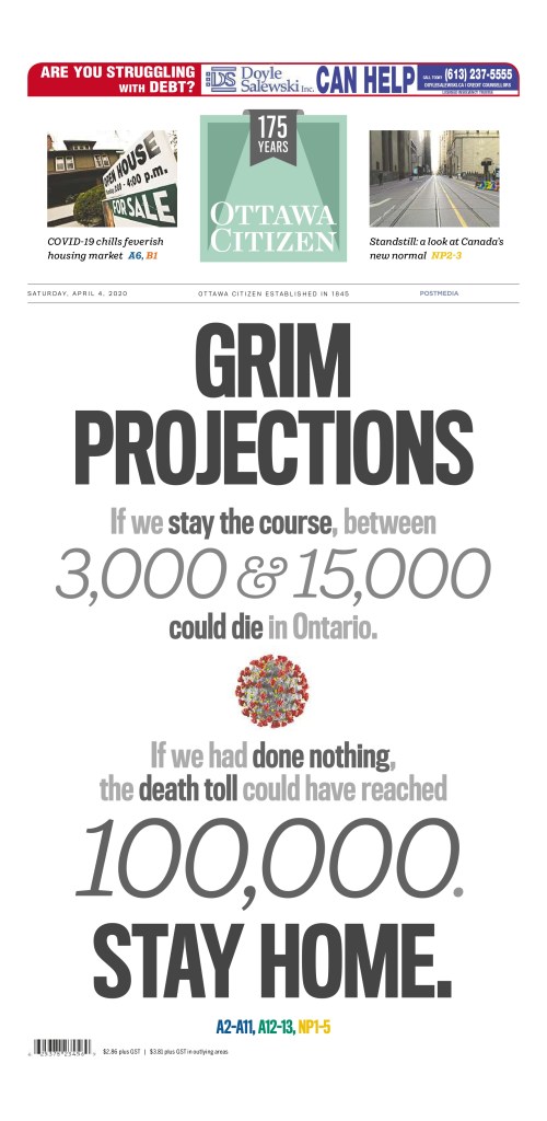
Ottawa Citizen A1, Saturday, April 4, 2020
An example of the power of a type attack using shades of grey and a mix of Postmedia’s bold block line style font with the serif style we use for big numbers in display. The page also broke from style in that there was no main art, only a small close-crop of the now-familiar computer-generated image of the coronavirus. Saturday A1s usually are colourful, teaser-driven pages, so the calculated, drastic deviation from style served to emphasize the seriousness of the province’s message.
Ottawa Citizen A1, Saturday, Jan. 30, 2021
While I usually avoid using clip art whenever possible, this page presented a challenge in that the only art available was largely poor-quality headshots of the suspected serial killer and his victims, and those were used with the three-page feature inside. Andrew Duffy’s incredible piece strung together suspicious deaths, fires, shootings and rumours as police spent 30 years trying to get the evidence to convict a man who has always maintained his innocence. This design broke from style by using clip art of a smoking match (to convey the link to fires and a trail gone cold) and putting large, bold type for both the head and deck on the black background of the image.
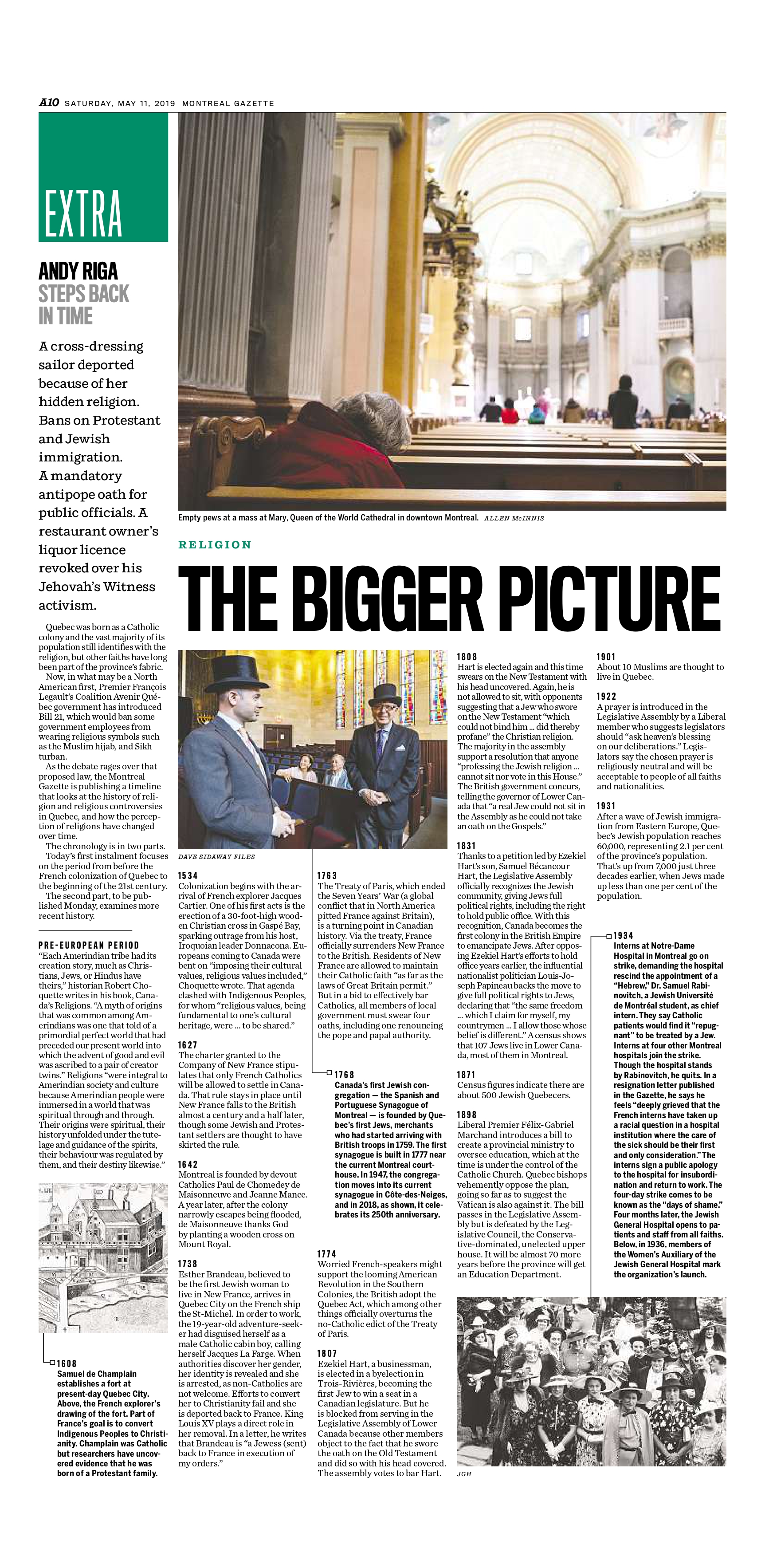
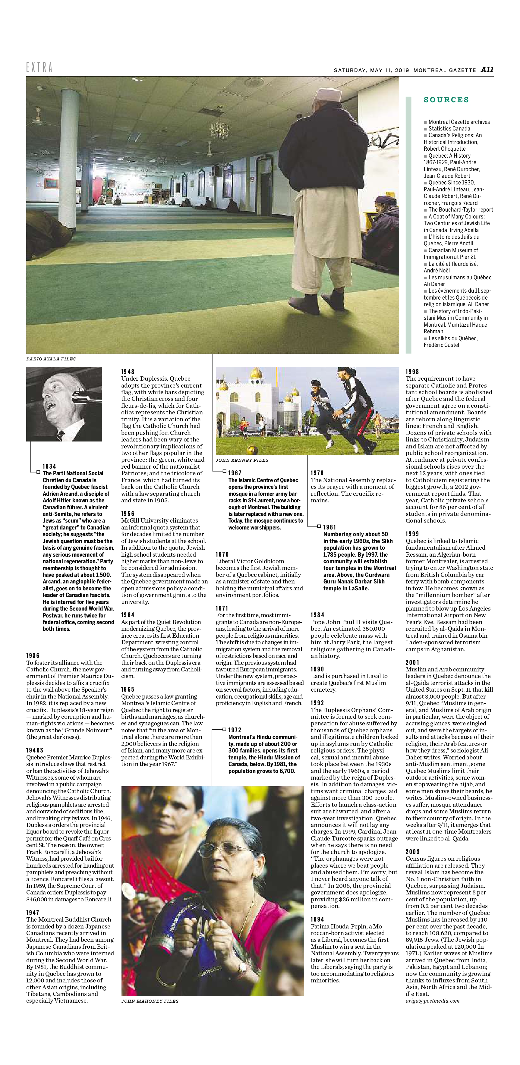
Montreal Gazette, A10/A11, May 11, 2019
It’s difficult to separate politics from religion in Quebec. In a two-part series, Andy Riga looked at the intertwined history of two integral pieces of identity for many Quebecers. The first part ran May 11, 2019, and consisted of a piece that took some time to figure out – what would be the best way to present a narrative feature in a format similar to an illustrated timeline? If styled like a usual timeline, our sans infobody style, it would be dense and difficult to read at that length. I used archival images, special formatting derived from existing styles in our design and, my favourite, white space to make key moments in the timeline stand out.
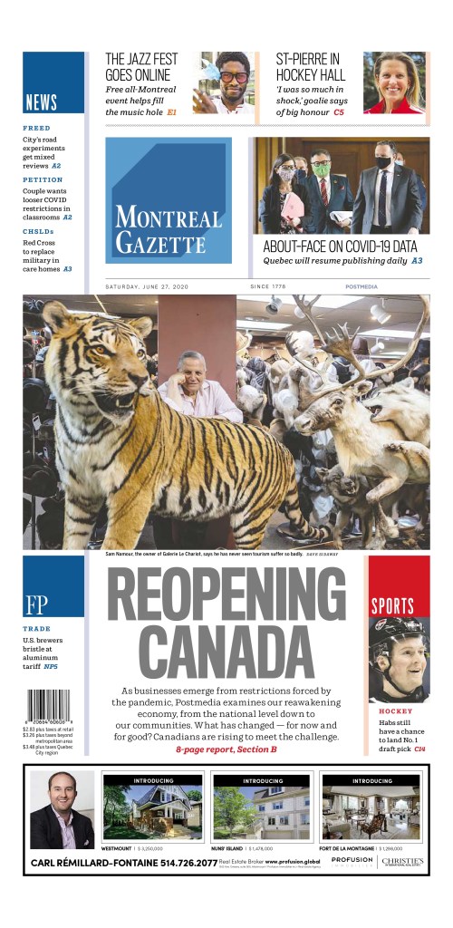
Montreal Gazette, Reopening Canada package, A1, B1-B8, June 27, 2020
Every major-market paper in the chain ran a Reopening Canada package June 27, 2020. With a mix of local and shared content, the sections required a cohesive look that would tie everything together and say, “Here is something you need to read.” Our section squares are usually set solid colours reserved for standing sections. I created a special red square with a Maple Leaf watermark to use on the section front and smaller on each page in the section. Pages were limited to a maximum two stories, features or alternative story forms, every one labeled in red – not one of our usual accent colours – to indicate the specific economic sector, such as aerospace, retail, restaurants, arts and culture, etc … Each page featured a large pullquote beside the inside square, a style most often restricted to the OpEd pages.
Thanks, Raina! Thus ends the Q&A portion …
I agree with Raina on her choices, particularly the Grim Projections page. It uses text so boldly to send an important message. Stay home. That’s it. And as I said up top and in a previous post, I love the design on the anniversary of the pandemic declaration.
Here are a couple more I really dug from the samples she sent.
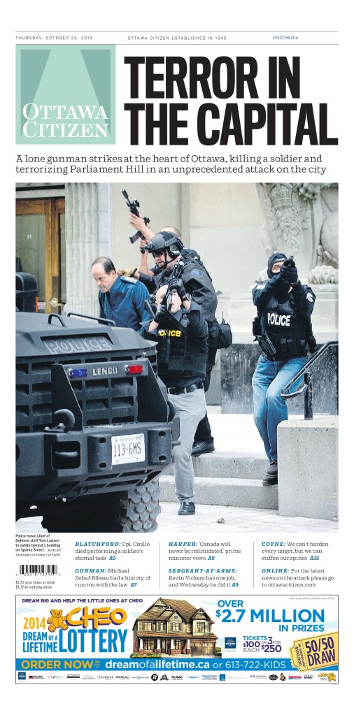
Ottawa Citizen, October 23, 2014
I love this one for three reasons I always go back to. It’s a big day, and nothing captures a big day like a powerful newspaper front page. It’s simple, which I always appreciate, but especially on big news days with emotional, sensitive content. The story is the story. The page needs to capture the gravity without taking away from it. It can be hard to not go too far on a design. And the strong image.
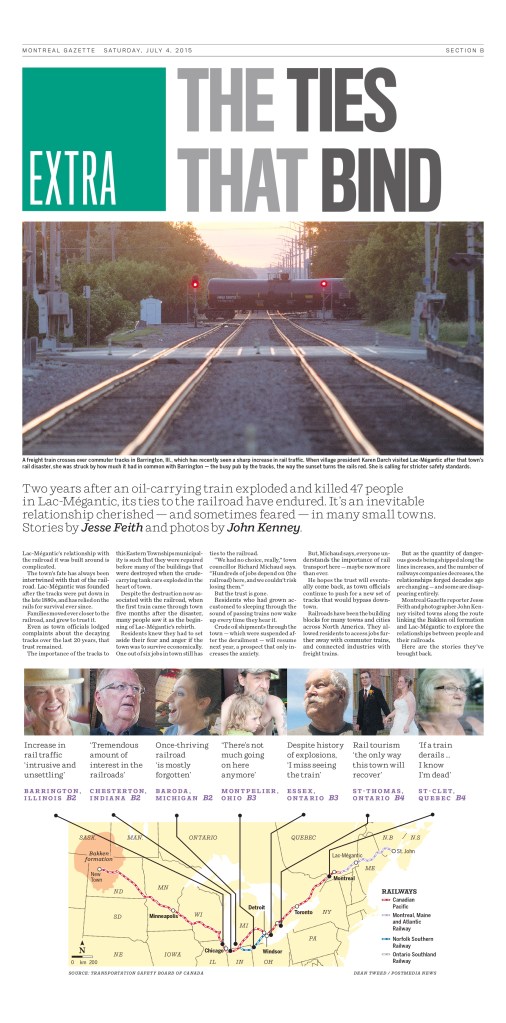
This is another design I like for being simple and informative. A good, big, bold headline. Clear throws to the inside. A helpful map. And again, this was about an important and sensitive topic, though a retrospective kind of look, rather than the day after coverage.
Many staff at the hub take pride in the work they do for “their” paper or papers and feel they are contributing in a meaningful way to the papers’ success.
Raina Toomey, on working outside a specific newsroom
There were so many others to choose from. Raina had a number of wonderful designs (some beautiful graduation pages, capturing and celebrating graduation in a pandemic in the Calgary area, and more), and I also very much appreciate her approach to and philosophy on design. We share so many similar views. Not only that, we both work in a similar environment. While the Postmedia Production Centre is part of Postmedia, it’s still outside the newsrooms, which creates a new dynamic with editors. The same is true at PMNA, though we are an outsourcer (that said, PMNA is owned jointly by three organizations, two of which we have done or still do layout and editing for: the Globe and Mail and Toronto Star). But even with a different relationship, outside the newsroom, Raina has found a way to shine (as have the editors at PMNA).
But a special thank you again to Raina Toomey. Thanks for continuing to give it your all in an industry that doesn’t value print design as it once did. The results are evident. And I know many still appreciate it, though maybe few as much as I do.
My blog is about print. It is about celebrating creativity and innovation in print journalism as cuts imperil its future. But as a 20-year journalism vet who has seen and experienced many layoffs, and survived, I feel it is incumbent on me to honour those who are facing cuts right now. It was announced today that HuffPost Canada and HuffPost Quebec are shutting down, cutting 23 jobs. The employees filed for union certification in February, just two weeks ago. So this sort of goes against what this blog stands for, being always positive, but this is a big deal. And the positivity comes in celebrating the great work by this staff over the years.
Most of my social network is journalists or formal journalists. And news like this spreads so fast. It’s like a loss in the family. We mourn. We rally. We support. Nearly my entire Twitter feed is taken up with tweets about this one topic.
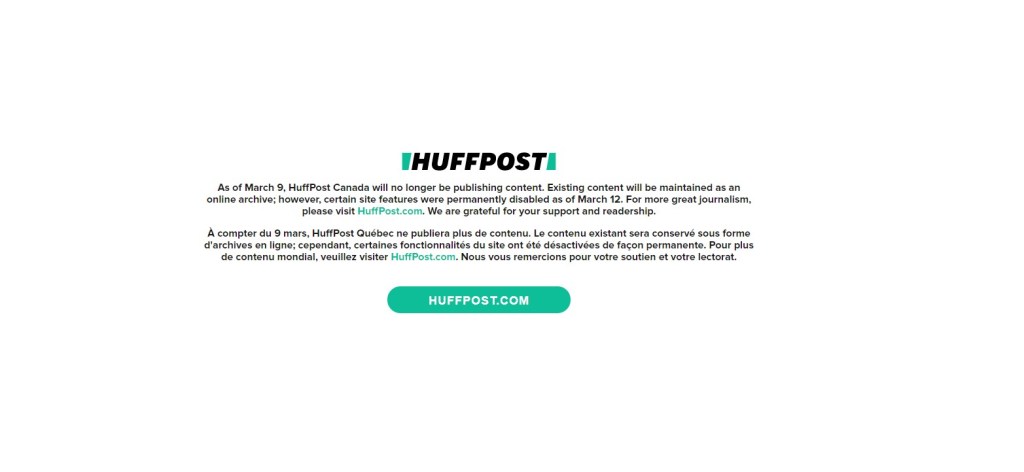
So this blog is about newspaper covers. In my first post I said no one remembers the front page of a website on big days. But I want people to remember this one. I will even review the design. It’s white space. Lots of white space, and in the middle lies an important message. And it’s different. It’s not what you’re expecting. Nor should you be. Newspapers pages are meant to provoke emotion. News websites are generally designed to convey information. So this site sticks out. Sadly for BuzzFeed, its starkness probably garnered more attention than they would have liked it to. Reporters were surprised to find out the site was shutting down. They were met with this page. The page makes a statement on the state of journalism and issues with ownership and the sad state of the industry. Another reason to mark this is that eventually, unlike a print page, it will be gone. And no one will see what many saw, when they learned the site was shut down. So here it is.
The layoff process was also unfortunate. I have learned from mistakes and from what I have done to make the layoff process more human. Using a password of spring is here is unadvisable. Layoffs happen. They will continue to happen, especially in journalism. But we can do better. Consider even the smallest of details.
While it was in a different space from my focus in journalism, and especially different from my focus on this blog (it was meant to be a print v. digital space), I want to acknowledge the incredible work done by HuffPost Canada staff.
There is so much more to say, and I may update this post. But for now, I will now turn this space over to some in-the-moment tweets. In the meantime, as tweeted by Brian Bradley at the Toronto Star: “Hug a journalist day. And then hire them.”
Tweet about the importance of journalism. And why these jobs matter. And some tweets.
BuzzFeed is shutting down HuffPost Canada and HuffPost Québec, just two weeks after they filed for union certification.
Buzzfeed has laid me off, along with everyone else at HuffPost Canada. For years, this place was one of the few Canadian newsrooms where people of colour could make shit happen.
Thank you to everyone who's already reached out to check in and offer kind words.
I joined HuffPost Canada five years ago and I couldn't imagine a more fun, supportive newsroom or better place to start my career. Shoutout to all my brilliant, clever, creative colleagues
HuffPost Canada was my first media internship and I’m grateful for where it launched me. It's profoundly sad to hear that our already shrinking media landscape has gotten that much smaller today. So many smart, clever, talented people worked there.
I'm losing my dream job with my dream team after 8.5 wonderful years at @HuffPostCanada. BuzzFeed is shutting us down. It's a shitty situation, yes, but I'm also so thankful for the opportunity to learn, ask questions, and write stories.
Really said news about HuffPost Canada and Québec. The latter took ballsy chances with experimental digital content that I was privileged to be part of, with @daphneehackerb, @thecamillelopez and @PatWhite70. Bon courage à tous affectés.
I am so livid and heartbroken for everyone at @HuffPostCanada, who are my former colleagues.
They do INCREDIBLE work. They are a lot of young journalists who have been a crucial voice in the media landscape. Losing them will create a huge gap in coverage. It's wrong. https://t.co/XV71CLdZlh
Another media lay-off in Canada, and each one honestly feels like a dagger to the heart. Thinking of all my friends at HuffPost Canada today. None of you deserve this. https://t.co/36lPm115Fv