My blog is about print. It is about celebrating creativity and innovation in print journalism as cuts imperil its future. But as a 20-year journalism vet who has seen and experienced many layoffs, and survived, I feel it is incumbent on me to honour those who are facing cuts right now. It was announced today that HuffPost Canada and HuffPost Quebec are shutting down, cutting 23 jobs. The employees filed for union certification in February, just two weeks ago. So this sort of goes against what this blog stands for, being always positive, but this is a big deal. And the positivity comes in celebrating the great work by this staff over the years.
Most of my social network is journalists or formal journalists. And news like this spreads so fast. It’s like a loss in the family. We mourn. We rally. We support. Nearly my entire Twitter feed is taken up with tweets about this one topic.
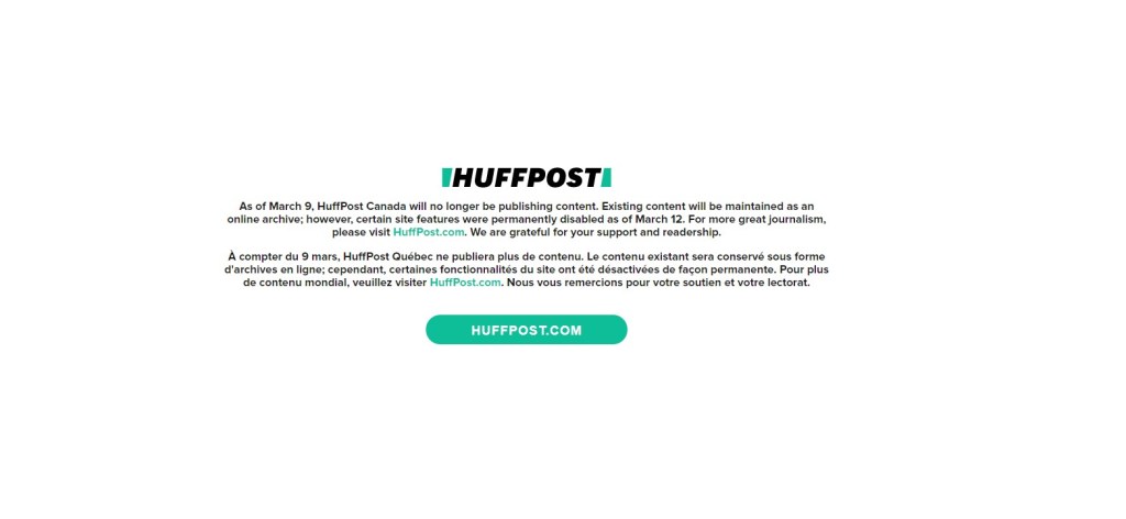
So this blog is about newspaper covers. In my first post I said no one remembers the front page of a website on big days. But I want people to remember this one. I will even review the design. It’s white space. Lots of white space, and in the middle lies an important message. And it’s different. It’s not what you’re expecting. Nor should you be. Newspapers pages are meant to provoke emotion. News websites are generally designed to convey information. So this site sticks out. Sadly for BuzzFeed, its starkness probably garnered more attention than they would have liked it to. Reporters were surprised to find out the site was shutting down. They were met with this page. The page makes a statement on the state of journalism and issues with ownership and the sad state of the industry. Another reason to mark this is that eventually, unlike a print page, it will be gone. And no one will see what many saw, when they learned the site was shut down. So here it is.
The layoff process was also unfortunate. I have learned from mistakes and from what I have done to make the layoff process more human. Using a password of spring is here is unadvisable. Layoffs happen. They will continue to happen, especially in journalism. But we can do better. Consider even the smallest of details.
While it was in a different space from my focus in journalism, and especially different from my focus on this blog (it was meant to be a print v. digital space), I want to acknowledge the incredible work done by HuffPost Canada staff.
There is so much more to say, and I may update this post. But for now, I will now turn this space over to some in-the-moment tweets. In the meantime, as tweeted by Brian Bradley at the Toronto Star: “Hug a journalist day. And then hire them.”
Tweet about the importance of journalism. And why these jobs matter. And some tweets.
BuzzFeed is shutting down HuffPost Canada and HuffPost Québec, just two weeks after they filed for union certification.
Buzzfeed has laid me off, along with everyone else at HuffPost Canada. For years, this place was one of the few Canadian newsrooms where people of colour could make shit happen.
Thank you to everyone who's already reached out to check in and offer kind words.
I joined HuffPost Canada five years ago and I couldn't imagine a more fun, supportive newsroom or better place to start my career. Shoutout to all my brilliant, clever, creative colleagues
HuffPost Canada was my first media internship and I’m grateful for where it launched me. It's profoundly sad to hear that our already shrinking media landscape has gotten that much smaller today. So many smart, clever, talented people worked there.
I'm losing my dream job with my dream team after 8.5 wonderful years at @HuffPostCanada. BuzzFeed is shutting us down. It's a shitty situation, yes, but I'm also so thankful for the opportunity to learn, ask questions, and write stories.
Really said news about HuffPost Canada and Québec. The latter took ballsy chances with experimental digital content that I was privileged to be part of, with @daphneehackerb, @thecamillelopez and @PatWhite70. Bon courage à tous affectés.
I am so livid and heartbroken for everyone at @HuffPostCanada, who are my former colleagues.
They do INCREDIBLE work. They are a lot of young journalists who have been a crucial voice in the media landscape. Losing them will create a huge gap in coverage. It's wrong. https://t.co/XV71CLdZlh
Another media lay-off in Canada, and each one honestly feels like a dagger to the heart. Thinking of all my friends at HuffPost Canada today. None of you deserve this. https://t.co/36lPm115Fv
A look inside an edition of a Society for News Design Best of Newspaper Design books.
By Brad Needham
For years people have been saying it. Print is dead. Newspapers are dying. Perhaps the end is nearing, but newspapers are not dead yet. And as long as they’re around, I want to celebrate those making an extra effort. Print design, newspaper design, has shaped my career. It’s a passion. There is not much like it, so I, for one, want it to survive as long as possible. They’ve long been sending out a please resuscitate message, and I’m happy to do newspaper CPR as long as necessary.
Where it all began(for me) In 2003, fresh out of out university, I had just lied my way into a job in Fort McMurray, Alberta. Am I a good designer? I taught design at Mount Royal as a TA, I said. It wasn’t completely untrue. I landed the job, and thus I packed up and moved to northern Alberta in February to start my first daily newspaper job at the Fort McMurray Today.
It was there I stumbled on some books called The Best of Newspaper Design by the Society for News Design. It changed my life. The designs inside were spectacular. Awe inspiring for a young aspiring designer. No longer did I want to be a photographer and certainly not a sports reporter (sorry, dad). I wanted to do that. As I learned more about the Society for News Design (SND) I discovered they were the preeminent design society. The best designers in the world were competing to get into this book. New York Times, El Mudo, Virginian-Pilot, Boston Globe, Toronto Star. I was hooked.
I took these books everywhere (including to Red Deer when I left the paper in Fort McMurray … ssshhh). On vacations, to the cottage, on the bus. When other people were reading novels on the dock, I had my big cumbersome SND books, new sticky notes flagging inspirational designs being added frequently. Every time I did a big design, I was pretty proud. I look back on many of them now with less pride. But I was learning. At the Red Deer Advocate, the Woodstock Sentinel-Review, the Barrie Examiner (RIP). And then I got to the Guelph Mercury, the little paper that could — and did. I was offered a role overseeing the Here section, a feature section focusing on interesting local people and places. I was given time to conceptualize, assign, design. My managing editor was incredibly supportive of my ideas, even if they seemed bizarre on … paper.
That’s how it happened. Years after discovering the Best of Newspaper Design books, collecting dust on a book shelf in a northern Alberta newsroom, after dozens, maybe hundreds of pages drawn, I decided to enter. As a lark. Weeks passed. Nothing. Until one day a note popped into my inbox from SND. I had been recognized for my features portfolio. My heart was pounding. I jumped out of my desk and stormed into my boss’s office as if my house was on fire. I didn’t knock. “I … won an SND. I won!” I could barely breathe.
I submitted five pages. One of those in a few weeks’ time would be in Best of Newspaper Design 28. It was beyond my wildest dreams. To be in these books I used for inspiration. After that I was handed the keys to a full redesign of the Mercury. I was told I could redesign an entire fairly major Canadian newspaper. One of the country’s oldest. I was humbled. With that behind me, I kept chugging along. I submitted a portfolio the next year. I thought it was stronger. But nothing. It was a once-in-a-lifetime achievement, I thought. Winning an SND award. Except it wasn’t. I won again a year later for a news page, based on the redesign. My managing editor allowed me to use all the front page real estate for a design idea. Best of Newspaper Design 30. And I won again two years later, Best of Newspaper Design 32, working with a great designer, Diane Shantz, at the Waterloo Region Record (but for a Guelph Mercury page — the industry was starting its contraction as the Mercury’s page production was brought into the Record. A sign of things to come, and why great newspaper design should be celebrated now more than ever).
A changing landscape That was in the early 2010s. Print advertising started on a steady decline. Stories were available online for free. Newspapers, once a licence to print money, weren’t as profitable (but still doing well relatively speaking). But as revenues dwindled, newspapers started cutting staff. Some adopted a “good enough” policy (it’s true, but I won’t say who said it). It was the idea that readers don’t care about design. They don’t care if a photo is beautifully shot by a professional photographer. A handout picture would do.
Perhaps the end is nearing, but newspapers are not dead yet. And as long as they’re around, we should celebrate those making an extra effort.
Even by 2010, newspapers were in decline. A Pew Research Center report said half a dozen U.S. newspapers had closed down the previous year. Alarm bells were ringing. But we hadn’t seen anything yet. A report out of the Hussman School of Journalism and Media at the University of North Carolina published in 2020 said about a quarter of all papers in the U.S. had closed in the past 15 years. And things aren’t any better in Canada. A story in the Toronto Star last year said 50 community newspapers closed over a period of six weeks. Six weeks. Compared to just over 200 in the previous 12 years. Three newspapers I worked at have closed, the Guelph Mercury, Barrie Examiner and Prince George Free Press. I can’t even begin to explain how much I learned in these roles, and what those papers meant to their communities.
To make a short story long, there are very few people left who get days or even several hours to put a section together, to conceptualize design. To sketch out designs on little yellow sticky notes, as I did at the Waterloo Region Record, and hand them to a designer to implement. I have been fortunate in my career. Awards like the Ontario Newspaper Awards no longer even have a print design category (I won once, received two other nominations and had the privilege of being a judge one year). But because I have been fortunate, I now want to celebrate those who are still doing it. Still producing kick ass designs, like the Toronto Star, Globe and Mail, Spokesman-Review and so on. And I will look at these papers and more to find out why they’re still investing. Hopefully they can inspire future aspiring designers to aim a little higher.