
By Brad Needham
Another week, another batch of nice newspaper front page designs. Showing my Canadian bias I will start with Canada! As always the best pages tend to fall in Saturdays and last week was no exception. The nicest page of the week goes to the Toronto Star this time.
Toronto Star
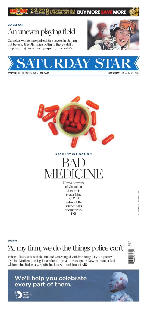
I am a sucker for white space it’s well done. This almost beefed on too much but not quite. On top of that it point to an important piece of journalism.
The News Journal Wilmington, Delaware
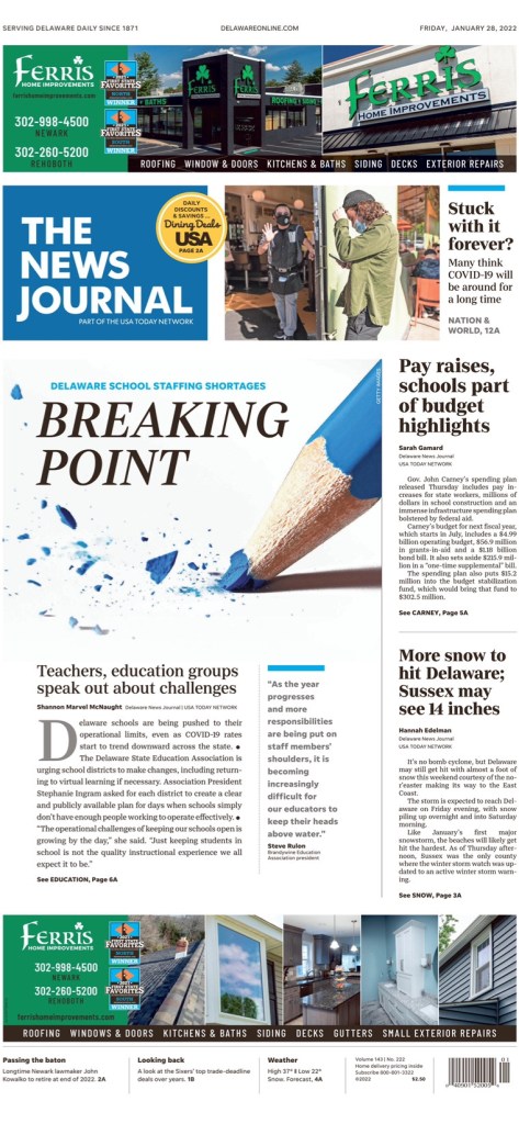
I love this page. Well-played stock art and creatively conceptualized. Again well used white space. Nice headline that works with the photo.
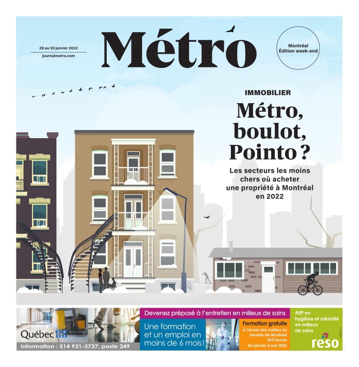
Metro Montreal
Metro often has beautiful pages like this one. It’s just a pretty and smart illustration. They use the small space well.
Argus Leader Sioux Falls, South Dakota
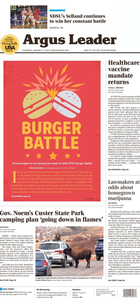
Burgers! A nice break from war, anti-vaccine protests, Donald Trump (had to know he’d be back). This centrepiece is just fun. Not just. It’s also well executed. Nice colours (just enough to be contrasty enough), the clashing, the stars. I
The Spokesman Review, Spokane, Wash.
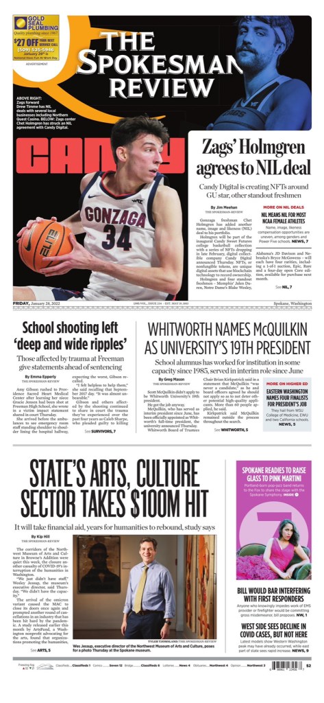
There were a couple from the Spokesman Review I liked last week. No surprise. You’ll probably find at least one every week. Their pages just speak to me. It’s my kind of design. But I will highlight the flag on this one, as that is what makes this page stand out.
Jyllands-Posten Denmark
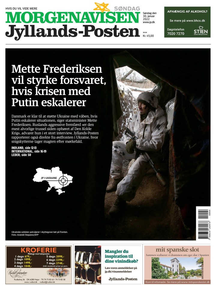
I like the black, the contrast. It’s a simple page with limited content. Nicely played where the words on the picture don’t take away from it, but complement it.
That’s all! Watch for more great pages next week. Want to submit a page? Reach out.
