By Brad Needham
The world has a lot of newspapers. With the help of Freedom Forum’s Today’s Front Pages website, the pool I generally look at as been narrowed down greatly. I will look at the best front pages I’ve seen from newspapers around the world. And this is A1 only. Papers like the L.A. Times and New York Times, and so many others, do amazing things with features sections. One day I will look at those. Today, A1s. And like the post from Canada’s best, I am highlighting the papers that go above and beyond regularly.
Anyone who follows my Instagram will see the same papers again and again. That is not because I am ignoring other papers. It’s because these papers are consistently producing great pages, while other papers don’t. Many do once in a while. The papers below do it regularly.
I will pull out a few of the top pages from each, and then put the rest in a slideshow. There was some outstanding work in 2021.
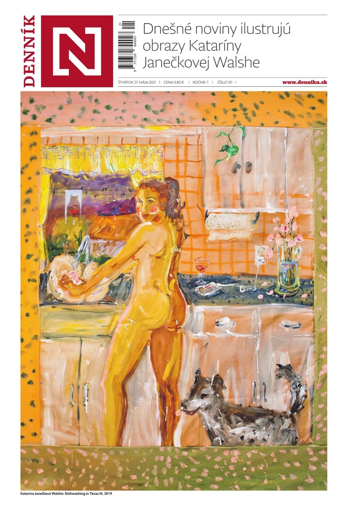
Dennik N Slovakia
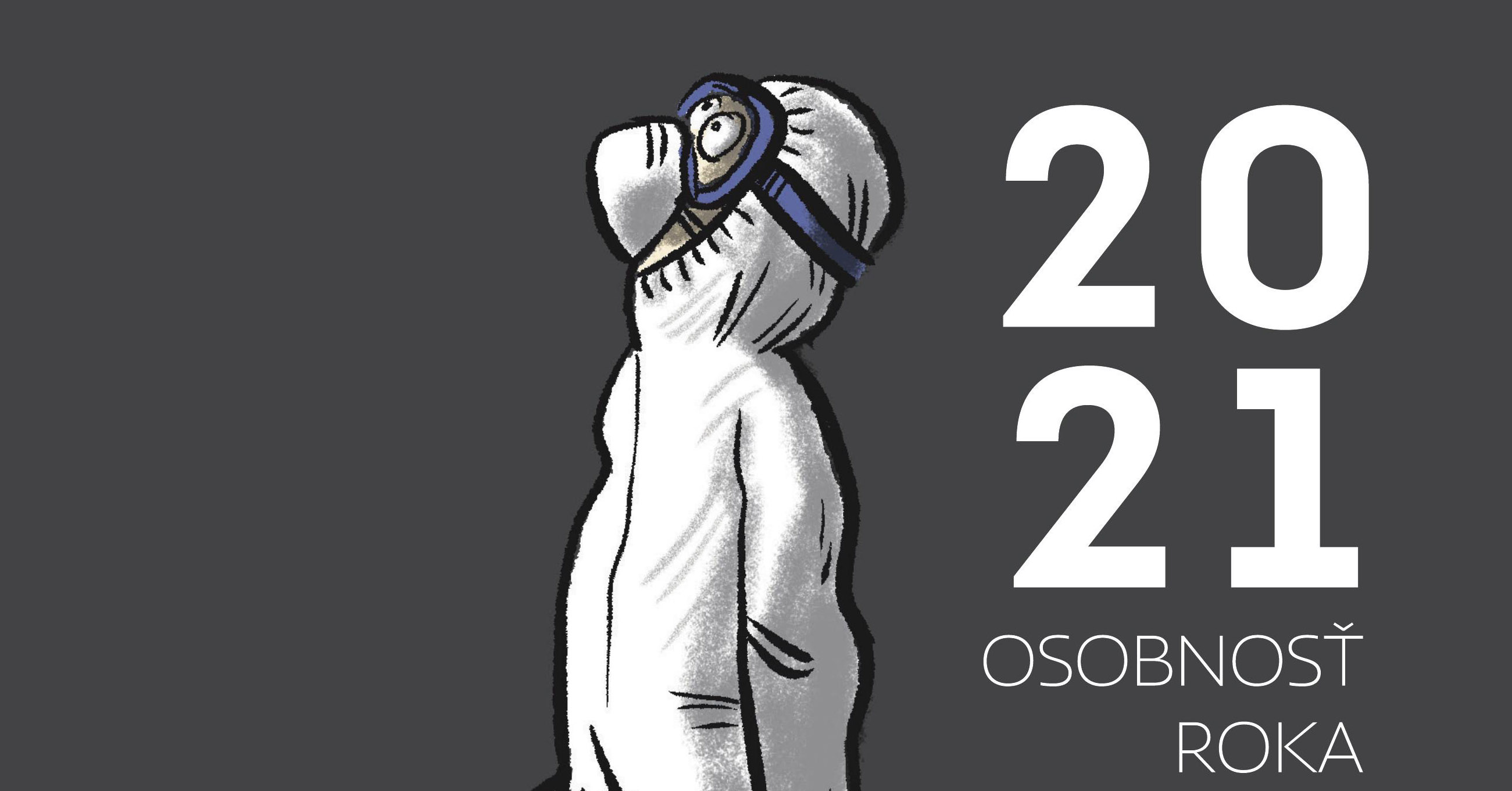
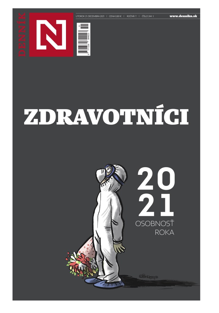
What can I say about this tab. I have been in awe of Dennik N since I first started really paying attention to pages from around the world. I look at 500+ every day, and every day I could highlight the front page from this publication. They definitely have their own style. The cover often has cartoons, and the characters come back again and again, like the health-care worker (shout out to them, as it’s been a trying two years to say the least). On average, I enjoy more covers from this paper than any other in the world, though Reporte Indigo has some breathtaking stuff as well. All illustrator-driven.
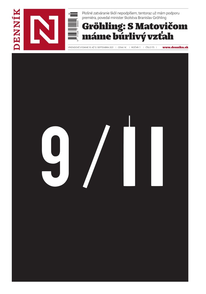
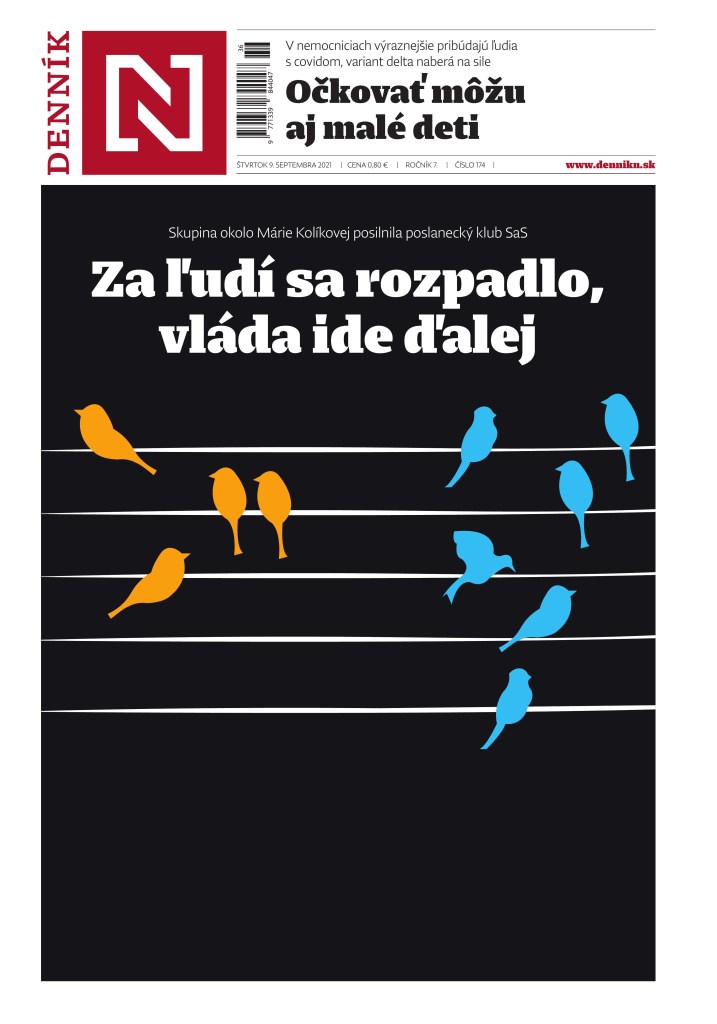
This 9/11 page was one of the most powerful, and simplest, to mark the 20th anniversary. It was so close to another cover, not featured here. Just the idea of adding a thin line to the top of a thick line. It was just 1. Now it’s a 1 and a tower. Simple. Powerful.
This little dude made a few appearances. Health-care workers were in the spotlight as COVID ravaged our lives. My life is more difficult. I can’t imagine working in health care right now. This little guy was always just right.
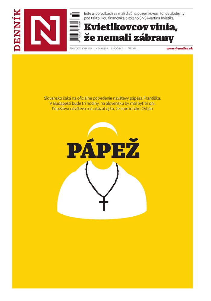
I don’t think much needs to be said about this one. It’s just simplistically beautiful.
I could go on forever with the paper. They do amazing stuff. Maybe one day I can talk to one of the designers. Here are some more from this amazing paper.


Reporte Indigo Mexico
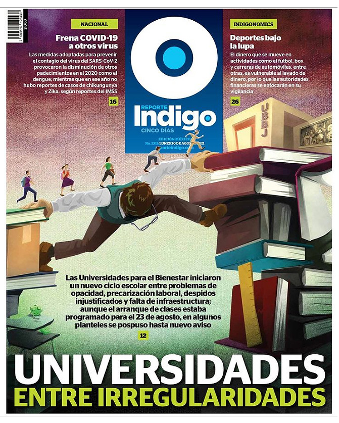
Like Dennik N, but to the extreme, Reporte Indigo is driven by illustrations. Unlike Dennik N, which often has basic and simple illustrations, Reporte Indigo has elaborate pieces. The work is always stunning. Always worthy of recognition. I don’t have as many from them as they aren’t on the Freedom Forum site. I only found where to get them partway through the year (the entire paper can be downloaded from their website, and you can see it on PressReader). The art goes on throughout, every page pretty much. I can’t imagine how much time and effort this takes, so kudos to them. It’s gorgeous. This first one is truly mind blowing.

I just loved this visual when I first saw it. And I love the little dudes walking past the flag. That is some attention to detail.
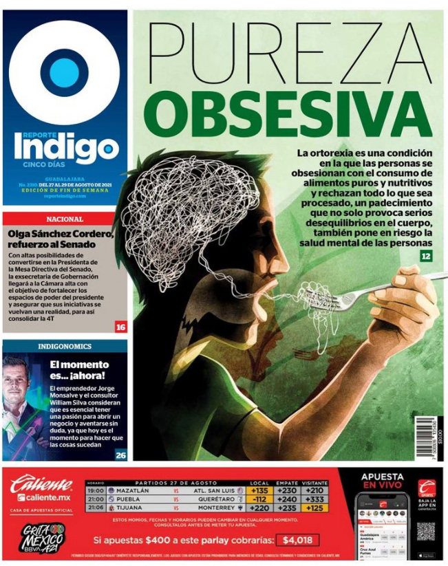
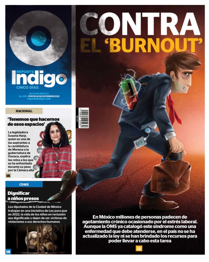
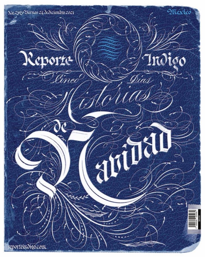
And here are a few more. You get the idea, but damn, they look so labour intensive. A for effort, and unreal execution as well. But loving how hard they work.

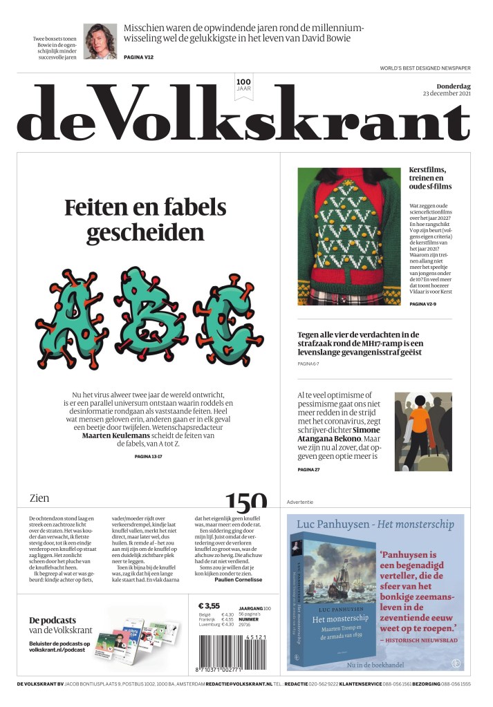
de Volkstrant Netherlands
The tiny little words on top of the flag say it all: World’s best designed newspaper | European newspaper of the year. De Volkstrant is not at all like the ones above. It doesn’t rely on illustrations. It is elegant and clean. It is a paper that has mastered the use of white space. Did I mention it’s elegant. The fonts are so smartly chosen. I chose a similar looking font when I redesigned the Guelph Mercury because I am a fan of elegance in newspapers. And the little numbers they do are great.
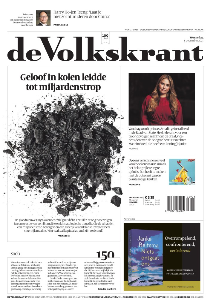
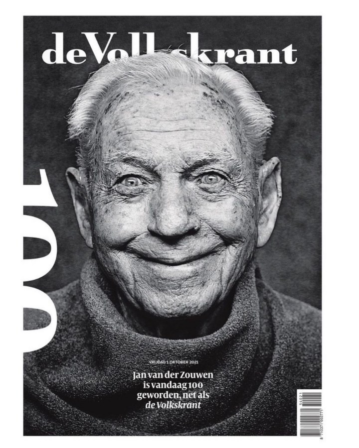
Did I mention de Volkstrant turned 100 last year? I hope it has 100 more years in print with pages like this. Again, it’s not elaborate. It’s just beautiful. What a photo.
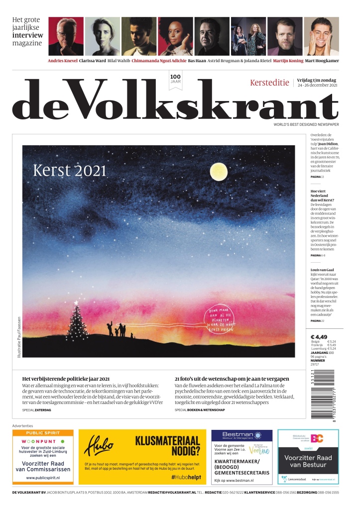
Just after I say they don’t rely on illustrations … a beautiful illustration by Paul Fasssen. But even still it fits their personality. It’s pretty, as is the text around it.
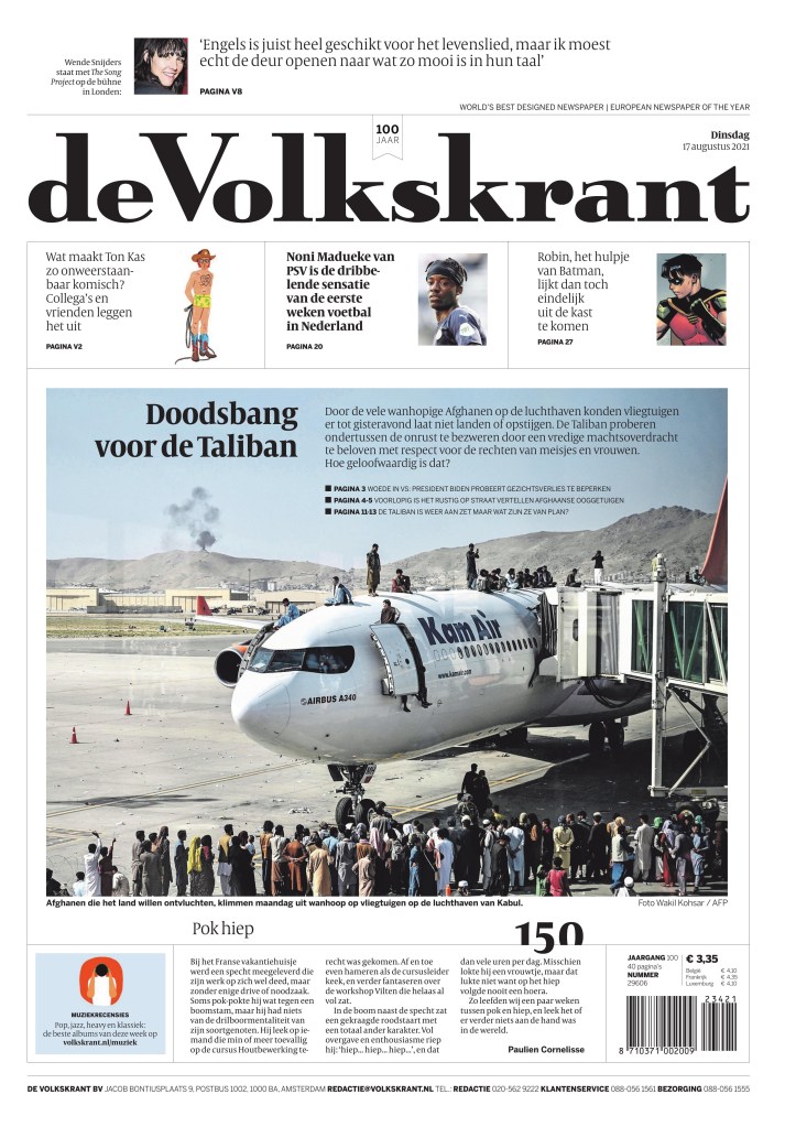
And just a few more to admire.

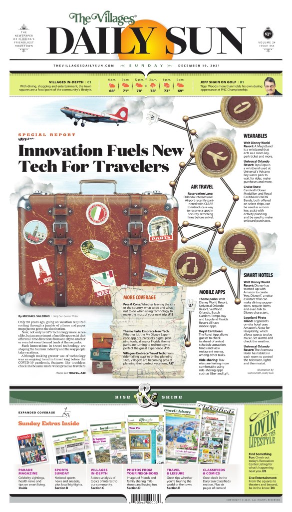
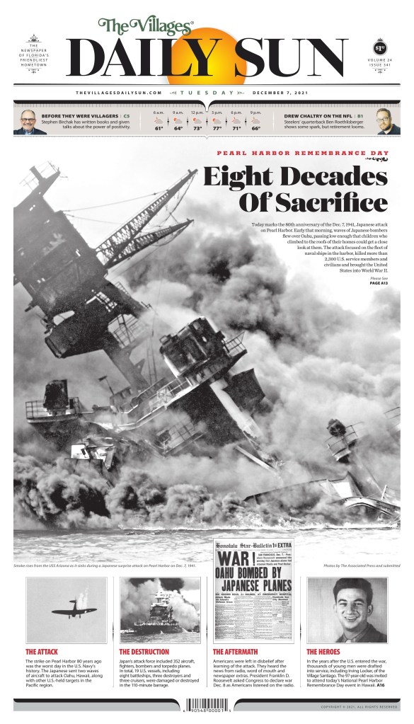
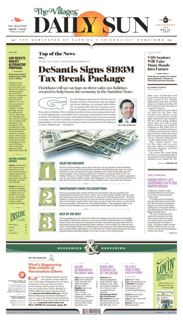
The Villages Daily Sun Florida
I have made it no secret that I love The Villages Daily Sun, a paper with a print-first mentality. Print FIRST!! Like Reporte Indigo, the designers here put a lot of effort it all the time. As I mentioned in my post on Adam Rogers and Colin Smith, they also worked hard to match the design to the community. That’s incredible. Unlike a lot of papers, there is never any doubt when you’re looking at a Daily Sun page. Branding, baby.
But back to effort. All I need to say is just look at this page. Mind. Blown.
Not a lot of papers went big with the 80th anniversary of Pearl Harbor, but the Daily Sun did. And it’s striking. Newspapers need to look forward, but they also need to look back.
And a few more.

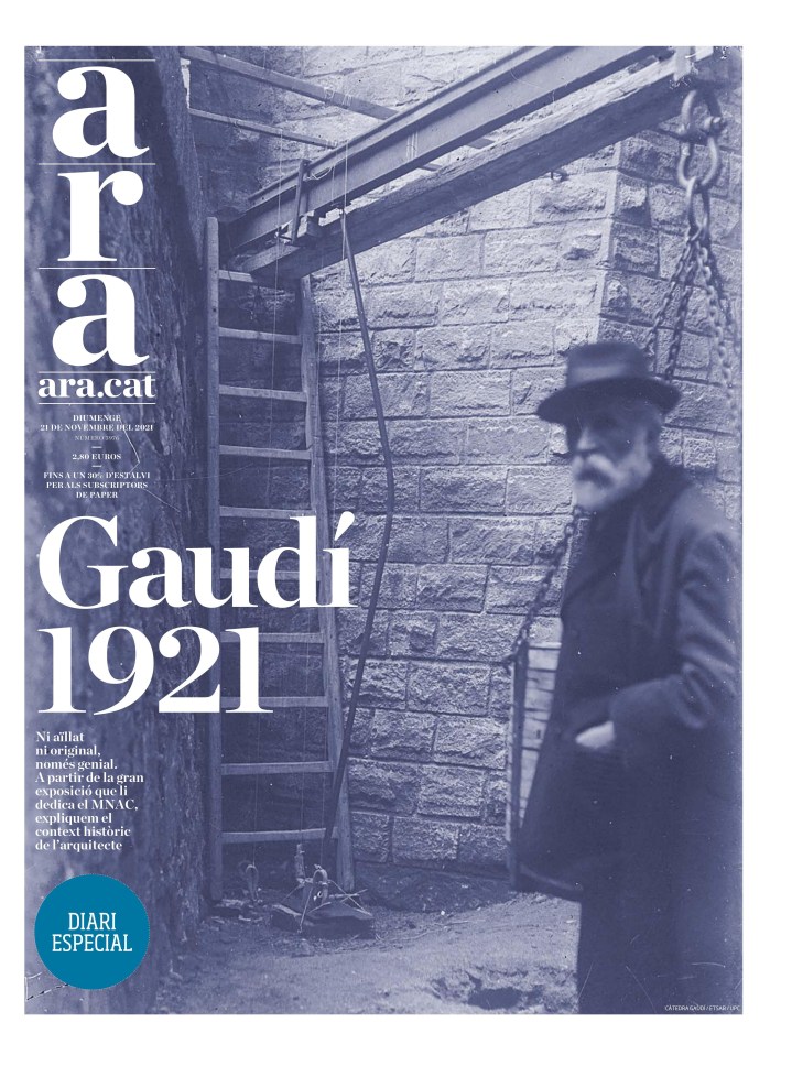
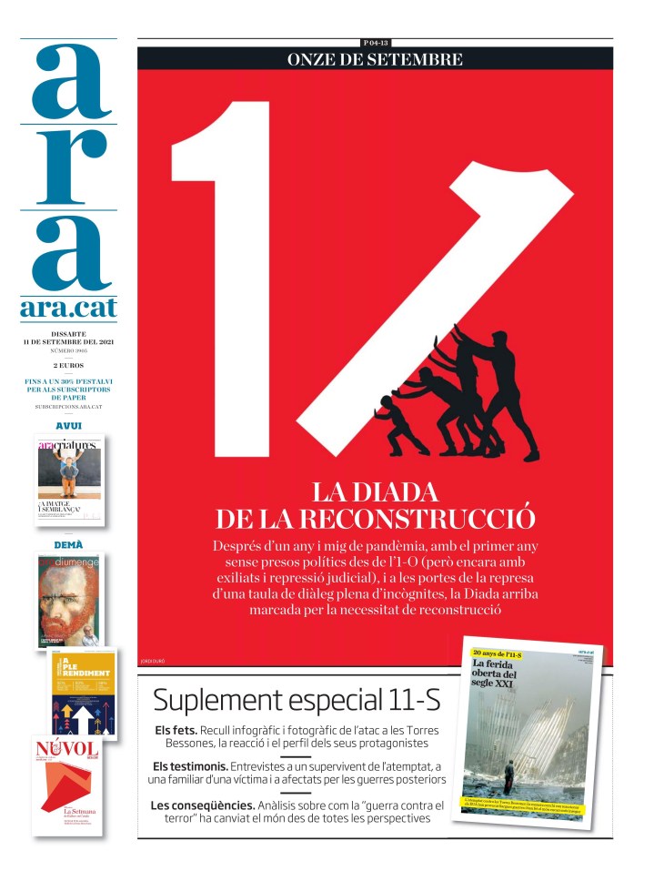
Diari Ara Spain
Diari Ara grew on me slowly. But I kept seeing pages that clearly had a lot of thought put into them. And then I saw one I loved. And then another. This one struck me and I’m still not precisely sure why yet, but I just loved it. It speaks to me. I do love a good sepia tone. And the blurry person. It adds mystery.
This was one of my favourite 9/11 pages, marking the 20th anniversary of the tragedy.
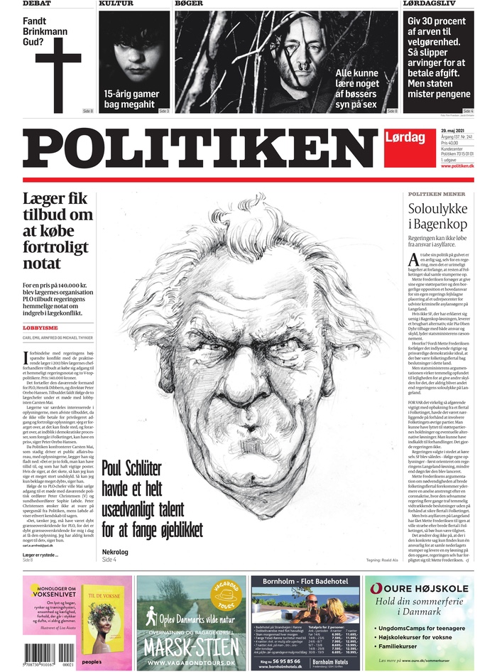
Politiken Denmark
Politiken has a harder news feel than some of the others. It uses sketches, less colour, often plays on the the white, red and black in its design, leaving other colours to wish they were invited to Politiken A1 party.
So … when they use colour … boom! The paper often has such a hard feel to it. Then Christmas Eve, and here is this beautiful page. I have no idea why or what, but I love it.
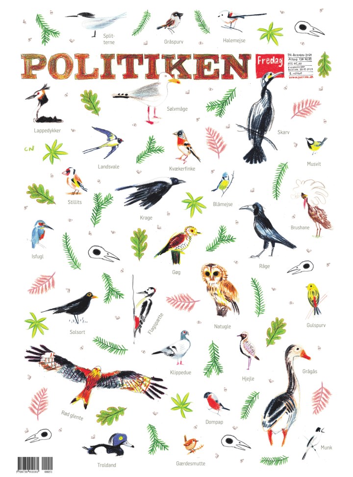
And just a few more from very little colour to a lot of colour.
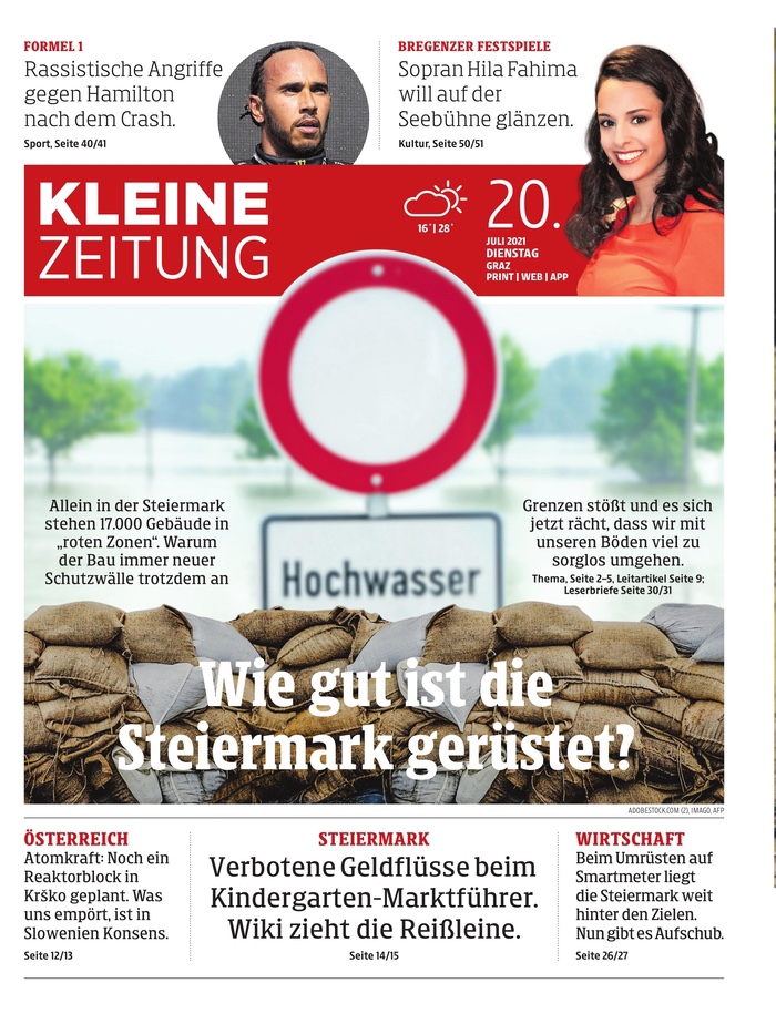
Kleine Zeitung Austria
Another tab, and more great work. There aren’t a lot of papers like Kleine Zeitung in North America. There are tabs of course, but I don’t see things like this. It’s a lovely paper, doing lovely things all the time. This depressing page might have been my fave of the year, right under the wire.
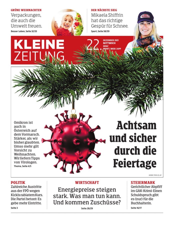
I should always translate the text, and I worry about this one. But it is striking. It’s just such a clean page, with a nice illustration as the centrepiece.
They have had so many good ones, and here are just a few more.

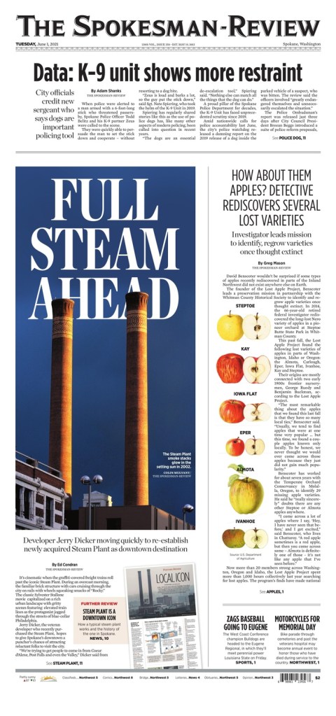
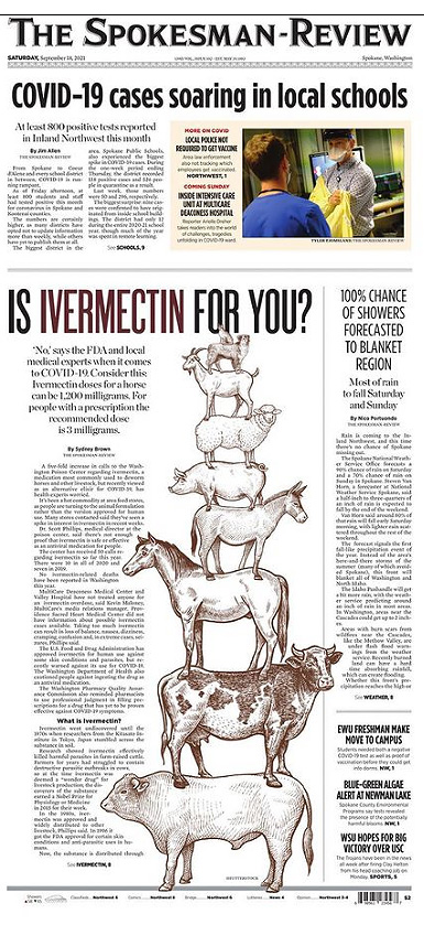
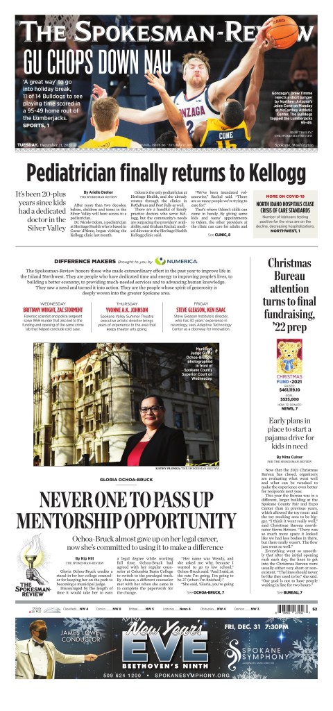
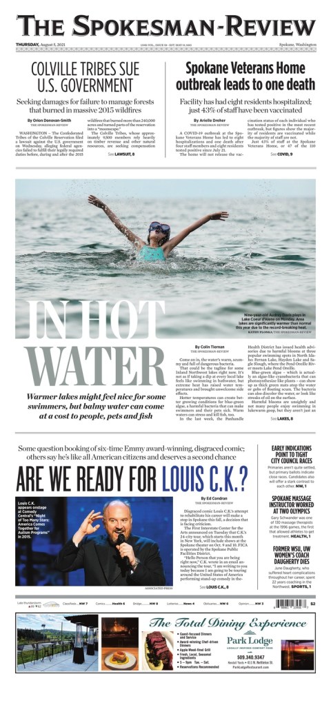
The Spokesman-Review Spokane, Wa.
I have had a years’ long love affair with The Spokesman-Review (don’t tell my paper). Anyone who follows this blog will know this as I was lucky enough to talk to Caitlin MIller, an emerging designer for a recent post. Until becoming a volunteer with the Society for News Design for last year’s Best of Newspaper Design competition, I would have said it was the best designed newspaper in the world, after the Virginian-Pilot stopped performing it’s magic. I say that with all due respect to my former employees at Pagemasters North America. They did some incredible things for the Pilot after it moved production to PMNA. But it used to be the best cover in the world most days. I digress. The Spokesman-Review has a similar feel. It lets stories breathe, it goes big, it uses its flag in design. And it continues on other section fronts. I admit I have cheated here as I lost some from page files in a phone swap, so I am including some section covers. Sorry! As a side note, some other amazing things they do: they have today’s and recent front pages on their site, inside pages from today’s pub, historical pages and they list the designer. I wish more papers did this.
I love a few things on this page. I love the big reverse text head. I love that it is played in the background. The apples, and just the air.
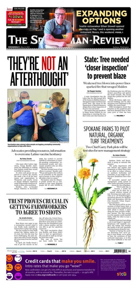
The thing about the Spokesman-Review is that it has character, a consistency. I can say the same thing about each front page, yet it never gets boring. They try new things while somehow keeping the same flavour and feel day after day. A credit to Chris Soprych, I’m sure. Again, great typography. A playful bit with the dandelion. Air. And the flag. They play with their flag all the time. When that’s your brand, that’s bold.
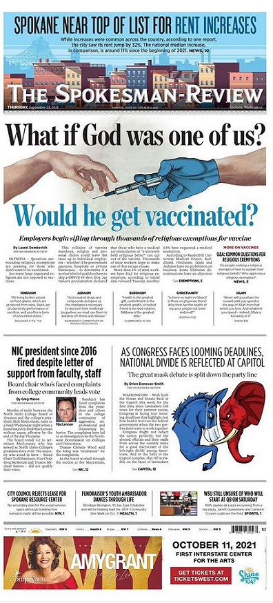
And here are a few more, with some inside pages.

Jyllands-Posten Denmark
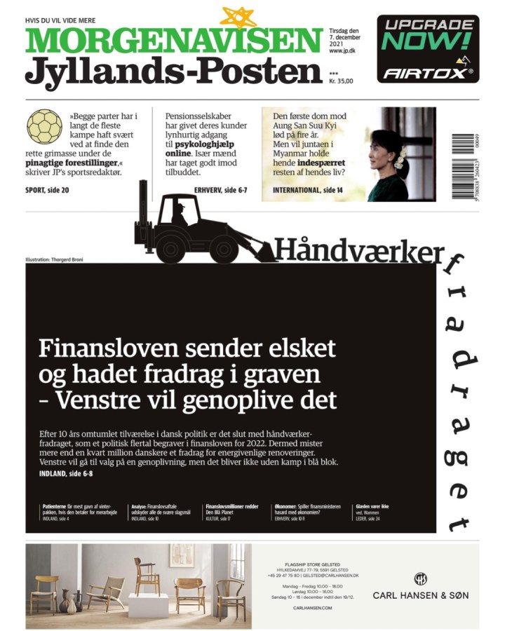
I love this tab. Just smart design, often simple and clean. It’s great. This page was my fave because of the smart and creative use of playful typography.
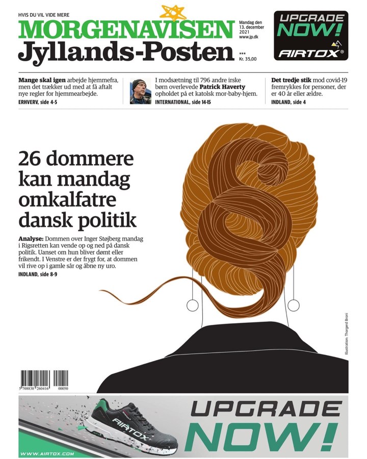
I love when newspapers do portrait-type art like this. There is no face, it’s simple, but readers will know who that is instantly. This is so nicely done.
And a couple more.
There were more from other papers. But these were my faves from papers who frequently went above and beyond. I am excited to see what 2022 brings, but I hope for more like these.
