By Brad Needham
When it comes to fashion and trends, Europe tends to be ahead of North America. But what about newspapers? You can spot European fashion at a glance. You can also typically spot European newspapers at a glance. They are different. Fewer broadsheets, more rules, crisp and clean designs, the typography more often used in different ways. Those who follow my Instagram will have seen pages from a lot of these publications as I feature them all the time.
I have already posted about Canada’s best and America’s best. This post will feature some of my favourite newspaper pages submitted to the Society for News Design‘s 44th creative competition from outside of Canada and the U.S. Most are from Europe, but not all. I have covered the best from Canada (home team bias) and the U.S. Now the rest. But the world is a big place outside of Canada and the U.S. That will make narrowing down the the choices of pages in this post a challenge.
RELATED: Results from SND44
Before I jump into the top papers (which I am classifying as Die Zeit and Weekendavisen, both finalists for the competition’s World Best Designed Newspaper, as well as the remaining papers in the top 10 in awards, de Volkskrant, Politico and South China Morning Post), I am carrying on a tradition I started last year to make it official. While my role was muddied this year, I am still calling this a Facilitator’s Special Recognition.
Facilitator’s Special Recognition
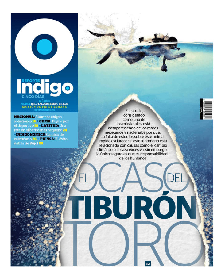
There are thousands of entries. I try to go though as many as I can, but I can’t get through them all. As I was going through this year’s entries, I thought one of my favourite publications was absent. But then I saw it. Reporte Indigo from Mexico is one of those publications that leaves me chuckling every day at how much effort is put in, and how great every edition is. Shaking my head in a awe-struck kind of way, asking how do they do it? There isn’t a dud. Some are stronger than others, but they’re all great. I wish they would submit more entries. While I can’t speak for how the judges would react, I love this publication. This spread does so much for me. The sketch and then sketched flag (I did this once, with both drawings much more rudimentary, though intentionally so!), the beautiful illustration, the amount of information. I fell in love with Reporte Indigo at SND42. A page from this publication left me biting my tongue listening to the judges speak. They gave the page an Award of Excellence, but I wanted more. I have included that page below. But first my special recognition.
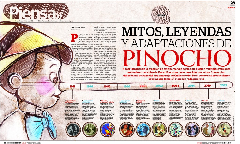
Here is the first page that made want to scream to the judges, give it a medal! It’s worth it! This was from SND42. It’s the page that made me love this publication. I hope to see more next year!
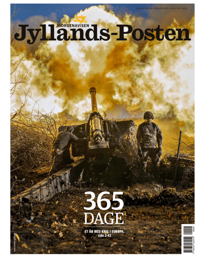
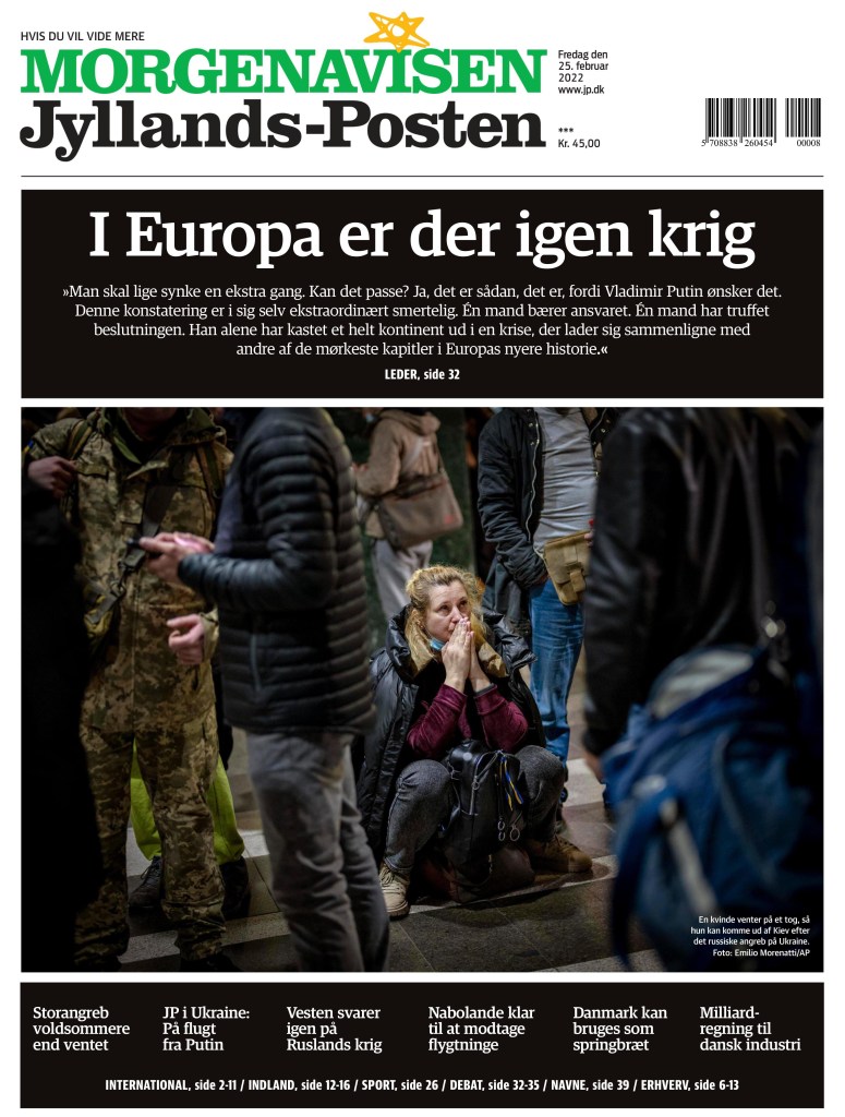
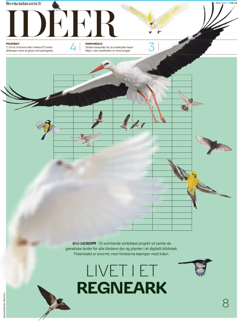
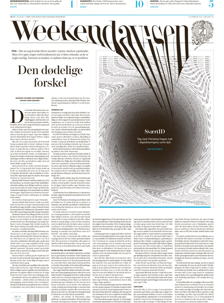
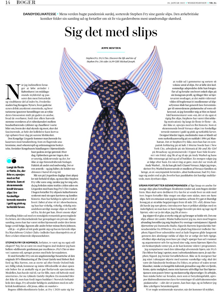
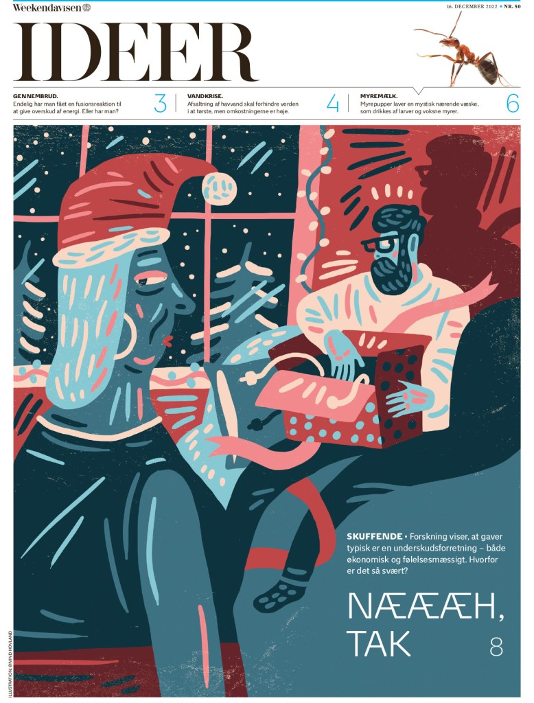
Weekendavisen
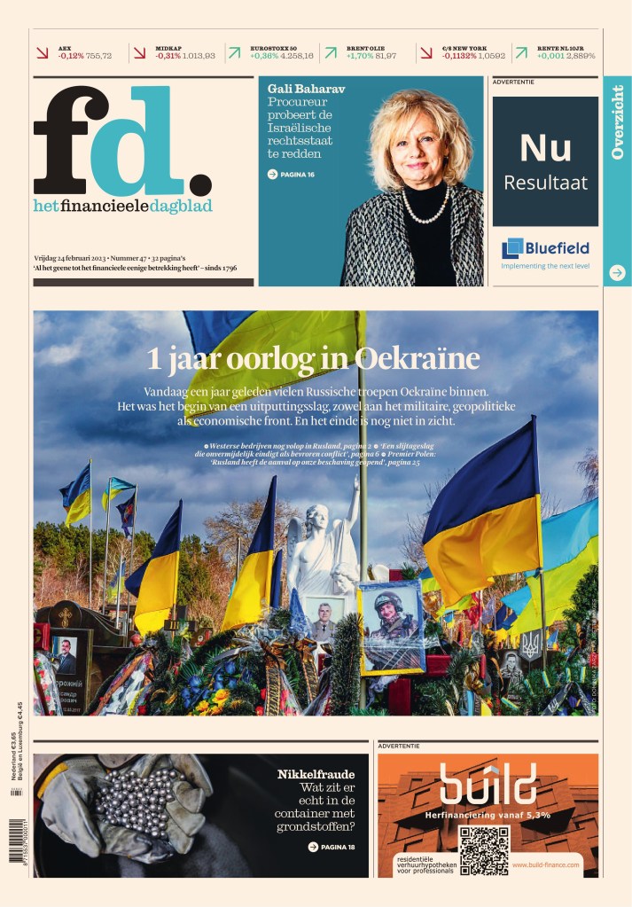
This Dutch paper is so elegant. That is a theme among a lot of European papers. They are beautiful and clean. This page uses such a nice illustration, but it works so well around the flag and text on the page. It’s more than just an illustration.
This is a smart cover. The text from the flag feels like it’s being sucked into the blackhole. I love it when newspapers are willing to play with their name plate.
I also love when newspapers use text in design (you will see more of the is with Die Zeit. In fact, you will see one that’s quite similar in concept!)
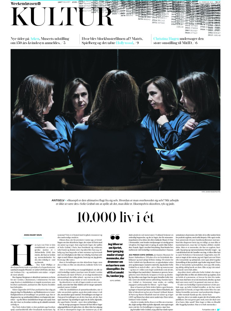
And here are a couple more. Just so well done, with so much attention to even small details. One is an inside page that has a classic European compact/tabloid look.
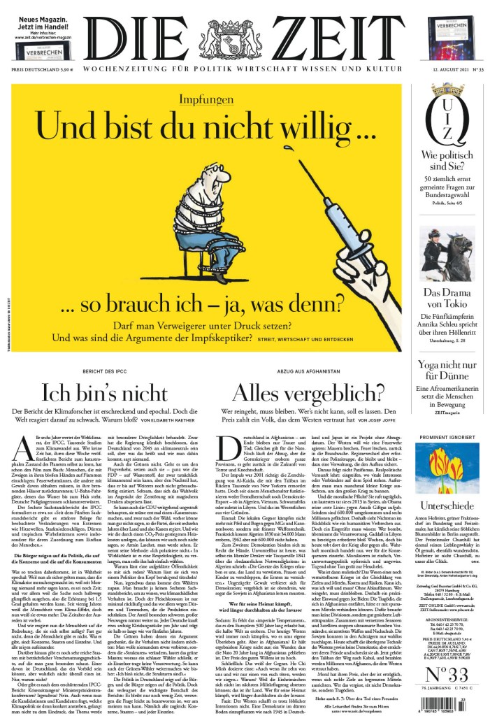
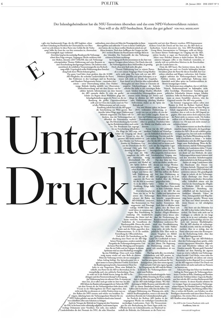
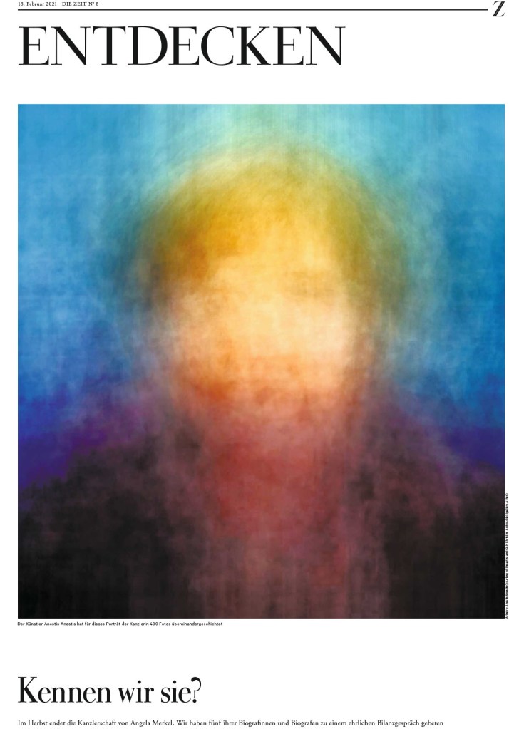
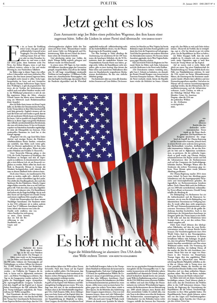
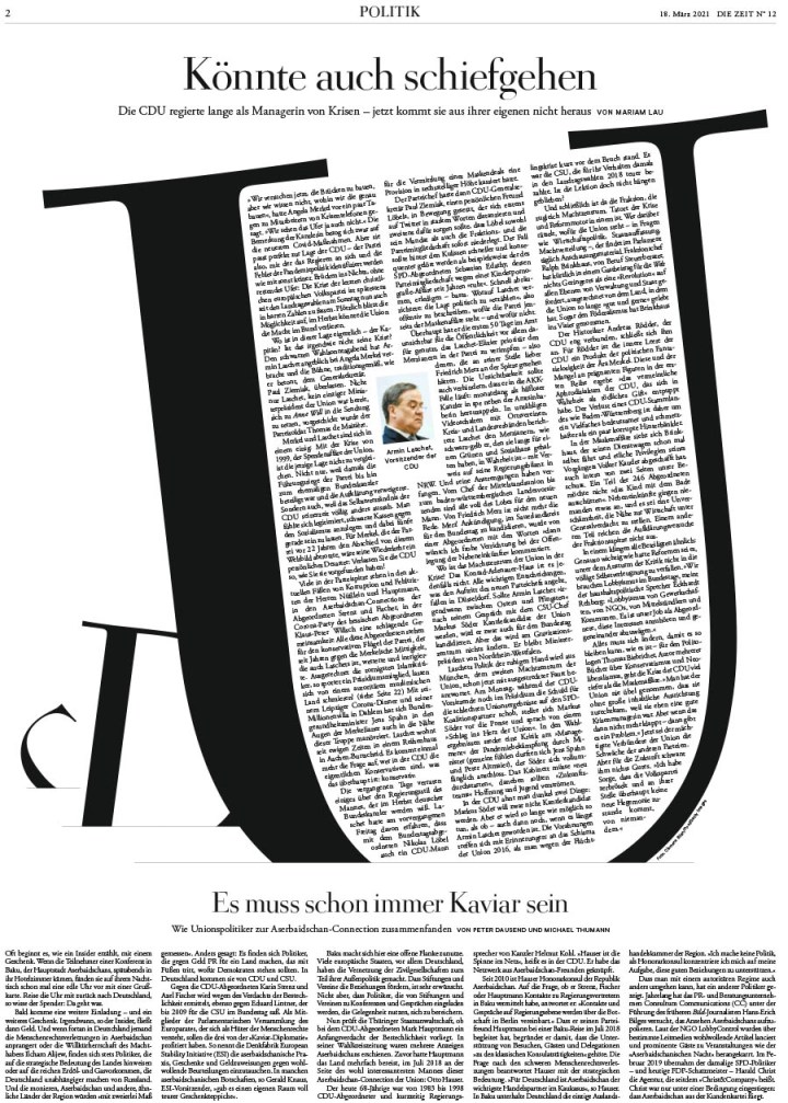
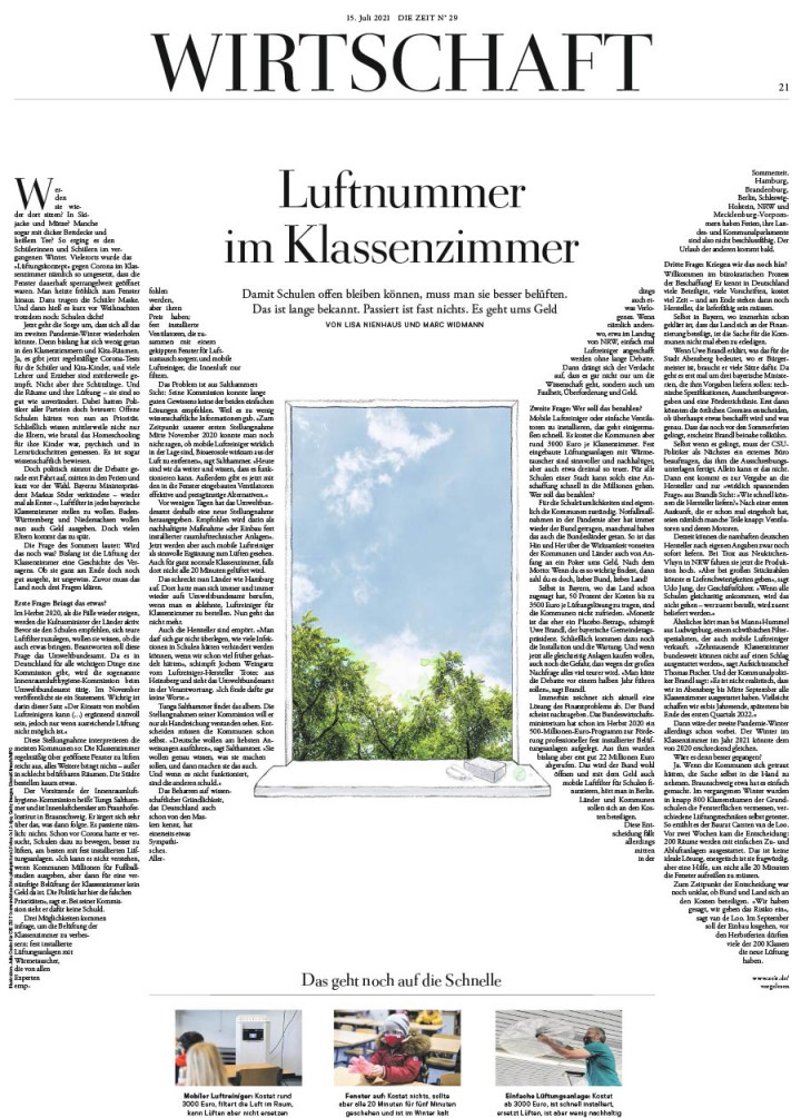
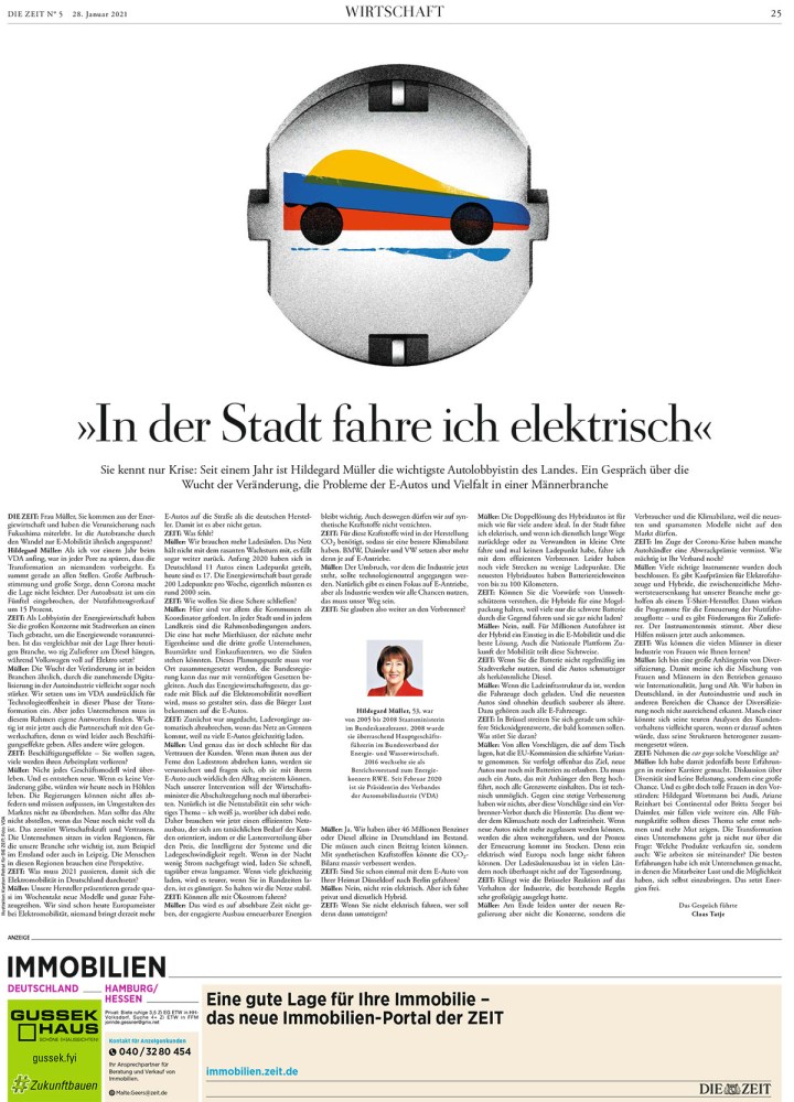
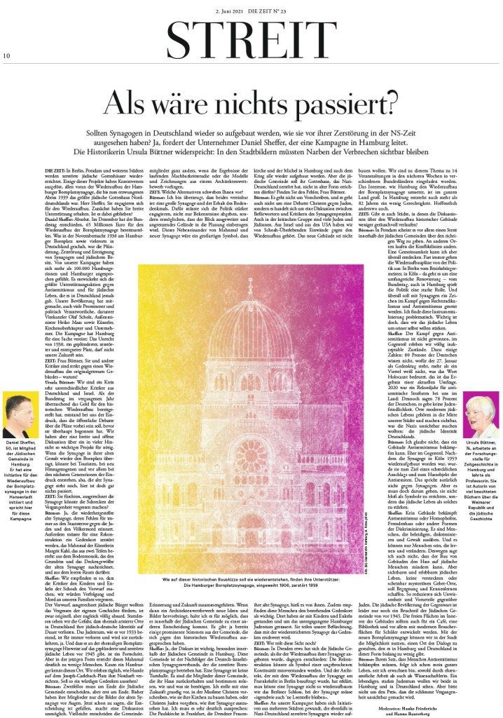
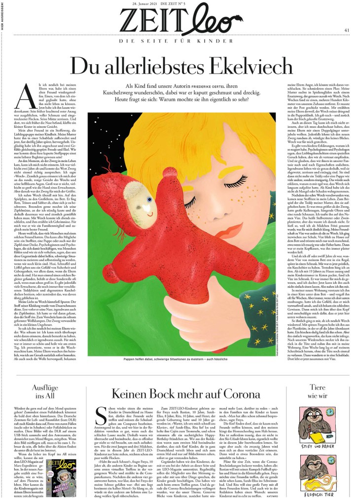
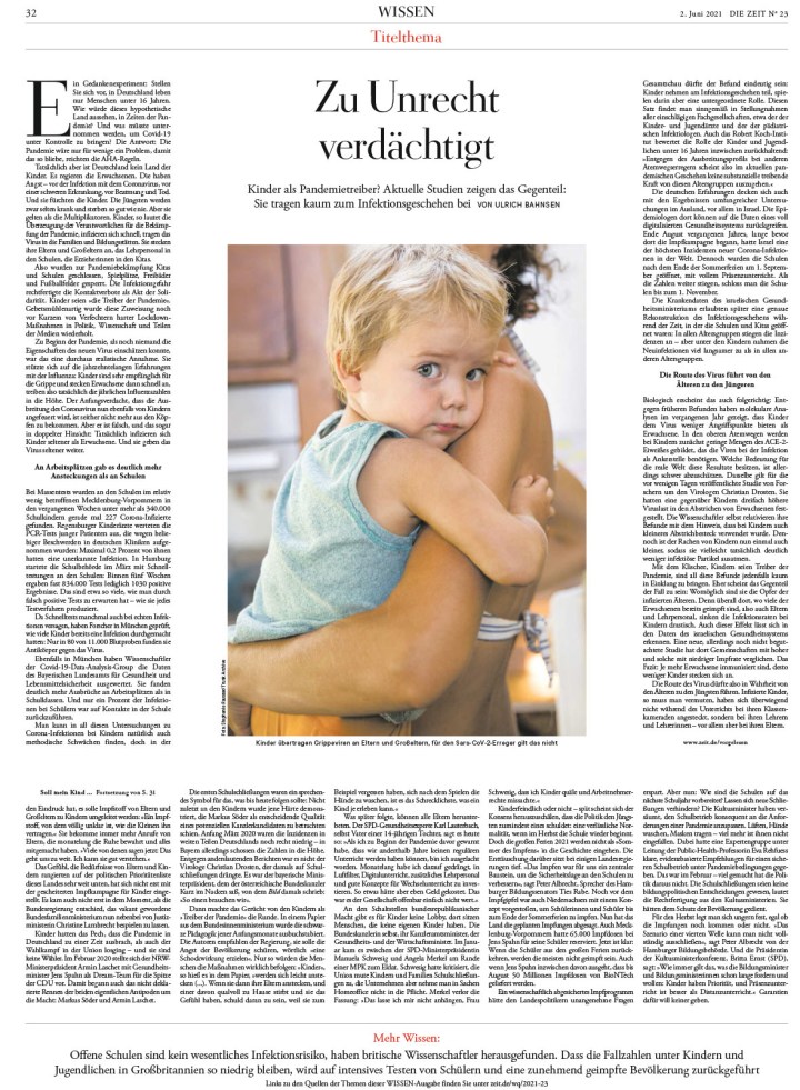
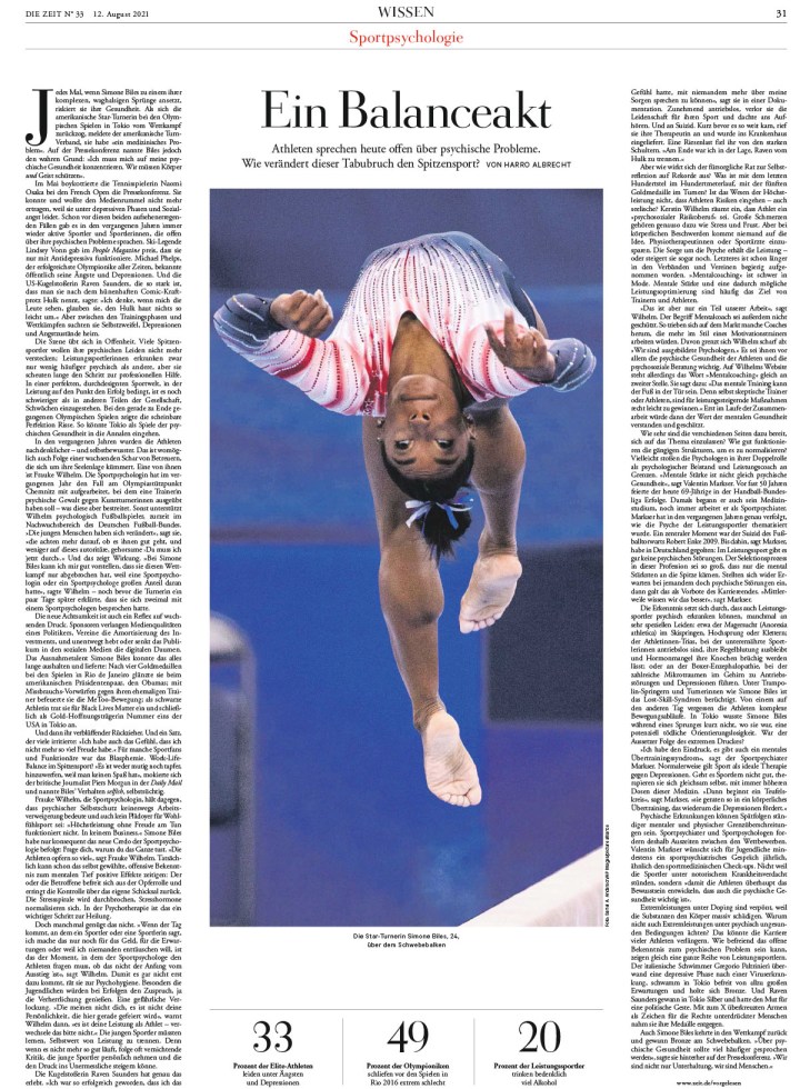
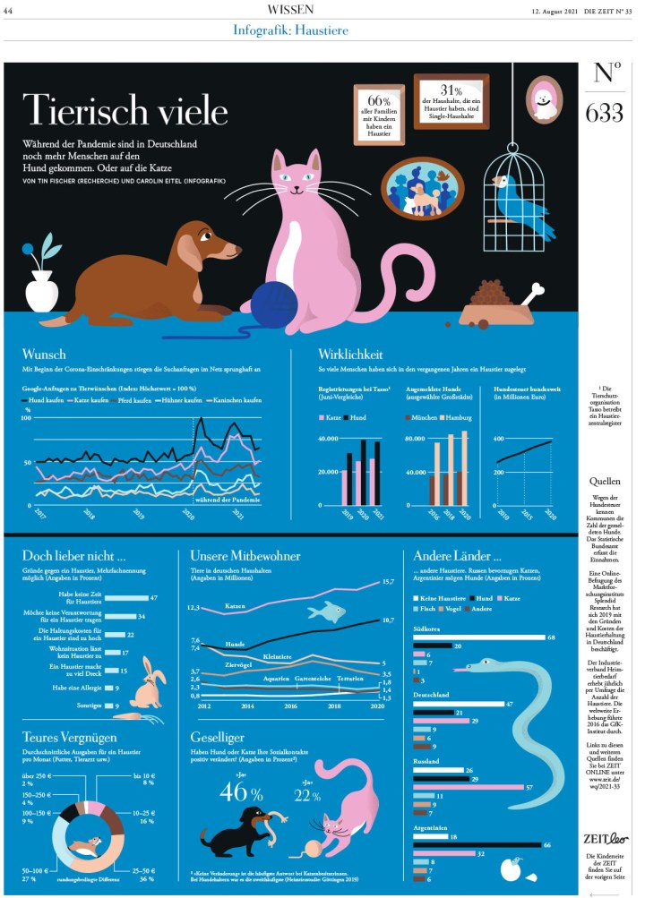
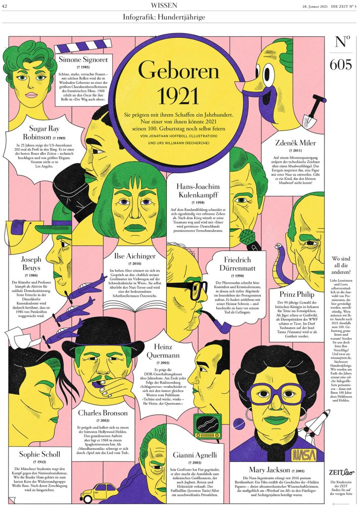
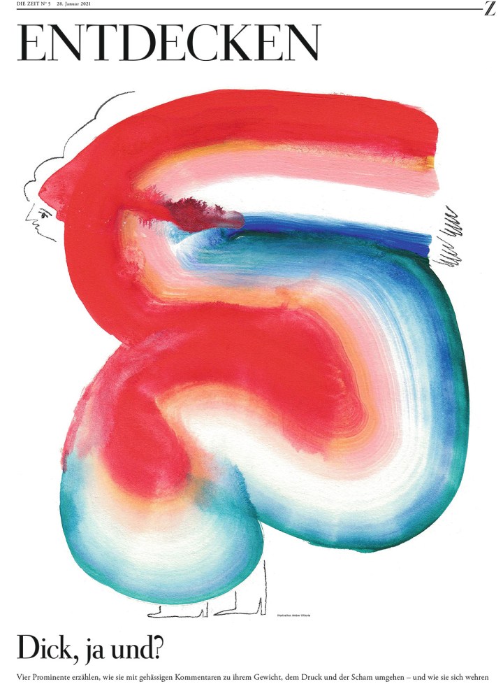
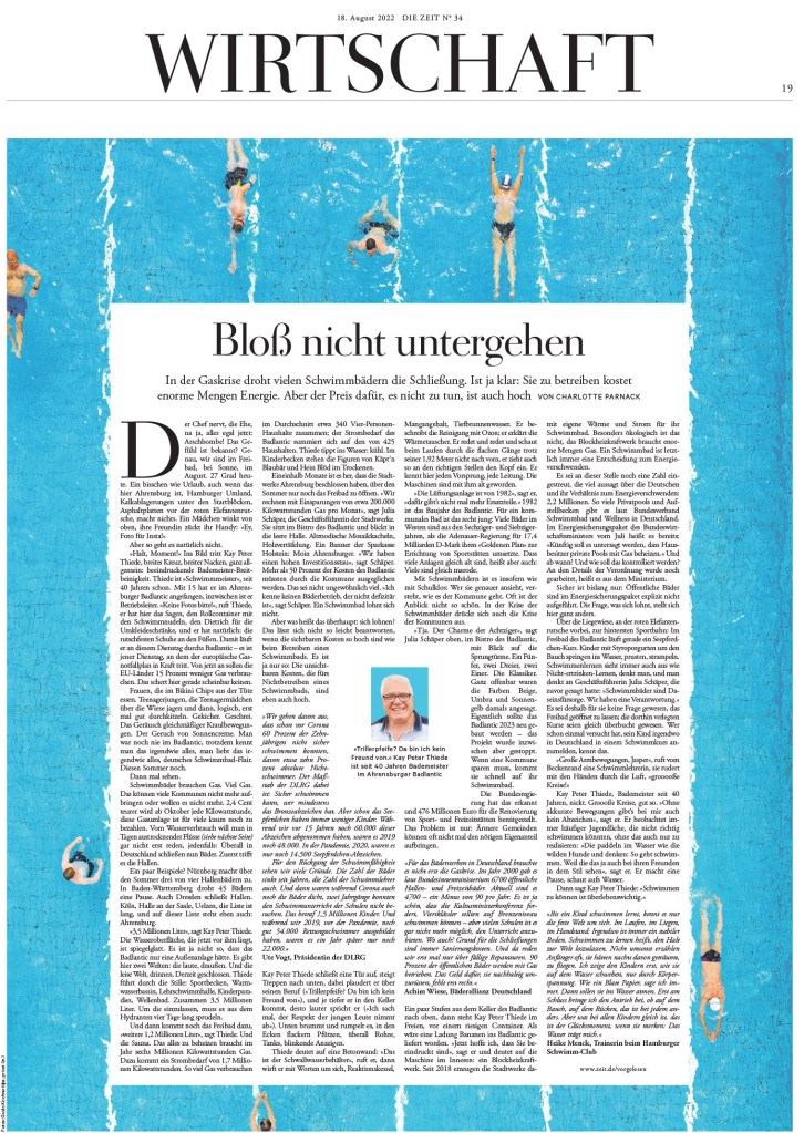
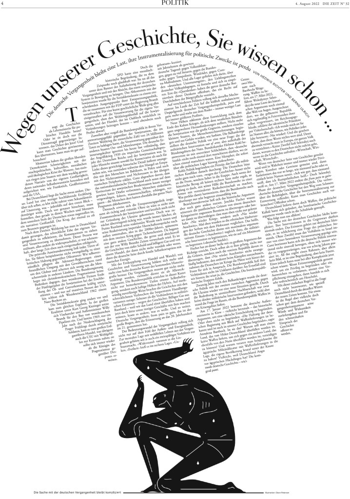
Die Zeit
This German paper, last year’s World’s Best Designed winner and in contention again this year, could be talked about with some German stereotypes. It is exceedingly well organized and very consistent throughout. There are few papers in the world as consistently consistent! And it is one of the best at using text in design. But on top of being consistent, it has some pages that surprise. Some that are very bold.
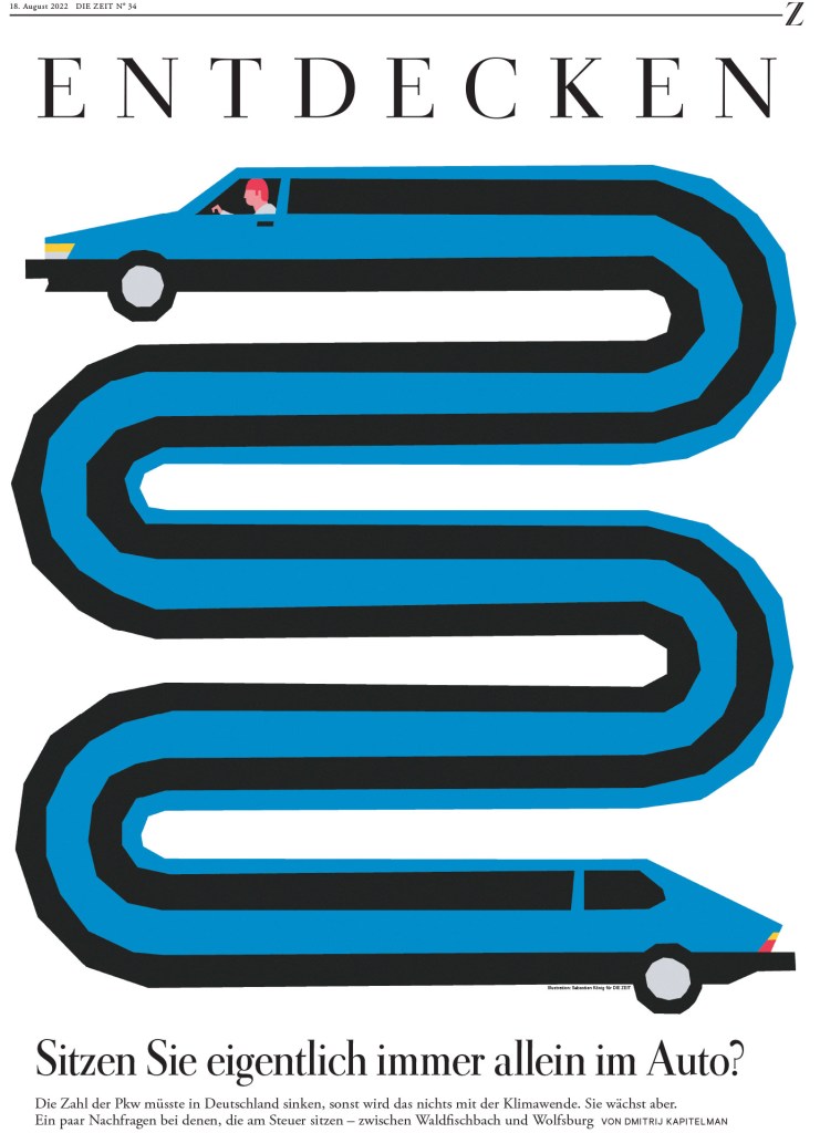
Here is the page that had a similar design and concept to the Weekendavisen one above. Who did it better? We’ll call it a tie.
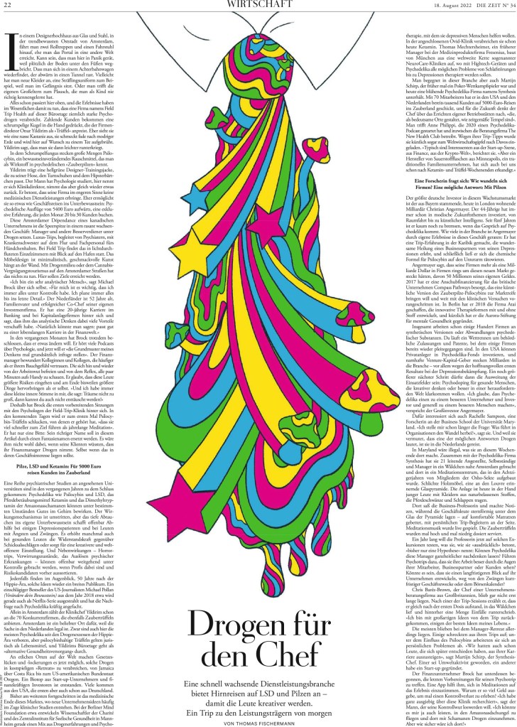
The designer uses the photo so well in this design. One thing that always blows me away with this paper is how much text, a volume of text that might appear dense anywhere else, it can put on a page and still have it pop. It’s almost like a sleight of hand. Grey block of text? What do mean? Look at the design …
And just a small selection of text in design, or rather text as design. I’m not sure anyone does it better.


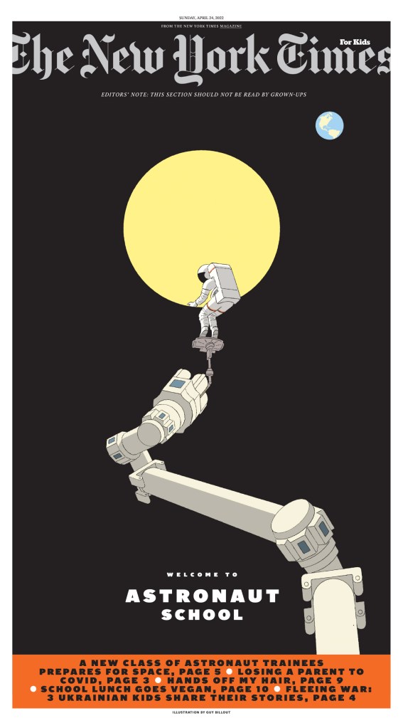
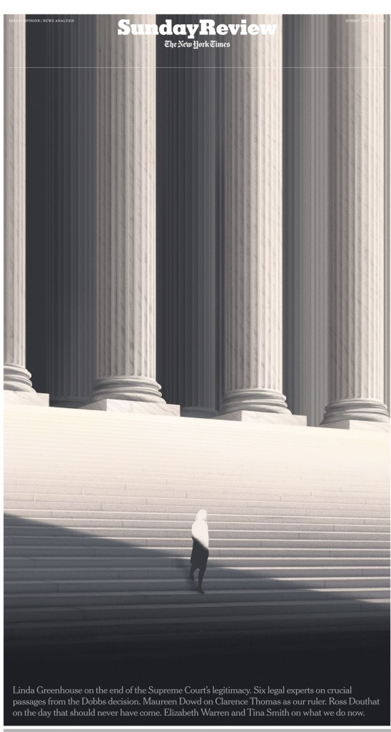
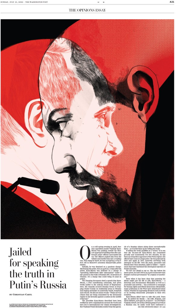
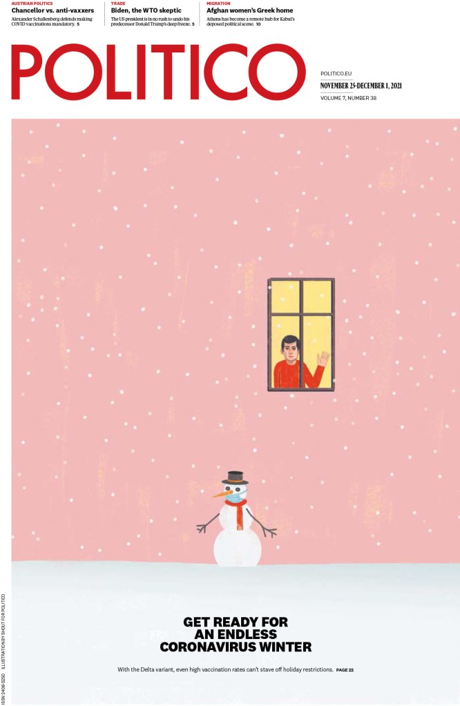
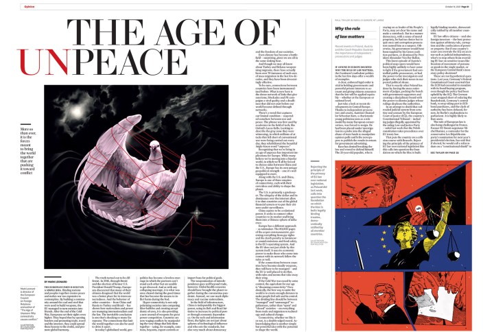
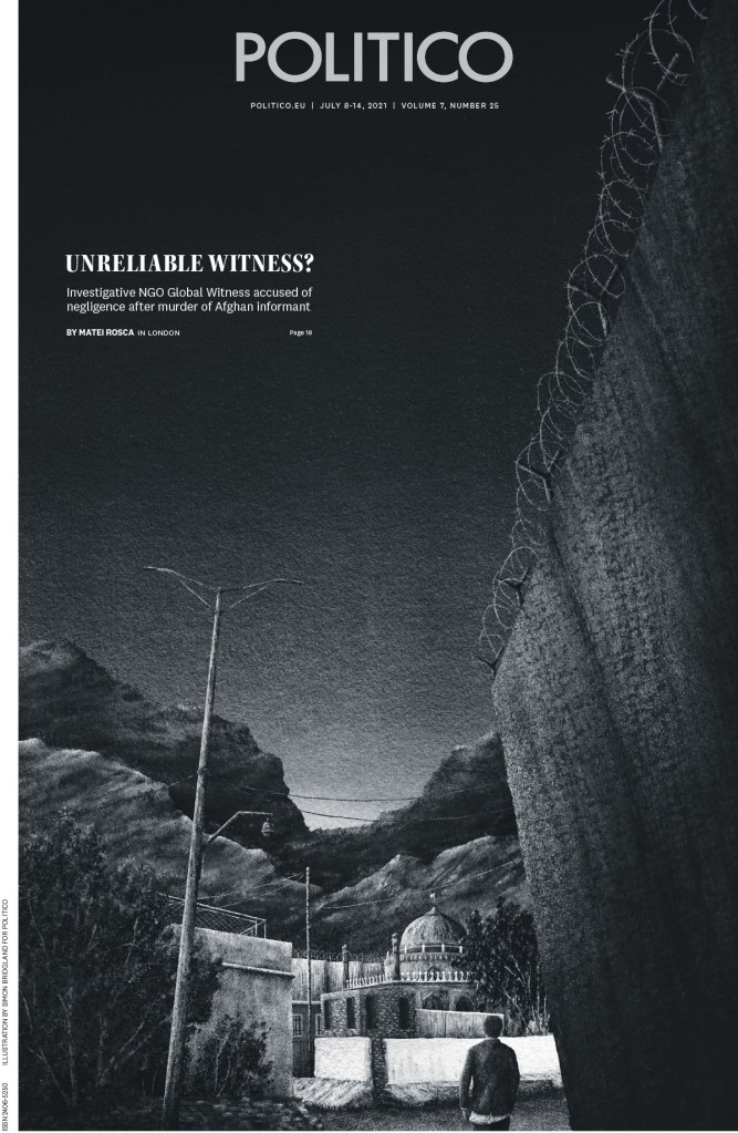
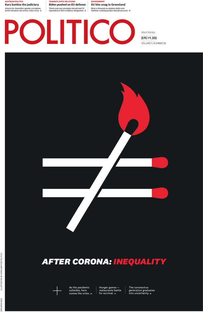
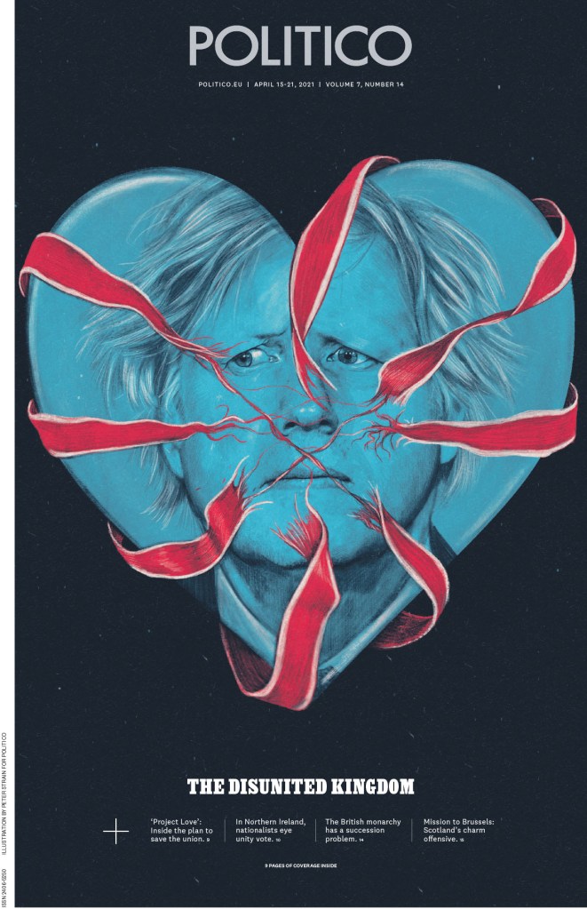
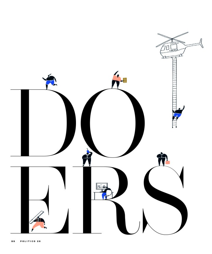
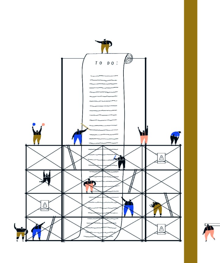
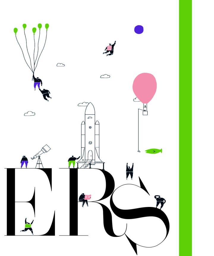
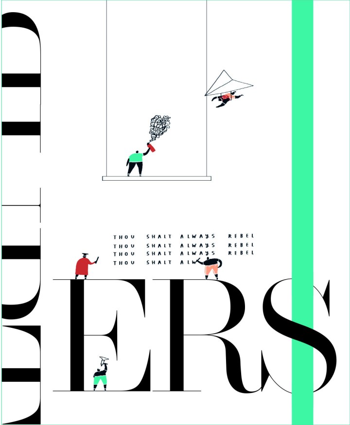
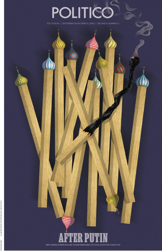
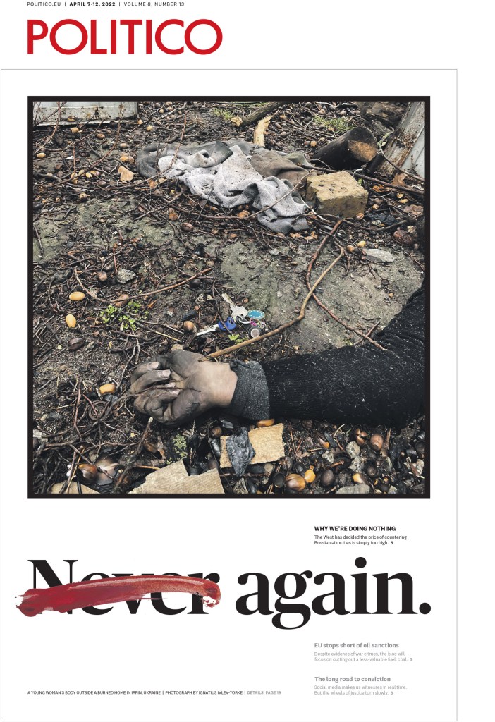
Politico
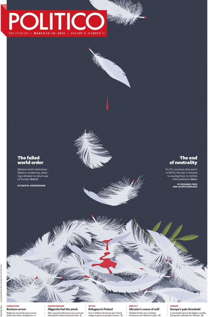
The covers of this paper are some of the most compelling around. They are illustration-driven in almost all cases, which means for them to stand out as design they must be backed by strong art direction. As the team gets it so right so often, I can only assume this is the case. Politico isn’t afraid to tackle very difficult subjects either. This first one was one of my favourite pages from the competition.
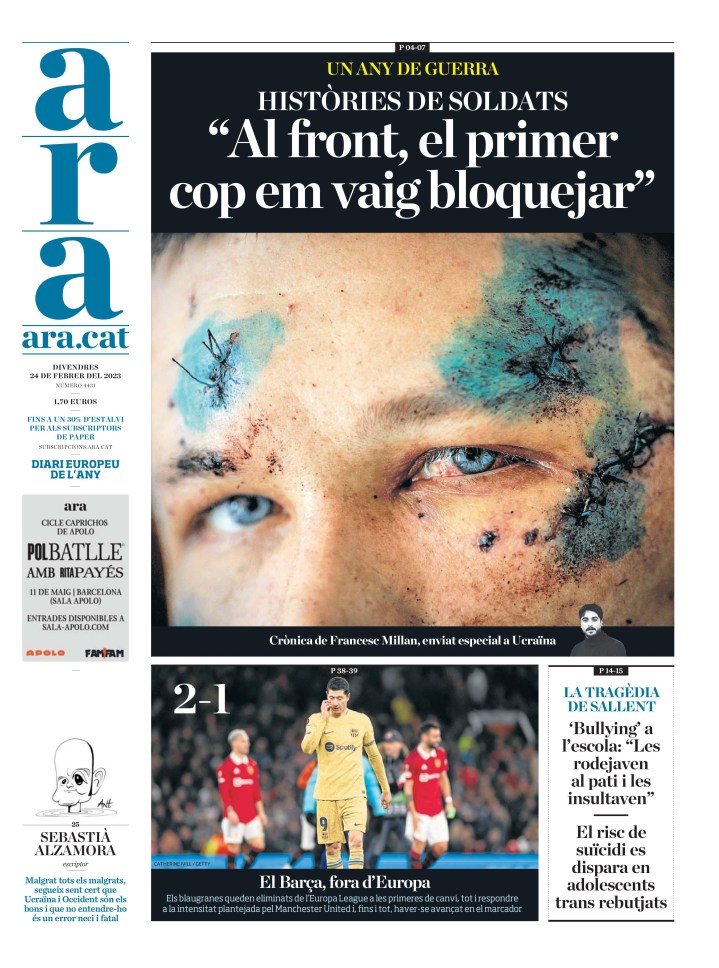
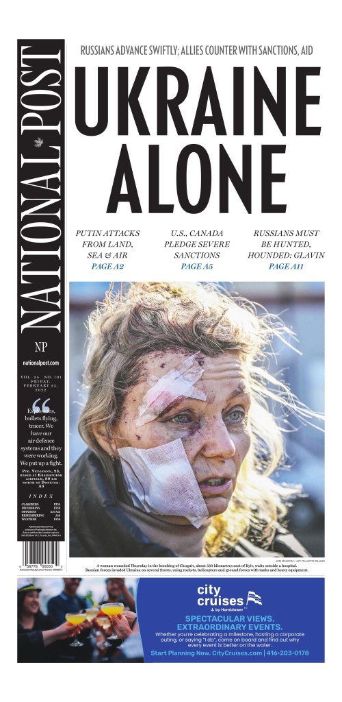
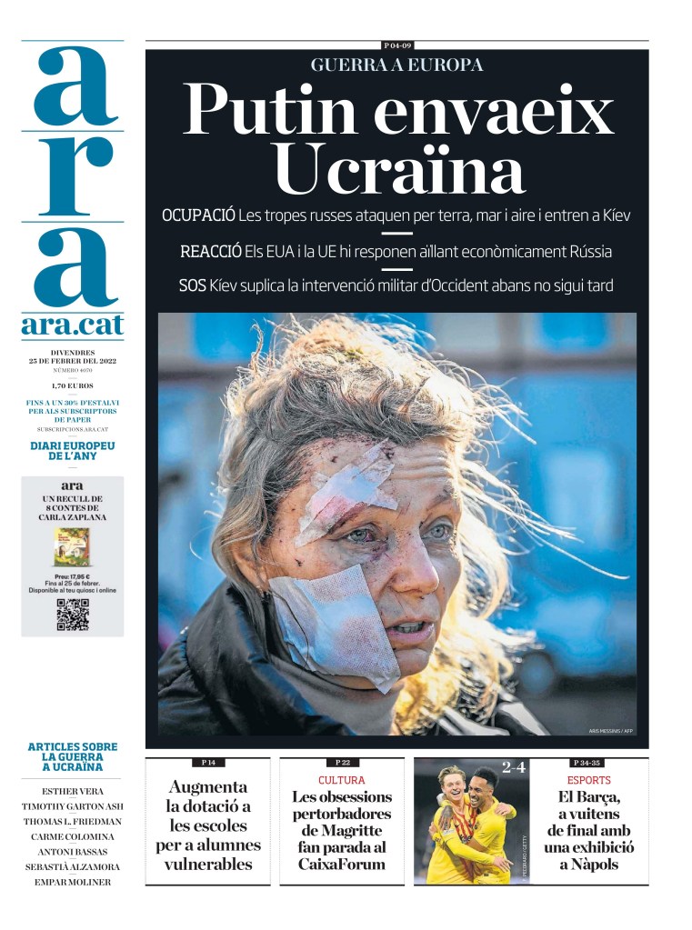
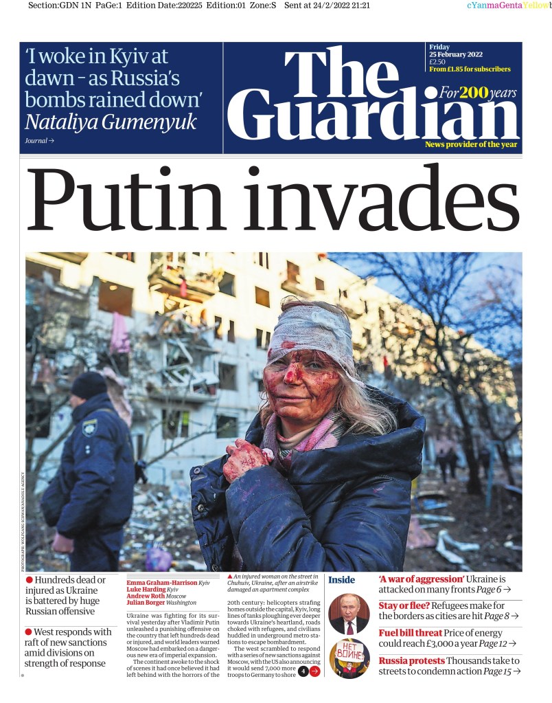
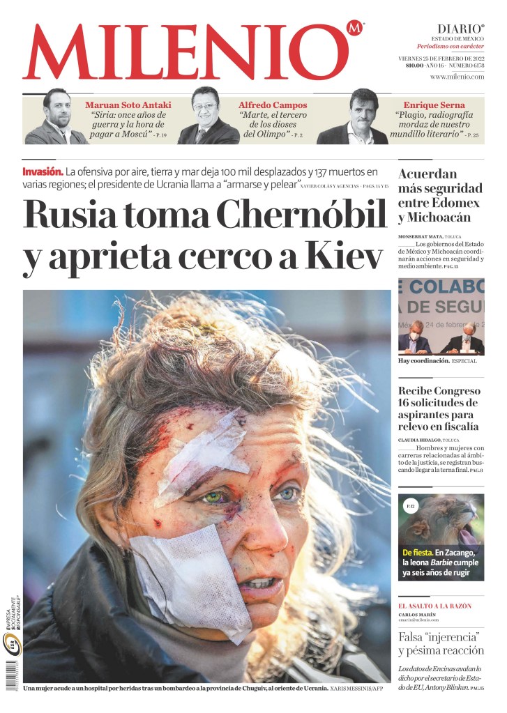
Another around the war in Ukraine. Last year marked a bit of a trend toward using darker photos. Photo editors and those making decisions often agonize over decisions like this, but in order to show the true devastation in Ukraine, dead bodies and other gruesome scenes became common on newspaper front pages. But this photo below is still so shocking, and using it like this is bold. And it has a smart headline, almost a call to action. How did we let this happen? Again?
These two spreads were near the top of my faves list as well. So simple, so smart, such little art. But it works so well. The text carries so much of the burden in the design.

And this. So much about the text but the image helps elevate. Early in my career I did a page that reminds me of this, but on a much lesser scale, where I used a shadow effect, for mine it was a dollar sign acting as a shadow for the finance minister. I will always favour pages that remind me of mine! This one is next level.

This illustration is very powerful. Taking something beautiful and making it tragic. I could show so many more for Politico, but I’ll leave it here for now.
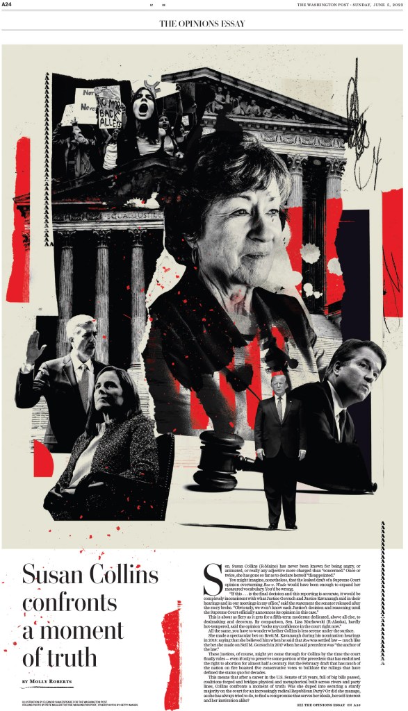
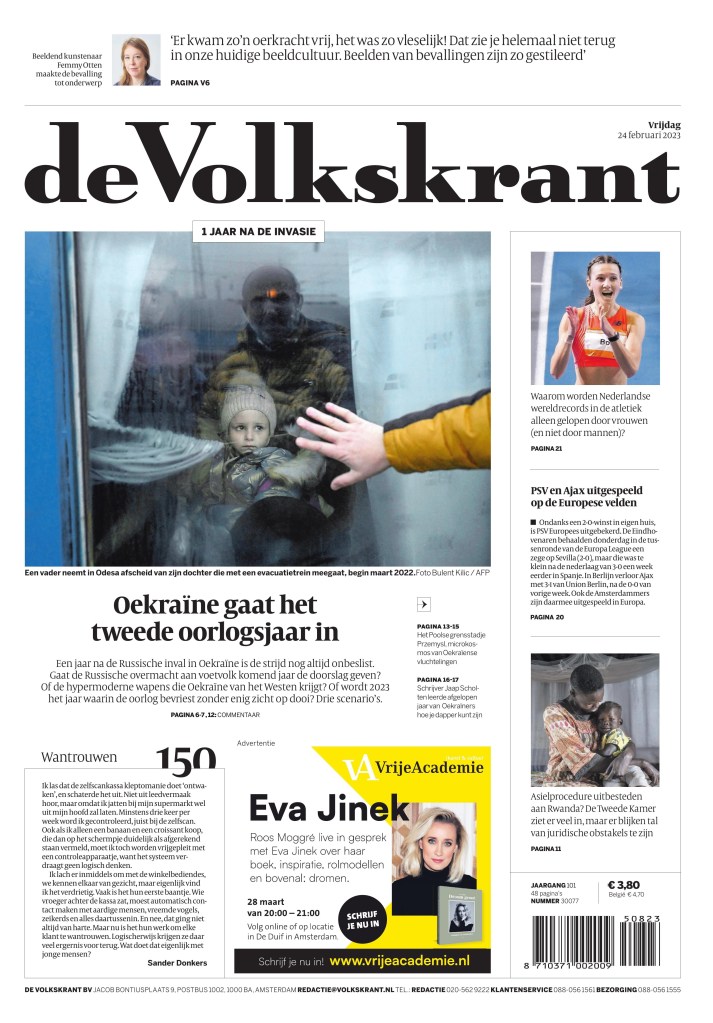
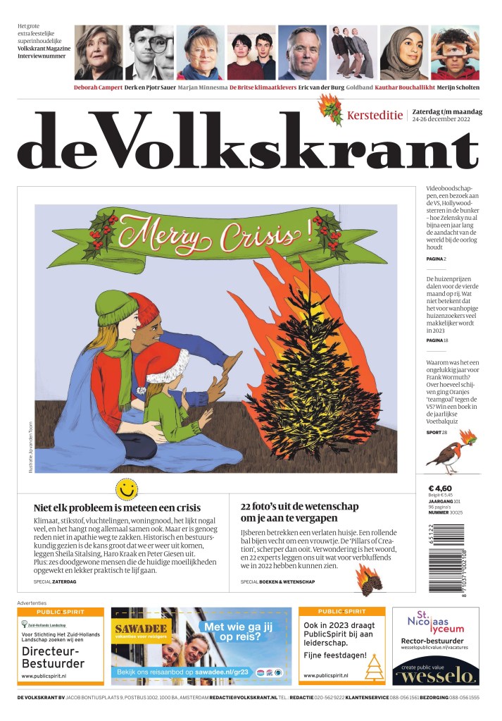
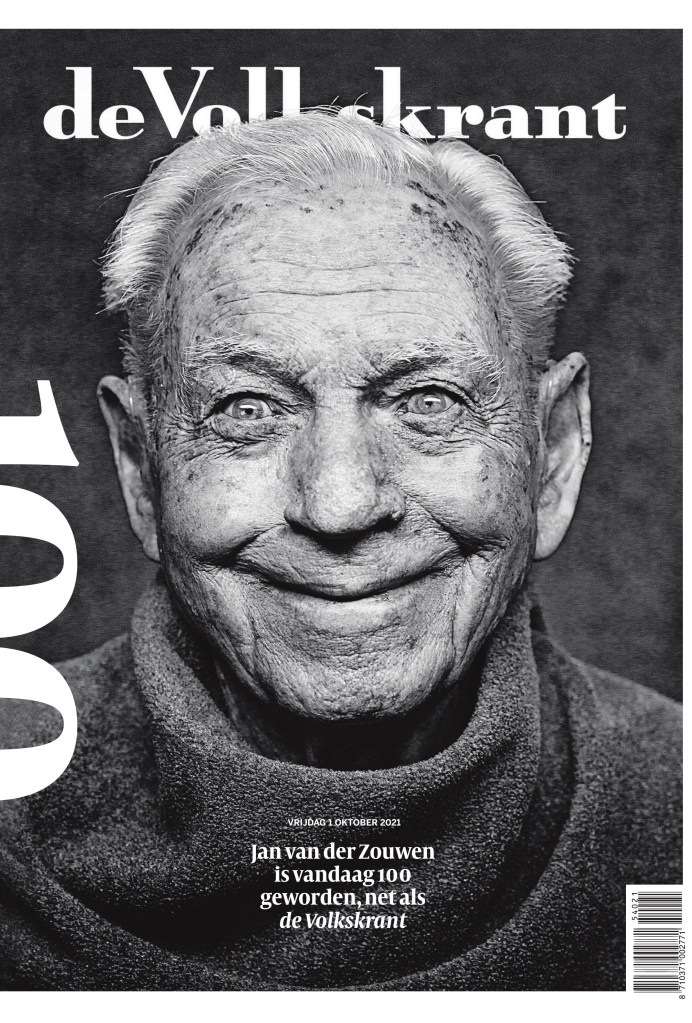
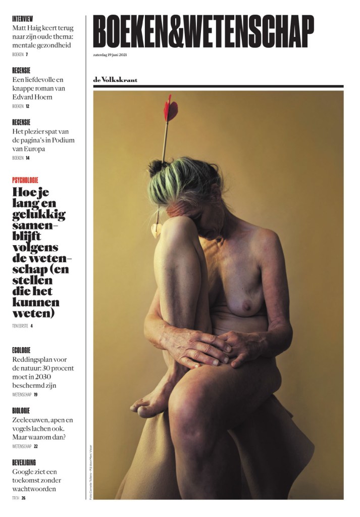
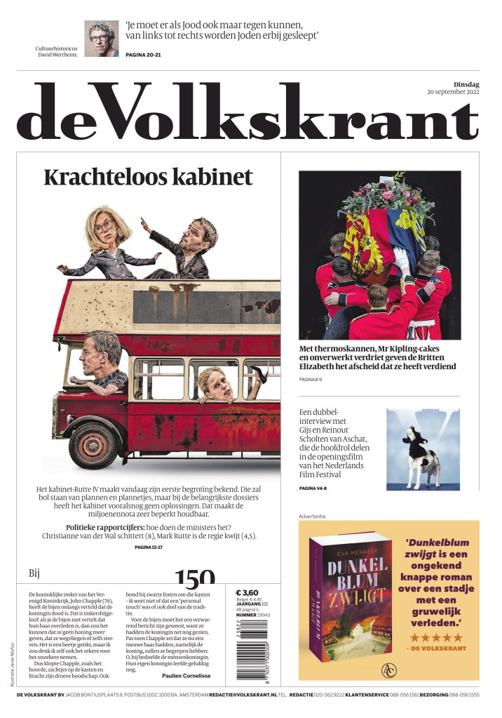
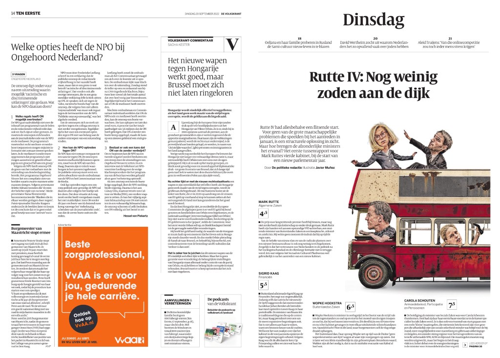
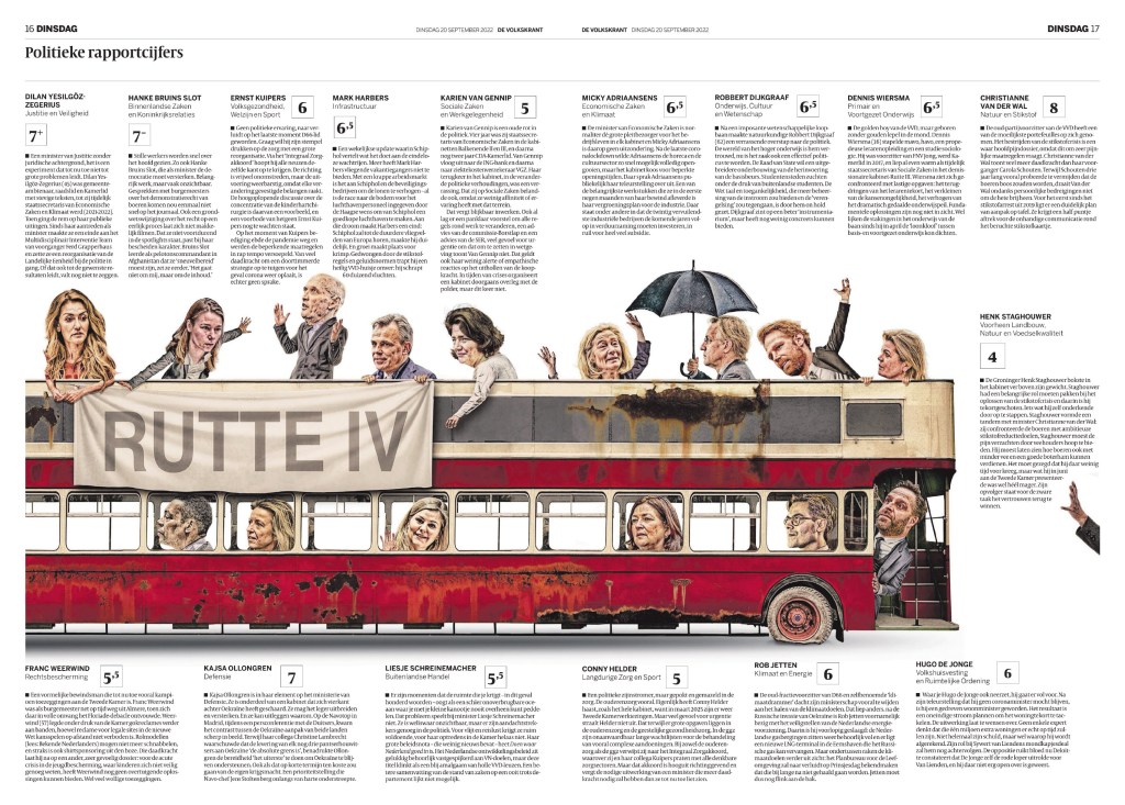
de Volkskrant
I won’t lie. I think this is one of the best designed newspapers in the world, maybe the best, but I’m not a judge. From the cover and beyond. It’s so fresh, often surprising, but still always on brand, even when it surprises. The small details. You can see many pages from de Volkskrant on my Instagram and in previous posts here.
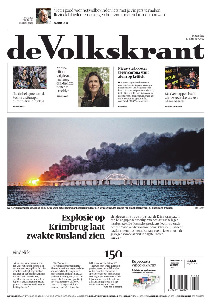
And while there are so many more incredible pages, I have chosen a few from the same edition to highlight how its commitment to excellence and consistency goes beyond the cover.
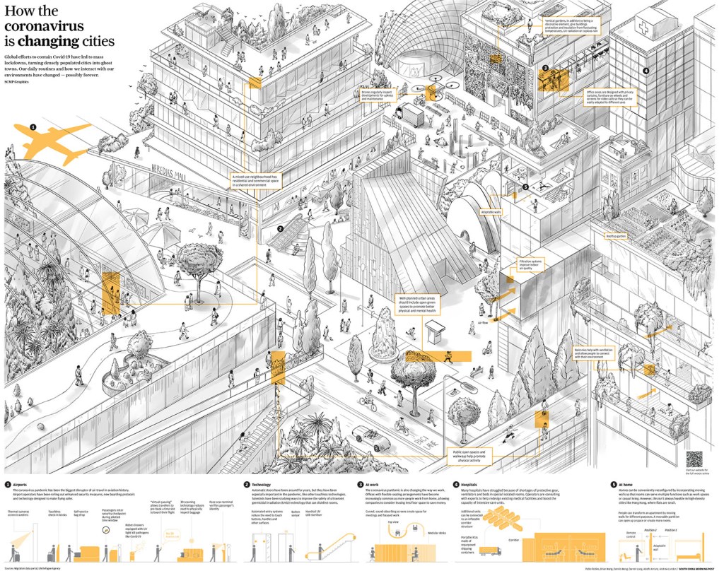
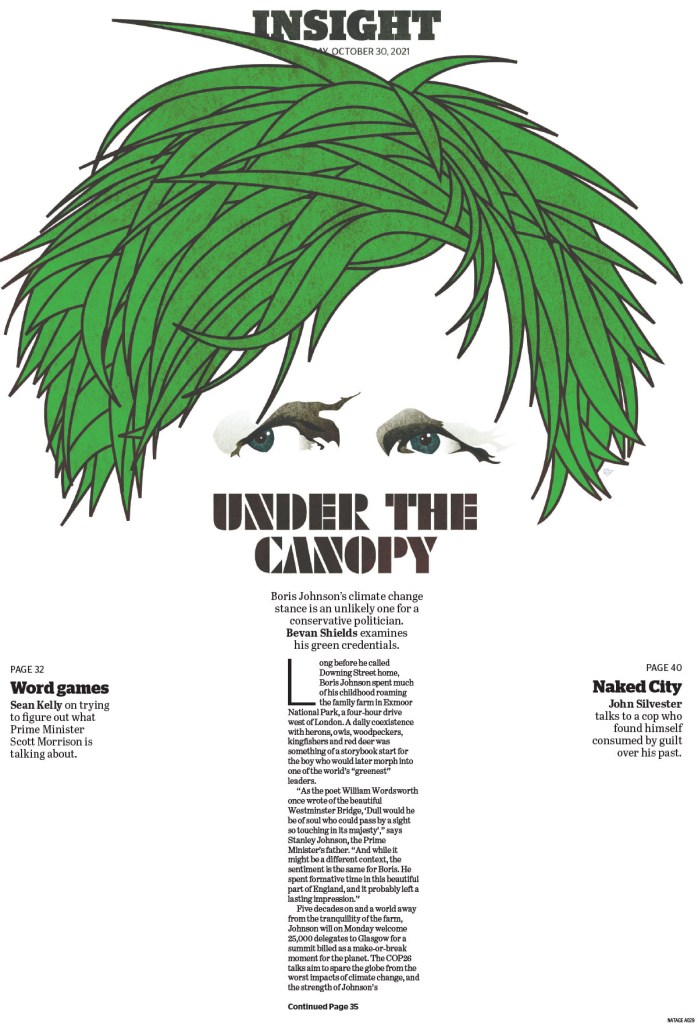
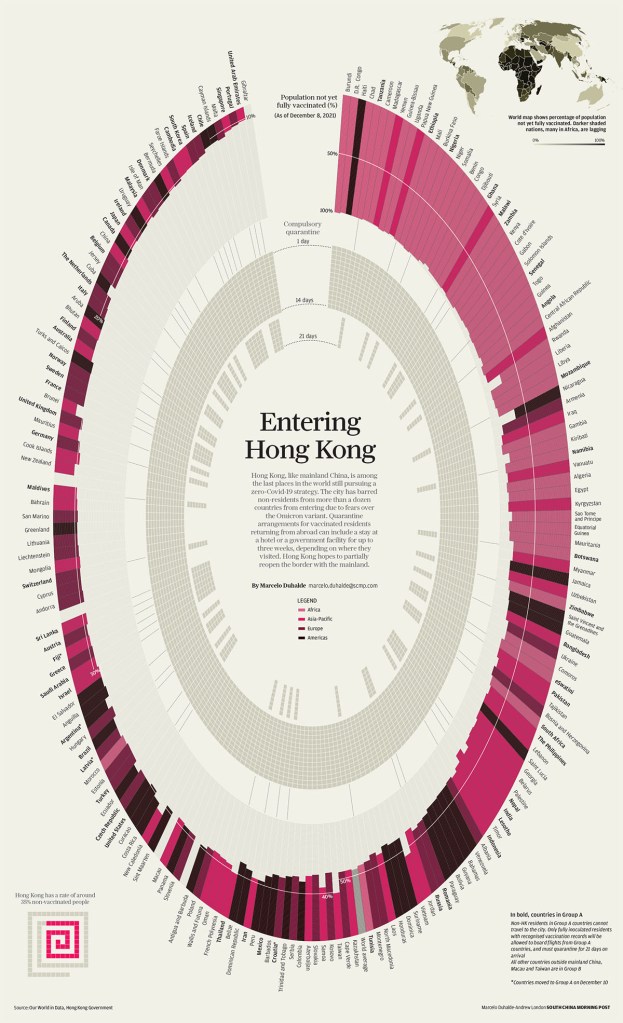
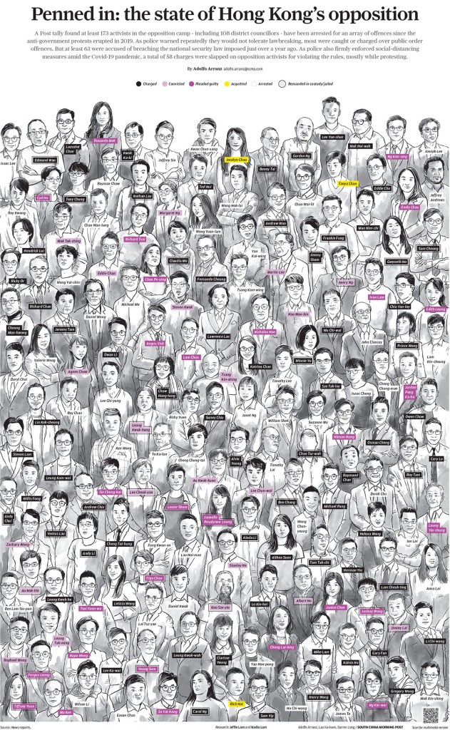
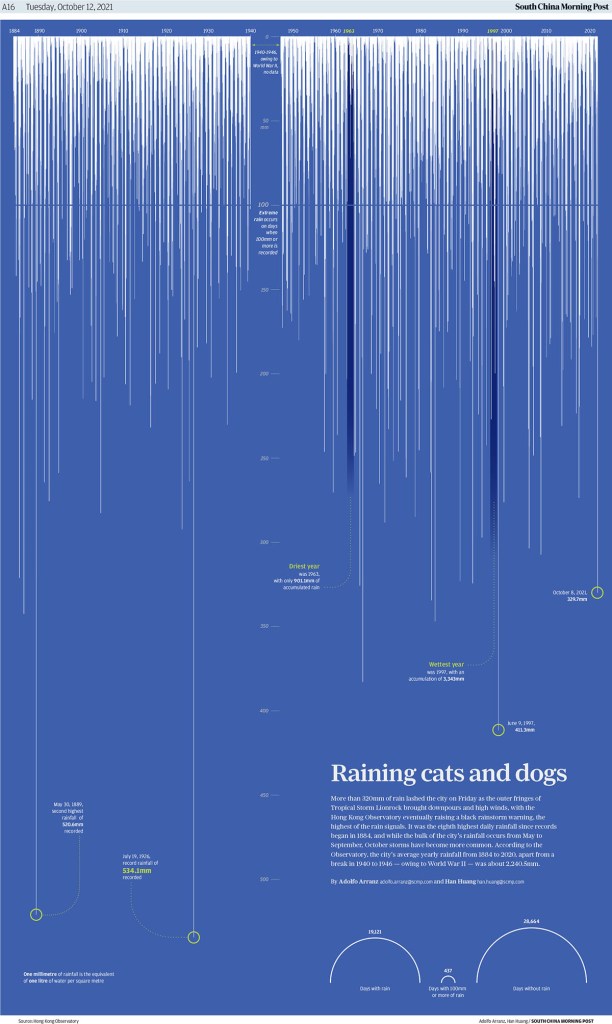
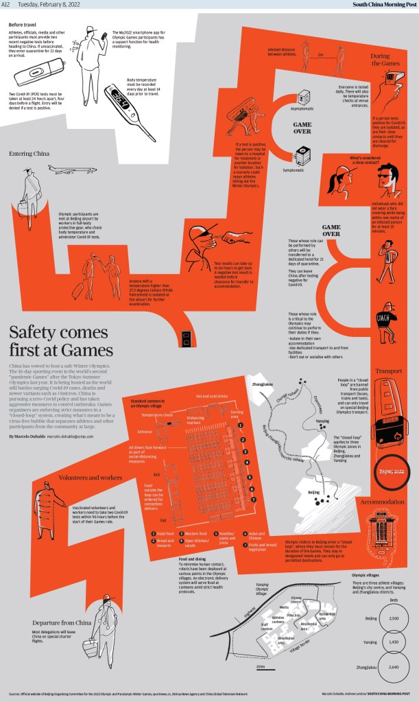
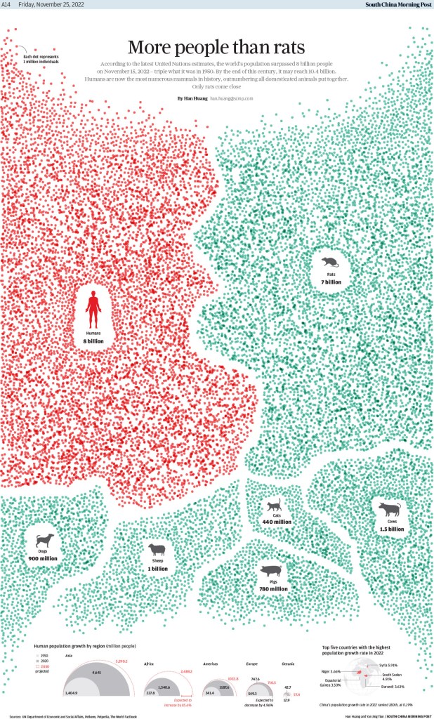
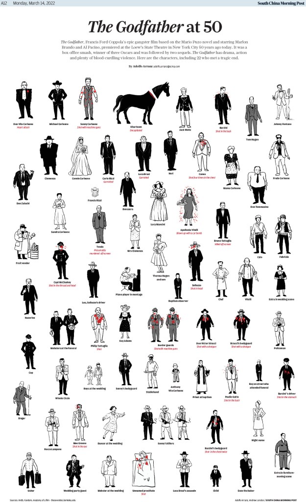
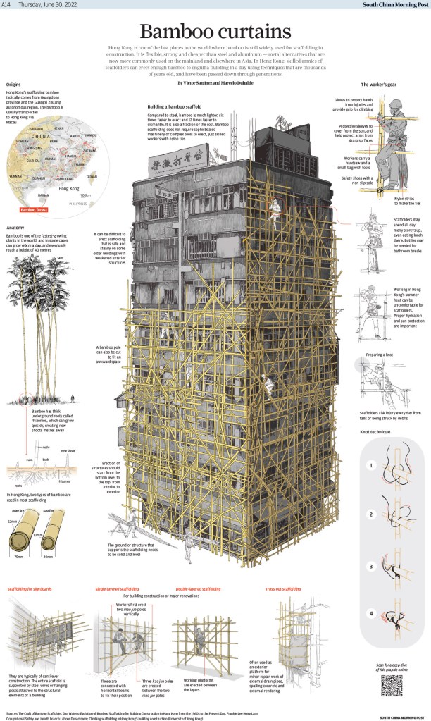
South China Morning Post
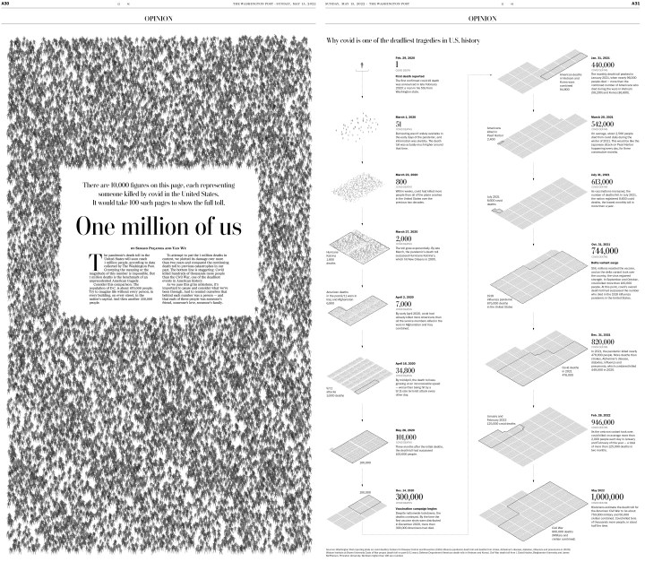
And the South China Morning Post, which tied for 10th overall in awards. This publication has some absolutely stunning information graphics. The visual presentation is so strong, and it adds a ton of little bits of information to support the graphics/illustrations. This first page won a silver medal, so a step above an Award of Excellence. It’s followed by three others, that are also incredible in their own ways. While the designers could rely on the same style, they have quite a range. They somehow manage to be versatile, taking very different approaches, while maintaining excellence throughout. Each one of these is vastly different from the one before and after, but all of them are jaw-dropping.
Europe and beyond
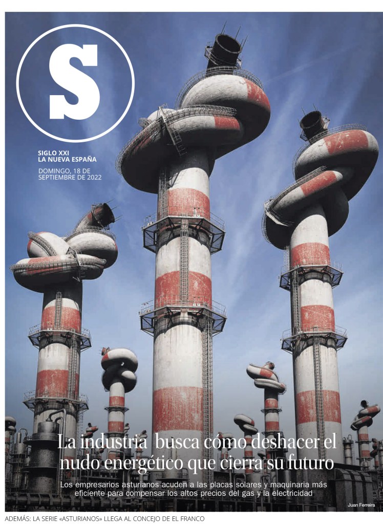
The illustration on this first page by La Nueva Espana looks so real you almost ask yourself, how did that happen. This is another of my faves from the competition.
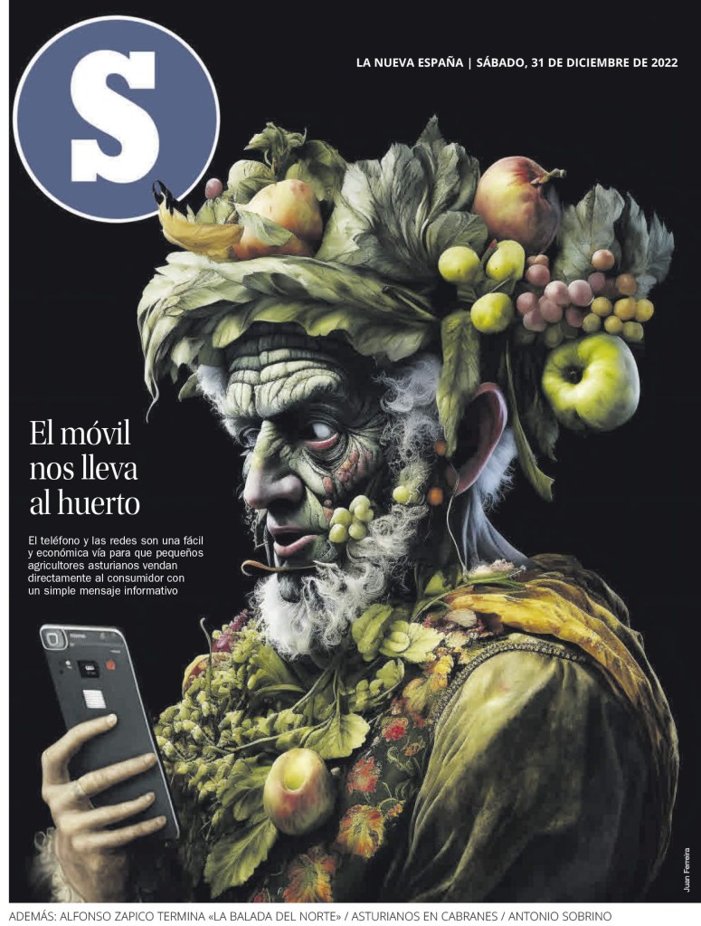
And then this illustration. Mind blowing.
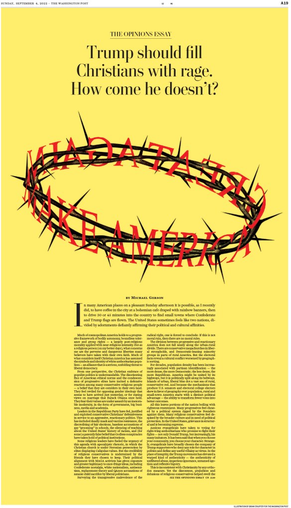
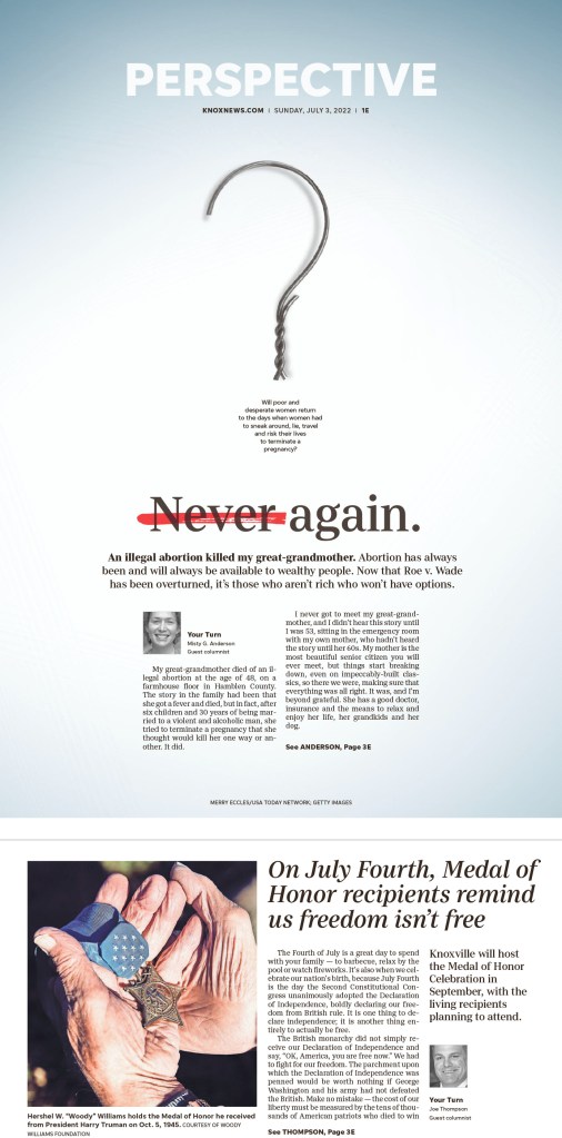
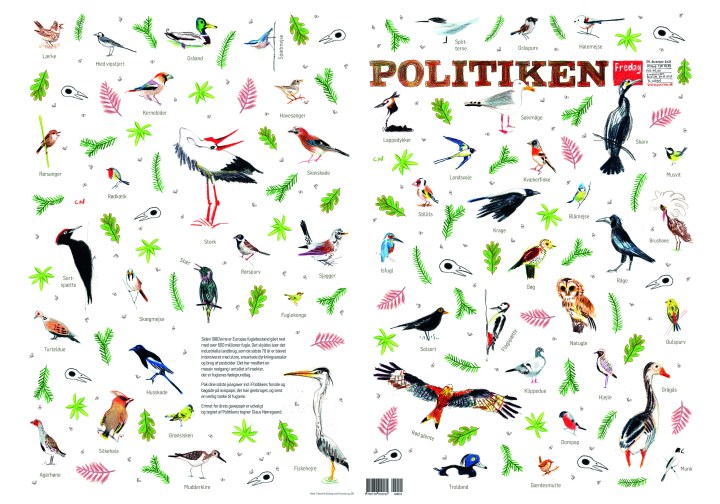
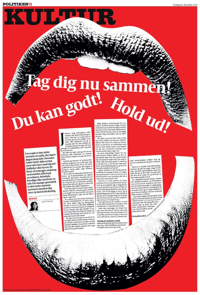
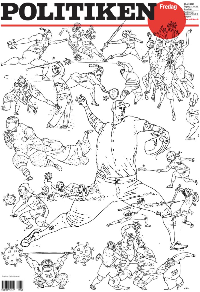
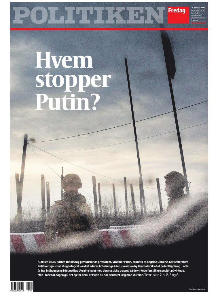
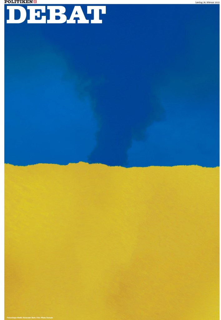
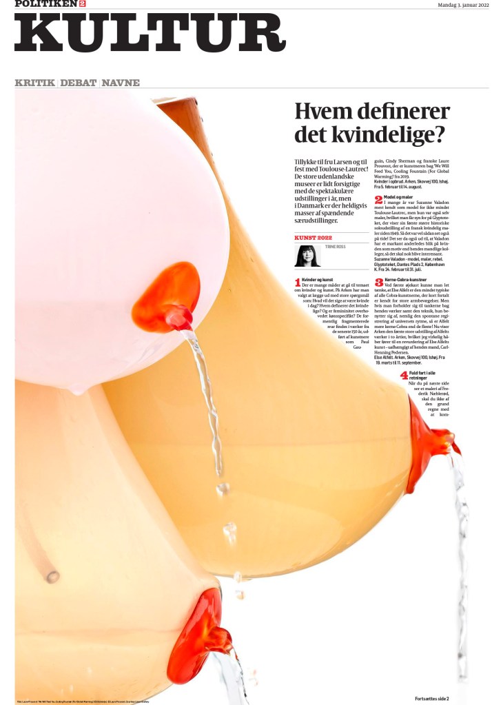
And I can’t leave Politiken out. I am a big fan of this publication. I think it does so many things well. It is perhaps the best at using a consistent colour palette. It uses red and black throughout so often to hold it all together. And this first page is just such a powerful topic, headlined: My rape.

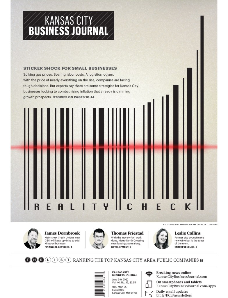
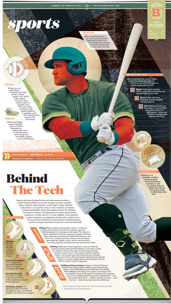
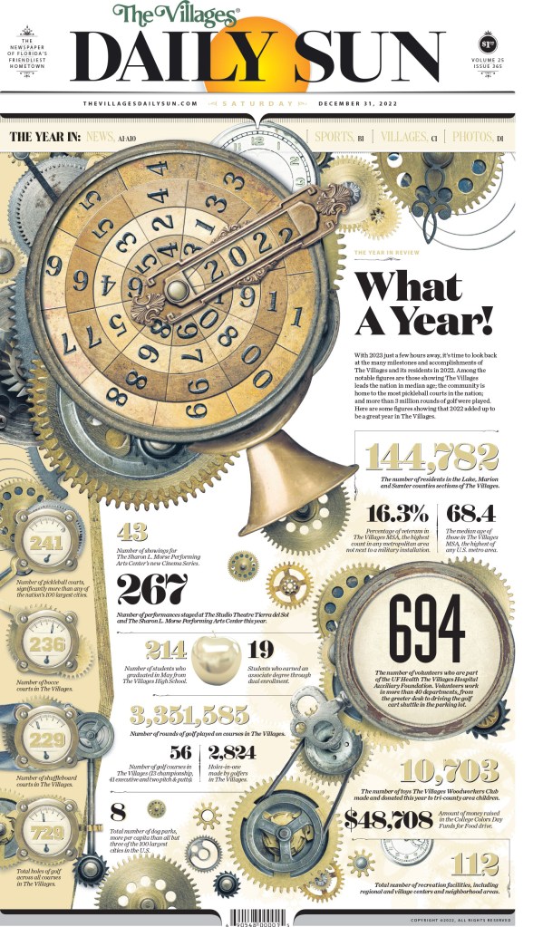
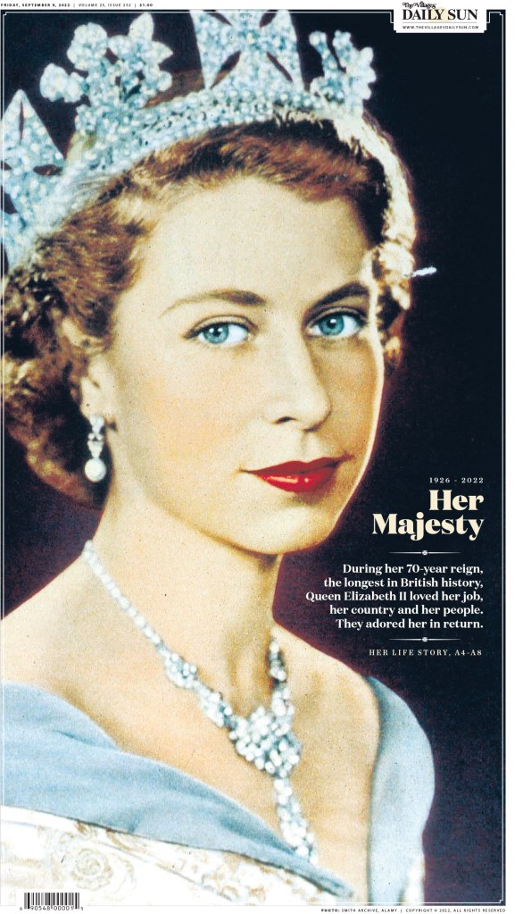
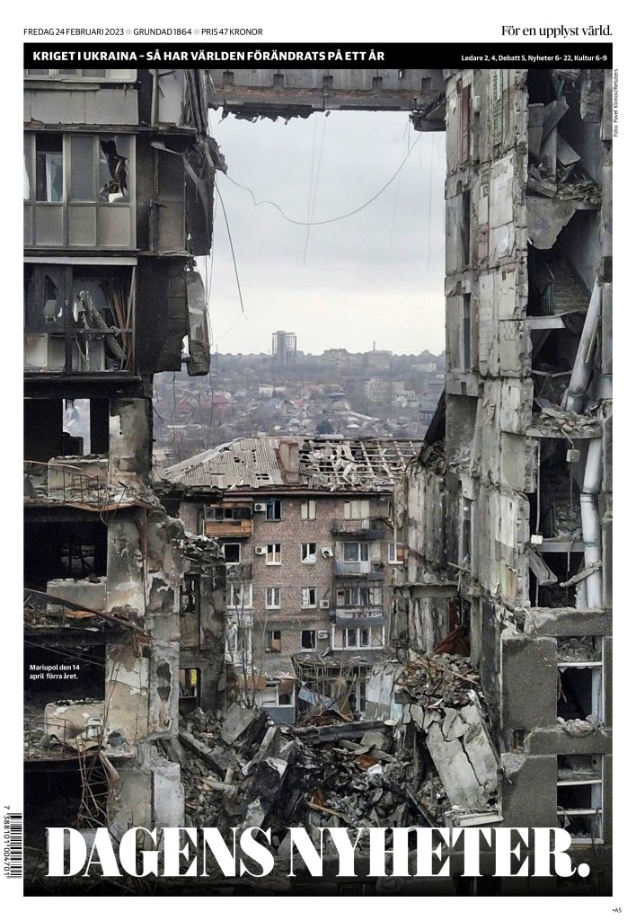
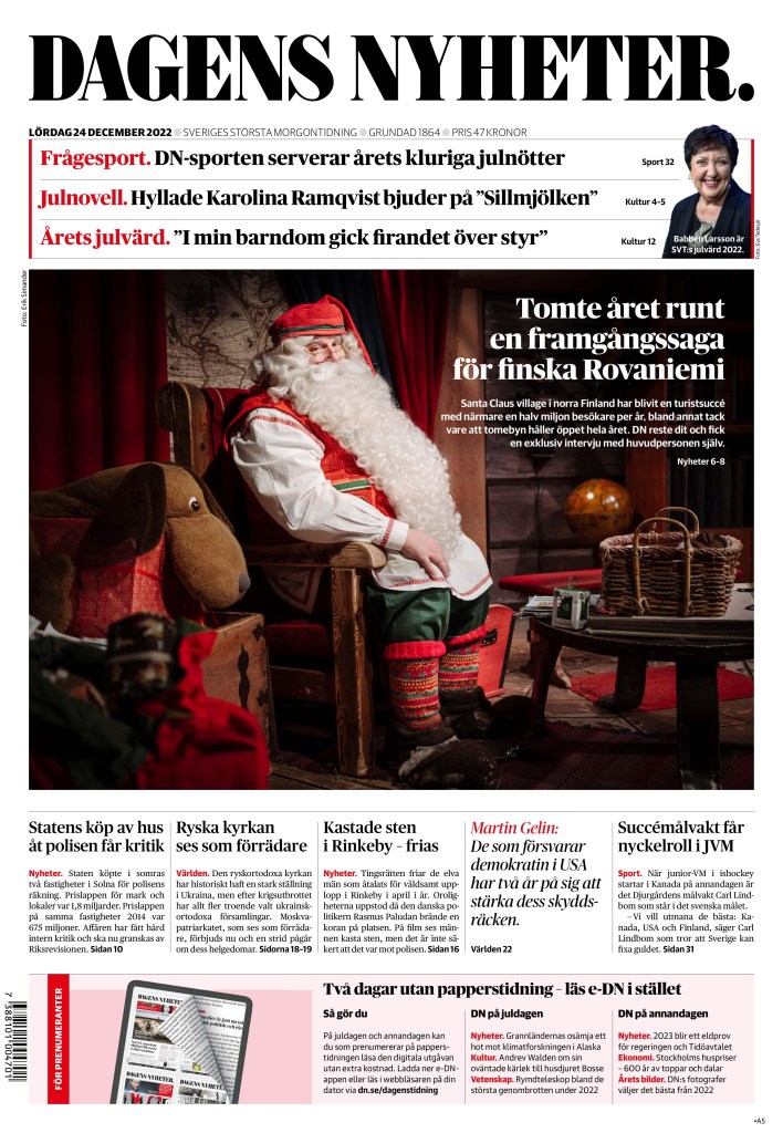
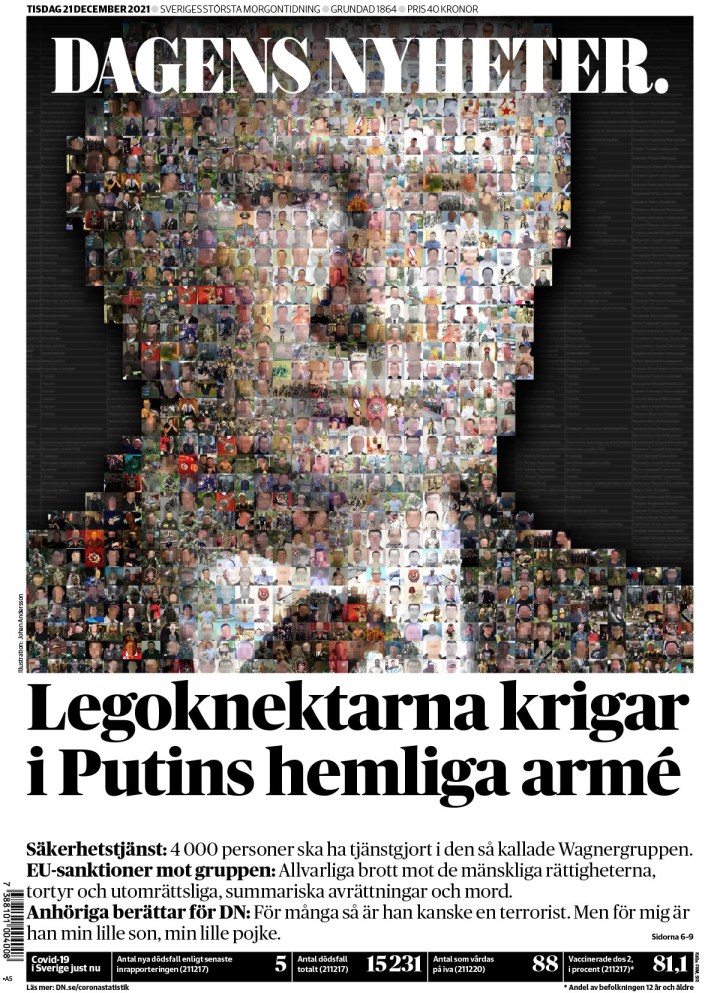
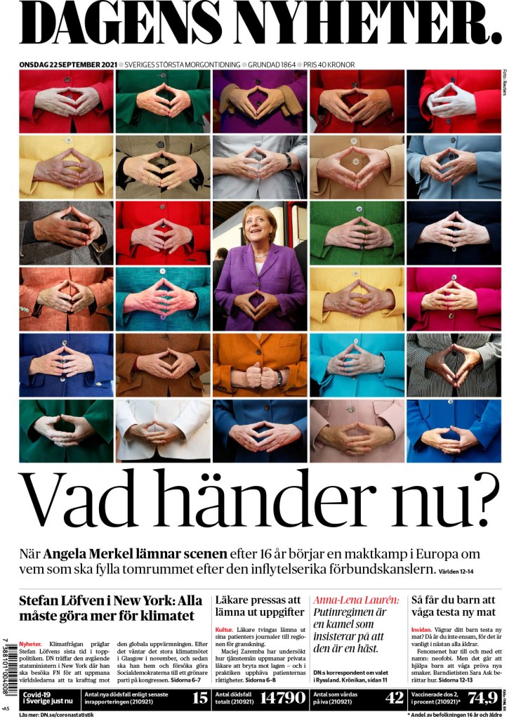
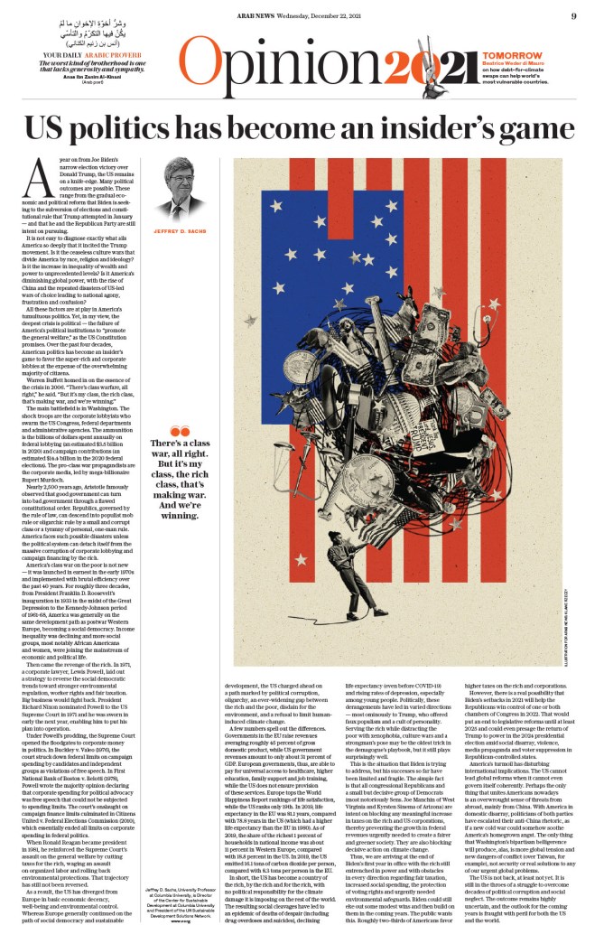
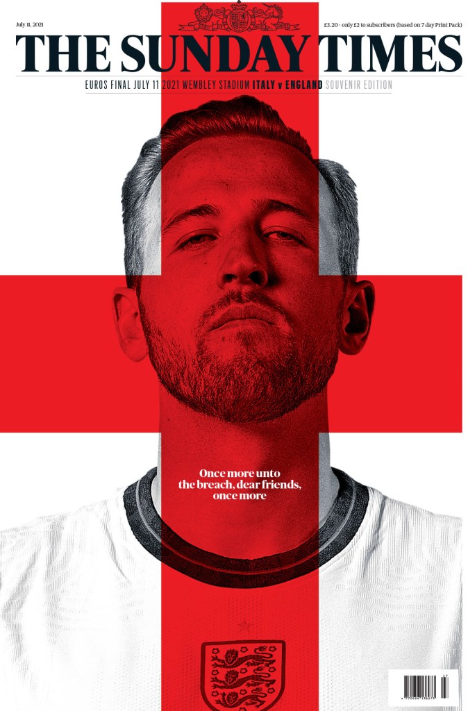
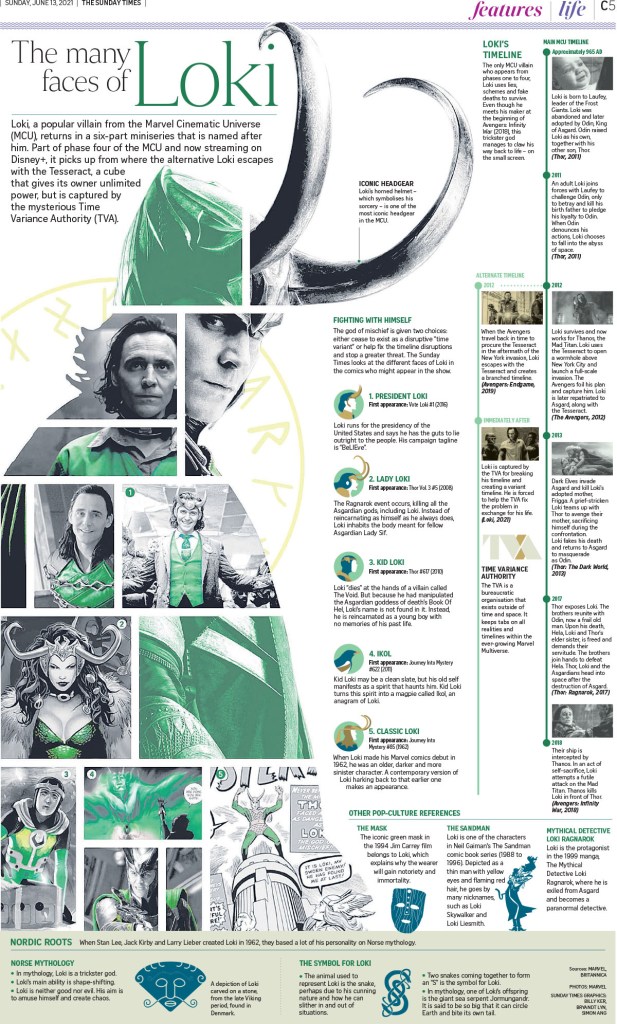
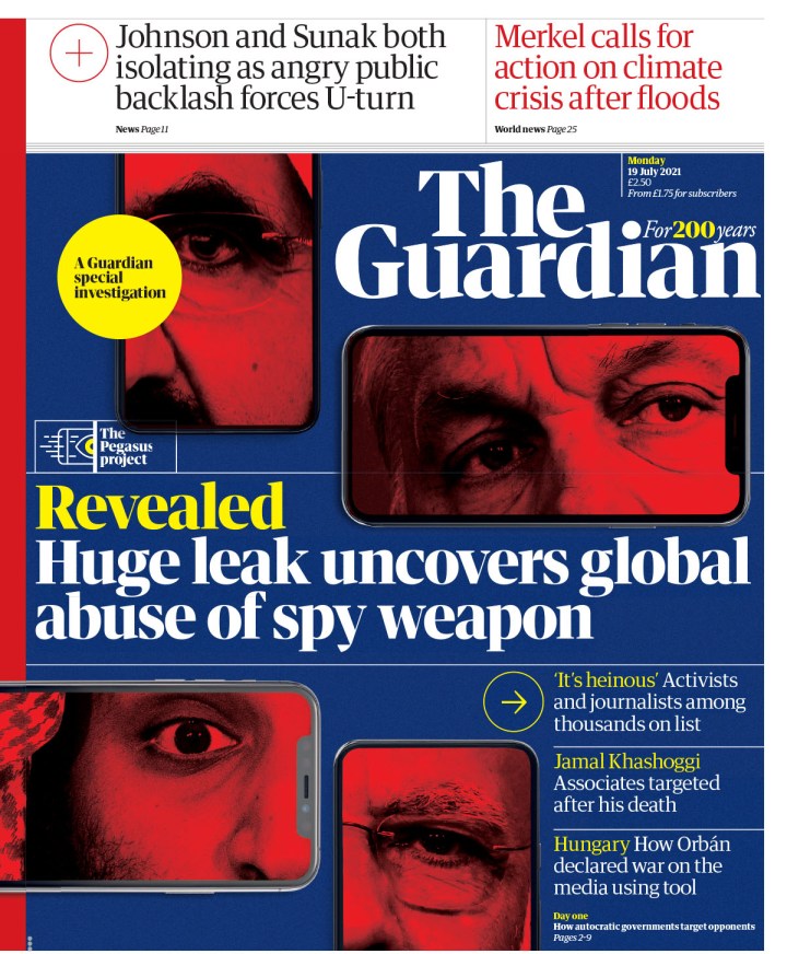
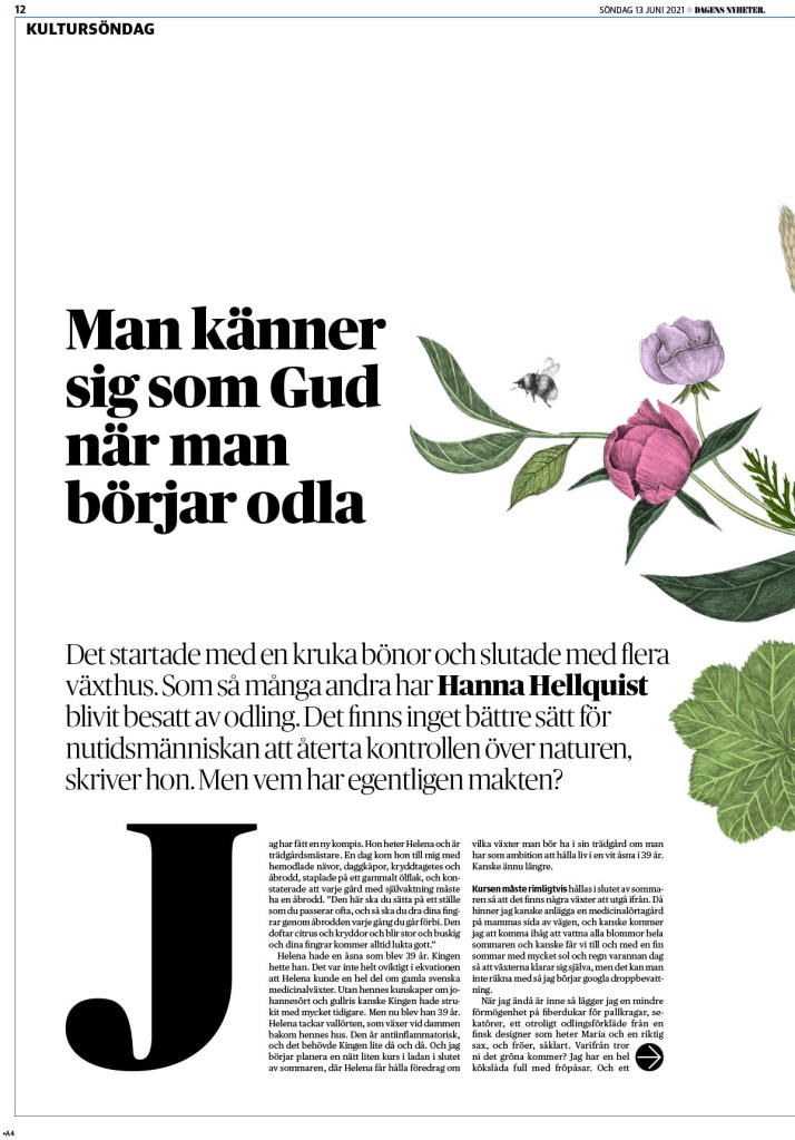
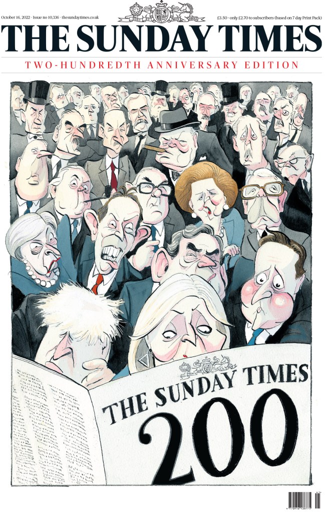
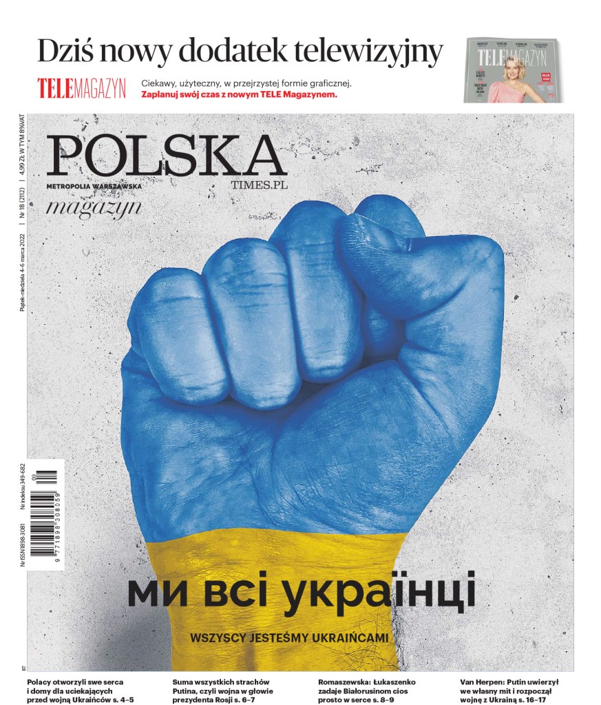
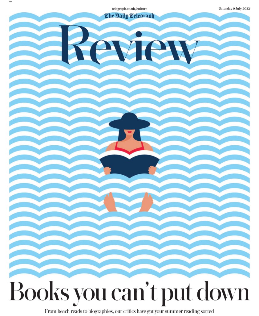
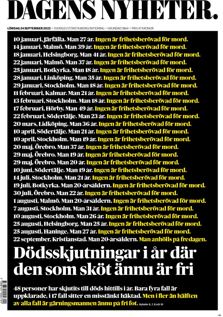
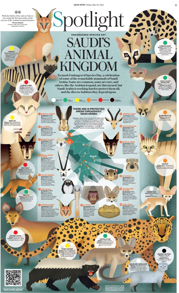
Below are the last few pages I will highlight, though there were so many more worthy of the spotlight. Below are pages from The Sunday Times (U.K.), Polska (Poland), the Daily Telegraph (U.K.), Dagens Nyheter (Sweden), The Age (Australia) and Arab News (Saudi Arabia).
I could go on and on. There were thousands of entries from a number of publications, all submitting the best of their best.