World’s Best Designed Newspaper. Phew. That’s a big deal. Even today, maybe especially today, as newspapers are facing an existential crisis. World’s Best. By no fault of the staff involved in production — the unsung, behind-the-scenes heroes of newspapers, those who play a key role in the daily miracle — many newspapers are mailing it in. They are putting words on paper to wrap around print advertisers, who are still by in large keeping the media world afloat (thank you, print advertisers!). Most in the newspaper world would like to do more, and they do as much as they can with the resources they have. But then there are those publications that stand out. Those who can compete for World’s Best Designed Newspaper.
There were four finalists this year, and two winners. The finalists where The New York Times, Washington Post, Die Zeit (Germany) and and Weekendavisen (Netherlands). I have featured the Washington Post in my American post, and Weekendavisen in my world post. But for now, the winners: The New York Times and Die Zeit, last year’s reigning champion, at the top again.
It can be like comparing apples to Mack trucks, as someone I once worked with used to say. How can you choose between a daily broadsheet and a slightly smaller weekly (though slightly larger that I thought it was only ever seeing it in a PDF format)? How does one compare anything to the mighty New York Times and its resources? The answer? You consider all factors, but in the end it comes down to which newspaper is best executed and puts out the best product, overall and for its readers.
So what makes a newspaper the World’s Best Designed, in the eyes of Society for News Design judges? As the judges change each year, the criteria can also change though the themes are generally very similar. Here are some of the factors they looked at this year:
How the typography is handled
How it interacts with illustrations and photos on page
Is it thoughtful?
Does the hierarchy feel right?
How well do they tell the story using all tools available to them to help readers understand the story easily? They should masterfully use all tools available.
Photo editing
Information graphics usage
Is the design tailored to the content?
Everything should be thoughtfully considered
Hopefully it’s beautiful along the way, and there is still an element of surprise.
An entire publication should be cohesive
The judges also said the winning publication or publications should be setting a standard for other publications to look to for inspiration. And I would say the two winners do just that. And what is great about it is that they do it in very different ways.
The team of judges overseeing this category know a thing or two about design and newspapers. You can read more about each them here, but here is a quick look:
Beto Alvarez, a deputy news editor at the Los Angeles Times; Joe Hutchinson, the creative director for Rolling Stone;Mary Jane Callister, the deputy design director of features for The New York Times (she didn’t vote or take part in discussions on the NYT entries); Mie Brinkmann, visual editor of the Danish weekly Weekendavisen (she didn’t weigh in on her publication either), and Tonia Cowan, director of graphics for The Wall Street Journal.
The New York Times
The New York Times has some of the best designed pages in the world. And more of them. Overall this year the publication won a staggering 188 awards. Of those, eight were gold medals (nearly half of the 17 awarded) and 26 were silver medals. That’s outstanding. Nobody comes close to those numbers. Eight gold medals means eight entries in which a team of judges was hard pressed to find a single flaw. Pages that push boundaries.
Because of all the amazing pages, The New York Times is very often in contention for this award. What often holds it back are the inside pages in the A section, sometimes even the iconic front page. It’s simple to see that a standard inside A page can’t match a kids section page, or an opinion section cover, or even an inside page in a weekly competitor. But they put those news pages out under intense deadlines, and one thing can be said: they are on brand. Also they serve the purpose they intend to serve. They inform the readers, and they do it at a high level. Despite the moniker of Old Gray Lady (the front page is still a little grey but that’s both part of the charm and the brand, and it’s less grey than it once was) the inside pages use a surprising amount of art. With some world-class photographers in house, why not?
Here is what the judges said about The New York Times:
The New York Times design harnesses a wealth of deep and diverse journalism. The paper has a design approach that enables them to craft solutions for a broad range of storytelling. Their design uses elegant and timeless typography that is instantly recognizable as The New York Times.
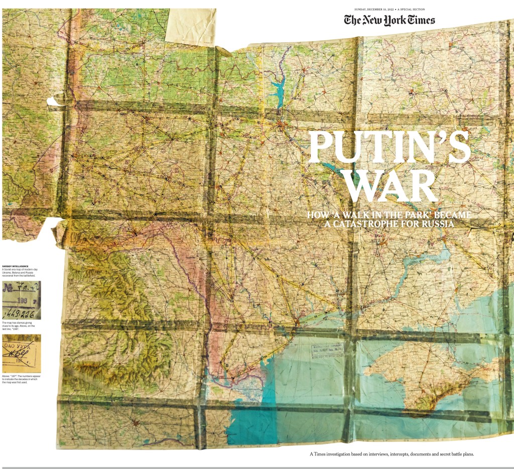
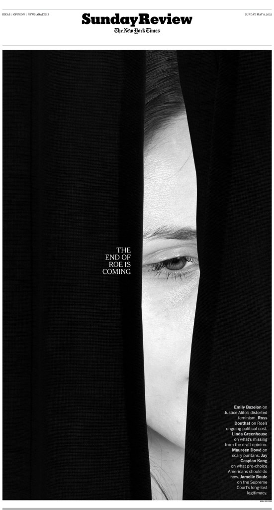
Here are some of the pages, and I’ll try not to have too much overlap with my previous posts, but there will need to be some, and I will start with one. This was just so extraordinary. So powerful, and all in black in white. Black and white and read all over. So classic newspaper, and just so smart, from concept to execution.
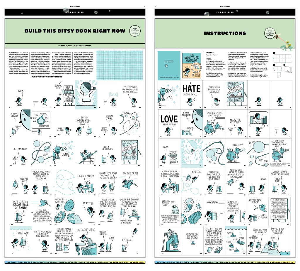
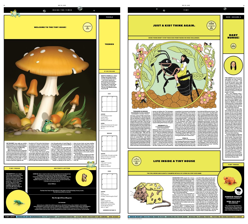
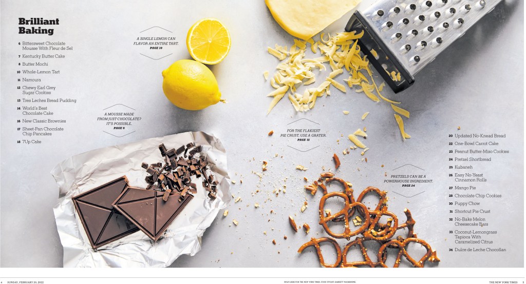
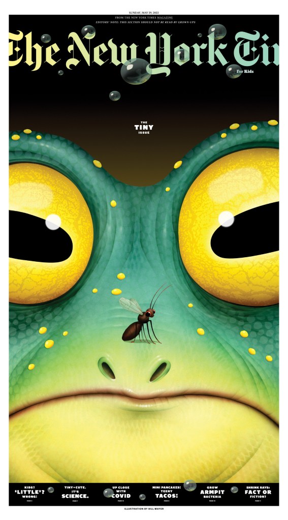
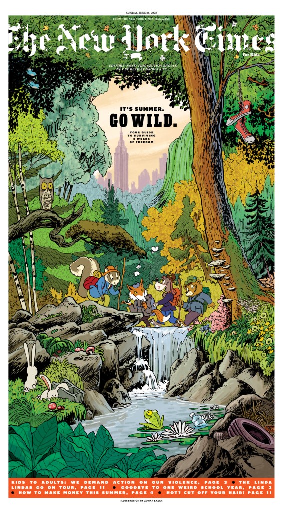
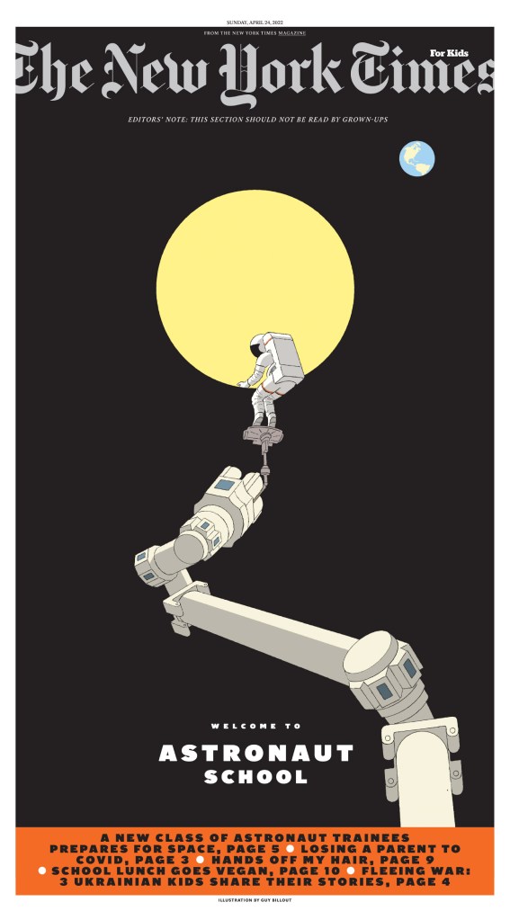
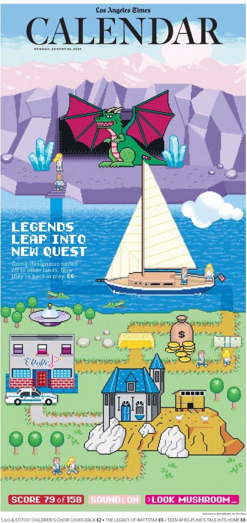
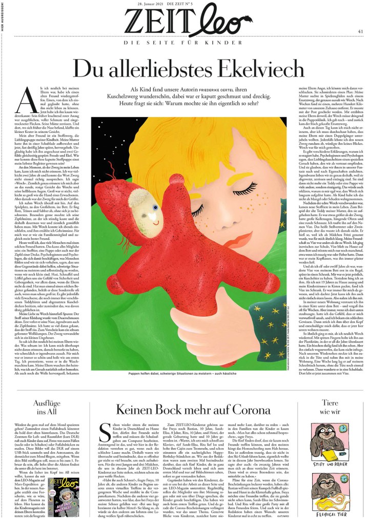
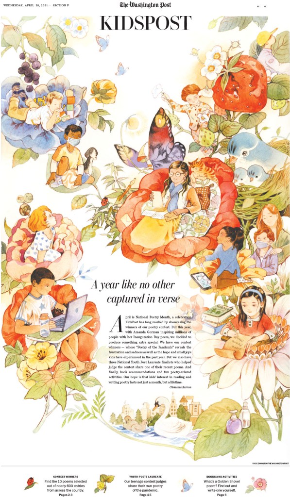
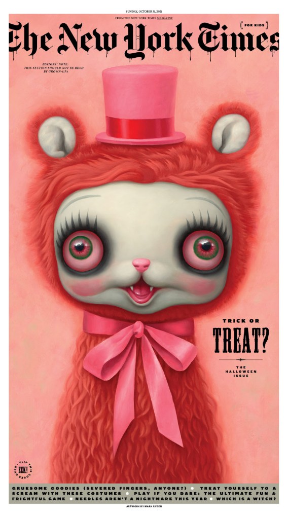
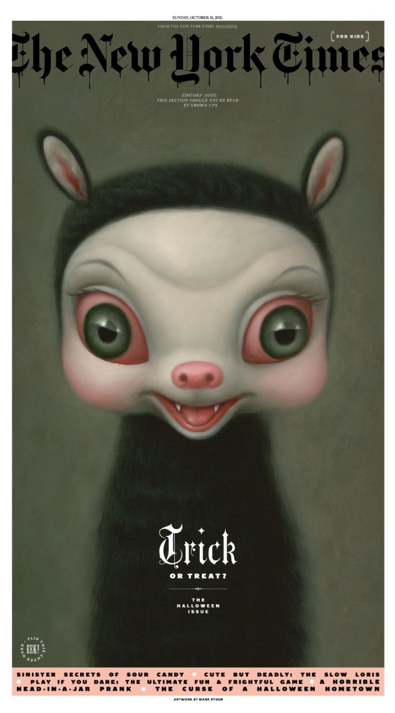
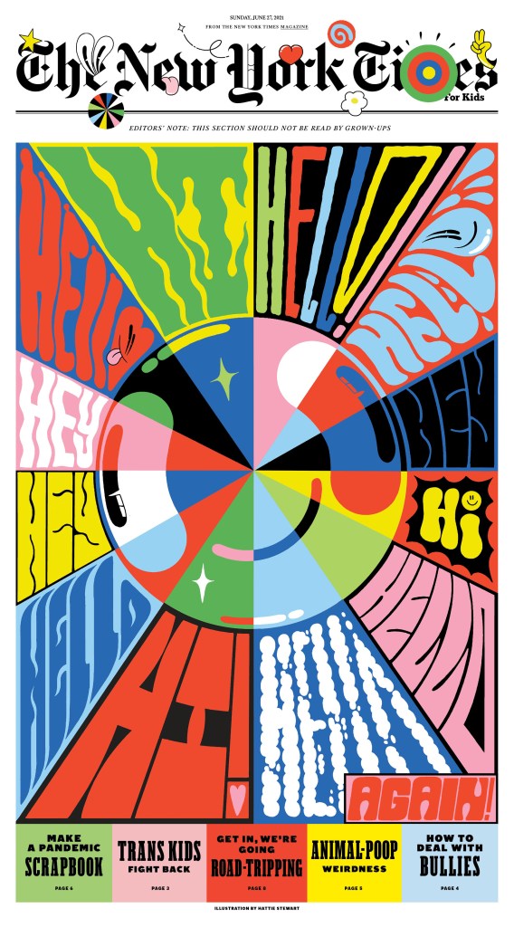
And the kids section. Every year it gets talked about probably more than any other page or section. This is just one of the many incredible samplings. It must take incredible resources to produce something like this, and it’s great to see a media organization willing to invest in this level of content. The illustration on the front below is by Bill Mayer, and it’s also used as my feature image for this post.
I will get back to the big splashy pages, but here is a selection of more classically designed newspaper pages, just text and photos. They are clean, informative and easy to follow. And also beautiful in their own way.
Here is a sample of a section that is both visually wonderful and very practical.
And back to big and splashy. When a New York Times designer gets some time to spend on something, do they ever blow it out of the water.
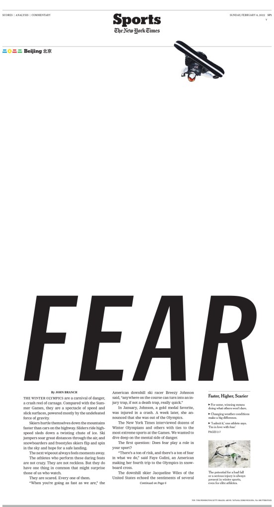
As I mentioned, The New York Times won 188 awards. So this sampling is a drop in the bucket. I will end it on this sports page, which got a lot of love from the judges. The use of white space here is doubly smart.
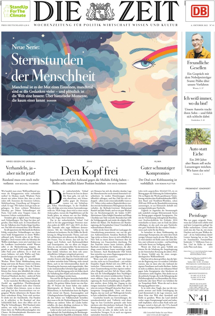
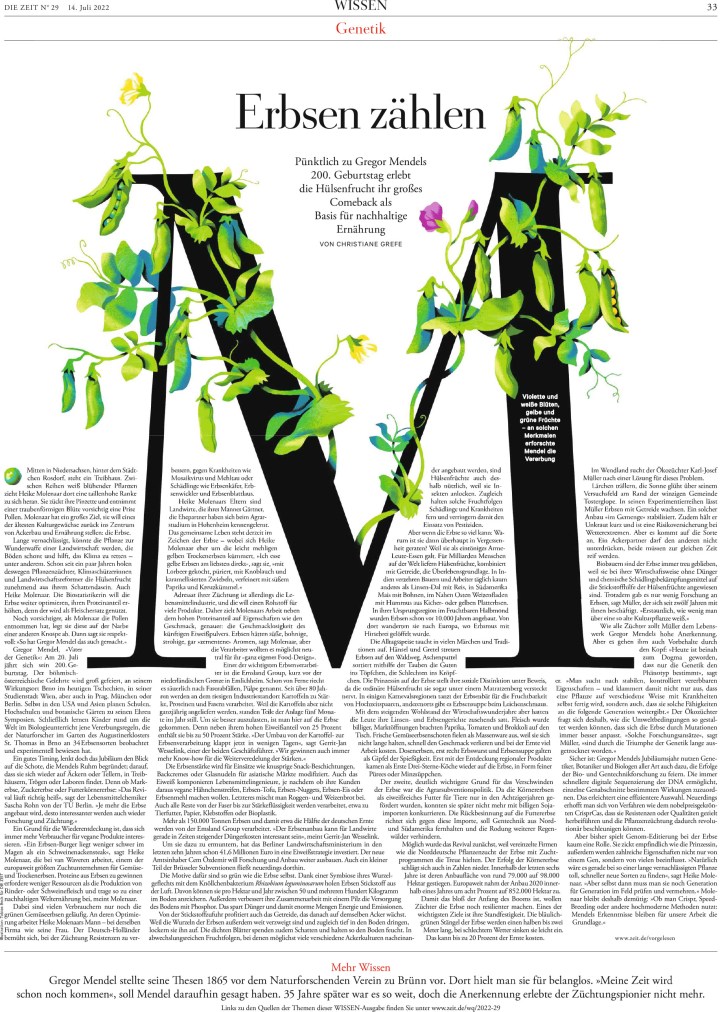
Back on top for a second year in a row is this paper described as almost too perfect. But not quite. It’s just perfect enough. Die Zeit so clean, so consistent. You can tell they pay attention to every detail, like how every line of text wrapping around a image looks. It must be evenly spaced and easily readable. Every drop cap and rule is considered. Every detail seems to be considered.
Here is what the judges said:
Die Zeit’s creativity and cleverness are consistently on display. From their larger typographic illustrations to the tiny illustrative details that adorn their initial caps, Die Zeit never misses an opportunity to delight. The juxtaposition of large amounts of text with judicious white space makes long form stories approachable. The typography, tight photo editing, concise information graphics and a controlled color palette represent an overall wisdom and restraint that allow visuals to shine.
First, a front page. It is elegant and consistent week to week.
One great thing Die Zeit does, similar to The New York Times, is designing with images and text, rather than a large illustration takes up the entire page, leaving the creativity to the page designer rather than an illustrator. And unlike many newspapers, they can take a big block of text and make it look so good.
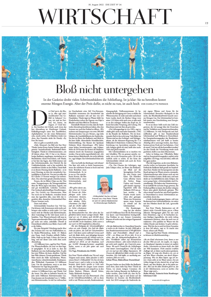
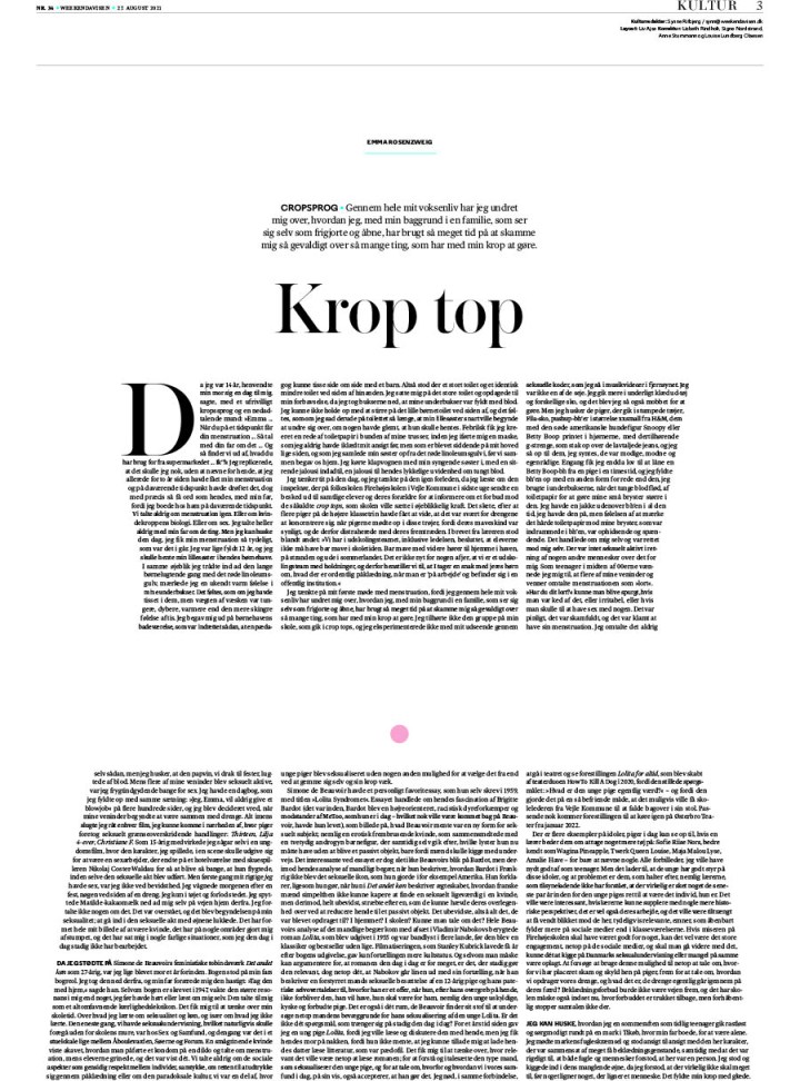
And here is the European side of things. They aren’t afraid to get spicy. The story, as you might be able to tell without being able to read the text, is about older people and sex.
Before jumping into the pages that surprise, because despite being very consistent with their crisp, clean design, they also surprise, here is a basic inside page. It’s clean, the art is funny and eye-catching, and also well considered.
And the surprise. Die Zeit can get very bold in their design. This first page, especially, is so bold. And the 3D effect is unreal. Or … very real! But all of these pages are just stunning.
And as I have mentioned, nobody uses text in/as design like Die Zeit. Many try this, many fail, as the body text is awkwardly spaced or hard to read. But Die Zeit does it so well so often. These pages are some of my favourite from this publication. I have always loved trying to use text as design, and, in fact, my first SND award was for a page that did just that.
All of the entrants had to submit five full editions, and I was also able to look single page entries for this post, so there were hundreds of pages to go through. I could show so many more, from basic but compelling inside pages to other exceptional covers and graphics. But I will leave it here. Congrats to The New York Times and Die Zeit, as well as all those who entered. Every publication that put itself out there to be judged very critically did so much very well.
When it comes to fashion and trends, Europe tends to be ahead of North America. But what about newspapers? You can spot European fashion at a glance. You can also typically spot European newspapers at a glance. They are different. Fewer broadsheets, more rules, crisp and clean designs, the typography more often used in different ways. Those who follow my Instagram will have seen pages from a lot of these publications as I feature them all the time.
I have already posted about Canada’s best and America’s best. This post will feature some of my favourite newspaper pages submitted to the Society for News Design‘s 44th creative competition from outside of Canada and the U.S. Most are from Europe, but not all. I have covered the best from Canada (home team bias) and the U.S. Now the rest. But the world is a big place outside of Canada and the U.S. That will make narrowing down the the choices of pages in this post a challenge.
Before I jump into the top papers (which I am classifying as Die Zeit and Weekendavisen, both finalists for the competition’s World Best Designed Newspaper, as well as the remaining papers in the top 10 in awards, de Volkskrant, Politico and South China Morning Post), I am carrying on a tradition I started last year to make it official. While my role was muddied this year, I am still calling this a Facilitator’s Special Recognition.
Facilitator’s Special Recognition
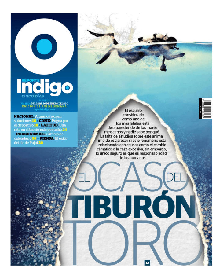
There are thousands of entries. I try to go though as many as I can, but I can’t get through them all. As I was going through this year’s entries, I thought one of my favourite publications was absent. But then I saw it. Reporte Indigo from Mexico is one of those publications that leaves me chuckling every day at how much effort is put in, and how great every edition is. Shaking my head in a awe-struck kind of way, asking how do they do it? There isn’t a dud. Some are stronger than others, but they’re all great. I wish they would submit more entries. While I can’t speak for how the judges would react, I love this publication. This spread does so much for me. The sketch and then sketched flag (I did this once, with both drawings much more rudimentary, though intentionally so!), the beautiful illustration, the amount of information. I fell in love with Reporte Indigo at SND42. A page from this publication left me biting my tongue listening to the judges speak. They gave the page an Award of Excellence, but I wanted more. I have included that page below. But first my special recognition.
Here is the first page that made want to scream to the judges, give it a medal! It’s worth it! This was from SND42. It’s the page that made me love this publication. I hope to see more next year!
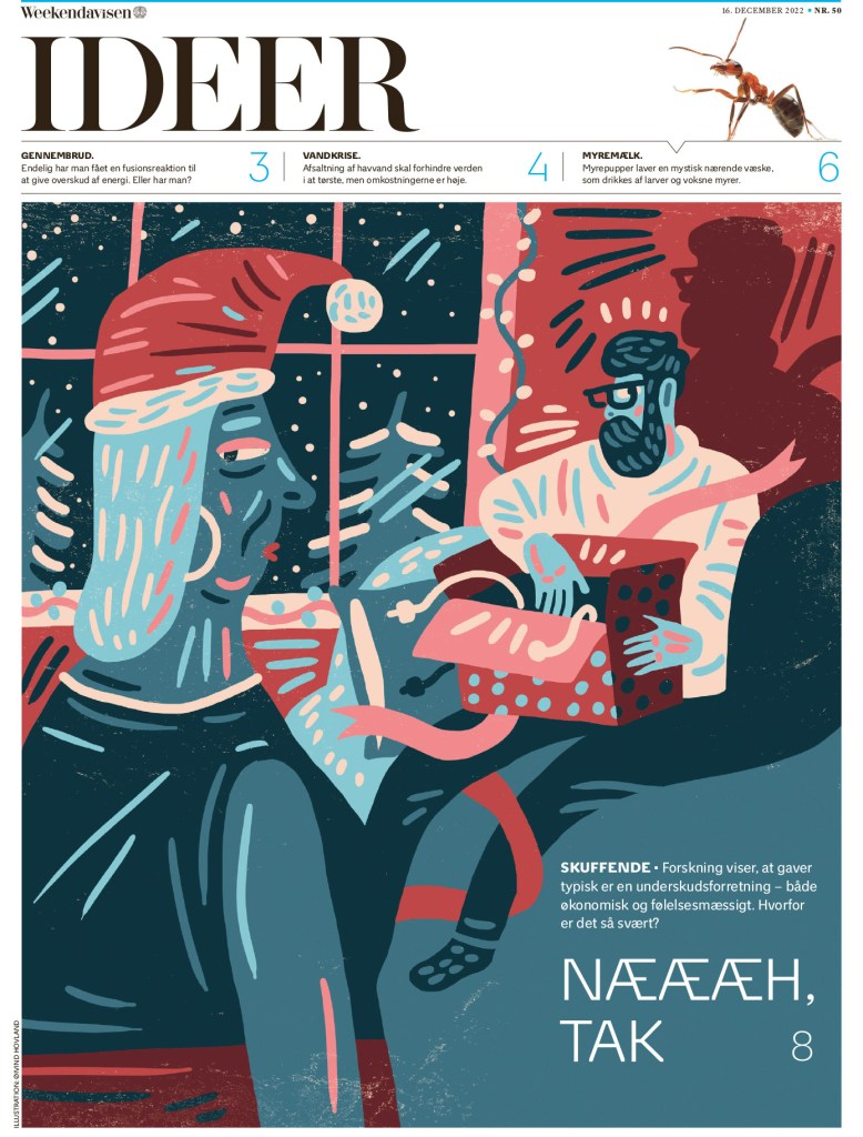
Weekendavisen
This Dutch paper is so elegant. That is a theme among a lot of European papers. They are beautiful and clean. This page uses such a nice illustration, but it works so well around the flag and text on the page. It’s more than just an illustration.
This is a smart cover. The text from the flag feels like it’s being sucked into the blackhole. I love it when newspapers are willing to play with their name plate.
I also love when newspapers use text in design (you will see more of the is with Die Zeit. In fact, you will see one that’s quite similar in concept!)
And here are a couple more. Just so well done, with so much attention to even small details. One is an inside page that has a classic European compact/tabloid look.
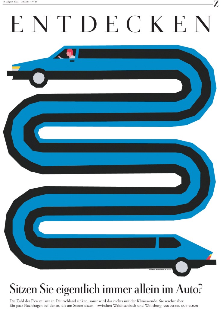
Die Zeit
This German paper, last year’s World’s Best Designed winner and in contention again this year, could be talked about with some German stereotypes. It is exceedingly well organized and very consistent throughout. There are few papers in the world as consistently consistent! And it is one of the best at using text in design. But on top of being consistent, it has some pages that surprise. Some that are very bold.
Here is the page that had a similar design and concept to the Weekendavisen one above. Who did it better? We’ll call it a tie.
The designer uses the photo so well in this design. One thing that always blows me away with this paper is how much text, a volume of text that might appear dense anywhere else, it can put on a page and still have it pop. It’s almost like a sleight of hand. Grey block of text? What do mean? Look at the design …
And just a small selection of text in design, or rather text as design. I’m not sure anyone does it better.
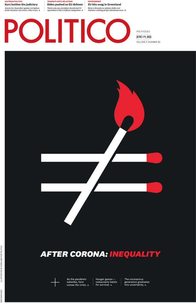
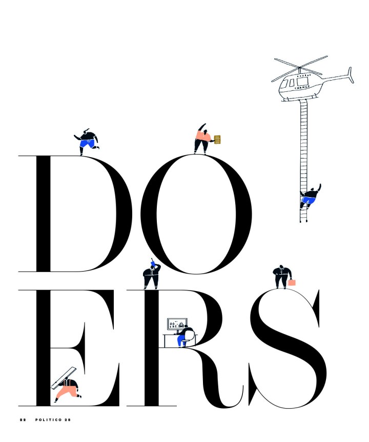
Politico
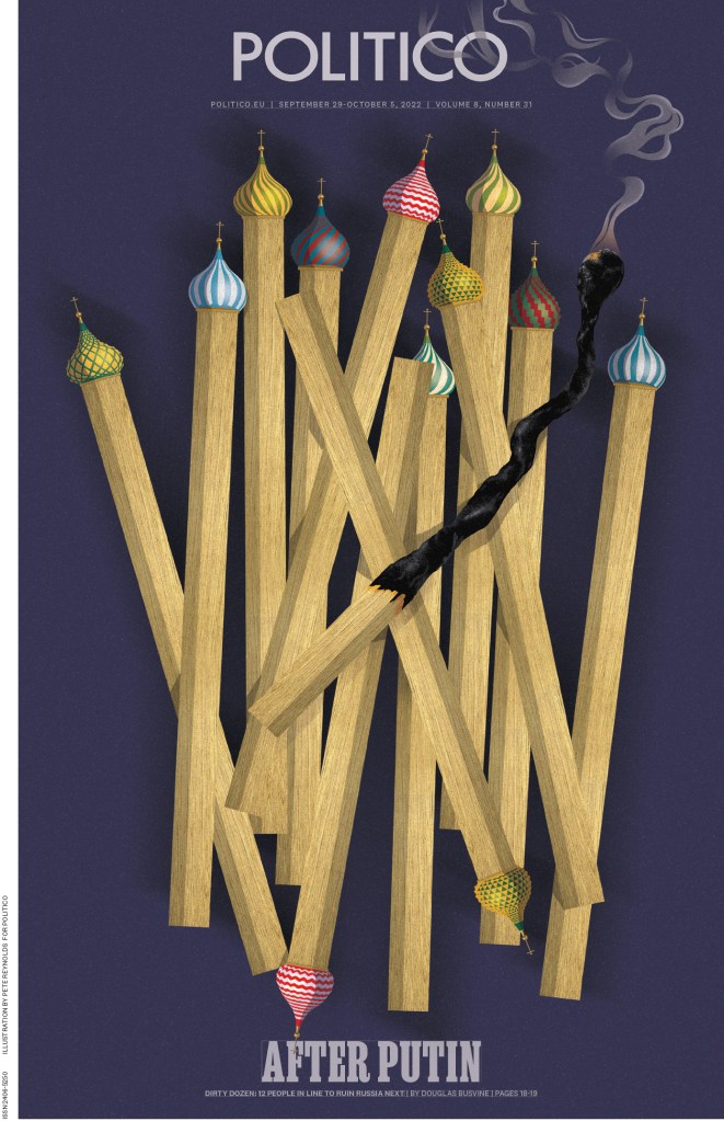
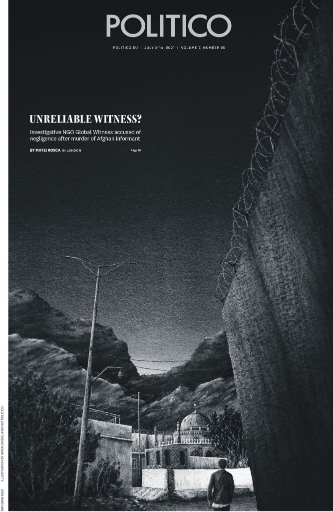
The covers of this paper are some of the most compelling around. They are illustration-driven in almost all cases, which means for them to stand out as design they must be backed by strong art direction. As the team gets it so right so often, I can only assume this is the case. Politico isn’t afraid to tackle very difficult subjects either. This first one was one of my favourite pages from the competition.
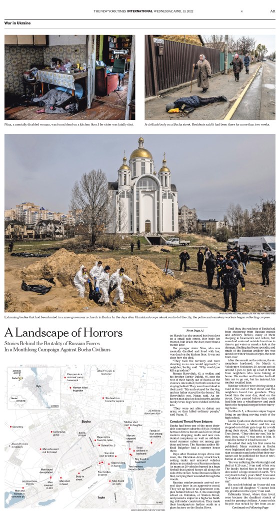
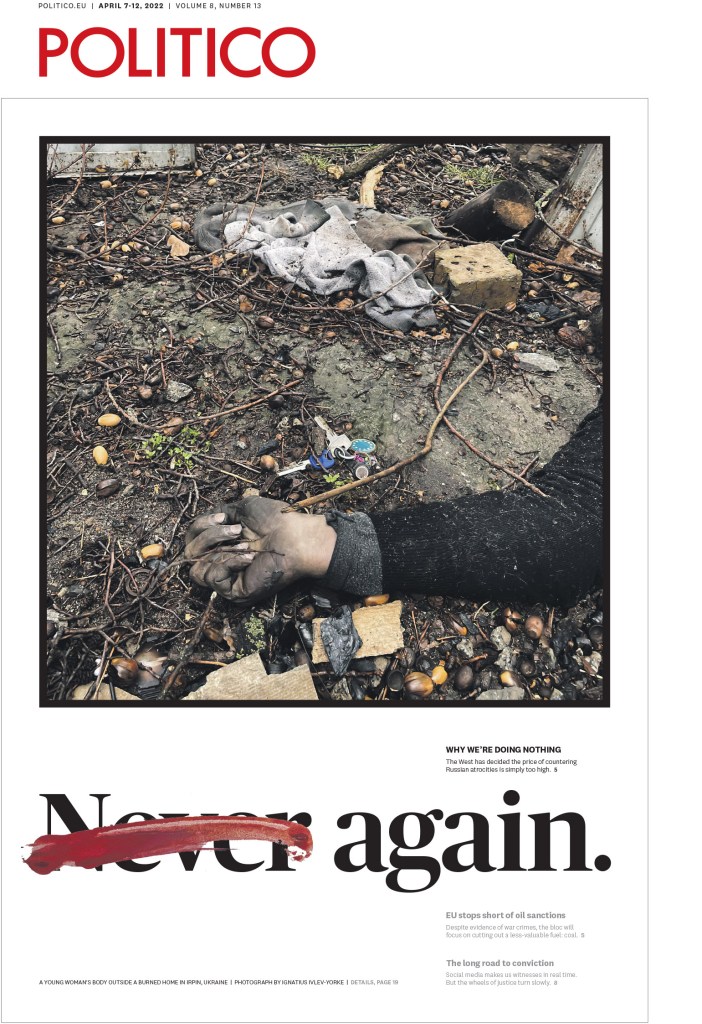
Another around the war in Ukraine. Last year marked a bit of a trend toward using darker photos. Photo editors and those making decisions often agonize over decisions like this, but in order to show the true devastation in Ukraine, dead bodies and other gruesome scenes became common on newspaper front pages. But this photo below is still so shocking, and using it like this is bold. And it has a smart headline, almost a call to action. How did we let this happen? Again?
These two spreads were near the top of my faves list as well. So simple, so smart, such little art. But it works so well. The text carries so much of the burden in the design.
And this. So much about the text but the image helps elevate. Early in my career I did a page that reminds me of this, but on a much lesser scale, where I used a shadow effect, for mine it was a dollar sign acting as a shadow for the finance minister. I will always favour pages that remind me of mine! This one is next level.
This illustration is very powerful. Taking something beautiful and making it tragic. I could show so many more for Politico, but I’ll leave it here for now.
de Volkskrant
I won’t lie. I think this is one of the best designed newspapers in the world, maybe the best, but I’m not a judge. From the cover and beyond. It’s so fresh, often surprising, but still always on brand, even when it surprises. The small details. You can see many pages from de Volkskrant on my Instagram and in previous posts here.
And while there are so many more incredible pages, I have chosen a few from the same edition to highlight how its commitment to excellence and consistency goes beyond the cover.
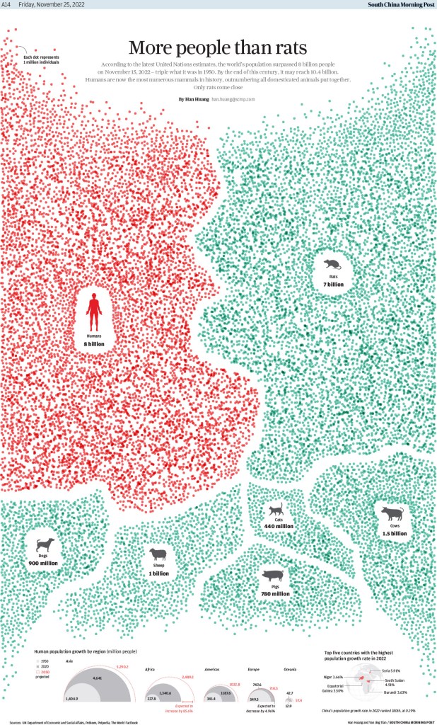
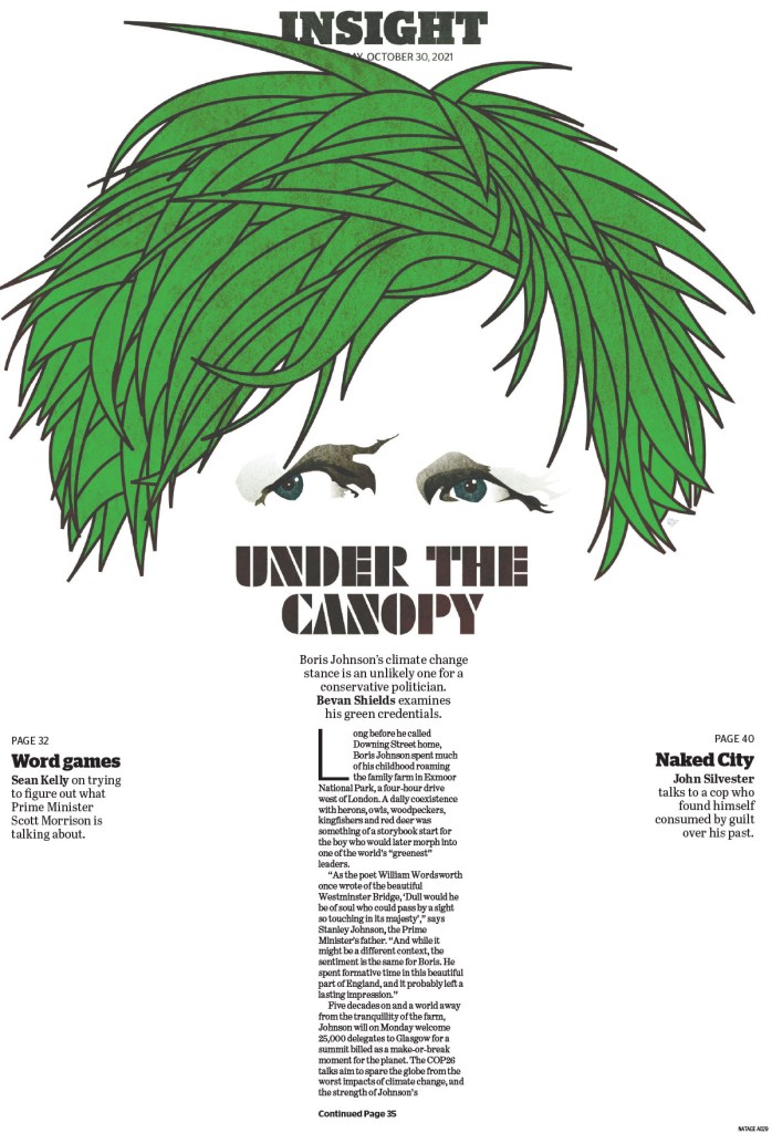
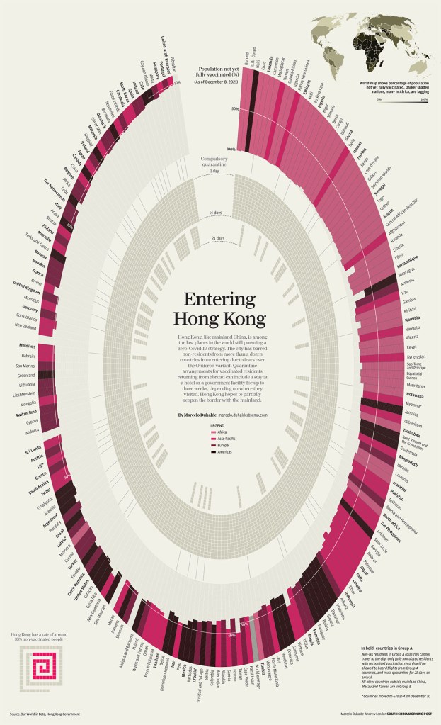
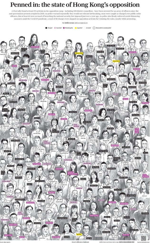
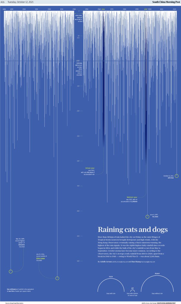
South China Morning Post
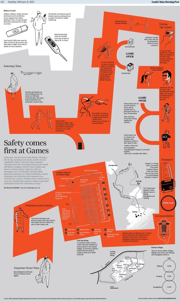
And the South China Morning Post, which tied for 10th overall in awards. This publication has some absolutely stunning information graphics. The visual presentation is so strong, and it adds a ton of little bits of information to support the graphics/illustrations. This first page won a silver medal, so a step above an Award of Excellence. It’s followed by three others, that are also incredible in their own ways. While the designers could rely on the same style, they have quite a range. They somehow manage to be versatile, taking very different approaches, while maintaining excellence throughout. Each one of these is vastly different from the one before and after, but all of them are jaw-dropping.
Europe and beyond
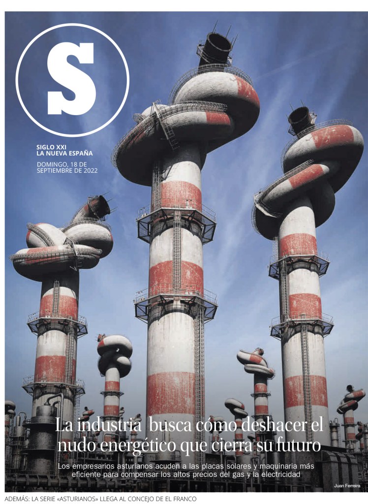
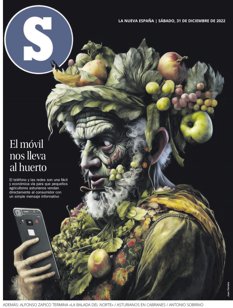
The illustration on this first page by La Nueva Espana looks so real you almost ask yourself, how did that happen. This is another of my faves from the competition.
And then this illustration. Mind blowing.
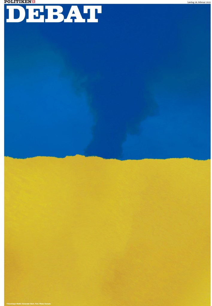
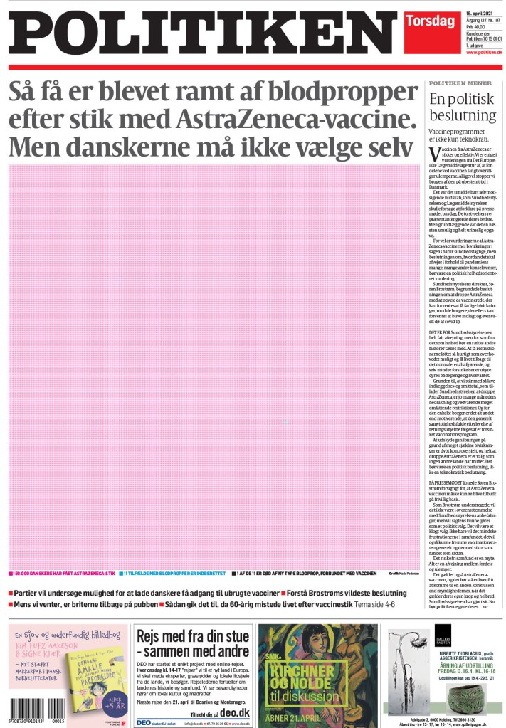
And I can’t leave Politiken out. I am a big fan of this publication. I think it does so many things well. It is perhaps the best at using a consistent colour palette. It uses red and black throughout so often to hold it all together. And this first page is just such a powerful topic, headlined: My rape.
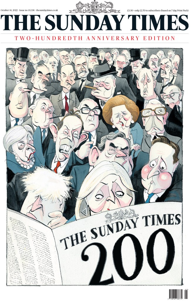
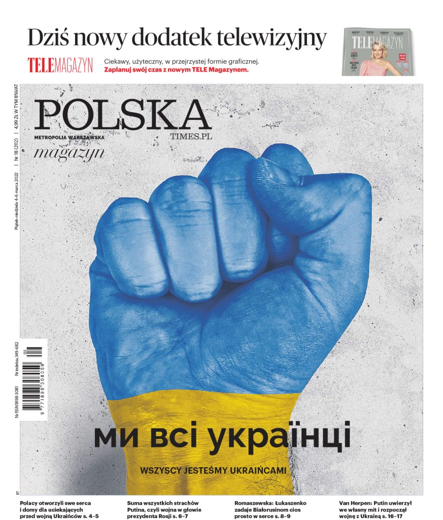
Below are the last few pages I will highlight, though there were so many more worthy of the spotlight. Below are pages from The Sunday Times (U.K.), Polska (Poland), the Daily Telegraph (U.K.), Dagens Nyheter (Sweden), The Age (Australia) and Arab News (Saudi Arabia).
Canvas_Version:3.0.25
I could go on and on. There were thousands of entries from a number of publications, all submitting the best of their best.
Newspaper design can be like a drug. A good page, your own or others, can leave you feeling elated. And leaves you wanting more. But what I have experienced lately, is like a good high (from someone who doesn’t know what an actual good high is!), the more greatness I see, the greater it needs to be to blow me away. When I first had the honour of being involved in the Society for News Design‘s 42nd creative competition in 2021, my breath was taken away a hundred times or more. Given a judge’s role, I would have been like, awards for everyone! A medal for you, and you, and you! I was nearly weepy by the end of it. After feeling the print world crumbling around me, I found myself in an oasis, damn near a utopia, of newspaper design.
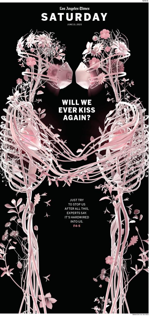
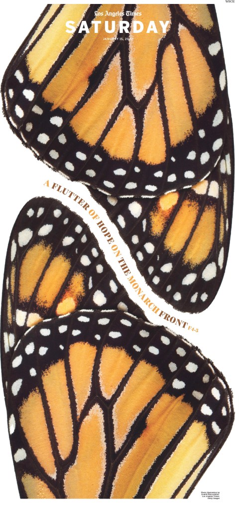
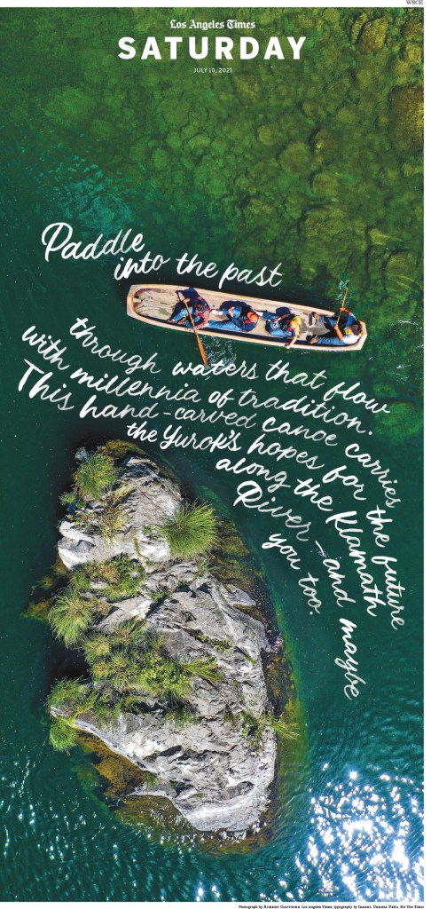
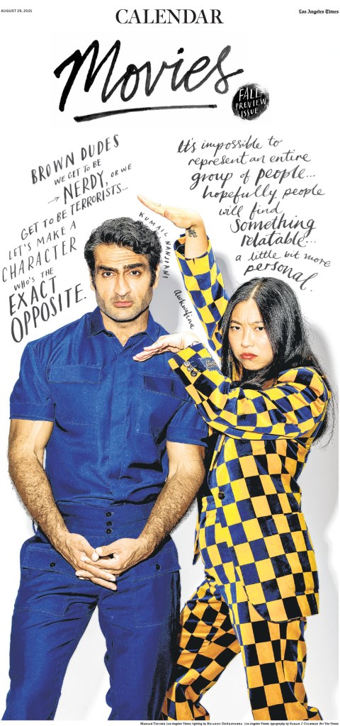
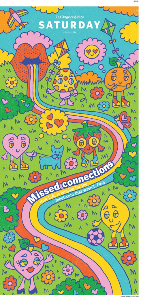
There is still a page from that year’s competition that I can’t shake. This page from the Los Angeles Times gave me the feels.
By 2022, I had a new perspective. I heard the judges talk about what makes a page great, what elevates something from good to great. I was more critical that year, but still my breath was taken away quite often. And now, 2023, I feel even more discerning. The competition was back in real life, held at The New York Times building. For the first time, I found myself looking at some medals and asking, would I have given that a gold? But I am happy to say, there are still breathtaking pages. Despite being immersed in the best of the best newspaper pages in the world for three years, plus all the pages I look at on a daily basis, I find inspiration in some of the magical work still taking place. It’s partially because the work is next level, but it’s also because the field is shrinking. It is a dying art. The exceptional work shines even brighter.
There are newspapers who still care deeply. The Big 4 in the U.S. produce some of the most stunning work in the world. And it is seen in their results, either Awards of Excellence or Silver and Gold medals. The New York Times: 188 (!!); Washington Post: 122; Star Tribune (Minneapolis, Minn.): 121; and a few places down, holding onto 6th overall, the Los Angeles Times: 44. Both The New York Times and the Washington Post have been named finalists for the World’s Best Designed Newspaper, along with Die Zeit and Weekendavisen (you will see more from these in the post about papers from around the world). The winner or winners will be announced Friday.
I will give more play to the Big 4 publications in this post. But I can’t feature hundreds of pages. So I will pare down the winners and present some of my faves. And despite my exposure and, for better or for worse, higher standards, my opinion is still very humble. At these contests I am surrounded by design greatness.
One key takeaway from this year’s competition was the value of art direction. As someone who mostly worked in smaller publications, I was, in effect, the art director, at least for the sections I handled. In the past couple of years I have started to wonder about pages that are driven almost exclusively by their illustrations. Are they great pages or great illustrations or both? Well, I’m told, this is where you can see the value of great art direction. A publication can’t get it so right so often and have it be so on brand without great art direction. So much of the credit for these pages goes to the art directors.
The New York Times
What can I say about the paper sometimes still known as the Old Gray Lady? Despite those functional daily news pages, The New York Times produces some of the most magical pages in the world.
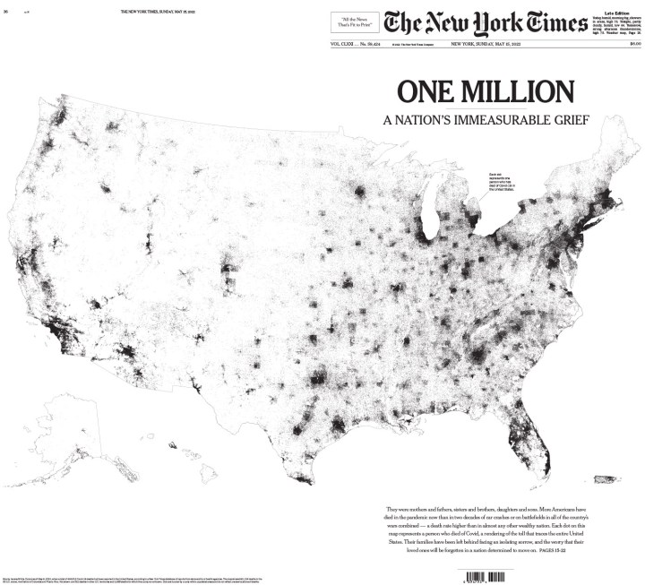
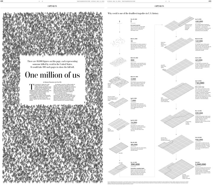
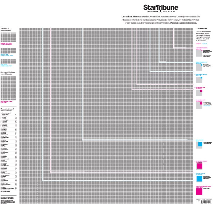
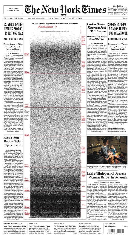
First, one million. I remember seeing this page when it was published and being blown away. I still am.
And one can’t talk about NYT without mentioning its kids section. It is outstanding. Always. I sure hope it’s working, and that it is attracting younger readers, showing them the power of print media. The kids of New York are perhaps the best served child newspaper readers in the world!
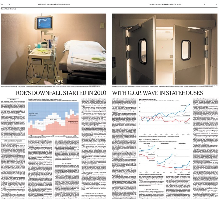
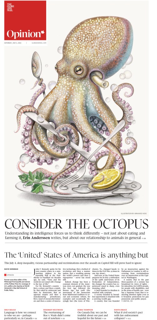
While COVID isn’t behind us yet, there was less focus this year. Abortion, however, was in the spotlight, thanks to a groundbreaking decision to overturn Roe v. Wade. Many papers produced powerful pages around this topic, and the Times produced some of the best.
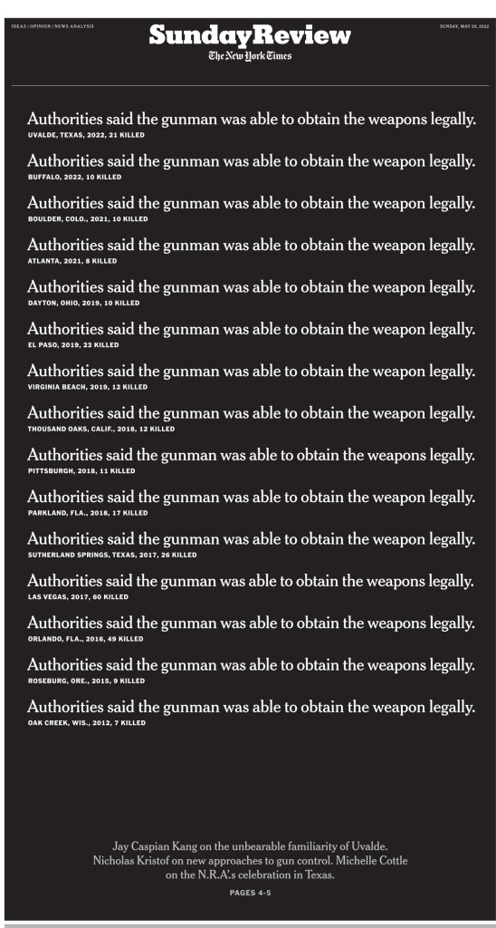
Shootings and gun violence have also divided the U.S., and put it into the spotlight around the world. Most of the world doesn’t get it. It’s good to see some Americans, many, are also questioning. This page, all text, the same thing repeated, is so powerful.
I could go on and on. But I will leave you with just a couple more. And they will be political, because what is America right now if not a world political hotspot? Years after the election, it’s still Trump, it’s still Biden. Brace for many more pages with these two as the focus.
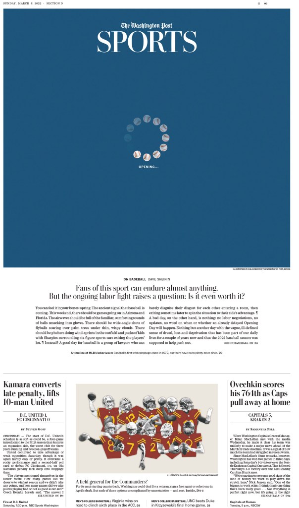
Washington Post
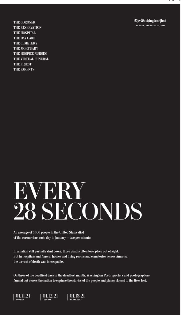
The Washington Post always delights. The Outlook and opinion pages are so regularly outstanding that even those have to be whittled down. The first, also marking the tragic COVID milestone of one million American deaths, followed by a slideshow of more strong opinion pages.
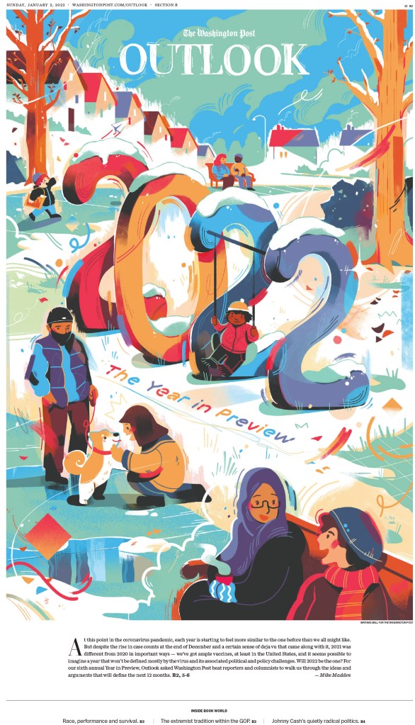
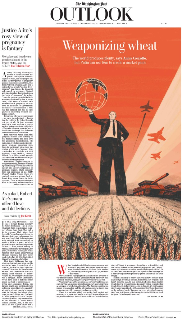
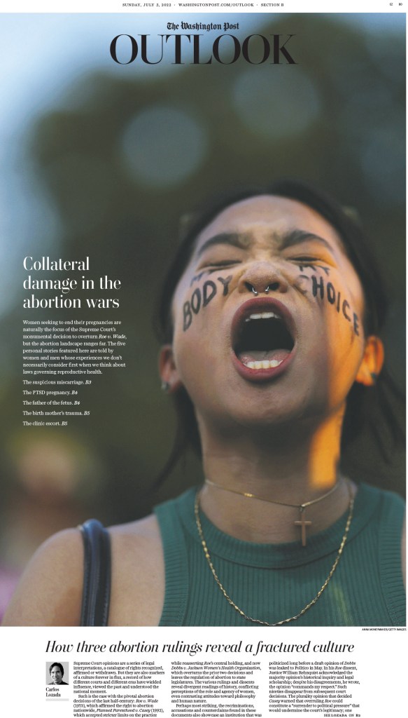
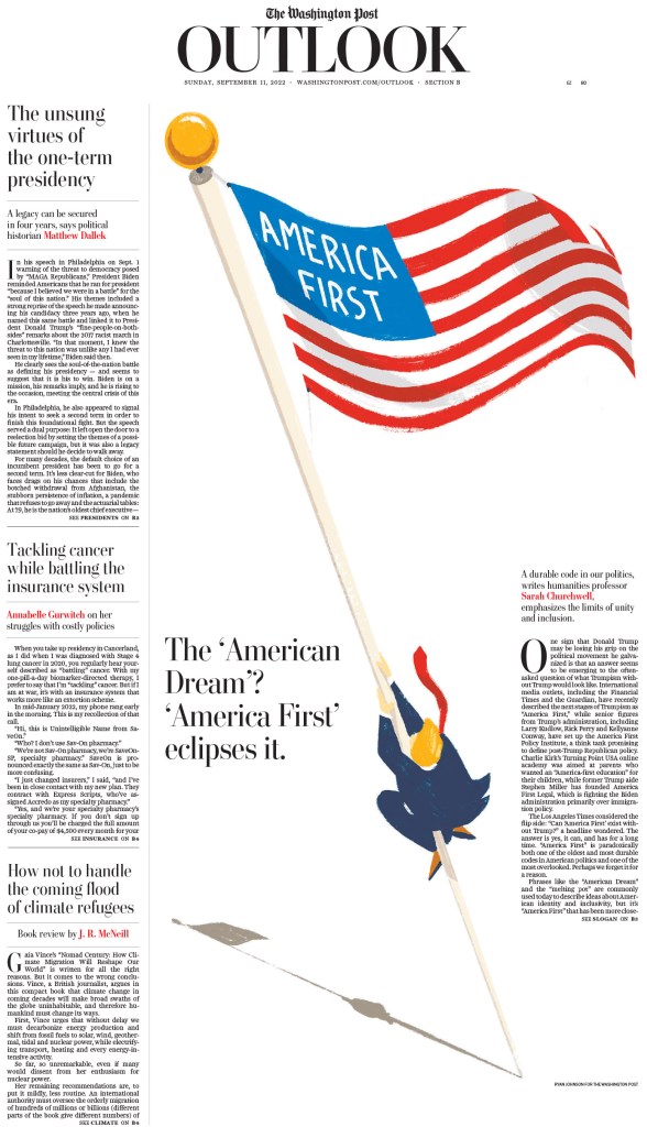
And a collection from the Outlook section.
I loved this page when I saw it last year. A simple but very smart illustration.
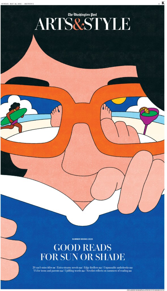
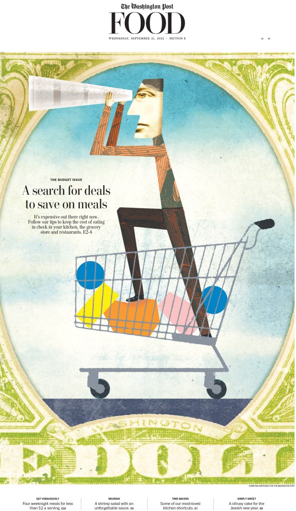
And of course they have fun, too. Here are some pages about things that aren’t breaking news, like books and food!
And weekends! I love this one. Not only is the illustration top level, the headline is fantastic. Kudos to the writer.
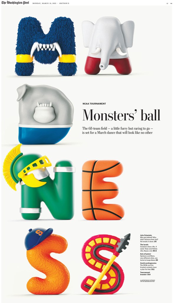
Star Tribune (Minneapolis, Minn.)
The Star Tribune might not have the same recognition as The New York Times and Washington Post outside of design circles or outside the U.S., but it is very much known as a heavyweight in the design world. But also, unlike some other big papers, it focuses on the news at home, a real local paper. That and incredible designs? It reminds me of a next-level Guelph Mercury, the paper where I cut my teeth in design. To be clear, the Star Tribune is several levels up, but its mission is close to my heart.
I will once again start with the one million milestone. How can they make little squares look so compelling? So devastating.
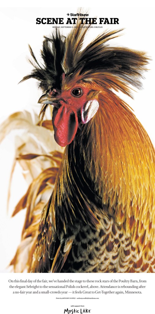
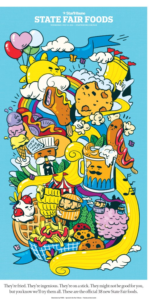
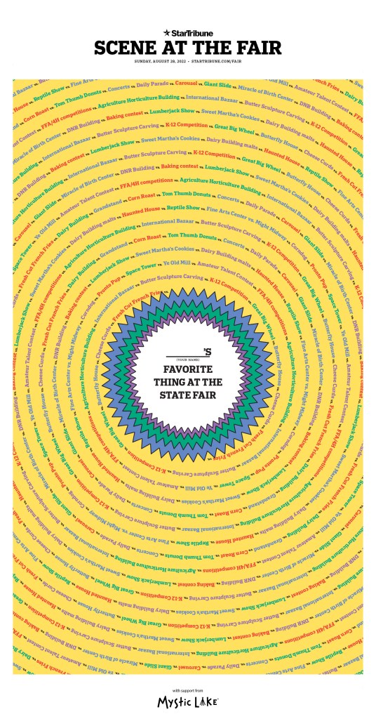
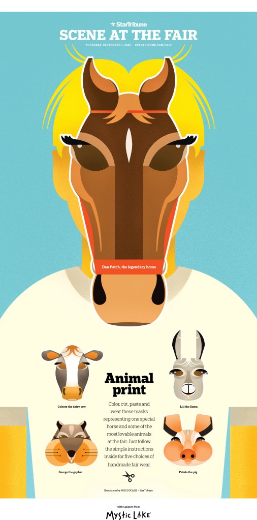
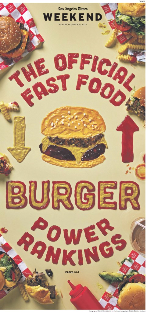
At the competition, I said there are two regular events that will always produce design awards. One is the power rankings for burgers in Los Angeles (see LA Times below) and the Minnesota state fair.
But as per usual, the Star Tribune offers much more than fair pages. This was one of my favourite pages from the competition (I had no clear favourite, as I have in the past two years). And like last year, I can’t say why.
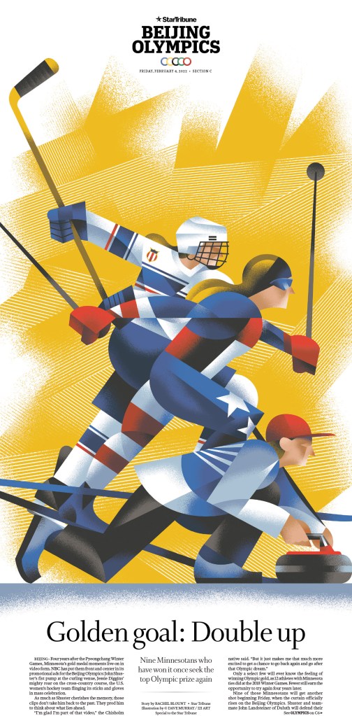
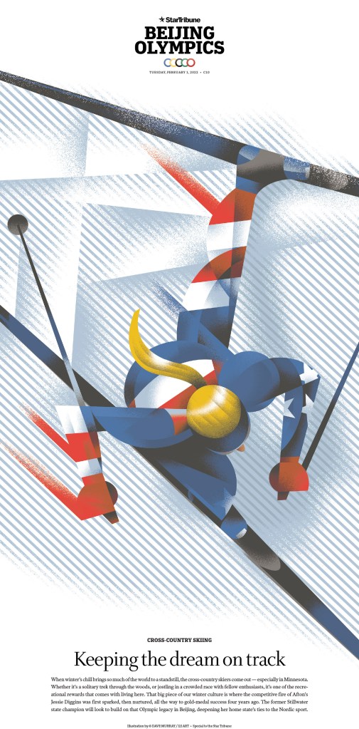
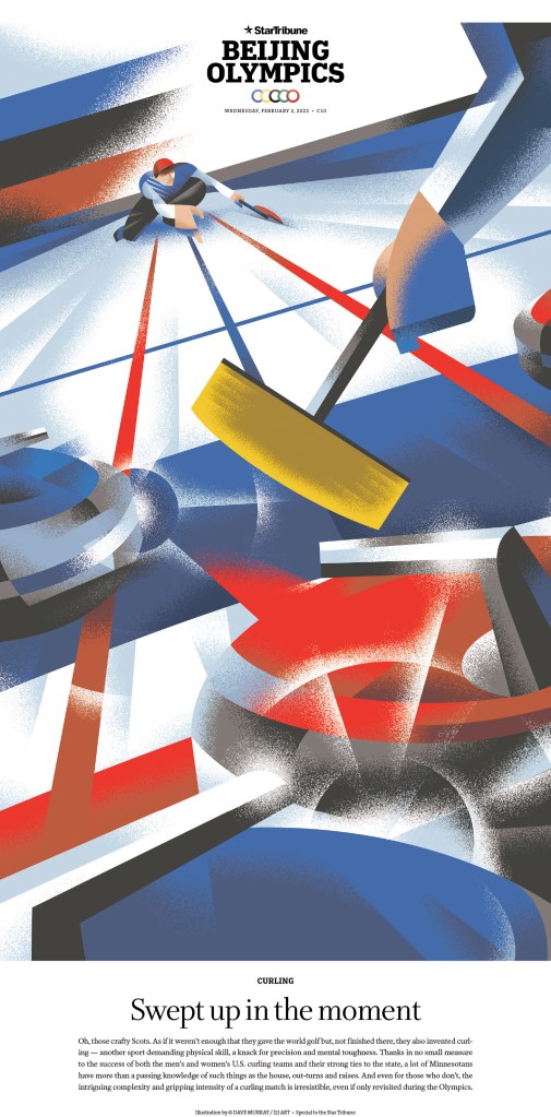
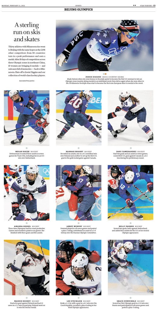
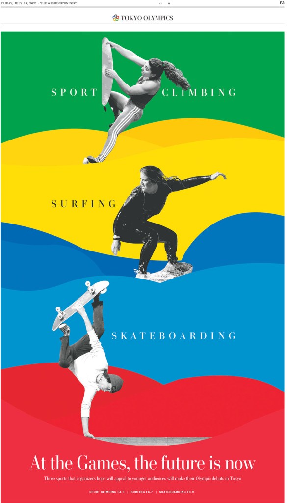
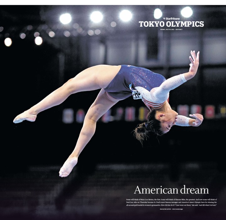
The Olympic pages by the Star Tribune were perhaps the best in the world.
And one more to leave you with. A page that is so Star Tribune.
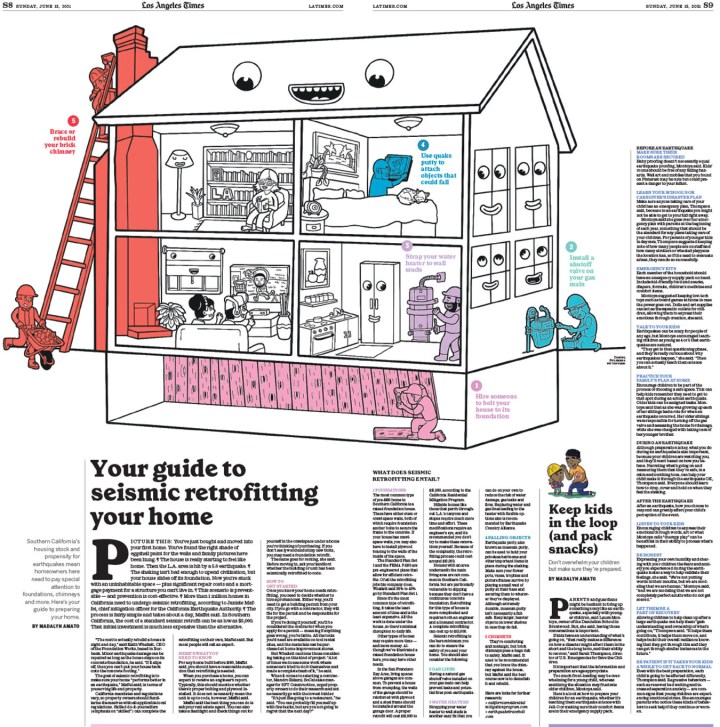
Los Angeles Times
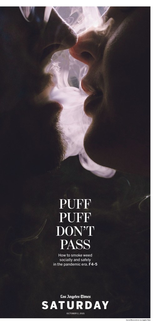
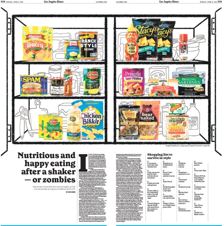
I’m a sucker for the Los Angeles Times. Maybe it’s because of the kiss page above. Maybe that hooked me. Despite having fewer wins than the three above, I find so many of their pages so striking and enjoyable. It is one of the papers clearly benefiting from some of the most brilliant art directors the world. So many of the pages are driven by outstanding illustrations. And one thing they do better than most is food. Which brings me to … burgers.
And this page. I think it’s just beautiful. When it comes to pure beauty, few publications move me like the Los Angeles Times.
And another driven by a beautiful, touching illustration, but one that seems clearly designed for the soft yet prominent headline treatment.
This stunner was a silver medal winner. It just gets cooler the more you look at it.
And here are a few more. Some that are just so bright and happy, and of course a couple more food pages.
Other publications
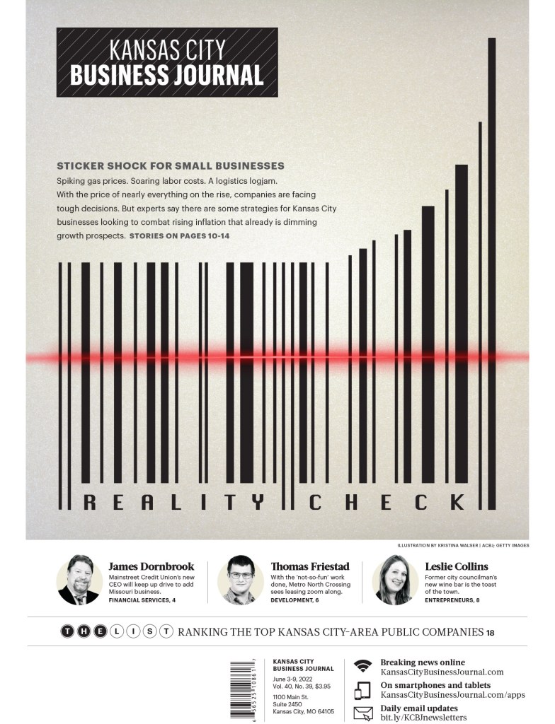
And of course there are many other great publications doing solid design work. While the pool is shrinking, these publications still rise to the top. There are so many more incredible pages from other publications, but I can’t show them all. There were thousands of entries. Here are the last few I will show, starting with this sharp page from the Kansas City Business Journal (part of the American City Business Journals, which tied for 10th overall in terms of awards).
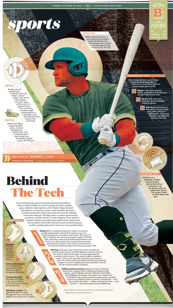
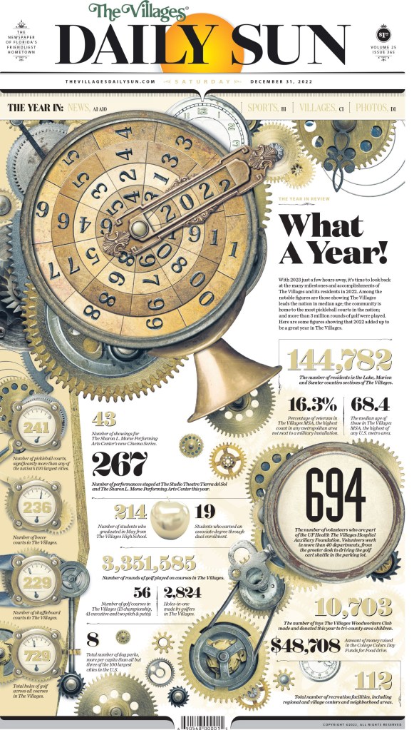
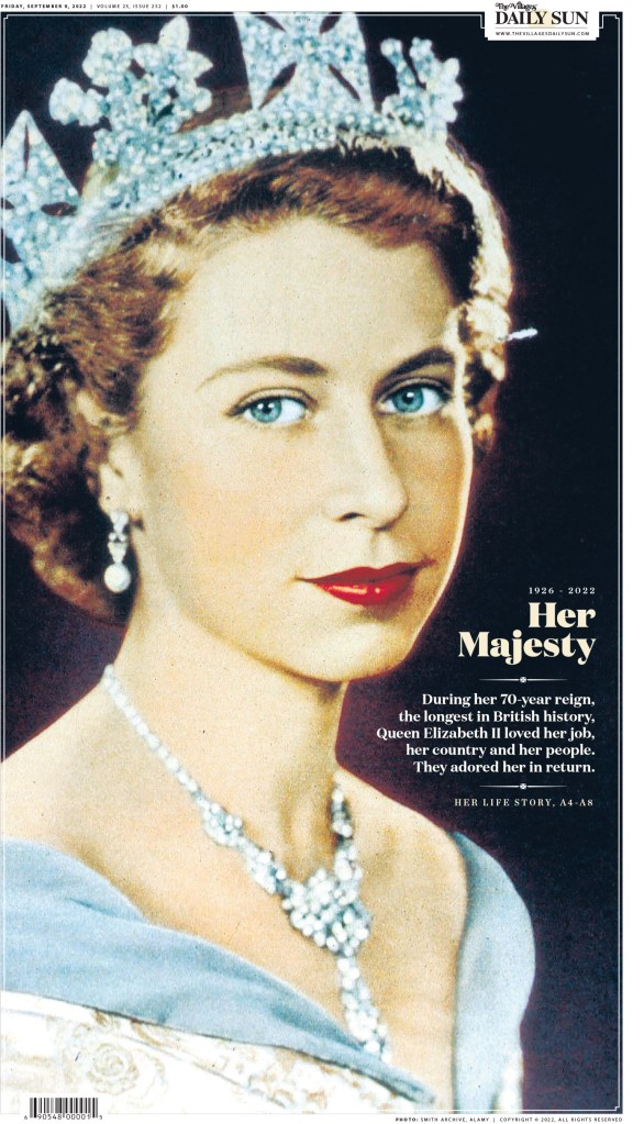
Anyone who follows my blog or Instagram knows I love The Villages Daily Sun. There are few newspapers that have a more distinctive style, and one that so clearly connects with its readers.
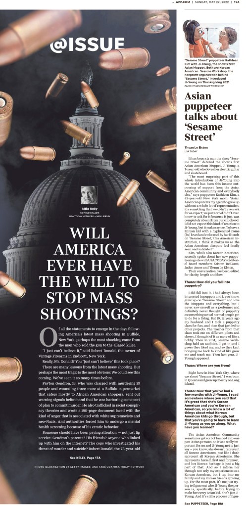
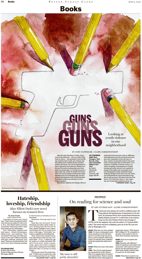
Next are a couple of strong pages on the topic of guns, one of the bigger topics, and, sadly, likely a bigger topic in next year’s awards. These are from the Asbury Park Press and the Boston Globe.
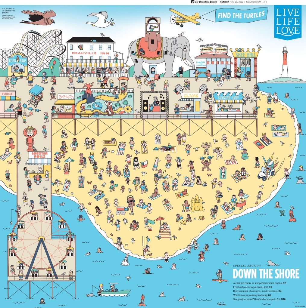
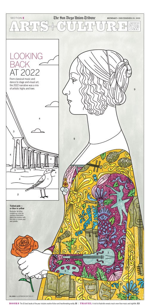
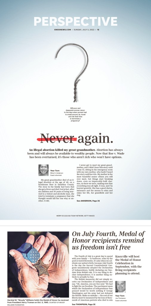
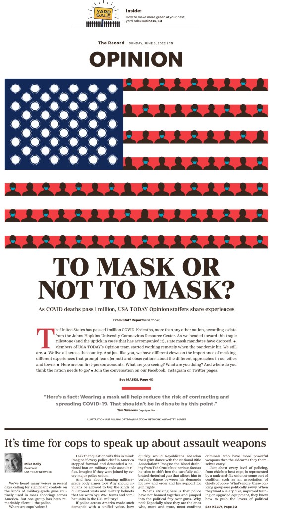
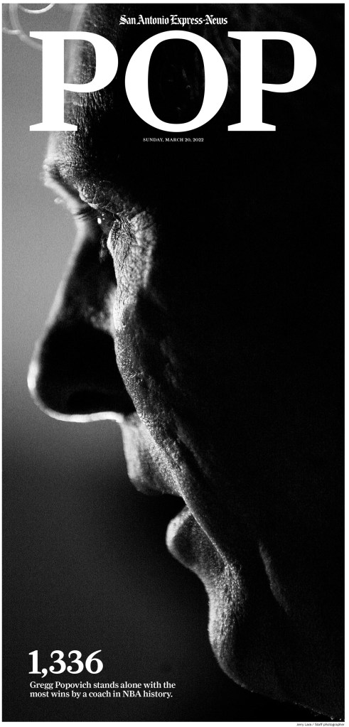
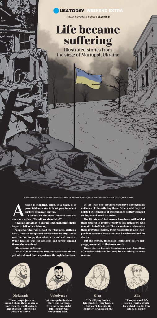
And last, but definitely not least, a few more brilliant pages, starting with fun illustration from the Philadelphia Inquirer, two from the San Diego Union Tribune, the Knox News Sentinel, Bergen Record, San Antonio Express-News and USA Today.
I would like to say print is alive and well, but it is struggling. Newspapers are closing all the time, resources are becoming more limited, revenue sources are drying up. But that is what makes this competition even more extraordinary. In the face of all of this, there are so many still striving for greatness, still working to give their readers more than just stories on paper. They are giving them an experience. The print experience.
This time of year is like Christmas for those who love print newspaper design. Newspapers who still take design seriously have submitted the work they consider their best to the Society of News Design. And for those of us who are lucky enough to be a part of the judging process in one way or another, as part of the planning committee, a facilitator or judge, it’s magical. We get to look through the best designs by the world’s best designers.
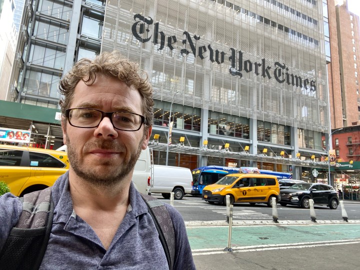
But to make this year even more special, after moving to a remote a competition because of COVID-19, it was back in person, and in New York. To make it even more exciting, it was in the New York Times building. I admit I got shivers as I saw the sign from a distance.
This year I had a bit of a hybrid role, part planning committee until life got in the way, part facilitator, part floater. For the second year in a row I got to be part of the team that chooses the World’s Best Newspaper (I wasn’t a judge, so not making the decision, just helping out).
This post is about the best in Canadian media. Sadly not as many papers submit. When I won, each of the three was for the Guelph Mercury, which had a circulation in the neighbourhood of 10,000. There is nothing close to that size anymore. This year in Canada, with Postmedia being out of the mix, only three media outlets submitted entries: The Globe and Mail, Toronto Star and Le Devoir, which just so happens to make up two-thirds of the ownership group of Pagemasters/The Canadian Press, my employer (Globe and Torstar).
So while there were fewer entries overall, and fewer outlets, than in years past, the quality of work these publications submits is still right up there with the best in the world. In this post, I will look at the Canadian entries. I will follow up with posts on the best American papers as well as the best from around the world, and also on the winners of the World’s Best Designed, which will be announced later this week. It will be worth the wait.
In Canada, The Globe and Mail was far and away the top winner, followed by the Toronto Star and Le Devoir. The Globe finished in the top 10 overall, which I attribute largely to incredibly smart art direction.
As a bit of a legend, awards are broken down into a few categories. First, an award of excellence must get the support of three of five judges, and those judges must think this work is beyond good. It must be excellent. Work that rises above what you might expect to see normally. Then there are silver and gold medals. As the level of award goes up, so do the expectations. By the time judges reach a gold medal discussion, the entry must be essentially flawless, down to kerning, every bit of white space and so on. It should be hard to find a flaw. This year, there were no gold medals for Canadian publications.
The Globe and Mail
This year the Globe won all awards of excellence other than in photography, which is somewhat out of scope for the blog, so I will look at the AOEs. The Globe finished in the top 10 overall, with 32 awards, three of which were silver medals for photography.
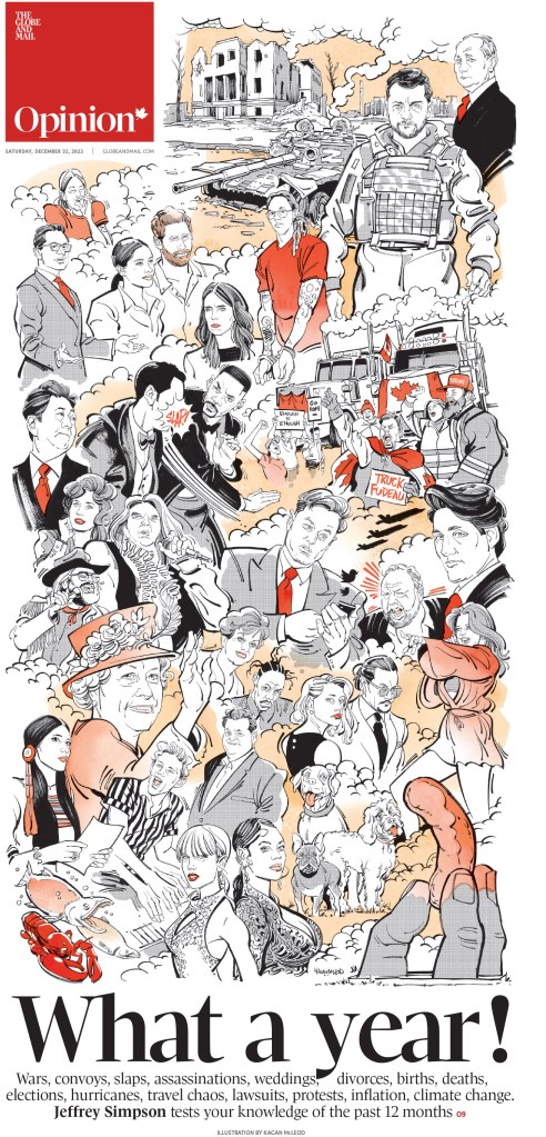
As soon as I saw this page in production, I knew it would be contender. Interestingly, pages like this were raised by judges. Is this a great page or a great illustration, or both? To be a great page it needs to use the illustration as part of a total package. To be clear, this page is absolutely driven by this stunning illustration. And this is where the art direction comment comes in. The Globe consistently uses incredible illustrations to drive pages. At some point that moves beyond just incredible illustrations and into smart art direction. Not only are the illustrations beautiful, they work with the story, and elevate the page to another level. And that is precisely what happens here and in many of the pages the Globe won for.
As often is the case with Kagan McLeod illustrations, the illustration drives this page. And I always know, regardless of the paper it appears in, at a glance that it is a McLeod special. He has a distinctive style. He has been helping Canadian newspapers elevate their front pages for years, from the Globe to the Star to the National Post. And I’m sure they are grateful.
This page was part of a staff portfolio award package. I often don’t like when newspapers use different fonts for headlines, but this page works. Nice symmetry, cute illustrations, and the typography is playful and works.
Not much to say about this other than it is visually magnificent. It’s a beautiful page, smartly conceptualized and executed. This and the next three pages are from the great Brennan Higginbotham, who won an award of excellence for his portfolio or work. I won three awards, one of which was for a portfolio of work. That is the award I am most proud of as it’s for a body of work. And as Higgenbotham shows here he is far from a one-page wonder. Some beautiful work.
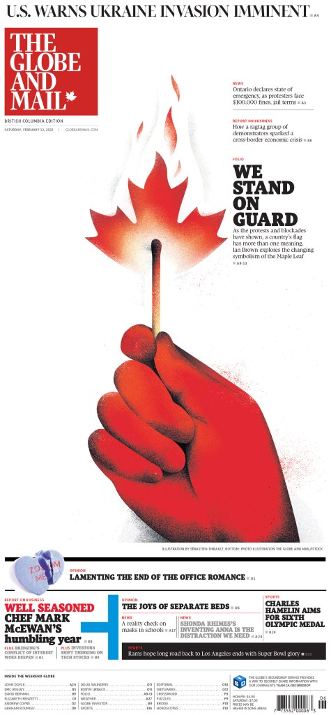
Using the maple leaf in a creative way in an illustration is not novel, but I am always impressed by how many amazing ways newspapers use it. To the world, Canada likely seems like a peaceful place, full of people saying excuse me and sorry. Especially sorry. But things are changing. As populism politics take hold in other countries, very much emboldened by Donald Trump’s presidency, Canada is following suit. The country is more divided than ever. And this illustration politely shows (so Canadian) that things are heating up. A great and smart illustration, nice use of white space and a witty main headline.
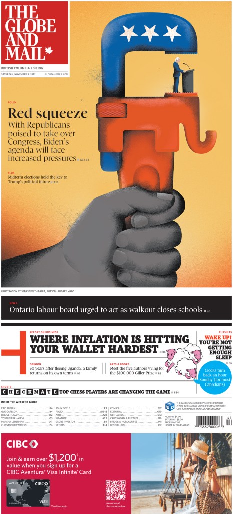
Just a lovely illustration, used well on a front page. NBD.
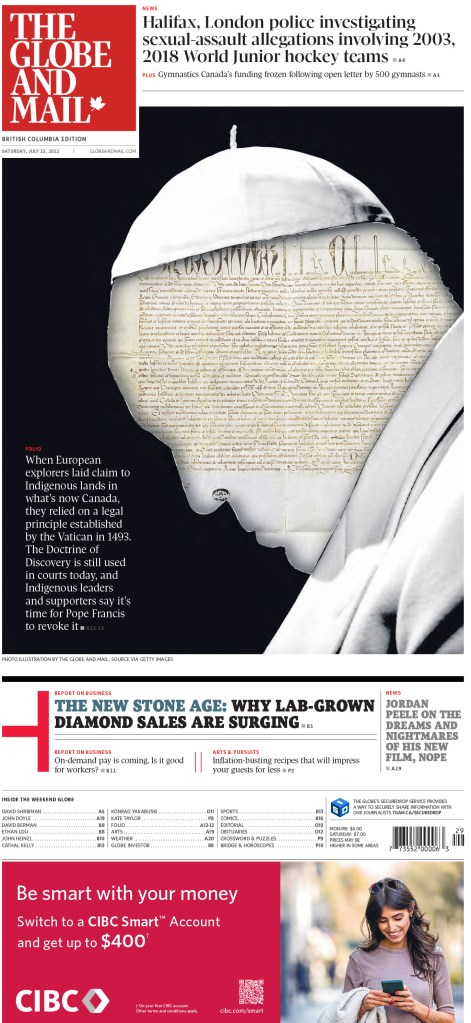
When I looked at the paper this Saturday morning I knew I’d be seeing this page in the competition. It’s one of my faves from year from the Globe. Is the song in your head yet? It makes for a very bold and colourful front page. As for the Globe entries for this post … that’s all folks.
Toronto Star
The Star submits significantly fewer entries than the Globe, and less than it used to. It’s great to see that it is still being recognized when it swings for the fences. It won four awards in total. Here are a few.
This is an example of a page with a great illustration that helps drive the story, but also a great design. The illustration needs smart typography to work, and it works.
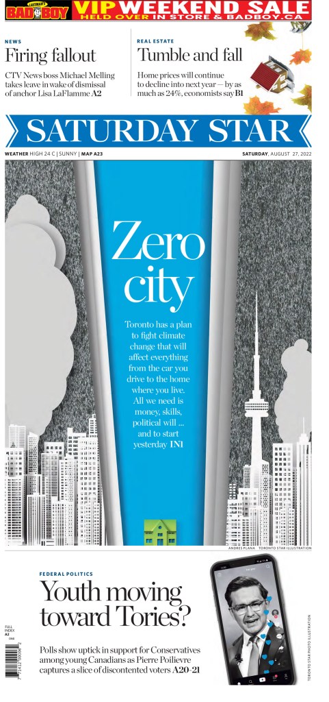
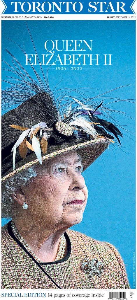
Anyone who follows me here or Instagram would have seen this page already. It was one of the sharpest pages around the Queen’s death. Great photo choice, very simple headline in terms of content and design.
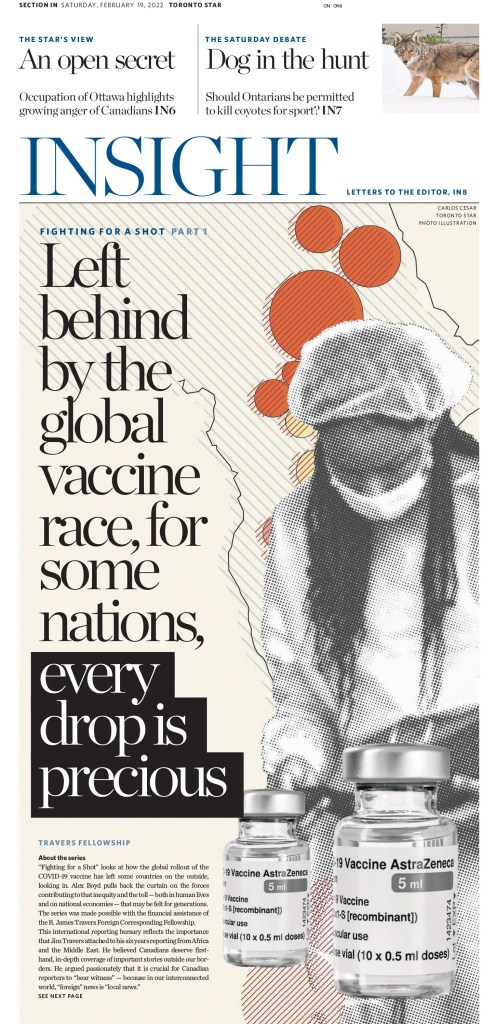
As a counter to the very simple Queen page, this is a busy page. There is a lot going on. Yet the focus of the story is clear. It does some things I might not normally like, but manages to pull it all together to make a very compelling design.
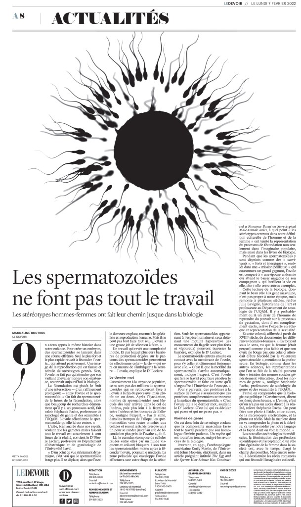
Le Devoir
Le Devoir submitted very few entries, but did a heck of job curating those entries. It won two awards in total. Here is one of the winners and one I liked that didn’t win.
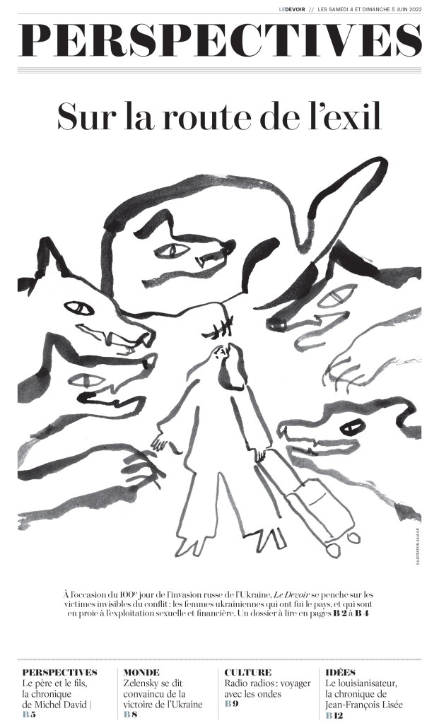
Something about this illustration speaks to me. It didn’t win an award, so this is a facilitator’s special recognition, I guess. I dig it. It really draws me in, and even without knowing French well enough to read this, I feel like I really want to know what it’s about.
This page looks very much like many of the European newspaper design powerhouses. The rules, the simplicity and the attention to very small details, like the illustration around the drop cap. Love it.
I know there is other great design happening around the country. The Winnipeg Free Press, Postmedia and elsewhere have some strong designs, even in this new and more challenging newspaper world. Sadly for judges and Canadian media loves, they don’t submit.
A huge kudos to those who do, and those behind the designs, from an art direction standpoint. You all put your work out there into the world to be judged by some of the world’s best. You open it up for critiquing. And sometimes you win. All of these papers had more entries and winners than I have shown. This is merely a selection of the incredible work they produced in 2022. As the Globe page above said, what a year.
So bravo to the Canadian designers who won awards and submitted their work.
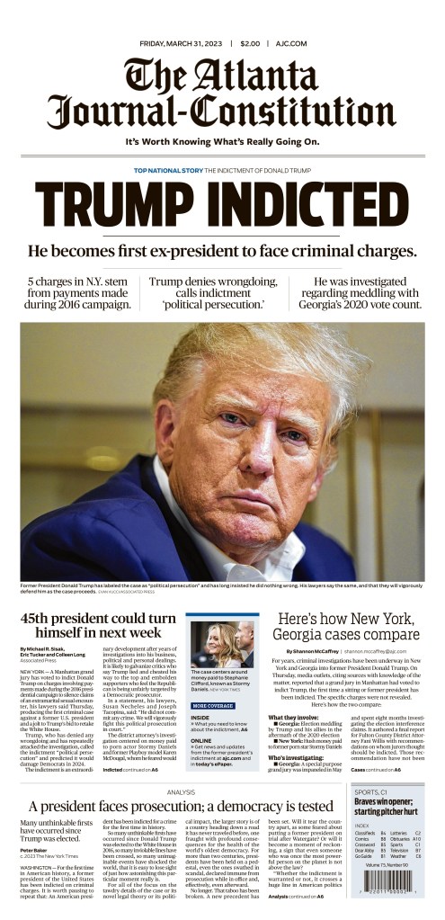
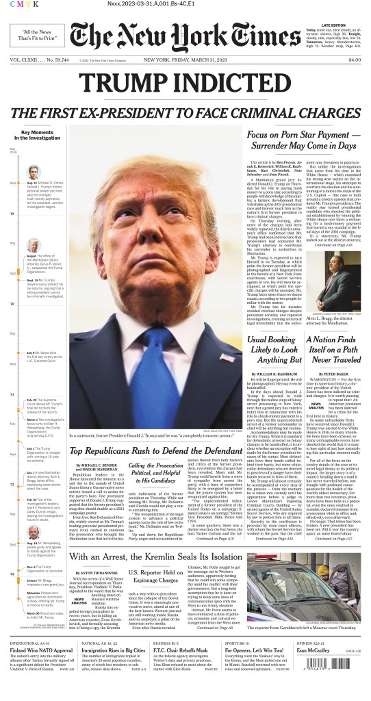
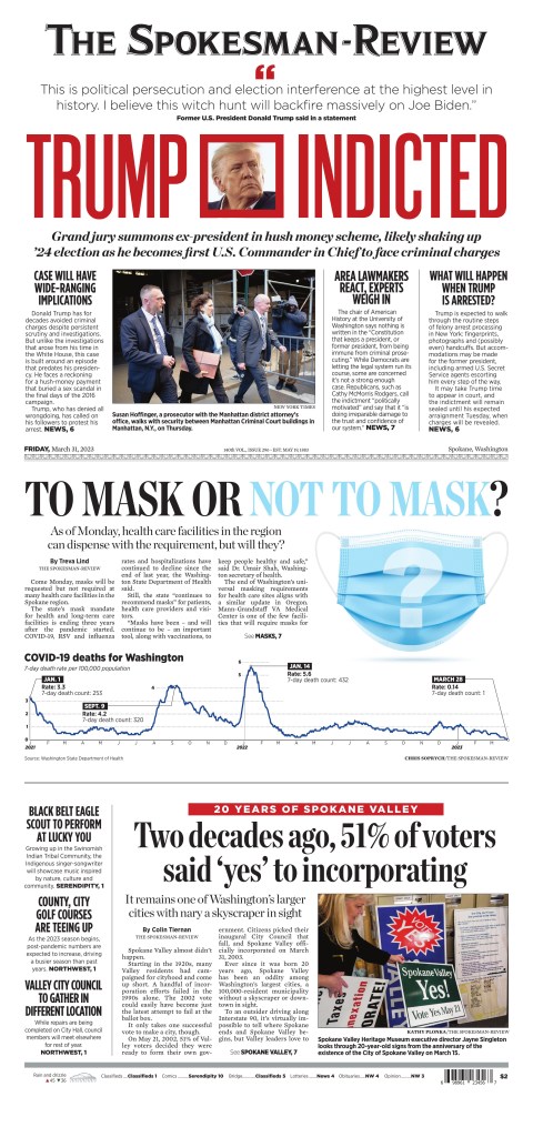
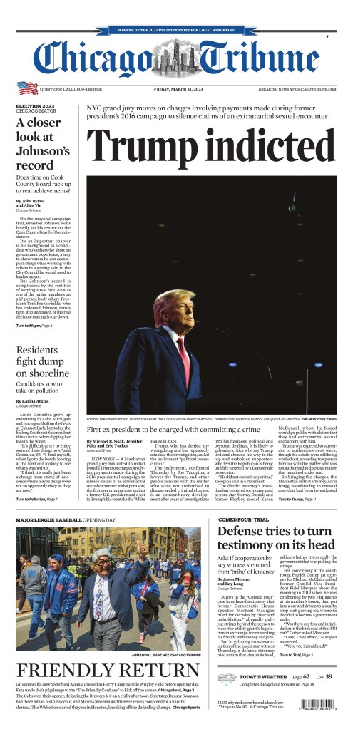
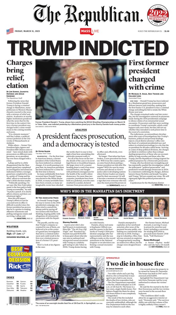
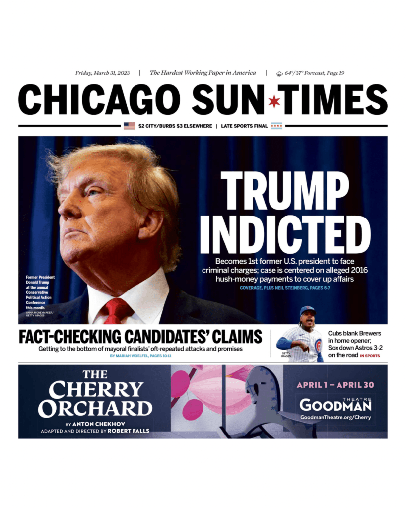
When word came out yesterday that former U.S. president Donald Trump was indicted, it was pretty obvious it was going to be the lead story on many newspaper front pages, particularly across the United States. It was the first time anyone who has held that position had been charged with a crime, though others have certainly committed some.
Nor was it surprising to see one headline splashed across more papers than anything else. While some papers carried a version of this headline, most papers went simply with: Trump indicted.
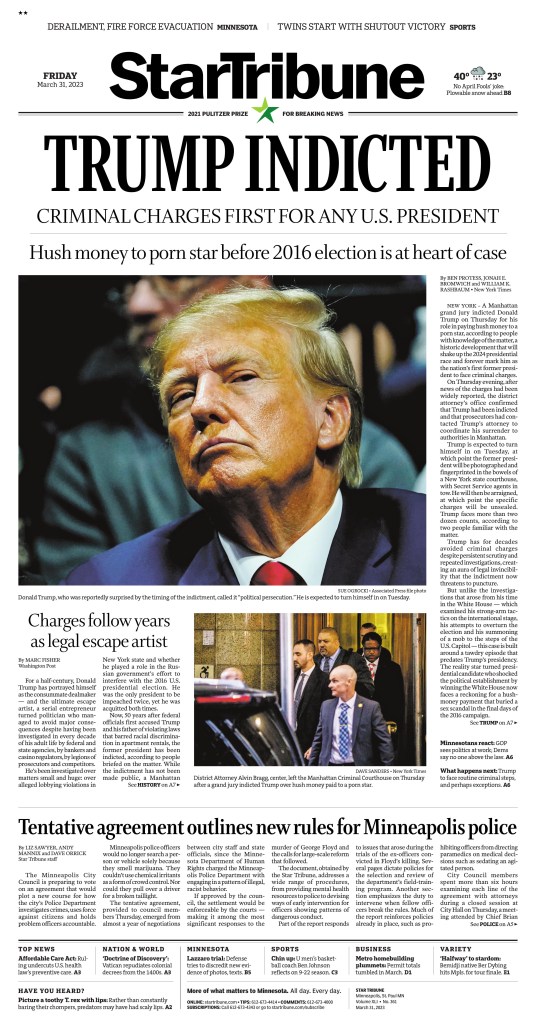
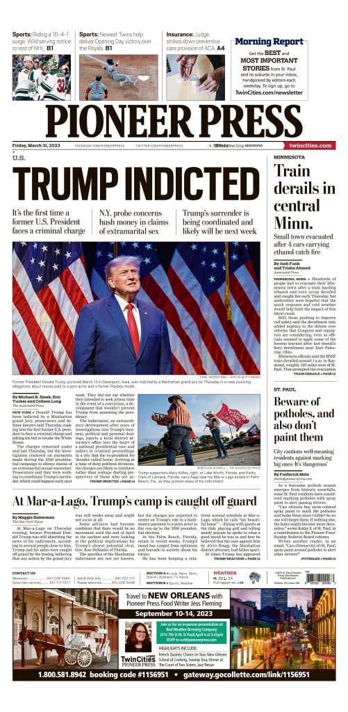
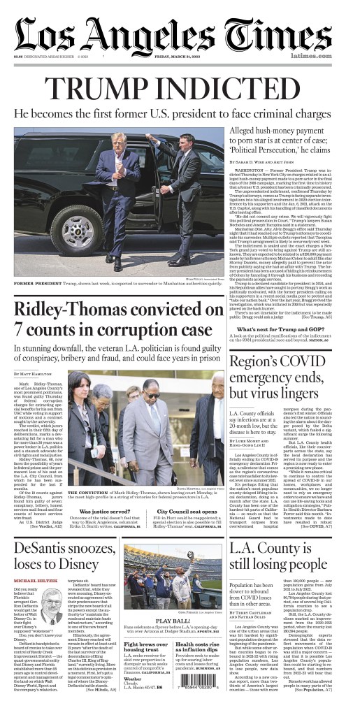
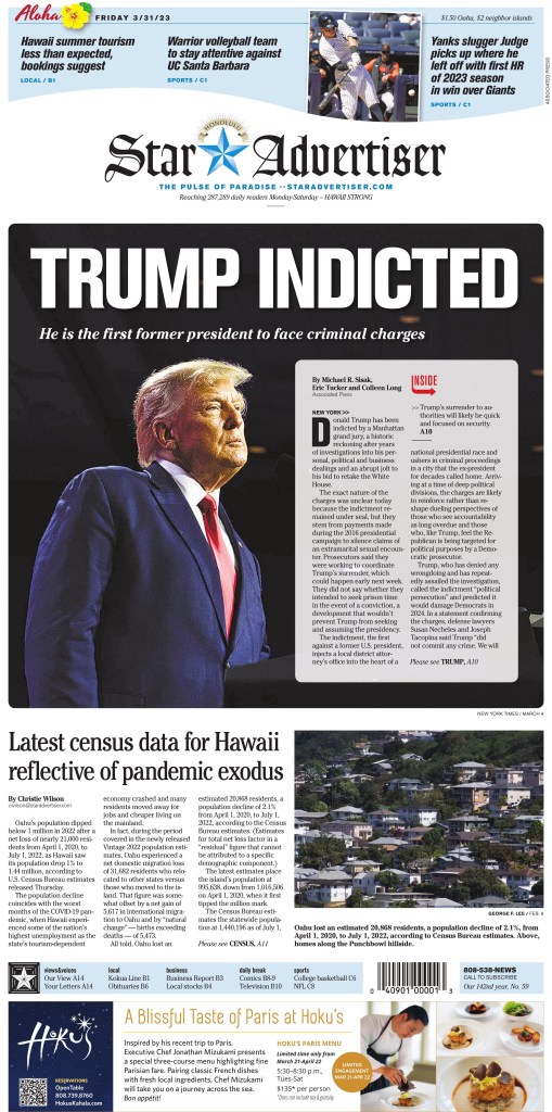
Here is a selection of 10 newspapers that used that headline. Most used the headline very similarly: big, bold and all capitals. The design that follows the head is similar in some cases, but it’s also very different in others. The Atlanta Journal-Constitution is my favourite from today. It is often a design leader on big news days. Take a look.
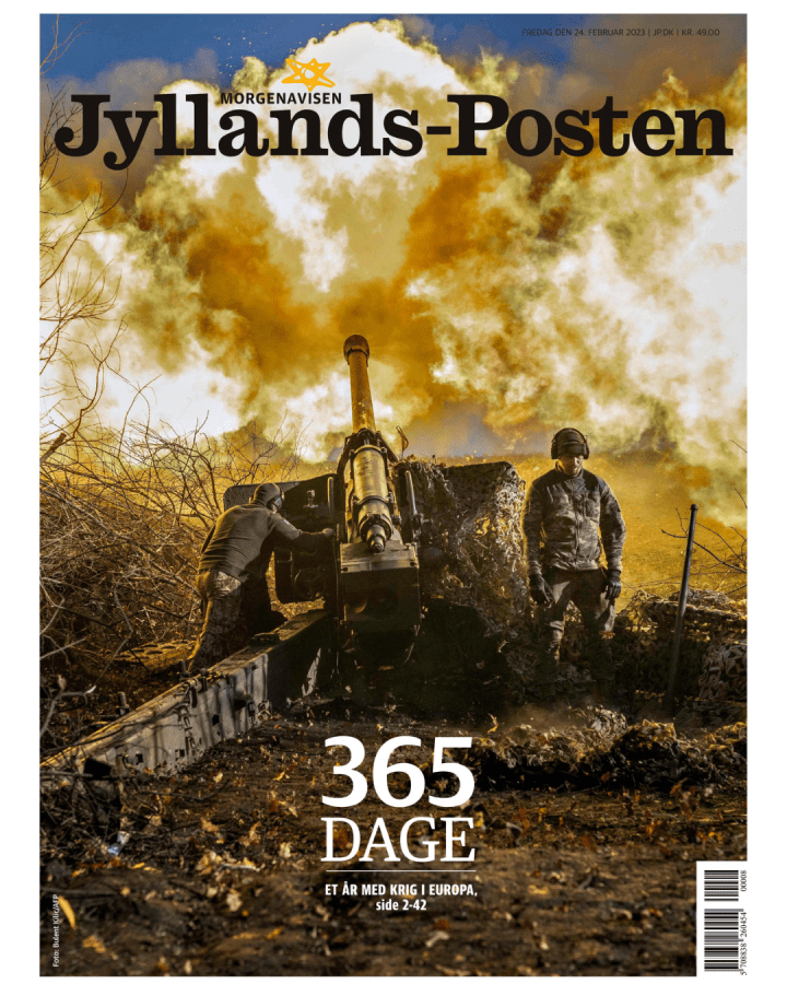
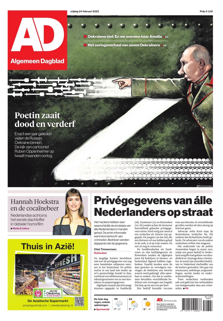
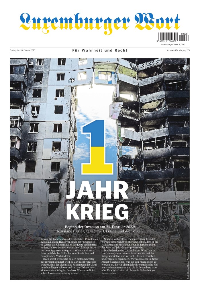
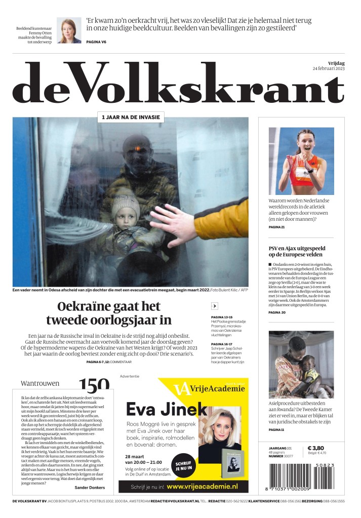
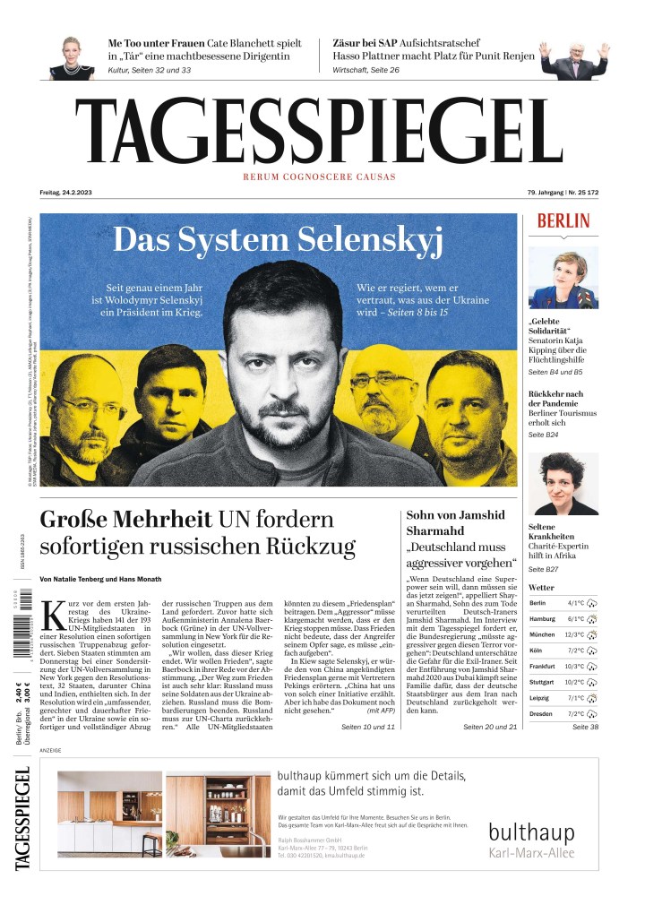
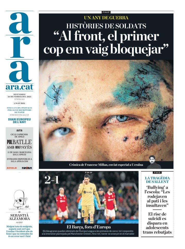
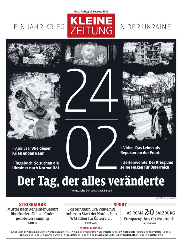
After months of threats, of world leaders warning an invasion of Ukraine was imminent, one year ago today, Feb. 24, 2022, Russia began an unprovoked war. Many thought the super power would roll over Ukraine. But one year later the war continues, with surprisingly little change, other than the tragic and large-scale loss of life on both sides and massive destruction in Ukraine. One year ago, the invasion dominated newspaper front pages. It dominated it for weeks. But, as happens with long-running stories, it started to fall off the front, and move inside newspapers, or down media home pages. Certain events would bring it back to the front. Media have tried to keep the war in the collective consciousness. Today, one year since the invasion, the sombre anniversary has brought the war back to newspaper front pages all over the world.
As I Tweeted out a few pages today, as a journalist, for a second, I debated the hashtag #RussiaInvadedUkraine, worried about showing bias. But reporting facts is not bias. Russia invaded Ukraine. And newspapers have not shied away from that.
Today, Poland delivered the first Leopard tank to Ukraine. Most of the world still stands behind Ukraine.
Here is a selection of some of the stronger front pages marking the anniversary.
Jyllands-Posten front page, Feb. 24, 2023, Viby, Denmark
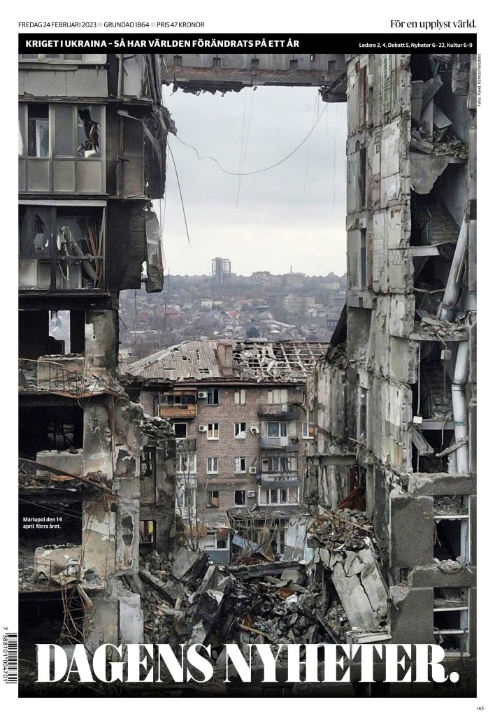
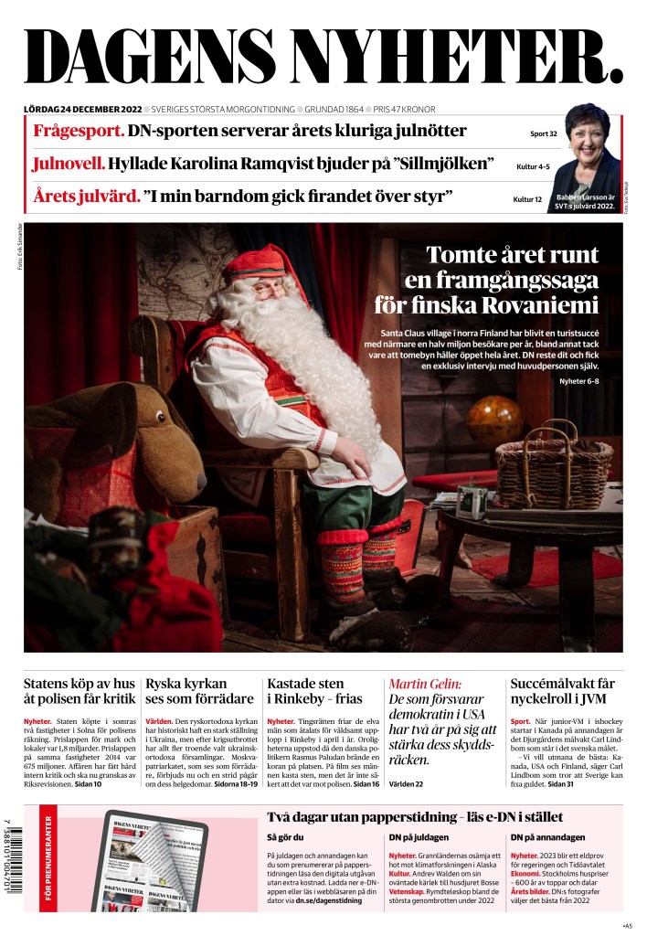
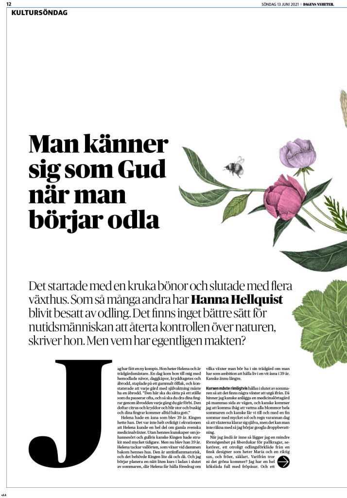
Dagens Nyheter front page, Feb. 24, 2023, Stockholm
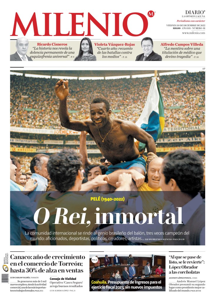
Not long after soccer fans watched one of the greatest World Cup finals of all time, where a No. 10 cemented his place in soccer history’s greatest of all time, they lost another one of the game’s greatest, the original No. 10. Pele, the king of the beautiful game, the original icon, has died at the age of 82. Evidence of his popularity as well as that of the sport is seen on newspaper front pages around the world.
Pele is the only player to ever win three World Cups. He played in four. He truly was a legend. I remember being in elementary school and watching a movie about Pele. I don’t remember why, but I can see the classroom and screen in my head, many, many years later. I remember the scissor kick and being in awe. Later I joined my school’s soccer team. I was blown away.
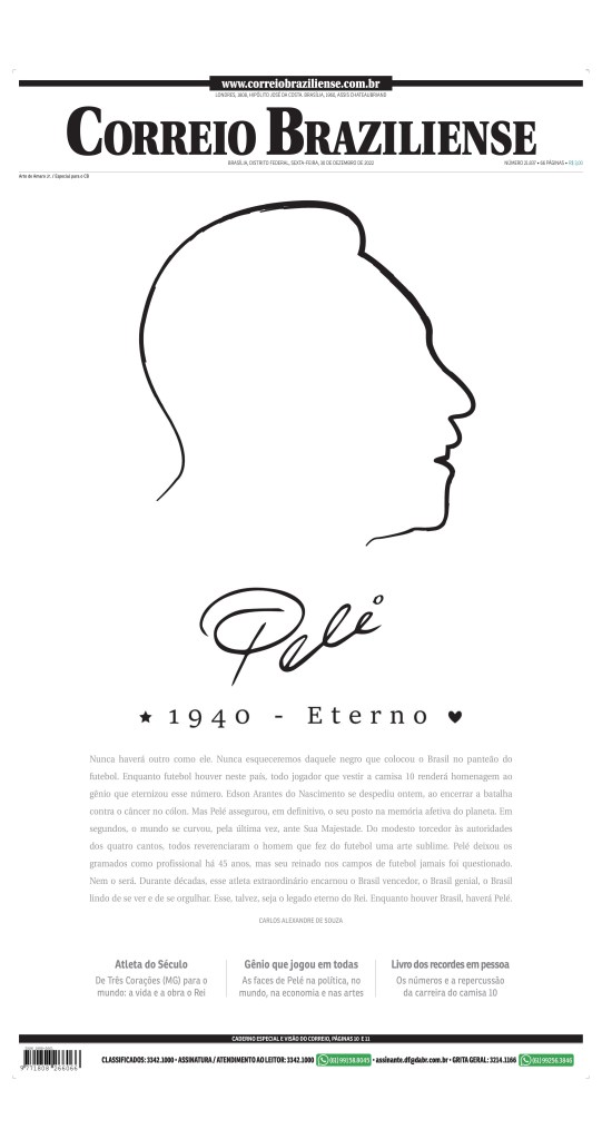
Pele died Thursday, and the world mourns. Here are 10 of the best and strongest front pages, in honour of his No. 10, marking the death of a sports legend. There are pages from around the world, but perhaps no surprise Brazil, where Pele is from, has a high concentration of the best.
The first, from Correio Braziliense (Brazil) is so strong from a design standpoint. One of the few that didn’t run with a photo. It’s a beautiful page fitting of the king of the beautiful game.
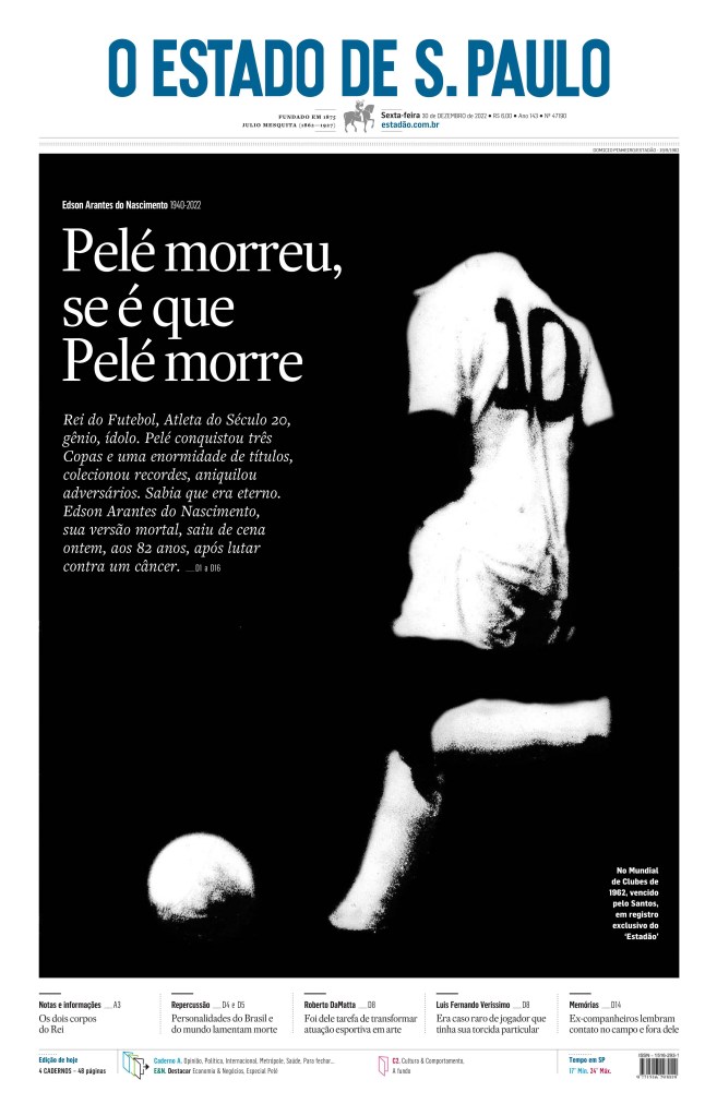
Next up is O Estado de S. Paulo, also from Brazil, also took a creative approach with the art, highlighting Pele’s iconic No. 10.
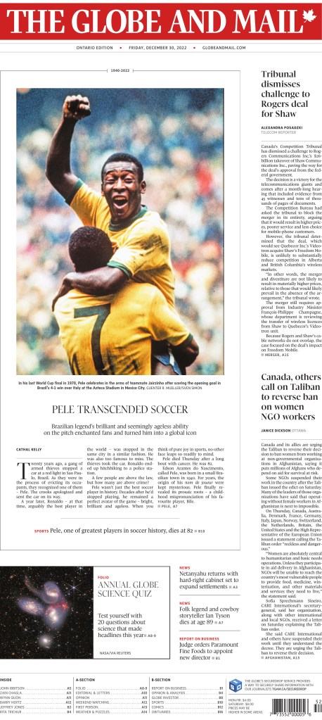
Canada’s Globe and Mail is always quick to highlight a big soccer story. So of course Pele’s death would be front and centre.
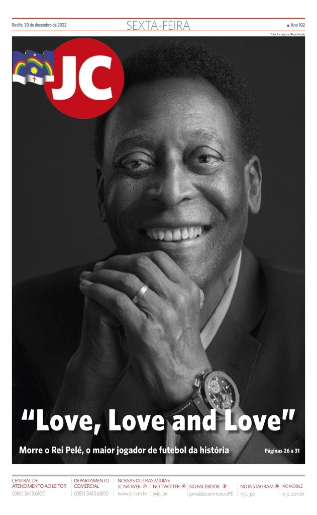
Jornal de Commercio, another from Brazil, uses a strong portrait.
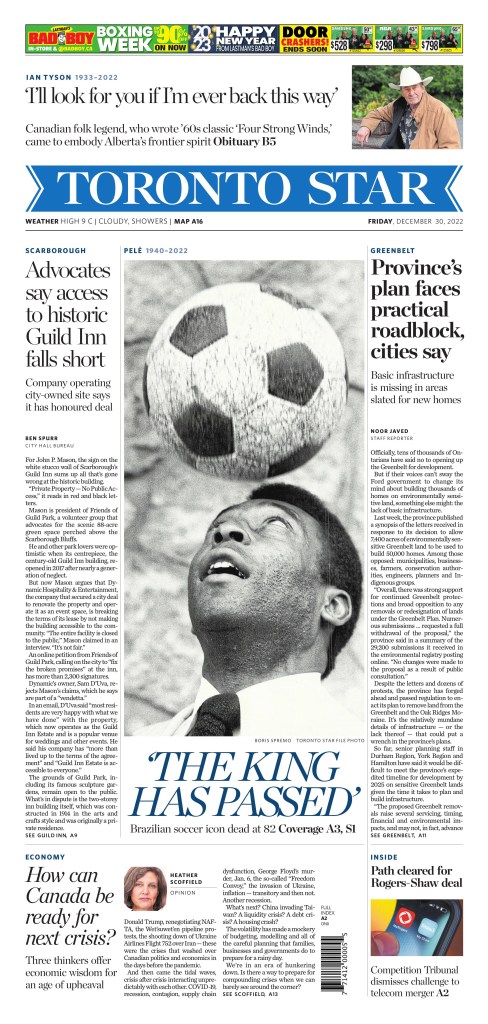
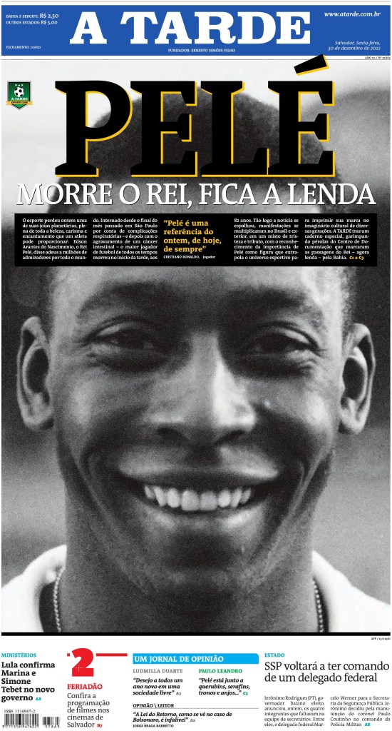
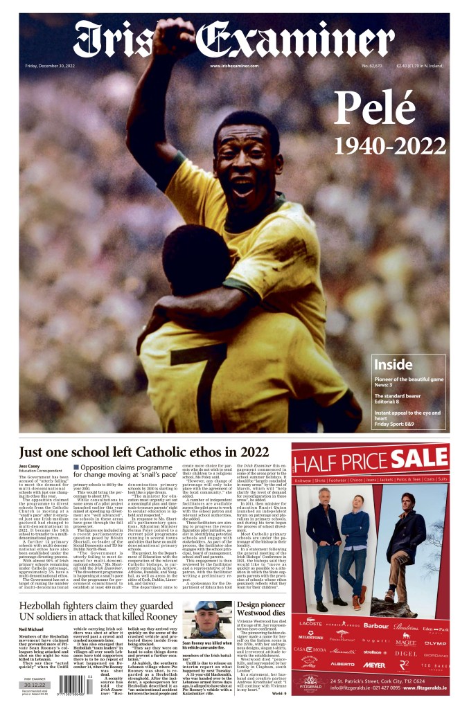
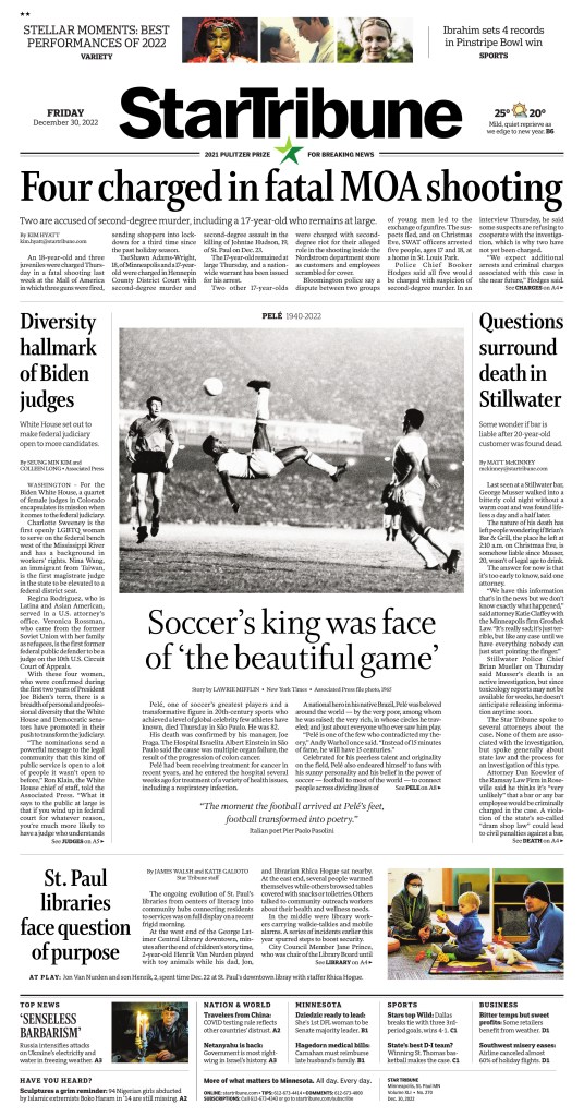
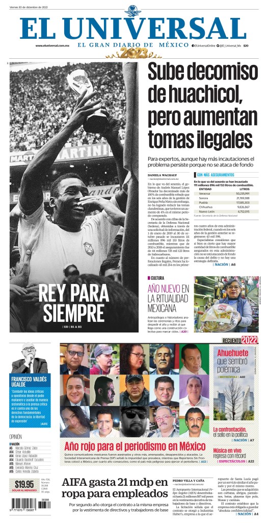
And below are, in order, the Toronto Star, A Tarde (Brazil), Irish Examiner, Star Tribune (Minneapolis, Minnesota, with the classic scissor kick), El Universal (Mexico) and Millenio (Mexico).
Christmas is often the best time of year when it comes to newspaper design. Unlike disasters or major events, Christmas Eve and Christmas Day is the other time of the year when newspapers have similar content and often produce some great and less depressing front page content.
Below is a selection of some of the best from Christmas Eve 2022, starting with Het Parool (Amsterdam), which makes me chuckle more than anything. But it’s also a fun front page with a great illustration. I don’t know how the speech bubbles translate but in this case I kind of like it that way.
Update: I have learned what it says! And now I am glad I know. 🙂
Him: It itches
Her: You don’t say.
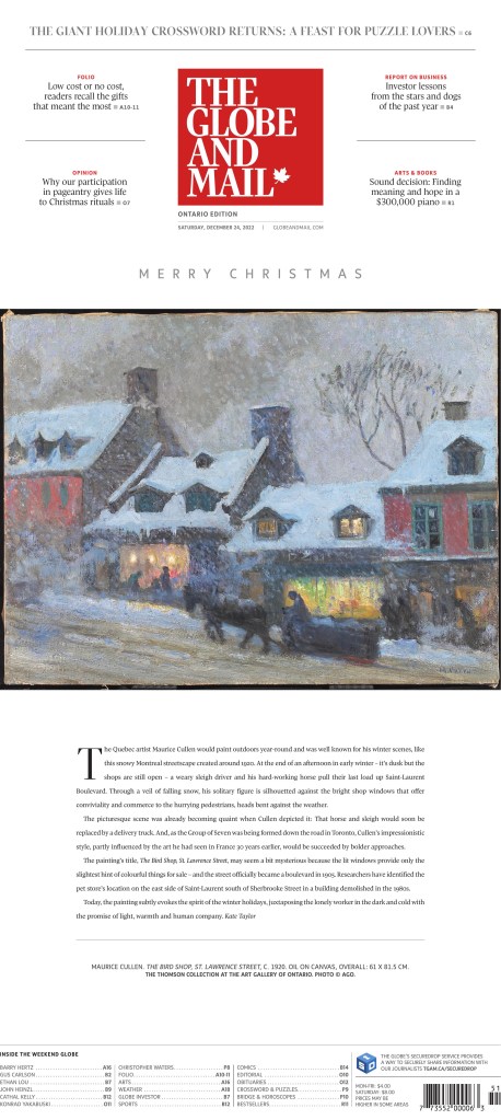
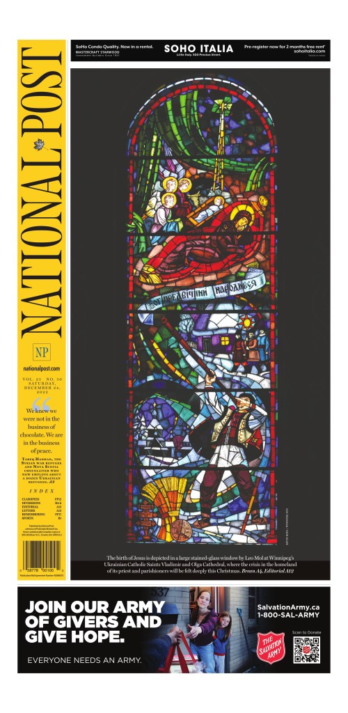
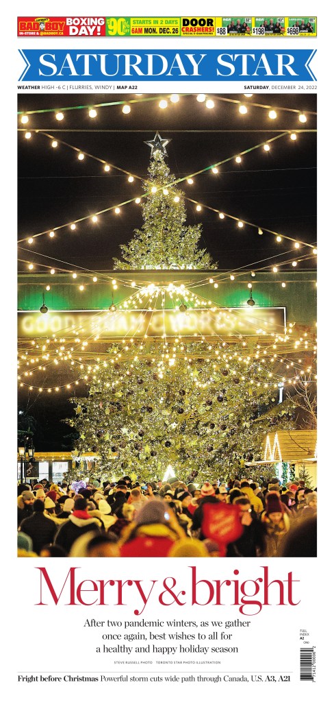
And of course the Canadian classics. The Globe and Mail with its elegant painting, the National Post with its stained glass and the Toronto Star with a large photo blowing out its front. In most years this is what each of the do.
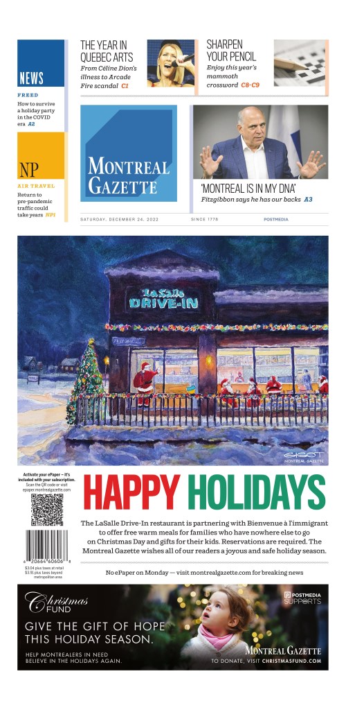
And another from Canada, though not necessarily as traditional as the others. The Montreal Gazette.
I might add more here tomorrow if there is anything great! And my gut tells me there will be.
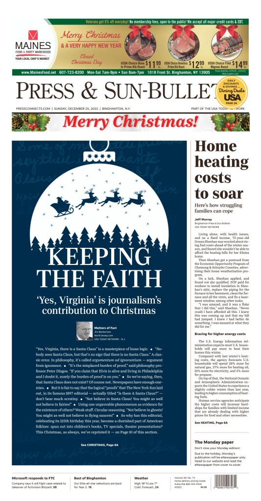
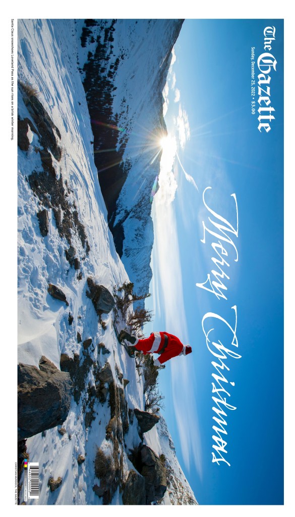
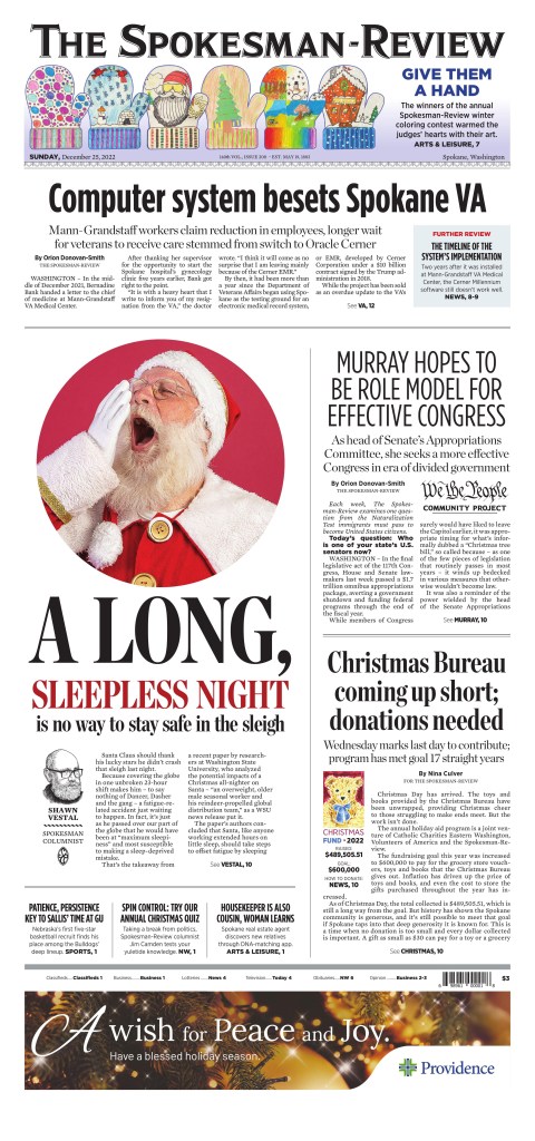
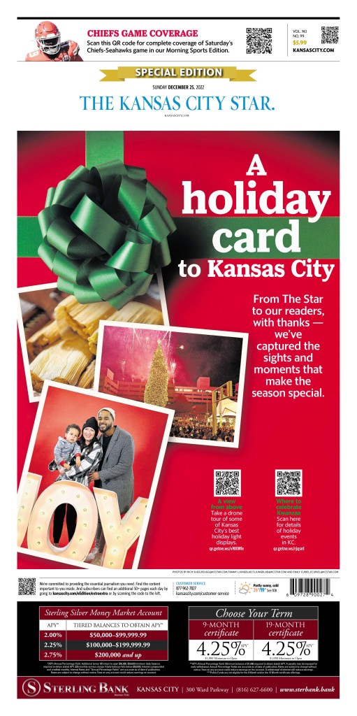
Update: Here are a few more pages from today! First up, the Press and Sun-Bulletin from Binghamton, New York. Next is the Gazette from Colorado Springs, the Spokesman-Review from Spokane, Washington, and finally the Kansas City Star.
The world is a big place. To break it down for this blog, when in came to celebrating all the magical newspaper entries from the Society for News Designs Best of News Design competition I have broken it down into Canada (because I live and work here), the U.S. and the rest of the world. And that is not to diminish the rest of the world. The work coming out from newspapers around the world is astounding, which in itself is astounding given the times we’re in. Which brings me to where I want to start. The World’s Best Designed Newspaper, SND’s highest honour.
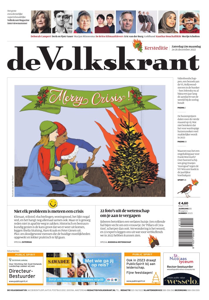
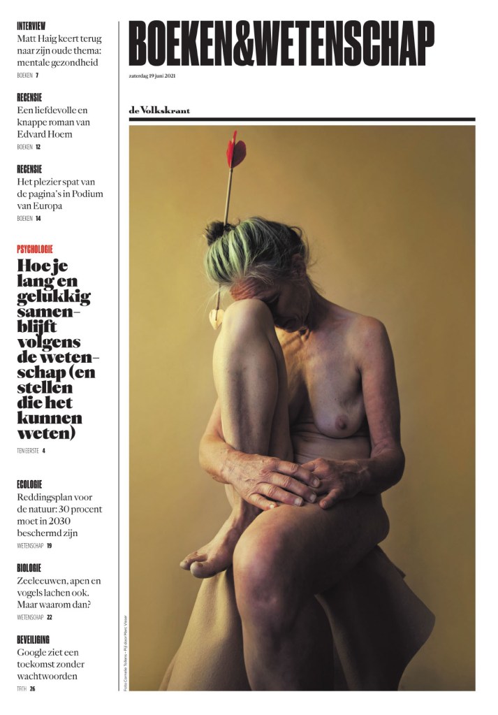
This year I had the great honour of being a facilitator for this competition. I got to watch them whittle down the entries to four finalists, and from there to choose one paper. The discussion was riveting. It came down to the New York Times, de Volkskrant, Het Parool and Die Zeit. Anyone who follows me knows I love de Volkskrant. Seeing it make the final was very satisfying.
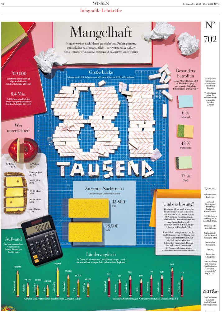
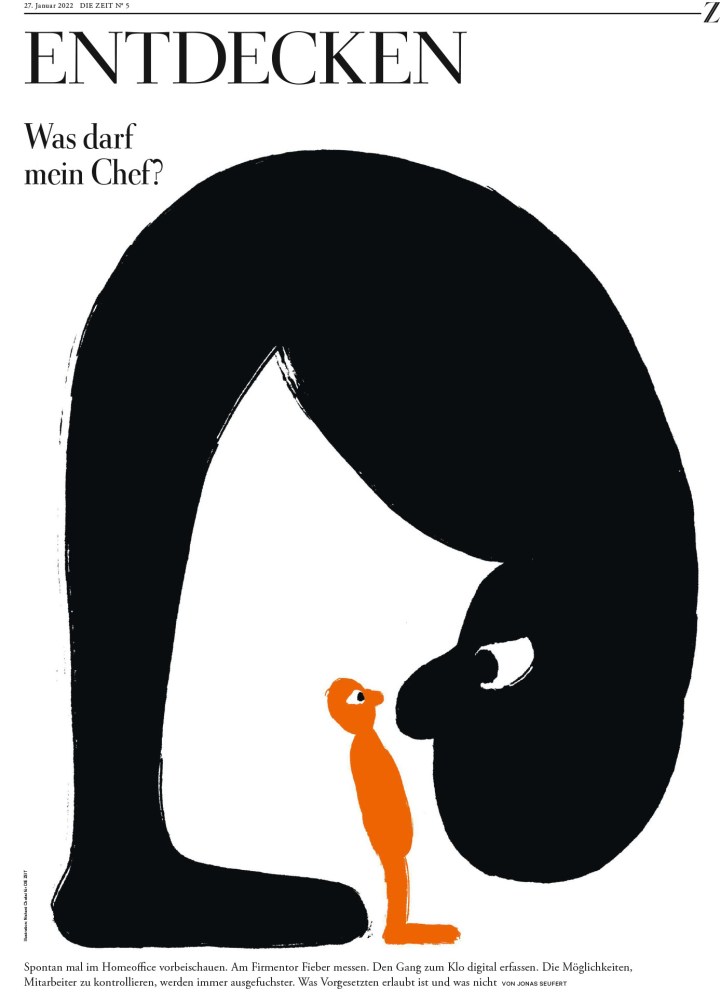
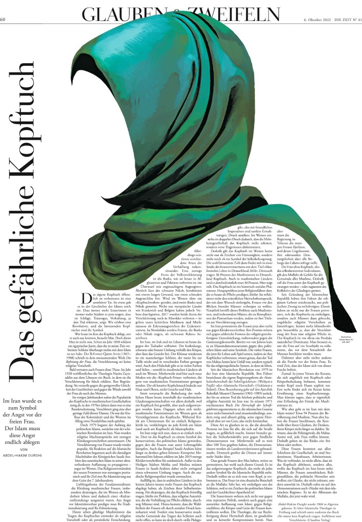
After days of review and debate/discussion, Die Zeit came out on top. While all these newspapers have huge strengths, Die Zeit is worthy of this lofty title.
What makes a world’s best-designed newspaper? So, so many things. One word that was heard again and again was “considered.” Everything is so considered. All the little details. Nothing was overlooked. Things like drop caps, the spacing of words that wrap around images, kerning, and so on. But also the big things. Photo choices, how and when illustrations are used, how the text worked with art and the design. The funny thing was it was so well designed, it was remarked that the design falls to the background. Except when it doesn’t. The design is so remarkably clean, but sometimes they go big. And their use of photos and graphics? Considered. Everything is so artistic, they said. The judges could tell there was collaboration between editors and designers, which is imperative if you want to go from a nice paper to a top paper. Even more needs to happen to elevate a paper to world’s best designed. Congrats to Die Zeit for doing all of this and more. It shows.
While Die Zeit may not have many of those big “wow” pages, it still has some amazing, striking pages that take their clean and refined design to another level, and that clean design is already at another level. It really is a paper that rises above. I’ll start by showing some pages from Die Zeit, followed by a selection of some of the best pages from the rest of the world, Canada and U.S. excluded. You can see those here (Canada) and here (U.S).
“Great print design paints a coherent experience for the reader where every carefully chosen element contributes to convey more than the sum of its parts.”
Judges’ statement
Die Zeit
Die Zeit is a weekly paper out of Germany. So that is one main difference from the papers it was up against. First, I will show a selection of some consecutive pages. Just to lull you into thinking it’s just a nice clean design. But this is what readers would see every day as they start flipping through their newspaper. After those pages, I’ve included some with sizzle. Text as design, illustrations and graphics, colour.
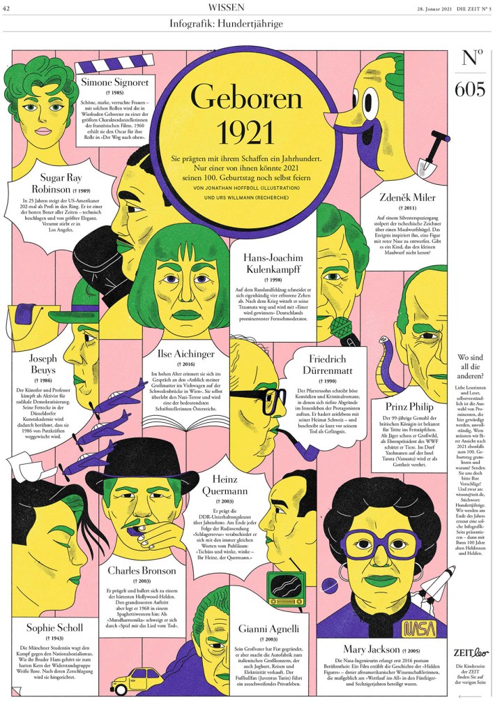
This one is one of my faves from Die Zeit. Every year one paper does a funky text design that grabs onto me and won’t let go. This was this year’s. I love the bend, that the text is still so well spaced and readable. The E. And they did more incredible text designs. They made a chicken out of text. A chicken! Wait for it. It’s coming.
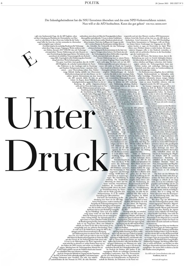
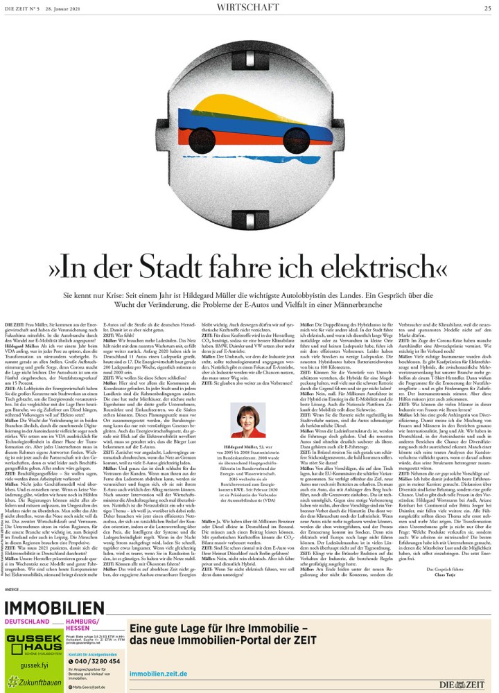
Die Zeit, Jan. 28, 2021
This page is just funky. That’s all. I love the text treatment. The border. The pic. It actually reminds me of a design I once did, just better. So good.
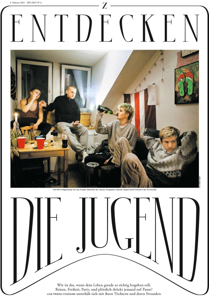
Die Zeit, Feb. 4, 2021
A chicken! Out of text! Over a two-page spread!
Die Zeit, March 31, 2021
I’ve included a few more separately. They were too good to be missed.
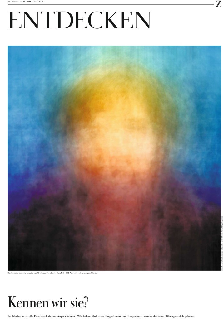
Die Zeit, Feb. 18, 2021
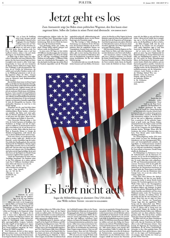
Die Zeit, Jan. 21, 2021
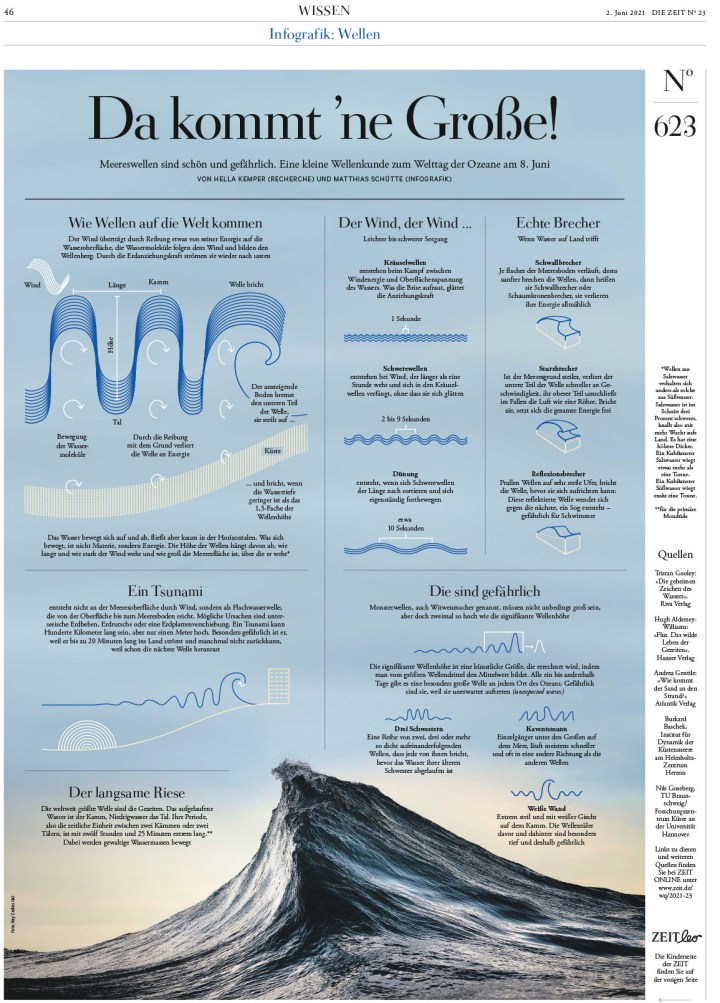
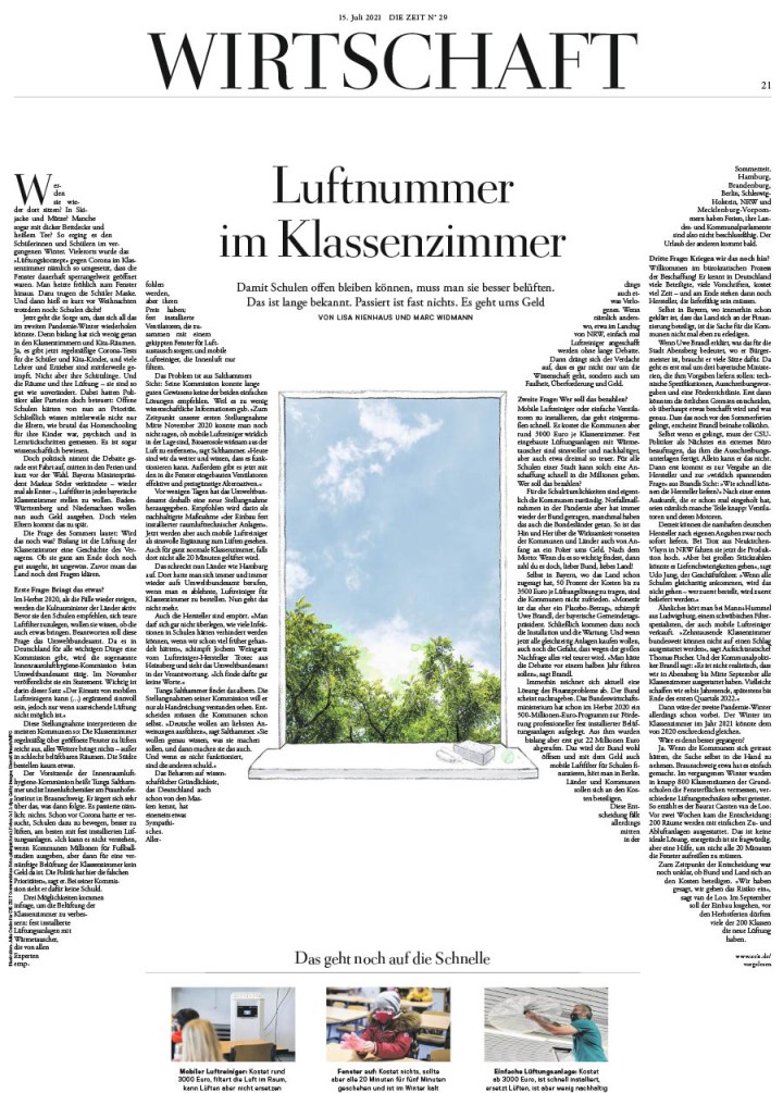
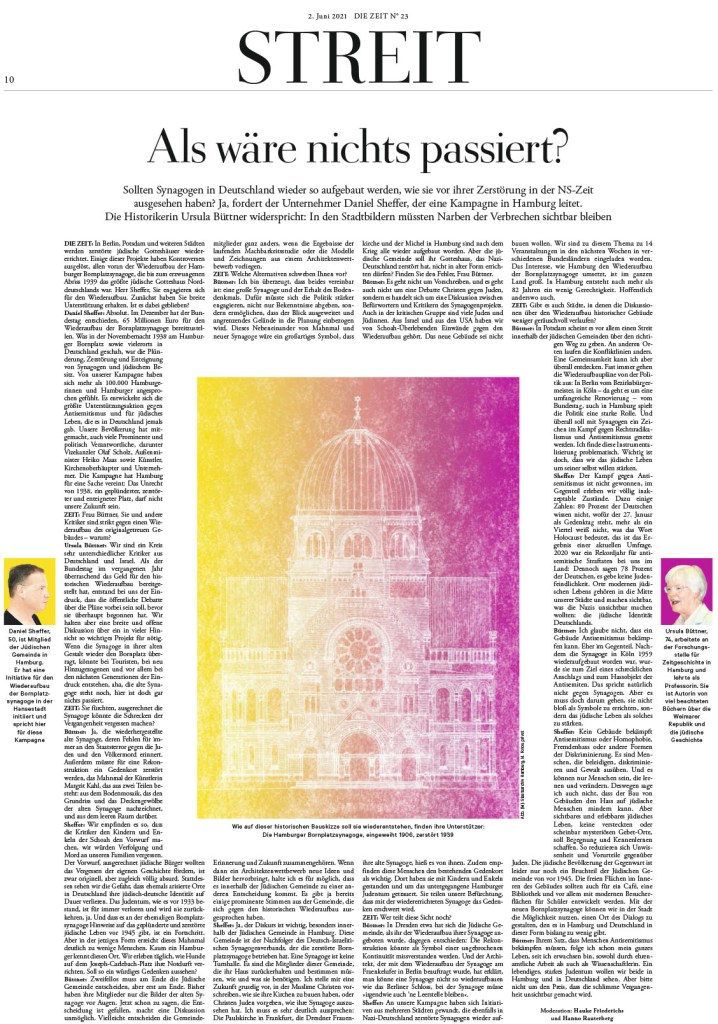
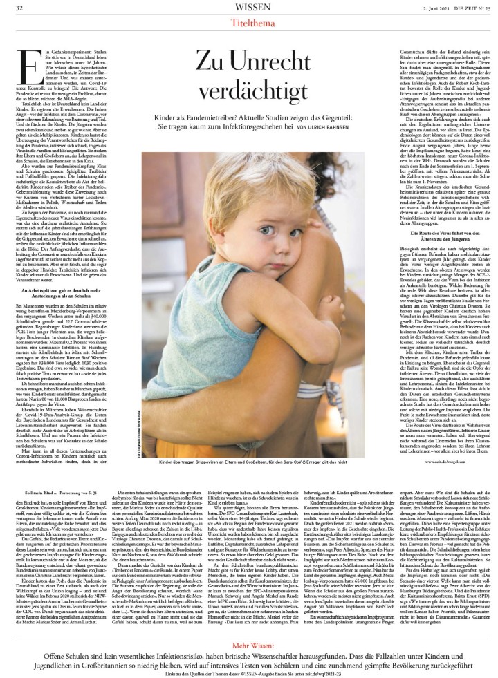
Die Zeit, June 2, 2021
And so so many more stunning, smartly designed pages. This slide show has a number of them, but it’s still a small sampling of the work that comes out of this paper every week. Just such amazing attention to detail on every page.
The rest …
There were more than 3,500 entries in this year’s competition, up from the previous year, which is encouraging. Of those, there were more than 800 winners. If that sounds like a lot, keep in mind the 3,500 entries consist of what designers from around the world considered their best work, work worthy of award consideration. I look at 500+ front pages every day. That’s just covers. I can’t even begin to fathom how many pages are produced each year. How many great pages weren’t entered.
Alas, you’ve seen Canada. You’ve seen the U.S. Here is a very slimmed down selection of pages from the rest of the world. One of the things I love about newspapers from other countries is that they often look so different than the typical North American newspaper. They take a different approach, have different design philosophies. But one thing is clear with all them: they want to wow their readers. This will mark my last post from SND 43, but it may not be the last you see of some of the pages in this post as I try to gently coerce the incredible designers behind some of these pages to talk to me about their work. First up, Politico Europe and Politiken!
Politico Europe
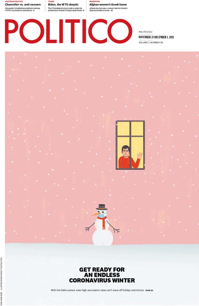
There is such a range of pages from Politico Europe. A lot are illustration-driven. And the illustrations are beautiful or haunting or striking. I will start with the snowman. Every time I saw this little guy, and the person in the window, I felt something. I want to feel happy. But then …
Politico Europe, Nov. 25-Dec. 1, 2021
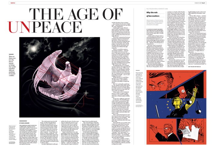
This spread is so well done. The art is striking, the headline is strong, both words and design. It’s clean, but with some surprises. The headline is almost jarring as set up, but I feel it’s supposed to be. It’s not the age of peace, after all.
Politico Europe, Oct. 14, 2021
In this slide show, again, there is a great variety, starting with this dark image, and ending with a section about doers and dreamers that makes me smile. Every page makes me smile.
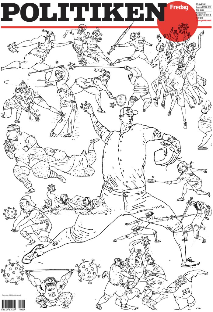
Politiken
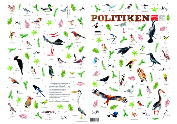
I’ve long been a fan of Politiken. I feature pages from this publication on my Instagram frequently. This was a page I featured here. I put it in with my Christmas collection even though I wasn’t sure if it was meant to be a Christmas page. But the entry was called wrapping paper! So it is.
Politiken, Dec. 24, 2021
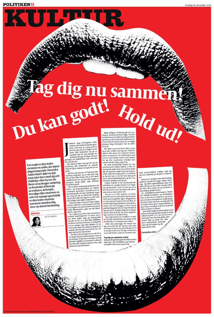
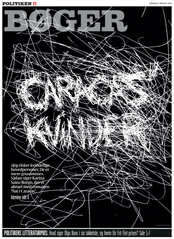
And now for something completely different. The next two pages are from the same award-winning portfolio by designer Caroline Niegaard. What strikes me about these is that they are chaotically bold. They are full of energy.
Politiken, Dec. 29, 2021Politiken, Feb. 27, 2021
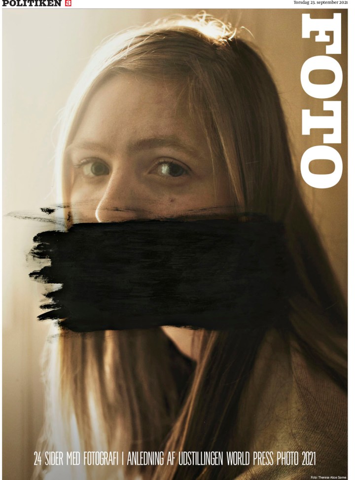
And many more. I love that this paper takes risks. And that its work is so varied. The last three I’ve chosen to show are completely different, but still within character.
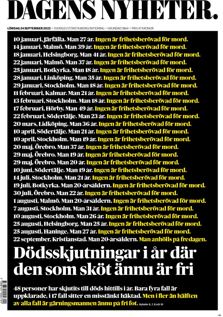
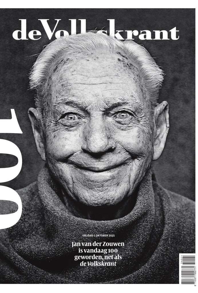
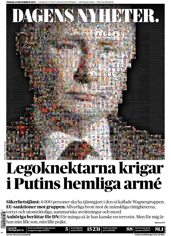
Below are some others I have pulled out to highlight. Just some of my faves, but there were so many more incredible entries from other papers. First from de Volkstrant, a page that was featured on my Instagram, and then two from Dagens Nyheter, which I think does an incredible job on covers regularly.
de Volkstrant, Oct. 1, 2021
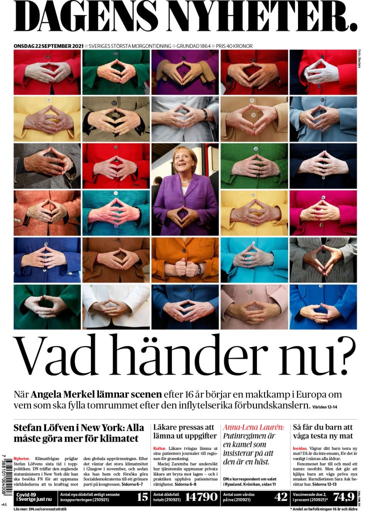
Dagens Nyheter, Dec. 21, 2021
Dagens Nyheter, Sept. 22, 2021
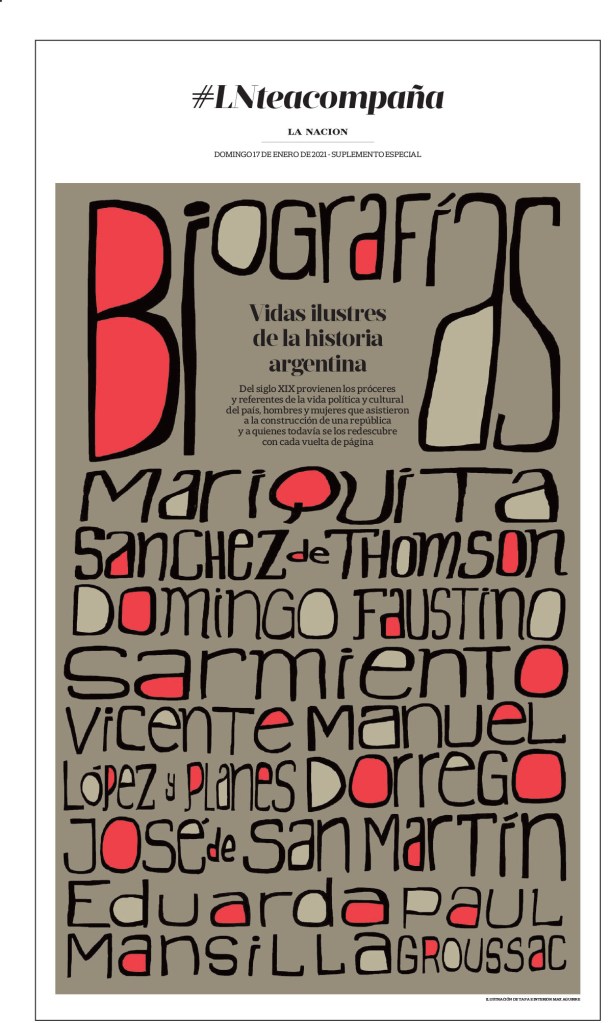
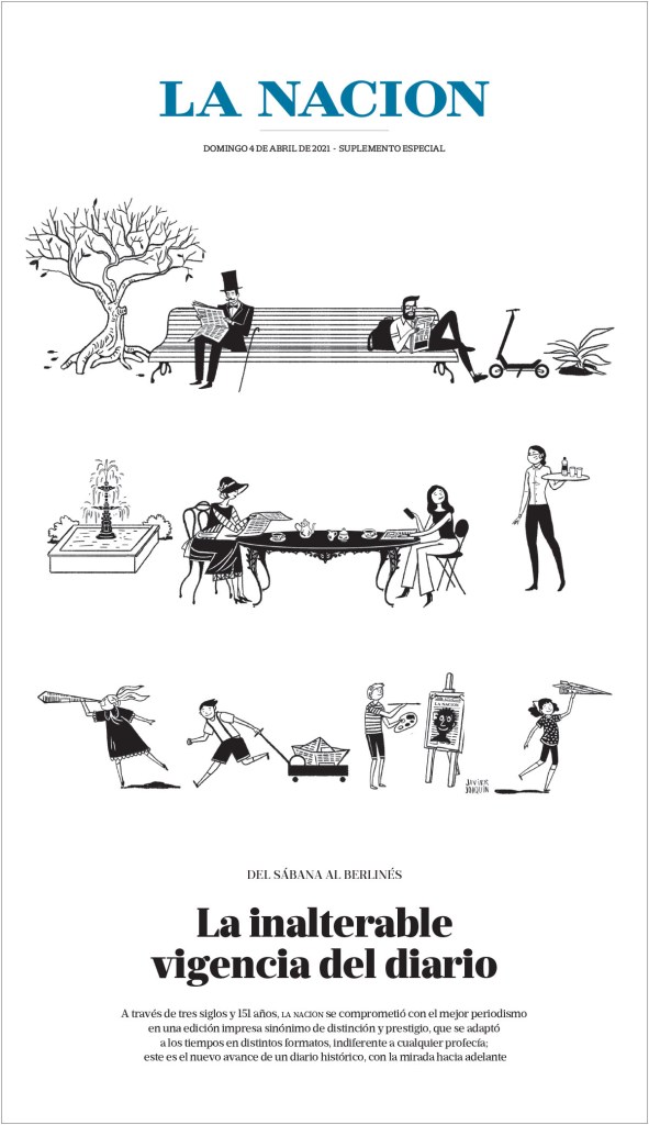
This page from La Nacion is just so lovely. There is another from them in the slideshow.
La Nacion, Dec. 17, 2021
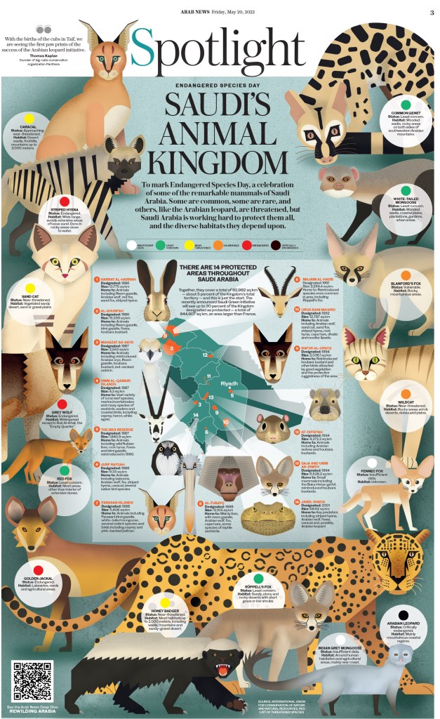
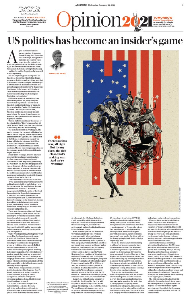
Arab News has many great pages, but this opinion page really jumped out at me. I love the illustration, and the page itself is just clean and crisp. The American flag features prominently in pages, particularly opinion pages, around the world. It’s used in so many different ways to convey so many different ideas.
Arab News, Dec. 22, 2021
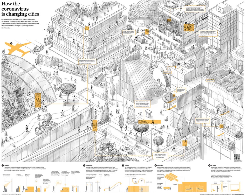
There are a few more South China Morning Post pages in the slideshow. While this is one really works because of the illustration, it was just such a compelling illustration. For the most part I didn’t include pages that won just for illustration. But they also used the small bit of display text so well. I am positive the space in the top left was left for display copy.
South China Morning Post
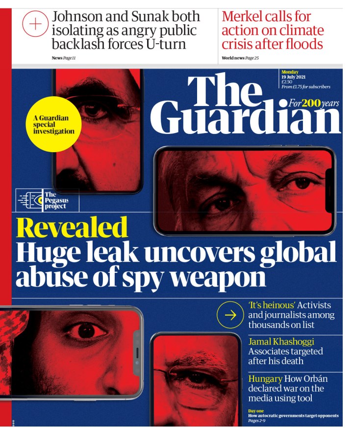
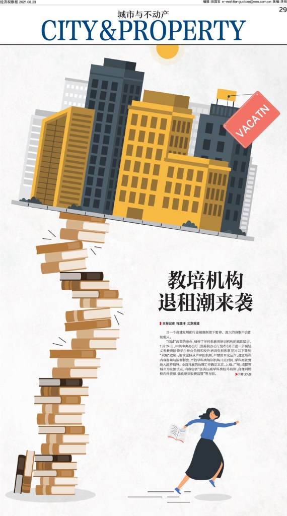
And the final slideshow from SND 43. There is a wide cross section of pages from multiple publications, such as The Age, The Guardian, The Day, Economic Observer out of China and more.
Canvas_Version:3.0.23
And that’s it. Another year, another awe-inspiring competition. Inspiring is the right word, as it would be impossible for any newspaper designer seeing the incredible work submitted to walk away without some new ideas, some extra enthusiasm or desire to push just a little harder.
More than 3,500 entries. That’s more than 3,500 newspaper pages (way more, as multiple page entries like sections are one entry) that designers and newspapers around the world decided were their best, and submitted to the Society for News Design‘s annual design competition. Nearly 800 winners (798 Awards of Excellence, 68 Silver Medals and 18 Gold Medals). So how does one winnow that down into a blog post? One doesn’t! I tried. Not a chance. So I started by breaking out Canada due to my obvious Canadian bias! But there are still more than 700 left to choose from. So after that, I attempted to cram the rest of the world into one post, but nope. So American papers get their own post, followed by the rest of the world. Even still it’s challenging. Despite newspapers falling on tough times, designers are killing it. So this is an act of curation based on my tastes. And leaving out dozens upon dozens of entries that I dearly loved so that this doesn’t go on forever.
I had the good fortune of being a volunteer facilitator for the second year in a row, for the organization that truly changed the arc of my journalism career. Beside my desk sit five tattered SND books, which they release annually capturing the winners of these competitions. I am beyond humbled to be in three of them, one for a portfolio of work. I had six books, but one got stolen or borrowed and not returned. Do I begrudge that person? No, because my path started by … borrowing two from my first newspaper job when I left. One of those is missing. That’s just the circle of design life.
For SND 43, I was part of the World’s Best-Designed Newspaper competition. Results will come soon. But here, I present the individual entries. If you’ve not been following along, a quick summary of awards. AoE is an outstanding page, one that is deeply considered, uses typography and/or white space and/or art, etc. incredibly well. It’s not design for design’s sake. It is designed with purpose. A silver rises above even further, is exceptional among the outstanding. It could be considered state of the art. And gold. Well, on a gold page, it needs to rise to near perfection, above the outstandingly exceptional. It should be hard for a judge to find a flaw. That is why there are so few. Kerning between two letters, a crop that seems just off, too much or too little white space. All sorts of tiny details prevent a page from being elevated to this level. Because of that, finding the best way to present this (by paper, by theme, by region) is so challenging. I will start with the only gold medal for a portfolio of design (there was another for illustrations).
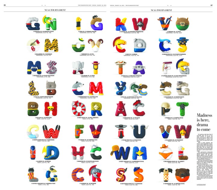
Brandon Ferrill, Washington Post, Gold Medal for portfolio
The first page in this slideshow was really the talk of the weekend. Universally loved. And fun. There were some hard pages, some big subjects in 2021. COVID-19 was still raging, the Capitol riot, the Taliban in Afghanistan. And so on. And then we have this happy-making page. The entire portfolio is striking. That judges moved an entire portfolio to gold says so much about the quality of this work. And trust me, you will see a lot more from the Washington Post here. When they go big, they win. We win.
Facilitator’s special recognition
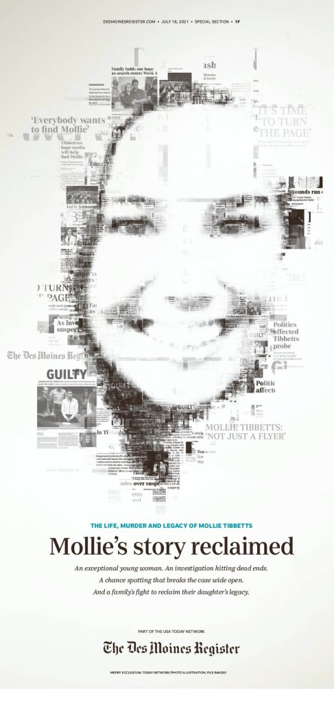
At last year’s competition (my first), two pages immediately took my breath away. And it kept piling on. I waited for that experience this year. Nothing will compare to that first experience at SND. Not because the pages aren’t just as exceptional, but you start thinking differently, more critically. You know what can be done. What’s out there. But this year there was a page that really struck me (so many did). But I kept going back to this one. And it wasn’t the Washington Post, the New York Times, the Los Angeles Times or the Star Tribune. It was the Des Moines Register. Maybe it is because I am a champion of the underdog. Maybe it’s because it uses newspaper clippings, which doesn’t often work but really does here. It’s so smartly done. Maybe the lack of colour. Seemingly simple, but quite complex. And the judges must have mostly agreed. It won a silver medal.
Des Moines Register, July 18, 2021
U.S.: The Big 4 conference
When it came to papers in the U.S., the four I mentioned above really stand out: New York Times, Washington Post, Los Angeles Times and Star Tribune (Minneapolis, and employer of my most recent featured designer, Stacie Kammerling). I will give each paper a slideshow and little blurb. I will exclude the portfolio above from the Washington Post below.
Washington Post
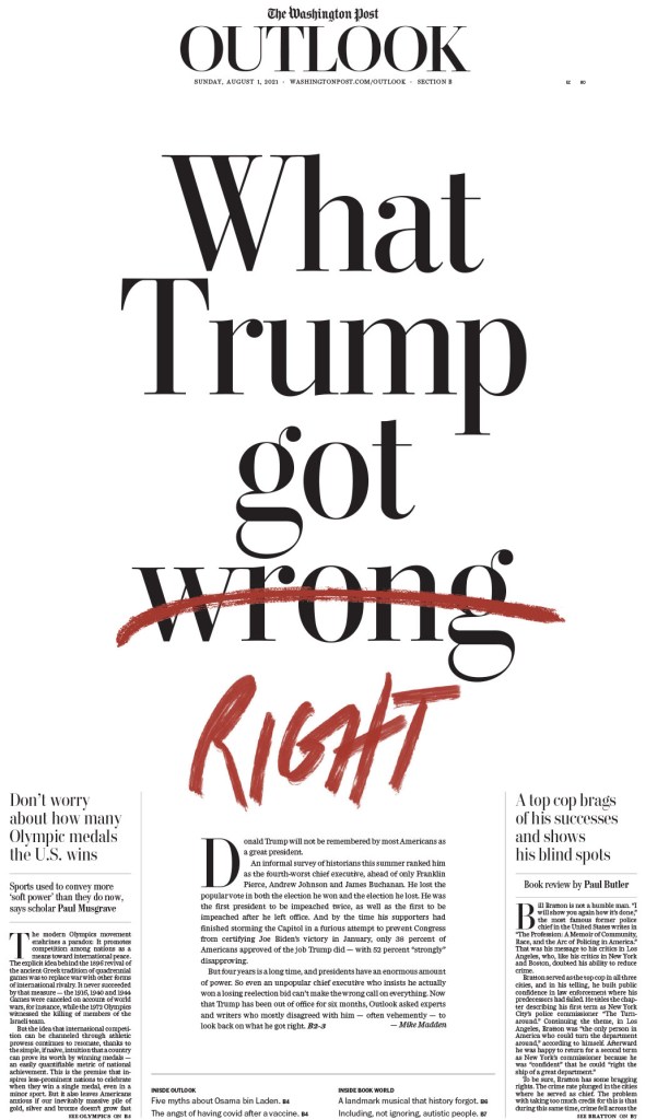
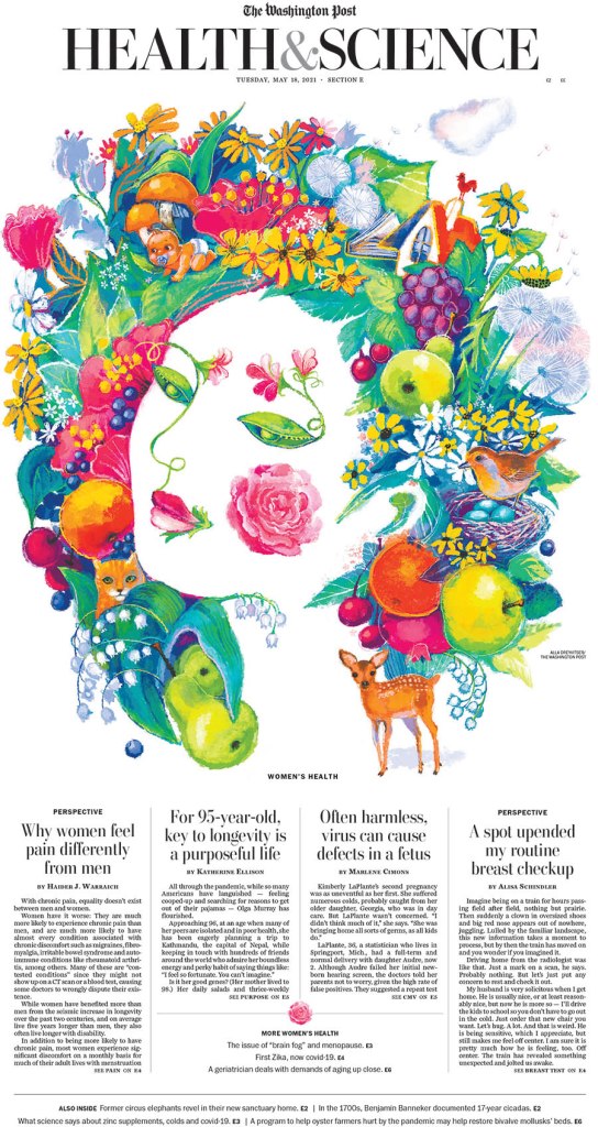
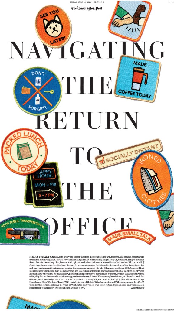
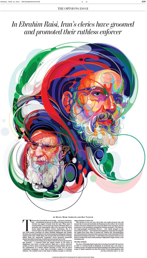
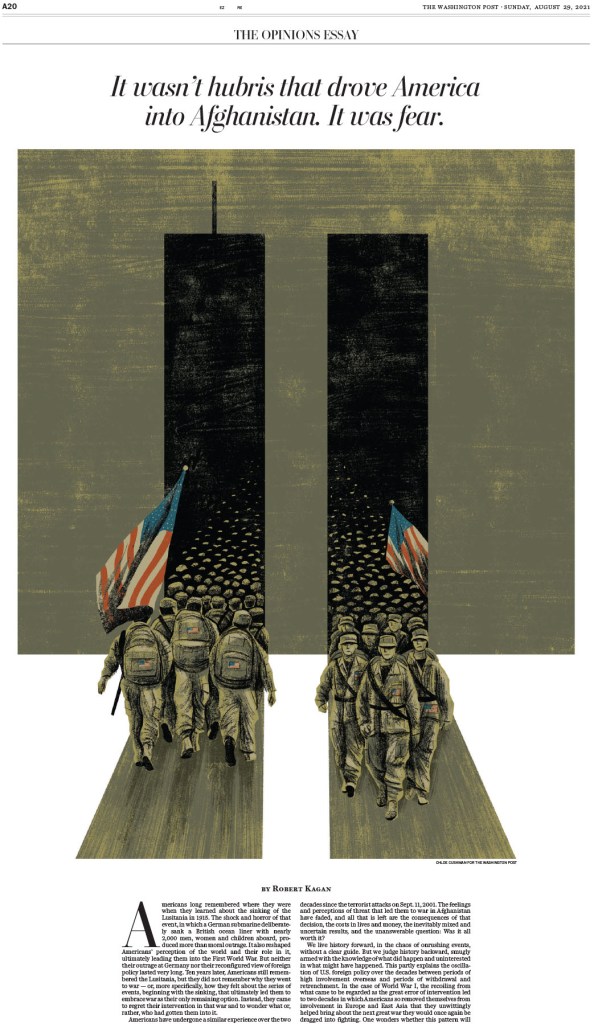
I tried to choose a favourite. I really did. But the first three here are so close, for very different reasons. Some pages are driven by illustrations, some by text alone. I’ve said this before: A good illustration is good on its own, enhanced by a good design. But then there is just good design, and designing with text is skill. Also, when it comes to opinion pages, the Washington Post is among the best in the world, if not the best, largely based on smart illustrations. And I had to narrow this down. I cut some amazing pages out.
The New York Times
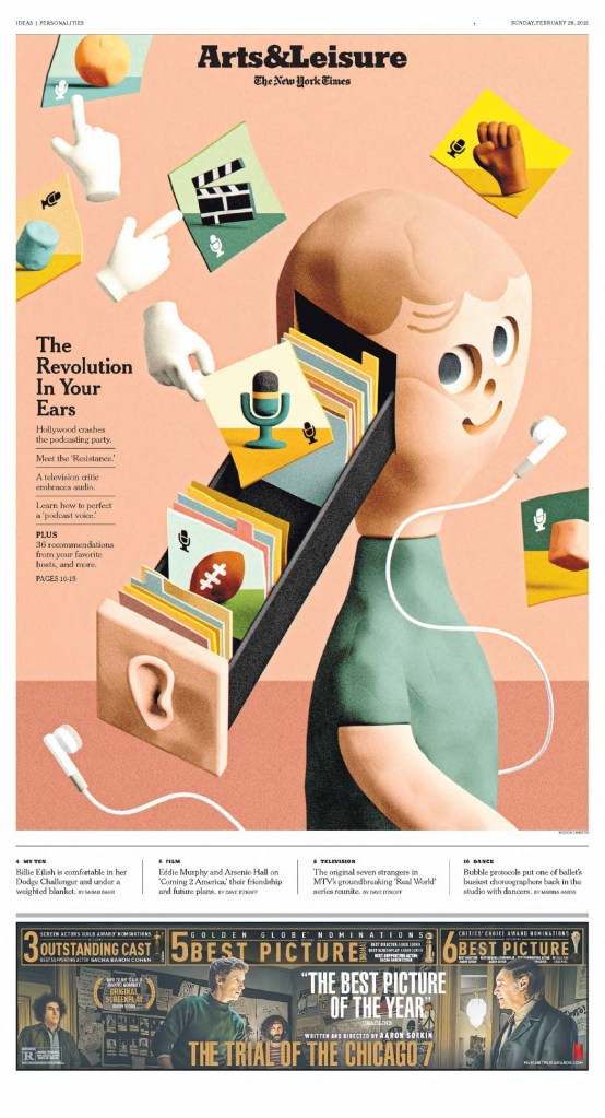
What can I say about the New York Times. It’s funny that it’s known as the Gray (Grey) Lady. Because once you get past that iconic grey cover (much less grey than it once was), and past the news section, it’s a marvel. Design beyond most designers’ wildest imaginations. The kids section alone is a masterpiece. Truly brilliant.
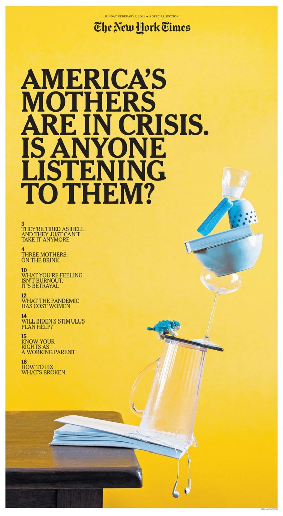
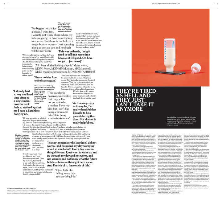
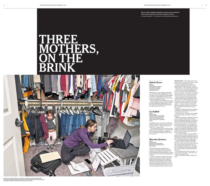
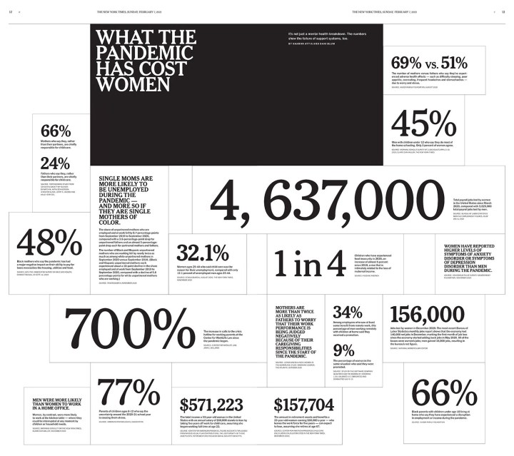
There were so many jaw-dropping pages from NYT, so this is truly just a snapshot of the work they produce. There were some I couldn’t do justice to as it would require seeing the entire section. I have included four pages from a section about the struggle of mothers because of the subject matter, and because of the judges’ comments. The section, they believe, is designed in a way intended to make you uncomfortable. It’s far from a standard design. It is jarring. I am so envious. If they are ever looking to hire a designer with a Canadian perspective, feel free to reach out. I accept. In a twist, the one A1/front page I included is so strong because it’s grey. I wrote an entire post about it when it came out in early 2021. The first two pages in the slideshow is two of my faves from the competition. I love little pictures. And the god page is boldly and smartly done.
Star Tribune
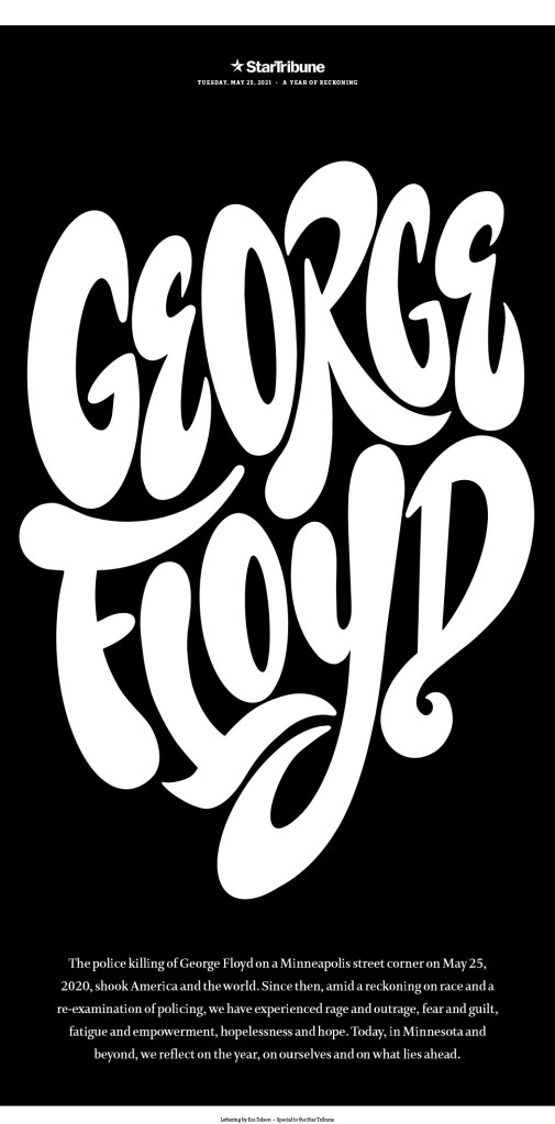
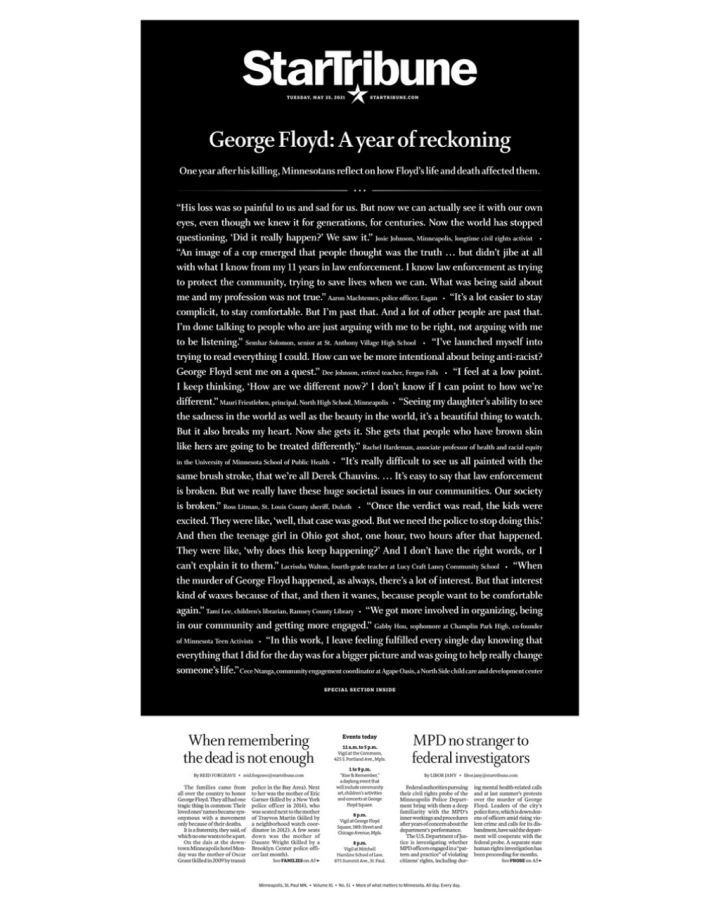
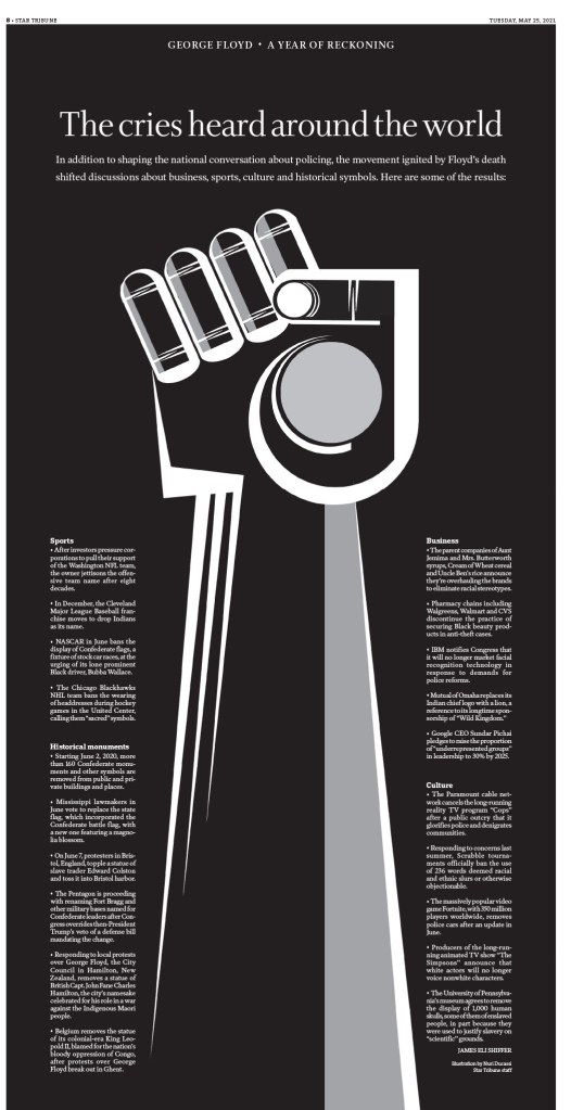
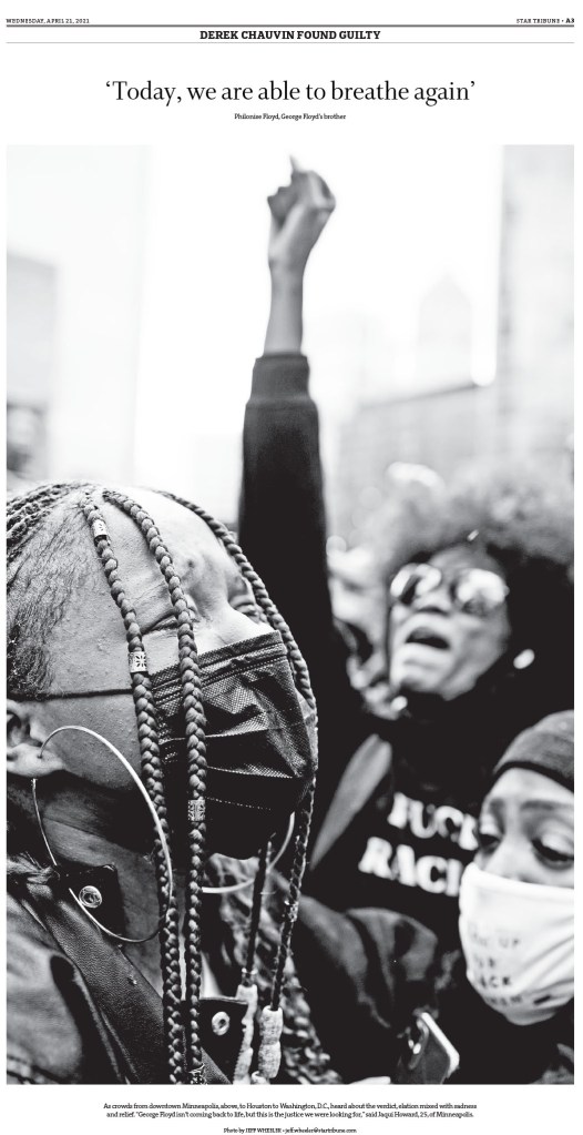
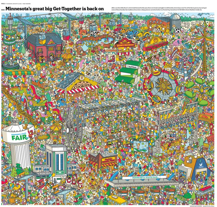
Funny thing about all of these four is that if you look at the front page each day, while they are well designed (particularly the Star Tribune, which is just a nice, clean, newsy front most days), they don’t look flashy. But then you get inside. Or then you have those big days. And wow. What is absolutely paying off for the Star Tribune is the state fair. There are always beautiful pages that come from there. To see more Star Tribune pages, other than what I’ve included here, see my recent post on designer Stacie Kammerling. A much more serious story this newspaper has handled so powerfully and with such grace is the George Floyd story. Just incredible, sensitive, yet provocative, boundary-pushing work. I will start there. Then to some fun and fair stuff (the contrast of last year’s fair and this year’s fair in cartoon figures is magical), and I have even included one of those hard-working front pages. And yes, I cut a lot again.
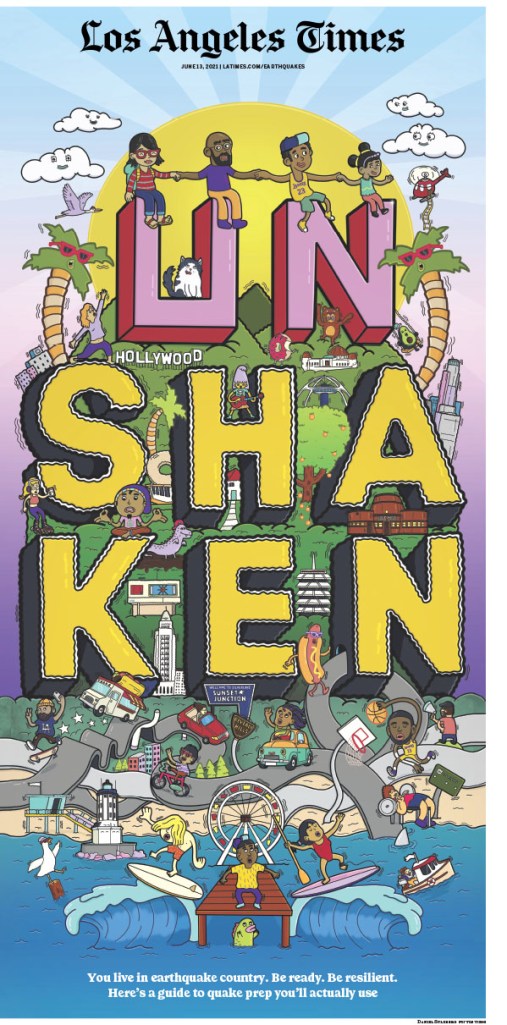
Los Angeles Times
And finally, the Los Angeles Times. Perhaps my favourite paper from last year’s competition. I still absolutely loved it this year. I have started with pages that just use design. Brilliant and bold typography, strong photos, creative white space. Then I get into breathtaking illustrations, followed by a few pages from a special section, which is a clear strength of the Times. They had some outstanding complete special sections, but again, I had to make some choices.
And more
Having these papers down here is not meant to dismiss any of them. They did some incredible work. I had to pare it down somehow. You can see them all here. Below are a few outstanding pages separately, and then another slideshow with more.
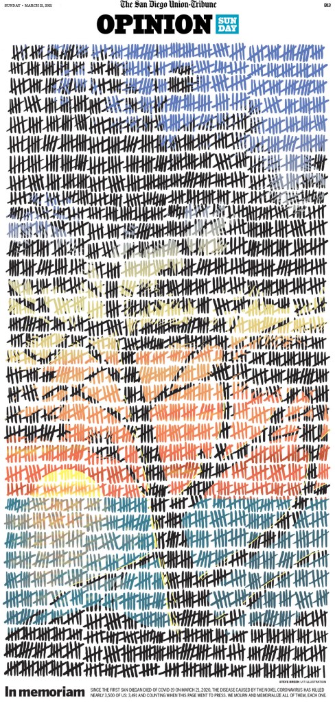
The San Diego Union-Tribune, March 21, 2021
This page from the San Diego Union-Tribune was one of my top pages from the competition. It’s a new take on using tallies. It is so well executed.
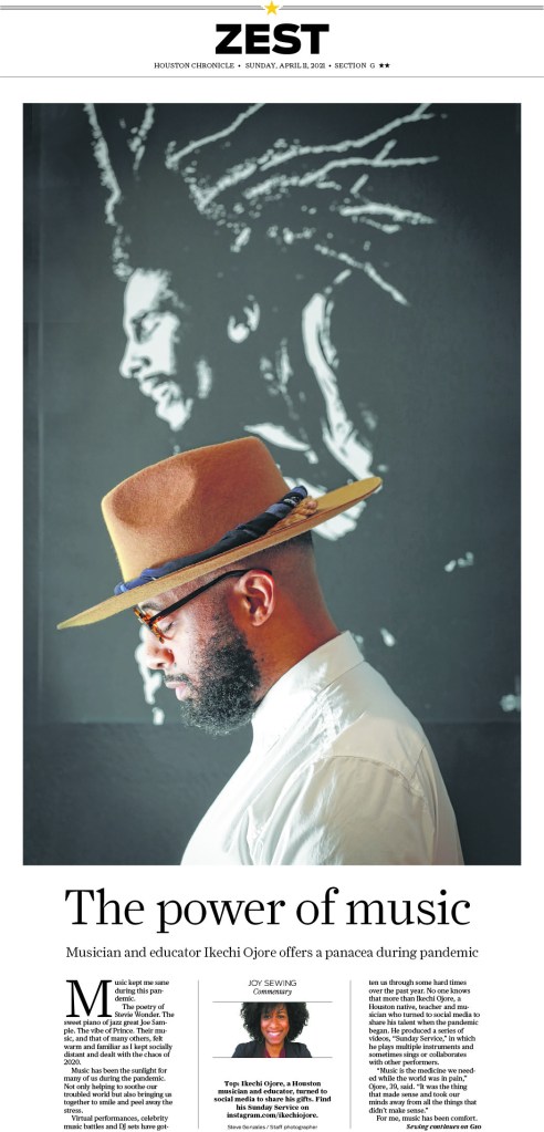
Houston Chronicle, April 11, 2021
I put this Houston Chronicle page in for its simplicity. Proof that you don’t need to do big and wild designs to look good. I love it.
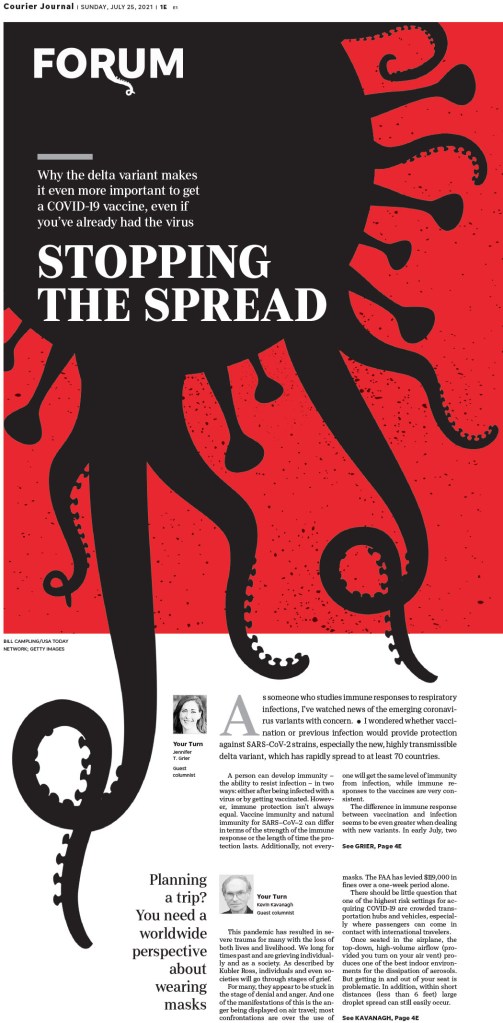
Louisville Courier Journal, July 25, 2021
This Courier Journal (Louisville) page is so compelling and is a creative play on the COVID imagery we have seen again and again. This is new. Very clever.
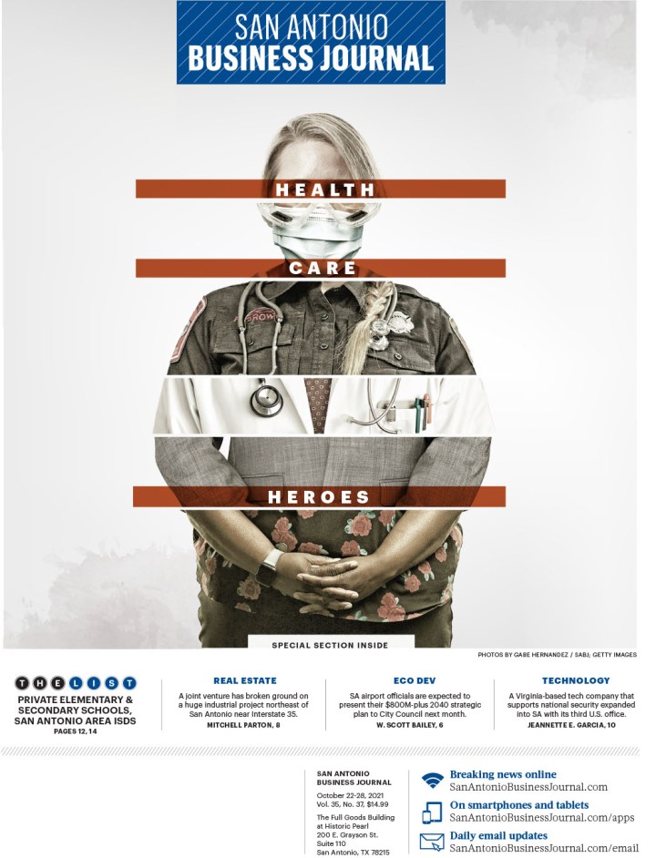
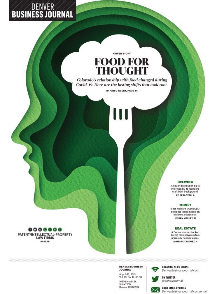
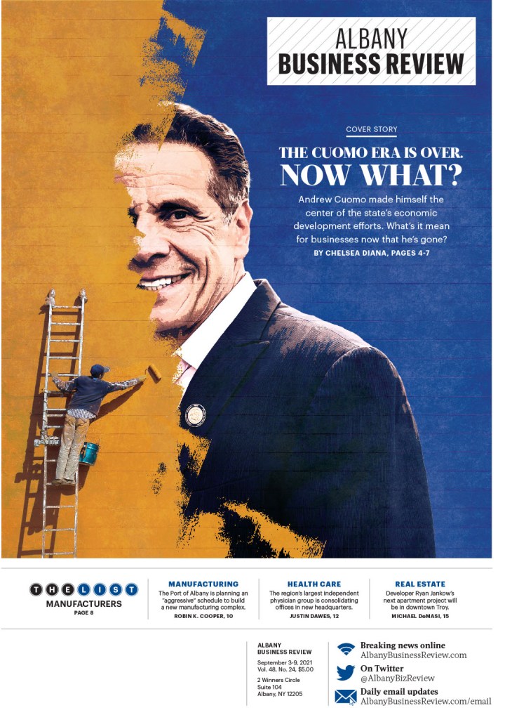
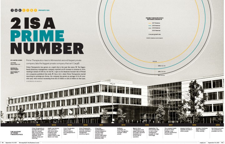
Here is a selection of pages from The Business Journals. They had a number of winners. They are doing such smart things with illustrations and text. The text on the first page is both understated and bold at the same time! Small, but reverse white on red with a touch of transparency.
And last but definitely not least, a selection from some other publications. I am positive I will look through the pages again and curse when I see a dozen that I forgot about. That’s how much there was to look through. It is a tribute to the incredibly hard-working and talented staff at all the newspapers or news hubs. Thank you for all your work. And your readers do too, even if they don’t know it. It’s hard to know what goes into not only the execution, but also the conception. Amazing.
So there you go. Print is alive. I just proved it.