On the heels of a major and deadly earthquake in Haiti, Kabul, the capital of Afghanistan, fell to the Taliban two decades after it lost control after a U.S.-led invasion. That is a lot of big news over a couple of days. While there was very little in terms of big pages for Haiti, the same was not true for Kabul. There were several striking pages. It’s a significant story, and one that will be playing out for a long time to come. There will be dire consequences for many in the country, particularly girls and women. Newspapers were right to give it the main play today.
I find it fascinating to see the design choices, both in terms of layout and photo choices. So often there is one photo that stands out. In this case most of the pages used one of two photos. And in some cases the designs and headlines were almost identical. That is not a knock. That’s newspapering. This isn’t the time to for wild design choices or plays on words. These are serious news pages. And these newspapers, all of whom have a strong focus on the world, presented the dire situation to their readers in a way will have an impact. Hopefully the world acts.
Here is a selection of some of the amazing pages from around the world, with the pages mostly speaking for themselves.
The Guardian, Monday, Aug. 16
Globe and Mail, Monday, Aug. 16
The Globe, above, and Hartford Courant, below, are so very similar, but also so well done. They are both powerful pages, achieved with a good, big and clear headline, strong art, and nice but simple treatment of other elements.
Hartford Courant, Monday, Aug. 16
And again this photo. Wow. Used in many papers today. Both the above and deVolksrant below were just three of many who went with this powerful image.
deVolkstrant, Monday, Aug. 16
Jyllands-Posten, Monday, Aug. 16
And a helicopter photo, also used by a handful of papers, including the next three (different pictures or crops, but same idea). The comparison of Vietnam and Kabul is an interesting play in Arab news. A beautiful and powerful headline. It says so much in so few words.
George Floyd’s death was more than a tragedy. It was a murder. It was a catalyst for an uprising, in the U.S. and around the world. It was a wakeup call, one of many, but one that seemed to resonate with people outside of the Black community. George Floyd, who was killed after allegedly buying cigarettes with a counterfeit $20. Killed by police. For nine minutes and 29 seconds, police had him on the ground, knee on his neck. Somewhere around the eight-minute mark he lost consciousness. But the knee remained. This was May 25, 2020.
His death came to be a symbol of what’s wrong, not only in America, but around the world. The systematic racism that exists and thrives.
Newspapers covered his death in the immediate aftermath and long after. There were many necessary stories, many appearring on front pages around the world. And while newspapers won’t run out of key angles to write about (assuming the editors and decision makers are keeping this story in the collective consciousness), how do designers keep the story fresh, to help keep it dynamic? Sure, a newspaper can put a story over the fold on its front page. It will get attention. But the design can play a key role in elevating the story. You can’t have readers get complacent and gloss over the story. A designer needs to pull them in, and sometimes there aren’t a lot of choices visually.
More than a year has passed since his death. In a world of 24-hour news and social media, most stories don’t get the spotlight for long. This story, the issue it thrust in front of the comfortable and privileged, needs to be there.
One year after Floyd’s murder, there were two pages that stood out for me, each taking very different approaches to their designs. But both highlight the power newspapers have, and the responsibility they have. And the power of newspaper design. It’s not just the words.
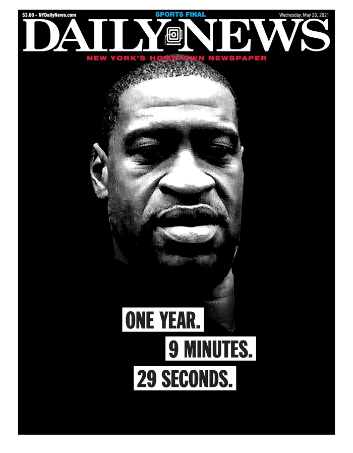
The first page that caught my eye was the New York Daily News. It was striking. A big photo of Floyd. His face instantly recognizable, brightly lit in parts and not in others. Starkly placed on a black background. The white newspaper flag adding contrast. And a great newspaper page almost always has strong words. Or strong words elevate a great page to unforgettable. This one simply says: One year. 9 minutes. 29 seconds. Black text on white on black. Those words are so significant. Anyone familiar with the story will know what it means. Anyone not will be appalled. How the words are played is significant. It was a masterful page. It captured the feeling one year later, and helped keep this story in front of readers.
New York Daily News cover, May 26, 2021
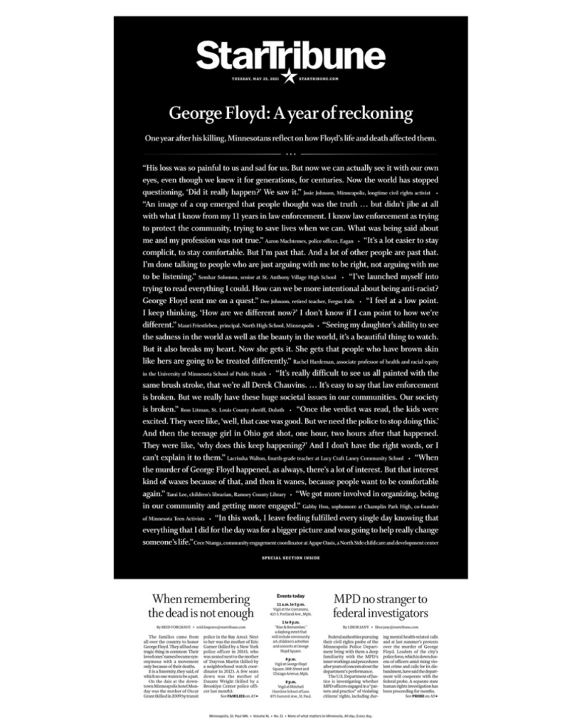
The next page took a very different approach. The similarity was that it was also on a black background. Reverse white text on a black background. But it isn’t a picture of Floyd that makes this page. It’s words. All words. It was a powerful message. When a newspaper makes a decision to run a page without art, the words have to do it all, so they have to be done well. When an issue is so consequential, sometimes words are all there is. The Star Tribune is an exceptional paper. It’s in Minneapolis, where Floyd was killed. While this became a worldwide story, this paper owes it to its community to keep this story front and centre. This page was breathtaking, yet simple. So many words, but that’s why it works. In this instance. In others, it wouldn’t. But it was the right time and the right play and the right words.
Newspapers owe it to readers and to society to run stories like this, to keep these issues, issues like this, like the unmarked graves of Indigenous children in Canada, in the collective conscience. It was in the news again when Derek Chauvin, the police officer who kept his knee on Floyd’s neck, was found guilty of murder. And again when he was sentenced to 22.5 years in prison.
But these pages above, and the ones below (which I’ve shown in previous posts) highlight the power of print design. Three of them show, or somewhat show Floyd’s face, which has become a symbol of the movement and a way to illustrate the story. And newspapers try to present his face in novel ways. As long as newspapers are trying to raise awareness of serious issues through design, I will keep showing them.
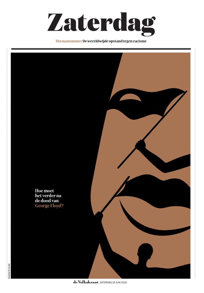
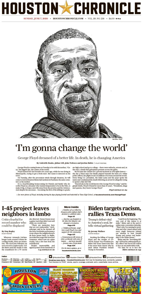
Above: de Volkstrant’s stunning and masterful illustration of Floyd’s face, and of the movement it catapulted into the world’s consciousness, and the Houston Chronicle, with a powerful sketch of Floyd.
A newspaper front page can do and say so much. It can capture a key moment in history (man on the moon, the Sept. 11 terror attacks, tragic death tolls). It can celebrate big moments (sporting victories, like Italy’s big Euro 2021 win, or Argentina’s historic Copa America title — a victory for the country and short people everywhere — Google: Lionel Messi height, as it’s the thing most googlers care about after age and money). And it can hold people to account. One of the primary functions of newspapers is to hold people to account. Comfort the afflicted, and afflict the comfortable. These are terms heard in the journalism sphere all the time. And sometimes power doesn’t mean the 1 per cent. Sometimes a city, a country, the world, needs to be reminded. They need to be held to account. Sometimes I need to be held to account. Not just the powerful, but the privileged.
I want to look at two issues from the past few months over two posts. I am looking back because part of the problem can be after a cover comes out, calling out the privileged to act, or at least think, the issue gets a ton of attention and then fades away. Other issues arise. News is happening everywhere, all day, every day. But I want to key in on the design, and how it helped raise awareness.
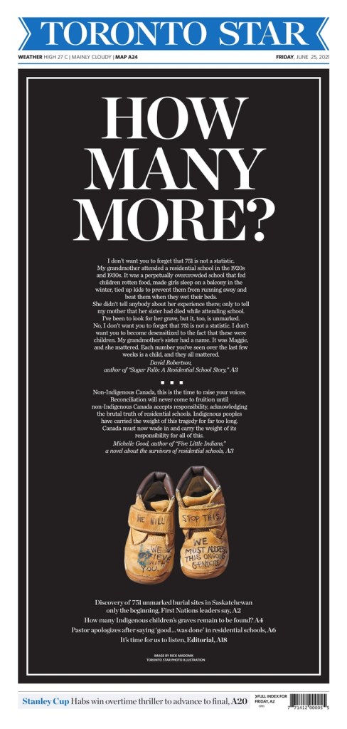
I am looking at the coverage around unmarked graves of Indigenous children being found at residential schools. Another discovery was made in Saskatchewan (after a previous discovery in B.C.) on June 23. On June 24, most Canadian newspapers dropped the ball (I will celebrate, and not critique design here, but I will critique editorial decisions). Postmedia, which has a local paper in Regina, had the story first. An example of why local news matters. Postmedia’s coverage on the first day was strong. The rest were lacking. But the next day, the Star attempted to make amends. The previous day highlights the challenges to newspapers. The story was somewhat late breaking. There wasn’t a ton of information. But, and it’s a big but, the story required more attention than it got. It was the tear-the-front-page-apart kind of story: 751 UNMARKED graves of Indigenous children were found at a former residential school in Saskatchewan. I won’t say hundreds, as every one is important. I highlight unmarked to emphasize the contempt, the lack of humanity, toward the children, the families. Here is what the Star produced the following day, Friday, June 25.
Toronto Star, front page, Friday, June 25. How many more?
This page is powerful for a lot of reasons. First and foremost, the picture of the small shoes. Clearly for a child’s feet. The wording written on them is powerful as well. WE WILL STOP THIS. WE GRIEVE WITH YOU. WE MUST ADDRESS THIS ONGOING GENOCIDE. And the reverse white text on black. The big, all caps headline, with a powerful question: HOW MANY MORE? The start of a story by David Robertson, an Indigenous graphic novelist and writer, and Michelle Good, the author of “Five Little Indians.”
We know there are more. Many, many more. Unmarked graves of Indigenous children who were taken off to residential schools. As a parent I can’t imagine. When my daughter goes to school, she’s safe. That’s just a basic requirement. Safety. I assume she’s learning important lessons. (In Grade 1 and 2 she did learn about residential schools, and I’m grateful for that, as I never did as a child. We’ve been able to talk about it.) But she’s safe. I can’t imagine the trauma, the fear, Indigenous parents must have felt. But I should. I should know. This isn’t ancient history, and even if it was, I need to know. The privileged, who have never worried about these things, need to know. I know this front page is only a piece of paper. But it helped. It brought it to the forefront. And it needs to stay there. Which is why I was glad the Star followed up a little later with this cover, questioning whether Canada’s history is something to celebrate.
Toronto Star, front page, July 1, 2021.
This page was 100 per cent driven by the beautiful and powerful illustration by Chloe Cushman. An amazing, talented illustrator with a knack for evoking emotion with her work.
And credit where credit is due. This was one of the Postmedia pages (the Calgary Sun) the day after the graves were discovered. They had more time, as they knew earlier. But it doesn’t matter. Newspapers need to react. Most didn’t. The ad aside, which unfortunately didn’t reflect the seriousness of the issue, but pays the bills to allow front pages to keep happening, this page was one of the best in Canada the day after. It has a strong image, a big and powerful headline (one-word headlines aren’t uncommon but the right word has an impact).
There are going to be more. Probably a lot more. And despite knowing this, each discovery should feel just as shocking and unsettling as the last. One unmarked grave should elicit intense anger, and spark a call to action. I ask all the white and/or privileged parents in Toronto or Calgary or New York or London: when your kid goes to school, do you expect to see them again? Just think about it. Imagine. #everychildmatters
An observation perhaps not worth noting is that every one of these front pages has a tiny throw to a sports story that might have otherwise been given much bigger play.
This @TorontoStar front page is so powerful. This should have been the lead story in every Canadian paper (and beyond) yesterday. But here is the power of #printmedia at work. Keep it up. This story needs sustained attention. #everychildmatterspic.twitter.com/Fqwd14Er9M
In 1999, I started journalism school at Mount Royal University in Calgary, Alberta. I had big plans. National Geographic photographer. Maybe foreign correspondent in war-torn countries. By the time I graduated in 2001, everything was on track. Except the job. In 2002, I set up a meeting on the other side of the country with a well-known Canadian photographer. Maclean’s, here I come, I thought. My best friend, C.J., and I set off on a road trip. Thousands of kilometres, one week, and a 1991 Chevy Sprint Turbo. Bubbles. And now I ask you to come along. Jump in the way-back machine, imagine yourself in a sky blue Sprint Turbo (the Turbo is worth mentioning every time. Every. Time. Just ask C.J.’s brother), and join me on my cross-country, 20-year journalism lookback journey. I don’t like to celebrate myself often, but I also don’t leave my profession often. After this, I will return to regularly scheduled broadcasting in this blog by focusing on designers still in the biz, and those who are lightyears more talented than I am. I peaked in 2010 (there might have been a higher peak, but the journalism world was having none of it, as it started to contract around this time).
Anyway. Bubbles. The journey began in Calgary. A couple of provinces in between, mostly fine, and then Ontario. Many routine police stops later (driving late at night with Alberta plates in Ontario) and almost no time to sleep, 36 hours later in total, we made it. I had my meeting. I brought my best stuff. I was proud. The verdict? Some potential. He loved the photos later in my portfolio, and said about the one for which I nearly had my head run over by race horses: “you were just there.” Yes, I was. And it was a damn fine photo (if I ever find my pre-digital portfolio, I will add the pic here). Alas, maybe photography wasn’t my path.
Enter Fort McMurray. The daily newspaper, the Today, offered me a job as an editor/designer. I moved up there (on a map, as the Friendly Giant would say, look up, look waaaaay up). It was there, as I have mentioned a few times in this blog, that I discovered the Society for News Design’s Best of Newspaper Design books. And I found my new love. Newspaper design (in case the book title didn’t get you there).
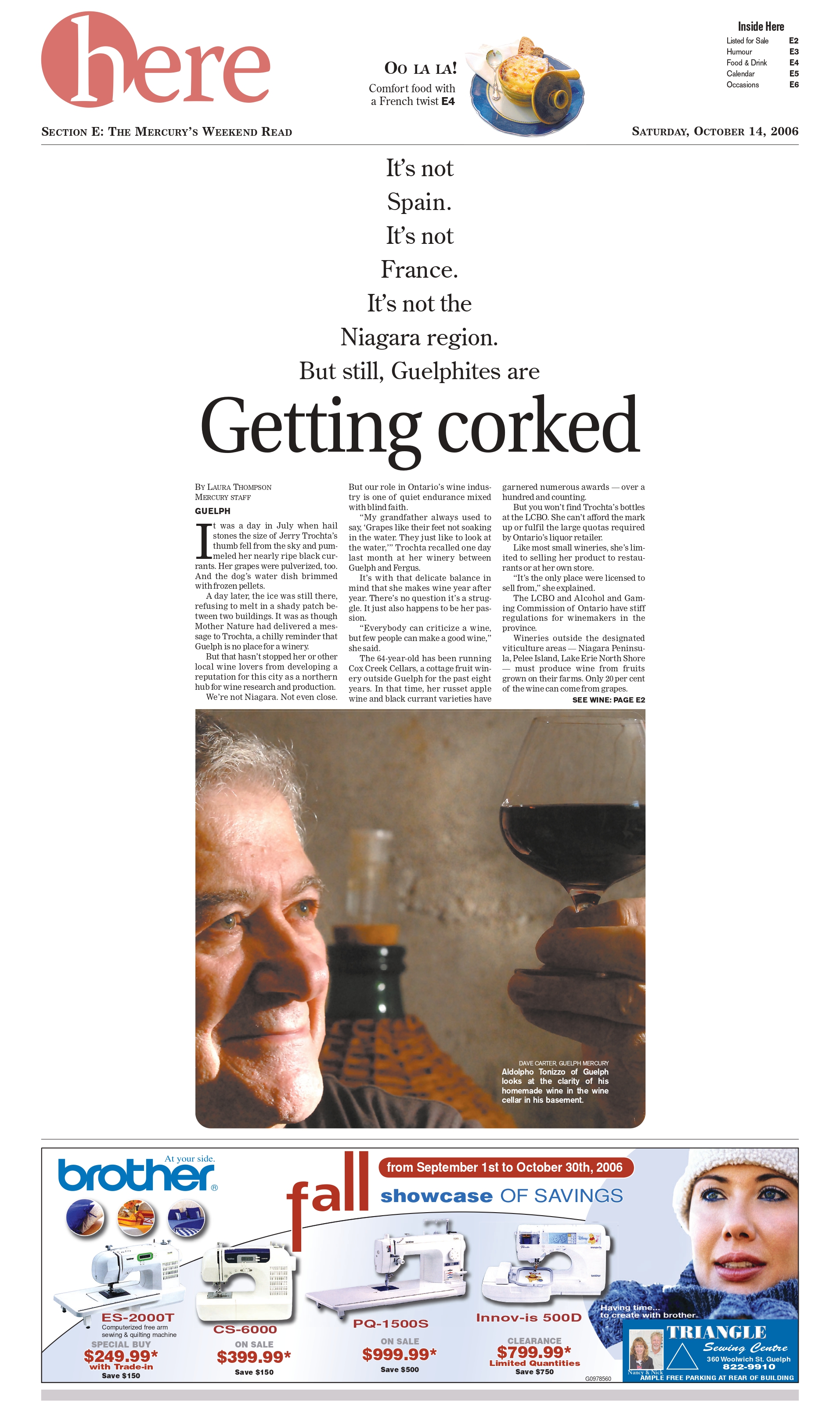
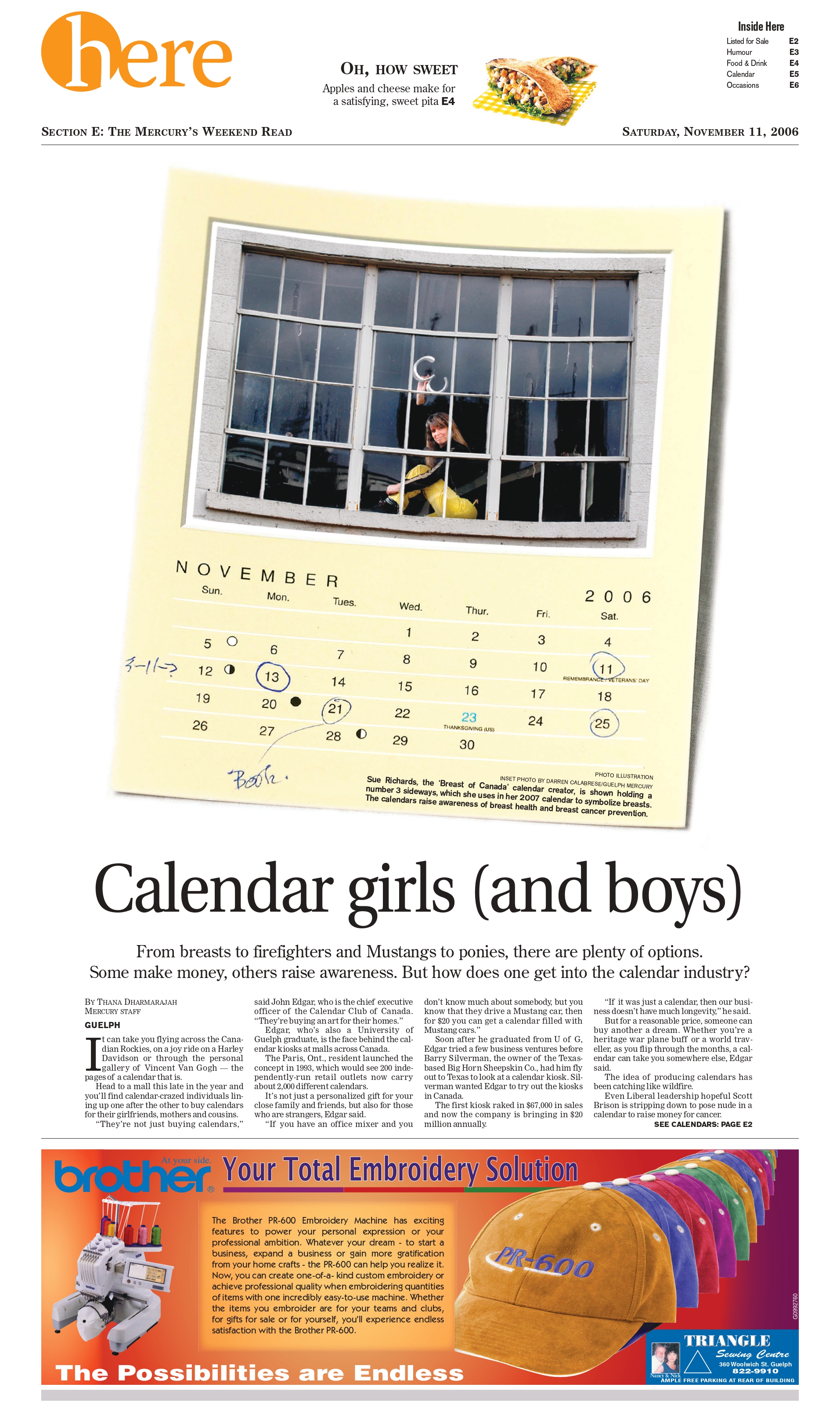
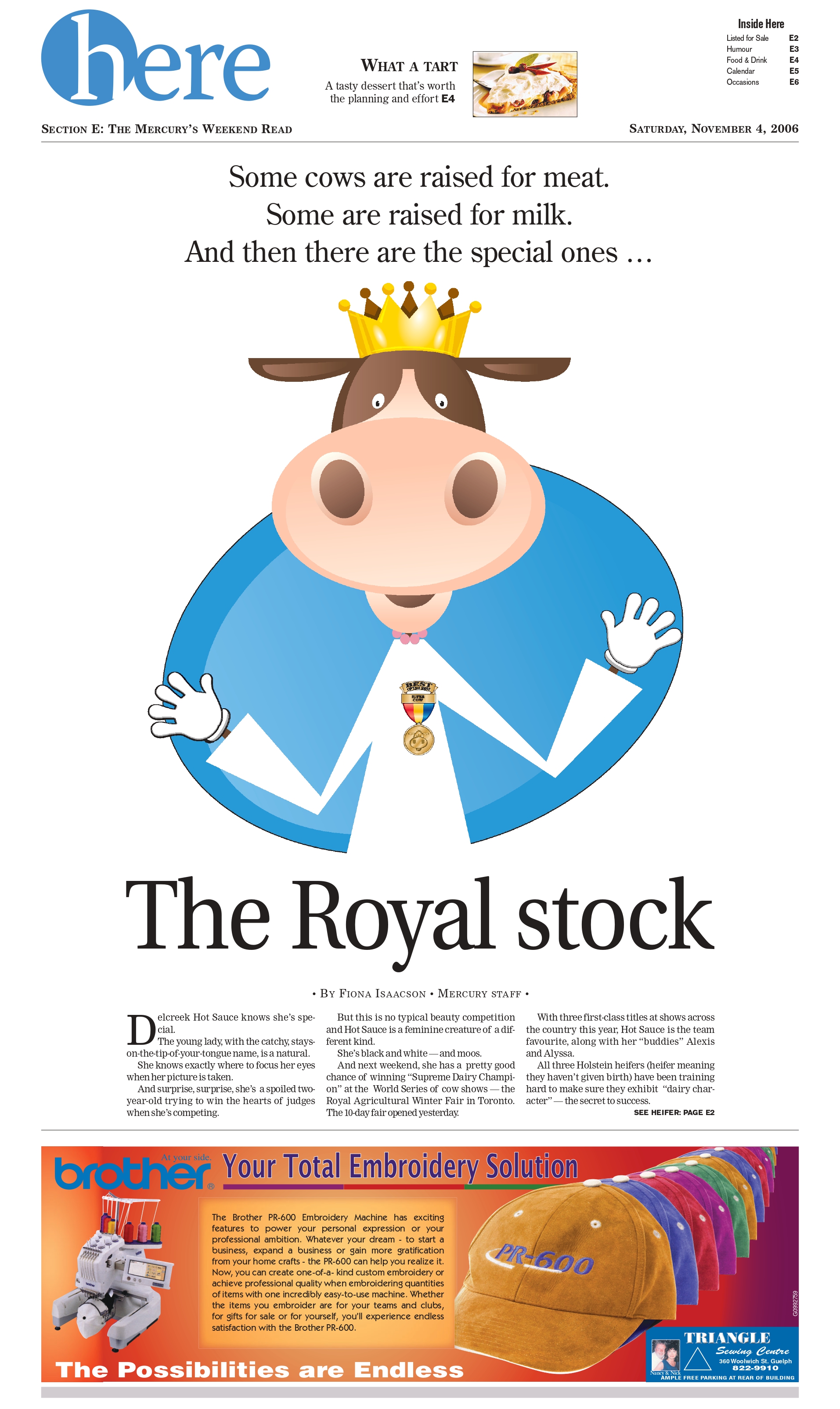
But the city was small (and cold) and the bugs were so, so big (when hot). So I went to test my writing chops in Red Deer, Alberta at the Advocate. Less than a year later, I was off to the promised land: Ontario. First at the Woodstock Sentinel-Review, then to the Barrie Examiner (RIP), then to the paper that firmed up my love for design (because someone told me I was good at it. Spoiler: it was SND), the Guelph Mercury (RIP). I was proud of some of my work in Woodstock and Barrie. Even Fort McMurray. Looking back, pre-Barrie work wasn’t as good as I thought it was at the time. But the Mercury made me. I was given so much freedom and time by my mentor and boss, the legendary Phil Andrews. I oversaw the Here section, a weekend features section all about Guelph. It was for this section that I won my first Society for News Design award, and still the one I’m most proud of as it was for a portfolio of work.
Those are three pages I think were part of my portfolio. I know “Getting corked” was, as it was the one in the book! I made the book (sitting in my soon-to-be-former office, so no pics available). The book that started me down this path. It was a dream come true. I even was fortunate enough to attend SND Boston where I picked up this fashionable … tote bag.
I then had the good fortune (with my newfound design street cred) to be asked to redesign the Mercury, from top to bottom. This was no refresh. I was even tasked with redesigning the flag. That is quite an honour. And scary as hell. Thanks to the Virginian-Pilot (at the time the best designed paper in North America, maybe the world, imho) and the Star-Tribune for the inspiration. Especially to the kind soul at the Pilot who sent me a box full of print copies to help me get further inspired. I was very pleased when the first issue went out (below) and almost all the feedback was positive. That’s almost unheard of! People hate change. But they appeared to like this. To this day, this is one of my proudest career accomplishments.
First day of the new Mercury.
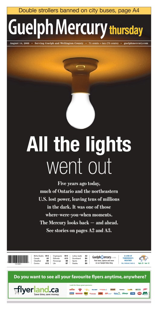
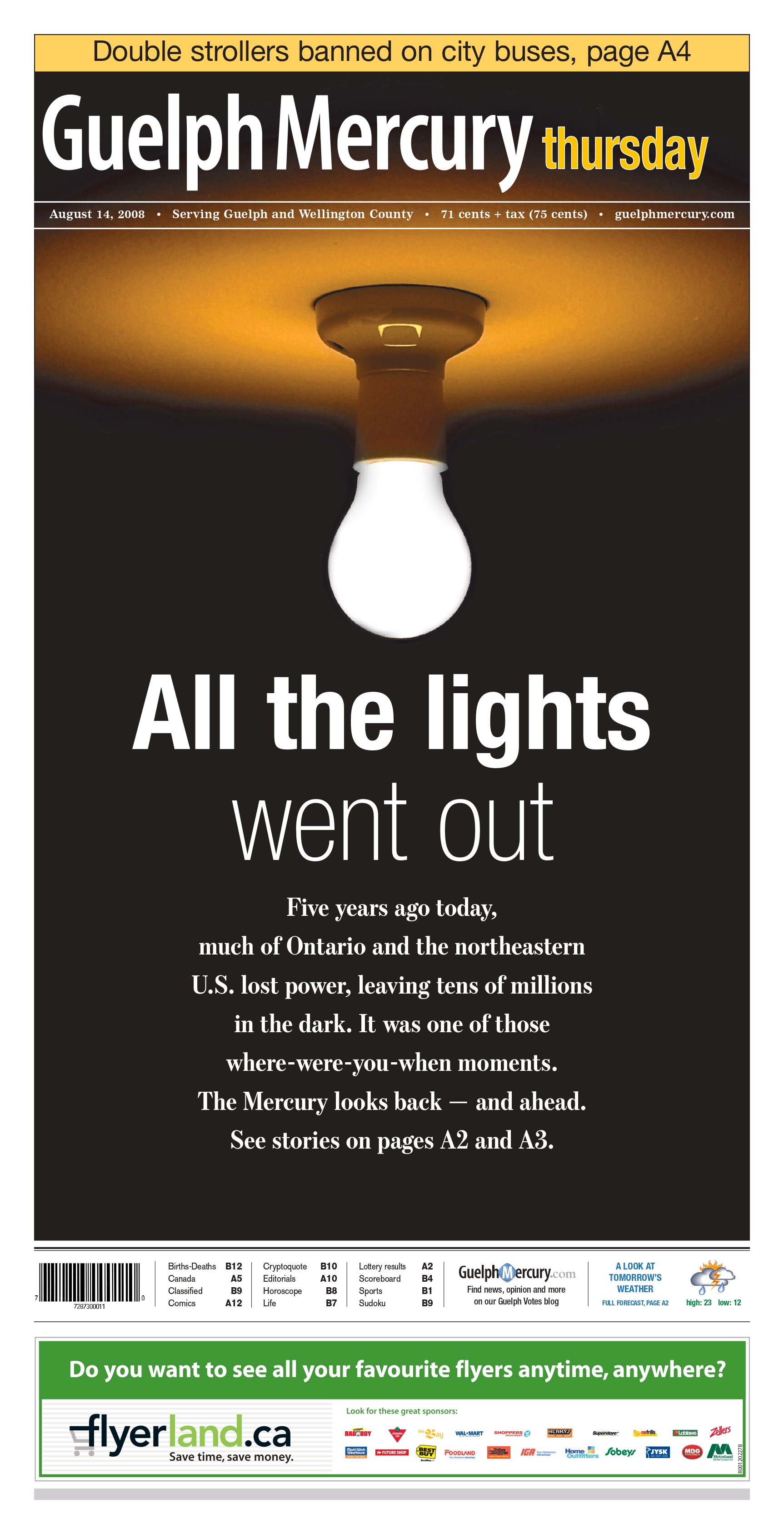
Two years after my first SND award, I won again, this time for a front page that I was given full freedom on, the fifth anniversary of the major blackout that swept through Ontario and much of the northeastern U.S. When I designed it, my boss said he looked forward to seeing that page in the next SND book. And much to my surprise, he was right.
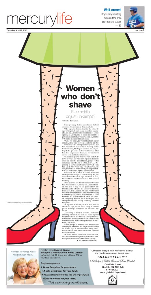
Shortly thereafter, I moved on to the Waterloo Region Record. And shortly thereafter after, so did production of the Mercury. It was a sign of things to come in the industry (and this blog post). But I continued to work on the Mercury from the Record. At the Record I continued designing, but also moved into a very basic art director-type role. I had a vision, drew it poorly on a small yellow sticky note and handed it off to one of the Record’s great designers, Tania Praeg-Geddes and Diane Shantz. And wouldn’t you know it. Two years after “All the lights went out,” with the help of the great Diane, we did it again. We earned the Mercury its fourth SND award in five years (it won another for a page produced by again soon-to-be-former colleague, now at The Canadian Press then at the Mercury, Kate Hopwood). This time the page likely won mostly for Diane’s brilliant illustration. It was much better than the hairy legs I drew on my sticky note. 🙂
Then came the email from the Toronto Star. They had an opening. I answered the call. I did some work I was proud of at the Star, but my heavy design days were over. Sitting at another bank of desks was a team of designers, whose entire job was to design covers. But I am happy to say I got to do some front pages for what is or was (depending on who you talk to) Canada’s largest daily circulation newspaper. The one on the right below isn’t a super fancy design, but it was my first A1 at the Star. So it’s special to me. I loved my time at the Star. But, as previously mentioned, the industry was contracting.
I was laid off and I moved to Pagemasters North America. It was eight glorious but mostly design-less years as a manager, overseeing a team of incredible editors, helping them grow and develop. So I still had a hand in others’ designs. Even super designer Tammy Hoy occasionally asked for my advice. Five of those years were spent overseeing the Star after they outsourced to Pagemasters North America (see, the Mercury was a sign of things to come in the industry and this post).
And now I depart marking what is likely the end of my journalism journey, at least as an active participant. For now. Anything is possible, but I am excited for what lies ahead. I know I have been so fortunate in this industry. Or as some would say, unfortunate. I made it 20 years. I lived through some not as lean times. I was blessed with opportunities and support. The Mercury was an incubator. It launched many to greatness. As I start looking back, I look ahead. I hope to be able to blog more, and showcase print design talent from around the world, from those who are sticking it out in this industry and doing outstanding work. I will do it here, and hopefully even more often as I will need my print design fix, and on my Instagram. Until then, a journalism cliche …
When I got access to all the entries to the Society for News Design best in print newspaper design competition, I was like a kid in a candy store. It was such a delight to see some of the best pages from around the world. But as a proud Canadian (slightly dampened by our slow progress on COVID-19 vaccinations, particularly for essential workers), I quickly searched for Canadian entries. I was both tickled to the see the incredible creativity that flowed from home, but also a little saddened to see there was little variety in entrants. Lots of entries. Very few titles. Dominated by the Globe and Mail, a selection from the Toronto Star and some from Le Devoir.
When I entered the contest in 2007 and 2009, I entered as a designer for the now-shuttered Guelph Mercury. We had a circulation of just over 10,000 at the time, if I recall correctly. We were the little engine that could. Sadly I didn’t see that this time. Two of Ontario’s design heavyweights (despite being relative lightweights in circulation), the Mercury and Barrie Examiner, have both closed. Other papers are being done in internal or external production centres. To be very clear this doesn’t mean there isn’t some incredible and award-worthy work coming out of these places. You only need to look at my profile on Tammy Hoy to see what is being done. But there is less time for most places to spend on design. And they’re not entering anymore, as media organizations shift their focus to digital (I assume that’s why?). Hopefully that will change for SND43. I hope to spread the gospel to Canadian newspapers so that there are more titles next year.
But I digress. As much as I like to think everyone is here to read my witty insights and elegant prose, I know it’s beautiful newspaper pages that drive this blog!
So first, here are some from the Globe, with very brief bits about what I like. As with most beautiful pages, they speak for themselves. But as I learned at SND42, there is so much to say about why these pages are excellent.
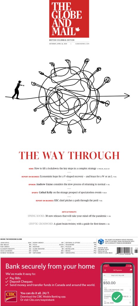
The Globe and Mail, The way through
As a subscriber to the Globe and Mail, I loved this page the second I peeled it out of the plastic bag (maybe two if it was raining — or, gasp, snowing — that day). It is hard to come up with a novel concept when it comes to the unmistakable shape of the COVID-19 ball, with its protein spikes always threatening to hook on to something. But this was new (for me, though as you can see here another newspaper did something very similar, proving how hard it is to take a unique approach in newspaper design). A tangled COVID knot, showing the almost unnavigable path through this complicated situation. Beautiful and well used white space. Of course it’s a Saturday Globe cover, and I’ve come to expect nothing less, but this was one of the standouts even among the weekly excellence.
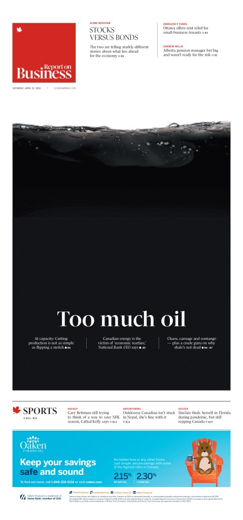
Globe and Mail, Too much oil
At first glance even a seasoned designer might not see this idea as novel. Reverse white text on a black background. But this isn’t just to make it pop. This page works, it rises to a new level, only because it’s about oil. Too much oil. The black has a real purpose. And you can see the oil swishing at the top. It’s someone taking an old idea and making it new, giving it purpose. It’s a bold use of space.
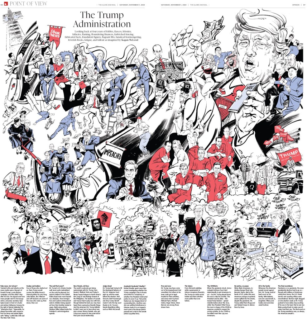
Globe and Mail, The Trump Administration, illustrated by Kagan McLeod
This page is almost entirely driven by its illustration by the incredibly talented Kagan McLeod (who also did the National Post cover illustration to mark Prince Philip’s death). There is so much happening. It’s so busy, but in a good way. Like a Where’s Waldo picture, you can spend so much time taking in all the different ideas and details. The text is played respectfully, letting the illo do most of the talking.
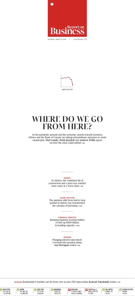
Globe and Mail, Where do we go from here
While the Globe had many more outstanding pages, this is the last I’ll look at. I like it, again, because it takes an old idea and makes it new. I see lots of graph-driven pages. But usually those graphs dominate the page in order to make them stand out as main art. It’s a graph after all. But in this case, the graph is tiny. I mean, it is a graph after all. But that makes it stand out even more. It’s a tiny focal point. But your eye goes there. And it illustrates a rapidly shrinking number. Once big, now also tiny. And another Report on Business cover. I love to see so much creativity on business pages.
Toronto Star
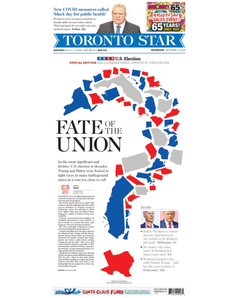
Toronto Star, Fate of the Union
Some in Canadian media will recognize this Toronto Star page, as it was also nominated for a National Newspaper Award for presentation/design. On top of COVID-19, George Floyd and Black Lives Matter, there was an election for the ages in the U.S. And one complicated by COVID. Often results are late. Often a country is divided. But in 2020, both reached new levels. Mail-in ballots meant delaying your press start by three hours likely wouldn’t net you results. The question mark made up of the states was such a creative way to illustrate this. Red, blue, too early to call. Fate of the Union is such a great headline as this was one of the most important election in U.S. history. And the world was watching.
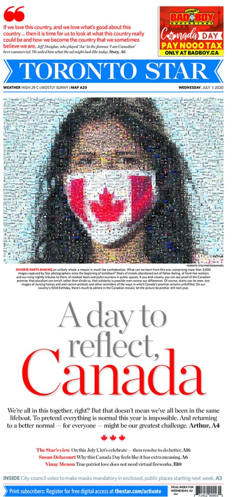
Toronto Star, A day to reflect, Canada
The work that must have gone into this page is extraordinary. It takes 3,000 images from Star photographers since the beginning of the pandemic lockdown and makes up one image of a woman wearing a Canadian flag mask. And the head works so well with the mosaic. But again, it comes down to how much work and the thought process that must have gone into this. It’s mind boggling.
Le Devoir
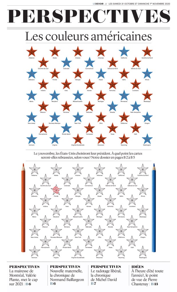
Le Devoir, American colours
This Le Devoir page is a fun and different approach to the U.S. election. Going into it it was anybody’s guess. The polls were so close. So Le Devoir highlights that with empty stars, ready to be coloured in, complete with pencil crayons.
Thanks, Canada
There were more great entries from each of these papers. I salute the effort they put in, as well as papers like the National Post and others, which didn’t have entries as far as I could see. Print is still kicking in Canada, and while it might not be as vibrant as that in the States and other countries around the world, it’s still alive. I hope 2021 will see more entrants, and, more importantly, more bold and inspired print designs. If newspapers want to show readers they still care, they need to make an effort. And I will be here to celebrate it when they do.
There are average newspaper pages and there are good newspaper pages. And there are almost unbelievably great newspaper pages. That is what the Society for News Design is all about. If you read this blog, you likely know all about SND by now. Over the course of a few days last week I was fortunate enough to be a facilitator in the SND42 Best of Print Design competition. I got to listen to some of the greatest minds in the visual design space talk about some of the best pages in the world throughout 2020, a tumultuous year to say the least. The judges spoke. They gave their awards and their medals. And for the most part I agreed with everything. In many cases their keen observations bowled me over. While I didn’t get to look at all of the more than 3,000 entries, I did try to look at as many as I could. I wanted to share some of the pages I was secretly rooting for, yelling at my muted computer when the team captain asked if anyone else had anything to say.
Here are a selection of pages from this year’s competition that blew my mind, mostly from the news category my team was judging, but not all. I haven’t included any of Canada’s best here, as that will be separate post.
De Volkskrant on George Floyd
This page is timely again after the conviction of Derek Chauvin on all charges, including two murder charges, in the death of George Floyd. This page certainly didn’t get past the judges. It was much talked about. It does so much, capturing the iconic image of George Floyd, but also movement it sparked in one illustration (by Noma Bar). And that’s just the beautiful illustration. The rest of the page is strong too. The words are small, deferential. They don’t take away from the image. This captures the power of print.
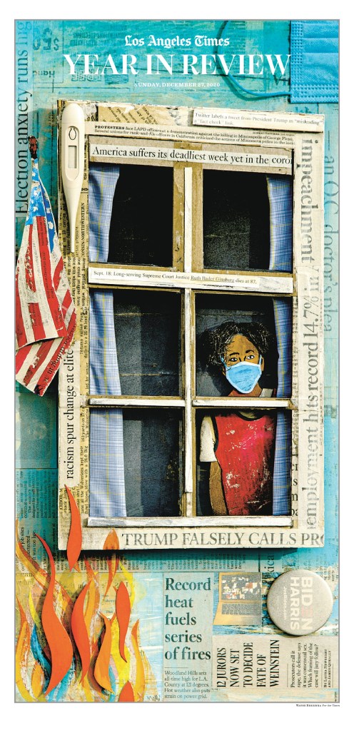
LA Times year in review
I hope to get the chance to talk more about this page with someone who was involved in it in a future post. But this was the first page that took my breath away. Not only do I find it to be such a striking image (illustration by Wayne Brezinka), it in itself is a celebration of print, with newspaper clippings pasted throughout. It looks like a crafting project, just better than any crafting project I’ve ever seen (though my daughter does some killer crafting).
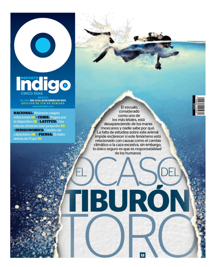
Indigo’s disappearing sharks page
This page did so much for me. As I listened to the discussion as to whether it should be a medal contender, I found myself loudly voicing my opinions while muted (facilitators aren’t allowed to weigh in, but I did in spirit). I loved the text, the tear, the obvious shark that is not there, which was the point. It’s about disappearing sharks. The 3D effect. The colours. Despite being about a depressing topic, as many of the pages are (hence their power), the design made me happy.
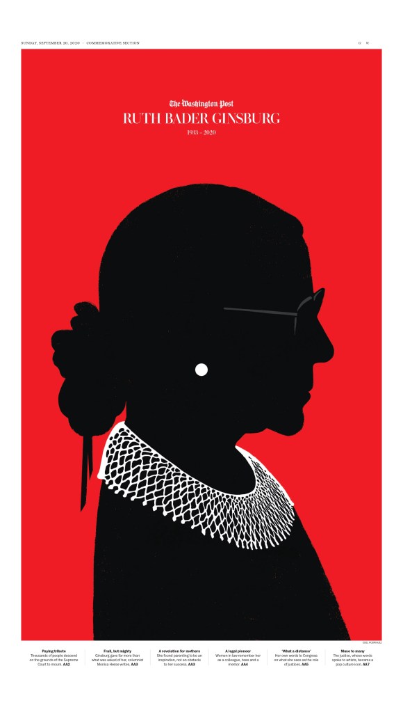
Washington Post, RBG
I don’t need to say much about this one. It’s stunning. It’s powerful. It’s simple. It’s respectful. The silhouetted look is the focus. The words are small, and don’t take focus away. The earring and the collar. The slight but necessary hint of glasses. This page is more about the illustration (by Edel Rodriguez), but the respectful treatment of it makes it a complete package. They could have used a photo of Ruth Bader Ginsburg. They could have used a more traditional illustration. But neither would have the power that this did. I saw this one the day it came out and it struck me then just as powerfully as it did when up against the world’s best. Read more about it here.
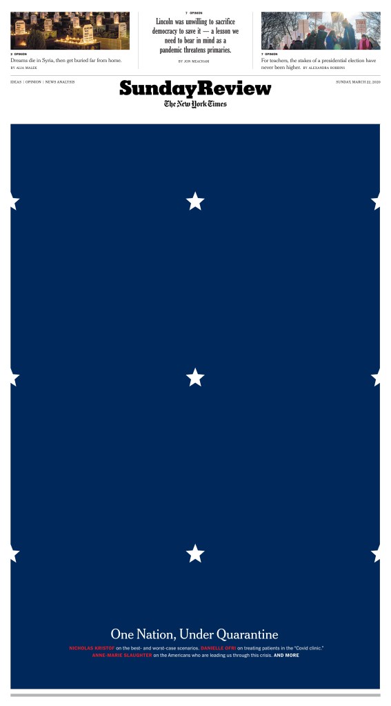
New York Times, One Nation, Under Quarantine
When I saw the wall of grief page from the New York Times, I thought that was the pinnacle. It was so powerful. Could there be a stronger NYT page? Enter SND42, and One Nation, Under Quarantine. This page is so strikingly simple and complex at the same time. Playing off the flag, a symbol of unity. The Stars close together, separate but united. But not here. Quarantine drove Americans, drove everyone, apart. The stars normally so close now evenly spaced, physically, socially distancing. It’s such a symbolic visual.
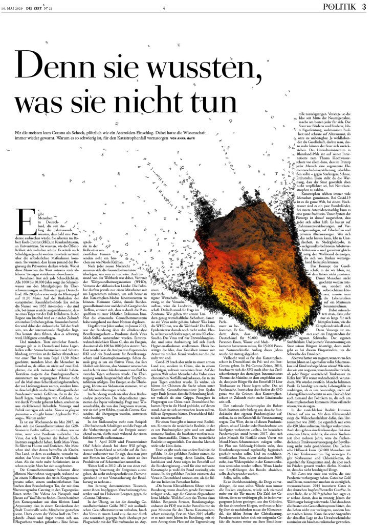
Die Zeit, COVID’s impact
This page has a lot of text. It could almost be considered too grey. But the visual of the meteor tearing through the page changes that. Letters flying around. A disease like COVID wasn’t unexpected. It was predicted. Like we might be able to predict a meteor’s path. But we didn’t prepare. And thus the impact has been devastating, like this meteor tearing apart a piece of regular life, a newspaper. The meteor is tight to the text. With almost any other illustration it would be too tight. But that’s the point. It’s still burning through. The impact still being felt. And the text is still readable, so key to design. A page can be the most beautiful thing in the world. If the design affects readability, you’ve lost most of your readers.
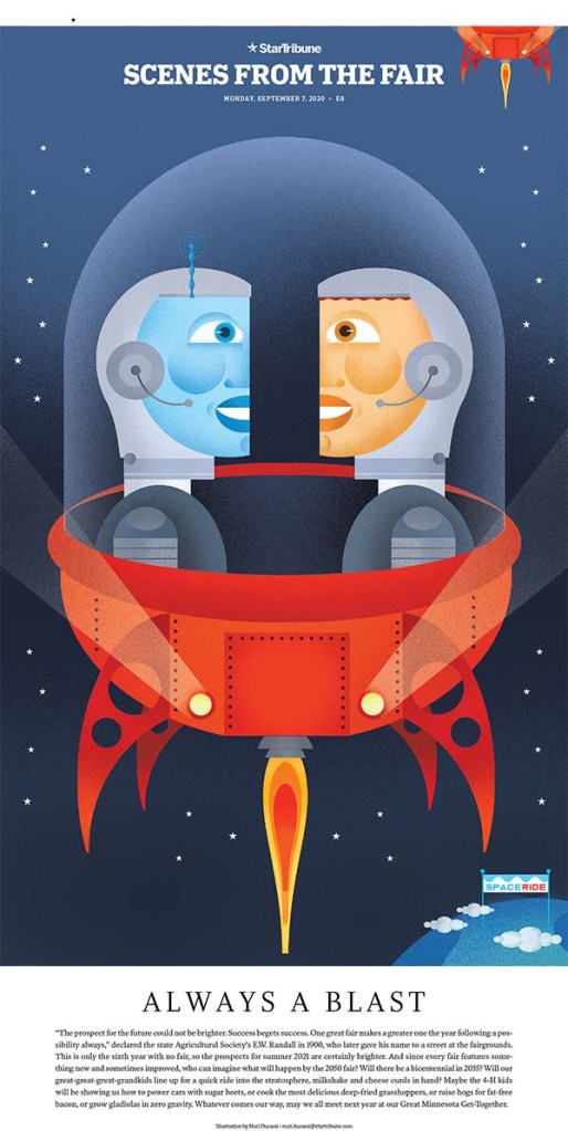
The Star Tribune had so many great pages. It’s such a hub of design and creativity. So with pages on George Floyd and COVID-19 and the U.S. election, why did I choose one about the fair? Because it makes me happy. It was a tough year. There were so many big and hard stories. But when I saw this page (there are many just like it), I smiled. It brought out the kid in me. Not only is the illustration lovely (by Nuri Ducassi, whom I had the good fortune of working with at the Toronto Star), the page itself is just wonderfully designed. Simple, effective and fun.
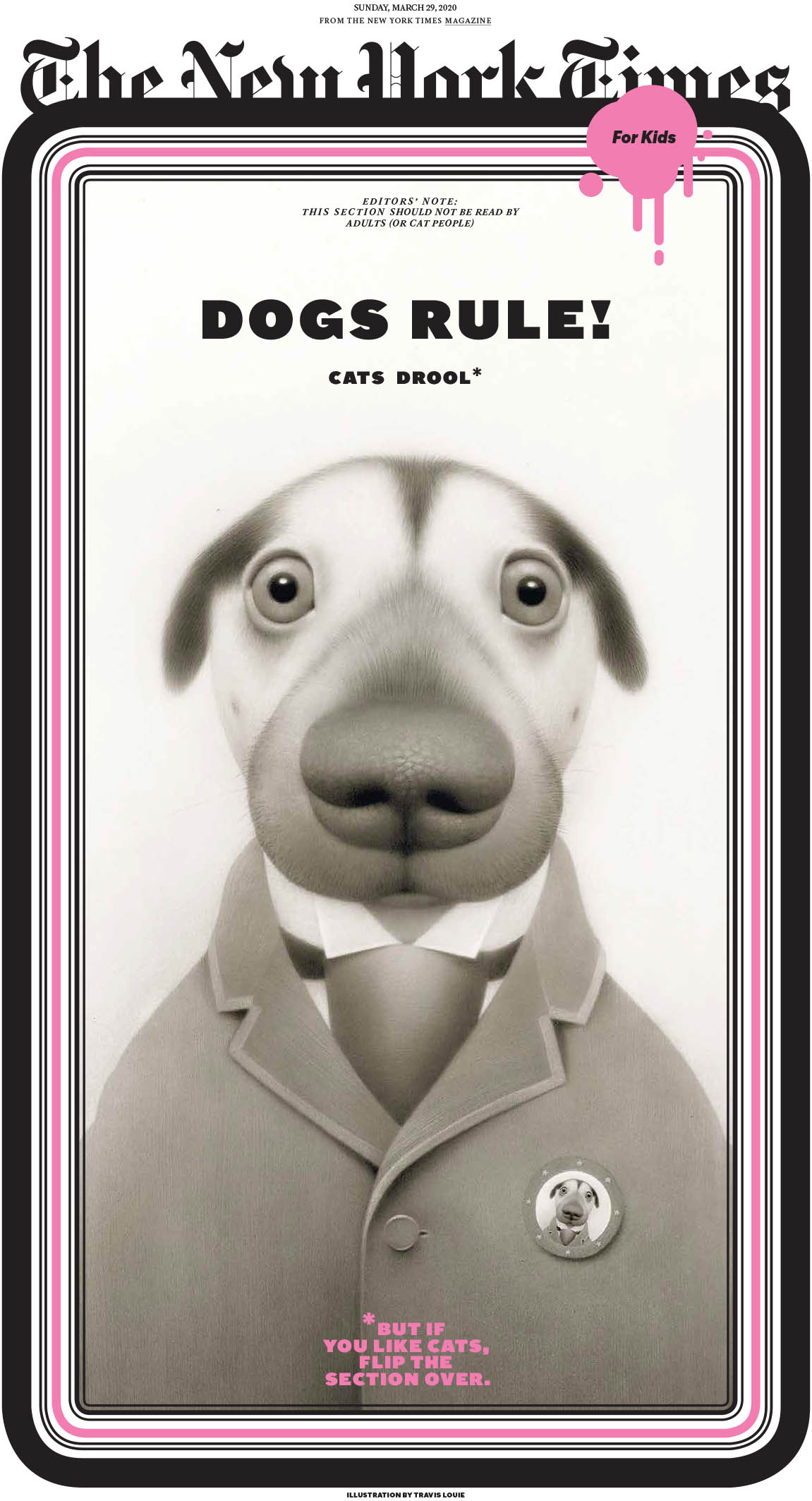
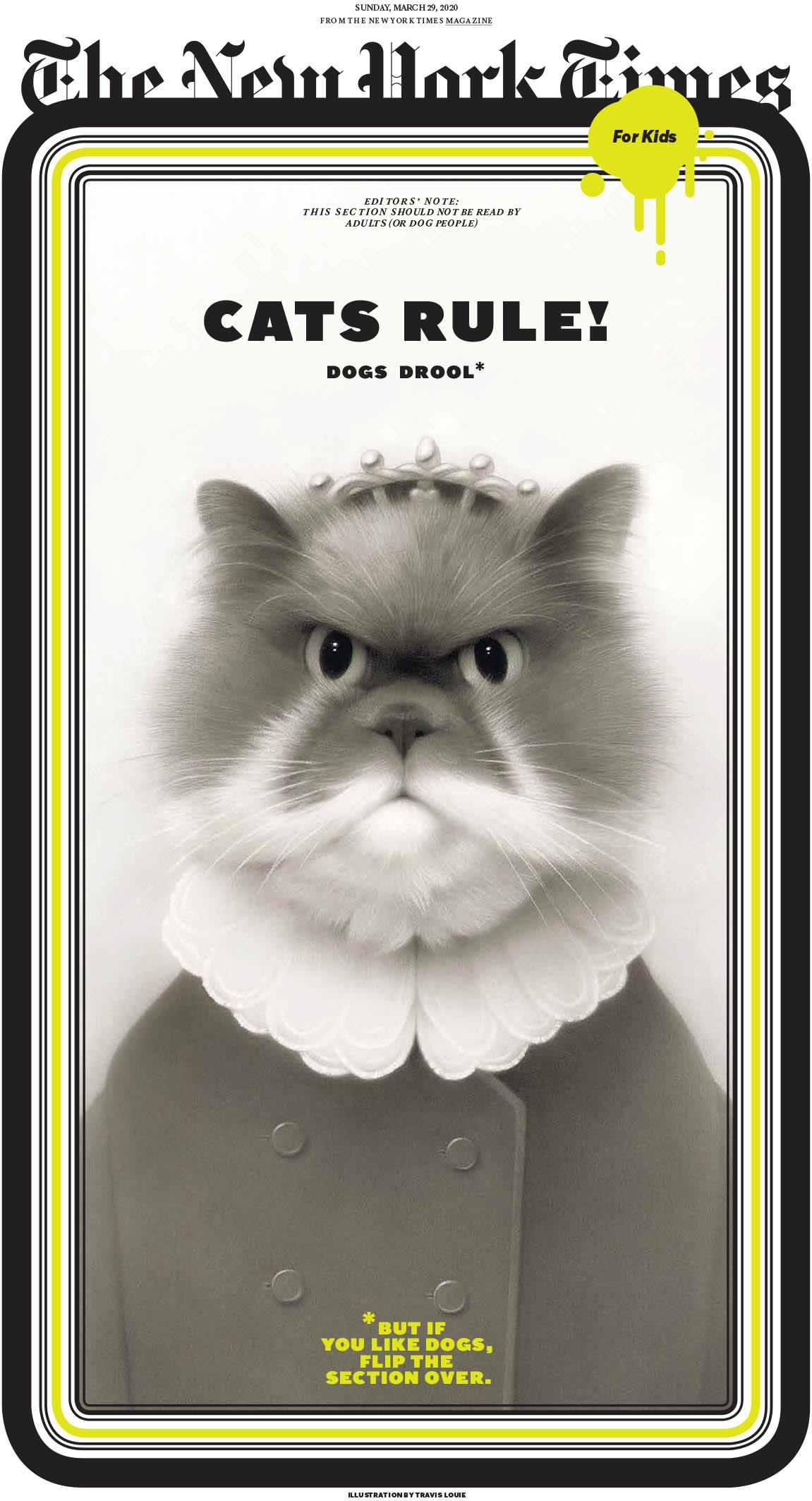
Speaking of simple fun, these New York Times pages from its kids section are just that. Fun. And who doesn’t love the age-old debate about which is better (and which drools), cats or dogs. But I think we all know the answer. Feel free to share in the comments below, but really, do we need to? We know (wink, wink). Again, pages driven by brilliant and beautiful illustrations. But a great concept. And a smile.
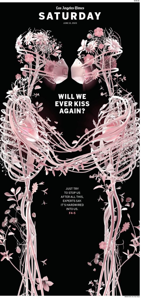
LA Times, Will we ever kiss again?
Last but certainly not least, the kiss. Another LA Times page driven by an illustration, but what an illustration it is. This haunting image by Eddie Guy is beautiful. How else to explain it? It gives me chills. And it’s even more impactful now, I’d argue, more than a year after the pandemic was first declared. Vaccinations are rolling out, there is a sense that we could return to some version of normal, but it’s been so long. and it’s been so hard. The biggest loss in all of this, after the tragic lives of so many lives, is personal, human contact.
There were so so many more incredible pages. It was astounding to see so much creativity in one place. I have some that rival these above on my scale of favourites. There was just so much talent on display. But I will seal this one with a kiss.
I hope that SND42 will be the gift that keeps on giving. I plan to talk about the amazing work that came out of Canada, and with any luck I will talk to some creative types who played a role in some of the pages that got so much love in the competition.
The power of print. Newspapers. It’s the reason I started this blog. Every day I look through hundreds of front pages from newspapers all over the world. Over the course of a few days last week, I had the privilege of looking through some of the best designs in the world at the Society for News Design print competition. It was mind blowing. It actually left me stirring with emotions. To look at one of the most challenging years in our history, at least recent history, through the lens of newspapers around the world. The loneliness and emptiness of COVID-19. The coming together and rallies around George Floyd and the racial reckoning. We probably watched videos. Read countless stories online. Maybe we remember some. But newspaper pages live on. They are a time capsule. I was fortunate enough to be asked to be a facilitator at this year’s SND Best of Print competition. It was even better than I was hoping for.
Some of the judges, organizers and facilitators from SND42.
In my first real newspaper job, I stumbled upon old, tattered SND books. I looked though them, in awe of the brilliance. Wondering if I might be able to learn something. I took them everywhere, even on vacation. I had yellow sticky notes marking inspirational pages. Some books had dozens of pages marked, the sticky notes tattering like the books (two of which I stole from my first workplace — sorry and thanks). Less than 10 years later, I appeared in one of the books. Then again two years later. And again two years later. That was 10 years ago. Every time, the feeling was magical. As newspapers were contracting, I made the fateful decision to move to the Toronto Star shortly after the last award. After just over a year I was laid off, and moved to Pagemasters North America to lead … the production of the Toronto Star. But my design days were mostly left behind. Being at this competition made me wistful and left me with a strong sense of longing. How I wanted to do it again. When I heard that the competition almost didn’t happen this year, I was floored. While print media may be in a period of contraction, I can assure readers there are so many who are still giving it their all. Some of the pages were so powerful. Some brought people to tears. (I might have been one of the tearful.)
De Volkskrant’s entry, “How should things go on after the death of George Floyd?”
I will sprinkle a few of the entries through this post, but I will do another post soon reviewing what I will call my best in show, an actual category at SND that is sometimes awarded and sometimes not. To meet the highest standards, a strong majority of judges need to agree that one submission stands above the rest. In a competition with thousands of outstanding entries, with judges from diverse backgrounds, feeling different emotions, being pulled in different directions, finding one that stands out from the crowd is no easy task.
Los Angeles Times a year in review.
Being in the room listening to the judges was such a joy. And one of the most educational moments in my career in terms of design knowledge. Ten years after my last award and I feel like I know so much more. Listening to the insight different judges had, on both the strengths and failings of different pages. On Sunday while out for a walk, I listened to the Best in Show discussion on my phone. It was like a tennis match, each judge skillfully volleying their opinions, only to have another judge counter with an equally insightful opinion on the other side.
There were pages from all over the world. It was fascinating to see all sorts of representations of the COVID ball, depictions of George Floyd (see the Houston Chronicle and Die Zeit above). It was surprising to see creative concepts, seemingly unique, repeated in slightly different ways. Below, the Globe and Mail and Politico Europe use a tangled string to illustrate getting through COVID, while The Economic Observer and Politico Europe use an upward view of buildings and plane in the sky for very different stories.
This was the first year the competition was held virtually. So instead of newspaper pages spread out on tables, it was PDFs being opened on laptops. While the pages were all crisp and clear, no yellowing of print from pages pulled from the archives, some judges commented on how they felt certain entries would have hit them differently laid out in all their print glory. Instead of cups holding votes for Awards of Excellence or not it was computer tabs, with a virtual separator between those that got three votes and those that got four or more, which would then be up for medal discussion (an entry needs three of five votes to win an Award of Excellence). Instead of taking 15,000 steps over the day, those partaking were lucky to get in 1,500 sitting in their basements, in front of bookshelves, old cameras, bourbon. And instead of more than 10,000 entries, there were a little more than 3,000. If SND will have me between now and next year, I am determined to change that. After looking through pages every day, I know there are potential Awards of Excellence out there that weren’t submitted. Maybe medals.
Judging for SND42 Best of Print News Design has completed. The complete results will be released by SND in the next few weeks. A huge thank you to all of the entrants, judges and facilitators! pic.twitter.com/m6ZkeoFdm2
The experience overall was worth its weight in gold medals. There were five this year. Here are a few more tweets with judges’ commentary from SND on some of the big winners.
A judges’ special recognition goes to American City Business Journals for a body of work that shows commitment to an overall design philosophy. The elegant but flexible design system serves a range of stories and voices across many cities, through many publications. pic.twitter.com/M0LT3MENYP
In features section design, a gold medal goes to @nytimes for "Kids sections: April, August, December"
"They’ve thought about everything — it pushes the medium. When it comes to state of the art, it’s the most cohesive cover to cover section." pic.twitter.com/iexhMBZrsd
I will use this soapbox to encourage people to support print media. I will argue here or there or anywhere, on a train or in the rain, that there is no media more powerful, with more impact, than print media. I encourage those from smaller newspapers to start thinking about next year’s competition. Put yourself out there. The vast majority of the entries were outstanding. Some rose above, and some rose even further. Even those that didn’t win still showed that the creative spirit is alive and well. So a shoutout to print designers everywhere. To illustrators (some of the illustrations this year were breath-takingly beautiful and powerful). To those who still put forth their best effort day in and day out, with fewer resources and less time. You’re all amazing. And I will bury this here. I was contemplating quitting this blog. I didn’t think there were enough people who cared about print media. I was having a hard time finding magical pages. But after seeing the emotion and passion at SND42, and the sheer volume of awe-inspiring entries, I’ve decided to keep plugging away. Sharing great designs when I see them. I can’t wait for SND43.
Looking back
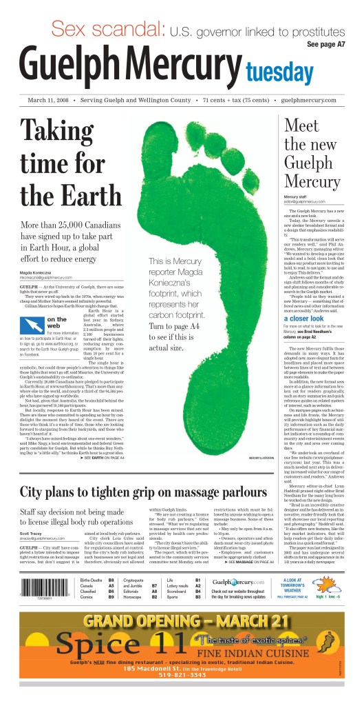
These were three of the pages I submitted over two years to get recognition. Not on par with the stunning pages I saw this year, but I am proud of the work we did at the Guelph Mercury, with a circulation around 10,000 and a very small newsroom.
Coming soon: posts on my best in show and one on CanCon at SND42.
Have thoughts? Share them below. Want to see more? Subscribe!
Prince Philip, the Duke of Edinburgh, was a towering figure, both in physical and societal stature. The husband of the longest serving monarch in British history. Married for more than 70 years to one of the most powerful woman in the world. Himself the longest serving royal consort in British history. While he retired from his royal duties in 2017, his stature didn’t fade. Prince Philip died two months shy of his 100th birthday.
Newspapers are often ready for the death of a significant figure. While nobody likes to think about or predict someone’s death, readers have come to expect information immediately. There has been a long practice, perhaps nearly as old as journalism itself, to prepare obituaries for key figures ahead of their deaths, particularly for anyone who could be at greater risk. So media organizations will have obituaries prepared, starting with “z-copy”, a.k.a., their history, so all that needs to be added are the new details, such as when and where the person died, any recent events or interesting information, and then refining as required. That allows the story to be posted very quickly, and then it can be refined later. But that’s the story. What about the design? Readers demand the story immediately. The design comes next.
In most cases, newspapers won’t have predesigned pages, unless something is imminent. In the case of Prince Philip, he had developed heart problems in his 80s, and was recently hospitalized. It’s possible media organizations had started to compile key photos. But it’s unlikely it went much further, though that very well might not be true of papers in Britain. While the Duke of Edinburgh was a significant figure around the world, particularly in Commonwealth countries, no where would his stature be larger than at home.
While media often struggles with just want to say about key figures when they die — do they mention Prince Philip’s racist comments and other offensive remarks over the course of his life? — the same is often not true in design. The design captures the gravity of the situation — or the gravitas of the person. While the display copy — either the headline or the deck — might capture some of the negative aspects of the person, it is generally left to the story to capture the nuances. The good and the bad.
Today newspapers around the world had some amazing front pages that did just that. It captured what he meant to so many. The good and the bad, of him and the monarchy. There will be more powerful front pages after his funeral. For today, I want to put a spotlight on front pages mostly from Britain, but some from other Commonwealth countries as well. I will let the pages do most of the talking, as that is the power of a great front page. It shouldn’t need much help.
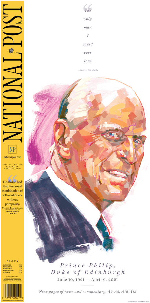
I will start at home for me, with the National Post. It was the best cover in Canada, one of the best in the world today. And on days with big events, it often is. It is known for its bold design. It used the entire front page real estate and showcases a beautiful illustration by artist Kagan McLeod. A great use of white space and an emotional quote, played small, but powerfully. It’s entirely possible the National Post had this illustration ready to go already. If not, it’s even more amazing. In Canada, the announcement came with hours to go before deadline, so papers had a chance to give design more consideration.
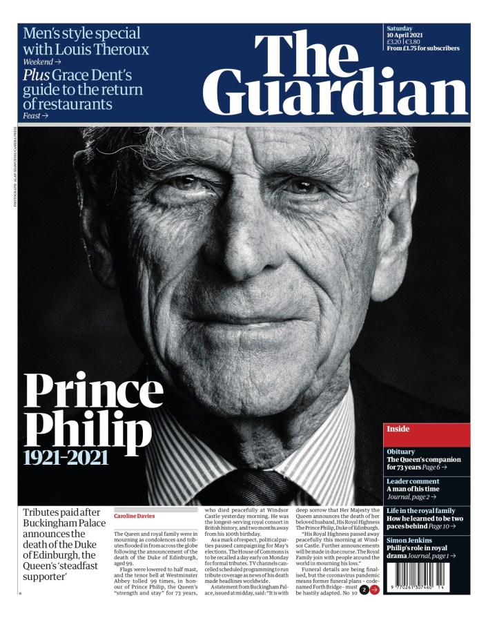
British papers on the other hand would have had less time. But they all did well, which speaks to how committed print journalists still are to their craft. No surprise that the Guardian would have a powerful cover. A stately portrait, his name, and the dates he lived. Simple and effective.
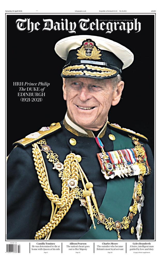
The Daily Telegraph has similar play to the Guardian. Elegant photo, name, dates. And that’s all you need.
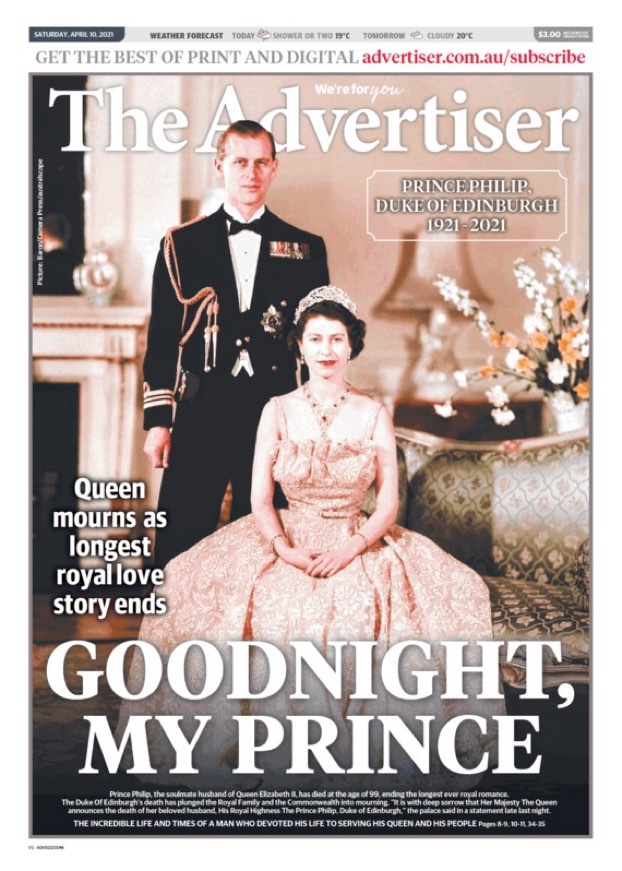
The Advertiser in Australia uses a classic photo of the prince and the Queen. The big headline, all caps, GOODNIGHT, MY PRINCE, captures the emotion. These are still human beings. They had a long marriage, many trials and tribulations. This page evokes nostalgia.
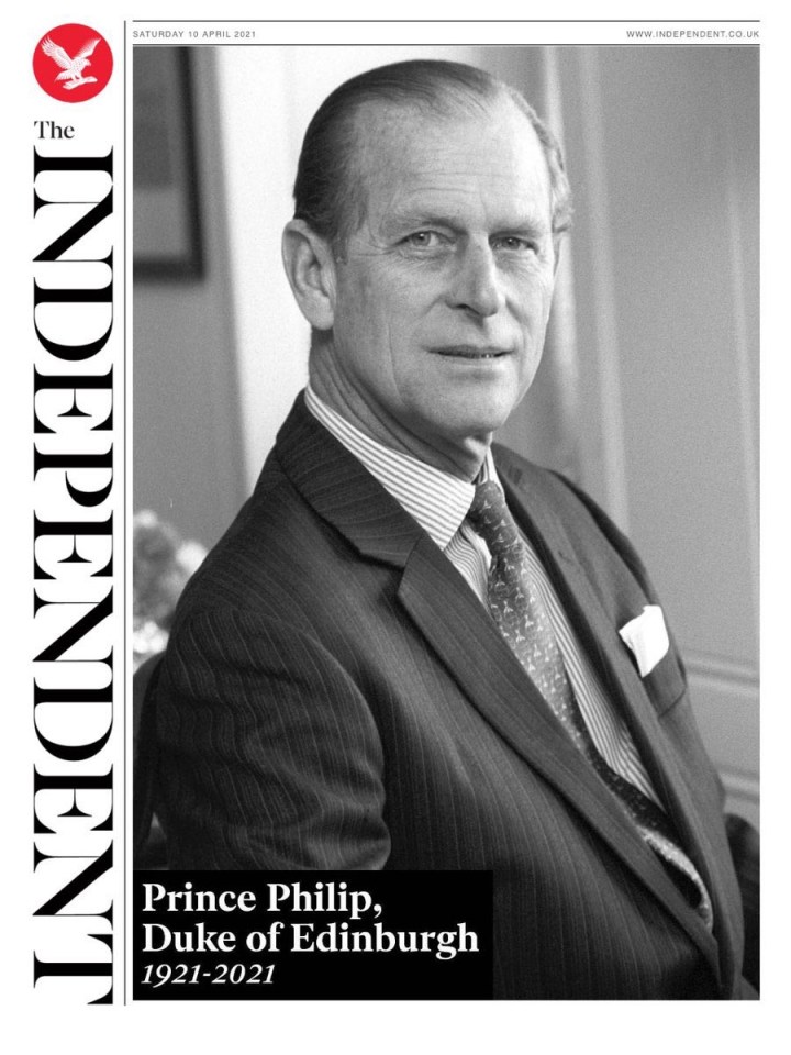
The Independent has a similar but slightly different approach. A black and white portrait, capturing a younger Prince Philip. A lovely page.
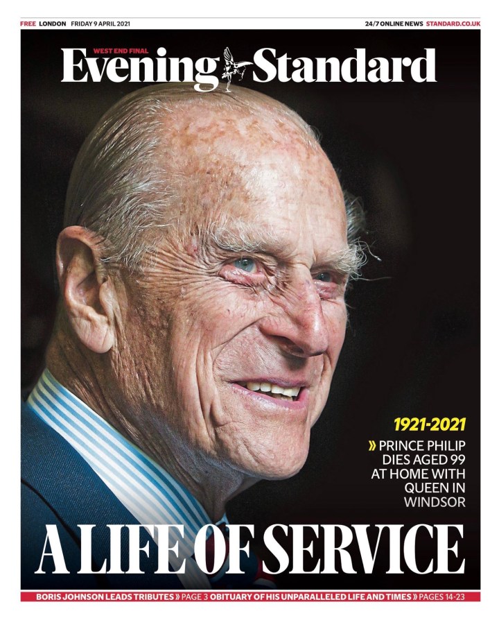
The Evening Standard went with a more recent photo. Capturing the now. It’s a beautiful portrait of man who lived a long, full life. A headline about his service. He was actively serving royal duties until 2017.
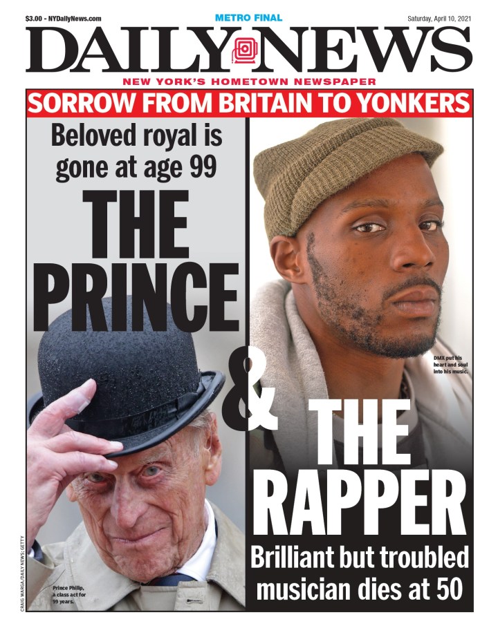
I chose this one for a different reason. The design is nice. But the Daily News also split the attention between Prince Philip and DMX, and many thought it should have been DMX getting these covers instead. The page has some issues, as it highlights the troubles of DMX, but doesn’t touch on any of the controversy around Prince Philip. But I respect that the paper, in New York, knows its audience. Readers expect DMX to get attention. And he should have. He was very influential. On any other day, he would have been the cover. And in many papers, maybe he should have been anyway.
There were plenty more worth celebrating for their creativity and power.
Expect more powerful covers after Prince Philip’s funeral. It will be a major event and the world will be watching. While many will watch it live, newspapers will do their best to capture the moment with a strong front page. Have thoughts? Share them below!
Newspaper design. There is not much more anonymous. Even the front page. Many magazines will list who designed the cover on or near the masthead. That is not standard practice in the newspaper world. In the past designers could compete for awards, but even those are disappearing. The Ontario Newspaper Awards dropped its design category (though I will urge them to bring it back here…). There is a presentation category that captures print and digital at the National Newspaper Awards. But other than the Society for News Design awards (still the pinnacle of print design awards), there isn’t much left. However, often those who get into design do so to be behind the scenes. So perhaps some don’t want to throw their hats into the ring of competition and have their names up in lights. Leave that to byline-hungry reporters (we thank you for your content).
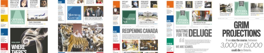
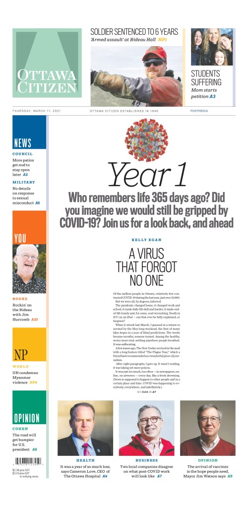
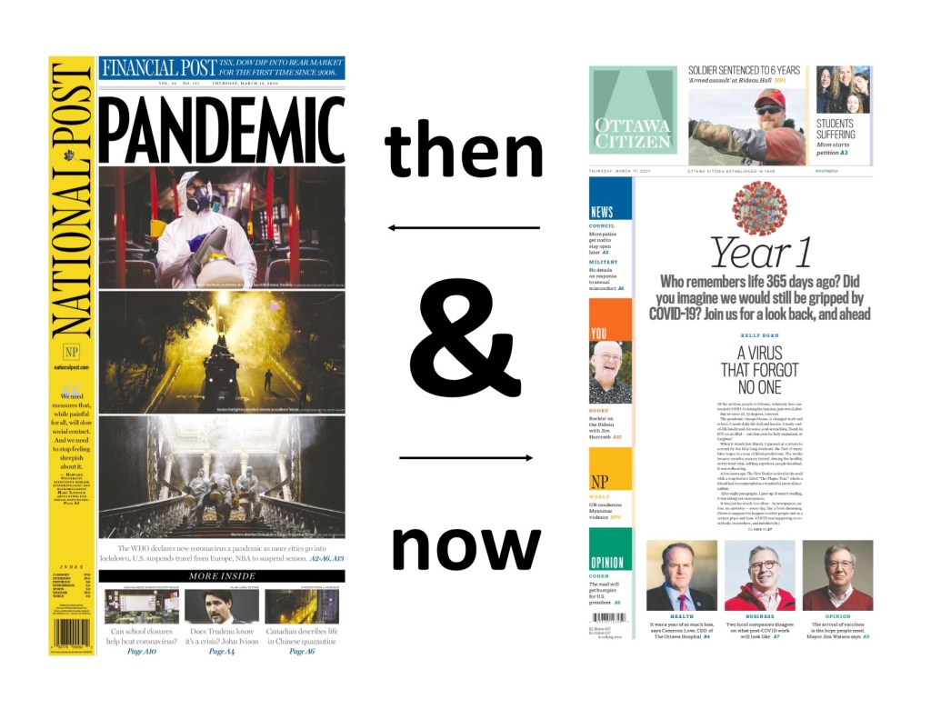
But the role of this blog is to shine a spotlight on both the publications and, when possible, people behind the designs. In this post I speak to Raina Toomey from the Postmedia Production Centre in Hamilton. It is the primary print production centre for Postmedia. I have long heard Toomey’s name. And unknowingly, I have seen her work (because it’s so anonymous). It was only luck that I stumbled upon something designed by her when I was doing a post on COVID-19 papers. She was responsible for what was probably the page of the year, in at least Canadian newspapers, on the anniversary of the declaration of the pandemic, March 11, 2021.
Ottawa Citizen, March 11, 2021
I was happy to hear that she would be interested in talking to me about more of her designs. I love to look at a body of someone’s work, rather than one piece, to see themes and differences. I asked Raina some questions about her career in design. I found that she and I had a lot of similarities. We both started in editing. We both love simplicity in design. We both work in media production centres. Without further ado …
How did you get into newspaper design? I studied print journalism in college because I loved writing and, at the very wise age of 19, decided it was journalism or teaching and I didn’t want to be a teacher. (I shake my head at myself now, of course.)
In my second semester of college, I started working part-time as a copy runner (essentially, a gofer) at the Ottawa Sun, took on freelance work for them and did my job placement there in the fourth semester as a reporter. That was when it firmed in my mind that I really hated reporting and talking to strangers at some of the worst points in their lives. I was hired as their TV editor, which involved a mix of interviewing, writing features and basic layout. That evolved into the new position of production editor for the Today section, laying out and copy editing the Sun’s arts and life pages. Being the Sun, that meant a lot of bells and whistles and splashy design.
Readers’ time is valuable. Effective newspaper design informs as much as it attracts.
Raina Toomey
From there, I moved to the Sun’s news rim as a copy editor, then to the senior slot editor, slotting and drawing the news and business pages.
After 17 years at the Ottawa Sun, I made the move to broadsheets and the Ottawa Citizen as a copy editor on the news desk. By the time I left the Citizen four years later, I was their A1 editor and had worked on a number of special projects, including design and being a builder of their content management system.
I transferred to Postmedia Editorial Services in Hamilton, where I am the production editor for the hub that produces the chain’s 10 major market publications (nine broadsheets, one tabloid). The position offers a lot of variety, and I’m somewhat of a jack-of-all-trades. My specialties involve developing efficient print workflows across the chain, newsroom technology, planning and newspaper design. I work on everything from day-to-day production – layout, editing, clearing pages, design of pages that break away from the ordinary – to the design and production of special coverage such as the Olympics and elections, to rolling out and training staff on our content management system and other technology.
What do you like about newspaper design? And what makes it different? I love the flexibility of newspaper design, in that it goes beyond pure esthetics. Newspaper design demands a special skillset that blends news sense with creativity. It needs to draw the reader in, while remaining true to the subject matter. It must be more than visually pleasing; it has to be readable. Yes, use a pullquote, but only if it draws in the reader in a contextual way. Info boxes, numbers packages, sidebars all have to be treated as part of the whole and add value. Readers’ time is valuable. Effective newspaper design informs as much as it attracts.
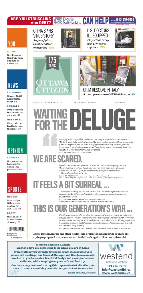
Ottawa Citizen, March 28, 2020: a text-driven cover.
What was the most fun you have had with a design? I think the most fun I’ve had with design is when I’ve been forced to make something out of nothing – where the art is lacking or of poor quality, but the story is important and needs to make a splash. I am not fond of using clipart unless there is no other option, so it is satisfying to devise a type attack or interesting play of lacklustre art that manages to make things pop.
Do you rely on one design principal more than others (white space, text as design, colour, cutouts, etc.)?
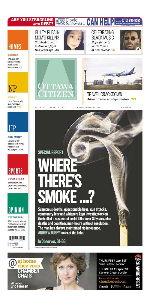
Ottawa Citizen, Jan. 30, 2021. A simple cover with just three headshots as art.
Simplicity is important to me. I like the conscious use of white space, as well as the judicious breaking of rules in limited instances. The Postmedia design has what some have called rigid rules – headline hierarchy, how and when colour should be used in text, no text on photos, no cutouts or close crops – but that is only for the day-to-day design. Sticking to the rules in the majority of situations adds more power and impact to a design when a decision is made to deviate from the rules.
Tell me about a design you loved that was rejected. One paper had a lifestyles section front about wedding dresses. The main art was fairly small, and restricted to above the fold. I sized the art way up, so the model went from the top of the page all the way to the bottom, approved a close-crop and extended the train across the bottom of the page. It was stunning. The editor insisted the photo be sized back down so the entire gown could be above the fold.
I feel I’ve grown a lot as a designer and a journalist since my early days, and expect to learn more – and improve – in the years to come. If I don’t, that would be a sad state of affairs.
RAina Toomey
Now, in my opinion, above the fold/below the fold is outdated thinking, even when it comes to A1. First, the bulk of the circulation for most papers is based on home subscribers, not single-copy sales at the corner store or gas station. Secondly, someone who is going to pick up a paper along with their gas and lottery tickets will not be choosing their purchase as they would decide which tomato to buy at the grocery store – they want to buy that newspaper. Lastly, this was an inside section; by default, the reader would have to unfold the paper to even read it, and would see the dress in its entirety.
Are there any designers or publications other than those you have worked at that you are sure to look at? I love the design of the National Post’s Weekend Post. It’s very magazine-like, and showcases the way great design can maintain a consistency in style while doing some pretty out-there design. Lovely.
How do feel now about the first handful of pages you were proud of? Still love them? Wonder what you were thinking? Wistful for times gone by? I don’t do a lot of looking back. I consider design a constantly evolving skill. What I did years ago is indicative of where I was at that point in my career, and that’s fine. I feel I’ve grown a lot as a designer and a journalist since my early days, and expect to learn more – and improve – in the years to come. If I don’t, that would be a sad state of affairs.
I do appreciate that technology has reached the point where the designer can touch all aspects of their creation – no sizing wheel, no getting camera-ready versions of images shot for paste-up, no painstaking close crop work with an X-Acto knife.
How is it different working in Hamilton vs. working directly in the newsroom? In some respects, working at a hub offers more variety, challenge and flexibility than working in a traditional newsroom. While our newsroom colleagues may feel that those at the hub are separate from them, and not as invested as they are in stories that matter to their readers, that is not the case in reverse. Many staff at the hub take pride in the work they do for “their” paper or papers and feel they are contributing in a meaningful way to the papers’ success. This past year of working from home has likely offered our colleagues a glimpse of what it is like to work outside the newsroom and still be part of the important work we do as journalists.
The logistics of working at a production hub are different, and that can largely be chalked up to technology and how economics have changed the business of presenting the news.
In past years, when every large newsroom had in-house designers, print design was as much a part of the discussion for special projects as the writing and photography. Now, that kind of start-to-finish collaboration often only occurs for digital presentation. It’s possible that some newsrooms consider print design to be outside their scope, since their paper is no longer put together in-house. It is also simply the way things are as we move more fully into the digital world.
Unlike traditional newsrooms of the past, the production hub has to balance creativity and workload. Where once a designer in a large newsroom might have a week or weeks (or longer) to create something spectacular, a designer at a hub has to work under much tighter time constraints and deal with a greater volume of pages. Some newsrooms try to involve the hub as much as possible, giving advance notice and filing early when they require something with flare. They may have suggestions or a vision, or they may just hand it over without offering guidance. Other newsrooms aren’t as aware of the time needed to make something sparkle, or face staffing constraints that don’t allow much turnaround time. Everyone everywhere has to do more with less.
It might be like picking favourite family members, but if you had to pick a few favourite pages, what would they be and why?
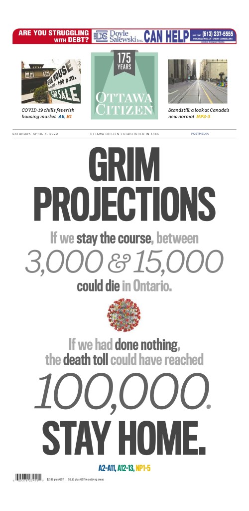
Ottawa Citizen A1, Saturday, April 4, 2020
An example of the power of a type attack using shades of grey and a mix of Postmedia’s bold block line style font with the serif style we use for big numbers in display. The page also broke from style in that there was no main art, only a small close-crop of the now-familiar computer-generated image of the coronavirus. Saturday A1s usually are colourful, teaser-driven pages, so the calculated, drastic deviation from style served to emphasize the seriousness of the province’s message.
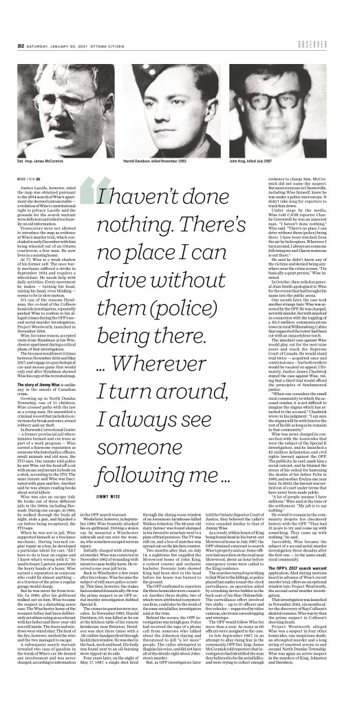
Ottawa Citizen A1, Saturday, Jan. 30, 2021
While I usually avoid using clip art whenever possible, this page presented a challenge in that the only art available was largely poor-quality headshots of the suspected serial killer and his victims, and those were used with the three-page feature inside. Andrew Duffy’s incredible piece strung together suspicious deaths, fires, shootings and rumours as police spent 30 years trying to get the evidence to convict a man who has always maintained his innocence. This design broke from style by using clip art of a smoking match (to convey the link to fires and a trail gone cold) and putting large, bold type for both the head and deck on the black background of the image.
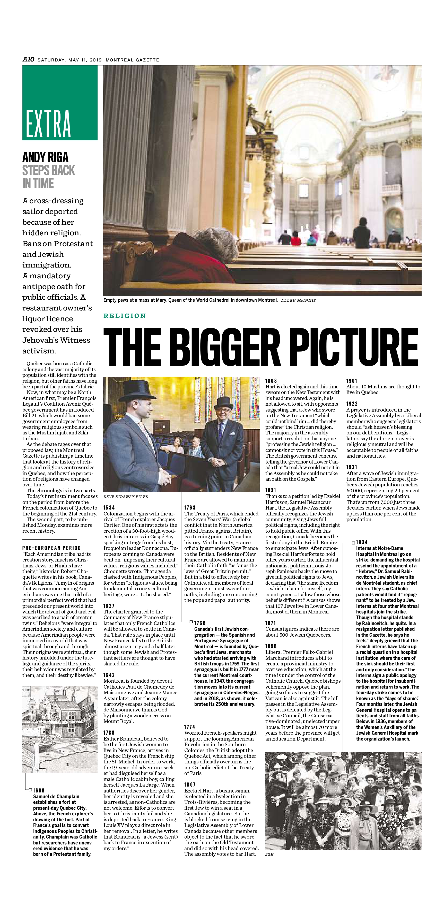
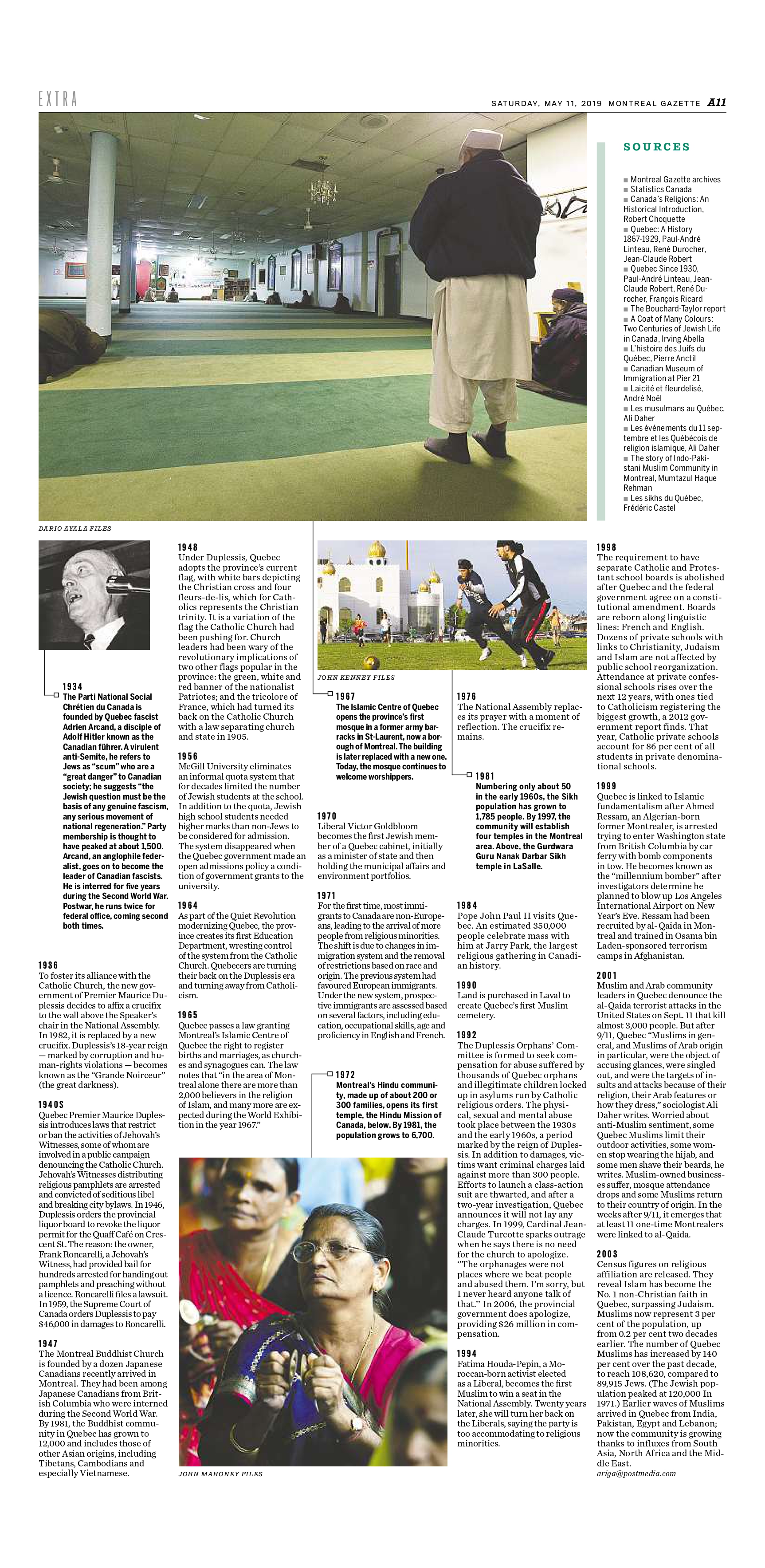
Montreal Gazette, A10/A11, May 11, 2019
It’s difficult to separate politics from religion in Quebec. In a two-part series, Andy Riga looked at the intertwined history of two integral pieces of identity for many Quebecers. The first part ran May 11, 2019, and consisted of a piece that took some time to figure out – what would be the best way to present a narrative feature in a format similar to an illustrated timeline? If styled like a usual timeline, our sans infobody style, it would be dense and difficult to read at that length. I used archival images, special formatting derived from existing styles in our design and, my favourite, white space to make key moments in the timeline stand out.
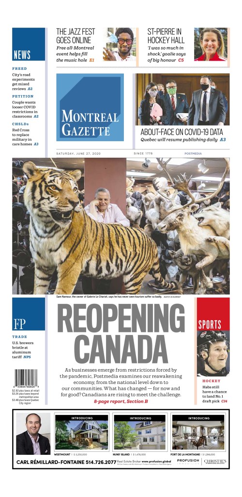
Montreal Gazette, Reopening Canada package, A1, B1-B8, June 27, 2020
Every major-market paper in the chain ran a Reopening Canada package June 27, 2020. With a mix of local and shared content, the sections required a cohesive look that would tie everything together and say, “Here is something you need to read.” Our section squares are usually set solid colours reserved for standing sections. I created a special red square with a Maple Leaf watermark to use on the section front and smaller on each page in the section. Pages were limited to a maximum two stories, features or alternative story forms, every one labeled in red – not one of our usual accent colours – to indicate the specific economic sector, such as aerospace, retail, restaurants, arts and culture, etc … Each page featured a large pullquote beside the inside square, a style most often restricted to the OpEd pages.
Thanks, Raina! Thus ends the Q&A portion …
I agree with Raina on her choices, particularly the Grim Projections page. It uses text so boldly to send an important message. Stay home. That’s it. And as I said up top and in a previous post, I love the design on the anniversary of the pandemic declaration.
Here are a couple more I really dug from the samples she sent.
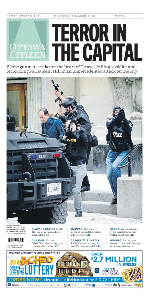
Ottawa Citizen, October 23, 2014
I love this one for three reasons I always go back to. It’s a big day, and nothing captures a big day like a powerful newspaper front page. It’s simple, which I always appreciate, but especially on big news days with emotional, sensitive content. The story is the story. The page needs to capture the gravity without taking away from it. It can be hard to not go too far on a design. And the strong image.
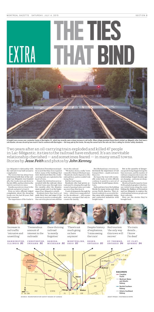
This is another design I like for being simple and informative. A good, big, bold headline. Clear throws to the inside. A helpful map. And again, this was about an important and sensitive topic, though a retrospective kind of look, rather than the day after coverage.
Many staff at the hub take pride in the work they do for “their” paper or papers and feel they are contributing in a meaningful way to the papers’ success.
Raina Toomey, on working outside a specific newsroom
There were so many others to choose from. Raina had a number of wonderful designs (some beautiful graduation pages, capturing and celebrating graduation in a pandemic in the Calgary area, and more), and I also very much appreciate her approach to and philosophy on design. We share so many similar views. Not only that, we both work in a similar environment. While the Postmedia Production Centre is part of Postmedia, it’s still outside the newsrooms, which creates a new dynamic with editors. The same is true at PMNA, though we are an outsourcer (that said, PMNA is owned jointly by three organizations, two of which we have done or still do layout and editing for: the Globe and Mail and Toronto Star). But even with a different relationship, outside the newsroom, Raina has found a way to shine (as have the editors at PMNA).
But a special thank you again to Raina Toomey. Thanks for continuing to give it your all in an industry that doesn’t value print design as it once did. The results are evident. And I know many still appreciate it, though maybe few as much as I do.
Up until March of 2020, newsrooms had always been buzzing, busy places. Reporters on calls. The clickety-clack of typing. Editors and designers shouting across the room. Editorial decision-makers making decisions. All in one place. How could it be done any other way? It was about collaboration and community. The community within the newsroom preparing news for the community without. And then on March 11, 2020, the WHO declared the coronavirus outbreak a pandemic. Not an epidemic. And unlike some of the other pandemics in the past 50 years, this one seemed to capture the attention of everyone. Maybe it was that the NBA postponed its season one year ago today. The NHL followed suit shortly thereafter. Two organizations driven so much by money cancelling their primary revenue streams. Money talks.
But by March 11, or very shortly thereafter, what seemed unthinkable for a newsroom, producing a daily (or weekly) newspaper from anywhere but a newsroom, became a reality. One year ago today or shortly thereafter, newsrooms started shipping computers and keyboards and monitors and mice home. And setting up VPNs. Soon setting up Zoom accounts for all staff.
It was a pandemic. One that caused mass panic. You couldn’t even find toilet paper in most places. I know because I searched high and low trying to find some for an editor who said she couldn’t find any. I found a four-pack and brought it into the office. I went to 10 stores, a little scared in every one. This was pre-masks. Or knowledge.
But was it such a big deal? One that warranted panic buying of toilet paper and canned goods? Hindsight is usually 20/20. In newsrooms one year ago today, discussions were being had about tomorrow’s front page as well. What do we do? Is this bigger than the flu pandemic of 2009? Or the SARS pandemic of 2002? Newspapers are always worried about blowing things out of proportion. So do we play this big, they would be asking? Do we downplay it? Do we talk about soup? It had to be on the front page. But how big?
I’m going to look at some of the papers from March 12, 2020, and then at some from today, March 11, 2021. I admit I was expecting big anniversary covers. That was going to be the focus of this post. Some papers did. Most papers didn’t. It also happens to be the 10th anniversary of the 2011 Japanese earthquake and tsunami, which also caused a nuclear disaster. A devastating tragedy that left 20,000 dead. It is a tragic anniversary, so I acknowledge it here before looking at the pandemic papers of 2020 and 2021.
March 11, 2020 (March 12 in the newspaper world): WHO declares a pandemic
National Post, March 12, 2020
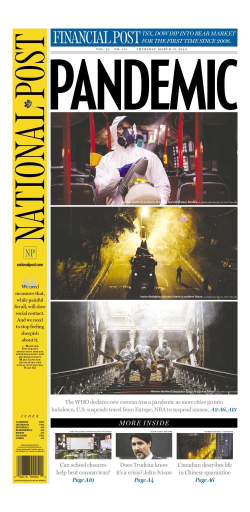
Of all the pages I looked at from March 12, 2020, the National Post cover was the one I felt most hit the mark on the type of play this should get (or should have gotten in hindsight). This was a significant day, and while it was just a declaration, the disease would have spread and wreaked havoc around the world regardless, this was a key moment. This week last year was when everything changed. This page uses a single-word headline, all caps: PANDEMIC. I’ve talked about this in previous posts. It seems so simple. But It was certainly discussed ad nauseum. And to complement that are striking, bold images. And equally important, they blew out the entire page. For a national newspaper to blow out an entire cover it needs to be a significant story. The editors at the National Post felt this was. This was a scary day, and life changed after this. But this is a beautiful page, despite the devastating and deadly outcome over the next year.
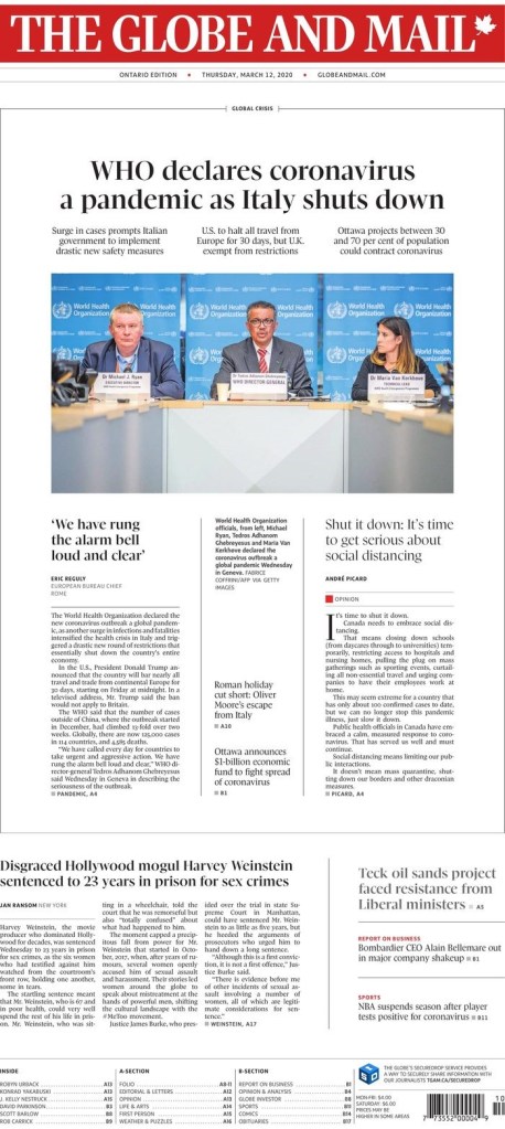
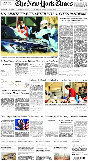
Globe and Mail, March 12, 2020
Another national newspaper in Canada also gave it big play. The Globe and Mail, while not as bold as the National Post in this instance, gave the pandemic top-of-the-fold play. And as is typical of the Globe, it uses white space to its advantage. They chose not to blow out the entire front, and while I wasn’t in the room, I can imagine the discussions. First, the Globe targets a different audience. They want information on the front. They often use their real estate to its fullest, having some pages inside without art, or very small art. On top of the pandemic, Harvey Weinstein was also sentenced to 23 years in prison for sex crimes. It was assumed the legal system would go easy on him, as it has with most powerful men charged or convicted of similar crimes. But it didn’t. On many days, this would be a black line story, across the top. It was a significant verdict. The Globe decided it must still make the front. I respect that. And the page is still well executed. It gives the pandemic centre stage, but acknowledges other key news of the day.
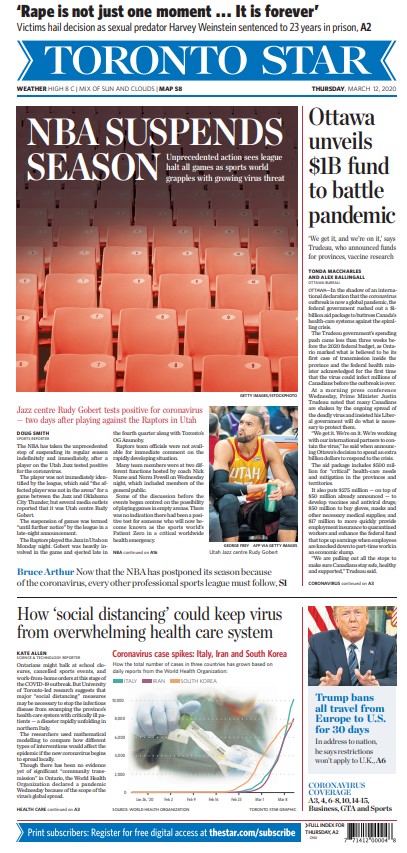
Another major Canadian newspaper, the Toronto Star, went a different route. While, other than a throw across the top (also recognizing the importance of the Weinstein verdict) the cover is all about COVID-19 (coronavirus), it’s less splashy and focuses on an intensely Toronto angle: the NBA’s suspension of its season, a.k.a. the end of the Raptors’ season. The cover design itself isn’t outstanding, but it had a clear focus on the news of the day. And looking back at it, you wouldn’t feel they missed the mark. It’s a solid cover. Strong news value.
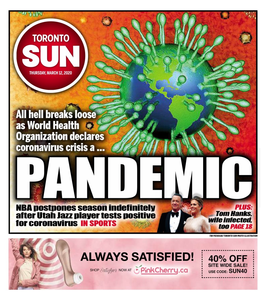
Toronto Sun, March 12, 2020
I admit I don’t often go to tabloid covers (by tabloid I don’t just mean size) for the design, even though they are often very creative. The Toronto Sun deserves credit here. It doesn’t take that big of a story for a tabloid to blow out its cover. But this has a take on that iconic COVID-19 image. The Earth as a coronavirus, with its telltale spike proteins, the claws that “act as grappling hooks that allow the virus to latch onto host cells and crack them open for infection,” as so well said on the Scripps Research website. Tabloids will often blow things out of proportion, but I’m not here to talk about that (all love, no hate, remember?). I am here to say well done to the Toronto Sun. This a bold, colourful cover. It captures the essence of the day, even if we were uncertain as to what it meant then. Believe the hype. It was worth the strong words and the design. And of course the ad. Who knew how relevant that might be for time spent in solitary confinement for the next year.
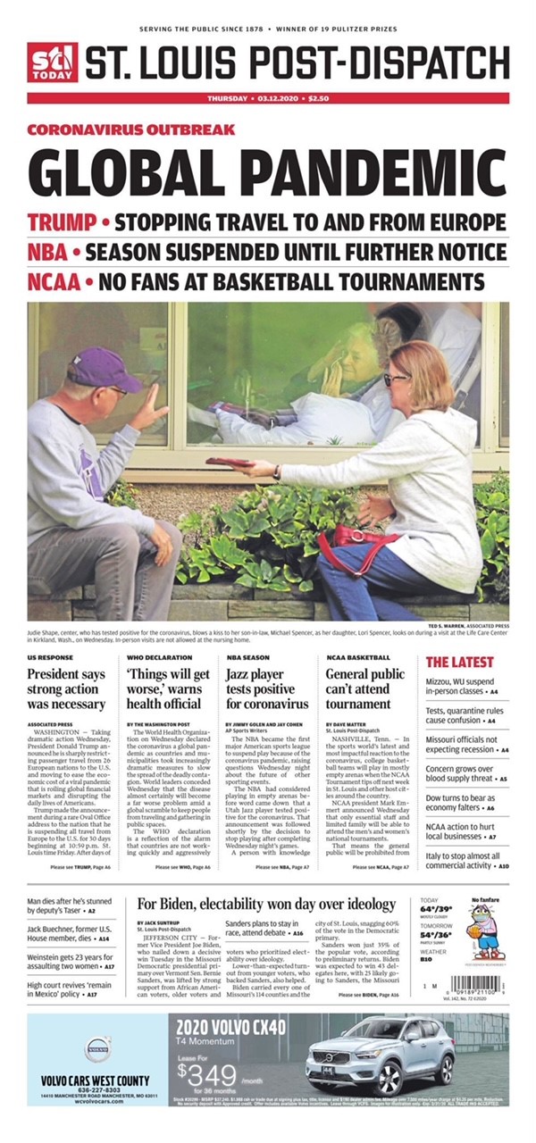
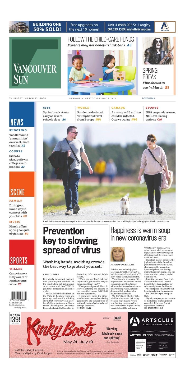
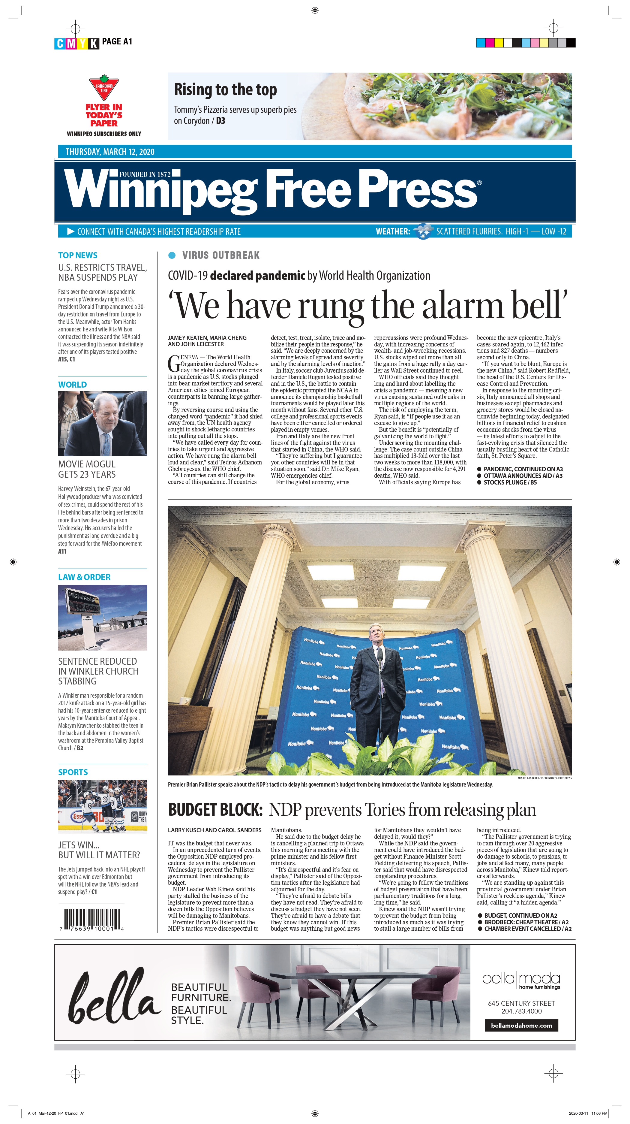
I won’t go into each of these with individual posts. My favourite from a design perspective is the St. Louis Post-Dispatch. It still looks different than other days, and is clearly taking the declaration seriously. The New York Times is the New York Times, here because of its stature in the journalism world, not for its design. I included the Vancouver Sun because it does have a heavy focus on the pandemic, but also adds a lighter touch: Happiness is warm soup in new coronavirus era (told you there was soup). It almost seems laughable a year later, but surely the editors wanted to present a mix of information. And the Winnipeg Free Press presents a standard newspaper cover. Much like most of this year’s that I have looked at.
March 11, 2021: one year later
When I decided to do this post, I was prepared for covers to be blown out again. It’s been one year since the declaration that changed our lives. Alas, it mostly wasn’t to be. Of course it comes the day after the U.S. Congress passed a $1.9 trillion (TRILLION) pandemic relief package. Money talks. Especially when it’s in the trillions. So there was news to share. And maybe editors were never planning on commemorating the day at most papers. I looked at hundreds of newspaper covers today* (thank you to Freedom Forum for its daily gallery, which I look at almost every day). Two stood out, and both deserve praise. In order of how much I love them (no shame in finishing second here!). * One additional page of note landed Saturday, a big day for blowout feature pages in Canada, so I am updated to add the March 13 Toronto Star.
Ottawa Citizen, March 11, 2021
It’s … beautiful. This is what I was hoping to see today. This is the kind of page this blog is about. It’s simple. It’s clean. It’s not gimmicky. It uses white space wonderfully. A big headline. A little bit of the story. And it captures the moment from last year. Was this declaration a big deal? Yes. Yes it was. Huge points for the Ottawa Citizen today. To the designers, decision makers, editors and all involved (some direction provided by editors in Ottawa and then further conceptualized and executed by the talented staff in Postmedia’s production hub in Hamilton), well done. As print journalism struggles, it’s comforting to see that someone still cares.
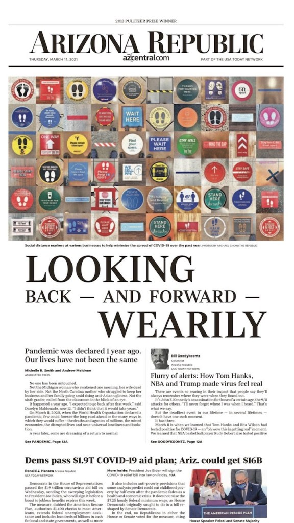
The Arizona Republic takes a bit of a different approach, but the design is still lovely, and really captures the importance of the day. It still gets the story about the $1.9 trillion (trillion!!) aid plan, but also offers a look back to one year ago today. It uses striking imagery right across the top of the page. It’s not an obvious image. You need to really look at it. Which is a great strategy. And the headline is playfully done, unlike a standard headline. Different sizes, different alignments. Strong word choices. So again to those in Arizona, bravo. It’s often a well-designed paper, and today was no different.
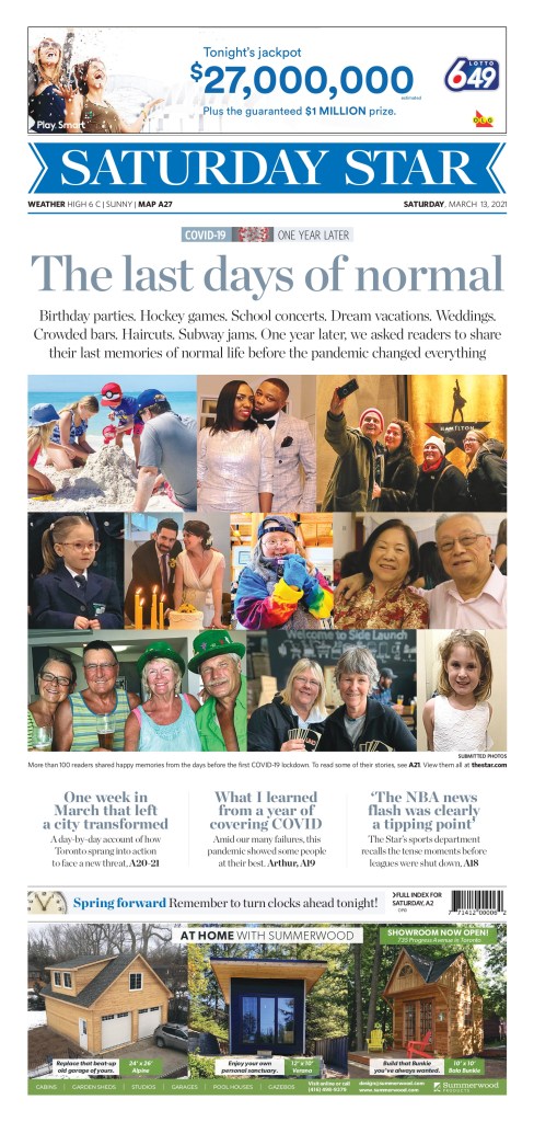
A few days after the anniversary, the Toronto Star ran with this cover. It focuses on the people affected by the pandemic. They blew out the front cover for the story (a tear-jerker, particularly if you are wistful about that last week, and the days before). Similar to the initial pandemic cover, the actual design is more basic. A collage of photos. But that it blows out the front page with essentially snapshots is bold. As a reader you know there is a story behind every photo. There are billions of stories over the course of this year. But here the Star shines a light on 10 photos, and more people. I tear up thinking about “The last days of normal.” So points for headline as well. It was. Nothing has been the same since, and may never be. This cover captures that emotion (as do the stories inside).