By Brad Needham
I have heard that taste buds change every 10 days or so. And that as we age, our tastes change as well (with fewer taste buds, we need more to keep things spicy). As I have volunteered for the Society for News Design’s creative competition for the past four years, my tastes have changed as well. The first year I got access to all the entries my mind was blown. I spent hours and hours looking through thousands of entries. I probably cried tears of joy. Then, pages with other worldly illustrations — the likes I never had access to as a designer — blew me away. I couldn’t get enough. Each year it has been harder to get me swooning like I did the first year. And I started to think, is that a great page design or a great illustration/art direction?
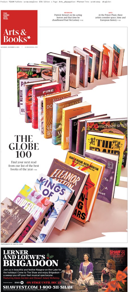
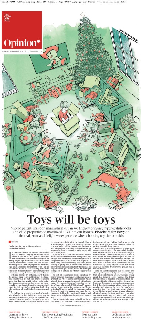
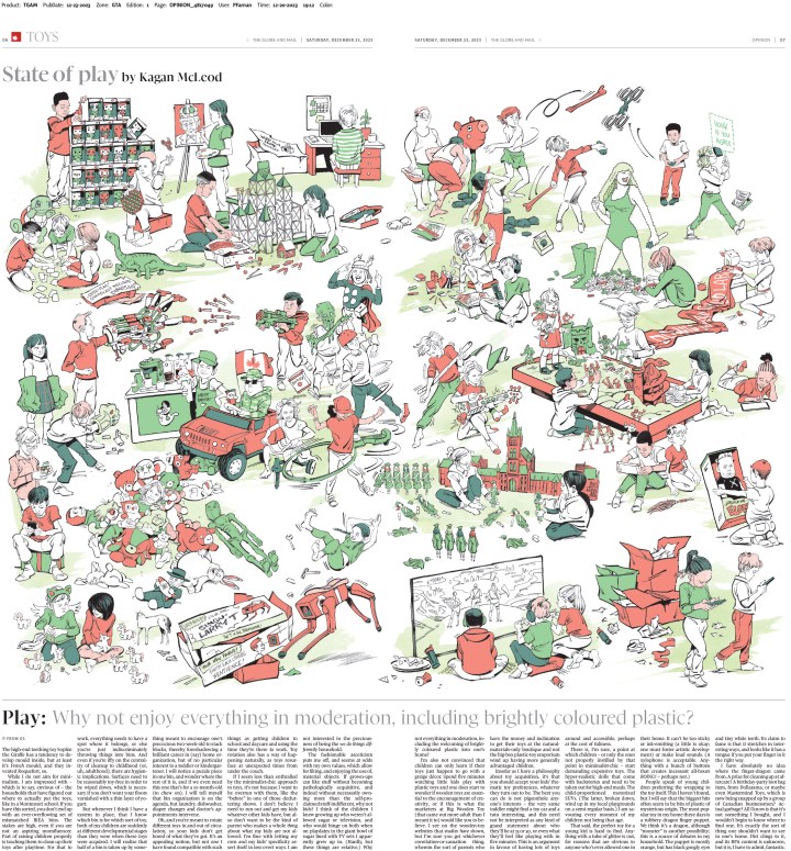
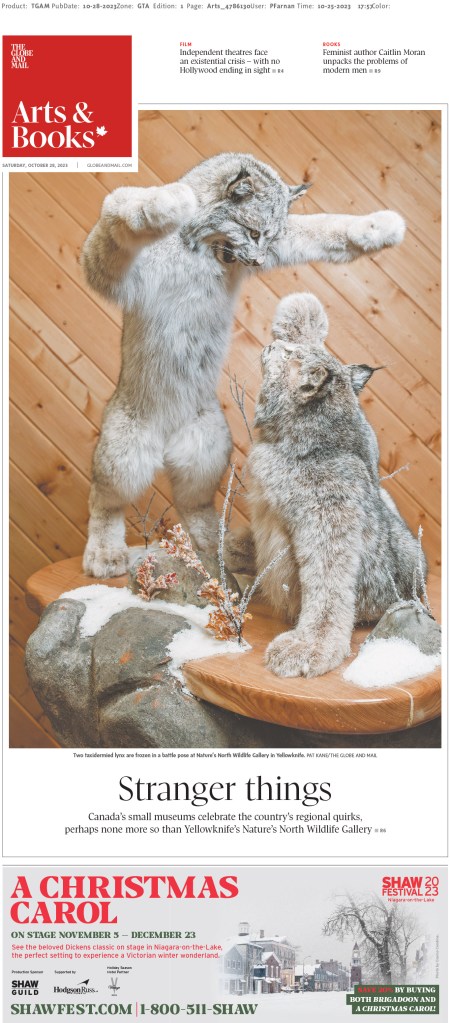
Either way, I still love the big, splashy pages, and you will see some here. This post will focus on newspapers outside of the Canada and the United States. Canadian newspapers are the books. A post about newspapers in the United States is coming.
SND44: Best newspaper pages from around the world
It’s not easy to cram the rest of the world into one post. There are so many incredible publications doing incredible things. And sadly this only reflects those who submitted entries to SND45. There are so many more out there doing outstanding work. But this year, I want to ensure the pages I show here capture both the outstanding illustrations, but also my new love. Pages that rely more on pure page design. Maybe you have photos, maybe you have a simpler illustration. So how you use those matters. What do you do with the white space? What about the typography? These are things any designer, almost regardless of resources, can do if the powers that be are willing to let them be bold and use space.
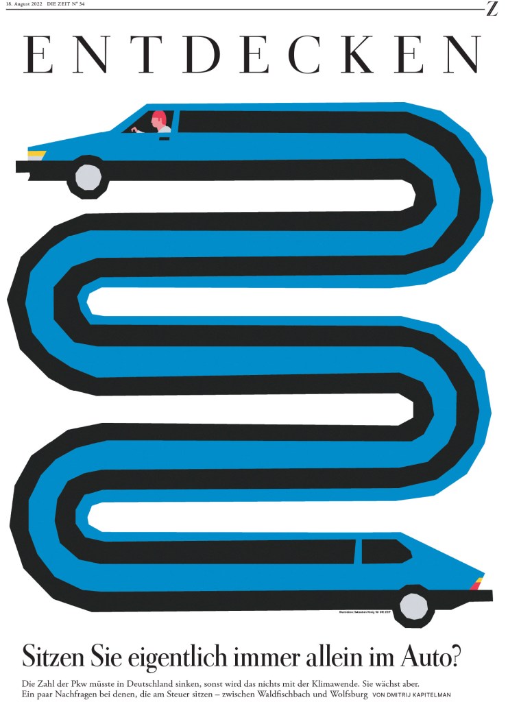
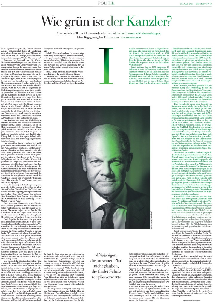
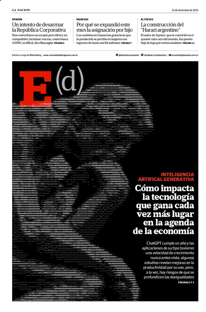
Some of the major winners at this year’s competition were Politico Europe, Die Zeit, South China Morning Post and Politken. Dei Zeit and Politiken, along with Weekendavisen and La Nacion, are also finalists for the title of World’s Best Designed Newspaper, which was the team I helped facilitate for again this year.
And now to some pages. I will break them down in different ways. Some by title, some by design philosophy (I will have a special section for pages that don’t rely on one big, stunning illustration). I will also have a small section on World’s Best finalists, as I will be doing a separate post for that after the winner or winners is/are announced.
Before I jump into some of the other big names, I’m going to look at one of my favourite newspapers. And despite what I said above about loving simplicity, this publication uses big, bright and/or bold illustrations all the time, covers and inside. But I appreciate that even with the illustration-driven pages, the text is still well designed.
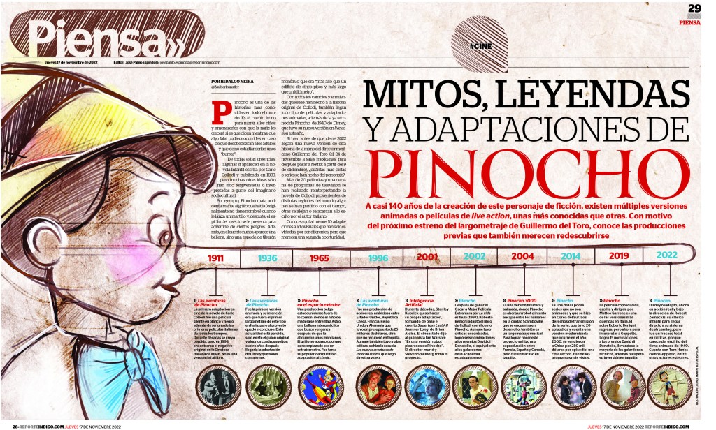
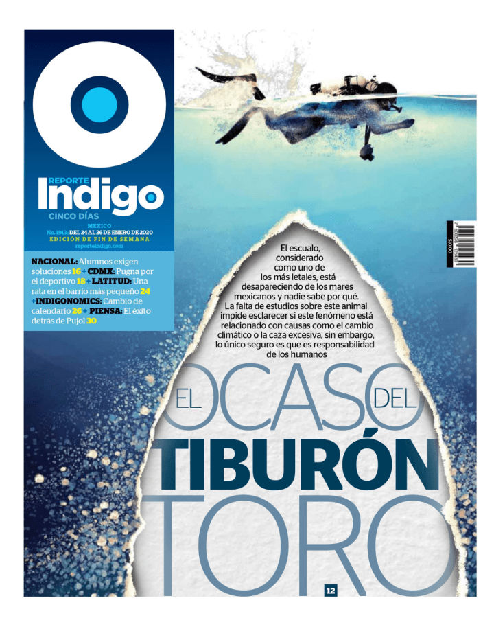
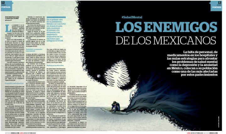
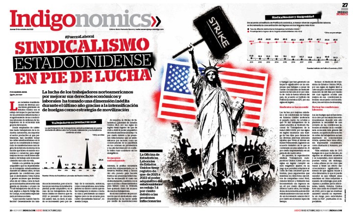
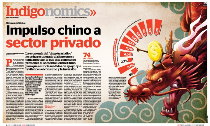
Reporte Indigo
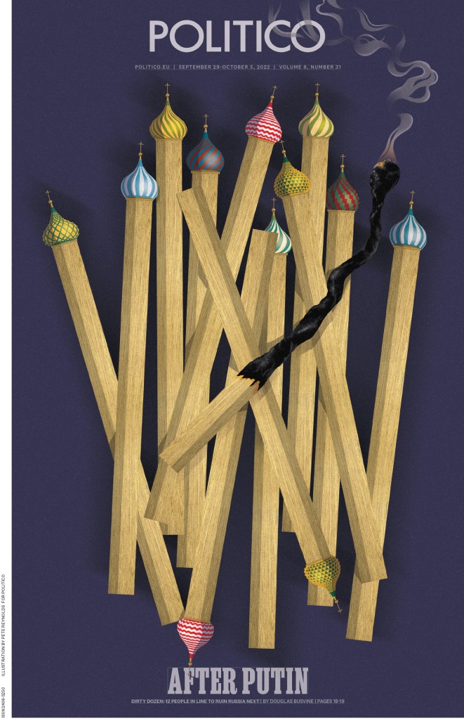
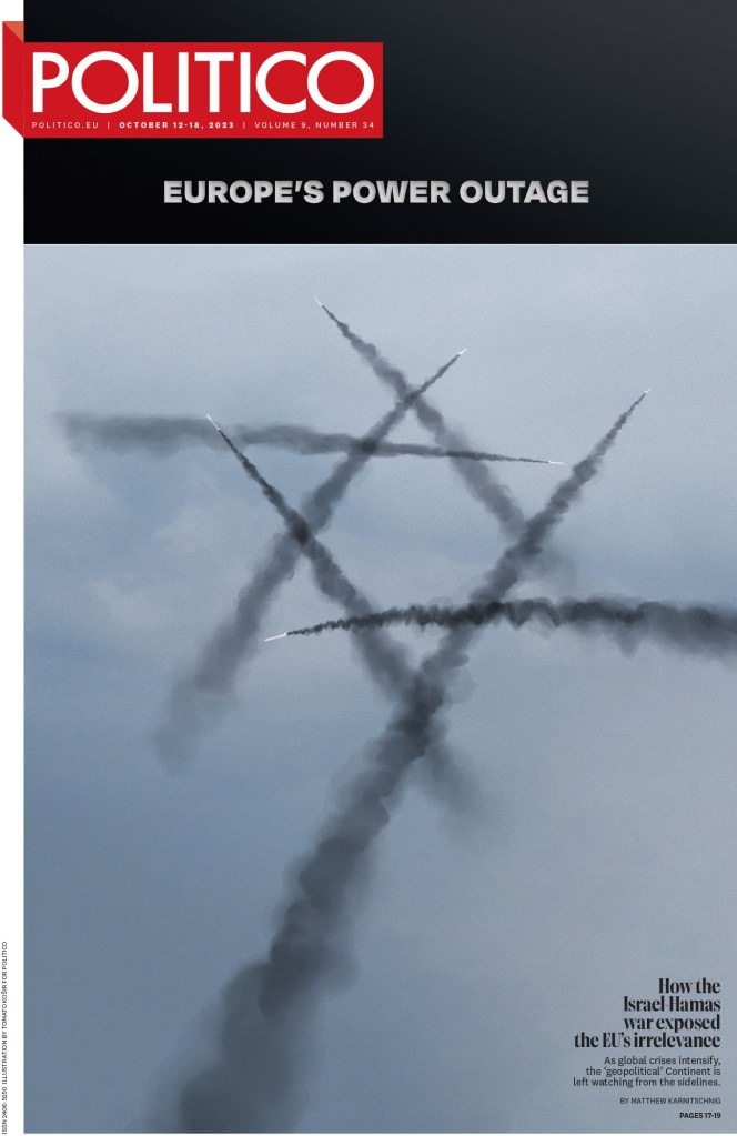
Politico Europe
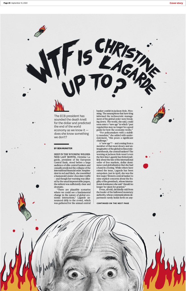
Politico Europe is a publication that punches above its weight. They do some outstanding work. I believe they were the top paper outside of the United States in terms of overall awards at this year’s competition (only behind The New York Times, Minneapolis Star Tribune and the Washington Post). The next two pages are from the same story, and while I love the cover illustration, I appreciate the inside design even more. But also the illustration!
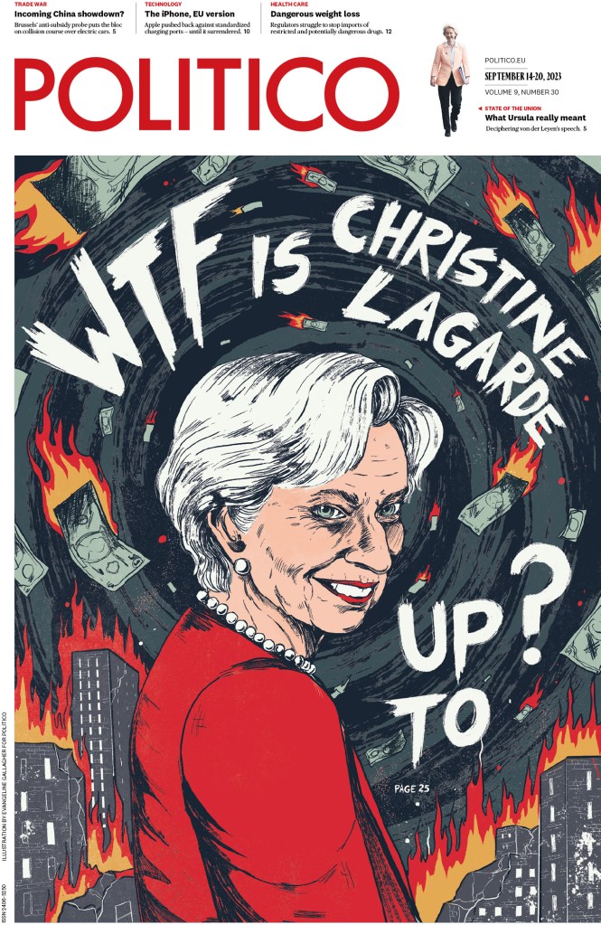
The illustration below won a gold medal, which is an incredibly high honour at SND. To receive a gold, it not only has to stand out from other award winners, it should be nearly impossible to find a flaw and should be state of the art for print design.
And here are a few more including a short slide show at the end. I’d love to include more, but I need to get onto some other papers. But you can see all the Politico awards here.

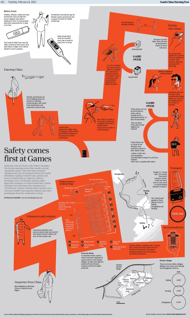
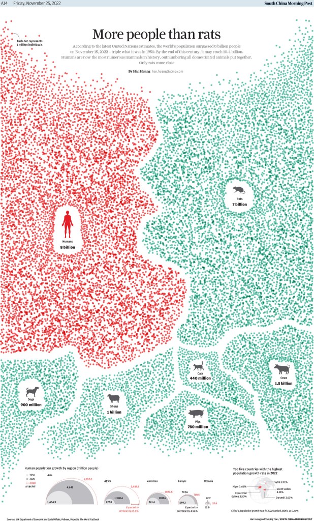
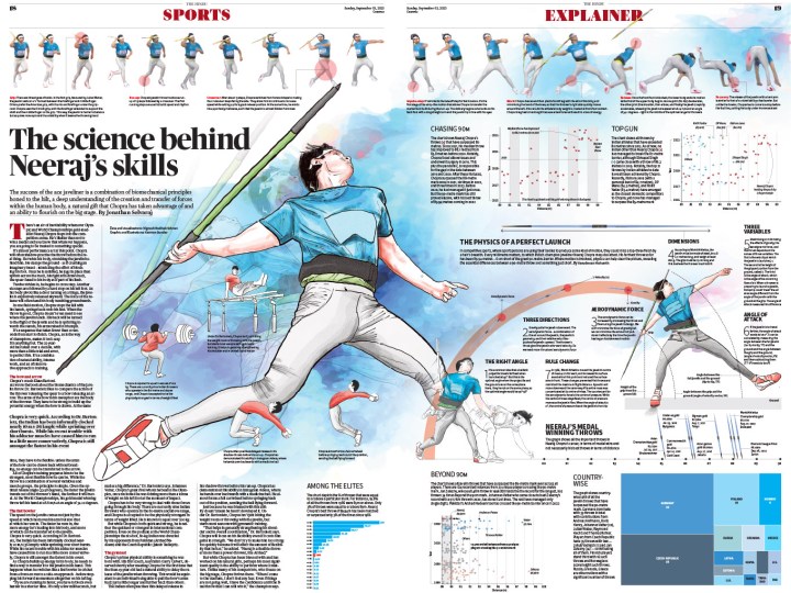
South China Morning Post
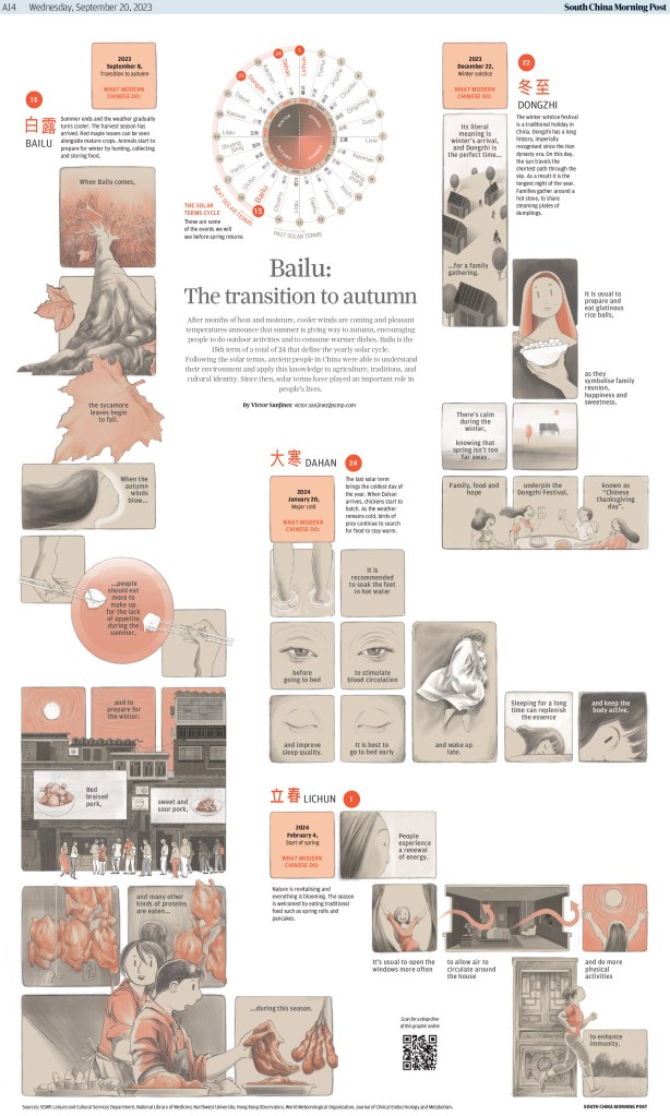
This publication is known for its mesmerizing infographics and illustrations. And it didn’t disappoint this year. Here are a few to keep you captivated (full results from SCMP here). The first won both a gold medal in the information graphics category and a silver for illustration. Not bad for one page.
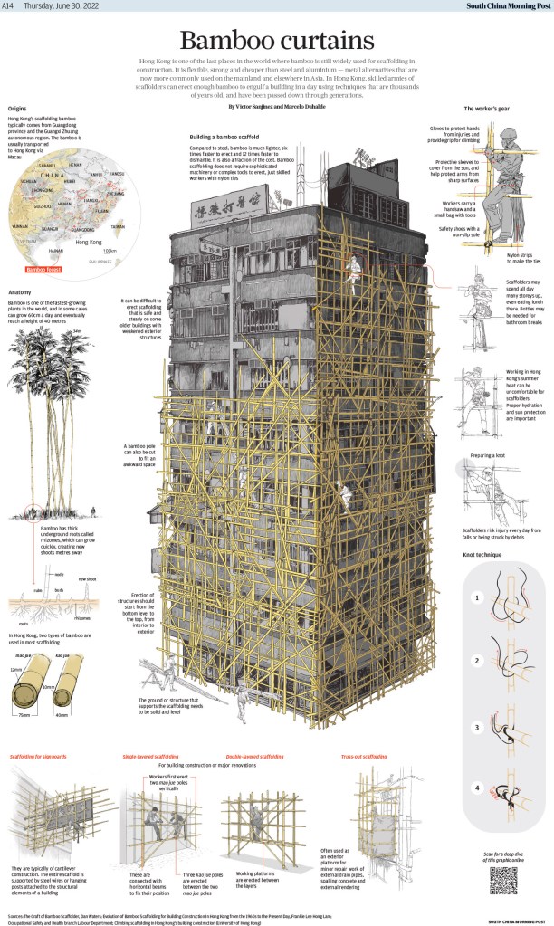
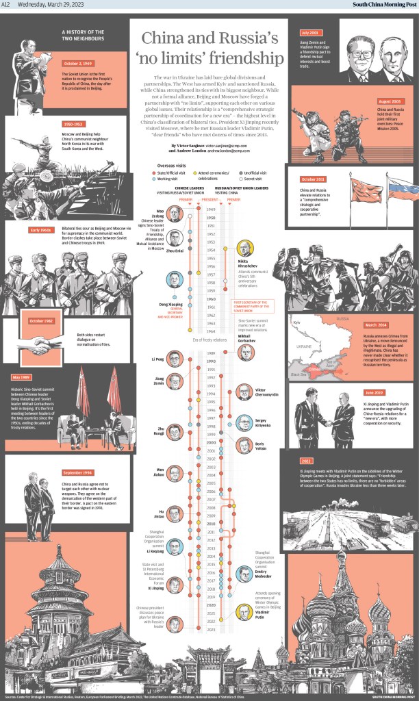
This one also won a silver medal for information graphics.
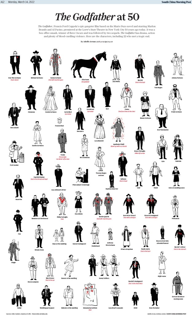
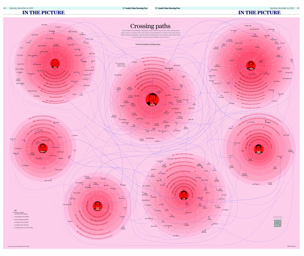
And this one is just a visual journey.
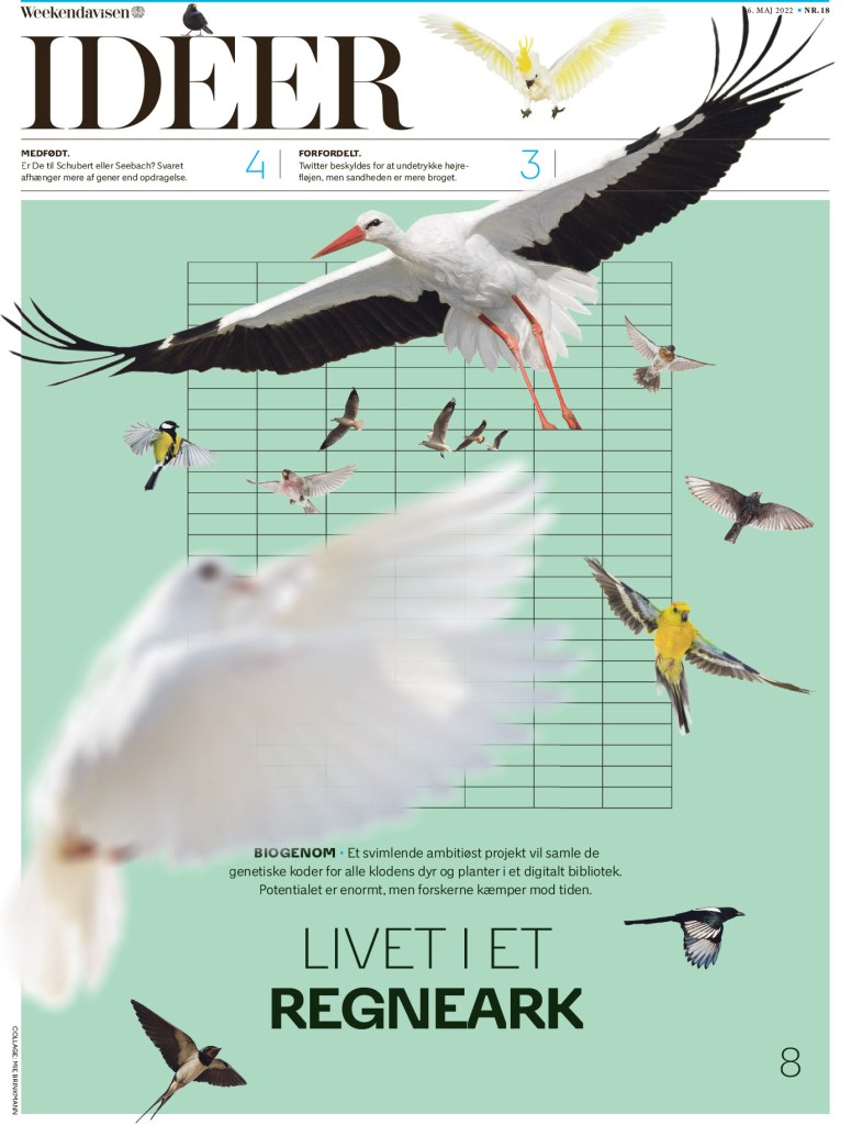
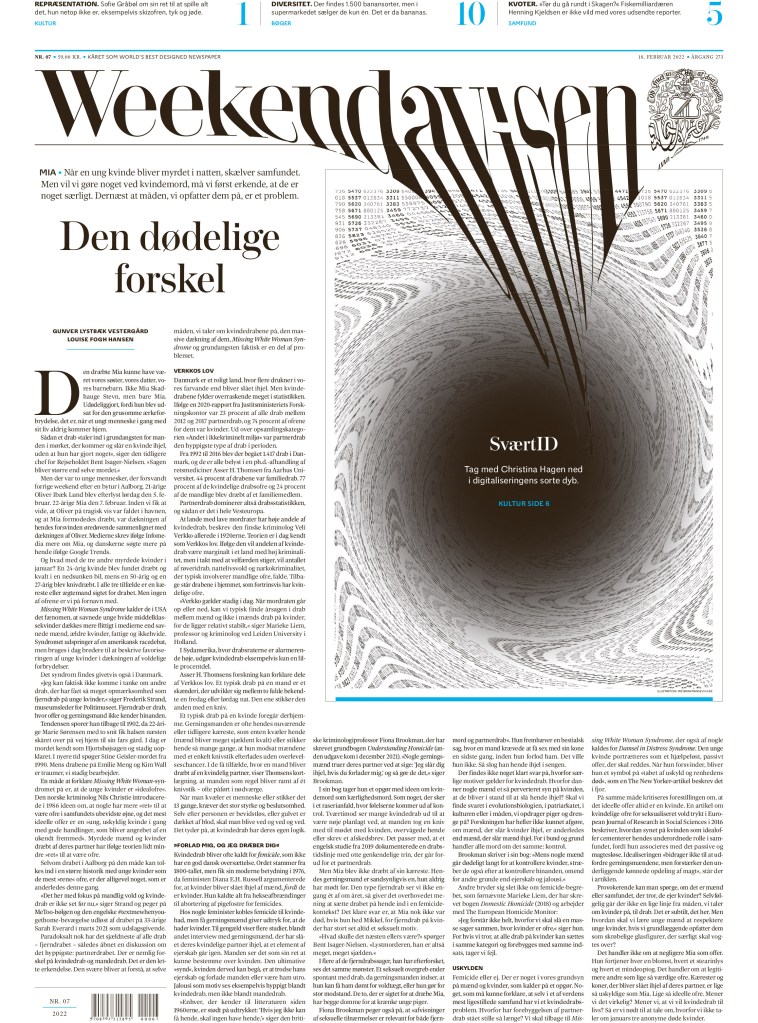
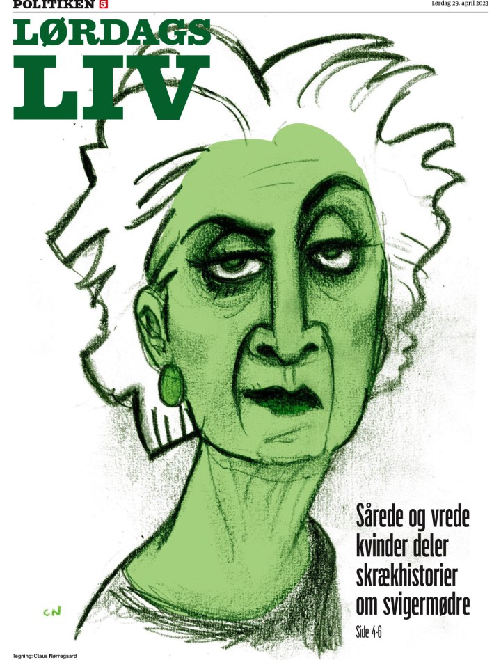
World’s Best finalists
Here is one page each from this year’s World’s Best finalists, in no particular order, as I will dedicate an entire post to these titles. Again, they are Weekendavisen, Politiken, Die Zeit and La Nacion.
A look inside
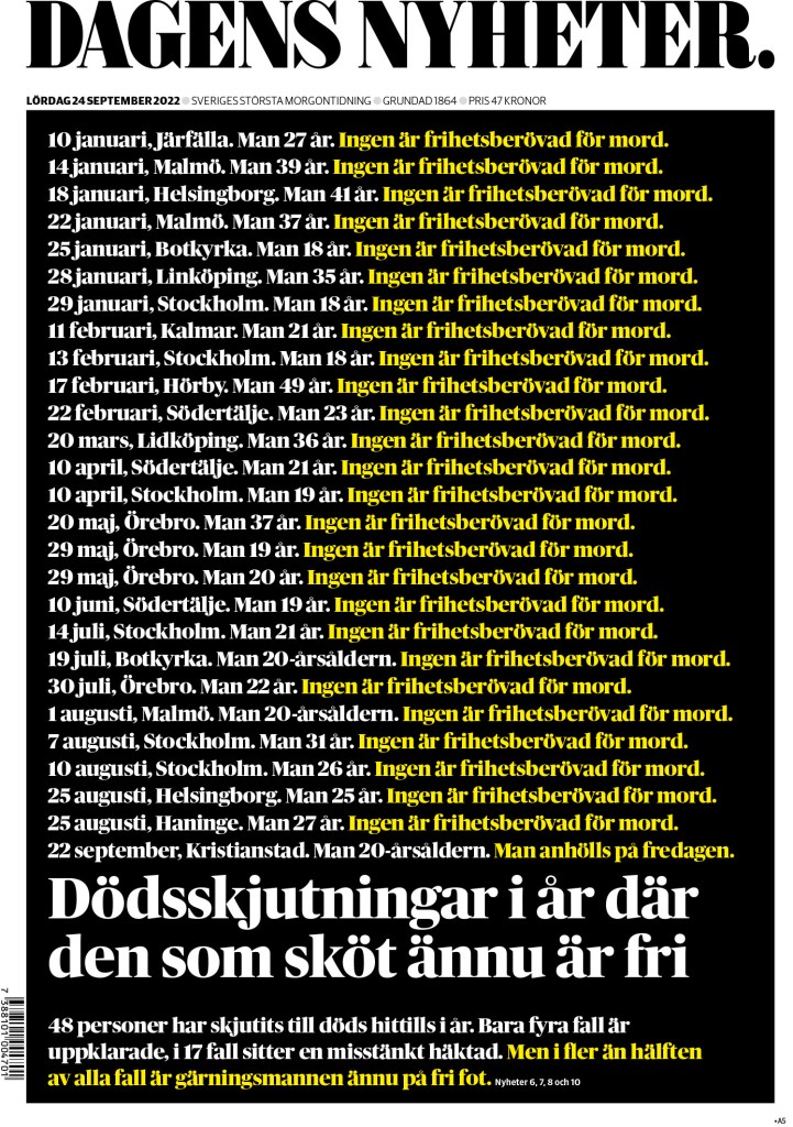
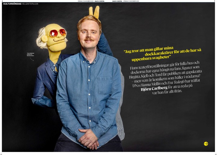
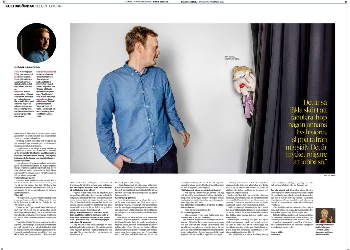
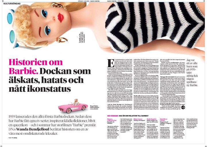
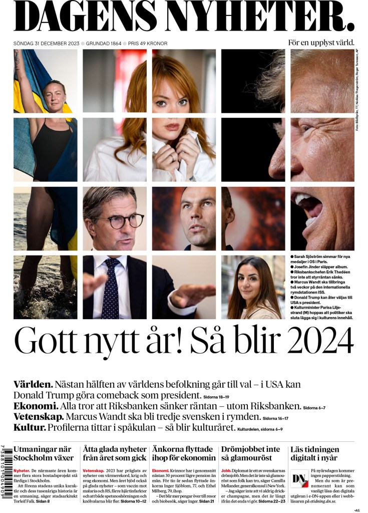
Now for my new (old) love. I don’t want to say simple, but here are some pages (a few in slide shows that I encourage you to scroll through) that rely on page designers more than illustrators to give you the wow. I got giddy looking through some of these. This was the sort of thing I aspired to in my design days because I could with the limited resources my paper had (and the willingness of my managing editor to be bold). I’m not saying I hit this level, but I also don’t want to downplay that I won three times (including once for portfolio) at a paper with a small circulation and an even smaller team. The slide shows are from winning story design entries, and will sometimes have illustration-driven covers. This first one is from Dagens Nyheter, which you will see more from later as it’s another one of my favourite papers.

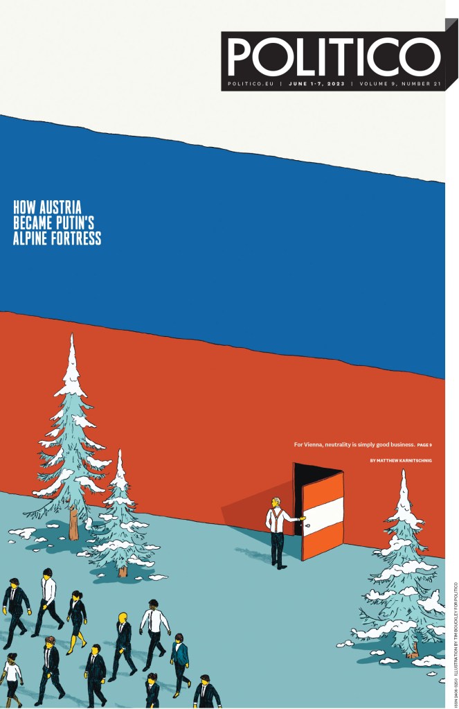
This Politico cover uses a fun image, which mostly requires a solid photographer and a creative mind. And the inside relies on beautiful design.

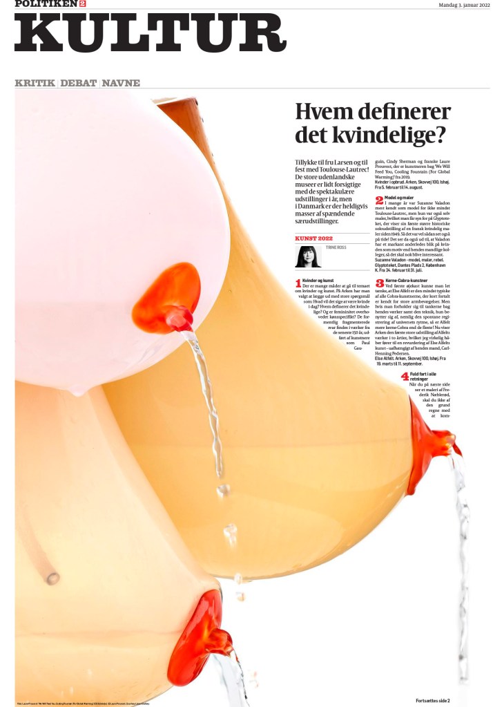
This Poliken story package is largely driven by stunning photography, but it also uses a nice clean design inside.
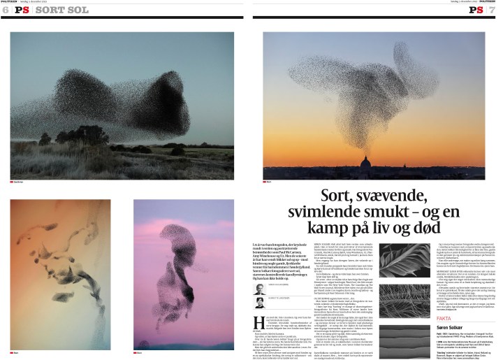
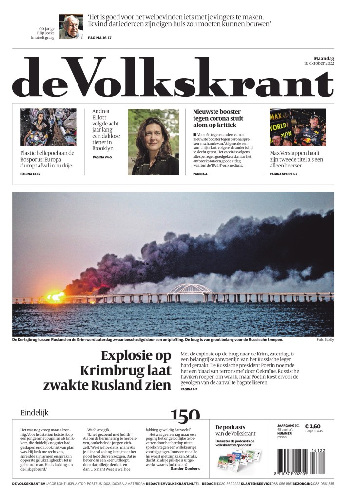
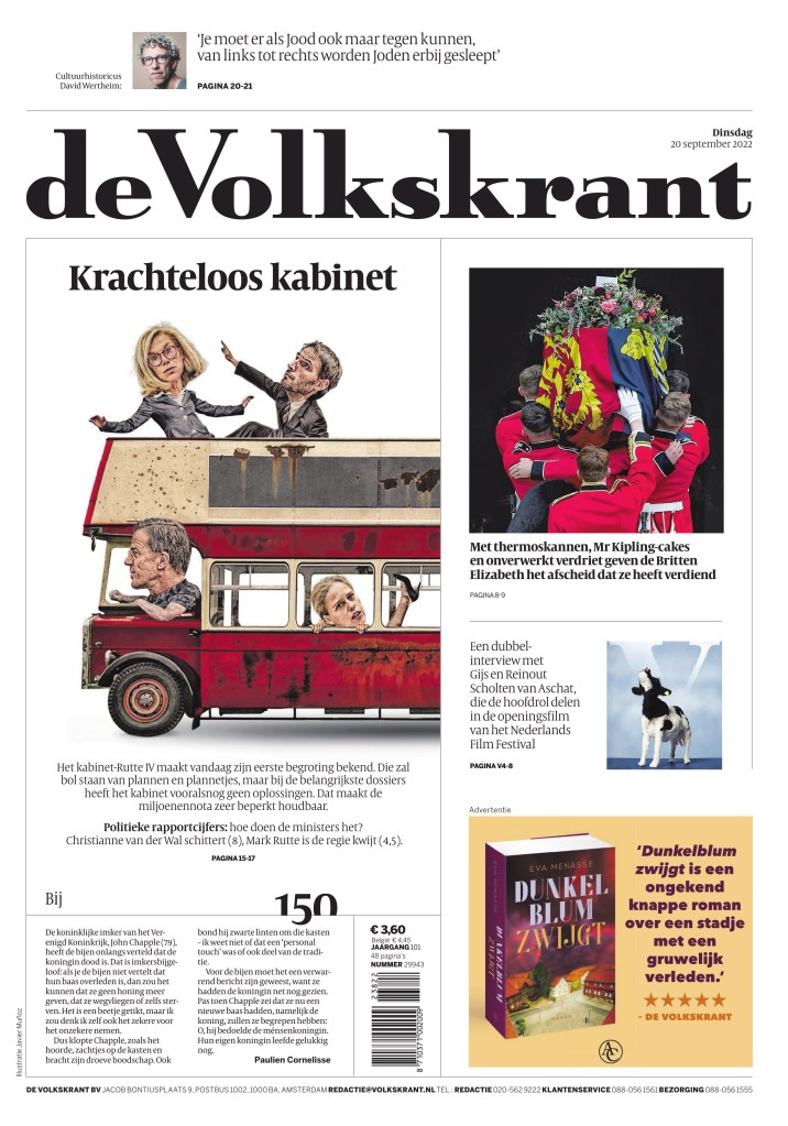
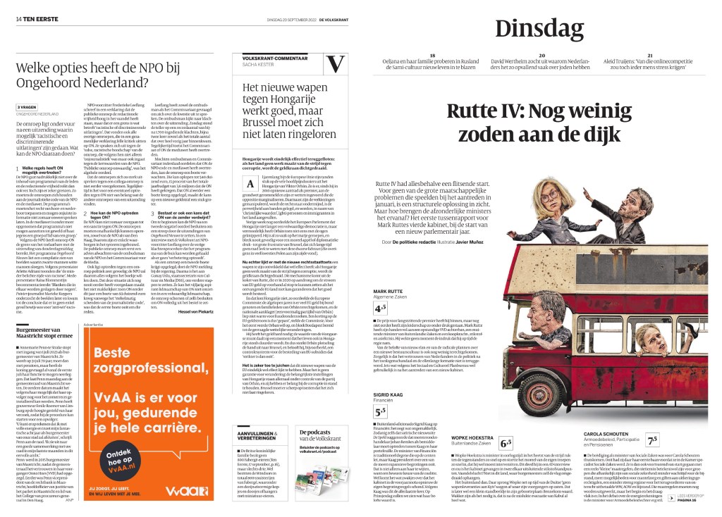
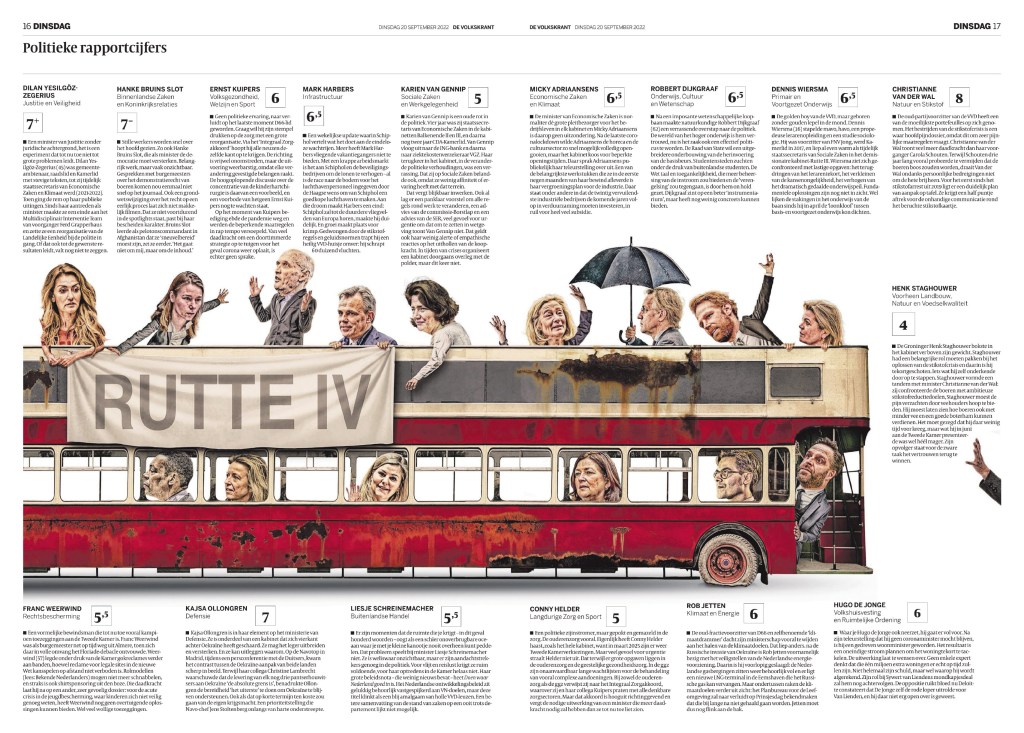
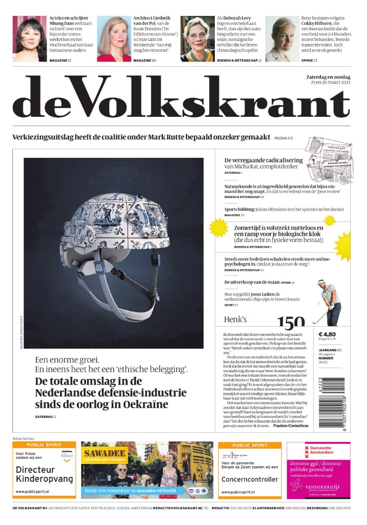
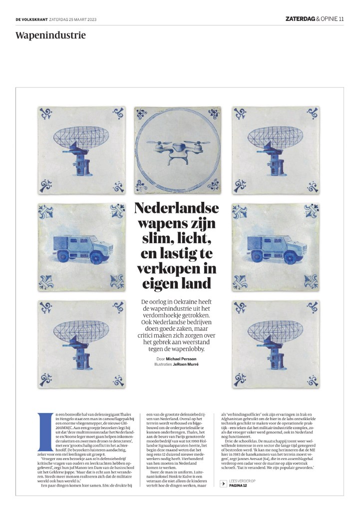
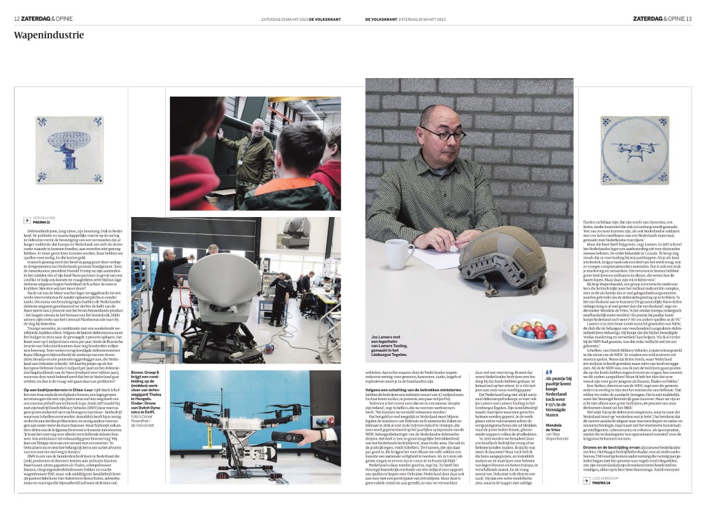
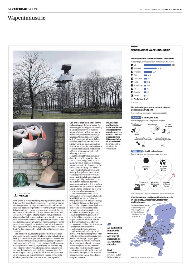
I especially love the super clean and elegant page 2 of this de Volkskrant package.
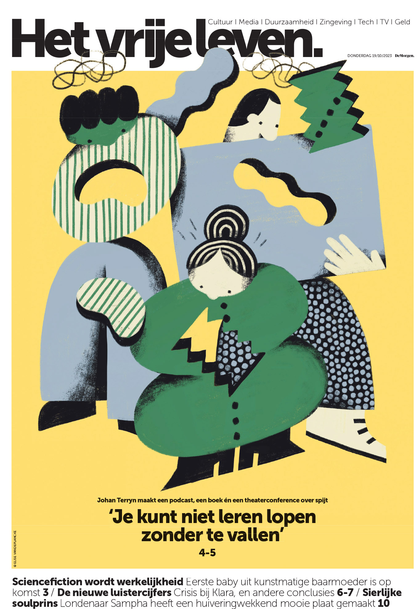
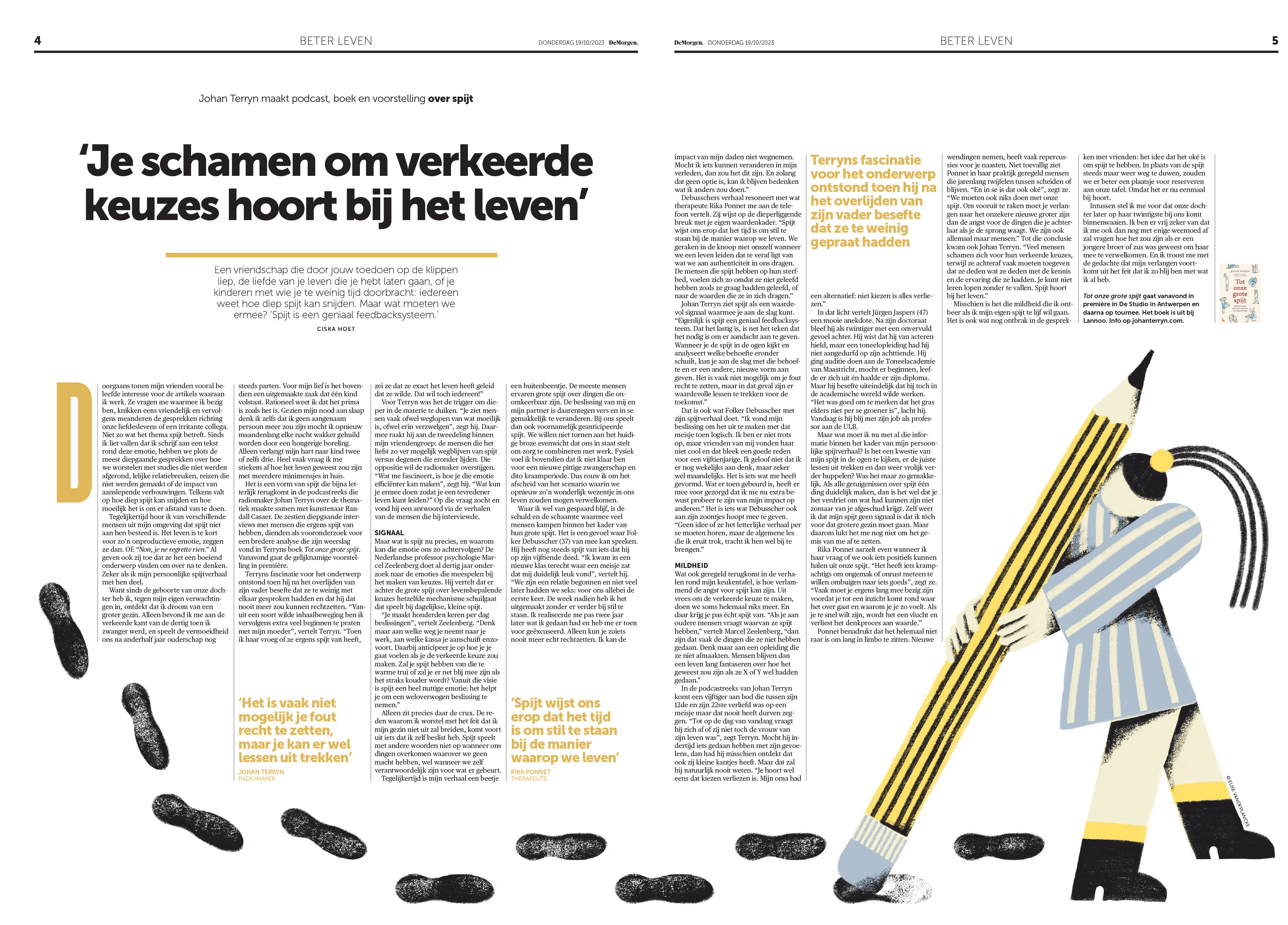
OK, this De Morgen package relies on a creative illustration for the cover and inside, but I love the inside page so much for its page design, which uses a very smart illustration so well. It fills the space perfectly.
As to not make this post too much longer, I’m going to share a few pages individually and then the rest in a slide show. There so many brilliant pages from so many organizations this year. You can see the full competition results here. I will start with this one from Spanish newspaper Faro de Vigo, as it was one of my standout pages from this year’s competition.
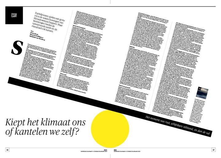
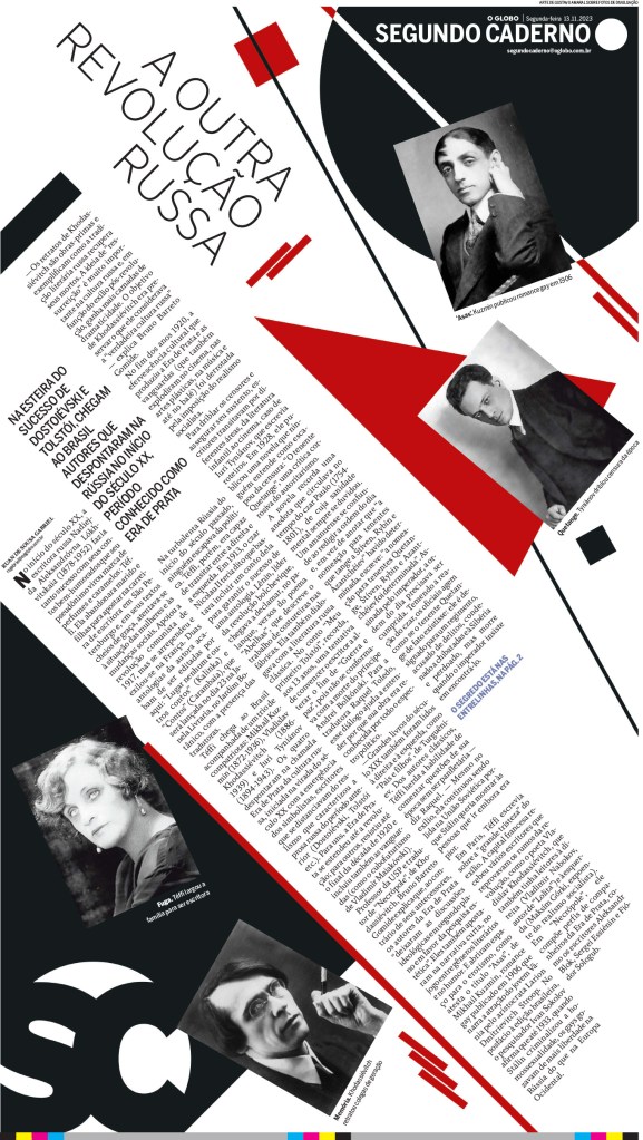
What’s your angle? It depends. NRC (Netherlands) is tipping few degrees this way and O Globo (Brazil) is tipping a lotta degrees that way!
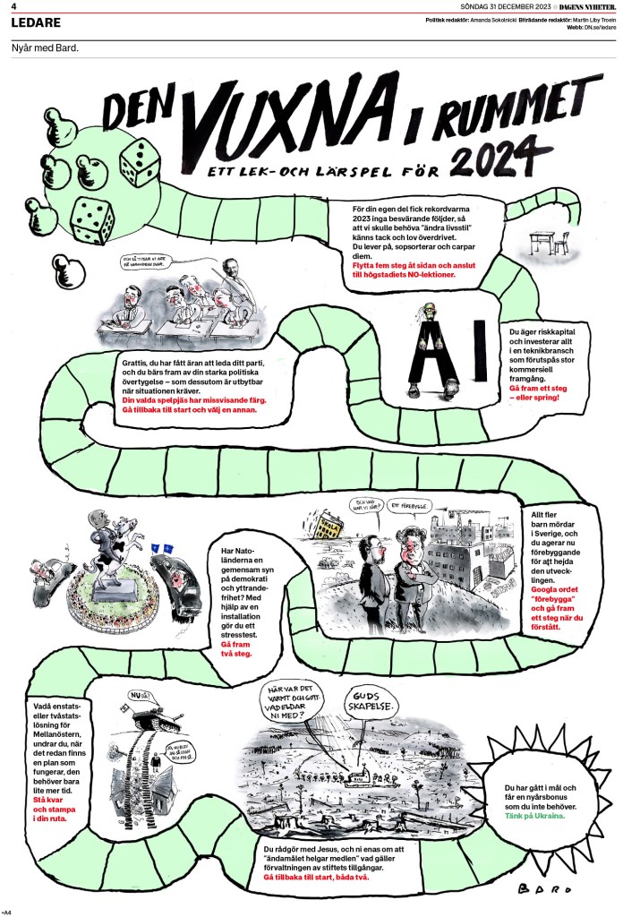
As promised a few more from Dagens Nyheter. I love this Barbie page.
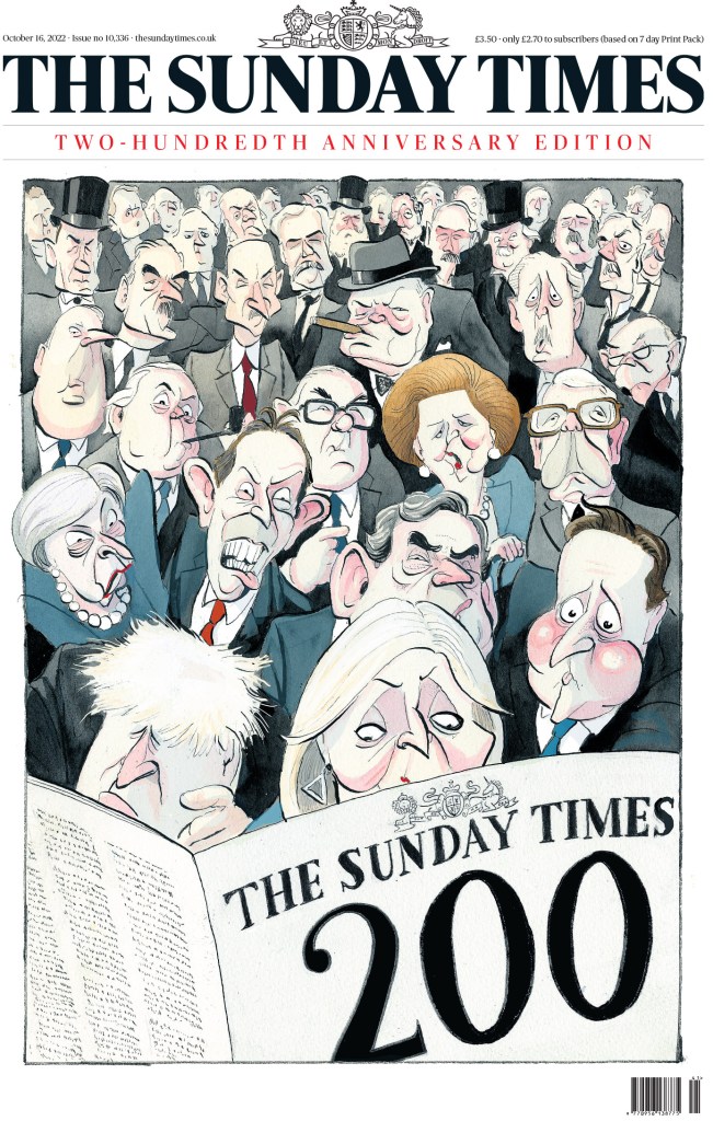
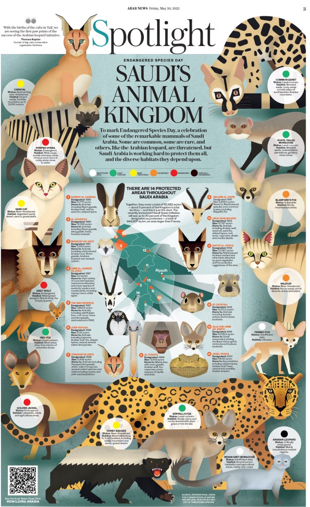
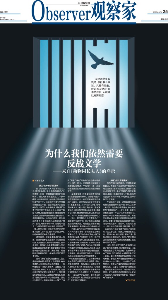
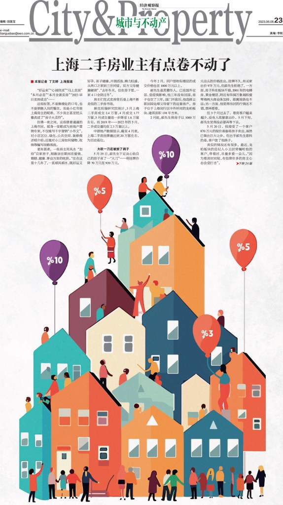
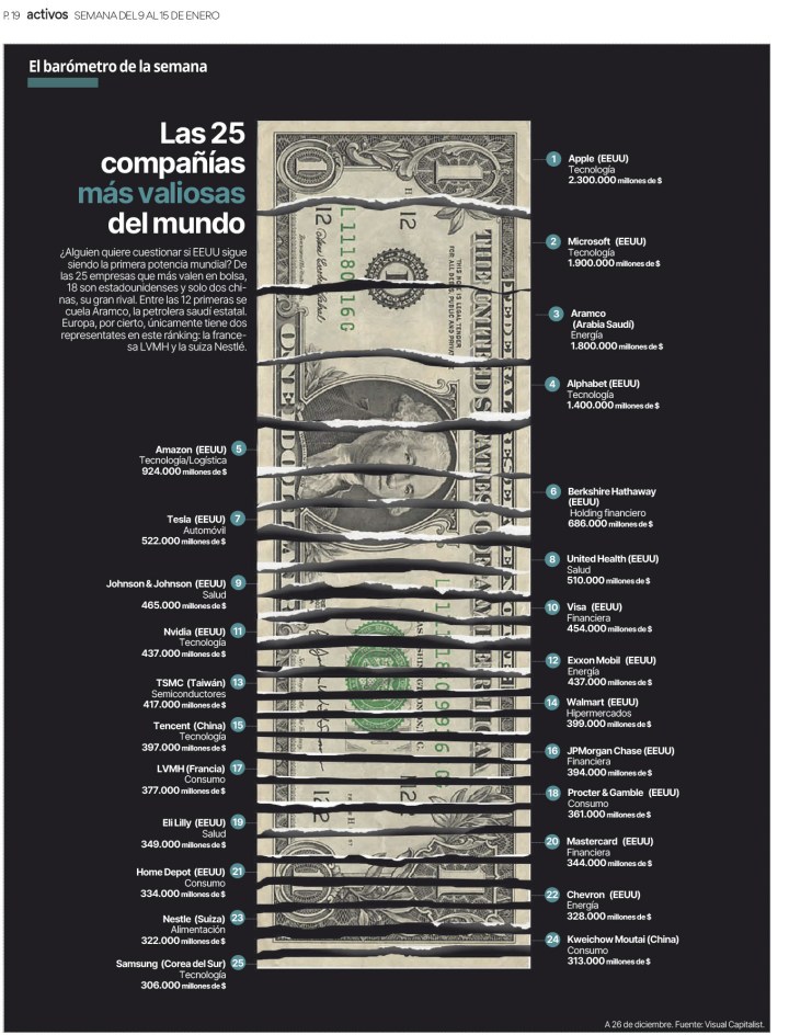
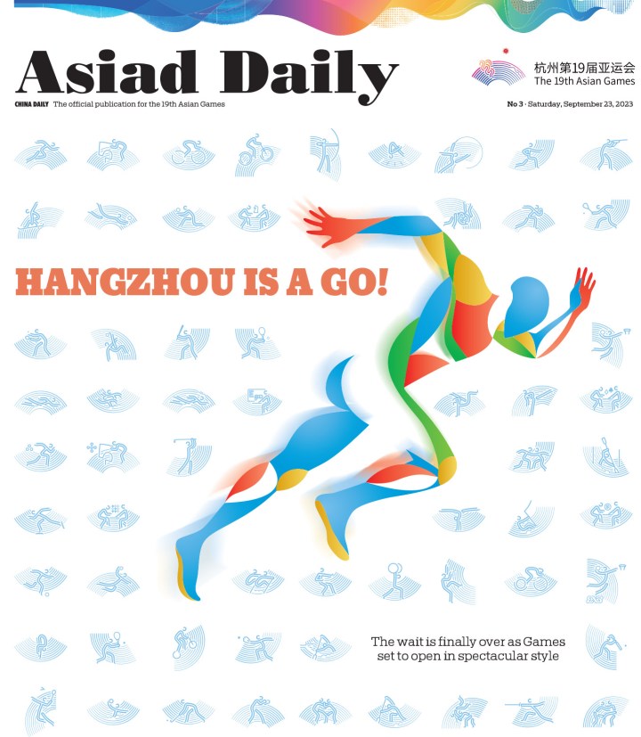
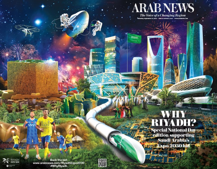
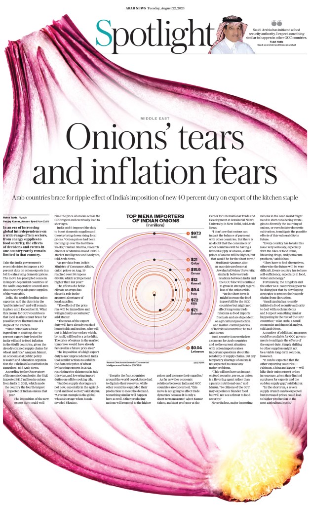
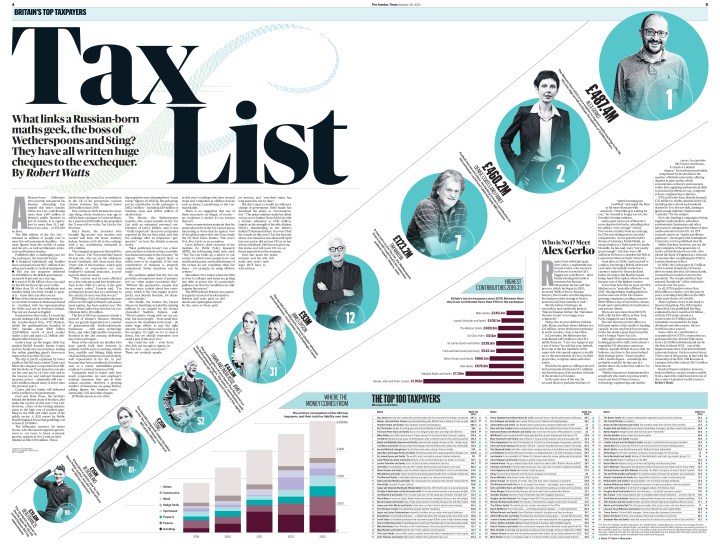
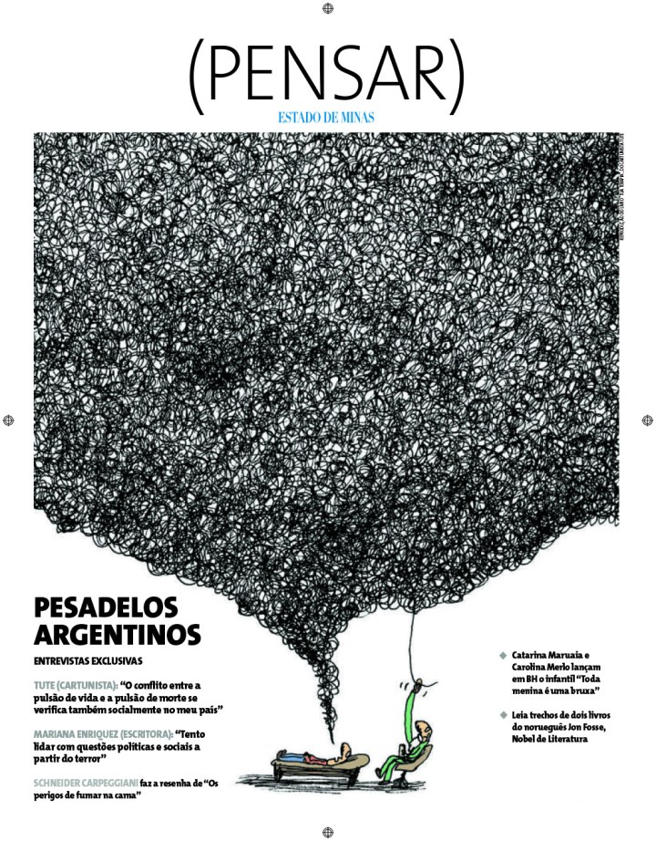
And last but not least, here is a slide show with pages from the Economic Observer (China), the Hindu (India), Activos (Spain), Asiad Daily (China), Arab News (Saudi Arabia), Handelszeitung (Swizterland), The Sunday Times (Britain) and Estadio de Minas (Brazil).

More from SND45:
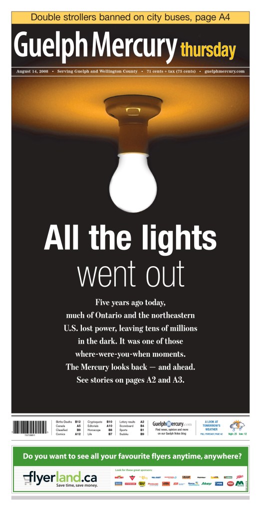
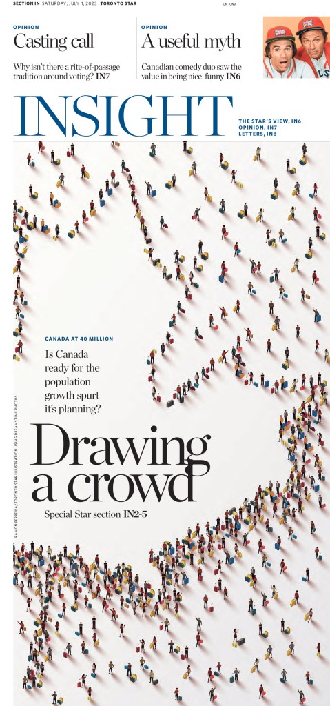
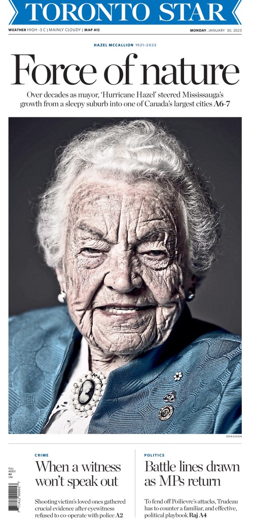
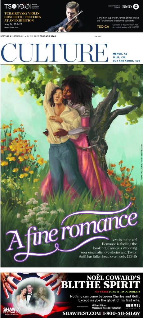
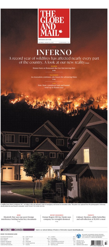
Best from Canada
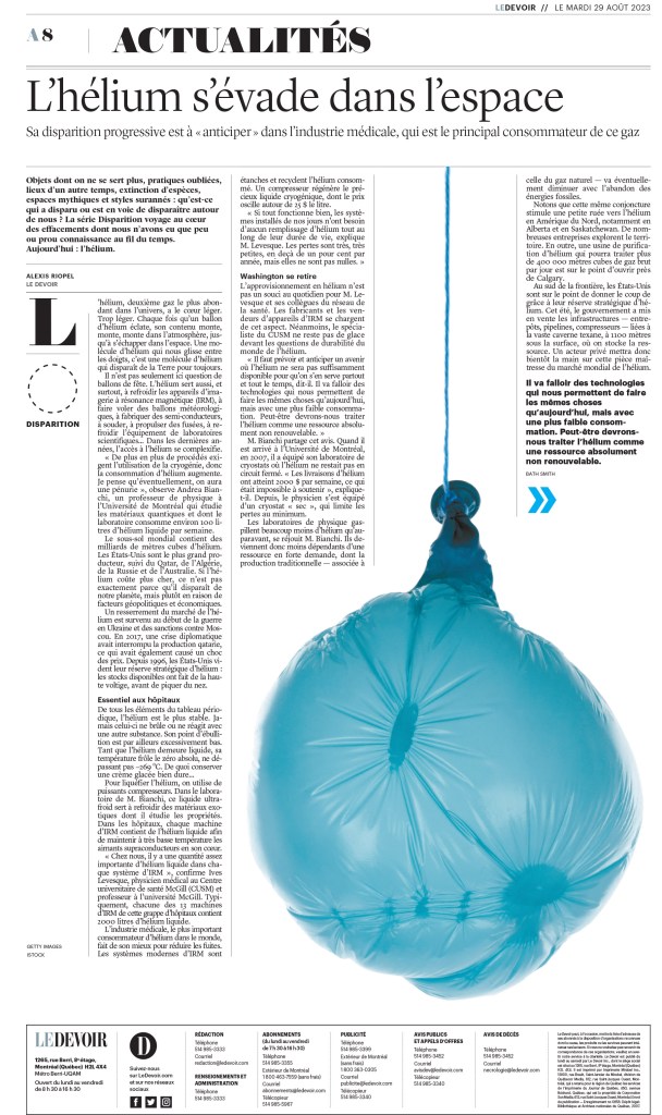
Using black and white
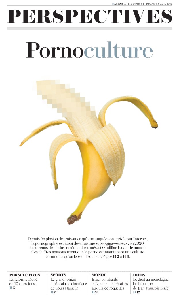
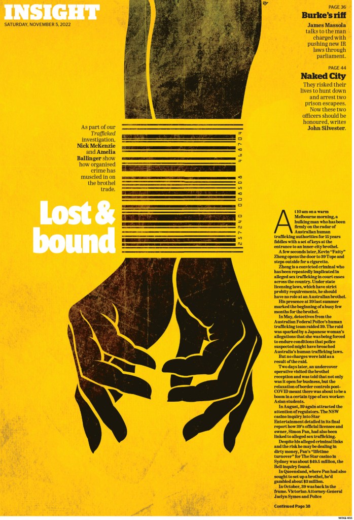
Dealing with tough topics
Callout: If you’re a newspaper designer who would like your work featured, reach out!