By Brad Needham

Covers in a dangerous time. I chose this as the name of my blog to highlight that newspapers are going through a tumultuous time, but I wanted to make sure the great work still happening was recognized. Each year at the Society for News Design’s annual creative competition, I am reminded by how much more prevalent the tumult is in Canadian media.

Again this year there were only entries from three newspapers: the Globe and Mail, Toronto Star and Le Devoir. Between them they won 33 total awards, including one silver medal (awarded for pages that are excellent, but even stand out among the excellence. This was given to the Globe and Mail for its climate coverage package) and 32 awards of excellence. For a page to receive this honour, three of five judges need to agree that this page shines. Overall, the numbers are down for Canadian outlets (The Globe had 32 on its own last year, and managed 26 this year). The Canadian total was 38 last year.

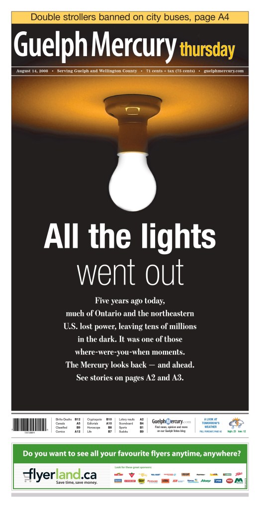
When I won, I submitted for the Guelph Mercury, a small paper that punched way above its weight. I would love to see a few more publications next year.
Alas, this site is meant to celebrate excellence in visual journalism, and despite there being fewer wins this year, Canadian media outlets produced some outstanding stuff.

Full results: SND 45 winners

As a little background, this is my fourth year assisting at SND’s Best of Newspaper Design competition. I have acted a facilitator (I am not a judge; I help the ensure the judges have everything they need, and help organize things for the SND team). I started on the news team and have been on the World’s Best team for the the past three years. It has been an honour to be involved. This year it was held in Minneapolis, Minnesota, at the Star Tribune office.

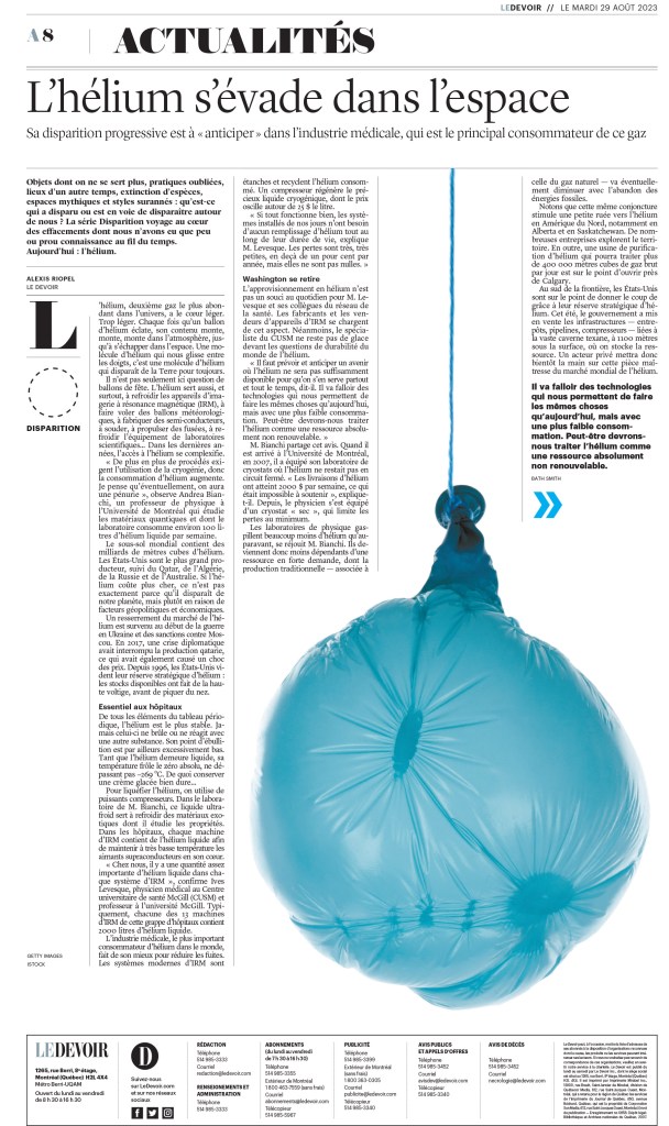
Time to show off some brilliant newspaper design, the reason anyone comes to this site. These pages may or may not have won awards. I chose them because I liked them. I will start with Le Devoir, as they had one of my favourite pages.

Le Devoir (Montreal)

Often when doing newspaper design, designers need to find a way to illustrate things that can be tricky to illustrate. I appreciate the thought that goes into this. In this case it’s porn. Imagine being asked: we want to do a story about pornography, and it will be a section front. How will you illustrate this? Blurry bananas, naturally. Or at least one.
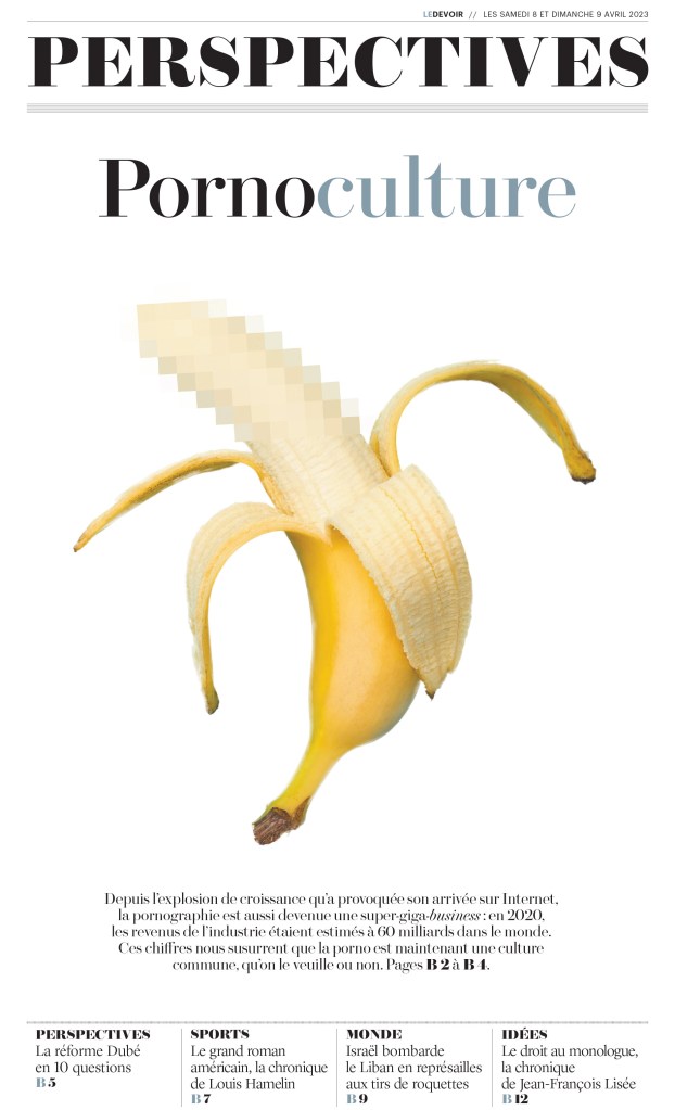
And here is another. A simple but smart photo. A good use of white space, as this paper is known for.
Toronto Star

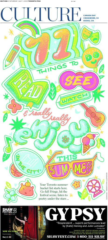
I am always excited to see the Star do great things. I am proud to say I have worked on Star pages and created some I’m proud of. Though I didn’t have the opportunity to do any of this calibre in my time there. This first page, from a staff portfolio submission, has a bit of a Los Angeles Times vibe. It’s bright and fun. Bubble letters.
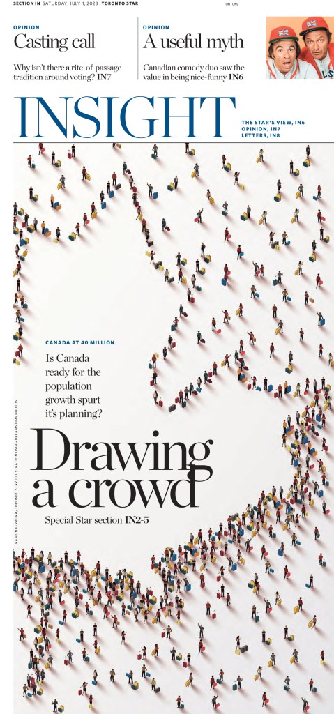
I have seen pages similar to this before. Little people making shapes. This is nicely done. Not only the image but the rest of the design.
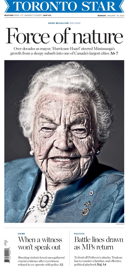
This page created some controversy when it first ran. Many thought the photo was insulting to longtime Mississauga, Ontario, mayor Hazel McCallion. Others thought it should have been identified as being enhanced (it was desaturated, which isn’t normally something a newspaper would do with a photo, but rather a photo illustration). But even when it came out, I posted it on my Instagram. It’s striking as an image, and as a page.
One more from the staff portfolio entry. It’s driven by the illustration, but there is some fun text treatment.
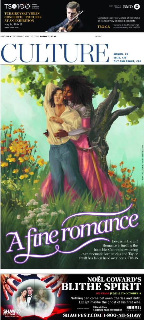
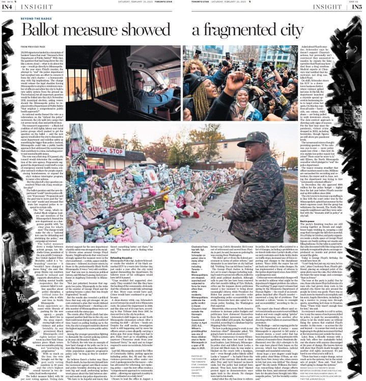
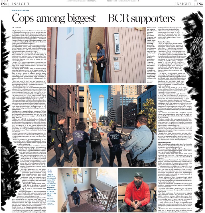
And here are a few more from the Star.

Globe and Mail

And last, but definitely not least, Canada’s big winner, the Globe and Mail. The results are still being tallied, but looks like the Globe might have squeezed into the top 10 again this year, at number 10. Much of the design the Globe was recognized for was for coverage of serious and heavy topics. Special coverage on climate change won a silver medal. I get the Globe at home (and disclosure: PMNA, where I work, does page production for the Globe) and the next two pages were pages that really stood out for me. All the pages here are handled at the Globe and/or art directed at the Globe.
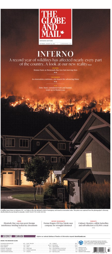
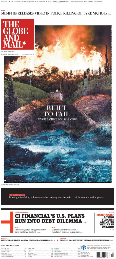
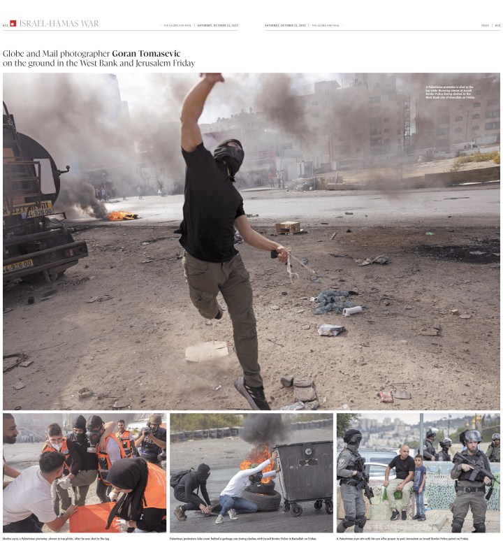
The Globe has also been a leader on coverage of the war in Gaza in Canadian media. It had some striking pages on that topic, like this cover (the Globe does a poster front on Saturdays) and the photo spread below. They do some beautiful photo spread pages.

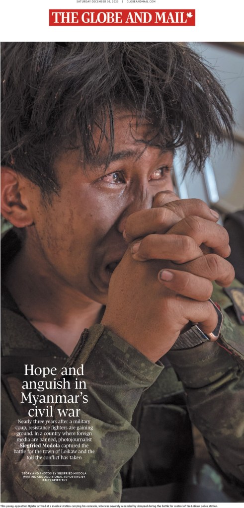
And one more, driven by this powerful, emotion-filled photo.
The next two were pages from art directors who each won individual portfolio awards. That’s a tricky category to win in, as it recognizes a body work. The first is from Brennan Higginbotham. The second is from Lauren Heintzman.
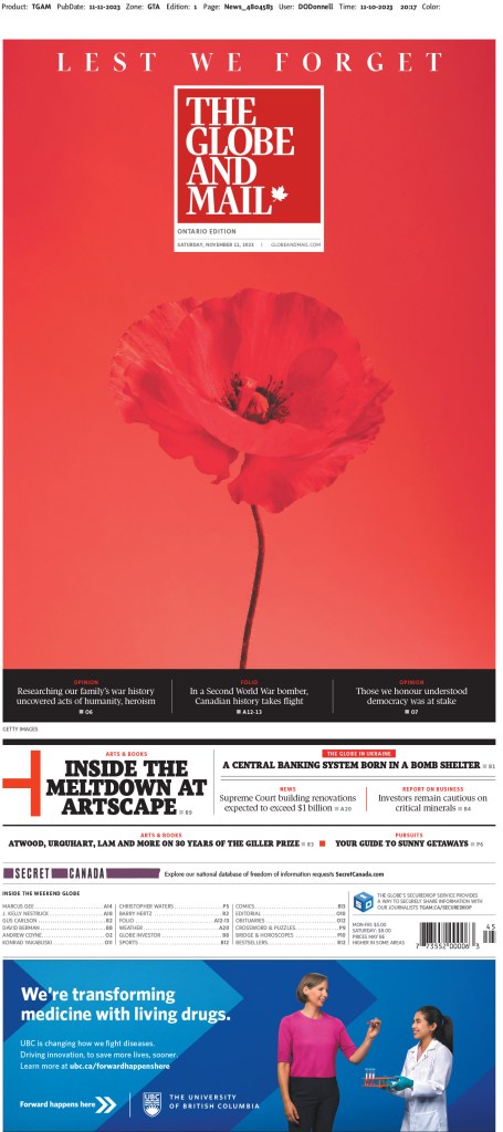
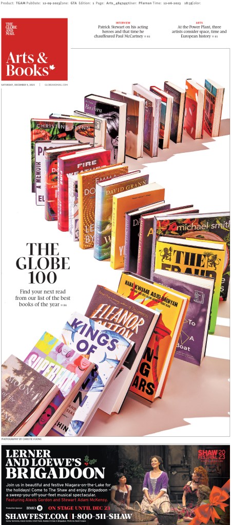
And now for some fun stuff. The Globe, and other Canadian media outlets, often turn to Kagan McLeod when they want a fun illustration. He’s a wizard (also credit to Kagan for the featured image I use with this post, as it’s a portion of one of the illustrations below). And he didn’t disappoint here.
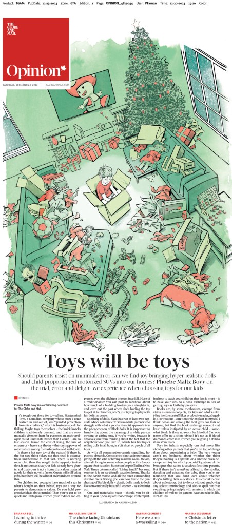
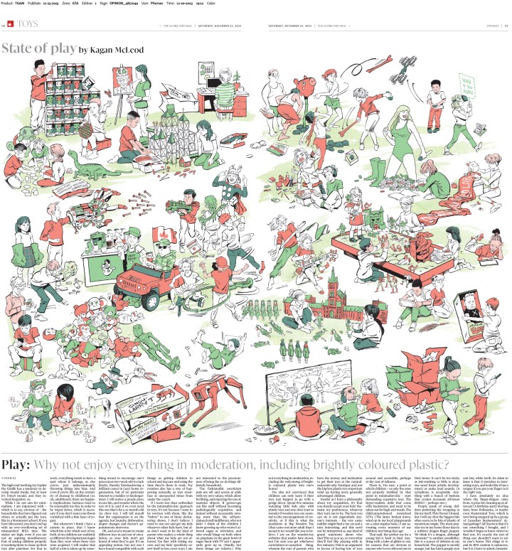
Here are the last couple I will show from this year. They are both so playful and fun. And as has become norm for the Globe, they have fantastic headlines.
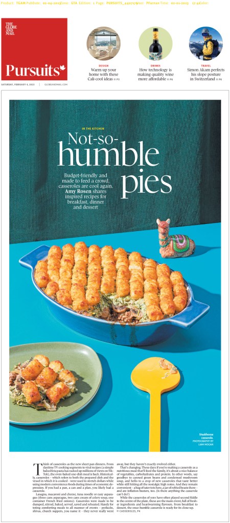
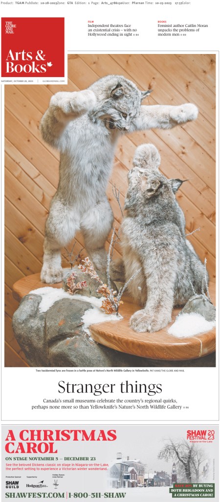
Fingers crossed we see more Canadian publications entering next year. Looking at you, Postmedia and Winnipeg Free Press, among others. Stand with print media and celebrate your great work.

Up next: Best from the United States, best from the rest of the world, and finally World’s Best Designed Newspaper. Watch for those sprinkled over the next week or so.
By Brad Needham

When I got access to all the entries to the Society for News Design best in print newspaper design competition, I was like a kid in a candy store. It was such a delight to see some of the best pages from around the world. But as a proud Canadian (slightly dampened by our slow progress on COVID-19 vaccinations, particularly for essential workers), I quickly searched for Canadian entries. I was both tickled to the see the incredible creativity that flowed from home, but also a little saddened to see there was little variety in entrants. Lots of entries. Very few titles. Dominated by the Globe and Mail, a selection from the Toronto Star and some from Le Devoir.

When I entered the contest in 2007 and 2009, I entered as a designer for the now-shuttered Guelph Mercury. We had a circulation of just over 10,000 at the time, if I recall correctly. We were the little engine that could. Sadly I didn’t see that this time. Two of Ontario’s design heavyweights (despite being relative lightweights in circulation), the Mercury and Barrie Examiner, have both closed. Other papers are being done in internal or external production centres. To be very clear this doesn’t mean there isn’t some incredible and award-worthy work coming out of these places. You only need to look at my profile on Tammy Hoy to see what is being done. But there is less time for most places to spend on design. And they’re not entering anymore, as media organizations shift their focus to digital (I assume that’s why?). Hopefully that will change for SND43. I hope to spread the gospel to Canadian newspapers so that there are more titles next year.

But I digress. As much as I like to think everyone is here to read my witty insights and elegant prose, I know it’s beautiful newspaper pages that drive this blog!

So first, here are some from the Globe, with very brief bits about what I like. As with most beautiful pages, they speak for themselves. But as I learned at SND42, there is so much to say about why these pages are excellent.

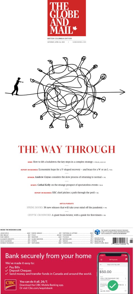
The Globe and Mail, The way through

As a subscriber to the Globe and Mail, I loved this page the second I peeled it out of the plastic bag (maybe two if it was raining — or, gasp, snowing — that day). It is hard to come up with a novel concept when it comes to the unmistakable shape of the COVID-19 ball, with its protein spikes always threatening to hook on to something. But this was new (for me, though as you can see here another newspaper did something very similar, proving how hard it is to take a unique approach in newspaper design). A tangled COVID knot, showing the almost unnavigable path through this complicated situation. Beautiful and well used white space. Of course it’s a Saturday Globe cover, and I’ve come to expect nothing less, but this was one of the standouts even among the weekly excellence.

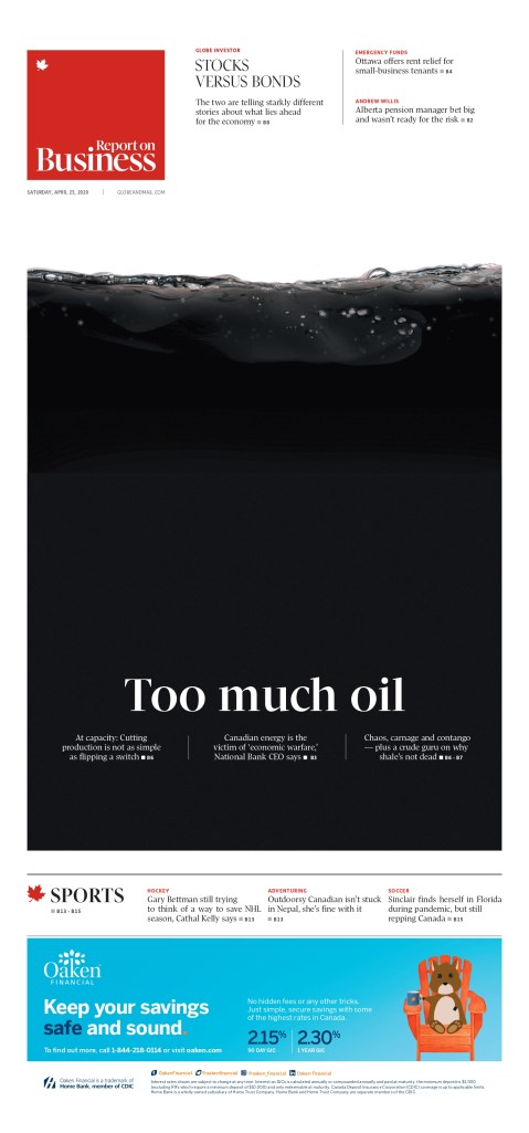
Globe and Mail, Too much oil

At first glance even a seasoned designer might not see this idea as novel. Reverse white text on a black background. But this isn’t just to make it pop. This page works, it rises to a new level, only because it’s about oil. Too much oil. The black has a real purpose. And you can see the oil swishing at the top. It’s someone taking an old idea and making it new, giving it purpose. It’s a bold use of space.

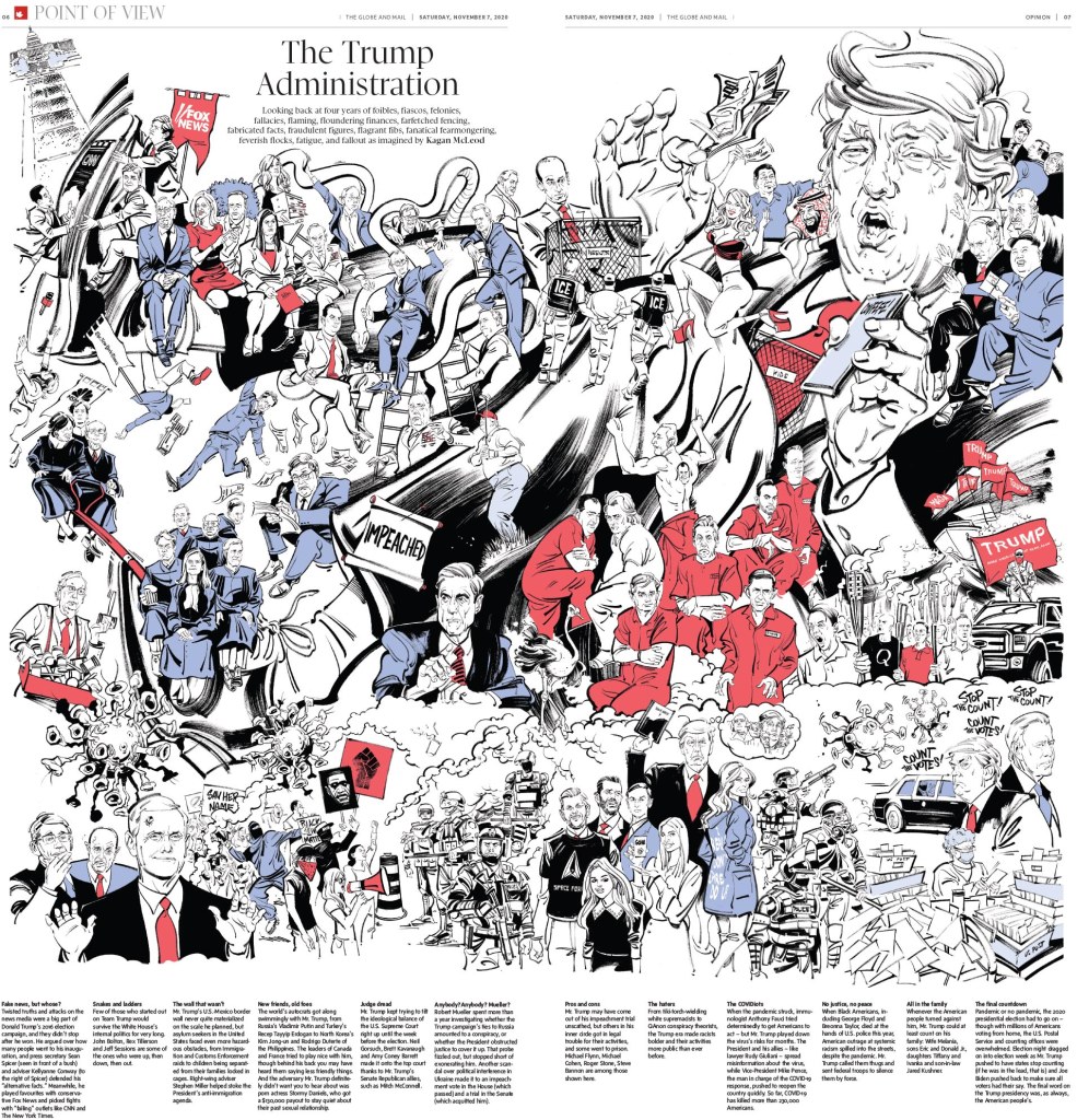
Globe and Mail, The Trump Administration, illustrated by Kagan McLeod

This page is almost entirely driven by its illustration by the incredibly talented Kagan McLeod (who also did the National Post cover illustration to mark Prince Philip’s death). There is so much happening. It’s so busy, but in a good way. Like a Where’s Waldo picture, you can spend so much time taking in all the different ideas and details. The text is played respectfully, letting the illo do most of the talking.

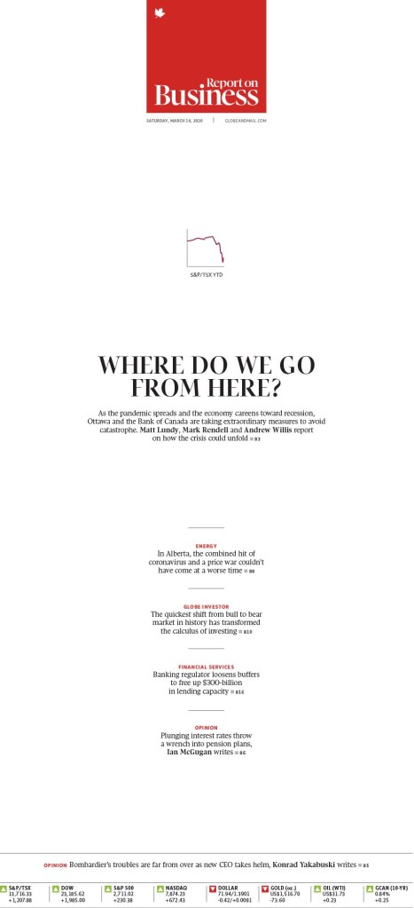
Globe and Mail, Where do we go from here

While the Globe had many more outstanding pages, this is the last I’ll look at. I like it, again, because it takes an old idea and makes it new. I see lots of graph-driven pages. But usually those graphs dominate the page in order to make them stand out as main art. It’s a graph after all. But in this case, the graph is tiny. I mean, it is a graph after all. But that makes it stand out even more. It’s a tiny focal point. But your eye goes there. And it illustrates a rapidly shrinking number. Once big, now also tiny. And another Report on Business cover. I love to see so much creativity on business pages.

Toronto Star

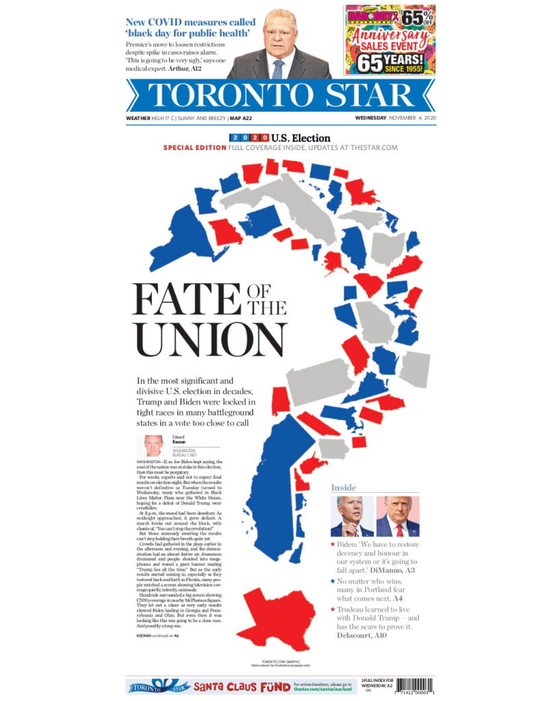
Toronto Star, Fate of the Union

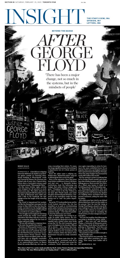
Some in Canadian media will recognize this Toronto Star page, as it was also nominated for a National Newspaper Award for presentation/design. On top of COVID-19, George Floyd and Black Lives Matter, there was an election for the ages in the U.S. And one complicated by COVID. Often results are late. Often a country is divided. But in 2020, both reached new levels. Mail-in ballots meant delaying your press start by three hours likely wouldn’t net you results. The question mark made up of the states was such a creative way to illustrate this. Red, blue, too early to call. Fate of the Union is such a great headline as this was one of the most important election in U.S. history. And the world was watching.

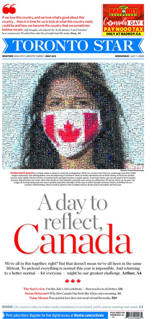
Toronto Star, A day to reflect, Canada

The work that must have gone into this page is extraordinary. It takes 3,000 images from Star photographers since the beginning of the pandemic lockdown and makes up one image of a woman wearing a Canadian flag mask. And the head works so well with the mosaic. But again, it comes down to how much work and the thought process that must have gone into this. It’s mind boggling.

Le Devoir

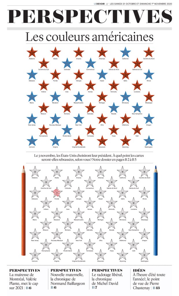
Le Devoir, American colours

This Le Devoir page is a fun and different approach to the U.S. election. Going into it it was anybody’s guess. The polls were so close. So Le Devoir highlights that with empty stars, ready to be coloured in, complete with pencil crayons.

Thanks, Canada

There were more great entries from each of these papers. I salute the effort they put in, as well as papers like the National Post and others, which didn’t have entries as far as I could see. Print is still kicking in Canada, and while it might not be as vibrant as that in the States and other countries around the world, it’s still alive. I hope 2021 will see more entrants, and, more importantly, more bold and inspired print designs. If newspapers want to show readers they still care, they need to make an effort. And I will be here to celebrate it when they do.

Have thoughts? Share them below.