The Villages Daily Sun goes above and beyond in visual journalism, print specifically. Colin Smith and Adam Rogers tell us more.

By Brad Needham

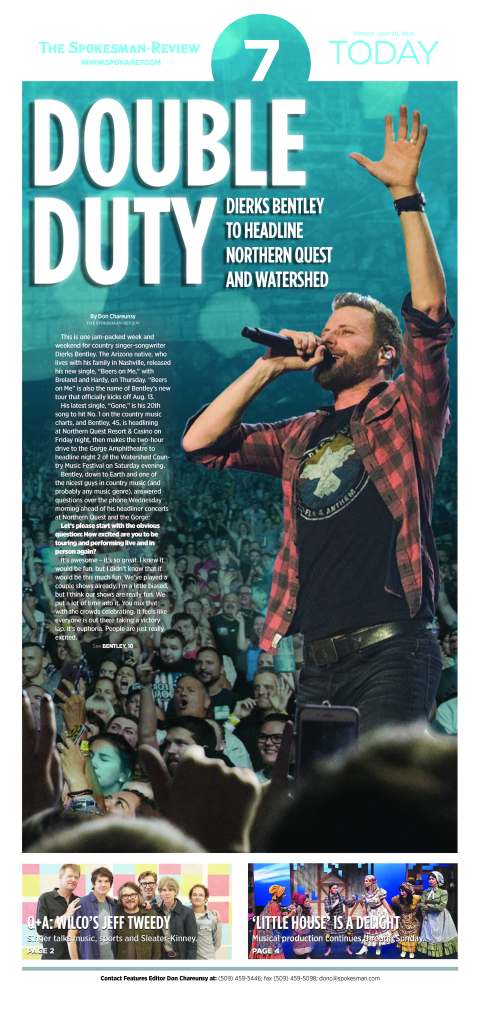
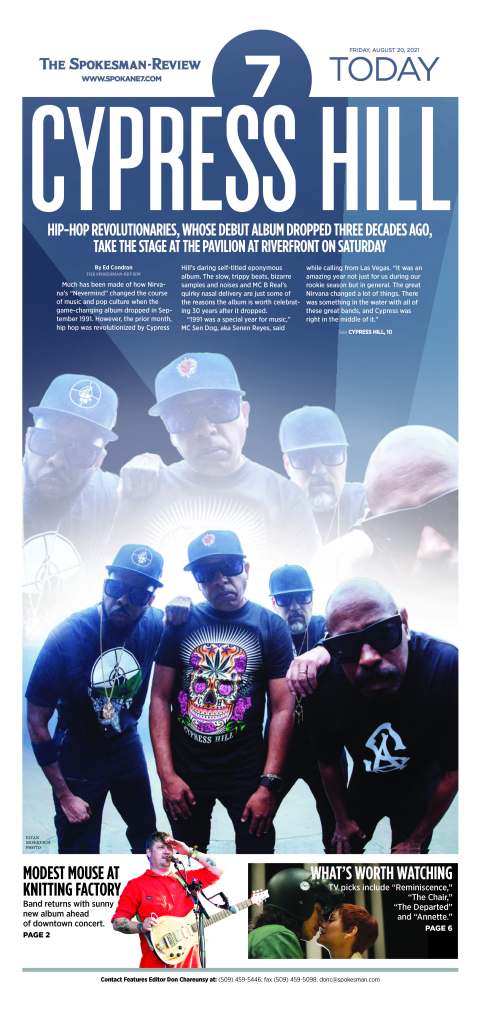
Print might be on the way to becoming an afterthought for some newspapers, but not the Villages Daily Sun in Florida. It is proudly and heavily visually designed for print. They don’t even have an Instagram account. I know because I posted a front page on my Instagram account once and couldn’t, for the life of me, find their Instagram handle. Yet shortly after I posted it, they found me! An editor sent me a note saying they don’t have Instagram and they are a print-first publication (but they do have a Tumblr account!). As a longtime mostly print journalist and print designer, I love that. So naturally I asked them if I could talk to a designer. Not only did they oblige, they sent me two! And they each sent pages. And a visual philosophy.

I am so thankful to have heard back from both Colin Smith, the senior project designer, and Adam Rogers, managing editor of innovation. I had a lot of fun reading through their thoughtful answers, looking at their stunning pages, and feeling like I’m not alone as a print lover in a digital world.

The first thing they sent me was their design and visual philosophy document. It is fun to read. Here is how it begins.

I knew right away these were my kind of people. They have designed a newspaper to reflect their community. Not just in content, but design. Amazing. How can you not love a philosophy like this?

We’re not just filling pages, we’re a daily friend offering news, information, community moments, support and, most importantly, surprises on every page.

The answer? You can’t. You must love this, or you’re on the wrong blog. This blog is for all the print that’s fit to print.

I will turn it over to Adam and Colin. Eds. note: these responses are from early September.

How did you get into newspaper design?
Adam: It was something I sort of stumbled into as a student at Youngstown State in Ohio. My degree is in TV and video production, but I was minoring in multimedia design. That led me to a page design opportunity at the student newspaper The Jambar where I ended up working for four years and decided to focus my career efforts on print design.

Colin: My academic background is urban planning and architecture. I started news design at my college paper, then it became my first job out of college. I’ve been in the industry ever since.

What do you like about newspaper design? And what makes it different from other design?
Adam: I really like that you have the opportunity to start with a fresh canvas every single day. With 365 editions each year, you can experiment. See what works, what doesn’t and learn from it. And I feel like whether its design or general knowledge of the world, I learn something new every single day.

Colin: Philosophically, I like being able to tell stories to wide audiences on a daily basis. I especially love working on redesigns — the chance to weave visual worlds for our readers to explore. On a personal level, I like the frequent, immovable deadlines of daily news production — it’s perfect for a procrastinator like me.

What was the most fun you have had with a design?
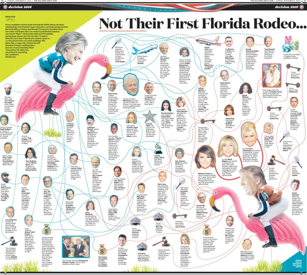
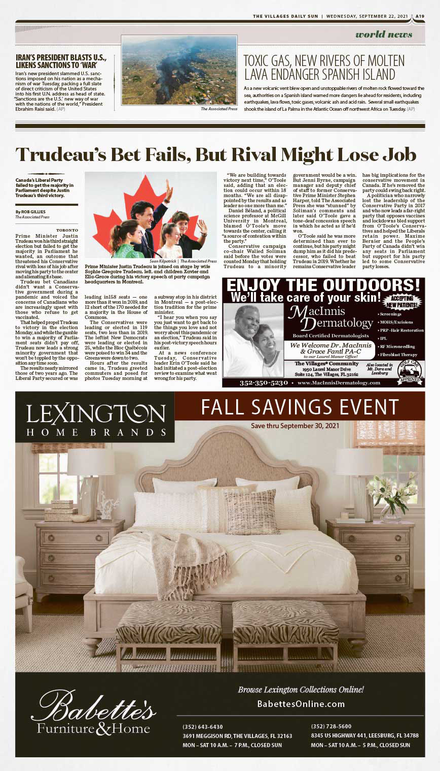
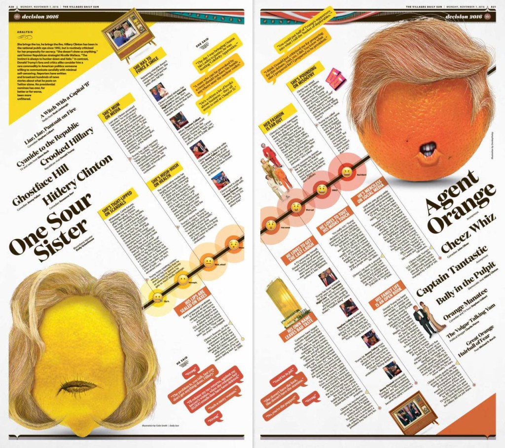
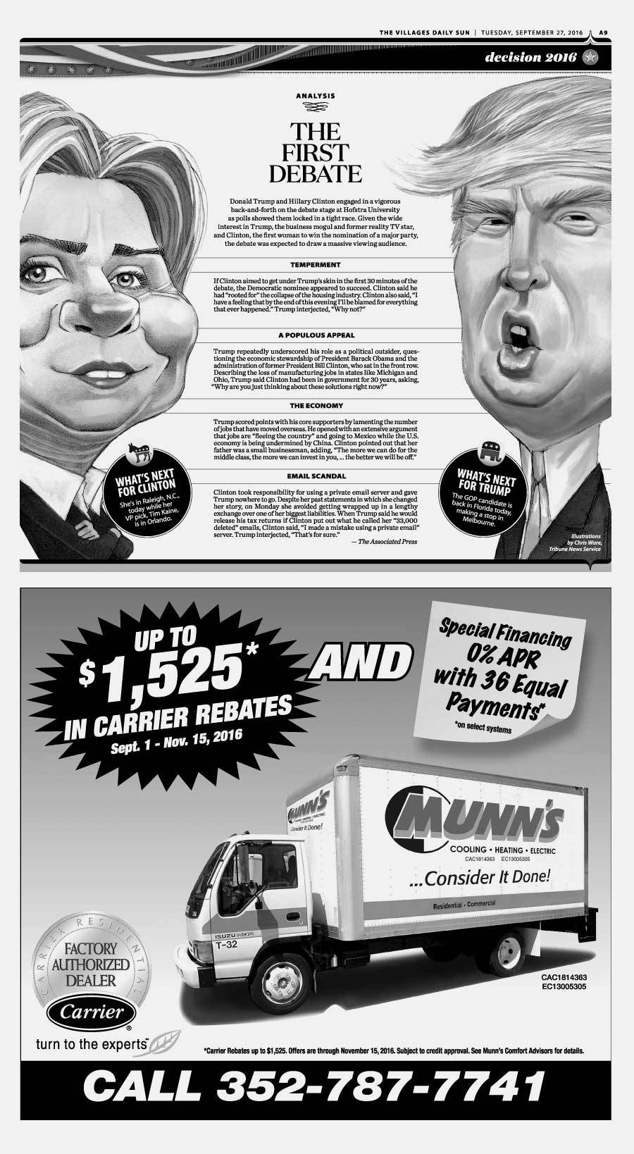
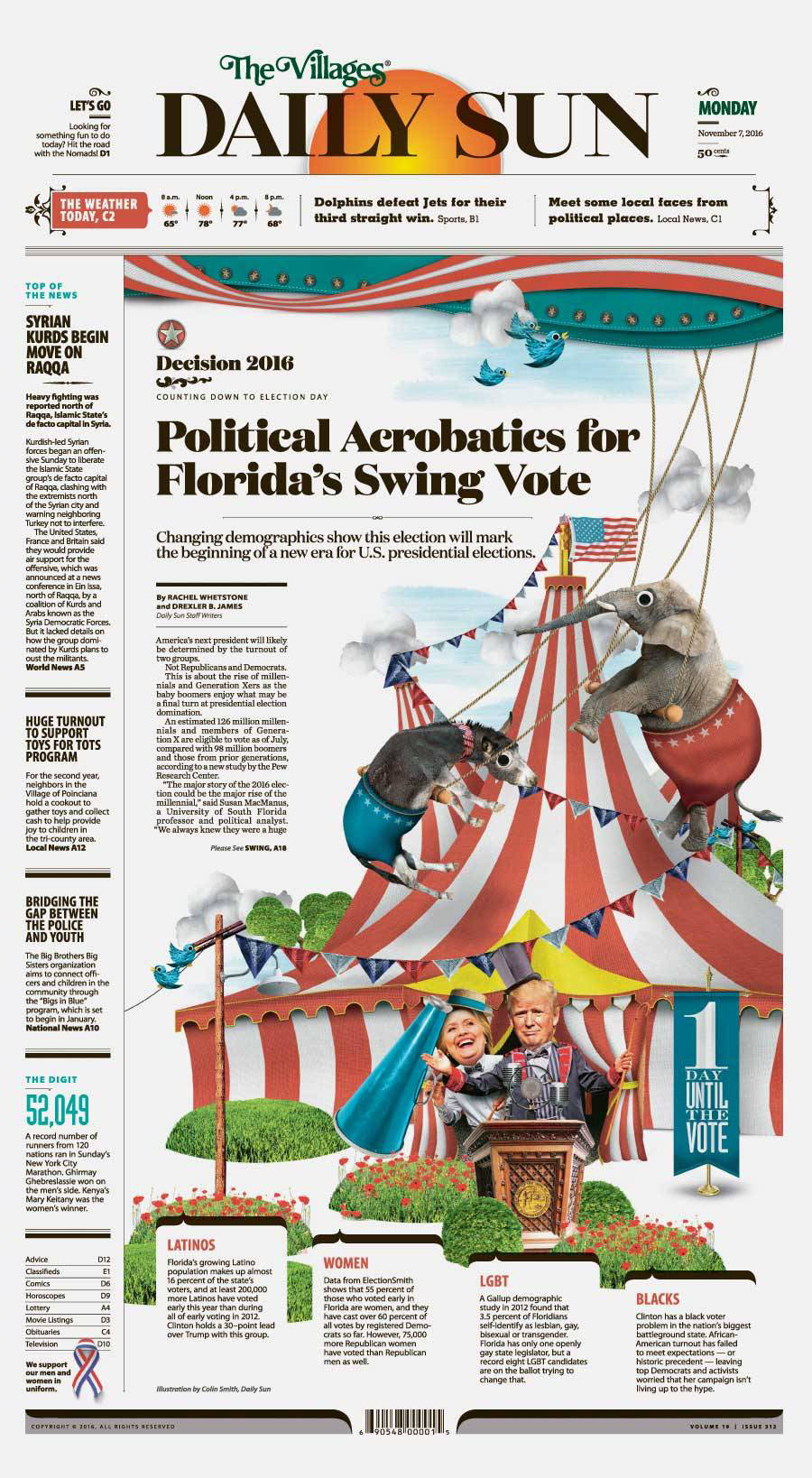
Adam: I would have to go back to a doubletruck presentation I worked on during the 2016 election showing all of Donald Trump and Hillary Clinton’s connections to each other and to the state of Florida. It involved some colourful photo illustrations of the candidates riding flamingos. Honestly, Colin Smith and I had a lot of fun throughout that entire election cycle creating illustrations for a variety of topics along the way.

Colin: The Daily Sun has definitely been the most fun at I’ve had at a paper. I love redesigns, as I’ve mentioned, and this was at the first paper where (aside from the nameplate) nothing was off limits. It’s a paper that wants to have fun in a community built for having fun. That’s opened up so many paths visually. The editor has been a huge part of that evolution. She really has helped push me in directions I would have never thought exploring at other publications, and I think it’s really made a unique product in the process.

Do you rely on one design principle more than others (white space, text as design, colour, cutouts, etc.)?
Adam: At the Daily Sun we focus a lot on just being consistent. We have built a beautiful core structure for our newspaper that highlights our colour palette and carefully selected typography. From there we make strategic decisions on when to break from the templates. And when we do, we usually go pretty big.

Colin: Great question. When in doubt, I go to the grid. Barring that, then I tend to focus on clean typography and common alignments. I don’t like to modify my type too much, so generally it’s one colour and one alignment. And you can’t go wrong with a beautiful dominant image. I tend to shy away from cutouts mostly because, after 20 years, I’m just tired of doing them (although I will if I must, but it’s not my go-to move). And I’m always a sucker for a symmetrical layout.

Tell me about a design idea you loved that was rejected or just wasn’t working so you had to abandon it.
Adam: I joke a lot about having a pile of abandoned pages that I burn for warmth during that one week of winter we get in Florida. And that’s true to some extent. After a decade it’s tough to narrow it down to one that stands out. Our projects and pages grow and evolve so much during our design process that I’ve learned to not to get emotionally attached to an idea. We try to put the our readers and the storytelling above our own egos.

Wherein most newspapers follow an assembly line model, our process is more circular, with reporters, editors and designers working in concert to iterate and elevate our content in ways that surprise our readers and surpass expectations.

Colin: Too many to count, honestly. I used to revise and revise and revise before showing a page/project/redesign, but that philosophy doesn’t work at a paper where we have a very deliberate style we’re going for. So now I do a quick mock-up, get input from the editor to see if I’m going in the right direction or not, then I either refine what I’ve done or archive it and try something else. Honestly, I’ve never flat-out thrown a design away. If something doesn’t make the cut, I’ll usually file it away possibly for use later. Generally if I’m really excited about a design, I’ll find a way to get it used. Although I’ve had print/web designs implemented then discarded after I’ve left a paper, so I guess that’s stung a little more. But such is life.

I like the idea of your design direction matching your community, i.e. a heavily designed community begets a heavily designed newspaper. Tell me more!
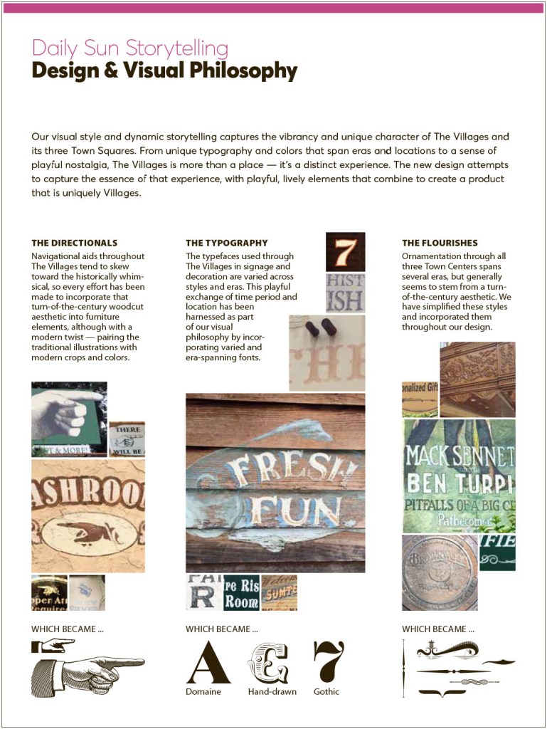
Adam: If you were to visit The Villages (which everyone really should some day) you would see that the developers put a lot of time and thought into the small details. We like to say that the community is designed to take you back in time, but you can’t always hit on exactly when. We’ve taken their fun but meticulous sense of design for the community and have made the newspaper reflect that. From the colour palette down to our use of woodcut and victorian flourishes, we have pulled inspiration from all corners of the community.

Colin: I believe the true power of newspaper design is the ability to create a visual microcosm of the community that is filled with all the surprises, delights, familiar places and new experiences that one expects from a journey in their city or town. I believe the areas of the paper should capture the personalities of a place (quiet cafés and loud clubs, bustling streets and quiet leafy suburbs). Visually, The Villages is a master planned community with several strong visual identities. On top of that, residents here have very active lives and fascinating stories to tell. There is always so much going on, and so much life to capture, that it really puts the onus on the Daily Sun to be as energetic and vibrant as our readers.

Visually the editor challenged me to come up with an overall design that was both nostalgic and thoroughly modern. That’s why you’ll see Victorian text flourishes paired with vibrant citrus colors to create something that blends a fondness for the past with an optimistic vision of the present. The goal was to create a kinetic vibration throughout the entire publication that is both familiar and yet also completely unique to our community.

I’ve been told the idea your covers are based on (lots of small bits of information) carries on on the inside. This concept and a few others seems to make this paper stand apart from others. Can you show some examples and tell me why you decided to do that?
Adam: That is very true. While The Villages may be a mecca for retirees, they break every stereotype for seniors imaginable. We are blessed to have a very active and engaging community to cover. Our readers are very busy and we want to respect their time. So we implement of a lot quick hit information and alternative story formats that make the news quickly and easily digestible. We use this approach in every section in concert with traditional longform presentations.

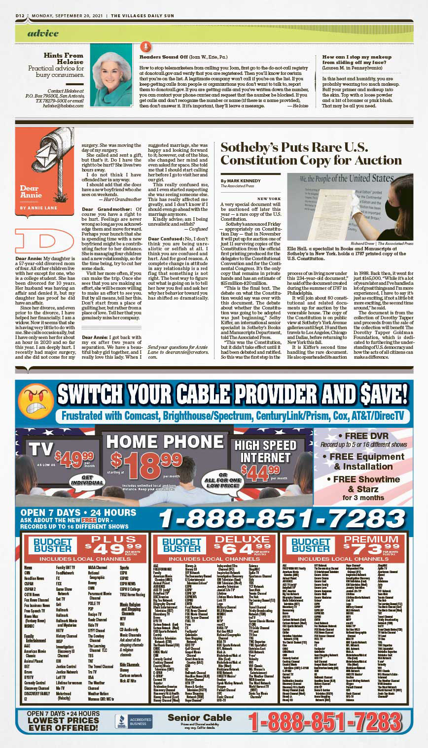
Colin: Adam probably already went into this, but just in case he didn’t, here you go. Even though the vast majority of our readers are retired, they are still quite busy. Between social gatherings, planned events and daily excursions we owe it to our readers to get as much information into every page as possible. Since Villagers come from around the U.S. and the world, we try to get as much into each edition as possible. Our high ad stacks make it difficult to get a lot of traditional articles on a page, so instead we run a collection of briefs, photos and alternative story formats along the tops of inside pages (we call them attics) with a longer read below it.

It might be like picking favourite family members, but if you had to pick a few favourite pages, what would they be and why?
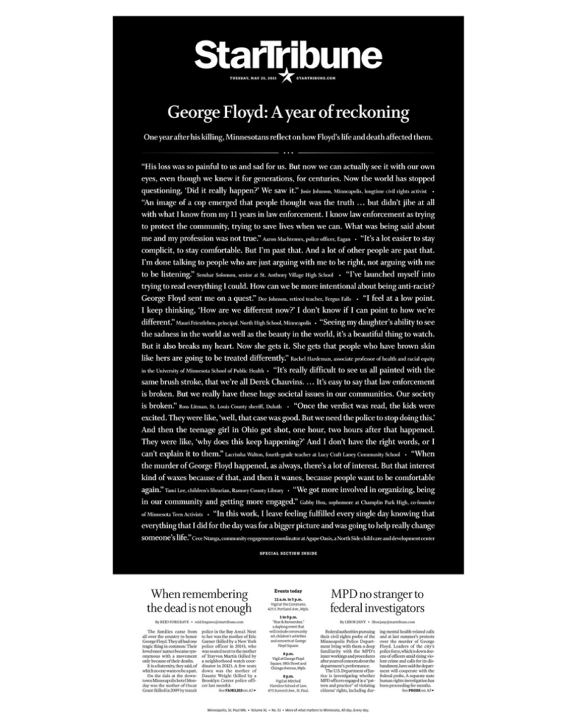
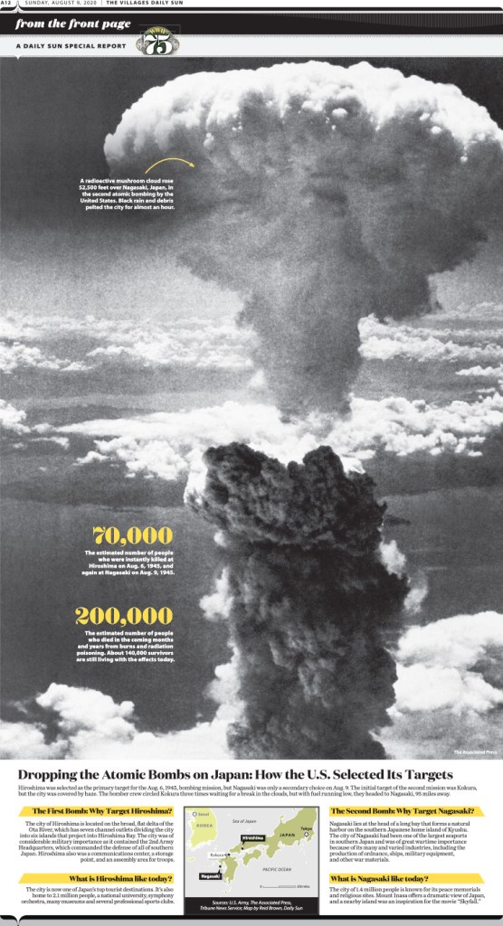
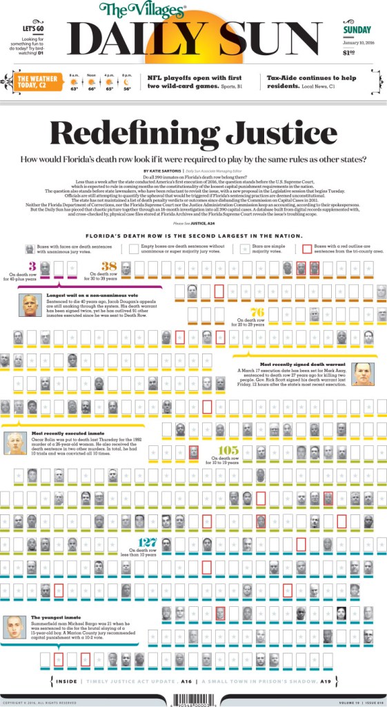
Adam: First I would go back to a 2013 page on the 50th anniversary of the March on Washington. I worked on this page with the help of executive editor Bonita Burton and it evolved from a traditional centrepiece that we just kept pushing bigger and bigger. Our design and typography has changed a lot since then, but this did land me my first SND Award of Excellence and I was truly humbled. Then I would say a 2016 front page information graphic that was part of our multi-year “Redefining Justice” investigation into Florida’s death row. It really pushed my organizational skills and I spent a lot of time making sure the information we were presenting on a complex topic was digestible. And then more recently an inside page on the atomic bomb that was part of a yearlong series we did on the 75th anniversary of the Second World War. I really like working with historic photography and finding ways to present it in striking ways.

Colin: Ooh, that’s a good question. I mean, I’ve been redesigning our paper for so many years it’s hard to pick just a few. But if I had to:
+ Redesign/Template-wise, I love our A2-A3 world map — I really had a fun time drawing the map, and the page has so much personality. We used to have a sea monster on the page, and I do miss it.

+ We have some templated local front pages that really have a lot of visual oomph that I’ve enjoyed putting together, too. 

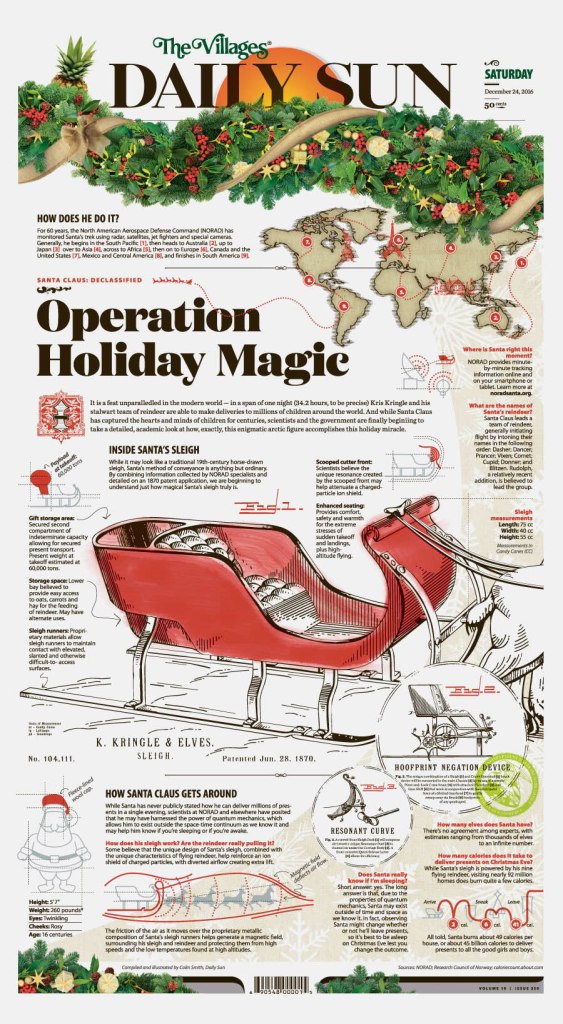
+ When I’m not redesigning the paper, some pages I’ve worked on that I really like have been a Christmas cover with a Santa sleigh based on an 1800s patent application (we’ve gotten a lot of mileage out of that one, re-running it pretty much every year).

+ An oldie but a goodie, but I also really had a ton of fun designing our 2016 election coverage and doing those illustrations. 

Tell me a little about your process. How do you come up with ideas?
Adam: For our bigger projects, we huddle up a lot to brainstorm. Sometimes it’s really simple to just run with your first idea, but we talk a lot here about not stopping too short. One thing Bonita says to us a lot when approaching a page is “what can we do that we’ve never done before.” And then the brainstorming kicks off. Even if it’s not a huge project, just turning to one or two other people in your pod or in the newsroom can help elevate an idea or a page. We’re sort of all in this together.

Colin: Ideas for stories is pretty simple. Generally main stories are planned weeks in advance and special projects are planned months in the future. The bigger the project, the more the lead-time for visual discussions — from data visualization to the need for photo reporting and illustration. Actual designing for special projects doesn’t begin until about two weeks in advance, with final design beginning in earnest a few days before publication.

As far as the ideas, it’s a back-and-forth process where the narrative is weighed with how we’ll tell the story visually and one, the other or both are adjusted until we’re happy with the final result.

And that’s a wrap from Colin and Adam. But what fun. It seems like the Villages Daily Sun would be any print designer’s dream job. Thanks to both for all their insight.

From really northwest to regular northwest America, this newspaper designer is making the most of her opportunity at newspaper that loves its design

By Brad Needham

One of the things that frustrates me about trying to promote newspaper design is that it is often so hard to find out who is responsible for all the amazing designs I see. I would love to shoutout all the amazing talent behind the stellar newspaper front pages from around the world. But I can’t just turn to the masthead or page 2 and see, Cover Design by … as one might in a magazine. That’s why I was tickled when I posted a Spokesman-Review arts cover on my Instagram account and I got a response from the paper. They told me they would pass my message onto their designer (including the comment about wondering if the reverse text was readable in print). And then Caitlin Miller, the designer in question, contacted me on Twitter to tell me, yes, indeed, the text was perfectly legible!

The page just popped for me. The contrast. The big display. Smokey Robinson‘s eyes and the joy in his face, which is especially notable in a never-ending pandemic.

I have long been a fan of the Spokesman-Review’s design, particularly their front page. I think it’s one of the consistently best designed newspapers around. They give it their all and achieve solid, and sometimes outstanding, results. I hope I have the good fortune of talking to an A1 (1A?) designer one day (nudge, nudge!). Side note: I love that the Spokesman-Review posts, every day, its front page, other section fronts and historical pages on its website (link to Sept. 23 front page). The more we can celebrate print the better, and they have a lot to celebrate.

Being such a fan, naturally I asked Caitlin if she’d be willing to talk to me. And she said yes! While she’s not been in the industry long, she’s making a splash. And unlike most U.S. designers, her career started further north than this high-kilometre Canadian has ever lived or worked (and I lived/worked in Fort McMurray and Fairview, both Alberta, as well as Prince George and Fort St. James, B.C., which are pretty far north).

Caitlin talks about her growth as a designer. And she talks about working within the framework of your newspaper. Some papers, like the Spokesman-Review, really pride themselves on design. Other papers, particularly in the present print media climate or smaller papers, don’t go big on design every day. Caitlin now gets to work with a team that loves design, one that submits a pile of pages to the Society for News Design‘s design competition every year. And I bet that passion for design is contagious!

Here is our chat. I have sprinkled a few more of her eye-catching Spokesman-Review designs throughout the questions, and end with some pages from her pre-Spokane days in Alaska.

It’s a never-ending learning experience, and I love that.

Caitlin Miller on working in journalism

How did you get into newspaper design?
I fell into it. What got me into print news was a semester working at The Sun Star as the managing editor at the University of Alaska Fairbanks. Certainly, no design experience! My job in that position was strictly editing and guiding writers (albeit at writers’ own discretion of accepting my edits, but that’s working at a college paper for you).

I kept my eye on the local paper as a possible job prospect in Fairbanks for a while. After I graduated, I was working at a hotel and would read the paper daily, including checking classifieds. Finally, a copyeditor position opened. I knew the former editor-in-chief of The Sun Star was working as an editorial assistant at The Daily News-Miner and hit her up. Funnily enough she had deleted my number from her contacts, but when she figured out it was me, she was supportive of my interest and put a good word in. I applied the next day, and a month later I was hired. I learned newspaper design on the job and taught myself a lot of what I now know, but I knew I couldn’t grow staying in Alaska, which is how I found myself at The Spokesman-Review. It’s a never-ending learning experience, and I love that.

However, I knew that I always wanted to work in newsprint. It’s a bit of a family legacy, with my grandfather and his father working in it, respectively in different aspects.

What do you like about newspaper design? And what makes it different?
First, I like that I’m using both sides of my B.A. I hold a degree in English and art and being able to interact with both design and words is satisfying to say the least.

(A writing mentor) opened my eyes to the beauty of page layout; she gave me a reader’s perspective.

I was meeting with a writing mentor at a coffee shop one day, and as we were catching up, she had asked me where I was working, and I answered that I was at the paper and explained my job. We found ourselves in conversation about the benefits of a physical copy (versus web) reading of a newspaper. She opened my eyes to the beauty of page layout; she gave me a reader’s perspective, a perspective I’ve never interacted with before as a designer despite my own reading of papers. But things always look differently from another’s eyes, don’t they? Through her gaze, we discussed the way readers interact with stories, how a jump from the front page to an inside page, or a refer/tease, could bring a reader to stories they wouldn’t have likely known about otherwise. Not everyone thumbs through all the pages of the paper. How many of us non-sports people don’t give sports a single glance? Or maybe a parent only bought the paper to keep record of a story on the front page related to their child. Suddenly, that parent finds himself or herself on Page A5 reading about a column on a local event involving a nonprofit that seeks to benefit cancer awareness.

What was the most fun you have had with a design?
My favourite pages are those with the most agency. In a way, this applies here, also. Those pages that I’m given a feature story or column with lots of art, I like being able to take the lead and do what I see fit with it. I like that editors who give me the content trust my judgment. They also know I’m not afraid to ask questions, so communication between us is so very important, including sending page proofs for them to see and affirm or correct where needed. Pages where I am given lots to work with, and pages with breaking news also are fun to work with. I’m really thankful for templates however, because sometime a page just needs that basic layout and nothing more, and that’s cool.

I hope I can, with the pages I provided, express the “most fun” I’ve had with design. It’s hard to explain otherwise, and these include my favourite pages as well.

Do you rely on one design principle more than others (white space, text as design, colour, cutouts, etc.)?
I do a lot of cutouts. Always have. But, gosh, do they take time. It can really depend on the page I’m working on. Feature-y pages will likely have cutouts whereas hard news pages will likely not, at least from me thus far. Colour does play a role, oddly. Sometimes I look at a page after I’ve completed it and go, “Wow! How did this work out!”—and it turns out that all the photos visually correlate by complete happenstance. I tend to avoid lots of white space, however. But at The S-R, I’m learning the benefits of it. We use it far more than I’m used to, whereas before, I was very adamant on squaring everything off and making sure everything fits tightly on a page.

Tell me about a design you loved that was rejected.
I don’t think I can answer this exactly how you want it answered, simply because it isn’t about something being rejected. I don’t think I’ve had an entire page design rejected before; however, I have had aspects of designs criticized and rejected. It isn’t a good feeling. But talking through it and learning from it is important. Maybe it’s something the design editors were avoiding you didn’t know about. Great. Now you know not to do that ever again. Or maybe it’s a learning experience between you and the more experienced designer who suggests the text be more horizontal in nature and less vertical. Awesome. Now you can take that experience and apply it to future designs that might have similar elements that could benefit from it.

It still feels crummy sometimes having your work criticized. But it’s worth it.

It still feels crummy sometimes having your work criticized. But it’s worth it. The team effort is important, and you can learn a lot from working with others and seeing design through your critics’ eyes.

Are there any designers or publications other than those you have worked at that you are sure to look at?
If I’m in a new city or town, or visiting family, I’m sure to pick up the local paper. It’s hard not to look at design now wherever I go. This includes magazine covers — it’s interesting the crossover between the two, like siblings of sorts. But I look at both general design, and what stories they put where, such as what the designer of that paper chose (or perhaps editors — this really depends on the size of the paper!) for the lead, down the rail, centrepiece, down page, etc. It can say a lot for what the town sees as important, and a lot of time localization is prioritized over national wire stories.

It might be like picking favourite family members, but if you had to pick a few favourite pages, what would they be and why?
I’ll address my career thus far. I’ve noticed with The Daily News-Miner my favourite covers are the ones where I have the most agency. And perhaps the same can be said with The Spokesman-Review. While at the News-Miner, I have a handful of pages I love.

The News-Miner doesn’t like much for creativity, per se, but the Our Town page, a localized feature page that ran weekly, allowed me to kind of do what I want within means. And I loved it. I had a good knack of what was allowed on A1, but Our Town meant I could explore making cutouts, changing fonts, applying gradients. Many of these pages had strong interaction with local audiences who were regular followers of the editor of that page. And, I have to say, there is such satisfaction in knowing how well I did when that editor comes to and tells me the impact I made. I’ve also seen cutouts of various stories from various pages I’ve constructed framed, and that’s a whole other feeling on its own. At the DNM there are other front pages I love for other reasons, ones I’d include in a portfolio, but they certainly don’t hold an impact like the one’s that have made a personal connection with me emotionally. Maybe the emotionality of it sounds biased, but it really can help a person grow as a designer to know what they’re doing is good in some way or another.

As far as my work at The Spokesman goes, I haven’t quite hit that emotional satisfaction yet, but being at a much larger paper might have much to do with that. However, working with the Seven cover at the Spokesman (weekly entertainment feature section) really allows me to explore my skills as a designer, and there is much satisfaction in that. I really can’t wait to see where this takes me.

Tell me a little about your process. How do you come up with ideas?
There isn’t much to say about this. Either I have a good idea of where I’m going with something or I don’t. A lot of times I can look at the content and know exactly what is going where, but I think experience has a role in this. And other times I might spend three hours just trying to figure out and experiment with where I’m going to take a page. I may even sometimes have multiple ideas in my head. It’s interesting, working at The Spokesman is such a different experience coming from a small paper. Before, a lot of decision making was solely up to me, regarding what stories go where and what art should appear where. At The Spokesman there’s an editor for everything, including photo placement.

The Spokesman Review has some exceptional designs. How much pressure is there to continually produce great work? Do you swing for the fences every day?
The Spokesman staff is so supportive. However, while I’m fairly confident in my abilities, I certainly feel a lot of pressure! I took over the design of the Seven cover after a couple of months being with the company. Prior to that our A1 designer was doing the cover and he certainly has far more experience than I have. Chris Soprych is helpful in many ways. There are days where I just don’t have a clue what do with the art I get. Frankly, sometimes it just isn’t good enough to work with to produce an eye-catching cover. But then he shows me how he’d approach it and from that I’m able to learn different approaches. I’m thankful, and this experience is a huge part of why I wanted to join The Spokesman-Review.

Certainly, communication is important and helps relieve some stress. I’m not the only one who looks at the page or cover. And others’ suggestions can certainly make or break a page in its success. Constructive criticism is always important. And I really enjoy that so many people are involved with the process and looking at the final proof. I’m also coming from a paper prior to The S-R where I was the only set of eyes on pretty much everything, so it’s all been both a learning experience and a huge relief.

For the young and aspiring designers, remember we do this because we love this.

Do you have words for wisdom for young, aspiring designers?
For the young and aspiring designers, remember we do this because we love this. Remember that behind the scenes we still make a difference and affect a reader’s interaction with the paper as whole. We’re not in this for the pay. We’re in it because we love what we do, and we love journalism. But also, for those who may feel stuck at a job that you feel no mobility in, don’t be afraid to extend yourself beyond what’s familiar and apply all over. Call. Talk to editors and tell them you want the job. It may seem old school, but working in newsprint is, believe it or not, still old school. Basically, don’t be afraid to chase your dreams, bug people and be adventurous!

Fave designs

Below is a selection of Caitlin’s favourite designs. She explains what made each of them special. We’ve seen the Spokesman-Review pages. That’s where she is now. This is where she began. “I really feel like the Seven covers for The Spokesman-Review show my potential as a designer in contrast to what I was more so limited to designing at my former job.”

My one issue with this page is the text wrap around the columnist’s mug has a weird break that I didn’t catch until months after when I was going through my portfolio and applying to other papers. Jorgy Jorgensen played a huge part in the Alaska community and touched a lot of people’s hearts. This page brought many people joy and the columnist received many thanks from the community for making it happen. It’s really special to be a part of the community in this way, even being behind the scenes. 

This cover page was the moment I realized the power journalism has in a community and how a page designer can contribute to making an impact.

This cover page was the moment I realized the power journalism has in a community and how a page designer can contribute to making an impact. It was also the moment when I knew I found the right career for me. There was a lot of excitement that led up to this page: it was the weekend and unplanned; our 12-page paper needed to be expanded into a 16-page paper, ads had to be moved, everything that was supposed to go on the front page got moved inside. At the time the governor of Alaska had vetoed the state budget, an action that would in turn affect all parts of the state and everyone of all ages. Many were upset by this — Alaska had been facing years of budget cuts already. I knew when I sent that cover I did something. And sure enough, I woke up the next day and discovered that at a protest, Fairbanks residents who didn’t have posters or signs to hold, used our Override editorial front page.


I feel like these pages really captured how the COVID-19 pandemic affected people (pages above and below). We weren’t expecting there to be a Midnight Sun Game that summer. The team that usually hosts the annual tradition cancelled the game due to the pandemic, but a couple of teams from the area came together to make sure it still happened. It was really a “beacon of hope” for a lot of people in a time when so many traditions were cancelled. I think Laura Stickell’s story shows the importance of community and how coming together plays a large part in human morale. It was our sports writer’s last day with the News-Miner and she sure went out with a bang. Great story, great photos.

Want to be featured?

I am always looking for newspaper designers to talk to, whether you’re at a college paper or the Washington Post. Reach out to me through the comments or at bradneedham@gmail.com.

George Floyd’s death was more than a tragedy. It was a murder. It was a catalyst for an uprising, in the U.S. and around the world. It was a wakeup call, one of many, but one that seemed to resonate with people outside of the Black community. George Floyd, who was killed after allegedly buying cigarettes with a counterfeit $20. Killed by police. For nine minutes and 29 seconds, police had him on the ground, knee on his neck. Somewhere around the eight-minute mark he lost consciousness. But the knee remained. This was May 25, 2020.

His death came to be a symbol of what’s wrong, not only in America, but around the world. The systematic racism that exists and thrives.

Newspapers covered his death in the immediate aftermath and long after. There were many necessary stories, many appearring on front pages around the world. And while newspapers won’t run out of key angles to write about (assuming the editors and decision makers are keeping this story in the collective consciousness), how do designers keep the story fresh, to help keep it dynamic? Sure, a newspaper can put a story over the fold on its front page. It will get attention. But the design can play a key role in elevating the story. You can’t have readers get complacent and gloss over the story. A designer needs to pull them in, and sometimes there aren’t a lot of choices visually.

More than a year has passed since his death. In a world of 24-hour news and social media, most stories don’t get the spotlight for long. This story, the issue it thrust in front of the comfortable and privileged, needs to be there.

One year after Floyd’s murder, there were two pages that stood out for me, each taking very different approaches to their designs. But both highlight the power newspapers have, and the responsibility they have. And the power of newspaper design. It’s not just the words.

The first page that caught my eye was the New York Daily News. It was striking. A big photo of Floyd. His face instantly recognizable, brightly lit in parts and not in others. Starkly placed on a black background. The white newspaper flag adding contrast. And a great newspaper page almost always has strong words. Or strong words elevate a great page to unforgettable. This one simply says: One year. 9 minutes. 29 seconds. Black text on white on black. Those words are so significant. Anyone familiar with the story will know what it means. Anyone not will be appalled. How the words are played is significant. It was a masterful page. It captured the feeling one year later, and helped keep this story in front of readers.

New York Daily News cover, May 26, 2021

The next page took a very different approach. The similarity was that it was also on a black background. Reverse white text on a black background. But it isn’t a picture of Floyd that makes this page. It’s words. All words. It was a powerful message. When a newspaper makes a decision to run a page without art, the words have to do it all, so they have to be done well. When an issue is so consequential, sometimes words are all there is. The Star Tribune is an exceptional paper. It’s in Minneapolis, where Floyd was killed. While this became a worldwide story, this paper owes it to its community to keep this story front and centre. This page was breathtaking, yet simple. So many words, but that’s why it works. In this instance. In others, it wouldn’t. But it was the right time and the right play and the right words.

Newspapers owe it to readers and to society to run stories like this, to keep these issues, issues like this, like the unmarked graves of Indigenous children in Canada, in the collective conscience. It was in the news again when Derek Chauvin, the police officer who kept his knee on Floyd’s neck, was found guilty of murder. And again when he was sentenced to 22.5 years in prison.

But these pages above, and the ones below (which I’ve shown in previous posts) highlight the power of print design. Three of them show, or somewhat show Floyd’s face, which has become a symbol of the movement and a way to illustrate the story. And newspapers try to present his face in novel ways. As long as newspapers are trying to raise awareness of serious issues through design, I will keep showing them.

Above: de Volkstrant’s stunning and masterful illustration of Floyd’s face, and of the movement it catapulted into the world’s consciousness, and the Houston Chronicle, with a powerful sketch of Floyd.

A look inside an edition of a Society for News Design Best of Newspaper Design books.

By Brad Needham

For years people have been saying it. Print is dead. Newspapers are dying. Perhaps the end is nearing, but newspapers are not dead yet. And as long as they’re around, I want to celebrate those making an extra effort. Print design, newspaper design, has shaped my career. It’s a passion. There is not much like it, so I, for one, want it to survive as long as possible. They’ve long been sending out a please resuscitate message, and I’m happy to do newspaper CPR as long as necessary.

Where it all began (for me)
In 2003, fresh out of out university, I had just lied my way into a job in Fort McMurray, Alberta. Am I a good designer? I taught design at Mount Royal as a TA, I said. It wasn’t completely untrue. I landed the job, and thus I packed up and moved to northern Alberta in February to start my first daily newspaper job at the Fort McMurray Today.

It was there I stumbled on some books called The Best of Newspaper Design by the Society for News Design. It changed my life. The designs inside were spectacular. Awe inspiring for a young aspiring designer. No longer did I want to be a photographer and certainly not a sports reporter (sorry, dad). I wanted to do that. As I learned more about the Society for News Design (SND) I discovered they were the preeminent design society. The best designers in the world were competing to get into this book. New York Times, El Mudo, Virginian-Pilot, Boston Globe, Toronto Star. I was hooked.

I took these books everywhere (including to Red Deer when I left the paper in Fort McMurray … ssshhh). On vacations, to the cottage, on the bus. When other people were reading novels on the dock, I had my big cumbersome SND books, new sticky notes flagging inspirational designs being added frequently. Every time I did a big design, I was pretty proud. I look back on many of them now with less pride. But I was learning. At the Red Deer Advocate, the Woodstock Sentinel-Review, the Barrie Examiner (RIP). And then I got to the Guelph Mercury, the little paper that could — and did. I was offered a role overseeing the Here section, a feature section focusing on interesting local people and places. I was given time to conceptualize, assign, design. My managing editor was incredibly supportive of my ideas, even if they seemed bizarre on … paper.

That’s how it happened. Years after discovering the Best of Newspaper Design books, collecting dust on a book shelf in a northern Alberta newsroom, after dozens, maybe hundreds of pages drawn, I decided to enter. As a lark. Weeks passed. Nothing. Until one day a note popped into my inbox from SND. I had been recognized for my features portfolio. My heart was pounding. I jumped out of my desk and stormed into my boss’s office as if my house was on fire. I didn’t knock. “I … won an SND. I won!” I could barely breathe.

gm1408_a01_page-0001

I submitted five pages. One of those in a few weeks’ time would be in Best of Newspaper Design 28. It was beyond my wildest dreams. To be in these books I used for inspiration. After that I was handed the keys to a full redesign of the Mercury. I was told I could redesign an entire fairly major Canadian newspaper. One of the country’s oldest. I was humbled. With that behind me, I kept chugging along. I submitted a portfolio the next year. I thought it was stronger. But nothing. It was a once-in-a-lifetime achievement, I thought. Winning an SND award. Except it wasn’t. I won again a year later for a news page, based on the redesign. My managing editor allowed me to use all the front page real estate for a design idea. Best of Newspaper Design 30. And I won again two years later, Best of Newspaper Design 32, working with a great designer, Diane Shantz, at the Waterloo Region Record (but for a Guelph Mercury page — the industry was starting its contraction as the Mercury’s page production was brought into the Record. A sign of things to come, and why great newspaper design should be celebrated now more than ever).

A changing landscape
That was in the early 2010s. Print advertising started on a steady decline. Stories were available online for free. Newspapers, once a licence to print money, weren’t as profitable (but still doing well relatively speaking). But as revenues dwindled, newspapers started cutting staff. Some adopted a “good enough” policy (it’s true, but I won’t say who said it). It was the idea that readers don’t care about design. They don’t care if a photo is beautifully shot by a professional photographer. A handout picture would do.

Perhaps the end is nearing, but newspapers are not dead yet. And as long as they’re around, we should celebrate those making an extra effort.

Even by 2010, newspapers were in decline. A Pew Research Center report said half a dozen U.S. newspapers had closed down the previous year. Alarm bells were ringing. But we hadn’t seen anything yet. A report out of the Hussman School of Journalism and Media at the University of North Carolina published in 2020 said about a quarter of all papers in the U.S. had closed in the past 15 years. And things aren’t any better in Canada. A story in the Toronto Star last year said 50 community newspapers closed over a period of six weeks. Six weeks. Compared to just over 200 in the previous 12 years. Three newspapers I worked at have closed, the Guelph Mercury, Barrie Examiner and Prince George Free Press. I can’t even begin to explain how much I learned in these roles, and what those papers meant to their communities.

To make a short story long, there are very few people left who get days or even several hours to put a section together, to conceptualize design. To sketch out designs on little yellow sticky notes, as I did at the Waterloo Region Record, and hand them to a designer to implement. I have been fortunate in my career. Awards like the Ontario Newspaper Awards no longer even have a print design category (I won once, received two other nominations and had the privilege of being a judge one year). But because I have been fortunate, I now want to celebrate those who are still doing it. Still producing kick ass designs, like the Toronto Star, Globe and Mail, Spokesman-Review and so on. And I will look at these papers and more to find out why they’re still investing. Hopefully they can inspire future aspiring designers to aim a little higher.