Top half o the New York Times Feb. 21 cover.

By Brad Needham

Once in a while, on a day you wouldn’t expect, a front page comes along that leaves readers awestruck. It’s a page that does something to convey a story or an idea so big. Through a design, through a graphic, through an image. Sunday’s New York Times front page was such a page.

At a quick glance, the reader wouldn’t even know what they were looking at. The Gray Lady was even greyer as the primary graphic on the page was black and white and at first indiscernible.

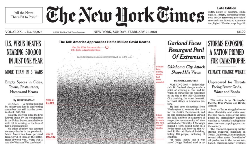
It doesn’t get you at first glance. But when you look deeper you see it. The graphic is made up of nearly 500,000 dots, each one representing an American who has died from COVID-19. On the front page of the New York Times, about half the page taken up by almost 500,000 tiny dots. In newsprint almost certainly blending together becoming unrecognizable as single dots as the death toll starts increasing at an alarming rate. The page goes from grey and white to almost a block of black. That is part of what makes it so powerful. How in itself it tells a story. The dots blur together.

New York Times cover, Sunday, Feb. 21.

It goes to speak to the power that still resides with newspapers and why I celebrate them. Of course it’s easy to celebrate the New York Times, though more often than not it’s for the reporting, not the design. It may not be as grey as it once was, but its front page is still usually pretty busy. Even this one has other stories. Imagine if the entire front was simply this graphic?

In a New York Times Insider article about this page, Nancy Coleman explains that a similar version of the graphic ran online in January. Despite that, I didn’t see much about it on Twitter or other social media. But when I searched for front pages on Sunday, this page was everywhere. And that’s quite a feat for a newspaper page.

“The prominent real estate in the print edition conveyed the significance of this moment in the pandemic and the totality of the devastation,” she says in the article.

Because there is still nothing like it. The power of the front page. Where real estate is finite.

It may sound like a contradiction, but the graphic is both painfully simple — dots — and thoughtfully complex. What often gets lost in newspaper design is what happens before the execution. Someone is conceptualizing. They are either given a story or idea and told to come up with something or they come up with a concept and run it by their editors.

A huge shoutout to New York Times graphic editors and the graphics co-ordinator who worked on this (Lazara Gamia, Lauren Leatherby and Bill Marsh) as well as those who made the decision to run this in print. The insider article, linked to above, is a must read for those who wonder what goes into such decisions.

… unlike the previous approaches, Sunday’s graphic depicts all of the fatalities. “I think part of this technique, which is good, is that it overwhelms you — because it should,” Mr. Gamio said.

From the NYT insider article

Here is some of the reaction from Twitter, just a sampling as there was a lot more.

Any time the front page of a newspaper makes such an impact in the digital world, and not for something stupid, it deserves to be called out. So thank you, New York Times, for such a powerful page. A devastating milestone captured not only for today’s readers, but beyond.

A look inside an edition of a Society for News Design Best of Newspaper Design books.

By Brad Needham

For years people have been saying it. Print is dead. Newspapers are dying. Perhaps the end is nearing, but newspapers are not dead yet. And as long as they’re around, I want to celebrate those making an extra effort. Print design, newspaper design, has shaped my career. It’s a passion. There is not much like it, so I, for one, want it to survive as long as possible. They’ve long been sending out a please resuscitate message, and I’m happy to do newspaper CPR as long as necessary.

Where it all began (for me)
In 2003, fresh out of out university, I had just lied my way into a job in Fort McMurray, Alberta. Am I a good designer? I taught design at Mount Royal as a TA, I said. It wasn’t completely untrue. I landed the job, and thus I packed up and moved to northern Alberta in February to start my first daily newspaper job at the Fort McMurray Today.

It was there I stumbled on some books called The Best of Newspaper Design by the Society for News Design. It changed my life. The designs inside were spectacular. Awe inspiring for a young aspiring designer. No longer did I want to be a photographer and certainly not a sports reporter (sorry, dad). I wanted to do that. As I learned more about the Society for News Design (SND) I discovered they were the preeminent design society. The best designers in the world were competing to get into this book. New York Times, El Mudo, Virginian-Pilot, Boston Globe, Toronto Star. I was hooked.

I took these books everywhere (including to Red Deer when I left the paper in Fort McMurray … ssshhh). On vacations, to the cottage, on the bus. When other people were reading novels on the dock, I had my big cumbersome SND books, new sticky notes flagging inspirational designs being added frequently. Every time I did a big design, I was pretty proud. I look back on many of them now with less pride. But I was learning. At the Red Deer Advocate, the Woodstock Sentinel-Review, the Barrie Examiner (RIP). And then I got to the Guelph Mercury, the little paper that could — and did. I was offered a role overseeing the Here section, a feature section focusing on interesting local people and places. I was given time to conceptualize, assign, design. My managing editor was incredibly supportive of my ideas, even if they seemed bizarre on … paper.

That’s how it happened. Years after discovering the Best of Newspaper Design books, collecting dust on a book shelf in a northern Alberta newsroom, after dozens, maybe hundreds of pages drawn, I decided to enter. As a lark. Weeks passed. Nothing. Until one day a note popped into my inbox from SND. I had been recognized for my features portfolio. My heart was pounding. I jumped out of my desk and stormed into my boss’s office as if my house was on fire. I didn’t knock. “I … won an SND. I won!” I could barely breathe.

gm1408_a01_page-0001

I submitted five pages. One of those in a few weeks’ time would be in Best of Newspaper Design 28. It was beyond my wildest dreams. To be in these books I used for inspiration. After that I was handed the keys to a full redesign of the Mercury. I was told I could redesign an entire fairly major Canadian newspaper. One of the country’s oldest. I was humbled. With that behind me, I kept chugging along. I submitted a portfolio the next year. I thought it was stronger. But nothing. It was a once-in-a-lifetime achievement, I thought. Winning an SND award. Except it wasn’t. I won again a year later for a news page, based on the redesign. My managing editor allowed me to use all the front page real estate for a design idea. Best of Newspaper Design 30. And I won again two years later, Best of Newspaper Design 32, working with a great designer, Diane Shantz, at the Waterloo Region Record (but for a Guelph Mercury page — the industry was starting its contraction as the Mercury’s page production was brought into the Record. A sign of things to come, and why great newspaper design should be celebrated now more than ever).

A changing landscape
That was in the early 2010s. Print advertising started on a steady decline. Stories were available online for free. Newspapers, once a licence to print money, weren’t as profitable (but still doing well relatively speaking). But as revenues dwindled, newspapers started cutting staff. Some adopted a “good enough” policy (it’s true, but I won’t say who said it). It was the idea that readers don’t care about design. They don’t care if a photo is beautifully shot by a professional photographer. A handout picture would do.

Perhaps the end is nearing, but newspapers are not dead yet. And as long as they’re around, we should celebrate those making an extra effort.

Even by 2010, newspapers were in decline. A Pew Research Center report said half a dozen U.S. newspapers had closed down the previous year. Alarm bells were ringing. But we hadn’t seen anything yet. A report out of the Hussman School of Journalism and Media at the University of North Carolina published in 2020 said about a quarter of all papers in the U.S. had closed in the past 15 years. And things aren’t any better in Canada. A story in the Toronto Star last year said 50 community newspapers closed over a period of six weeks. Six weeks. Compared to just over 200 in the previous 12 years. Three newspapers I worked at have closed, the Guelph Mercury, Barrie Examiner and Prince George Free Press. I can’t even begin to explain how much I learned in these roles, and what those papers meant to their communities.

To make a short story long, there are very few people left who get days or even several hours to put a section together, to conceptualize design. To sketch out designs on little yellow sticky notes, as I did at the Waterloo Region Record, and hand them to a designer to implement. I have been fortunate in my career. Awards like the Ontario Newspaper Awards no longer even have a print design category (I won once, received two other nominations and had the privilege of being a judge one year). But because I have been fortunate, I now want to celebrate those who are still doing it. Still producing kick ass designs, like the Toronto Star, Globe and Mail, Spokesman-Review and so on. And I will look at these papers and more to find out why they’re still investing. Hopefully they can inspire future aspiring designers to aim a little higher.