World’s Best Designed Newspaper. Phew. That’s a big deal. Even today, maybe especially today, as newspapers are facing an existential crisis. World’s Best. By no fault of the staff involved in production — the unsung, behind-the-scenes heroes of newspapers, those who play a key role in the daily miracle — many newspapers are mailing it in. They are putting words on paper to wrap around print advertisers, who are still by in large keeping the media world afloat (thank you, print advertisers!). Most in the newspaper world would like to do more, and they do as much as they can with the resources they have. But then there are those publications that stand out. Those who can compete for World’s Best Designed Newspaper.
There were four finalists this year, and two winners. The finalists where The New York Times, Washington Post, Die Zeit (Germany) and and Weekendavisen (Netherlands). I have featured the Washington Post in my American post, and Weekendavisen in my world post. But for now, the winners: The New York Times and Die Zeit, last year’s reigning champion, at the top again.
It can be like comparing apples to Mack trucks, as someone I once worked with used to say. How can you choose between a daily broadsheet and a slightly smaller weekly (though slightly larger that I thought it was only ever seeing it in a PDF format)? How does one compare anything to the mighty New York Times and its resources? The answer? You consider all factors, but in the end it comes down to which newspaper is best executed and puts out the best product, overall and for its readers.
So what makes a newspaper the World’s Best Designed, in the eyes of Society for News Design judges? As the judges change each year, the criteria can also change though the themes are generally very similar. Here are some of the factors they looked at this year:
How the typography is handled
How it interacts with illustrations and photos on page
Is it thoughtful?
Does the hierarchy feel right?
How well do they tell the story using all tools available to them to help readers understand the story easily? They should masterfully use all tools available.
Photo editing
Information graphics usage
Is the design tailored to the content?
Everything should be thoughtfully considered
Hopefully it’s beautiful along the way, and there is still an element of surprise.
An entire publication should be cohesive
The judges also said the winning publication or publications should be setting a standard for other publications to look to for inspiration. And I would say the two winners do just that. And what is great about it is that they do it in very different ways.
The team of judges overseeing this category know a thing or two about design and newspapers. You can read more about each them here, but here is a quick look:
Beto Alvarez, a deputy news editor at the Los Angeles Times; Joe Hutchinson, the creative director for Rolling Stone;Mary Jane Callister, the deputy design director of features for The New York Times (she didn’t vote or take part in discussions on the NYT entries); Mie Brinkmann, visual editor of the Danish weekly Weekendavisen (she didn’t weigh in on her publication either), and Tonia Cowan, director of graphics for The Wall Street Journal.
The New York Times
The New York Times has some of the best designed pages in the world. And more of them. Overall this year the publication won a staggering 188 awards. Of those, eight were gold medals (nearly half of the 17 awarded) and 26 were silver medals. That’s outstanding. Nobody comes close to those numbers. Eight gold medals means eight entries in which a team of judges was hard pressed to find a single flaw. Pages that push boundaries.
Because of all the amazing pages, The New York Times is very often in contention for this award. What often holds it back are the inside pages in the A section, sometimes even the iconic front page. It’s simple to see that a standard inside A page can’t match a kids section page, or an opinion section cover, or even an inside page in a weekly competitor. But they put those news pages out under intense deadlines, and one thing can be said: they are on brand. Also they serve the purpose they intend to serve. They inform the readers, and they do it at a high level. Despite the moniker of Old Gray Lady (the front page is still a little grey but that’s both part of the charm and the brand, and it’s less grey than it once was) the inside pages use a surprising amount of art. With some world-class photographers in house, why not?
Here is what the judges said about The New York Times:
The New York Times design harnesses a wealth of deep and diverse journalism. The paper has a design approach that enables them to craft solutions for a broad range of storytelling. Their design uses elegant and timeless typography that is instantly recognizable as The New York Times.
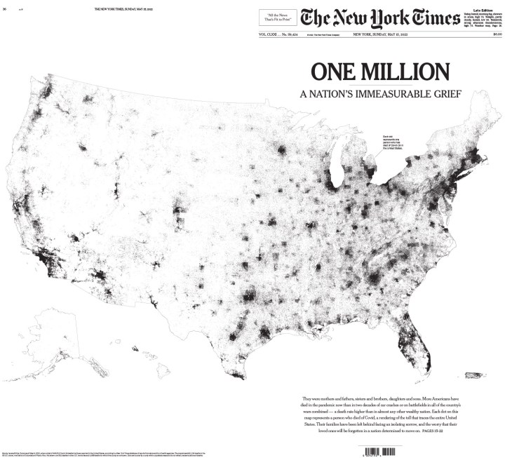
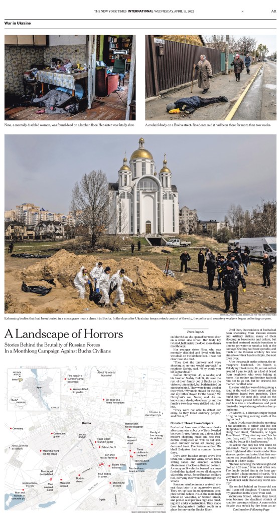
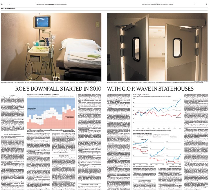
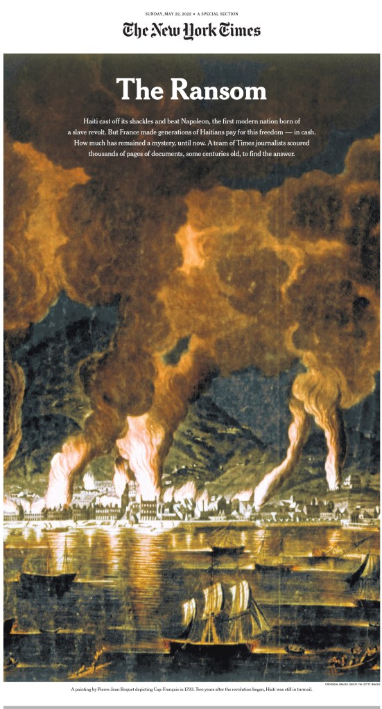
Here are some of the pages, and I’ll try not to have too much overlap with my previous posts, but there will need to be some, and I will start with one. This was just so extraordinary. So powerful, and all in black in white. Black and white and read all over. So classic newspaper, and just so smart, from concept to execution.
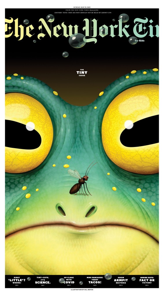
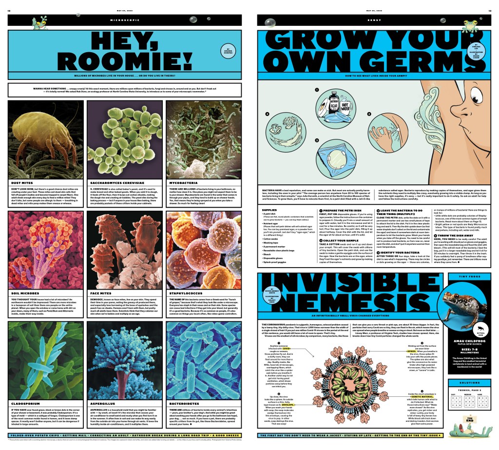
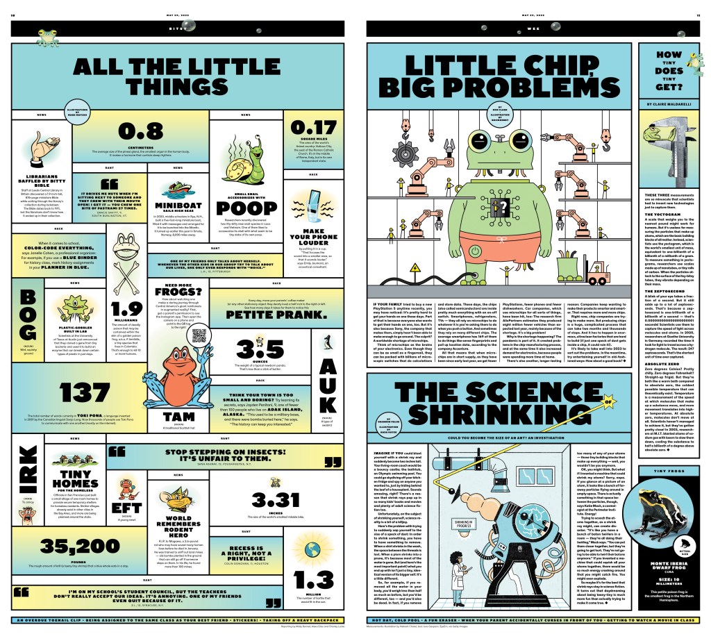
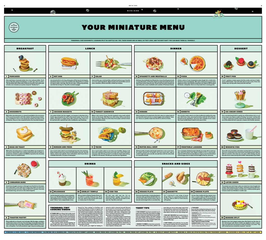
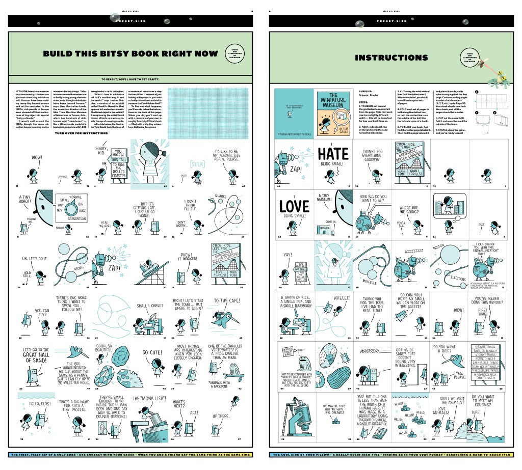
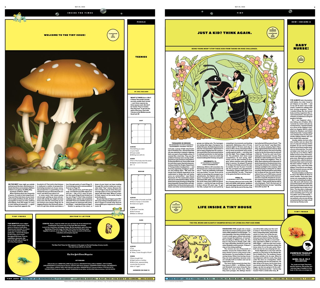
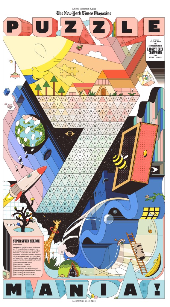
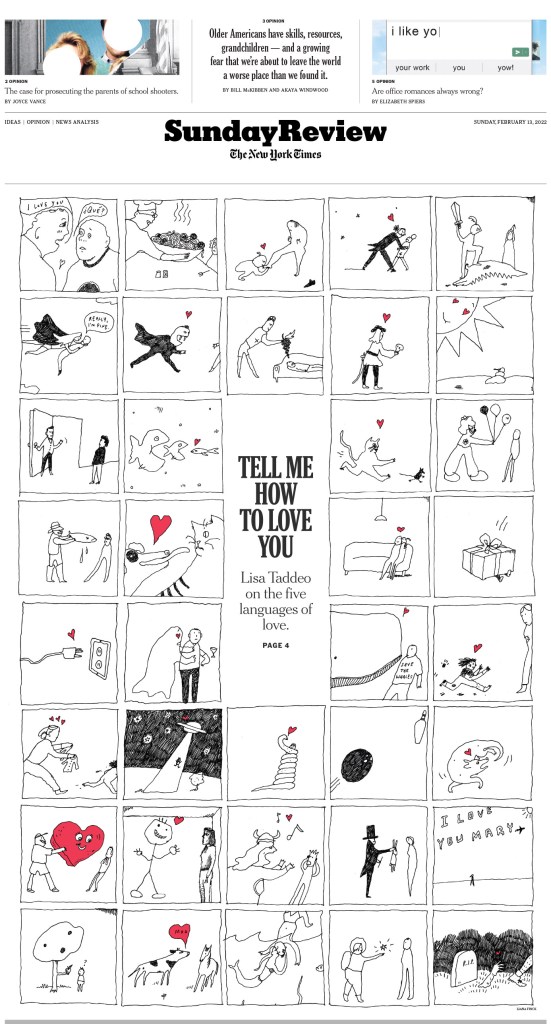
And the kids section. Every year it gets talked about probably more than any other page or section. This is just one of the many incredible samplings. It must take incredible resources to produce something like this, and it’s great to see a media organization willing to invest in this level of content. The illustration on the front below is by Bill Mayer, and it’s also used as my feature image for this post.
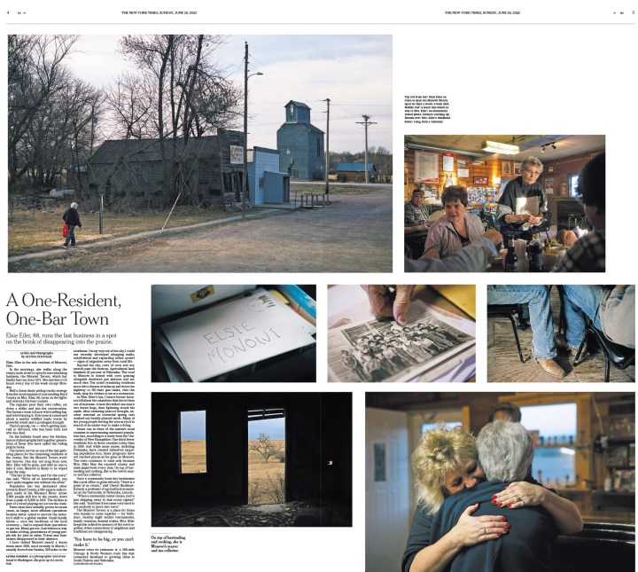
I will get back to the big splashy pages, but here is a selection of more classically designed newspaper pages, just text and photos. They are clean, informative and easy to follow. And also beautiful in their own way.
Here is a sample of a section that is both visually wonderful and very practical.
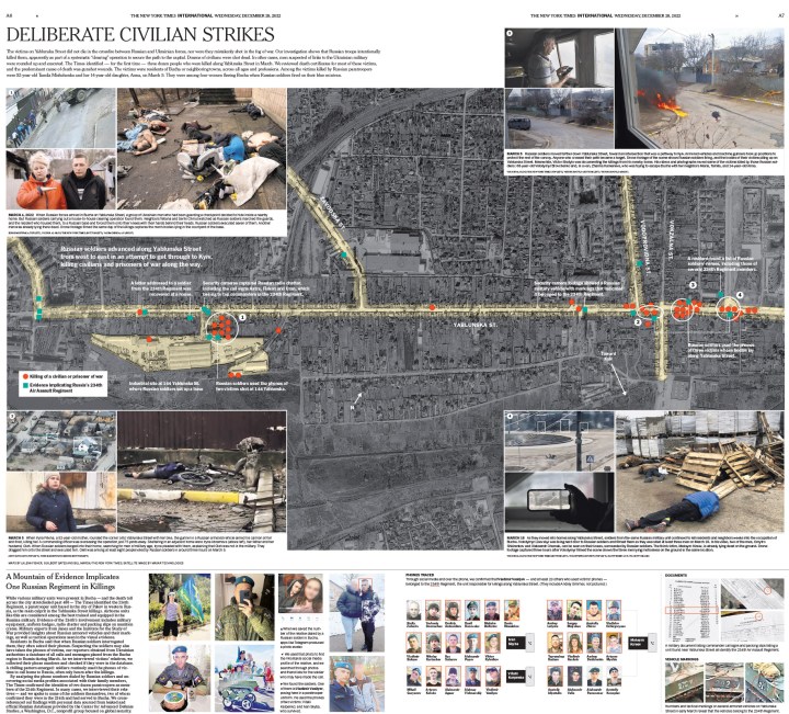
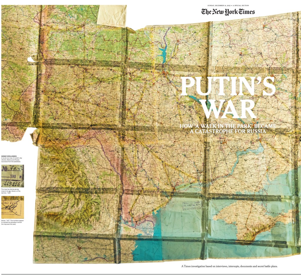
And back to big and splashy. When a New York Times designer gets some time to spend on something, do they ever blow it out of the water.
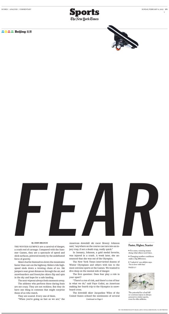
As I mentioned, The New York Times won 188 awards. So this sampling is a drop in the bucket. I will end it on this sports page, which got a lot of love from the judges. The use of white space here is doubly smart.
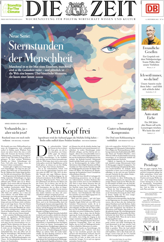
Back on top for a second year in a row is this paper described as almost too perfect. But not quite. It’s just perfect enough. Die Zeit so clean, so consistent. You can tell they pay attention to every detail, like how every line of text wrapping around a image looks. It must be evenly spaced and easily readable. Every drop cap and rule is considered. Every detail seems to be considered.
Here is what the judges said:
Die Zeit’s creativity and cleverness are consistently on display. From their larger typographic illustrations to the tiny illustrative details that adorn their initial caps, Die Zeit never misses an opportunity to delight. The juxtaposition of large amounts of text with judicious white space makes long form stories approachable. The typography, tight photo editing, concise information graphics and a controlled color palette represent an overall wisdom and restraint that allow visuals to shine.
First, a front page. It is elegant and consistent week to week.
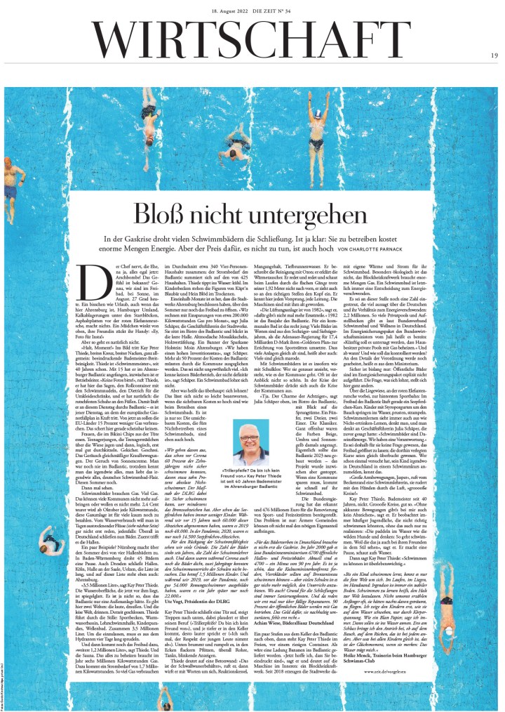
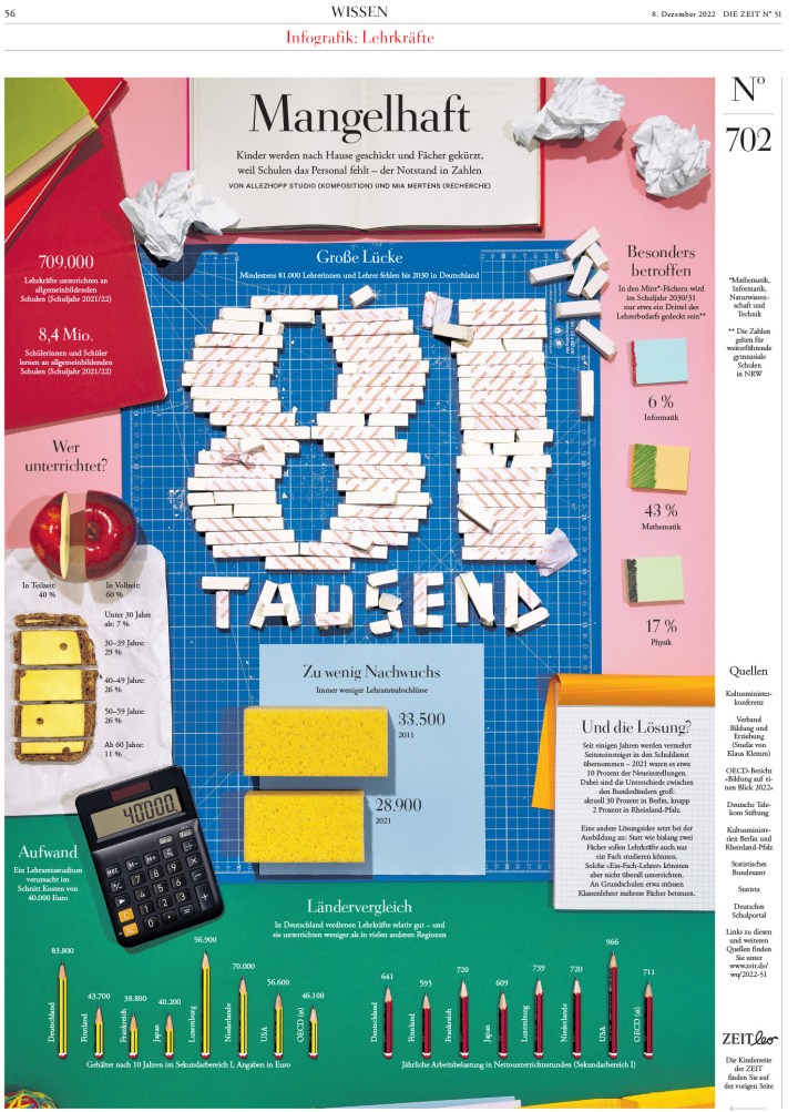
One great thing Die Zeit does, similar to The New York Times, is designing with images and text, rather than a large illustration takes up the entire page, leaving the creativity to the page designer rather than an illustrator. And unlike many newspapers, they can take a big block of text and make it look so good.
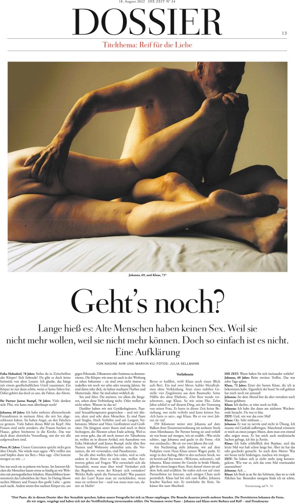
And here is the European side of things. They aren’t afraid to get spicy. The story, as you might be able to tell without being able to read the text, is about older people and sex.
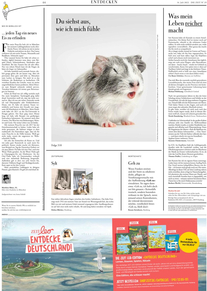
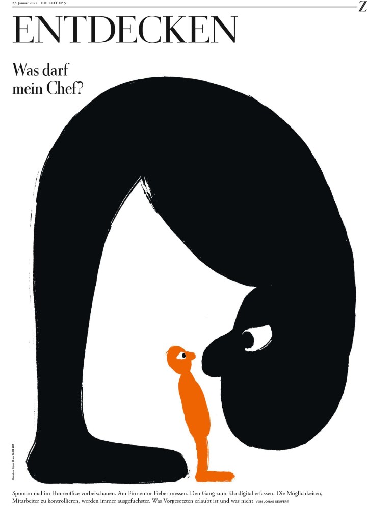
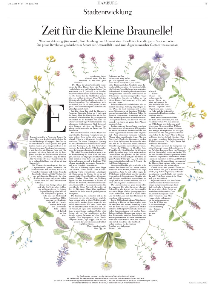
Before jumping into the pages that surprise, because despite being very consistent with their crisp, clean design, they also surprise, here is a basic inside page. It’s clean, the art is funny and eye-catching, and also well considered.
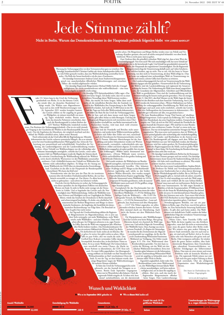
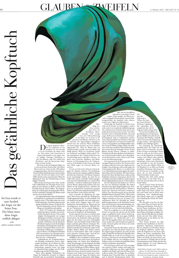
And the surprise. Die Zeit can get very bold in their design. This first page, especially, is so bold. And the 3D effect is unreal. Or … very real! But all of these pages are just stunning.
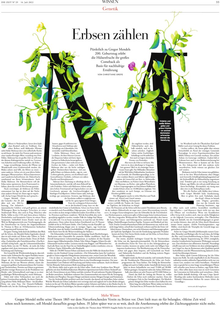
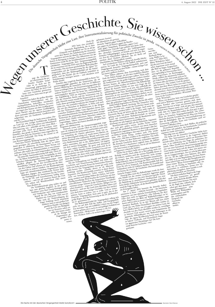
And as I have mentioned, nobody uses text in/as design like Die Zeit. Many try this, many fail, as the body text is awkwardly spaced or hard to read. But Die Zeit does it so well so often. These pages are some of my favourite from this publication. I have always loved trying to use text as design, and, in fact, my first SND award was for a page that did just that.
All of the entrants had to submit five full editions, and I was also able to look single page entries for this post, so there were hundreds of pages to go through. I could show so many more, from basic but compelling inside pages to other exceptional covers and graphics. But I will leave it here. Congrats to The New York Times and Die Zeit, as well as all those who entered. Every publication that put itself out there to be judged very critically did so much very well.