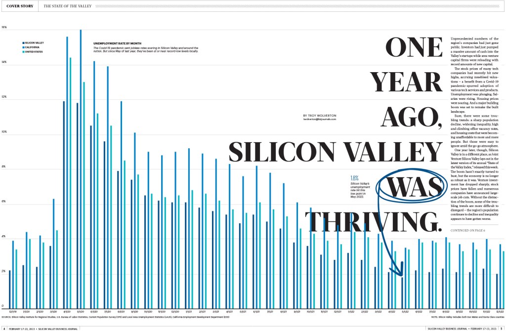
U.S. President Joe Biden took himself out of the 2024 presidential election against Donald Trump, after weeks of calls to step down. After what many have called a brutal election debate performance, and many Democratic allies calling him out, he finally ended his run for a second term. It’s unprecedented in U.S. history. And it’s a hugely consequential election, in a time when America is deeply divided. So it was a resignation played on newspaper front pages around the world.
Most gave it the gravity is deserved. It’s a huge shakeup in what is probably still the most powerful country in the world (for how long remains to be seen and could depend on the outcome of this election). Some had some fun.
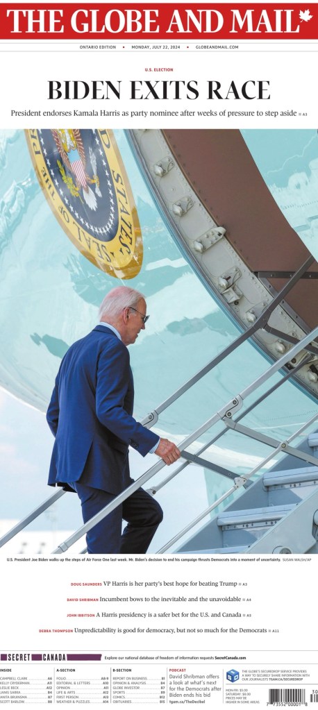
Here are 15 front pages. Most are from the U.S., but it got big play on front pages all over the world. It’s beyond the butterfly effect. What happens in the U.S. will have huge consequences everywhere, even with its closest ally and neighbour, Canada. So I will start with The Globe and Mail, before jumping into American papers.
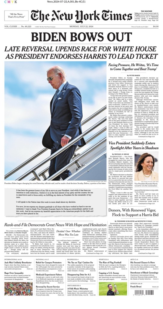
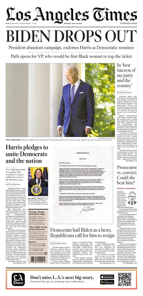
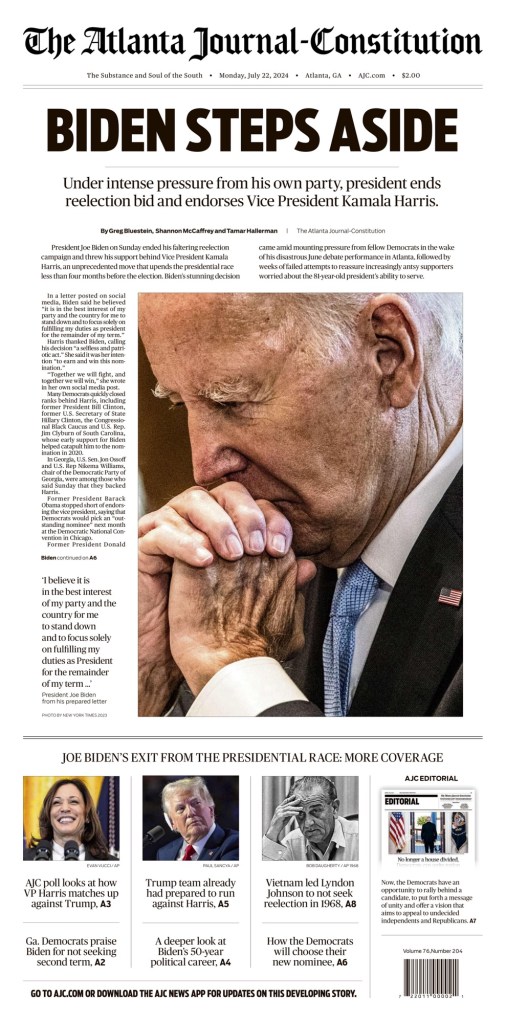
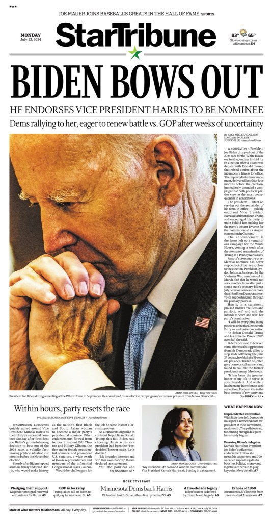
And here is a selection from the U.S., including some of the biggest, starting with The New York Times, Los Angeles Times, and the Minneapolis Star-Tribune and Atlanta Journal-Constitution, which as been all over big political coverage, with some of the finest front pages when there are big stories. AJC and the Star Tribune also used the same photo.
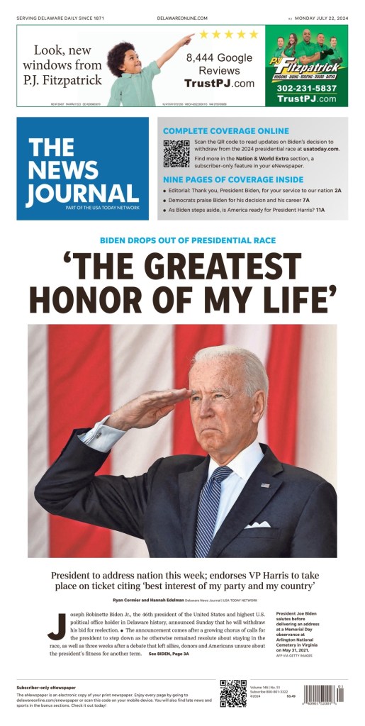
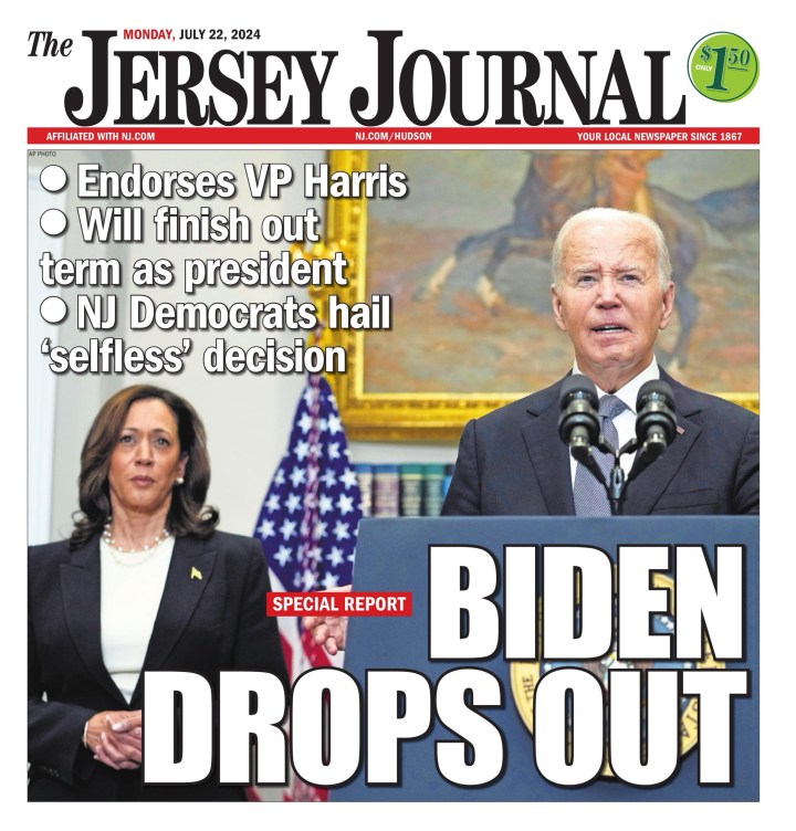
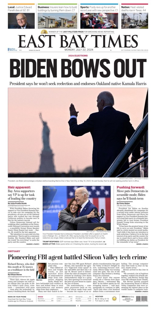
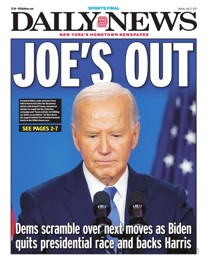
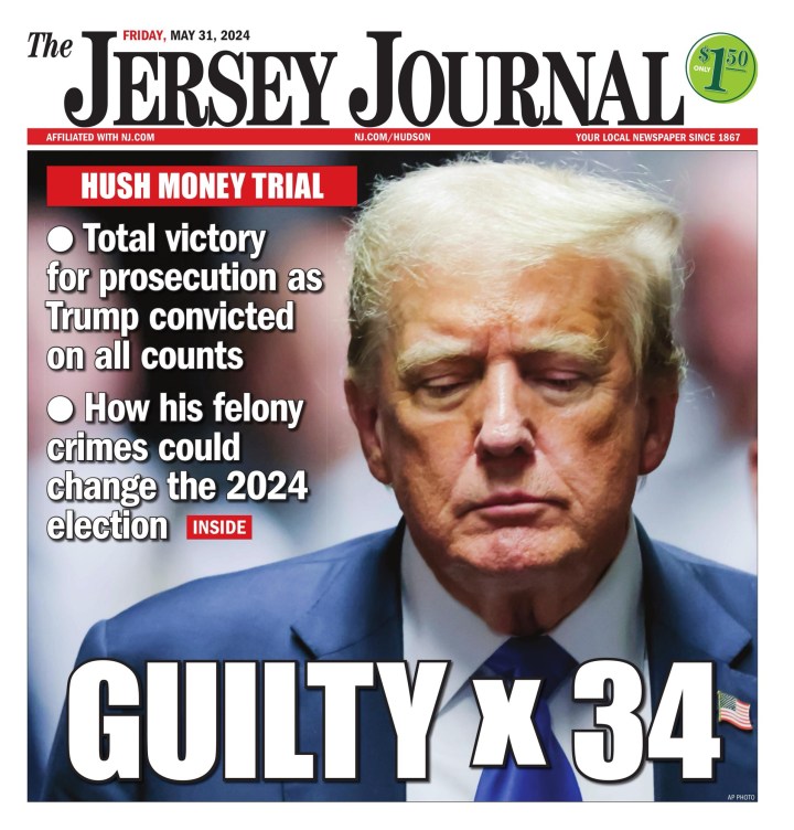
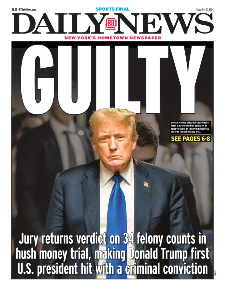
There were a lot of strong photo choices. Here are a few more from the U.S., including The News Journal (Delaware), The Jersey Journal (New Jersey), East Bay Times (California) and Daily News (New York).
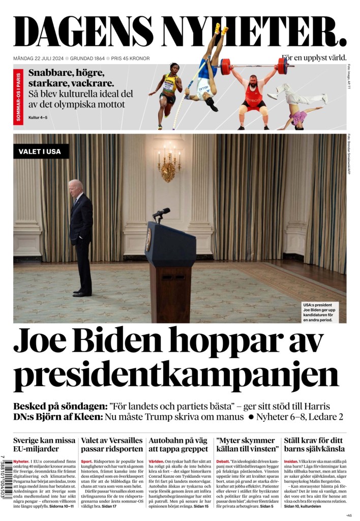
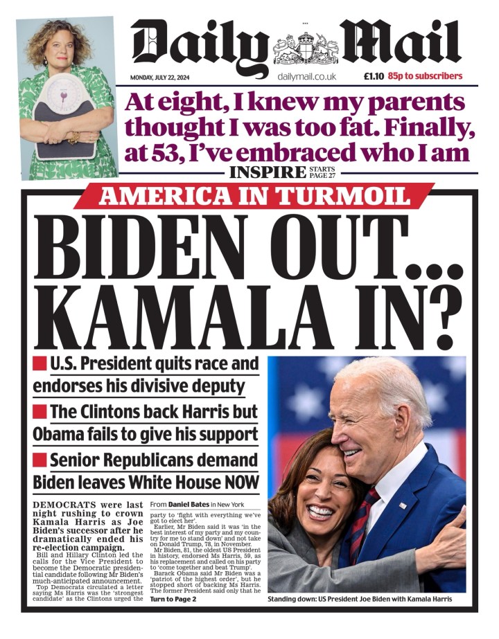
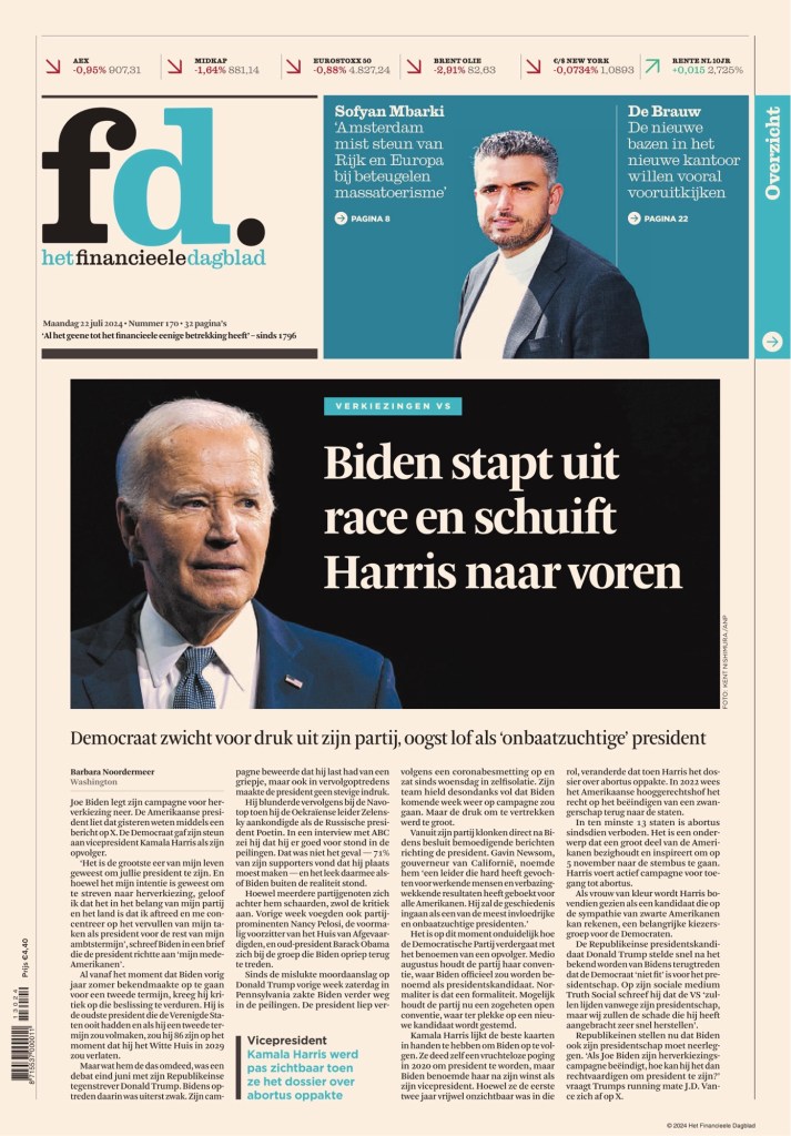
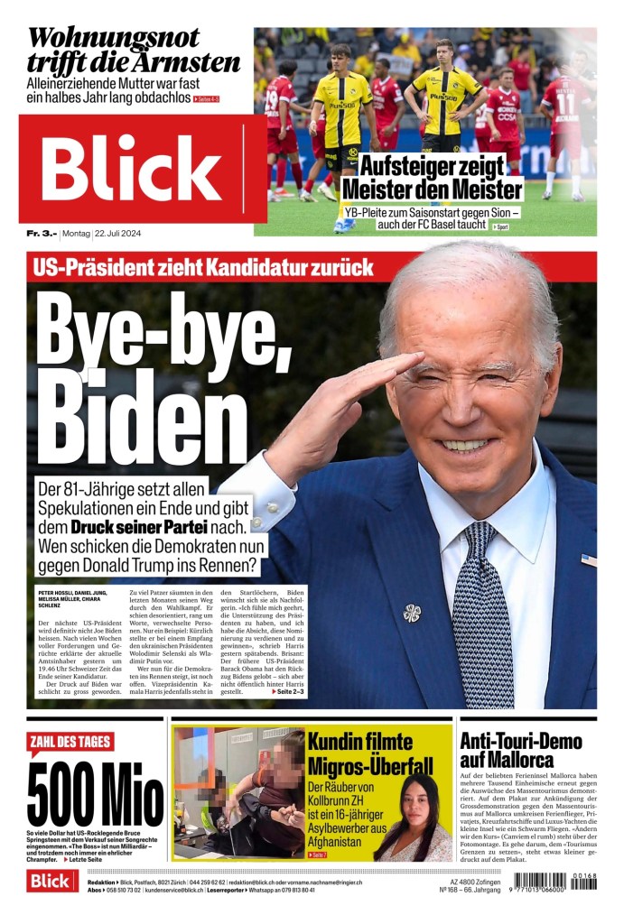
But as mentioned, it wasn’t isolated to American newspaper front pages. Here are a number of international papers that gave the story a big splash. De Morgen (Belgium), Dagens Nyheter (Sweden), Daily Mail (U.K.), Het Financieele Dagblad (Netherlands) and Blick (Switzerland).
I can be pretty certain this American election cycle with provide more opportunities for big stories and big splashes on the front page. With U.S. Vice President Kamala Harris being the new likely democratic nominee, there are some big possible stories, with the biggest being the possibility of the U.S.’s first female president. Stay tuned to see how newspapers handle the next few months!
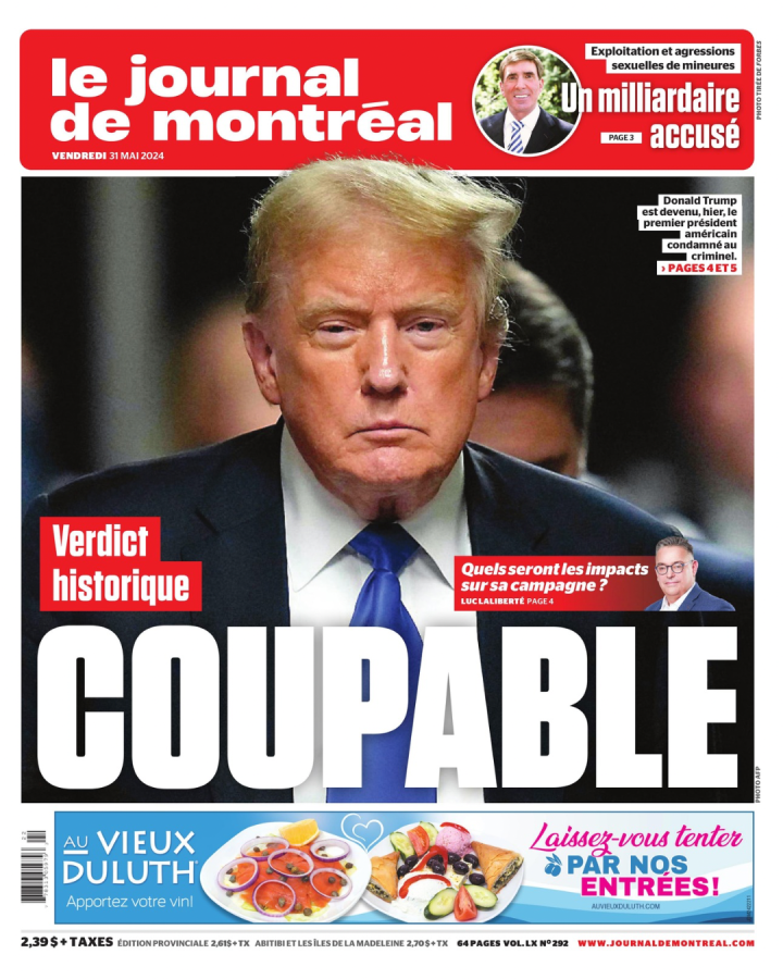
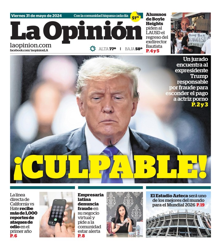
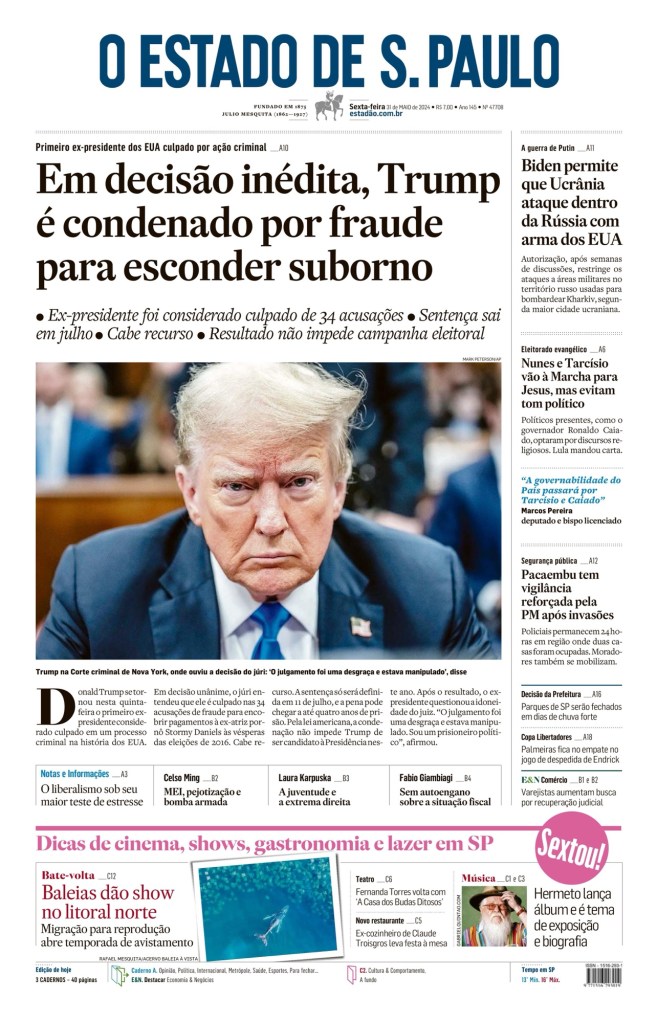
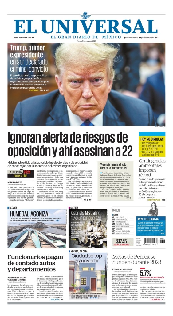
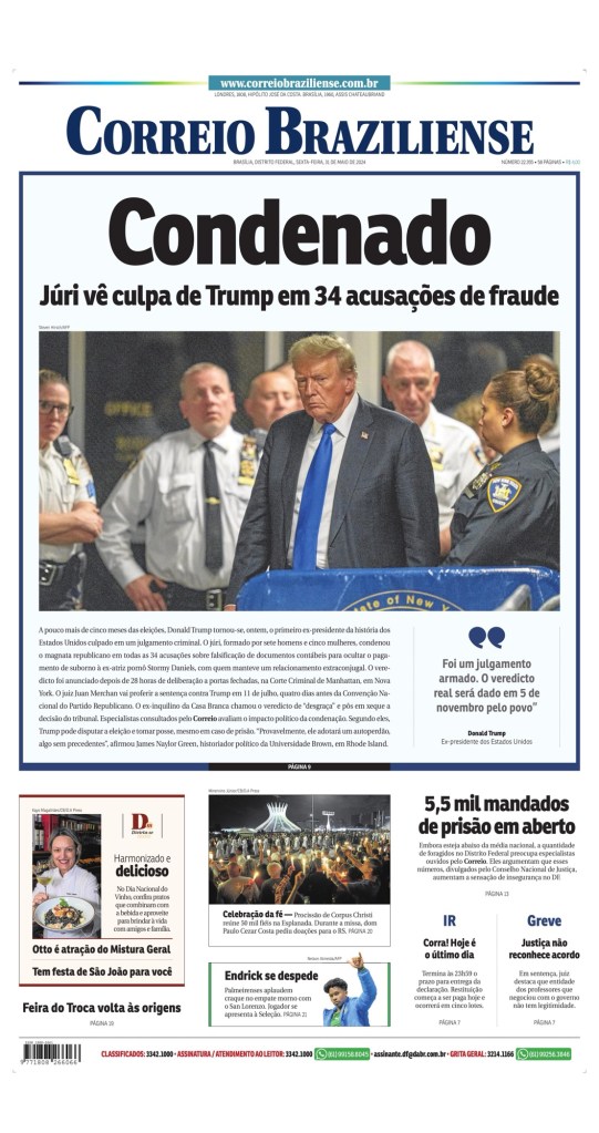
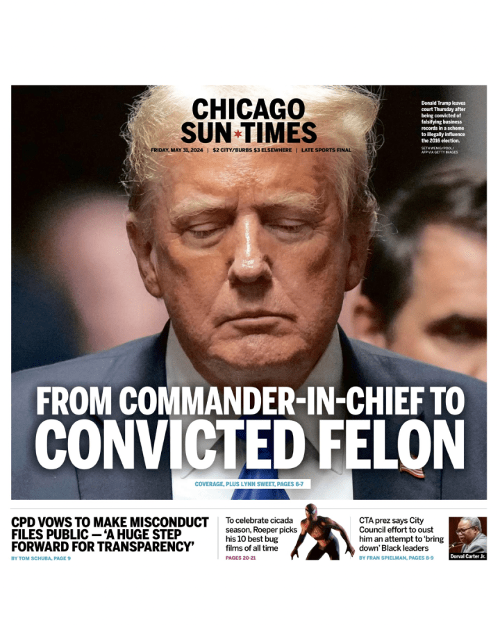
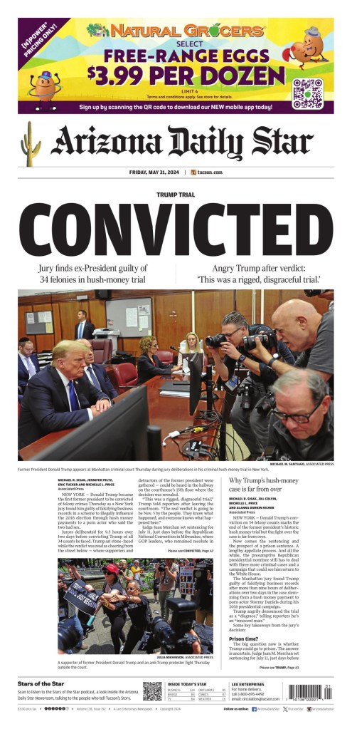
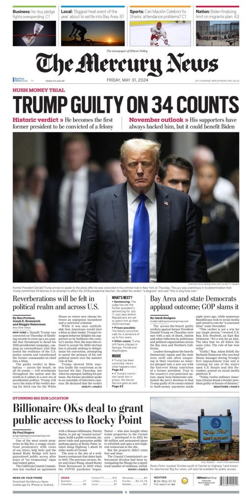
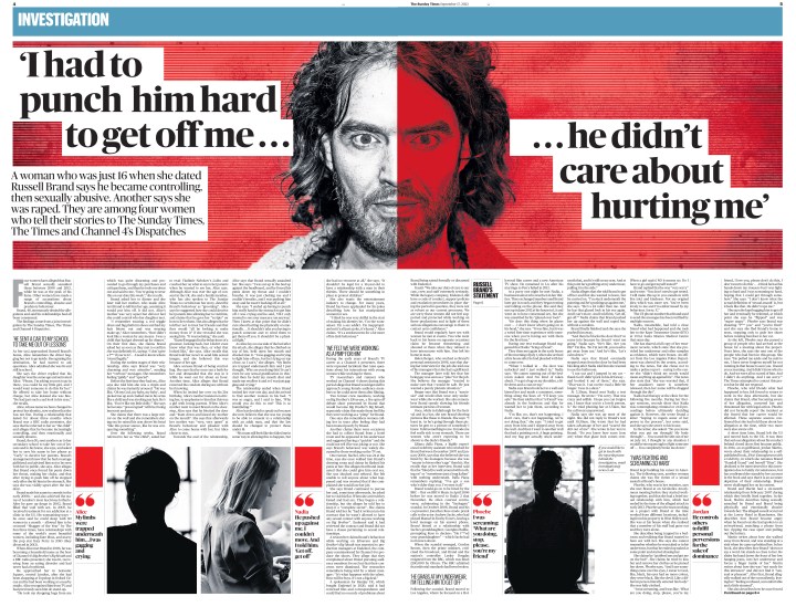
Guilty. Condenado. Coupable. No matter how you say, the guilty verdict against former U.S. president Donald Trump was splashed all over newspaper front pages around the world (depending on the time zone, as it came too late for some). With this Trump becomes the first U.S. president to be convicted of a felony crime. On days with big news, I like to look at how different newspapers treat the news from a design perspective, which includes headlines, picture play, and so on.
This the second post I’ve done on Trump’s legal issues, and it likely won’t be the last Trump post as the U.S. election nears. If I were a betting man, I’d predict there could be some Trump wins front pages come November. But I will try not to do too much on Trump, as I know that has long been a criticism of the media: too much coverage.
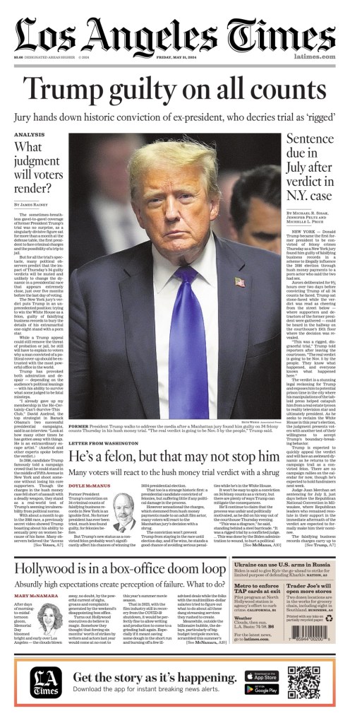
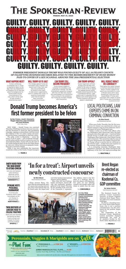
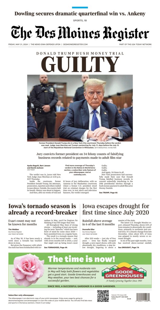
Today there were dozens of front pages that gave Trump huge play. I have selected 20, for various reasons. Some that look the same, some very different, different languages and regions. I will start with two of the bigger U.S. papers, The New York Times and Los Angeles Times.
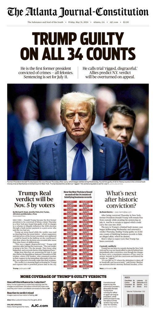
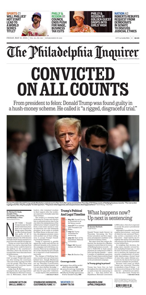
The next two are two of my favourites from a design perspective. Classic big news front pages. Big headlines and photos, some explainers. They are The Atlanta Journal-Constitution and The Philadelphia Inquirer.
Next up, a selection of papers in other languages, from other parts of the world.
Here are a few U.S. tabloids.
Highlighting the Tampa Bay Times for use of the largest headline on the day, at least in broadsheet.
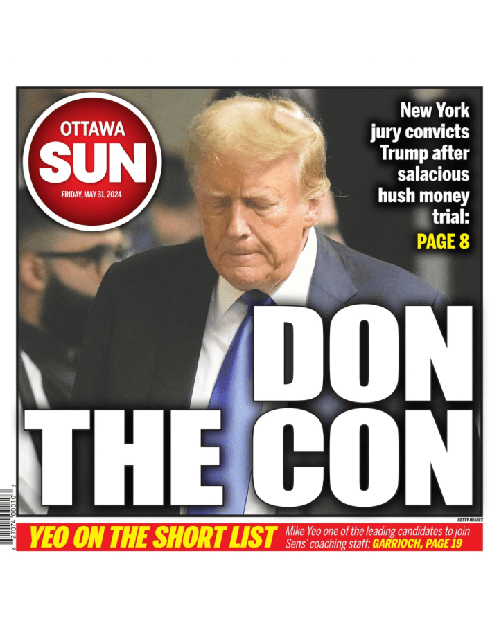
And to wrap it up, a slideshow, starting with another Canadian paper, the Ottawa Sun, giving the story classic tabloid treatment.
World’s best designed newspaper. One could argue as the newspaper world contracts, the title of world’s best designed newspaper means less. I will argue the contrary. As print revenue is in decline, anyone in the newspaper world has heard about cuts or newspaper closures. There are fewer resources available. Yet some newspapers refuse to take their foot off the gas pedal. Some newspapers are still prioritizing the print reader experience. And in this post, I salute them.
For the third year in a row I have been fortunate enough to be a facilitator on the World’s Best Designed Newspaper team at the Society for News Design’s annual creative competition. This year’s was its 45th. My role is to help the judges with anything they need. I always feel so privileged to hear some of the world’s best designers debate what newspaper (or newspapers) should be declared World’s Best.
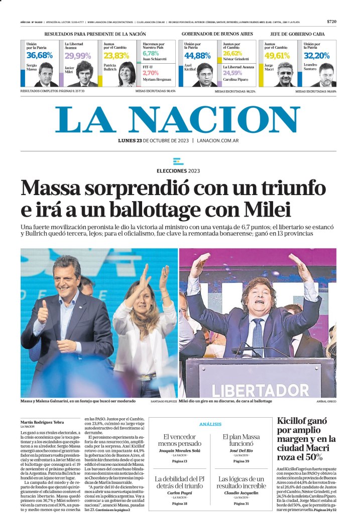
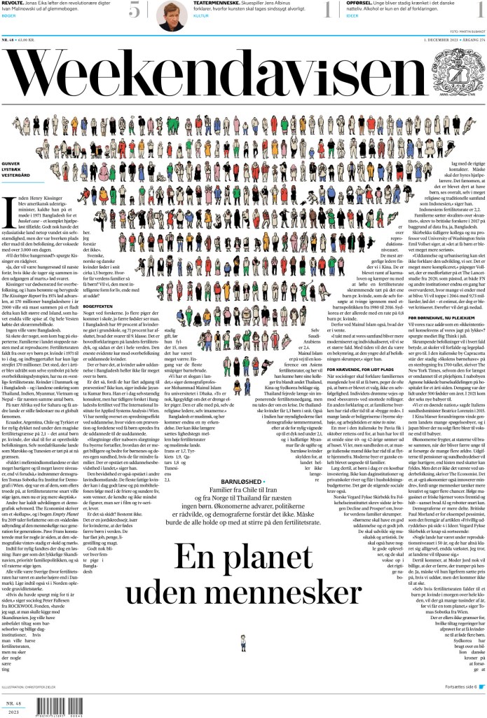
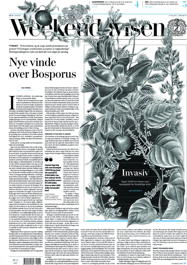
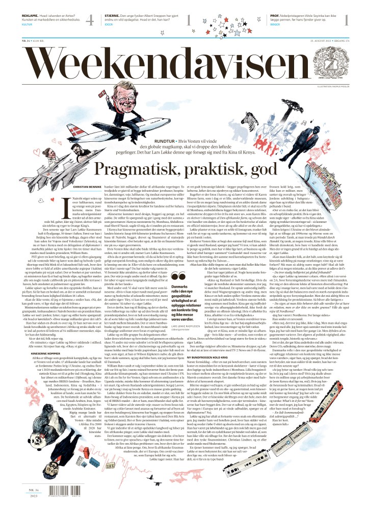
After much back and forth, and some fascinating discussions, the judges pared the entry pool down to four finalists. This year, none of the finalists were from North America. They were: Die Zeit, La Nacion, Politiken and Weekendavisen.
Before I get to the winner (I will talk about and show pages from all finalists), I want to touch on the judging panel at SND45. The panel included Vanessa Wyse (Sudio Wyse), Wayne Kamdoi (The New York Times), Raju Narisetti (McKinsey & Company) and Kris Viesselman (consultant). Below is a little more about them, some taken from their SND bios. There is more to say about all of them as they have had and continue to have impressive careers.
Vanessa Wyse is the founder and creative director of Studio Wyse in Toronto. She has over 20 years’ experience working with some of the worlds’ largest media brands and institutions including Pinterest, The Globe and Mail, Fairfax Media, The University of Toronto and Air Canada. The Grid, a smaller but mighty now shuttered Canadian weekly publication, where she was the founding creative director, was the first publication to win three consecutive World’s Best Designed Newspaper awards.
Wayne Kamidoi is an art director for The New York Times, focusing on enterprise in its print hub. He was an art director in Sports for more than 20 years after joining The Times from the Detroit Free Press. He is also one of the few newspaper designers I’ve seen people come up to and talk about feeling lucky to be in their presence. He was a rock star at SND45.
Raju Narisetti is leader of global publishing at McKinsey & Company. Over a 35-year career, he has created, reimagined and managed major media organizations in the U.S., Europe and Asia. Raju spent 14 years at The Wall Street Journal where he went from a reporting intern to editor of WSJ Europe, and later managing editor, digital, of the global WSJ. Also, Raju has a Wikipedia entry, so that’s fun!
Kris Viesselman is a creative director, editor, designer and ring leader. She has been a top editor and top creative at a number of media companies and has worked as a consultant with a wide range of clients. Kris is a past president of SND and has consulted and presented in five continents.
Before I get to what judges were looking for a World’s Best Designed Newspaper, I feel like we need to see some pages! I will start with the runners up, which means I need to announce the winners. This year the judges selected two newspapers as World’s Best Designed. They are … Die Zeit (for the third year in a row!) and Weekendavisen (the second win in four years!). Which leaves us with La Nacion and Politiken. I will start with La Nacion, and the judges’ statement.
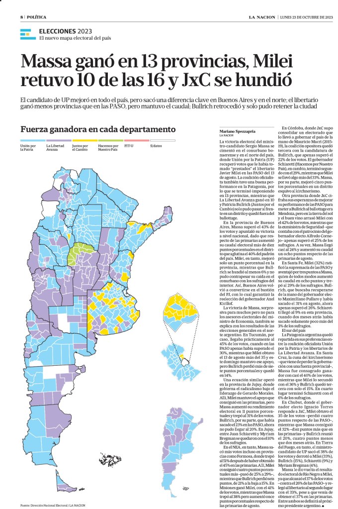
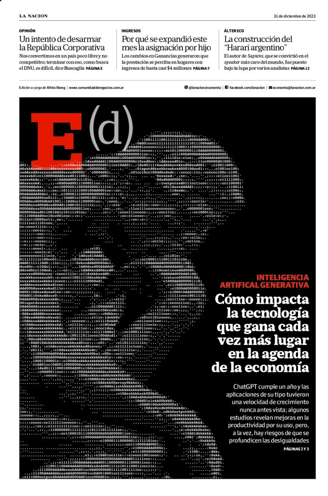
La Nacion
“La Nacion is a terrific example of how to build a 50- to 80-page daily newspaper, one that offers a cohesive reading experience with gravitas and dynamism, even on some of the biggest breaking news days. Its elegant information graphics, powerful blend of illustrations and robust news photography, coupled with consistently smart selection of typefaces poured into organic shapes, is sophisticated yet highly accessible, and makes for a very satisfying, complete offering.”
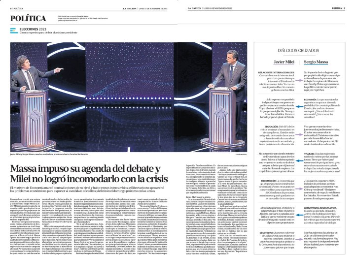
One of the things I loved about La Nacion was its inside spreads.
And a couple more, where they use nice graphics or photos to drive the pages.
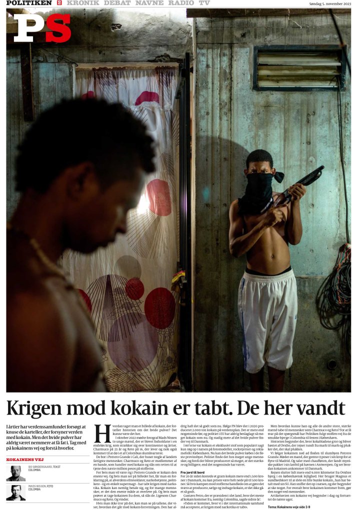
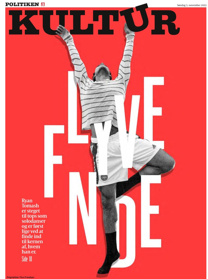
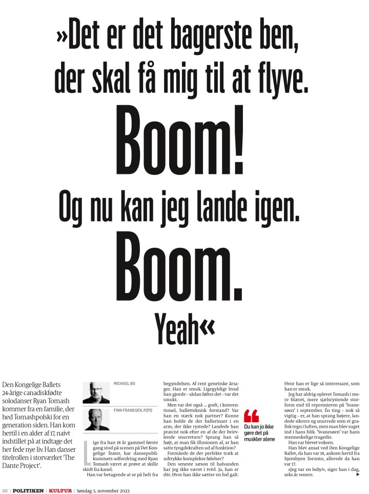
Politiken
“Politiken’s dynamic design conveys a sense of urgency, while maintaining its overall elegance. Distinctive visual content is the foundation for storytelling that runs the spectrum from sober to edgy to delightful. Despite this range of tones, a cohesive report emerges, propelled by carefully selected — and deployed — typefaces and navigational devices. The result is a curated publication that is iconically Politiken — at once powerful, important and beautiful.”
I will start with a variety of pages, all done differently: big photo, nice illustration, typography. They use such a variety of design techniques, but still remain clearly Politiken. Anyone who follows my Instagram will know I am a fan of Politiken.
And a few more. I have shared more from both these publications in previous posts.
And now for the winners. Here is what the judges said they were looking for.
“We were seeking smart, lively publications that were cohesively designed. The ones that stood out had a clear vision and brand identity that was reflected in their typography and signature visuals. They had a strong sense of place and a clear focus on their target audiences. While we valued consistency, we were delighted to see surprises — places where extra planning, collaboration and innovative ideation was apparent. Maximizing the strengths of print presentation helped some rise above the rest. In our increasingly digital-first world, we applauded print’s ability to offer readers thoughtfully curated content that is both unique and rewarding.”
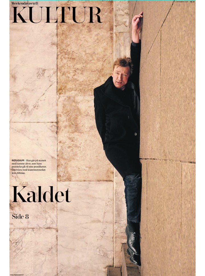
Weekendavisen
“Weekendavisen is a joy to read, with visual impact in all of the right places. The offspring of one of the oldest newspapers in the world, Berlinske Tidende, Weekendavisen offers its readers a contemporary feel, while adhering to its traditional roots. From front to back, Weekendavisen is a cohesive experience that is serious, evocative, innovative and playful. Its designers are not afraid to take risks. Restraint is the key to its success — nothing seems forced, always executed with purpose. Its many strengths include elegant typography, a carefully curated and restrained color palette, on-point illustrations and a sense of whimsy. The icing on the cake: Solve the puzzles on a smartly packaged spread.”
One of the similarities between the two winners is that they aren’t afraid to take chances. They make some very bold design choices, but one has to ask, are they taking chances if they succeed so often? Or do they just know it’s going to be great? These first to covers. Mind blown.
Both also use typography so well, in ways other papers might be afraid to try. You see a lot of that with Die Zeit, but here are a couple from Weekendavisen.
Here is an example of how to make a lot of text beautiful. I love this spread.
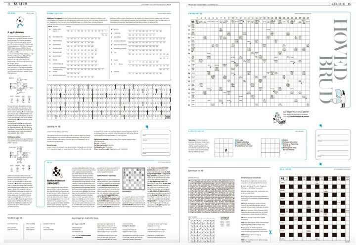
And of course the puzzles the judges loved so much! Image a puzzles pages being cited as a reason for a paper being chosen world’s best designed.
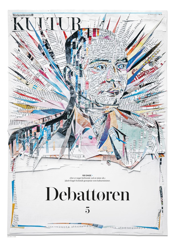
This is very much driven by the illustration, but this page caught my eye and I kept coming back to it. It’s one of my faves from Weekendavisen. A special shout out the illustrator, as I have used a portion of this as my feature image for this post.
And here are a few more. You can see such variety in the pages, but still a strong design voice shining through.
Screenshot
Screenshot
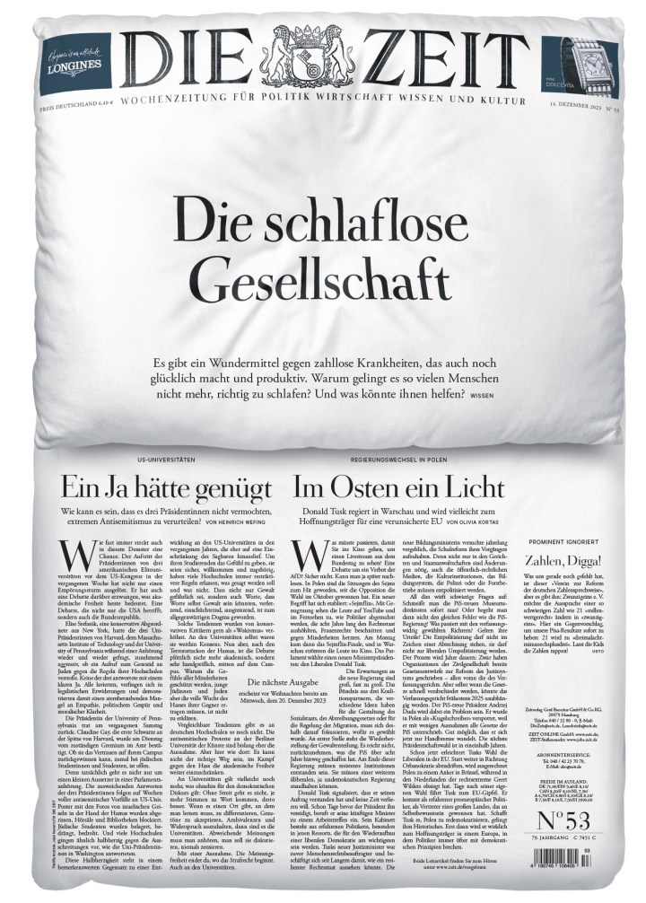
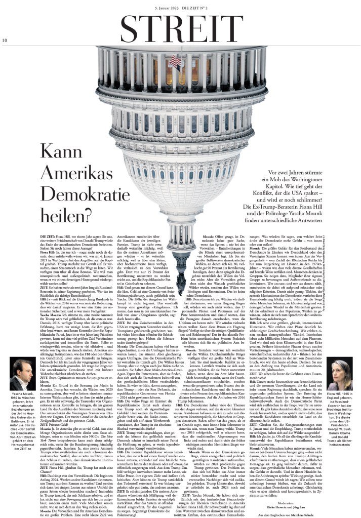
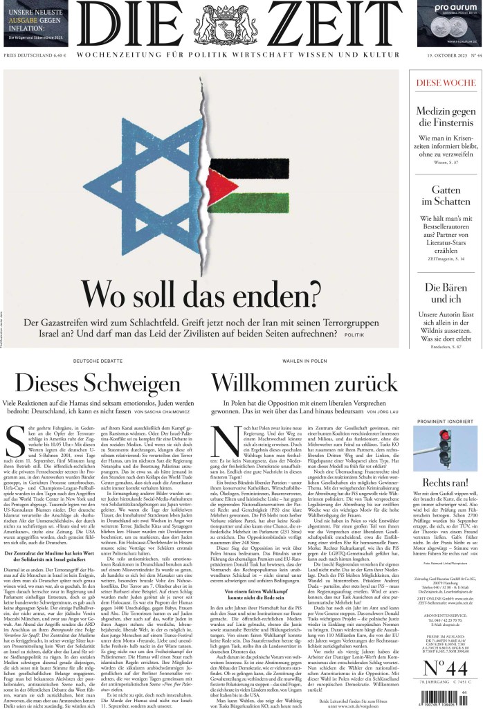
Die Zeit
Here is what the judges said about three-peat champion Die Zeit.
“This is print storytelling at its very best. Every move made by the team at Die Zeit is rooted in intentional decision-making, restraint and surprise. Die Zeit continues to captivate by balancing long-form journalism with exceptionally smart illustrations, impeccable photo editing and beautifully placed typographic touches. Each page reveals subtle, layered details, as Die Zeit’s talented team surfaces delightfully subtle design nuances that engage a busy reader. The real superstar of the newspaper is what isn’t immediately apparent — the strategic use of white space to amplify the content.”
This is a front page. So cool, what else can I say? It’s so smart. Great concept and well executed.
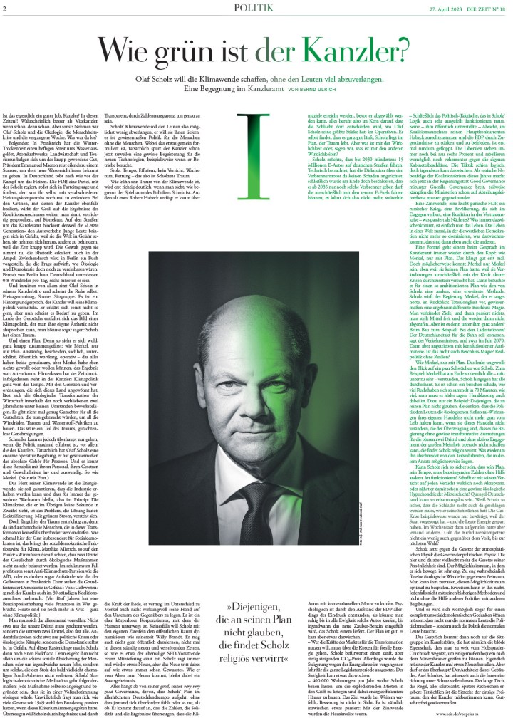
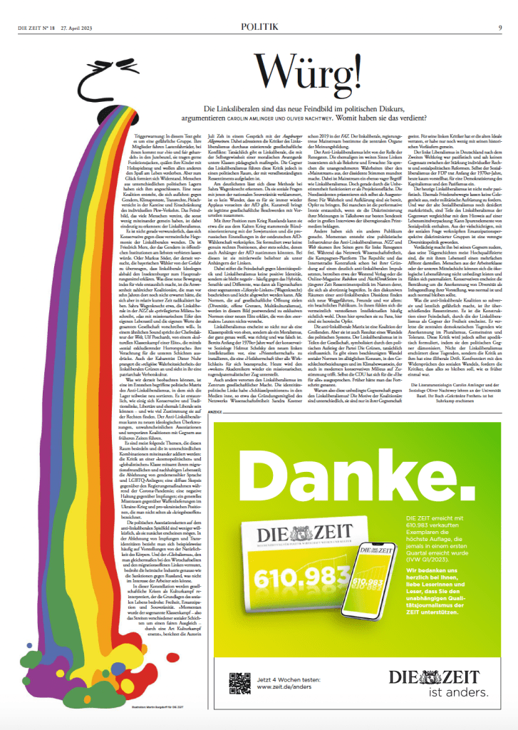
A smart use of the image and the play of the typography in the body copy make this page hard to look away from. It has a ton of copy. But it’s striking.
Nobody does bold and smart typography better than Die Zeit, in my opinion, and here are several examples of it.
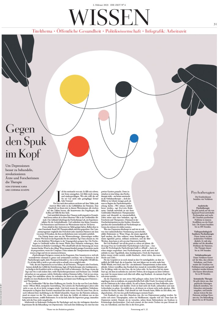
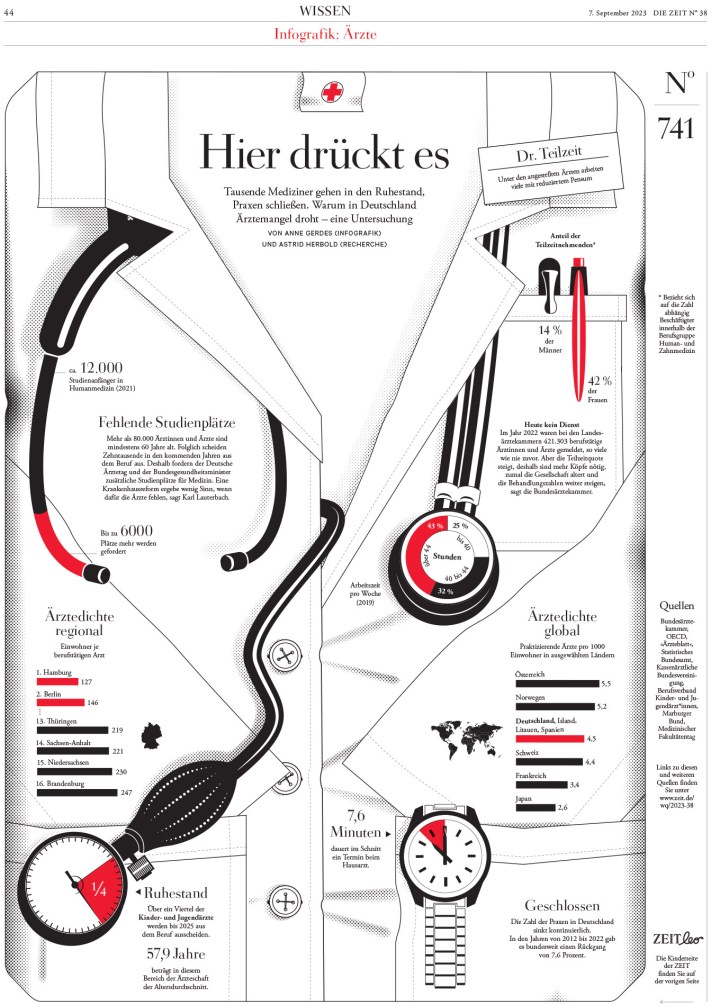
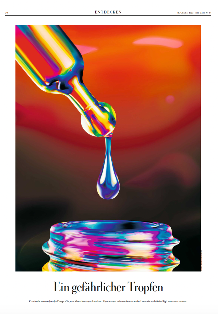
This is such a strong infographic page.
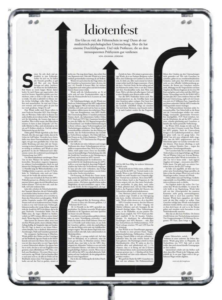
This page does so much well. Not only does it have a strong illustration, it doesn’t rely solely on that to create a compelling package, as we often see. There is a lot of page design going on to complement the illustration. Brilliant.
And that’s another year of SND in the books. Again, it was a great privilege to be a part of it. I always find it so inspiring, both looking at all the incredible submissions, including all those that didn’t win, but also listening to the judges.
When it comes to the best newspaper designs in the world, the United States is always a leader. And at the Society for News Design’s 45th creative competition, that held true again. The U.S. has some incredibly strong contenders, usually led by The New York Times. Funny thing about the Times. If you have only ever seen the front page, it might surprise you to know they have mind-blowing, colourful, art-driven designs throughout. The often-not-so-grey lady led the competition again this year, with well over 150 awards, including nine gold medals (!!), which tied its gold total from last year.
Some of the other big players in terms of awards were the Star Tribune (Minneapolis), which finished second overall this year (!), The Washington Post and The Wall Street Journal. There are always solid entries from the Los Angeles Times and American City Business Journals as well.
Which leads me to my annual tradition before I get into the pages from the big winners. At SND’s competition, there are awards of excellence (three of five judges must agree an entry is truly excellent), silver medals (four of five judges must agree the work rises above excellence and stands above other AoEs), gold medals (all five judges must agree it stands out among silver winners and that it is nearly impossible to find a flaw), Best in Show (all golds can compete for this honour, and 75 per cent of judges agree it’s worthy), World’s Best Designed Newspaper (more on this in my next post) and finally Judge’s Special Recognition. This is for work that is outstanding in a particular respect not necessarily singled out in other areas of the competition.
This year I was again honoured to be a facilitator on the World’s Best team. As facilitator, I have no sway on the awards, nor can I participate in discussions. And let me tell you, it’s not easy as I have opinions! Which is why I created the Covers in a Dangerous Time Facilitator’s Special Recognition award!
Facilitator’s Special Recognition
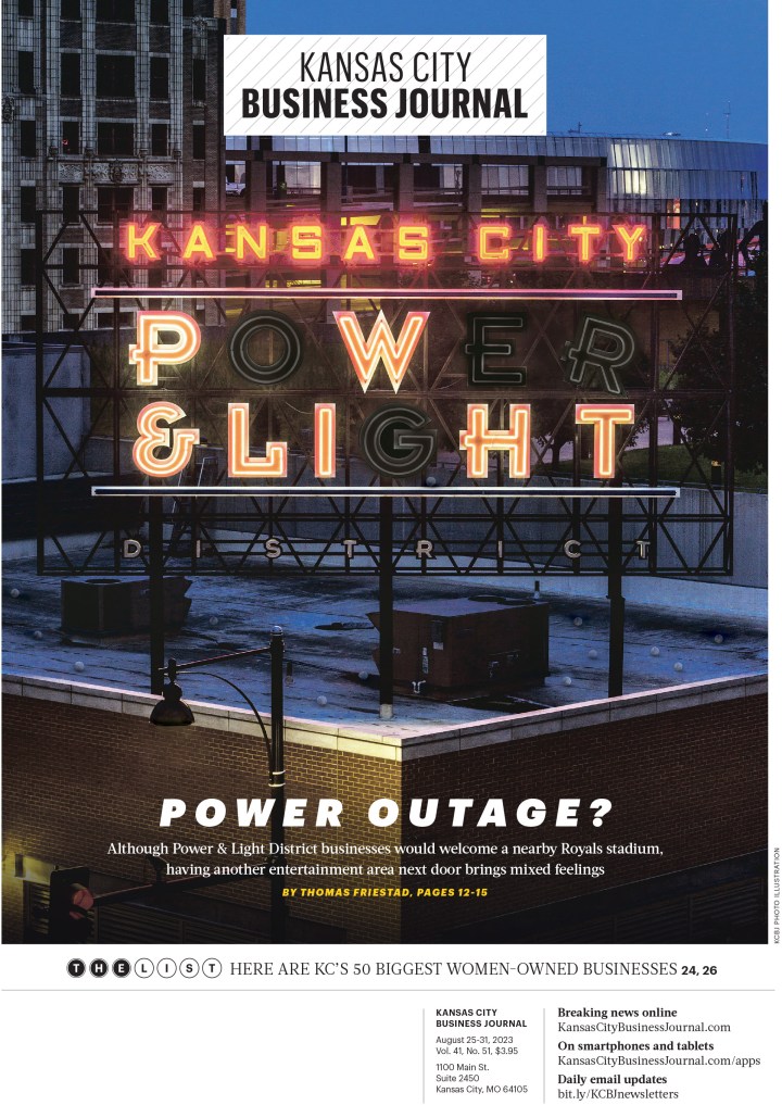
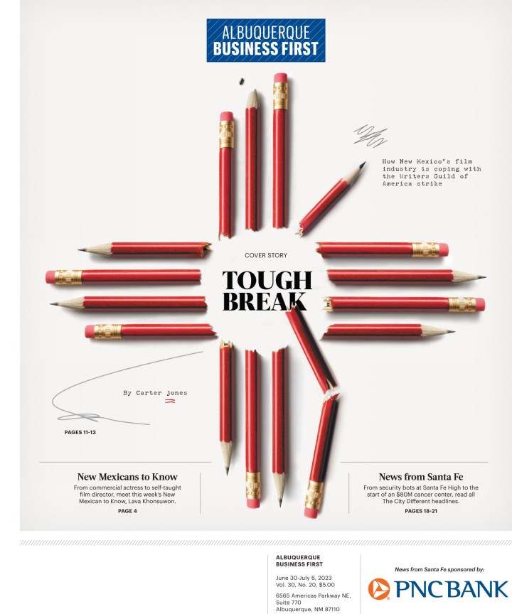
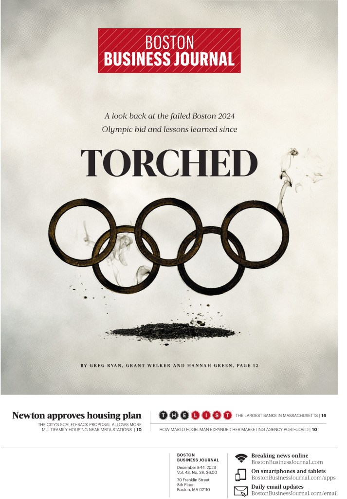
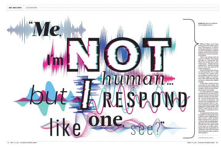
This year there is a tie! As the title of the this site implies, I tend to focus on covers (front pages). However, there were two non-related cover entries that stood out for me this year. The first is American City Business Journal inside spreads. They are stunning. Such a strong use of brilliant art/illustrations and beautiful page design. Here are a few.
A bar chart winning awards? Yes! Thanks to a great design overall.
And then there is this Washington Post headline. It just to happens to be on a wonderfully designed and conceptualized page, but the headline. I feel like the page was decided on after someone came up with this headline. As someone who has always been on both the design and editing sides of things, something that mixes both is going to catch my attention.
And now for some more pages, starting with the big winners, but please keep reading/viewing, or even just scroll down to look at some of the pages from those that didn’t finish the top 10 or so, but still produced some brilliant work. First, the always mighty New York Times.
The New York Times
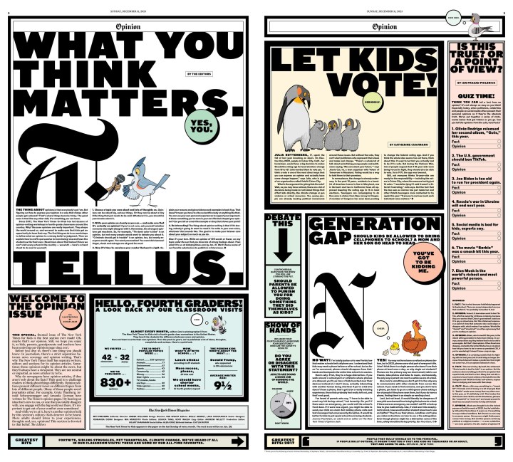
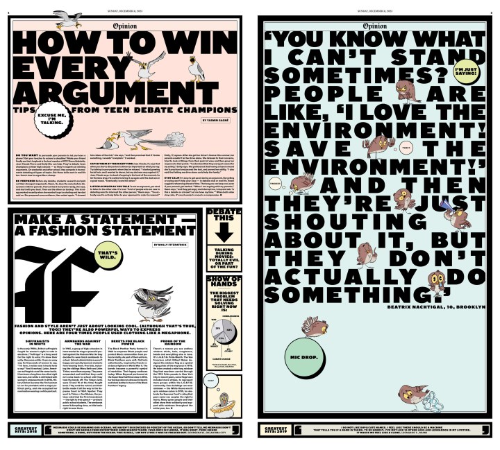
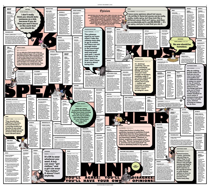
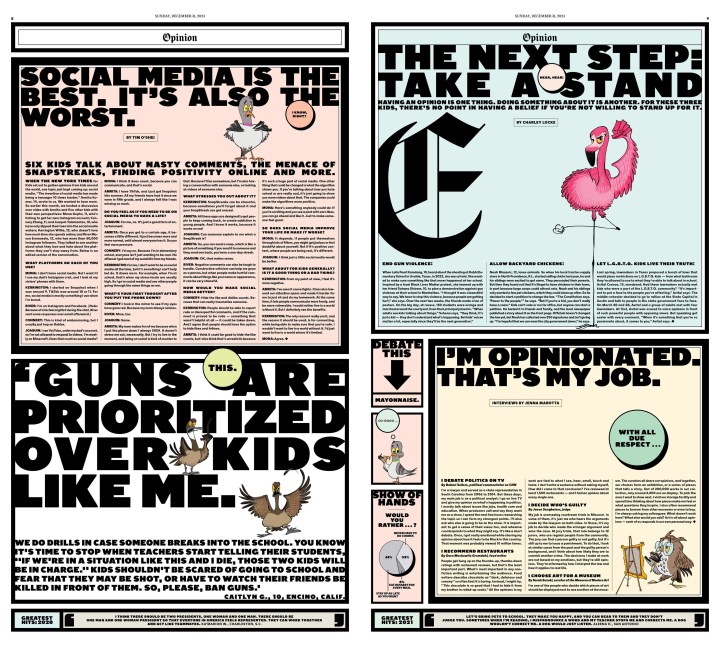
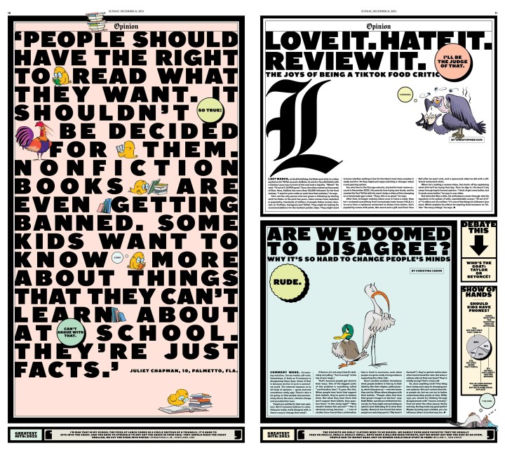
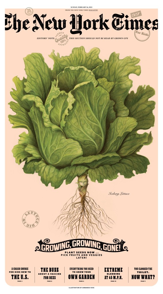
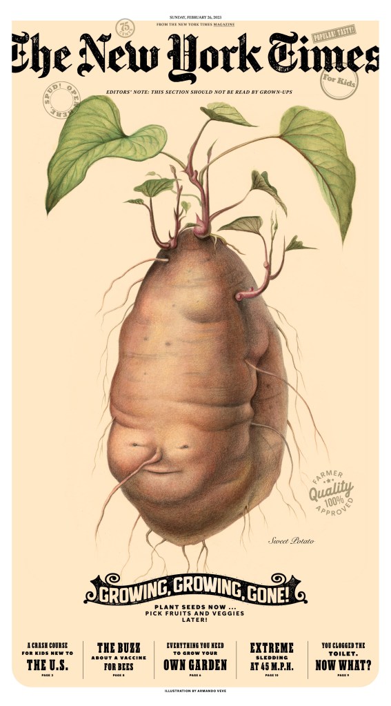
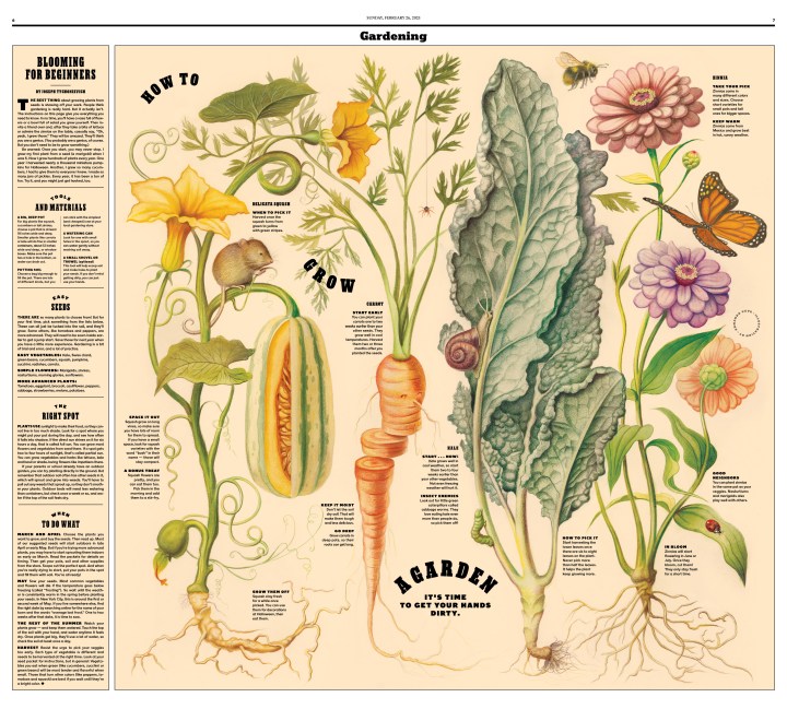
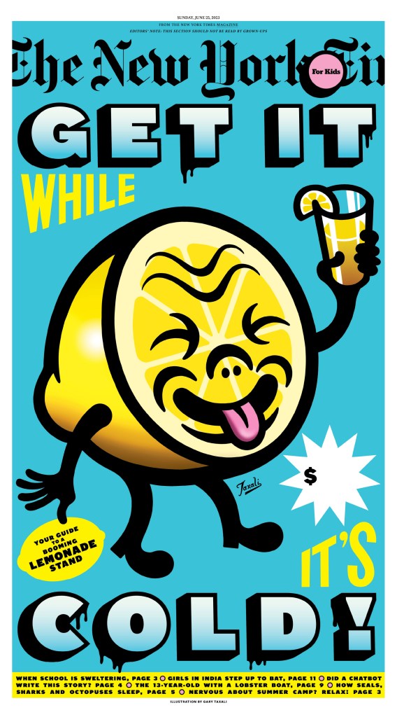
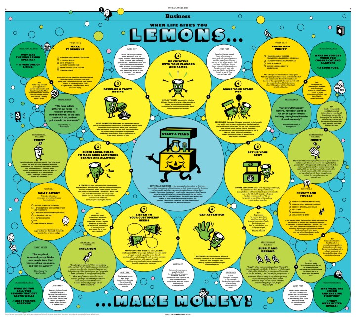
I might as well jump straight to the kids’ section as it always garners a lot of discussion and always wins plenty of awards. It’s big, bold, busy and playful. Always. I have included slideshows showing full sections or a single story’s design.
Have you recovered? If so, let’s move on to something completely different. Here are some of the non-kids pages that I loved from The Times this year.
I could go on and on. But I will just add these to wrap up NYT.
Star Tribune (Minneapolis)
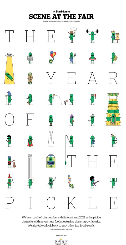
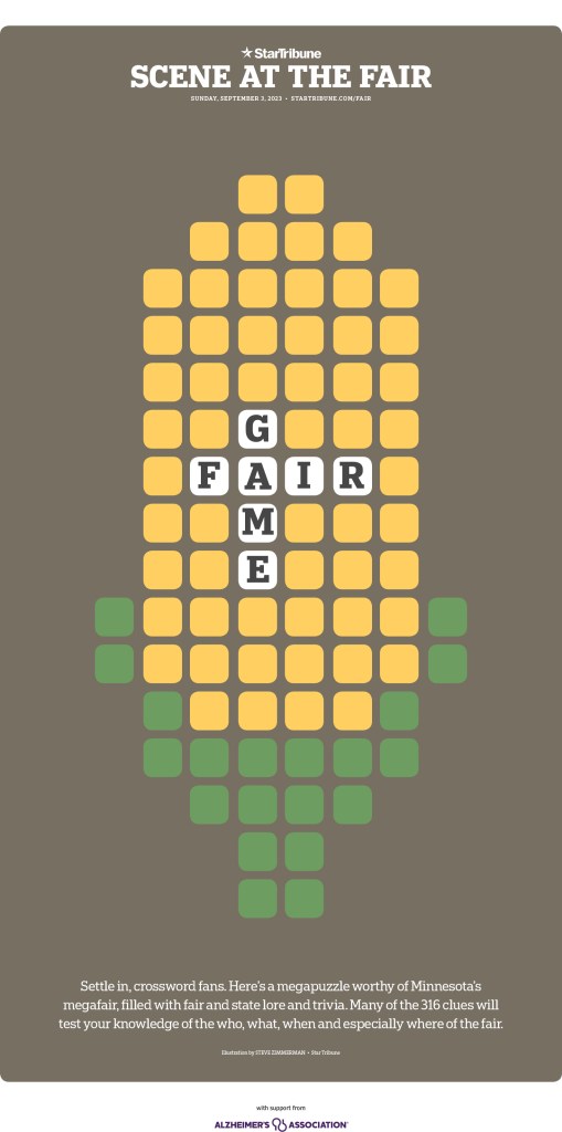
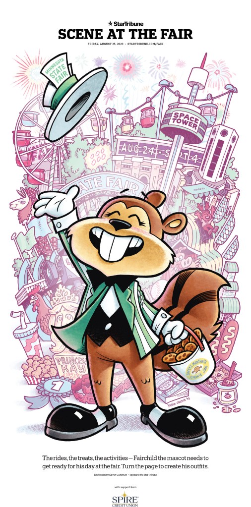
This paper has long been one of the finest designed in the world, thanks a commitment made from the top and some incredible talent to pull it off. They produce outstanding work on the regular, and especially with their very playful features sections. The state fair gives their creative minds design fodder every year. So first a few from there, starting with pickles, of course. Mmmmm, pickles.
And then … corn!
And while I could keep showing brilliant and fun fair pages, I am going to move to some other incredible designs, including some full story designs over multiple pages.
Animals are a common theme on Star Tribune pages, and the one nearly impaled goose on this page pushes it over the top (or very near the top in the goose’s case)!
The next two slideshows show brilliant covers and what happens when you get inside the paper, which is always telling. Does a paper just focus on the front, or does the design carry on. With the Star Tribune, I can assure you, the design keeps going. It’s a mix of beautiful, simple design, charts, illustrations. They really do it all here.
And a few more to wrap it up. You can’t have 2023 and now show something about Taylor Swift. And yes, I did sneak another fair page in here.
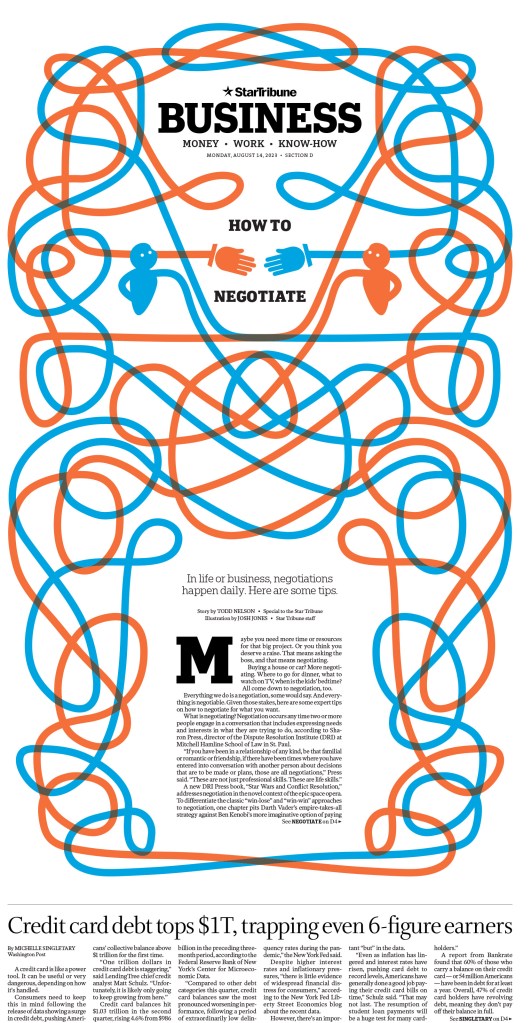
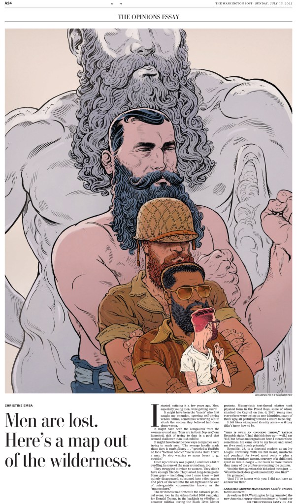
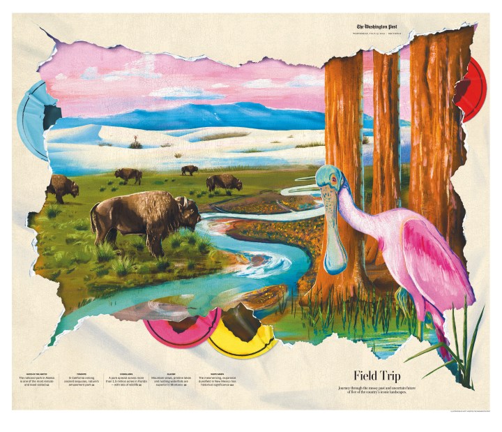
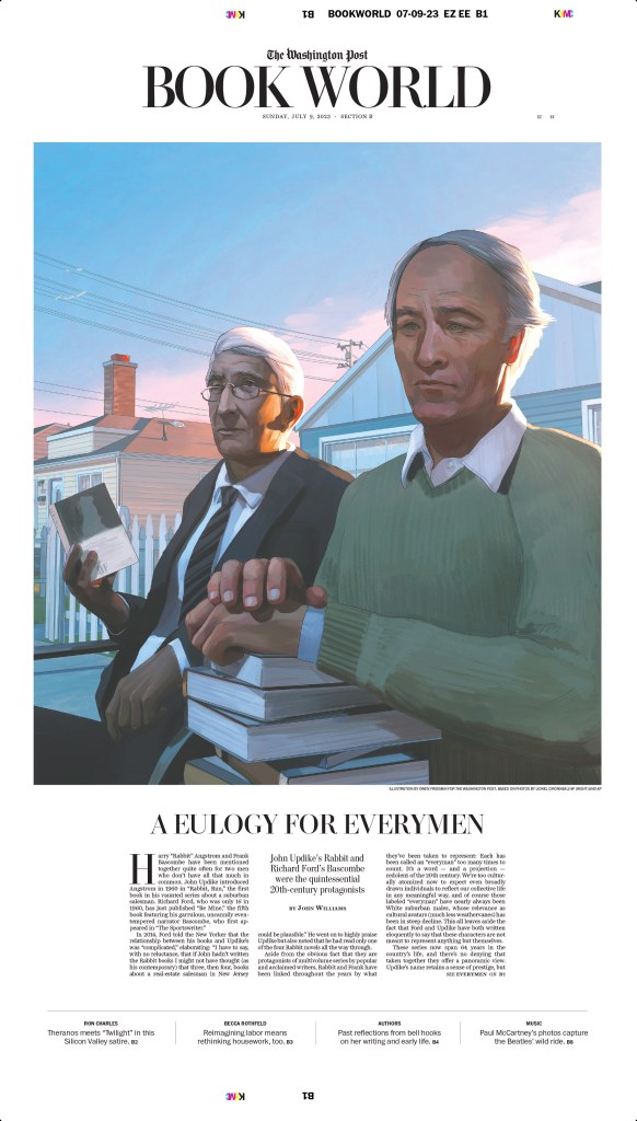
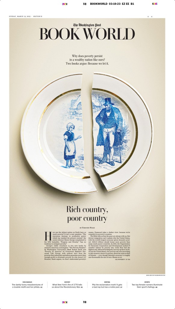
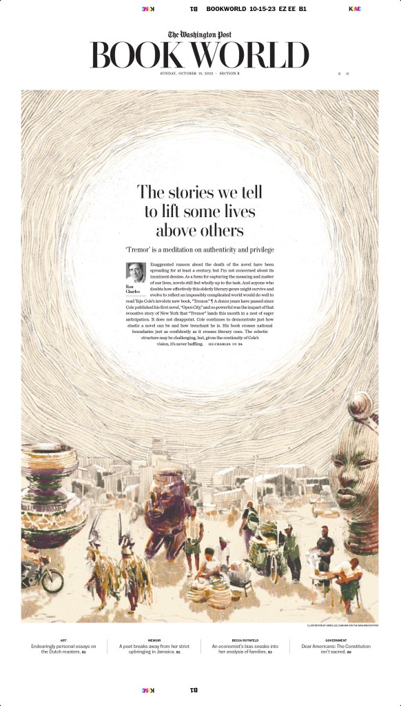
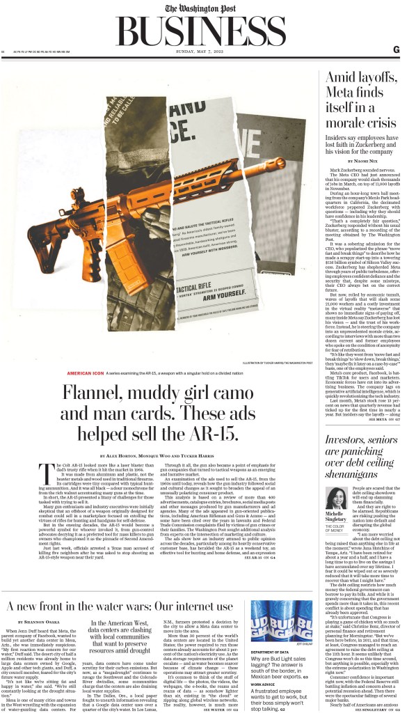
The Washington Post
I have already shown much from the Best in Show-winning entry on AR-15s in a previous post, so I will leave those out. But it was an incredibly powerful package, both print and online and is absolutely worth a look. So I will start here, with this gold-medal-winning illustration, followed by a few more illustration-driven pages.
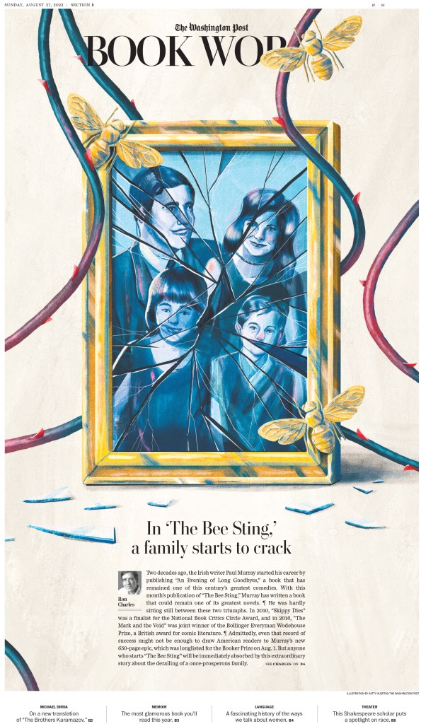
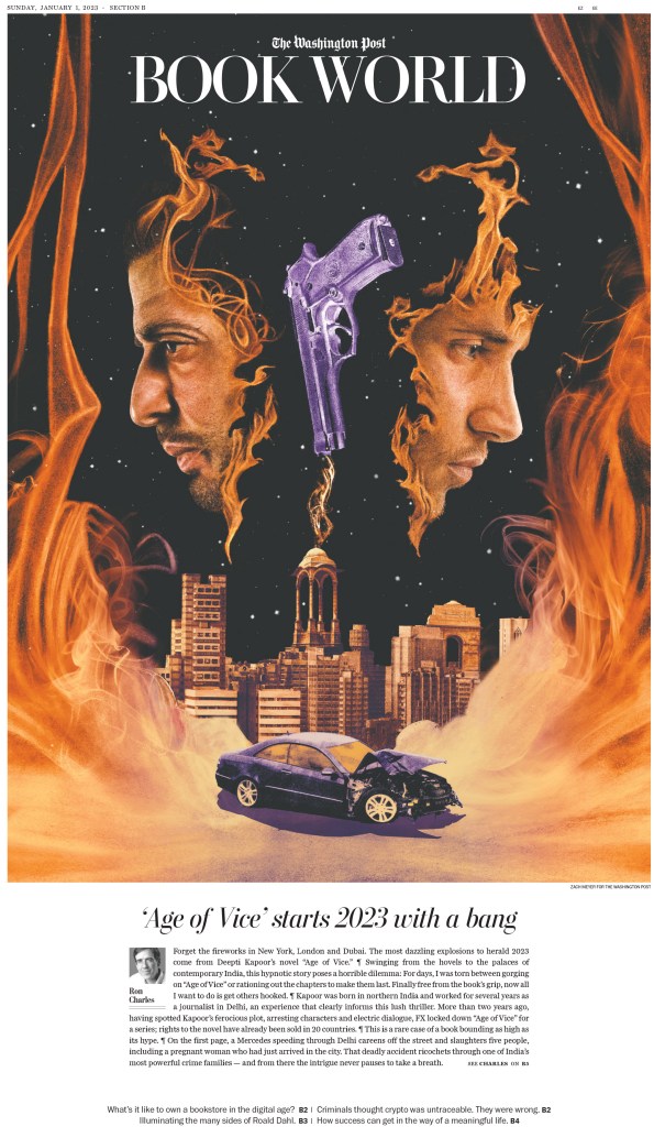
These books pages come from a gold-medal-winning portfolio, the last gold awarded at this year’s competition!
And a few more to close off The Washington Post.
The rest
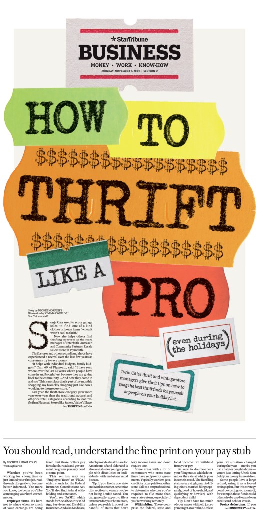
And now for the rest. Full competition results can be found here (you can filter for specific newspapers or categories). The Wall Street Journal also finished in the top 10, but more than half of the awards were for (strikingly beautiful and incredible) illustrations. I will show a couple, as well as many big and bold illustration-driven pages from other publications. I will also show some full stories that relied more on page design.
This illustration for the Wall Street Journal page won a silver medal.
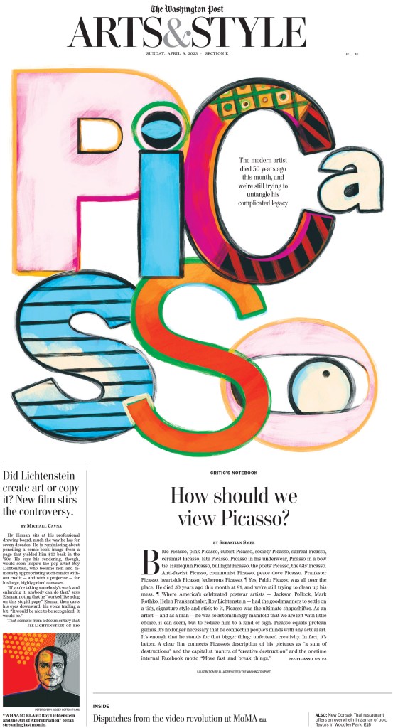
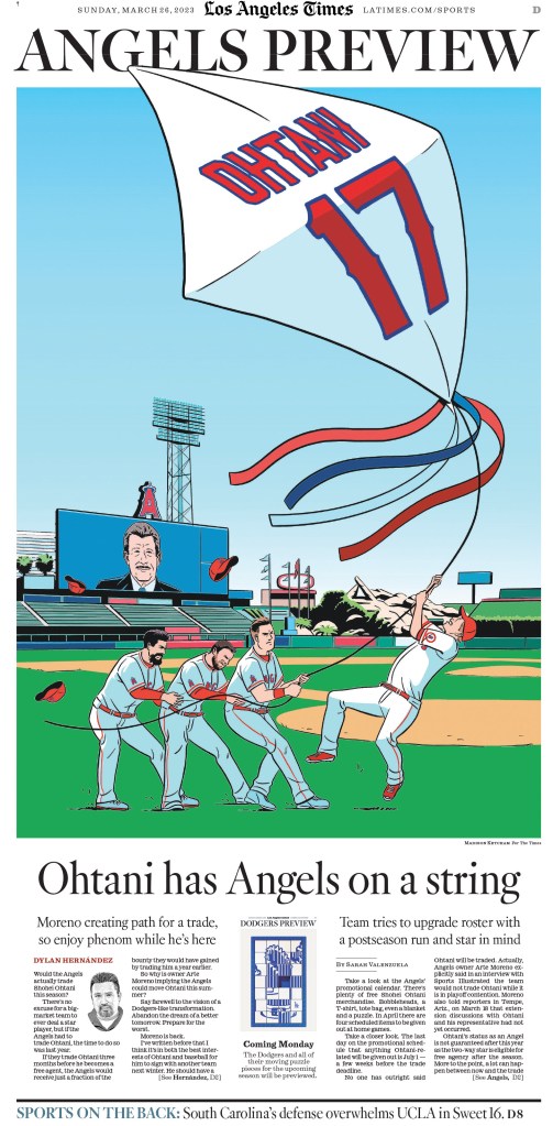
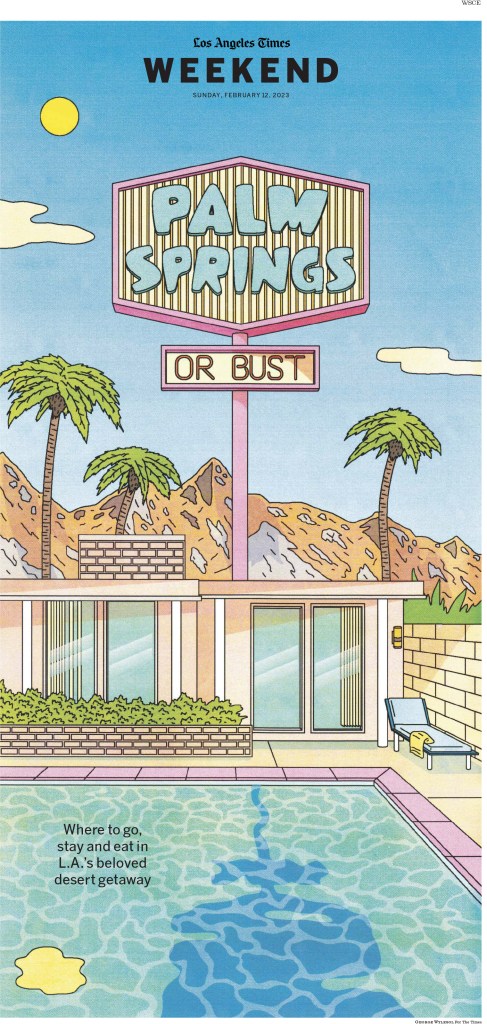
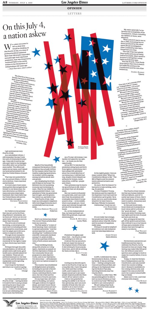
The Los Angeles Times didn’t finish in the top 10 this year, but I’ve long been an LA Times stan, after they gave me the feels while I was volunteering with SND for the first time, for a Covid-inspired page, which you can see in this post (Will we ever kiss again?). Here is a selection, starting with some driven by the kinds of illustrations I have come to expect from the LA Times.
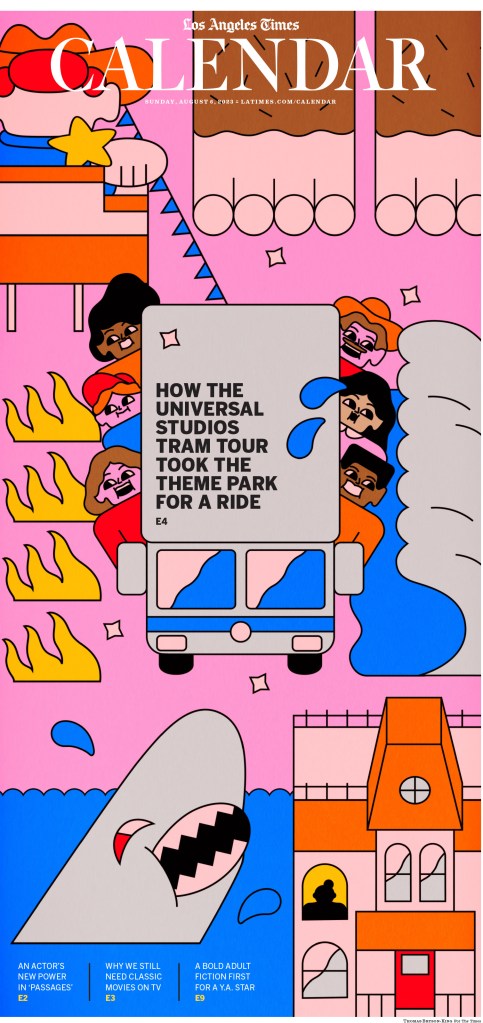
I almost gave this page a facilitator’s special recognition award. A letters page winning for design? Amazing. Creative. Also credit to illustrator Patrick Hruby, as I used a portion of the illustration as my feature image for this post.
And this is just some solid story design. A look inside, which you don’t see as much here. I appreciate the use of the rules between stories throughout. It’s a small but nice touch.
Barron’s had some very strong entries this year, led by this gold-medal-winning page. What a smart concept, and brilliant execution as well.
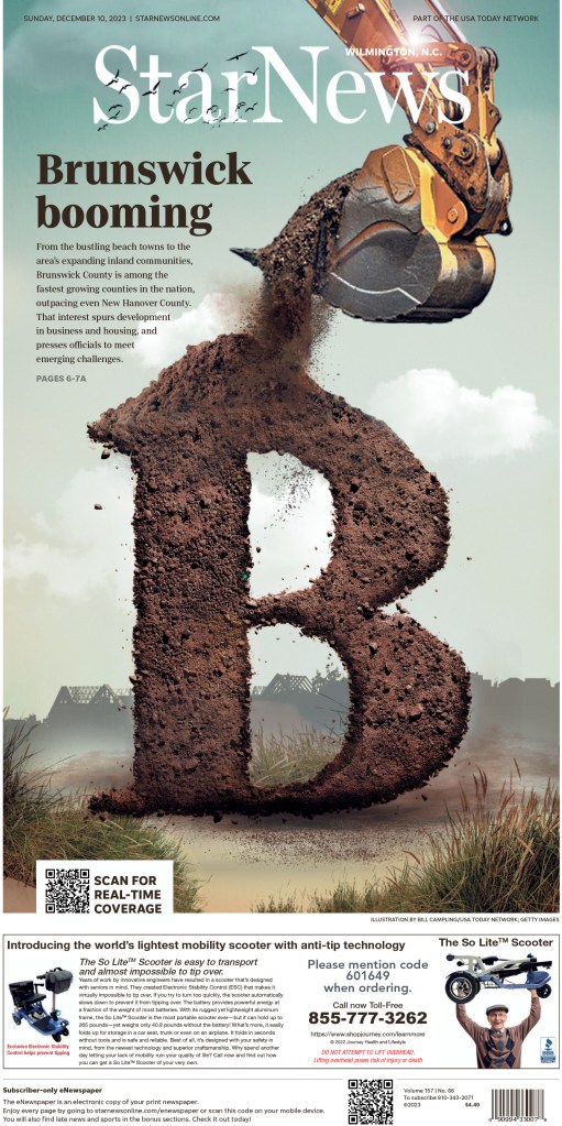
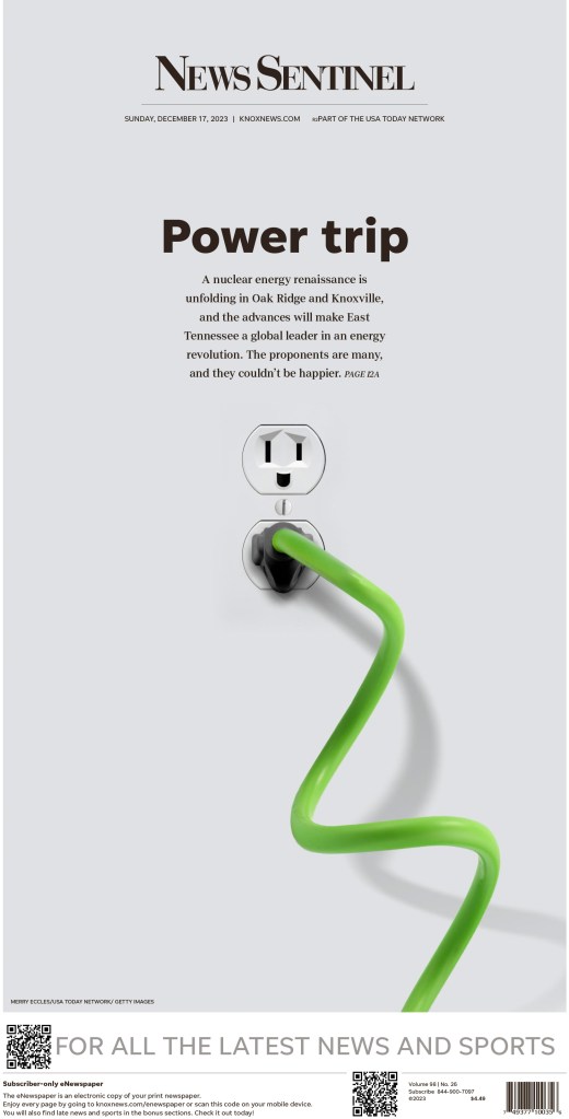
Gannett also had some amazing pages from different publications. The next two were my favourites, from the Star News (Wilmington, N.C.) and News Sentinel (Knoxville, Tenn.).
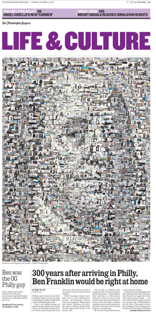
This concept, when executed well, makes for pages that give you so much to explore. You see the main image, but what are all the smaller ones? The Philadelphia Inquirer nails it here.
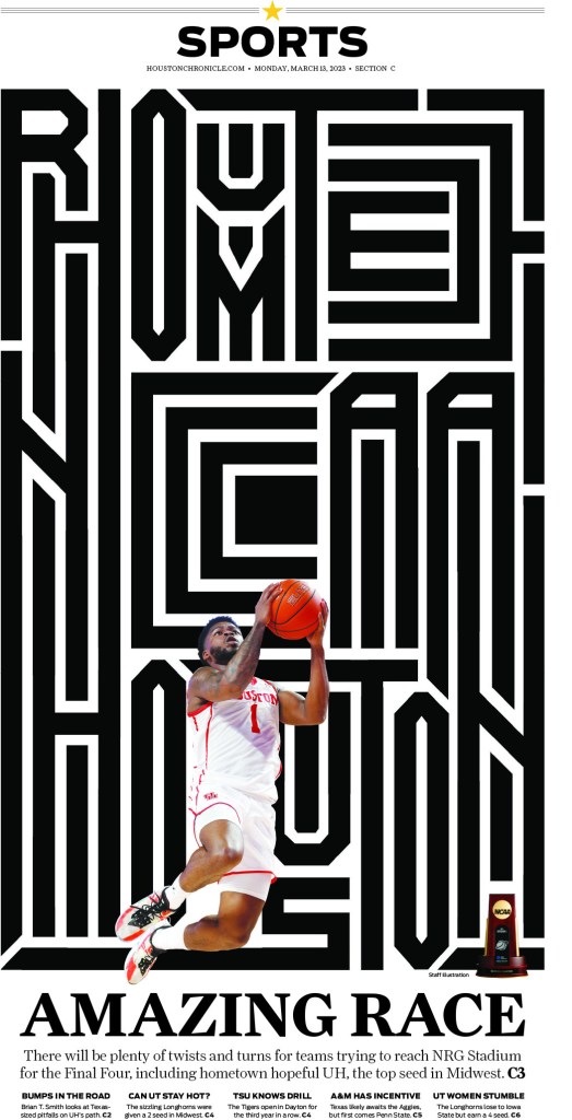
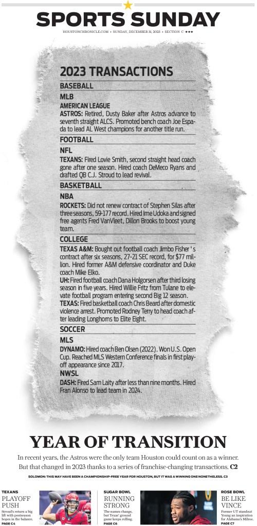
Hearst won a handful of entries for pages from the Houston Chronicle, including the two in the slideshow below (the first won a silver medal!). Hearst is a client of Pagemasters North America, the company I work for, though we don’t handle pages for Houston. But we do love working on their pages!
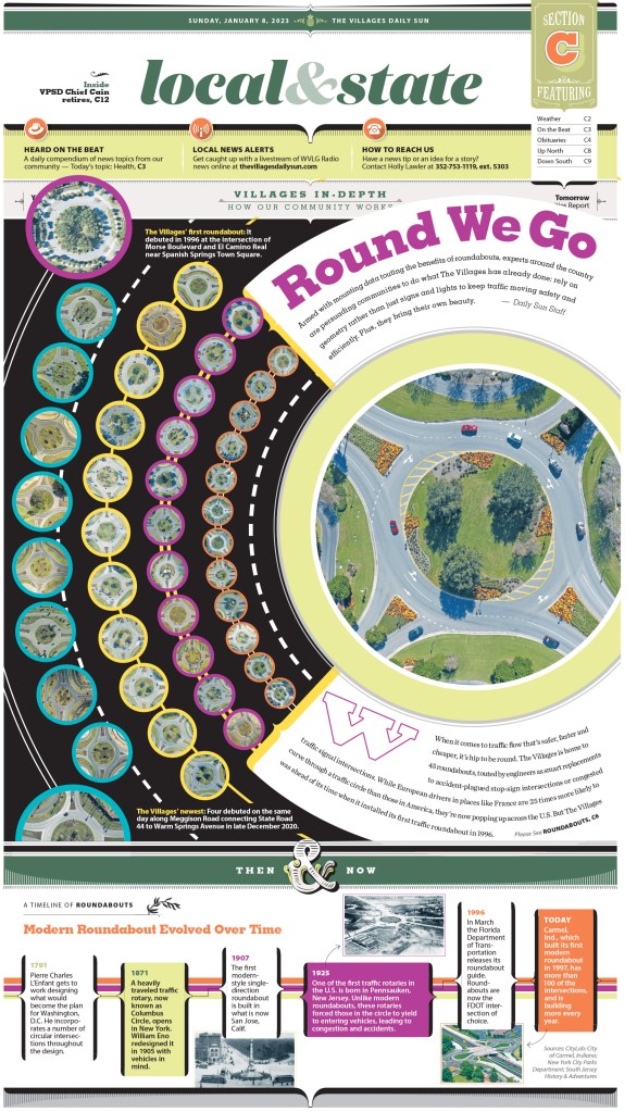
Anyone who has followed me for a while knows what I feel about the Villages Daily Sun. I did a feature on two of their designers, one of whom was the team lead on the World’s Best team this year, so I had the privilege of working with him again.
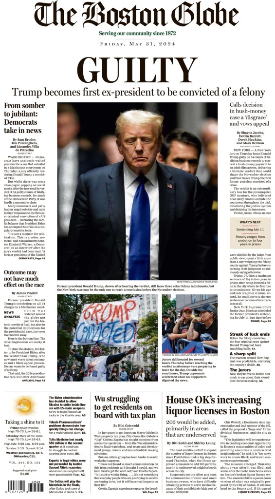
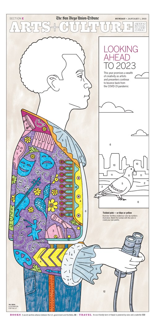
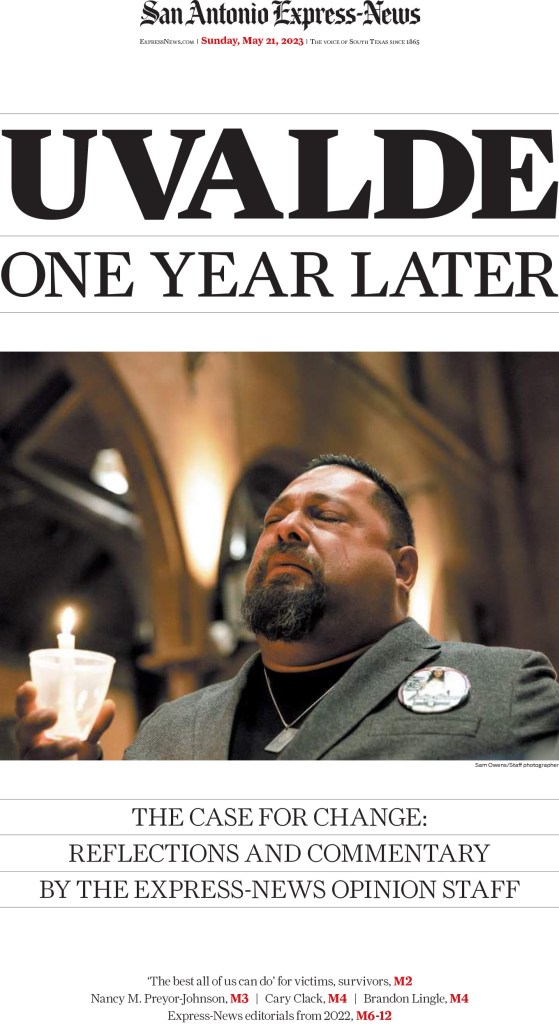
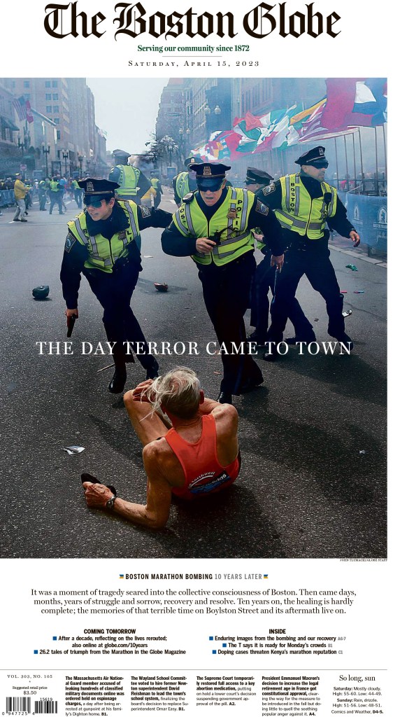
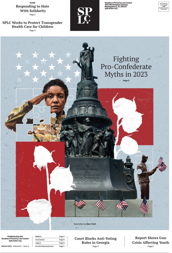
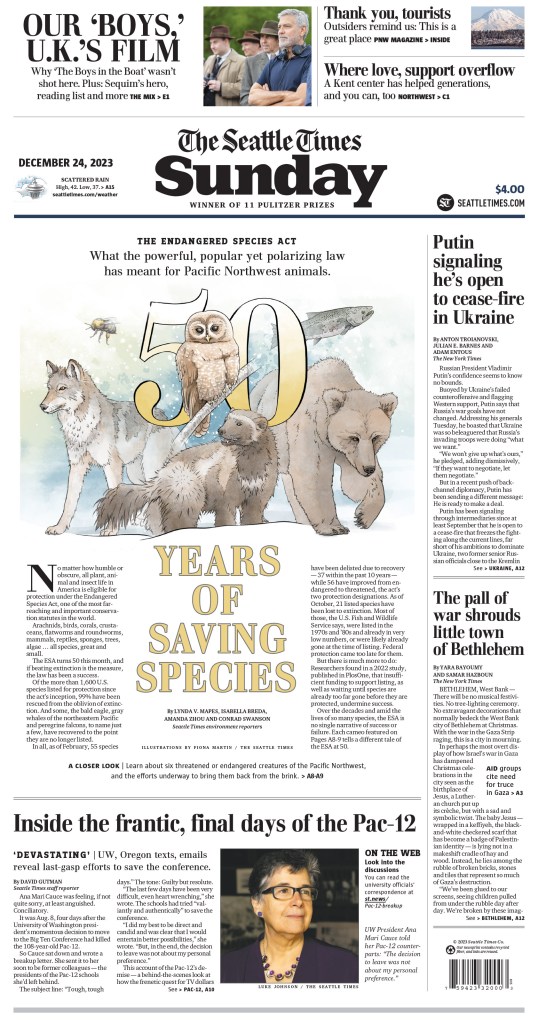
And last but not least, two more slideshows. I have to say, paring down the thousands of entries is not easy. And it’s painful. I hate to cut anything or any publication. In the first slideshow there are excellent pages from the San Diego Union-Tribune, San Antonio Express-News, The Boston Globe (a digital client of Pagemasters), Southern Poverty Law Center and the Seattle Times.
And just a little more from some of American City Business Journal titles, including one more inside spread. I couldn’t resist.
So there it is. Another very strong year by American newspapers. Even as newspapers find themselves in tumultuous times, there are so many still going all out. Thanks to all the designers, illustrators, headline writers, art directors and even executives are willing to allow their papers to do this. We are better for it.
I have heard that taste buds change every 10 days or so. And that as we age, our tastes change as well (with fewer taste buds, we need more to keep things spicy). As I have volunteered for the Society for News Design’s creative competition for the past four years, my tastes have changed as well. The first year I got access to all the entries my mind was blown. I spent hours and hours looking through thousands of entries. I probably cried tears of joy. Then, pages with other worldly illustrations — the likes I never had access to as a designer — blew me away. I couldn’t get enough. Each year it has been harder to get me swooning like I did the first year. And I started to think, is that a great page design or a great illustration/art direction?
Either way, I still love the big, splashy pages, and you will see some here. This post will focus on newspapers outside of the Canada and the United States. Canadian newspapers are the books. A post about newspapers in the United States is coming.
It’s not easy to cram the rest of the world into one post. There are so many incredible publications doing incredible things. And sadly this only reflects those who submitted entries to SND45. There are so many more out there doing outstanding work. But this year, I want to ensure the pages I show here capture both the outstanding illustrations, but also my new love. Pages that rely more on pure page design. Maybe you have photos, maybe you have a simpler illustration. So how you use those matters. What do you do with the white space? What about the typography? These are things any designer, almost regardless of resources, can do if the powers that be are willing to let them be bold and use space.
Some of the major winners at this year’s competition were Politico Europe, Die Zeit, South China Morning Post and Politken. Dei Zeit and Politiken, along with Weekendavisen and La Nacion, are also finalists for the title of World’s Best Designed Newspaper, which was the team I helped facilitate for again this year.
And now to some pages. I will break them down in different ways. Some by title, some by design philosophy (I will have a special section for pages that don’t rely on one big, stunning illustration). I will also have a small section on World’s Best finalists, as I will be doing a separate post for that after the winner or winners is/are announced.
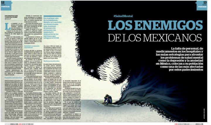
Before I jump into some of the other big names, I’m going to look at one of my favourite newspapers. And despite what I said above about loving simplicity, this publication uses big, bright and/or bold illustrations all the time, covers and inside. But I appreciate that even with the illustration-driven pages, the text is still well designed.
Reporte Indigo
Politico Europe
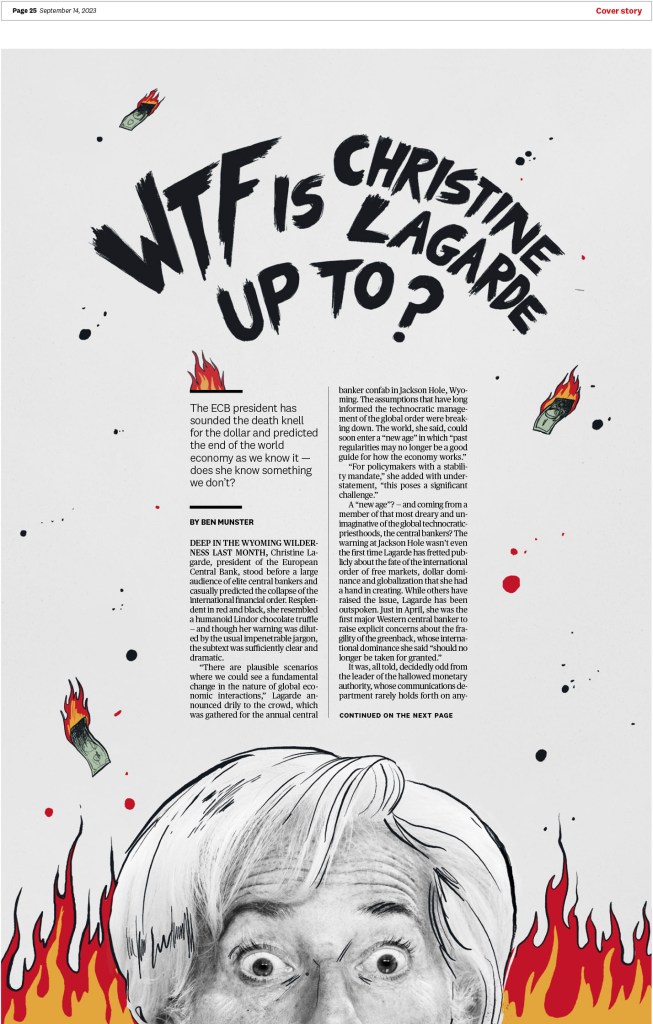
Politico Europe is a publication that punches above its weight. They do some outstanding work. I believe they were the top paper outside of the United States in terms of overall awards at this year’s competition (only behind The New York Times, Minneapolis Star Tribune and the Washington Post). The next two pages are from the same story, and while I love the cover illustration, I appreciate the inside design even more. But also the illustration!
The illustration below won a gold medal, which is an incredibly high honour at SND. To receive a gold, it not only has to stand out from other award winners, it should be nearly impossible to find a flaw and should be state of the art for print design.
And here are a few more including a short slide show at the end. I’d love to include more, but I need to get onto some other papers. But you can see all the Politico awards here.
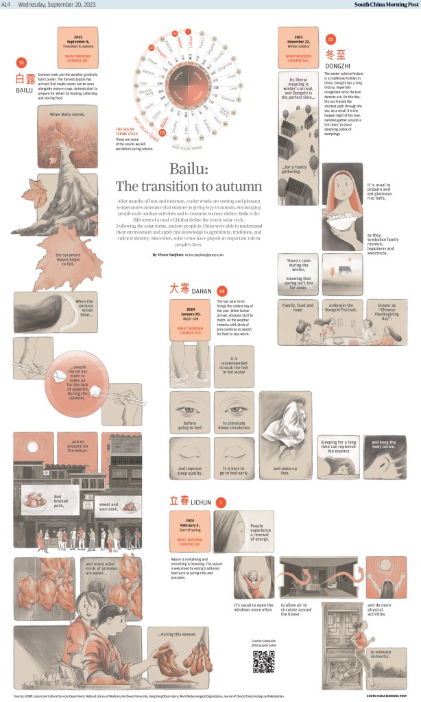
South China Morning Post
This publication is known for its mesmerizing infographics and illustrations. And it didn’t disappoint this year. Here are a few to keep you captivated (full results from SCMP here). The first won both a gold medal in the information graphics category and a silver for illustration. Not bad for one page.
This one also won a silver medal for information graphics.
And this one is just a visual journey.
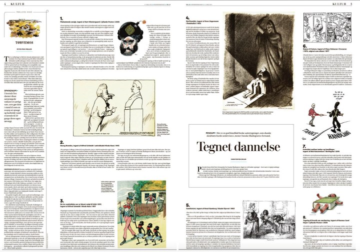
World’s Best finalists
Here is one page each from this year’s World’s Best finalists, in no particular order, as I will dedicate an entire post to these titles. Again, they are Weekendavisen, Politiken, Die Zeit and La Nacion.
A look inside
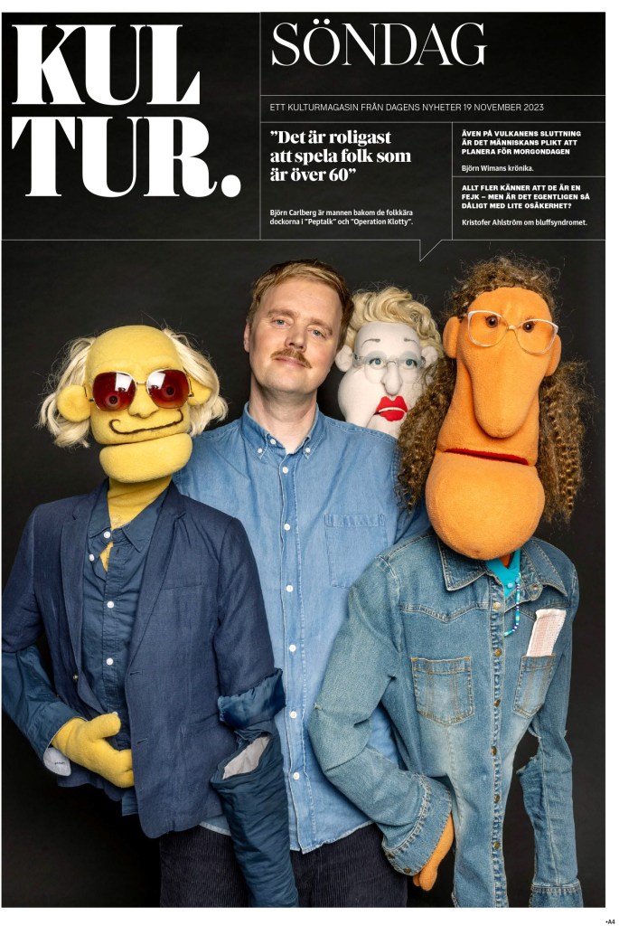
Now for my new (old) love. I don’t want to say simple, but here are some pages (a few in slide shows that I encourage you to scroll through) that rely on page designers more than illustrators to give you the wow. I got giddy looking through some of these. This was the sort of thing I aspired to in my design days because I could with the limited resources my paper had (and the willingness of my managing editor to be bold). I’m not saying I hit this level, but I also don’t want to downplay that I won three times (including once for portfolio) at a paper with a small circulation and an even smaller team. The slide shows are from winning story design entries, and will sometimes have illustration-driven covers. This first one is from Dagens Nyheter, which you will see more from later as it’s another one of my favourite papers.
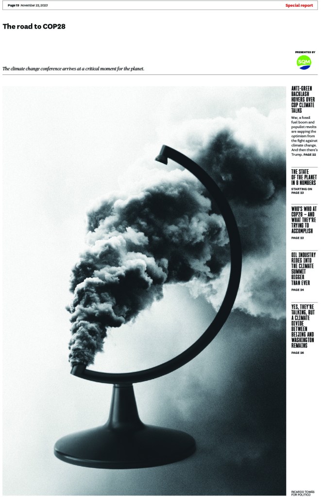
This Politico cover uses a fun image, which mostly requires a solid photographer and a creative mind. And the inside relies on beautiful design.
This Poliken story package is largely driven by stunning photography, but it also uses a nice clean design inside.
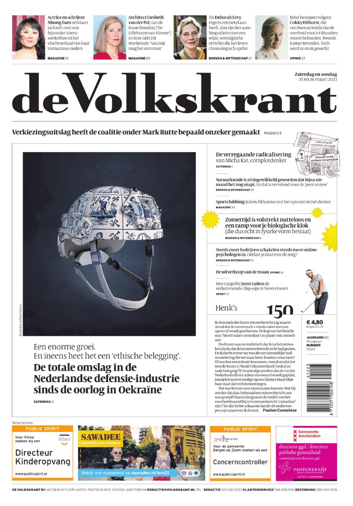
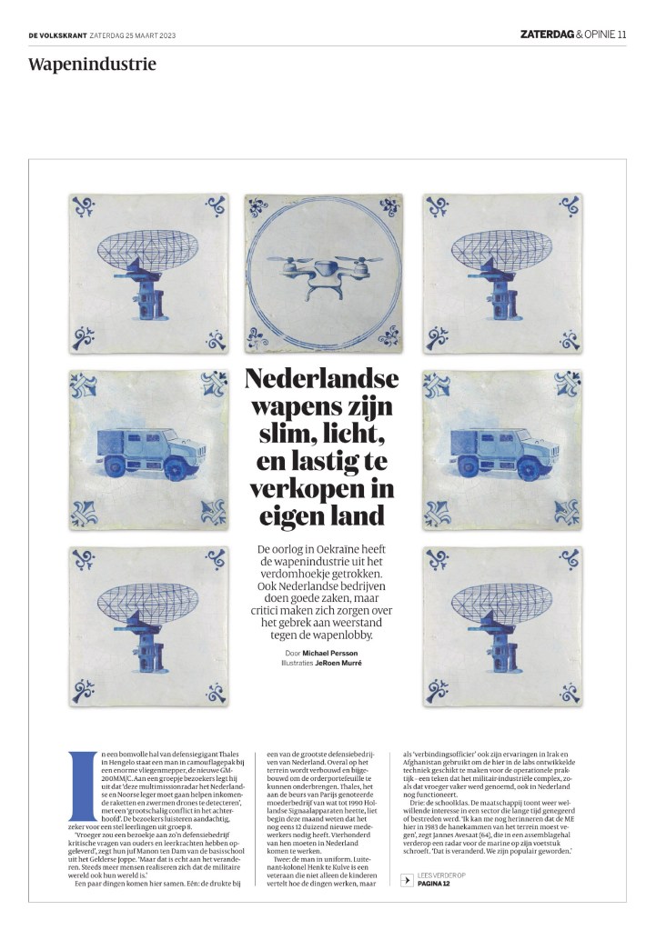
I especially love the super clean and elegant page 2 of this de Volkskrant package.
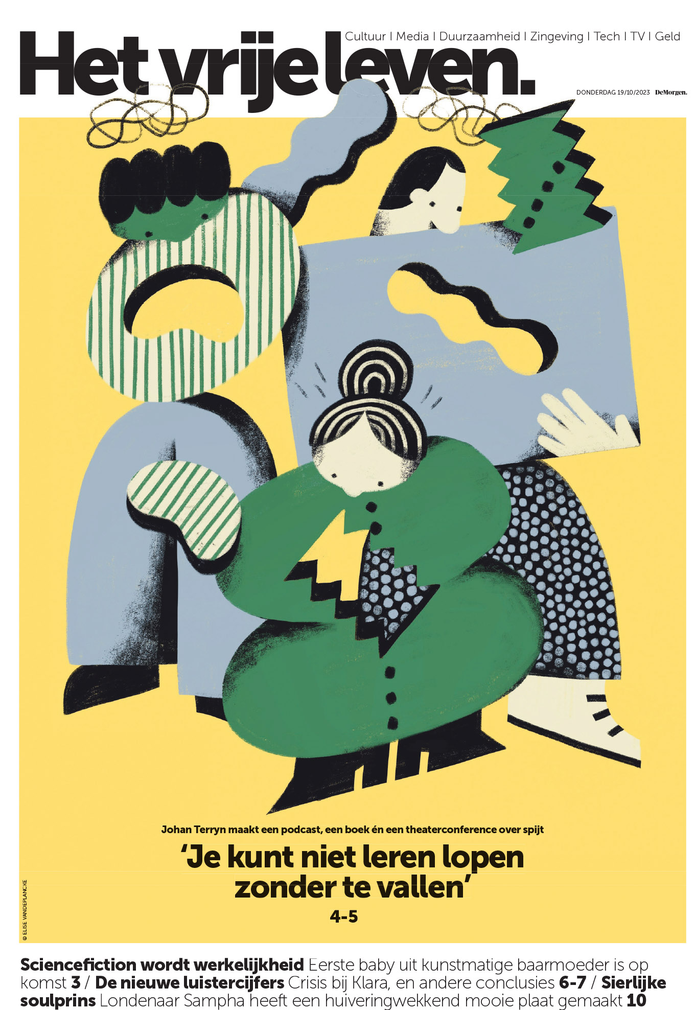
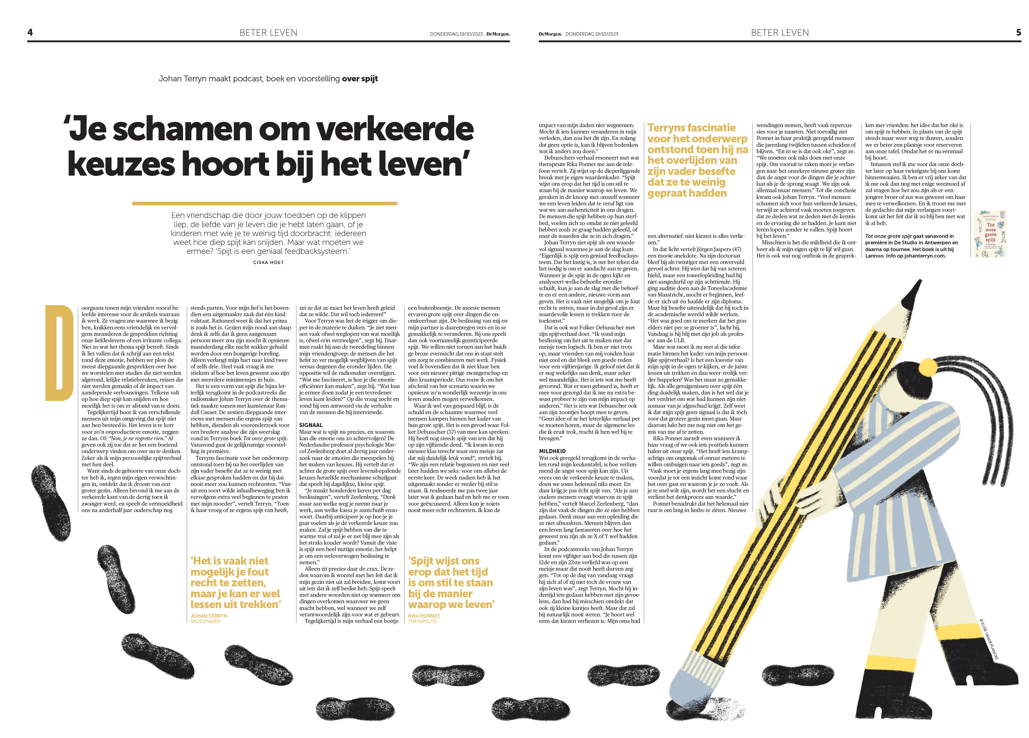
OK, this De Morgen package relies on a creative illustration for the cover and inside, but I love the inside page so much for its page design, which uses a very smart illustration so well. It fills the space perfectly.
As to not make this post too much longer, I’m going to share a few pages individually and then the rest in a slide show. There so many brilliant pages from so many organizations this year. You can see the full competition results here. I will start with this one from Spanish newspaper Faro de Vigo, as it was one of my standout pages from this year’s competition.
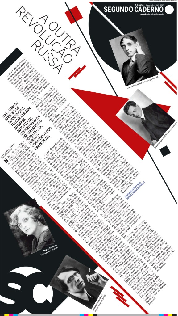
What’s your angle? It depends. NRC (Netherlands) is tipping few degrees this way and O Globo (Brazil) is tipping a lotta degrees that way!
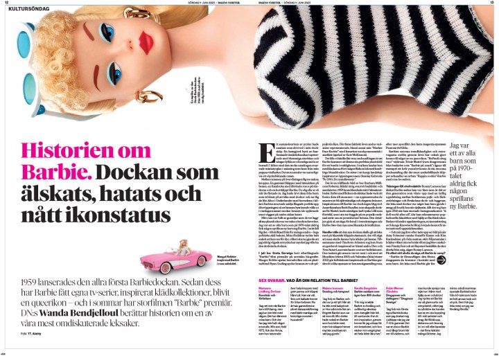
As promised a few more from Dagens Nyheter. I love this Barbie page.
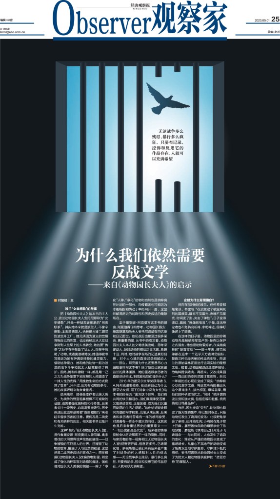
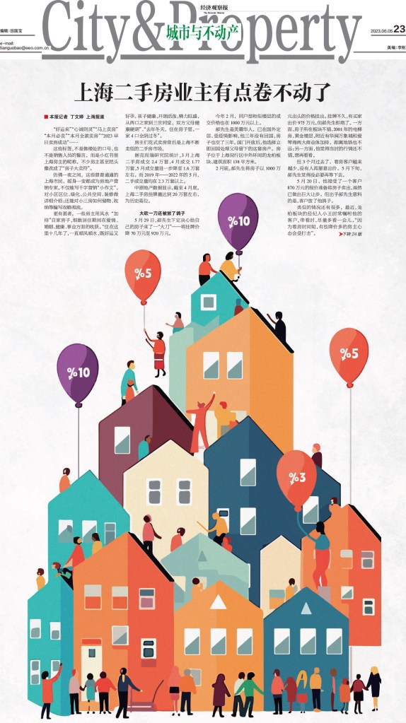
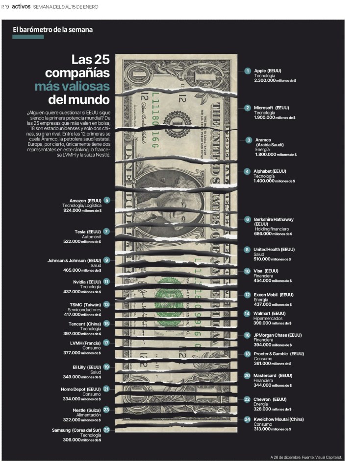
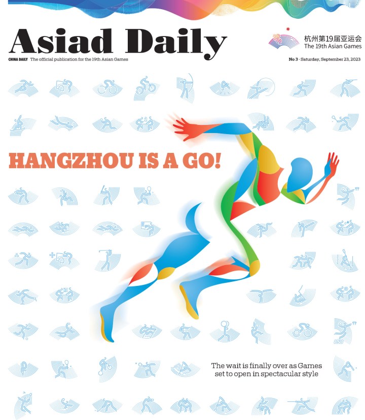
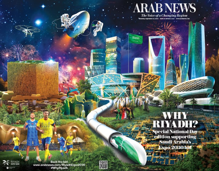
And last but not least, here is a slide show with pages from the Economic Observer (China), the Hindu (India), Activos (Spain), Asiad Daily (China), Arab News (Saudi Arabia), Handelszeitung (Swizterland), The Sunday Times (Britain) and Estadio de Minas (Brazil).