By Brad Needham
Scrolling through newspaper designs on the Freedom Forum’s website is one of my favourite hobbies. I like to do it as often as possible, and hope I can even get there daily. The site is amazing, but only hosts pages for the day of publication. Like Cadbury Eggs and Easter, after that they’re gone. But it means if I miss a day, I might miss some magical front page designs. It also makes it exciting when I do find a great design. Like hearing your favourite song on the radio, rather than on repeat on Spotify.
Thursdays have been lucky days for me so far. Though it could be forced luck. I want to publish a post by Thursday every week if possible, so as a typical journalist, I wait until Thursday. And wouldn’t you know it? There are some great designs this week too. What I like to do most days is truly take a brisk scroll through the pages. If a page doesn’t catch my eye as I scroll through hundreds from around the world, I move on. But some did catch my eye today. As a picture is worth 1,000 words, I won’t blather on too much about each page, but I do want to celebrate the creativity and explain why I like these pages.

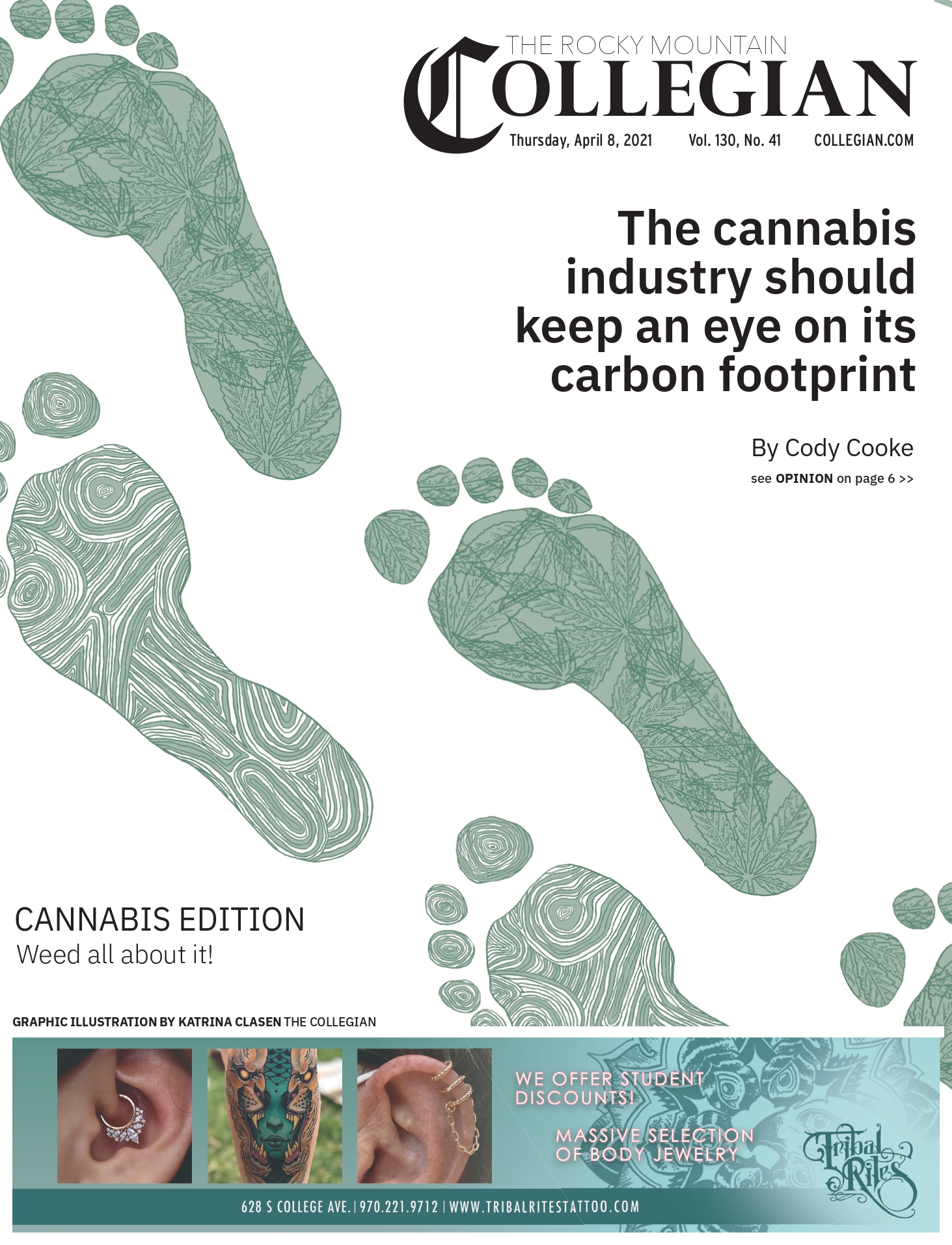
Anyone familiar with my designs might think I have a bias toward this because it reminds me of me. That’s simply … only slightly true. I love that the Collegian cover is blown out on one topic. I love the footprints, and how they’re a design in themselves. And, yes, I will give points for the play on words, Weed all about it. (Insert slow clap here.) It’s an important topic, creatively done. The white space is well used, which is harder than it looks. All in all, it’s a smokin’ page. The design draws me in and makes me want to … weed the story.
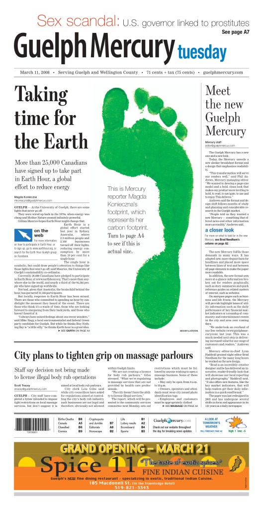
Great minds think alike. This was a page I did after completing a redesign of the Guelph Mercury (RIP). This was the first day of the redesign, and also looking at a carbon footprint.

The Toronto Star often has solid designs, particularly for their centrepiece stories. (Disclaimer: I worked at the Star!). This is a basic design: reverse text (white on black), big numbers. But that’s all you need. It’s above the fold, which, as discussed in a previous post, might be an outdated model in terms of design consideration, but it allows you to blow out part of page, and leave the rest for key news content. In the age of shrinking news holes and page counts, that can be crucial. Designs are nice, but readers come first. But the Star balances this well. Two key numbers that help tell a story. Text on photo. A nice header graphic. And a good bit of two stories to boot. That is just a nicely put-together newspaper page.
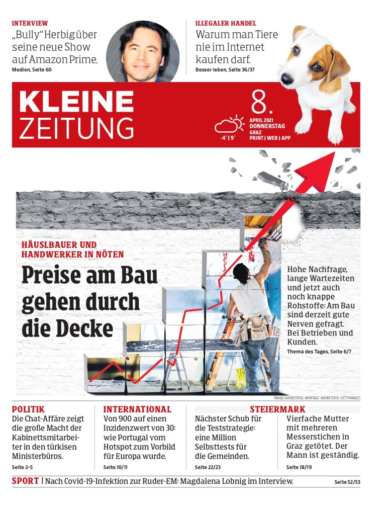
I like these two pages for the same reason: creative graphics/illustrations. Kleine Zeitung uses its headline to complement the photo, about prices going through the roof. I love it when a headline and photo or graphic really work together. And it’s just a fun illustration with the arrow breaking through the top. It looks like live action!
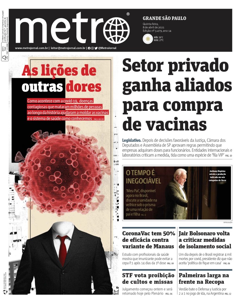
The Metro graphic captures your attention instantly. Presumably intentionally, it also ties the text to the picture, talking about how diseases have helped shape vaccines and health systems. And we all know that distinctive COVID shape by now. I also really dig the use of colours. The tan and black, with red text. Also using reverse text, as the Star did above. Often it can seem too busy. Three colours of headline text, different background colours. But this is thoughtfully done.
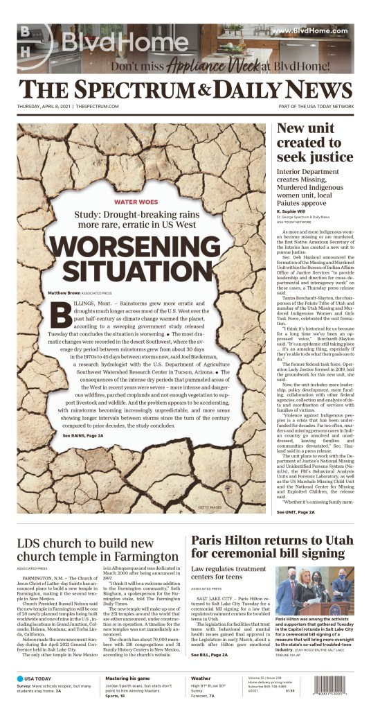
It’s pretty obvious what I like here on this Spectrum & Daily News page. You can see the thought process that went into this. It’s a Getty Images illustration (thank goodness for good stock art). But the design is visually enticing. A break from big blocks or text or a picture of some dry landscape in the region. I like the big and literally bold headline, the small red kicker and the big drop cap. And they story is placed in the middle of an interesting image, so you get a big, bold illustration, but also can start to tell the story on the front page. All can be entry points to draw the reader in. There is little doubt where one’s eye will go first on this page, or at least which story.
That concludes today’s leisurely scroll! Thanks for joining me. If you have any thoughts, let me know below!
