When tragedy strikes, or there are difficult and painful stories to tell, there is little like a newspaper to get the information out. At design competitions like the Society for News Design’s creative competition, playful and fun pages often dominate. But sometimes powerful and painful stories, partially told through thoughtful visual journalism make their mark on judges, and almost certainly on readers of these papers. One entry in particular left judges at SND45 talking and, in some cases, shaken.
I will look at a few tough topics here, including the wars in Gaza and Ukraine, but I will start with mass shootings and the now infamous AR-15, a weapon so deadly those who don’t live in the United States have a hard grasping how it can be so prevalent. Many Americans wonder the same.
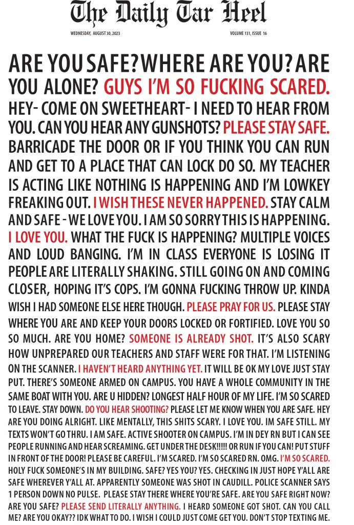
I will get into the Washington Post entries that have provoked so much response, but first I wanted to share an incredibly powerful page that evokes emotion in a way I feel only a newspaper can. After a deadly shooting on campus (an AR-15 was not used in this shooting), The Daily Tar Heel, a university paper at the University of North Carolina Chapel Hill, ran with this cover. All text. Real words from texts and social media sent during the shooting. Here is more on how the page came to be.
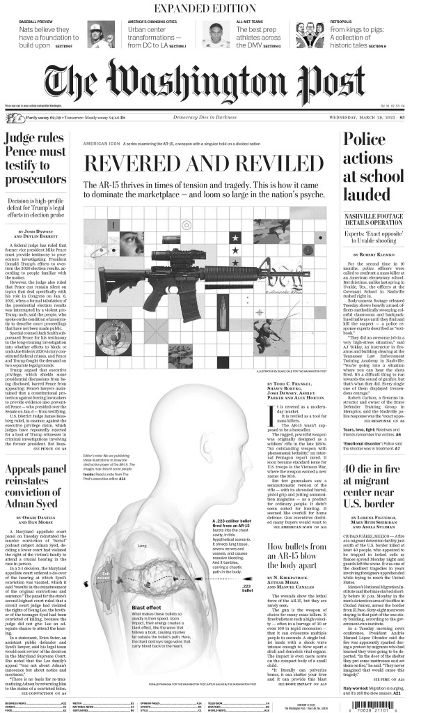
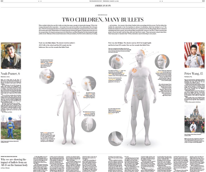
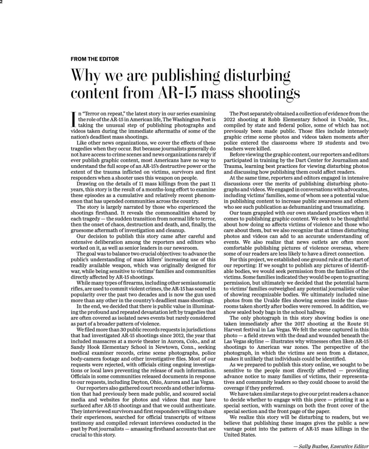
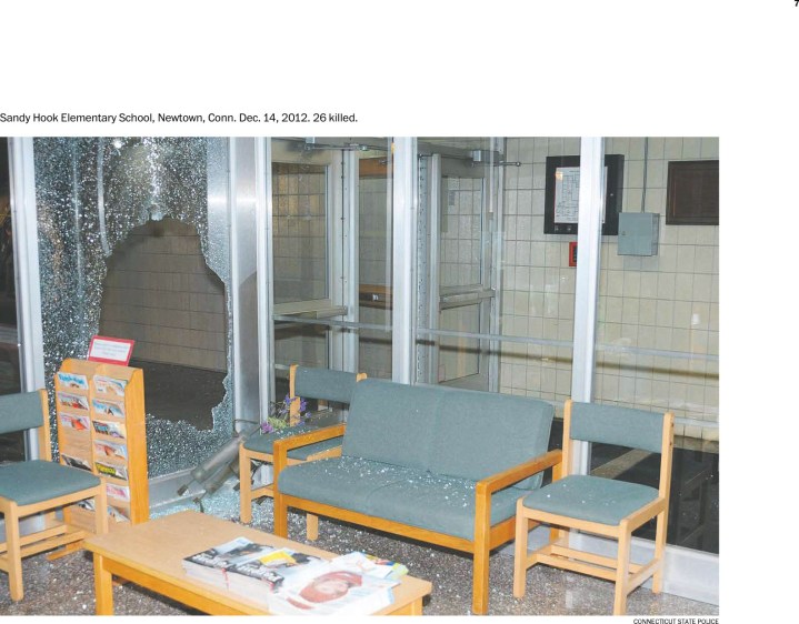
This is a sample of some of the Washington’s Post powerful entry on the AR-15, including this digital presentation. I haven’t included all of it, and I have left out the most graphic pieces. What’s striking about this piece, after the front page, is the simplicity of it, the starkness. It is minimalist, letting the photos do the work. If you want to look at more from this powerful package, you can find it here. This entry went on to win Best in Show and SND45. It’s the first time this award has been handed out since I have been involved as it requires such a high threshold. Only awards that have been awarded gold medals are considered. To win a gold, a page or entry needs to be nearly flawless. State of the art, and pushing boundaries. And then at least 75 per cent of all judges must agree one entry deserves that title, over all the other gold medals.
This digital portion of the entry takes the above page and brings it to a new harrowing level. A warning, it is hard to look at, but it is so incredibly powerful. The print entry alone was next level, but the print and digital combo entry is what one Best in Show. Together this entry evoked so much emotion.
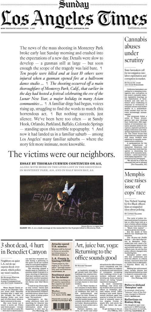
And here is one more page from a mass shooting, this time from the Los Angeles Times. An AR-15 wasn’t used in this shooting.
Wars and other tragedies
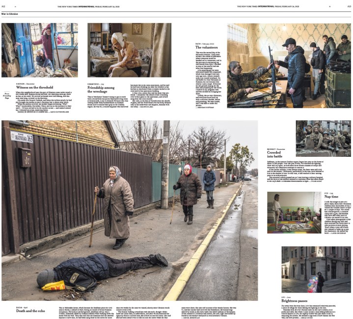
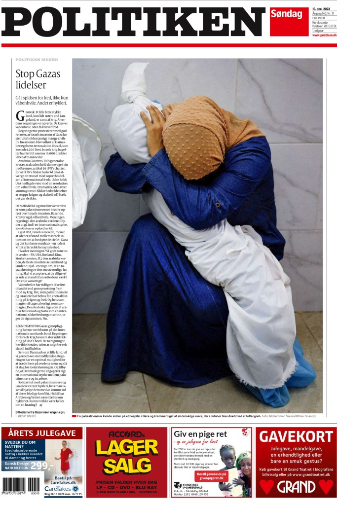
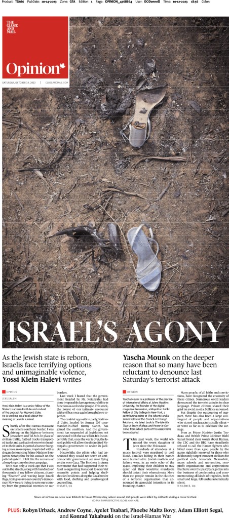
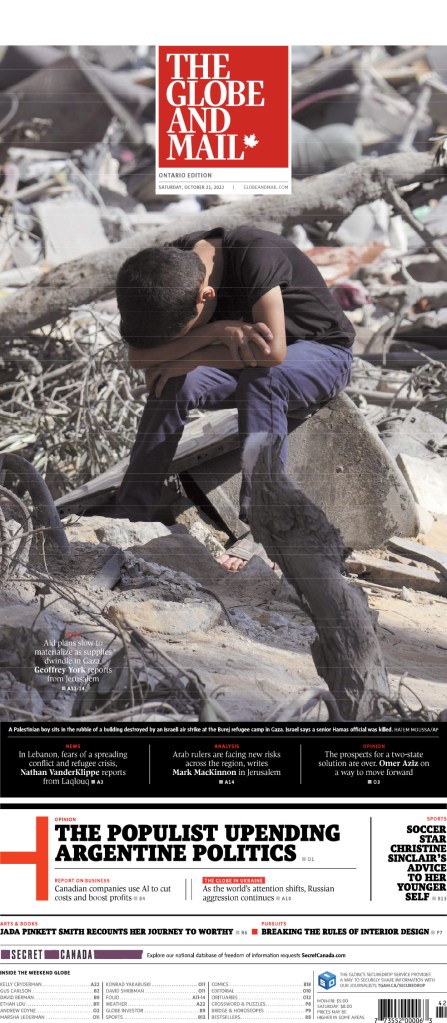
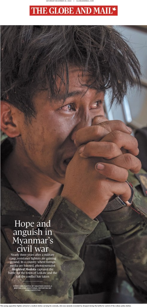
I expected to see more entries from both the Gaza and Ukraine wars. There were some powerful pages, many of them driven by bold photo choices. Before the war in Ukraine began, seeing dead bodies on newspaper pages wasn’t that common, but as the death toll started to rise, editors started to make the hard decisions to show the reality unfolding. This is war. As well, many photos that drove the pages show the raw emotion of people dealing with tragedy and loss, in some cases on both sides of war. The pages on Ukraine are by The New York Times and De Morgen (Belgium), followed by the war in Gaza, from Politiken and two from the Globe and Mail, which has been a leader on this coverage in Canada.
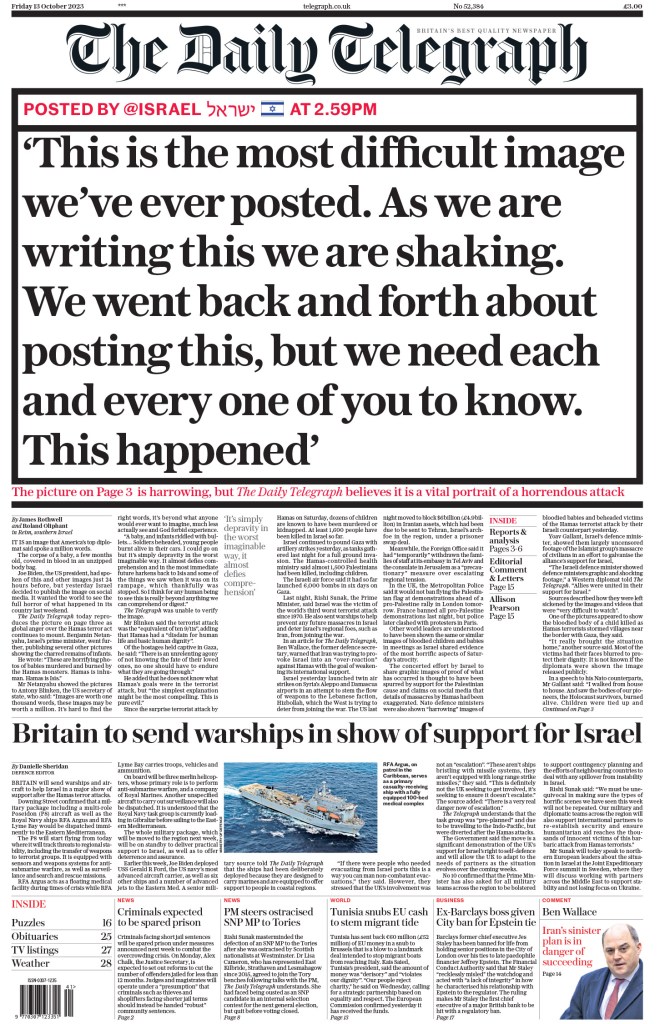
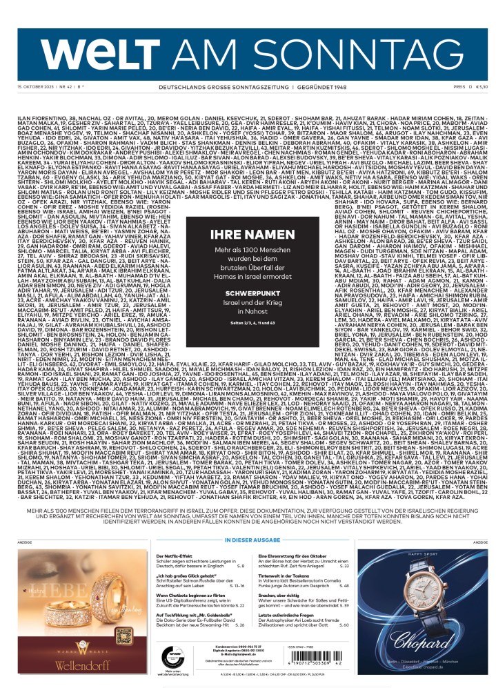
Not all of the powerful pages were driven by art. Some used text to convey the message and the gravity of the situation, such as The Daily Telegraph, from Britain, and Welt am Sontag, a German newspaper. Welt am Sontag lists the names of those killed in the October 7 attack by Hamas.
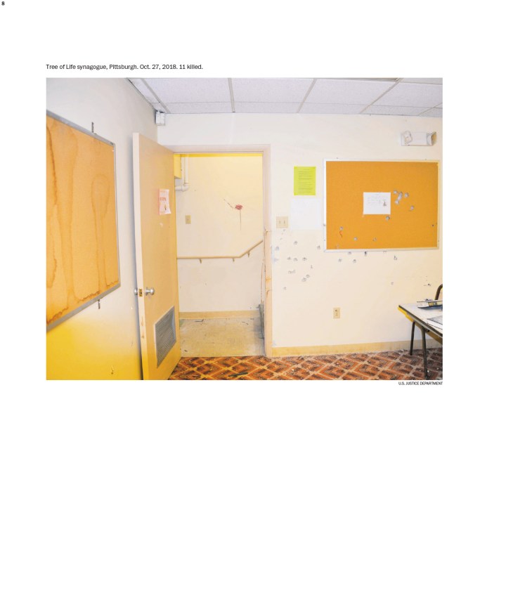
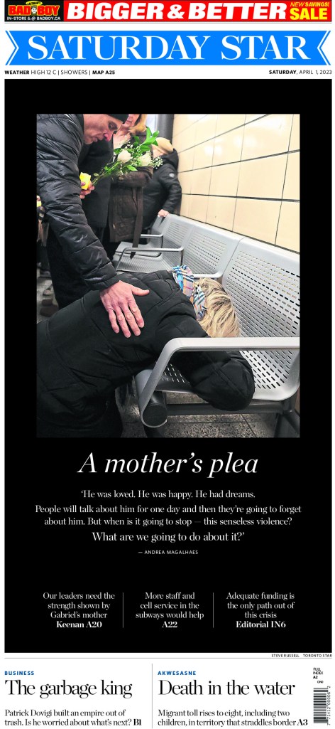
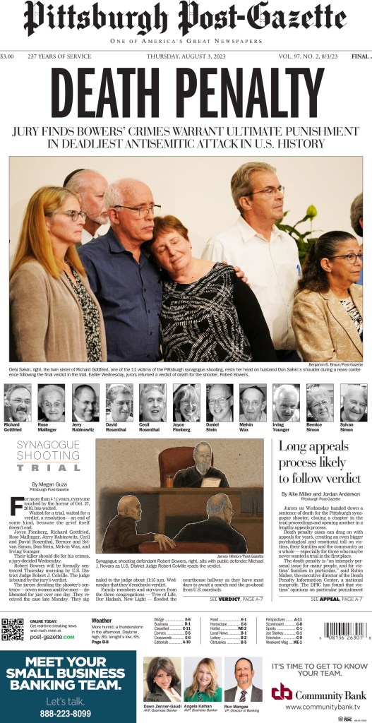
And here are a few other pages tackling hard topics. Included are pages from the Toronto Star, Globe and Mail and the Pittsburgh Post-Gazette. Each of these are driven by emotional art. While these pages can be difficult to look at, I feel they show the power of print journalism. Newspapers still play a vital role, and these pages are examples of this.
There is something special about design in student newspapers. Student newspapers often push boundaries that mainstream newspapers cannot. The designers have less experience, which isn’t a bad thing. While skills can be refined with experience, enthusiasm can also wane with the restrictions major newspaper designers face. It’s why I look back so fondly at my time at the Guelph Mercury, where I had essentially free rein to do whatever I wanted. It made for much bolder designs (and a few fails!). The same could be said about my time in student newspapers at the Reflector at Mount Royal University in Calgary. I had so much fun.
There are so many reasons to celebrate student papers and the creativity behind them. One, they tend to be very good. Two, they are often bolder. Three, young aspiring journalists or designers or even those doing this for reasons not related to journalism deserve some time in the spotlight in an industry that is making that considerably harder.
But the main reason I wanted to do it? Because there are still student newspapers. Print products. Newspapers fellow students hold in their hands. So many schools have gotten rid of theirs, which is so sad, both as a lover of print media, but also as someone who hires young people to work on print products. The skills are getting much harder to come by as schools close their papers in favour of online-only publications.
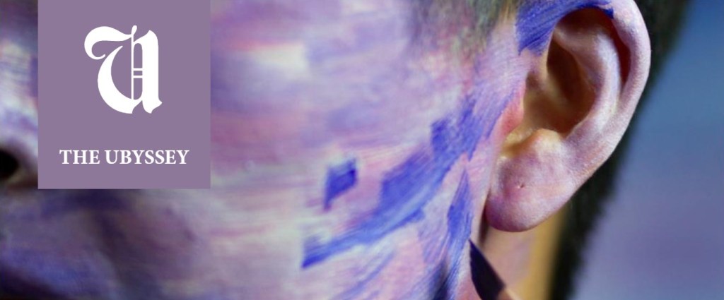
So I issued a callout on Twitter to those in this realm. I was tickled to hear from Lua Presidio, the visuals editor from the Ubyssey Publications Society at the University of British Columbia. The Ubyssey is always doing exciting things. Their covers are always dynamic and bold. And the theme is generally carried on throughout the issue, not just a one-off design to blow out the cover as is often the case in traditional newspapers.
I asked Lua some questions. Here they are, in no particular order (other than the order in which I wanted to present them)! The first question presented was the last question I asked. But I agree so strongly, I moved it up. Designers, print designers especially, so often go unnoticed nowadays. Organizations like the Ontario Newspaper Awards axed its design awards, and the National Newspaper Awards pit print designers against digital designers. Thank goodness for the Society for News Design, which still loudly and proudly celebrates print design.
“We really are putting our hearts and souls into making these. I see some amazing work out there that I would love to see get more recognition.”
Lua Presidio, on celebrating design in student media
What got you interested in this, and why did you reach out after my tweet? I thought it was a cool opportunity to showcase the work of student journalists who aren’t actually dealing with words. Not many organizations are paying attention to that when it comes to student journalism (understandably so since very few newspapers have full-time visual staff), but we really are putting our hearts and souls into making these. I see some amazing work out there that I would love to see get more recognition. (The Eyeopener and The Gateway are two of my personal favourites — amazing design teams).
What goes into designing a cover and an issue? What is the process? The design process and what it takes varies a lot. It depends on what type of issue/project we are working on, the time frame we have to complete it, and if any breaking news arises for the day/week we publish. For regular issues it’s usually a week’s worth of preparation where we decide which article should be featured on the cover. We choose an article based on relevancy. Then, the editor for that article and I work together with the Photos Editor to come up with a concept for that cover. If the concept is around a photo, the Photo Editor will take care of it. However, if it’s around an illustration or photo modification, I am responsible for it. Usually I try to pitch out these covers to have a variety of styles and people featured on our pages, but depending on the week I end up doing a large sum of the designing of covers. If it is a bigger project like the gender issue, “Performance,” the process is very different and much longer, but still relies on the collaboration between editors.
I’ve noticed the theme from the cover carries on inside for many issues I looked at. Has that always been the way? Generally yes. I like to keep styling consistent and when deciding on anything for an issue, cover is usually what comes last because I always want the cover to reflect the content and not the other way around. The cover should make readers want to pick up the issue, but it shouldn’t be more interesting than the content itself.
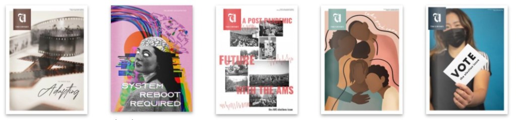
Why did you select the editions you did? What do you like about them? I sent you three editions that I think tell a complete story with the cover.
Ubyssey Gender cover by Lua Presidio and Elizabeth Wang
The Gender issue had an extensive preparation behind it and it’s one of the issues I hold closest to my heart although looking back at the inside design I wish I had done things differently.
Ubyssey climate cover by Alex Vanderput
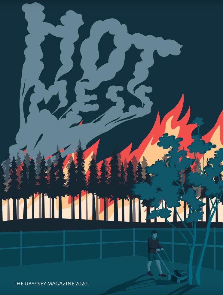
The 2020 Magazine “Hot Mess” I love because it’s a meme reference that was transformed into this beautiful illustration most people don’t even recognize as the meme. And yet, the sentiment of the world burning while we do nothing really captures some of the themes present in the issue. The 2020 Mag was about climate change and hot mess was a very quick, catchy way we found for describing the entire world situation.
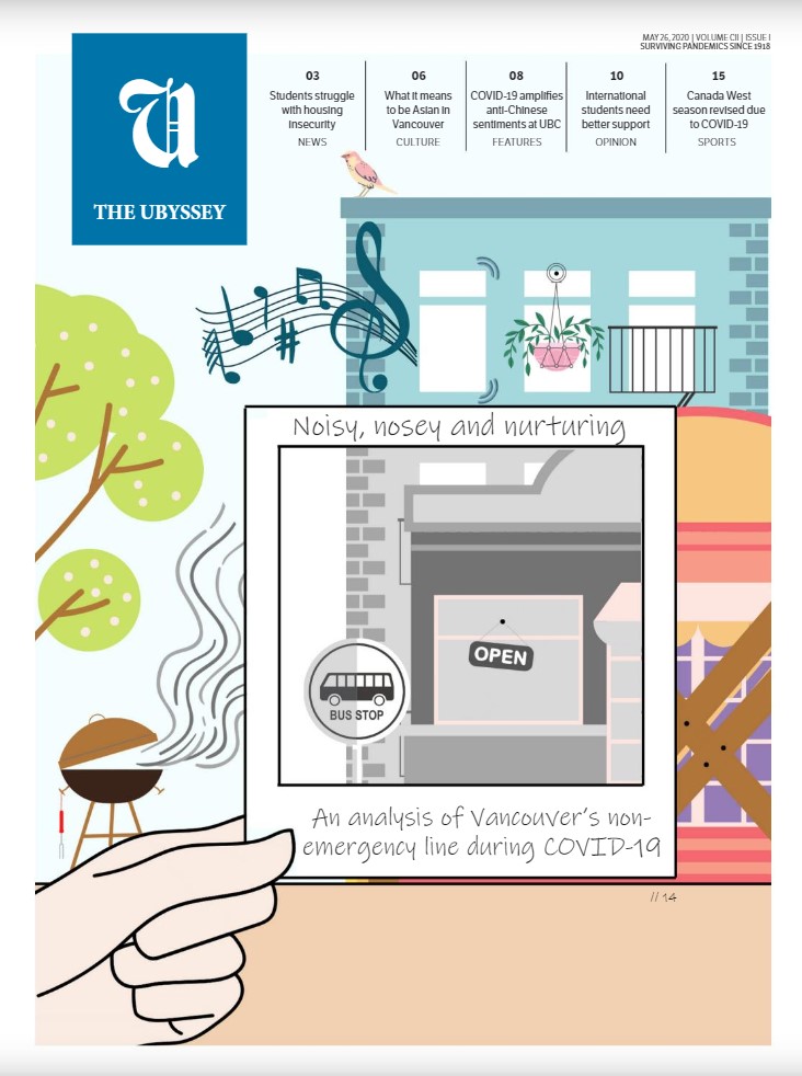
Ubyssey May 26 (COVID) cover by Eisha Sharda
Finally, our May 26 issue is one of my favourite representations of the before and after that the pandemic has brought about. The article talked about some of the positive aspects of the pandemic, and I think the cover reflects those positive aspects well without ignoring some of the difficulties that were also brought about during the pandemic. There are other covers that I also love and could have shared, but they were some of the ones I designed myself, and I don’t love to toot my own horn that much.
Tooting horns
I have no problem tooting horns. I wanted to show off a few other covers and pages that I really enjoyed, the first by Jasmine Foong, and the next two by Lua.
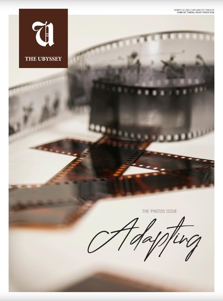
Ubyssey cover by Jasmine Foong
I just find this cover visually pleasing. Plus it brings back memories. My original career path was photographer, and I was a film guy. Digital photography was just in its infancy when I was in university. I remember my professor putting the strap around my neck to ensure that his wildly expensive, heavy 1MP camera didn’t shatter on the ground at my feet. I also love this as it’s so fitting to this blog. Adapting. To survive newspapers have had to adapt. And that has led to moving money from print to digital. So while designers are working with less (time, money, updated software) they are still killing it. This cover is an example. It’s actually relatively simple. A picture. Depth of field. Sepia tone. But I love it. Confession: I love simplicity in design. If you can be simple and have it work, that’s magical. Things like white space, not coloured boxes. A simple photo, not a cutout. Text as your art, no photos. Amazing. This cover makes me wistful, and if a cover can evoke emotion, it’s working.
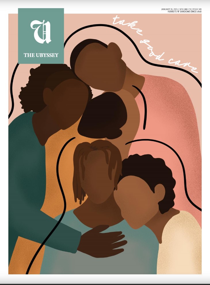
Ubyssey cover by Lua Presidio
This seems like a simple illustration and in a way it is. There are no features, no fine detail. But that’s why it’s so great. It’s almost featureless, which is the new trend in illustrations, and rightly so. So people can see themselves in the image. But on this cover, this is where the almost comes in. There is one feature that binds. And that is that all these otherwise indistinguishable people are Black. Despite the figures not having an identical skin tone, the reader knows they are meant to represent the Black community at UBC. That was the focus of this issue. As the editor’s note says, addressed to the Black Community: “In 2021, the push continues.” Here is the message below.
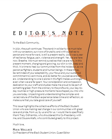
Ubyssey inside pages by Lua Presidio
This is what student newspapers are about. This is the kind of thing you can’t do at a big newspaper. There are some design rules broken. The font is not perfectly and easily readable for two reasons. It’s reverse text and the font isn’t simple. But I like it. It tackles a big subject with a non-standard but powerful (yet relatively simple) design.
I hope to do more on student newspapers. As long as they are around and people are having fun designing them, I plan to celebrate this budding newspaper creativity, in hopes that it continues on past post-secondary education and into the traditional media world.