By Brad Needham
What’s black and white and read all over? Still newspapers. Or maybe newspapers again? As the Society for News Design wraps up Day 2 of its 45th (!) Best of Print News Design Competition, I was looking for themes. Not just a shared news topic, but a design concept.
As newspapers struggle to remain relevant and get noticed, they need to stand out. For years, newspapers have been moving to more and more colour. A good portion of newspapers are full colour (but not The New York Times!). So now that we have brilliant colour popping off the pages, and have for years, how do we catch people’s attention? What about … not colour?
One thing that stood out for me this year was a strong focus on the contrast of black and white (often with a splash of red) through a variety of publications. Designers around the world are finding ways to make black and white the new colour.
As per usual, I will write posts about the best from Canada, the U.S. and the rest of the world, and the World’s Best Designed Newspaper (or newspapers), which I again have the honour of assisting with as a facilitator. As a facilitator, I don’t have a say in what wins. I just help the judges with anything they need.
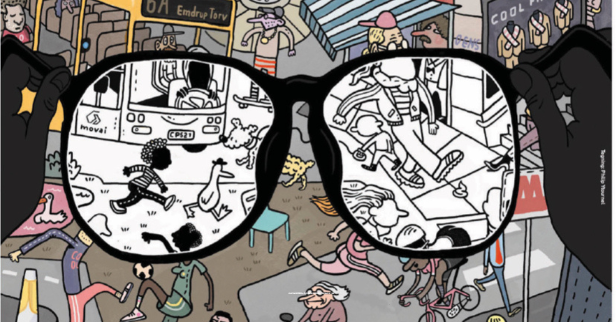
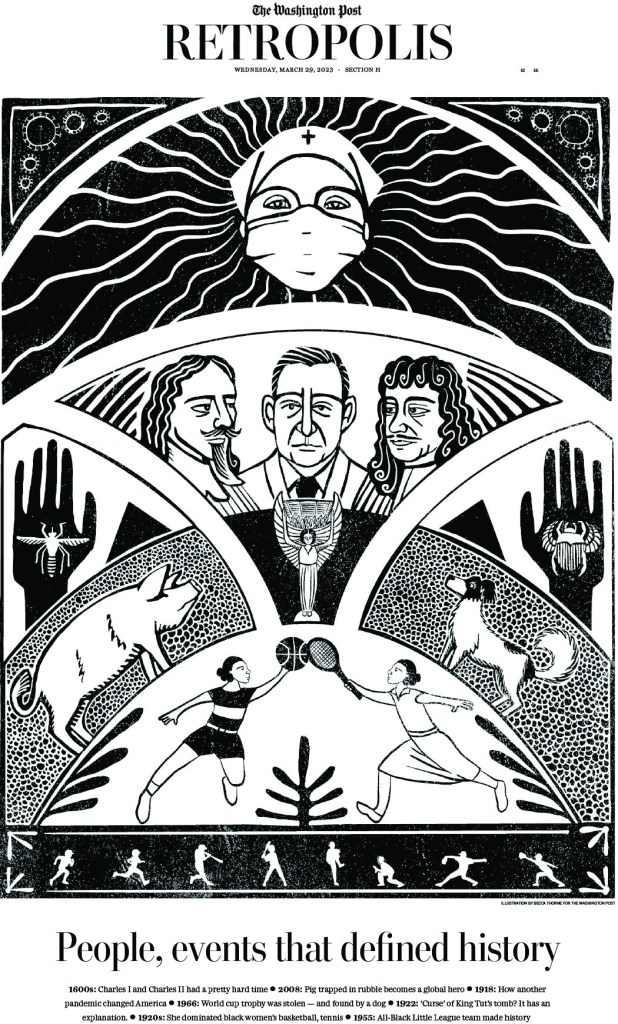
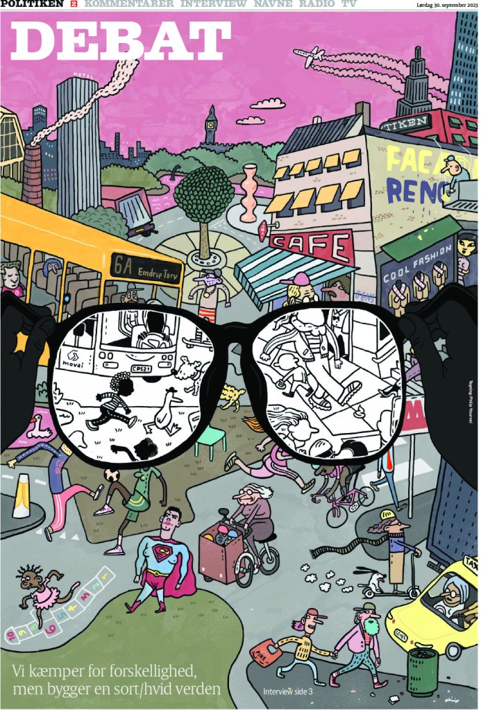
But for now, here are 10 pages that stood out to me (independent from judging and awards, so just my opinion and selections as I get to look through all the entries, winners or not) that used black and white (and sometimes red) well. The first three did it very differently. The Washington Post used strictly black and white, making for a striking contrast. El Periodico used white on black, but added that splash of red. And Politiken, which very commonly uses black, white and red, used a beautiful colour illustration, with a splash of black and white, to draw the focus away from all the colour.

Politico does it all, white on black, splashes of red. Pop. Pop. Pop.

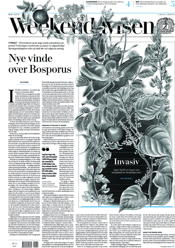
Weekendavisen, a Danish weekly paper, uses a beautiful black and white (or many shades of grey) illustration, and incorporates it into their flag. Anyone who follows my Instagram knows I love it when newspapers play with their flags in creative ways.
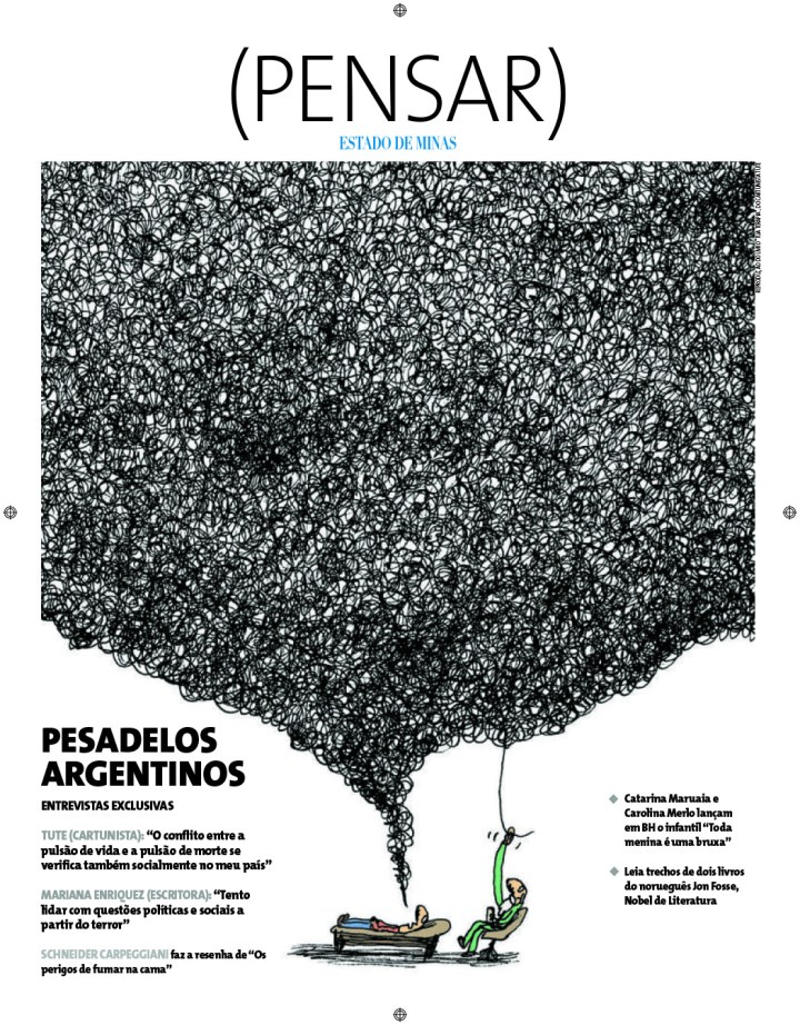
Estado de Minas, a Brazilian newspaper, boldly has a tangle of mostly black, with bits of white peaking through. The small bits of colour really pop against all the black. Also, the illustration is fantastic.
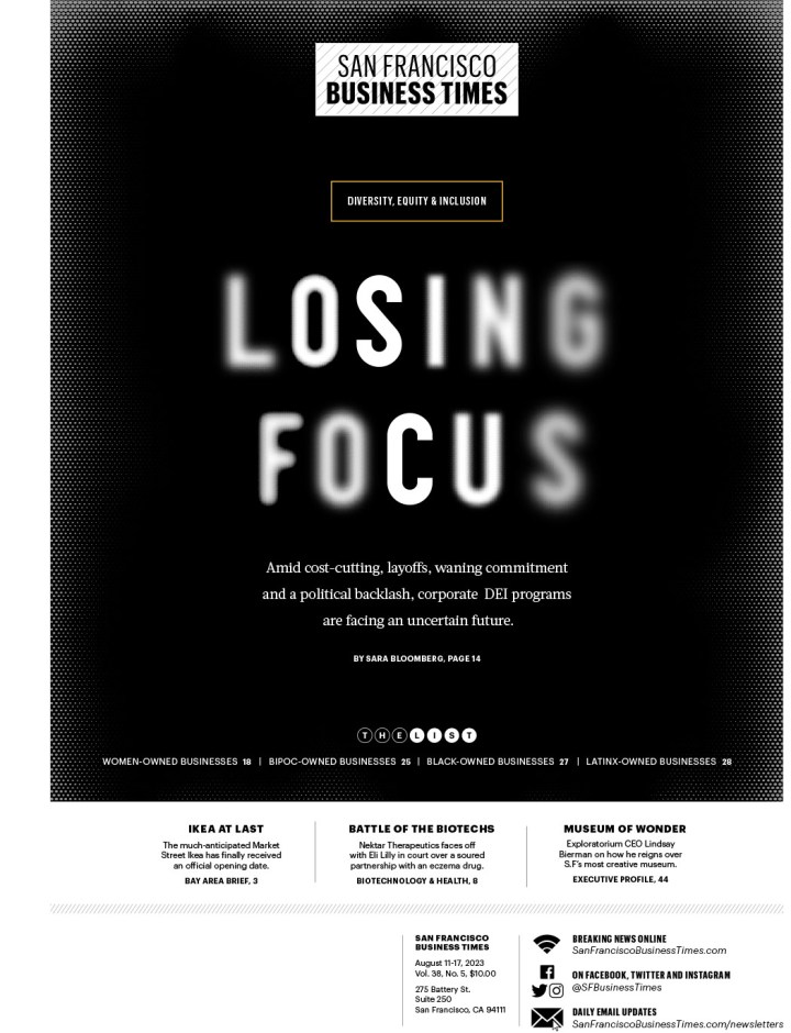
The San Francisco Business Times not only uses reverse text, white on black, but also drives the page with that text. The text is the art, and it’s well played. As a bespectacled person, I feel the blurriness feels legit.
La Nacion, an Argentinian publication, uses the combination of black, white and red to great effect. This says nothing of of the overall design. It’s worth taking a closer look at the image.

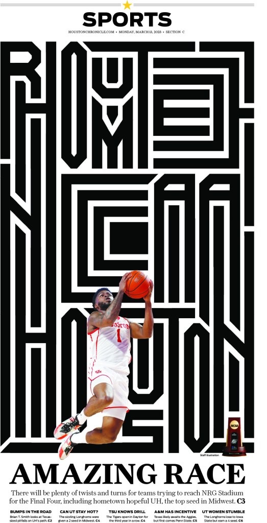
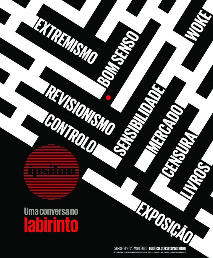
The final two pages use a similar technique, with the strong black and white lines. The first, the Houston Chronicle, uses the black and white as words, but not obvious words at first glance. And they are complemented by a small colour photo on the bottom of the page. And at the bottom is Publico, a Portuguese publication. They use the lines to lead into words, and add a splash of red.

[…] from SND45:Best from CanadaUsing black and whiteDealing with tough […]
LikeLike
[…] best from Canadian newspapersThe best from American newspapersThe best from the rest of the worldUse of black and whiteDealing with tough […]
LikeLike